Transcripts
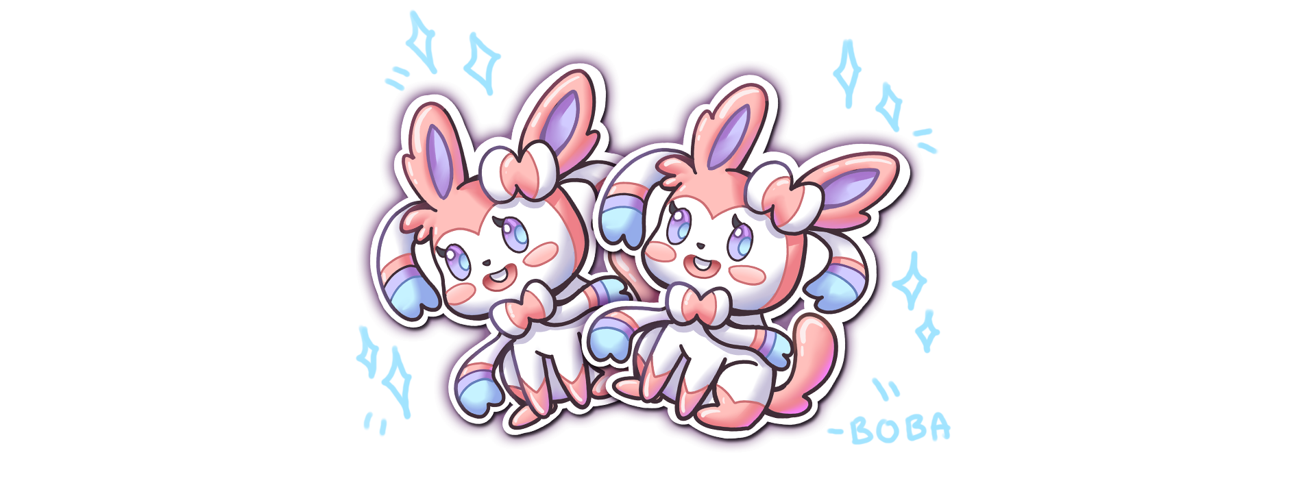
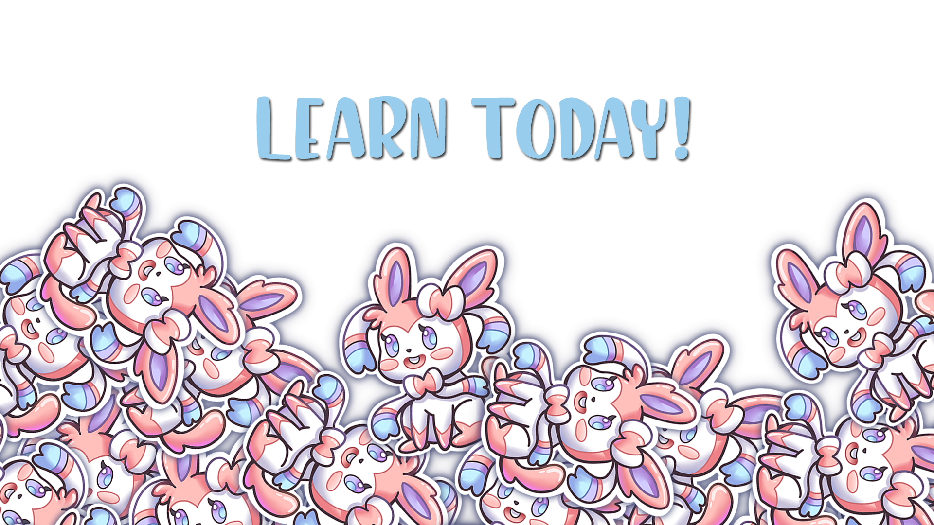
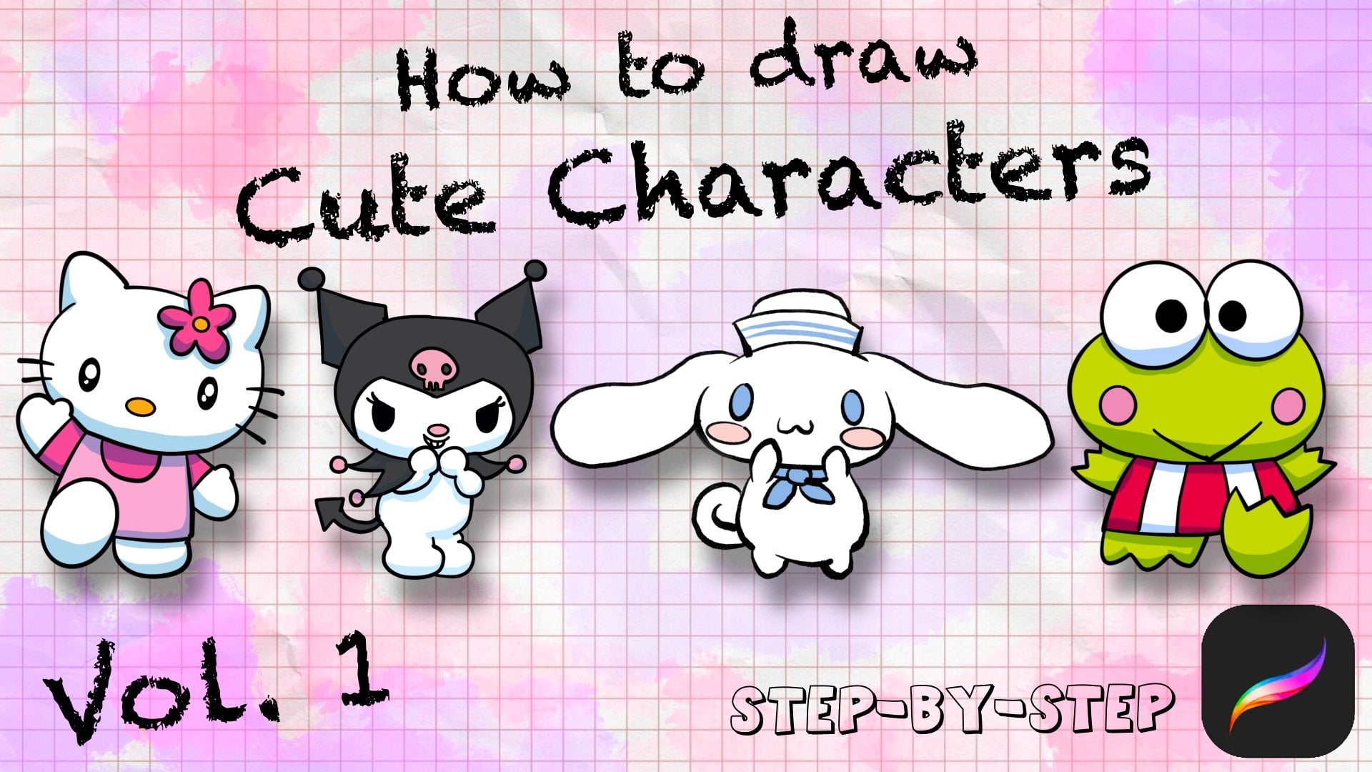
1. Intro: Hello, I have you guys ever wanted to design your own stickers? This editorial go over how to design simple stickers in Procreate. I'll be going over how to design this. Sylvia on mobile. We start with a simple sketch. After that, we will be doing some liner. With the liner, we will be doing a color pass. And finally, we will be adding a white background first stickers. At the end we will be pretty stickers on sticker paper and cutting them out by hand. And after this tutorial, you will be able to create all the stickers you want joined today and let's get started.
2. Brush Intro: Hello, We are going to go over some brushes used for today's lesson. We're going to use the bubble set and we're going to be using paint, brush for painting. This is a general question. Good for painting. There is some capacity and thickness of thin for a good variety. And then for the other brushes, Let's see, we have a texture brush. We might be using this to add some texture to our paintings. Soft air to airbrush, some softer, severe features. 6 B pencil. This is primarily used for sketching. It's a nice thin brush and allows us to sketch quickly and effectively. And let's see, finally we have the ink smooth. This is a great brush to ink and clean up your drawings. There is some smoothness enabled in that allows us to draw clear and quick. And it's pretty simple to use. Once you get used to, It's easy to draw. And then let's get started.
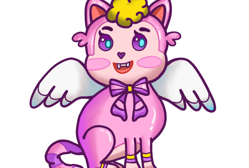
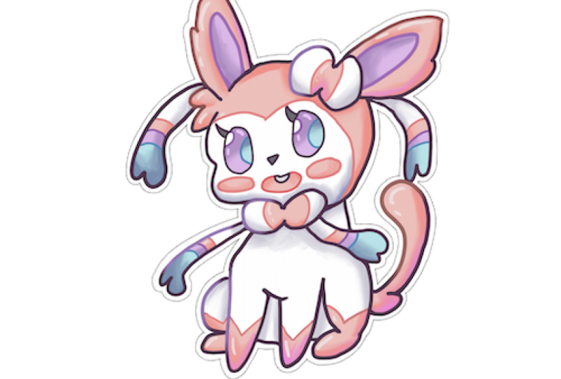
3. Sketch: In today's lesson, we'll be drawing, still be on. We're going to start with a simple circle for the head. Especially move it down a little bit, give us more room for the ears. Too dry, too big round here, trainer. And since this is a CIMI, we're going to make every proportional little bit bigger than more cute. And we're going to start by adding a little bit detail for the bot. And now let's add a little bit SHE hair. Now let's move over to the body quick. Before we move on to the list, let's add a little tiny body. Think of it almost like a potato sack, cheap. Let's see. Progress and contour lines. Show it a second. I guess it could be a parent that's cut off. Nice and simple. And less drought the legs in before we draw right on top of it. So for the lights we want her to be sitting cell it's two of the knees and then have little feet. Topping out. There should be good. And then let's draw a little bow right here. For both the town. Clean up a little bit. And then let's go for her feet. Or feet should be right in front of her chest. You know, just the need just a little bit seem a little high. So I'm going to move them down. Just a little bit. Doubtless did. And let's clean up this area just a little bit so could see where we could make the shapes a little bit better. Yeah, I need the foot, foot and then arms. Let's move over to the tail real quick in nice big fluffy tail or error. And then let's move on to the ribbons. She has a form ribbons. There's going to be two up here, and the two where her bow is. Let's start with the bottom ribbon and let's add a nice flow. You would have been one on this side and one side. Is ground this out just a little bit more. If you need to pause the video anytime. Or please feel free to do so. And then rewind. Maybe also we need to do so. I think I want to move her whenever a little wider. They do seem a little walls. That's great spot. And then we can move over to the ribbons on her head. Let's add one right? One over here. After erase this example. Let's add one written right here. These ribbons are pretty. They're just going to be one line and then we're going to do a snip of w and that line going back. And then the site and other women will just make a curved line and then add an MOU. And then she does have some different color in there hears. So we're going to add a shape for that. And we're going to color that a different color. And then we'll get, add a little bit of the detail to a year. Some flutes. And I think we are ready to move or to finish here. So for the face, we want to start off with some lines to map out the eyes and the mouth. And this should help us record out a little bit cleaner and more even. Going to start with a nice round shape because she has in pink, right? Where this line is going to add a little bit of a cheat. Just a little tag. And then we could give her a little mouth. Smile. Well, let's give her a little bit of t. And then we can move over to kill her nose, just a small one. And then let's work on the ice. Let's try it with some big eyes for this one, TLB we'd go maybe like two big round eyes shaded in. Maybe a little smaller and those are little big for my liking. You could try big eyes or smaller eyes. Whatever it looks cuter to you. I'm just going to go more of an oval, smaller eyes. And I give her a nice cute elections. It's very simple actions. Let's see where else we could improve this triangle. We could add some of the lines that are going to be our different colors when we colored hair. Well, definitely add those in. And these are the bands of color on her ribbons. And their bot does have two tone colors of pink and white. So we can get by it that this line right here, the same thing down here. Looks good. And then her feet has it combine and it looks like it be nights and so you'll stay with her. P0 divided. And this is where we've colored in green. And then our, in our feet, we're going to zoom in. Let's clean up this area just a little bit and we're going to add the actual separation of each one here, one here, just to show the tones that are there, saving with the feet. Just to simple separations. And I think we're good with almost done with our sketch. Clean up a little bit thing, get things nice and around. And then I'm going to draw in the pupil and where to use this for airliner to color. I'm going to clean up the brow and my move it down just a little bit to match the eyes closed but more round around the eyes. See the back of the head a little smaller. So it just any adjustments you wanted to, you could just erase and then adjusting things. And this is where you wanna do all your adjustments during the sketching phase. Because once we move on to the inking phase, you'll want to have our sketch almost 90 percent there. We know where the details we want to keep are and where we don't want to keep them. So definitely spent time on this sketch before we move on. Clean up the ears. Now let's give two areas of lush to add. Pending. That's a great sketch to start with. I'm going to move it down in the middle so Yuki could be a lot easier.
4. Line Art: Let's get started. Good luck. You're going to want to start with lowering the opacity of your sketching, your sketch so you can barely see it, but it shouldn't be distracting once you do that, you can't up. So I would say around 30 percent good. And then you're going to start a new layer. And then we're going to switch over to MOOC, turn it to a black color, make sure the size of it, it's a good size but not too thick, not too thin. I think this is a good size right here. And this can be around the middle or this brush. And then we can start inking. Usually I like to zoom in and move them around the canvas during the AU base. So definitely suggest you do that. And then you just want to go and follow your liner. And then just IQ throughout your painting. Let's add this here and make sure each line is connected. Like let's say the ear to the head is connected. And then this bot, for example, should, it should connect right here. And we don't want any spacing. During the coloring process. We're going to use the Clark Field tool. And if there is a spacing in-between them, that color will bleed out. So definitely pay attention to all the spacing and make sure everything is connected. And if you don't like a line, just undo it real quick with the double-tap and then we're going to move forward to the rest of it. All right? Nice and simple. Using this brush, it makes it a lot easier to ink because there is some lack assisted guidance. So everything feels smoother and simpler. We go for an ace. Hello, It's good to me. Come over to his bow. I'm going to save these lines inside with a thinner brush. So I'm just gonna do the bigger line side, side. Usually it's on the outside of the details, but slain stake in the inside to separate the colored. We would do that with a thinner brush after. So let's just focus on the big lines outside. And then are the smaller lights and said we will shrink the brush. I continue to pick this ribbon right here. And then the tail. Do a nice big smooth or detail. I might need to do to voting as a block here and erase that. Let's finish off the face and neck. Zoom out and see what it looks like. Peter is submachine gun here. Then for the smaller details and the face, I'm going to scale it down to maybe 70. For senate. We shouldn't give us a thinner line, finer details. And use this to separate each. The color. Make sure there's no gaps. Make sure everything is connected and sealed off alive when we color. Good and let's finish off with the face. Nice, cute. Then for the eyes disturbing the circle or an oval like this case. Let's get them a little bit more around the lashes and the twos girls for the highlights. Then let's flush Here. Here. Finally, the pattern on her head or head. And I think this books are away. Do I think that looks good. Everything is ready. We're gonna do a step where we thicken up some lines to make it look a little bit more clean or barotrauma, the line art layer. And then we're going to do this thing where whenever there's a T section, we're going to thicken up the contact point. This should help with a good variety of lightweight. Now make the drawing a lot more interesting. I'll go through and then I'll zoom out and see the results look like. So anyway, there's contact points that came up those areas just a little bit, just so that the lines aren't the same thickness, RL. And you don't have to do this for every line just selected feel that you'd think could use it and then just thick enough the contact point. Or we didn't miss these lens for this area. I'm just going to put them in real quick. So a little bit of work, but it adds a little bit of variety that at EKF will be referred got the tube she foot the bill right here. Pelvis. Good. Now we can move over to.
5. Color: We're gonna go to their liner layer, click on it, actually, create a reference layer. And this will allow us to par and colors without going outside of the lines are showing you. I mean, so GOP, layer below the liner, you're going to add a layer and we're going to pour in each individual color and every layer, it's going to be a different color. So for example, we're going to start with pink, sylvian, the main colors cheek. So I'm going to select a pink that we think it's really close in there. We're going to pour in to the areas that are pink. And since the reference layer is up, it should allow us to, or in the line layer and the paint layer, you can be separate so we're able to paint each layer individually, sub-par in every area that would be pink on cilium. I might have to zoom in, just loop the return iPad to catch the areas I intend to be pink. And then just go in really quick and just get the Areopagus. She could possibly be paid. Then I think the math looks good. And then let's go in and add another layer. And we're going to make this one, we're going to go white. And to see the white willow better where you actually change the background color to a gray. So when we part in the white will know if it's appropriate layer. And we can see the areas we have filled in. C processes, the paint just select all of the areas that are white. This is one of the simplest button, the SOPA and most effective way I color my opinion piece a lot quicker. Okay, let's double check that all the weight is in. There is a little bit of a peek missing. So I'm going to switch back to the pink layer, pink color and just color it in. And let's go back to the way earlier and double-check. We got all limit. With these two highlights over here could also be awake. Looks good. Let's go with a lavender, blue, purple, and areas that would have that color. And we actually call it the ice, the same color to create color. Finally, we need a layer for blue. And this can be a like paper growth. And that, that is, you've got the queue and then one more layer just from the dark sluggishness. Can do are really dark, gray, purple, real ashes and then limits. Now let's get every layer should be filled in and we're ready to shade each area. So you want to go each layer that has a color in the new Alpha Lock, and this will make it so don't paint outside of the area. And we're going to start with the pink. I'm going to switch over to my paintbrush. And this will allow us to paint in shadow pretty quick and easy. So we're going to select the pink color real quick. And then we're gonna go a little bit darker, a little bit more saturated. And sometimes I like to shift the color down a little bit too purple. And that gives you some nice rich shadow color shape. And then for shading, I usually just like to color the underside of each of the shapes. So imagine if this table is ET, tube shape. And then we're just coloring the underside of it. Same thing with the feet. Then the pulse. Then a little bit of this year for the bow and we're going to do the same thing to the white. So don't worry that that going over to the other side. I like to separate the colors just makes it easier to manage. This adding shadow. One if we see fit, the above would also casts a shadow on top. So adding their shin back at it a little bit here, the school liver summary here. So this side. And I think that looks good for all the pink. And then we'll get him do the same thing with the white. We're going to select the white. Go down a little bit darker, electing use a bluish purple for the shadows the way it always looks really nice and subtle. And we're going to do a lot more shading. And that's because there's a lot more white on this character. So we're going to go under the neck. The head will create shadow, this biliary atresia, be feet, cache shadows. Backside of that. Bottom of this thing. There are some areas in the pink that I missed, but we can always go back and forth. So let's just get a good base in. And then. And areas that we miss and that turn you back. Let's go here. The cheese. No shadow for the upper lips. There's some shadow missing here or the feet and the acyl for both. So I'm going to go back to the layer, select the same color, and then add that. In that sense it's a clipping masks should make it so it's a lot cleaner and easier and you won't be painting outside of each area. Let's move over to the blue lavender area selected. Go low, darker, shifted a little bit more purple, and then continue. The same method. We have less of this color, so we can add some up here, darken. The iron was hot. And then finally, the baby people do around here. There's a long white missing on the Bot. Go back, just go back and declare that in. And that would kill work on shading it further. We're going to do it and each layer at a time, I'm going to go back to the pink layer. I like to actually add some color to my shadows. So we're going to select the color. Maybe add like a really nice hot pink over use adding Touch, have it here and there. And we're going to actually blend in with the smudge brush as a smudge feature right here on top. So just a little bit and I'll show you what happens when you use the brush to blend the colors in. Now smooth that out and looks really nice. I suppose. Don't overdo it just in areas you think could use it, but you don't have to do it in everywhere. Usually, I do it towards the bottom, but I don't do it for cash shadows, for example, right here, where the ear creates a cache shadow animal I just went live, but I like to smooth and areas where it just rounding around. So it creates a nice shape. It makes it feel a little bit around. And weakness can be used to smooth brush. We've got some areas really quick and easy. Horn add a little bit more color. We're going from black to our brush. Be a little bit code or data here. Could go with drinker. Period, right here, which ears are easy to mess up? Making it blend really nicely. Let's get the pink area that's done. We're going to move over to the light and use the same process. It's a cripple active, maybe add a different color. Let's go with a nice dark deep represented this time. Just adding little bit deaths. Smooth it out. So it looks nice and around cache shadows I like to leave, but then areas like right here, right here. Lambda 1. If she'd more and more of these, you'll, you'll decide like what color looks good. And you just say you could just try a few colors. Sometimes you can even go park vibrant and is still fine. As long as it's a close like glue. These purples, reds, you can use purples. If it's green, you don't want to mix purple inside of it, it will look a little bit more off. So just pick a color that's very close to the original Kolyma and she'll look fine. And it wasn't good. And let's move on. Triplet now. Same thing. Well, this is a cast shadow because it's the pink cast a shadow onto the lavender. So I'm going to leave it by itself, but I'm going to add a gradient down here by selecting this area. And that should make it look a little softer. This a little bit.
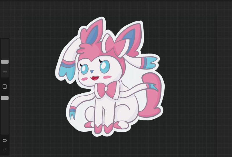
6. Outline: All your shading, we're gonna go and colorize the liner. To do this, again, I create a new layer above the liner. First you want to turn off reference. If you have it on, just turn it off. We can create a new layer above it, and then we turn it into a clipping mask. This little flower says to color in the area and it will only affect the liner. That's what allows us to make the line color a little bit more cohesive right now it's really dark and black. So this makes it look really striking and start like very different from the nice pastel pinks. So we can actually play with the color of the line art to improve our illustration. I like, I like to just part in a really lighter colors that I think most of the painting could use. What's the liner could use and then see how dark it could get you far. I move on to color each individual area. It can be a little bit more permeable and can you be a tad bit darker to start? And then we could go into areas such as pink right here. Switch to your paintbrush, and then we can paint in areas where we want it to be a little bit lighter, tone TO darker than the area. We want a smooth us up and out, just so you can still see the liner and appreciate it. But since it's pink, it will still be, we'll call it just blends two together. So using the paintbrush on this layer, we're going to just go in and create that nice transition from the painted pink to the liner k1. And they are realists a little bit more unified. And we looked, continue this throughout the piece where we see fit. See that sheiks definitely means it on the mouth sits is such a dressing detail. I might go a little darker than the rest of the areas. And let's find this, this whole area. Let's move on to the other colors. It's cool, but the presumed this next area school, that little darker blue just so it's still keep the liner. See how that looks. Great to me at metal's name. Mr. little bit pink. And we're just going to select the third peak area below that in Norway. To do with the loop. And I guess the final one is going to be per mole. I'm leaving off the thicker lines dark just because it's such a heavy silhouette line. And I think it could just stay pretty dark. We could light it up just a little bit, but it's a bit darker now and see where we can get on with it. Okay. That looks good. And then for the dark lines that we could select areas, but if you go a little darker, a little lighter, but now to lie, I like to keep usually those lines creating or those areas pretty dark. And you just hit some areas. Can then, since this is a purple, enter detail, I'm going to color this purple. Make sure you use a blend to blend out some of the partnerships. My they seem like some looking at a lot softer than the original that could turn off this layer to show you. So I've turned it the cages little bit more work, maybe this white area, it could be a nice little bit lighter or both. Colors just smooths it out afterwards. Variety. Same thing for up here. I'm using pretty simple tools and brushes, grab the whole piece as Jeff painting down stuff. And then we'll let you get just as smooth out the areas and colors, adding this gradients and tones. And I think that looks pretty to me. And finally highlights, we're going to add right below the line layer. We're going to add a layer and then we're going to just use our paintbrush and then we're going to color and highlight areas. Then you don't need to do this step by step. Just add more depth to our drugs. To do this, we're just going to select the color a little bit brighter. I'm going to just have this areas of highlight. I have a nice jelly look. Since this area is why it's really hard to get brighter. So we're just going to go with the pink area for now. It's a little query here. Maybe a little bit to see if we could add a little bit. Bright purple in your life. Hi, It's good to meet. You could actually add a layer in between the two and make the dark color a little bit brighter. I showed you that they must find this, undo that car. Once our design is done, we can actually create a background for stickers pretty easily. This is what allows us to have some bleed room to first. And since it's a background, this is a background. We could turn it off and show but the pixels available or to see it. So we're going to add a white border. So in case we want to print this in the sticker, I hope the white border will be there for the cutting process. So you're going to add plus double-tap on the top left to turn it white. We're gonna go with the ink smooth. So we get a nice thick white line and we're getting just outline everything with a little bit of white just for our sticker border. And this will help if you are using is stick the cutting machine. But if we can't cutting be r, If your R, Hey, cutting these stickers, it won't matter as much. Weight corner to everything. A little stuck. Double check everything and then areas that are small. You don't want the machine to connote, just fill them in. And that's how we do our sticker design. For the next step, we're just going to be printing these out on a sheet, laminated them, and we're going to start with Hank cutting them. If you have a machine you done, do not easy. If you use your machine to cut out these stickers.
7. Create Stickers: And one head and printed out the design on some Flossie sticker paper. This paper has a sticky backing. So I'm just going to use it for a simple stickers weren't going to be cutting out these five him today because I know not everybody has a sticker cut. I do recommend a silhouette of your planets. Get your own. We're gonna go ahead and laminate these real quick just at a more durability. I like to use everyday 11 it There's simple Self stick laminate that you don't need to let me need airport. And you can find these on Amazon. Or you could probably find these at your traps, stars like Michael slow going in. So I'd like to just peel and put the laminate down right here. We're going to use a squeegee it got and then lemonade, these really quick. I like to just loop the cabin, put a little plus, go with this. And then lemonade the site though. Nice and simple. Okay? And since these are laminated, to cut out just one of them, for example, be careful about to cut too close to the other stickers. We wanted this have enough room for both tiers to have the amaze order. So this Duik click cut, so you have enough room for a portrait from either side. Let's cut this one out. And if you get the rights, that kinda stuff, I usually use a vinyl gloss. They're really durable and pretty much waterproof. I don't believe they're UV proof, so you can't really stick them onto any vehicles or anything that's going to be outside in the sun for a long time. But I'll water bottles and laptops. It should be perfectly fine to last for quite a long time. So let's get this sticky onto water. Our water bottles might look a little closely. They're still files, still a spring. Almost finish. There we go. Perfectly nice Decartes. And let's bring out for a water bottle. As fathers. They get up to here. All right, Here. And there you go. Created a nice, cute she be sticker. And then yet you could use the methods to learn today and that create your own stickers. And yeah, I've thought it was that you have questions or reviews or anything in particular. Just comment down below are started discussion. And I'll get right back to you. Thank you for watching.
 Boba Tea, Art Teacher