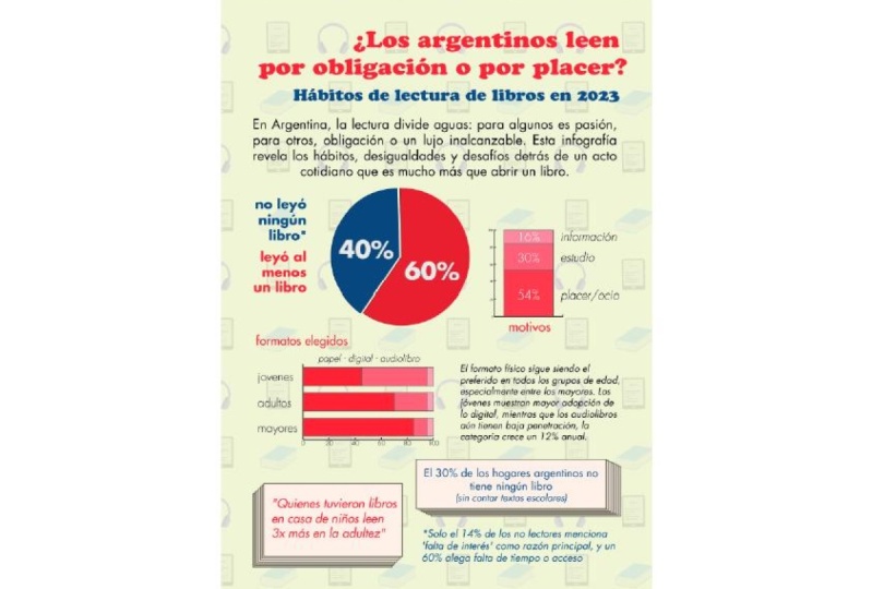
Transcripts
1. Level Up Your Skills: Hey guys, I'm Kate and I'm back with some more Adobe Illustrator tips and tricks in this intermediate course. I highly recommend before starting this level to begin with the introduction course that I teach, to develop a basic understanding of the software. This is the same course I teach in the UK's leading Adobe Training Center in London. These are some of the fine tuning skills that we will cover. We will be creating graphic styles, we will be converting objects to 3D and adding special effects to give your ideas an edge. We will be enhancing our typography to really make our work stand out. We will also be working with warping and distorting, playing with gradients and blending to create some really cool designs. More do's and don'ts with the pen tool to really become a pen tool pro, and some stunning brushes to create a more authentic hand-drawn decorative feel to it. I love creating seamless patterns. These can be used for so many things like wallpaper design, wrapping paper, fashion prints, and so much more. We will also be working with the Graph Tool and we will be creating graphs that can be used for presentations and reports. Finally, some more advanced type options. There are lots of files that you can download that are available with this course so we can play along with the exercises. Are you ready to level up your Adobe Illustrator skills? Let's get started.
2. Drawing Techniques: Hey guys, welcome to this course. Make sure you have Adobe Illustrator installed on your computer or laptop. Any version will do really. You can go ahead and download all the project files, lots of zip files, which you can find in the project section. Now, maybe place them somewhere accessible like your desktop, just so that you can open the files very easily. We will first start with some drawing techniques to further expand on our existing pen tool skills. We'll cover how to design symmetrical shapes using something called reflect and join, which is super cool, and then some more icons and illustrations, and we'll use something called stroke options, offset path, and expand, which sounds complicated, but it's actually great. Let's do this.
3. Opening Project Files: Hey, guys. I'm really excited to teach you more Adobe Illustrator skills to enhance your artwork. How exciting? If you did the introduction course, which I strongly recommend, you will have a strong foundation and it will make your whole process go much more smoother now. The amount of tools to learn in Adobe Illustrator is endless, but I'll show you a lot of really cool tricks to enhance all your artworks. There's so much to play with so it's really fun. Let's do this. Firstly, we need to make sure we have all the files needed. If you go to the project section, you will see a zip file or maybe multiple zip files. Remember these are compressed folders. I would like you to download this and place it somewhere accessible, like your desktop. Now, if you double-click on this, it will expand into a folder. You can access all the files inside. If you double-click on it, you'll see that there are a lot of files and folders because we will be learning a lot of Illustrator skills as you can see. If you did do the introduction course, you will have practiced some exercises like this where you practice a Pen tool and shortcuts for adding Anchor points, and moving anchor points and the Direct Selection tool. Just a reminder, the Pen tool shortcut is P. Adding an Anchor point is plus, removing an Anchor point is minus. To move an Anchor point, that is a Direct Selection tool, and that is A. Then so many more shortcuts which will be repeated in this course as well. Now in terms of files, I'm currently using a Mac, which means that some of the previews of my files will look different to those that are using PCs. Mine has a little preview as you see here, but if you are using a PC, you will see AI in orange, which is the icon for an Adobe Illustrator file. Make sure you have Adobe Illustrator. I'm currently using the latest version. Now remember to open a file, an Adobe Illustrator file, you can either go to Adobe Illustrator, and then open a file from here. You go, "File open," or "Open," or you can also double-click on one of these files and It will open up in Adobe Illustrator.
4. Reflect & Join: One of the exercises we'll start with is this one. It's one of my favorite exercises. I love it, it's super fun and I think it's a great way to start the course because it covers, again, the selection tools, the direct selection tool, the selection tool itself, and also a bunch of other shortcuts. It's quite good to start with. Now, the principle of this exercise is that in reality, whenever you create an icon or an illustration, what you do instead of creating the whole icon and breaking your head trying to get it exactly the same, exactly symmetrical on the other side, instead, one way of creating icons is you create half of the shape with the Pen tool, like so. Then what you do is you copy, and you reflect it, and then you join it. If that doesn't make sense to you, it will all be clarified when we actually do this exercise right now. Let's open this up. Go ahead and double-click on this. Now, on the right-hand side, you will see the shortcuts. If you forgot, zooming in is Command Plus for Max or Control Plus for PCs. You'll see some lovely shortcuts over here; selection tool V, direct selection tool A. Now, I live in London and my way of remembering these shortcuts is I think of my favorite museum in London called the Victorian Albert Museum, so selection tool is V, direct selection tools A. It's also called a VA Museum. That's how I remember it. Feel free to make your own associations. I think it always helps you remember shortcuts. We will also learn a bunch of copying shortcuts and joining. More will be revealed in a bit. The first thing we need to make sure of is that we go to the selection tool through the shortcut V. We need to select this half heart by clicking and dragging. What we'll do first for each of these is copying half of their shape. We're going to reflect it. We do that for each of these. Once we've done that, we're going to join all these half shapes to make it a single shape. Anyway, go to the selection tool, select your hearts. What you can do is copy paste. I'm sure you know probably some shortcuts or you can go to Edit, Copy and Edit, Paste. But we're going to do something even better right now. I'd like you to go to Edit, Copy or Command C, Control C for PCs, and instead of just pasting it in a random spot like Edit, Paste, this is what not to do. If I do that, it will just paste it in a random spot. I'm just going to undo that, Control Z or Commands Z. Instead, I'm going to Edit and Paste in Front or the shortcut is Command or Control F for front. When you do this, what will happen is you'll have two copies of this directly on top of each other. If I were to move this heart a bit more to the right, you will see that there's two of them. I'm just going to undo now so it goes back into its place. I just tend to do this just to check, are there two copies? Yes, there are. Okay, no problem. Edit, Undo, or Command or Control Z.
5. Reflecting Objects: Now that we've copied the half of this heart, we need to reflect it. The way to do this, is to head to the Properties panel. If you don't have the Properties panel open right now, I would like you to go to Window, Properties, wherever it is, there we go. Make sure it's open. We need to look at the Transform panel right now. What's super important is this, this is the reference point. Currently it's in the center. Now, this means that if we make changes to this, it will be according to the center. Then there's another little icon here called Flip Horizontally. This means it will reflect. That's the one we need. Now, because the reference point is in the center, if I select the Flip Horizontally now, what will happen, is it will reflect it but not in the correct spot. I'm just going to undo that, Control or Command Z, and this time I need to select the furthest point to the right. Any of these. That means that it will reflect according to the furthest point to the right, which is this point here. Let's do that now. Select this point, and now click on "Flip Horizontally," and voila, it's reflected. Now, let's not worry about joining right now. We're just going to repeat this process for each of these because I believe in repetition. It's the best way to learn. But this time we're going to try to work with shortcuts, so that it goes up much faster. Again, let's select our whole half cup here. What we're going to do is Edit, Copy or Command C. Edit, Copy, and then Edit, Paste in Front, or Command F. Remember I like to check is there a copy here? Yes, there is. Undo, so it goes back into its place. Now, only need to do is reflect it, because the reference point is already set so that's much easier. We click on "Flip Horizontally," and viola, so fun. Let's do the others. Selection tool V, select the headphones, Command or Control C for copy, and then Command or Control F for paste in front. Is there two copies? Let's check. Yeah, so you can just Undo and then you select Flip Horizontally. Let's do it again. We select half the vase, or vase depending on your accent. Again, Command or Control C, copy. Command or Control F, paste in front. Double-check that you did it correctly that there are two copies. Yes, they are. Undo, Command or Control Z, and reflect or Flip Horizontally. Let's do it again. Select the half the hand, it can be called a Fatima hand, or Hamsa, whatever makes sense to you, and then what you do is Command or Control C, or Edit, Copy. Command or Control F, or Edit, Paste in Front. Always double-check. Is there a copy? Undo, so it goes back into its place and Flip Horizontally. Let's do the final one, the microphone. Select the whole microphone, click and drag around it, Command or Control C, Command or Control F, and reflect. Voila, we've just replicated all the halves and the next part will just be joining them so they're seamless. It's a holistic icon.
6. Joining Objects: Now for the joining parts, because we need to make sure that we join each of these. Otherwise there will be gaps and we won't be able to add colors easily. It's always best to close icons, close the shapes. Now, we'll leave the heart for last, because it's the most difficult one, and I always like to start with the easier ones. We're going to have to select directly or individually anchor points. To select anchor points, you need to go to the direct selection tool, this one or the shortcut A, which is also given here. Now, I might zoom in a little bit so I can see better. Command or Control plus. What we need to do is select two anchor points. The best way to do this is to left-click and drag across both anchor points. There's an anchor point here and there's an anchor point there. You might see this, that the ones selected are blue and the other ones are white inside. Could be a little bit hard to see, but if you zoom in, you will see that. What we've just done now is the same as clicking on one anchor point, and holding down the Shift key, and clicking on the other anchor point, it's the same. We've just selected both anchor points. Now to join these, you need to either right-click and select Join. Now, if that option isn't available to you, you could also go to Object, Path, Join, or the shortcut Command J for Macs, Control J for PCs. When you do this, voila. I always check, is it really joined? The best way to look at it is to click on an anchor point and move it. Yes, it is joined. Remember to undo once you've checked that everything is okay. Then the next part is at the top. Let's check if it's really joined. I'm just going to click on it and drag it up. No, it's not joined because we haven't joined it. I'm going to undo again. Here we do the same thing. We left-click and hold and drag across both anchor points here and they're directly on top of each other. Clicking in Shift here would be very difficult to do because they're on top of each other. In this case, it's easier to left-click and drag across both anchor points. Again, you can right-click Join or Command or Control J for the shortcut. Again, let's see, is it joined? You click and you drag it up and yes, it's joined. Awesome. Undo, Control Z. Let's move on to the next one.
7. Joining Continued: Moving on to the headphones. Same thing here, we're going to do it bit by bit, this first and then that bit. Left-click and hold and drag. Make sure you're still on the Direct Selection Tool. Click and drag. These are selected. Right-click Join or Command J. Again, check is it joint? Yeah. Undo. Now let's do the bottom one. Click and drag. You'll see that this is blue, so it's selected the anchor point. Again, right-click J. Now, you may or may not notice something interesting about this bit. This suddenly jumped in front of the other headphone ear thing, not sure what it's called. That's because part of the lines were in front and the others were at the back. Now it doesn't know what it's doing. It's weird. The solution for that is just to bring this layer back. You can do this by either right-clicking Arrange, Send to Back, or Send Backwards, or Command or Control square bracket, and that will bring it to the back. If you do it a few times until it goes each time a layer back, it will bring the layer back and now it's sorted. Let's move on to the vase. Let's do this bit. You click and drag and select it. Again, these anchor points are selected and command or Control J or join. The bottom parts, right-click, join. Again, we do this part now, the hand, we select the top middle finger. Right-click Join. This as well. If you're not sure what is split, because it's hard to tell here, I know obviously because I created this exercise, so I know where I split things. But if you're not sure, you can always click on an anchor point and move it and you'll see it's not joint. You select both anchor points and Command J. You do this Command J, or Control J for PCs and the bottom part as well, command or Control J. Now, I trust that you can do the microphone one on your own. I always like to give a single exercise for you to do on your own. Make sure you join each and every part of this. I will be demoing here in case you're lost. Command or Control J. Voila for now.
8. Averaging: A few things that could go wrong with this exercise is that you're not on the correct tool, you're on another tool instead of the direct selection tool to select the anchor points. Another option that could go wrong is that earlier when you duplicated half of a shape, you did copy, Control C or Control F, maybe you did it too many times and then when you try and join it, it goes a bit crazy. I would like you to make sure that you click and drag and move the shapes around and then put them back into place by Control Z just to make sure that you don't have an unnecessary amount of copies there. If you had three of those, that would be too much. Make sure you only have two and then you join it and that should be okay. Again, if you have any questions, drop it in the comment section or send me a message, and I will get back to you as soon as possible. Anyway, moving on to the hardest one, the heart. Let's make sure we are on the direct selection tool or A from Victorian Albert. Then again, we start with the easiest always. The easiest will be the dip here. I'll like you to click and drag and select it. Then if you can right-click or Command J and join. For this part here at the bottom, it's slightly different because you can see it goes into a funny direction. I'll show you what not to do right now. If you click and drag, and then you right-click join, that will be a very ugly heart. I mean, I don't like it. Let's Edit, Undo. Instead I'll show you another trick, a solution for this. Again, select both anchor points and right-click. Again, if you don't have this option, by the way, you go to object path and you have the same option here. Now, there's something called average. What average does is it takes two lines that go in a funny way and it takes the average of both. It's trying to make them go towards each other. It will average them. I have a little bit of dyspraxia, like special awareness stuff and I struggle sometimes with knowing which it is, if it's horizontal, vertical or both. Bear with me. Now, if it doesn't work, don't worry, just undo. I think it's horizontal, but I might be wrong. Let's take a little risk here and click on "Okay". Well, it didn't work on mine. Let's try again. If it worked on yours, perfect. Let's try again then. We click on "Average". Let's see if I select vertical will happen. Yeah, it worked here, so that's awesome. I hope it worked for you. Again, if you didn't try one of the two options and it should work. Now, bear in mind that this is not joint, it's just averaged. Though the final part for this would be to join it. Click and drag and right-click or Command or Control J. Now that we've joined all these lovely shapes, we've learned how to create a symmetrical shape. I hope that you will use this technique for creating symmetrical icons. Also it saves time because you don't have to draw both halves. You just have to draw one-half, which is awesome. I hope you enjoyed this and over to some more exercises.
9. Bezier Shapes : These are some of the exercises that we'll be working with. So we have a bunch of graphic typography, a bit of illustration, coloring, some patterns, more patterns, more patterns, and more. Some brushes which are really cool. Some more graphic styles for texts and some more, and some pen tool exercise and blob brush, which is another way to paint or draw or cutter in an illustration. Bunch of really cool things and I'm excited for you to do them. But for now, we're going to do some more drawing techniques and since we covered the pen tool, well, we covered what to do after the pen tool here. We're going to cover more on the pen tool right now, something called Bezier shapes. I would like you to open 02 Bezier shapes which is a folder and you'll see a whole bunch or a couple of files. We like you to select curves and corners because this is something pretty interesting, it's do's and don'ts for drawing with the pen tool, so we'd like you to maybe zoom in to the first exercise, so I'm going to show you a couple of ways to draw with the pen tool. We've covered the pen tool in their introduction course, so remember the shortcut is P, P for Patrick or P for pen tool. Now, what I like to do is make sure the stroke is red, so that I can see things a little bit better. I can select the stroke over here and I get click on red over here that's one way to do it, and we're just going to draw these, so the first one is super easy because it's just a corner anchor points. All you need to do is click, click, and I probably need to zoom in a little bit more, so I can do this a little bit better, so control plus and then start over so click, click. Obviously we're not aiming for it to be perfect. Click, click, click, and then you close the shape by clicking on the initial anchor points you started with, so that's easy. Now for a smooth anchor point, so to create a smooth path, instead of clicking, you click and drag and you add anchor points at the top or the peak of a hill, the peak of the curve. It could be here, let's say could be in multiple places just going to do in here, click and drag and you could also add one here, lets do that click and drag. Add one here, click and drag and add one here, click and drag and you close a selection by clicking on the original anchor point you started with. Now it's only game of adjusting, you need to go to the direct selection tool and you can play with the handles, you can pull the handles.
10. Manipulating Corners: Moving on to the next one. We're just covering a couple of things we've already covered in the introduction course. What we haven't covered in the introduction course yet is the next couple options. This is a change of direction. This is a mixed anchor point, meaning it's both a curve end, a corner point. Let's start with this one. Let's make sure we go back to the pen tool, P. We can start here. Remember this is a curve, so we're going to have to click and drag. Again here, we place the anchor point here and we click and drag. Going to not look perfect, but that's fine. Now, the handle over here goes towards the top. This means that if I were to try and do something here like click and drag, it's just going to go really funny, so I'm just going to undo. What we can do in Adobe Illustrator is change the direction of this handle. The way to do this is we hold down the Alt or Option key. You will see this V-shape. When you see this V-shape, it means that you can click on the handle and you can drag it down. Now you can click and drag over here, and it's going in the direction we want. Obviously, we need to adjust this with the direct selection tool. We go to the direct selection tool or A, and now it's just a pulling game. You just click on anchor points and you can move handles around. Now if you're struggling with a couple of shortcuts, or with how to manipulate the handles, I do cover this in the introduction of course. Just feel free to have a look. I think it's not a very long session, so you can just look at that. Otherwise, just feel free to carry on with me in this one.
11. Practicing Corners : Moving on to the next one, so scroll to the right. Another option of something we haven't covered and that is half a curve and then it goes into a straight line. It's the same principle here. We're going to have to change the direction of the handle, and I'll show you how. We go back to the Pen tool P, and we click and drag this way and then this might look really terrible. But let's see. Then we click and drag here and it goes a little bit crazy. Actually, a finger should have added another anchor point here, so let's do that again. Undo. Let's do this, we're going to click and drag. Then we're going to add another anchor point around here because there's another kind of curve here. I click and drag. We can adjust later, no problem. Then we do the same here, we click and drag. Now again, the same problem, my handle here is going in a funny direction. If I tried to create a straight line now it's not going to work. Instead I'm going to undo, or Edit, Undo. Another thing I can do is again, select the handle and make it straight. We do this by holding down the Alt or Option key so we see this little V-shape. Then we can click and drag and make it straight. Then a straight line. Obviously this can go down a little bit. But you can adjust this by going back to the direct selection tool or A and then clicking on the handles and adjusting it, moving corners around, anchor points. Then moving this down, you get the picture. That is one way to create a half anchor point, half corner point. Stuff like this appears when you try and draw your illustrations and you'll see, so when it does appear now you know how to deal with it. Now, I'm going to show you a bunch of exercises for this. We have a whole bunch of them. I'll show you something else as well later. To create these shapes, you can use the technique I just showed you. It is a little bit tricky. If this doesn't suit you, if you're going to find this really confusing, really complicated, do not worry please. Because after this, I'll show you a second way of doing it, and maybe even a third. There's always multiple ways of doing something. If you don't like it, don't worry, just move on to another technique. We're all different, anyway, let's try this though. I want us to go to the Pen tool. I want us to start here. This is where the anchor point is meant to be placed. We're going to click and drag and follow the direction of that beautiful handle and we let go. Now, we're going to click and drag, but this time in the other direction because the arrow is facing down. Click and drag, arrow facing down. We go over here, click and drag arrow facing up. Isn't this satisfying? Click and drag arrow facing down. I'm sure you can do a better job than I. I'm being a little bit lazy, not making it perfect, but that's okay. Click and drag again and click and drag again and that is pretty easy to do. No problems here. Feel free to adjust these so it looks better. Now, when we move on to this one, it's going to be slightly different. We're going to apply the technique I've just showed you a couple of minutes ago.
12. Practicing Curves: Let's scroll to this one and let's use the technique I showed you earlier. Make sure you go back to the pen tool P. What we're going to do is we're going to go here, and we're going to left-click, and hold, and drag to the top because the curve is at the top. Then we're going to go over here to the anchor point, and click and drag downwards. Now we're going to move the handle. To select the handle, we hold on the Alt or Option key. We click on the handle, still holding the Alt or Option key, and we see it. We let go of the Alt, and now we click on this bit. Just click. Now I want you to click and drag directly on top of that anchor point upwards, and this will show you the handles. Now we're just adding the handle. Then we're going to click and drag on this anchor point here, downwards. Again, we need to change the handle direction. We're going to Alt or Option and click on this handle, make it straight. Let go of Alt, and then click here. Straight, just click, let go. Now click and drag upwards directly on top of the anchor point, and let go. Then click and drag downwards and let go. Change a handle, hold down the Alt or Option key, and click. Sometimes I make a mistake. Just undo, Control Z or Command Z. Hold down the Alt or Option key and move it and voila, make it straight. Click and drag downwards. Let go, and click and drag upwards. Now, I know this involves a lot of steps and it's very complicated. If you didn't get this, don't worry. If you really want to get this, you can just try and repeat this a bunch of times, and eventually get it. But this is just one of the many techniques of drawing a mix of curves and corners.
13. Converting Corners to Curves: Now, we're going to do something really cool, something I love. We're basically going to convert our corner shapes into a corner shape, a slashed circle, using some corner options and some different options. Let's make sure we select it and zoom in a little bit, Command or Control +. I would like to show you something very cool. Each of these anchor points are corners, there's no handles, it's not a curve and sometimes you want to make it into a curve. Let me show you a trick to cleaning this. If you go to the pen tool and you hold down the Alt or Option key, you'll see this kind of phone or technically it's a curve with two anchor points. But I think it looks like an old phone. Anyway, you hold down the Alt or Option key, and then you can click and drag and look at that. You're curving the straight lines. That is holding down the Alt or Option key. When you do this, you'll see the telephone and then you can curve things, which is cool. It's just another way to make your whole drawing process go much faster. Trust me, you'll thank me when you create a drawing and this will come up, you'll know what to do. That was that. Feel free to try it again. I'm going to move on to the next one, and I'm going to show you another way to convert a corner point to a curve and that is using our lovely properties panel here. You'll see converts and you'll see this, converts anchor points to corner, converts anchor points to smooth. Now, let's click on this anchor point. If you select converts to smooth, it will convert it to a smooth or curve like I call it. You click on the anchor point here, and you do this again, click on convert to smooth. It will convert it to a smooth and we've just copy it then. Feel free to do the other points you click on then, convert to smooth and this point converts to smooth. That's pretty cool, isn't it? Now we're going to do the opposite. We're going to take a circle or a curve shape, and we're going to convert the smooth corners into a proper corner or the smooth anchor points into corners. If you click on an anchor point, now which is a curve, you click on the corner, it is now a corner. You do the same for this, you click on it, click on the corner, converts to corner, and then do the same for this one selected. Make sure you're on the direct selection tool, click to corner, and this one, click to corner, and that is a very quick way to convert corner points to curves, curves to corners, and just another way to curve everything by doing it much later using Alt or Option.
14. Drawing Bezier Shapes: You can close this file now by clicking on the x here. PCs it would be on the right-hand side. Don't save unless you are keen. I'm going to minimize Illustrator and go back to that folder, the zip file. What we're going to do now is we're going to practice what we've just learned with the pen tool and the curves and the extra drawing techniques by creating a couple of shapes. Please select two Bezier shapes folder and select simple Bezier shapes. Just press "Ignore". We don't actually need it. That is our file. Let's see, what do we start with? I've always started with the easiest one, so I guess I will start with the hard here. Press P for the Pen tool. Maybe remove the fill, select the stroke, and make this red. You can just click on the color here. That should be okay. We can use what we've learned earlier, the reflect as well. But first we're going to focus on the Bezier shape, on the Alt and converting a file to a curve. Anyway, one thing we can do here is we can click in the dip. We can just click and add corners. I'm thinking maybe one here and one here. Let's just do that now. Now, if we hold on the Alt Option key, we can curve this and then we can have our little heart-shape. This is what I mean. This is just another way to create some nice curves. Remember, if you're not happy and you need to edit it, go to the Direct Selection Tool or A and I can move this around. That is the gist of it. Now, obviously you can use the technique I showed you earlier and now to reflect this. You can go to the selection tool. You could maybe make the stroke a bit thicker so you can see better. Feel free to always adjust it here, so it's a bit nicer because that's one already nice dark corner. Anyway, something like this. Then you go command C or copy command F, paste in front and reflect. That is what I showed you earlier. That's two things we've learned earlier applied now. Feel free to join them as well by going to the Direct Selection Tool, selecting the bottom command or Control J, and selecting the top command or Control J. In this case we don't need to average because it's already okay. It's a cute little circly heart. Let's go over here now to the Batman logo. Feel free to practice what we've just learned. What you can do is you can either use the pen tool, click and drag, and start drawing the way we've done before with the pen tool, you practice it. Obvious, you might want to reduce the stroke because it's quite thick. You could do it this way. See, this is an example of [inaudible], the handle is going crazy. It's going beyond and if I try and do this, it's going to go not great. In this case I can hold down the Alt key, the V, move this handle up and go like this. That's the gist of it. You click and drag, the handle will go crazy. What you do is you hold down the Alt key or Option and you move the handle upwards, click and drag. We just do half of it as always, because it's less work. I love always finding a faster way with less work if possible. Now again, if this technique it doesn't suit you, if you really don't like it, you can just get rid of that. Instead, you can do what I showed you earlier. You click, click, click. You're just going to draw, paint these corner points. I know it's going to look very bizarre at first, but don't worry about it. Then what you do is instead you hold on the Alt key for the telephone and you click and drag. This is one other way of doing it. I don't personally use this way all the time just because I have the other one. The other one is more my habit but oversee we're all different. Whatever works for you, you just make them curves and then obviously with the Direct Selection Tool A, you can adjust it. Anyway, have fun with this and please finish this Batman logo. When you're done, you can reflect it and join it and even give it a color and that will be it. Here you have another example of how to create and how to use all the techniques I've showed you to create this little flame logo or icon.
15. Drawing a Flame: Let's try and do this little flame. If we go to the Pen tool, shortcut P, you can start wherever you like. I'm going to zoom in a little bit, Command or Control Plus. We get started here. Let's try that. This little point here. I've got no fill and I've got a red stroke. Feel free to do that as well. Then we just start, click, click and drag. You place an anchor point at the peak of a hill. Click and drag, click and drag, click and drag, see it's going a bit crazy. I could manipulate the handle by holding down the Alt key or Option and just moving it slightly down and click. Then let's try doing this now with fewer anchor points. Instead of adding an anchor point here, we're just going to add an anchor point here, so we're going to go click and drag. Again, remember if I try and do this, it's just going to go funny, because my handle is currently facing the wrong direction. This is where we go, Alt or Option, hold down the Alt or Option key, look for that v, and then we move this handle, holding down the Alt key. We move it up, I think, something like that, and then again we click and drag. Might want to add an anchor point there or later I can adjust this. But again, this is going crazy. What I can do is hold down the Alt or Option key and make it go down, then I can click and drag over here. Obviously yours is not going to look identical to mine. We always adjust it later. I never make it perfect from the get-go, I always perfect it later on with the direct selection tool. Anyway, we've got this, let's try it and see what happens if I add an anchor point here. Again, I'll adjust it. Let's see if I add one anchor point here, it's a nice curve there. Obviously this again is going to go crazy, so if I try and do this, it's not going to work, so Undo. Again, I'm going to hold down the Alt or Option key and select the handle. Move the handle thereish, and I can click and drag and create this curve. Same thing now, hold on the Alt or Option key and move the handle down, and I can create this curve. That was a corner, so I don't actually need to add a curve there, that was easy. Now I can click and drag. Same principle here. Hold on the Alt or Option key and move this down. Let's try and create this funny curveish, which I'm going to adjust later anyway. Again hold on the Alt key, push it down. Whoops, that was too much. Again, hereish, and there we go. Again, hold on the Alt or Option key to move this curve, click and drag. Hold down the Alt or Option key to move this handle up, and voila. Then hold down the Alt or Option key to move it down, and voila. Now things are in place. Now for the adjusting bit, go to the A, shortcut for the direct selection tool, and then to adjust your curves, you click on an anchor point and then you can just pull the handles and adjust it. Now when working with the handles, you never go crazy and you never make it dance, you just make minor adjustments. You go straight down, click and drag and straight down, just minor movements. Sometimes you need to move an anchor point around as well. Again, make some minor adjustments. For here, pull it down. See I'm not going crazy like this, instead I'm just pulling it down. Always minor movements. Click on an anchor point to select the handles, and move the handle a little bit up or down, with minor movements. This is not a symmetrical shape, so we're not doing half of it, we did all of it. Then we click and drag and select the handle and adjust it. Obviously yours will look a little bit different. Your anchor points will be placed probably in different spots, which is absolutely fine, no problem. If you do need to add or remove an anchor point, you can press the "Plus", which is a shortcut for adding an anchor point, or "Minus", shortcut for removing an anchor point. If I want to add an anchor point here, I can click on the "Plus", click here on the path, and then with the direct selection tool or A, I can select the anchor point I just added and move it. There we go. Now if I wanted to add a color, I can either swap these around. If I go to swap here, it gets swapped, so I can see a little bit better, and then I can make some further adjustments if needed. When you're done and that's it, you can close this file and I hope you enjoyed this and this is just a little bit of practice for the Pen tool. Again, if you need some reminders of how to use a Pen tool, and if this was too difficult, so head back to the introduction course where this is all explained and over to the next exercise.
16. Outline Stroke: Now, what we've done so far is playing with the Pen Tool and some different tricks to drawing with the Pen Tool, and reflecting, and joining, and drawing symmetrical shapes. Now, I'm going to show you some more drawing techniques, and this time something called outline stroke and offset path. You can open this file please, which looks like this. It's just another technique to help you draw different options. In this case, it's quite a thick border. More will be revealed in a second. Let's just open this file. Right-click "Open". It should open with Adobe Illustrator. I'm going to zoom in Command or Control Plus and start with this page, the little bike. What we can start with here is the wheels. One way you might think to draw these wheels is to draw one circle on the outside and then one circle on the inside, and then use something called the pathfinder, which was covered in the introduction course, but I'll show you a quicker, easier way to do this. As usual, I want you to make sure that the fill is empty, so no fill. The stroke, it can be black or it could be red. I'm going to pick a red color, but let's go pink. I love pink. Yeah, let's do pink. Say I want to draw the circle, I need to draw from the center. What I do is I try and figure out where the center is. If it's not perfect, it's not the end of the world. Usually, when you draw and you click and drag, make sure you're on the Ellipse tool by the way. We select the Ellipse tool or shortcut L. When you click and drag and draw, it always draws from the side, but if you hold on the Alt or Option key, it draws from the center, and then if you hold down the Shift key, it becomes a perfect circle. What you want to hold here is Alt and Shift and then you want to draw it in the middle, in the center. The path is in the center. It's not perfect. I don't think I've aligned it perfectly in the center, but that's fine. We can always move it later. When you're done, you let go of the mouse first and then you let go of Alt and Shift. What we need to do now is increase the stroke so we make it thicker. We go to stroke in the Properties panel. Make sure to Properties panel is open. Remember if it's not, you go to Window, Properties then you increase the stroke. That is the circle. Then you go back to the selection tool. Now the circle is great, but the circle right now is a stroke. It's lines. If I wanted to convert this into a shape so that I can add a stroke so I can add a fill, what I can do is go to Object, Path, Outline Stroke. Now, what it will do is it will convert this into a stroke. This is a stroke now and this is the fill. Maybe change the color of the stroke, red or something. If I add a stroke now, can you see it's now a shape rather than just a path? Just so you know as well instead of going Object, Path, Outline Stroke, you can also expand shapes and it does the same thing. I'll show you both. Now, normally, I would copy this, but because I believe in repetition, I want us to do the other wheel again just so we practice. We go to the Ellipse tool again and remember, no fill for now. Well, that's fine. We can add a fill here that's fine. Anyway, try and figure out where the center is, and then you hold on the Alt or Option key and Shift, so Alt and Option for drawing from the center, Shift for making it a circle, and then you let go, and then we go to the stroke here. In the Properties panel, increase the stroke width. Again, we can go to Object, Path, Outline Stroke. Again, this means that we can add a stroke and it's just a shape. Basically, that's what it means. I'm just going to undo now. Just to show you that expanding, if you expand this, it's the same option. We're going to look at both expand and outline stroke later. It's exchangeable. If you go to Object, Expand, what it's asking you is do you want to expand this shape into a fill and a stroke? Yes, you do. You click on "Okay." It's exactly the same as before. We can still add a stroke to it basically. Now, the same goes for the rest of the bike. I'm just going to change these wheels because I don't like it. I think it can look prettier. We can make it pink and maybe the stroke can be red. There we go. I like that. Obviously, choose whatever you want. Now to create the rest of the bike, you can go to the Pen Tool. You can click and draw with the Pen Tool like I showed you before. Just start clicking and clicking. Obviously, I made a mistake. I need to remove the fill here. Otherwise, it goes funny and you can just click and drag and draw. Then when you're done, what you do is you increase the stroke and that's basically the gist of it. Now, I'm going to be ticking, add something else here because it's applicable to this particular exercise. If the corners here are corners and you want it to be rounded, you can just go to the stroke here and you can choose the round cap and corner round. That's basically it. Remember, if you want to expand it so it looks similar to this, you can go to Object, Expand, or Path, Outline Stroke, which does the same thing, and then you can just copy this and make it look cool like that.
17. Drawing a Bike: If you want to do the rest of it you can just, again start with just a stroke and click and drag. Start adding and drawing. Remember when you're done with a puff, you can just go back to V on the selection tool and then go back to P the pen tool and then keep going, click and click. Now I'm going to go back to V to close this and then Pen tool again click, click. Artistic freedom make it look as good as you can, make it look. Then V when this is done and P again, selection tool, and Pen tool again. Then remember to adjust, you go to the direct selection tool and you can move your anchor points around, adjust them. Again for the circles here, it's the same principle, you go to the Circle Tool, Ellipse Tool, Alt and shift and you just make the stroke a bit wider then you do the same here. Once you're done with all these parts, you can just change the stroke so it's wider, of all of them selected and make the stroke wider. Select this and make the stroke wider. Select this to make the stroke wider. Go free to obviously adjust this so it looks a bit better, no problem. Then when you're done, go free to select all these little bits. I use the direct selection tool and when I do as I click in the middle, an Object Expand, Object Expand, Object Expand, Object Expand and the two little circles, Object Expand. Now I don't actually like this border so what I'm just going to do is select everything. I'm just going to make it pink and I'm just going to remove the border because I don't like it. That's a little bit better and then feel free to make some adjustments if needed and that's it for the little bike.
18. Expanding Shapes: Now we're going to move on to the next page, and we're going to practice this outline stroke or expand again with this example. What we can do here is go to the Pen tool and we can click and click and draw a straight line. If you hold down the Shift key, it will be straight as well. Make sure that the stroke is a color and the fill is empty. Then what we want to do is increase the width of the stroke. Obviously it's a square corner. What we do is we go to the stroke and we select Round Cap and, voila. We might need to shorten this so I can go to the direct selection tool and just shorten it this way. Or you can keep it as is, that's fine. We're going to do this again. So go back to the Pen tool. Click, click, hold down the Shift key and click so it's a straight line again. Make it thick just like before and you can go to Stroke and Round Caps. That is our little plus sign. That is great. But this currently, they're two lines. This is a line. I can just change a stroke if I wanted to. What I'm going to have to do is convert this to a shape so I can then add a little stroke here as well, so it's a shape. To do this, you go to Object, Expand. It's going to expand it to Fill and Stroke and click on "Okay". Now something we've covered in the introduction course, and that is the Pathfinder tool. Reminder, if you have two shapes and you want to join them, you go to the Pathfinder tool. Now this is a single shape. If I wanted to add a stroke like here, I can go to Stroke, make it red. If I need to increase the stroke I can, and there we go. That is an example of when you would need expand or offset stroke. Now we have the same principle here for another example. Like I said, I live in London, so the underground logo is pretty popular here. Let's do this again. We go to the Ellipse tool, remove the fill, try and select the center of the shape and then hold down Alt for drink from the center and shifts so it's a circle. Then you can press the up or down arrows later if you need to move it around if it's not really in the center. Then we increase the stroke, make it wider. Then just like before we go, Object, Expand or Path, Outline stroke, which does the same thing. So Objects, Expand, "Okay". Then you can go to Stroke and add a border. If black isn't here, by the way, you can just click on this. They'll make sure you have the stroke selected. Then you click on this. Now you can increase the stroke width. Now for the underground bit, it's easy, you just have to go to the rectangle tool and draw a rectangle and make it blue. Well, not this blue, if you want to get dark blue, you can use the eyedropper tool and copy that blue, and voila. So that is done.
19. Handrwriting Effect: Now let's move on to this page which will be super cool. I would like you to zoom in first, Command or Control plus. There we go. Here we're going to learn a couple of things. First of all, what we're going to do is hand write "Hello" with a brush. Then we're going to expand it or outline stroke it. Then we're going to make it into a fill and stroke and add a fill and a stroke. This is just a really cool way to play with typography and to make it a little bit more authentic. Let's start. We're going go to the brush tool, shortcut B. Mine is already set up here, but I'm just going to get rid of that just so we can do it together. First of all, the stroke is the one that determines the brush. I would like you to go to Stroke, click on here, and select than fuchsia color. Alternatively, you can pick any color you want by double-clicking on the Stroke and choose any color over here. Now we're going to draw with a brush. To determine the brush size, you can resize it by using the square brackets. The right square bracket to make it bigger, and the left square bracket to make it smaller. We're going to start drawing with the brush. I'm just going to draw "Hello" because I can't really think of anything else original right now. Let's go click and drag, and of course, we're not going to get it exactly the same. We do what we can. That's interesting. Click and drag, that's interesting. Now we're going to go to the Selection tool, and select it. This currently right now is a puff, so to line, it is not a shape. It doesn't have a fill. If I were to add a fill, it would be a bit odds. What we need to do now is expand it or outline stroke it. We can either go to object, expand appearance, or path outline stroke, which will do the same thing. Select object, expand its appearance. Now, can you see these little overlapping bits? Those are just shapes that are overlapping right now. Now to fix this, we can use our lovely Pathfinder tool. What it does is it unites all the overlapping bits. But sometimes the Pathfinder doesn't show up in the properties panel. In this case, we need to look for it in Window where all the panels live. We go to Window, Pathfinder, and there is our lovely Pathfinder panel. Now if we select "Unite," which will join everything, beautiful, it is seamless now. Now if we wanted to add a stroke or a border like in this case, we would have to go to "Stroke." We can select that red color or any color you want and increase the stroke width, and voila, that is our little cool typography handwritten style. I'm sure you can use this to create very authentic styles. I hope you have a nice handwriting. Cool.
20. Offset Path: We're going to go a step further now and move on to the next page and we'll learn something else that really enhances your graphic styles, your shapes, and it's going to be super cool. Let's head to this page. We can close the Pathfinder tool, we don't need this anymore. What we'll do is create something like this. This is called an offset path. It's when you have a shape and then you have the same puff of that shape away from it. Off it and which is why it's called offset path. It will make sense in a minute when we actually do it. We're going to hit a few birds with one stone again here and we're going to go to the Shape tool. We're going to need to draw the star here. To do that, we go to the Star tool. Now if we click and drag, that's how you draw a star. If you press the up and down arrows on your keyboard, this is how you determine how many sides you have. You can pick whichever shape you want and how many sides you want. I quite like to have a standard star and have five sides. If you hold down the Alt/Option key and this will make the sides go inwards, which is also called the Start insects. Hold down the alter option key and let go. I'm going to move this a little bit, so go to the Selection tool, move this down just so we have a little bit more space. I'm going to get rid of the stroke. You can click on this, get rid of it. There's only a fill. Actually what we can do is just have a stroke and make that thicker. If we do it this way, I think it will be a little bit easier to see. Then we can always change the colors later. The way to apply offset path, which is this, you need to go to Object Path, offset path. Look how cool that is. With this panel, you get to decide the offset. The more the offset is, the more away from it it goes. You can increase that by highlighting this value and then if you press the up or down arrows on your keyboard, this will increase or decrease the value, which is super cool. I love that. How cool is this? Then you can choose to make the joints around the bevel. I quite like round. It's quite cute, isn't it? Then you click on "OK". Now we can do this again, Object Path, Offset Path. Again, and I had some very swirly thick stars. If you want, you can reduce the offset a little bit or not. Then you click on, "Ok". That's super cute, isn't it? Now if you want so free to turn these into fills instead of strokes, so you can change this to, I don't know, another color. Then you can select this one and change it to yet another color. Let's see what color do I want. Maybe even lighter color. Click on "OK". I can get rid of the stroke. That's a weird-looking star. Now in these ones, it looks cool just because I've added some shadows. If you want to make it look like that as well, you can just click on your star. You can click on Effects here. If you go to Stylize Drop Shadow, you can add some shadow and maybe change your opacity if it's too way too dark, I'm make it a little bit less dark. It looks a bit nicer. You can do that for each effect stylize, drop shadow. Again, select Effects, Stylize, Drop Shadow, and voila. Obviously, it's not exactly the same, but it's in the same style. Find it very hard to recreate exactly the same because I often just make things up on the go. Anyway, let's repeat what we've just done, but with some text. I would like you to go to the Type tool. We're going to start by creating a text frame. You can click and drag. I would like you to go to the character here and select a really cool font. It can be any font you like. I'm just going to choose another font. By the way, there are lots of really cool fonts that you can download in Google fonts, in Deaf fonts, and obviously in Adobe fonts. This is your time to shine and to be really creative. Just choose any font you think is cool. Once you've chosen a font, make sure the font size is pretty big because if it's big, well, it's easier to see. Now, this Lorem Ipsum is a placeholder text. It's a default whenever you create a text frame, the Lorem Ipsum is there, I just want you to press Delete. Now we can start typing something. I'm going to type Adobe, I think because I can't really think of something else right now. I'm going to select it and resize it using the font size. Maybe I'll make it all caps. This is again up to you. If you click on the three little dots here, you will then see all caps at the bottom. If this happens and your text frame is too small, you can make your text bigger or you can go to the Selection tool. You can make your text frame bigger, so there's enough space for your text. If you double-click, by the way, you can highlight the text again. There are some other stuff you can do. You can change the tracking as well so the letters are closer to each other. I mean, this is totally up to you or not. We'll see how it looks like. I'm just making stuff up as I go right now is I have no idea what it will look like. I'm going to give it another color and can go back to fill and choose that lovely fuchsia again, I love pinks, I love red, I love fuchsia, you of course choose any color you want. Now what we're going to do is we need to expand this. This currently is a text inside a frame. But if we go to the selection tool and we select this, we're going to convert this into fill and stroke or in other words expand it. If we go to Object Expand or Path Outline Stroke, which is the same thing, we will convert it into shapes and then we'll be able to add our lovely offset. If we go to Object, Expand, expand it to objects and fill. Click on "OK", it will now be lots of little shapes. Now to create this gorgeous offset, are going to select it and again, we're going to go to the Object Path and Offset Path. This is what it's going to look like. Again, you can determine the offset by pressing the up and down arrows on your keyboard to increase or decrease the value more or less. Again, artistic freedom you do whatever you want here, and you select Number 2 or whatever size you want and OK. I'm going to actually make this white because I don't really want this to be specific and to make it white you can just click on this white here and now it's white. Now if you add a stroke, that's another color, I can make it red, let's say. You can increase that it will look like this, which is cool. What you can also do now is make it a bit thicker. That's a style or you can do it again and add another offset. You go to Object Path, Offset Path and just add some more and you can make the offset go further away. It's endless how much you can play with this and design and create, and click on OK. If you want, you can make this, I don't know another color. Just making things up. Shall I go with orange? Let's see what that will look like. Ooh, funky. Or maybe I can swap them and remove the white here. That's a certain style. If you didn't like that just undo. Yeah, that's just a really cool way to add some topography. Now she wanted to do something like this, like on this page. One of the things I did was just select the stars and group them. If you go click and drag around the star and you go right-click group or Objects group. What you can do is then resize it, holding down the Shift key, and then you can duplicate the stars. To duplicate, you hold down the Alt or Option key until you see the black and white cursor. Then you can drag it and duplicate it and then you have loads of little stars. I think it's a bit like too many stars, but yeah. Cool. Now we're going to add this lovely rectangle and we're going to add a border and all the other offset paths to it. But maybe we might want to move our text a little bit in and some stars and maybe want to get rid of a couple of stars. Just so there's a little bit more space. What we'll do is we'll go to the rectangle tool and we going to draw a rectangle. However you want, you determine the size. It can be like this and then he can choose the color over here and then you can add a thicker stroke and something like that. If you want, it can be thicker as well. That's totally up to you. Artistic freedom as usual. Then we're going to go to Object Path, Offset Path. Now, currently, it's on three millimeters, which means that it's going to go away on the outside. But we want to offset to go inside. What we'll do is we're going to go in minus. When we go in minus, it goes on the insights we're going to present downwards arrow on our keyboard and we'll see that the path is going to go inwards to bit hard to see now because I mean it's the same color, but if you click on "OK", and then change the stroke to the red let's say, you can then see it. Let's do it again. We're going to go to Object Path, Offset Path again. Automatically it gives you the last option that you used. Then you click on "OK". Again you click on stroke and you can choose any of those cutters, but I want to give it this pink color or a similar pink. I'm just going to double-click on the stroke and going to choose a pinky color, a dusty pink, and then OK. Voila, this is how you add this border. Feel free to move some stars around and make them smaller and play with this and we'll look at some other exercises next.
21. Brushes: Now we're going to cover brushes. We've briefly covered brushes earlier in this exercise, by creating this handwriting style. We know a little bit about brushes. But now we're going to go to four brushes. We're going to do a couple of exercises with brushes. First we're going to learn how to customize a brush. How cool are these, I've customized them, some are hand-drawn. You can create a brush from literally anything. This is an example. Then after this I'm going to teach you another type of brush, and it's called a blob brush tool. It does what it says on the tin. It creates a blob. It's just another funky, cool way of coloring stuff in an imperfect way, in a more illustrative way. Let's start with number 2, customizing brushes. I would like you to click on the Brushes panel. Now in the Brushes panel, you have a whole bunch of brushes. If you go to the Brush Libraries menu, you have loads of existing brushes which are cool. The ones here are basically brushes that I've created. If you look at these, this is basically like just an ellipse. If I go to the Ellipse tool, it's just an ellipse. This can be used for stitching, for instance, because my background is in fashion, this would be a big hand stitch. This is the metropolitan line here. The Hammersmith city line in London. Again, London represents. Some of these are just hand-drawn using a brush within a brush, that I've done converted into my own customized brush. We're going to do that. If we go over here, we're just going to play with a few brushes and create our own brushes. First, I would like us to go to the Line tool, and just draw a line. If we go click and drag and hold down the Shift key, we're just going to draw a line and you can just increase the stroke, and that's it, we have a line. Then maybe you can go to the Selection tool, and copy this by holding down the Alt key and dragging it down. Sometimes it's easier to zoom in when it's quite thin to duplicate. Alt and drag. If you do Control or Command D, you can repeat this, which this is covered in the first Adobe Illustrator course.
22. Customising Brushes: Okay, moving on. We're going to draw a couple of things so we can do the hands stitching that I did earlier, if we go click and drag and draw this little ellipse and we can swap. There's a fill and stroke. We can double-click on the fill and choose another color. Vola, that is one. If we go ahead and select this and we open the brushes panel, what we're going to do is drop this in our brushes panel and convert it into a brush. We're going to make sure we're on the selection tool. We're going to click and drag, drop it over here and click on pattern brush. Pattern brush is pretty good for when you have corners. Click on Okay and you'll see here that it does whatever for corners. You can choose the type of corner you want as well. Over here you can have no corner or you can have one of those which merges them. I'm going to select no corners. Then I'm going to go on Okay. Now I've just created this brush over here, this pattern brush. That means that if I select this line and I click on this pattern brush, vola my lovely brush is created, my lovely stitching. If you click on that and you would like to change it, change the scale and stuff like that, what you can do is double-click on it, then you can change the scale here. Make it smaller, make it bigger, which is quite cool. In terms of spacing, to add more spacing in between, you select spacing and you press the upward arrow on your keyboard to increase the spacing and you'll see spacing gets created, which is cool, then you click on Okay and Apply to Strokes. I believe in repetition. Let's do this again with another shape. We can go to the Ellipse tool again and draw maybe a circle, I'm just making something up on the spot, by the way. We can, what do we want to do? We can give it a fill and maybe a stroke that has a funky color. This is going to look weird, but let's see, then we go to the selection tool. Once you've done creating your shape, you go to the Selection tool. You might want to zoom in a little bit because sometimes it's hard to pick something to drop it on the brushes panel. Just zoom in Command or Control plus, select it and make sure your brushes panel is open. You want to select it and drop it on the brushes panels so you see that little green plus and then select Pattern Brush and Okay. That's pretty interesting. Again, you can change the size, it's smaller, and you can add more spacing. Let's add that later. For now, just click on Okay. Again, we select this line and we select our new customized brush. That's quite cool. I like that actually. If you wanted to change it, you would double-click on the pattern brush and again, you can change the size and the spacing, increase the spacing if you wanted to and then click on Okay and apply to stroke. I just think that's gorgeous by the way. It's just so nice because you can create little customized borders, decorative borders, and enhance your creations. Let's do this again, but this time, can we create a brush within a brush? What I mean by that is, I'll do something similar to this, where we use a certain existing coup brush from Adobe Illustrator. We draw something and then we make that into a brush. We can go to the actual brush tool now, [inaudible], and we can select one of those or you can go to your brush libraries here. Select artistic baby and calligraphic or one of those artistic ones, whichever you want. This will do or maybe this one or this one, I can't make up my mind. Anyway, pick one of those. Obviously, pick a nice color for your stroke just so it's a bit more interesting. Now you want to draw whatever you want. It could be a little star, it could be a heart. I'm very original with the heart. I'm sure you can think of something cooler. What you do is you select it with the selection tool, click on it and as usual, you drop it in your brushes panel until you see that green plus, you click on pattern brush, you click on Okay and that is your little funny hearts and you click on Okay. To apply it, to select this line and click on the heart. As usual, you can edit it by double-clicking on it, changing the size and the spacing. Select spacing and press the upward arrow to add more spacing if you wanted to and click on Okay.
23. More Brushes: I think you get the gist of it and you can create lots of cool brushes. Now what we're going to do is create this one, for the Hammersmith and Metropolitan line over here. The London underground. So we're going to go to the rectangle tool and we're going to draw a thin rectangle and swap it so it's a fill, not a stroke. We're going to use something called the Eyedropper Tool to copy these cutters. We have exactly that color. So we go to the Eyedropper Tool, we click on this pink, and we're up. Now what we'll do is we go to the Selection Tool. Now if you can zoom in a little bit, because it's going to be easier to see, and what we'll do is we're going to duplicate this. So there's this yellow one, this one, and then the purple one. To duplicate, make sure you're on the Selection Tool and then you hold down the Alt or Option key. You click and drag and you hold down Shift, so it's straight. Then you go to the Eyedropper Tool and make it yellow, and then you do it again, you go to the selection tool and then you hold down the Alt or Option key. You click and drag and you hold down Shift, click on the bottom one, and click on the Eyedropper Tool to select this purple. Now what I like to do to make sure that they're aligned, is I select them, and I go to horizontal left line, and this ensures that they're aligned on the left. So it shouldn't cause us any problems hopefully. Now let's create a brush from this. Obviously this might be a bit thicker than this one, but that's fine. So I'm going go to the brushes panel and we're going to select this and we're going to drop it in our brushes panel. We're going to select the pattern brush and click on "Okay". We've just created this kind of interesting brush and then we can click on "Okay". Now let's see if it works. So what we'll do is we're going to select this line and click on this brush, and voila, we've created the Hammersmith and Metropolitan line. Now look, what we can do here is I've already drawn out this, but I want you to draw this line out with the Pen Tool. So I want you to go to the Pen Tool, shortcut P. I want you to make the straight so you click, you click and drag, you click and drag, you click and drag, and you click. Now with the Selection Tool, we're going to move this line we've just created a bit down. So forget the one I created earlier. We're going to apply our metropolitan line to it by clicking on it, and isn't that beautiful? Now if yours isn't working and it's giving you straight corners, what you can do alternatively is click on those corners and convert it to a smooth corner, like we've done earlier. Click on a corner and convert it to a smooth corner, and click on a corner, convert it to a smooth corner, etc. Actually before we move on to our Blob Brush, Let's get funky and have fun with this. We're going to do something similar to this, we're just going to draw a bunch of rectangles and add some of the brushes we've just created. So you go to the rectangle tool and you can just have fun. Draw a rectangle. and then click on the brush you've created, and then draw another rectangle and then click on another brush you created. Draw another rectangle, and click on another one. Draw another rectangle and we've got another one. Can you guess what's next, draw another rectangle, and click on another one. It's so pretty, I love this, just so pretty things super inspired now, who knows what I'll create next. I hope you're inspired too, and that's pretty much that. So this is one way you can use it. There are so many different ways to use brushes. Like I said, I used the many in fashion for stitching, for studs, for buttons. Yes, so over to the Blob Brush tool now. So feel free to save this file, Save As, save on your computer and save it as another file, or you can just click on the little x and you can close the file. Don't save.
24. The Width Tool: We're going to move on to our next exercise, and that is this exercise, width profile and blob brush. Before we move on to the next brush, we're going to start with the pen tool and we're going to draw this. We're going to use something called a width profile to create this beautiful inky illustrated TV puff. Once we've done that, we're going to learn how to color this end using the famous blob brush tool, which I will introduce you to now. Let's go ahead and open this. Now, I would like you to click on the layers panel here, which will be pretty important. I've created a few layers. You've got the example, which is this one. If you click on the eye, it will hide it. Then you've got the working layer. What we'll do is we're going to create two layers. One layer will be for the outline, and then we're going to create another layer later for the blob brush for the color. What you can do, Layer 4 is what we'll start with. You can double-click on Layer 4 here and rename it to Outline. Brilliant. Let's zoom in, control or command plus. We're going to start drawing this on top of this outline. We'll start with the pen tool P. We're going to have to remove the fill, and make sure we have a stroke. There are a few ways of drawing this. We'll start with this way. I'm going to demo a little bit of it and then I trust that you can do the rest of it on your own. It's great practice for the pen tool. What we do is we click and drag. When we see the peak of a curve, we click and drag again. Then we click and drag again, and again at the peak of the curve, and again here. Now for adjusting, we're going to have to go to the direct selection tool and click on an anchor point so that we can move the handles. Obviously, this part needs to be thicker, we're going to go to stroke and make this thicker. Now in terms of this beautiful inky effect, it's called a width profile. I'll show you how to get to it. What you need to do is go to stroke and at the bottom you'll see profile. Currently it's on uniform. Now if you click on it and you select the first one, let's say because you have a whole bunch of one, each one of these creates a different effect. You've got this effect, that one. This illustration we're doing is a mixture of a few of them. But for this particular one, it's the first one. You might want to increase the width a little bit of the stroke. We've got the first one. Let's go ahead and do other bits with the pen tool. Click on P or the pen tool. Then you can do other bits. Can just start drawing with the pen tool. Just like before, you make the stroke wider. Then click on Stroke and you choose, I think this one. Again, from the top pen tool, click, and this could just be a line, click and drag. Might want to adjust this, so go to the direct selection tool or A and adjust it. Increase the stroke. Click on the stroke here. Click on the profile and select Width Profile one. I think you're starting to get the gist of it, but I'll still demo with you just do a couple more. Click and drag, make it wider. Now the fastest way to actually do this is actually to start drawing all the lines, but not adjust them yet. You just start drawing all the puffs with the pen tool. Once you've done that all, you can select everything and then change the stroke and the profile. That would be the fastest way. Let's do a little bit more. Click and click and click and click. Here, this is the end of a line. When that happens, when you want to cut a line or just stop there. What I do is I go to the selection tool, shortcut V. Then I go back to the pen tool, and then I can carry on. Again, I need to stop so I don't want it to continue, I just go V. Then I go to the pen tool again, click. Then go back to V, selection tool, and then the pen tool again, click. See how shortcuts make your life a bit easier. P pen tool, click, V selection tool. P pen tool start again. Here we can do the cushions. There are a few ways of doing this. Let's see how. Artistic freedom. Click and drag, click and drag, click and drag, click and drag, click and drag, click and drag, and some more. We can always adjust it later. No problem. By going to the direct selection tool or A, clicking on an anchor point and then move things around. Remember I mentioned my favorite museum, V&A in London. Well, that was the V&A. V selection tool, A direct selection tool, P pen tool. Now click and drag again, and click and drag it. Feel free to do it again or feel free to copy the first pillow. Click and drag, click and drag. Then to adjust it, you go back to the direct selection tool, click on an anchor point and adjust it. Now what you can do just to see how it looks like. Obviously, adjust where needed you can select all these bits now. Make it thicker on the stroke, maybe not too much. Click on the stroke, words, change a profile to Width Profile 1. If that's not it, we can look at some other ones. There are so many. That was cool. I don't think it's the one I used initially, but it does look cool, doesn't it? That's great.
25. The Blob Brush: Well done. Once you're happy with how your outline is, you're never going to get it exactly the same, but as much as you can as much as you're happy with, we're going to move on to adding the colors. First of all, what we're going to have to do now is create an additional layer by clicking on the "Plus" and we're going to call it the color layer; double-click; type color. This will be the layer for our blob brush. If you can move the color layer underneath the outline. This is because otherwise you won't be able to see the outline the color is going to cover it, and in here you see that the color is underneath the outline. Now you don't need the Layers panel anymore, so you can close that. We will need the Swatches panel. I've prepared some of the swatches, some of the colors. If it's a bit small the icon, you can click on the "Hamburger" icon, the three lines, and select "Large Thumbnail View" and it's a little bit easier to see. We've covered the brush tool, now, we're going to cover the blob brush. The paintbrush tool, if you select that P and you start drawing and you want to color something in so you click and drag. If you go to the selection tool and select it, you'll see it's not a shape, it's actually a puff. Now let's look at what happens when I select the blob brush tool and I do the same using the blob brush, I do something similar. I click and drag and draw around it. Now, let's go to the selection tool. It is a unified shape. This is a puff, this is a shape. That's the essential difference between the brush tool and the blob brush. The blob brush creates these blobs, these shapes. It's perfect for an example like this one where you have lots of gaps here, you have lots of gaps that you can see, which means that if you were to add a color here, you can't really add a fill. It's not going to do what you wanted to do, it's just going to be a bit weird. This is a good example of using the blob brush because you don't really need to worry about closing these and getting rid of gaps. Anyway, let's close this. Let's delete that, press "Delete" select that, deletes. Let's go to the blob brush. Now, the blob brush requires as well a stroke, so that's what you select as the stroke, and then you select which ever swatch you need. If we start with this one, I think it's this gray, and the same shortcut applies here. You have to press the right Right Square Bracket" to make your brush bigger and "Left" to make it smaller. Let's start drawing, this is one of my funnest parts of this particular exercise. I want you to click and drag" and start just drawing it by eye and just click and drag. Don't worry about not getting it perfect because I will show you an eraser tool in a second. click and drag, you let go and voila. The reason you can see the outline is because we placed the cutter layer underneath the outline layer. That's awesome. Now, let's select another color, I think this one, and let's do the rest of it. You might have to adjust the brush so make it smaller using the left square bracket and click and drag. Square brackets, click and drag, and maybe make it bigger here, right square brackets. I'm sure you can do a better job than I did. I think I had a little bit too much coffee today and so I'm shaky, but that's fine. You know why? Because I'll show you the eraser tool now. Right below the blob brush, shortcut Shift B, you have the eraser tool, Shift E. It's awesome. Again, the eraser tool also gets adjusted with the square brackets. The right square bracket to make it bigger, the left square bracket to make it smaller. You can just click and drag and remove all excess bits. I like it when things are not aligned perfectly. As this happens, it's accidentally deletes things you don't want. What you can do instead is select something first and then Shift E or eraser. Then when you raise it, it doesn't erase the good bits. Again, we select dark color, and we can keep going, shift B or blob brush, and let's do the other bits. I don't think is that color at all, but you know what? I like it, so lets keep it. Great. Now we can make this look pink. Obvious, you can use your own colors and make it your own style as usual. I'm actually not using the same pink, but does that matter? Nope, it doesn't matter at all. I think this could look really nice as well. Click and drag. Very nice. Now let's do this. You can choose fuchsia. Let me do this. How fun is that? I love doing this. Really satisfying. Hopefully it will inspire you to design, maybe some interior design. Who knows? Now the lamp, so select one of the reds and you might need to make the brush smaller using the left square bracket. You can click and drag. Even smaller; drag, click and drag. Whips, whips, whips. Remember your best friends, undo, Control Z or Command Z. Click and drag, click and drag. I'm making it less perfect than this one, but I like that. If you don't, you can just select this piece and again, go to the eraser tool and then delete the bits you don't want. Remember, if you select it first, it won't delete the other bits, just the selected shape or blob. Actually this, we can change the color. But you need to select the fill because this is a fill, and you can change the color of that, and I think that's more like it, isn't it? Yes. Let's do this, the sheets. Blob brush. Let's select the stroke because remember the blob when you draw it as a stroke, but later and becomes a fill. Then we can click and drag. Don't worry, we can just go like this and even go above everything else, and that's absolutely fine because what I'll do is I'm going to move this layer underneath everything else in the layers panel. We're going to go back to our layers panel. I'll show you. We're going to expand the colors panel. If you go to the selection tool and select this red blob that we just created, which I think it's this one. If I hide, yes, it's this one. Just move it underneath everything else, and voila, got it. If you need to make some adjustments, you can go to the eraser tool and delete where needed. Make sure you select the sheets first. Looking good. I don't think it's the same color, but it's looking good. Shift E again, if you need to just a bit better, V to select it, Shift E. Shortcuts, as usual are awesome. Cool. Now go back to your swatches and further cushions. It has another layer on top of it with a pattern that I created. I created a few patterns here, and you can pick any one you want. What you can do is deselect. Make sure to deselect, and then you go to the blob brush tool. You want to swap these so it's the stroke that's selected, so you need a stroke. Then in your swatches, you need to select whichever pattern you want. Have a play, you can choose any of these, they're all fine. Maybe the yellow one, and then you can click and drag, and start adding a pattern on top of the cushions. This is basically it. Feel free to make any adjustments you need to make it look even better, or if you love making it look a bit more messy, that's absolutely fine. I hope you enjoyed this exercise and when you're done, feel free to close this by clicking on the "X" and over to the next section.
26. Easy Patterns : We're going to cover patterns, which is super cool. I love creating patterns and you can't really do an intermediate or advanced Adobe Illustrator course without covering patterns. We're going to look at some basic patterns which is very quick to create, and some more combo patterns which are tiny bit more complex but still easy. Let's do that now. Let's open up five patterns Adobe Illustrator. File, open with Adobe Illustrator, and beautiful. First of all, I would like you to make sure that the swatches are open because this is what we'll use to create our swatches. These two are basic patterns. These are a bit more complex, a bit more combo, and they won't require us to create tiles like over here, to make it look seamless. There's a little bit of math and specifics involved, but only in good time. As always, let's start with a less difficult one, these ones, the simple one. What I would like us to do is make sure we go to the Selection tool, and I would like us to select this. This will be the tile for this. Then if we can click on it and drag it in our swatches, I've already created one, but that's fine. This is how you can create a swatch, so this will be a swatch for our pattern. What we do is we go to the Rectangle tool and we create a rectangle. Make sure you select this new swatch and make sure the fill is selected so it goes in the fill, and that is our pattern. Let's say you don't like how it looks and you want to change the positioning, the space in-between. What you can do is double-click on this new patterns swatch. You can also name it, headphones pink. Pink again, my favorite color. You can even change it from grid to brick, brick by column, and you have all these different options that will give you more playtime with it. You also have width and height, and as usual, I give you my shortcut for increasing or changing the value and that's up or down arrows on your keyboard. When you do this, it creates more space which we don't want because it will create more space between the squares. Anyway, now what we do is we can just click on ''Done'' and that will have changed. Now you can see it's a little bit different, the way it's positioned. I'm going to show you one more thing, another way to change the pattern, and it's if you want to scale, actually scale the headphones. The way to do this is to go to the Selection tool select it, and you can go to Object, Transform. We're going to use a Transform panel here for a couple of things. It's good, you get introduced to it. Object, Transform, and Scale. As you can see, I have a few transforming options. Later we're going to use Move but now we use Scale. If you select Uniform, make sure you untick Transform Objects and you only have Transform Patterns. Otherwise, the whole shape is going to change. We only want the pattern to change. If you select the Uniform here and use my lovely shortcuts by pressing the up or down arrow to resize it, so I'm pressing ''Up arrow'' now, wow, it's big. You can press a ''Downwards arrow'' now to make it smaller. If you hold on the Shift key simultaneously, it will go smaller or bigger. That's cool, the trippy, and we're done. Click on ''Okay.'' What we're going to do is create another one, maybe from the heart. We're going to select the heart here, which can go on its own. You don't actually need a shape underneath it, you can just select the heart and drop it in the Swatches panel. It's easy to do because you only have one shape or one graphic in the pattern. That's pretty easy to do. As soon as you have multiple, it gets a tiny bit more complicated. Anyway, if we can go to the Rectangle tool and draw another rectangle here, make sure the fill is selected, and then you click on our lovely new pattern swatch here, and it looks the way it looks. If you double-click on this new pattern swatch remember, you can change the tiles, you can make it brick by row, you can change it. Then if you select width and height, you can change the spacing between the hearts. Remember, up arrow to make spacing bigger and down to make it smaller. Then if you hold down the Shift key, it goes a bit faster, which is cool. Do something like this. Feel free to play around and decide for yourself. Then I'll click on ''Done'' and that's cool. But say I'm not happy with the hearts, they're too big. I would like to scale them down. I'd have to transform them. But make sure you go to the Selection tool, select the swatch, Object, Transform, Scale. Then make sure Transform Objects is not selected because, look, right now it's resizing this, which we don't want, so untick Transform Objects, just have Transform Patterns. Over here, you can press the up or down arrow on your keyboard using Shift to make it go bigger or smaller and faster with Shift. How awesome is that? You can literally create a pattern from anything. In your own time, it would be cool if you create your own icon using all the tools we've learned in the introduction course and in this course, and then you can create a simple pattern from it. You saw how easy it is. That's cool.
27. Mixed Patterns: Now we're going to move on to the tiny bit more complex patterns. A pattern like this one is a combination. Now the first thing you need to know is, to do this, you're going to need a tile. But we're going to add this towards the end because for now we're going to focus on adding the graphics. Make sure you're on the selection tool. Now to create a seamless pattern, what is really important is if you think of something like this, if you turn it, if you replicate it, if you multiply it, it's always going to be seamless. If you reflect it, if you flip it, it's going to look the same. That's why it's important that we have the same graphic at the top and at the bottom and then left and right. We're going to play with that using this little tile. Now when you create a little tile like this, I just created an artboard that is 600 by 600. This could be a good reference. You could do that as well in the future. I suggest you always select and draw a little square or an artboard and the size of a square which will make it way easier to create a seamless pattern. Anyway, let's get to it. I would like you to go to the selection tool and you can grab it over here, move it down. I'm going to play over here or what you can do is duplicate it using my famous shortcut, well, not mine, but illustrator's famous shortcut. Holding down the Alt/Option key, you see the black and white cursor. Click and drag and you're going to duplicate it. Then you can bring it over here. Now, if you want to make sure that this is in the center, like horizontally, you just need to click and drag and select this. Then you can select Horizontal Align, horizontally in the center, as in this line. Now let's learn how to transform this by creating another copy over here, so it will be seamless later. The way to do this, make sure you have it selected with the selection tool. You go to Object, Transform, Move. Now remember my little tile here, my artboard/square is 600. First let's make everything zero, type zero in horizontal, zero in vertical. Nothing happened here. I want to move this down. I'm going to add 600 in vertical because that's vertical and that's horizontal. We want to move this down but 600 pixels as in the size of the artboard. It's just going to go none here, but here because this is 600 pixels. In vertical, you type 600 and you click in another value box and this will put it into effect. The only problem is it's moved it but we need to make a copy of it. We don't want to move the original, we just want to create a copy of it. This is where we click on Copy. Now you will have two of them, which is awesome, super. Now let's do the same of the heart. Remember, we're on the selection tool, hold down the Alt/Option key, click and drag over here. This time we want to make sure that this is in the vertical center. I'm going to select it. I can select with the artboard over here by clicking and dragging. I can choose this time vertical line center and voila it's vertically aligned in the center, super. Now, we're going to select this heart again and we're again going to copy and move it or move it and copy it by going to Object, Transform, Move. Again, make everything zero, fresh plate. Now we're going to have to move it horizontally. This is horizontally, so to the right but 600 pixels because this is 600. Type 600, but remember we want a copy of it, so we click on Copy. There we go. This is great for the moment. The only thing that's missing is our little transparent tile. You don't really see it, but if you click on here, I created a tile. You can either copy down or we're going to create a tile from scratch which is just a square we've to fill in the stroke. Let's go to the rectangle tool. We might want to zoom in a little bit, Command or Control plus. Now remember our artboard is 600 by 600. What I do is, I click and drag and I start doing it by eyeish, click and drag. But the thing is when you do it by eye, you're not 100 percent sure it's the correct size. What I do is, I go to the transform panel here and I type the measurement of the square, which is 600, so go ahead and do that, and I type 600 there as well. Because this is on, it automatically made it 600. Now let's go to the selection tool. It's great we have a tile. If you want, you can add a little color just so you can see. But the tile needs to be in the center, it needs to be aligned to the artboards. We're going to go to the selection tool, we're going to click and drag and we're going to click on Horizontal Align Center and Vertically Align Center. Because when you're aligned horizontally to the center and vertically to the center, you're aligning it exactly with the right angle. Now you're going to remove the stroke because the tile needs to have no stroke. This now is where we can either go to layers or use my shortcuts. This transparent frame needs to be at the bottom and it needs to be below everything, so either we go to the Layers panel. Pretty busy right now because there's a lot going on. You'll see it's highlighted here. Either you click and drag and move it down or what you can do is select it, right-click, Arrange and Send to Back or Shift Command square bracket. Now you know that the square is underneath everything. Now it will be ready to be made into a swatch. Let's test it. If we go to the Swatches panel, we select our lovely little swatch we created. We click and drag over here and let's hope it works. We scroll to one of those. We can select it and make sure the fill is selected because the inside and we click on this and voila it worked. How cool? Remember if you want to scale it, you can go to Object, Transform, Scale. Remember, untick Transform Objects, just Transform Patterns and then you can go up and down using the upwards arrow on your keyboard. Click on Okay when you're happy, super. Now the final thing we'll do is we're going to actually do the same here, but now we're going to add a color, like so. That's not going to be the final. The final is going to be a little bit more complex, adding the little vase of this. Now we have all of this. The last thing we need to do to add a color is literally draw a square, but the square needs to have a color. That square needs to be above the frame. Instead of trying to draw it again and getting exactly the same which would be a pain, what we can do is a shortcut we've used before and that is copy paste and front. That was Edit, Copy Command or Control C. Make sure you have that frame selected. Then Edit, Paste and Front or Command or Control F. Now we're going to have two of those. If you look in the layers, you'll see rectangle and another rectangle. You know there's two. Now we can either click on this color or if you don't like it, you can click on any color you want. Feel free to explore. Wow, it's been much. That's a bit sad, but that's fine. Let's remove the line. Now makes sure that this shape is above that shape. Again, you can look in layers and see that the line rectangle will be above the empty rectangle. Now if we select all of it and we go to swatches and we pop it into our swatches, we will have created a swatch like this. We can select this again and select the last swatch we created. Make sure the fill is selected. Now to transform it, we can go to Object, Transform, Scale. Again, untick Transform Objects. You can change using the up or down arrows on your keyboard, cool. Now we're going to do the same as this one. We're just going to add one more graphic. You can add anything you like. I'm just going to make it easy and add as vase. Again, to duplicate it, Alt or Option, make sure you're on the Selection tool. Alt/Option and click and drag. You're going to place it over here. What you can do is, this time you can just have it by eye. It doesn't have to be exactly in the right spot. It can just be by eye. Then what you do is again Object, Transform, Move. Because we want to move this just there. Make everything zero, fresh slate, clean slate, then to move it horizontally. Over here, 600 pixels, the size of the square. You type in 600 and click. Remember we're creating a copy, so we click on Copy. Now we're going to do this again, but down. I'm going to select this and I'll go to Object, Transform, Move. This time we remove this. We'll make everything zero again, I always start with everything zero and we're going to move this vertically down. Type in 600 and click. Remember we're always making a copy, click on Copy. Then we're going to click on this and go Object, Transform, and Move again. Again, we're going to move it vertically down, and it's already correct. It's already set. Just make sure you click on Copy. Then this is great. The only thing is it's going to have a big gap in the middle if we don't add one graphic in the middle. I'm going to Alt and drag and duplicate one of the vases. I'm going to add it in the middle wherever you like. Now, I think this should be our tile pattern sets. Now, just bear in mind if things are slightly off, this will change the way your pattern looks like. But anyway, we're going to give it a go. We're going to select this whole new swatch tile. We're going to click and drag in our swatches panel. I'll be as surprised as you how it's going to look, who knows. I'm going to select this or let's select that one. We're going to click on the last pattern that we created. That's pretty cool, isn't it? Very, very cool. Again, to transform it, you go Object, Transform, Scale, untick Transform Objects, and you can highlight, go up and down and change the scale. This is pretty much how to create simplified patterns and swatches for patterns. Some combo ones and some simple ones and they're seamless. I hope you enjoyed this and that you'll create some really cool patterns from this and maybe use it for wrapping paper for your Christmas present or for birthday presents or whatever it is that will be useful to you.
28. Stylising Graphics: Hey guys, I hope you enjoyed all the drawing techniques. Now, we will look at ways to decorate our graphics or objects using graphic styles and special effects, which are really fun. We'll cover tool by tool. We're also going to look at warping and distorting, and in particular how to distort a flag so it looks wavy, so it will be fun with flags. In the introduction course, we covered gradients and blending, and now we will look at more advanced ways to look at gradients and blending. Let's do this.
29. Graphic Styles: Now we're going to learn some more very cool effects to add on our typography or on our graphics, and it's called graphic styles. We're going to create essentially things like this, these really cool effects like neon, metallic, scribble, 3D and scribble, 3D and more. Some really fun stuff. We're going to go ahead and open 06 graphic styles. You can right-click open with Adobe Illustrator. Voila, that's it. Now, if you can zoom in over here, what we'll do first is I'll show you some existing presets for graphic styles, so these are graphic styles. Then what we'll do is we're going to customize and make our own graphic styles like I did over here. I designed this, it's a combination of effects, which we'll cover in a bit. But always start with the easy one, just the existing presets in the library. What we can do is we can go to the Rectangle tool, and we can draw a rectangle over here. Again, the size is up to you, and you can give it maybe a fixed stroke. Something like this. If you're not happy can go to the Selection tool and resize it. If you want to add a color, whatever, that works. Like I said, I always love using pink. If you can make sure that there's no fill here and get rid of the fill. Then if we could go to the Type tool and type a bit of text, whatever you want. This can be your name, it could be hello, could be graphic. I'm just going go with graphic. Why not? Maybe we can create another one. I'm going to type style. We have more to play with. Now, if you highlight your text, over here in the character you can find any font that you would like to use for today for this. Get creative, pick whatever you want and go to one of those free websites that I showed you, to download some fonts, or some Adobe fonts. Make sure you make the size bigger by increasing that. Yeah, pretty much. I'm going to maybe give it another color. Which color do I want? No idea. I think so. Maybe we make this pink. No idea, we'll see how it looks, it could look really weird, but that's fine. Now if you want to move it, you can go to the Selection tool and move this around. To be honest, I like it like this just the way it is. Just the way you are. Now, to add graphic styles, to customize them, you need to go to effects, which we'll look at later. A graphic style is a combination of effects. Let's look at the existing graphic styles first. If you click on this button, you might see a long list of these or you might not see anything because these might be just the ones that I've previously used. But if you go to this library, this is always the icon for the library, then you can look at the whole list of different types of graphic styles. Let's say you go to Artistic Effects. Go here. Let's try. Can click on any of these, and you'll see it will create some very cool effects. Just like that, you're already creating graphic design really, and you can enhance your graphics and create adverts and social media graphics, or isn't that awesome, just by clicking? Buttons and rollovers, look, it's so awesome. Nice. Have a little play. Have a look at all these different styles. Love them. The one I used for this, the neon, I have it over here. I have a neon 1, and over here somewhere I have the pink one, me and my pinks. That's super cool. If you want you can select style and then also add a cool style to it. I love that. That's awesome. You could add another rectangle, let's see. That's cool. Then give it something else. Isn't this awesome? So much to play with. These are some scribble ones. Once you've picked the styles that you want, you can go to the Selection tool and you can move on a bit to the right. Because I've created an empty space. What we're going to do now is, again, go to the Type tool and create some texts. You can type whatever you want, blabla. Very original kit, blabla, again. No idea what that means, but okay. Then feel free to add some color. Sometimes color doesn't matter, because sometimes the effects have color. Then you can select that and maybe give it another color. Wow, that looks awesome, as it is. Sometimes all you need is a very cool font. Feel free to add a rectangle, and resize it. There's a better way to create a square that's perfect. What you do is you line it to the edges. Once it's aligned to the edges, if you hold down the Alt key and Shift, it's going to be perfectly aligned, symmetrical to the shape. We have this now. What we're going to do is select it, add some 3D effects. We're going to do this via the Effects panel now. Because we've played with some existing graphic styles, now we're going to customize some graphics. If we go to the Effects panel, if you look at 3D part, there's so many. We've used stylize before, there's a drop shadow. We used it earlier with the offset path. But there's loads of them. In your own time I'm sure you'll have plenty of fun trying them out. But for now let's look at a very cool one, and that's 3D, Extrude and Bevel. That's funky. I think that is super cool. I can play with the axes, front axis, back axis, etc.. You can also change the rotation here, which is cool. You can also change the extrude depth, so you can make it really whoa extruded, or you can make it less extrude. You can go very minimal by pressing the up or down arrow on my keyboard. That's pretty cool too. Click on "Okay." Awesome. Now, let's select the word again, and we go to Effects. I'm going to show you some other cool ones. If you go to Distort and Transform and you select any of these, they all have really cool ones. Let's select "Roughen," let's say we'll create this cool effect like that. Super cool. Let's make sure we can still read it though. That's one effect. You click on "Okay." What's really cool as well is if you go to Effects here, you'll see the effect, which means you can edit it. You can click on it, and you can see the effect and edit it again. Let's go to Effects again and let's look at some other ones. There's also twist or zigzag, and this also comes with a really cool effect. Love that. Click on "Okay." Then you can combine 3D and this effect. You can go back to the Effects, select "3D," select "Extrude and Bevel." This might slow down your computer because it's doing a lot of work right now. Oh, my God, that looks so awesome. Love it. You can also play with the extrude depth and make it less or more extruded. Then when you're done you click on "Okay." Then you can do the same for the little border here, if you want to select it, you go to Effects and have a little play, you can make it 3D, or again, go to Distort, Zig Zag, lets say. That's pretty cool, actually, look. If you make the size small and then you add a bit more zig zag, it could be quite cool. Click on "Okay." That's one other style.
30. Customising Graphic Styles : Now I created this, I designed this. It's a mixed of scribble and 3D. To create this, you can start by going to the Type Tool. You can click and drag and you can type hello or whatever it is you want to type. In terms of font, I'm just going to use Myriad variable concept or Myriad pro just a boring font. It doesn't have to be particularly cool. Then you can go to the fill and go to your swatches and you can choose any color. You know me, I love this pink, dusty pink. I'm going to go to stroke as well. I'm going to have a black stroke by clicking on this. Then what we can do actually is duplicate this, going to the Selection Tool, Alt and drag and duplicate it and have one maybe with outer stroke. Click, so we have both, which can look super cool. Then maybe we can add a rectangle as well. Be less lazy and click and drag, align it. You can resize it, Alt and shift, something like that. Let's start by adding a scribble. We select this and we go to effects. Then we can go to distort and select Ruffin and then add lots of detail here and it can look super cool. Obviously you're not going to get it exactly the same, but it can look cool. If you hear a bit of fanning or a bit of your computer heating up if you're using a laptop. I mean, your computer is working a little bit hard right now, so this is a little bit normal, so do not worry. Then once you're happy with this, and you can make it a bit smaller and up to you, then you can click on okay. Now we're going to go to effects one more time and select 3D, Extrude and Bevel. This is going to make your computer work even harder. Now, I like to go to surface and select diffuse shading because it removes the shading. Then what we can do is you can add more, Extrude, something like this. It can look pretty cool. Then you can also change the rotation. If you select rotation, press up or down and it can change rotation. Then when you're happy you can click on, Okay. Now, instead of using this, what we can do is just delete this. Then we can duplicate this one, Alt and drag, which might slow down your computer as well. Then if you remove the border, it looks like this, which is also super cool. Now for this border, you can just go to Effects, Distort and Transform and select roughen again and add more detail and play around with it. Then when you click on, Okay, that starts. You can also add some hearts and this will look pretty cool. Alt and drag, and the hearts is just you draw a heart and then you add that effect to it. You can add a rectangle or a border, remove the fill, and add a fixed stroke. Now feel free to play around with all the others and create some really cool effects by combining them. Yeah this, isn't it super fun? I hope you enjoyed this and we're going to move on to some more effects and cool stylizing options.
31. Blending Revisited: Now we're going to move on to some blending. If we could right-click on seven blending, open with Adobe Illustrator. We briefly covered blending on the first Adobe Illustrator introduction course, the blend tool. But we're going to look at other ways we can use the blend tool to enhance our graphics and essentially create some really cool things. First of all, we're going to go over here to this art board, and we're going to go to the Ellipse Tool. We're going to draw an ellipse. We're going to give it a color, any color you want. Make sure the fill is selected. Alternatively, if you want, you can go to the Eyedropper Tool and copy this exact color. Repetition, the way to use a blend tool is you can now hold on the Alt or Option key and drag this one over here and hold down the Shift key so it's straight. Then if you want to create a blend or replication of these two, you can go to the blend tool which is over here, W. What you can just click on this one, click on that one, and voila, it's blended. Now to change the amount of blending, you can double-click on the Blend Tool and select Specified Steps and reduce the number of steps, and voila. Now let's do this again. We're going to go to the Ellipse Tool and we draw an the ellipse. This time, instead of drawing an ellipse, we're going to draw a star. We're going to go over here-ish and we're going to click and drag and don't let go. With the other hand, I want you to press the up or down arrows to add or remove sides of the star. So up. Great. Now we're going to go to the blend tool and we're going to click on one, click on the other and isn't that super cool? Now we're going to do this again but with different colors, so it's going to blend the colors as well. We're going to go Alt and Shift to create a perfect circle. Then again, we can go to the Star Tool, click and drag, and maybe make the star yellow. Then we're going to go to the Blend Tool. We're going to click on the first one, click on the second one. There are too many of them, that's why it looks like this. But we can double-click, click on the specified steps. With the arrow downwards, we can reduce the number of steps. If you hold on Shift, it's going to go much faster, and voila. Now there are other ways to use the blend tool. You can create these cool shapes by going to, let's say the Star Tool. You can draw one star here, maybe in a border, so remove, swap these around, add a stroke. Then you can draw another star over here, let's say, but you can make it that color. If you go to the eyedropper and select the stroke and hold down the Shift key and click, this will copy just the color and not the fill. Because if you don't hold Shift, it will copy the fill as well. If you hold down the Shift key and you click, it will copy the color. Then you can move this by going to the Selection Tool, select both, and move it over here. Now in terms of the Blend Tool, you can click on the Blend Tool, click on this one, click on that one, and wow, that looks so pretty. I love this. If you didn't want this though, you could go to the Blend Tool and you could again go to Specified Steps and reduce the number of steps and hold down the Shift key so it goes faster, and there you can reduce the number of steps and it's super cool. If you like the way it is, you click on okay. There are so many little graphics that you can create using this. You can also create a 3D shape. If you go to the rectangle tool let's say, you could draw a rectangle and then you can draw another rectangle here and then you can go to the Eyedropper Tool and copy that color. Maybe you can add a little border as well. May be a little border on this one. Now if you go to the blend tool and you click on this, click on that. It can look a bit weird but then go to the Blend Tool, go to Specified Steps and reduce the number of steps, and then it can look pretty cool. A bit 3D. Okay, this is it for this page and we're going to move on to the other page in a minute.
32. Advanced Blending : That was nice. Moving on to some more blending option but this time for text. For texts, the blending modes might not work. If I try and go to the blending mode and I go click and click, it won't work because currently my text is text in a frame, and the blending mode only works with shapes. What we need to do is convert our text into shapes and we do that by using our Expand option, which we've used earlier. If we select both text frames and we go to object, expand, it's going to ask us if we want to convert it into an object and a fill. We say, okay. Now, these are objects, they're shapes. Now if I go to the blend tool and I click on the yellow, click on the pink. There we go. Again, if you want to customize this, you double-click on the Blend tool. You can go to specified steps. Maybe I can zoom in a little bit. Start with one just to see how it looks and then you can increase by pressing the upward arrow on your keyboard. That is beautiful. Click on Okay. Selection Tool, click Away, and that is your blending mode for text. Now we're going to look at a couple of other blending options. What we can do is go to the Type tool and click and drag and we can type in another piece of text, blend. Highlight your text and make the font bigger. You can use any font you want as usual. I'm going to try another font. Maybe a thicker font. You can choose black italic. Cooper STD, black italic is just one of the fonts you can use so many though. Now we're going to duplicate this. We hold down the Alt or Option key and we click and drag and we duplicate it. Let's make this a similar cutter to this or that. We're going to go to the Eyedropper tool again and make sure the fill is selected and we're going to hold down the Shift key and click. That looks good for now. Now, we're going to go back to the blend tool. But did I forget something? Let's see if you remember. I need to expand this text because currently it's text and we need to convert it to a shape. We go to object, expand to object and fill and click on Okay. Now, we can use the blend tool by clicking and clicking. That looks super beautiful. But if we go to the blend tool, we double-click again as usual, we can modify this, creating more and more. If I zoom in a little bit, you can see better. Double-click Specified Steps and more and more and more. You can create this very cool 3D effect and even more if you add a border, a stroke to this, I think it will look even cooler. If you selects stroke and you click on this. Look at that, that is super cool. There's so many ways of creating a blending effect, a 3D effect, and a gradient effect, and later we're going to look at other ways to create a gradient.
33. Gradients: Okay. Now, we're going to look at gradients, which is also a really cool way of enhancing our graphics. Gradients are beautiful and you can add gradients in text. You can make a shape look more 3D thanks to gradients. We'll look at 3D as well and combining 3D and gradients. Just like here, and some very cool silver or gold effects. Some of the ways that I use gradients in my experience in fashion for zip pullers and buckles and other hardware. Okay, you can go ahead and select 08 Gradients and open up gradients. Surprise, surprise. Cool. Isn't that pretty? All these gradients together. We're going to recreate some of them, and what's cool is, I'm going to also show you how to add another artboard because we're going to need a blank artboard for us to work in. I would like us to go to the Artboard tool. We can click on the "Artboard" tool, which is here. Click on this "Artboard". Now, if we click on the "Plus", it will create a new artboard over there. If you want, feel free to do whatever we're going to do over here. Alternatively, we can actually find a little space on the existing page and do it there. This is totally up to you. What I would like us to do maybe is go to the Selection tool, and maybe you can hold down the "Shift" key and resize this and just make it smaller. We'll start with the gradient. First of all, let's just make sure it goes back to default. We're going to go to the Rectangle tool and we're going to draw a rectangle. You always start with a shape first, when drawing a gradient. We can remove the stroke here because I think gradients look nicer when they don't have a stroke or border. Then, to create a gradient there are a few ways. You could go to the Gradient tool and just click. This will create a gradient. Now, the default right now is the gradient that I created, as you can see. If I go to Swatches now, you'll see a bunch of gradients here. If I go to the gradient panel, this is where you work with the gradient, either here or there. In InDesign, I only work with a gradient panel, but in Illustrator, it's actually easier to just change colors from here. When you normally create a gradient, let me show you what it looks like. We're just going to make it the default black and white gradient. That is the default. Let's select this and press "Delete". Then let's select like this one, double-click and select "Black". Let's select the yellow one, double-click and select "White", and then you can move this. Right now, this is the default. When you open Illustrator, this is what your automatic gradient looks like. It's like this one. Okay. Now, if you want to change the direction of the gradient you're going to click and drag, and I love this, this is so awesome. Then, to change the color of a gradient, it's what I showed you. You click on one of those, you pick a color. You click on one of those, you pick a color. Then you'll see if you click below, you can click on the "Plus" and can double-click here and add another color. That's super cool. Now, what you can also do is this current swatch that we've created, this current gradient swatch, we can save it. If we go to the Swatches panel and we click on the little "+" here, we can save it.
34. Text & 3D Gradients : Now to create a gradient in text, we have to go to the Type tool and we can click and drag and create a little text here. I'm just going to write my name. Now, I can barely see that. Obviously it looks pretty small. Let me zoom in. Control or Command plus. Now obviously we need to make it bigger, so we can go to the Font size, whichever font you picked, and make it bigger. You can select any font you want. This is Arial Rounded MT Bold, but obviously, pick any font you want. Now to make the gradient apply to text, you have to convert the text into a shape. In other words, we need to expand it, so if we go to Object, Expand, expand to Objects and Fill and "Okay". Now we select our gradients watch. Beautiful, that's what we want. As usual, we can go back to the gradient tool and if we want, we can change the direction. We can change the colors and stuff like that, which is cool. Great. Let's move on to the next page and we're going to look at how to create a gradient that makes it look 3D. If we go to the Ellipse tool now, we're going to draw a circle, and the way to draw a circle is to hold on the Shift key. I'm going to go to the Selection tool and I'm going to move it. Now, if I go to my gradient panel over here, I also have a radial gradient. Remember to move the gradient around, I need to go to the Gradient tool. Then I can just go like this. It will make it look a bit more 3D. I can also flip the gradient or reverse it, and that is really cool. Now to make something look 3D, what you can do is add a little bit of white. If we double-click on this and we select White, it will make it white. Go to the Selection tool, click away and you've done something a bit more 3D, which is super cool. That was to create something 3D, you select the Radial Gradient, you can reverse it and you add a little bit of white here to show where the light hits the shape.
35. Gold Gradients: Now, we're going to look at how to do these, which are golden effects, which is quite nice. In fashion, I use it to create highlights, or you can use it for jewelry, or to create a gold foil. Anyway, the key here is to create a combination of this orangey yellowy tone and some white. That's how you would create a gold tone. Let's try with the Ellipse tool. Let's create a circle holding down the Shift key. Obviously right now currently I'm printing the one we already have. What we can do also is delete the stop here. We're going to double-click on this, and make it black, and now we're back to the default color. Now to make this goldy, what we can do is double-click on this one, and make it any type of yellow or orange you want. Why don't we try with a more yellowy one? We can also double-click here, and click on this. We can make it a bit more yellowy. Then we double-click on this one, and we do the same. We select this. We can also add a combination of three colors. Then what we do is we're going to add a white here. If we click in the middle where we see the little plus, and double-click now on this, and select the white, we've created a sort, a goldy gradient, but slightly different in this one. If we go now to the gradient tool, we can click and drag, and play with it, change direction, etc. Or we can make it radial. That can look super cool too. Go back to the selection tool. Now, for texts it's the same thing. We're going to repeat the whole principle, and maybe we can save this swatch first. We go to swatches, we go to plus, and we save it over here. Actually, let's go back to the gradient, and remove the griddle, just make it linear. Now, go back to swatches, and save it. It's over here. Now, we're going to go back to the Type Tool, and we're going to click and drag, and you can type whatever you want. I'm going to type gold. If I need to make my frame bigger, I need to go to the selection tool, and I can make my frame bigger. Now, remember if I try and add the gold, even though the fill selected. If I try and add a gold swatch here, it's not going to work. I'm first going to have to expand this text by going to Object, Expand. Click on "Okay." Then I can click on this gold. A gold effect.
36. A Gradient Mug: Now we're going to look at some more 3D mixing with gradients like here. Feel free to create any type of mug you want, this is totally up to you. I'm going to go over here and there's a nice little bit of space here. If we go to the 'Ellipse Tool' and we click and drag and create an ellipse. I love this gradient, but no, it's not going to be a gradient. We can just click on 'Color' here or any color that you would like. Then we're going to go to the 'Selection Tool.' We're going to add a 3D to this by, again going to fx, 3D, 'Extrude and Bevel.' You select 'Off-Axis Top' and you make this zero, and you make that one zero and basically, we have something like that. If you want, you can change this as well. I'm pressing the downward arrow and this will change the perspective as well. When you're done, you can extrude it a bit further, press the upward arrow so it goes a bit down. Extrude it further, so it's longer, and keep going until you're happy with your mug shape. Then 'Okay,' when you're happy and then you can move it down. Great. Now to create this thingy here, what I did was I went to the rounded rectangle and I clicked and drag and I gave it a fixed stroke, so I swapped it so there's a stroke and no fill. I made the stroke big. Then maybe you guessed it because we did it earlier. I expanded it. I went on 'Object,' 'Expand, ' now it's a shape. We do need to move this underneath this. What you can do is right-click, 'Arrange,' 'Send to Back,' or square, or command or control square brackets. Again, going to fx, 3D, 'Extrude and Bevel.' What you can do is select 'Surface' and select 'No shading.' It's going to look unified for now, but it's going to be easier later when we add a gradient because we're going to have to expand the shape into different little shapes. If there's a gradient, what will happen is it will expand it every color in the gradient or in the shades in this case, it will be a different shape. Best to remove the gradient here and the shading. Then if we go to 'Object,' 'Expand Appearance' now, we'll be a little bit better. This will be one shape, this will be another, and that will be another. Maybe we can select this and go to our 'Gradient Swatch Tool' and click on that. We can create a shadowy gradient here by double-clicking on the color and making it black. This can be maybe a dark gray. You can see how nice it looks a little bit shadowy. If we go to the 'Gradient Tool,' we can also play with, then click and drag and make it look shadowy. Then if we go back to the 'Direct Selection Tool,' we can select those two shapes. Now, these two are two different shapes and what I'm going to show you is another way to join two shapes without using the 'Pathfinder Tool' is called the 'Shapebuilder Tool.' It's something similar. I want you to select both shapes. Click and drag with the 'Direct Selection Tool.' Then if you can go to the 'Shapebuilder Tool,' I love the 'Shapebuilder Tool.' What you can do, you'll see a little plus and you'll see this little grid or dotted shape. Let's you left-click and hold and drag across both shapes. This will join these and voila. We'll look at the 'Shapebuilder Tool' maybe a bit more later in detail. Now if we want to add a gradient to this, we can go to our swatches and you can pick any gradient you want. Like this one, so I'll click this one. I think that's super pretty. Obviously, if you want to play with this, you can go to the gradient tool and click and drag and play and change the direction and stuff like that. That is basically how you combine a gradient and a 3D shape.
37. Metallic Gradients: Now, these are some examples of how to use gradients effectively to display a fabric or a material like I used in this case. You won't have this on your document but you can create your own and try and be really creative and use your new gradient skills to create your own gradients. Now, if you look at a gradient like this, it's a similar one to the one we've created earlier. If I go to the Gradient Tool, you'll see a few yellows, a few whites, and a darker yellow. It's a combination of yellows and a white. Then this one is like a putter, so it's a dark metallic one, and it's combination of two blacks and in the middle a gray, so you can create your own ones. What we can do though is create. We can create one of these like this little hoop or loop and for fastening, for belt. If we go to the Rounded Rectangle Tool and click and drag and what we do is we make sure we have a stroke. We can make it blacker. If you click here, it will be black and we can make the stroke wider and this will create this. Now, remember we have to expand it so we go to Object, Expand and click on "Okay". Now to add a gradient, we can just click here in the "Gradient Panel" and make sure you're also on the Gradient Swatch Tool. Now, to create that little effect we have make sure also that the gradient is applied to the fill not the strokes, and that this is a very common mistake. Always check is the gradient on my fill? Yes, it is, okay, no problem. We're going to double-click on this one and make it black. Double-click on this one, make sure it's black, and then the middle one, you just select a dark gray and that should create this effect. Now if you click and drag and play with it, it will make it look a bit more metallic. Can also play with these ones so the light grays, a bit more spread out, I'm going to zoom in so you can see better. We can also double-click in the middle and choose a lighter gray, maybe that will look nicer. I think it actually does. It looks like another type of metal. Whatever you think looks better is good. If we go back to the Selection Tool and select it, we can get rid of that stroke. Like I said I don't like it that much. Then you can save this new metal in your swatches, make sure the fill is selected, otherwise it doesn't work. Click on the "Plus Bullet Pewter" and now we've created another type of gradient. If you draw an ellipse, for instance, it will be like that and it will be really cool. You can draw an eyelet, where you put your laces in on a shoe. Again, you hold on the Shift key to create a circle, and then you swap it, so it's on the stroke and then you can increase the width and it looks like an eyelet. Select the stroke this time because we're applying it to the stroke and make it more radial so it looks more 3D. What we need to do though, is I know it's working, now you can see gradients here, but if you make this black first and then you go Object, Expand, we're going to need to expand it and convert it into a shape. Great, because there's a lot more we can do when it's a shape. Now, we're going to go to that gradient and then apply it. Now what we can do is go to Radial Gradient and then go to the Gradient Tool and then we can click and drag and it might make it look a bit more 3D when it's this way, just a little. Can move this as well bring this here, and created an eyelet for a shoe. There are many more examples that you can create gradients with. I hope you get super creative and use it for typography, for shapes, to display material or anything that makes sense to you.
38. Warping Objects: Now we're going to look at another way to enhance Typography, which is super cool and it's Warping. How to warp some texts, all of these really cool type of warping, some more, but also how to warp lines and a flag and some more warping stuff. How to create a line shirts. To access this, you have to go to Nine Warp and Distortion and open up this open with Adobe Illustrator, and voila created this nice page and then on the right-hand side, I've left some open art-boards for us to play with. We're going to try and recreate a few of these. The way to warp something, it's actually not that hard. We can create a rectangle here just to make it look good. You can hold down the Shift key, so it's a square or not? Actually, I don't think it's a square. It doesn't really matter, it's more decorative. Remove the fill, change the stroke, double-click, change the color, and then increase the stroke on. This is just for decoration. Now what we're going to do is go to the Type Tool and we're going to Click and Drag and draw a couple of texts. You can type warped if you want. Again, it's pretty tiny, so we're going to highlight this and increase the size and character, the font size over here. If you use my trick, press the upward arrow on our keyboard so it goes faster and then hold down the "Shift key" as well, so it goes even faster. Now, as usual you can choose any font you would like, it's totally up to you. I would like to make this all caps, so I'm going to click on the three dots, which means more option. I'm going to select All Caps. I think that's better. Also I might choose maybe a bold version of whatever font, I've chosen just because I think it's going to be easier to see, and then to change the color, I can either click here, but obviously I have to make sure that the fill is selected when I do this, and maybe remove the border. We'll have something like this. Again, pink surprise. Now to warp something, you have to go to the Selection Tool, and you Click and Drag just to move it and then to warp it, you need to go to Effects this time, or Affects here actually, so this and this, is actually the same, so if you go back to effects, we've already covered 3D, we've covered stylized with the shadows, we've covered the distort, roughen, some twist and some options, and now we're going to look at warp. If you just select any of these arc, you have so many different versions of warping. This is pretty cool. You can distort it this way and that way, super cool. You have so many different ones, arc lower, arc upper, or arc, bulge, shell. So much to play with. Flag we'll look at this in a bit, not quite like that one. This is just a really cool way to play with typography and to enhance her graphics, and as you can tell, it's pretty easy. The same thing as we did before with 3D, with shadows. It's pretty cool. Choose any version you would like and then you click on "Okay," and that is applied, so super easy. Let's create a couple more texts frames and actually we're going to create one more. I'm just going to type cool or something and then, again, I can change the color. What's cool about this is, it's giving you all the same character formatting as I had before. Something like this and go back to the Selection tool. You do have to go to the Selection tool in order to apply the warp. Selected or I might actually do even duplicate the cool by holding down the alter option key. Look for the black and white cursor. Make sure you're on the Selection tool, click and drag and so we have more stuff to play with. You know what, I'm going to be a total dark and I'm going to type coolio because why not? Now we go back to the Selection tool. Let's bold them. Actually let's make this yellow. I'm just going to click, make sure it's the fill that's selected. I now change. Then I'm going to go back to Effects, back to Warp and I'm going to choose another warp. It totally doesn't matter, it's all about how it looks and aesthetic and whatever you think looks best 3D. Anyway, once you selected whichever warp you like, and you can click on "Okay" and move on to the next one. Click on "Effects" again. Click on "Warp", click on "Arc," and then choose again whichever one you would like to apply. Click on "Okay," when you're happy. Great. Maybe undo the last one that we created. The way to do this, by the way, to remove an effect, you can just click on the little bin here or trash if you're in America, bin is in UK. I'll show you another way to warp elements. There's a different way of working something and that's more manually, more detailed. You can control it more and to do this, you have to go to Object, Envelope Distort, and Make with Mesh, this is called envelope distorting. You can choose how many rows and columns you're creating, and the more columns and rows you have, the more you can tweak it and you click on, "Okay." Now you need to go to the Direct Selection tool because we're going to have to select these anchor points. What it does is essentially it creates an anchor point and you can click on one and move it down, click on another one, move it down, click on another one, and you can already see that I am distorting this, but many of this, I'm the boss here. I can click and drag and it's just another way of creating something cool. We're always looking at more ways to be creative and more tools to help us do so. Then we can move this up and up and this, and this and whatever. This is pretty cool, and that is envelope distort.
39. Envelope Distort: We're going to look at another way of using envelope distort now, using something like this. We're going to envelope distort this over here. The way to do this is we'll start by creating a little ellipse or circle. Go to the ellipse tool and we're going to go click and drag and hold down the Shift key so it's a circle and then we can add a border. We're going to draw a rectangle then what we're going to do is create something like this and we're going to give it a color. I can give it pink, another version of pink. As usual, surprise, go to the selection tool and move it down. Then what we're going to do is hold down the Alt and drag it down. Then we're just going to repeat action, and that is Control D or Command D, that is repeat the last thing you did. This is covered in the original Illustrator introduction course. Now if you select all of these, for now, what we could do is give it a border by selecting the stroke just for now, just so it's easier to see. I want us to go to the direct selection tool and select every other rectangle, and then make it white. Remove the stroke, select the fill, and click on white. That's good. Just make sure that we know that this is our circle is underneath here. Now the way to use the envelope distorts using something like this. We actually have to do something called rasterizing. Now rasterizing this is rasterized right here, rasterizing is the opposite of a vector. What it does is it converts it into pixels. Photoshop for instance, is a pixel-based program. This will appear like a picture, which means it will be so much easier to use envelope distort on this. If we select all this graphic we created, and we now rasterize it by going to object rasterize, which is near expanse and that's good to remember, object rasterize and just click on "Okay," and now this will be like an image. That's cool. Now what we're going to do is we're going to use the envelope distort here and maybe we can go, so we can see a bit better, so arrange send to back. We can see. We're going to use the envelope distort here, like I showed you just five minutes ago or less, we go to object, envelope distort, make with mesh and the same principle applies here. We're just going to have to move this around if you want you can add more rows and columns, that's up to you and click on "Okay." Now, remember to move the anchor points. They are anchor points now, we go to the direct selection tool and we can click on an anchor point and then move some anchor points down and some more, and it's just a way to manually distort our shape. Some more, and some more and some more and another anchor point. Something like this. I'm sure in your own time you can do maybe something even cooler than I'm doing right now, but I'm happy with this. Now I'm going to show you something new and that is drawing inside. There's something in Adobe Illustrator that allows you to draw inside a shape. Currently, we are on draw normal, which is just normal. Then you also have draw inside. But to do this, you have to have a shape selected. If we select this circle and we click on "Draw Inside, whatever we draw, it will go inside the circle. Anyway, let's first select with the selection tool this and cut it. Edit cut or Command or Control X. Then we're going to select this circle and we're going to click on "Draw Inside." Now you can see when you see these dotted arrows that means that we're about to draw inside the shape. Which means that now if we paste it, edit, paste or Control or Command V is going to go inside the circle and I think that is super cool. Now super important about this whole drawing inside bit is once you're done, make sure you go back to draw normal because otherwise, you won't be able to do anything else other than draw inside the shape. This is how you use draw in side and envelope distort.
40. Fun with Flags: Now, we're going to do something similar, but with this flag. We're going to select this flag, maybe we can move it here actually, and if we want, we can make it look a bit more flagged by creating the stick. I don't know how you call it, the pole, the stick for the flag. If you want, you can draw a little circle here it's up to you. Kind of forgot how flag looks like, but something like this. Now we're going to select our lovely hearts and graphic and we're going to go to effects warp and select flag. You'll see that it doesn't work really well okay? That's exactly what I wanted to happen and that is because they're all different shapes, if we warp them, it will go crazy. So instead we need to do what we did earlier over here. We need to rasterize it so it becomes an image, a holistic shape to do this, we go back to object rasterize. Now we go to effects, we go to warp, and we go to flag and now you'll see that it does work. This is what I was trying to create. A flag affects obviously our stick thing our pole thing we can move it later, so no problem. That's kind of like a flag, like the wind is there and if you make this zero the vertical, then this bit will stay straight, I think that's super cool so many more to play with. Click on " Okay " and that is how we do the warping, the envelope, distorting and the rasterizing.
41. Introducing Live Paint: Hey, guys. I hope you enjoyed learning how to decorate your graphics with graphic styles, and special effects, and warping, and distorting. Now, we'll learn something that I've really like called live paint. It's a solution to adding colors to objects that aren't closed, that don't have seams, that are open. It's a quick way to just drop colors in, like just a paint bucket in paints. It's really fun. I hope you enjoy this.
42. Live Paint : Okay. Now we're going to learn another way to work with color and to paint something other than just using silk. It's a solution for when you have unclosed shapes like here. It's a really fun exercise, it's really satisfying to do something like this. But it's used for an example like here where you have, for instance, this is sort, but it's not a closed shape in itself. This is a shape, that is a shape. But this is not really a shape in itself, it's just lots of lines that are joined. So this is an example of when you would use something called the Live Paint Bucket. It's always coming up with solutions to get you to create your graphics in the most efficient way. Let's go ahead and open it. It's in 10. Live Paint, open 4. Live Paint. I've added some shortcuts over here, so you can see the shortcut, Paint Bucket Tool is going to be changed because there's a K in bucket, I know it doesn't make sense, but it is what it is. So we're going to make this into this. I've already pre-saved all the colors in our swatches over here, so that's cool. Okay. Like I said, everything needs to be joined to use the Live Paint Bucket. What I want us to do is to go to the selection tool and select our lovely drawing here. By the way, if you want to create this from scratch, feel free to draw the outlines and then add colors as well, which you should be able to do now with all the Pen Tool exercises that we've done so far. Okay. What I want us to do is press "K", which is a shortcut for the Live Paint Bucket, like I said, because there's a K in bucket. You'll see this icon and some colors. I want us to go to swatches now and click on a color, click on any of these. As you press the arrows on your keyboard, you can swap the colors around and you'll be able to drop some colors in. Let's say this is the skin color or it's this one, I can't remember, one of those. Then you click and that will color the skin in this color, how awesome. You can click here and that will be the hands. You are going to want to try and click here, but it's not going to work over here. The reason why is because this is not a closed shape. It's open here, so the Live Paint Bucket doesn't work. So we're going to go to the Pen tool and we're going to have to close this just by going click and click. Now it's a closed shaped. This is the principle of the Live Paint Bucket. You need to make sure that there are no gaps gaping through, its all closed. Then you can use the Live Paint Bucket. Again, go back to the Live Paint Bucket, shortcut K and we're going to continue what we started. Go back to the color and click. You can refer to this to see what color we need. Maybe zoom in a little bit, so we can see better and select this color. Click on the eye, it's a eye shadow. Click on here. Click over here, click over there, and click over here. Now I've got the same problem, I didn't actually realize that this was open. So it's good we do this because now we know know to use it. We go back to the Pen tool and we close this shape and click. If you click on the anchor point, an open anchor point, click, it will carry on the puff. Then you can close it over here. Now back to the Paint Bucket K. Now we can add our lovely color here and voila, select the other pink, click, and the other pink, the purply color, top, select the eye color and pop it in the eyes. Then hair is black. That is pretty much it. So that was super-quick, super easy. So it's a quick solution to illustrations that don't have closed shapes. Shapes don't have to be shapes within themselves. They can just be lines without gaps. Now, this bit, what I did was just a blob brush. So feel free to do that. If you go to layers and you can create another layer, I can move it to the back, call it BG or background. Then you can use the blob brush like I showed you earlier, "Shift B" is a shortcut, low brush. I believe I saved this color as well, I think. No, I lied. No, I didn't. I saved this one, I believe. Remember the shortcut for the blob brush, it's the right square bracket to make it bigger. Start drawing, but make sure that the color is applied to the stroke because remember, the color of the blob is applied to the stroke. Then click and drag and you can start drawing. See, it's starting to cool. Obviously it's messy, but we'll fix it later. So that's cool. Then if you wanted to erase this, "Shift E" the razor which is just below, you can erase the bits you don't want. If you hold down the "Shift" key, it goes into a straight line, by the way. So that's nice for us humans, especially those of us that drink too much coffee and aren't really stable. Yeah, so feel free to do the little tree here as well. You can click on a stroke, remember the stroke. Select another color. I'm not sure if it's this color, but it doesn't matter. Make sure you go to "Shift B", the blob brush and you start drawing. Yeah, there's this color. Actually, you can draw this way, shift and click so it's straight. Try and avoid the eyes because the eyes are empty. Don't go like this. Then the last one, I think it's one of those colors, but it doesn't really matter. Click and go like this. "Shift E" to delete this bit. Then if you want to move this trunk, the tree trunk below, you can right-click "Arrange", center back. Voila, that is basically how you use the Live Paint Bucket to draw in an illustration that isn't divided into sections or shapes. So really cool solution. I'm sure you'll use it in some of your illustrations.
43. Introducing The Graph Tool: Hey, guys. I hope you enjoyed life paints. Often, a lot of us have to create presentations and reports using boring graphs. Well, Adobe Illustrator has a graph tool, and we can even learn how to stylize them to make them look a little bit more interesting. Adobe Illustrator has a graph tool where you can design pie graphs, line graphs, and bar graphs, and so much more. Let's do this.
44. The Graph Tool: Now we're going to look at graphs, which is really cool and it's important to create infographics and presentations and so much more. Let's click on 12 Graphs and this is what will create, some really beautiful colorful ones. Column graphs and a pie chart, and it's really easy to create because there is a growth tool on Adobe Illustrator. Let's go ahead and open this and beautiful. What we're going to do is first we're going to create some additional artboard so we have space for us to play with, and we're going to go to the Artboard tool, select this and click on the plus and then we're going to go on this artboard tool and click on the plus. Then we're going to select this artboard tool and click on the plus. We're going to go to the Graph Tool, which is just below the blend tool over here. If you right-click, you'll see a whole selection of graphs tools, column graph, bar graph, pie graph, and a lot more. We're going to go to the Graph Tool and we're going to zoom in over here and now what we do is we click and drag and draw the parameters of our graph. Over here we type in the values. This can be up to 10, let's say, or we can choose. What we can do start with 2 let's say, and 3 so that's 5 and 1, that's 6 and 3 and 1, let's say. Now we click on the V, and that is our column. Now we can click on the little x here. What we do now is we're going to select this whole graph and when you create graphs, they're automatically grouped, which means that if you click on it, it will move altogether. Another default is that it's automatically grayscale. We're going to change that by going to the pellet here, the artist's palette icon, click on the hamburger icon and select RGB or CMYK, RGB is for web and CMYK is for printing and then we're going to go to swatches, and we can click on any swatch and it works. Now, I've saved a bunch of cool swatches here that I've used in my other graphs. Feel free to use these or your own colors. Now we can go to the direct selection tool. What you can do is because it's all grouped, if you go to the direct selection tool and you click on one of these, you can select them individually and change the color and select, let's say this. Click on this ones like the second color, the third ones, like the third color, click on the fourth ones, like the fourth color and the fifth ones like the fifth color. Beautiful. Now to change this, you have to click and drag and select it. Let's start with the numbers, like the numbers and click on any of those colors you want. Now for those lines, you have to click and drag, and don't forget this little one here. Hold down the Shift key. Now this has a stroke, it's a line. Remember we have to select the stroke over here, then we can go to swatches and click and why don't we choose this color? Then we can increase the stroke so it looks quite nice and thick. We could also select the numbers again and choose that color for the fill and the stroke and it will make it look a bit more thick, which is nice. That is the column graph.
45. Stylising Graphs: Now if you wanted to resize this, you'd have to go to the Selection tool, and select it. What you can do to resize it is you can go to the Scale tool over here, and when you click and drag, it re-scales it. If you hold down the Shift key, it keeps a proportion. But as you can see, it's a little bit fiddly, and sometimes it distorts it. What I personally like to use is going to Object, Transform, Scale, instead, which we've used before. Hopefully that's still in your mind. Select this. What you do is you select "Uniform," and you press the up or down arrow on your keyboard to increase or decrease the size. It keeps a proportion which I love. Then you can click on "Okay." Now, we're going to move on and do this little guy over here. Move on to this page. Again, we're going to go back to the Column Graph tool, and this time we're going to choose the bar graph tool. Again, we're going to click and drag and choose the parameters for our graph. Again, type in some numbers, so it can be 2, 3. Sometimes you can copy just the values from a table or from a PowerPoint's existing graph, anyway, and then you can type 4 and 2 and 1. Let's see. Then we can click on the little x here. Now, again, repeat the whole process. We can go to the Selection tool. Selected all. Go to the artist's palette. Over here, click on the hamburger icon. Make sure it's RGB if it's for web or CMYK if it's for printing. Then we can click on swatches and click on any color you want. Now if you want to change the colors individually, you can go to the Direct Selection tool, and you can click on the first one for the yellow, second one for the other yellow, third one for this one, fourth one for the fourth color, and the fifth one for this, which is nice. Now it's same here for the numbers, you can either leave them as they are. I actually like this color, so I'm going to keep it. For the lines here, click and drag. It should select all of it. Now remember it's a stroke. Select the stroke. Go to the swatches, choose any color you want, and increase the stroke so it's a bit thicker and nicer. Cool. Now, I don't like all these borders. I'm just going to select, click and drag. Make sure you're on the Direct Selection tool. I'm going to remove the stroke here, because I don't like it. Now if you see this, I've added a little swatch here, an existing swatch on top of this. The swatches are here. You have a bunch of existing swatches here. Or in the swatch libraries, you can look at way more swatches if you go to Patterns and Decorative and Basic Graphics. Now, if you were to select everything and just click on a swatch, what will happen is, first of all, make sure you're on the fill. What will happen is it would replace a color with the swatches, which we do not want. Instead, what we're going to do is we're going to select each of these and copy and paste a second copy in front, like we did earlier in the beginning of the course. We're going to select one of these and we're going to go Edit, Copy, or Command or Control C, and Edit, Paste in Front, Command or Control F. We're going to do the same for the others. There are two copies currently. Let's select this one and Command or Control C, copy, Command or Control F to paste in front. Now this Command or Control C, Command or Control F, paste in front. Again, Command or Control C, Command or Control F. Make sure you select them first. You click, and then Command or Control C, Command or Control F. Hopefully, we'll have known the shortcuts by now, and if not, just keep practicing. Now if you click and drag, you can check, are there copies? Yeah, there are. You can just undo Control Z, just so they are popped back into place. Now we're going to click and shift on each of these. We're just selecting the doubles. We're going to make sure the fill selected. Now we can select any swatch we want, any at all. Pick any that you want. Once you're happy with one of them, I'm not even sure which one I'll choose, once you're happy, what you can do is go back to Object, Transform, Scale, again, which we just did. Now we don't want to change the actual shapes or objects. We have to untick Transform Objects, and just make sure Transformed Patterns is selected. We're repeating what we did earlier with patterns. Now we can press the up or down arrows on your keyboard, to change the scale of this pattern. Then you can click on "Okay."
46. The Pie Graph Tool : Over to the pie graph. If we go over here, we'll see the pie graph and we're going to cover two elements here. One is a pie graph and two it will be the 3D aspect. We're going to go over here to this page, and we're going to go back to the graph tool and select the Pie Graph Tool this time. Again select the parameters by clicking and dragging, and that will be the parameters for a pie graph, and we can type just a few numbers, 3, 4, 2, 1, 1 and apply. That's one type of graph, and then what we'll do again is select it all with the selection tool, go to the color palette again and select RGB or web and give it a color. Now we're going to choose a piece with the direct selection tool. We're going to choose this piece and we're going to move it away, and that's because often in graphs you have a little section where you say, let's say 30 percent of people bought the chocolate ice cream on this summer's day. You move this away to show those 30 percent or whatever percentage that was. That's what we'll do. We can start adding cutters now. We're going to click on this one, let's say, and select the yellow, let's say, or actually let's select the pink, it's nicer. This one and select that color, select this one and select this color, select that one and select this color, and the final color just like that. We're going to type with the type tool. We're going to click and drag and type 30 percent or whatever percentage, I can't remember now, that it was and highlight it. You can increase the font size, make it bigger. So it's bigger, and maybe you can make it white. Make sure the field selected maybe a little bit bigger than that. There we go. Now, what we'll do is we're going to go to the selection tool and select our own graph. We want to remove the stroke. We want to select this and click on removal of the stroke because it's just going to look nicer. If that doesn't work, we're going to go to the direct selection tool and select just a pie graph, avoid the number and remove the stroke. Make sure you go back to the fill and back to the selection tool. Now we're going to select again the whole pie graph, and just like before, we're going to go to Effects, 3D, Extrude and Bevel, which we used earlier. We can select Diffuse Shading or Plastic Shading, and again, what we'll play with here is to extrude depth and you can press the up arrow on our keyboard to make it go faster, to extrude it, so to make it deeper and more 3D. If you hold down the shift key it goes even more. I can also play with this again and change the rotation of it, and something like this. Then when you're happy click on "Ok". That is our pie graph that is in 3D. I hope you enjoyed creating these little graphs and that you experiment with some more graph tools, and that you go and create really cool graphs with really cool textures and colors.
47. Introducing The Shapebuilder Tool: In the introduction course, we covered the Pathfinder tool, which is very useful. It's a way to create complicated shapes from a collection of simple shapes. Well, there's a new tool, an alternative to that called the Shape Builder tool, which is also very user-friendly, very easy to use. It's just a different way of doing the same thing as the Pathfinder tool. I hope you enjoy it and I'll see you soon.
48. The Shapebuilder Tool: Now we're going to cover the Shape Builder tool, which is similar to the Pathfinder tool that was covered in the introduction course, but it's just another way to combine and create shapes. We're going to look at this and so I'm going to look at some puzzle pieces, it's just an easy way to use the Shape Builder tool. Go ahead and select 13 Shape Builder and open Shape Builder tool. If you can scroll down over here, and we're going to look at a few ways to use the Shape Builder tool. First of all, we're going to have to select this. This will be a t-shirt and then the Shape Builder tool is where the live paint bucket used to be, so it's in the same spot. You might not see directly, but if select Shape Builder tool here and if you look at the icon, the icon looks like two circles that are being joined, and you have the dotted lines. In any Adobe software, you always have certain rules. So Shift always means add and Alt always means remove or delete, and the same goes here. Currently, when you hover over the shapes, you'll see the shape fills with dots, and you'll see little plus. Then that means that you're about to join things. That means that if I go click and drag, I have now joined these two shapes. I'm just going to undo. But if I were to delete, if I wanted to delete a piece, I would have to hold on the Alt or Option key and I'll see a minus. Then I can also click, so you can click, but you can also click and drag. As soon as you let go of Alt or Option, it becomes plus again, which means I can click and you can click and drag and you can join. Sometimes you have these little pieces here that are joined, which we can fix later. Let's do it again with this one just to practice. So if we select this with the selection tool, we go to the Shape Builder. To remove a piece, we do Alt, click and drag or just click, and to join, we go click and drag and click and drag. You can also join it this way, so it looks like this, and [inaudible] that's how you do a t-shirt. Now, here with the puzzles, we're just going to play around of this, so I've done this one, but you can choose if you want to remove a little piece of the puzzle, add and stuff like this. Again, select any puzzle piece, let's say this one maybe. I'm going to zoom in Controller, Command Plus, then I'm going to go to the Shape Builder tool. If I want to join this, I can go Plus, I can Plus and that's joint. If I want to remove a piece, Alt and Alt, and Alt and Alt and even more Alt, hold down Alt or Option key. That's that. Now to do another piece, select it and then go to the Shape Builder Tool, again, Shift, M. Again, you can Alt, hold on the Alt or Option key to remove pieces and then you can hold on nothing, you can let it go to join. So you can go ahead and join and it will just remove all the seams. You see that this is actually much faster than the Pathfinder tool. But the Shape Builder tool is a little bit newer than the Pathfinder tool, which is why I have the habit of using the Pathfinder tool because it's been years of using the Pathfinder tool. Anyway, you can choose the next puzzle piece, select on the Shape Builder tool, Alt and Alt and let go of Alt and Shift and drag Alt, Alt. Go back to the selection tool and over to the next piece. Go to the Shape Builder tool and again, you can Alt, Alt, Alt, Alt and click and drag to join. There are so many possibilities to do this, so just have fun with it and it's just a really cool way to combine shapes or subtract shapes from themselves.
49. Advanced Type : Paragraph Styles: Now we're going to move on to advance type, which is just a really cool way and really easy way to make your whole text consistent and the same, and it will be very time effective, so it makes everything go faster. It's called paragraph styles and character styles. Now, this is the same on Adobe InDesign as well. You have a similar c term. You have a similar tool here, and it's going to be very useful. Let's go ahead and open this style sheets. What we're going to do essentially here is we're going to copy this. We're going to create styles from this. Stars are like a template or a sample. We're going to apply this to the rest of the text over here. We're going to work with paragraph and character styles. The way to get that panel up, it's another panel will need is, we'll go to Window, Type, and select Paragraph styles. Character styles will be with it, so you've got character styles and paragraph styles. The difference between these two is paragraph styles gets applied to whole line, a whole paragraph, and a character style gets applied to a word, a letter. It's often a color. It can be the weight of texts like bold. What we'll do first is we're going to create styles from this. Once we've done that, we're going to apply it to the rest of the text. To select this, by the way, you can either go to the Selection tool and double-click, and now you're in the type tool, or you can just go to the type tool and click. Now if you select the paragraph style and then go to Paragraph styles, we're going to click on plus here. This is how we create a paragraph style. Then we're going to double-click and name it heading. What we've just done now is we've copied all the text formatting, all the character formatting over here, the font size, the font, etc. Now we're going to create another one. Let's make this black for now. That's going to be easier. We're going to make it blue later. Now we're going to select this and create a style here. Click on the plus and again double-click and name it subheading. Cool, so that's the paragraph styles applied. Now we're going to select this and make it blue. You can click on a Blue here, making any type of blue. Or you can look at your swatches and choose one color from here. Now we're going to select this piece of text and head to character styles this time, and click on the plus. We're going to double-click here and call it blue. That will be that. Now we've created all our styles. All we have to do is apply them to the rest of the text. Now it's the fun part, I think. What you do is you select this piece of text and you click on Heading. You'll see what's really cool is it automatically takes the spacing as well, the space after this text. Now I'm going to select this. Click on Subheading. Cool. Now we're going to select Text and head to Character Styles and click on Blue. Let's do the same for the rest, so select Random Texts, click on Paragraph style heading. Select other text subheading, select the word Texts, and click on Character Styles, Blue. Select this text, click on Paragraph Style heading. Select that text. Click on Subheading. Select Text, click on Blue. A final one is like this. Click on Heading. Select that, click on Subheading. Select this and click on Character Style, Blue. Now this is really cool and it will ensure consistency in all your future documents, so if you apply this method for text and you create all the styles, it will be a lot more time, effective and consistent, and there's a lot of benefits to this. I hope you enjoyed this exercise.
50. Congrats! : Hey guys, congratulations on completing this intermediate course. I'm really excited for you, and I hope you feel way more comfortable with the pen tool, with the interface, and that you really enjoyed all these graphic styles and special effects that I showed you, and that you get really inspired to create some super cool designs. I would love to see what you come up with, so please post any ideas, any designs in the project section below. As always, it was an honor to teach you, and I will see you soon.
 Kate Silver, Graphic Designer & Adobe Instructor