Transcripts
1. Let's Get Started with Canva: Hey, there. I'm Kate Silver, and if you want to design some gorgeous wedding
stationary in Canva, then you've come to
the right place. Quick story, I designed my own sister save the
date card using Canva, and I realized how easy and fun it is to create
gorgeous designs, even if you're not a pro. And now I can't wait
to show you how to do the same. Now, who am I? I'm a top teacher on skill
share with over 20,000 students and a background in fashion design and
graphic design. Whether you're planning
your very own wedding or wanting to start a side hustle in graphic design or simply
a Canva beginner, wanting to learn
Canva from A to Z, this class will give you
everything you need to know. We'll start with the basics like Canva shortcuts and
wedding formats. Then we'll dive into
creating invitations, save the dates, and
even animated gifts. The end of this
clause, you'll have a fully designed wedding suite. I've put together free chit
chat with font guides, format sizes, and
Canva shortcuts, specifically for this clause. I'll be sharing Canva tips
you wish you'd known sooner. By the end of this clause, you'll know how to use
Canva efficiently. With shortcuts and
design techniques and most importantly, have a fully designed
wedding suite. Beautiful, cohesive and ready for printing and to
share digitally. I'm here to guide you
every step of the way. It's going to be super fun. So voila let's get started. E.
2. Welcome to the Class!: Okay. Okay, my friends, welcome to this wedding
stationery Canva Class. I'm super excited because
today you'll get to design wedding
stationary with Canva, which is such an amazing
and super easy, frankly, software or tool, whether you're on your somewhat stressful
wedding journey, and you would like to create
your own invitations, or perhaps you
would like to start your own side business of
creating wedding invitations. If this is you, then
this class is for you. I actually had the idea for this class because my
sister is getting married. And she asked me to design
her save the date card. And usually I would use Adobe Photoshop or adobe in Design to design
something like this. But this time, I decided to play with Canva
because there are so many amazing existing
templates, free templates. And I thought, Let's
give that a go, and I fell in love with Canva, and I hope you will fall
in love with Canva, too.
3. Downloading Files and Free Shortcuts: Interesting. Now,
first things first, let's make sure that we have all the class files available. I've created a bunch of
folders with lots of really useful information
for our class. So if you can access them by clicking on the zip files
and downloading them, and when you double
click on a Zip file, it converts into a folder. In this huge wedding
graphics folder, I created a folder with
couples photography, which is just images
that I've placed from on Splash and Pix
of Bay and Pexels, which are some really cool, high quality free
stock images websites. But if you're fancy and you
have your own photography, and perhaps if you're even fancier and have videos,
that's even better. Again, I've taken
these videos as well from Unsplash, Pixabay and More. Now, the most
exciting part about these free files is that I've created free
chee heats just for you, just for this clause, and
I'm super excited about it. So firstly, I've created
a shortcut hee heat, which is my favorite because if you know me
and the way I teach, I'm all about shortcuts. All about a good old shortcut to make the whole process go faster and smoother because we're all time poor
today, let's face it. So anything that can go faster and easier, that's the way. Now one thing that's really good news is that if you've done my Adobe Photoshop or in
design or Illustrator classes, you'll recognize some of these
because a lot of these are the same in all softwares
and tools, which is great. So you only have to learn it
once, and then you know it. So in terms of MAC versus PCs, if you have a MAC, most shortcuts will
start with command. If you have a PC, most shortcuts
will start with control, and I'll be repeating
these shortcuts. So by the end of the class, hopefully you'll know
a bunch of them. So the most important
ones are copy and paste, Command or Control C, which hopefully
you'll know by now, but if you don't, all good. Undo and duplicate,
alter option and drag. And personally, a shortcut that I've learned from Photoshop is actually to move objects or move layers forwards
and backwards. And that is Command or Control square brackets, zooming in. So anyway, we'll be practicing
this these as we go along. Now, another thing
that I created that's also really cool I find is wedding stationary
format and sizes. Like, what sizes do you need? You might be wondering. So this will depend if you would like digital invitations or printed cards, like
more traditional. You're going to go for
digital inventations, which is cheaper, of course, you just have to send it
through email or What's up. Then ideally you would like
a JPEG version for What's up or even PNG or
PDF best for emails. And most of these will
be 1080 pixels by 1920 pixels because that's the size of the screen
that I'm using right now. It's like the standard
size of, let's say, YouTube video or your phone, which is almost full screen. So you can go wrong
with this format. And in terms of printed, the standard format is 5 " by 7 " for save the
date for wedding, wedding details, it's a
smaller card with the details. RSVP is going to be also a smaller card with the details and a thank you note as well. Smaller. Now, personally,
I've actually used the 5 " times 7 " for the save the
date card, which is digital. For a digital save
the date card for my sister and her
partner, I use this. Because I quite
like that format. So literally, you
can't go wrong. You can still use
these for digital. So there's a lot
we can play with. Okay, another really cool
che cheat is font sizes. So I've compiled another list, and this time for
every type of card or invitation you'll have and what each of these sections
font sizes should be. So you've got the
digital ones on the left and the printed
ones on the right. So for the digital
ones on the left, will be in pixels, and the printed ones
will be in points. Just be aware of that. So it would be great
that throughout the clause or throughout your own wedding
stationary design, you refer back to this
and you cross reference, and you make sure that all
the sizes are correct. Great. So moving on to the
final chee chi that I created, and that is fonts. Fonts, fonts, fonts,
it's really good to have a good list
of useful fonts.
4. Introduction to Canva: Interesting. Okay, now, let's
get started with Canva. So in the clause description,
you'll see links. You can go ahead and click on them and make sure
you sign up to Canva. If you haven't already done so. You can click on Start Designing and either you already
have a Canva account, which I do, or you
sign up with Es design with Es and sign up with Es
and add all your details. Now, you can have
Canva for free, which I started with, and you have a lot of stuff, a lot of free templates, access to a lot of things if
you have the free version. Or alternatively,
if you have the P, there's a lot of really
cool things you can do, like removing backgrounds. There's a lot of very
nice illustrations and elements that you can
pop into your designs. There's a lot of
templates that are more cool and more complicated
that you can use. But either way, do what's
best for you, free or pro. Now, you can sign up to
Canva on your desktop, which is what I have right now and just open it on
a plain old browser. But I do recommend
using the app. So in terms of
downloading the app, click on the link
and make sure you download for Mac if you have a Mac or PC or Windows,
if you have a Windows. I have a MAC, so I'm
going to click on Download Canva for
MAC, and there it is. It's downloading, and I'm
going to open it up like this, and then I can double
click and Hello Canva. Okay, so something super
exciting about Canva is that Canva did what they call a
glow up or a complete update, where they changed the
interface and honestly made everything look much
prettier and cooler and, I think, much more clear. So this is what Canva
used to be like, and by the way, this
is the save the dates that I've been working on. This is what Kanva used to
look like until very recently. So it's dark, it's
cool, but okay. And this is what
Canva looks like now. Cleaner, fresher, and I just think it
looks so much better. So I'm happy with that. So if you have the
older version of Canva, you can totally
follow this clause. No problem. If you have
the newer version, then you're in luck because
I think it looks great. This is also a
thank you card that I've designed that we'll be
looking at in this class. Okay, so one thing we'll
start with in this class is a cohesive collection
of wedding invites. I called it the
minimalistic designs because I find them
minimalistic but pretty. And I also like to
start my classes, my classes with
more easier designs and then build our
skills as we go. So this is what we'll start
with very plain, very simple. Then we can move
on to a bit more designed and lots of
these illustrations, by the way, come
with the Pro account which I have, which we'll use. Phew. Now that Dad
is out of the way, let's get started with Canva.
5. A Minimalistic Wedding Deck - Adding Colors: Okay. So if you click
on this home icon, you will be greeted
with the homepage, and there's a lot of
stuff all over the place. But don't worry about
it. I will guide you. Okay, so let's get our
Canva juices flowing, and we'll start by a very
simple wedding stationary deck, and we'll use graphics and
fonts and learn shortcuts like duplication and adding colors and background colors
and duplicating pages. Now, I love when there's a very simple
wedding design deck, and they're all very
simple and similar, but in a different color. And when it's actually
printed, it looks stunning. Let's start with a
very simple five by 7 " printed wedding card. So let's go ahead and
go to Canva and go to home and click on
Create a new design. And I'm going to need Invitation
Landscape seven by 5 ". If you can't see this,
then you can have a little look over here and click on the arrow and
see if you find it. If you still can't find it, then you can type in here Invitation landscape
and see what comes up. Seven by 5 ". So there we go.
That's what we need. So you can go ahead and click on that and a our blank page. Okay, so first things
first, if we wanted, we could name this document
simplistic wedding deck. And that's what it's going
to be named with typos. Okay, cool. Now the next stop is we'll talk about
colors first. So to add colors to your page, you can either click
on Background Color here and choose from
the solid colors. You won't have these
colors because these are colors that
I've personally added, or you can click on this icon and you can type a specific code in or you can click here and play by E
and try and find a color, but I struggle with this. I struggle with this
way of finding colors. So instead, I'm
going to show you a very cool trick that I
personally love to do. What is my trick? So my trick is to
go to uploads and upload a bunch of images,
my wedding photography, let's say, although these are images taken from Man Splash, because I want colors that are cohesive with my wedding photos. So this is just for
the colors, okay? So I'm going to go to uploads. I'm going to go to upload files. And I'm going to go to that
folder with all the images, multi image one and pop
these images and open. And I'm going to use a trick. I'm going to derive
colors from these images. And actually, Canva is going to do that for me,
which is amazing. So I'm not really going
to use the images. The images are there just
to grab their colors. So I'm going to click and
drag. And there's one. Click and Drag and another and click and drag and don't
worry too much about them. Now let's see
something super cool. Now when we select
the background and we click on
background color, Canva will do something awesome. It will show here
my photo colors, which means all the colors that appear in the images,
which is awesome. So I can choose this one, let's say, Whoa,
that one, this one. Basically choose
these colors that I love so let's choose this one. So now that we have our colors and we used colors from photos, we can move on and
start designing our very simple
design. Okay, cool. Let's go to duplicate page. And let's ignore
that first page and start deleting these images. Click on one and press the delete button because
we no longer need that. And if we want it, we
could also name the page to wedding invitation.
Nice and tidy.
6. Adding Text & Duplicating Text : Cool. So let's start.
Let's make a little start. So we'll go to the text icon and click on Add a
Text Box and boom, there's going to be a textbox
in the middle of my page. So now I can start typing Emily, which is the name of one of
the partners in the couple. Now we're going to
start text formatting and changing the font
and the typography. So this is where we do this
on this bar over here. Let's click on Canva Sands, which is the current
font that we don't want. And instead, let's go to font and type in a font that
I find is gorgeous. And it's called Bodoni FLF. So go ahead and click on that and let's start
changing the font. So first of all, if I
look at my font sizes, and I look at
wedding invitation, it says here that the
names should be 28-36. So anywhere between that, so that's what we're
going to do now. So anywhere 28-36. So let's see if I
choose 36 Whoops. Let's see for now. There's
gonna be more text, obviously. Great. Now, let's
have it in uppercase. Yeah, that looks better. And let's make the text color white, which should be here. Because personally, whenever
I have a dark background, I like to make the text
light and vice versa. Okay, let me show you a really
cool trick that I love. Click on this icon for spacing, and we're going to add
spacing between the letters. 120 something, 26. And you'll see more letters, more spacing between
the letters, which is really cool. And I think it gives it
a really nice effect. I'll explain line spacing later in the next few exercises. Cool. So we can go ahead
and click away now and this move Emily
more to the center. Awesome. Now I'm going
to show you a trick. Now we need to add the
second person in the couple. James, very British. But instead of having to do adjustments and text
adjustments again, I'm going to give you the
first shortcut over here, and that is duplication. And the shortcut for that is alter option and drag and boom. And you'll see those pink lines. They will tell you when
your image or in this case, your text is aligned. Perfect. Obviously,
let's rename this text, double click and
type James. Awesome. Now, let's click on one, click on the other, and
perhaps center it this way. Can you see the pink line? And now they're
sort of centered. I like this positioning. Great. Perhaps
move Emily more to the left and then do
the same for James. Awesome. Great. Now we're going
to duplicate Emily, once again, alter
option and drag. And we're going to double
click here and type. And we can simply now
click away and click on and pop it in the
middle and beautiful. Now I'm going to
be a bit cheeky. I quite like when the end
has a different font. So I'm going to give
you another font that also is really cool. So can you select the end
icon? Click on Bodoni. Go to Font, click
on the Clear x, remove Bodoni, and
type Alex Brush, which is a very cute font. Click on that and beautiful.
I quite like that. I do think it needs
to be a bit smaller, so you can click and
drag and make it smaller and click on this
icon to move it up or down. Awesome. So now let's duplicate
Emily. Once again. We're going to do
this a couple more times because it will
save us a lot of time just by duplicating instead of redoing the text
formatting every time. So let's old and
drag and duplicate, select Emily and
make it smaller. And actually, we're going
to make it ten points because if I look at
my wedding invitation, I'll see secondary texts
should be 10-12 points. And then the date
should be 14-18. So let's go ahead and do that. Let's decrease the font
size to ten And hello. And actually, if we wanted to, we could make it slightly
bigger, perhaps 12. Let's see. Let's start typing invite you to celebrate their enter
wedding Awesome. Okay, now let's add the
venue at the bottom. So hold down the
alter option key and drag and double click and
start typing fancy Hotel, New York, making
this up, by the way. First Street USA. And perhaps click on this
icon and post it a bit lower. Awesome. We're getting there. Cool. Now for the date. So we're going to Alt and drag and duplicate this
one more time. Double click and type
first of June 2026. And remember, the font
size for the date should have been bigger 14-18 points. So we can increase the font size and see
what looks best, really. I quite like this 16. But of course, feel free to adjust it and make it
bigger or smaller. Totally up to you.
And if you wanted to, you could get rid of that
space that we added here and just have text in one line
to make it less busy. Again, this is up to
you. Move this up.
7. Adding Graphic Elements & Lines: Okay, the next thing
we're going to do is start adding graphics. So we're going to
go to elements, and you'll see shapes. If you click online,
we can add a line. If you can't see
it, just click on CO and you'll see
lines over here. Let's go to line style
and perhaps make it thinner by reducing the line
weight to one, perhaps. Nice and thin and
rounding corners. If you wanted to,
you could also add dotted lines or dash
lines, which is very nice. And if it's not white, make sure that you choose white by clicking here
and clicking on White. Awesome. Let's
click on this arrow on this icon and push this down. Great. And now for
the final part, the best part, I think, is
adding a graphic, an element. So we can go to elements
and go to graphics. Se all. What I like to do
personally is type in flower line because it
is a wedding after all, so flowers is
always a good idea. And you can go ahead
and pick any of these gorgeous
illustrations there are so many to choose from. So go ahead and choose, and some of them, unfortunately, are for the Pro account. So if you have the Pro account, I'm sure you have more access
to more illustrations. Wow, this looks cool. Books. Got to love books. So you click on one and it will appear, and then you can click and drag and make sure it's
aligned to the center, click on the color
and make it white. And that looks gorgeous. I kind of love that.
If you want it, you can click and drag on everything and push
it slightly down. To have more space for the illustration. I
really love this. So I'm going to
duplicate this page, and I'm going to have a look at some different illustrations so I can have a lot to choose from. So go ahead and have a play
with different illustrations. Now, I'm going to cheat. I'm going to go to Graphics C O, and I'm going to go
to recently used because there's a
particular illustration that I'm very fond of,
and it's this one. It's a flower. It's an idea bulb with flowers inside, and
I think that's so cool. So I'm going to delete this, select this and delete, select this and pop that in the middle and make this white, click on the color
and make it white. And there we go. Another thing that's really cool is,
if you look over here, add magic recommendations, and these are all pro
with the P account, but I just find that
they look so stunning. Isn't that gorgeous? Make it
white, as well, of course. So you have so many gorgeous illustrations
to choose from. So go ahead and design it and choose a really
cool illustration. And if you want, you can pop
it in the project section. But let's keep going. Last but not least for this very simple
wedding deck is we're going to change the colors and change the content
and have a deck. So let's click on
Duplicate page. And instead this time, click on Background Color and start
choosing another color. I love this one.
Gorgeous. And let's start changing the contents. I'm going to get rid of
James by James, sorry. Get rid of the end, pop Emily in the center, and just change the
content to RSVP. And obviously, this is
where you would change the content to add
RSVP information. And respond by certain date, and you would add all
the RSVP information, which I trust you can do. Now, let's do it again. Duplicate this page, and
let's choose another color. Click on the background, click
on the background color, and choose this gorgeous color. Love it. And you can double
click here and type details. And this is where you would
have all the wedding details, and perhaps you could even
change this illustration. To perhaps type a venue
and see, Okay, not quite. Perhaps type mansion
and see what comes up. Let's say you're one of those lucky few who are getting
married in a mansion. Let's click on this. Let's click on that and make it white. And oh, my God, I love this. Doesn't
that look great? So I could get rid
of the light bulb here and have this
one for details. So it's all very similar
but slightly different. And now last but not least, let's scroll up again for
this one, duplicate it. Click on the background color. Click on Background color
here and make it pink because my favorite color
had to put one in there. And type thank you. This will be our thank you card. Of course, you delete this and you delete that and you
pop this here and you say something like thank you to our loved ones
or something like that. Now, I want the U
to be underneath. So I'm just going to
click and drag over here so that the U is below, cause I think that
looks quite good. And that looks gorgeous. So we now have our little super simple
wedding deck collection. Beautiful. Love this
one with the details.
8. Exporting to Jpeg, PDF, for Print & more: Okay, so for exporting this now, let's say it's for printing, then you would have
to go to share, download, and bear in mind that if you have
the free version, there's a lot of things that
are limited, unfortunately. So if you select
JPEG or PNG or PDF, which would be
great for virtual, for digital, then you might have restrictions on
sizes and quality. I always like to amp the
quality all the way up. So for printing, you would
have to select PDF Print, and you would have
to select CMYK. But for digital, JPEG or PDF
standards can work as well. It's the best for emails, and JPEG would be great for WhatsAp or other text softwares. So let's say you
choose PDF standard, and you can save all of
these in one document or untake all pages and
just save the current page. And when you're done,
you click on Download. And voila. That's it
for our simple deck.
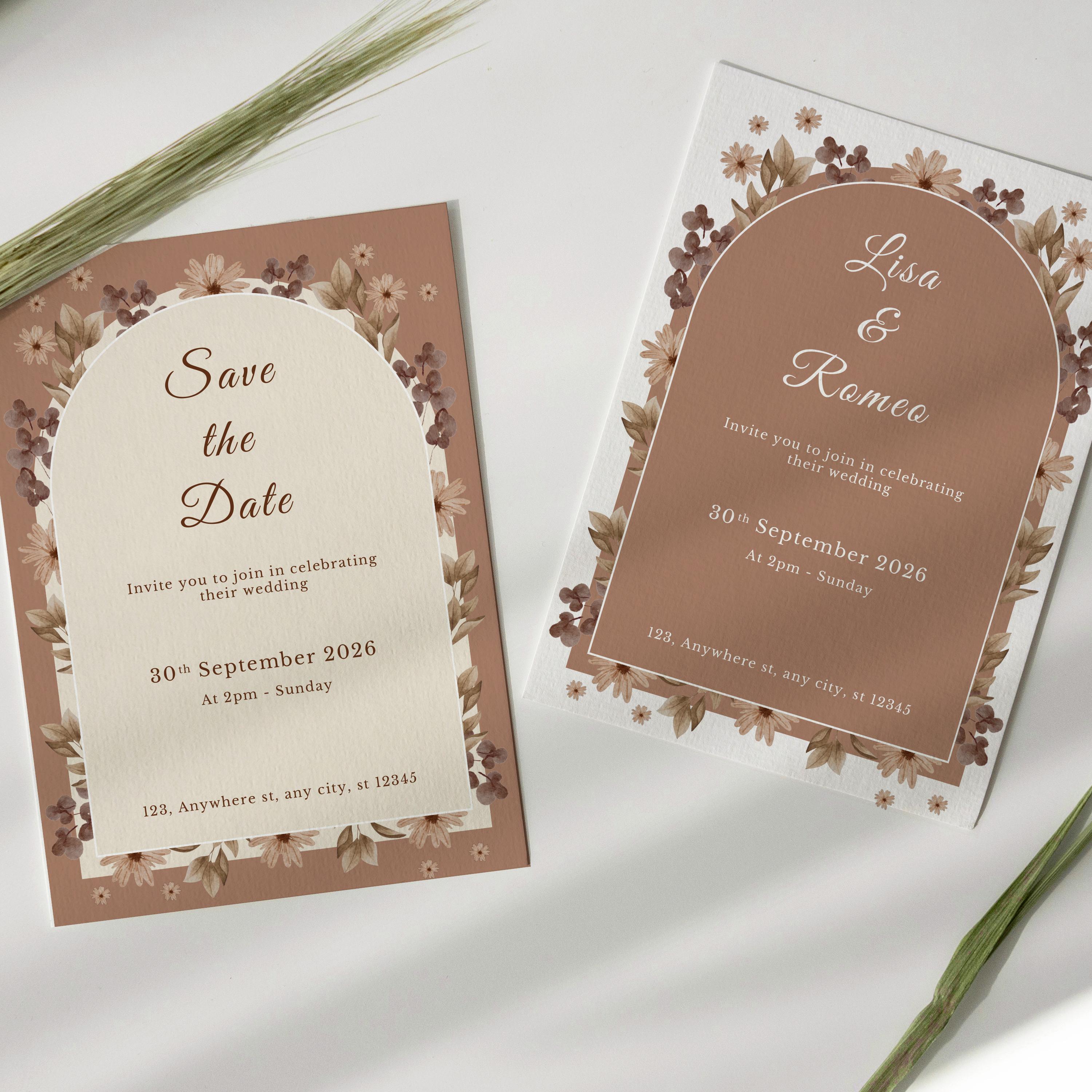
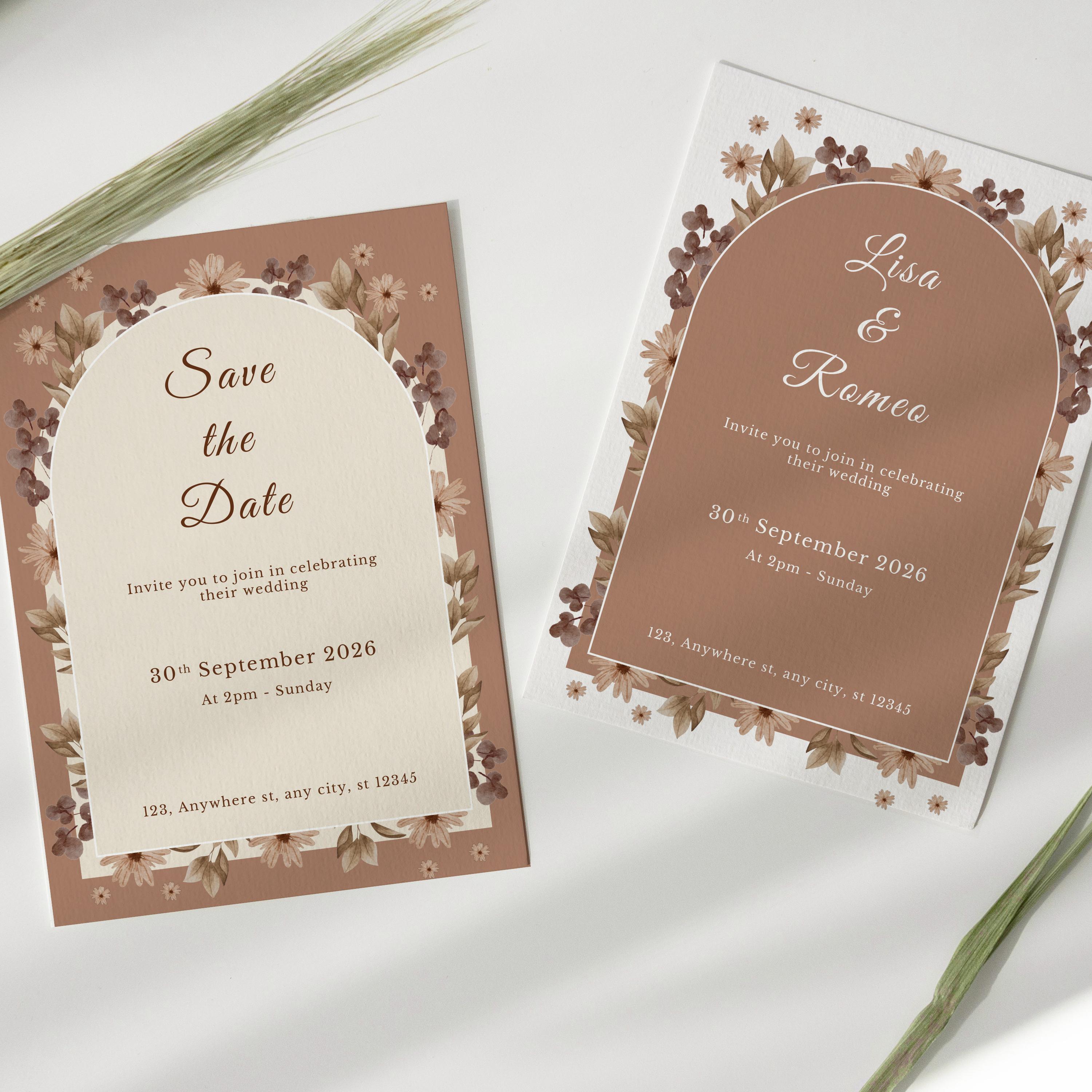
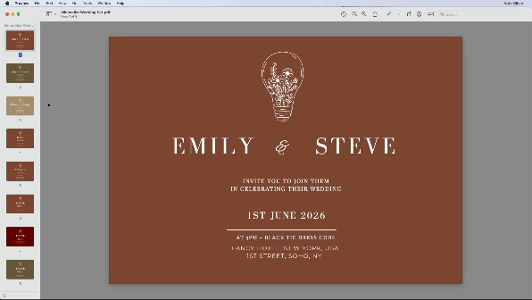
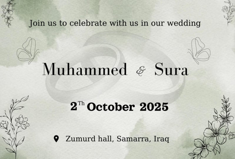
9. Save the Date - Format & Size: Now, let's move on to some
more slightly complicated, slightly advanced,
save the date invites. We're going to create
simple ones like these. We play with fonts, composition and lay out
images in frames or shapes, grids of images, and more. So this will be fun, I hope. Now, in this particular invite, I've actually used
five by 7 " again, and that's what I
actually use for my sister's Save the date Invite because I personally
liked that format. But that is personal choice. So feel free alternatively
to use that 19 2010 80 by 1920 size for a
digital invitation or for a printed five by 7 ". If you wanted even to have both, where people that are local, you printed and people
that are abroad, for instance, you could
send them a digital one. So you could create
just 15 by 7 " and use the same invite both for
printed and for digital. It's totally up to you. Okay, so again, we can either click on Create New
design, create a design, and choose from one of
those popular layouts, or you could type Invitation and then I want
it to be portrait this time. So we mix it around, so five by seven portraits. All right. So first of all, we're going to start
by going to uploads. And if you haven't
already done so, go to upload files and go
to that folder or go to your own Images folder and
start popping in the images. Either select them all. You
could do that. No problem. Open. And voila are all going to appear in
here, which is awesome.
10. Save the Date: Okay, cool. So I'm going to select
this image with the horse because
I love animals. And to make this bigger, you can click and drag, and we're going to
try and align it and make it fill the page. And obviously, it's
not the same size, so you might need to make
it bigger and fill it out. Cool. So that's a good start. Now, let's start adding text. Cool. So let's go to
text and add textbox. And we can start typing save
and if you want to zoom in, by the way, come on, plus. Let's type in save
and just start to save because I want save and and date to be in a
different frame text frame. I want to make it white. And just like before, because I like consistency, I think it's quite great when you have consistent fonts and colors to give it like a cohesive feel like
it's a collection. So I want to use that font
again, the Bodoni FLF. So click on Canva Sans
font and type Bodoni F, and I can see it
over here and great. And let's make it
bigger over here. Now, I don't know
if you remember, but I added some space between
the letters previously, so I want to do the same here. And ideally you would have
the exact same spacing. You would always use
the same spacing. So you would go to
spacing over here, and the one we want is letter spacing
between the letters, and I don't know about this. And we can click and drag
and move in here and pretty. Okay, remember my shortcut, not mine, but remember D
shortcut for duplication. That is alt or option and drag. So click Alter
option and drag and make sure the pinky lines show that it's aligned at
the top and the bottom. And double click and change
this to date. Perfect. Now we're going to duplicate
this Alt and drag, and we're going to do the
same for the H E, THE type. And we could make
it smaller because I quite like when the
the is different. So make it smaller over
here and push it here, and that's a style,
maybe a bit smaller. So I think that looks kind
of cool. I quite like this. But I want another one
with another font. So perhaps I'm going to change a font for the because
I quite like that. I go to X, and previously, I use a few different fonts, and what's nice is it
says recent searches, so I can see the fonts
that I've used previously. So there was Angela White, but I think that's a bit much. Let's retype it actually, because I think
it's with all caps, and we don't want that for the. So THE, make sure all caps is off and maybe make
this a little bit bigger. And you know what? I
kind of like that. But let's go to X. So go back. Let's try Alex's Brush, which was the font for the end. And I kind of like that. Perhaps I'll go with Alex Brush. I like that, so
I'm just gonna pop it either at the bottom
or in the middle, but I quite like the bottom. And wow. I like that. So if I wanted to move
all three a bit upwards, I'm going to click on Save. Hold down the shift
key the entire time to add to selection. Click on the whilst
holding the Shift key, click on date and
press the arrow upwards on my keyboard
to shift it up. Cool. Now, let's add the date. So we're going to alter option, alter option and
drag to duplicate, double click and type
first June 2026, sir, it's just a random
date that I invented. So put your date in and make it smaller by going
on the minus, or alternatively, you can make it smaller
by going like this, whichever makes sense to you. And I always like to make sure that my alignment
is in the center. So everything is centered. Maybe make it a
tiny bit smaller. Cool. Okay, what's the
next thing we want to add? I want to teach you how
to add some dotted lines. So we're going to go
to elements, Line. And we could just
choose those ones. So click on this
and then click on Line style and type dotted. Click on dotted, I mean, and make it thinner, like maybe two and actually
rounded oh, that's better. Click on this color
and make it white, and then let's pop it here. And maybe zoom in so we
can see a tiny bit better. So I'm going to click
on this and pop it in. Now, I want to resize
it and make it smaller. So I can click and drag, but if I click and
drag, what happens, I need to make sure I don't
go up and down and I go straight so it doesn't
get distorted. So to go straight, you can
also hold down the Shift key. And it will allow you to
go straight and make sure that the line starts
where the S starts, because I quite like
when things are aligned. It looks good. Now
we're happy with this, so we're going to alter
option and drag and duplicate this dotted
line on the right. So alter option and
drag and voila. Now zoom out and BEA beautiful voila Feel free to resize the text so it's smaller or bigger
according to your comfort. And I'm going to start
adding some names. I already forgot the names
we chose for a couple. I think it was Emily and James. There we go. So we're
going to go to text. Add Text Box and type James because James is
on the left, and Emily. And now, if we're
feeling lazy and we still have our
file open somewhere, we are entirely welcome to grab that click and shift and
copy and pop it in here. Paste. As you can tell, this
is the same font. Now, if you don't want
the names to be all caps, you can also remove
the all caps. If you do that, make sure
the first letters are caps. If you want it to
make it bigger, feel free to either click on
the plus or click and drag. So that's pretty cute.
I quite like this.
11. Save The Date - Design Variations: Okay. Now what we're going to do is duplicate this,
duplicate page, and we're just going
to replace this same save the date card, but with another image. So we're going to select
the image and delete. And it looks like
there's nothing. And that's because everything is white, so don't
worry about it. Now, let's go to uploads
and select another image. I think this image is stunning,
so I want to use this. Click and click and drag and Wow stunting and perhaps
make it a bit smaller. And this works just as
well with any other image. But obviously, it's
chopping his head off. Ooh, and I think we lost the
dotted lines along the way. So we're going to
command or control left bracket push it behind. Cool. So I would like
to move these a bit higher so it doesn't block
his head. So click on this. Hold on the shift key the entire time while clicking
on all these options, all these elements and press the upward arrow and it
will beautifully go up. Now you could, as well, add some variation and
change the to another color. If you click on text color, let's make it funky and add
peach. Quite like that. And if we wanted maybe
the dotted lines, click on the line color
and select that peach. And just like that, we've
created a variation. So you can move this to
the right or to the left. Cool. Okay, so now let's
duplicate this page, and we're going to make
a slight variation. So again, I like to play around and make a lot of
slight variations so that I can make up my mind and try new things and
come up with new ideas, and then in the end
decide which I prefer. That's how I work in most
of my softwares that I use. So I want us to select the image and press
the upward arrow on our keyboard to move the
image up, excuse me. Now, select the text. By clicking and dragging, this is another
way of selecting, clicking and dragging,
and we're going to change the text color to black. Because remember, white text on white background,
you can't see it. So select Emily and James. Press the upward
arrow on my keyboard, and perhaps we want to add
another piece of text. Click on text at
Textbox and type, it's a summer wedding
or something like that. Just to add a bit more
text and move it down. Cool. Now, to save the date obviously is
blocking their faces so you can click and hold on a shift key and move
to save the date. Oh, maybe on the hand.
That looks cute. Now, select dotted
line first of June and a dotted line all
while holding now the shift key and pop it here. And now we have our
second save the date, our first one, very simple. I believe in simplicity.
I like simplicity. If you have a gorgeous picture like this one, simple is great. This one, which is a slight
variation, and this one.
12. Image Editing, Auto Blur & Filters: Great. Now, I'm going to
teach you how to make some adjustments on this image. Select the image, and
you can click on Edit. I love it. You can click on
Adjust, first of all, and change a few adjustments
if you wanted to. And you have a few
cool things here, but I want to start
with the filters. So let's click on the filters. And just like that, you have some cool stuff
in your filters. Oh, I quite like this one, mist. You can also decide if you want to lower intensity
of the filter. So these are very standard, very similar, I would say, to Instagram or
any social media, where Astro is also nice. You could go to
Duotone which is cool. It means two colors and
also choose one of these. And reduced intensity,
so it's slightly, but not a lot. We have so many like dusk. So this is really fun. Again, I like simplicity, and I think the picture
is amazing on its own, but, you know, it's
always fun to play. And if you don't have
such a nice image, you can make it look really
cool with these filters. Okay, another thing
I love is autofocus. Let's say you didn't have
such a great photographer that doesn't have like, you don't have a picture
with a blurred background. Well, you can fake the blur. Like, can you see how blur the background is or remove it? So this instantly makes it look way more professional
and gorgeous. So yeah, that is one
of our save the dates. Cool. Another version.
13. Placing Images Inside Arch Shape: Awesome. So these look good. Just like that, we have a
few different variations. So we're going to
duplicate this again. Let's go ahead over here
and notice how I like to duplicate pages
instead of starting from scratch because it
saves me a lot of time. I suggest you do the same. Click on Duplicate page for
this one. Delete the image. Now, let's select all this. I want all of that to be black. Go to the color and
click on Black. Same for the bottom stuff. Remember, there's
some text here, so click and drag, so we select all of
it and make it black. Select it and move
it down and notice that pink line in the middle that tells you that
it's in the middle. Okay, so for this
next small section, we're going to add an
image inside the frame and then after for the rest
for the remaining lessons, we're going to look at
images inside frames. But we'll start very easy
with this chapo frame, and then later we'll
build our skills. Okay, so how do we do this? So we need to go to elements, and if we scroll down,
we'll see frames. So let's click on CO, and you'll see a
collection of frames, all different kinds of frames, which you're welcome to pick
any of these there we go. I'm going to click on this one that doesn't have a border, and then I can click and
drag and distort it, click and drag, click and drag, and I personally quite
like when things align, like when the text
and the frame align. I think it looks very
visually pleasing, and as humans, we like when things aligned
and look perfect. So that's what we'll do. Click and Drag, go to uploads, choose that gorgeous image. And that didn't work, so
click and drag and pop it inside and cool. Very cool. So now, actually, I want
to move everything down. So I'm going to select these, push it down, and Elongate this, make it longer because I think
that will look better and perhaps make this a bit higher
and if you double click, you can also play
with the image and decide where you would
place the image. Now, to get out of this,
just double click away. And Wella just like Dan, we just created
another save the date. Okay, so stay tuned for
some more exciting frames.
14. Placing Images inside Frames, Polaroids & Torn paper: Interesting. Okay, so let's make some more, save the dates with multiple
images and grids. Alright. Now, let's duplicate this. And I just want to show you
how easily you can just add an additional image or change the image and
put something else in. And to do that, first, you can select this and delete. Click on this and delete, and then click on this image
and click and drag inside. End Vo. Now you can double click and again move
the image up or down. And just like that,
we've created our own little template
for Save the date. And feel free to make
any adjustment you want. Okay, cool. Now I'm
over this shape. Let's move on and
do the same thing, but with a different shape. So let's duplicate it. Click on Duplicate page. And let's delete the
image and the frame. So press delete key and
also delete the frame. And now we're going to go
back to elements and close this and we're going to go to so you'll
see frames and grids. Let's go to frames again because we're going to
look at grids later. So you have basic shapes, film and photo,
which is also cool. You could totally do
that. Ooh, and have, like, a sort of polroid. That could be fun. I'm just inventing this right now, FYI. So let's go to Uploads and pop this image
in and I don't know, pop the ring image there. In Voila that's
another save the date. That's cool, but let's
duplicate and have another one. Let's go back to elements, and let's go back to shapes. I'm just going to delete this. And what I did want
to show you is the paper frames because I
think that looks really cool. Click on COL and select
any one that you fancy. I'll just go with this
one, the first one. And then I'm just going to
click and drag and distort it. And change it and
perhaps move my text up, perhaps move all of this down. So every time we can
play around with it and distort it and change
it around, which is fun. And it's so easy to use. Okay, once you're happy with the shape of your paper frame, you can go back to your uploads and choose the image you want. I'll go for this pretty
image this time. Again, all these images are available in couples photography or craded ultiimage folder. So I'm going to choose this
image and pop it in and Wow. That's really pretty,
isn't it? Click and Drag. And just like that, we've created yet another
save the date. Of course, feel free
to resize things to make the names
different somewhere else. By the way, if you
select all three, you want to move them, move them from here, from that icon.
15. Creating Image Grids: Cool. So let's go and duplicate
this again and delete this image because this time, I want to create a three
page frame like this, a three image frame. So I want us to resize
this, resize it. And let's start adding
some more paper frames. So we go to elements, paper, make sure you're in, you know, frames, you know, that you're here, and you go to CO and that you go to paper. And then let's start adding
some more paper frames. This looks good. Click and Drag, and now I'm going to turn it. Perhaps turn it this
way and pop it here, and then I can
resize it and play with it and feel
free to choose any, you know, paper frames
that you like personally. You could also click and
drag and duplicate it and just elongate it if you wanted
to or use a different one. It's totally up to you. Now let's go to uploads. And again, let's
place a few images. Click and Drag and
place this one. Click and Drag and
plays that one, and, of course, the rings. Click and Drag and
plays the rings. Double click on an image and
then change what you see. Click and Drag on this
image and click and drag to the right or use
the arrows on a keyboard. Or perhaps you would
like it rotated. Like this, again, I'm
just playing with it. It's totally up to
you. There we go. So now we have multiple
frames, but in a paper. Now, duplicate this
and see how nice this will look when we add
frame, a colored background. So click on background color. And yikes. I don't like that color. So click on CO, and we can see every photo color that is
taken from each picture. And I think that looks
really good when you take colors that are
derived from a picture. I just think it looks good, and I think I'm going
to go with this color. Now, remember what I said
when it's dark background, I think it looks better when
you make the text white. So go ahead and select, click and shift on
all these bits, even the lines if you wanted
to, and make it white. And the names click
and Shift and white. And that is a more funky
save the date fun stuff. Now we have a few different save the
date designs so cool.
16. A Floral Wedding Invite - Brand Colors: Okay, my friends,
are you ready for this gorgeous wedding
design invitation? I'm really excited. It's gonna be really gorgeous and fly and traditional
yet modern. We're gonna create a full
winter version like this one. And a more traditional floral
version like this one, and it's just stunning. And you'll see that it's
actually very easy to do so. And I'm going to teach
you lots of trick to enhance your process
and make it faster. Skills and shortcuts
like duplicating and moving layers
forwards and backwards, which are the same
shortcuts that you have in Adobe Photoshop. Cool. So let's start by
creating a new blank page. So we're going to go
to this home icon, and we're going to click
on Create a new design. And I would like us to
select Invitation portrait. If you can't find it, then try and have a
little look over here. And if you still can't find it, then you can type in
Invitation portrait and try and find it. Make sure it's five by 7 ". So anyway, I'm going to
go ahead and select this. And Vola our new
document is done. So let's go to brand
because I want us to start by adding our gorgeous brand colors
that we're going to use. So there's a few ways of
adding colors in Canva. You can either go
and click on Edit, and then you might
not have this. So if you don't have
this, you can click on these three dots and click
on Ads Palette Below. And you can rename it to my gorgeous colors or
something like that. Now you will have your palette. Alternatively, if you
click on the background of a page and you click
on this background color, you will have access
to more colors here. You can choose a
color by clicking here and try and pick a color, or you can add a code, which is what we'll do now. I'll give you codes for
these gorgeous colors. So I want us to go to color palette and
click on the plus. And I want us to add this one, this color, a 0735f. So just type it in a 0735f. And there you go.
There's this color. Let's add another
color seven, three, three, four, 20, and now
we have another color. Let's add this yellow d59f 36. And another color,
62, three, three, 27. Now we have that color. Let's add this pinky color. F4e a DC. And of course, you can
choose any color you want. You don't have to
follow my colors. Let's add this one as well. B two, 866f. And feel free to add some more
of your own colors. Great. So now that we have some
of the colors we'll need, and we might need
to add some more later, let's get started. Let's make this background
color white for now. Plain old white.
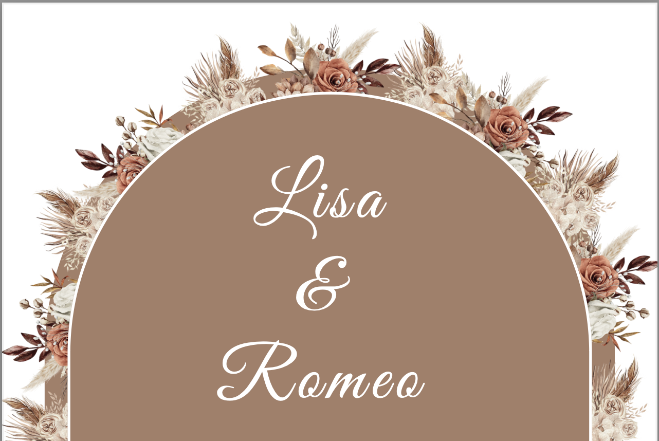
17. Drawing Arches, Text & Resize from Center: What we're going to start with first is creating
these two hills, these arches, and we're going to add a border
to the smaller arch. Then we're going to
start adding some texts, and I'm going to teach
you how to do the TH or to make the TH
smaller for 30. And then we can start adding
the gorgeous graphics, which is my favorite
part. So let's do this. So we're going to
go to elements, and we're going to click
on Shapes CO. Let's scroll down and select this
hill or this arch and click. And it's going to
come up in a color. Now, let's click
and drag and start distorting it and try and
get it the way we want it. Click and drag. Every
time I do this, it looks slightly different. So don't worry if it's
not exactly the same. Great. So once you
have that shape, make sure you click and
drag and move it so that it's aligned with
those pink lines. Can you see the pink line? Telling you it's
aligned horizontally. Cool. So now what
we're going to do is we're going to
create a second one, a smaller one that's going to go on the inside
with a white border. And we can do this by going
Commander Control C for copy and Commander Control V
for paste, and there we go. We have another one. Now, let's change it. Let's change a color so we can differentiate between those two. Oh, difficult word. Let's choose one of
those lighter colors. And voila. Now we're
going to align these two. So they're perfectly aligned, and I'm going to show you a
little trick, a shortcut. So if you want to
make the smaller, you can just click and
drag from the edges. But unfortunately,
it's going to be resized from the corner. So let's undo
Commander control zt. I'm going to show
you a trick that lets you resize from the center, and that is holding down
the alter option key. And click and drag and Wow, you'll see that it
will beautifully be resized from the center,
which is awesome. Gorgeous. Now I want us to have a little white border
in the smaller arch. So we're going to
click on border style, and we're just going to
click and drag and add a two millimeter border. Now let's make this white. So we're going to
click on border Color and click on white,
and there we go. Last but not least,
for the shapes, let's make the behind arch, the bigger arch, the same
color as the center arch. So if you can't select
it, by the way, you can go to
position and layers, and you'll find all the layers, all the objects
of our page here. So go ahead and select
the darker one. And then click on Color and
choose that lighter color. Voila. We have our
shape, our two shapes. Cool. So let's start
adding text, shall we? So let's go to text and
click on Add Text Box. And if you need to zoom in, press Command or Control
plus for zooming in. Let's start typing Lisa, Enter and Enter Romeo. And I want us to select the whole pieces of text
so we can click and drag. But if that's tricky, we can use the
shortcut for select A, which is Command or
Control A for A. And let's start
formatting the text. So we're going to
change the font. So click on Canvas Sands, and I'm going to give
you a really great font. And the font is
called Great Vibes. So go ahead and type
in here great vibes. And there is that gorgeous
handwritten font. Okay, let's make it bigger. G to click on the plus
until it says 36 points. And the reason I chose 36 is because if you look at the shortcuts cheat
cheats that I gave you, you will see for wedding
invitation printed, which is what we're doing now, we're choosing wedding
invitation printed five by 7 ". It says names 28-36 points. Now, I chose 36 points. So let's make this white. We're going to go to text
Color and click on White. And then let's go ahead and
apply my favorite effect. Click on spacing,
and we're going to change the spacing
between the letters. So we can go ahead and click and drag and perhaps make it 86, which is what I had last time, and you can see the spacing
between the letters change. You can also change the letters, the spacing between
the lines. And voila. Now, last but not least, we can click away to deselect
and move it up or down. Click and Drag, or you can even use the arrows
on your keyboard, up arrow and down to move it up. Just make sure you click and
drag and that it aligns to the center of the page horizontally that you can see that pink line
in the middle. Great. Let's start
adding some more text. Click on Add Text Box, and
it's going to appear here. Click and direct, push it down. And now the font we're
going to choose is called Libre Baskerville or
Libre Baskerville. I don't know how to say it in a non French accent or
non Belgian accent. So anyway, let's
click on Clear and start typing Libre Baskerville. And it should appear here. Another gorgeous font. Let's start typing in the text, invite you to join in
celebrating enter their wedding. And now to select
the whole text, click and drag or
Command or Control A, for the shortcut
for selecting all. Cool. We're going
to make the text ten because according
to my sheet, secondary text should be 10-12. So make sure the
font size is ten. Again, let's make the
text color white, and I think that's it. You can move it up or down. Now we're going to
add a second piece of text to the bottom. And because I want it to be exactly the same
font and formatting, we're going to duplicate it. So we're going to use the
shortcut for duplication, which is alter option and drag. And then scroll and drag
down, and there we go. And trust me, this
duplicating shortcut will save you a lot of time in
Canva and other softwares. So let's double click or
Command or Control A, and start retyping the
address of our venue. So type one, two, three, anywhere street, any city, one, two, three, four, five. So obviously, this is made up. It's a made up street. Click and Drag and move it down. Ideally, you will have added your own venue details, right? Awesome. So let's do it one more time.
Let's duplicate it. And this time, we're
going to add a date. So hold down the alter
option key and drag. And you can even see
those pink lines that tell you these two are aligned. So change a date to
30, September 2026. Awesome. Click away, and
let's click on it and duplicate it one more time
for the time and day. Hold down the alter
option key and drag. Double click and type at 2:00
P.M. Sunday and click Away.
18. Adding Superscript Ordinal for 'th': Okay, let's make the
font size for the date 14 because that's what it says
here, event details 14-18. So I'm going to select
this date and click. So it is 14 and gorgeous. So it stands out a
little bit more. Awesome. Now, one last thing about this
before we move on. This is going to be our template
is the TH in September. Now, in a software
like Adobe in design, this would be so easy and there would be a little
button for that. Unfortunately, in Canva, I haven't found one. I
don't think there is one. So we're going to
make a little trick and do it anyway using a trick. So if you can zoom in
Command or Control plus and double click. And we're going to replace
the TH with two spaces, so we can delete that and
then press one space. And a second space. Then we're going to
duplicate this piece of text and retype it type TH
in this formatting. So hold down the alter option
key and drag to duplicate. Double click to select
the whole text, press delete to delete
the text and type TH. Now, you're welcome to resize
it further and make it even smaller if you want
it to by clicking and dragging or leave it as is. Click on this moving
icon and move it here. Now, you can either align it to the top the way it is now, which that's my preference, or you can align
it to the bottom, and you can move it up or down. Now, if you've lost it, I can't currently select it, and it's really
frustrating, don't worry. You can just click on position, and you'll find a TH there, few. And now you can press the
click and drag or press the upward arrow or downward arrow to push it
down or up or in the middle. So that is totally up to you. I quite liked it when the TH was aligned to
the top of this frame. Click away, Zoom out,
and there we go. We have our first template. So this was the long bit. The next part is
going to be easier, faster and more fun, I promise, because that's when we're going to add some
gorgeous graphics, which is my favorite part.
19. Adding Fall/Autumn Leafy Flowers: So we're going to make a
duplicate of this page, and perhaps we can select it
first and move it up a bit. I think that's
better centering it. And let's make a
duplicate of our page because this is just going
to be our empty template. Let's scroll down and
start designing this. So let's go ahead and go to elements and click on that
arrow to get out of shapes. Click on Graphics CO.
And if I'm cheating, I can use my recently
used flowers. But if I don't want
to cheat because you don't have access probably
to the same ones, I want you to type wedding
in graphics and Enter. And you'll see a lot of super gorgeous wedding graphics
that you can choose from. Feel free to choose any of
them and design your own. But I'm going to recreate the design that I
created before. So, feel free to tag
along and do that, or create your own version
with your own graphics and flowers and
ideally post them in the project section below my class so that
we can all create this gorgeous wedding hub for all of us and get
inspired by each other. Okay, so you can go ahead and try and find the flowers
that I'm going to be using. That's a tricky bit about
wedding is trying to find it. But perhaps I can type
wedding flower and see. Oh, that's already
better, isn't it? Let's see if I'm going
to find those flowers those exact flowers.
And there it is. This is one of the
flowers I'll be using. So I'm just going
to click on that, and I'll see these beautifully leafy flowers here or leafs. And I can click and drag
and put it there for now. And I'll see here
magic recommendations. This might be just
available to Canva Pro, and some of the graphics are
only available to Canva Pro, see what is available to you. So I'm going to click on C O, and I'll see some more graphics that I'll need like this one. This is one of them, and,
wow, that's stunning. So I'm just going to click
and drag pop it here. And then finally, choose
this one because this one, the brownie one is also
the look I'm going for like a fall
winter esque wedding. So I'm just going
to click and drag and also put this to the side.
20. Moving Layers back with Shortcuts & Duplicate: Okay, so what we're going to do now is we're going
to start placing and duplicating these elements
and start filling it up. Using our shortcut
for duplication, which is alter option and drag. And then we're going to put
it behind the small arch, and it's going to create
a really stunning effect. So let's start with
this flower, shall we? So we can resize it and
perhaps duplicate it. Hold down the alter option
key and pop it here. And now to move it layer back, hold down the command
R control key and the left square
bracket, and Wow. Starting. Now you can press
the arrows on your keyboard up and down to move
it up or down. Cool. Feel free to click and
drag and resize it. Let's start adding some more. So we're going to duplicate
this by holding down the alter option key and
drag and pop it here. Stunning. Let's do the same on this side because I want
things to be symmetrical. So hold down the
alter option key and drag and pop it here, and you can even
align it perfectly if you follow the pinky
magenta lines. Let's scroll down and add
some more to the bottom. So hold down the
alter option key, select this one, and
drag it over here. The reason it's all behind the smaller arch is because I've already
placed it behind it, and when I duplicated it, it automatically came there. So holding down the
alter option key and drag and add one here, and alten option key and
drag and pop it here. Beautiful. It's starting
to fill out, isn't it? Feel free to resize them and
make them smaller if needed. Cool. So we're done with
this little flower for now, and we're going to start adding
some more different ones. Let's start with
the brownie leaves. So let's resize it,
click and drag, and let's rotate it, perhaps, and click and
drag and pop it here is. And now to move it
a layer backward, press Command or Control
left square bracket, on your keyboard, and voila. Stunning. Let's duplicate
it and pop it on the right. Symmetrical. So hold down
the alter option key and drag and Wow. Pop it there. Click on flip and flip
horizontal Whoops, and click and drag
and rotate it. Stunning. Let's start
filling it out more. So let's click on this
one and duplicate it. Alter option and drag
and pop it here. Stunning. Let's do the
same alter option and drag and pop it there
and perhaps rotate it. Beautiful. Let's keep going
and start filling it up. Let's add some more here. So hold down the alter optim
kin drag and rotate it, not too much and place
it so it looks pretty. And maybe I'll even
flip it vertically. And click and drag
and rotate it. Cool. Let's do the
same on the right. Click and drag and
perhaps rotate it. And, wow, stunning. It's getting filled
up very quickly. But let's start
adding the leaf now. So we can click and drag and
pop it here and rotate it. And perhaps I want the leaf to be a bit bigger than
the other flowers. So I'm going to pop it here and then move
it a layer back, pressing Command or Control,
left square bracket. Beautiful. Now, let's
duplicate it to the right, so holding down the alter
option key and drag and perhaps rotating it
and if that doesn't work, perhaps clicking on
flip flip horizontal, and then rotating it. So again, trying to
make it symmetrical and pretty and filling it up. Again, if you're struggling
to select one of them, and you're getting frustrated, and you're like, Whoa, how
do I do this? Don't worry. Go to position, and then you can select individual
elements over here. Cool. Let's keep
going, shall we? We're on a roll.
Let's select this. Hold down the alter
option key and drag and duplicate it and
perhaps make it smaller. Click and Drag, pop it here. And again, duplicating this, holding down the alter
option key and drag. Now we're going to duplicate
both of these in one go. So we're going to click on one. Hold down the shift key
and click on the other. And now Alt and drag and
duplicate both in one go. And last but not least, click on flip Flip Horizontal. Again, both in one go
and then click and drag. See, once you use the shortcuts, things are a lot more
faster and efficient. Okay, let's start adding the leafy bits here
and fill it up. Holding down the alter
option key and drag and click and drag to
rotate one more time, alter option and drag over here, and perhaps click on
flip flip horizontal, and we'll rotate it and voila. Feel free to adjust things and move things
a bit more around, so it's more filled up. And that is gorgeous, isn't it? Okay, so we're not
entirely done just yet. We're just going to add some
little flowers that stick out that are on the
edges like over here. So we're going to click
and drag and make this smaller and added here is, and perhaps make a second
one, so duplicating it. Alt and drag over here
and make it smaller. Add a second 110 drag and
make it smaller perhaps. And let's do the same
for the other side. So select all three
by going click and holding down Shift and then alt or option and drag and pop it to that side and start
moving things manually around and adjusting it
just so it looks a bit like a sprinkle of fairy dust
going all over the place. Or something like
that. Cool. So once you like that and
you're happy with it, I kind of want to
flip this, actually. Click and Drag and
I think that looks better, doesn't it? Beautiful. So zoom out and stunning. Now let's add some more of
these little flowers to the bottom holding down the
alter option key and drag, add one here, Altern option
and drag and add one here, maybe make it smaller. Do the same for this side, and that side, and gorgeous. Now, last but not least, I'm going to add a
little pinky background to make it even more stunning. So select this page. Click on this color.
And we're going to choose a color that you
might not have actually. So I'm going to give
you another code. And that's going to
be FFF nine F nine. So click on this, add new color, and type FFFF nine. And that gorgeous subtle
color zoom in and Wow. Stunning. So
absolutely gorgeous.
21. A Much Appreciated Class Review: All right, my friends.
I hope you're really enjoying the
claw so far and that you're learning
a whole bunch of tips and tricks and shortcuts. Now, it would be super, super helpful to me if you
could leave a class review, letting us know how you're
experiencing the claw so far. I would be ever so grateful. And Voila, let's
get back to Canva.
22. A Version for Save the Date: Not done just yet because one of my favorite things
to do is creating a duplication and then changing the illustration and the colors ever so slightly to create, for instance, the details and RSVP page and then
create another one, another variation for
the save the date. So let's go ahead and do that. So we're going to click
on Duplicate Page, and let's start
changing things ever so slightly. Let's
start with this. I want our Hill to be a
different lighter color. So I want us to
click on color and choose this color for the hill. And I want us to select
the background Hill, but it's hard to select because there's a
lot of stuff there. So let's click on
position layers and try and find the back hill. Here it is, click. And now select the color and choose that same
background color. Gorgeous. Now, let's
select the background. Click on the
background color and choose the original
color we started with. So we reverse it, essentially. Wow, that's so pretty.
I'm so obsessed. Now, one of the things I do is that when there's a
light background, I like to have dark text. And when there's a
dark background, I like to have light text. So let's select all these pieces of text and make them dark. So click on one, holding down the Shift key the whole time
and click on the other ones. To make sure you change a text color in one
go, saving time. Click on Tex Color and click on any of the brownie colors
that you find nice. Gorgeous. Now I want to select the TH as well and make that
as well that same brown. If I can't find it, again, go to position and click on TH. Stunning. Just like that, I've created yet
another variation. And perhaps we can type
save the date instead, and this will be your
save the date card. So it's gonna be a really
cohesive wedding card and save the date. Cool. Let's do another variation. So duplicate this and this time make this yellow
because it's very pretty. So select color
and select yellow. Let's select the arch, click on position, scroll down
and select the back arch. And let's make that
yellow as well. So click here and
click on yellow. Stunning. Last but not least, let's make save the date White. So we're going to
go to text Color, click on White and Wow, that looks pretty and change the text to details and RSVP. So details Enter and
Enter RSVP and gorgeous. Now we have three
of these stunning. So once you're happy with
your wedding invite, you save the date and RSVP
that are all cohesive, you would go to share
and save it as a PDF, and it will be
ready for printing. Now, for printing,
just make sure you always talk
things through with the printer or printer services that you always do a test print. So you want to go to download
and select PDF Print. Now, if you want your objects, your images to line to
the edge of the page, then you would have to
have crop marks and bleed. Which means the
printers will trim it and print it on larger piece
of paper and then trim it. But if instead you're using a color paper or printed color, then you wouldn't need that. So it all depends. So let's say we're using printed paper. So we're just going to print
this on printed paper. So in that case, we won't have to use crop marks
and bleed marks. Make sure for the color profile, you select CMYK best for
professional printing. Also available only
on P, unfortunately. And then select the three
pages that you're printing and download it and it will
appear in your downloads. Over here, we've got the
three types of design, and they're gorgeous. I'm obsessed.
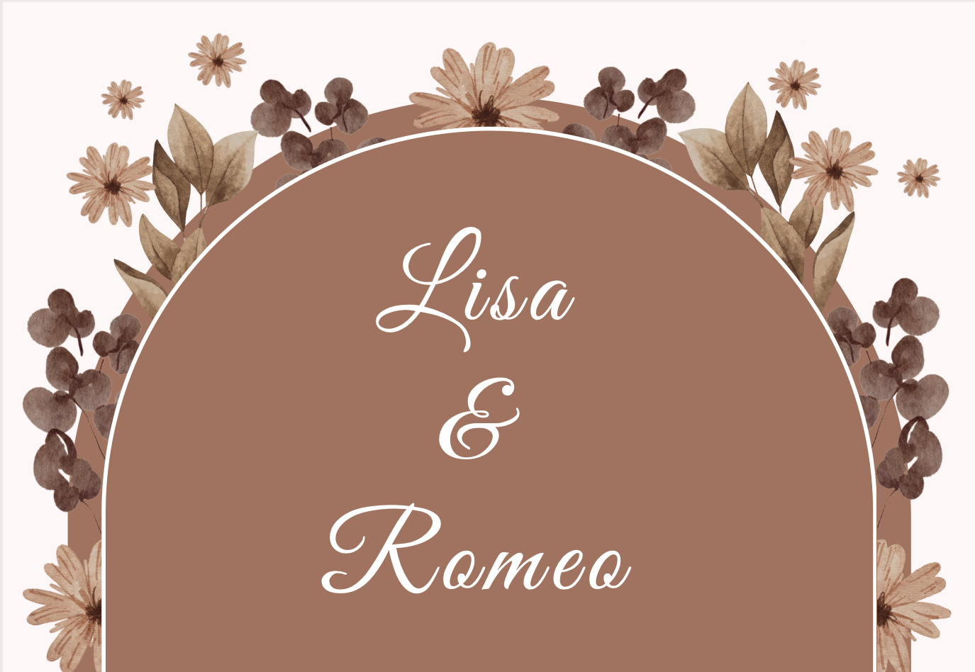
23. A Traditional Floral Invite Design: Cool. We're not finished
because if you know me, you know that I love creating
a bunch of variations, and now we're going to create a more traditional
floral wedding design. And it's also gorgeous. But now that we
have our template, this is going to be a
lot easier to design. Trust me, it's just a matter of adding some more flowers
and using our shortcuts. So let's go ahead and
click on Duplicate page. And let's go back on
this arrow and back to wedding graphics
and perhaps type wedding flowers this time
and see what comes up. So I'm going to be using
a bunch of these flowers, and I want us to use
the exact same flowers that we've used or
for you to use your own and pick your own and design your own style and pop it
in the project section. Okay, so go ahead and try
and find these flowers, and I'm going to cheat
a little bit right now, and I'm just going to click
on recently used C O. And the ones I'll be
using are this one. So I can go ahead and click. And it's a gorgeous bouquet, and I'm going to scroll,
make it smaller, click and drag and pop it here. Gorgeous. I'm also going to use this one because that's going to be gorgeous
for the edges. It just looks like an edge. So I'm going to click and
drag and make it smaller and already pop it here for now, I'm also going to
use this one because I love this dried flowers look. I'm going to click and
drag and pop it here, and that should be all
for the flowers for now. So let's start doing this. So I want us to move this layer backward by
pressing Command or Control, left square bracket and voila. Now, let's duplicate this for the right side, symmetrical. Hold down the alter
option key and drag and flip it horizontally.
Easy PZ, right? Click and Drag and
adjust it, and Wow. I'm already filling
it up so quickly. Cool. Let's start
adding some more. So I'm going to select this
bouquet and duplicate it. Alton drag and pop it there, and perhaps rotate it. So I can see that
lovely white flour and pop it here. Move this away. Click on the shortcut
for moving it a layer backward and that is Command or Control
left square bracket. Cool. Let's start duplicating
this bouquet, shall we? So hold down the alter
option key and drag and start popping it
all over the place. Pop it here, and then Alton drag and
duplicate and pop it here. And if I want it, I can
rotate it. No problem. I could make it bigger and make it more inwards and do
the same for this one. So whatever you
think looks good, you be the designer here. Let's duplicate it
again and add it here and another one here. And then I can select this one, select that one, holding
down the Shift key, and duplicate both in one go by holding down the alter
option key and drag and Wow. Duplication. I can also click
on flip flip horizontal. And just like that, it's getting filled up
so quickly. Love this. My shortcuts that I'm using are pretty easy
and cool, right? Cool. Let's add one
for the bottom. So hold down this and duplicate it to the
bottom Alton dragon, perhaps make it a
bit bigger. Cool. Let's start adding the fluffy, dried flour one, this
one. That is hiding. So I'm going to click and
drag and make it smaller and start placing it here is, I think, and then move
it a layer backwards. Come under control,
left square bracket. Duplicate it, alter option
and drag and pop it here. Rotate it. And you know the
drill by now, hopefully, that is the goal of
this clause is that it becomes second nature
and fluent and easy. Let's start adding some more. So Alton drag and pop one here, Alton drag and pop it here, Alton drag and pop one there. And I think you're starting
to get the gist of it, right? Let's add some more
and fill it up. And, of course, if
it's too filled up for you, that's also fine. You can also use fewer flowers. Alton drag One more time or a couple
more times Walton dreg. And here and see how
quick that was to create this stunning and maybe make
this a bit bigger, though. Stunning and floral and great. And we just created another design very similar
using that existing template. Cool. So once you're
happy with this design, yet again, I think you
can expect what's next. We're going to make a variation. So we're going to duplicate this and perhaps we're
going to give it a background with a color so we can click on background
color and perhaps make it yellow and Wow or perhaps
I changed my mind undo. And instead, I'm going
to make this yellow. Select this and make
it yellow and try and select the back arch by
clicking on position. Click on this on
the layer and make it yellow and voila,
another variation. Perhaps double click
and type save the date. Obviously, you would change
all the information. Awesome. Let's see what other
variations can we make? Let's duplicate
this. And actually, let's make the
background yellow. And let's make this more
like a white color. So click on color
and this or white, whichever you think looks best. Let's select the
back arch position. And find that layer, which is yellow and back choose
that white or that pink. Again, when there's a
clear or light background, you want to select all the
text and make it dark. So select, click and shift and start selecting all
the pieces of text. Click on A and make
it dark and gorgeous. Don't forget that little TH. Click on A and make it dark. And isn't that stunning? You can also type now
details and RSVP. Change the text, all
the text so that it's the details of the
wedding like I did here. I deleted everything, and I
popped this text over here, and I moved the flower here. So I think you get
the gist of it. Let's do one more variation. I promise it's the
last one duplicated. Select the background
and select the color and this color because I
love it. And, wow. Isn't that stunning?
I'm obsessed. I hope you enjoyed this, and I hope you know now
how to save it, export it for printing. I hope you had a
blast. I sure did.
24. BONUS: Animated Save the Date Video: Oh. Interesting. Okay, so now for a really
exciting part of this clause, I'm super excited
about it because it's animation and video. And the reason I'm so excited
about it because I think Canva made it so easy
to add some really, super easy and cool
animation or video. And I'm just super
psyched about it. Like, I just created all
these animation clips in Canva and I think it took me maybe 20 minutes to
do it, maybe less. And I love it. And
these are very minimalistic and
simplistic because it goes with the theme of our, you know, collection today. But I just wanted to
show you that you can easily add animations. You can easily add graphics
and stickers, and I love it. Cool. So I added a video here, a video clip of
all the animations that I just created
in like 20 minutes, one with images and
text animation. And just illustrations and stickers that I
added from Canva. Canva has such a huge collection of existing stickers and
illustrations and animations, and I think it's so cool. So you can just find
a couple that looks like you or perhaps
you're fancy, and perhaps you have an
illustrator that you might have asked them to do a beautiful illustration
of you or not. So anyway, let's
get to it, right? So let's start from scratch. We'll go to home, and there's
a few ways around it. You can either go back to old templates,
template, templates. And perhaps you can type in
wedding animation invite. I'm not sure, by the way,
let's see what comes up. Oh, perfect. And here you go. You have a bunch of
gorgeous animations. Yeah. So this time, I actually want us to create
a full screen animation. So before we've used five
by 7 " for the invites. For the Save the date, we use a portrait, five by 7 ". But remember that anything
digital should be 1080 1920, which is the size of most
monitors and screens, and it's almost a
full iPhone screen. So that's what we're
going to do now. We're going to use this
format in portrait. So so far we've used this,
now we're going to use that. Okay. So there's a
few ways around it. You can either choose an existing template or
create one from scratch. So let's create
one from scratch. So we can click
on Create Design, and there we go. That's what we need, although we need the opposite of that. I'm pretty sure
that is landscape, and we're going
to need portrait. Let's see. Actually, this is what we need. Portraits, phone wallpaper. Let's go with either
this or that, which is, as you can see, it's
the same format, so it doesn't really matter. So any of these will work. So I'm going to
click on your story, and you may notice that it's
a bit longer over here. And the great news
about choosing your story is that it's
for Instagram stories, I assume, so it's
already in a video. So let's open
another file again, and let's pretend this time
we didn't use your story, but instead we used
phone wallpaper, which is the same format, but without the video. Exactly. This is just a page. So the one with my
story is video. The other one is just a page. But it doesn't matter because
as soon as we start adding the super easy animation effects
that are built in Canva, it will turn into a video. So it's totally up
to you if you choose a page or if you choose
already a video. So let's go with my story, suggested size. Your story. Okay, so I would like to go to Uploads and go back and
add that beautiful image. Now, if you don't
have that image, just go to Upload Files. Desktop our little folder, couples photography and choose this image or choose any image
that makes sense to you. An image of you. I love this
image, actually, personally. I might use this one,
actually, change my mind. So I'm going to click on Open, and I'm going to click on
it and it will appear here. And now I can click and drag, click and drag and fill
it with the whole screen.
25. Easy Animation with Canva: Cool. And now we can
click on Ad page, and we have a second
page, page one, page two. In that second page, I'm going
to click on Upload Files, and this time, I want to
go back to that folder. But this time, I want to go
to video because I've taken some videos from Unlesh
and Pixels and Pixel Bay. Feel free to use any of these. I'm going to go with this because it's like a wedding
on the beach and it's pretty. So I'm just going
to pop it in here. And because this is
landscape and my image, my file size is portrait, I'm going to have to adjust it and click and drag
and make it bigger. And unfortunately,
this means that there will be a bit
of white space, but that's fine because I've
decided that I'm going to use that white space
for some animated text. Okay, so let's go back here. Now we're going
to add some text. If we're going to be lazy, which I personally am, I always believe in
shortcuts. Why not? I'm going to select
this text and copy it. And if you don't have it here, you can just go to text and add textbox and type save the date. And I can't remember
what font it was. Oh, yes, it was Bodoni. Recently used Bodoni,
and it was uppercase, make it bigger, whatnot. Make it bigger. Although
if you remember, the the was actually
another font. So get rid of the add a space and create
another textbox for the, and the the you might want to
change it to another font. So save date is Bodoni, and the the was Alex brush and not all
caps, and there we go. Or you can just paste
from previous document, which I'm going to
do now because I'm lazy. Get rid of that. Get rid of that, and click and
hold down the Shift key to select all these and push them down and perhaps resize them and
make them bigger. Cool. Okay, so let's start
animating, shall we? Now, if we wanted, we can
click on these and give it an effect to make it boost so we can see
the text a bit more. So we go to effects and lift
and perhaps add more lift. And you'll see the text kind of pops up a bit
more, which I like. It becomes more
readable, legible. So let's click and Shift
and select Save the date, and then click on Animate. And yes, my friends,
it's as easy as that. And here you'll see
a collection of all kinds of animations
that you can choose from. In this case, I
would like to select Pan because I quite like it. And then I'll click on
first of June Animate, and again select Pan. And now you've got save
the date and then pen. But I think maybe we need
to make the text bigger. So click and shift on
all the pieces of text, make them a bit
bigger. Okay, cool. Another thing I like
to do is select the image and actually
animate that image. So I'm going to
click on Animate. And I quite like any of the ones where the
image goes bigger. So this one breathe. This one is also nice. So there's so many cool ones to choose from
Blur is also nice. So have a pig, decide
which one works for you. I might go with breve I quite like when it
goes in and out, or you could also choose
out and in the opposite. That also works. Pretty. There we go. So
the first is done. And actually, no,
I changed my mind. I wanted the image to go out. So play. You can always click on the Play
button and it will play.
26. Editing Timelines Duration & Splitting Frames: Cool. Now we've got one. Now, let's say I
want the text to be animated first
and then the image. So if you click on duration, so you click on duration and you'll be able to see
all the timelines. Now, let's say it's too fast, as in you don't want
to see the end bit, you could click and drag
and make it smaller. So now it's a bit smaller. And then you could add
the same text here. You could add the same text, but change it to the names. So click and shift
click and shift, and then Command or
Control C for copy. Then go over here and I paste Commander Control V and perhaps
make the text bits black, click and shift and
make them black. And you might want to remove the effects where it lifts
it doesn't look that good. Oh, and the select select
effect and remove cool. Now, I would like to
change it to their names, which was Dave and
Kate. That's me. Cool. Change it to. And what's cool is because
we copied it from here, it will still have
that animation. So if we go play Great. Still think the first bit
needs to be a bit shorter. Okay, one, two, three, play. There we go. We have our super easy, super
quick animation. Now, let's say I would
like to split it here. Instead of dragging,
I can also right click and click on
Split Page or S, which is the same in
other softwares, as well. Again, I love that. Let's go on this bit and just
delete the animation, and we'll move on to the next
really, really fun part. And that's my favorite part. It's adding Illustrations and animations and
stickers, fun stuff.
27. Adding gorgeous Illustrations: Couples, Florals & more: Okay. So over here, you can see, I've added
the chapel, the couple. I've added more
couples and flowers. I've changed a background. So there's so many
little things we can do. So let's go back here. And if we go to elements, you can see on all the recently
used ones that I've used, but that's cheating, so I'm not going to look
at that right now. Alternatively, you could
type whatever you need. I'll type wedding couple
because I'm looking for illustrations or graphics
of a wedding couple. And then I'll click on
CO and then I can start. Wow, this is beautiful, clicking on them and
popping them in. Okay, so this animation, this illustration is stunning. Perhaps I'll make the
background another color. Oh, I love this. So how fun to always
be able to make these gorgeous illustrations
and animations. So perhaps I'll change
it so it can move. So I'll go to animate and
perhaps I can have blur. I think fate looks nice. Fate. So again, I'll press
play, and let's see. Cute. But no, that's
not what I want. I will split it so we can
practice our split shortcut. S. And now we have
two of those. Great. Let's delete this,
and let's look at some other really nice ones. We have also this one, which is pretty, but I don't want that. There we go. There is my friend, my friends that
I've used earlier. Beautiful. I also really like this chapel. So I'm going to click
and drag click and drag and add the chapel. Now, remember the shortcut to move a layer back. Well,
it's the same here. So command or control left square bracket to move this
chapel behind the couple. And perhaps you want the
date here or the date there. Totally up to you. Move this
up and have the date there. Love this. Oh, this is
stunning, isn't it? So now I'll press
play, and let's see. Beautiful. Could
also have a chapel, animate the chapel,
have it fade. You could also type in sparkle because I
would like to add some sparkle and perhaps
type animation and click on C O with Graphics and choose one of those
sparkly ones, maybe this. No. And once you found a sparkle that you
like, you can use that. And, wow, that looks pretty. Let's press Play.
And there we go. We have a little animation. Great. Now, let's
do another one, and this time, just
make the color white. So I've just created another one by clicking on the plus at page. And let's go back
to elements and type again wedding couple. You can see it in recent. Click on CO with graphics, and choose this one perhaps because I
think it's stunning. Click and Drag. And again, me, I'm feeling lazy, so I'm just going to grab all this text. Click and Shift and Commander
Control C for copy, and then Command or
Control V for paste, and I'm just going
to steal that text. And I'm going to be
even more cheeky, and I'm going to click and
select that text, as well. Commander Control C, and
select this page and Commander Control V and
make it maybe smaller. And I just realized
I have this twice. I want to type save instead, the Make sure this
is not caps date. Save the date, Dave and Kate. That rhyme's cute.
This looks good. But let's scroll down and see. Are there things
we can add here? Click and Drag and
add this? Wow. So that's what I like to do. I like to scroll and
just have a look at what would look really nice with
my image, perhaps this. Pop it in here. Ooh,
that fits nicely. And perhaps I want the
background to be a fun color, perhaps make it yellow. And wow. Then make this another
color so we can see it. And isn't that pretty? So if I press play,
let's see the animation. So, that's great. I still think we need to
add more animation. So select the couple,
animate, again, fade. That's a bit much. I
like to keep it simple. And perhaps we can add
animations to these elements. Click on the rings,
click on animate. And maybe this or Rise and then maybe add
this and select rise. Let's see. Press play. Pretty. Love that. You can do two more. And
then if you want it, you can add more pictures. So over here, I'm going
to recreate this by adding another page and perhaps
making it pinky, winky. I can't remember which
pink, but one of them. And I'm going to
add another couple. So still on wedding
couple illustrations, perhaps make it
less bright pink, more like baby pink. And and try and find a
couple that looks good. They all look good, I think. These illustrations are
incredible. There we go. I like this couple.
I'm going to make it bigger, not too big. And I'm going to grab this
text copy Commander Control C, and pop it in here and perhaps
change the name to Julia and Dave and perhaps make
these a bit smaller. And add this text. Alton drag and
duplicate it down. And here I would
like to retype it, double click and type
a wedding celebration. And let's try and find some more fun stickers
that we can add to this. Again, if we want it,
we can always add dose. What else is Canva suggesting
to add Mr. And misses? Just so many gorgeous designs. Oh, I love these
hearts. Let's click. And hearts and Wow,
just like that, we've just created like
such a pretty graphic. Ooh, let's do this. Add the ring in the vax because it also adds
a bit of red color, which looks really nice
with these and perhaps put it here and perhaps
put the hearts a bit there or make them bigger so they're
a bit everywhere. So anyway, let's press
Play and see. Very nice.
28. Exporting MP4, GIF & as separate files: Now I created another one
here where I've added Mr. And misses and I've added
flowers all over the shop. From here, just from
wedding couple, you can pick so many different
flower illustrations and couples, and it's just super exciting. Like, I'm quite pleased with
this last design that I did. How pretty is that? And if you wanted,
another thing you could do is click over here, and it will all be
in full screen. So I trust that
now that you have the skills for very, very, very easy animation, you can
create even cooler animated, save the dates and
wedding invitations. And you can use lots of existing illustrations
and stickers that Canva has to offer. And that's another really
amazing side of Canva. But remember that some
of them are with P. So this is why I personally
have Canva Pro because oftentimes I like to have the freedom
and the liberty to just choose from any of
these that are all pro. A lot of the best
ones tend to be P. So that's great. Now, let's look at
how to save these. So let's go ahead and click
on Share and download. And over here, you can
choose MP four video. If you choose this option, then it will come up as a video
which you can easily send through emails and
What's upp and whatnot. And click here. If you
want to send them all and let's say it's one holistic
invite, which is a bit crazy, but then you can have all
pages in a single video, which is what I had before, or you can save
them or actually, you might want to
add three together. I think it's quite
cool. Let's say these three are one video. I quite like that, actually,
but that's just me. Maybe normal people like
to keep it to one or two. Yeah. So normal people go ahead and just click on Download and select one or two
pages instead of three. And then you click on Download. And it will download it
as an MP for a video. You can go back to share,
go back to Download, and you also have the option of selecting gifts without sound. And you can select all pages, and it will convert
everything into a single gift or alternatively, you can tick this download
pages as separate files, which means that every page
will be a separate gift, which is what I have here. They're all separate
gifts. Which is great. Or alternatively, one
animation, one video, 42 seconds or save them
all as separate videos. That is totally up to you. So I really hope you enjoy this class and that
you go on and create amazing wedding invites and save the dates and wedding
animations and whatnot. And that I taught you a lot of skills and shortcuts to make your process smoother and
faster and more fun, hopefully. It was an honor to
teach you so soon
 Kate Silver, Graphic Designer & Adobe Instructor