Transcripts
1. Introduction: Hey, guys. In this class, we'll learn a whole bunch of InDesign skills by creating a two-page recipe cards. InDesign can be really overwhelming at first and the best way to overcome this is to practice and practice. What better way to do this than by creating a gorgeous exercise like this one. My name is Kate, and I'm an Adobe instructor working at the UK's leading Adobe training center in London. I'm a graphic designer, I'm a shoe designer. I've worked for companies like Jimmy Choo and Sophia Webster. In this class, I'll take you through all the InDesign essentials that you need to know to create such a document. Things like how to set up the document with guides, the best practice for placing images and resizing images. We'll be working with Gridify, which is just a really cool name for how to create grids in Adobe InDesign. We'll also be working with text and we'll use paragraph styles, which is a must when it comes to Adobe InDesign and formatting text. It will make your whole InDesign experience run more smoothly. Of course, we will also learn how to save and export our files into a PDF. I hope you get really inspired by this and start creating your own recipe layout or your ingredients or your menu. If not, don't worry, every single skill learned in this exercise is completely transferable. This means that it can be used for any type of InDesign documents that you would like to create. Let's get started.
2. Downloading the Project Files: Hey guys, and welcome to this Learn Adobe InDesign: By Creating a two-page Recipe Cards class. I'm really excited to teach you all the tips and tricks that I have learned over the years, but also my personal approach of creating this gorgeous document. It would be great if you have Adobe InDesign installed. Any version is fine, so to make sure that you can play along with this practice exercise. You should be able to download the course files in the project section below. We will start with how to set up our document and create the layout and the guides. Then we'll start placing all our content and our graphics accordingly. I will be guiding you with clever shortcuts for the whole time. Let's get started.
3. Setting Up the Document: Hey guys, and welcome to this exercise. I'm really excited to get you started on this gorgeous recipe cards. Now in this exercise, you will learn a lot of InDesign essentials, which means that these skills will be adaptable and transferable to any type of document that you would like to create in InDesign. We will cover images and text, and how to add an icon and so much more. Let's get started. First of all, you will have received a zip file in this class, which means that it's basically a compressed folder that if you double-click on it, it will expand into a folder and you can access all the files inside. In this file, you'll have all the fonts, which I want you to download now. What you'll have to do is double-click on a font and click on "Install Font".` Now your computer will have it forever and ever and ever in all your software. I would like you to do the same for all the fonts just to make sure that you have the font we need for this particular exercise. You can just do that for all of them, and voila. Now, in this folder, you also have links, which is the folder with all the images that we'll be using today, along with the icon that we'll be using. You have the PDF, which is what we need to create. We'll create a spreads with all these graphics. Then, I would like you to open this file which has the InDesign file. I've added all the texts we need for this particular exercise, so you don't have to waste time in typing all these texts which will take ages. I've just pasted all the content in that InDesign file, this one. Go ahead and open this, and it should look like this. We will use all this content and make it look awesome. We're going to create this document from scratch. We'll start by creating a new document. To do so, we need to go to File, New, Document. Now, I will give you all the information we need right now for our document. Let's make sure we go to Print because this is meant for printing. Let's select A4, which is the standard printing paper, which is what we want. Now on the right-hand side, we're going to change all the preset details. First of all, let's select landscape, which is this little guy here. Second of all, let's add three pages for now. Normally a card like this, if you want a double-sided card, you would have to un-tick facing pages, which means that it's not a book, it's just one card that's double-sided, one page that's double-sided. But for the purpose of this exercise, we're going to make it facing page document because it's going to be a lot easier to create, and we can always change this later. No problem. Please go to columns below, and I would like to add a three columns, 1, 2, 3. The column gutter, which is a space between the column, make it 10. The reason for this is because we're going to divide our document into three and this is like a skeleton or a wire frame, or a guide for us to place all our content in, so very useful. Scroll down and the margins. The margins are basically these guys, the pink fuchsia rectangle, and it's going to help us determine where we need to place our graphics as well. This will all be clarified later when we actually start adding our content. Let's make everything 12. Can you see how it all changed together? That's because the Link icon is currently ticked. Let's make them all 12. Then, I would like you to click on this Link icon, so it's no longer linked, you can see the chain is broken. I would like you to make the bottom 16. Again, this means that the bottom here will just be a little bit higher than the rest of it, that's just for our content. Now the final thing for our document is the Bleed. Because it is for printing and we want our graphics to line to the edge of the page, we're going to need a bleed setting. Which means that later on when we print it, when we send it to our printers, they're going to trim it and have our graphics bleed over the page. If this is not clear, then I will repeat this at the end of the class, don't worry, it will all make sense. Now just remember that the industry standard for the bleed is three millimeters. Whoops, three, not four. Check that you have all this information that I've just given you. When you do, click on "Create". That is our document. Now the first page is on its own. You can scroll down and you'll see these facing pages.
4. Setting Up the Guides: Let's zoom out a little bit. To zoom out, you can always go to View, Zoom In, Zoom Out, or Command or Control plus or minus, or Fit Page to Window. That helps. I'm just going to zoom out a little bit, Command or Control minus just so we can see those beautiful pages together. The next thing I want us to make sure is that we have the same workspace right now. What I want you to do is go to Window, Workspace and select "Typography". No matter which version of InDesign you're using right now, that's fine because we're going to make our workspace the same. You'll be able to play along regardless of your InDesign version. When you select "Typography", there are a bunch of panels, but there's a panel that we'll need and that's called the Properties Panel. We're going to have to go to Window, Properties, and open this panel, which will open it here because we'll need this panel. This is basically a panel that offers a lot of information, things like the page size. If we have a graphic, the graphic size. We'll need this later, so keep it in mind. The next thing I'll do is I'm going to give you a few presents. I'm going to give you a few guides here. A few guides that tell us where we need to place all our content. We already have a few guides, but I'll give you some more. Make sure that you are on the Selection Tool, which is a top black cursor here. This will be our default setting. We'll always go back to this tool. I would like it to see as ruler. If you don't see it, by the way, just go to View, show rulers. Then you can left-click and drag and scroll down to this page, and let go. You'll see a number at the top. This is the measurement where it is, I'm going to give you a measurement now. First measurement that I'm going to give you is 24.5. Go ahead and type 24.5 and then press "Return" or "Enter" and our guide just moved accordingly. Let's do it again for another guide. Left-click and drag and hold, and add the top. Type in 44 this time. Let's do another one. Left-click and hold and drag. Did I mention that if you're only seeing your guide on a single page, it's just because you're dragging on that page. So make sure that you drag to the gray area, also known as the baseboards in InDesign terms. It's a continuous line on both pages. This time, I would like you to type 90. We're getting there. I think we're done with our guides for now. No, I lied. There's one more less guides that we need, so go ahead and left-click and drag. This time, type in six millimeters. There we go. This will all make sense later. All these guides are to tell us where we need to place things. We can always have a look at our PDF, we can minimize that and see. I've given us just some guides to know where to place these shapes, the images, these shapes and the text. It all make sense in a bit.
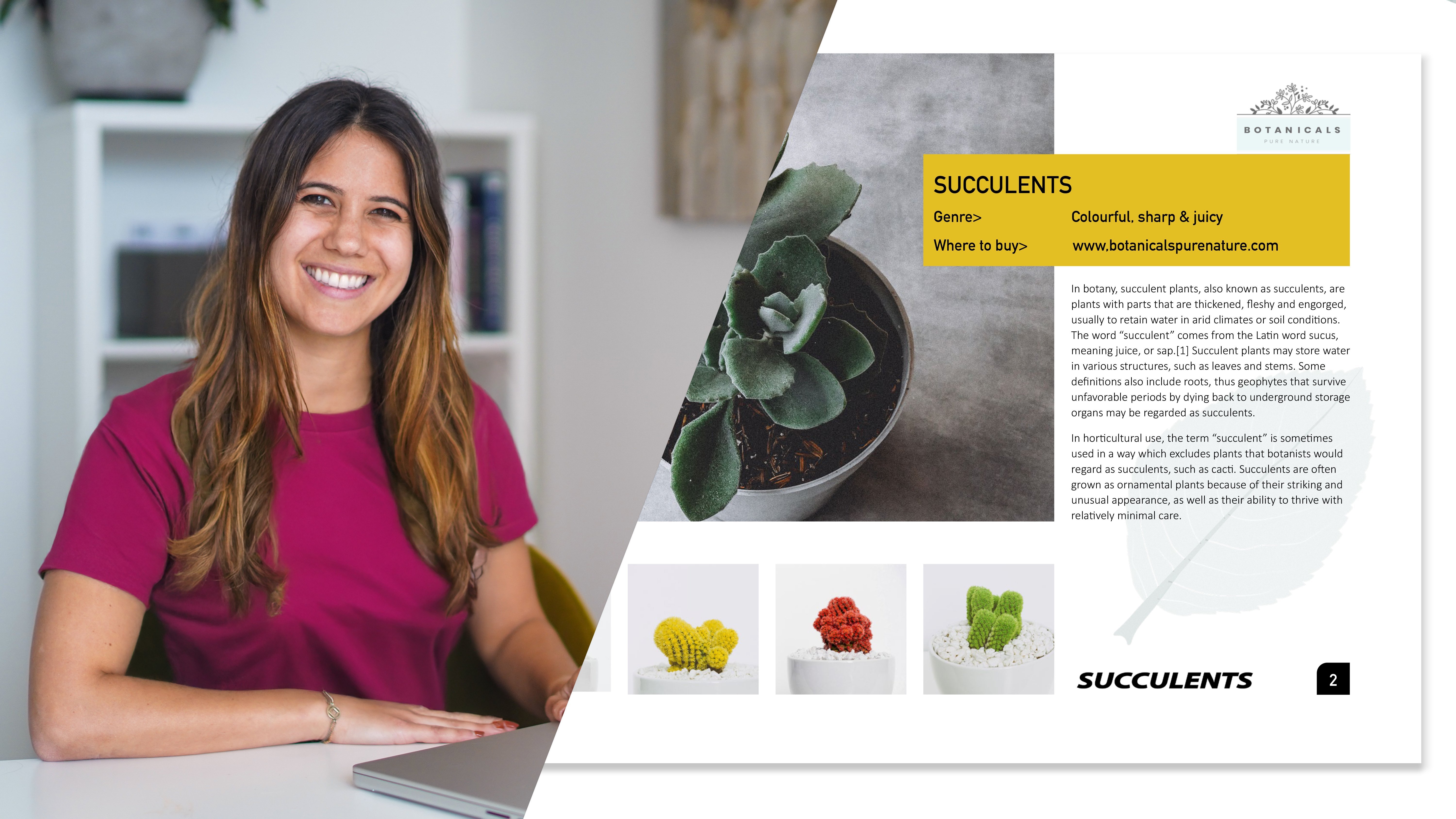
5. Adding the Shapes: What we'll do now is I'm going to show you how to create these shapes. These pink or fuchsia shapes, love that color. Then we'll move on to images, and then we'll move on to texts. Let's go back to InDesign. To create these shapes, you always have to go back to the rectangle tool, it's here shortcut M. I'm going to show you as well how to add a color in a bit. But first, what I want you to do is we're going to draw one long rectangle at the bottom that covers both pages. We just need to make sure that it aligns to the red line, which is also known as the bleed line. Okay, so what I want you to do is literally left-click and drag and you'll see this rectangle and draw a rectangle that goes up to the red line. It aligns perfectly on both red lines and let go. Now we're going to change the size in a second. There are a couple of ways to change this. You can either go to the selection tool and what you can do is literally click and drag and zoom in Cmd or Ctrl +. You can literally go click and drag and move this up or down. Or, what you can also do is if it needs a specific measurement, you can go to the properties panel and type in a specific measurement. That's what we'll do now. We want this height, you'll see W H, width and height. We want the height to be 9.5. It's another present that I'm giving you for typing 9.5 and this will be the height of our rectangle. Now make sure if nothing happens and if there has been a mistake and you're freaking out, just make sure that you're on the selection tool and that you have it selected. Click on the border and you'll see these white boxes and then make sure you can type it in. That's for the size. Now let's look at the color. Now in this text page information, I've given you a color code, both. One is for web RGB, the other one is for printing. Depending on what you need it for, but we need to print this. We need to select the printing one and add this value codes, which together will create our color. Let me show you how to do that. What we need to do is, here is the fill, which means a color or shape is filled with and there is a stroke, the border. If you double-click on the fill, you'll see this panel and you'll see CMYK where you need to type in the color code, which was 21 in C, 78 for M, magenta, Y, yellow 33 and K, which is actually black, eight. When you click away, you'll see this beautiful fuchsia pinky color. Click back here in CMYK. Now when you click "Add CMYK swatch" what that will do is save this color in your swatches. We'd like you to click on "Okay." There's a panel called swatches here, you can click on that. Scroll down and you'll see, wow, that gorgeous color is here. Very nice. Which means we can always reuse it. No problem. Cool. Command or control zero fit to screen. Now we're going to do those two little rectangles at the top, which are these two here. These lovely two. We're going to go to the rectangle tool. Always go back to the rectangle tool to draw rectangles. We're going to click and drag. Another way to create a shape and have a specific size is to look at those little W H here, width and height. What you want to do is click and drag until you see 23.5 in the width. That is the size that our rectangle needs to be. Make sure you align it, so it fits nice in the pink column and this turquoise cyan line. That's why I created this line. It fits nicely here. If it doesn't look exactly the same, do not worry. Artistic freedom always. Now because we've saved our swatches color, make sure you click on this panel so it's there. We can just click on this. Voila, we have that beautiful color. Well done. Now, there is a second one that needs to be here. To save you the trouble of doing this over again, I'm going to show you how to duplicate this by going to the selection tool. Now, obviously you can copy paste Control C, Control V shortcut. But I'm going to show you another trick and it's called duplication. I want you to make sure you're on the selection tool. Have this shape selected and hold down the "Alt" option key. You'll see a black and white cursor and you can just go ahead and drop it on the right hand side. Voila, we have our two shapes. Beautiful. Now the other shape that we need is the one here. If I minimize InDesign, it's going to be this one, this beautiful shape rectangle, the header with all this information. We're going to go to the rectangle tool. For this one it's pretty easy because of the guides. It's basically from the red line to this guide. You just need to click and drag and align it to the red line. Now click on "Swatches." For swatches, make sure that your fill in is selected and not the stroke. Otherwise, you'll have a border instead of the fill. If that happens, just swap them. Voila, we already have all the shapes in our document.
6. Adding the Images: Great. Now, that we have all the shapes, what we'll do next is images, which I find really exciting. Now, whenever you need to add images in an InDesign document, you always go to the Rectangle Frame Tool, which is the rectangle with a cross in it. That means that it's a place holder for images. If you ever see a rectangle with a cross, you're meant to place an image in there. These guides here that I showed you, the 1,2,3, three guides, is where our image starts, our burger image, and it's going to end here at the bottom, this pink line here. Now make sure you start from the red line, the bleed line, and you go click and drag, and you want to stop in the middle of the page or the spreads where the binding would be if you were to bind a book, and around here and let go. Our image is going to go in here. Now we're going to place our image, and that is File, Place or the shortcut Command or Control D. Now you've got to go and find this folder, which is somewhere here amongst all my million folders. Here we go. You go to links, which is where all the images are, and select this yummy burger, who's hungry, click on "Open," and our image will be placed here. Cool. Now, obviously it looks really weird, very zoomed in. So we're going to fix this by going to the frame fitting option, which is an automatically fitting option. You can see it here in the properties panel frame fitting. I want you to select the Content-Aware Fit. It does a good job. It just needs to be moved up and down. The way to do this is you have to make sure that you go back to the selection tool to do this. When you go back to the selection tool and you hover over your picture, you will see this content grabber, this button. If you click on it, it will select the image inside the frame. You'll see the RNG brownie border, and you can just press the downward arrow on your keyboard. This is going slow. So if you press Shift, and the downward arrow, it goes a little bit faster, and you can move it down in artistic freedom here. You can decide how to fit your image. That's up to you. Well done. When you're done, you click away to deselect. Super. Now we're going to do the other images. If we look at our PDF again, the steps. By all means guys, I'm not really a chef or a cook, so all this information, it's fake. Don't try and actually create this burger because you'll end up with a really weird meal. It's just some random content. Feel free to add your own content. That's what we'll do next, all these images. So if we can go to the Rectangle Frame Tool, what I've done is those two guides here that I gave you earlier, these are the parameters for our three images here, one here, one there, one there which is why we have these three columns, so useful. I want you to start here. I want you to left-click and drag it to where the thirds would end but don't let go of your mouse. If you did, just start over. I want you to press the right arrow on our keyboard once and then twice, and then let go. This is how you create something called, which essentially is a grid. Now we have those two images ready to be placed, and we're going to duplicate them just like we did with these shapes. To duplicate them, remember, we're on the Rectangle Frame Tool so we're going to go to the Selection Tool. We're going to use my little trick again for duplicating, and that's holding down the Alt or Option key until you see the black and white cursor, and then you click and drag it down, and let go. Now make sure, when you do this, that you did have all your shapes selected otherwise, it would just copy one. Then we can always move these later. Now I'm just placing them by eye. This will be moved a little bit around later, so do not worry. Now we're going to place these images inside, very exciting. We're going to go Command or Control D, which is a shortcut or File, Place. We're going to select all our images. Just select all of them. If you hold down the Shift key on your keyboard, it will select all of them and click on "Open." You will see an image with a little number. That means how many images are waiting to be placed. It should be six. Then to place the images, you have to click on the appropriate shape for where you want the image to be placed. This is a dip, you want to place in here, so go ahead and click on this shape. Cool. Then this one, the courgette you can click here. Bear in mind that if you miss, if you go click, whoa, oh no, what do I do? You just go Edit, Undo or Command or Control Z. No problem. Then he can go and click on this one, and then on this one, and there, this one here. Whoops, Command or Control Z. Make sure you pop it in the shape. That looks a little bit disgusting, doesn't it? It makes me a little bit sick. Let's make it more yummy by zooming out. Make sure you are on the selection tool, and you can click and drag and select all these shapes and images. We're going to fit them all in one go instead of doing them manually, individually. We're going to select that frame fitting option that I talked about earlier, we're going to select Content-Aware Fit. That's fine. We're going to have to change a few of them. Make sure you deselect, you click away. We're going to click on the Content Grabber, that button of some of them, and this one, I'm just going to press the downward arrow on my keyboard just so it goes down a little bit. Then we're going to do the same for the burger. Click on the Content Grabber, press the downward arrow on a keyboard so it goes down, and then click on the Content Grabber for this dip and the upward arrow on the keyboard. I think the buns are okay. I think that's pretty much. No, maybe this image could move down a little bit so we can see the hands a little bit more. You can click on this Content Grabber, press the downward arrow on your keyboard, and voila, like we say in French. Now this is where sometimes InDesign can crash or your computer can crash or whatever happens, so just to be on the safe side, I would like us to go File, Save As and just Save As on your desktop. You can call it whatever you want, burger. Just save it as an InDesign document just in case because we've done quite a bit now. The next part, we'll be adding this icon over here, the timer icon. So I would like us to go to File, Place or Commands or Control D, and you'll see a PNG called timer icon. PNG is great for logos and icons with clear backgrounds. Click on "Open" and we're going to pop it in here, artistic freedom again, I'm just going to click and drag, and I'm going to zoom in. I can move to the right or to the left, to the left. If you need to make it bigger or smaller, let me give you a super cool shortcut and that is Command or Control full stop for making it bigger, or Command or Control comma for making it smaller, and this is probably my favorite shortcut in all Adobe software. Now what I like to do is often just press Command or Control S, which is a shortcut for saving. So I go File Save. This will save you a lot of trouble in the future. If you just keep saving it as you go, every time you create something, then you're sure that you'll never lose this.
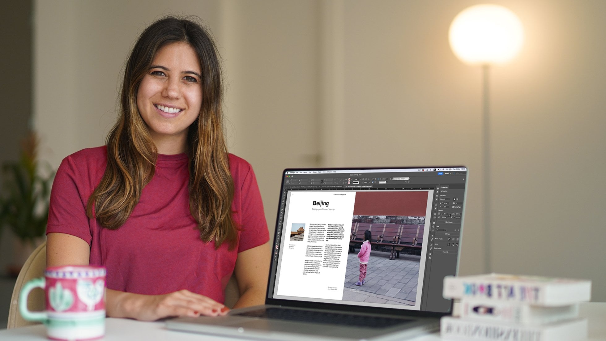
7. Formatting the Text: We have all the images in here, now we're going to work with text. The great news is you don't have to type in all our texts. You just have to copy the content and change the text formatting, the fonts, and stuff like that. Let's go back to that tab, Text Information page. This is a first page, this is the second one, so all the content is here. We'll start with this. This is the content we need for the first page. If you're on the Selection Tool and you double-click in here, it will automatically take you to the Type Tool, or you can click on the Type Tool over here. You can select this text and go Edit, Copy or Command or Control C. We're going to copy this text and we're going to place it in our other InDesign document over here. Our text is going to go beautifully in here in this parameters, again, which is why I have given you these guides. We're going to go click and drag because to add text, you you need to create a text frame. Click and drag, let go, and Command or Control V, which is a shortcut for paste, or of course, Edit, Paste is fine. Now we have our lovely texts. You can zoom in Command or Control plus. This is lovely. I'm going to show you how to change the formatting. Let's start with Burger Heaven, so dramatic. Could you click and drag and select "Burger Heaven", please? To change a font, text formatting, you can do it over here in the Properties Panel for some simple ones. First of all, you'll see character, and then below, you'll see paragraph. We'll use both. I would like you to go to Character and select "Minion Pro", which is probably the most boring font in the world. Sorry. But it is what it is, by choice. You'll see regular or something else. If you don't see Minion Pro, by the way, and just go ahead and type it, or you can search from your fonts. You should have it now because you've installed it along with me. Below you'll see regular. I want you to try and look for Pro Semibold, this one. Cool. This is the font size. I want the font-size to be 26. Click up on this arrow, 26. This is the leading, which is meant to be the space between the lines. I want you to make this 31.2. Such a random number, isn't it? But there it is, and that is our heading. Then what I would like you to do is you will see here paragraph Align Center, please. Viola, it's in the center. I'm going to do the same with the rest of the text. Could you please select the rest of the text, "Vegan Burger with Parmesan"? That doesn't make sense, does it? Now give you the information for this fonts and the text formatting. Again, we go back to our text here. This time, it's Regular Minion Pro, then choose "Regular". The font size needs to be 12 and the leading needs to be 14.4, which it is already for me. That's super cool. Then I'm going to select "Align Center". Wow, perfect. The only thing here that I notice is that these two are quite close to each other. I want to add some space here, so I'll show you how to do that. If you could select "Burger Heaven", click after Heaven. We're going to add something called Space After, which adds a space after a heading or something. To do this, I want you to go to Paragraph, and you'll see below Space After. I want you to click 1, 2, 3 and that's it, three, so that our text aligns with that guide. Again, which is why I added this wonderful guide. The last thing for the text here is a cutter of this. This should be this beautiful fuchsia. Because our swatches are already open, all you have to do is click on it, on the swatch, and beautiful. Over here, it needs to be 40 minutes, and that will be the last thing we do on the first page. How exciting. If you click in the shape with the Type Tool, it will convert this shape into a text frame, which is cool. You can start typing directly in here. I would like you to type 40 mins. Could do that actually in all caps because that's what it needs to be, MINS. I wanted to highlight this and make it paper which is white, and then change the font size accordingly. This one you can play by here, you can do whatever you want. Then to make it align to the center, this is horizontal center. You click on that. To make it align vertically center, so it's here I need you to go to the Selection Tool. This is a tricky one. But at the top, you should see Align Center and click on there. bear in mind, if you are using a laptop and you do not see this icon and you're worried, do not worry. There is a way around it. You can right-click and go to something called Text Frame Options and just select "Vertical Justification:", "Center". There's always a few options, so zoom out a little bit, Command or Control minus. We have just done page 1, the first page. Congratulations.
8. Placing the Remaining text: Okay. Well done on the first page, let's scroll over to the right page. What we're going to do now is add all the text, and you're lucky because as I said, all the text is in this file and it's over here. What I've done here is I've created text and I've made the first of each the exact way that we want the rest of the text to be like. Meaning, this is how we want our text to be like for this one and this one. This is how we want our text to look like for this, this, this, that, and that. We're going to learn how to work with something called Paragraph Styles. That is essentially saving a style or a text formatting so that it looks the way we want it to be, and it's like saving a template for text. More will be revealed later. Make sure you head here and I would like you to go to the Type Tool, and click and drag and save this piece of text, edit, copy or Command, or Control of C. We're going to head over here to our text. Our text is going to line up in this fuchsia piece, but it's going to line up to this guide. We're going to go click and drag approximately here. I'm going to go edit, paste or Command or Control V. That is our text exactly the way it needs to look like. Let's go back to this page. Now, I'm going to place this text in. Select it, Command C or Control C. Go back to our burger InDesign file and do the same thing. We click and drag and try and align our text frame to the top. If you align at the hero, you'll see this green line at the bottom. This is a smart guide. It's telling us that it's the same width as the other, the first text frame. Again, I'm going to go edit, paste, or Command or Control V. Now, this text we're going to have to change. Don't worry about that. This will be changed. Now, let's go back to our text page information and do the same here. Select it, Command or Control C. Go to burger and paste it over here. Click and drag. It can be a bit bigger as in longer the text frame, that's fine. Command or Control V. Let's do that for the whole text and then we'll do the text formatting later. So we click over here, we highlight this piece of text Command or Control C. Command for Macs Control for PCs. Go to burger. We're going to pop it here. I don't have a guides currently for this. That's fine, we're just going to do it by eye and then Command or Control V, paste. Let's go back here and select it Command or Control C. Go back here, create a text frame, and paste it, and go back here. Now, if you're finding this boring, there is a quicker way to do this. You can go to the Selection Tool and you can just click on that one text frame. Hold down the Shift key, and click on all the ones you want to copy, and then go edit copy. If you go here back to the other InDesign file, you can now paste it Command or Control V. Do it this way, which obviously is faster. I just wanted to show you both ways. Make sure you're on the Selection Tool still. You can click and drag and try and align our text.
9. Paragraph & Character Styles: Great. Now to save us the trouble of having to do all this text formatting, which we've already learned by doing this, this is the same here, just different styles and colors and stuff. What we'll do is we'll use this as a template and we'll create a template from these called a paragraph style. Then we're going to apply that style to the rest of the text. Now to do this, I want you to left-click on "Paragraph Styles" in the panels, and drop it on your page. I want you to click on the arrows here to expand panels. Now I want you to select "Character Styles" and drop it at the bottom of this panel until you see that blue line and it means that it will be grouped. It means these two panels are grouped. What are paragraph styles and character styles? Paragraph style is when you want to copy a whole style of a whole paragraph or a whole line or more and a character style is when you want to copy a style of a word, a letter, this is often a color, it can be bold. We're going to create styles from each of these, and then we're going to apply it to the rest of the document, which is something you need to use whenever you're working with longer documents. This will save you a lot of time in the future and it will ensure consistency. First of all, let's go to the type tool, T. I'm going to save a style from this. I want you to highlight this. I want you to go to the Paragraph Style panel and you'll see a little plus at the bottom. If you're using an older version, this will be just a square. When you click on the "Plus", it will copy this style and create a cell here. As a default, it will be called Paragraph Style 1. It's very important that we rename these because it will get confusing later on. So double-click and you'll see style name. I want you to call it, let's call it top bar heading. Not sure if that makes sense, but if you find something that makes more sense to you, by all means, use it, call it whatever you want. Click on "Okay". Now it's called top bar heading. So great. Like I said, we're only going to create the styles first, we're not going to apply them yet. Now let's create a style from this. Highlight this piece. Click on the "Plus" over here and it's going to say paragraph style again. Double-click on that and call it top bar. Could be main text, could be, let's just say text. Or it could be main text, let's do main text. You click on "Okay". You can call it whatever you want as long as you know what you're using. Let's move on to the bottom, this beautiful, little font. I would like you to highlight this. Again, we go to Paragraph Style. Click on the "Plus", double-click on "Paragraph Style 1", which we need to rename, and we're going to call it, could be called cooking steps, which is what it is. Step 1, step 2 and heading. That makes sense to me. If it doesn't make sense to you, obviously, find something that's better. I'm sure you will. Click on "Okay". Great. Now I'm going to create another style from this whole paragraph and we're going to click on the "Plus". Again, rename Paragraph Style 1 and call it cooking steps, text or main text. Click on "Okay". Now we have 1, 2, 3, 4 of them and the basic one. Very cool. Okay. Now, can you see there's a few bold words and colors? We're going to do that for some other pieces. We're going to save these as character styles because it's a word and it's less than a whole line. I would like you to select "Onion" and this time we go to Character Styles. Click on the "Plus", double-click on "Characters Style 1" so you rename it. You can also rename it this way, by the way. You don't have to open up the panel. We're going to call this bold because it's bold. We're going to do this again for the green color. We're going to highlight this to centimeters. Click on the "Plus", rename it, and call it green, and click on "Okay". Now we have created all our paragraph styles.
10. Applying the Styles: Now for what I think is the most fun part, applying the styles just like magic. First of all, let's highlight allergy information here. This, we want it to look like this one. Remember we called it top bar heading. If we select top bar heading, it will look the same. Now this piece here was top bar main text. Go ahead and select top bar main text, and then select tools needed, and select top bar heading. Select this piece of text and select top bar main text. Now, if this happens, if it's black, don't worry. All you need to do is overwrite this. You'll see a plus here. If you click on this icon, it will overwrite any mistakes and make it white. That shouldn't happen, very odd that it happened on mine, but it's good because if that does happen now you know how to do it. Mistakes are actually always gifts in a way. Sorry for the cheesiness, there is cheese in this burger. Anyway, let's move on to the next pieces of text. Select cook the faux meat and this has to be cooking steps heading. Click on that, and beautiful. Select this piece of text and select cooking step text and overwrite. If nothing changes, click on overwrite. If you ever see a plus, click on overwrite. Now for some of the character styles, you can pick anything you want here, like 10 minutes, and select green, and look at that, it's green. Select faux meat let's say, and make it bold, et cetera. Let's do the next one, three, prepare the bun, and select cooking steps heading. Select the rest of the text here, and select cooking steps text, and if you need a few in green and a few in bold, go ahead and do that too. Isn't this satisfying? So fun. Much faster than having to redo all the texts, isn't it? Let's go ahead and do the other one. Four, prepare the dip, and select cooking steps heading. Select the rest of the steps, cooking steps text. If you want to make salt and pepper bold, go ahead and do that, and coriander maybe. Good. If you want to make olive oil green, just making stuff up now. Now select five, spice it up. Spice it up, and select cooking steps heading. Like the rest of the text, cooking steps text. You can select the time here and make it green. You can select bun and make it bold, then the next piece of text. Select six, finishing touches. Cooking steps heading, select the rest of the text here, and make cooking steps text. Overwrite if you need to, and you can make salt and pepper bold again, and jalapenos you can make that green. Hope I've pronounced it right, and amazing. Go back to the selection tool, and always press W. W is print preview. You can see how beautiful it currently looks. Beautiful.
11. Saving & Exporting: Look at what you've just created. That is incredible, really proud of you. Now the last and final thing that I'm going to show you is how to save it or export it into a PDF. I've already showed you how to save it as an InDesign file. You can just go File Save and save on top of your existing InDesign file. Now to save it as a PDF, you're going to have to go to File, Export, Adobe PDF Print, and save it wherever you like. You'll have to choose a few options here. First of all, let's select the "Range." I only want to select Page 2 and 3. I don't want to save Page 1. If you wanted to save them as individual pages, you select ''Pages.'' If you want to select ''Spreads,'' you select "Spreads." Now, if you want to send this to a printer and have them include the bleed line and trim it, you're going to have to select "Crop Marks," "Bleed Marks," and tick "Use Document Settings." This will have these ugly marks that the printers will know where to trim when they print it so that your graphics align to the edge of the page. I'll show you how it looks like, and obviously if you don't want this, if it's for web, or if it's just printing at home, you don't have to tick this. That's pretty much it. You just make sure you select "High-Quality Print" and we've just modified this. You click on "Export." I always forget where I export my things. But it's going to open up here and this is our wonderful PDF with all the crop marks here so the printers will know where to save it, where to crop it. Now feel free to use this and create your own style of this. Create a similar recipe card and change all the images, and the text, and the fonts, and the logo, and make it your own. I would love to see what you come up with, so post it wherever you can, and I will see you soon.
12. What's Next?: Hey guys, congratulations on completing this exercise. I hope you had so much fun with it, that you learned so many different things. You learned about images, about gridify, about paragraph styles and how to work with them, and so much more. I hope you use these skills and transfer them and use them for any type of InDesign documents that you would like to create. Now, if you want to learn about InDesign a little bit more, I do have a beginners class that's called Adobe InDesign CC: Beginners, Workshop, Essentials. It covers all the InDesign essentials and basics and it's a three hour course which is great to get to practice loads. I hope you've really enjoyed this and as always, it's been a pleasure and I'll see you soon.
 Kate Silver, Graphic Designer & Adobe Instructor