Transcripts
1. Welcome to Class!: Something truly magical about
the world of watercolor. Watching the paint
bleed together, experimenting with
new techniques, learning to let go of control. It's all part of the joy
of watercolor painting. It's what drew me in
nearly five years ago, and I haven't been able to put down my brushes since then. My name is Pria from Petals
by Pria Watercolor Designs. I'm a full time
artist and I create floral and botanical designs
for products and teach watercolor artists of all
levels how to fall in love with their practice and
build creative confidence. I've always loved the
painting process, but about a year into my
journey with watercolors, I hit a bit of a roadblock. I felt stuck in my progress and wasn't loving my final
pieces of artwork, but I wasn't sure what I was missing or what I
needed to do next. If that resonates with you, you're feeling confident
in your basic abilities, but you're ready to breathe fresh life into
your paintings and advance your skills as a watercolor artist,
you're in the right place. In today's class,
you'll learn a few of my favorite intermediate
watercolor techniques to help transform your good paintings
into great paintings. In each of the lessons, we'll be completing
practice drills and individual projects to put
what we learn into action. These techniques will
include utilizing tonal values to add depth and
interest to our paintings. Learning to blend individual
and multiple colors to create smooth and
seamless gradients, applying layers to enhance
glow and establish depth and using our brush to
lift pigment from the page to create eye
catching highlights. At the end of class, we'll work together on a more
advanced final project, the Tropical Monstera leaf. This project will utilize
all of the skills we practice in the class and
you'll end up with a beautiful, detailed botanical painting
that you can be proud of. Not only that,
you'll also be well equipped with all the
skills and techniques you need to move forward in your watercolor journey
with confidence and ease. Trust me, you'll see a drastic difference
in the outcome of your paintings when
you start to apply these techniques to
your own works of art. Before we get started, if
you'd like to learn more, you can find me on Instagram
at Petals by Pria On my pealsp or on YouTube at
Petals by Pria Watercolor. I also have more
resources on my website, including my watercolor
supply guide and color mixing guide that I linked down below in the
class description. Now that we've covered
all the basics, let's get right into it. I'll see you in
the first lesson.
2. Class Project: As I mentioned in the
introductory video, this class will include
five projects in total. One small painting for each of the techniques
we learn and one final project
at the end where we can put all of our
new skills to use. For these paintings, I've included sketches in
the resources section. You can download and use
those for your projects or feel free to paint loosely without sketching
if you'd prefer. Now, I normally paint
without sketching first, but I really want the focus of this class to be on
getting the hang of each of the techniques and not worrying about shapes
or compositions. That's why I'll be using
sketches during the class, just to simplify things and really focus
on the brushwork. Next up, we'll go over all the supplies you
need for the class.
3. Art Supplies: Let's talk about supplies. I'll walk you through
everything you need for class, and for
your convenience, I also included a supply list with links in the
resources section. You can download that as well. First up is watercolor paper. For this class, I highly recommend using
100% cotton paper. As the techniques
we'll be learning require a high quality
absorbent surface. Next is your brushes. Feel free to use any round brushes that you're
comfortable with. I'll be using a variety
of sizes ranging 2-10. My favorite brushes are the Princeton Neptune
and Valve touch series. For the Monstera
project at the end, I'll also be using
some masking fluid to mark out the
holes in the leaf. A quick note on that topic. If you also choose to use
masking fluid for that section, make sure you get a cheap
disposable brush because masking fluid can be super
harsh on your bristles. You definitely don't want to use your favorite brush
for that part. For watercolor paint,
I'll review the colors that I'm using for the projects
in each of the lessons. But I want you to remember, you're welcome to
use whichever colors you have available to you. Other supplies you'll need include a jar or
bowl of clean water, mixing palette,
and a paper towel. Once you gather
all your supplies, we'll start learning about tonal values in the next lesson.
4. Tonal Values: The first technique I'd like to share is how to understand and utilize color values
to enhance your artwork. This is something I
didn't fully grasp until much later on in
my watercolor journey. But once I took the
time to understand it, learn how to create value
skills and intuitively incorporate a range of total
values into my paintings, my artwork improved
almost instantly. Take a look at this example of the simple berry branch we'll be painting
in the next lesson. This one is what it looks like without caring
about color values, and this is what
it looks like when I'm being mindful of my values. You can see this one has much more depth than visual interest. As you can see both the
leaves and the berries vary from light to dark instead
of being one flat color. When I talk about color
values or tonal values, what I'm referencing is the relative lightness
or darkness of a color, and that's determined by how diluted or concentrated
your mixture is. As you can probably assume, a mixture with more water in it will be lighter
and a mixture with less water will be darker because it's a more
concentrated mixture. I want to share a
couple more examples here so you can
really start to see the impact that total values
has on real life paintings. These are the lemon and avocado paintings we'll be doing
later on in class. You can see in both
of these projects, I've utilized a range of
values to help add shadows, highlights, and depth
to the subjects. For example, in this
lemon painting, I have a much lighter
value of yellow here to demonstrate the highlights
where the light is hitting it. I have some medium values
here in the middle, and then the darkest values of yellow are around the
edge for the shadows. Incorporating all these
different values of yellow really helps to
bring the lemon to life. Now that we've seen a couple
of real life examples, let's start by
creating a value scale because that's the best way to learn it is by
actually doing it. You can use any color you'd
like for this exercise. Start on the left side of
your paper and load up your brush with a very
concentrated mixture of pigment. I have barely any water in
my mixture at this point, and my paint is very
thick and opaque. Go ahead and lay
down a small swatch of color on your paper. Now, gently rinse just a
bit of that color off of your brush and add a second
swatch right next to it. Notice how the value
of the color is slightly lighter
because the mixture is less concentrated.
Let's do that again. Go ahead and rinse off
even a bit more pigment and lay down another swatch of color next to our previous one. Now I want you to repeat this process all the
way across your paper, gently rinsing off more
and more pigment each time until your mixture
is almost all water with just a touch of color. So now you've created
a value scale going from the darkest value
to the lightest value. And again, this is all
the same color but different values based on the concentration
of your mixture. So you can see we achieved
a wide variety of tonal values and have tons of options to use these
in our artwork. And that's just with one color. Imagine all the possibilities you'll have for your
paintings when you get comfortable doing this with all the colors you have
available in your palette. Go ahead and keep practicing
your value scales, and when you're
ready, we'll put it into practice in
the next lesson.
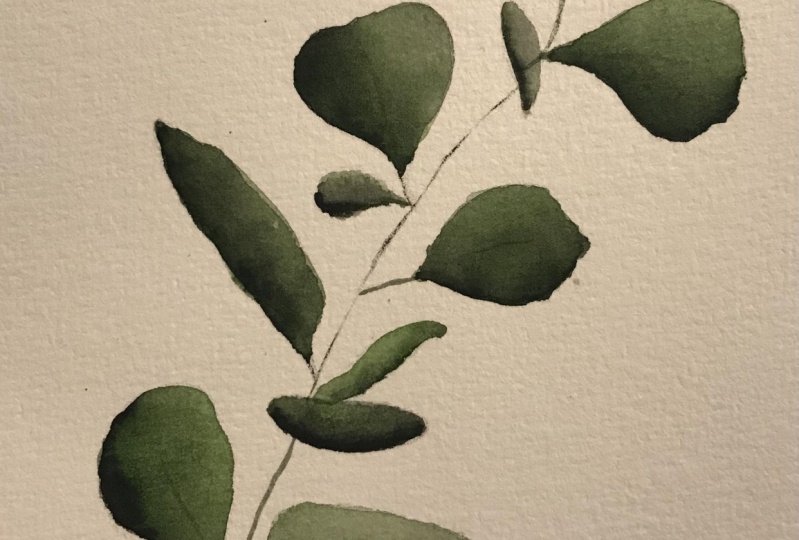
5. Values: Berry Branch: Put this into practice, let's paint a simple branch
with some berries and leaves. Making sure to change
up the value of each berry and the leaves to make the painting
more interesting. We'll want to have some berries
be very light and watery, others to be dark and bold, and some of them we want to
have somewhere in the middle. Remember, you're always welcome to download the sketch below, or you can paint freely
for this one as well, especially since we're
starting off pretty simple. I went ahead and sketched
out the leaves and the stem, but I left some space
empty for the berries, so I can paint them
in wherever I'd like. The colors I'm using for this painting are a
mixture of sap green, panes gray and indigo
for the leaves, and this fox berry red from my Woodlands art
philosophy palette. But remember, you can use any
colors you have available. I'm going to start
this off by using just the very tip of my round
brush to paint in the stem. I'm making sure that I
use a very light hand, which means I'm not
applying much pressure onto my brush because I really want that stem to remain
nice and dainty. Then I'll go ahead and add the little branches off
for each of the leaves. Again, using just the
very tip of my brush. Okay. Now for the leaves, I'll show you my painting
in real time for the first few so you can see what
our process will be like. Here, I'm starting
with a light value of green for my base layer
on each of the leaves. You want it to be nice and even without any pooling
of water on the page. Then I load up my brush
with a darker value of that same green color and just add it to the edge
of the leaf like this. Now I'm going to rinse
off my brush and just smooth out that
darker color a bit. Now, don't worry, we'll be
going much more in depth with layering and blending
later on in the class. But for now, I'll just be
adding these darker values on top of my base layer and then
gently smoothing it out. I'm going to go back in
with another layer here. Now I have an even darker
value of my green, and I'm just going
to gently add it to the edge, just like this. Again, I'll be going way more in depth than this technique
later on in class. But for now, my one
biggest piece of advice is just not to
overload the layer. You don't want too much
water or too much paint. Once again, I'll be rinsing off my brush and just smoothing
out those edges a bit. There you can see that this
one individual leaf looks really beautiful because we
applied a variety of values, so you can see it shifting
from a light to dark, giving this leaf a very
dynamic, interesting look. Let's do this same process again and feel free to
paint along with me. I'm starting with a
very light value, which again, means I have
plenty of water in my mixture. I'm just applying
a nice even layer before I go back in with a slightly darker value and just tap it in
along the edges. Finally, adding one more
layer of darker value, which means I have a slightly more concentrated
mixture of pigment, tapping it in along the edge to give it even more
shadow and depth. Then rinsing off my brush, dabbing off the excess water and slightly just smoothing
out that leaf. I don't have any of
those harsh edges. Now that we've done a couple of these leaves in real time, I'm going to go ahead
and speed up the rest, but don't worry, the process
will be the exact same. Starting with a
light base layer, adding in a medium value, smoothing it out, and adding
in some darker values. Now, before I actually
start painting the berries onto
our final painting, I grabbed this practice sheet
of paper just so I can show you the process that we'll be using when we paint our berries. I started with a very dark value of my red fox berry color, and you can paint
along with me on scrap paper if you want
to practice this too. Then I use a clean, damp brush to paint another
berry right next to it, just gently grazing
the outside of my first berry to grab
some of that pigment. Let's try that again. Start with a dark value of your red color, paint in a simple berry and
then rinse off all the color, dab off excess water and paint another berry
right next to it, just using the color from the first berry to drag
some in to our second. This is the process
we'll be using when we paint our berries into
our berry branch. This gives it the
very dynamic value because you have
those dark ones to start with and then super light
clear berries next to it. Now we can start doing
that same process on our berry branch. I'll be starting with a
dark value painting in a simple berry and I leave a little bit of white space for the highlight of the berry. Then I rinse off almost all the color
off my brush just so it's clean and damp and I paint another berry
right next to it, using the tip of my brush to grab some of that color
from the first one. This is how I'll be adding
all of the berries. Now I'll start on the
bigger group of berries. First, with a dark
value of my red. Making sure I have
enough pigment on there that when I add the
additional berries, I have enough to pull from. If you start to light, then you won't have
enough pigment to draw into your
additional berries. I start nice and dark. That way when I
rinse off my brush, add my second one like you
can see I'm doing here. I have enough color to pull
into that second berry. I'm going to add
another small one here. I want to make
sure I'm mixing up the size as well as the
value of the berries. I'm just going to
continue this process, adding in my berries,
where I feel like it. You don't have to do the exact
same areas that I'm doing. Just take a look at your branch and see how many
you want to add, where you want to place them, and be sure to mix up the
values that you're using and the sizes because we really want to make this painting
interesting and dynamic. Now, take a look again at
the example where I painted the same exact project without paying attention
to color values. All the berries and leaves
are the exact same shade. Look at how flat
and dull it looks compared to the version
we just created together. It's a small and simple
change to your process that makes a huge difference in the outcome of your artwork. Feel free to keep practicing your values and start to think about how you can apply them to different subjects that
you like to paint often. Whether it's landscapes,
florals, portraits, animals, or anything else
you like to paint, you can always level
up your artwork by incorporating a variety
of color values.
6. Blending One Color: Now we're moving on
to color blending. If you've taken some of
my other classes already, you might be familiar
with this technique. But in this lesson, we'll go more in depth about
how to create smooth and seamless
transitions between a single color and
between multiple colors, which can be useful for
all types of artwork. A lot of times
color blending and tonal values go hand in hand. Now that you're more
comfortable with values from the previous lesson, we'll be incorporating that
into this one as well. But first, let's take a look
at a real life example. This is a watercolor wreath
I painted a few years ago. While the painting itself is pretty simple and
straightforward, you can see I've used
a variety of values of this green shade and each leaf has a seamless blend
between light and dark. Aren't any harsh lines
between the two. All you pick up is
a smooth gradient that looks natural and
pleasing to the eye. The key to creating
smooth blends like this is all
about water control. You want to have enough
water in your brush so you can blend out
the color smoothly, but you don't want
to have too much. Otherwise, the water will
flood the surface and you'll end up with really harsh
lines once it all dries. Let's start by drawing three
rectangles on your paper. This is just a
practice exercise, so it doesn't need
to be perfect. Again, feel free to use
any color you'd like. We're going to be
practicing blending first with not enough
water on our brush, then with too much
water on our brush, and we'll finish with
just the right amount. Now, it might feel
a little strange to practice a new technique
the wrong way first. But I really do think
it helps you not only understand why water control is so important when
you're blending, but it'll also help you
identify issues if you run into problems with your
blending in the future. So first, we'll be attempting to blend with not enough
water on your brush, which you'll see
is very difficult. So I'm going to start
by just laying down a swatch of color on the
left side of my rectangle, and then I'll be rinsing
off all the pigment and really drying off
my brush completely. Now, you'll see when
you try to blend, it's coming out very streaky. And there's just not enough
water on your brush to grab that color and smoothly blend it out to the
rest of the rectangle. So that's why we're just
seeing a lot of harsh edges, a lot of streakiness, and it's just not
ideal to try to blend color smoothly with not
enough water in your brush. Now, on the other
hand, let's try blending with too much
water on our brush, which you'll see has its own set of challenges that
comes along with that. So start again by
just laying down your dark value swatch
on the left side. Now when you go to
rinse off your brush, don't dab off the excess
water onto your paper towel. Now when I try to blend, you can see it immediately
floods the surface, it pulls all of the color instead of gradually
pulling the color, and it just doesn't
really blend. You're not getting
the streakiness that we saw in the first method, but we're not getting the dark to light blend because we had so much water that
all the pigment just pooled on the
entire surface. When you see that
pooling happening, that's how you can
tell that you have too much water on your brush. Now we can do the example
we've all been waiting for using just the right
amount of water on our brush. I'm loading up my color, and I'm going to start the
same way that we've done the other examples
just by adding a swatch of color on the
left side of my rectangle. Now I've rinsed off my color. I don't have too much
water, but I have enough, and I'm going to just gently
start pulling some of that pigment out to the
right side of the rectangle. Now it's easy to tell
that I'm not getting that streakiness like in the first example and
it's not flooding, but it's just gradually
spreading to the right side. Each time I do this, I'm
rinsing off more pigment off my brush so that I can transition from a
dark to light value. I'll just let this
process continue rinsing off my brush as I
go lighter and lighter, then you'll start to see
that nice gradual blend, which is exactly what
we're looking for. Now, let's try this again, but this time let's blend
using vertical strokes. It'll be the same process, but just using short
up and down strokes instead of horizontal like
we did in the last exercise. I've added my first
swatch on the left, ns off all the pigment, but I have a good amount
of water in my brush. It's not dripping off the edge, but it's also not too dry. I'm just going to
start gradually blending from left to right. Making sure to keep my
strokes going up and down. I'll do another example
here in a minute, but that's another important
thing is you always want your blending strokes to be parallel to the initial
swatch of color. Let's try this
again, but we'll use perpendicular strokes
and see how it looks. I'm starting with
vertical strokes just like I did in
the previous example. But now, when I try to blend, I'm going to use
horizontal strokes. My brush is clean
now and I'm going to try blending horizontally, and you can clearly see
the difference between that initial swatch and the color that you're
trying to blend. It looks messy. You're able to tell which way you're
using your paint brush, and it just doesn't achieve that smooth gradient
that we're going for. That's why it's super
important to keep all of your blending strokes parallel
so that it has a nice, seamless transition
from dark to light and you don't see any of
those individual strokes. I really encourage you to continue doing
this last practice drill a few more times to really nail down
your water control. And when you're feeling
more confident, we'll move on to blending two colors together
in the next lesson.
7. Blending Two Colors: Now we'll move on to blending
two colors together. There are lots of ways
that multicolor blends can enhance your artwork. Let's do a few more
practice drills to really get the hang of it. Now, it's important
to acknowledge that some colors are more suitable for blending together
than others. Like this pink and yellow, meet together in the middle
to create a beautiful orange. Whereas if you blend purple
and yellow together, that makes a muddy brown color. You can still definitely
blend those types of colors together beautifully and we'll
practice that in a minute. But you'll need to go
about it slightly more carefully to avoid
the muddy middle. Let's start with
the easier colors first, pink and yellow. I'm going to start
by just adding a small swatch of pink
at the top of my page, moving horizontally, just
adding a little bit. Now I'm going to
rinse off my brush, so I have clean water. It's nice and damp and starting at the bottom
of that swatch, I'm just pulling some
of that color down. Rinsing off my brush and
continuing to pull it down. You get a nice soft blend from the dark value at the top
to lighter down below. Now, I've rinsed off all
the pink and I'm loading up that warm yellow color and doing the same thing
at the bottom, starting with a deep value, but just a little swatch, rinsing off all the pigment and pulling some
of that color up. It's going lighter and lighter
because I'm rinsing off pigment and using
clean water to blend. Then you can see
it meets nicely in the middle to form
a warm orange. Here I'm just using
a clean damp brush and just softening out where
it meets in the middle. Now you can see a soft gradient
from pink into orange, soft in the middle and
down into the warm yellow. Let's give it another try. Starting with a dark value, adding just a bit of color
up there at the top, rinsing off my brush and
pulling that color down. Rinsing off my brush again
and continuing to pull down. You want to make
sure your brush is clean so that you're not
pulling too much pigment down. And just smoothing
out that color a bit before loading up my brush with the yellow and doing the same, but just from the bottom up
instead of the top down. Starting with my dark
value of yellow, just a bit of a swatch there, rinsing off my brush
and pulling that color up to meet softly in the middle with the
light value of pink. I'll do this exercise
one more time, sped And now, I'll show you
the difference with blending purple and yellow and why we have to
be more careful. So I'm starting with a
really dark value of purple laying it
down on the page, and now I'm going to add my
really dark value of yellow. Right below it. I'm not
giving much space to blend. This is an issue
because when you try to blend it together,
like I'm doing here, it just causes a muddy
brown color in the middle, which is definitely
not what we want. We have to go about it
in a more careful way. Go ahead and load up your brush with your
dark value of purple. Just that a little
bit up at the top. Now we're going to do what we did with the pink and yellow, but we're going to soften it
to an even lighter value of purple because we want those
values to be super soft, super light at the point where
they meet so that there's not enough pigment to
cause that muddy middle. So you can see I'm
blending it out to almost just clear water with
just a touch of purple, so it's super light
lavender at this point. I'll go ahead and do the
same thing with the yellow. I'm starting pretty far down, adding in my dark value. Again, I'm going
to blend up very gently to where it's super
light value of yellow, meeting a super light
value of purple. That way, it blends seamlessly
without mixing too much to cause the brown. Blending up. You can see it's
pretty much clear, but you have a little bit of color mixing there
in the middle. And that's how we're going to
create the nice soft blend. I'll do this process
again slightly sped up. But that's the key
that I want you to remember if you're
having trouble blending two colors together
and it's just causing a little bit too much
muddiness in the middle, you'll just have to work a
bit harder to blend into a super light value at the point that
those two colors meet. As I'm doing here, I have very dark values of
purple and yellow, but I'm getting plenty
of space to blend to an almost clear color at
the point where they meet. That way you have that
nice soft gradient, but you're not
getting any muddiness because the pigments not
strong enough to mix. And now that we've mastered individual and
multicolor blending, let's put it into practice
in our next lesson.
8. Blending: Eucalyptus: For this project, let's paint a delicate stem of
eucalyptus leaves, using our new
blending technique to create these soft gradients
in each of the petals. Go ahead and download my sketch or feel free to create your own. Now, I really love painting
leaf stems like this one, especially when
you're practicing a new technique
because you get a lot of repetition and it allows you to really build up
your muscle memory. Eucalyptus tends to have a cool, blue green color scheme. For this painting, I'll be
using a mixture of indigo, hooker's green, and a
touch of panes gray. We'll start each leaf by adding a dark value of our blue
green mixture on the edge, and then we'll use a clean, damp brush to gently blend that color out into
the rest of the petal, creating a nice soft gradient. I'm grabbing a pretty dark value of my green blue mixture. As I mentioned, I'm
going to start on the top petal and just gently line the edge with a nice
layer of the darkest value. Then just like we did in
our practice exercises, I'm rinsing off
the extra pigment, getting a good amount
of water on my brush, and then I'll start gently blending it out into
the rest of the petal. And I'm working
from dark to light. I want to make sure
I'm rinsing off pigment each time I go
into blend so that I can keep a very light
transparent value on the upper right
edge of this petal. This is the process we'll
do on each of the leaves. I'm going to finish
blending this one out, and then I'll do one or two more in real time, so you
can follow along. Starting on the next
petal on the right side, I'll be doing the same
process starting with a very dark value on the
bottom edge of the petal. Then using my clean damp brush
to start blending it out. And as I work my way up to
the outer edge of the petal, I want to make sure that
I'm rinsing off plenty of pigment so that I
have just clean water, and that allows me to maintain the very light
transparent value. Now you can tell that
the second petal is slightly lighter than
the first one we did. I want to keep it a
bit more consistent. So I'm going in with an
additional layer starting with my darkest value and just tapping a new layer
along the bottom edge, and that'll help
make the contrast a little more dramatic. From there, I'll use the
same exact technique and start gently blending it out to the rest of the petal. Now I'm moving on to the little
tiny petal in the middle. And the process will
still be the same, but because it's so small, I'm making sure to
just use the tip of my brush and really be
mindful of my water control. Let's do one more petal
together in real time. I've zoomed in a bit so you can really see what
I'm doing clearly. So I'm starting with
the darkest value, just like we did in all of our blending exercises and like we've done in the
first three petals. Then using a clean damp brush
with not too much water. I'm starting to blend out that color into the
rest of the petal. As we mentioned in
the last video, you want to make sure
you have plenty of water to gently blend out that color, but you don't want
too much to where it starts flooding
the entire petal because then you start to lose that gradient and it all
just becomes one color. You want to make sure
you're being mindful of your water control and
also making sure to rinse off pigment in between blending
sessions so that you can maintain a lighter value in the areas that you
want to be lighter. You can also do what I'm doing
here where I tap in a bit of additional color around
the edge of the petal. You'll just want to
make sure that you go back in and blend it out. The process might
start to feel a little bit tedious because
it is so repetitive. But as I mentioned before, that is one of my
favorite parts of painting stems like this because you get a lot
of great practice, a lot of repetition, and then this whole blending
technique will start to feel very natural
and intuitive for you. I'll go ahead and speed up
the rest of the leaves. And now that all of
the leaves are done, we can go ahead and
add the little veins in each of the leaf petals. So I'm using the very
tip of my brush, not applying very
much pressure down, and I'm using a
dark value and just gently lining that in to
the center of the petal. Let's do that again.
Using the very tip of my small round brush, not applying too much
pressure and just gently lining the
center of the petal. And I'll just continue
making my way down. You don't have to do this
part if you'd prefer to leave the eucalyptus
leaves just plain, but I think it adds a nice
little finishing touch. Now, the very last
step we'll need to take is using the same
technique as we just did, but adding in the stem. So I'm using a very light hand, not applying too much pressure and just adding
in that stem with a very dark value and I'm making sure to avoid the
overlapping petals. So you can see I've
left that part blank and then I'm
continuing down. I hope you're feeling
more confident with your blending
skills at this point. Remember, the key to
creating those smooth, soft gradients is water control. So if that's still a
challenge for you, make sure to go
back and practice some of those drills
before moving on.
9. Layering: Next up on our list is layering. Learning how to
apply layers will help add depth to our paintings. Turning a flat avocado like this one into
an eye catching, realistic one like this, which we'll paint together
in the next section. I'll be honest, when I first started painting
with watercolors, I only thought that layering
was going to be useful if you're doing highly detailed
botanical illustrations. Since I was going more the route of loose floral watercolor, I didn't think I would
need to know how to do it. But I've learned that
using layers or even just applying a single
base layer to my artwork can be extremely useful without interfering too much with the loose nature of
my painting style. Applying a base layer can
help add dimension and bring out warm or cool
undertones in your paintings. This will come in
handy when we paint our monstera leaf at
the end of class. In that project, we'll
paint a base layer of yellow and then paint our
darker greens on top of that, you'll see the yellow
provide a subtle glow in the leaf instead of just having the white of the
paper show through. Layers are also used in landscape paintings to help
convey depth in your artwork. For example, when I paint
my forests like this one, I start with really light layers for the background
in the distance, and then my layers
get darker and darker as I paint
into the foreground instead of having just
one flat layer of trees without any of
that depth perspective. On a similar note,
with watercolors, you always have to layer
from light to dark. In other mediums like
acrylic or guash, it can be pretty easy to paint a dark layer first and
then a light layer on top. But it's just not possible
with watercolors. Keep in mind, we're always
layering from light to dark. Let's do a couple of exercises to get the hang of
working with layers. The first layering
technique we'll be doing is called wet on wet. I'm going to go ahead
and take a light value. You can use any
color you'd like. I'm just going to
paint a circle. You can do any shape you'd like. This is just a
practice exercise. I just want to make sure that
this layer is very even. I don't want it pooling
up on the page, but I also want to make sure
that it's wet enough that I can apply an additional layer
on top of that wet layer. I don't want it to be too dry, but I don't want
it to be too wet. Now, while it's still wet, I've grabbed a darker value, and I'm just going
to start dabbing that color around the
edge of the circle. Because we're applying wet paint on top of another
layer of wet paint, you can start to see
that pigment bleed and bloom out into the
center of the circle. That's what happens when you
use wet on wet technique. Now we'll move on to wet on dry. Just as the title suggests, we're going to be painting
a layer of wet paint on top of a layer of paint
that's already dried. So we'll start out the
same way as we just did, paint a simple shape. I'm just going to go with
a circle again and make sure it is a nice,
light, even layer. This time, I'm going
to let this layer dry completely before I add
in the darker value. Once it's dry, you
can go ahead and grab the darker value and start
adding it in along the edge. And you'll notice the difference
from what we just did. With the wet on wet technique, the pigment
immediately started to bleed out into the
center of the circle. Whereas with this wet
on dry technique, it's maintaining its shape. So it's keeping
those nice clean, sharp edges because it doesn't have any
water to bleed into, like, with the wet
on wet technique. So when you're working with
layers in your artwork, if you're going for
those finishing details and you want sharp, clean lines, you
can use wet on dry. Whereas if you're going for
the more loose effect or you're just adding in and
blocking in your colors, I tend to go more
for the wet on wet. Now, I know we already practice blending quite a bit
earlier on in the class, but now I'm going to
show you how to blend wet on wet versus wet on dry. So for wet on wet, I'm going to repeat the same
process we did, starting with a nice
even layer and just painting in a simple
circle shape. Again, you want to
make sure there's not too much water
where it's pooling up, but you definitely want
enough to where it stays wet before you
add your second layer. Now, I've grabbed my darker
value of the same color, and I'm just going to start lining the edge of the circle, adding in that additional
layer and watching the pigment bleed and bloom out into the
rest of the circle. Now I'm going to start
blending this together, and I want to make
sure I have a clean, damp brush with
not too much water because both of these
layers are already wet. I don't want to add too
much water on top of that. So I'm keeping my
water control in mind, and I'm just going to start
gently softening this out. So we're getting more
blending practice on top of what
we've already done. Now I'm going to go back in
with an additional layer. Again, this will be wet on wet. I'm just using a very
deep pigmented value of my green blue mixture. Adding in some more
rinsing off my brush, so I have a clean damp brush. I've said this many times, but that's really what
you need for blending. Clean damp rush, a handle
on your water control, and then just start blending it out so you get the
nice soft gradient. Now we've got some practice
layering wet on wet. We've also blended wet on wet. We've layered wet on dry. Now you guessed
it, we'll go ahead and start blending wet on dry, which is a little bit different
than blending wet on wet. I'm starting again
by just laying down a light value circle. Okay. Making sure it's nice and even. But this time, I'm
going to let it dry completely before adding on my second layer and
blending it out. Now that that base layer is dry, I'm going to go ahead and apply that same second layer as
I did on the left side. Applying it to the outer edge. Again, because that
base layer is dry, it's not bleeding
out or blooming out like the wet
on wet technique. Now while that second
layer is still wet, I'm working fairly quickly using a clean damp brush to
start blending it out. You'll notice that this is
very similar to what we did in our berry branch
project where we had a very light value
of the green first, and then we added more
darker greens and blended it out just like we're doing in this
practice drill. I'll just continue this process, softening out those edges until I'm happy with
how that looks. Now that you're more comfortable
working with layers, we'll move on to our avocado
project in the next lesson, and we'll be utilizing values,
blending and layering.
10. Layering: Avocado Base: Now that we have some solid
practice under our belt, we can get started
on our next project, where we'll be utilizing layers to help bring this
avocado to life. The colors I'm using in
this project include a lemon yellow from my art
philosophy pastel palette. A mixture of green and blue from my art philosophy
decadent pies palette, and a mixture of
warm light brown, dark brown and black for the seed and the
skin of the avocado. I know I'm using quite a variety of odd colors from
different palettes, but you can really use any similar colors you
have available, so don't worry too much about
finding these exact ones. Once you have your
avocado all sketched out, we're going to start by applying a base layer of a very
subtle light yellow. This won't make a
huge difference in the overall painting, but as I mentioned in
the previous video, applying base layers
like this can really help bring out warm
or cool undertones. I want the underton of
this vocado to be yellow. So it's not a very strong
pigmented version, it's just a very light value. I'm just going to
make sure that I'm applying it nice and evenly across the whole base layer of just the green vocado part. So I don't want to
touch the seed yet. Once that's done and
while it's still wet, we'll start building out
our layers of green. We're going to do
quite a few layers. One thing I want you
to keep in mind is we want to start from light near the seed so the
center and then get darker as we expand out
towards the outer edge. I'm starting still with a fairly light value of green
I'd say a medium value, and I'm just going
to start applying that on top of our
yellow base layer. Again, you want to make
sure it's nice and even. This is the wet
on wet technique. I want to keep my
water control in mind. I don't want to
flood the surface, but I'm just blocking in my
color values at this point. We're really getting a
chance to use all of our techniques so far because
I'm adding these layers, I'm using different values, and as I'm layering, I'm really also utilizing my blending technique
like I'm doing here. So that I get these
nice soft edges. I really don't want there to be any harsh lines at this point. We will be having harsher
lines when we add finishing details when we
add the skin and the seed. But for now, I'm blocking
in my color values and I really want them to
be smooth and seamless. Now, from this point on,
I'm going to be adding two more layers to the
green part of the avocado. You can see that I've gone noticeably darker in
my value of green. I'm just lining the outer
edge because I really want to maintain the light value towards the center
where the seed is. I'm being careful to just
line the outer edge, and this is still wet on wet, so that's why you can
see those color blooms. Once again, once all of that
color has been applied, I'm just using my damp
brush to blend it out and just smooth out some of those areas
that have bloomed. We're getting a lot of good
practice with blending. And now comes the final layer. I've added a little bit of
blue to my green mixture. Again, I'm just lining
that outer edge. This is still the wet
on wet technique, so I'm going to need to soften those edges a little bit
and just blend it out. But this will be my final layer of building up the green values. Now, once all of that has dried, I'm going to be
using wet on dry to add this outer edge of green. This is still a green layer, but it is different
because we're adding it on top of dry paint. We're not seeing the paint
bleed and bloom anymore. It's maintaining its crisp edge. I still want to
soften that a bit, so I'm just going to
do one half at a time. Now that left side is done, I'm using just a small
round brush with just a tad bit of water and
just softening that out, so it doesn't look as sharp. I don't need to go full wet on wet and full blending technique. I'm just softening that out. Now I can do the same
thing on the right side. Using just the very
tip of my brush, a very dark value of green. I have a little bit of
brown in the mixture, too, but it's mostly
just dark green. I'm just lining the very
outer edge using wet on dry. Okay. And once the
paint supplied, just using a very small tip of my round brush to
smooth it out a bit. Okay. Now, once
everything is dry, I'm going to use my very
dark brown black mixture to add the skin of the ovocdo. Again, you want to
make sure those layers that we just worked on are
completely dry because I don't want any of
my brown black color to bleed into the green
part of the ovocdo. I'm just going to
gently use the tip of my brush and start
painting that in. We're not layering
at this point. We're adding a new
block of color, and I'm just gently
lining where I put that dark value of green
because I want it to connect, but I don't want it to overlap, and I'll just gently make my way around towards the
bottom of the ovocdo. Carefully lining it with
the tip of my brush. Now I'm going to start taking a clean brush and
just blending it out a little bit because
I don't want the whole skin of the ovocdo
to be one flat color. I want the edge of it to
have a little bit of shadow and depth to make it look like it's an actual round ovocdo. I want there to be
just a little bit of variation in color. I'm just using my clean brush and blending that
out just a bit. You can start to see that
nice light brown color form. Now I'll go ahead and add a little bit of
that darker color around this edge for the shadow. This is what's going
to help make it look more rounded and three D. A little bit of the
wet on wet technique, we're changing up our value, we're blending it out, and just helping this
vocato more realistic. I'll just use the very tip of my brush here to
just soften that out. There we go. Once the left side is done, I'm going to use a
super small brush. This is a round
brush that size one, and I'm using that
same deep brown color, and just very gently adding one final layer around the
right side of the avocado. Because you want to
still be able to see just a touch of that
skin on both sides. Okay. If you don't have a
round brush this small, you can still use any of
the other brushes you have. Lots of times if I don't have my round size one
readily available, I'll just use the very tip of a size four or five round brush, and that seems to
work just fine. Just make sure it's
pointed and you don't have too much water. Okay.
11. Layering: Avocado Seed: Now we can go ahead and
get started with the seed. You can see we have a lot of different values ranging
from light to dark. We also have a highlight, and we're going to be
adding quite a bit of layers to add that depth
and the shadows to it. So I've loaded up a very
light mixture of my brown. This is a very warm brown color, and I'm starting very
light because I want to have a strong highlight where the light is
hitting the seed. So I can always get
darker if I want to, but it's a lot harder to
go from dark to light. My advice is to always start lighter than
you think you need. And I'm going to leave
just a little bit of that white space in the top
right area for the highlight. Just applying a nice
even layer here. Now I can start
building out my layers. I'm going to, as I said, work from light to dark. Now I have a medium value, and I'm just going to start
adding in those shadows. Now, you want to
be fairly careful with your green layers. You want to keep it separate, but because the edge
of the seed will be darker than the lightest
part of the green. It is okay for a little bit
of the brown to overlap the green because we'll be adding the final layer of brown, and that's when we'll really
want that edge to be crisp. But at this point, it's okay if a little bit of the brown
overlaps the green. You just don't want it to
get too out of control. So now I'm starting to be more mindful of this crisp edge, like I said, so I have a slightly darker brown and I'm just going to start lining
the edge of the seed. Building up those layers to establish depth and
really make it look three D. This part is really up to you how three D and realistic
you want to make it. You don't have to
add the exact amount of layers that I'm doing. Just use your artistic intuition and start building it
out as you see fit. I went ahead and
sped up this section quite a bit just because
it's a lot of the same. I'm adding layers, I'm smoothing
it out, blending it out. And then we'll go
ahead and work on the final layers together. But just make sure you're
working at your own pace and feel free to add as
many layers as you need. Just make sure you maintain
that highlighted area. You don't want to add
too many layers to where it overtakes the
whole seed because then it won't look
rounded in three D if you don't have that highlight where the light would be hitting it. As you add your layers
and you blend it out, just make sure you maintain that light value
for the highlight. And now we're back in real time, and I've got my darkest
value of brown. This is almost as dark
as I used for the skin. And I'm just gently and
very carefully using the tip of my brush
to outline the seed. It's still wet on wet, but I don't have it super
wet to where it's bleeding too much because I want to
maintain just that crisp edge. And this is what I
mentioned before, because this dark brown is much darker than the light green
that we're going on top of. It's okay if you have to
overlap a little bit. All right, so our first
avocado is looking good and now we can move
on to the second.
12. Layering: Avocado Second Half: Now, the majority
will be the same. We'll do the same yellow
and green layers. We'll add the brown
for the skin, but the difference
will be the center. So let's look at my
other example here. Instead of having the seed, we're going to have this concave hole where the seed would be, and we're going to need to use quite a bit of shading
to achieve that. Now, because the brown of
the seed was much darker, we didn't have to
be too careful when we were applying
our first layers. But because this
green isn't much different than the green of
the rest of the avocado, you want to make
sure you're being very precise when you add those first few layers
because we're not going to have the dark brown to
go over the top of it. Just be a little bit
more careful as you go. Because the first few steps will be the exact same
as we just did, I'm going to go ahead
and speed it up. But as a reminder, we're
starting with a light yellow. To have that undertone. As you can see here, I'm
being very careful to go around the circle where we're going to have
that concave area. So starting with
the yellow and then gradually building up
our layers of green. We're utilizing wet
on wet technique. We're going from light to dark and we're
blending in between. All right. Now we'll
go ahead and grab our dark brown black mixture, and we'll add the skin just like we did on the first part. This one's a little bit thinner. I'm not going to worry
about shading and using the different values because it doesn't need to look
too rounded at this point. We're just going to
block in that color. Just using a very small
size one round brush, adding in the color
for the outer edge, and then making sure to line
the other edge as well. So we just want a very thin edge all the way around the avocado. I'm not applying
too much pressure, I just want it to be
very light and thin. I also decided I wanted
that outer edge just to be slightly thicker
so it looks a little bit more three D. I'm
just going to add another layer and just expand that skin
just a little bit. Now we can go ahead and get started with the center of it. I'm going to start with
a very light base layer. So my initial stroke was
a little bit too dark, so I'm just going to
water it down a bit. It has a very yellow undertones, so I added a little
bit of yellow, and I'm just going to
apply a nice even layer. It will be pretty
similar to how we did the brown except we're going
to be using the green. Because this is where the
other half of the seed would be living if the avocado
was not sliced in half. So I'm just being very careful
with my breast strokes. I want it to just barely meet that outer edge of the
rest of the green. And at this point, you do
want to make sure that all of your green layers are dry so that it's not
bleeding or blending. I'm just going to apply very
carefully this first layer. And because I want to
make it look concave, I'm going to add those shadows
around the edge just on one side to make it look like it has a little
bit of depth to it. I have a slightly darker value. It's a little less yellow. And I'm just going to add
that in around the edge, using the wet on wet technique, and then I'll start blending it out and adding
additional layers. Now those initial
layers have dried, and I'm going to go ahead
and add a fairly dark value around the outer
edge because I want this to be the deepest
part of the pit. So it's wet on dry at this point because that
base layer is dry, so you're not seeing
any other color bleed into the middle. And now I'm just going
to gently blend it out using a clean damp brush. I'm really making
sure to work with my values here because
that's going to help us show the viewer of this piece of artwork
that there's depth there. If it was all one flat color, you wouldn't know
that it's a pit. But because we're
adding these shadows on the end and softening it out, it really makes it
look concave and it makes it look like that's where the rest of the seed would be. So I'm just going
back and forth here, adding in some more color
and blending it out. And I'll go ahead and speed
the rest of this part up, but it'll just be
a back and forth between adding more
color, blending, adding more shadows, and this is just based on what
my avocado needs. So again, you don't
need to follow the exact same amount of layers and the exact same
blending that I'm doing. Just take a look at
yours, see what it needs, and try to use these new skills to your advantage to
make it look nice in three D. Mm. And that's it. I love
how this one turned out, especially when you
compare it to this example where I only used
one layer per color. The one we painted
together looks so much better and so
much more realistic, and we achieved that
through applying layers. As I mentioned before, there are so many different
ways you can utilize layers with your watercolor paintings to help bring them to life. So I want you to
give it a try with another subject that you
like to paint often. I promise you once you start getting more comfortable
working with layers, the whole process will become
more natural and intuitive.
13. Lifting Color: Now, we'll learn a
technique called lifting, which is a great way
to add highlights to your paintings and lighten the
total values where needed. It's also a handy way to help fix mistakes
in your artwork. It's all around a great tool
to keep in your back pocket. I want to start by showing
you a quick example of how I utilize the lifting
technique in my own artwork. I typically use it when I'm creating highlights
on a painting, when I want to make an object
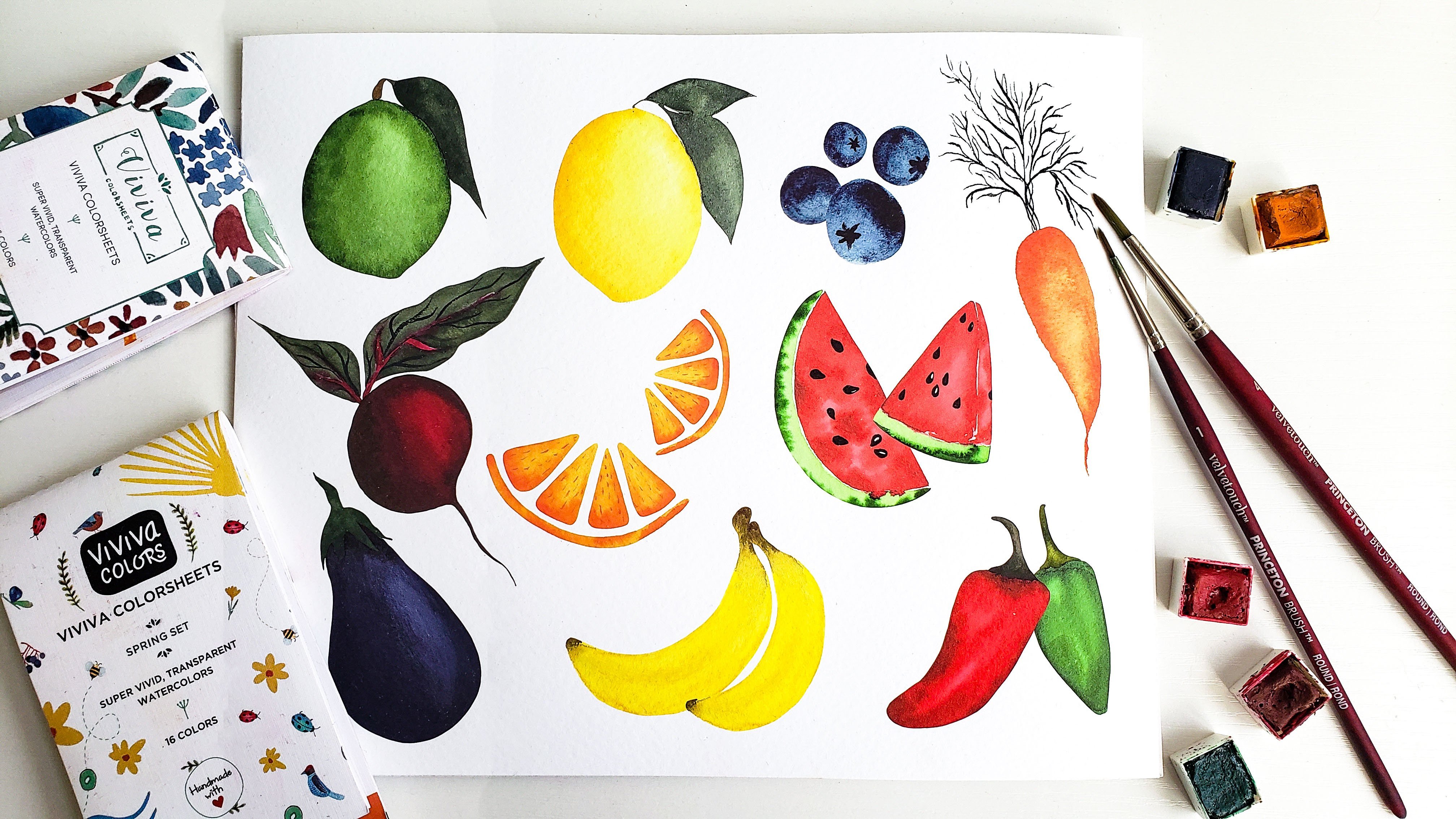
pop and look more three D, like in food illustrations. This is one of my art prints
from my kitchen collection, where I painted a handful
of fruits and veggies. You can see especially on the lemon lime, and blueberries, that there's a clear
highlight where the light would be
shining on the foods, which I created by lifting some of the color off the page. Let's start with a
basic example of lifting to help
demonstrate the technique. Go ahead and paint a swatch
of color on your paper using any color you like and make
sure it's a nice, even layer. Now, let's say you want
to create a highlight or lighten the value in
the middle of the swatch. All you have to do is rinse off all the remaining
pigment on your brush, dab off the excess water
on your paper towel, and then just gently
press your brush onto the page and lift the color
right off of the paper. You can do this
several times if you'd like to keep
lightening the area. Just make sure you rinse
off your brush each time so you don't accidentally
add the color back on. So now let's go ahead and
try this technique in a different shape to help
us repair for our lemon. I'm going to start by laying
down my initial layer. But this time, I'm doing it
in the shape of an oval. And again, you just want to make sure it's a nice even layer. And once the
pigments rinsed off, I'm applying my brush down on the paper to lift that
color right off the page. Now, if you want that to
be a little smoother, you can use some of the
blending techniques that we've been practicing
throughout class. You can continue lifting
color off and then using your clean damp brush to
soften out those edges. This is exactly
what we'll be doing in our lemon painting as well. As always, you'll just want
to keep your water control in mind so that it's not
pooling up on the page, but you have enough liquid in your brush to make
those soft edges. This first example is
a hard edge where we just show the example of
lifting color off the page. But this oval shape that we're working on
has a much smoother, softer effect to it. That's the highlight we want
to create on our lemon. What we're also
going to be doing in our lemon project up next
is tapping in shadows along the edges to really make
that lemon look three D. So I'm just giving a little bit of practice here on our oval shape, tapping in some darker
value along the edges, smoothing it out, lifting
more color where needed, so it just looks nice and
soft and three D. Now, it's generally easiest
to lift color off the paper while it's still
wet like we just did. But you can still do it
if your paint has dried. You'll just have to reactivate the pigment before lifting. This can be
especially helpful if you want to fix mistakes
like I mentioned earlier or erase splatters of
paint after they've dried. I'll show you a nifty
way to do that. First, you'll want to
take a clean brush and gently wet the surface, which helps to
reactivate the paint. Then clean off your brush again, tap it on your paper towel and start lifting just
like we did earlier. With paint that's already dried, you might have to do this
process a couple times to get your desired effect,
but it still works. In the next section, we'll
get more practice using the lifting technique as we paint our beautiful
lemon branch.
14. Lemon: Base Layer: Now that we know
how to lift color, let's put it into action by painting a lemon branch
with some leaves, using the lifting technique to create the highlight
on the lemon, which will give it more depth and help it look more realistic. We'll also utilize the layering
technique we practiced in the previous lesson to add shadows to the
sides of the lemon. We'll really start to
build all of these skills. Just a quick
reminder, the sketch is also available in
the resources section, if you want to download
that before we begin. The colors I'm using
in this project include a mixture
of lemon yellow, warm orange, and light
brown for the lemon. Sap green and indigo
for the leaves and a mixture of medium and
dark brown for the stem. I'm going to begin by applying a very light value of yellow across the entire
base layer of the lemon. I went ahead and diluted
it a bit more because my initial stroke was a little bit darker than
I would have liked. I'm making sure to leave the highlighted area
very, very light. We'll also use the
lifting technique to remove even more
of that pigment. But for now, I'm
just being a little more mindful to make sure I have a very light value in the area that the
highlight will be. Now, our base layer is done, and I'm going to use the
lifting technique to remove even more of that pigment
in the highlighted area. And we'll be doing this as we continue to add more
and more layers. But for now, I
really want to start off that area very, very light. Now, before we add
our darker layers, let's look at the example here. Around the stem is
where you're going to want a lot of
that shadow and then around the edges and
the bottom as well to help give it that
three D curved effect. I've grabbed a medium
value of my yellow, and I'm just going to
start slowly blocking in those values and
building up my layers. So we'll do quite
a few rounds of this to really establish depth. But here I'm just adding in those darker values around
the edges, around the stem. And again, I'm just being
very mindful to keep that highlighted area
a very light value. So I'm not going to be adding
my layers on top of it. But as I go, I'll continue using the lifting technique to make sure I'm maintaining
the light value. Now, I've grabbed an
even darker value of my yellow, and again, I'm just going to be
building this up, applying the darker
values where I really want to accentuate
those shadows. I'm just keeping my
water control in mind as we did with the
avocado project as well. I don't want it
flooding the surface, but I want enough that
it can bleed and that I can blend it out because I
don't want any harsh edges. I really want it to
look smooth and soft. As you continue to work on your layers and
really build it up, I just want to encourage
you to not get discouraged with
how your painting looks in this messy middle area. When I was first getting
comfortable working with layers, I honestly would end up
tossing out a lot of my paintings or I'd get super frustrated and just
quit working on it. Because a lot of times when
you're building up layers, it can look a little off in that kind of middle
part of your process. But as you keep
adding your shadows, blending things out,
building up your layers, it really starts to come alive. So, for example, when I was working on my practice one here, I really like how it turned out. But in the middle of my process, I almost ripped it
in half because I just wasn't liking
how it was shaping out. But I reminded myself
to keep going, keep adding my layers, build out the stem,
build out the leaves, and then I really was happy
with the final result. All that to say, I just
encourage you to stick with it, enjoy the process, and see
it through to the end. At the very least,
even if it doesn't turn out how you like,
it's a great practice. Now, as I'm adding
my final layers, I've added quite a bit of orange to kind of warm up
my yellow mixture, and I really want the
warmer shadows to be around the edges and where the
branch attaches to the lemon. I'm just going to be
adding these final layers and making sure to smooth
out all of my edges. And once I get to
my final shadows, I'm making sure that my layers beneath it are a little
bit more dry because I want these shadows
to really stand out and I don't want them
to bleed out too much. So keeping water
control in mind and just using a bit less water
for those few layers.
15. Lemon: Leaves & Stem: Now I'm going to
go ahead and move on to the leaves of the lemon, and we'll be using a lot
of these same techniques. So you can see I
have light value on the bottom edge that slowly
blends into the darker value. Once again, we'll start
with light values, tap in some more and
blend it all out. I've grabbed a very light
value of my green mixture, and I'm just going to apply a nice even base layer
to this first leaf. And now I'll start the process
of building up my layers. I'm grabbing a medium
value of that same green, and I'm just going
to start adding that in around the edge, keeping water control
in mind and softly blending them out,
just like this. Remember, if you get
too much water on your surface and
it's starting to flood or poll up on the page, just use a dry brush. Just rinse all the
water off your brush, dab it on your paper towel, and let your bristles soak
up that excess water. Now, I've let that base
layer dry quite a bit. Now I'm doing wet on dry
and I'm really going dark with this value
because I want the contrast to
be very dramatic. I've loaded up a dark value. It's not very watery, it's pretty
concentrated, and I'm just lining the edge of the
leaf with that dark value. That way, when I blend it
out with my clean brush, it creates a nice soft gradient, but there's still quite a
bit of dynamic contrast. So I'm just really
using that brush. To blend it out and create a
soft gradient on that leaf. Now, we will be doing
that same process on the rest of the
leaves as well. But before we start on
the right side leaf, I want to make sure that
your lemon is completely dry because this leaf is going to bump up right along
the edge of the lemon. If any of that pigment
was still wet, you'd have the
green from the leaf bleeding into the lemon, which we definitely don't want. Just make sure it's dry and then you can go ahead and
do your base layer, add in your darker
values and blend it out. I'm going to go ahead
and speed up this part, but just remember, it's
the same exact process. So now that the leaves are done, I've switched over
to a very small size two round brush for the stem. I'm actually using the
same brown mixture that I used for
the avocado peel. And I want to start with a
very light value to just apply a very light base
layer to the entire stem, and I'll be tapping in some darker browns
to add some texture. I want to make sure I'm
working fairly quickly here. But I want that stem
to still be pretty d. So be careful
with your lines. Use a small brush
if you have one or the very tip of another
brush if you don't have one. And make sure you connect
your leaves as well. Next comes my favorite part. This is such an easy way
to add great texture to a wood branch or
a stem like this. Just go ahead and grab a dark
value of that same color. Again, it's a mixture of
medium brown and black. While the base
layer is still wet, just tap some of that in
along the edge and you'll see that pigment bleed
into the rest of the stem and create
really great texture. Then I just go in between using a clean damp brush to soften
the edges a little bit, and then going back in
and tapping in darker. You just let it do its thing, let it bleed, and then
soften any rough edges. Again, it's a simple step to remove some of that pigment
and create our highlight, but it really does
help make the lemon look more realistic and it
makes the highlight pop. I painted the same
lemon without using layers and without lifting
color for the highlight. You can see again
how dull and flat it looks compared to what
we just painted together. I know I'm showing you a lot
of examples in this class, but I really want you
to understand how these new techniques can
truly enhance your artwork, even if they seem like
simple adjustments to make. At least for me, seeing side by side comparisons really helps
put that into perspective.
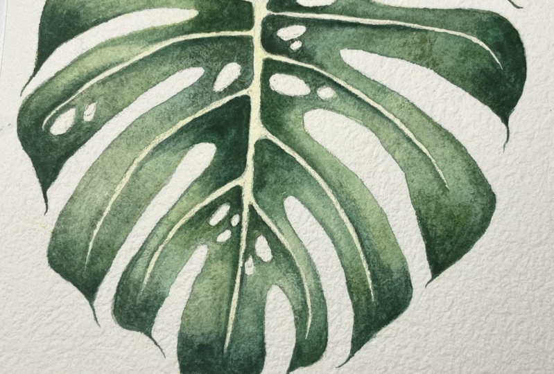
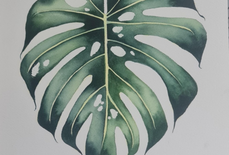
16. Monstera Leaf: Base Layer: Tiers to making it to
our final class project, the tropical Monstera leaf. We've learned a lot already, now's our chance to put all of our new techniques
into practice. The colors I'm using for this painting include
a light lemon yellow for the base layer and
various values of my green, which is hookers green, pains gray and indigo. I'm painting this leaf
on an eight by ten sheet of 100% cotton cold press paper, and I already have my monstera lightly outlined in pencil. As a reminder, you can
download my sketch below or you can draw your own
monstera leaf if you'd like. The first step we're
going to take is applying the masking fluid to
the holes in the leaf. If you don't have masking fluid, you can just paint
carefully around them. But using masking fluid
means you won't have to worry as much about
painting over it as we go. I've started by pouring
a little bit of masking fluid into
this little palette, and I've got my
specific brush that I use just for masking fluid. I'm going to start applying
an even layer of this onto each of the holes that
I've outlined in my sketch. I don't want it
to be super thick where it's pooling
up onto the paper, but I definitely
want to make sure it's thick enough
to cover the space, none of the paint gets into it once we start adding layers. As I mentioned, if you
don't have masking fluid, you can still do this
project totally fine. You'll just need
to be more mindful of painting around the holes. And I'm just going to
continue this process, adding my masking
fluid to each of the designated areas and
then I'll give it time to dry and you want
to make sure it is completely dry before adding
any paint on top of it. Once the masking fluid
is completely dry, we can apply our underpainting
or our base layer. For this, I'm going to use the super light
value of yellow and just apply a very light wash
across the entire leaf. This is a very subtle yellow. It's not going to make
a huge difference. But in the highlighted
areas of the leaf, I'd rather have a
yellow undertone shine rather than just
the white of the paper. And I'm just making
sure to apply an even layer across
the whole entire leaf. And since I have masking
fluid over the holes, I don't have to worry at all about getting any
pigment on those. Now comes the
process of adding in our greens and building
up layers using different tonal
values to enhance the highlights and the
shadows of the leaf. In general, we're going to have the lighter areas
in the center of each side and darker values along the middle of the
leaf and the outer edges. I'll be adding dark
values of green in those areas and then blending them together to a lighter
value in the middle. I'll just be careful to avoid
the veins going through the leaf because I want those to remain the
light yellow color. When I start blending
these together, I'm making sure that I
rinse off my brush often, so I'm not dragging too much
pigment into the middle, where I want the
highlight to be. This will be our process
throughout the entire leaf, adding the dark values
on either side, blending to a lighter
value in the middle, and lifting any
additional pigment in areas that need
to be lighter. But don't worry, I'll
do a few more sections if you can follow
along at a slow pace. Something else I want to
mention is that I'll be doing two layers
on this in total. This first time around, I'm blocking in my colors
and my values. Once the entire leaf is done, I'll go back in with
another layer to darken the shadows and
add final details. As you add your dark values, you want to make sure you're
working fairly quickly, so those areas are still
wet and easily blendable. If they dry out before you
get the chance to blend, you'll just have to add more
color and then blend it out so you can avoid
any harsh edges. You can also start to
see that some areas of my leaf are a bit more green
while others are more blue. That's why I really like to use a mixture of indigo and Hooker's green because I can
add a bit more of either color to get a varied
look throughout the leaf, so it's not just all the
exact same color of green. I'm going to go
ahead and speed up the rest of this layer
while you work on yours. But remember, it's going to be the exact same process
we've been doing so far. Then once the whole
layer is done, I'll show you what I'm doing on my final layer in real time. I know I it
17. Monstera Leaf: Final Touches: All right, so now my
first layer is done, and I'm really happy with
how it looks so far. But I want to add another layer to darken some of the shadows, sharpen my edges, and just make the color contrast a
bit more dramatic. The process will pretty
much be the same, but since I want these
shadows to be even darker, I'm making sure to
add more indigo to my mixture to
darken those values, and then I'll just
continue blending. As you work on yours, I
really want you to make these choices based on
what your painting needs. Don't just do what I'm doing
just because I'm doing it. Trust your artistic intuition, which areas of your painting
need more contrast, which areas could use
some smoother blends or sharper edges and
make those changes. Because even if we're following the exact same sketch and using the exact
same color mixture, no two paintings are going
to be the exact same. You have these new
skills in your tool kit, and now's your
chance to put them into use in the
best way for you. Again, I'll speed this
part up because it'll just be the same process all
the way around the leaf. Now my second layer is
done and completely dry. Now it's time to remove
the masking fluid. It's super important to make sure the paint is fully dried, so you don't end
up smudging any of it as you take off
the masking fluid. To do this, I'm just going
to use the tip of my finger and gently rub it off towards
the center of the hole. Masking fluid can sometimes rip off some of
the paper surface. If that happens, I'd rather be inside of the hole
where it's supposed to be white than accidentally
taking off any of my color. I'm just carefully doing that
to expose the white space. I'll continue working
my way around the leaf, carefully removing the
masking fluid with my finger. All right. The masking
fluid came off pretty well. There was one little spot here that tore off
a bit of color, but it's not too bad. Overall, I'm really
happy with how this project turned
out and you'll notice that the initial
layer of yellow that we put down isn't
super noticeable. But there are a couple of
areas where you can see the subtle yellow poking
through the highlights, and I really like
how that looks. Then the additional
layers of green and the darker shadows help
to bring it to life and make the leaf look
a bit more three D. I really hope you
enjoyed painting this monstera and you got some good practice using
the new skills from class. In the next and final video, I'll share some
additional resources and we'll wrap up the class.
18. Resources & Final Thoughts: Congratulations. You
made it to the end, and I'm so happy you
decided to join me today. We learned a ton of
stuff in this class, so let's do a quick recap
so we don't forget. We started with color values,
learning what they are, creating value scales,
and practicing, applying a variety of total
values to our artwork. We then took a deep dive
into color blending, learning how to create
soft and smooth gradients between individual
and multiple colors. We also learned all about
layering and how to apply base layers to enhance the warmth and glow
of our artwork. And we got plenty of practice
with our avocado project. And last but not least, we learned how to create
eye catching highlights using the lifting technique, and we practiced it on
both wet and dry pigment. With all those new
skills in our tool kit, we painted the beautiful
tropical Monstera leaf in our final class project. Now, I really want to
remind you that honing these skills does take quite
a bit of time and practice. So be sure to give
yourself grace, allow time to practice,
and make mistakes, and try to track your
progress so you can really see the difference between
old and new paintings. One of my favorite things to
do is look back on all of my old artwork to see how much I've grown and
improved as an artist. It's not always easy to recognize progress
in the day to day. But when I compare
where I am now to where I was even six
months or a year ago, the difference is
truly inspiring. I want to thank you again
for joining me in this. And if you enjoyed
painting alongside me, be sure to check out some of
my other classes as well. I have a wide variety of
classes on watercolor florals, seasonal projects,
digitizing your artwork, and even how to design and print your very own
greeting cards. So thank you again and happy
painting for me to you.
 Petals by Priya Watercolor, Watercolor Artist & Teacher