Transcripts
1. Introduction Interior Design: Would you like to create
realistic visuals of interiors without any three D modeling
and rendering applications? Well, you came to
the right place. And Martin, I have over 20 years of experience as a
graphic designer, illustrator, and Adobe
certified instructor. I have worked with companies
like BBC, Disney, Google, IKEA, and I cannot wait to share my best
practices with you? This is a streamlined
hands on course focusing on a real
life design project. I will be walking you through
everything step by step, and you will get all
the exercise files so you can follow along. In case you prefer
not to copy me, you can also follow my workflow using alternative
assets provided and create something
completely unique that you can showcase in
your creative portfolio. I am pretty sure
this course will inspire you to create
something amazing. This course, we will
learn how to use a OB photoshop to create
convincing composites of images. We will start with photographs
of existing spaces, clean them up by retouching and removing unwanted details. Finally, we will
fill them up with furniture, plants,
and decorations. We will use features like smart objects to
simulate perspective, to apply materials to surfaces. And we will use
adjustments and filters to match lighting and colors
between multiple images. You can join this course without any prior knowledge
in graphic design, illustration, or
Adob applications. But to complete the project, you will need access
to AOB Creative Cloud and the desktop or
laptop computer. But now it's time
to start creating, so I will see you
in the next lesson.
2. Interior inspiration: This project will be
perfect for you if you're interested
in interior design, and I'm going to show
you the techniques, which will help
you to be able to visualize anything
that you imagine. This workflow got easier
and more exciting since the introduction of generative
AI features in photoshop, but I wanted to mention
that I've been using photoshop for a long time
for this type of work, including changes to
our own properties and also properties of our
clients because it is always more exciting to see something that looks realistic like a photo compared to a
CD drawing like this one. So here is another example
of a photo of an interior, which then got turned into something
completely different. Once all the visual elements and textures were placed
in inside photoshop. So without any further delay,
let's start decorating.
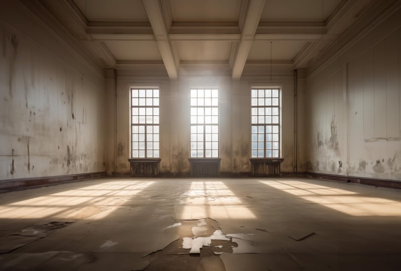
3. Preparing the interior: Once you open one
of the images in photoshop that I prepared
for this project, the first thing you will have
to do is to tie the up a bit and make the interior look a little
bit more presentable. So all the examples that I
prepared are intentionally look a bit run down and
derelict or abandoned. And the problem with
that is that if you are planing to add anything with
the generative fiel feature, it's also going to
resemble that esthetic. Anything you will add will
also look quite old and dusty and just generally not the aesthetic
that we are after. So time to tidy up. First of all, let's
create a new layer. I'm going to click on
the new layer icon here. And on this blank new layer, I am going to use one of the best retouching tools for this job called the Remove Tool. This one, you can select by pressing J on the
keyboard as well. But be careful because
it might select a very similar tool called
spot healing brush tool. So it's always easier
if you right click on this tool here and
choose it from the menu. Now, once you have this tool, this is going to
work like a brush, and you can increase,
decrease the brush size by using the square bracket
keys on the keyboard. One is going to increase it, the other one is
going to decrease it, or you can also hold down the
control and option key on Mac and click and drag left and right to quickly change
the size of the brush. If you are on the
PC, it's control, old, right click and drag. But this tool, you can work on a separate layer
non destructively, meaning that you
are not going to affect the original layer, as long as you have the sample all layers option turned on. So make sure that
you take this one. And it's recommended
to also keep the remove after each
stroke option turned on, which allows you to
work much faster. So, for instance, if I
just paint the line here, as soon as I let go, it will immediately start
retouching those details. You can also do with this
tool is to draw over an area, just highlight that area, and it automatically
going to fill in the details within
that selection. I'm going to show you this
again here at the bottom. I'm just going to make
a selection like this. When I let go, it automatically fills in the center
of that area, and it's going to replace
everything inside. Now, the results will vary. Sometimes it will be spot on
and exactly what you need. Sometimes you need to do
it a couple of times, so you need to go
over that section. In this case, I'm going to
make another selection here and keep updating it
until I am happy. So I don't actually want to have more light coming
into this area. So I'm going to try to force
photoshop from doing that, and that's already looking
a little bit better now. So let me just do
another selection here. And then I can just draw over this line here
at the bottom, and it's already
starting to look better. Smaller detail there,
some more detail here, and then keep drawing
over these bits. Here's another bigger area. I can draw over and let
photoshop fill it in. And it's already looking tidier. We can also tidy up
around here just to make sure that we will get
a much cleaner result. So we can turn off this
layer that we created, see before and after, and it's already
looking much better. Now I'm just going to go over
the details on the walls. And again, I might need to do this a couple of
times until I can remove all of these
blemishes or dirt from the walls and make it look more
presentable and neat. As you can see, I'm
doing smaller sections. I'm going through each of
these areas one by one. The great thing about
this tool is it's not copying any detail directly, so it's really good
the way it's mixing up details from the image and
combines them together. So it's not going
to be as obvious as using a tool like
the Clone Stamp tool, which would just
copy paste details from one part of the image and
just keep repeating those. So it's much faster and more effective working
with this tool. And you will notice that the more areas you
tidy up in an image, the faster it starts to get to remove any additional
details because, of course, it's going to have more areas within the
image to reference, and the more tidier
areas you have, the more effectively
it can work. So I'm just going to tie the
up a little bit more here. Probably we'll get
rid of this line in the center or just soften
that detail there. I want that wall to be more
flat, something like that. Now, we have to also
tidy up these parts here on the front between
the windows. Again, I want to make sure
that those look tidy. I'm painting over them, but I want to keep that
feature in the center, that vertical column that's
in between the windows. I want to make sure
that doesn't disappear. And also, I don't want the
window sills to be bigger. So you might see me
sometimes just going back using Command
Z on the keyboard, just doing an undo, if I'm not happy with a detail. That looks quite good. And then we can tie the
up this side as well. I might get rid of
this column here. On the left side, I don't
think that's necessary. We can tidy up the corner. Of course, I don't want
to lose that corner, so I want to make sure it's still going to look
like a corner. Let's just see if we can do
that. Maybe here on the top. We need to tidy up a bit more. I feel like that's
looking quite good. A little bit dirt
here at the bottom, and that's looking
much neater already. Now, we could go further
and refine all the areas, but maybe one last
thing I'm going to do is to remove these
hanging cables. I can see another one here, and there's one more
here on the left side. Notice how I also change the
brush size as I'm working. So constantly adjusting it to the areas that I am trying to recreate or improve
some more blemishes or dirt that I'm
trying to remove. And now we can again
see before and after. And it is already
looking so much better. I'm thinking I'm
also going to remove these radiators
below the windows. And for this, I'm actually
going to use another tool, the Clonta tool because
I want to extend these windows and make
them look like they are almost going all the
way to the floor. I am going to hold down the old or op shan key and click on this point
here in the image. So I'm sampling from
that corner point. And I will also make sure that the sample is set to all layers. That way, we can paint with this tool on this
additional new layer. Again, working non
destructively, not changing anything on the
original background layer. And once I sampled, once again, it was old or option key and click on the area you
want to sample from. And then since this
is a brush as well, you can increase and
decrease the brush size, and you should be able to see a preview of what
you are sampling. You can then align it to where the radiator is and just
start painting over. This way, we can nicely extend the window and come down
all the way to the floor. Now, that is a
little bit too far, so I am going to
use the eraser now. So I can come all the
way here and switch to the eraser tool or press
E on the keyboard. Just delete back a little
bit of that detail. So yeah, something like that. I feel like loose good. And I'm going to repeat
the same step here. Once again, I'm
using the Clonstm tool sample from
this point here, align it, then paint, and painting over the
walls as well a bit. And we can always
refine this later. F now, I just want to make sure that the
radiators are gone. And then switching
to the eraser tool, I am again just painting over
this bottom section here. So we still want
to have a sill for the window visible.
Something like that. We can also change
the hardness of our brush by using that keyboard shortcut
I mentioned earlier. So control option drag. But instead of dragging
left and right, if you drag up and down, you can adjust the
hardness of your brush. This is another
thing you can access from the menus here
on the top as well. You can just drag the
hardness up and down. Now, if I'm using
a zero hardness, is going to make sure that the edge details of my
brush is looking better. I can just go back here and draw over the edge
a little bit more, just to make it softer,
the transition. And I'm going to
do the same thing once again using
the Clonsem tool, align it to this point, l or Option click, and then paint over
that area with the radiator and a bit of the
wall, something like that. That is looking good. And use the eraser and
just erase back a bit. And that's one of
the big advantages of working on a separate layer, you can easily go back and
forth between the two. Now most of the detail that we created here will be
covered up by the sofa. But I am going to switch
back to the remove tool, and I'm going to just refine
this area here a bit. So if I paint over
that side there, it's going to adjust
the lighting there, make it a little bit more coherent to the
surrounding details. So it aligns it a
little bit more, can do it here on the
right as well just a bit and go down. Yes, I feel like that is
looking much better now. So once again, before and after, we are pretty much done
with the tidy up phase.
4. Adding the floor detail: Now it's time to add
some nice details, and I'm going to
start with the floor. I would like to make
it look like it has a beautiful wooden floor. And for this, we will be using another image
that I prepared. You can go to the file menu
and choose Open and navigate to the folder called furniture and textures within
this project folder. And there you will find a
couple of floor patterns. I'm going to work with
this particular one, so I will just open this one, which will open as a
separate document. And here, go to the select menu and choose A or press
commando Control A, And once the selection appears, go to the edit menu and
choose define pattern. This will allow us
to use this later as a pattern overlay layer style. So I'm just going to click Okay, and then we can
close this document, just simply go to
file and close it. Now, to be able to use
this in our interior, we will have to also
create first a rectangle. So from the shape tools, select the rectangle tool and make sure here on the top
it's set to shape mode. Then click and drag and draw
a fairly large rectangle. If you hold down the space
bar while you are drawing, you can reposition the shape
and just have more space for it in case you
started drawing it in the wrong position. So I'm going to draw
something like that. And then I will double
click on the layer. Here on the right side
in the layers panel just double click near
the name of the layer. And then within
the layer styles, I want to use a pattern overlay. Whenever you use a layer style, just remember, it's not
enough to click on the tick. You have to click on its name to be able to see all
the settings for it. So, for instance, if
I turn on inner glow, it doesn't give me
the settings for it, only once I actually
click on the name. So that is a common mistake. Once you have the pattern
already selected, you will be able to change
the pattern itself. And by default, it should select the most
recently used one, but it might have something
completely different. Let's just say like this one. If I then want to choose the
one that I just created, I will go to that
one at the end. Once this is selected, there is a setting
for the scale, which you can
increase or decrease, and you also have a
setting for the angle, so you can decide
whether you want it going horizontal or vertical. I actually prefer to keep
it vertical because in this image that's
going to give us a really nice perspective, and I'm going to probably
reduce the scale a little bit to
something like that. I think that looks quite good. I'm going to click k now. And then what we need
to do as a next step is to turn this layer
into a smart object. Now the reason we need
to do this is because if we were to just
transform this layer, the pattern itself is not going to have perspective on it. So I'm just going
to show this to you if I press
commando Control T and start dragging one of the corners while holding
down the command key. That's the way to create
a perspective distortion. As you can see, it's not
going to affect the pattern, so the pattern stays the
same, completely flat. So to be able to work
in a way in three D, we will have to turn this
into a smart object. So right click on the
layer, the shape layer, and choose convert
to smart object. Once you've done that,
you will be able to do the transformation
in perspective. For this, you will need to
use the commando Control T shortcut or edit free
transform feature, and use the commando
Control key while dragging the corner points to add the perspective
distortion. And as you can see, now, the pattern is reacting
to this distortion. This is exactly what we needed. So I can drag these
corner points here and align it to the image. I can zoom closer
just to double check, and make sure that it is as close as possible to the
alignment that we need. I feel like that is
looking quite good. And then there is
another useful shortcut. If you want to extend
any of the size, just hold down the shift
key and drag it out. So if you had it too small, you can just drag
it out, make sure it fills up the image
here at the bottom. And another quite
complicated shortcut, but still very useful one is
the perspective distortion, which is command
optioned shift on MAC or Control old shift on PC. And with that, you
can click on one of these corner points and
start dragging it out. You will have to actually
drag it out quite far to make sure that it aligns
to the edge of the wall. The good thing about this
shortcut is if you do it, it will automatically
do it symmetrically, so both sides will adjust
to that perspective. So if I do this again, you can see it's
happening on both sides. So something like that, I feel like is looking good. Maybe a little bit more. Just drag it out a bit more. And I feel like that
is perfect for us. So I'm going to press Enter
to accept the transformation. And then we can have
a look at this, and I feel like it is
looking really good. The perspective is
exactly what we needed. The texture is looking
great as well. And if we ever want to go back and make adjustments
to the pattern itself, we will have to double click
on the layers thumbnail. So this thumbnail here, I have to double click on it, which will open the source of
that smart object document. So it's a separate document. Here, I will be able to
turn off the pattern if I wanted to or double click on it and go back and
adjust the scale. So if I feel like it was a
bit too small or too big, I can always come
back and adjust it. I'm going to click, and
then go to file save. So any changes that you do,
you will have to save it. Because, like I said, this
is a separate document. And when I go back to
the other document, the main one where
we are working in, here I can see before and after, and I can decide whether I
like the changes or not. By the way, I'm going
back and forth with the edit undo and redo commands. So I can see that was before, and this is after actually prefer it to be a
little bit bigger, so I'm going to go back
to this previous state. I just wanted to point out
that you can always go inside the smart object and make
those amends if you want to. Now, you can experiment with
multiple patterns as well. So, for instance, if I go
again inside the smart object, all I have to do
is to just create a duplicate layer that's
command or Control J. So that's going to have another rectangle inside this document. Double click on the
pattern overlay, and there you will
be able to choose any of the other saved patterns. So if you import more, like I showed you earlier, you will have more options
to choose from here. I'm just going to show
this quickly to you. Maybe we have a texture that we like like
this one. I click. I save these changes. And then I can just switch to the other document
to see this update. It's going to remember
the perspective, and it looks great. But this is not the style
I want for this document, so I'm going to just simply
turn off this new layer, save this document
again, close it, and then it should revert
back to the other texture. So that is looking good, and I'm going to start naming
my layers because it's going to be hard to find out what's happening
if we don't do that. So the layer on top
is called floor, and this I'm going
to call clean up. So we can see the floor
before and after. Now, one thing that I notice
straightaway that we are missing is this lovely light that is coming from the windows. And that's something I
definitely want to keep. So one thing that
you can do is to reduce the opacity
of this layer, the floor layer, maybe to
around 60% or maybe even lower. And then you already start to
see the light coming back. Of course, this means
that we are also reintroducing the
original floor. And as you recall, it was
quite a neutral floor, so it doesn't really affect
much in the composition, but still it will have a
little bit more cracks and details that you
might not want to see. So although you can
reduce the opacity, maybe down to 80%, just to make it a little
bit more blended into the lighting and the general
atmosphere of the document. What I recommend
to do is to turn off your floor layer just temporarily and
make a selection of these windows with the
polygono lasso tool. Once you find this tool, all you have to do is to make a selection around the light. Here on the left side, I just
go outside of the document. That's the my selection. Then I'm going to press and hold shift key to add
to this selection. It's enough to press and
hold it at the first click. After that, you can just keep making your selection
until you close it. Then again, hold down
the Shift key to add the third window light. And come all the way
around and close it. Now we have all three of
these lights selected. We can go to the background
layer and duplicate these onto a new layer by simply pressing
commando Control J. So that's going to copy and paste onto a new
layer, the lights. Now, if we turn
back the layer with the floor texture and put
this new layer on top of it, which is the window
lights, I'm going to call. This is going to look
strange because, of course, it has the original
textures on it as well and some details that
we don't wish to see. But what you can do is to
change the blend mode of this layer to overlay
or soft light. I actually find soft light
to be the better one. Overlay may is a little
bit too intense. But you can decide
which one you prefer, and you can experiment
with other ones as well. Like screen is actually
a quite good one too, maybe with a bit reduced
opacity that could work well. However, I am going
to stick with soft light with 100% opacity. And what I'm going to
do is to add a mask on this layer because I would like to refine the edges a bit. So the layer mask can be added with this icon here
at the bottom. Click on this icon, which looks like the Japanese
flag, I always call it, and then simply use
a soft edge brush, so the normal brush tool. And I'm going to adjust my size as well and the
hardness of it like before, and make sure that you have the black color set as
your four gram color. So the brush tool, drawing with black with
a soft edge brush, and I'm going to draw
over the edges now. And you can see that we
can refine these edges and just generally have a much better blend
in the details. Something like that.
This sit here can be a little bit reduced. And then I feel like the
rest is looking good. So let's see before and after. Yeah, that is definitely
looking much much better. So we added the
new floor texture, but we still retain that
lovely light that was coming through the windows
from the original image.
5. Painting the walls, Polygonal Lasso Tool: Now it's time to
paint the walls. For this, I'm going to use the
polygonal Less tool again, and I'm going to start
selecting the wall. I would like to paint. So I'm going up
all the way there, and then go around the
edge of the document. So this way, I created
an nice selection. And this is the first
time we will be using the generative fill
here in this document. In case you haven't used it
before in the other projects, you can find the
contextual task bar from the window menu. This is where you
can turn it on, and you can decide where you want it to appear by
moving it around. I am going to click on Generative fill since we
already have this selection, and I'm going to
just type in blue all and then it Generate. Now, depending on
the image you work with and depending on
your selection and the state of the document in terms of how much changes
you made to it already, you might get a
different result. It's very hard to predict how
the generative field works. But most of the
time, this should give you a fairly good result, and I can even see some other
options coming up here. I actually like this
third one probably, although there are
some details that I will need to change
there as well. Okay, I can work
with this first one. The only thing I'm
not sure is that it didn't fill in the
rest of the details. So this part here should be blue as well and
the top detail. My selection was a
little bit larger. So I'm going to try to fix that. I'm going to generate a new set. I might get luckier this time, so I'm just going to use
the properties panel and click on generate while
this layer is selected. And this time, we got
a little bit closer to the edges compared to
the previous results, but I actually prefer the
colors on this layer. So I'm going to stick
to using this one. But what I will do is to tidy this up a bit
on a separate layer, so I create a new layer, and I'm going to use the
removal tool again and just paint over these
little blemishes that were created here. Because I want this
wall to be completely neutral with no mistakes
or no blemishes on it. But I really like what Photoshop
did with the lighting. I think it did a really good job matching the interior
and the lighting. So I'm going to use the Lasso tool again on the right side. L et's try to make
a similar selection on this wall here on the right. Again, I will try to align
it as close as I can, and then type in
again blue wall. Now, since we already have a
blue wall on the left side, most likely the sampling
is going to take that into account and it's going to make something
more similar to that. You most likely won't get
a different shade of blue, although this is a little
bit more saturated, but the second one
already is looking much closer to what we
have on the left side. And then this is
looking quite good, too, apart from maybe
that small detail there. But what we can do is to hit generate again from
the property spanel, which is going to give us additional options
to choose from. It's always worth doing this at least once or twice until you get selection of
variations. So let's see. Okay, that's quite interesting. Oh, that looks very
nice and neat. So, yeah, we have almost
like a curtain here, more textured result as well. This is looking quite
interesting, too. But I quite like this
very neat version. That looks nice, and it really did a good job
around the edges as well, so tied that up beautifully. I am very happy with this, so I can actually put these
three layers into a group. So the ones that I
use for the walls, just so I can find them
easily in the future. Select those three by selecting one and command or Control,
click on the others, and then use command
or Control G, which will create the
layer group for you, or you can find this option
from the layer menu as well. There you can find the
group layers option. So once you have the group, you can call it walls, and we can see it
before and after. So that's what we added there.
6. Decorations, details, lamp: Now it's time to
add some furniture. I'm going to use the
rectangular Marquee tool. It's M on the keyboard. And with this, just
make a big selection in the center of the image,
something like that. You can hold down the space bar again with this tool
while you are drawing your selection in case
you want to reposition it within the document
before you let go. I'm going to draw it
somewhere around here. And then from the
contextual Tas bar, I can click on Generative
fill and type in white sofa. And this is looking really nice. Let's just see the
other results. So we have that one as well. And then we have that one. And the only issue with
these results is that the windows are modified. They are much smaller now. And if that's a problem
and you want to fix it, I'm going to show
you how to do it. But first, let's just decide
which sofa we like the most. I actually probably
like this one the most. It's quite nice. So that was without the sofa,
and this is with it. And definitely the windows
got much smaller now. I actually don't mind them
being smaller to be honest. But in case you wanted to
see the original windows, what you could always
do is to select the layer mask for this new generated layer,
the white sofa one. So there's the layer mask, that black and white thumbnail, and then you can
use the brush tool. So select the brush tool, in this case, probably
keep the hardness to 100%. And by drawing with black, you will be able to reveal
the origin of windows. So we can draw over these details here and
start revealing them. As you can see, I
can go over it. And of course, it will
take a little bit time to make sure that it's nicely
aligned all around. But with a little bit more time, I would be able to get them back exactly the
way I wanted it. That's something you
can do, and it's a completely non
destructive technique because you can always go
back and use the white color. So if you switch to white
here in the toolbar, with white, you can paint
back those details. That were generated
with this new layer, so I can just simply paint with white and bring them back. So it's completely
non destructive. The main issue with the
generative fill in general, is that because it generates not only the
object that you want, but also its surroundings within that selection that
you created originally, it means that this object, we can't just move
around easily. So if I were to move it around, you can see all its surrounding is going to start
moving as well. So, yeah, that's just simply
something to bear in mind. But that's not a
big problem for us. But what we need to
still fix is that the window lights are not showing up here around the sofa. So I'm going to switch
back to the mask of that layer and use the brush tool with a
soft edge this time. And just simply paint over
these areas with black. So using black, and just go over that part and this part here
and also that part there. So, of course, the light would be obstructed
by the object. So we have to also take
that into consideration. Maybe hide a little
bit more detail there, hide a little bit
more detail here. Of the light,
something like that. I think that's quite
realistic now. So that's obstructing the light, and it is looking quite good. So before the sofa
and after the sofa. And now let's create
another selection with the rectangular
marque tool. I would like to have a plant
here on the left side, so I will it somewhere around there and just
type in house plant. And that looks
quite nice already. But let's see our options. Out of these three, I actually
like this one the most. It looks very realistic. It has nice shadows around it. The plant itself
is looking nice. So yeah, I'm happy with that. I'm going to keep that there. And then let's put a lamp
here on the right side. So I would like to have a nice lamp somewhere
around here. Again, we generated fill, I'm just going to type
in standing lamp. Maybe let's make it a
copper standing lamp, just to make it more stylish. And that first one looks
more like a street light, so I'm not going to use that. The other ones are not
looking that good. Maybe if I just type in
a modern standing lamp and generate three
new variations, let's see how they turn out. Okay, so this one is already
looking much better. I feel like the first one is the best in terms of
perspective as well. I feel like that fits
the aesthetic the most. From this point on,
it's really up to your imagination and creativity, what you
would like to see. But one additional acute
detail that maybe we can do together is to add
a cat on the sofa. So I'm just going to do
generative fill, cat sleeping. And animals and people in
general can be a bit tricky. So the results vary a lot. Sometimes it's spot
on what you want, but you might need to do
a couple of generations. Like in this case,
this cat looks a little bit strange in
terms of proportions. That one looks much better, and that's cute as well. So yeah, I quite like this cat. I'm going to keep that
one and maybe add the pillow here
on the left side. I'm just going to type in
here blue pillow cushion. Let's see that one. And maybe the second one this
time is the best. Yeah, I quite like that one. It just nicely matching
the colors of the walls.
7. Place embedded, furniture: Of course, you can't always rely on generative
fill in case you want to have a
specific furniture placed into your interior. So to practice this, I
would like you to go to the file menu and
choose place embedded. And then navigate to the folder where you
had the patterns. You will find a couple of
furniture images here, like this white armchair. Once you place that in, is going to come in
as a smart object. So we can resize this
maybe to around that size, and then press enter to
accept the placement. So this obviously is already isolated from
its original background, which makes it a little
bit easier to work with. However, we still have to get
rid of the wide background. And the easiest way to
do that is by going to the select menu and
choose subject, which should automatically
recognize the chair itself, and then click on the mask
icon in the layer spanel. That way we can mask
this image out. And you might want
to flip it around. So if we want to put it
here on the right side, I think it already looks good. But maybe if I want to place
it here on the left side, I can go to the edit menu and choose transform
flip horizontal. That way, we have
it flipped around. And one of the first
things that you will have to do
whenever you bring in another photo into your
composition is to try to align the perspective
and then the lighting. So in this case, the
perspective is fairly simple. Use the free transform tool, commando Control T.
And then look at the legs of the chair and
zoom a little bit closer. If I align it to the floor, these two legs should align. And also, those two legs should align to the
lines on the floor. That will help us to get
the perspective right. Hold down the commando control
key and start dragging the corner points until
it's a closer match. You can also use the side points a little bit keep dragging
until it's aligning better. The front two legs
are better now. Now it's the legs in the back that's a little
bit still distorted. So I'm trying to align those
as well at the same time. Can be sometimes a little
bit more tricky to do that. Feel like that is
looking already better. So let's see before and after. It's a subtle change, but it's still better. I feel like I can place
it somewhere here. And now in terms of lighting, what we can do is to bring
back the original shadows of this object by
duplicating this layer, that's commando Control J. And then set the blend
mode to multiply. Then delete the layer mask. So right click on the layer
mask, choose deleted. This way, we get back
the original shadows. So multiply blend
mode on its own without the original layer
would look like this. It would just cost
anything that's darker on the current layer
onto the environment. But because we have
two of these layers, we have one set to normal
blend mode. Which we must out. And this other one, the two
together works really well. And I actually prefer the
colors or the lighting on the chair itself once we have the multiply
layer turned on. So this way, it
looks much better. You can see without the chair, and with the chair, I feel like it is looking really good. In some cases, the
multiply effect might make the actual object
itself too dark, and in those cases, just use the layer mask, so add a new layer mask
and using the brush tool, just paint with black
over the areas, which you want to keep still in its original
lightness or details. So in this case, we
could use this just to add a little bit
more light here around where the light is coming from the
windows like that. So without the mask
and with the mask, that is actually helping, again, to align the lighting or synchronize lighting
in the composition.
8. Adjustment layer, ceiling: Last but not least, I wanted
to also brighten up a bit the ceiling because that's exactly how it looked
in the original image. We only tied it up a bit, but I feel like it could
be a bit brighter. It looks slightly off it
just doesn't match again, the aesthetic that I am after. So for this, I'm going to add an adjustment layer on
top of all my layers. We can find the
adjustment layers here in the layers panel. For this, I'm going to use
the curves where I can just simply click and
drag the curve and make it brighter like this. I can adjust it, move it
around and look at the image. Well I like the most. I think that brightness on the ceiling is going
to work for me. Of course, it makes
everything too bright now. But because we have this on a separate layer and
this layer has a mask, we can decide exactly where we want these
effects to show. So I'm going to
select that curves layers mask and use
the gradient tool. With the gradient, we'll
just make sure that you have this first swatch selected,
the black to white, and the linear option, and then click and drag from the windows up to around here. The good thing is that you can always adjust these two points, so you can decide where you want the effect to apply
in the composition. Feel like something
like that works well. So before and after, it really is just affecting
the top of the image. And fills it up with light. So the rest of the image
is not getting brighter. That was already bright
enough in my opinion. And yeah, I feel like that
is looking much better.
9. Final checks, thoughts: Now we can see the
original image once again. If I hold down the
Alt Option key, I can click on the icon, hide all my new layers. This was before,
and this is after. Of course, we can also put all of these layers
into a group, select the layer at the
bottom, te clean up, and then shift click on the
top to select all of them, and then commando Control G, to put them into a group, and then we can just
call it changes. Now we can just easily
turn all of them off, and then back on again. I'm quite happy with the
result we got, but of course, it's up to your creativity now to come up with an
interior that you like. Feel free to add more objects, experiment with different
styles and aesthetics. And of course, also, besides experimenting with all the original settings
that I created, try this out on your own images. So take a picture of any
interior that you wish to amend to and visualize
how those would look like, and then fire a photoshop
and get started.
10. Workflow perspective pattern: Love doing interior
design mockups or visuals in photoshop. Today I'm going to show you one of the
coolest techniques, which is easy to learn, but it's actually a quite
advanced and complex method. This is for creating
repeated patterns like here, the floor, having these
floorboards showing. You can see it's actually
not the original one. I replaced the original one, but to create
something like that, and something that you can
easily adjust later on, That's what I'm
going to show you. We are going to
use a smart object with a vector shape
in perspective, and on top of all of this, a pattern and a gradient
overlay layer style. So let's see how it works. It's actually much
easier than it sounds.
11. Pen Tool, edges, floor : When I start working
on a visual, it usually looks like this. That's the photo I
took of the space. Then first of all, I
started cleaning it up. I got rid of a couple of
things that I won't need, and then I start adding
all these details. You can see I keep everything very structured
and I even have additional options
that I can turn on and off and see what works best. It really helps to decide how to do the interior
design of the space. The floor is what we are
going to concentrate on. I'm going to just turn off all the details
and as the floor, and I'm going to
turn off this layer just so you can see how
I do it from scratch. The first thing I would
normally do is to use the pent tool and
set to path mode, or you can also use it in shape mode, whichever
you prefer. I actually prefer
it in path mode, and it's important
that you need to make sure it's set to combine shapes. So as long as you have that on, you can start drawing. I always start
drawing from outside, and then just roughly for now, I'm going to identify the
edges that I need to keep to. So under the skirting, we go around and follow the
line that we need to fill in. You can see I'm not
really bothered about being too precise. Because what we can do
is once it's closed up, the whole shape, we
can always tweak this. For example, if I go zoom
a little bit closer, you can see this line
needs to go further out. I'm using the direct
selection tool and simply dragging
that point out. Then I just quickly check
like this can go in. When you select
something, you can even use the arrow keys on the keyboard to push it in to maybe somewhere
around there. As this one can come up to maybe here and so
on and so forth. I would be able to refine this further, but I think it's fine, maybe just this last point here, I'm just going to drag out
a bit that way. All right. This defines the
plane on which we need to create the pattern
for the floorboards. What I'm going to
do next is to turn this path into a vector shape. The way you do that
is by going to the little yin yang sign at the bottom and choose the
solid color adjustment layer. So once that's created, we can click, I'm just going
to set it to gray for now. It doesn't really matter
what color it is. Click k, and you can see
that is already there. The next step is going to be to create another vector shape. But for this one, I'm
just going to use the simple rectangle tool. Again, this one, I use as shape, and I'm going to keep everything the weight is and
click and drag to define the area on which I'm going to
apply the floorboards. Let's say something like this. Usually, I just cover the
whole canvas with it. And then once that's created, we can find a texture that we can use for
the floorboards. Now, I already have
two prepared here, I have a brighter one
and I have a darker one. Let's start with the dark one. I'm going to use command or
Control A to select all, and then I choose edit
and define pattern. That is going to create a
seamless repeatable pattern. Of course, it's
important The image that you use needs to be already
prepared in that way. That's a whole
separate technique, which I'm going to show
you in a separate video. Now let's just say we found this actually,
I found this online. You can also search for it. The same thing if
you just search for wood texture or
floor wood texture, you will find something
similar to this. I'm just going to
call it dark oak. It actually could be walnuts, so I'm not going to call it oak, so I'm just going to
call it dark wood floor, and then. Now that's safe. I can even close this image. I don't need it anymore, because now what I can
do is to go back here. Double click on the layer, the rectangle layer, and then
from the pattern overlay, I can find the most
recently saved pattern and with the scale option, I can start increasing or
decreasing the scale of it. That's a really handy
feature which you can use to adjust the size. Once I click, we will be able
to start working with this. Now you can see
when I Zoom closer. It looks much more detailed, just from a little
bit further away, it doesn't look as detailed. But now what we can do is to turn this into a smart object. The pattern overlay is going to be inside
the smart object. And there is a reason for that. Actually, I'm going to create a duplicate just so I
can show it to you. So in this case, for example, if I
use this layer, and I wanted to use maybe
a distort option on it, holding that commando control, you see that it's not going to add perspective on the pattern. So the pattern is going to just stay flat two dimensional. So instead of that, I am going to turn this into
a smart object. So right click. Convert
to smart object. And then I can use the free transform tool and
holding down the shortcut. Command option shift
or control or shift. You can create
perspective distortion, and then I can just simply without the shortcuts,
drag it down. Again, drag it further back in. I can start applying the
perspective distortion. Most of the time, I
would just hold down commando control and start dragging the corners into place. So here again, I
will drag that out, drag this out as well and align that corner into
that corner up there. I'm just going to make sure
that this aligns here. The cool thing is that you can always drag this further out, if there's more space
you need to cover, and it's going to still work quite well with
the perspective. So if you want to
see this in context, you can also reduce the opacity, and you can make sure it aligns well with
all these lines. So when I use the
free transform again, I can just drag it up a bit
and I'm paying attention to the lines of the floorboards and the lines of the
skirting in this case. So I can just make sure that this aligns a
little bit better. So you can see how
those perspective lines are following the skirting
here and also here. I think that looks quite good. So now if I set
the opacity back, then it will work quite well, but let's not forget that we
created that vector shape, which we will be
using as a mask. Now that I have
these two objects or layers on top of each other, all I have to do is to use the alt option key
in between the two and click to create
a clipping mask. That way, the shape we created at the bottom becomes the mask, and this smart object
is clipped onto it.
12. Different floor surfaces: That's how quick and easy it was to set this up in perspective. The cool thing is
that if I feel like this floorboard actually in
terms of scale is too big, maybe the actual elements of these floorboards needs
to be smaller or bigger, all I have to do is to double click on the Smart
objects thumbnail. And within there,
double click on the pattern overlay layer style, and just adjust the scale. Let's say we need
to make it smaller. I can just reduce the scale, click Okay, save
this. It's important. When you are within
a smart object, you have to go file save, and then when you switch back, you see a date updated. The other cool thing
is when you are making amends within a smart object, you can stay in the main composition
and just use undo do, quickly see the
difference between the larger and the
smaller floorboards. I'm just going to keep it on the larger one I think
it works quite well. But not only that, you can also have
multiple textures used in the same composition, and you can experiment
with whether darker wood or brighter wood will work better in this space. The way I would do that
is similar to before. I just find a texture that
works as a repeated pattern. Turn it into a pattern. So I'm going to do the same
thing and I'm going to call it light wood floor. And now it's saved, I
can close this one. And we need to go back
into the Smart object. So again, double
click on the Smart objects thumbnail,
and then within this. I can either create
a separate layer or add another pattern overlay. In this case, I think I'm just going to
create a duplicate, so command or Control J, and then double
click on this one, change the pattern to this
bright one. Click Okay. And now you can see I
can just simply click to show the bright one or show
the dark one underneath, and I can even call
this one light, dark. Because they are vector shapes, I could even change
the color here just so it's easier for me to find
which one I'm working with, that can be the dark brown, and this can be
the brighter one. Maybe something like that. I can very quickly see which
one I'm working with. If I save the smart object, don't forget you have to
update the smart object, then we will immediately see
the updated version here. Now you can see this pattern
wasn't really seamless. Here we can see a clear edge. That's why it's
very important to first create a seamless pattern and that is the one that you would then use in
a pattern overlay. But even like this,
it's not that bad, we can still get the idea of
how this would look like. So once again, I can use undo redo and compare
which version I prefer, or if I need to show
this to a client, I can show very quickly present it within photoshop the changes. There's one last
thing I would do, and normally that would
be the gradient overlay. So to make this
look more natural, and I think it's going to look better on the darker version, we would need to
represent somehow light. Light is obviously
coming or flooding in from the garden
and from the top. This part would be
much brighter than here further inside the room. What I would do is
to do this outside on the smart object with
a gradient overlay. The way you do that
is double click, get to the layer styles,
choose gradient overlay. And what I normally like to work with is the radio option, and normally I would reverse
the default gradient. That way, the bright details are inside and the darker
details are on the outside. Now you can see it's
already set to multiply, but I just set it back to normal so you can see it better. This is actually how it works when you use these settings, and you can increase
the scale for it. Now, imagine this is
like reflector light. So I want the light to be
around there on the top. Now, if I then go into the bland modes
and choose overlay, that creates this effect, as you can see it,
and of course, the light doesn't need
to be as harsh as this, so we can reduce the opacity
to something around there. Now, even if I just
turn this on and off, you can already see how the
whole thing looks like. But if you want, you can also
start amending the colors. So instead of black, you can change the color in the gradient to maybe
something dark brown, and that's going to create a
nicer effect in my opinion, and even the white
can be amended to something that's
coming from the outside, maybe a bright blue color, something like that, which
would represent the sky. In this case, I'm just
going to keep that white. And if I click Okay, I can increase the
overlay effect. You can see how that starts to look more
and more realistic. Again, before gradient
overlay and after I apply it. The best thing is that again, everything is non destructive, which means if I go
inside the smart object, I can still turn on
the other texture, the light wood, and I can see that together with
the gradient overlay here, it's obviously too harsh, so we can just reduce
the intensity of it. To something like
that, or maybe we can even change the bland
mode to multiply, I think, in this
case, that would work better,
something like that. But because everything
is already in place, it's much easier to amend it. That's all I wanted to
show you in this video, and I'm just going to turn back on all of these other elements. If I put this underneath here, we can turn back all
the other details, and that's our final result with the other texture that we
created in this video.
13. Smart object techniques : This time, I'm going to
show you a technique with smart objects on this example. So we have a hallway this time, and I already went ahead and prepared a couple
of things here. First of all, I have a layer
group with the clean up, so I can just remove a
couple of things that I don't want to see
in this visual. Then I have some
decorative elements. I also have a layer group here
on the top call textures, where I have a couple of things prepared that we will be
using for this tutorial. So my aim is to create a
visual for the stairs, and this is roughly what we are going to build
in this tutorial. So let me walk you through step by step, but
most importantly, the key is that we will create
a chain of smart objects, and you will learn why this is such a useful feature
in photoshop.
14. Stairs top, chain object: So first of all, let's
just turn on the textures, and I'm going to start with the top of the steps in the sir, and for that, I'm going
to use this dark wood. So I'm just simply going to copy this out from the
textures here on the top, and I can turn off the rest. I am going to
rotate this around. Holding down shifte I can
make sure it's 90 degrees exactly and then I will turn
this into a smart object. This is the key. Before you do any other distortion
or rotation, the purest form of the shape is when you should
save it as a smart object, and ideally, the highest
resolution possible. Definitely before you start making it smaller,
scaling it down. What I'm going to do is
right click and choose convert to smart object
in the layer spanel. Now that it is a smart object
that means we can resize it without losing any details
of the original quality. But more importantly, we will also have the ability to
have them all connected. So all the steps in the
stairs will be all connected. You'll see how it works. So let me just move
this down here and I'm going to create
the first step here. First of all, let's
use free transform, commando Control T, and then to create
perspective distortion, I'm going to use
commando Control key and drag these control
points around. So this is skewing or
perspective distortion, depending which handle you
grab, and there you go. The first step is
already in place. Now, make it look
more realistic. We will also create the nosing. The nosing is the bit that
wraps around the stab. I'm going to copy this old click and drag
or Option click and drag, and then I'm going to
make it much smaller than the other detail or
much more squashed in, and I'm going to drag it
out, something like that. Now, when we Zoom closer, we can refine this even more. I think that looks quite good. The only thing is, I would say this one can be
slightly darker, so I'm going to also use
an adjustment on this. Because it's a smart object, adjustments are added as smart filters,
which is brilliant. Again, just saving space
and making it easier, and also most importantly non
destructive to apply them. So anything that you do
non destructively means that you have the flexibility to make changes to it later. So what I'm going to use
in this case is curves, command or Control M, and with that, I'm just going to make it darker,
something like that. If I drag this curve up, it gets brighter, and
that's also quite nice, but in this case, I think it
makes more sense to turn it darker because the light
source is more from above. So the top would be brighter, as you can see, light is
mainly coming from the top. So I think that looks
quite realistic. This is what I meant, it's non destructive adjustment
because it's a smart filter, I can just turn it off,
turning it back on. If I don't want to see
this, I can even hide it, so it just takes less
space in the layer spanel. Now that I have these
two elements ready, I can start duplicating them. I select both of them together using the move tool
old or option key, I can make the duplicate. First of all, I'm going
to adjust the size, probably needs to go
up somewhere there, and then let me see
somewhere around here, and then somewhere
there in the corner. That seems like a good fit, and then I can adjust
the nosing as well. Command held down
while resizing, I can drag it into place. You can see how quickly
and easily we can generate multiple versions
of the same element. Now, I'm going to do one more and I'm not
going to go through all the steps because it just keeps repeating the
same technique. I'm just going to do one more. There you go. Holding down command when using the move to, you can also control on PC. You can also switch
between layers. Just simply command
or control click. I can select the one that
I want to work with. Another big advantage of
working with smart objects is that it preserves the
distortions as well. You have the control points
exactly at the corners. Unlike normal layers
where you would have just a bounding
box around it. You wouldn't be able to handle the perspective as well as this. So it's definitely
Smart objects is one of the key features in photoshop that if you haven't
been using already, I highly recommend
learn to work with them because it makes
work much easier. Let me see maybe a little bit. This one can come
out further down, and also here come
down a bit further. Then this one, we just drag in, I'm just choosing the
same shortcuts as before. That looks quite good. Now, we can already
put all of this into a group command or Control G once you have
the layer selected. Can turn it on and off easily
to see before and after. That looks quite good, I think. The best thing about this
is that because all of these elements were starting
from the same smart object, they are essentially instances
of the same element. If I update the source, all of these will
update at once. Let me show you how this works. If I double click, On one of the smart
object thumbnails. It opens up the source. If I come back to
the composition and I grab one of these
layers, in this case, this bright wood
and put it in here, so put it inside the
same smart object and just simply align it with
the free transform tool. I will be able to have
another detail on top of it, and I can call this
light and that one dark. Now if I save the smart object, go to file save, and go back to our composition, which is this one here, see it immediately updated
and not only that, but even the nosing
bit that we used smart filter on will also have already that
slightly different shade. Everything is fully non
destructive and flexible. I can always go back again to the smart object source,
turn off the light. Save it and go back. Now it's brown again
or dark again. And just like in the
previous sorial, I showed you, if
I use undo redo, even without going inside the
source of the smart object, I can see the differences
before and after. So that's a very
quick and easy way to see, which one works better.
15. Adding details to the front of the stairs: Now, let's just take
this one step further, and I'm going to do also the
front part of the stairs. I'm going to call this one top. I'm going to use this texture, so I just created a duplicate. It's a very nice decorative
tile that can be used. Might be a little
bit over the top, but I think it can work. Before we do anything, don't forget to turn this
into a smart object as well. I'm going to right click, convert the smart object, and then we can move it underneath the rest
of the design here, and I'm going to start using the free
transform as before. Command T or control T and then holding down
command or control. I'm doing the
perspective distortion, setting it up to
something like that. Then duplicate align free
transform, align done, duplicate, align free transform, also align and done. There you go. That
looks quite nice. Again, I'm going
to put this into a group and I'm going
to call them front. Now we can turn it
off, turn it back on, or turn both of them off, turn both of them back on. Just like before, if
I wanted to change all of these tiles to
something else in the future, like this other pattern, I'm just going to
show you quickly. Here it is. I can copy this
layer, commando Control C, Go into the Smart
object source by double clicking on the thumbnail and Cano Control
V to paste it in. The ability to copy layers
between documents was recently added in Photoshop CC
2019, and I love it. I use it all the time.
Now we have two versions. We have the original tiles at the bottom and this
new one on top. Don't forget what you have to do is save the smart object, and then when you
go back, you will already see it updating there. Once again, do redo, I can compare which
one I prefer. So I'm not going to continue adding all the additional steps, but I can show you how
it would look like. If I turn these off, I can turn back the
stairs that I created, and all of these are
built the same way. If I just change one thing, all of the steps will
update straightaway, even though they are all in different perspective and maybe even using filters on them, because the source is the same, that creates this chain
of smart objects, which basically connects
them all together. One last bonus step, what if you want to have one of them independent
from the others, like let's say
here on this step, I would like to have
something different. What you need to do
is to right click and choose new smart
object via copy. That means it separates
it from the chain or the other instances,
it becomes unique. I'm going to just mark
this with a color. I normally do this
right click and set the label on
that layer to red, that makes it easier to find which one is the
independent version. But if I now go inside
this Smart object and maybe use another pattern
here like. Say this one. Once I save it and go back, you see it won't affect
the other steps. That's the smart object
via copy feature. It's a way to detach one instance from the rest of the smart objects
in your chain.
16. Conclusion: Well done for
finishing this course. I hope you had just as much fun going through it as
I had recording it. And of course, don't forget
about the class project. Because remember,
practice makes perfect. I can't wait to see your work, so make sure to submit it. And in case you
like this course, and you would like to
learn more from me, then there's plenty of other courses that
you can find here. Go ahead check them out now. I can't wait to meet
you in the next one.
 Martin Perhiniak, Graphic Designer, Illustrator & Educator