Transcripts
1. Introduction: I've been told many times that an eye for color
is a natural gift. But I know that you can learn
to have an eye for color. All you need to
understand is the way that gifted individuals
actually view color. And color theory
rarely covers this. This class explains
the relationship between human color vision
and standard color theory. Then it layers on New and alternative ways of thinking about and
categorizing Colour. My name is Julia backbeat, and for the last 20 years I've taught interior design
and color theory, London's most prestigious
design school. In this class, I'll be
covering how we see color. Recipes for combining colors, three-dimensional color
models, color families, neutral colors, hues,
tints, tones and shades, value and chroma, nuance,
and accent color. Whatever your interest in color, the learning from this
class can be applied. However, I am an
interior designer. So my examples were largely
related to interior design. I will explain
every concept from first principles and
I welcome beginners. I'll also layer on original
ways of thinking about color, which I hope would be new for
intermediate students too. I can't wait to share the
lessons I've learned as part of my own personal
long color journey. And I look forward to
seeing you in class.
2. The Class Project: The project for this
class is very simple. At any stage of the course, please share color palettes
to the project area. Include a very brief analysis of why the pallets is
or isn't successful. And try to use the terminology of the course to
help explain this. There's a downloadable guide
as part of the course to help you to review and
describe your materials. You could share a
photo that you've taken of colors you've
seen out and about. You could share a digital
Palace of colors. You could photograph
materials that you plan to use as part of
a creative projects. Or maybe you've got a collage or an artwork that you've made
that you'd like to discuss. You can also tag me on
Instagram at recipe for a room.
3. How We See Colour: Many color theory classes start with a color
wheel and they explain that the primary colors are red, yellow, and blue. And that these colors combine to make the secondary colors. And that the secondary colors
make the tertiary colors. This system of color is called
the subtractive system, where mixing all the colors together makes a
sort of muddy black. The subtractive system
applies to paint and pigment and we
won't be needing it. We're going to set
this system aside. Instead, we're going to approach color from a completely
different angle. We're going to focus
on how we see color. Because in terms of using
color intentionally with the aim of creating drama or a very particular
type of impact. It's actually how we see
things that really matters. Now this particular lesson, just this one, is a
little bit technical, so please stick with me
because I promise you that this brief introduction is deeply relevant as part
of a color masterclass. Let's think a little bit
about how we see colour. You've probably notice that
in a wireless environment, if you stare overly
long at a strong color, when you close your eyes, you see an after image, a copy of the shape that
you've been looking at, but in a completely
different color. So why do we see
colored after images? Most of us have got
trichromatic vision, which means that we have three types of color sensitive
cone cells in our eyes. And each type is dedicated sensing particular
wavelengths of light, which is similar to saying dedicated to particular colors. Here's the visible
spectrum of light. This is the range of colors
that our human eyes perceive. Color enters our
eyes as lightwaves, and we see light waves of
different frequencies, different wavelengths
as different colors. Now, any specific wavelength, a light wave with a
particular frequency, is a specific color. You can define a color
by noting its frequency, the vibration of its wavelength. So here's superimposed
on the visible spectrum. We now see the territory that each of the three types
of cone cell covers. They do overlap, but one set specializes in short
wavelength light, one in medium wavelength light, and the third in long
wavelength light. Let's turn the visible spectrum into a wheel, the color wheel. Now, in this format, let's overlay the territory of each of the three
cone cells again. And let's also think
again about afterimages. Here's an approximation of
typical after image colors. You are overexposed to
the colors in column a. The result is an after image
in the colors in column B. Staring at one color for an
extended period brings on temporary retinol fatigue in the cone cells that are sensitive to that
light frequency. While your color vision
sorts itself out, the other two sets of
cone cells takeover. But they can only perceive the colors within
their territories, which means that your vision is tainted by their color flavor. Looking at the color wheel, you'll see that the
relationship between the colors in column
a and the colors and column B is that each pair of poses one another
on the color wheel. So we can predict that by using bold varieties of
these colors together. All the cone cells
in the eye will be stimulators and there is the potential to trigger the afterimage mechanism
in unexpected ways. For this reason,
opposing colors are the most disruptive and alarming color
combinations we can make. So I give you the
complimentary color scheme. Everything that
standard color theory teaches us about
combining colors. And the effect of these
combinations is based on the physiology of our eyes
and on how we see color. In the next lesson, we'll take a closer look at the prescribed recipes of color recommended
by color theory. This is just a refresher in case it's new to you because in this class we're going to internalize this knowledge
and then build on it. We're going to move on to a much higher level
of color mastery.
4. Classic Colour Theory: Color theory makes
observations and generalization about
the color wheel and about the predicted
consequences of choosing colors from
different parts of the wheel. The first step I
want to make is with warm and cool color because this concept is
really important. Many color palettes
succeed because they create a good balance
between warm and cool. Where heat within
colors is concerned, the color wheel divides
itself in half. Warm colors come from the
fiery side of the wheel, yellow, orange, and red. Whereas cool color is IC
and involves hues of blue, violet through to blue-green. We're told that picking
opposing colors from the wheel creates the most jarring
and vibrant combinations. At full strength, these
can be hard to look at, hard to live with. They will grab and throttle your attention and they
might quickly tire the eye. These pallets are called
complimentary schemes of color. Reputation of dazzling and
jarring complimentary colors is true when the
colors are strong, pure, and intense, particularly when they're
used in equal measures. When one color is used more sparingly and another
one dominates. The same electric contrast
exists at the boundaries, but paradoxically, it's the
subsidiary color that can become the strong focus for having been used with restraint. This is a way of using
compliments more subtly, creating double takes and
making you look again. Artists have used color
theory for centuries. Complimentary colors
or chalk and cheese, Yin and Yang, they are dramatically different
from each other. And that's why they make such strong, even alarming
collaborations. They share no common ground. There is no such thing as a reddish green or
a yellowish violet. We can reduce the
violence of the argument between complimentary
pairings if we slightly swerve the strongest
contrast and split the pairing landing either
side of a complement. This is called a split
complementary scheme. It retains the
interesting dialogue between colors that
have nothing in common. The skillful shift dials down the shock and can
increase sophistication. Taking the outcome from obvious to something
that's a bit more subtle. When we increase the divergence, moving our three arrows, two equidistant
positions on the wheel, we move into the area
of a triadic scheme. Triadic pallets of intense, pure color is still
bold and vibrant. It's an energetic palette. Color theory says that the
even spacing on the wheel ensures balance between the
three contributing colors, no one being closer to the other or having more or
less in common. It's still a brief
palette without the eye boggling impacts
of a complimentary scheme. When we want pairings
that are harmonious, that hum along nicely together. Color theory shows us that neighboring colors have lots
in common with one another. We do find reddish violets
or yellowish greens. Color theory says you can safely use these related
colors in combination. It calls these pairings
analogous or analogous. Harmony is used as shown
in color theory diagrams. They still represent
a brave choice, bold pure color, and bold pure color is always
impressive and powerful. In the world of
analogous schemes, we find ready-made palettes
that we already know. Schemes have color that
we've given titles to like Barry colors or citrus
colors or autumn colors. Other color theory
strategies include working exclusively
with one color. This is called a
monochromatic scheme. Good neutral schemes are often monochromatic or
sometimes analogous. But it needs someone
perhaps to point them out. And I'll explain more about neutral schemes in
a later lesson. I find color theory
of limited help. Looking to color theory. We find rationale for mixing pretty much every color
with any other color. As you'll see from
the example shown, color theory is there for us. If we want to work in
bright blue or bright green or primary red
are brilliant yellow. But a lot of what
it teaches us stops being true once
we modify colors, darken or lighten them, or reduce their intensity. A modified complimentary palette is still an interesting
proposition, a worthwhile dialogue
between colors. But there's no longer any
need for a health warning. So we have to be careful not to allow color theory
to rule our lives. It gives us tools
for our toolbox. But most importantly, we
need to learn how to make our own color recipes
so that we can work with desaturated or
lighter and darker colors. And the key to getting
this right lies with the realization that
colors live in families. And that's what we're
going to be looking at in the next few lessons.
5. Colour In 3D: Usually in color theory, colors are shown in the form of a flat two-dimensional whale. But it is so much more
helpful to think of color in three-dimensions as a
globe or a planet of color. The color wheel is still there. It forms the equator
of the planet. The color wheel, which
is now the equator, is made up of pure
hues of color, where the word hue
means full strength, intense color, not grade, blackened or D, saturated. I like to think of these hues as being the heads of the
families of color. These layout around the equator. Let's have a look at a cross-section or a
segment of our planet. Each segment then is
a family of color. So the family of
green or yellow, green or yellow, or yellow, orange, and so on. Now, we're going to look at the very good practical reasons to think of colors as
existing in families. This is a key concept. When we look at a segment, we can see that the
axis of the planet, which runs from the North
Pole to the South Pole, ranges from pure
white through to pure black with tones
of gray in-between. Heads north from the equator, it becomes more and more affected by the
influence of white. When we add white to a hue, it stops being a hue
and it becomes a tint. As come ahead South, it becomes affected by
the influence of black. And when we add black to a hue, it stops being a hue
and it becomes a shade. When we add gray to a hue, it stops being a hue
and it becomes a tone. In color theory, value is
the term that we use to describe the measurement of the whiteness or
blackness of a color, the colors, lightness
or darkness. How much it's like white or
how much it's like black. You can see to that
starting from the hue at the equator and moving into the mid gray
core of our planet, our color loses
intensity or saturation. We call this measurable
quality of color. It's chroma. Chroma is a measurement
of how strong, intense, or pure a color is, or isn't, how much pigment is
present within the color. So there are two treatments, two qualities of color that we can play with that we can
manipulate and modify. The first of these
is that we can change the value of a color. We can make it
lighter or darker. The second quality
we can play with is we can change the chroma. We can increase or
reduce the quality of pure strong color within
the color itself. So with these two
possible modifications, these two treatments
that we can apply, either by modifying the value
or by modifying the chroma, or by doing both
at the same time. We can create pretty
much every single color. This is the basis of this class. And this color concept
says that when we arrange color in
three-dimensions as a globe, we can represent every
color we're going to need. Every color can be achieved by either lightening or
darkening the hues, or by increasing or reducing their saturation,
their color intensity. The hue is the head
of the family. And by modifying a hue, we turn it into a tint
or shade or tone. This concept is the
core knowledge that you need to turn yourself
into a color superhero. In this class, we'll discover that people
who are said to have an eye for color are actually just recognizing color families. Seeing the family likeness
in tints, shades, and tones. And they're working
intentionally within these color families. This simple concept
is all that you need in order to develop
a powerful eye for color.
6. Meet The Hues: In this class, we think of colors as belonging to families. And at the head of each
family there is a hue. Hues are fully saturated, intense colors that haven't been whitens grade,
or blackened. We see the hues arrayed as part of the
traditional color wheel. And here is my
favorite color tool. It's my NCS Color Atlas. I have no affiliation
with this organization. That's just a product
that I love to use. And this is the color
wheel within this binder. It's a ring of 40 hues. So there aren't a
fixed number of hues, but starting with 40 allows NCS to cover most color needs. You'll remember that
the organization of this spectrum of color, which is presented in the
round here as a ring, relates back to
our color vision. Overtime color theorists have
suggested ways that we can combine color with
specific aims in mind. One recipe to create
eye popping drama, and another to make a
palette of harmonious colors that just look super
happy to co-exist. These are predetermined
strategies for combining colors in order
to achieve known effects. And usually they are shown
being applied to hues. What I think is most
interesting is that if the hue is the
head of the family, the strategy also could still apply to every other
family member. So you could take the
same strategy but applies a little bit further
down the family tree. The NCS Color Atlas includes
a color wheel of 40 Hughes, and this is followed by
40 pages 1 for each hue, it's a family album of color. Let's take a look at
a specific example. So this page is for the
hue of pure yellow. The hue is located at the equator bulge of the
segment up top left. You can see what happens to
yellow when it's widened. And bottom left you see what happens to yellow
when it's blackened. All of these tints, tones, and shades belong to the
color family of yellow. Some of them might
not look like yellow, but all of them are. If you were to use any of these colors within
a color scheme, you have to recognize
that they are yellow and intentionally placed them within the specific
role that yellow is to play as part of
your guiding strategy. So I'm gonna give
you two examples, and both are
monochromatic schemes, schemes of a single color. One is very subtle and muted, and the other is designed
to be much higher impact, much louder visual volume. So here's example one. There are a number of Scandinavian style
accounts that I follow on Instagram homes that are apparently decorated
in neutral colors. One example is the German
Instagram or Alexander par. Look closely though,
and you'll see that in fact the colors in his home, or a monochromatic scheme of yellow from the
floor to the walls, to the woodwork
and the furniture. Almost every tint, tone and shade can be found
on the yellow page. The wall color is up here, the floor color is in here. The reason that this
home looks so completely right because of
the family likeness across the entire piece. Here's the second example. I'm going to return two hues
to fully saturated color. There is a balance to be
struck when we use hues. They have huge visual impact. Their bowls, they're fun, they're energetic, and they
certainly ramp-up drama. The question they raise
is whether you want to live full time with that
strength of personality. In example one, the
saturation levels are so low, the effect is soothing. And drama and interest comes
from contrasts in value, light versus dark, and also in the use of a variety
of surface textures. Here in example two, which is also a monochromatic
scheme and yellow, fully saturated elements
dominate the scene. And this use of color is joyful. It's exuberant. It's definitely less grown-up
than Alexander pause home. But despite looking like this, could perhaps be a Cauchy or an olive green with a bright
yellow against in fact, all the colors in this room
or from the family of yellow. It's why the scheme works. Now, I work professionally
with color and I need to invest in very high-quality
professional tools. But these can be expensive. So where could you find free reference materials to help you to recognize
color families? I'd suggest you take a look
at the Raul Color website. The color wheel carries a
similar number of hues. And as you scroll
down through these, you can see the families
presented together with each family sharing the
same initial number. So maybe the family
170 or 180, and so on. Within each family,
you can compare the hue with its tints,
tones, and shades. So what's the key
messages of this lesson? First of all, that
color theory makes recommendations about
how we use hues. But we could also recognize
that the same strategies can be applied to every
member of that color family, regardless of how dilute, how light or dark that
particular color is. We don't just have to apply color theory to dominant hues, we can actually work our
way down the family tree. This knowledge massively
expands our playground, but hopefully it also restricts us so that
we're only working within a palette of
colors that always go together and always look right? The second takeaway from
this lesson is that Cromer saturation
intensity of color is an active decision and you need to take
a position on it. So when you're
working with color, do you want to create interest by using strong bold color? Bearing in mind the costs
that might come with this, which is that you might
eventually get tired of it. Or perhaps it might
lack some gravitas. Or would you rather
get your visual kicks from contrasting value, light versus dark color? Or combining contrasting surface textures
whilst quiet running down the overall chromatic minus the intensity of the
main color choices.
7. Neutrals Are Colours Too!: From time to time, I've managed a desk in a store at affair, offering free interior
design advice to customers and passes by. The same questions keep coming
up over and over again. The most common
questions are about rooms that look flat and dull. And also questions about colorless colors like
neutrals, which just jar. They look wrong together. So why would a mix of
neutral colors jar? The simple answer is, neutrals are colors too. As we've seen, color theory
comes with tried and tested strategies for
mixing colors, e.g. complimentary, monochromatic
or analogous combinations. And all of these are
based on physiology, biology, the way that our eyes
and brains perceive color. Some color combinations
are quiet and harmonious, others are allowed. An explosive color theory says, it's safe to mix near neighbors and
potentially dangerous, but sometimes in a
good way to pair across the color wheel,
across the divide. Because neutrals are colors to that governed by
exactly the same rules. It's just that because
they're so D saturated, we don't always see that
we're breaking these rules. So what is a neutral color? Well, apart from pure
white and black, which don't have any pigment and are completely colorless. Some grays, beige,
grayish, sand, and brown are often spoken
of as being neutral. Gray is a case in point
because technically gray is a colorless mix
of black and white. But some grays do
have hints of color. So just because the color
is described as being gray, There's no guarantee
that it's going to sit really well
with another color, which is also called gray. In terms of color theory, where the neutrals height. Well, the worlds of
color can be broken down into key family groups. And these families are
headed up by the hues. So e.g. the family of violet, the family of Orange,
the family of blue. All colors belong to a
family and each family has a head of clan that has a
strong, bold, distinct color. All colors except
for black, white, and pure gray, belong to a family and slot
in behind a hue. Looking again at the
NCS Color Atlas, if we look at this
page of grays, we can see that graze can
also have family ties. They might be faint, but they are really important in terms of how we mix them up. If you try it out, the gray trend that's been popular for the
last decade or so, and you've been disappointed
with the outcome. It's possible that you combined grades from different
color families. So just as you would think twice before making a scheme of
red, yellow, and blue, you should think
twice about making a scheme of red base neutral, yellow base neutral,
and blue base neutral. Beige is yellow. Tube can have hints of violet there from opposite
sides of the color wheel. Paint companies often cure eight groups of neutrals,
of different values. Grips of neutrals that are
guaranteed to work together. E.g. a favorite paint
company of mine, Pharaoh and bull has
six neutral groups, and you can use these
with confidence. They include sets called traditional, contemporary
and architectural. When you compare the sets, It's easy to see that
the whole set comes from the same color family or from very near neighbors
on the color wheel. So there are two takeaways
from this lesson. The first most
important is neutrals, are colors to when you
make a neutral scheme, make sure that you have traced
the family roots back to the dominant hue
that you're working intentionally and you
have a strategy in mind. Secondly, when
you're working with stronger colors and you want
to introduce a neutral, maybe to calm things down a bit. Make sure that you
look to neutrals from the same color family or
from a near neighbor, don't bring in a new color by accident under the guise of just assuming that it's neutral.
8. Colour Acuity: I had a work colleague who had a reputation for
meticulous color matching. She'd spend long stretches
contrasting and comparing, just staring at color. But her color palettes
were always perfect. I realize now that she was
looking for family likeness. She was tracing color DNA of the 40 hues in
the NCS Color Atlas. My colleague would have been
able to sort every tint, tone and shade into their
correct family groups. But she didn't have a
magical eye for color. This is a learnable skill. That said, some people do have more reliable color
vision than others. Greater color acuity. If you want to test
your color acuity, do a web search for the Farnsworth months
or 100 hue test. At the time I'm
recording this lesson, the x right website has a
shortened version online. It's good to know just how accurate your color
vision actually is.
9. Chroma And Accent: I want you to think
of yourself as being a master of color, sitting behind a fabulous color mixing deck like a DJ of color. And imagine that you have three controls on
your mixing deck. You have hue, value and chroma. You can pick a
color, picker hue. You can make it
lighter or darker. You can make it more intense, richer and more vibrant. Color is to vibrance. You can turn down the chroma. If a scheme is lackluster, you can turn up the chroma. You can go through the same
process with a palette of different hues based on an
intentional color strategy. Sometimes bowls color
can be a scary choice. And justice were
about to commit. We chicken out and we go
with something lower chroma, a conceptual color scheme, one that's looking
exciting and Original, can be ruined by a last
minute chroma swerve. Accent color is a richly
contrasting color edition. It's drops in and a
few small areas to live and upper scheme and to lead the eye through a space. It's like little color snacks dotted around for
the eyes to enjoy. If you don't feel that a
high chroma color palette is the right choice
across larger areas. Then think about really tweaking
the chroma when you use accent color within a
scheme of shades or tones, or even with tins. The introduction of color from the same color
family or from a contrast in hue can be
hugely impactful and exciting. When you turn up the chroma, think of yourself as someone who can play with the
visual volume of color. You can turn it up and down
with fingertip precision. You could tweak chroma and
you could lift vibrancy across the entirety of a
muted palette of color. Or you could make
accent colors sing out brilliantly against a
lower chroma backdrop, making both the accent
and the background pallets more interesting
for the contrast. Alternatively, reduce
the garish impacts of a childish pallets
of pure hues. And instead turn it into
something grown up. A seriously sophisticated scheme of muted shades and tones, all of which can be done
at the touch of a button.
10. Value: Some design styles, e.g. Scandinavian style interiors
can be very low chroma. They achieve almost all their visual interest
from contrasts in value, light to dark, from
white to black. If you don't care
for bowls color. And if you wonder how to
create impact in a room, then actually introducing
a wider range in terms of value can be key. When we see black and white
used successfully, often, what we're actually looking
at are off whites and blacks. When he wants a quantity
of dark shades in a room to paint a piece of furniture or a lamp base
or for woodwork or trim. Then maybe it's time to think about families of color again. If you have a dominant hue
within the scheme of color, lets say blue or green, then, instead of using black
as your value contrast, think about using very, very dark blue or
very, very dark green. The impact of almost blacks with occasional Jill
colored lens when the light strikes them can
be really interesting, glamorous, dramatic, and
sophisticated compared to sticking with achromatic
white, gray, and black. And of course the same
is true of off-white. It's a bit of a
decorating cliche. There are millions of
white paints available. However, if you're using
strong colors on the wall, then contrasting this
against a white trim or white ceiling can
actually appear quite hard. Ferro and Bull colour director
Joe mastodon, pairs rich, strong hues with lighter colors, which look like white compared to their high
chroma neighbors. But actually readers
colors in their own right when they're contrasted against
a sheet of white paper. So it's helpful to know that
paint manufacturers rate their products according to
how light or dark they are. They awards and L of v or light reflectance value
score to their pains. Their graded from
zero reflectance black to 100%
reflectance, white. Any color that's
rated 50 or lower is going to absorb more light than it reflects
back into the room. Here are some things to
consider from this lesson. You can rely solely on value contrast to make a color scheme dramatic
and successful. And increasing the
spread of value within a room might
be a solution. If things are less
than exciting. It's sometimes
helpful to photograph a room in black and
white because that helps to show up the contrast of the different levels of value that are present
within the space. Sometimes color can actually mask contrast of
value within a room. Another takeaway is
that pure white and pure black are perfect
for some design styles. But if you want a softer impact, then I'd recommend choosing
an off black or an off-white. It can sometimes be
a better choice. Then finally, the
strategy of using shades of a key color as
your darker values within a room can actually level up your color superpowers and make color palettes that look
unique and extraordinary.
11. Nuance: To recap our story so far, the lightness or darkness of
a color is called its value. And the intensity, the vibrancy of the color
is called its Cromer. Traditional strategies for
combining colors help us to choose coordinating
families of color. But they don't go any
further than this. When you understand
value and chroma, you can work with new
strategies of color theory. So e.g. we are going
to look at nuance. By nuance, I mean
categorizing colors into working groups according to how much pigment is
present within each color, or how light or dark
those colors are. Working with colors that
have shared intensity, saturation or chromatic minus. If you want to scheme
with color interest. But without hierarchy
with no dominant color, you could decide to combine colors of equal
chroma and value. In Gloucestershire in England, Luke Edward Hall and
Duncan Campbell have used highly chromatic Hughes as the
base layer for their home, making a home that is
vibrant and high-energy. But then liberally styling
with paintings and other decorative
details that break up the large expanses of
eye popping color. Within the interiors
that he creates. Belgian designer axle
for vote, mixes, low chroma tones to make quiet and contemplative
grown-up spaces. In Brisbane, Australia,
interior designer and a Spiro mixes pallets
of bowls nuance, almost, but not quite fully saturated color
of similar value. And this shared nuances, the guiding color
strategy of the scheme. When you're searching
for colors to join forces within a scheme. Sometimes instead of thinking first about the families
you're going to combine, you could actually think
of choosing colors because they have the
same value and chroma. In fact, when people think about the colors they like best, it's the common ground
these colors share in terms of nuance there
lightness and brightness. That can be the defining
characteristic of favorites. So instead of having
favorite colors, in particular, they actually
have favorite nuance. If you work professionally
with InDesign. This actually could
form the basis of exploratory conversations
with clients. New ways of thinking about color and
discussing it with them.
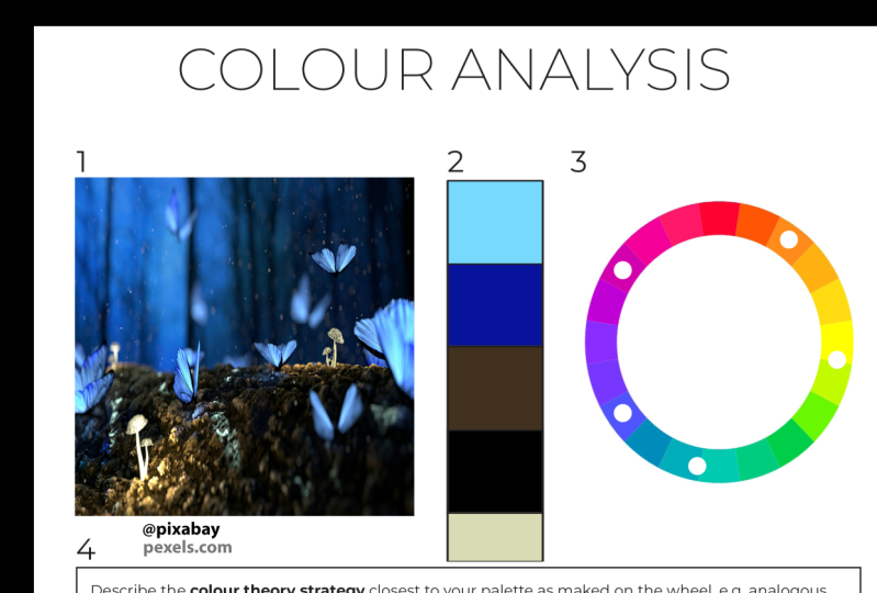
12. Colour Analysis Demonstration: Any color analysis starts
with an inspiration. For me, this is often something
two-dimensional, e.g. a. Photo, a textile, a painting, perhaps some commercial
packaging or a magazine image. On a recent trip to Australia, I was really moved by
the colors of the bush, the bark and foliage
of the gum trees, and the mid blue sky, which was slightly tinted
rather than a pure hue. I took a photo to work out
why it was interesting, why the palate was interesting, and which color theory
strategy could be at play. Just as a learning exercise. I work digitally and I input my image into
software today, I'm using Keynote, which
is like PowerPoint. The next step is to isolate the colors that
excites me the most, the ones that have drawn me
most to the inspiration. I create some shapes here. It's a line of circles. I feel each shape with color. I work my way across the
empty circles one at a time, filling each one with color
using the color picker and selecting pixels from
the inspirational image. Each time I isolate a color, I make a mark on the color
wheel to note which head of family hue represents each
color that I've chosen. When colors or muddy or gray, it can be tricky to see exactly where on the wheel
the picker has landed. But if I do a quick
comparison with pure white, I can see that in this case, the bulls-eye has nudged ever
so slightly towards orange. Once your collection of three
to five colors as complete, each shape is filled and the
color wheel is marked up. Now I turned to think about which color theory strategy
might apply in this case. Now, here's a warning. In the real-world, very few
color palettes can form completely to a standard
color theory strategy. So you might have a few
options and you can choose which direction you want
to take for your projects. E.g. this could be a complimentary scheme
of blue and orange, but with the orange
highly D saturated, knocked back to
the palest tones, yellow greens could
be used as an accent. In which case, the
colors I might take forward for my creative
project could look like this. Another way of looking at this
case is to think of it as a near miss split
complementary scheme. I have a very soft spot for
split complimentary schemes. There's something grown up
and compelling about them. So I'm quite tempted
by this option. I could try and force the issue. If I made a true split
complimentary palette, I shift my blue towards violet. But actually, I don't like
this palette as much. It was the blue that attracted
me in the first place. So I'm going to
stick with the blue and adjust my working palette. On the right, show
the now dominant blue with its accents of
orange and yellow green. This almost split
complimentary result is much closer to the outcome
that I was hoping for. Here's an important note. I found that most
successful color schemes have some warmth
and some coolness. And yes, this is the case here. Adding a cool touch to a
warm scheme and vice versa. Even just a hint is a much more important
color strategy as far as I'm concerned, necessarily following a
standard color theory recipe. I also check the
spread of value. Too narrow range of value can sometimes be a reason that a color palette lacks interest. In this case, we have an excellent range from
off-white to off black. Adding a touch of light tone can really freshen up a scheme. As you see with a
bark in this photo. All of this analysis allows me to write a description that comments on the value and chroma and the impacts
of these on the palette. It's writing analyses
like this that I credit with increasing
color confidence. Understanding accrues over time. And you can learn from
this exercise which color theory rules
can be bent or broken and which
are most important. Eventually, this way of thinking about color becomes instinctive. You train yourself and you carry the toolbox
around in your head. You can make analyses
on the spot. Finally, with this palette, if I wanted a lower
chroma outcome, I could focus on the
most desaturated colors and use the high chroma
elements as an accent. Instead. It would still carry the same sense of the
original inspiration. Putting on my interior
designer hat. This is a really powerful way to create palettes of color to apply to buildings within
a distinct landscape. Decorating your Australian home grounded in a similar landscape. Having found colors
through this process, provides a really rich
palette of colors that connects the interior
and the exterior. It feels just right
for the location. So I strongly recommend using this process with distinctive
and appealing photos of location to help you find original pallets of color for artworks and design purposes. In the next lesson, we'll look at a few
more examples of color analysis using
ready-made pallets of color. Now again, it would be just
fantastic if you could have a go at this and share your colors to the project area, even just the roughest notes. I think you'd find that
the process was really interesting and helped you on your color learning journey.
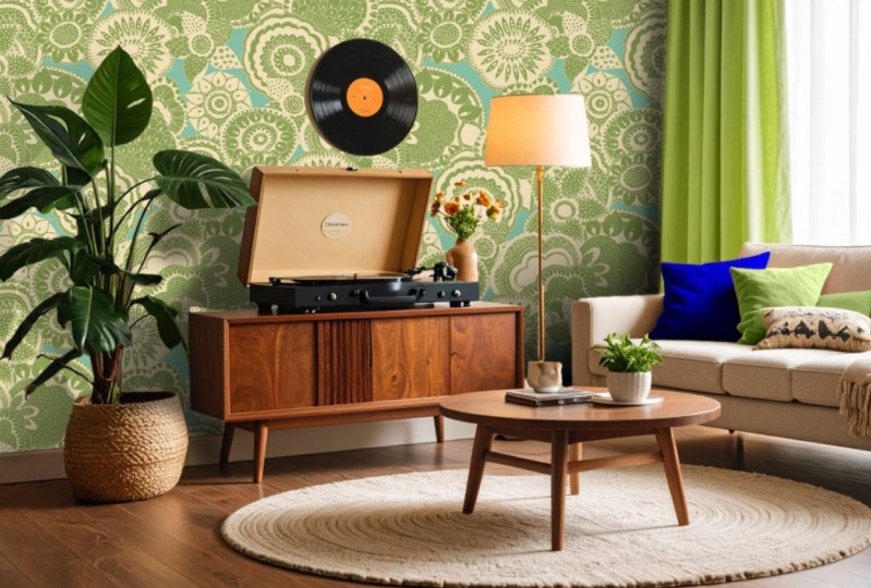
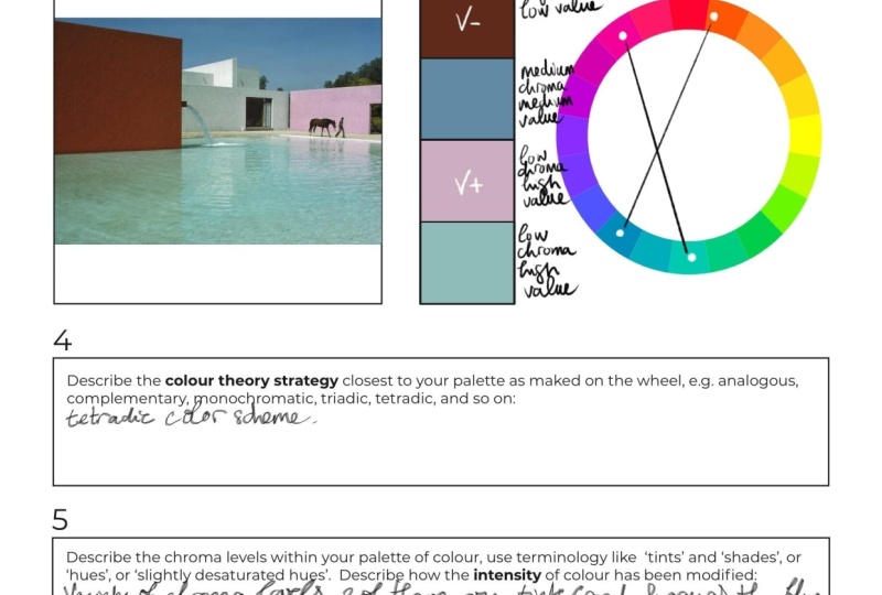
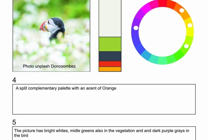
13. Colour Analysis With A Ready-Made Palette: In this lesson, I'm going to run three sets of experiments. These examples use a favorite
Instagram reference and reverse engineer
pre-made palettes of colors to work out
where they came from. Example one. Each analysis begins by locating the color palette
on the color wheel. Then by working out a possible rationale for
why the scheme works, using traditional theories
of color as a guide. In this case, I'm happy
to define this as an analogous palette
of orange running through two yellow
green and with a cooling accent of blue-green to take the
edge off the heat, we can see a good range in terms of value from light to dark. It's easy then to write a description of the palate
as being a mix of tones and shades with a potential to be warm and muted
or dark and moody. And the choice is ours to make. Example two. Here's another
pre-made palette taken from Lauren Wiggers
Instagram account. And let's run the process again. First, we work out
where the colors are originate from
on the color wheel. This reveals an almost perfect triadic
palate where there's equal balance and distance between the hues are
the heads of family. There is a mix of
warm and cool color. There's also a good value
range from light to dark. My description of
this palette is a triadic palette
of equal partners. Dominance is being asserted
by the lowest value, shade. The palace is a mix
of tones and shades. And by shifting the
quantities of each color, we could choose to drive the palate either
warmer or cooler, whichever is our preference. Example three, again, this is imported from Lauren
Wiggers Instagram. We start plotting colors
on the color wheel, finding the hues that are
active in this scheme. In an earlier lesson, we looked at Nuance as a driving strategy
for combining color. And we noted that palettes
of nuance don't necessarily conform to any particular
color theory strategy. You could argue that
this is the case here. I could force a tetrad strategy onto most of this palette. But I prefer to think of it as a pallet of similar nuance, perhaps using the slightly
richer colors as accents. So my description of
this color scheme is a pallet of
near equal nuance, otherwise hard to
categorize, perhaps tetrads. It's sort of complimentary, ish, with some lower value,
higher chroma accents. It's warm and cool. It's a pallet of faintly grades tints with
very little spread in value. It's a pretty palettes. And we could increase
the value differential, lighten or darken some of
these tints to increase the seriousness or the
dramatic impact of the palate. And we know that if
we don't want to rely on matched nuance
as our strategy, we could play with
value and chroma, creating interest in drama by making that stronger contrast.
14. Conclusion: In this class, we've
studied the relationship between color theory
and our color vision. We've understood the
meaning of the words, hue, tint, tone, and shade. And we've mastered the
concepts of value and chroma. We've seen that colors
live in families and that the head of each
family is a unique hue. And we've realized
that people who appears to have an
uncanny knack for color are simply instinctively aware of these
family likenesses, the relationship between colors. And they use this awareness when they combine
color palettes. So we've seen how
color theory recipes like monochromatic,
complimentary, or analogous palettes can
be applied not just to use, but also to other
family members as well. And above and beyond this, we know that we can abandon the constraints
of color theory, and instead, we can
make palettes just have tins or of tones or shades. That having a common level of Cromer is an excellent rationale for bringing colors together regardless of where they
sit on the color wheel. We now know that mixing up unrelated grays and neutrals
can make a bit of a mess. When we want to find
a palace of colors, we should either
choose from within a family that were
already working with, or we could use color theory to find another
family to introduce. But we need to do all
of this knowingly and intentionally and with a very
particular impacts in mind. We exert control over color. When a color palette
seems tame or flat, we turn up the chroma, or we increase the spread between the highest
and lowest values, or we can do both. Alternatively, we could
play with accent color, dropping this in with restraint. Just enough, like a trail of
breadcrumbs through a space, curating a journey for the eye. Now, accent color can
be an existing color with the chroma amped or
with its value tweaked. Or it could be another color
suggested by color theory, pops in just for the
sheer **** of it. Now, sometimes we can
work instinctively and we can drop something in
just because it looks great, but it's good practice always
to stop and ask ourselves, given what we now know about color families and
value and chroma, why does this combination work? If the scheme lacks sophistication or it
looks childish or garish, or if we worry that we might
get tired of bold color, we can nudge the chroma down, confident that we could
always manipulate the value to keep the
drama and impact high. Learning about color is
like learning to drive. It will only embed and become real when you start to apply it. And you need also to
record your observations. When I kinda palette
strikes, you, use the analysis
sheet that comes with the course to
help you to work out which color theory strategies
at work and how the mix of chroma and value lies
behind the striking impact. I'm going to be so interested and excited to
see your successes with color or to share ideas or even to break down why
something doesn't work. So please do post any observations at all in the project area
for this course. And keep an eye on my
Instagram page at recipe for a room for ongoing
color palettes analysis. I want to thank you for
taking this course, for giving your time to it. And I sincerely hope
that you found it useful and that it's giving you new ways of thinking
about color. And that it helps
you on your way to developing color
superpowers and towards becoming that gifted individual who has an instinctive
eye for color.
 Julia Begbie, Recipe For A Room