Transcripts
1. Introduction: If you would love
to use thoughtful, beautiful, and original
combinations of color. But you can't decide
where to start. Then this class is for you. I'm Julia backbeat,
and I've spent the last 20 years teaching
design and color theory. One of London's top
design schools. You will learn
methods for creating color schemes that you
can use for any purpose. So this isn't just necessarily
about home decoration, but the practical outcome
of this class is then converting that color
inspiration into the references and codes
that you will need if you wanted to go on an order of paint to decorate your home. The project for this class is supported by a
downloadable handbook. I'm most excited about sharing
professional shortcuts. So the tricks of the trade
that designers use to make sure that every client
gets a fabulous project, one that is perfectly matched to their needs and preferences. Each step is fully explained. I'm excited to show you new
ways of thinking about color, along with fast and easy
methods for creating limitless, brave, joyous and
sophisticated color palettes. So I look forward to
seeing you in class.
2. The Class Project: The project for this
class is creating your own original and
beautiful palette of colors. And by the final lessons, you'll have converted this into the real-world references that you'd need to order paint
for decorating your home, or for picking other
products and materials. The lessons of the class will clearly guide you and there's a downloadable handbook
that you can also use to help follow through
the various stages. The creative process that we're going to be learning
is one that you can repeat over and over again whenever you need
color inspiration. And not just for the
purposes of home decoration because designers from all
disciplines use this method. Now, I've included ways of working that use digital tools. And we're going to be exploring some really powerful
digital tools that I personally love to use. I know that's not
everybody's cup of tea. So I'm also going to
be showing you ways of working with
paints or pencils, puzzles, whatever you
happen to have at home. So how you take the
class is up to you. This process would also work
really well an art project. My advice to you
taking the class is you are definitely going
to get the best out of it. You'll get the best results
if you don't overthink. So try to stay open-minded
about color choice. Relax and follow where
this process leads you.
3. Defining Your Comfort Zone: Before we start the
projects for this class, I'd like you to do
two things for me. First of all, I'd
like you to look down and check what
you're wearing. Secondly, I also want
you to go and look with fresh eyes at the colors of the clothes in your
wardrobe or closet. I've taught classes like these
many times in real life. Working with students
in a classroom, helping them to find the colors that make
their heart sing. I promise you that every
time at the end of the day, the majority of
students have made color schemes exactly match
what they're wearing. And until it's
pointed out to them, they haven't even noticed
that they've done it. So this is a little note in advance that if
you want to get the most interesting
results from the projects, it would be great if
you could try using colors that you might not
have considered before. In which case, it's a
good idea to know upfront where your subconscious is
going to try to drag you.
4. Making A Color Palette: The Process : I think it'd be really
helpful for you to see some examples of the process that we're going to be using. So before we get
onto the how-to, I want to tell you
some stories about how useful this way
of working can be. I'm going to tell you four
stories and their stories about different professionals
who all work with color. So first up we've got a
florist who is looking for color inspiration after
a customer orders a Posey of fresh flowers
for a young person. Our second professional
is an interior designer. Their client works long
hours in a stressful job, and they want color in their
home to welcome them back. At the end of a Hard Day's work, story three introduces
a graphic designer who's working for
a business that's launching a new energy drink. And our graphic designer needs colors to brand the new product. Finally, our fourth client is an up-and-coming movie
star who has just asked a fashion designer to
choose colors for a dress that is going to be traffic stopping at a red carpet event. These are our four
briefs and each has been given to one of four
different professionals. During step one, are professionals don't think
about color at all. They simply come up with an inspirational word to
describe a mood for the project. Let's see how this works. The florist thinks
about the brief. The words used are
fresh and youthful. For the florist, this also means unspoiled, a clean palette. They choose the word innocence to lead them forward
in the Color Hunt. The interior designer
is thinking about a warm welcome and
arms thrown wide, greeting, a hug, a heartfelt
sense of positivity. The interior designer
decides that the emotion of gratitude carries all of the qualities that they would
like the room to project. The graphic designer wants
their chosen word to convey a sense of
changing states. So starting with
something that's empty, then which is refilled with vitality and they decide
on the word empowerment. Finally, our fashion designer
wants to create shock, grab attention,
cause double takes. The fashion designer
picks the word startling. So with this step
one is complete. Each professional has now got a working title for
their color challenge. Let's have a look at step two, starting with the florist
and the projects, which is now called innocence. Step two is the hunt for an
inspirational image that embodies a sense of the
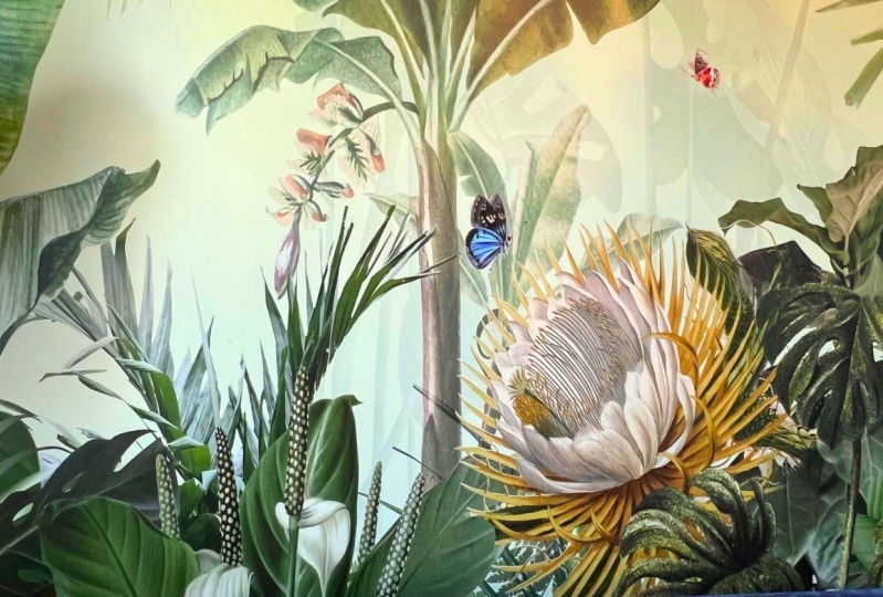
chosen keyword or title. The florist finds innocence in this photo of a
freshly unfilled fern, something that is unspoiled and still in its spring greens. In step three, the florist
extract the color. Now I'm going to show
you clearly how to do all of this and
it's fast and easy. So the process gives the
florist or color palettes, which is suited to a
young person with this, to work with, all
they have to do is choose coordinating flowers. Meanwhile, the
interior designer with the working title of gratitude
is also on step two, the hunt for an
inspirational image. Now, in this case, the outcomes quite a literal association because
the designer is drawn to the concept
of Thanksgiving when looking for images
that convey gratitude. Again, step three is a
quick color extraction. And hey presto, we have a color
palette and it's ready to use to inspire a
decorative scheme for a room that would
indeed welcome you home. In the world of graphic design, the energy drink will
have a color palette inspired by the
keyword empowerment. And our designer is
looking for an image to suggest boundless power. In step two, they find a
volcanic image that they love. And in step three, they extract the color palette. And then they have
this ready to propose for the coming
rebranding process. So finally, let's check in with the fashion designer who has the working
title of startling. They want an outrageous
color palette and they find inspiration for
electrifying color in nature. Step three is the
extraction process, providing them with
brilliant color to take into their design
sketches and ideas. So we have four worked examples of the process that we are now going to go
and work through. As I said, I'm going to
clearly show you how to follow each of these steps through
with your projects in mind. Looking back at these examples, the pallets took moments
to find and they're all tightly tied to very
particular scenarios. So without this framework, without our process, the same color work
could have taken days. It's very simple. We go from brief to working title to image
two color palette. And as part of this course, the application is going
to go a step further. And we'll actually show
you how to convert the color palette into
paint references. If you want to go ahead and actually apply
color in your home. In the next lesson, I'm going to ask you to
choose an inspirational word, the working title
for your projects. Please do look at the
downloadable handbook that comes with the class. Because along with
the next lesson, this is going to
help you to complete the word findings
stage of the process. A final thought, the words
that are designers used. So we had startling empowerment, gratitude, and innocence. Each one of these words has
a great deal of personality. They're quite distinct words. If the designers had
chosen more generic words, words like nice or
comfortable or Lovely, these words would not have
worked as well in narrowing down the field and an
inspiring, strong imagery. So the next step
is very important and you will find guidance
for this in the handbook. You now need to find an excellent working title or mood description
for your projects. One that clearly
captures the essence, the outcome that you
want to achieve.
5. The Keyword: Okay, So next, I would
like you to pick a word to describe
the mood that you want to create in the room
that you're thinking about. When I'm talking about a
word to describe the mood, I'm in the emotional
impact of the space. And that of course, is going to affect everyone
who's in the space. So it will affect you and
your friends and family. So we're looking for a single word that
would describe how the decoration and the color of the room should
make people feel. What's your intention for creating a feeling
within your home? If you have a look in
the projects handbook, you will find a list
of words that might help to inspire you as
you make your choice. Now it's over to you. Think about the room
you're going to be decorating and pick
a key word that really accurately
describes the mood that you would like
the space to evoke.
6. The Image : So to recap so far, hopefully, you now understand your
attraction to certain colors, any unconscious color
preferences that you might have. And you can watch out for these sneaking their way
into your work. The next step was you found
a word, a working title, that describes the mood, the emotional impacts that you want from this particular
part of your home. We're going to
carry that keyword forward into our project. My big tip for step three, I really want you to set aside any secret hunch you might
have about a particular color. Because if you can
really do this, you may be pleasantly
surprised and amazed by the outcome
of the process. Step three is the hunt
for an image that to you really conveys the feeling you want to create in your room. And you're going to use
this image as a concept, is going to become the key
that unlocks a world of color. Here's another tip. When I'm looking for a
concept image of this type. I try never to use images that have people's
faces in them. And that's because faces carried distracting
emotional information. That emotional information
might actually conflict with the colors
that are in the picture. So my tip is, if your mood image does
actually have people in it, then cover over the faeces and don't be distracted
in your search for color inspiration by pictures of human faces and signs
of human emotion.
7. Finding An Image: Your image search can
be physical or digital. If you prefer to work with
real life source materials, here are some things
you could look at. You could look at
your own photos or actually parts of those photos. So try to pick atmospheric
photos that have real color,
personality, a sunset, a landscape, a still-life, a moment that had strong
emotional resonance. So number one is photos, number two is books
and of course, inspirational
subjects like travel or fashion, art, cooking. Any books that contain
curated photography? Number 31 of my favorite ways to relax is looking
through magazines. And you could look both
at articles and at the adverts in-between because
they might hit the mark. Now, if you're happy
to work digitally, then obviously there's
a huge volume of inspirational reference
material available online. The first place that
you might look is a simple Google image search. You could also try looking
on stock photo websites, websites such as Adobe or
Shutterstock or I stock. Again, type the keyword into
the search bar and enjoy the many hundreds of photographs probably
that are going to present themselves with your
mood, particularly in mind. This is a really
relaxing exercise. And if you can find a
few competing images, that would be a great thing. Maybe save them, set them aside, and then come back to them
later with fresh eyes. And just see which of
the images resonates most with the feeling
that you want to create. By the end of this stage, you need to have
chosen one image only. And this is the image
you're going to be taking forward to the next step, which is palettes creation.
8. Color Extraction: An Overview: Apart from a couple of
reality checks along the way, when I'm going to ask you to critically think
about what you've done. You're definitely going to get the best results
from this project. If you try not to think about it and just follow the process, I've broken this lesson
down into two parts. Depending on whether
you prefer to work on a computer or phone or tablet. Or if you want to work on
this like an art project and use paper, paints,
pustules, pencils. You're going to do
a color extraction, which means you're going
to isolate and select a palette of colors
directly from the image. First up, in the next lesson, we're going to look at
the digital method.
9. Color Extraction: Digital: I'm going to begin
by showing you a worked example using
a free digital tool. First of all, save
your mood image on your device and save it somewhere that you
can easily find it. Again, I'm working
here on an iPad. For this process, I really enjoy using tin iLabs color
extraction tool. You can Google TinEye
labs and it will take you straight to this
page or alternatively, there's a link in the
project handbook. You could also do your
own internet search for other color extraction tools because there are
many available. So click the button to
choose a file and pick the image that previously you
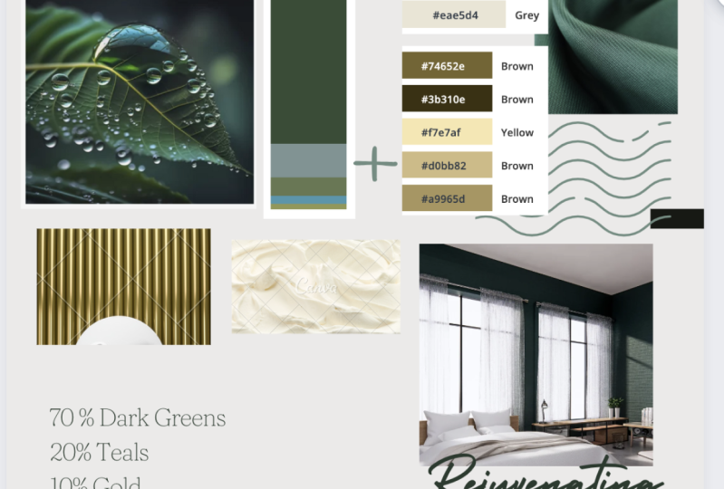
had saved to your device. The palette that
this tool gives you provides loads of information. Proportion is so important. If you adjust proportion, the mood of the palate could
be significantly changed. The final column on the right shows the pallets
in equal blocks. Although looking
carefully, you will see written on each block is the overall percentage
of the image that is actually made
up from that color. The alphanumeric code
that you see with the hash at the front is
important information to. This is a hex color reference for each of the blocks of color. And we can actually convert this closely to match
paint references. And we'll see how to
do this later on. At this point, I'd like you
to do a quick reality check. Now, is the extraction
in any way surprising? Are their key colors that
you see in the image, but that hasn't been
picked up by the machine. I. Does the selective palette still carry the true sense
of the image that you chose? I would argue that
from my chosen image, there's quite a lot of
brightness in this image. There's a really
good chunk of white. This hasn't come through
in the extraction. So if I were doing this, I'd make a mental note that
I have to reintroduce the white to make sure that
I get the right balance. And so the pallets still conveys the really delightful
freshness of the image that attracted
me in the first place. This method of digital
extraction gives you a computer-generated pallets of hexadecimal color references. If you regularly use
digital devices, there are other options
that you could try. If you're familiar
with working in software like
Photoshop, PowerPoint, Keynote, or a program like
Procreate on the iPad. Then each one of these systems has color picker
tools that would allow you to grab a pixel of
color and create a block, a larger block of that color elsewhere on your sheet
if you're working on your phone and this is something that you'd like
to use on a regular basis. Then you could consider
color apps from companies like Pantone
or from Adobe. I mentioned them here in
case you're interested, although unfortunately
they aren't, they usually aren't free. So these digital methods
give you a palette which is probably referenced with either RGB color
references for printing, or with the hexadecimal
that we saw before. When you want to convert these two references for putting paint onto the
walls of your home. There are actually websites
that you can go to to convert your RGB reference
to paint colors.
10. Color Extraction: By Eye: So here are some tips
for you if you'd prefer to do your color extraction like an art project and use paper,
paints, pustules, pencils. Tip number one, it
can be really hard to isolate a single
color within an image. So I'd recommend
cutting a small hole, a view finder, in a
sheet of white paper. And then you can lay
this over the image to mask out interference
from other colors. If you want to translate the same feeling of color
to your color projects, then keep the balance of
color true to the image. Visually analyze which colors dominate and which of the
colors are secondary. So this method is
going to give you a paint palette to a color palette that you've
made for yourselves.
11. Interior Design: Critique Your Colors: My course on color theory, I talk about warm
and cool colors. Warm and cool refers to the
colors of fire and ice. A closer we get to
the fire colors, the warmer the color, the closer we get
to the ice colors, the color, the color. These colors, warm red, orange, and cool blue-green, have a deep physiological
impact on us in your home, depending on whether rooms
face north or face south. And of course,
depending on where in the world your home is based, you will probably know which rooms field
warmest and coolest. As a general rule, it's a bad idea to
use large areas of warm color in rooms
that are overly warm. Similarly, unless you
enjoy discomfort and pain, It's a really bad idea to use
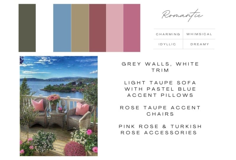
cool colors in cold rooms. In this image of or
terminal hughes. It's possible to change
the color balance to increase or reduce the
heat in the colors. One pallet is vibrant and warm and the other
is more neutral and it's reality check time. Consider whether the palette
that you have in mind is actually well suited
to your location. Be honest because if it isn't, you have a couple of choices. If you want to, you could go back and try a
different mood image. Alternatively, you could
simply look at changing the color proportions from
your original mood image. In which case, what is the point in picking an image
to inspire us? Well, from my point of view, the great thing about using an image in this way
is it constrains us, it limits our options. We can see in the image that the colors all sing along
beautifully together. So using a concept image keeps us on the
straight and narrow, even if we ultimately
take control and make some adjustments to change the overall impact of the
colors that we've selected.
12. Interior Design: The 70 20 10 Rule: For most of the class, we've let the process lead us. We've acted instinctively. We've avoided overthinking, other than recognizing
our own color biases. Whether the room
in question might need a warmer or cooler palette. I want to introduce you
to a rule in design. And it's a rule that
is called 70 2010, or sometimes it's called 603010. I'm a bit relaxed
about the math. The point is that with
this particular rule, we very visual impacts
so that you have dominant and then secondary
subsidiary inputs. As a rule of thumb, if you were just to use
equal amounts of each color, you wouldn't get
as interesting and outcome as when you
create a hierarchy. Hierarchy exists when we
see one element first, there's a dominant element. But then subsequently we
get to enjoy a journey of the eye as we pick up
on other smaller parts. So it creates a richer
visual experience. It's a layered experience. It's like eating a meal
that has complex flavors, a delicious meal of
complex flavors, but flavors that hit the
palate at different times. Now one of the good
things about the automated the machine made
digital color extraction was that it had already
established a hierarchy for us. It actually did break down the color palette by proportion. But let's take a
moment to review this. Coming back to the
white flowers image. The reason that this image
appeal to me the thing that I like best about it is the
clean white of the flowers. Contrast it against their fresh yellow and
green stems and leaves. However, the machine, I
miss this completely. This is where bringing a human
eye into the process can really add to the impact of
the work that we produce. And this also reflects what
we know about the image. I know those flowers are white. The machine doesn't, so it's
time for me to override the digital with what
my brain knows to be a truth about the image
that I'm looking at, you must absolutely feel free to change color and
adjust proportions. If this brings a
truer representation of the impact of
your concept image, just as I've done here. If earlier on you
didn't consider proportion as part of
your color extraction, you can think about it now. So which are the dominant colors in your image, which
are secondary? Make sure that you add
in any brilliant colors. That's an automated
extraction might've missed because proportionately
they were so small within the image. So make sure that the
palettes that you're going to take forward really represents the best and the truth of the image that
you have been inspired by.
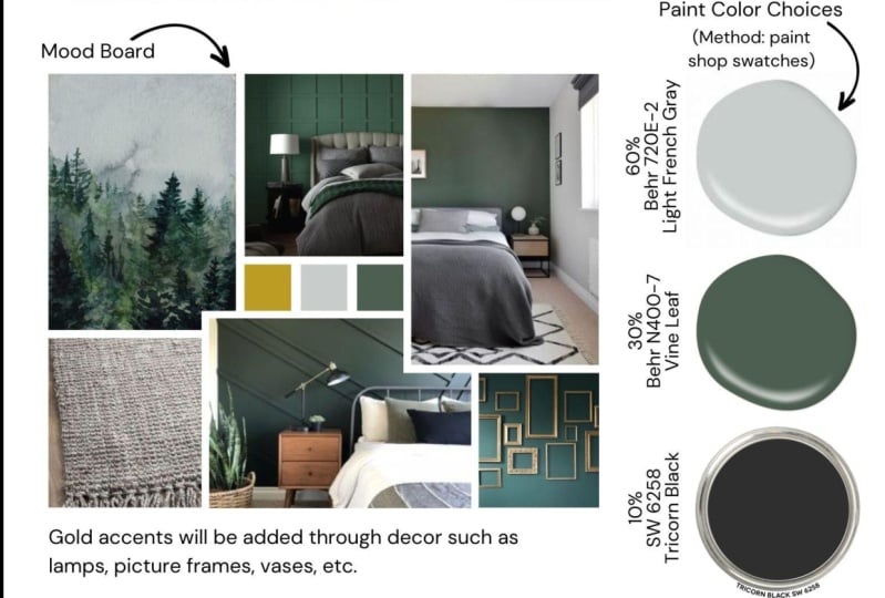
13. Interior Design: Allocating Colours: Now I'm going to break
the 70 2010 rule down a bit further because I want to bring in a wider
selection of colors. I want to use more of
the overall palette. So the way I like
to think about it is if the extraction tells me proportionately that
the image was 70% blue, 20 per cent green, and ten per cent yellow. I'd actually rather think
about that as 70% lose, 20 per cent greens
and 10% yellows. The next question we
need to answer is, where are you going
to use these colors? Where should you put them? Well, as a rule of
thumb, in a room, by far the largest surface
area is the walls. This is followed by the
ceiling and the floor, and then by large
pieces of furniture and finally accessories
and smaller items. Of course, you have
editorial control of this. But the norm would be to use the dominant
color on the walls, maybe using a variation of this color as a rag or fluorine. And then pick out the
secondary colors on large pieces of furniture
and dotted around elsewhere, filling in gaps with the
remainder of the palate. Try to break color up a bit. Don't use color
one on the walls, color to on all the furniture, and color three on
all the accessories. We were talking about
that journey of the eye. And you can help increase the interest within a
room by dotting colors around and controlling
the order in which the I is going to see
different parts of the room, different aspects
of your design. Okay? So once you've allocated a color to a particular
part of your decor, stand back and ask yourself if you're really
happy with this, because we'll have
other colors in your palette that you
could substitute in. And ultimately, it's
entirely up to you. You are the director of this particular
piece of set design. So to recap, when this
process performs, and it usually does, then the pink color for your walls is going to
be the dominant color that emerges in the
greatest quantity from your palette of color.
14. Interior Design: Your Whole Home: The homes that we
see showcased on TV or in magazines
usually look like they have one creative
director that there's an underlying
consistent color and design strategy behind
the whole thing. Successful interiors
don't normally look like a random
group of strangers. Each had their decorative way in each single room of the home. If you're decorating and
you're using the process in this class to guide
you to a palace of color. Then before you commit, consider the impact
in your home. Overall, if you are now about
to pop in a bizarre dual, the colorful cuckoo
into your nest. Is that actually okay? Because you don't mind
having an offbeat room or eventually you plan on
redecorating throughout. Or maybe you could pull some of your new colors throughout the rest of your home over time. Sometimes in my
interior design work, I've helped clients out with
just one room in their home. And surprisingly, this
can have mixed success. The mix comes when the new
room is a delight there, really pleased with it. But then there's a new level of dissatisfaction with the whole
of the rest of the place. I'm not suggesting that
you cancel your plans to create a room of brilliant
color and interests. Just bear in mind that by decorating one
room in your home, using a new process, a new strategy is potentially pulling on a
bit of a loose thread.
15. Interior Design: Be Bold & Picky : In the end, we only regret
the colors we didn't pick. In my experience, very few people regret
a bold color choice. Many go on to regret
toning things down. I hope your paint palette is a wash with rich, strong color. And I do know that it can be scary to actually see
this through in reality, sometimes people are
disappointed with the outcome. If they aren't quite
brave enough to go with a full throttle color that has suggested itself to them as part of
their experiments. Be brave and be
bold and be picky. Don't settle for a color
that's almost right, almost the same as
your inspiration. Keep trying with the samples
until you absolutely need. If you plan to paint your home, then there's a great
deal at stake. Obviously, when we
match by I or we convert pink references from a computer screen
to a paint pigment. They can be room for error. So however you pick
your paint colors, it's always absolutely critical to color test small
quantities of paint on site where they're
going to be used before you commit to a
big decoration projects. The tiniest difference between the color that you want and the color that you choose is
going to be magnified many, many times if it's applied
across a large surface. So always by test samples
and make sure that you give yourself plenty
of time to adjust these if that becomes necessary. So rather than painting
directly onto your walls and creating a patchwork
that you might have to live with
for a few months. Paint your test samples
onto paper or card, and put test patches in
different parts of the room, different corners,
different heights, to test under all possible
lighting conditions just to make sure that
it's a perfect choice. Day and night. Top tip, always refer back to your mood image as the
anchor of your projects. Ask yourself if the
colors on the wall are true to the inspiration
from the image, and don't buy a large
quantity of paint until you've tested and you know that the color is just right.
16. Conclusion: Real Life Paint References: Congratulations, You've got
your final Palace of color. So you have a color chosen
to be the main wall color. And then there's a
supporting cast of other colors that you
could use for trim, floor accessories, other
pieces of furniture. However, you would like to
use color within the room. I've got four suggestions now of ways that you could express this color inspiration
that you've created as paint references. Because obviously we want
to be able to use and apply the material practically that
we've created conceptually. So here are four suggestions. Method number one is
down at the DIY store. You could print your
color palette or take the hand painted
version that you created down to the nearest paint
store and actually match it by eye to the paint charts and chips that they have there. You could use a machine that reads color from
real references. So if you have a nearby store that has
a photo spectrometer, you could ask the team there
to take direct readings from your inspirational material
that would then be converted by them into the paint information
that you need. And of course, there are those somewhat expensive, but great, fun little hands devices
that you can use, that you can own yourself for taking paint readings
out in the wild. But of course, we have many free ways of achieving
this information as well. You could use the websites or a color chart from your
favorite paints supplier. And you could match that by eye to the references
that you've created. Now, just bear in
mind that if you're color matching on
a computer screen, when you want
real-world pigment, the matches not always,
absolutely perfect. So you are going
to have to check. Another method is if you've
made your color palette using a digital color extraction tool that gave you
hexadecimal readings. Or if you use software
that gave you RGB references for each
of your different colors, then you can use an
online conversion tool to turn your hex or RGB references into an actual
paint reference system. In Europe, Raul or
RHEL references can actually be used
directly to specify paint. Obviously I can't impress
enough that for any paint job, regardless of how you've arrived at the Palace of
colors you want to use. You absolutely must
test colors in your home before you commit to buy large
quantities of paint. It just makes sense. If you're impulsive like I am, you just might want to
dive in and get started. But that time taken to test
always pays dividends. So make sure that you do it. Always give yourself
the option of adjusting colors that
aren't quite right? Always stick to
your inspiration. Keep coming back
to it to make sure that color isn't diverging. It isn't veering off away from the original mood and concept. If you found it useful to see examples of color pallets
in the class materials, then just think how interesting
it is going to be now to go and look at the pallets that people taking this
class have made. I would love to see
your color palette, so please do upload them
to the project gallery. Thank you so much for
taking this class and learning along
with me how to create original color
palettes and then convert them over into
paint references. I can't wait to see your work.
 Julia Begbie, Recipe For A Room