Transcripts
1. Introduction: Do you struggled with
colors while designing? Don't worry, by the
end of this course, you will know exactly
how to use colors instead of trying to figure it out through trial and error. Hello there My name is tell her and I'm a Graphic
Design instructor. I had been working with colors all my life in my drawings, in graphic design on websites. I never really knew by some
colors work better and others didn't until I got
to know about color theory. And don't worry, I'm
not going to bore you guys with
definitions and slides. I have explained everything in this course using
real-life examples. And to be honest, that mostly
includes movie posters even start off by learning about the very basics of color theory. We will then learn about
the color wheel and how to decide which colors to use
by using color harmonies. We will also learn about different websites like
Adobe colors and coolers, etcetera for analyzing and generating color palettes
for your designs. We will learn different
concepts like color interactions,
grayscale test, the 603010 rule, etc, to make sure that
our decided colors work properly with each other. And lastly, we will
dissect Skillshare to see which colors they are using
on their website and why. So who is this course for? You could be a graphic
designer and animator, a web developer, or an artist. Basically, this course is
for everyone who uses color. Also, there is a project at
the end of the course so that you would implement everything that you have
learned in the course. So kindly download the project
file from the link below, and I hope that you passed it
with flying colors, right? Right. Come on. That was a good one.
2. Basics Of Colors - Uses And Meanings: What is color theory? Color theory is a set of guidelines and tools
which are used by designers to
basically communicate that message to the people who
are watching their colors. In a way you can say that we, designers are also
communicators because we try to communicate our
message through our designs. Whenever you want to create
a mood or tell a story, we use it using our designs. But before we learn
about color theory and color wheel and
color harmonies, etc, we are going to basically learn about
the uses of color. One of the main uses of color is to make
something memorable. I have this image over here. And if I asked you, what do you see in this image, obviously there is a can. But if I asked you
what brand comes to your mind when
you see this image, obviously you will think of
Coke because Coca-Cola has used the color red in such an amazing way that it
has become their identity. Another major use
of colors is to communicate a message
and the traffic lights, or the best example of this. You see that if you go anywhere in the world, in any country, you will know what
the traffic lights means by just looking at the red or green
and you would know whether to go or not. Another use of color
is to create a mood. So we have this posted over here or doctors chain in the
multiverse of madness. And you can see
that they have used the color red in such a good way because the color
red is the color of passion, love, and anger. And if you have seen the movie, you would know that this is
the whole theme of the movie. In the movie, wonder warns
her kids back because she loves them and she has
a passion for motherhood, but at the same time she's angry that she cannot have them. Color can also be used
to emphasize something. You can see by just changing the color of the word
emphasize over here, I have made it so
much more prominent. Another major use of color
is to differentiate. So you can see that I have these prime drinks
by Logan, Paul, and KSI, and they
have represented different flavors with
different colors. So if you know how to
use colors properly, you can make such
amazing products. So let's discuss warm
and cool colors now. So basically there are
two types of colors. I would say the warm
bond and the cool ones. At the left side of
the color wheel, the green, blue,
and purple, etc. These are called cool colors. And at the right side
of the color wheel, these are called
the warm colors, which are these yellow,
orange, and red, etc. We are going to learn
about color wheel in the later lectures as well. So let's first discuss
the cool colors. I have two products over here. One of them is trident, which is Spearman gum. There are other flavors
of this as well. But for this specific product, they have made the
packaging green. Why? Because they want
to show Mint in it. Similarly, if you
look into spray, you can see that they have
used the color blue and green. And in all of their
commercials they are always promoting freshness and Bulinus. You might have
seen this in a lot of herbal products as well, that they are always green because they want to
represent nature in them. But if you want to show
something spicy and exciting, you can always use
the warm colors. You can see that in
both of these products, which are really spicy, the Raman at the left is extremely spicy and not
everyone can eat it. So you can see that they
have used the color red, yellow, and orange a lot, and somewhat black
as well because that is a contrast color, but mostly you can see
yellow and red and orange. If you want to create a product
in which you want to show these kinds of
emotions and you want to show these kinds of flavors. You can always go
for the warm colors. So what is the meaning
of different colors? You see that different colors can have different meanings. For example, we
have red over here. So this is the poster of
the latest Batman movie. And the color red
represents passion, love, and anger, as
I mentioned before. If you ever want to show
these kinds of emotions, you should use the color red. There are other uses
of color red as well, but mostly they are used for
these kinds of emotions. Then we have blue over
here and four blue. I chose frozen. I totally love this movie and I guess I love all the
animated movies. So blue is the
color of calmness, responsibility, and you can taste somewhat sadness as well. If you look into the theme
of the movie Frozen, you would know that these terms, these words basically
represent the whole movie. The colors which I'm showing
you in these movie posters, they are not there by accident. The people who make these
movies and make these posters, they are really clever and they know how the color 2D works. Obviously, they are the
experts and they know how to trigger different
emotions and their audience. So the next color which
we have is green. So green is the color of new
and abundance and nature's, if you want to show
something which is natural and courier to nature, you can always use
the color green. So in this example, I have used the movie Shrek overhead because you might have seen that in the movie there is a lot of forests and
a lot of greenery. Then we have the color purple. And just I have used Avengers
Endgame poster over here. So the purple is the color of creativity, royalty and wealth. If you look into the movie,
you would know that these are Earth's mightiest heroes and in a way you can
call them royalty. A lot of them are
wealthy as well. And all of them are
creative in their own way because they have different
powers and abilities. Purple has been used in a such
a good way in this poster. But you should also know that different colors can have
dual meanings or can have different meanings
depending upon the religion or the region, etc. One of the best examples
of this is white. White is a color of purity, celebration and
worship in Islam, whenever people go to Kaaba, they veered the color white. But if you look into Hinduism, it is the complete opposite. White is the color of
death or sadness over there whenever there is a
funeral, they were white. Another example is the color
black and Christianity, whenever there is a
funeral they were black. You might have seen
this in the movies. The use of color is also
different for men and women. So men and women can basically
see colors differently. I have this very funny
image over here. At least I find it
funny that the guy is pointing out different colors
like red, purple, pink. And then there is the
woman over there who is naming all the
colors separately. There is a sturdy behind
this that woman can see more colors because
at the end of the day, color is a wavelength
and woman can see more of these
wavelengths than men. So I have two
examples over here. And the first one is
Victoria Secrets beauty. So I guess this is a sub-brand
of Victoria Secrets. And you can see
that they have used a lot of pastel colors
in their designs. I'm not generalizing this because I have seen
woman projects in which they have used a lot
of contrasty colors as well. But mostly you might have seen this trend data in
woman products. They usually use
especially colors. For the example of men, I have this brand called
Old Spice or space. It is a brand of
men's deodorant. And you can see
that they have used a lot of vibrant
colors and mostly read in their designs and it
is so vibrant and saturated. So if you ever create a brand
which is related to men, make sure that you
use prominent, too vibrant and bold colors because that
is what attracts men. This was it for this lecture. I hope that you understand now how you can use
different colors. What are the different
meanings or different colors? And different colors can
have different meanings in different areas of the
world or religion. In the next lecture,
we are going to learn about the properties of color. I hope that you
guys really enjoyed this lecture and I will see
you guys in the next one.
3. Color Properties & Harmonies: What are the properties
of a color mesoglea, there are three
properties which are hue, saturation and value. So let's discuss hue
first, not this hue. Hue is basically
another technical term for the word color. So all of these colors
like yellow, pink, blue, green, these
are called hues. So what is saturation? Saturation is basically
the intensity of the hue. And if you increase it too much, it becomes really
irritating for the eyes. If you have a color,
you can either increase its saturation or
you can decrease it. Basically, you are increasing or decreasing the
intensity of the color. And the last property is value, which basically
means brightness. So you can either
increase the brightness of you or you can decrease it. Let's take the same color again. If you decrease its value, it will look
something like this. Or if you increase
the brightness, it would look
something like this. So these three properties of
color are really important, but we will discuss
them later on in the coming lectures with
some more examples. But now you need to learn
about the color wheel first. And in the color wheel
you first need to learn about the
primary colors to basically there are
three primary colors which are red, yellow, and blue. You must be thinking
that I'm totally out of my mind because the
primary colors are RGB, red, green, and blue. So R by b is basically the
color scheme of pigments, basically the colors
in real-world. So if you use something on
a printer or paint or dies, you will basically use the rIIB color scheme and RGB are basically the
primary colors of light. So basically anything
which involves screen like a computer or
when bile uses RGB. And that is why in programs like Photoshop and
Illustrator, etc. You also see the
RGB color scheme, but you must be thinking for any kind of physical printing, don't we use CMYK, which basically
means cyan, magenta, yellow, and key e is
basically the black color. The thing is, CMYK is
exactly the same as our Yb. And it is done on purpose
because for a kid it is hard to understand what a
SAN or magenta color is. Blue is the
counterpart of say, n, and that is the
counterpart of magenta. That is why we are taught that are yb is the color scheme. Red, yellow, and blue
are the primary colors. In simple words, it is
a globally accepted way through which kids are
taught about colors. And that is why when we
learn about color 2D, we take relatives, yellow and green as the primary colors. So I hope this confusion
is out of your way. And now let's discuss
about the primary, secondary and tertiary colors. So like I said, red, blue, and yellow are
the primary colors. And if you combine these
colors like blue and red, and red and yellow
and yellow and blue, you will basically get
the secondary colors. But you can even
say that they are the average of the two
colors they are made from. And similarly, if you
combine these colors, again, you will get
the tertiary colors. And this whole thing is
basically called a color wheel. So let's talk about
color harmonies, or they're also
called color schemes. So the first one is
analogous color scheme. Basically in this color scheme, VTA colors which are
right next to each other. Let me explain it to you
with the help of an example. You might have seen
Kung Fu Panda. It is a very fun movie. You can see that in the
poster of Kung Fu Panda, they have basically use the
analogues color scheme. There is one more thing
you have to keep in mind, black and white or actually
the default colors. So you can use them with
any color scheme you want. This poster. You can see that they have used the analogous color scheme along with some white and black. And the thing about an
analogous color scheme is that it is widely present
in the nature as well. For example, in
the citrus fruits. But if you look at
the citrus fruits, you can see that the green is actually the one
which I have pointed out. It is lying than lemon, than orange, then grapefruit. So you can see the
pattern over here. Similarly, you can see
them in berries as well. You can see that red, purple and then glue all
these are colors of berries. Strawberries, blackberries
and blueberries. And blackberries are actually purple in color
just so you know. The second one is
complimentary and complementary color
scheme is probably one of my favorites because it is so easy to use and it
is really effective. The basically you take colors from the opposite
of the color wheel. If you ever want to try wearing a brown shirt
with the blue suit, it will go so well together. I have an example for
complimentary as well. You can see in the
complementary color scheme, we have this example of
the poster Blade Runner. And they have used the color red and teal in such a good way. These are basically the total opposite
on the color wheel, but they go so well together. Then we also have
split complementary. So in split complementary basically you take three colors. Two of them are one gap
apart from each other, and the third one is
exactly opposite to them, basically making a triangle. I have an example
for this as well. Now I'm not sure if
this is a movie poster. I actually took it from
the Internet and you can see that this
makes so much sense. The artist has used the red and greens and
dealing such a good way. And basically the whole
image is in harmony. Because the end of the day, whenever we are designing, the main thing is to
create harmony in our designs are when you
basically means balance. Then we have the
triadic color scheme. And in this color scheme
we basically take three colors which make
the perfect triangle. And I have a perfect
example for this. So a few years back, they basically recreated Aladdin and Will Smith was
in it obviously. And you can see that
the poster is amazing. They have basically used the triadic color
scheme in this. You can see that they have used the purple and orange more. The teal, teal is very
less in this poster, but they have used the
purple and orange a lot. And don't worry, we
are going to discuss this in the later
lectures as well, that how much percentage
of a color should use use. Then we have the
square color scheme. Basically you select colors in a square on the color wheel. And I would say
that this is one of the most difficult
color schemes to use, because not everyone can
do it to use it properly. In the movie Inside Out, they have used this
color scheme and you can see that different countries
have different colors. And like I said, it is very difficult
to pull off. If you don't know how to use
the color theory properly, then we have that are
triadic color scheme. Basically it is similar
to the square one, but it is actually a rectangle. So again, this is also
very difficult to use because if you overdo this, if you use these colors a lot, it becomes very difficult to create harmony in your designs. I have a very good
example of this. So you can see that
in this example, they have used the
main color as orange. And the rest of the
colors are very minute. You present like
you can see that in the umbrella and the shorts
of the guy above it, they have used blue than they have used a
little bit of green. And the pink is very little in just the
flamingo over here. The main colors which they used, our orange and white
and like I said before, for white and black
are basically, you can see the default
colors and you can use them with any
color scheme you want. Then we have the
monochromatic color scheme, which is extremely easy to use and it is very
simple and effective. So basically you take
a trailer and you increase its value
or brightness, and then you also decrease it. And this whole color scheme
is called monochromatic. Monochromatic color
scheme is also used in a lot of movie posters. And the last thing which
we are going to discuss in this lecture are shared
stints and tones. And I think it is very important there to learn these terms because I have seen people
use them in such a wrong way. A lot of people
use it like this. Lighter shade and darker shade. There are no lighter shades. It is basically tints. So what is the tint?
Basically, you take a color and you keep
on adding white to it. You basically increase
its brightness or value. That way you get different tints and obviously the sheets
are exact opposite. You take a color and you
keep on adding black to it. You decrease its value or brightness and you get
these kind of shapes. And the last one is tones. Again, take a color and you
keep on adding gray to it. And that way you get
these kind of tones. For now. I just wanted you guys to know
about these terms properly later on we're going to discuss them with examples as well. So I hope that you
guys now understand what is the difference
between our Yb and RGB and why we use them
versus the color wheel. And what are the different
color harmonies you can use about our shares,
teams and tones. So I hope that you
guys really enjoyed this lecture and I will see
you guys in the next class. The next class, we are going
to basically learn about some really cool
websites through which you can generate some
really nice color schemes.
4. Color Website - Generate Colors Easily: So which are the best websites
for generating colors? I have a couple of
websites over here, and the first one is
called Adobe color. So you can simply go
to color.adobe.com. So basically, you
can see that we have a color wheel over here
and the middle one, if you click on the middle one, you can basically drag. And you can see that the
colors below are changing. So basically this is the analogous color scheme
which is selected over here. Then the previous
lectures we discussed different color schemes
and harmony is, and you can see that
they are all over here. You can simply click on
monochromatic over here. So it will create a
monochromatic color scheme over here with the tints
and shades as well. Or you can create a triad. And there is one more
thing which I forgot. What you can do is if you
have a specific color, you can enter it over here, maybe over here as well. But all of these colors are basically bound to this
specific color over here, and you can basically
move it around. So let's just say I want to create a complimentary
color scheme. I can click over here. And you can see that it is
not giving me just two colors because when we are learning
about color harmonies, we just learned that there
are two or three colors. But you can have multiple
colors or multiple shades, but obviously you have
to stick to the harmony. Then we have split
complementary over here. Double split complementary
like it even has options which I didn't even tell you about
hotel squared and compound, to be honest, these are the ones which are used very often. And then the bottom
ones are the ones which are not very common but
you can still use them. Yeah, like I said,
you can simply click on the middle one and you can drag it and it will give you a very nice kind
of color scheme. Okay? Then there is
another option which is called extract team. I totally love this. So you can simply click on this. And what you can
do is you can drag and drop or upload
an image over here. So I have a couple
of images over here, and I'm going to drag this
one to be drop it over here. And boom, just like that, the whole website has
basically created a color scheme for
us using this. So the thing about nature
is that I would say that nature has all
the colors we need. And everything
which we know about colors is basically
derived from nature. And I didn't even do anything. I simply have to read the image. And you can see that we have such a nice scheme over here. And obviously this is analog. But you can do is
let's just say if you don't like any
of the colors, but you can do is you
can simply click and drag it and it will select
some other color for you. But let's just say I
like this color, okay? So it has selected this. And what I can do is I can also select the bright
colors in the image. The mutate. Obviously all of this is artificial intelligence. And it can detect which
colors are bright and muted and deep and dark. To be honest, just this
simple one works best for me. And what you can do
is you can simply click on Save
overhead and it will save the color scheme for
you in your Adobe libraries. I forgot to tell
you about this one. So basically if you go back
to color wheel over here, if you click on Save, it will save this color scheme as in your library and
your Adobe library. If you have a subscription, if you don't have a
subscription where you can do is you can simply take
a screenshot of this. So I'm on Windows over here, but I'm going to
do is I'm going to press Windows Shift S. This way. I can take a screenshot of
this and I can say, okay, then I can upload it on my Photoshop or Illustrator
and then use it. Similarly in extract him. You can do the same thing. Okay, So far, so good. Then we have another
option which is called extract gradient. To be honest, this is not
something very revolutionary, but you can do is you
can simply upload the colors in Photoshop and then create a gradient
over there as well, like Photoshop or Illustrator. But we have the option
over here as well. Again, not too revolutionary, but you have the option. I guess you can add
more colors over here. I guess there was an option. I don't remember. Yeah. So if you click over here, you can add more points. Got it. I guess we have a very
nice color gradient over, going on over here. Not too good to be honest. Then we have some accessibility
tools over here as well. Over here, we have a very useful tool which is
called contrast checker. You can see that I have
two colors over here. The first one is the text color, and the second one is
the background color. What you can do is you
can basically select any, okay, So I have two
colors over here. The first one is
the text color and the second one is the
background color. Over here you can see
a rating as well. So this is showing me an error. According to this, the contrast between these two colors
is not very good. It is passing the shape
test and the bigger, larger text test, but it is
filling the smaller one. What we can do is let's just say I select a color over here. Let me change the text color and let me change the
background color as well. Okay. I guess something like this. Now it is giving you
a much better rating. And there is a contrast
ratio over here as well. But the thing about this is that I don't really
like it because it doesn't give you a proper
rating for your contrast. There is another
website for this. Let me show you. Basically
there is a website called coolers.co over here
who les dot code. And it is very popular
for generating colors, but they also have
a contrast checker. So we're going to cover
this first as well. So you can see that it is
giving me a rating based on the contrast and it
is still in over here. So let's just say I click over here and I select any color, for example, this light yellow. And then I select
a darker color, like this bright red. It is giving me basically
a contrast rating. Now it just means
telling me that basically in terms of stars
and the rating as well. And it is telling me
if it will work for smaller text and
larger text as well, and even the bold one. But what would happen
if I select something really off the charts
like this color? You can see that it is now
giving me a 1.95 rating. And it is very poor because
this is not very visible. But what is the most contrast you could have between
any two colors? So basically you vote. Fulbright and full black. Like this is a tricky one to highest number which
you can achieve is 21. But I think anything
which is above, you can say like 15 works just fine because that
contrast is good enough. I guess maybe you can even
go for 14 for some colors. Good enough. Let's go to the color generator. Like I said, cooler. This is one of my, one
of my favorite websites. And I guess I know a lot of creators who use this
because it is very useful. So let me simply
come over here and click on start the generator. And what this website does is it basically generates
color palettes for you. In the early days of
my design career, when I didn't know
much about color 2D, I always used to come to
this website for reference, but now I know how
things work out and I even love it,
love it even more. So if you click
on the space bar, to tap on the space bar, it will basically generate
some color themes for you. How cool is this? Basically, you can
keep on tapping the space bar and it will keep on generating colors for you. And the best thing about this is you can save the colors, okay? And there is one more thing. You can log the color. So I'm going to lock this color. And now if I click on space bar, it is going to generate
all other colours depending upon what color this is, according
to this color. So I'm going to
tap on space bar. Now. Now you can see that it is generating colors
depending upon this color. And we already have a very
nice color scheme over here. I totally love it. Let's click again. This is also very nice. And let's let
something like this. Again, I really like
this and you can even select it and click on
the other one as well, like log these two colors. Now if you click on space bar, it will generate the
other three colors. But yeah, this website
is extremely useful. Again, if you want to
download these colors, but you can do is select
something like maybe this. You can simply click
on Export over here. There are some options. You can download it as image
or PDF or share it as a URL. I love to download
these SVDs because then I can use them exactly the way they
are in Illustrator. So I'm sorry, I got a message
from one of my co-workers. You can say he's more of a partner like we are in a partnership in my
business anyhow. So yeah, let me
close lag for no, I guess it is closed. So yeah, you can basically
download the images, these colored in the form
of SVGs images or PDFs. Let me close this, then there are some other
options as well. You can click on
View and you can basically click on each color to see RGB and CMYK
and just l values, which is useful if
you are like super into your complete color. And then we have option
for adjustments as well. You can basically adjust
the whole palate. The hard palate is exactly
the way it is over here. And you can increase or
decrease the saturation. That's what you do. Basically, you are
basically changing the hue while keeping the team,
keeping the harmony. Then you have
saturation as well. So you can increase or
decrease the saturation. You can increase or
decrease the brightness and temperature as well. Okay. The last one over here
is colorblindness. To be honest, I don't know
much about colorblindness, so I'm not going to cover this. You can simply
click on apply over here or click on cancer. So this was coolers. The last one is color space. I got to know about this website from Ryan Siegel
from Flex Academy. And this is really
nice if you are, if you are into colors and you want to generate
a good color scheme, but you don't know much, a lot about color harmonies. But you can do is,
let's just say, I come over here and I liked, really like this color. I'm going to copy
the hex code from over here. Simply copy it. Then I'm going to come over
here and simply paste it. Then you will click on Generate. What will happen
is that basically it will create a color scheme. Basically it will create
multiple color schemes for you and you don't
have to overthink it. It won't give you like
crazy amount of options like coolers and Adobe colors, but it will give you some
really nice color schemes. Simply select one of them and
just start working on them. So just by looking at these, you can see that this
one is triad, okay? Then you can see that there are analogous color
scheme as well. This is the analog, this one. If you will know about color
schemes properly, you can, just by looking at these, you can see you would know that which color
schemes are these. But to be honest, like I said, you don't have to overthink it. You can select any
color scheme you want and it will work
out great for you. But yeah, this was
pretty much it. Adobe colors,
coolers. Hello space. These are like top
three websites for me in terms of
generating colors. But there is one more thing. Even after downloading colors, a lot of people say that they have downloaded
a color scheme, a color harmony from a website, and it still won't work properly when they are
making their designs. Well, it's because
you don't know what the color interaction. So in the next lecture, we
are going to learn about color interactions and how different colors
work with each other. Because even if you download
this whole color scheme, all of these colors
are not going to work together properly. So how do you determine
that there weren't proper properly or not, and how do you mix
and match them? That is what we are going to
learn in the next lecture, which is colored interactions. So I hope to see you
guys in that one.
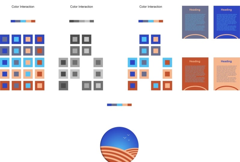
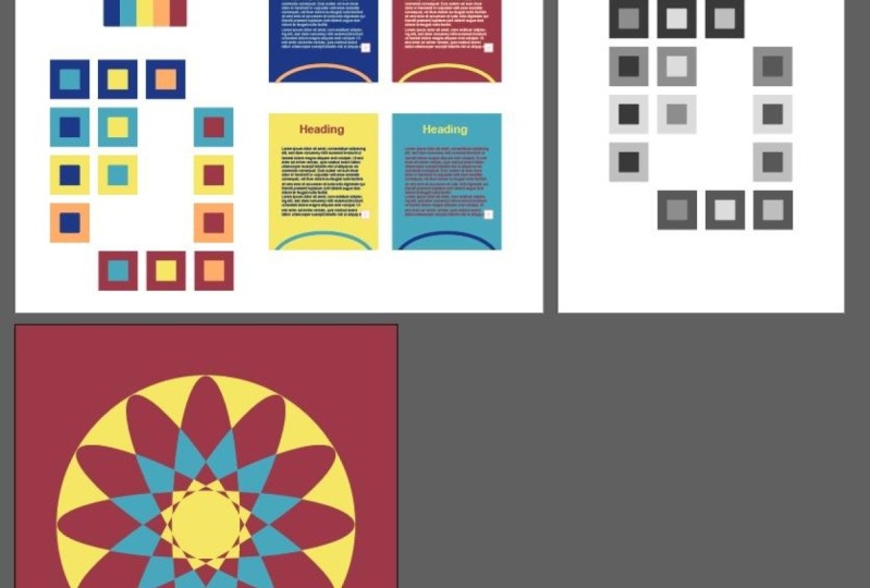
5. Color Interactions: So how do you check if the
color scheme which you decided for your brand or product
will even work or not. But let's just say
you have decided a color scheme and
you downloaded it. So I don't order it this
color scheme from coolers.co. And now I want to check if these colors will even
work together or not. So basically these are
called color interactions. Let's delete it and let him, let me just do it
from the start. Okay. Let me zoom in a
little over here. Let me delete these as well. Okay. We are just going to
keep one of these so that basically we
could copy it later on. Let's zoom in over here. Okay? So what I'm going to do
is basically I'm going to select the square tool and I'm going to create
a square over here. And I'm going to
copy this color. Then I'm going to create
another square on top of this story about this. But let's take a
square over here and I'm going to
copy this color. Let's put it on top of this. So basically, you can check the interaction
between two colors, that contrast between
two colors using this. Now I'm going to make a
couple of copies of this. I'm going to press
Alt or Option and drag it and then make
some more copies. So since there are five colors, there will be four interactions. I'm going to select this
one and copy this color. Similarly this one and copy this color and
similarly this one. Okay, So far, so good. Then I'm going to select all of these and make a copy again. And this time I'm
going to change a color off the back one. So I'm going to change
it to this one. Okay? And you can already see
which are the colors which are not willing to
work together properly. So I'm going to
select this one and replace it with this one. No. Okay. So everything else is alright. Now I'm going to copy
all of this again. This time, I'm going to select all of these and
copy this color. But basically, this
is how you keep on interchanging the colors. And let's do it, I guess two more times. Let's do it over here. Let me zoom out a little. Then I'm going to select all
of these, copy, this color. And for this one, I will have to select
the previous one. And lastly, one more time. Then I will copy this color. I hope I didn't bore you
with this whole thing. If you think that this was
boring, phosphorylated. Okay, so basically we have color interactions
with us over here. Now, let me make it a little smaller so that you
could see properly. And by just looking at these, you can already
figured out which of these colors are going
to work together or not. Okay. But before that, let me tell
you a better way to do this. You can even eyeball it. So let's just say by just
looking at this one, I can see that this is not
going to work out for us. Similarly, this is not
going to work out as well and this one as well. But there is this
thing about colors is that if you check the
value of the colors, like I said before, that light value is the brightness
and we're going to use it. So we're going to
use it over here. So if you check the
value of a color, you can basically decide. You can check if they are
going to work together or not. I have this gray
scale test over. Basically I have this same, same the circles
which I've made. They are available over here. So let me zoom in over here. If you select all these colors and you convert them
into grayscale, I'm going to go up over here, click on edit, and then
click on Edit Colors. Study, I guess object. And I forgot where. There, there it is. Sorry about this. So basically I will click on Convert
to Grayscale. Now you can see that if a
color works in gray scale, if two colors working riskier, they are most probably
going to work in non most probably they will work in the color versions as well. But you can see by looking
at just all of these, this is not going
to work out for us. So I'm going to delete this. This an ordinary
worker for us as well. This is fine. The sitar
going to workout, this is not going to work out, and I don't think this
will work out either. So let me zoom out. And over here I can basically
delete the same colors. Okay? So these two weren't
proper for us, and also these two
and also this one. So now we can even do a
real-life test for these colors. So I have this simple kind of a sample for a real-life
example, okay? So what I have done
is I have used this color as the background, then this color as the heading. And then I created a
shape over here just to add a little extra touch
and I use this color. Let me copy this, and let's
try using this again. So basically I can
select any color from this whole color interaction
and it will work out. Hopefully for us, okay. But let me select the
background and maybe change it to this color. And maybe this. Okay. Then I'm going to
select the text and I'm going to change
it to this color, or I can select
complete black as well. Then I'm going to select the heading and change
it to this color. You can see that this is
working out properly for us. Let's try again. I'm going to copy this. Let me select the background
and select this color. Okay? Let me
double-click over here, select this and change
it to maybe this color. This color. And the heading seems alright, we can change the text color. Okay, So there's one more thing. What you can do
with, with, along, along with these colors, there is always an option to
use white and black as well. So white and black are
default colors which you can always use in any
of your designs. Okay? I guess I discussed this in one of the
previous lectures as well. White and black. But
remember not to use complete white and complete
black because some, because for some reason
they don't look alright. So I can click over here and
maybe select this white. You can see that these are turning out to be
so nice for us. Let's try another one. But we can do is we can
select this color again. Okay, Let's set the
heading to this color, and let's set the text to
maybe this color on this one. These both are working
out fine for us. And let's set this
to maybe discolored. Okay? So you can see that by just doing these kind
of interactions, we have a proper example which we know is going
to work out for us. Let me zoom out a little. And I have even do this
in a design over here. There is one more
thing which we have to discuss and that is how
much color you need to use. But there is this
coiled rule called, which is called 603010 rule. So let me show you
over here first. Basically, if you look at
this, all of these designs, you would see that there is one color which I
have used a lot, which is the background color, which is the 60 per cent. Then we have the 30 per cent, which is a lot of this
color, the text color. And then over here
we have the 10%. So basically, by using
the 603010 rule, you could make some
amazing designs for all, for all of you guys who wonder at how much
color you should use. This is how you decided. If I zoom in over here, you can see that in
this design and design, I have used the same
colors, which are these? Let me zoom in over here. And you can see that by simply selecting this
as background color, I have selected these two
colors as like this is a 60%, this is the 30%, and at the
very end, this is the 10%. Okay? And you can see that this
looks really pleasing to the eyes while you're over here, we have another
example I taught. We will just do this
as an exercise. Let me zoom in over here. And I guess I'm going to speed this up because I don't
want to reassure time, so I'm going to speed
this up and I will see you as soon as
I'm done with this. We are done with this.
And now you can see that we have the color
interaction over here. So let's try, let's
check if this will work out for us
in grayscale or not. I'm going to select all of this. Then I'm gonna go to Edit, edit Colors and then click
on Convert to Grayscale. By just looking at these, you can see that which
are the colors which are going to work out for us or not. Okay, let me press
Control or Command Z. And now we have an idea. So these are not going
to work out for us. These are not going
to work out for us. This is not going to
work out for us either. Okay, let's try the
same example over here. So I'm going to copy this. I'm just going to do one. Okay? And let's select the
background color as this one. Okay? Let's let the heading color as maybe this one or this one. Let's do this one. Okay? Let's select this shape color
as this one or this one. And finally, we can set the
text to maybe write as well. You can select this
color as well. Or you can set it to white. So you can see this is
such a good contrast. And by just doing this exercise, you can determine if your colors will work
out for you or not. Obviously, you don't have to
use all the combinations. You just need to know
which are the ones which will work out
properly for you or not. Later on, I will give you
an example of Skillshare. Skillshare are
using their colors, so we are going to
cover it as well. I hope that you guys
really find this, found this exercise useful, and I will see you guys
in the next class.
6. Color Wheel In Illustrator: What if I told you that everything which we
have learned so far, like color wheel
color harmonies, and even copying the
color from an image, it is already available
in Illustrator. Illustrator has some
amazing options when it comes to color. And I guess everything
which we have learned, 90% of those things are
available in Illustrator. Basically, you will be
needing three panels. Over here we have
the swatches panel. Then we add the color
guide and the color panel. If you don't know
how I got these, let's just say you don't have the swatches panel over here. I closed it. But where do you
have to do is simply go to Window over here, roll down and simplify
in the panel. The swatches panel is over here. Simply click on it and
then you will have it. Okay, let me close it for now. Basically, what you can
do is let's just say I select the eyedropper
tool pressing by pressing I and I
select this color. I have discolored know. Now what I can do is I can click on the ruler
guide over here. And you can see that
it has already given me a color harmony
color scheme over here. And if I click on this, by clicking over here, you can see that it is giving
me different options for triadic color scheme
that trade as well. Then compound Entrez
complimentary. So let's just see
if I click on this. It is giving me a
different color scheme. Then this complimentary
to the basically it is the same color scheme
but with some extra shades. Now what I can do
is I can simply create basically
spirit over here, and I can copy this
color over here, then this over here again. So basically you
can make multiple color schemes using this. Okay, Let's try with
some other color. Let's just say I copy
this color over here. And just like that, we have a really awesome color scheme. If you want to save this, but you can do is you can
simply click over here, save color group
to swatch panel. So simply click on this. And I guess no, yeah, so now it has been saved. Now you can simply
copy these colors from over here and we
have access to them. Pretty much it. So yeah, this is how you
can easily create color schemes right
inside Illustrator. But there is more to
Illustrator than just this. Let me zoom out a little. Let me select this. And over here, I
will go to Edit. Then I will go to Edit Colors and then click on
the re-color artwork. But this recolor
artwork is amazing. You can see the color wheel
is already over here. I will click on
advanced options over here because I want
extra options. Okay? I think I made the
interface a little too big, but I just, I did it on purpose so that you could
see everything properly. Okay, so there is
this edit option and then there is
this assign option. Now what you can do is you
can go to the color wheel. So I'm going to click
on edit over here. Like I said, the
way we did it in Adobe color options with
the Adobe Color website. You can simply click on this. You can move this. And all these colors are being edited in real time
in an harmony. You can see that the
original color scheme is over there and we are basically
moving the colors around. Then there are other
options as well. I can unlink, unlink
this as well. So instead of moving
these in the harmony, they will move separately. Well, I can select
anyone I want. Like this. It's totally up to you how
you want to play this out. But these are really
great options, okay? Then let me click on this again. Then we have options for already made
colors as well, okay? But you can do is
let's just say I want something metallic
to click on this. And it has copied a metallic
color scheme over here. How cool is this? Okay? And everything which
we are doing it is also available over here. So you can select this
from over here as well, which we have already saved in swatches. But let
me click on this. Let's just say I want
some earth tones. They are available over here. I want celebration. So like obviously
these are not perfect. You can obviously change them. But it is editing the whole thing to the
best of its ability. Let's just say I want
nature like flowers. You can see that we
have this color scheme. Then we have a few Google
to scientific rigor. Those analog is complementing
the color schemes as well. These options are like amazing. Like I can go to ancient, which are similar to the
metallic color scheme it is coping somewhere,
similar stuff. And there are options to
change colors from over here. Because lectin Industrial
Color and change it, you can decrease or increase
the saturation as well. Increase or decrease
the brightness as well, like its brightness, lower redness works really
well on this. Okay. These are some amazing options. There was an option
for coping colors from the artwork as well. Then we hit Okay, over here, let me try this again. I'm going to click on this, Edit, edit Colors, and then
go to Recolor Artwork. Okay, yeah, Color Theme Picker. So it is not available
in advanced options. Let me tell you the power
of discolored theme picker. I'm going to close
this and I'm going to bring this image over here. Let me make this
a little bigger. Now what you can do list,
you can click on this, then go to Edit Colors, and then click on the
re-color artwork. And what we can do is
we can simply click on this fellow team paper and
simply click on this image. And bam, it has copied
all the colors from it. Let's tie with that image. Let me click on this. Bring it over here. Okay, It is way too big, so let's make it
a little smaller. I'm going to click
on this and click on Edit, Recolor Artwork. Okay? And over here, I will select the color picker and
click over here. And it has corporate all
the colors from over here. Obviously we made it
a little darker so we can go to Advanced
options to edit it again. Okay? So I'm going to increase
the saturation a little than decrease
the brightness. I guess this is alright,
simply took it. And we have this amazing Mandela with this color
scheme over here. And obviously you can regenerate
this again and again and again if you want to
have more options. But like I said, everything
which you need is already available
in Illustrator. You can simply go to
these colors option. Then you have color
guide option. So like I have this
color selected, just giving me complementary
and other team colors over here as well, as well. Body. Then we have the swatches. So you can basically create a
whole swatch of colors from just one image or
just one combination. So everything that you need is available right
inside Illustrator, illustrator with a
very powerful tool when it comes to colors, when it comes to
pretty much everything ready to design, to be honest. But colors are really
powerful in Illustrator. I hope that you guys
really enjoyed this and I will see you guys
in the next class.
7. Skillshare Analysis: How can you use color
2D on a website? And this lecture
is basically for everyone who is into UI UX, but for everyone else, you will also learn a lot
from this lecture. So we have skillshare over here, and you can see that there are some colors which
are quite prominent. Like they're green. This is like the
main green color which is extremely prominent. And they are known for this. But there are other
colors as well. But you don't notice them
because you are not looking to the website with the IR for our designer
or maybe a colorist. Because the thing
is, the thing about good coloring scheme
is that it is prominent enough that you get main colors of the
website or the brand, but at the same time you
don't notice it as well. Okay. But let's start
with the first one. I also have Adobe colors
opened over here. Let's refresh this
and let me show you how we can basically
analyze this website. So basically I'm going to select my color picker over here I have this Chrome
extension called colored Zillow. So basically it using
this extension, you can copy any
filler like you can. If I hover over it,
you can see that I can be any color I want. Let me try it again. You can see that I can copy this color on maybe this color. So if I hover over this color, you can see that I can copy it. So I'm going to click on this, and now it is copied. I'm gonna go to Adobe teams. So the Adobe color over here, I'm going to paste
the color over here. Control V, paste
your dark color. And now Adobe is giving me
the analog is color theme. But the thing is, using this, we can determine what color
scheme is Skillshare using. Over here we can click on monochromatic triad,
complimentary. But if you look very
closely over here, this is what
Skillshare is using. This is the green color, and then there is purple. And this is the color
which they are not using. If you go back to the website, you can see over here that they are using purple
so much over here. Again, it is not very prominent, but at the same
time you notice it. But again, if this subtotal that this is the main
green color and they have used the veneer of the triad colors as they
are secondary color, which is also in some
word, excellent color. Over here, you can see that this is the failure
which they are using, and this is a collaboration
they are not using. Apart from this, they are
also using this color. If I copy this and then
I paste it over here, let me copy this first. You have to hover
over it to make sure that you copied properly. Now if I come over
here and I copy this color over here, okay? And then I go to
monochromatic color scheme or analagous colors. You can see that
they are also using. They're not using just one, not just triad color scheme. They are also using analagous. You can see that
this is somewhat Skillshare's main colors and this is the darker version
of the same color. They have basically used a shade of this same
color over here. So this is the main color and this is the shape of
that specific color. Apart from this, they are using gray as the
neutral color over here. And on top of that, they are also using
this white color. So like I said before, you can always use complete
via it and complete black as extra default colors. So what is the color of
the texture over here? If I click on this? If I hover over any of
the texts, for example, over here, this is basically
the same color as this. If I paste it over here, you can see that this
is the same color. They are using the code to use
a black over here as well. But like I said before
that you shouldn't use complete black or
complete white as well. I'm sure this is not
completed by it as well. Let's try hovering over it. Okay? So this is complete
right over here. In some cases you can
definitely use it. But a complete black is always not recommended because it looks it becomes a
little too harsh. Yeah, this was pretty much it for the analysis of Skillshare. Let me go through it again. They are basically using
a triad color scheme. And that triad, they are
not using the third color. Apart from this, they are also using an analogous color scheme. And they have basically
use a tint of color, which is this green. I hope that this was very
insightful for you guys, and I hope that you
guys really enjoyed the lecture and I will see
you guys in the next one.
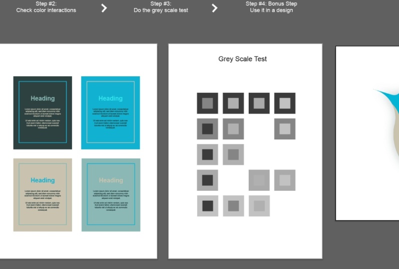
8. Class Project: It is time for your
class project. So in one of the
previous lectures we learned about
color interactions. You can see over here. So basically you have to do the same thing over
here in this project. Basically I have written down the steps over here as well. Step number one is don't
load a color palette. I have already downloaded
well for you from coolers, you can download one yourself
and use it over here. Then step number two is
checked polar interactions, like I have done over here, and then I did for
this one as well. I forgot to save it. So basically you have to check the color interactions
over here as well. Then I would recommend that
you create these as well. I didn't add this
as a separate step. So basically like I
have done over here, you have to check your color interactions
using this example as well. After that, you will
do the third step, which is test the story,
the grayscale test. You will copy all of this, select and copy it
over here using Alt. And you have to
test it over here. By the way, there might be some people who don't
know Illustrator. So you can simply
recreate all of this in the program of your choice and do the exercise over there. And lastly, which
is the bonus step, you have to use your
colors in our design. So it could be as simple as
the one I made over here. Or you can make
something complicated. Make sure that you submit your projects in the project
section on Skillshare. I can't wait to see all of your designs and all
of your projects. But I hope that you guys have a really fun time
doing this project. And I will hope to see
you in the outro video.
9. What's Next: Congratulations, you have made it to the end of the course. And it wasn't that
big either, right? But the concepts which you have learned are really important. And I hope that you have a
sound knowledge of colors. Now, if you make any designs
using these concepts, don't forget to share them
in the discussion section, I would love to
check out your work. And if you go into certificate for completing this course, kindly send me an email at
Teilhard payload digital.com. And remember, you will only get the certificate if you have
completed the class project. A little disclaimer, it won't be an official certificate
from Skillshare. It will be from my
personal brand. Towards next, I am
assuming that you took this course since you
are already a designer, I have other courses as well which could be really
useful for you. Like I recently made a course on graphic design principles, which really go hand in
hand with color theory. I then also have beginners and advanced courses on
Photoshop and Illustrator. If that is your cup of tea, you can check them
out on my profile. So one last thing
before we end this. Basically there is
a review section with this course
here on Skillshare. So whatever feedback
you have, good or bad, kindly read it over
there because it really helps me in
making better courses. So I guess this is Bye for now. I hope that you had a really
nice time learning and I hope to see you in
another one of my courses.
 Talha Bhatti, Graphic Design Instructor