Transcripts
1. Introduction: Hello there. My name is Talia and I'm a Graphic
Design instructor, and I have a confession. When I started off as
a graphic designer, I learned all these
fancy design tools, but I still couldn't
make any good design. Well, it's because I didn't know their design
principles properly. And to make sure that you don't
make those same mistakes. I created this course in vitro. Teach you all about
design principles and 2D so that you could make
some amazing design. After completing this course, you will be much more
confident while designing. You will spend way
less time working. And finally, you will
know exactly what is missing from your designs
and how to fix them. So what exactly will you
learn in this course? We will start by learning about negative space and how the biggest companies in
the world like Apple, Google, and Tesla, and
use them in their design. We will then learn about
alignment and balance and their different types with
the help of some examples. You will also learn
about hierarchy, how to create it
in your designs, and it's different patterns. The difference
between and rhythm, and how to effectively
use them in your design. We will also learn
how contrast and emphasis can really make
or break your design. And finally, how you can make your designs
more interactive. It's scaled proportion
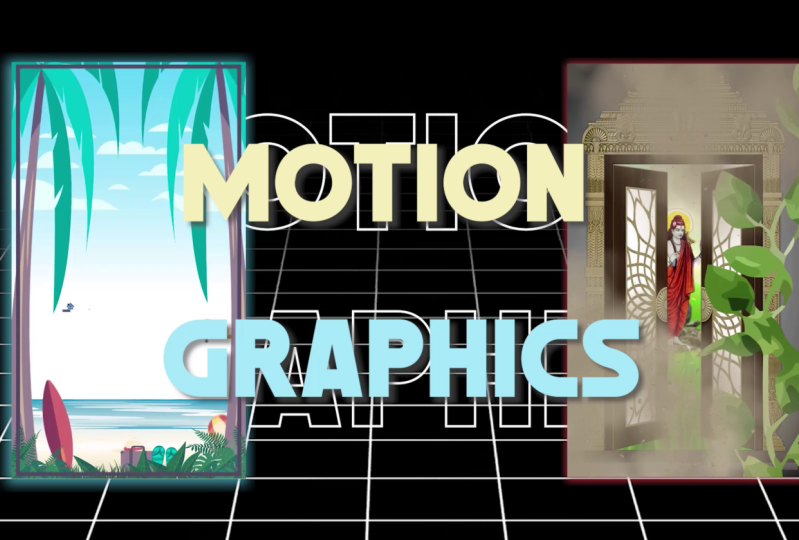
and movement. So who is this course for? Well, if you do any kind of visual creative work
like graphic design, motion graphics,
or make websites. I believe this will
really benefit. You can download
the project file from the link given below. And I can't wait to see
you in that cohort and vomiting after you're
done watching the course, don't forget to leave
your feedback because your feedback really helps
me in making better course.
2. Negative Vs White Space: Hey guys, I hope
you're doing great. You made it into the course, and I would like to welcome
you to the first video. So today we are
going to learn about negative space and whitespace. These are two concepts which are a lot of people
get confused with. They are really
important to be honest. Let's get started. Let's get started
with the first one, which is negative space. So let's define it. First. Negative space is the empty area around or between
our design element. So it could be around your element as well
and in-between as well. I will later on explaining
to you what I mean by that. It is used to show
another design element apart from the main subject. So you could have a main
logo or main design element. If you want to show something
else with negative space, you can show it as well. Confusing a little. Let me show you some examples. Mostly it is used
in logos and we are going to use logos as examples. The first one is FedEx. You can see the FedEx
logo over here, and it is very intuitive. I totally love it. You can see that between
the E and the X over here. Let me show you, show
you with my mouse. So you can see that between
the E and the X of the logo, they are showing
the complete logo, but there is also this
arrow in-between. So basically this shows moving forward since they are
a delivery company. The second example is
Tobler on the chocolate. You can see a lot of people
don't know about this. There is actually a bear
in the mountain over here. Okay. So Tobler on was made in a city. I don't remember the
name of the city, but it is in Switzerland That city is popular
for their beers. That is why they decided to incorporate beer
into their logo. And finally, formula one, which is very iconic,
very popular. You can see that there
is actually a one in between the F and
the flag over here. I guess this is a
flag for the endline. But you can see
that this looks so nice and they use negative
space so well over here. So this was negative space. Now, let me explain
whitespace to you. So what is whitespace? Whitespace is the
empty area around the design element or text
to make it more visible. Let me further
explain it to you. Mostly it is used on websites. Let's, let me show you
with a couple of examples. So Google is one of the best
examples of whitespace. You can see that
the whole interface is just in-between
at the very middle. And there is a lot of whitespace
around the whole thing so that people would be
focused on the very middle. And there is a lot of breathing
space for the design. Similarly, Apple
uses it really well. You can see that
they make sure that their products have
a lot of whitespace. And by now you might
have figured this out. Whitespace doesn't
really mean white. It could be any color or
maybe an image as well. You just want to make sure that your design elements
are focused properly. And lastly, Tesla, like I said, that whitespace
doesn't really mean, it basically means empty. If you want to show your
main element in the middle, you make sure that there is a lot of breathing
space around it. So yeah, these were examples for negative space and whitespace. I hope that you guys
really enjoyed this. I hope that you
learned it properly. If you guys have any questions, you can basically commented down below and I will make
sure to answer them. I will see you guys
in the next class.
3. Unity Vs Variety: Welcome back guys. I hope you are doing great. And today we are
going to learn about unity and variety in design. So these are two of the most important
principles as well. But unity is really important because if you don't have
unity in your design, everything will fall apart. Let me further
explain it to you. So basically we have unity
over here and directly give design the appearance of
oneness or resolution. So whenever you are designing, you want to make sure
that every element and every color and
every shape makes sense, they all fit together. There is also a
thing about unity. Sorry, about design. A good design is seamless. It is not obvious that whenever someone looks at their design, they cannot tell
why it looks good. If they are a lemon obviously, but they just know
that it looks good. So that is unity in your design. This ensures no single part is more important
than the other. When you have unit
in your design, people cannot just figured
out that we are focusing on this specific part because
we want to make sure that the whole thing as a
whole makes sense. I'm sorry, that was a lot
of hole in one sentence. Let's get to variety over here. So variety in design means
using different sizes, shapes, and colors
in your artwork. To create visual diversity, you want to make sure that you use different sizes and shapes, and colors and patterns and textures that make your
design look really nice. But if you go
overboard with them, it could look hollow, horrible. Sorry. Yeah, there is also a very nice code for
unity over here. So to achieve visual
unity is the main goal of graphic design when
elements are in agreement, or design is considered unified. This is the important part when all the elements
are in agreement, they could be of different
shapes and sizes and all we will discuss it
later lectures as well. But they all should make sense. I have an example
for you over here. By the way, this quote
is from Alex white. The book is the element
of graphic design. The elements of
graphic design, sorry. So Vr, over here, we have two examples,
unity and variety. On the left you can see that we have a couple
of circles which are the same color
but different sizes. So basically they have unity in color but variety in size. Then we have another
example over here. There are a lot of
circles over here, but they have different colors. So they have, they
are unified by size, but they have variety by color. I forgot to add some real-life examples of
unity and variety over here. But let, let me make this
as a task for you guys. Go out there and find some
examples of unity and variety that which basically shows that they are present in our
design and post it over here. And we will discuss
it later on as well. This was pretty much
it on unity and variety and how you can
use them in your designs. I hope that you guys have really enjoyed this class and I will see you guys
in the next one.
4. Alignment: Hey guys, welcome back to
another class and today we are going to learn about
alignment in graphic design. So I know I look a
little different. I actually had a haircut
while recording this course. But, uh, yeah,
let's get started. So we are going to learn about alignment and let's
first define it. So basically the arrangement
of various items in relation to the edges or items themselves
is called alignment. But that basically means
is that you align things based on a site or a
Corner, naughty corner. But aside, like left aligned
or right align or you arrange the thing
based on the things themselves, like center line. Let me further
explain it to you. So basically there are
two types of alignments, like I said, edge alignment
and center alignment. Let me give you some
examples of alignment. First, you might have seen
these icons over here. Let me focus on this. So you might have seen
these left align, right align, top line,
and bottom line. These are the basically the
four types of edge alignment. You might have. Whatever tool you use, like Adobe XD or Figma or
Photoshop or Illustrator. Whatever design tool
you use there is always alignment
options in them. So these are examples
of edge alignment. You might have seen
these icons before. Similarly, you might
have seen these as well, like this one and this one. So this one is vertically centered and this one is
horizontally centered. You can use center align or Agilent depending
upon your need. So here are some
examples of alignment. And you can see the first one, which is good alignment. You can see that everything
is properly aligned and it looks neat and all the
blocks are proper. And the right one, it looks a little messy
because it's mixed align. The thing about misalignment is that you can use it as well. But if you don't use it
properly, like over here, it looks weird and it looks
like chaos and their design. So I will give you some examples
of misalignment as well, that how can you use them
in your designs as well? So alerts first, see some
examples of good alignment. So these are some of the designs are books
which I really like. The first two are
basically center aligned. So you can see that all of the text over here
is center aligned, similarly over here as well. But the thing about center line is that it is a little tricky. You have to make sure
that you use it properly. There is, has to be some
emphasis on the important text. Otherwise, people don't read
a lot of center line texts. People can read a lot
of left aligned text. Same with the right
align, right align. This also very tricky. Over here on this example, you can see that this
book hyperfocus, all the text is left aligned. So whenever in doubt, always use left align. So here are some examples
of mixture line. Like I said, that mix a line
can also be used if you use the other principles with it properly and especially balance. You can see that in this
image, in this cover, you can see that
all the text is, all the text and everything
else is mixture line. But the thing is, it
is all balanced out. Similarly over here, it
is not aligned properly, but it is balance. Balance is one of the most important
principles when it comes to using
mixed alignment. So make sure that
you use it properly. Lastly, using of grid is really important when
it comes to alignment, especially in a UX designer
who use this UI UX, like you work on Figma and Adobe XD and other
similar software, make sure that you use
Grid properly because grades are really important
when it comes to alignment. Yeah, I guess this was
pretty much it on alignment. I hope that you guys really
enjoyed the lecture. If you guys have any question, feel free to let me know and I will make sure to answer them. I will see you guys
in the next class.
5. Balance: Welcome back guys. I hope you are doing great. And today we are going to learn about balancing graphic design. So balance is also a really
important design principle. And in the previous class, you might remember
that I mentioned that to use mixed alignment
balance is really important. So today we are going
to learn exactly what balance is and what are
its different types. So let's get started. Let's first define balance, the distribution of
visual weight of objects, colors, textures, and space. Basically all of this
defines balance. Balance doesn't really mean
that in the real world, how we say is that one thing is one-kilo and other
thing is two kilos. So this one would
have higher weight. In design. The balance could be based
on a lot of factors, like I said, colors, textures, space, objects, a
lot of other things. So let's define the
types of balance. Basically, there are
two types of balance, symmetrical balance, asymmetrical balance,
radial balance. We have three examples
over here as well. So over here you can see
that in symmetrical balance, everything is properly balanced out from the left side
and the right side. But when it comes to
asymmetrical balance, everything is not even this. This is one block. There are six blocks over here, and they are balanced
out but not symmetrical. At the same time,
I will show you some examples and
you will be able to understand them
properly then. Lastly, radial balance. So if you basically copy
anything in a circle, it becomes readily balanced. I will give you examples
of this as well. Let's first cover
symmetrical balance. So here it is the best example
of symmetrical balance. You can see that everything
is basically identical. You would see that there are three circles over here and
three over here as well. Then there is this
block in the middle. Similarly over here,
we can basically call this somewhere to radially
balanced as well. If there were maybe
more of these blocks. And then here's this
example as well. Let me give you some
real life examples. So you can see that we
have this magazine cover. Basically, everything over here is not properly
balanced according to, you would say, the rule. But since this one and this
one is properly balanced out, similarly, this text and this text is properly
balanced out. The whole thing is basically
symmetrically balanced. Let's first go then cover
asymmetrical balance. So you can see that
everything over here, everything seems like a chaos, but it looks pleasing
to the eyes. If your design looks
pleasing to the eyes, I would say that it
is balanced out. Because every design
in the world, every good design in the world, is basically balanced,
otherwise, it looks weird. And lastly, radial balance. You can see that over here, everything is in a circle. All the Mandela, as you might
have heard about this term, it is a very popular
term in design. Mandela's or basically
readily balanced design. That is why they look so good. Similarly over here, this
looks really nice as well. Yeah, I guess this was
pretty much it on balance. Let's do a little recap. So basically there are
two types of balances. Symmetrical balance,
asymmetrical balance, radial balance. And if you know how
to use them properly, it will be a game
changer for you because you have to use it
in all of your designs. So I hope that you guys
really enjoyed this class. If you guys have any questions, feel free to ask me.
6. Hierarchy: Welcome back guys. I hope you are doing grid
and today we are going to learn about hierarchy
in graphic design. So let's get started. Let's first define it. The process of visually
ranking elements is called hierarchy. Okay? So let me tell you
what is the use of hierarchy because
just understanding that definition won't
be enough for you. Basically, hierarchy is used to add structure to your design. Great visual organization, like wording is important
and what is not. Create direction. You can tell the
user what to read first and where to
read afterwards. Then add emphasis on
one specific thing. And lastly, help you navigate and digest
information easily. So if you have proper
hierarchy in your design to user won't be overwhelmed
with all the information. They would be able to read
the whole design easily, not just detect, but the
whole design easily. So what happens if you don't have hierarchy in the design? So no hierarchy basically
creates confusion. Your user is left with confusion that what you are trying
to convey in your design, because as you know, that graphic design is all about conveying
your information. And lastly, doesn't
tell what is important. If your design doesn't
tell what is important, your design is useless
because a design basically solves a problem and it tells
the user what is important. For example, if in a design
you are trying to show a shoe and the
price of the shoe. If the user doesn't
buy the product at the end of watching your design, your design is useless. So how to create hierarchy? Basically, there
are multiple ways through which you can
create hierarchy. Number one is size. By default, if you look
at this specific design, this whole screen, What
are you reading first? Obviously, the bold
red text at the top. So size basically
creates hierarchy. Second one is color. Again, I'm using hierarchy
in my own design over here. The red text is important and
you are reading that first. Then topography. You can use typographic to
create hierarchy as well. And lastly, layout. I'm going to give you examples of all four of these in
the next couple of slides. So number one is size. You can see that I have
three examples over here. And all, in all three examples, you are basically
reading the texts which is boiled first, die with 0. Next rule, Sherlock Holmes, you will always read the bold and the bigger size of the text or the
bigger thing first, because your eyes,
it is important and after that you read
the other information. So size is one of the best
ways to create hierarchy. The second one is color, too. I have two examples over here. And in these two examples, you can see that there
is a lot of icons on the right one and there are some texture on the
left one as well. But I instantly goes to
contrast and the first one, and the word arts
in the second one, because there is hierarchy
depending upon the color. Then typography. So you can see that it says, it is very nice that it tastes. Hierarchy lets you let the reader know
where to look first. You can create, sorry, It can be created using size, weird color, and space. So by default, you are reading
all of these depending upon the way the user
wants you to read, okay? And lastly, layout. So if you are into UI and UX layout is extremely
important because otherwise you won't
be able to tell the user how they should
read the whole thing. And voting is important
and what isn't. Layout is also really important. So the thing about hierarchy is that you don't
have to use one rule. You can use multiple rules. So in both of these examples, you can see that in this one, the color is also used. Even in the color, there are different colors so that you will do focus
on both of them. And then similarly over
here in size as well. So similarly over here, you can see that layout has been used in the size has been used, the color has been used. Even the typography has
been used because you read the bold text first and the rest of
the text later on. Okay? And lastly, the
patterns of hierarchy. These are really
important when it comes to creating any kind of
design, but especially text. And whenever you are
making websites. So there is the F pattern
and the Z pattern. So first, let's first
cover the Z pattern. The Z pattern is
really important in website designs because
people actually read the information
from left to top. Then they come down like this Z pattern and then they read the rest
of the information. So you might have seen that the navigation bar is
always there at the top and it has all the
important links because people read from
left to right first. And similarly in the F pattern, that pattern is really
important when it comes to writing because people
read from left to right, like I said in the previous
tutorials as well. This was pretty much it on
hierarchy and how to use it. I hope that you guys
really enjoyed this class. If you guys have any questions, feel free to let me know. I would love to
answer all of them. So I will see you guys
in the next class.
7. Repetition vs Rhythm: Welcome back guys. I hope you're doing great. And today we are
going to learn about repetition and rhythm and what is the difference
between them? This is going to be a
really short class, but I would say that these
two concepts are really important if you are into
making patterns and textures. So let's get started. Let's start with repetition. Repetition is the recurrence of a design element commonly utilized in patterns
or textures. So if you haven't
made a texture or a pattern in mostly illustrator, you might have seen that you
just create one element or a couple of elements and then
you repeat them infinitely. That is what our
pattern or texture is. So let me show you some
examples. Over here. You can see that there
is just one element over here and it
keeps on repeating. Basically, we have just
one hexagonal element and it keeps on repeating. Similarly over here, we have this circle over here and
it keeps on repeating. But the pattern or texture is not the only use of repetition. You can use repetition for
basically emphasis as well. Since everything
the background is, keep, keeps on repeating. The emphasis is on the ball. And this guy over here,
this was repetition. Let me know,
explained you rhythm. Rhythm is similar to reputation, but a little different. So rhythm basically,
basically means just like reputation is created by
reoccurring design elements. But yes, there is a bird, but they don't have to be
similar in repetition. Let me show you over
here in the petition, everything keeps on repeating. But in do them, let me show you an
example and do them, the things keep on repeating, but they are not seem. So in this example over here, you can see that we have these ovals over here
and they keep on, the size of these
keep on increasing. And they are basically
repeating in a spiral. But at the same time, they are repeating, but
they are not the same. They are basically causing
a rhythm in design. Similarly over here you can see that we have a
couple of circles. Basically, all of
them are different. All the lines, all the
circles are different, but they are still giving
us a feeling of repetition. So you can even call rhythm as asymmetric reputation because all the things
are not similar, but they still give you
the feeling of repetition. So I hope that I was able to convey you the
concerts properly. I hope that you were able to understand the repetition
and rhythm properly. If you guys have any
questions, as always, feel free to ask me and I will
make sure to answer them. I will see you guys
in the next class.
8. Contrast: Welcome back guys. I hope you're doing great. And today we are going
to learn about one of the most important
design principles when it comes to typography. And that is contrast. Because if you don't
have contrast in your designs and
your typography, people won't be able to understand what you
are trying to say. So today we are going to learn that and let's get started. So the difference
between two elements in our design is
called contrast. There is another principle
under design principle, which is called emphasis, which is very
similar to contrast, but we are going to cover
that in the next video. Okay? So it is used to
create an effect. So if you want to
create any kind of effect in your design, contrast is really important. It is used to
create emphasis at, is used to add a visual appeal. And there are some examples
of contrast as well. So just like a lot of
other design principles, you can create contrast
based on shape, scale, color, and
layout as well. But the most important one, which I would say
is based on color, like you can see over
here in this screen. What is one thing
which you are focused on the most, the word contrast, because the contrast of this color according to the background is
really, really high. Similarly over here you can
read this properly because the contrast of this color and the background
color is proper. Okay, So let me give you an example of good
versus bad contrast. Over here. The first one is definitely good contrast because you
can see it properly, okay? In the next one, you cannot see it properly because the contrast
is not proper. In this example, the
maroon color is not proper depending upon the background color.
You know what? Let's forget about these slides and let me show you a website which is really very useful
and I really like it. So let me go to Google
over here and let's write on trust checker. There are a couple of absurd
which you can use the but the one which I really
like is coolers.co. So let me open this one. And this website is really nice. I really love it
because it shows you if you have a background
color and the text color, and it actually
gives you a rating that whether you
should use it or not. For example, if I have
the text color like this and I changed
the background color to maybe something like black. You can see that this text
is not readable and it is giving us a proper
reading for this as well. Maybe slight green,
a very light green. You can see that the reading actually
matters because it is telling us that the contrast is very good for
these two colors. Then you can basically select any color for the text
and the background. And it will give you a proper rating for
a contrast reading. And it also tells you
if the text looks good on small text
or large text. So, yeah, this is a very useful absurd and I thought I would tell you guys about it. I hope that you
guys really enjoyed this class and I will see
you guys in the next one.
9. Emphasis: Welcome back guys. I hope you're doing great. And today we are going to learn about emphasis in
graphic design. Emphasis is similar to contrast like I mentioned
in the previous class, but they are a little different. And in this class, I will tell you how. So let's start with emphasis. Let's define it. So emphasis is used to focus the viewer's attention on a certain part of a composition. If you want your viewer to
focus on one specific thing, this is what emphasis
is basically used for how it is achieved. So the effect is achieved by manipulating the design
elements like color, shape, and size to make specific part of a
design stand out. So in this whole slide, which is one thing
that I am focusing on, I am emphasizing on
the word emphases. So yeah, that is
emphasis section, sorry about the lame joke. So in this example, you can see that we have
this pattern over here, but our eyes instantly go to this specific
hexagon over here. Why? Because of It's color, it is different from the others. Also the same concepts
which are for contrast, they are also applied over here. Emphasis is also created
depending upon the size, the color, the topography,
and the layout. Similarly in these
examples as well. But let me give you a little
more practical example. So we have two
designs over here. And in both of these designs, your eyes automatically
go to a certain point. Why? Because we have emphasized
on that specific part, like in this example, your eyes automatically
go over here, even though the rest of
the design there are different colors and the
background is black. But still they go up to this point because we
have emphasized on it. Similarly in this example, or eyes automatically
go to this person over here because we
emphasized on this person. This concept is a lot, a lot of the time,
this concept is Jewish in movies as well. Yeah, basically, if I tell you what is the difference between contrast and emphasis, contrast is like on a
very small-scale and emphasis is like the bigger
picture of the whole design. If you are trying to create contrast between
just two things, if you are trying to, yeah. So contrast is between two things and emphasis is
between a lot of things. This is the simplest
way I can define it. So yeah, I hope
that you guys now understand the different
routine contrast and emphasis. Emphasis is so important
and how to use it. I hope that you
guys really enjoyed this class and I will see
you guys in the next one.
10. Scale, Proportion and Movement: Welcome back guys. I hope you are doing great
and congratulations, you have made it to the last
video of the whole course. In this class, we are going to learn about three concepts and they are scaled,
proportion, and movement. Since I think these
three concepts are pretty much similar, that is why we should
cover them all together. So let's start with the
first one, which is scale. So scale in design is the sizing of elements to create
a focal point. Okay, so let me tell you how. So what happened is that
as you create scale based on something really
large or really small, you create an unrealistic scale and realistic size of things. You can see that we have some really small
trolleys over here. On the top of the trolleys, we have some really
gigantic elements. This ice cream, this ball and this badminton shuttle acog, I guess this is cold. So since there is
scale in the design, the trolleys are so small, we are forced to focus
on the larger things. Okay? So basically this is
how you create scale. I have another
example over here. We have some really large text at the background and
a very small car. Since texts cannot be
bigger than the car, this creates an
unrealistic kind of expectation and
that is why we are focused on the text
and the car both. Okay? So this is scale. Now let's cover proportion. Proportion is the actual size between two design elements. Unlike scale and proportion, you make sure that the sizes are actually
the same because the proportion has to be same according to the
real-life example. I'm sorry if you can hear this, but I guess there is someone using the
hammer in my house, so I'm sorry if you
are hitting this, but I'm sure I won't
have to re-record this. Pooled proportion versus good proportion versus
bad proportion. So in the first example, you can see that this
is bad proportion. A person cannot be as
big as the house, okay? You might be able to use
this in a scale example, but not in this
proportion example. This is good proportion. The person is standing up
front and artists why? This is how a person
in the house can be of the same size Depending
upon the perspective. Okay. Yeah, this was pretty much
on scale and proportion. I guess if we have
another example, the basketball is obviously this much bigger
than the baseball. If the baseball was as
big as this basketball, it wouldn't have made sense
according to the proportion. But for scale, you
can definitely do so. And the last concept
is movement. The movement, then
graphic design movement doesn't refer to the
movement of images on screen because
otherwise it would become motion graphics
or an emission. In graphic design, it is
something very different. Instead, it refers
to movement or viewer's eye as they
move across the screen. So basically you
create the movement of your user's eye on the screen. Your design is so moving that nor moving in
a spiritual way. Let me give you an example. So we have a couple of
examples over here. And in this example,
in the first one, you can see that by default
we are forced to look in the middle because both the
punches are moving inside. Similarly in this example, there are circles over here and this vertex comes down to
this part and we are focused, we are made to
focus on this part. Similarly, over here,
it looks like that the, I guess this is a slot and the slot is running,
right words. So basically this is how you can create movement in your designs. So I guess this
was pretty much it on scale, proportion
and movement. I hope that you guys really enjoyed all the concepts
in this course. And if you guys
have any questions, feel free to ask me because I would love to answer
them because I would want you guys to
understand these concepts properly and implement
them in your designs. So, yeah, this was
pretty much it. I hope that you guys
really enjoyed the course. And I will hopefully see you
in the outro video. Bye-bye.
11. Class Project: Welcome back guys. I hope that you are doing great. And I guess it's time to tell you about the
class project. The class credit is very simple. All you have to do
is basically select any design principle
from the whole course. It could be anyone with
you like the most, and you have to
basically explain it with at least two examples. The thing about example this, that you could take the
examples from the Internet. Or it would be much better
if you design something yourself and explain the
concept using those examples. So I hope that you guys really
enjoyed the whole course. I hope that you had a fun time learning
the design principles. And if you guys
have any questions, feel free to ask me down below, and I hope to see you guys in
another one of my courses. So bye-bye.
 Talha Bhatti, Graphic Design Instructor