Transcripts
1. Hello!: Hi, my name is Christine and welcome to this wonderful and vibrant abstract painting course. Every step is a great milestone on your way to master the art of abstract painting, you will learn how to create wonderful effects using multiple layers of color and stunning contrast. You will use the palette knife to apply colors in very unique ways that you will find very useful for your future paintings even if you are new to acrylics. This is a very simple artwork to make. You will be guided through every step in order to have a great experience with all of that being said, welcome to the wonderful world of abstract painting.
2. Materials: For this abstract acrylic painting, you will need the following materials. On Canvas that has 40 by 70 centimeters. A big mixing palette for mixing the colors, the palette knife for mixing the colors and applying them on the Canvas. A big wide brush for applying the colors very efficiently. And small brush for corrections and details. A graphite pencil for a quick sketch at the beginning. And the following acrylic paints. Cadmium light yellow, cyan blue, dark titanium white, permanent red, violet light, some bright orange. This one is mad and it has a great luminosity. And a little bit of black Mars. And that's all. Now, let's get into the journey.
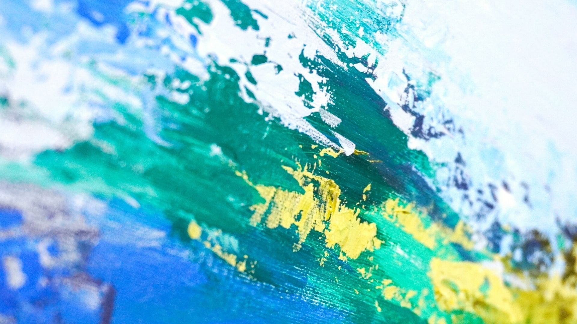
3. Light Blue Shapes: For the beginning, you will need the graphite pencil to make a couple of marks on the canvas. Don't be afraid to draw as much as you want. At the end, everything will be covered with paint, with a canvas centered on landscape. You will want to make a couple of straight lines shapes. These shapes will have different sizes, but you will want to keep the lines parallel with the edges of the canvas. This will help you organize your composition so you can later play with the different layers. So you will begin to shape the first form, living from near the middle of the top edge of the canvas, going down with a straight line. It doesn't need to be too long. From there, you will go parallel with the top edge of the canvas to the right with a short line. And then from there you will descend, once again, making a shape like some stairs. From there, you will connect the end of the last line with the right edge of the canvas. So after this, they're like shape is formed, you will create a square inside the form on the top right corner. All of this form will be filled with blue, but this small corner will be of a lighter blue. After the first form is finished, you will move to the middle of the bottom edge of the canvas, a little bit more to the left side. And from there you will create a rectangle that goes up. You don't want to place it underneath the last form. Make sure it's placed a little bit to its left side. For the top of this shape, you will create another stair like shape. This will create an interesting relation between the two forms. Now, you will relink the top of the form with the bottom edge of the canvas. Now, moving to the left side of the canvas, you will create another shape that goes towards the middle of the composition. This will help the composition have a clear direction, which is the middle of the canvas. Like shaping some arrows that indicate towards the middle. So you will go near the middle of the left edge, but a little bit more to the bottom. And from there, you will live with a short straight line parallel with the bottom and the top edge of the canvas, then you will make another short line going up at 90 degrees. After that, you can look for a point for the end of the next line. And then from there, you will relink the point with the end of the last line. Now for the top of the shape, you will draw a long line parallel with the canvas, going to the middle of the canvas and at the end, link it with a vertical line with the other one. For the last shape, you will go to the top of the one from before and create a simple rectangle. You will want to make it very stretched horizontally, so it will look like a stripe of color. Let's make this form a little bit more big on the bottom. Now that the main shapes are, then you will start the first color step. For this step, you will need the beautiful cyan blue. And now let's add it to the mixing palette. You can add a bigger quantity so it can be enough to go through the entire step. And now next to the blue, you will add the same amount of white. Now you can start to prepare with the palette knife, the first new ones, so blue. So let's grab the palette knife and create a very light blue. You will take a little bit of blue and add it to the white, gradually incorporating the blue and the white when mixing the color, it is better to start with a smaller quantity of darker colors. So you can have more control over the way the color shifts. Color will be very light and bright. You will want to apply this light blue over the small square from the top right corner. And then you will add the rest of the blue from the mixing palette to the light color next to it, and add it to the bottom and the left side. For now you can grab your big flat brush and take a good amount of the color from the mixing pellet. Now let's apply the color on the small square. While doing this, make sure you are also covering the edges of the canvas very well, making sure all the surface is very well covered. You can also leave some fine stripes of color for some very delicate textures. Now that the square is colored, you can grab the palette knife and gradually add the blue to the light color. You will want to obtain a color that is slightly more saturated, somewhere in the middle between the one from before and the clean cyan blue. You don't have to add all the blue. You can keep some of it for the end, for some accents of bright blue. Take your time to mix the color very well so the color can be as uniform and smooth as it can be. Now you can grab your big brush and take some of the newly created color and start filling the rest of the form from the top right corner. While filling the form, you will want to make sure you won't cover the blue square from the corner, but you can lightly go over its edges so you can nicely covered the white of the canvas. Let's take some more of the color and cover the bottom side of the form using vertical motions. After the color is applied, the entire form, you can go over it once again and make it a little bit more uniform and get rid of that excess color, go around its edges with the tip of the brush. After the form is filled, you can move to the form from the bottom side of the canvas. And using vertical motions, drag the color downwards, creating that beautiful blue square. Maybe make it a little bit more larger on the top. And adding that extra shape on the top right side of it. After you have nicely corroded, you can feel your brush once again and move to the left side of the canvas. If the form is displaced horizontally, tried to use horizontal motions when filling the forms, this will make the process much more faster and you'll make sure the edges of the forums remains as straight as they kept going on the edge of the canvas as well, discharging the brush and making sure that Canvas don't show up. And now for the bottom of the shape as well. And dragging the color towards the middle of the canvas, making that bottom square a little bit bigger. Take your time to make the edges of the shapes as straight as you can. Don't rush the process. It is very important to pay attention to every step when creating complex compositions. Now, let's take the brush and mix some of that cyan blue and the color from before. You don't have to take too much color, just a little for a couple of contrasting accents. For the first form, the one from the top right corner, you will go over the bottom edge, likely blending the blue in the color, creating a gradient. Take some more and moved to the top side of the left edge, creating some textures with the straight edge of the brush. Don't go over the entire form. You can limit yourself to the half. Now let's move to the form from the bottom and apply some of that blue on the left edge and on the right edge as well. After that, you can take the rest of the blue from the palette and go over the form from the left side, going around the edge with a couple of light brushstrokes. Don't blend it too much. So it can have some darker accents of blue here and there, so the colors don't appear to plane. Or an interesting, Let's take some more and apply on the bottom and go over the two stripes of blue as well, making the line from the right side a bit more straight and dark, and the one from the bottom right side, making it more vertical. And now the first step is done. You can move into the next step without waiting for the colors to dry.
4. Dark Blue Shapes: For the next step, you will want to establish the next zones where you will work. So using your graphite pencil, you will create three forms. One on the bottom right corner of the canvas between the two Blue Zones. Another one on the bottom left corner, a little bit smaller, and another one on the top left corner, even smaller. As you can see, all the forms have different sizes and shapes, which brings a lot of diversity through form, even though the directions are the same. Now, you will shape the first form on the bottom right side of the canvas, linking it through a small bridge with the one from the top. Then from its end, you will move to the right with a slightly more longer line and then descend until you meet the bottom of the Canvas. Make sure the lines are straight and parallel with the canvas. As you can see, the next shape is smaller than the one from the top and bigger than the one from the left. Now let's move to the bottom left corner and once more grade that small bridge by continuing the formed from the top a little bit to the lower side. From there, you will draw a rectangle going to the right side and then you can descend with a line till the bottom of the canvas. When you are creating shapes like this, try to avoid to align them too much so they seem a little bit more organic. Now you can move to the top left corner of the canvas and create another rectangle, drawing one single line, a little bit more towards the right, then the one from the bottom. And at the end, make sure you draw a small rectangle in the corner so you can leave the corner and touched the corner will be later colored differently. Now that you've settled the places where you will paint in this step, you can look for a clean spot on the pellet and add a good amount of cyan blue to it and the tiny amount of black, you can notice that there is still color left on the ballot from the previous step. You will want to make sure that those color remain untouched so you can use them later on this step. Furthermore, you will want to avoid the black with the white to make it lighter. This will turn your color gray and unpleasant. So avoid getting into the color from before. Now, you can take your brush and start mixing some black in the blue. Even though you might end up using the entire quantity of black, it is better to mix them gradually so you don't have any unpleasant surprises if the colors you use are not very well segmented, it is possible that you will need to use a bigger quantity to color the black. So take your time and observe how easy is for the black to shift that blue into a darker tone. Even though this blue is very beautiful, you will want to add more black to it because you will need to create a rather darker hue of blue. Take your time to incorporate the black in the blue and make sure there are no chunks of plaque left in the color. The color obtained should look like a light in color spreaded entertain layer, the blue will appear more intense in contrast with the white. Now that you are satisfied with the color obtained, you will start applying it with the big brush. You don't need to take too much color just enough so you can lightly covered the forms. The first form will be the one from the bottom right side. You can start from the top and then you will go down and brushed a surface lightly until you see that transparent blue showing out, you will keep brushing it likely following the shape and using horizontal motions. As you can see, the color has an extraordinary coverage. So you don't have to apply too much. Just move the color around the edges until all the form is filled. For this step, you don't have to pay too much attention to the contours, but keep in mind that they should be very well brushed for the edges of the canvas. You'll want to make sure they are very well covered. So you can pay some extra attention to those places, making sure none of the white of the canvas can be seen through. Now you will take some more color and move over the bottom left side of the canvas. For this, you will want to leave some wide between the brushes of color, the ratio of color and the white of the canvas should be around 50 percent. You'll want to make sure you don't cover all the surface, but you just make some beautiful horizontal moves, barely touching the canvas, moving to the next area, you can take some more color from the mixing pellet, moving over the shape, you can cover it entirely and not leave any space uncovered going from the bottom, using horizontal motions, you'll move carefully to the top and avoid the corner creating some freestyle edges on the right side. Now, taking some more color and covering the bottom of the shape, making sure there is sufficient color on the surface. As you can see, there are many ways in which you can create different effects. The brush, you can have a light and uniform surface, as in the bottom right corner, you can obtain some very interesting effects, like in the corner from the bottom left. Or you can create heaviness and textures like on the deep blue from the top left corner. What is very important is that when you are applying the colors, they are very flexible as long as you pay attention to the way they are communicating. As you can see, using the same blue, you've managed to create three different zones with three completely different looks. Now that you've applied the color on the three zones, you can rotate the color palette and get some of that light blue. It is not very important what kind of blue is, as long as it's lighter than the one applied previously. Now, you will move back to the last shape and end the middle of it. Using short horizontal moves, you will apply some of this light blue in the middle of them. You will want to very gently create some delicate brush textures on the middle of the form. Just putting a couple of short brushes here under to have for later. After that, you can take some more color and smudge those two colors between getting rid of that powerful contrasts from between them. As you can see, the light blue is much less powerful when it's applied over darker surface. Now you can take some more color and move to the left edge of the canvas where the two nuances of blue are emitting. As you can see, when the two colors blend, they create a color that is much more uncertain because the white from the first one and the black of the second one are creating a gray. Now let's take some more color and apply a little bit more on the forums from the left side, on the edge, and then on the lower part of the long rectangle can extend the shape of the adult on the lower part so you don't cover too much from the light blue from the top. Now let's move to the right side and cover that dark light contrast. Once again, going with a dark color upwards inside the light blue, letting that gray color appeared through blending those two layers. Then you can go lower with a lighter nuance and introduce some of that light blue on the top of the dark one. You don't have to blend them too much. Just a couple of light brushstrokes will be enough. Creating a couple of color variations on the upper side of the blue. Take your time to brush the color inside the one from before. Now you will go over the blue from the top left side and blend those two layers a little bit more so it doesn't attract much attention. This blue colors stand for something like a background for the colors that are to come. So they don't need too many details, textures. Now let's take some more of the light blue and apply it on the top-left corner and blend those two layers a little bit more to reduce the contrast. Now that all the shapes are defined, you will want to blur a little bit the outer edge of the forums. So at start, you will smudge a little bit of the edges of small white square from the top-left and make that square a little bit more irregular and organic. Moving down, Let's smudge a bit of that angle and then move lower. You don't need to spread it too much on the white. Just make a couple of colored transitions for the next colors. Now you can move to the right side and as before, fade those edges, corners, brushing the colors from inside the form to its outside. So the forums seem more integrated on the composition. Moving to the top right form, you will do the same. Lightly brushing with your brush, almost dry of color. Just adding a little bit of something like a shadow on the bottom of the forms. As you can see, the forums are much more harmonized now that they've exchanged a couple of brushstrokes. Now before letting the colors dry, you can move to the next beautiful step.
5. Purple Nuances : In this step, you will want to start by adding to your mixing palette some wonderful permanent red violet. This brand has great colors with high levels of pigmentation, which are great to work with. Now let's add some of this wonderful pink on the top of what's left from the dark nuance, blue from the pellet. Now you can grab your brush and mix the two colors together. Very well. Let's take some of that black labs from the previous step and blended into the color and maybe a little bit of that light blue as well to give a little bit more brightness with this color, you will create a transition between the blue and the next bright colors which are to come. So you will work with the file that on the top of the blue and between some blue areas. Now, for the bottom left corner, you will want to cover the spaces between the brushstrokes of blue and cover a wide parts using horizontal moves and trying to keep the blue clean as much as you can. You can go over its edges a little bit, but make sure you don't cover the entire parts. As you can notice this violet has a great coverage, so you don't have to apply too much color, just enough to cover as much as you can of the white parts. Let's move a little bit on the bottom right side of the composition, on the dark blue. So taking some of the violet from the mixing palette, you will go from left to right with the white side of the brush and swipe some of that violet and blue. Don't press too hard. So you can still see the blue from underneath. Makes sure you don't cover the blue completely. Just add a couple of bright brush strokes of violet on the edge and then go on the top of the dark form as well. Now let's cover the corner with some of these purples here you can't see any more of the canvas. And now let's take some of the purple and move to the left side of the canvas. The next area where you want to apply the color is between the two stripes of blue. You don't want to cover too much of the blue, but make sure there are no blank canvas spots left between the two colors. And if you want, you can blend them just a little bit. If the area on which you work is too narrow, you can apply the color with the thin side of the brush. Now, let's add a couple of purple accents over some lighter blue areas. But using the color very, very scarcely because you don't want to create too much contrast, but bring more harmony between the areas. So using the thin side of the brush, you will swipe some purple over the blue from the top right side, just on the left side of the shape. And now just a tiny amount of purple on the blue from the bottom middle of the canvas. Just lightly apply some of this purple, as you can see, it creates a rough contrast. So do not apply too much. Now that the purple areas are done, you'll want to add to your mixing pellet some more of this beautiful pink color. With this clean pink, you will create some highlights for the purple applied previously. You will want to focus on the areas from the left side between the two light stripes, blue and on the bottom left corner over the purple takes some of the color from the palette and create some light textures over the purple areas. Just apply some of it here and they're focusing on the top right side of the shape. With this pink, you will also want to make sure all the white parts of the canvas are covered. Remember not to cover the dark blue parts. Let's take some more pink and applied on the left edge of the canvas to make the shape a little bit more uniformly colored. Now with some more pink, Let's put a little accent on the purple from the top and a couple of more textured paint on the one from the bottom between the two parts, just being some extra attention on coloring the Canvas entirely. You can use the thin part of the brush so you can have more control over the marks you are making. Now, let's focus a little on the right side of the shape as well. As you can see, less and less of that white is visible and the shape is much more whole, going over the whole form with a couple of very fine brush strokes to smudge those bright accents of pink. And now you can take some more pink from the mixing pellet and once again covered those little points of light from the right side. Take your time when doing this and try to not miss any spots. Smudging some of the pink on the bridge between the colors as well on the top edge of the form to create another purple zone. Now that you've finished applying the pink over the blue and purple areas, you can take some more dark purple from the mixing pellet and applied between the two shapes from the left side, just in that blank rectangle left between them. You don't have to pay too much attention to its shape on the right side, just make sure you nicely covered the space between the other two shapes. You can use a little bit more color to speed up the process. As you can see, the purple applied next to the dark blue and not on the top of it, creates a much more stronger contrast and it's a little bit more bright. Now you will take some clean pink from the mixing pellet and the plate over the purple freshly applied. You will want to blend the two layers a little bit to create a midtone between the two colors. You can also go over the blue bridge from the left side of the purple form and create some textures with a wide edge of the brush moving from left to right, going for the edge of the canvas as well. And now let's put some nice accents of bright pink over the purple, just a couple of lung brushstrokes across the shape. Now you will take some more of this wonderful pink and move to the narrow purple shape from the top left side of the canvas and place a couple of lung brushstrokes creating some contrasting edges on the right side of the form. Just make that stripe a little bit less contrasting the bright blue from the sides. Now, for the last step, you will take some more of that beautiful bright pink from the mixing palette and create two rectangles on the top middle side of the canvas, similar to one from the bottom. So taking some pink, you will create the first rectangle positioned vertically moving from inside the canvas to the edge and another one place below the first on his left side, living from inside the canvas towards its edge, linking them very lightly brew two of their corners. Just so they seem from the same form, end up competing to each other. As you can see, the colors applied directly on the white of the canvas seem much more brighter than the ones applied on a darker surface. Before moving to the next step, you will want to make sure the colors are completely dry and the mixing palette, the brush and the black knife are clean.
6. Orange Shapes: In this next step, you will create some orange nuanced surfaces on the white parts of the canvas to avoid having verticals or grades on your artwork and to have clean and bright colors, you will always want to let the layers dry out before changing the temperature. So now that all the blue is dry, you can add to your mixing palette some of these beautiful orange, this particular color is met and it has a light consistency. It is clearly much more runny than the others, but these properties are not essential. Now, next to the orange, you will add a good amount of yellow. This will not create a great shift in the color, but it will make it much more consistent and it will create a bigger quantity out of these colors. You will only want to create one that will be a slightly brighter orange. Try to avoid adding white to make it seem more light because the white will make it much more opaque. And though you will start incorporating the yellow and the orange, as you can see, the yellow has no power over the bright orange yet. So you will continue adding yellow to the color because these two colors are of different brands and they have different properties like consistency and pigmentation. You will want to make sure they are very well-balanced together to avoid having the splitted color. If they are not mixed too well, they can separate and break the color you are trying to make. Now, as it might be seen, the color, it's still very bright and orange. So you will want to add some more cadmium yellow in this color. The color will be applied in a thinner layer. Later in this step, you will be able to see the yellow inside the color appearing with the help of the white canvas. Now, let's mix that beautiful yellow inside the orange, keeping half of the color from before intact for later. Now that the color is prepared, you start applying it. In this step you will cover a big portion of the white canvas with some very bright orange rectangles. When creating these rectangles, you will want to avoid as before to overlay the orange and the blue, but make sure in between them there will be no spots of white left. So you will start with the first orange shape and you will place it very nicely and snug on the wide from between the pink from the middle and the dark blue from the left side. Make sure it's the left side and not the right side. So you will start to apply the color using vertical motions so you can avoid getting the color inside the others. Carefully fill the edge from the right side where it meets the pink. And then you can use the edge of the brush to fill the edge with the blue. As you can see, the color seems them and translucent. So you can grab some more of the light orange and apply another layer. This time, maybe being a little more generous, Let's gradually fill those blank spaces next to the pink, and now you can move to the next shape. The next shape will replace on the right side of the canvas on the blank space between the blue from the top and the purple form from the bottom side, you will use horizontal motions to integrate that shape in between the two cold neurons colors. Let's take some more color and make that orange rectangle a little bit more saturated. Now, let's take some more of the color and move to the bottom right part of the canvas between the light blue from the left and the dark blue from the right side, you will fill the space only on the bottom side of the space and go over the two blues just a little bit, going from left to right. As you can see, when applied on a darker surface, the orange color loses a great amount of luminosity. That's why it's much better to be applied over a white surface. Now let's move to the bottom left side of the canvas and cover that space between the other two shapes. Take some more color and make sure the surface is very well covered. Color is opaque and saturated. Now let's move to the left side and cover those blank spaces near the purple and move a little bit higher to have some of that purple on the left side of it as well. Now you can play some orange on the top left corner of the canvas, on the blank space. If the space was covered with the dark blue, this orange would have looked very though and would have lacked a lot of luminosity. Now that the main shapes of orange are then, you will move closer to the middle of the canvas on the white bars with a couple of rectangles, which will be a lot more smaller and diverse in form. This will be very easy and simple, as long as you use the white side of the brush to create the shapes, the first shape will be placed on the top side near the left edge of the blue shape using horizontal motions. Then for the next shape, you will move close to the center of the canvas slightly on the right side and create a rectangle slightly bigger on the bottom. And then you can create a couple of freestyle shapes on the left side, try to keep these shapes straight line. So they may seem from the same story. Now that orange shapes are then, you'll want to create a couple of middle tones between the orange and the blue. We'll create some more temporary nuances, which will not look very bright, but we'll create a connection between the multiple areas of blue and orange from the Canvas. Keep in mind that the blue is Ri, and will not mix with the orange. So do not worry about getting the colors dirty. So for that you will want to clean your brush wrong the excess color, you don't have to clean it completely though. Then you can move to the right side and go over the blue and the purple parts with a couple of short horizontal brush strokes to create that middle tone through transparency. As you can see, the color is pretty scarce, so it will not stain too much of that blue. Now you can move to the bottom right corner of the canvas and grabbing some of the orange from the left, you will drag it a little bit over the dark blue, not too much, so you don't make the colors seem dirty. Keep your brush strokes short and clean. After that, you can move to the top-left corner of the canvas and smudge some of that orange over the right edge of the dark blue form using vertical motions. And then just a little bit on the top right side of the canvas getting that orange into the blue with some short moves. Now that orange parts are done, you'll add a couple more rectangles shaped forums. You will do that by adding some more yellow to the mixing palette and mix it with a little bit of orange so it will not turn so bright. Now you can move to the top side of the canvas and between the bright blue and the orange little rectangles you will cover the whitespace, completing the form, and filling some of those irregular spaces. Now you can move to the top side of the canvas and between the bright blue and orange rectangles, you will cover the whitespace, completing the form, and filling some of those irregular whitespaces. As you can see, this nuanced ASLR more brighter due to the higher amount of yellow from the color. Now, let's take some more color from the palette and make that orange form from the right a little bit more elongate to the left side until it meets the orange from the top and the blue from the bottom. Now, the step is almost complete. Before moving on to the next step, you will take some more of these beautiful color and make a couple of light researchers over the orange parts. You can go over the edges of the orange rectangles and make sure there are no white parts left uncovered. For the next step, you don't need to let the colors dry.
7. Pink Textures: In this painting, you will start to use the palette knife. And now you will want to create those very interesting layers of texture that will seem like they're in front of the colors used previously. So you will add a good amount of paint to the mixing palette and mix it until you have some color on the palette knife. With this bank, you begin to create some textures on the middle left side of the canvas over the purple and the pink from between the two stripes of glue. You will want to keep the blood knife horizontally when applying the color so you don't go too much over the blue parts. So you will likely hover around the purple and tried to let some of the pink sit on the canvas. Firstly, you will apply a couple of light edges of color, and then you will spread them very lightly using vertical moves to cover more of that purple. Then you can take some more of the color and focus on the right side of the textured form to fill that space where all those brushed colors are meeting. Now let's get some of the color and create some textures over the blues from the top and the bottom, just to get those two layers know each other. After this, you will move to the next stone where you want to apply the next textures. That's over the purple zone on the bottom left corner of the canvas. A little bit in words, you will want to make a rectangle form over the purple. So keeping your palette knife vertically, you will try to create some straight lines using the edge of the blade knife. While doing this, you'll want to make sure you don't cover the whole surface of the purple. You will apply the color progressively. Do not rush to cover the surface too fast. When creating this textured shapes, you can go into the exterior as well and meet the rest of the colors. You don't have to spread the color too much, just enough so you can emerge the nuances. You will want to progressively move to the middle of the purple and move to the right until you meet the white of the canvas and the little bit of the purple. So you can cover those paths that do not have any important information. After this form is done, you will want to move over the top middle of the canvas and create some more textures over the purple rectangles. You will want to keep your palette knife vertically and cover a good amount of forums. You will firstly apply a small amount on each of the forums, and you will then spread them nicely using the edge of the knife to create some sharp lines that the limit that textured areas when applying the color with the palette knife, you will want to keep in mind that the way the colors stand on the knife directly affects the shape of the textures you are creating. If the color is spread uniformly on the palette knife and it has not a lot of peaks. You can easily create the textures, but they will be a lot more flat. To create the textures, you will have to tap over the areas using the flat part of the knife. As you can see, there are still some spots of Barbeau left between the textures of bank. After this, you will want to add to the mixing pellet some white next to the pink. Then using the palette knife, you will incorporate some of the white in the pink to create a lighter tone of pink. You don't have to make a big quantity of color just enough to place a couple of textures with this pink, you will add one more layer of texture over the newly-created texture's pink. You don't have to add too much white, just enough to bring some light and attention to the carriers. So you will very lightly hover over the beam textures, not pressing at all, just letting the pink from below grab some of the newly applied pink. As you can see, the light pink is only remaining in the areas where there is already some texture below. That is because there is still some distance kept between the palette knife and the canvas. You can take some of the color, a good amount of it and move to the pink textures from the top of the canvas and holding the knife vertically, you move from left to right over the textures to make those highlights. Now let's take some more color and move to the left side of the canvas over the pink textures, just dragging the color from right to left. Now let's make that pink a little bit more light, so give it a quick mix on the bullet. And now once more, you will lightly tap with the ballad knife over the paint textures just to drop some of that light pink on the Canvas. Look at those beautiful stripes of light over the paint textures. Now let's get some more of that beautiful light beam can move over the orange part from the bottom middle of the canvas and cover some of that we're looking place. As you can see, the area is much more beautiful and bright without that brown. So just put some of that beautiful pink color over the area and drag it from right to left and create a bigger mass of being so it can cover nicely the surface after that, once more, let's create an even lighter nuanced mixing, what's left from that white in that pink. And then for the last layer of pink highlights, you will place a nice and beautiful accent over the pink from the middle top, little bit over the big area of pink on the right side and on the left as well. You can see how easy is to bring a sense of dimensionality to your textures by layering a couple of nuances on top of each other, a little bit on the lower side as well, making some edges to fade a little ghost rectangle shapes. And now you are ready to move to the next step. You don't need to wait for the colors to dry out, but make sure your palette knife and your mixing palette are clean.
8. Orange and Yellow Textures: For this step, you'll want to cover more of those white spots on the Canvas to complete the composition, the colors you will use for this step is yellow and orange. So you will start by adding to your mixing palette a good amount of yellow and a smaller amount of orange just to create a relation between the colors from the canvas. Now you can take your palette knife and start mixing that wonderful orange in the yellow. Take your time mixing the colors until the nuance is attained and there are no chunks of orange left in the yellow. As you can see, just a little quantity of that. Orange was sufficient to totally shift the brightness of the yellow, the color you will want to create. It's a muster the nuance of yellow. You will want to create a big amount of this color because you will create some heavy textures with your beautiful bloodline. With this wonderful yellow, you will cover the white zones from between the two orange spots from the middle right side. Holding your palette knife horizontally and vertically, take your time to spread that color and let those textures take place. You can go over the orange shapes from the top and the bottom to deem that feeling of separation between the colors. You can now take some more color and place it Over the spots that are white, hovering lightly over the light orange shape, taking some more color and placing it in the middle and dragging it to the sides very lightly with the palette knife, like spreading the frosting on the cake. Let's cover those white edges from the right and get into that blue a little as well. A couple more touches to cover those very tiny spots of white that are still showing. And now you can move back to the mixing pellet and take some more of the color. Now you want to place the light orange over some color intersections to get rid of those stripes of white. And also bring the little bit of silence between those ADG contrasting colors. You can apply this light orange over the orange from the top as well to create a transition to the middle of the composition. Now you can take some more color and continue going down and below the pink rectangle and create some heavy textures by tapping over the surface with your palette knife. As you can see, the surface is requiring a substantial amount of colors. So let's add some more yellow to the mixing palette and mix it with the rest of the color created previously. You don't need to add too much orange as this new ones will be. Just perfect to create some more bright spots of color over the middle of the composition. So with your palette knife, nicely packed with color, you will move over the last shape and apply once more a couple of colors, textures by slowly dragging the color and surface a little bit more yellow over the last one right next to the pink box. And now let's create a little light on the top left corner of the canvas over the orange, being careful not to cover it completely. Now you can mix more orange in the yellow and get back to the light orange nuance used previously, be careful not to add too much as this orange is quite powerful. After you have obtained the color, you can move over the big white square from the middle and heavily applied this orange to bring this color on top of the others. As you can see, you've got layers of textures are multiple. You can create some very interesting shapes. So do not rush to cover with just one plane layer, the entire surface of the shape. Taking some more color and moving over the right side of the shape carefully using vertical or horizontal moves to fill the spaces. If you apply too much pressure and your bullet knife is erasing the textures, you can tap over the color to create some peaks and then slowly drag them to the sides to flatten them quite a bit. Now let's take some more color and move over the left side of the canvas on the top, where the blue means the orange. And let's apply some textures with a palette knife placed vertically on the Canvas and creating a line with the left side of the knife. Drag the color to right over the orange. Then you can push the color upwards and downwards a little. And now with the edge of the knife, create some lines over the orange covering just a little of it. And on the right side of the pink box as well, just a hint. After this, you will add some more yellow to the mixing palette to create some lighter spots of textures over the orange ones. So after you've added the yellow, you can give it a light mix and then you can take a good amount of yellow on the back of the palette knife and go over the lectures from the middle. Being careful not to squish the textures from below too much. Let's go over the middle of the canvas as well with some more yellow. As you can see, the textures have a thick consistency and they produce very pleasant and delicate color variations in the middle of the canvas, which helps the eye focused in one place and not wonder around the artwork. Now you will likely go over the orange from the bottom left side with some very transparent and thin yellow textures. Now let's move back to the color palette and blend some of that bright and powerful orange into the yellow to make, once again, a very pleasant nuance of light orange. Let's add a little bit more yellow to create a bigger quantity. And after you've makes the two quite well and the color seems uniform, you can grab some of it and move on the edge of the light blue shape from the top right corner of the canvas, great, on the bottom of it to cover some more of that white. Keeping your knife horizontally, you will drag the color downwards and tap over the color from the canvas to lift it up a little. And then you can drag it to the left as well to go over just a little of that orange little box. Now taking some more color, you will use the edge of the black knife lace vertically to create two texture lines over the blue, one on the bottom and another one on the upper part. Now let's cover some more of that transition between the orange and the blue from the bottom right side and fix those textures from the top. Now let's cover those white spots from between the light blue and the orange from the bottom, tracking the color to the left towards the orange and making that line a little bit more straight, then you can move to the top middle side of the canvas and create some textures between the orange boxes to cover some more of that white. Now you will play around the outside of the textures and over them to create some more diversity, you will try to use the color scarcely this down, so you don't create too much noise over the middle of the canvas covering some more of that orange that was applied with the brush. The colors do not differ too much so you don't have to worry about overdoing it. And now before moving to the next step, you can let the colors rest to dry a little bit.
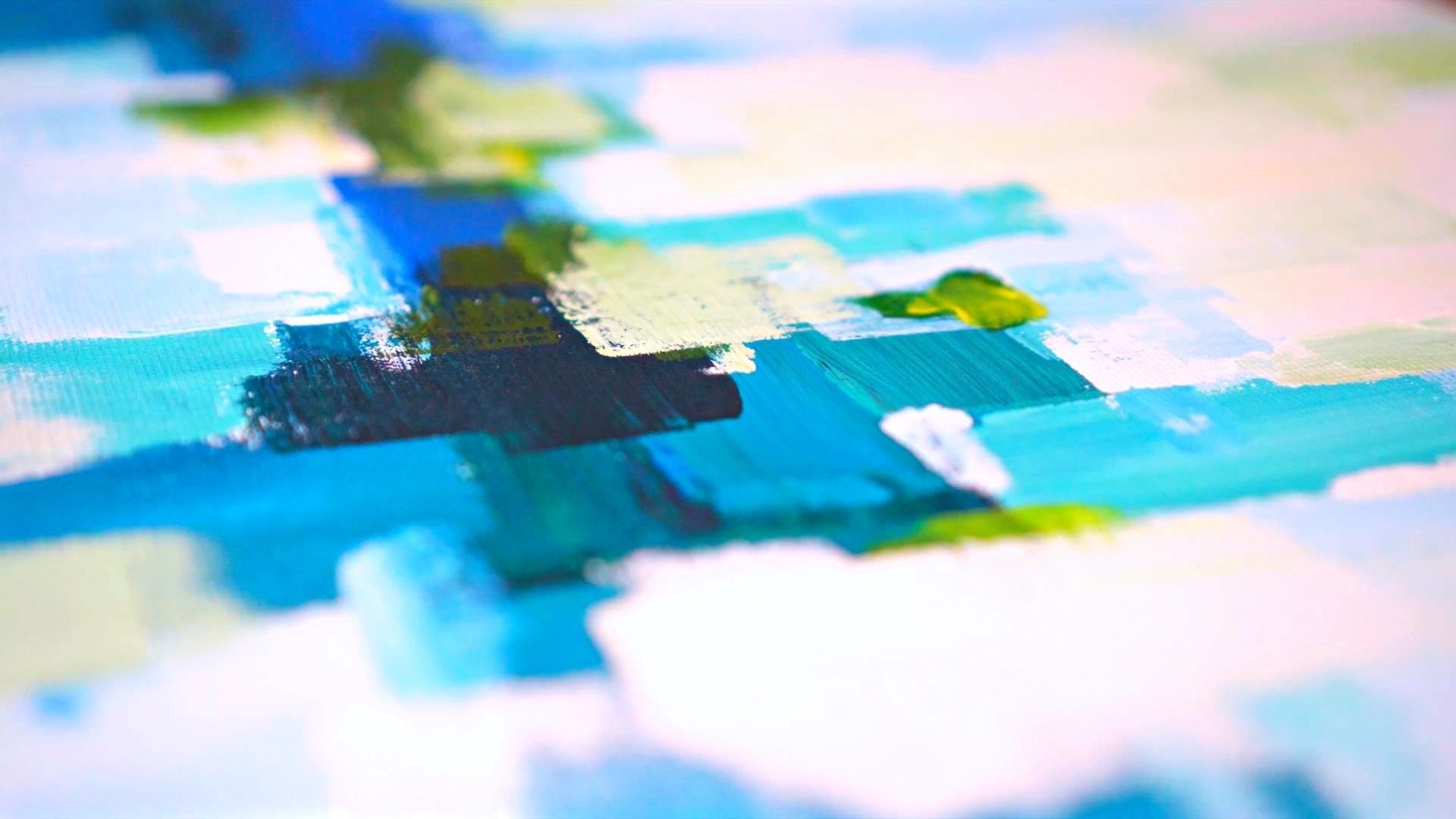
9. Light Blue and Blue Textures: In this step, you will create three nuances of blue to add textures over what's left from the unpainted areas of the canvas, as well as some beautiful textures over the darker blue shapes from the left, the bottom, and the right side of the canvas. So you will start this step by adding blue to your mixing palette and a good amount of white, maybe twice as much. You will want to integrate the blue in half of the continuity of the white. So split that into and grab some of the blue and start mixing them together. At the beginning, you will start with very wide nuanced, like a cold white. You will use this wide to cover the blank spots from the top of the canvas. And then you will progressively moved to darker nuances, which is the opposite of how you've worked until now, from dark to light. So take your time to create that very beautiful light blue, dragging the color from left to right in the mixing pellet and making sure that blue is very nicely and integrated in white. Now you will likely tap over the surface holding the palette knife vertically and then horizontally spread the color over the surface. Take your time and move slow near the edges to create textures and cover those white spots of the canvas. You can take some more color and apply another layer, holding your bullet knife straight so you can keep the edges the line for your composition. Now, let's cover that L shaped form from the bottom. For that, you will use the tip of the knife to pick up the color and applied over those small and tight corners, taking some more color and adding it to the top. And now let's pick up some of that color from the L shape and adding it on the shape from the top, creating some beaks on the shapes. So the next layer of color can lay on them. Now taking some more of this light blue, you will move over the last white square and holding your knife horizontally, track the color up and down, and then from left to right, slowly until all that white is no longer visible. You can go over the orange as well to make sure all the edges are covered with color. Let's add a little bit more color to the right edge. And now you can move to the mixing pellet and create a more intense and blue color of this one by adding a little bit more blue, it is not a very saturated color because you will want to create a smooth and delicate transition to a more intense nuance of blue that you can find on Canvas already. So you will take some of this blue and create a couple of textures and shapes. You don't want to cover all the surface. Somewhere around 50 percent will be enough. Now you will move to the big shape from the top and create once more some textures over the lighter blue. As you can see, the last couple of lectures are very much alike and attract very much of the attention. So let's go over them once again and try to make them a little bit more different. After that, you can once more grab some color and move over the left side of the canvas over this stripe of blue, you'll want to keep your palette knife horizontally so you won't go over those textures too much. And now let's blend the rest of the in the color made previously and add a couple of more textures over the blue box from the bottom middle side of the canvas, likely tapping over it, holding your palette knife vertically and then drag it from the top to the bottom, living some delicate textures over the surface. Let's cover that edgy dark corner from the top with a little bit more color. And now let's move to the top left side over the dark blue box, once again, keeping the knife vertically and horizontally, apply a couple of textures that covering too much of the surface. After that, you can use a small brush to smudge some of those edges going from left to right to disrupt that high contrast to make it a little bit more faded. Also, you can use your thumb to create some faded lines. With your knife almost clean. You can create some faded lines on the left side of the canvas, right in the middle of it. And now you can move to the mixing palette and add some more blue for the last layer of textures. Let's give it a like mix. And then you can take some more of the color to the blue box from the bottom middle of the canvas and create some more textures. As you can notice, this blue is the same as the one from below. Now you will want to make this form a little bit more stable on the composition by extending its bottom sides with a couple of vertical lines, two for each side, making them of different and irregular forms. Now let's create a beautiful contrast between this blue and some orange. So you will take some of the color and move over the bottom side of the orange box from the top left side, tracking the coloured vertically, taking some more color and applying it over the light blue from the middle, carefully tapping over for some very fine textures. And now let's move a little bit to its left side and get into that orange as well to lead with those beautiful contrasts. Now let's take some more color and move to the right side of the light blue and cover a little bit of that edge. As you can see in this step, you are creating some diversity through form and shape with the color over the orange. This process helps the composition seem a lot more uniform and harmonious by borrowing the colors from one shape and placing it over the one next to it. Let's continue adding this beautiful blue over the orange. Let's add two edges for the spring box from the left side, let's split a little that big orange shape from the middle with some bright blue. And now let's move to the top right side and place a couple of vertical lines over the edge of the canvas, going further on the right side with what's left from the palette knife, Let's create some horizontal lines with the edge of the knife. Just a couple of delicate textures, very crenulated. Now you will move over the blue from the top left side of the canvas and cover a little bit of those brushes, textures. And now with what's left from the color, you will go over the light blue area from the top and create some heavy textures, blending those two layers a little bit by pressing and squishing them together. And the little bit over the pink from the left side holding her knife vertical. Let's dim down that bright blue from the middle with a little bit of this darker blue. And at last, you will create a light blue to brighten up the blue from the bottom center of the canvas. So let's bring some of that white into the color and give it a light mix. After that, you will take a good amount of that color on your palette knife and holding it vertically, go over the right side of the blue box where you've placed the blue textures and very lightly apply one more layer, just slowly and carefully dragging the color to the right, pressing it very, very lightly. As you can see, the colors seems much less brighter when applied over dark area. That is why you want to make sure you apply the brighter colors on a clean canvas rather than on other colors. Before moving to the last step, you will want to make sure the colors are dry and you're mixing pellet and bullet knife are clean and dry.
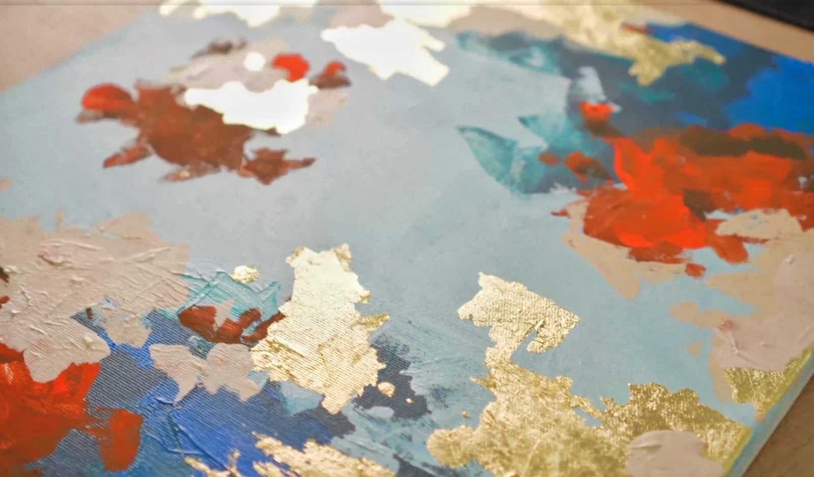
10. Orange, Brown and Black Textures : For this step, you will want to make some beautiful dark textures to create some contrast in the middle of the composition. So you will start by adding to your clean mixing palettes and beautiful orange and just a little bit of black, just tiny amount. Before mixing the two colors, you want to grab some of that bright orange and apply it on the bottom center of the canvas or the Internet in a horizontal position, these textures will be applied over the blue and the orange just in the middle. So you will lightly tap over the area and then drag it a little to the left side. Let's take a little bit more color and disrupt that texture of blue. Let's add a little bit more over the orange from the left side and on the right side over the orange and the blue. Now, you will grab some more color and apply around the top of the canvas on the orange areas to create some very beautiful and intense points of color. You don't want to make them too large. Just a little bit of intense color to give the composition some saturation points. Let's move a little bit on the left side as well to bring a little bit of balance. As you can notice, those very bright spots of orange are essential as the other color nuances are mixed. Now you will move to the mixing pellet and land some of that black into the orange to create the dark brown. Mix them just in-between an add just a little bit of more orange to create that middle brand. You won't need too much quantity of this color as you will just want to smudge some of this brown over the dried textures. So let's go in the middle of the canvas and work your way with your palette knife on the outside edge of the blue box from the bottom over the orange. As you can notice, this color is applied much more scarcely because it has a great coverage. After applying a little bit of color, you will use the edge of the knife to spread the brand over the textures of orange. Because the contact surface is much smaller and it lacks color, only the peaks of the textures will pick up the color a little bit more on the bottom to let those yellow textures get a little more darker. And after that, you can take some more color from the mixing pellet and move over to the left side of the top blue box and scrape some of that color over the edge of the blue. Now, let's create a darker zone moving, right? It is very important that the colors are dry so you can press with the palette knife over the heart textures to help them pick the thin layer of color from the knife, taking some more color and moving once again to the right, a little bit lower, just over the orange shape, you will create a couple of lines, changing the directions of the knife to create a square. While doing this lines and shapes, make sure the edge of the knife is either place horizontally or vertically. Let's move back to the top linens side of the canvas. And with this darker version of Brown, you will create a new texture shape over the brown one, meeting the edge of the canvas as well. Then you will take some more of this beautiful dark brown and move to the center of the canvas, a little bit more to the left side and over the orange and the yellow, just where the colors are, the most bright. You will place your palette knife and let those beaks take some more of this wonderful dark brown. Now you will move to the bottom, slightly to the right and apply to the edge of the canvas scripts some of that brown over the textures because the textures from below are kind of harsh against the blood knife, the appliance will be quite an efficient, which is actually better if you don't want to create two large textures. You can use the tip of your palette knife to scrape the color from the parts which are too dark. Now that the strong contrasts are done, let's create the middle. So you will go to the mixing palette and blend some more of that. Orange in the color. A little bit will be just enough. Now let's take some more color and move to the left side of the blue box from the bottom and create some textures on the top, just between the blue and the orange. And then move to the bottom and drag the color from left to right, dragging some more color on the orange side to the left. As you can notice, this color accents are placed around the middle of the canvas to make the eye more focused and not let it wander around the canvas. So let's add a couple more textures on the middle left side over the edges of the paint box. Now, let's balance those accents on the right side with one glazed on the top of the orange zone, holding your palette knife horizontally to place the color and then playing around with it to blend it on this little. Taking some more move over the end of the narrow textures of blue from the left side and place a little bit of this brown and just a bit over there on the top of the orange box. For the end, you will want to blend that orange with what's left from the palette knife. And with this dark orange, you will go over the middle and just drop here and there. Just a couple of small spots just so those wide areas of color gets a little bit of potential. Go into the tab now over the orange box holding your palette knife horizontally, check the color down to fade. Those textures are little bit on the bottom. Blue textured square from the right. And that would be all. Congratulations on your progress and thank you for taking this course. If you enjoyed creating your abstract artwork, make sure you leave a review and of course, share with the rest of the world your own beautiful piece of art and see you in the next course.
 Cristina Handrea