Transcripts
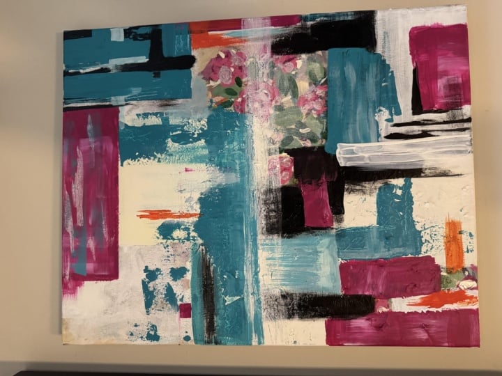
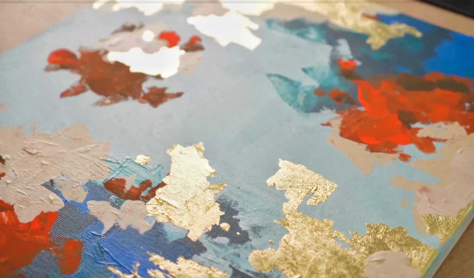
1. Welcome to the course! :D: Hi, my name is Christine, and in today's course you will learn how to make this wonderful abstract painting. Don't worry if you've never painted before. This course will walk you through step-by-step, whether you are looking to expand your knowledge or you are just here to have fun. This course is for you when creating your abstract painting, you will get to use the palette knife, some brushes, and of course, acrylic paints. This course will teach you how to paint an abstract artwork as you relax and enjoy the process, you will be taught the basics of using acrylic paints, things to consider while creating abstract paintings and how to combine different colors together to create a pleasing image with all of that being said, Welcome to this joyful course.
2. Required Materials: This course you will need the following items. Canvas that has 50 centimeters by 40 centimeters, a plastic plate for mixing the colors. And nice bullet knife for mixing the colors and applying them. How big brush for applying the color? A graphite pencil for a beautiful and simple sketch. The following acrylic colors from Vallejo. Cadmium red, pale yellow, turquoise, a little bit of black, some beautiful cyan blue, titanium white, and some beautiful cadmium light yellow. And of course, the painter's tape for some special effects. And now that you know what's needed for this course, Let's get into it.
3. First white: For this step, you will need to use your pencil to help yourself navigate on the white surface of the canvas. So you will start by adding three squares like shapes on the canvas. The first one will be bigger, placed on the right side, leaving a little bit of distance between its right side and the edge of the canvas. Then one on the top, on the edge of the canvas, and one more on the left side, a little bit more along horizontally, you will paint these squares with white. Even though it can seem redundant, it's important to have lighter spots painted on your Canvas too. You will want to keep them in the top half side of the canvas so the composition weight can see it better on the lower side with some darker colors. After you have finished drawing the rectangles on the top of the canvas, you will add a big amount of white to your mixing palette. And next to the white, you will add some yellow just a little bit. After that, you can grab your palette knife and start incorporating the yellow in the white. You don't want to add too much yellow just a little bit so the white can have a little bit of warmness in it. After mixing it for a while, you will notice slight difference in the neurons of the white that will be in a, you just want to break that filling of cold white. The yellow will help the white parts of the canvas seem a little bit more brighter and they will not look like some unfinished segments. They will seem like they're part of the composition. After you are satisfied with the white obtained, you can grab your big brush and fill it with the white from the palette. Then you will start adding the color firstly to the big square from the right side. You'll want to make sure you cross over the pencil traces because you don't need to You don't need them to guide you anymore. After that, you will gradually go and fill all serve as the square. When filling your brush, you can take as much color as you want. You can always take more from one to another square. Just make sure you have enough color on the brush so it can nicely covered surface and maybe make a couple of brush textures as well. Then you can move to the next square and continue applying the color, this beautiful white, combined with the yellow, starting with the sides and then fill in the middle. This will help you fill the form in a more efficient way. After the second square is done, you can take some more color and move to the last small rectangle. In general, you will want to make sure you cover the edges of the canvas very well. This will give your artwork of finished and complete overall look. Well, using your brush, you can use all the body of the brush. Not only the tape. Use wide moves to cover surface in a nice and efficient way. Look how beautifully it spreads on the surface. It's so enjoyable to see how the color is finding its place on the canvas. Play with the color, move it around until it fills all the edges of the form. After all the forums are filled, make sure all the edges are covered nicely. Now you will want to let the colors dry for a little while and then you can move to the next step.
4. Cream color: Now that the three white squares are nice and dry, you can start to create the next color for this abstract composition. You will continue creating a beautiful green color. This will be made by mixing white, yellow, and just a tiny amount of red. For this cream color, you will need to use a generous amount of white with a little bit more yellow than before, and just a small amount of red. So you don't need to put too much read on the mixing. Just a little touch. The color you will want to obtain is a warm white pottery color. You will start by mixing the white with the yellow, slowly, incorporating the yellow in the white with the tip of your palette knife, you can take just a small amount of that beautiful pigments, yellow, and added the color. Now let's add a little bit more yellow to the mix to make a bigger and more colored quantity. Look how nice the colors starts to look with just a little bit more yellow. You can clearly see how powerful is that tiny amount of red kept mixing the three colors together until they become one color. Make sure there are no chunks of red or yellow left in the color. So when you spread it, it can look nice and smooth. Now that the color is ready to be applied, Let's trace some limits for the next color so it can be a bit more easier to navigate on the canvas. Let's trace a line on the top, just above the white rectangle. Now you will move to the right side of the canvas, right on its edge and trace a long vertical stripe linking it with the left side with the white. And another beautiful and big rectangle on the bottom left side of the Canvas, maybe making it a little bit more inland. So the composition can look a little bit taller. And now you will add a long horizontal line on the bottom of the canvas, just right here. So we can have a bigger variety of shapes and sizes. You can almost imagine how great this will look after applying the first layer of color. Now you can take the big brush and grab a good amount of this nice buttery color, filling it on both of the sides. Now you can start applying the color on the rectangle from the bottom left side. Look how beautiful it spreads on Canvas. Makes sure all the edges of the canvas are nicely covered. And make sure you cross the pencil markers to at the end, after you have evenly covered surface, you can take the rest of the color left, take some more from the mixing palette and covered the square from the top-left corner, starting with the edges, making sure you cross the pencil line. You can go over the Y2. You don't have to worry about that. Then you will grab some more color and move to the right side of the canvas and put some more of the color on the top. And then you can drag it down nicely covering the edge of the Canvas. Make sure it's nicely covered on the bottom too. You will want to use your brush parallel with the Canvas so you can keep its shape. For the last form, you will get the rest of the color from the palette and drag it along the margin of the canvas. So easy and enjoyable to apply this beautiful green color. Now you can lay back for a couple of minutes and let the color dry for awhile for the next step.
5. Orange color: For the next step, you will want to create a couple of beautiful patches of orange. For this, you will want to firstly add to the color palette a nice amount of yellow, and next to the yellow, just a small amount of red. Then you can take your knife and take a small amount of that beautiful red and add it to the yellow. You can see how powerful is thread compared with the yellow. Now you will want to create a more light color living from this color tone. So you will want to add a little bit of white and some more yellow. The white will make the colors seem a little bit more matte and harmonized and balanced with the colors from the cameras. So with Black Knight, gradually add some white to the orange and mix it nicely until the color becomes a lot more uniform. Then you will add a small amount of yellow to make the color more bright and luminous. The color is much like the cream color applied previously, but a little bit more saturated. After you have finished creating the color, you can grab your clean brush and charge it with the color from the palette. Before applying, you can makes it a little bit more on the ballot so you can be sure there are no chunks of yellow or red color in the mixed color. After you have finished mixing the color, you will pick your brush with a good amount of the color and move to the top right corner of the big creamy square. Apply the color evenly along the directions of the square. You can get out of its form a little bit, maybe a bit more on the right side, give it a couple of brushes and then you can move the top-left side over the white paint with a brush stroke, pressing a little bit harder to let the white from beneath visible. Now look how vivid is that orange on the top of the white. Let's adjust little bit this line from the bottom to make it seem more horizontal. Now you will go back down to the square from below on the left side and place another small square just on the edge of the canvas, right on the middle. It's good to make sure you keep your form of different sizes so they don't look like pattern. So they can seem a little bit natural or organic. Now you will move on the right edge of the canvas, on the cream stripe and start applying a couple of short brush strokes going from the left to right on the surface of the long stripe. You can start applying with transparencies, blending just a little, the two colors to make them seem like they're part of a single block of color. Let's adjust this square a little bit more to make it a little bit more squarish and a bit more big, adding some more color on the top of it. Now you can fade it on the right side. Let's make it a bit more emerged on the right side. Now let's add a bit more yellow to the mix in pellet and give this orange a little bit more brightness. Let's add a bit more red to the color and start mixing it with the bullet a knife. This color is very similar to one from before, but it's maybe a little bit more pigment, it a little more inhibit. Make sit well with the palette knife until you obtain a nice and uniform mess of color. Let's put a little bit more red and makes it a little bit more. This will create a bit more diversity to this beautiful step. Having little shifts in Hughes without getting too far away from the original neurons. Now you can put away the palette knife and grab your big brush and take a good amount of the color on it and go to the top-left corner of the canvas on the cream color applied, previously applied on the left side of the rectangle with the wide side of the brush go on the bottom side as well, leaving some nice contrasting stripes of color, spread it around a little bit, and let's take some more color on the tip of the brush and place it on the bottom right side, just with the tip and a little bit on the top side. Now you will want to create a little bit more diversity. Give some accents of color on sunspots of the orange parts using just edge of the brush going around with a couple of horizontal lines. Then you can move to the right side on the orange form and play a little bit with some textures. Place a couple of lines with the help of the brush to create a couple of effects to add some information to that orange part. So it doesn't look just like a plain color. You can clearly see how much of a difference, a couple of accents of color can totally change the way the color is expressing itself through little stripes. Now you will add a couple of brush strokes of this nice orange on the lower side. Just balancing a little the amount of orange around the canvas. Now, let's put a bit more texture on the bottom of this form. Now you will go to the mixing palette and grab a little bit more red and mix it in a bit of color from before to get just a small amount of a more intense and red color. Then you grab your brush and take some of this bright color from the palette, then you can add it and the right part of the canvas to give it a couple of textured brush strokes, keeping the edge of the brush vertically, moving to the sides. And add two nice and wide brush strokes. One on the bottom and the other one a bit higher, and one more stripe on the top. So nice and easy to obtain some diversity with just a couple of simple brush strokes. And with that, this step is done. You can now let the color dry out for a little while and wash your use stencils for the next step.
6. Dark Brown: For the next step, you will want to create a couple of darker accents of color to give the composition some directions and weight. The color you will want to create is a dark brown. This color will be obtained by mixing black and red on the mixing pellet, usually black, it's a very powerful color and it dominates any color is paired with. But you can later add some more red if it's needed. So grab your palette knife and start mixing them together, slowly, incorporating the red in the black. Even though this color has a powerful coverage, you want to obtain a bigger quantity of the color before you start applying it. Look how strong is the black? The red is now almost invisible. So let's create more quantity by adding more red to the color and then mix them together. Keep a little bit more black for later. So you will grab your clean brush. After you have mix them, you will grab your clean brush and precede making a couple of lines with the edge of the brush on the left side of the canvas, on the lower part, you will want to use the color scarcely not spreading it too much, just giving a couple of lines and edges using vertical and horizontal moves, spreading it just like a thick ink received, making a couple of lines with the edge of the brush on the left side of the canvas, on the lower part, giving some contours on the orange forums. Now you will want to go on the top of the orange square from the middle left side and create a top limit. And then you will go down with two lengths of brushstrokes and then work with a couple of horizontal lines to the right side. Then you will take some more color and add a square on the right side of the orange square. And then you will create some more textures on the left side, just barely touching the canvas with the edge of the brush moving on the edges of the brown dark square. Now you will continue to add some details around the newly created forums to help them blend a little in the orange from below, you will just lightly move your brush from left to right, just letting the brush leaves some marks. Now you will create on the bottom right side of the canvas a darker corner, which will give the composition a bit more weight and balance. So you will firstly trace a top limit and then you'll place down just underneath the line a square. You will place square just making sure you cover all the coroner, not leaving any spot of white from underneath on the left side, you will want to make sure you don't covered the cream rectangle from the bottom. So you will just brush around from left to right, nicely covering the edge of the canvas. Now you will take some more color from the palette and add just above the green part from the bottom another dark colored block. As you can see, the color is pretty dense and thick, so you will want to make sure you spread it very well on the Surface, Go on the edges of the form and try to keep the edges of the rectangle as sharp and clean as you can. Adding another line on the top of the orangey color so you can blend the layers a little bit so they don't compete to each other. Now you will take some black from the color palette and add some accents of black on the right side of the canvas, just creating some contrast points. Just going on the top of the dark brown and making the edges nice and clean. Now let's play with a little gradient as a middle element between the left side and the right side of the composition. And just the small accent of this beautiful dark color on the top, just outside the edge of the orange rectangle. And with that, you are ready for the next step.
7. Light Blues: In this step, you will start to build some contrast between the orange from the canvas and the next color, which will be a couple of beautiful like use of blues. For this, you will use the painter's tape to help you obtain a couple of clean edges. You will want to read a couple of pieces and add them around the canvas. The first piece of the tape will be placed on the right edge of the top white square, a smaller piece in the middle between the white square and the little black square. Another one on the right side of the canvas over the orange from the bottom. Now you will add a bigger piece of the painter's tape between the last two pieces of tape, placed templates it horizontally over the white square, just in the middle. Now you will add one more on the top, tried to keep them as parallel as you can to the sides of the canvas. So you can obtain a nice and organized artwork. So all the lines can align and your artwork can look very beautiful. Now that we settled the areas where you will apply the color, you can start adding the colors to the palette. Firstly, you will add to the palate, to the mixing pellet a good amount of blue to start with. Then you will add an even bigger amount of white. After that, you can grab your palette knife and start adding some blue to the wide to obtain a lighter hue of blue. You don't have to mix all of the colors from the mixing palette. At the start, you can make a smaller quantity of this blue. The blue you will want to obtain is a light blue, but very well pigmented, adding a bit more blue to that beautiful blue from before, mixing it very well, until all the white becomes one with the color. Let's put a little bit more blue and incorporated in the color from before. Just like that, making it nice and pigment it such a beautiful color, very vivid is like a beautiful sky color. Then you can grab your brush and take some of the color from the mixing palette. You will firstly want to apply the color on the top right corner of the canvas. As you can see, it has a very good coverage, so you don't have to work it too much under the surface. You can go over the orange side too if you want. Now, let's state the palette knife and apply the color around the blue form just made, just dragging it over the margins. You don't have to press on the canvas with the knife. Just hover around surface and slowly drag the color away from the corner to the inside of the canvas. You'll want to create a different textures and sizes of forum sticky if the corner a little bit plasticity, let the form of the blue corner integrate in the rest of the Canvas. Look how beautiful this blue color stands on Canvas, on that beautiful corner of the canvas. Now you take some more color from the mixing pellet and follow the horizontal tape that's going to the left side. You'll want to make sure you cover the line that's made by the tape. And from there, covered down the white of the canvas. Move the color with the knife to create that limit and drag it down. Try to create some forms and shapes, going different directions. Grabbing the knife and dragging it to the lower side of the canvas. You don't want to cover all surface of the canvas. You will want to let some blank spots moving to the left side on the same tape edge, you will want to create a square form. So we'll want to grab a good amount of that blue from the pellet and added below the tape. Then you will move to the left edge of the canvas and create some more textures with the help of the knife. Applying this beautiful color, just stepping over the canvas and trying to make some interesting textures and lines. You can just step on the surface and then drag it over the canvas, not touching it, just crossing over its surface. You'll want to create these textures by moving the knife vertically and horizontally. For now, you will want to avoid using diagonal moves. This will help you harmonize the shapes and let the colors exposed or plastic qualities. Now you will fill the rest of the apes edge. So grab your knife and hover around the edges. To make sure you obtain some interesting texture in that edge. Now you will want to quickly get rid of the tape before the color is dry. If you don't move quickly enough, you won't be able to get rid of it anymore. So you will drag the tape parallel with the Canvas. Do not try to drag it up because this can damage the color applied. Now you will repeat the move for the next piece of tape. Now that the top side of the canvas has been colored with this beautiful blue, you can go to the next zone. This will be on the right side, just beneath the three pieces of tape. For this zone, you will create a lighter blue. So you will integrate the rest of the white on the blue created previously. Now that the top side of the canvas has been colored with this beautiful, gorgeous blue. You can go to the next zone. This will be on the right side, just beneath the three pieces of tape. For this zone, you'll create a light blue. So you will integrate the rest of the white on the blue created previously. You can add some more white to the mixing palette to create a bigger amount of this beautiful light color. Now, let's integrate that white in the color. Mix it very well. Until you arrive to a uniform color. The blue you will want to obtain is the light cloudy blue. Then you can take the color from the palette with your bullet knife and move over the white and start building up the color, dragging it down using vertical moves. You can go as fast as you want or as slow as you want to create those interesting textures you desire, makes sure you don't drag your knife over the canvas, just slightly swipe over the top of it. Just touching the color because the color is very rich and thick. It has lot of volume. You can play with it until you are satisfied with the coverage. Make sure you let some blank spots and don't use the color as a coverage for the layer from beneath, you can go over the orange as well, leaving some of it's still showing underneath. Then you can use the edge of the knife to create a sharp line on the bottom limit, where it means the dark zone. Just a couple of touches building that color on the top, making it super nice and textured. Now you will take some more of this wonderful color and move over the left side of the tape from the middle. Then you will progressively moved to the left until you meet the edge of the canvas. Try to keep the color between the blue from the top and the cream color from the bottom side. Slowly dragging it down using short and quick moves. With the rest of the color, you can move over the darker blues from the canvas to add a little bit more diversity, to mixing them a little bit so they don't feel so estranged. Try not to flatten too much of the textures. You can let them build a little for a more 3D effect to have a bit more variety and spaciousness. Now that you have finished applying the color, you can take off the rest of the tape, dragging it slowly so it doesn't reap the color. If the step is too long, it can happen to reap some of the color from the canvas. In this case, move as careful as you can so you don't damage the paint. And there you go with this wonderful blue step.
8. Blue Turqoise: For this step, you will want to create a very beautiful turquoise for a couple of nice accents of diversity. You will start this step by adding to your mixing palette some turquoise. Then you will add a nice amount of white to start with. Now let's add just a small amount of blue that you can use if you want to make your color more similar to the blue from before. After that, you can take your black knife and start mixing the turquoise and the green, slowly incorporating the turquoise in the wide. So it's not too overpowering. Mix it nicely, dragging the color from one side to the other, squishing it on the palette. This will allow you to see through the color. Now you will add just a small amount of this beautiful blue, so it can be a little bit more colder and similar to the colors already used. This will help you create a sense of unity between the colors from the canvas. Now, look how nice this color looks. It has a very beautiful luminosity and it's still pretty pigment it, this way. It really helps the color express itself without being too aggressive to the a. It makes the color a bit easier to be perceived. Let's add a bit more turquoise and the color is ready to be applied. For this step, you will want to use your palette knife to apply the color. For now, you will want to keep the color patches on the lower side of the painting and place them on the top of the green colors so they can create a relation of contrast. So you will apply some of the turquoise on the top of the small green patch from the lower side. Let's fade it a little on the left side and go over the white two. And a little bit of this beautiful turquoise on the right side to just crossing over that dark brown, keeping the edges nice and straight. Now you will want to create another zone of this light, turquoise on the left side of the canvas, a bit over the green and orange colors. But let's try and cover some more of this blank spots. You'll place a nice squarish shape just below the orange and dark spots, just over the white. We'll use the edge of the knife to create a straight line and then drag the color down. Let's add some more color on the right bottom side and create a squarish form. Now you will want to add a couple of, a couple more textures on the top of the two coins, patches of color, just dropping a couple of colors, chunks and lightly drag them over. The one from before. Now that you are satisfied with the way the two patches of turquoise are blending into the rest of the colors. You will add some white to the mixing pellet to create a lighter hue of turquoise. Keep in mind that acrylic colors tend to get a little bit darker as they dry out. So it's best to create your colors a little bit more lighter on the mixing pellet before applying them. So let's make this beautiful titanium weight in the turquoise color and maybe just a small amount of that beautiful blue. Now you will want to take some of this color with your palette knife and create another edge, the shape over the green color from the lower left side. When you apply the colors in order to create textures, It's good to make sure you already have those textures on your palette knife. Make sure the color is not laying flat on the underside of the knife. This will make your creative process much more easier. It will feel like the artwork is grading itself. So you can play with textures lightly going over the form with the flat side of the knife. And then you can add another layer on the top to create some more interesting shadows. Now you can take some clean wide from the mixing palette and go over the turquoise to create some interesting highlights. Not too much, just a couple of light spots here and there. Now for the last DEJ, you will take some more of this beautiful light turquoise and add it to the left edge of the canvas over the orange and the white part. Just a couple of nice textures, not too much. So you can create a little bit of diversity in the forums in which you apply the turquoise. And now that this step is done, you can let the colors dry before going to the next one.
9. Darker Blues: Now that main colors are set on the canvas, you will want to play with a couple of cold tones around the composition to create one more layer. This will help you balance the composition, making it a little bit more uniform. And in the same time, offering it some more diversity by playing with the palette knife and creating some interesting textures and layers. For this, you will need to add to your mixing palette a good amount of blue. And for now, just a little bit of white. Now let's add just a small amount of that turquoise to create a middle color between the other colors already present on the Canvas, makes it a little bit on the palate. And now you can take the color with the palette knife and go over the dark brown from the right corner, creating a line on the top side and then progressively dragging it down. You don't want to press too much, so you can allow the brown to be still visible underneath the blue. Now you will take some blue and move to the right side. As you can see, you can create a lot of color variations by blending the colors on the Canvas. After that, you will continue adding blue to the dark patch of color, creating our top limit and then dragging the color down. Now you will take what's left from that beautiful blue from the palette and give it a light mix. When creating textures on bigger surfaces, you will want to make sure the quantity of colors you create is enough to serve you through the whole process. So let's add some more blue and mix it on the rest of the color. After giving a nice light mix, you can take some of it and continue on the left side of the dark spot over the white canvas, you will now create a blue square with just a couple of wide holes inside the color to cover just enough of that whitespace. Now you will take some more color and move on the lower side, just on the left side of the turquoise batch and a bit over the green color from the left side. So it doesn't look like a chessboard. Now you will add some turquoise to the mixing palette and gradually mix it in the blue made before. Just a couple of quick stirs and it's ready to be applied. This will be an intermediate color for some contrasting parts of the canvas. Like where are the blue means the light, turquoise, just right here, creating a bridge between the two colors. A bit over the blue frame, the bottom right side, to break that big mass of cold blue and create some new textures over it. Now, let's create a lighter version of this bluish turquoise by adding a bit of white to the mixing palette. Look how beautiful is this middle tone of turquoise such a great balance between the whites, the blues, and the greens. It has such a smooth and silky texture. Now let's take some of it and move to the upper part of the canvas over the darker blues, creating just a small edge of color right there. Just a little bit of diversity. Now, let's take some of these clean blue and just a little bit of turquoise without mixing them. And let's create another beautiful texture layer. Over the blue from the top right corner. You can see how nicely the colors look together just by mixing them on the canvas. If you are not satisfied with the result, you can always grab the color and get rid of it with a napkin, but only if the layer from underneath, it's completely dry. Now you can give a couple of deep turquoise accents over the blue from the bottom right corner. Then you can use that white that had been left alone on the palate and give it a light mix. You'll use this light tone of blue to create a bridge between the blue and the white from the top right side of the canvas. So to scrap that beautiful color and apply just a little bit over the deep blue and over the white, dragging it up and down to cover a little bit of those harsh edges, making those edges a little bit more sweep. Now look how nice this light blue looks near the orange. Let's take what's left from this lovely color and just put it over the orange from the top left side to break that heavy and ADG block of orange. Let's make some more edges a little smoother by adding some more white to the palate makes it just a little bit with just the tip of that deep turquoise, just to make that white a little bit warmer. Now you can grab the color and just cross over the left edge of the canvas. Rock, disrupting just a little bit of those horizontal lines created with just a little bit of color on the knife and pressing very, very lightly. At last, you will take what's left from this blue and go over the little blue square from the middle of the canvas to make it a little less noisy. Now you will want to let your colors dry before moving to the next step.
10. Mustard and grey: This last step, you will want to create a couple of grain nuances and play around with them so you can deem a little bit of the color saturation. You will create this grace by firstly adding to that a good amount of white and just a small amount of red and black. You don't need too much of the black and red, just a small amount. Let's firstly mix the black and the red and see what kind of gray you can obtain. As you can see, just a small amount of white can make that darker colors seem grayish. So it's a good example to start with. It's a good example to start with. Now you will add sum of these two colors to the wide and see how you can create a gray. How much of the darker colors you need to find that sweet spot? This gray seems a little too red, so you will want to add a little bit more black. Just a bit will be enough to shift this color in a beautiful light gray. Now let's create a darker gray by mixing the black with the rest of the colors from the mixing palette. Just like that, you now have two hues of Grey, which you can play with. Now let's take this dark gray and place it on the top part of the canvas, just right next to the blue, creating that first layer gray. Now you can take a little bit of that lighter gray and place it over the dark gray, mixing them a little bit together on the Canvas, dragging the color down from the top and a little bit to the top side as well to cover the empty plates. Now you will take some more of this light gray and place it on the left side of the whitespace from the top middle, covering a little of that dark accent. Now you give a couple more color accents on the lower side. Now you can take some dark gray and move over the dark square from the middle and cover a little bit of that edge from between the brown and orange. Because it's a little bit too strong and bright. You can alternate between using the edge and the tip of the palette knife when working in small and limited areas as this one, just like that, dragging the color to the left side until you obtain some faded gray lines. And now let's place nice and bold edge right here, dragging the color to the left side over the brown, dark brown. Now you will add some more black to the mixing pellet. Let's take some more of that light gray and place it on the top of the canvas over the gray from before. Just to make that color block a little bit more solid, to have a bit more personality. Now you will place some of the same gray and the bottom right side over the light blue and orange, spreading the color up and down until the new color gets between the textures. After that, you will add some more of these gray over the orange part from the left side. Choose to give that corner a little bit more complexity to break those rigid lines of color and make them a little bit more diversed. Such a beautiful way of creating wonderful layers of textures. Let's create more of them. Going on the left edge of the canvas. Just in the middle over the light blue and a little bit over the last grade from the middle. Now you will take the rest of the white and mix it in what's left from the gray to obtain a lighter version. Now let's take some of this light gray and put it over the blue from the top right side, just a little bit right there on the top. And then you can create some more textures over the blue from the middle, just a little bit just going over the blue. So it's textures can grab some of the gray from the palette knife. Just a couple of color crumbs around. Now, let's take some of the gray hand, put it on the bottom of the blue from the middle, tracing a line on the bottom side and dragging it upward, but not covering the blue. Just stop at the limit of the blue. After playing with the grace, it's time to create another group of colors. This color will have a yellow, warm hue and will be in the same variety group as the gray. So you will start by adding yellow and mix them with the gray from the pellet. You will start by incorporating the yellow in the gray and gradually add some red to arrive to a more clay hue of grey, some kind of monster the neurons. After you have a right to that, nice muster, the new ones. You can move to the left side of the canvas on the top and covered that white spot. You will start by adding to the lower limit where the white meets gray and move upward. You can add some more red spots to create a little bit more contrast. Takes some more color and move on the lower side, just going over a couple of spots to disrupt a little bit the rhythm created between the colors from beneath. This monster. Clay has a very cold dish nuance. It is a very nice middle tone for those cold grades, and it can really enhance the rest of the colors. Just adding a couple more textures on the top left side to break those rectangular forms, creating some new edges, some straight lines in the middle, just barely touching the canvas. At the Finish, you can add a mix of black and gray on the dark side from the right side, and a little bit lighter gray on the bottom, just creating a little edge on the margin of the canvas. Now you will add a little bit of white to the mixing pellet to create a very light hue of grey. This gray you will cover the white spots from the top middle of the canvas, living from the edge of the blue and going upward, creating some nice and rough textures to give that part of the canvas more personality. Don't spread it too much, just make sure it creates a block of color that complements that blank space. Now you can take some more of that beautiful white and place it in the blank stripe of Canvas from the middle Cuba color on the tip of the palette knife. And then drag it down trying to fill as much as you can of that white stripe of the canvas. Such an easy way of giving a little bit of texture and personality to those free spaces. And a little bit more white on the lower part. And your abstract painting, it's now finished. Congratulations for finishing this beautiful exercise of imagination.
 Cristina Handrea