Transcripts
1. Trailer: Have you ever looked at someone
else's illustrations and wondered how they came up with such random or clever ideas. Have you ever
wondered how or why an artist decided to use
certain shapes, symbols, and their work as an
illustrator it myself, I can tell you that one
of the best ways to define a Ideas is by accident. But as someone
whose job it is the come up with ideas on purpose. You might be asking, How can I count on such accidents to happen
when need them to. My name is Mr. Tom Froese, Illustrator and Top Teacher
here on Skillshare. And I'm excited to let you
in on a little secret. I make accidents
happen on purpose. One of my techniques do this is what I call responsive
composition. It's actually a lot like Improv, a form of live theater where performances are made up more or less on this file in response to other things
that are happening, other Use that are
happening on the stage, hence the class name,
illustration Improv. Basically we draw some shapes and then we're
given a prompt and then we respond to
this prompt by drawing what comes to mind,
insider shapes. Join me as we
explore the power of responsive compositions in three simple but
satisfying Exercises, these will help you literally
think outside the box. How will you make this? Find yourself thinking
in other shapes instead? But that's entirely the point. For the final project
will take some of our favourite
compositions and turn them into finished
illustrations. These are perfect for
sharing with their friends and followers on social media. And you could even turn these
into things like t-shirts, stickers, or Art Prints. In this class, you'll
learn how to loosen up, break free from realism, blast through creative
block and even learn how to develop an illustration from
Sketching could finished. Or if you're looking
for more ways to find creative ideas and
compositions and Your Art. I made this class for you. Please join me. I look forward to
seeing you in the Class
2. About This Class: This Class is For Anyone
looking for new ways to come up with ideas and be
more creative in there are, It's especially geared
toward illustrators, but it's Fun and easy
enough to do for everybody. I'm all about helping
people tap deeper into their creativity
no matter who they are or what they
do for a living. In this class, you're
going to learn how to find ideas you'd never
have thought of before. You're going to learn
how to loosen up with your drawing and
how to break free from realism and come up with
more joyfully weird ideas. A lot of the Exercises
we're gonna do here, you're going to see some
pretty weird stuff happen. He might even like it. You're also going to
learn how to blast through creative
block and self doubt, those really annoying
enemies of creativity. This class is really
designed to help you break free from those
as much as possible. Along the way, you're also
going to learn how to refine a looser idea and turn it into a more confident
sketch and ultimately into a final illustration. I'm also going to give
you helpful drawing and illustration tips
along the way and even share some deeper insights into my own illustration style,
tools and techniques. This class is divided
into two parts. First, we're going to jump into the Exercises or sketcher sizes, where we're going to explore
different ways of using shapes to seed new
ideas and our Sketches. Next, in the final project, you'll have the
opportunity to turn your favourite sketches into fully finished illustrations. Again, you don't need
any experience to take this class and you don't
need any fancy tools. Well, I will be
using Procreate for my sketches and Photoshop for
my finished illustrations. You can just as easily
do this class using pencil and paper and maybe
some colored pencils. Just bring whatever
you love working with or whatever
you have on hand. Him, let the fund begin. Of course, you're gonna get
the most out of this class if you know your way around
some illustration tools, but that's certainly not
absolutely required. It's optional. Just one more note, if
you're using physical media, it might be useful to have some tracing paper
or Light Table. So you don't have
to redraw some of the shapes will be working
with in the class. But other than
that, like I said, no fancy equipment is needed. If you've taken my
classes before, you will find this one
refreshingly short, we just get right into it
with no additional lessons. So let's just get into it. Oh, but one last
thing before we get, get on with the
rest of the class. As you go through the
exercises and the project, please share your work on
the class projects page. Your projects or what
makes Skillshare such an awesome creative community. This is where you're
gonna get a chance to see and comment on
one another's work. And of course, this
is where I get to see your work myself. And also, please feel
free to share what you're working on in this
class on social media. You can use the hashtag
illustration Improv class. And that's a great way to let more people Find
Your work out there. It's a great way to
grow your audience. And for me, it's a great
way for me to just find your work out
there in the wild. Alright, that's
all I have to say. Let's get on with the Class
3. Creative Block and Self Doubt: Alright, I said
there wouldn't be any lessons before we
get into the exercise, but it wouldn't be
one of my classes unless I gave you a bit
of a primer to start. I just wanted to
explain why I made this class and how it can
help you in the real-world. There are two things that all creative
people struggle with. And the first is
coming up with ideas. And the second is getting stuck in self doubt and
self-criticism. If you follow me on my podcast
thoughts on illustration, you'll know how much I've tended to get stuck
over the years, especially with self-doubt, where it comes to finding ideas. Often what happens is we get stuck in one way of thinking. For example,
sometimes I just got one image in my head and I can't stop drawing that one
thing over and over again. What I love about the
techniques in this class is the hair truly
among the best ways I know how to get myself out of idea rats and bulldoze
over my self doubt. So before we begin, here's just a little
rundown of how my responsive composition
technique works. We'll go into more detail when we get to the
actual Exercises. So first, we start
by trying shapes. The more open and irregular
the shapes, the better. Next, we started draw things based on a
prompt or a theme. Inside the shapes. We're letting the shapes
kinda tell us what to draw rather than trying
to draw something more on purpose or
from our minds. That's why I call it
responsive composition, because we're responding
to these shapes on the page in a more
improvisational way. And that's where the magic
of this technique is. Ideas need to come
out fast and loose. Just like Improv is often full
of embarrassing mistakes. The Sketches are just
the starting point. And then later on
we can transform them into finished
illustrations. You know, maybe they'll even
cause others to wonder, how did they think of that? The whole point here
is to have fine and maybe even raised some eyebrows. So that's really all you
need to know for now. We're gonna get into everything else as we go through
the exercises. So get out your pencils and paper for your
digital equivalents. And let's get into the Exercises
4. Exercise 1: Simple Shapes (Warmup): This exercise is
called Simple Shapes. In this exercise, we're
going to start by drawing just some basic
shapes on our page. And then we're gonna do a quick little warm-up
exercise using the shapes just to get
us in the creative mood. So just a quick note about
the tool that I'm using. I'm gonna be doing this
exercise on Procreate. I might iPad Pro, and I'm using my Apple Pencil, and there'll be using the number six pencil brush
that comes with procreate. If you want to find the
same brush and I'm using, It's in the sketching brushes. And then you'll find
that right down there toward the
middle six B pencil. So to start, what I wanna do
is draw a few basic shapes, fairly large on the screen here. Are fairly large filling out
your page, I should say. So draw a square, draw a circle, and a triangle. And then below that, draw a nice big
open cross shape. Now the key here is make
sure that these are nice, big, open shapes. Don't do any of the parts
too narrow or spindly. The next thing we're
going to draw here, just one last big shape here
is a more organic blob. Now, let's actually continue
to fill in the spaces here. So there's some spaces and try to draw shapes that aren't
super straightforward. Anything but circles or squares. All I would say
to remember to do here is to make sure that the
shapes are somewhat open. The more irregular these
shapes are, though, the more interesting
things will get later on. So once you have filled your page with a variety
of these shapes, but most importantly,
the square, the circle, the triangle, the cross, and the blob. It's time to move on to the
second part of this exercise. If you're using a digital illustration tools
like Procreate, what you can do is add
a layer above this. Or if you're using physical
media like paper and pencil, of course you can use
Tracing Paper or Light Table to do the next part here. So I'm going to just
choose a different color. I'll use the cyan color
for this layer just so we can see it distinct
from the other shapes. And actually what
I'm going to do is just take the opacity of my shape layers beneath down a bit so that they're
not so distracting. Once you've done that,
be sure to select your, your the new layer
that you just made. And we're going to start by writing our names
in these shapes. You can do your FirstName, if you like, or your full name. And what You'll find is that the way you want
to draw on your name? This is what I find any way is sort of based on the sheep. It's responding to the shape. And what you end up
doing is arranging your letters in
ways that perhaps you wouldn't have thought of
without that Shapes help. In this case,
here's my name with the cross is very natural that
I'm going to try and make this work in a crossword way. And it just so
happens that my, OH, in my first and last names works well in the center there. So just keep going
and respond to those shapes as instinctually
and intuitively as you can. Don't think about a
two-minute too much. This is a warm-up exercise. We're not trying to
be super clever here. If you want to get super bold, just write one of your
letters really large and then figure out what to do next. Has in, I'm doing here and
show that T really big. And now I just have
to figure it out. And somehow I forgot the E, one of the ease and my name. So as you can see, once, once I have finished
my main shapes, the square, the circle, the triangle, the cross,
and the blob. I can start to move on to
these other shapes and you can go on and do
this right to the end. I encourage you to
finish the whole thing. Just to really get warmed up. Have some FUN. Okay, so I finished drawing my name or writing up my
name and all these shapes. Now let's just take a look
and see what happens. See what we can learn from it. So what I found when I did this exercise is when I
started with the box. My name is pretty regular
like I just kinda spelt it left to right
and top to bottom. Dislike I would if I
was writing my name on a square piece of
paper, kinda normal. But once I hit the circle and the triangle and
the other shapes, I really did find myself
responding to that shape. So of course we're
not drawing yet, we're just writing with letters. But you can really
get a sense of how, no matter what kind of marks you're making in these shapes, they just end up being influenced
by the shape around it. And you just end up doing
things that you're more critical and logical side would, wouldn't have thought to do. I particularly
like what happened when I started getting these
super irregular shapes, like the blob, for instance, things got pretty wacky there. And the way I write my m's
and my ease and stuff, they really look the same and so they start to really mess with my head
when I look at that. And I think that's good when
you can do things that kinda mess with your head and confused even you as you're drawing them, that's a sign that you're doing something right
in this exercise. I also just like how
these steps made me just keep it real simple and just
stick with my firstName, TOM, just to break my own rule so I
don't get too caught up and following rules at all. I did just draw a happy face. They're broke a little rule and drew something that
didn't even fit in the shape here with my
initials and an arrow. Sometimes it's okay to
break your own rules. Can be phon, and it
can actually kick you into something
more creative, or it can actually
just keep you moving. So of course, this
is just a Warmup. It's nice to loosen up without having to worry
about what to draw. We all know how to
spell our names. And so this is a
great way to just start thinking
responsively on the page. But this actually does have a more practical component to it or a more
practical used to it. And that's if we're
doing any kind of creative lettering or branding. Starting with a shape and
learning how to respond to that with our lettering,
with our writing. Without worrying about
if it's correct, is a really good
thing to practice. Now that we warmed up, Let's move onto
the next exercise.
5. Exercise 2: Ideas in Shapes: This exercise is called
Ideas in Shapes. It should be totally
unsurprising that we're gonna be drawing stuff inside
the shapes we just drew. But of course, it's
probably going to help have some kind of prompt or
idea to start with. So first, let's come up
with a theme to draw from. For this exercise. Choose a theme based
on your hobby, your favorite
past-time, or your job. I'm a runner, so he use
running as my theme. Now if you want, you can
get more specific and it actually might help you
come up with ideas faster. Like for instance, for me, running might just
be too general. It might be too wide
open as a theme. So to help I could
narrow it down into a more specific experience like trail running or
running on a hot day. If you need to just set
your theme to something general than just choose a general theme and pick an object based on
that theme like from you, it might be a running shoe. And then just try and fit that into each of your funny shapes. And as you go along,
you'll probably think of other things and you're
going to loosen up. And ideas will start flowing more easily just
as you get warmed up. Now I want to remind you
that there is no limit on how many of these
things you get to do. It's your time and your project. You can do 1,000 of
these if you want. So don't feel like you
need to have the best idea or the perfect theme right away. I guarantee that even if you have the best theme right now, like right away, no matter what, you're going to think
of something better as you go along. So of course, the first
thing we wanna do before we get started is choose our theme. And your theme can be
based on your job, or it can be based on your hobby or something
that you're interested in. So I'll just quickly
show you how I would brainstorm that if this will help you come up with
something for yourself here. So of course, my hobby, one of my hobbies is running. My job is an illustrator. I could also just do a
third category here, which is more of like
things I'm interested in. And maybe one of those
things is space. Another thing would be travel. So you can see there's
lots of ways you can figure out what
you want your, your theme to be on. I'm going to stick with running. And if I get stuck in
the running thing, I might go more specific and
make it about trail running. But the point here is to make it something that
I'm interested in, something that I know
a little bit about, that I don't have to
struggle to think of Ideas for it as I go
into the next part. So once you've
chosen your theme, you can begin the more FUN part. So what I'm going to do, because I'm working in
Procreate is just activate that layer again with
my original shapes. I'm just gonna use those exact same shapes as my
starting points. Again, I'm going to create a
new layer and make sure that I'm drawing in a different
color just so it stands out. And I'll go through
these shapes and the same order that I did
the first exercise in. So the point here is just to be as fast and
intuitive as you can. Don't overthink things,
don't be critical. Like for instance here, I'm already been
critical of myself. Like I drew high tops because high tops aren't the correct
shoe you would run in. But of course, I can say, well, it's not a high top. It's a running shoe
with socks in it. And once you've drawn that, you can move on to the
next shape for the circle. I am going to not overthink it. The first thing
that I thought of here was a tree for some reason, even though it's
not circle shape. But I can use that circle
shape just to fit the tree. And then maybe there's a little trail marker on the tree there sometimes that's what I see, and
then I'm going to move on. Now the triangle is
also a tree shape. And that's really the first
thing that I thought of. So I'm just going
to draw a tree and for some reason I just
thought of a running tree. So maybe what I'll do is I don't usually encourage editing while you're in this stage, but I want this to
be running trees. I'll just remove that stem
and put some eyes on here. There's my running tree. Moving on to the cross shape. Again, don't think too hard
about oh, what could be. For me, it's like,
Oh, what could be cross-shaped and running themed? Now, if I wanted, I could get, really, I could sit here a
moment and think about it. But if I get stuck, I can just draw whatever
the heck I want. And sometimes what I do is I
just draw a mark that just gets me out of trying to
do the perfect thing. And suddenly I see
someone VB stretching. This definitely looks like Hat shape. So I'm gonna
stick a hat in here. If you're a trail runner, you'll often see a lot of
people wearing trucker hats. So that's a trucker hat. This one. And a draw candy. This one I'm going
to draw shoes with no toes or with toes sticking
out of it, I should say. Because maybe he ran so much that he wore off
the end of his shoe. And for this one, it looks like a crown to me, which reminds me of
King of the mountain, which is if you're a
runner or a cyclist, and you record your
runs on Strava and you are the fastest one
on a segment or a root, then you get a crown icon, little badge thing that says you're the king
of the mountain. So the mountain,
this one will be, I keep seeing shoe
shapes. And that's okay. I think of like at
the start of a race, when the starting gun goes off. This one, I'm just
starting a mark. I don't know what it's gonna be. Maybe it's an arrow marker, something you might
see on the trail. You're trying to be trying
to find your way around. I'm starting off with no
idea what I'm drawing. Except for I have this
notion that it's like a giant watch on a
person runner, I guess. That does not make any sense. These two shapes I'm going
to put together as a, someone really
trying to go for it. This is an arm holding
a water bottle. This will be a metal. You can see that I'm
just drawing over my other doodles as I go along. And that's completely okay. Now here I see mountains and maybe like a weird
landscape where you're running. And then there's a trail
getting you to the mountains. And assign that
disproportionately large. It's bigger than the mountains. And for some reason, pointing you that way. I'll figure out what
to do with that later. You just have one more
shape to fill in here. Maybe it's just a rock with some grass and
dirt around it. Okay. So I am done this exercise now. Sometimes I come up with
stuff the first time through this exercise and I love it. And there's lots of stuff for me to work
with for some reason. I really struggled to get through this one
for some reason. And so what I'm, what I'm gonna do is
just say like try again and see if you can if you
can go a second time. There's no limit to how
many times you do this. I think the important
thing is just to keep that momentum going and not to get frustrated yourself. This is just Sketches. This is supposed to be phon. And so what I'm gonna do is just to make this
different this time around is I'm going to
rotate my page 90 degrees. I'm going to use a
different color. And I'm going to just
try my running theme again and maybe trying just relax and draw
it without thinking more. It's okay if you struggle to come up with
ideas the first time. Because this is really
just about free floating, free form, free
association type ideas. A big thing about
Improv is this idea, yes, and where, no matter
what you're given, whatever prompt you're given, safe from your audience or from your fellow actors on stage, all participating in this
improvised performances. You have to take what you get. You have to work with
what you're given from the other people and
try and make the best of it. And you're going to bomb. Things are going to work out. If you're if you're saying, oh, that's not good enough, I
didn't get the right cue. I didn't get the right prompt. I didn't get the right
setup for this or whatever. You can always blame
the outside for why you didn't have the
right conditions. Here is just about making the best of it and
saying yes and yes. I'm gonna go with that. And how about this? Yes. I drew a weird propeller. And how about drawing
some hands-on it? Figure out what to do it later. So I've filled out
actually two pages worth of these improvised
drawings in my shapes. And honestly as I
was doing this, I was starting to get
frustrated with myself. I was starting to feel like I wasn't coming
up with good ideas. I was being critical of myself. And this is the exact
thing that I'm trying to help Overcome in this class. But I'm going to leave what
I've done here because I still have a lot of
hope in the process. I trust the process enough
that I know that I can come up with some good stuff, even from the things that a pardon me is just like I could have come up with better ideas. And well, I just want to
quickly review what I've done. The first thing
here was that I had my running theme and I went in and tried to
fill in these shapes. My first attempt was in red. And I have this stretching guy. I have a hat, I have a shoe with my toes coming out,
however running tree. And then for some reason
I thought maybe I could do better and are or at least come up
with some more ideas. And so I went again. And this is what you can see
now in the cyan drawings. And I came up with a few more and I got,
kinda got weirder. I got Boulder. I just was like, Why don't I try something that I totally haven't tried before. And so I did some lettering. I did shapes that just didn't make any
sense at all like this. P with foot and stuff like that. So I'm just going to
leave these behind and move on to the third exercise and see
what I can make obese. But before we do,
I just want to say a big takeaway here is that we're often given shapes to work within that
seem restrictive. Now I'm talking about
when we're actually doing assignments are
jobs for clients. For example, if you're working
on a kid's picture book and the layout of the tax is already in place from
your Art Director. You can use the shape of
the space that you've been given as the starting
point for your Ideas. In other words,
you can respond to the shape of the spaces that Your Art Director
has left view. Another takeaway
here is that this is an example of how constraints
can make us more creative. Sometimes we encounter
limits or less than ideal conditions
in our projects. And we feel like
these are getting in the way of our true creativity. But creativity doesn't happen
in the absence limitations. It's how we can solve
our visual problems in spite of them in sometimes
because of them. What can be more ideal
as a canvas shape to work with than a basic
square or rectangle. It's not like they
sell triangle or octagon canvases at
the Art Supply Shop. But because we have
to work within these more random
shapes, as you can see, it's actually easier to find ideas because part of the Ideas starts in
the shape itself. Maybe one of the
problems with canvases, we have this blank
canvas syndrome or this blank page syndrome. The problem with it is that they're squares and rectangles. At this point, of course,
feel free to share your work on the
class projects page. Cheer your chosen theme, your original shapes, and
the Sketches you created. Other than that, we can get
onto the next exercise.
6. Exercise 3: Ideas in Shapes Squared!: This final exercise is called
Ideas in Shapes Squared. Now, don't be
fooled by the name. I don't mean will be drawing squares at all are,
I would hope not. Actually. What we're gonna
be doing is taking some of the symbols and things we drew inside the
shapes and the last exercise. And we're gonna be using them as the starting shapes this time. Now here's where the
squared part comes in. We're going to add
a second theme and mix it in with
our first theme. So it's sort of like
having our first idea or theme to the power
of the second one. So just for phon, let's just go with the worst or least favorite job we ever had. That's gonna be
our second theme, our worst, the worst
job we ever had. Mine was definitely
working at Burger King. If that doesn't work for you, you can choose another theme, maybe your favorite cuisine, or maybe even your worst fear. Now, because I had
a little bit of trouble when I was
doing my running thing, Thinking of things to
draw in the shapes for whatever reason I was
getting mentally blocked. This time what I'm
gonna do is just seed my imagination a little bit before we get on with the
rest of this exercise. So I just want to think of
some images before I even start thinking about how they'll fit into shapes and
stuff like that. What are some ideas or concepts related to working
at Burger King? I remember that I hated
wearing the uniform. I thought it was super dorky. I got fired. I'm thinking of putting
burgers on the flame broiler. I'm thinking of
obviously hamburgers, the smell of onions. I think of the furniture
inside the restaurant, like the booths and
stuff like that. I remember the particular
location that I was at had and dingy basement where I
had part of my interview. I think I remember garbage bags full of
expired hamburgers. So I could go on
with this imagery. There is some of the
more obvious stuff like fountain soda and a cup. The containers that hamburgers used to come in back in the day. I remember rollerblading work. I remember the advisors
that we had to wear. That's not a very good advisor, but basically like
a baseball hat, but the top cutoff with
the Burger King logo, which I proudly
wore as a badge of dishonor after I got fired
because I owned the uniform. Did you know that for a lot
of these part-time jobs, you actually have to like it. Part of your first
paycheck goes toward funding your own
uniform for your job. That was a surprise to me. Another thing that I remember from this first job that ever had was that five-minutes
early was on time. So in order to be considered
on time for work, it was a surprise to 15 year old Tom that I had to show up five-minutes
before my actual start time. Kinda makes sense
now as an adult. But why don't they
just say you start at five to four or whenever
you have to be there, instead of seeing
you start at four, just say you start at
five to four small rant. We can get on with the
actual exercise here. Now that I've just
kind of font a little bit more about what it means, what, what Burger King, what my worst job meant to me, and why just to, just to get
things going before I start this exercise in Procreate or wherever you
happen to be drawing, you can create a new layer
or open to a new page. And what we're gonna do
instead of working with those shapes that we did for the first couple
of Exercises, we're now going to make shapes based on our previous theme. So for me that was running. So I'm going to make
a running shoe. It's more of a stocking
shape and a tree. So these are just
shapes that happened to come up that in some way or another I drew inside the more basic shapes
the last time. What else did I have? I had a hat shape
somewhere in there. I think I had a shoe with
the toes poking out of it. And of course you want to draw
these as big open shapes. You can take up more of
the page for this one because we're not
going to be filling in with all those extra shapes. What else did I have? I had something around a
water bottle, I'm sure of it. And I had a watch shape. I can probably fit
one more here. I had some kind of I know
it wasn't wavy like this, but it was a trail to those mountains and
that weird skinny one. So I'll just draw a
wavy trail shape there. And I know I also
had some arrows, so I'll just draw
an arrow there. Now I have my big open shapes. And these are gonna
be what I now fill in with my second theme. So the, the big open shapes that
I just drew here unrelated to my first theme. Now, my things that I'm going to draw in here gonna be
related to my worst job ever, which was Burger King. And just to mix things up, I'm going to go
with a green color. Maybe that will make
me more creative to have a totally different color. And you don't have
to draw on these the right-side-up that you
could do them upside down. And just see what happens. I'll start right-side-up just
just to see what happens. So I did say that I remember rollerblading to work that feels like inappropriate
use of this. And I remember what else? I don't know why, but
this tree makes me think of a stacked hamburger, which I don't even know if
they exist at Burger King, like a Big Mac kinda thing. But I'm going to just draw that. And it's got onions
and lettuce and maybe a slice of melted
cheese on a sesame been. This one is going to be cup of soda that
someone's holding. So you can make these
drawings loosely related to your theme or exactly about it. The point is just to have
funding and get creative here. This, I'm going to
try and make it into an angry boss because I came on time instead
of five-minutes early. And my boss just happens to
be the Burger King himself. What does the Burger King
look like? I don't know yet. We're going to find
out maybe he has long regal hair and
a kingly beard. And he's mad, so he's
crossing his arms. Now this also reminds
me of a crown shape. Since we're thinking
about Burger King and kings and crowns, maybe this is, I don't know, this is a hamburger, like the bottom of
a hamburger bun and then Meet part
with the Iranians. And then it just happens
to have a crown. Just kinda weird. I'll leave that less. We be Trail shape
reminds me of Bacon. Has nothing to do with the experience of
my worst job ever. But, you know, bacon Always factors
into fast-food somehow. This hat shape is obviously going to be
my burger King visor. There's a young Tom
with his visor. I lost my arrow shape. But maybe what I'll do just for PFK-1 is do it one more time. I'll go through and make a few more Burger King worst job ever themed drawings here. I remember there was a sort of like a machine
that had it was basically the broiler and there was like a conveyor
belt like this. And there was flames,
like a barbecue. And we have to put
the burgers on. And they would go into
this thing and come out the other side and be cooked. And that was the flame broiler. Just one after the
other frozen patty on the broiler thing, keep putting them on the
conveyor belt and they cook. I also remember Thinking
about garbage bags full of hamburgers that
we had to throw out. So if the hamburgers sat in the warmers after being
cooked for more than 15 min, we had to throw them out and we weren't
allowed eating them. This one, I'm going
to start with a face. It's a Burger King worker. They're making a burger. They're putting it
together. It's probably me. There was a certain
order that we had to put our condiments on. So there is mayonnaise
on the crown. And then we had to
put lettuce next. And then the tomatoes, and then the Iranians. Then we put the ketchup or
whatever on the burger. So there's me trying to put it All Together
in the right order. Now here's my resume that I
handed to my future employer. And I had no prior experience. A very short essay. This arrow could
say drive-through. This is one of the reasons I got fired was because
I was too slow. I'm making the burgers. So here's me as a snail. Feeling bad about myself
for not being fast enough. That my job, That's the hat. This is me with my
burger King golf shirt. And I'm full because I've been snacking on the burgers
from the garbage bag. That's the logo. And I'm kinda feeling sick. Got a little greedy. Got long hair at the time. Okay. What else can at here? This is just a stream of
hamburgers on a conveyor belt. So what I'm finding I wasn't going along is that
I'm loosening up. I'm warmed up now and now ideas are coming,
they're freely flowing. And that's something
you'll experience also, as you do these
kinds of projects, they do require a
bit of a Warmup. I imagine that if I was doing some actual Improv onstage
in front of an audience, I wouldn't want to warm
up before I did that. And I think also, the more you practice
these things, the more you actually do Improv, the better you become at it, the more confident
you become at it. One of the things that's
hardest for me as an artist is actually performing my Art
in front of people. I like to work alone and in secret and not
be self-conscious. One of the things that I
find super hard to do is to draw in public, like say, sit on a busy street, maybe sit down on a chair and just start
drawing what I see. Because I know people
are going to come up and they're gonna be watching me and
they're going to say, Oh, who's the artist,
what are they? What are the up to? And then I imagined them
standing over my shoulder. Rather disappointed
by the bad drawings that this so-called artists
happens to be making. Now, that's not a good place to be when you're trying
to come up with ideas. That's exactly the
kind of mindset that's going to get you stuck. And you'll probably
spend your tires for a long time and ultimately
feel really bad. And you'll have no
joy in the process. So I'm finding, just as
I'm doing this more, I'm forgetting that
I'm recording, I'm forgetting that
I'm talking to you. And that's just helped
me come up with some really FUN ideas that I'm actually
really excited about. And so just an encouragement to you as you're going along. If you're not getting the
hang of it right away, if you're finding these
Exercises frustrating, It's very possible that
you just need to let yourself Warmup more if you find yourself
saying to yourself, okay, I'm all warmed up now. Now, I should be gumming
up with better ideas. And you're still getting stuck. Take a break, walk away, go for a walk, how some water, and then come back into
it and remind yourself, just to draw whatever comes
to mind and don't get stuck. If you're things
aren't really on point or they're not
matching the shapes, they're off theme, keep drawing, keep drawing them anyway. Because in the next stage, when we actually start trying to turn these into
final illustrations, I'm going to show you
how you can still rescue your bad drawings. And hopefully you're seeing
a lot of bad drawings here because ideas always
start out bad. So once you've filled
out your shapes, you can consider yourself
ready for the final project. The power of this exercise
is in how we can combine two totally different ideas together for a very
unexpected result. Now, this one was kind of random running and working at
Burger King in my case. But if you're working on an
actual illustration job, you can take two different
ideas or subjects from your brief and uses as a way to explore how to combine them. For example, maybe you're
making an illustration for a magazine article about tips for traveling
with toddlers. So maybe you make shapes
that are travel-related, like the shape of
different road signs, or maybe a full LDAP map, or maybe shaped like
cars or an airplane. And then you can draw a toddler, unrelated symbols or
objects or characters, or even words inside
of these shapes. And from there, That's how you can start to generate
some interesting, unique, and original ideas that you would never
thought of work. Now of course,
everything we've just done is just a starting point. I hope you had a lot of
Fun with these exercises, but now it's time to get to
the really satisfying part where we turn these into
actual illustrations. Join me in the next lesson
to see what's next. Now again, at this time, feel free to take a
moment to share what you've done so far on
the class projects page and on social media using the hashtag illustration
Improv class. And be sure to tell
us in the caption or project what your first
and second themes are?
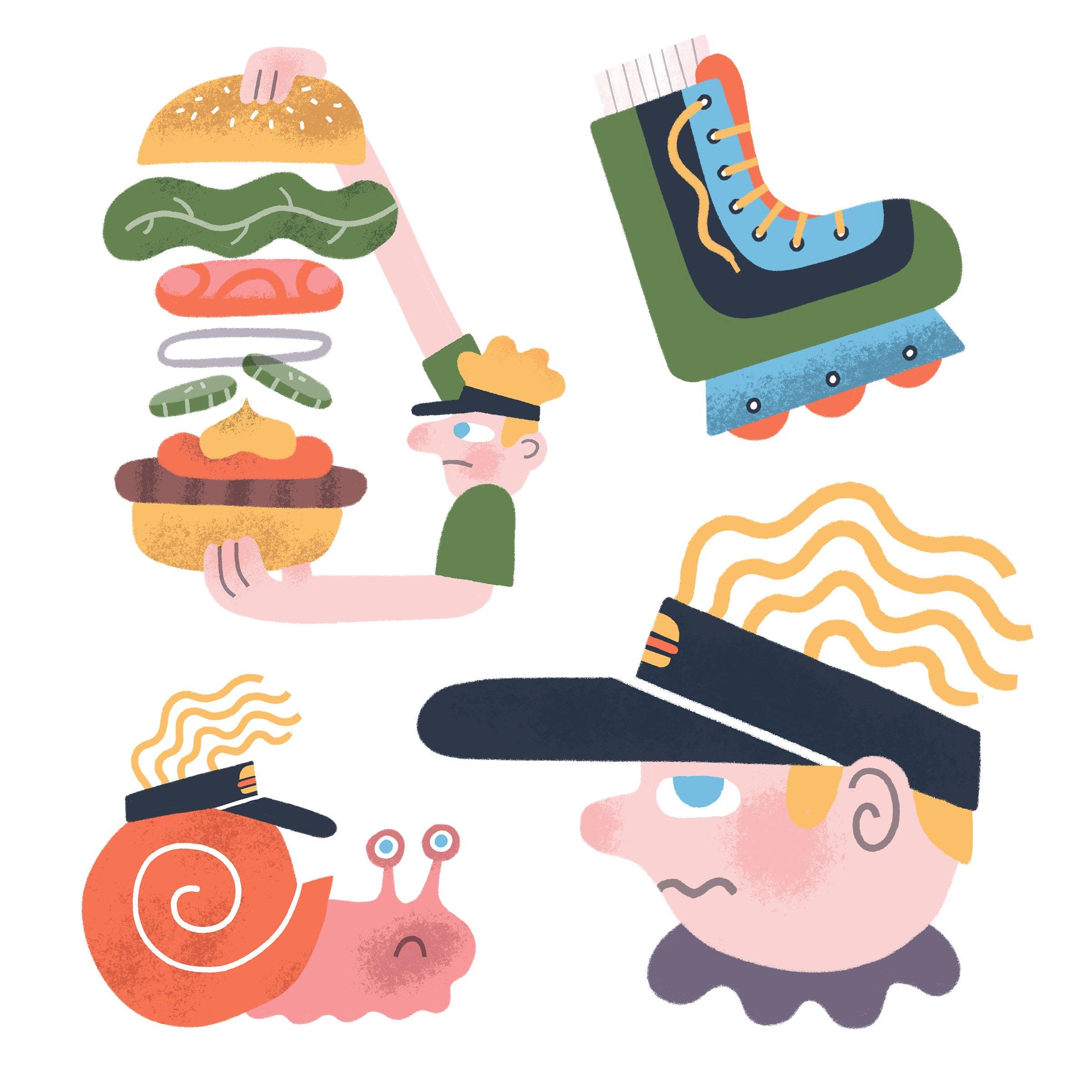
7. Project: Refining Sketches Set 1: For the final project, we're going to turn
our favourite sketches into finished illustrations. We'll start by choosing
our favourite sketches. Now I suggest maybe
three to five, but you can start by doing
just one if you want. Next, we'll refine our
rougher sketches by tracing over them in a more
careful and considered way. For those with loud inner
critics such as myself, this part might be
especially satisfying. This is what we're
gonna do in this video. And then in the
next one will turn each sketch into a
finished illustration. For the end of this project, you'll have a FUN little
Set illustrations to share on the class projects
page and on social media. But not so fast. Before we get to the actual
finalized illustrations, we still have to come up with our more Refined
Sketches and that's what we're going to have done
by the end of this video. What we want to do
to start is just choose our favourite
rough sketches. And what we're doing is we're
choosing a few of them to refine and make more clear before we take them into
the final illustration. So I gave myself quite a
lot of options because I did two tries for
both Exercises. So as you remember
in exercise two, I did the trail running theme in these sort of basic shapes. And I did that once
and then twice here. And then for exercise three, when I drew those more
trail running based Shapes, I did another two tries. So this is exercise three, my first take, and then
my second take here. The real problem
I've given myself here is I have too many options. So let's just see if I
can little things down. I think to start, I'm
just going to choose a set to refine
from Exercise two. And I'll just make this a little bit clear so we can all see
what's going on. So if you remember
from Exercise two, I wasn't sure that I liked
any of these first ones. But now that I'm here, I'm seeing a few that
I really actually do like I liked this
triangle tree guy. I do like the King of mountain. I liked the shoe that has
the toes sticking out. I'm going to pick two
more on this page. So I'll do the discombobulated, stretchy guy here that's
in the cross shape. And the, I like the arm
holding the water bottle. That is my first set. I've chosen five and maybe I'll just choose however many
I like from this one. I like this guy with
the I don't know, there's something kind
of cute about that. I like this tree guy. How about the bib? And why
not do the beer as well? Okay, so I've chosen four out of this and five out of this. Just to be clear, I'll hide the original
shape layers. Yeah, let's start refining the ones that I've
chosen here to start. So we're going to
trace over these with more confidence and this
is gonna give us a chance to make any additions
or changes to them. If we want, we can
try and make them fit our Shapes better. Which is maybe a
good reason to keep your original shapes
that you drew kinda visible as well as your
first rough sketches. So in Procreate,
I just kinda take my layers down roughly 30%. And then over top those
create a new layer. And just so we're a
little bit organized, I'll rename this to
something like Refined one. When I'm refining a sketch. If anything was really sketchy. Like if my lines were sort of tentative or
something like this, if you're trying to
build up a shape. I don't actually draw
like that a whole lot. I usually do just kinda naturally Draw and
bolder lines like this. But if there's anything
kind of unsure or tentative or loose or shaky, I try and just go over them. In these bold contour lines. Because we're not being
as impulsive here, we're not being as
fast and loose. You can take a little
bit more time here to be more considered. So I'm just noticing that the shoe shapes here are
both different ones, more flat on the bottom
and the other is round. And I want those to match. Thinking a little bit more
about my composition here. This is his shorts here
that he's wearing. Do I do the shorts so that the the cutoff ends up exactly
where his torso ends there? Or does that create
some confusion? Does it create a bit of a visual traffic jam where
this these two lines come. I wanted to see
maybe if I can make the shorts come a
little lower and make it even more clearly
like the cut-off shorts. So I've put this little I
don't know what you call it, but it's a little triangular cut that some shorts have there. And the reason I'm thinking
of doing that is to, again, just differentiate it from this line
which is his torso. Obviously, this is a
very unrealistic thing, but anything I can do to
add clarity to the idea, to the concept is good. For this project. The shapes are just
a starting point. So that original cross shape
that I have under there, my discombobulated runner guide, he doesn't perfectly
fit in there. But I'm not worried my goal
wasn't to draw something. The shape of a cross. The cross was just what do you do with this shape
when it's thrown at you? When you're trying to draw
things within a given theme. He should have a
shirt of some kind. So maybe he's
wearing a tank top. And just to give a little bit of definition to his arm there, I'll add a wristwatch. Another thing I might want
to add here is some kind of pattern to help set apart the torso part
from the shorts. This is supposed to be
that logo on a shoe. Leave it like that. Then I can move on. I'm just going to
actually move this guy a little bit out of the
way because I have another sketch that was just right below him
and they were kind of crashing into each other. So this was the hand
holding the water bottle. And actually I'm going to take this guy here and move
them right out of the way. I'm being a little bit more careful here about
how things are going. Not quite sure that's
the right solution. What I did there. So I'm going to try and do this a little bit true or
to my original sketch. I think I liked that better. By not having that little
thumb part that I drew here. I can put this water
bottle further back. It being somehow
you're to look at. And because I want that to be a little
bit more interesting, I'm thinking, what can I add to the arm to make it
more interesting? Could it be a tattoo? Maybe sometimes when you're doing a triathlon or something, you get your bib number
just tattooed on? Sometimes, I don't know. Is it a sleeve or maybe
a message like hydrate? Sure. This is a good message. Stay hydrated. We'll move on to
the damaged shoe. Playing a little
bit with, you know, what, what is my visual
language for a shoe? Here, I'd made no
laces or anything because they were just part
of a bigger composition. So I'm not too worried, but here the focus is on the shoes. So I'm thinking about what goes into illustrating
a shoe up close. So we're going to go with that. Move on to the King of
mountain badge here. So again, there's a social
media app called Strava. And Strava is like
Instagram for runners, but instead of sharing photos In videos, we share our roots. If you happen to run faster on a certain
route or a segment, then you get a little badge that makes you the
King of the mountain. For Mr. triangle tree. Think what I'll do is just make the undulations are the likes, the side profile of the tree
shape go a little bit wider. I'm going to run
into a little bit of congestion in
here with the face details because I'm using
such a fat pencil tip here. So if I find this too crowded, I can correct that later on. Slightly more dynamic
leg Shapes there. And he's gotta be wearing a hat. Okay. I have my 12345. Okay, so I've just iterated and Refined on my first set of
running themed illustrations. I'm just going to
hide that layer. Hide my original rough sketches, go to my second set and see if I can refine these
in the same way. Again, I'm just going to take the opacity of this layer down. And I might even take the opacity of my original
shape layers down even more. Found those a little bit distracting last
time I went in here. So gonna just add a new
layer and trace over these. And I'm gonna make
my pencil brush here just a slightly smaller so that I don't get that kinda congestion or crowding in these
smaller shapes. It's still good to keep
your pencil relatively bold because you don't want to get bogged down in details. If you have your pencil or your whatever brush you're
using to trace over to find. First of all, it's just gonna be this spindly little
line like this. And it's not as satisfying. It looks somehow less confident
and I don't like that. And also, you can start seeing, oh, there's a lot
of spacing here. So I want to add
another detail there and maybe I'll do some zigzags. You'll want to just
fill in all that space because there's room for it. And it won't look right
until you fill it in. A way of tricking yourself into making things more simple. In bold is just work in
a larger brush size, almost like the difference
between Sketching with a pencil and Sketching
with a Sharpie. This tree has his eyes
higher up in his mouth low, which is the different feeling than the one that I just
drew in the last set. If I want, I can
experiment with, you know, where to put
that mouth, for instance. I kinda like that. Now for the beer. Just want to make those
shapes a little more regular. Again, we're not so worried about whether the
original shape is intact. Want to add more detail. Maybe put a tab here so
that the beer looks open. What else did I circle here? The bib. These are supposed
to be safety pins. As you Refining These, just feel free to
add new details just like I did in the last set there where I was adding the details of
the shorts and stuff. This is not about being
true to your rough sketch. It's about taking
a rough sketch and taking it to the next step. And sometimes as
you're Refining, you might actually come up with new ideas that you
hadn't seen at first. Like for this arm. I know it's kinda gross
but I see sort of like it's been cut off and I imagine like the
bone coming out of the arm and then there's the flesh around it
and I let super gross. I'm not going to do that. I like the face too
much to edit that out. Let's see. Holding could just
be like a barbell or a flag pole. Maybe it's a trophy. Because it's a trophy, it
won't be super detailed. Maybe just one more
for phon, I'll redraw. This funny character
reminds me of the bookworm from Richard's
Gary's illustrations. So maybe this is the bookworm. So, so far I've selected my favorite rough sketches
from Exercise two, and I'm gonna go and do the
same for exercise three. And again, my ultimate goal here is to end up just with 34, maybe five of these
little funny sketches to take into my final Project.
8. Project: Refining Sketches Set 2: I'm hiding all my
other layers and just looking at my
second set here, the first round that I did, I'll turn on those original
shapes just so I can see what the original
shape I was going for. And I'm kinda just
scale that back and visibility or opacity just like it did
for the other ones. And the reason I'm leaving the original shapes visible is because maybe I want to
be true to those Shapes. Maybe I want to see if I
can make that hamburger, for instance, that I drew
here more pine tree shape. If I wanted to do that
as a creative exercise, that's something that could do. So I'm leaving those
original shapes just so it reminds me
of where I started. You could go either way. So I'm saying, on the one hand, you don't have to be perfectly true to
your original shapes. But on the other hand, you can also use
that as a challenge. If you think it's going to make your concept or something in your illustration,
just more interesting. So I'm leaving it a bit ambiguous so that I
can go either way. I'll start with
the roller blade. Now one thing about
this exercise that's different from a lot of the way that I
teach Illustration. Actually, the way that I go about illustration is that I'm not doing any reference images. Usually what I do
is I go through a process drawing things
just from observations. So let's just say
I wanted to know what a roller blade or
inline skate looked like. I would first just go on Google image search and
find such an image, an image of a roller blade. Draw that from exactly
the way I see it, not with the intention of
drawing it realistically later, but just so I know some
of the moving parts. But for this exercise
I haven't done that. And part of the reason is I I didn't know that I
was going to be drawing a roller blade or a hamburger or my old Burger King uniform and
Visor and stuff like that. So the ideas came before I
knew what references to pull. However, if I wanted to, now that I know
what I'm drawing, if I want to reference them a little bit more and see
what they look like, I could just go
onto Google Images and search them retroactively. So that's totally an option of what you wanna do if you
get stuck about what details. But part of the font of
this is that you really aren't drawing realistically it All this is really about
getting away from realism and coming up with this
just downright weird. Just drawing layers here I
have to figure out which parts burger in which
parts the button later. So there's the heel, the bottom part of the button. This is a burger. This
is a burger, I guess. That's a burger. Oh, no. I got things mixed up. So that's nothing. Let's put a hand down
there holding it. It just gets so weird. Little flag like there's a toothpick holding
everything together. Now for the hand holding
the fountain drink, I'll draw the fountain
drink cup shape first. And the lymph straw. How can I make this
relate more to the theme of my worst job ever? Maybe it's like I'm going to actually iterate
over this again because I just had a thought about
how that could be even more on my concept
of worst job ever. And because it was
such a bad job and it caused me anxiety, maybe the idea is actually the inversion of what
I originally drew. So I originally had
this shape like this, which was based on my
watch shape from running. And then I drew this
weird cop in hand thing. There's something bulgy about
that original shape that in a way like you
could think of it being like a cup that's About to explode like it's
swelling in the middle. But maybe that swelling
is inverted like this. So you have a cup that's
being squeezed tight. Somebody you want to
get that tight feeling and the cup here, some kind of creases. And challenge here is
how to get that cup to look equally like a cup. And also something that's
being scrunched and distorted. Sometimes when I'm drawing
and iterating and refining, I go in there with my eraser and refine some of the lines to get it looking somehow more
confident and finalized. Now, I wanted to
just refer back to the original sketch here
and keep myself on track. Think I might be
overthinking things. Something closer to what
I had is probably good. So I'm gonna go back and just try and do
that crushed cup, but less over the top. Do a more suddenly. And I could still edit this later if I thought there
was any use in doing so. Just need to make
room for that straw. Maybe some pop is coming out. Yeah. I'm thinking of like if the cup gets crushed and the lids
not going to fit anymore in some of the
pop is going to spill. And you get a little
bit more action and a little bit
more story in that. Maybe I don't want to
limps, draw the hair. Maybe it's more about there's more energy in a
straight straw sticking out. And again, I can iterate
over that later if I want. I wanted to also just
play around with this guy here is something
I like about it. Just in concept like that. It's kind of referencing me wearing my adviser
when I was a teenager. But I want to make
it clearer somehow. So what does Advisor look like? Adviser is basically a hat
that's had its top cut off than the way I draw hats that split
advisor would look like. I'm just trying to get a sense of will that look like a visor? I think it well,
let's go with that. Do like the bubbly
shape they are to. The question is, how do I
draw this the way I draw? So usually I draw my shapes of hats just
like that from the side. I don't ever Draw hat like
this, but it's bubbly. Just as a rule. It's just not naturally
how you do it, but, uh, kinda like that. I just like the way this
was shaped like that. But I'm going to cut
it off like that. No, that's not gonna work. Okay, so I kinda cheated
and I went to Safari just to see what adviser looked like. Getting stuck on this. It was just trying to figure
out what how do I represent a visor and a clear way
that is also in my style. And my usual way
of drawing hats, which is usually just like a, like a semicircle and a
stick or a line like that. It wasn't really working for me. So I found this image of the Burger King visor that I would have
worn back in the day. And I can see that
it's really I like a headband that would sit on your head at a
little bit of an angle. And then the visor would
do something like this, kinda like a duck bill. But it kinda works just to actually come off of
that with a circle. So that's what I'm gonna do. Pretend I'd never cheated there. But I like how this
guy looks like now. Now, my hair back in the
day would've sat over. I kind of a mushroom cut. You don't have to be literal. Though my hair, these
little illustrations were making can actually be related to maybe a
story about yourself. Or they can just be more random. And I think that's kinda
where I'm going with this Again, there's still some things that we're going to have
to figure out where it comes to Finalizing these
illustrations anyway. So I'll just start with that and see if I can
take it further later. It's kind of a logo,
they're angry. Burger King. Just going to take that part of my original sketch and
bring them out this way. I'm not worried about
damaging that other sketch there because I'm not
going to draw it. And just so it's clear what I'm iterating
over all actually just hide some of these other layers. So it's clear. Here's my burger King man. This is my very
disappointed manager. There you go. He looks
grump here already. So for me at this stage, part of the thing
I'm trying to figure as will the drawing actually work out?
Will it make sense? Like will it make sense to
have an ear floating between beard and hair? What
does that mean? I can always revisit that later. So another question I have
is do I draw his body also? Or is it enough that
he has a grumpy face? Like I'm thinking of a boss
being impatient and thinking, tom, you're too slow, hurry up and make
some for hamburgers. We've got some hungry customers. Okay, So just like
the last time, we're going to choose a few
of these that we really like. I have this slow snail guy, the garbage bag full of burgers. And maybe we'll do this guy. Kate. And again, just like the
last time we're going to take that back in opacity. I will take the original
shapes that were in the background
there down as well. So it's not as confusing, but leave him kind of visible
on my screen so that if I want to reference that original shape
that I drew them in, then I can, I'm going to
start with the slow snail. I don't really know
how a shell on a snail works and I'm not
going to worry about it. Let's kinda thing that
I get obsessive about, which I now am actually now
that I'm thinking about it, I'm thinking how
does a snail work? I think it's
something like this. And again, you can
cheat if you want. It's not actually
cheating to go on Google Images and just
look up a reference of whatever it is you're trying
to draw at this stage because we've done this sort of more improvisational part. This is just about Refining and coming up
with some actual Ideas. So maybe his visor
is from the front. And this is weird like
what's the point of advisor? If your eyeballs come up top and that does it even
look like a visor anymore? Probably not. There's original
goes pretty cute. I need to retain something
of that cuteness. What I think I'm
going to end up doing is keeping the original
cute slug like this, put the visor on his shell. I think that's actually funnier. The question is, do I do a little bit of
an opening there, get more of a shell shape. I like the contrast
of this snail compared to the running
theme that I did originally, which is more about being fast. And that we have this snail. Question is how do I draw
that visor on the snail? These are definitely the
details you want to work out during your sketches
stage and not when you're trying to make
a final illustration, because it's always easier to play around and Sketches than in a Final Illustration
Style when you're introducing colour and
technique and textures. And if you're working
in physical media, that's gonna be even harder because everything you do
is more or less permanent. As long as you're
working in Pencil, either physical or digital, you're actually able
to erase quite easily. Do I add some part of his Gastropod thing there. Yeah, that makes
it more sneakily. Garbage bag full of burgers. So when I was illustrating this, I was thinking like how
can I make it clear that there's burgers in
here without it just being black garbage bag. Is there like a tear in it
and burgers are falling out? Yeah. Maybe something like that. So there's like hamburgers kind of falling out of the
wrong part of the bag. Because I want this part here to be maybe it's
like a hand holding it. And just try this
idea one more time. The most important shape in this concept here
is the garbage bag. So it needs to, It needs to have that kind of bottom heavy, bulgy feeling of a garbage
bag on the bottom. And then everything else
has to work with that. My original sketch had that
the right feeling to it. The question is, how do I make it a garbage bag
full of hamburgers? When garbage bags are black, we don't know or
see what's inside. This is a scenario where the Ideas clever
or the Ideas gray, like a garbage bag
full of hamburgers. But I would really need
to break away from the shape in order to make it clear about what's happening. So I would maybe need to think of a different
way of saying it's a garbage full of
old hamburgers. So it's maybe it's
like if you have, I'm just totally breaking
away from my shape now. But maybe you have a
garbage can shape. And then a whole
bunch of hamburgers. Some with their buns still on, some of the patties. Kinda just thrown about. So maybe it's like you have
a garbage cancel full of hamburgers that the lid won't fit on straight and
that's not true to my memory. My memory is grabbing the garbage bag and it's full of burgers
and it's hanging. And I'm thinking this is
such a waste of food. And I'm hungry. But this more clearly
communicates the idea of discarded hamburgers and
a garbage and lots of them. So going to stick with that, I'm happy with that. I could take that into a Final
Illustration if I wanted. Then I said I would
draw this one last guy. So I'll just move this iterated refined
sketch of the way. And then here we have
guy holding hamburger. When you're thinking about using a shape to base
a composition M. If the shape is
well-known or has relevance to the brand that
you might be referencing, for instance, then of course, that shape might be
worth retaining. What if this guy,
instead of being in the shape of water bottle, was in the shape of a
Nike swoosh, right? And maybe just for instance, maybe I'm drawing some
things for my client who happens to be a really
big sneaker company. They probably want me to
keep their logo intact. I would ask, how
would I do that? Now, of course, this Bushi
logo probably wouldn't have inspired me to draw a guy
putting together hamburger. It might have made me
think more of like a scoop of mayonnaise or
something like that. But my point here is that there are some
shapes that are worth retaining for your final
composition in this kind of scenario where
we're working with responsive compositions
were drawing in Shapes. But if that shape ultimately has no meaning to most
people like that, or it's too ambiguous, then it's not necessarily
worth saving. So in this case, I'm just going to stay true
to the proportions that I made without being too worried about that original
shape coming through. Maybe because it was about assembling burgers
in the right way. Could be more like the
actual ingredients float. He's would be the onions. I liked that idea. Okay. Just gonna make this
a little bit smaller, so all my things can float. I have my burger, I have my ketchup, smear, and my onion layer here, then a tomato and then
some lettuce, mayonnaise. And then the button
on the bottom. This is definitely a
case where I'm not going to be true to the shape. Just want that led us
to look more legacy. I think tomatoes have
five sections in them. Doesn't really matter. I'm just thinking about how to make it look more like
a tomato doesn't matter if it's the correct number
of segments inside. And I'm thinking
about if I'm holding the bottom of a burger
and the top of a burger, what do my hands look like? So I'm thinking if I'm holding a burger that's suspended
in zero gravity, like I'm drawing here, but I'm holding the button
and I'm holding her, I'm holding the crown
and I'm holding the heel of it would have my hands look like
from that angle, I have my thumbs closest to my face and my
fingers away from my face. So sometimes I need to actually do the action to see what it would
look like to draw it. I can have FUN with
proportion here. It is possible to
overthink these things. But what I don't
like about this as a shape is starting
to become boring. It's kind of just
two regularized, whereas there's something
more dynamic about the shape. So I'll kinda make this
look more dynamic. His hands will be smaller, top and bottom like this. Doesn't need to be realistic. When I do want to just get us a sense that he's holding it. One thing I could
do as an option is actually not even have his arms behind their
will that work? Or should I do? It's something
where it goes behind. Like that. I like that. Something kinda
charming about that. I like that guy. Okay, So I have
given myself more than enough to choose from
for these Refined Sketches. Now I just need to choose three to five to take into the finished
illustration part. So I'm actually just going
to get my red color here and start by putting a little dot on the ones that
I'm going to take to final. I actually really
like these three, unfortunately, so I just
need to choose two more. And you know, since I have a little bit of
a theme going here, which is all about
me and Burger King. I'm going to just roll with that for the remainder
of my selections here. I like all of these, but I think I'm going to keep
this one with the advisor. Angry Burger King man. And I liked the roller blade because it's like a
little bit more cryptic. The only reason a
roller blade makes any sense in this set is that I remember rollerblading
on a hot day to my job and then
getting fired. So that's what I'm
sticking with. If I wanted, I could always
go and finish all of these, but I'm actually going to just leave all of my
original set behind, all those running
themed doodles. Because I've decided that
for this project they're all going to be based
on my worst job ever. And hopefully, you can see how much possibility there
is in this exercise. One hand, you could be
using those just to come up with FUN random ideas. Like what happens when
I have a theme like running and I try and fit it into a triangle or a
cross or a blob shape. That just helps you come up with more random looking
illustrations and you would have thought up. But then for me, I'm imagining that
I'm illustrating for a story about my worst job. And so I could start with my
usual process which is like Think about, oh, what was really bad about
working at Burger King? Oh yeah, I remember getting fired or whatever
it was and I couldn't just think more on the literal level of
like me getting fired. And so I might go
to Google image, search and look for
someone getting fired, maybe with some pointing or like an angry boss
or something like that. But because I started
with the shapes like the tree shape, a shoe shape, these were all based on running, which had nothing to
do with Burger King. By introducing those. It got me thinking about
totally different ideas, just stuff that's just
like related but more kind of In off kind of way. And that's just one way
of using this method of improvised illustrations
are responsive compositions to just get your mind out
of its typical boxes. So again, you have,
on the one hand, you could use this as an
exercise just to come up with random ideas for their own sake. Or it could use
the randomness of this process of starting
with one kind of shape and drawing something
in there and then changing your theme and drawing
in new shapes. You can use this as a
way of just getting so outside of what
you would have thought otherwise
to come up with actual concepts for
a real project, where you actually have to
have concepts that make sense. So I just have one more step that I'd like to do
before I take these into the final
illustration stage. And that's just to get
my final selections all up on the same page
so it's clean. I don't have all the
other massive my process. And so what I can do is I
can actually just go to my procreate gallery here, duplicate it, because
I might want to keep some of that process
for another time. I can just open my
duplicated file and then basically delete anything that's not part
of my selections. So just a quick little
Procreate tip here. I'm going to take
everything from this layer 23 all the way to layer one
down here at the bottom. And what I'm doing is I'm using my fingers to pinch all
these layers together. Now we'll just make
them easier to delete. Now I just have my first
and second selects. And for these, I'm going
to flatten this layer, and I'm going to flatten
the layer above it. So now I just want to
remove the outtakes here, the ones without the red dots, That's the stacked burger
and the squishy cup. Just want to select those. Cut them out. Then of course, arrange these so that they're all
visible together. I'll, it's a bit of a
mess here, but okay, I now have my sixth
final selections ready to bring into the
final illustrations. It was a hard choice I liked. So many of these other things will be PFK-1 to illustrate, maybe at some other time. But let's just go in with these. I have a nice variety. I have the more simple
snail and the roller blade. And then I have the
more complex guy with the floating burger stuff. Okay, so you should
now at least one, but maybe even more
Refined Sketches. Now it's time to turn them
into Final Illustration. But before we do,
I just want to say a main takeaway from this
step isn't how we can move a super rough and
random-looking first sketch toward something that looks more confident and intentional. When you look at someone else's
illustrations and wonder how they came up with
certain shapes or Ideas. Maybe they used a process,
something like this. They may have started
very loose and uncertain like I did
in the previous step. But then they made it
look like they did it on purpose and the more
confident refine drawing. And of course, that's
what I hope you find yourself moving toward
as we go through this project that
things do start to look more confident and they do start to look more refined. And ultimately in the
final illustration, I want you to be able to say, I can't believe I
did that. Anyway. I think it's time
to take these bad boys to the finish line. So I'll see you in
the next video.
9. Project: Finalizing Illustration 1: Now it's time to create
some final illustrations. I'll be finishing
mind and Photoshop, but you can use any tools
or techniques you want. In this video, I'll
show you how I take my sketches and build
on them in Photoshop, including creating a new file and deciding on things
like size and resolution. Dropping my sketches
into the final file, choosing colors and brushes, building up the
illustration using layers. And finally, getting the
Illustration ready to share on social media and of course on
the class project gallery. So just before we get started, quick note about the
tools that I'm using in case you are curious
for whatever reason. So I will be illustrating
using Photoshop on my Mac, and I will be using my iPad Pro and my Apple Pencil
as a graphics tablet. And the way I do that is
through Astropad studio. In terms of the
brushes I'll be using, all of them can be found in the woodland wonderland brush set by Retro Supply Company. Retro Supply Company makes
all kinds of amazing brushes, brush packs, and other kinds
of assets for illustrators. The Woodland Wonderland, the
brush that is particularly made for Procreate
and Adobe Photoshop. So if you have either of those and you want to use the
brushes I'll be using today. That's what I'll be using. Of course, I'll leave
links to both Astropad and Retro Supply Company in the project description
for this class. So now just turning
to Photoshop, I'm going to create a new file. I know that the final
illustrations I'm making are going to be to
share on Instagram, that's their final destination. And the minimum dimensions of an Instagram post as
of this recording is 1080 pixels squared. So I could make each of my files here just
1080 pixels by 1080 pixels. But I wanted to give it
a little bit more room, just so I have the option
using these for other things. Maybe I want to make
a sticker set or some temporary tattoos and these would need to be printed. So I want to have just a little bit more resolution
in these, just in case. I think what I'll do is make
these at least double that 2,200 pixels by 2,200 pixels. Because I'm making this
file in pixel measurements, it really doesn't matter
what my resolution is. However, if I was thinking
more in terms of inches, like let's just say I
wanted to make this 8 " by 8 " for print. Then I would want
to make sure that the resolution is 300 DPI. So eight by 8 " at 300
DPI will probably, or will definitely be
higher in pixel count. Here we have 2,400
by 2,400 pixels. That works great for me. I'm going to just make sure
that the color mode is RGB. And if you want to
learn more about why I'm working in RGB, learn more in my class called
the one pallet illustrator. Here on Skillshare. I'm gonna hit okay, of
course the next thing that I want to do is get
one of these sketches that I created in
the previous step in Refined into the file. So let's start with
something easy. Just to Warmup. We'll do the roller blade. I'm just going to select that, copy it and then head over
to here in my new file. Paste that down. And because I want it
to fill the space, I'm going to make that bigger
using the transform tool. Now, don't worry about little
things like, in my case, I have this red dot that was used to mark this one is
one of my selections. I can ignore that. It's there, it doesn't
matter and you'll see why as we go along. The next thing I'm wanna do is prepare this sketch so that I can actually illustrate
over it without it being so dark and my way. What I'm gonna do is just
rename this to sketch, just to be organized down
in the Layers panel. And I will take the
opacity down to 20 pixels. And now it can just build all my final artwork
on top of that. There is a way that I
like to do this and I'll quickly show you how
I do this and why. So of course, I want to make a new layer in the Layers
panel over my sketch. And this is gonna be where
I start making my artwork. But before I do that, I actually am going to
make a new layer group. So while this layer
one here is selected, I'm going to hit
Command G on iMac. And this creates a
new layer group with that layer inside of it. I'm going to rename
that layer group to Art Then I'm going to
set the opacity of that entire layer
group to multiply. What that does is lets
everything that I draw or illustrate inside of this be transparent to
the sketch below. If I didn't set the blending mode of that
layer group to multiply. If I left it normal
or pass through, then I wouldn't be able
to see that sketch underneath any of the
Final Illustration. Textures and colors and stuff
that I build within that. I set that to multiply. And then everything with in that layer group
will be transparent. And I will see the sketch
come through that later on. When I'm done the illustration, I won't need that
sketch anymore. I can toggle the
visibility, hide it. You won't see the
sketch anymore. And then that
illustration will be all UC, you'll see what I mean. Let's just get into it. So I can really just start turning this into
a color illustrations. So what's the first
thing that I do? I like to choose a brush that has a little bit of
a texture to it. And looking at my woodland
wonderland brush set here, I think rough
builder might work. Let's give that a try. So this is rough builder. Brush number nine. I'll start by black or this dark blue that I use
and see how that goes. So now I'm just using my Apple
Pencil to actually draw in the shape of this
roller blade boot. And then I just use
the bucket fill here, the paint bucket tool to fill
in that shape completely. Now what You'll notice if you do it this way is that you get this faint white outline between the filled-in area
and the original outline. And so what I do is I just
go and use my brush tool again to draw in over that. Does get a little bit tedious
when we have to do that. But it does make a difference. Of course, I want some
more color in this piece. I'm going to add the kind of the we'll hold her part on the
bottom of the boot here as a different color. And every time I
make a new color, when I'm working in Photoshop, I create a new layer
and that makes every single element editable. Later on, if I change my mind Or I need to
make an adjustment. So maybe for the, the bottom part of
the roller blade, I'm going to use blue, this cyan blue, and then just do exactly
what I did last time. Why don't remember to
do it up here as well? A closed shape because
that means I can just use my paint bucket tool
to fill that in. Now I want this bottom part
to sit under the boot, so I'm going to just drag it under the layer like that
in the Layers panel. And going to continue adding
more of this same color. So the top part of the boot, I'll also make in
the same color. Though you can't see it. It's kinda going under
the darker boot area. I am completing the shapes so
that I can do a quick fill there and then go
over with my brush, making sure that faint
white line goes away. The next thing I wanna do is some of the details
of this gate itself. So I'm gonna click on the
boot here in a new layer. Now I need to think
about what sort of color and line I want to
use for those details. I'm a little bit of a
minimalist where it comes to using
brushes in Photoshop, I tried to use as few as possible and I tried
to be consistent. So while I'm doing the
details of this gate here, I'll be using some kind of
line to fill in these details. I want to use that
same line quality in similar areas in
the rest of the set. So I'm thinking about that now. And I'm just going to try some different brushes here and see, see how they look. I can use the broken micron
pen and I'll try it in white. And let's just see what
it looks like if I use that right out of the box. To me that's a little bit thin. I don't think that
we'll look strong. So I'm going to just undo that. Another thing that
I could do is just try my rough builder, the same brush that
I used for the Shapes themselves. Maybe not so thick though. I'm going to try maybe
something like 3-5 pixels. And see you see how that feels. Now as I'm doing this, I'm also feeling like the
overall vibe of this, of these lines is just
a little bit two. Wobbly, feels just two
out of control for me. Sometimes what I like to do is change the smoothing
of the brush. So while you have your brush
tool selected in Photoshop, you can actually just
adjust the smoothing at this top bar area here. Something higher like maybe
we can try 80 per cent. And what that does is it makes your line quality
a lot smoother. It smooths out your
natural shake of hand. And that can be nice to give your lines just a
little bit more confidence. It's still has an
organic quality to it. It's just a little bit more controlled and
professional looking. Now another thing that I'm
aware of is at the top here, the lines are poking up
over the boot shape. Now quick way to make sure that linework that
you're putting over top and other shape stays within that shape is to make what's
called a clipping mask. So with the layer that you're making these
details on selected, you can actually just
right-click on it and the Layers panel and go
create clipping mask. I shortcut for that is Command Option G if
you're using a Mac. And that sort of makes it so
that whatever your drawing at the top only stays within the bounds of the shape that
you drew beneath. Now before I move on
to the lace detail, I'm going to create
the wheels now. So I'm going to
create a new layer and I'll make it over the blue shapes so I can see
what I'm drawing to start. And I'll make these wheels just to add a little
bit of variety. I'm going to make
them this red color. And maybe what I'll
do is just use one circle and copy and paste it for a little
bit more regularity. Now, when I look at
this circle this way it does look a
little bit diagonal. So I need to make sure it's
a little bit more regular. And a good way of doing
that is just by using the transform tool and
rotating it say 90 degrees. And then for me,
this helps me see the angle a little bit
more clearly because my actual perception of
things that I draw, it happens to be on an angle. There must be some distortion
either in my eyeballs or in my Perception like in
my brain somewhere. I don't know how to explain it, but I draw diagonally. And what I can do is using the transform tool
and holding down my command key is just sort of adjust the edges a
little bit rounder. And then if I rotate
it again 90 degrees, I can see where I
might need to make further adjustments
that I didn't catch in its previous position. So I'm going to just fill
that in as we've been doing. Use my brush tool to
fill in that white line. What I'm gonna do
is just hit Option and drag to duplicate these. Then in my Layers panel, I'm just going to select
all three of them, make sure that they're
positioned right. And another thing I can do is actually make sure that
they're spaced evenly. If that was something
that was important. Right up here in this
top toolbar thing, I can hit this distribute
horizontally button. And it looks like they
were pretty good already. Now of course, I want
these wheels to be beneath the blue part there. And now that I look at them, they feel a little
bit too close to the edges so I can just move
these independently in. And again, this is another good reason to
keep everything on separate layers so you can make adjustments as you need
without having to redraw. The last thing I can do is
add in the leasing detail. I'm just going to
hit new layer above that boot shape and maybe it'll make those lease holds a
different color than white, and going to use blue as well. Now I have smoothing on still. When I'm working
at a smaller size, I find that smoothing can
actually be annoying. So I'm going to
just set that all the way back down to zero. I could draw each one of these
on its own if I wanted or, or it could just copy and
paste each one of those. Now this time I'm using
the selection tool and copying pasting within
the same layer. And with little
details like this, I don't want on a
separate layer for absolutely every
little eyelet here. So it's okay to use the selection tool and copy
and paste in that way. I can make adjustments By using the selection
last Sue tool here, my keystroke is L to
select and then V to move. Now I can add the lace over top those islands,
so a new layer. And you can see that every
time I create a new layer, if it's under a clipping mask, this new layer will also
become a clipping mask layer. Just by default. I'm going to use
yellow for the laces. And I'll stay with this rough builder at 3-5 pixels and then
just draw those in. For the shorter lines. It's pretty easy to make them straight without
needing the smoothing tool. One thing I like to
do with my brushes is makes sure that the ends have a more controlled
look to them. Sometimes, I don't
like how the ends of the brushes go down by default. And so I'll actually just
use the eraser tool. And a good eraser to
use here would be hard, round pressure size, which is just the general brush that comes with Photoshop. And set that to maybe ten
pixels, just something small. And then using the Eraser tool, I can just cut these back a bit. In. This just gives, In my case, it gives my brushstrokes
a look that I'm, I'm very consistently using, which is this like cutoff
hard end of my brushstrokes. And for me that just
gives my brushes a little bit more control. And you'll see more
of how and why I do that as we go along
through the SAT. Now, at this point, I want to just take a look at my entire illustration
without the sketch, even though I'm not quite done, I'm just going to hide
the sketch by clicking the little eyeball there just
to see how this is looking. There's something about
this that I'm not completely satisfied with yet, but I'm going to have to see how the rest of
the Set builds out. Before I get to
critical about this, I'll just add the lease on this boot before moving on
to the next Illustration. And again, we'll
figure out how I want the style to actually
look with the, some of these details as I go along with the
rest of the set. So I'm going to go to
the topmost layer here, which is the white
detailing on the boot. And I just wanted to
create a layer above that. That's not a clipping mask
so that when I draw it in, it will actually go
beyond that boot shape. And I just want to add
the last shape here. And I'm not quite sure I want the street parts of the
lease to look like that. There's something a
little bit Genki, so I'm going to turn my sketch layer on just
to see what I drew. Maybe just go, go with a Sketches simple kind
of bow shape here. Then we can come back
to this if needs be. After I've done a few
more illustrations. Now having gone through all this part with the
first illustration, maybe a question you have is, how did I decide on
which colors to use? Now this is something you can also learn more
about in my class, the one pallet Illustrator. But real quickly, I have
a color palette that I consistently use with
every job as much as I can. And that includes
all of the colors at the top of my swatch panel here. So this cyan blue,
the pinks, yellow, the dark navy green, orange, red, and purple. For the most part. These are the colors that I use and then all the other ones
below are just variations that I can add in that
relate to these colors just based on the same
kind of quality of color. And again, if you want to
learn more about how I generate a palette
like this and how you can create a minimal
palette yourself. You can find all of
that in my class. The one pallet Illustrator
10. Project: Finalizing Illustration 2: Now it's time to create our second illustration
from our chosen Sketches. I'm going to just quickly save this file as
something else. I'm going to maybe move on to
the guy wearing the visor. And so I'll just call this
Pfizer guy and save that. And having saved
this as a new file, I can delete the
Illustration layers here on the board blade
and also the sketch. I can delete that. And I now
have a file, a blank file. I can start again way.
I'm gonna go back to my sketches here and
Find the visor guy. And use my last Sue
tool to select, Copy and then paste
that into my artwork, my Final Art File
here and again, using the transform tool
to make it large and centered in here
doesn't matter if it doesn't fill
the entire square. And just like the last time, I want to take the
opacity down to 20, 30% in the Art layer group that I kept from the last time, which is set to multiply. In the blending mode, I'm
going to create a new layer. That layer should end up
within that Art layer. If for whatever reason
you make a layer that's ending up outside
of the Art layer group, just make sure you grab
that in the Layers panel, drag it and put it into
the Art layer group. And you'll know that it's in the Art layer group by the
fact that it looks kind of inset compared to other
layers side of that group. So let's go to actually
create the final Art here. So I'm going to create
a light pink here, which is kinda like
a skin color for me. And I'm going to use my rough builder just
like I did the last time, keeping everything consistent
to draw this shape. I can see here
that that shape of my face is going to be
hidden beneath advisors. So I'm just closing the shape and then going to fill that in. And then use my brush to just
fill in that faint line. Just like the last time. I'm going to make a new layer
over top for the visor. I'm going to make that
dark blue because that's the color that my advisor
was when I worked there. Now quick shortcut to draw straight lines
and Photoshop is if you use your mouse or your stylus to make
a mark just one, then you hit Shift and
hit somewhere else. Then you get these
straight lines like that. I'm just holding Shift and
tapping at a distance here. From the last point. It's going to undo all that. And the reason I'm showing you that is because I'm
about to use that as a quick way of filling in
these faint lines in here. And I'm going to use
my eraser tool just to make some of these little corners a
little bit more customized. Unless default. If I wanted to have a little
sharp corner here as well, I could just add a
little bit more of my brush and then chisel it off. Like that, feels
a bit too sharp. But for now, I'm not going to worry too much about
those details. And in fact, I'm
going to just not worry about that at all. Go back to how that was. And I'll just draw on my advisor part of
the hat sunshade. Now, I'm having trouble getting that shape the way I want it. I could turn on
smoothing if I wanted to have that a little
bit more controlled. So if I go to smoothing and
hit that up to like 75, 80%, that should give me a little bit more control
or a lot more control. Meaning that consistent, what
I'm trying to do is have a straight line curved around
the straight line back. That's not hundred
percent straight, but straighter than I can
draw with my free hand. Then of course, fill
that in and then use my brush to fill in
those faint white lines. I'm going to want that ear to
come in over this as well. And I could use my eraser
tool to cut that out. But I also want that ear shape at the top to have
the same texture. So how am I gonna do that? One thing that I could do is use what's called a layer mask. So if I have my current layer selected and then
I hit layer mask, it creates this mask that's indicated by
this white square here in the Layers panel Now, using my brush, I want to draw out or cut away so that the skin
color beneath it shows. So what I need to do
is just make sure that my foreground color is black and my background color
right now is set to black. And what I can do is just hit X and that switches them up. Now making sure that my
layer mask is selected, I can just draw in, in almost erase away
that part of the ear. And the nice thing
about layer masks is that they are non-destructive. I can hit Shift and click
on that layer mask. And it shows you that the layer that is masking still
exists in its entirety. So it allows me to change
that up later if I want. Another thing I
want to add here, of course, is the hair. So I'm gonna just hit the layer beneath where
I started the face. I'm going to create
a layer above it, but beneath the visor. And I'm blonde, so I'm going to use the
yellow for blonde. And of course this guy represents me working
at Burger King, which was my worst job ever. I am going to just
experiment with brushes within the set here to see
what works best for hair. Does it work good to
use this squash brush. I find that a little bit
disappointing for some reason, for this particular use. Maybe the broken micron
is the way to go. I do want these
strands of hair to be thick in like spaghetti noodle like because I'm not interested in representing here realistically
is like fine strands. This is more stylized. There's movement to these. So I'm going to try
the fine micron, but really boost
the size to like 30 pixels and see
how that works. It's still too thin.
What if I made that 60 twice the size? Then what if I sat
the smoothing to around somewhere around 50%? Will that give me a
nice flowy strand of hair? I like that. I feel like there's
something missing down here. Not quite clear to me
what I need to do yet. So I'm going to
leave these as is, except for the fact
that going to edit out using the Eraser tool, these ends where I lifted my stylist because I don't
like how default those luck. I'm going to leave
that. Now move on to some of the
details of the face. So going back to the
skin face shape, I'm going to get another
layer over top that. This time I'm going to
create a clipping mask, just like I've done before. And I'm going to select
my darker color here. In Draw. I'm still using the micron, the broken micron pen. And I'm going to use that
as my linework details. Now, for the details that
I made with a rollerskate, actually use the
different brush. I use the rough builder nine. And just to get a
sense of what that might have looked
like if I did that. It is more consistent, isn't it? It has me wondering if I should
make everything including the hair as consistent as that. I'm going to compare them. So I have this one which is
based on the rough builder. And then I have this one which is a totally
different thing. I think what I like
about the broken micron is it's just a little
bit different, adds a little bit of variety to this style that I'm
working in right now. I'm going to just try to
keep working with a micron. And that means when I go
back to the roller blade, I want to try this same brush at around the same size as well. Another thing that I
want to do is not keep it fully black or
dark like that. I want it to be more
like a shader colors. So maybe set the opacity to 50%. Then if I hit Multiply, it will help it just
pick up some of the color of the skin beneath. And if I just hide my
sketch for a moment, I think I like how that looks. Let's continue to finish. This guy. Wanna do the ER detail. And I could probably
do it with the same, on the same layer group. So going back to my
60 pixel micron pen, I'm just going to do that little squiggly ear-shaped
that I originally do. And I'm gonna just draw it within the shape of that
year where it's cutaway, not all the way to the top. If I did draw that all
the way that the top, I think that would just Wouldn't look right to
me for some reason. I wanna do one more
detail here on the face, which is adding some
shading or blushing. So I'm going to hit that face shape one more time,
create a new layer. And then I want
to find some kind of texture that will make
this fleshy cheek here. So what if I used swamp crown? Know that might be too small
but about waxy roller. And then made the size smaller. That looks really big
for me to 400 pixels. I use this darker pinky color. And then if I set the
layer to multiply and the opacity down
to around 20 or 30%. That creates a nice
shady kinda feeling. And I can just apply
that also on the tip of the nose for extra cuteness. And hiding that layer. That looks pretty good. I just want to work out some of the details of the visor itself. And I may want to revisit
the hair strands, but let's see,
reactivate the sketch. Make sure I'm now working
on or above the adviser. I want to create a little logo
on the front and a detail for where the headband
part meets the visor. Here I'm using the 3D pixel broken micron pen
because this is a smaller detail and I can
do that clipping mask trick. And then the bottom part of
the button is here using my eraser tool just to
open that up a little bit. The key here is just
not accepting brushes, default qualities,
just as they are. It's good to edit them
out and make sure you have all the control over
your digital brushes. Okay, so finally,
I want to suggest the idea of a hamburger
in the middle. I know that in the logo
there's the words Burger King, but I'm just gonna put a red and a hamburger shape in here. Do the clipping mask. And I could just actually
move that around if I want, by selecting all of it. Maybe make it a tad smaller. And then I'm going to re-select
the visor shape here. Create another layer over it for the detail of this
connection here. And for this detail,
I'm going to stick with a smaller micron pen size here. So I had been using 60 pixels for all the other
details with this brush that's called the broken micron. The default size of
broken micron is 15, but I want to make it 30. So it's thin enough to
not be distracting, but thick enough that it's
not totally invisible either. I feel like that line
might be too solid. So what I can do is select
that line that I just made. I can create a layer mask on it. And making sure that my
foreground color is black. I can just draw it in over top of that sort
of a dashed line. The reason I do that is
it adds a little bit of texture and variety
to the overall drawing. It looks like I'm
pretty much done. I'm going to hide the underlying sketch and
just see how things look. It's not bad, It's
a little bit plane, but I have to keep in mind, these are pretty
simple illustrations. One thing I could
do if I feel like the hair is just too
loosey-goosey and there's not enough like a head
shape under that is I can maybe just going to that
hair layer and adding a layer just under it
in the Layers panel. I could choose maybe even that same waxy roller
that I use for the blushing. I can use that for the
hair under there as well. Well, that's kinda funny. But that's not my hair. So that doesn't work. Maybe I'll try the
rough builder just like the same brush that I used for the head shape itself. Do I want to rethink what
that here it looks like. Technically speaking,
back in those days, I think I had a
Backstreet Boys haircut. It was like kinda shaped like a mushroom cup apart
it in the middle. So if there's a way I
can draw here like that, then great. That's not bad. I kinda liked that better. It's more full than the wavy lines that I drew
in my original sketch. Even though those wavy lines
were kinda interesting, I kinda like how
much fuller this is. I feel like the burger here, the lines between them, the negative spaces
are a bit tight. So I'm just going to give a little bit more
space between them. Let me get a little bit smaller. That feels better to me. Now I was asking myself, do I need to make the expression
on his face a little bit more like this guy does
not like this job. I'm going to use the
last few tool here just to isolate the
eye and the mouth. I'm gonna go to Layer, New Layer via cut. And that takes this detail
and sets that on a new layer. I'm just going to hide that
and then create a new layer. And if you'll remember, I used the broken micron
brush at 60 pixels, and I did that using
the dark blue color. What I'll also need to do is make sure that's
over the right layer. I need to put that over the
face shape. There it is. And another thing that
I did there was I set that layer to multiply
and cut it down to 50%. And it's also a clipping
mask on that shape. All these things. But
I'm not doing a smile. I'm doing maybe more of
a Charlie Brown mouth. I might create an AI. Does it work to create an I
sort of like a Smiley shape? Or maybe I do a more open I, I've created a new layer and
I have white as my color. I'll just fill that
in real quick. And then over top that I'm
going to create a pupil. And I'll draw the pupil. If I draw that people
and set that also as a clipping mask over
my oval eyeball shape. Again, it creates a
nice clipping mask which keeps the pupil
kind of contained. Maybe I'm rolling my eyes about how boring and frustratingly
bad this job is. I think that works in one
thing that I'm wondering is, should I make that
blue just to add a bit of character to the piece and add a little
bit more variety. And I kinda like that. Okay, So this is the
second illustration down. I'm now going to move
on to complete the set
11. Project: Finalizing Illustration 3: So I've started to illustrate my snail now or finalize
the illustration of this. Now I have the shell shaped down and the slug itself down. And I just wanted to point out a few
decisions that I've made already and also maybe giving you a few more pointers if you are using Photoshop. You can see that in the drawing, originally I had these kind of more spindly stick
shapes that led up to the eyeball antenna
things at the top. And I decided to make
those more kinda like pointed horns almost rather than straight lines
to the little ball parts. And I feel like that
we'll just create a more satisfying shape overall. So I'm gonna just go with that intuition and see
if it, if it works out. The other thing that I wanted
to show is that I've made the shell shape and it was
originally drawn in yellow. And then I thought, I don't know if I want the shell
to be yellow. What about green? So I quickly double-clicked
on this shape and activated this
little layer style here called Color Overlay. And that allows you to
just change the color very quickly to
anything you want. Now of course, I have
disabled the effect, so I'll just
re-enable the effect. And you can see that
whatever color I set that color overlay
to, it will take on. Now I also want to
draw this spiral shape over the shell using
a clipping mask. Now one thing you'll
notice when you're using a clipping
mask over a color that has this layer
effect applied to it is it won't show up. So I'm going to use
this dark blue and I'm going to get my
broken micron pen, set that to 30 pixels, just like I did last time. I'm going to start drawing
over that now if I tried to create a clipping mask
from that, it disappears. And that's because it's
taking on the layer effect of the color below and that's not good, I don't want that. So what I'm going to do before I draw anything
over topping, try and do a clipping mask
is I'm actually going to flatten out or
kind of mega solo. This layer effect isn't
an effect at all anymore. And let me show you what I mean. I need to make a new layer
over top and then select that layer and the layer
beneath holding Shift. And then I hit Command E or
I go Layer, Merge Layers. And by merging the layers, just that blank layer and the snail shell shaped that had that layer
effect applied to it, it just makes that layer of fact disappear as though I had originally drawn the shell
in green in the first place. Now it can make a
new layer over top that have that
clipping mask work. Just do this just to show you. You can see that it Now clips in the way that
you would expect. Now as I'm doing this, I actually think that
that's too small. Let me try going back
up to 60 pixels. And I'm going to
set my smoothing to the same around 80% or so. And of course, customize it
a bit with my eraser tool. Do that clipping mask by
hitting Command Option G. Now it's not quite aligning
to the shapes beneath, but I can change the shape or I can
change the location of the spiral pretty easily. Let's do that. I just use the transform
tool to do that. The next thing maybe I
can do is add the visor. And what it'll do is just create a new layer over top the
snail shell business. Actually, before I do that, I want to make sure that that
snail shells spiral kind of blends more into the
color of the green. I'm going to multiply that. And that's pretty
dark and intense. So just like I did for other details on the
previous illustration, I'm going to take the
opacity down to 50%. And that makes it more
like a shader color. So I like that. Now I can move on to the visor that I cited drawing up here. I'm going to use my
rough builder and use the same color that I used
for the visor the last time. So what I'm gonna
do is actually just trace the shape of the
hat as I sketched it. And then I'll make sure that
it sits over that shell. The right way. Next, make some subtle
adjustments to the corner there. Now, I can move this
whole thing up above. I wanted to kinda sit on
a shell in a way that Visually feels right. I liked the way the
visor is pointing back down to the eyes of the snail. So compositionally, it creates a little
bit of movement where you have this spiral
inside the shell, kinda leading you up to the
visor at the top and then the visor brim is
now pointing at the eyes and they point back
down into the slug shape. So you get this nice flow
inside the illustration. You can make these kinds
of changes in the final, even though they're not exactly how they
looked in the sketch. Sometimes you get new insights once you start working with actual shapes and
brushes and colors. So let's now get onto
the rest of the slug. Now because this sluggish guy is a representation of me
being a slow worker. Maybe it makes sense
to make the eye color, the iris color here, in this case, the same as it was with the
visor guy illustration. For a very subtle sense of
this being the same character, can add the details
of the slug here. For the mouth. Again, 60 pixel broken
micron in the dark blue. Do that, multiply,
Set it to 50%. I want to think about
what's gonna happen with the squiggly part
under his belly? I don't think I want
a hard line there. I don't think that
would look right. So what I want to do is maybe
introduce some texture. This is something we haven't
done yet in this series. And so I'm gonna try one
of these green brushes that's included in the
woodland wonderland Set. It might just be a matter
of testing these just to see which one I liked the best. Sometimes they're
all the same and it doesn't really matter. Or the differences
are two subtle, but you can see like
the standard grain is very subtle and
it's not very chunky. Whereas the other
ones are chunkier. I kinda like these
three chunkier ones more than the subtle one. What am I try is this one here. It's a nice balance of being chunky but not as dense
as the other ones. So I'll just clear those out
and try this as my shader. On the slides belly. I'm gonna do a little
clipping mask action on that. I'm going to do the
whole deal or I multiply and take
back the opacity. And just keep trying again and again to see if that works. And I might actually
end up wanting to create a bit of a line
their back with my micron pen. But maybe being a little bit more selective about it
not going all the way. Now I have to ask, is it enough just
to have that line, can I remove the texture? Something not quite
resolved there? I don't know how to solve it. I'm trying to balance simplicity
with interestingness. I think this is the
best solution so far. So I'm going to just
stick with that and figure out how I can
incorporate that texture later. Because I think I will
want to incorporate it. I just haven't figured
it out just yet. Now, I'm gonna go to the visor up here and
add some details. Just create a clipping
mask type layer over top. Go with my 30 pixel
broken micron. For the dash here, I don't
want to go thinner than that. Then finally, create that kind of abstract Burger
King logo here. If you look in here, there are definitely some
strange things happening. I think what I'm
gonna do is just draw a general blog that's kind
of like a hamburger shape. And then use Eraser tool to cut out in that
just gives a shape. A little bit more unity. It's more gathered. And then I'm going to add that hamburger shape
in the middle. Its own layer so I can
adjust it as a need. Have it here. It feels too much
like its own element. So I'm going to just move the burger level is
slightly so it bleeds off the edge and it feels like
it just as less distracting. I also think that this dotted
line is very distracting, so I'm going to remove that. And try again with
the same brush, but just Tad thinner. The question is, do
I want to keep this solid or break it up a little? Maybe that's not working. Maybe I can do this
for the detail. Maybe that's not working. Maybe enough not to
have any detail at all. What if I make it 60? That actually works
better because the line thickness agrees. Assault agrees with all the other line thicknesses
that I've used here. I think that's what was
distracting me before. Here's a weird thought. What if I have my hairstyle
coming out of the visor? This would work well
if it referenced the way I did hair on the
visor guy Illustration, but that really means
I would have to go back and do this specific thing. So I've gotten about as far as I can with the snails so far. And I'm gonna go and create one more illustration
in front of you here. I'm gonna go back
to my sketches and maybe I'll do a
more complex one. I'll do the guy
holding the burger. And as I do this one, I'll probably figure out, hello, I'm gonna do all the details including shading
and stuff like that. And then come back
to the snail and the visor guy, the roller blade, and see how everything
can look more consistent and how the exact same kind
of texture brushes, the same kind of linework
and stuff like that. And yeah, we'll see
how that works out by approaching this more
complex illustration here.
12. Project: Finalizing Illustration 4: Okay, I've gotten this
more detailed illustration to the point where
I can start talking about some of the decisions
I'm starting to have to make that I think will apply to all the other
illustrations in the set. So some of these shouldn't
be too surprising. Like just for the blushing
part of this guy's face, I used the same
waxy roller brush, but I just made it smaller
instead of 400 pixels, I made it 200 pixels. And that's still worked
out quite nicely. Now for the condiments. And we have mustard and catch
up here down at the bottom. It didn't make
sense to illustrate those as we're me
shapes I found. And so I created more
of a dollop shape. I made the ketchup kind of blocked over the
mustard here and the, the ketchup just as
little pointy part. It doesn't really matter. I don't think
people are gonna be questioning whether it looks like realistic
catch-up in this case. The harder parts
that I'm trying to figure out right now are, how do I draw things
that are white? Like onions are white, but there's a white background, so those aren't going
to show up with the mayonnaise at the top here. The mayo has to be a different color
than way otherwise it's just not going to show up. How do I show the Mayo? I can choose not
to show it at all. Or I can do something a
little bit like in-between. So over top of created a
layer with a clipping mask. I can now go to the waxy
roller brush again. Then set that same
size down to 200, just like I did for the
blushing on the face. And just kind of
rough in so that there's just a little bit
about yellow coming through. So that's one way of just
suggesting some things. They're getting closer to
the idea of it being white. Now, as for the
Ionians themselves, There's such thing as red anions which are more purple red. Just use a purple color to represent those Ionians kinda
flying over the ketchup. So when I remove the sketch, I can see that I still have some details to add
to add definition. So I'll need to make
sure that I can separate the arm from the visor
divisors over top the arm. And I need to show that somehow. I'll actually go and
do that right now. Before I move on to
the other things, I'll go to the arm
in the back there. I'm going to make a
new layer over top of that and just make
it a clipping mask. I'm just actually
like filling it in with white grainy texture. I can actually go crazy
with that and just kinda move it around because
it's a clipping mask. Just something subtle
to separate that from the foreground without
it being a line shape. I could have used
just a simple line, but that might have
been too flat using the texture to separate that back part from the
head and the visor. A tiny little bit of depth, which is nice in
this flat style. The other thing I wanna do is
out a bit of blushing color to the HRM behind there. So I'm gonna do that using
the same technique as before. I'm using the 200
pixel waxy ruler multiplied and
about 30% opacity. And that just helps. This standard part might be a little bit overkill for
the texture of the arm, but I'm not going
to worry about it. I'm not going to
move on to creating, adding some details on
the hand above here. Same deal, waxy ruler and pink. Clip it, multiply it. Take it back. I'm now going to just add some details
for the hands. Going back to my broken micron, which I used for
the face details, I use that same idea
for these Now that's too thin coating to
my 3D pixel version. I am going to multiply
it and I'm going to set the opacity
down to around 50%. Then instead of using a clipping mask to get
this perfectly to the Hand shapes below here, I can just use the eraser, kind of cut it back a
little bit manually. Now I am finding this mayonnaise just I
don't know what's going on here and I don't think other people would really
know what's going on there. And I'm actually
going to just abort the whole Manet's effort. I don't have to be
literal about this. And then I'm going to
make some room for a very important
condiment that's missing here that would go right between the tomato and the Ionians, I believe, and that
would be pickles. So I'm gonna go and
use my rough builder. The default size should
work this time around. I'm just going to
draw in pickles. And they are interfering with
the Ionians a little bit. To figure out what's
happening there. I think I just need to
have more stacking. My fat am going to
erase my audience. And i'll, I'll actually
draw them back in in a different way off to
figure that out in a second. Everything is very simple here, so I'm not too precious about losing it and
having to draw it again. I just want to get that nice
feeling of flowing down. Things are spaced apart. Actually going to take away the ketchup now
and the mustard. Figure those out next. Maybe I'll just do more
of a smear down there. They will use white to draw
and pickle flesh here. And I can set the opacity
back to maybe 30%. Do you think the lettuce details
a bit too chunky though? So I'm going to go back in
with a smaller kinda detail. Maybe using 11 micron following
the contours of the leaf. That makes sense. If I can just carry that
exact level of detail on pixels even to the same level
of opacity on this layer. I think that will create
more cohesiveness with this piece. Not what, that is, what you're looking
for when you're trying to figure out
a style of something, you got to look at
the piece as a whole. How are all the parts relating? And how can you make
it more unified without it being too same, same. For me, I'm finding that I
need to vary the width of my brushes a little
bit more than I thought it first came by very, I mean, contrasts like have
more thins and thicks. I'm finding this tomato particular challenge
for some reason. And that might
just do the trick. Give it a bit of a hard
edge that erasing it. Now I think I do want a bit of mustard down here
for extra color, since we lost the Ionians. Going to draw some
texture on that button. Seeds, perhaps. That's better. But now that I'm here, I want to change the quality
of this as well. Something a little bit thicker. I like how the burger
and the condiments are kinda sitting altogether
to get that sense of gravity down
at the bottom and the other things that
are still floating and on their way down. And that creates a nice
contrast between already settled down and still
falling or floating. Now this would be a
good time to take a look at all of the
Illustrations we've done so far.
13. Project: Finishing Touches: So what we can do is open all of them at once
here and Photoshop. And then we could go window, arrange and do for up. That way we can see
them all at once. We'll just create one that's kind of in full
view in the window. And we'll make all of them the same Zoom rotation locations. So match all. You go to Window and
match all it makes. All the windows look the same. And now we can actually
start to say what's working, what's not, what needs
to be more of the same across the whole set. So what you're
going to see me do here is just do a little bit of a balancing act between
all the different parts. My least favorite
illustration here is the role of laid
for some reason. I think that it looks
just a little bit too loosey-goosey
for me right now. And I also find the
details on it too chunky. But it's also because
it's the only piece here that isn't character-based. Which may mean that
there's more pressure for this particular piece to have lots of character in it
without being a character. I think what I'm gonna do is just take back some
of these details. Might even just start again. This was my first
attempt in the sets. So sometimes the first attempt
is the worst attempts. There's this saying,
actually in parenting that the first pancake
always goes wrong, which is kinda sad, but it's also true you make all your mistakes on
the first of your Set, whether that's the first of your set of children
or the first of your set of
Illustration children. So now that I have a little bit more wisdom having gone through
for these now, I can apply that wisdom
to my first one. I'm going to actually
turn smoothing on because I had that on. And make this a
little bit more of a regular feeling shape, which I think will
contribute to this feeling more solid as an illustration. I also think I'm going to make
that bottom part the same. And then I'll work on
some of the details here. Now, remember, I'm cutting
and pasting things. I want to vary each
copy a little bit so it doesn't look totally
obvious that I just copied and pasted, especially if each one has
the exact same quirks to it. When you copy and
paste the quirk, you start to see the cork more. And it's very obvious that
a cut and paste happened. Anyway, I'm gonna
just put these all on one layer by merging them and filling them in with
the bucket tool. Just so they're easier
to manage as layers. Just looking at the others here. Yeah, so this is my best example of how I
want to go about this. I still don't really like what's going on behind his hat there. I'm going to figure that out
later because I'm focused right now on this skate. I think what I wanna do
is just add more color overall and not rely
just on lines alone. Liking it better already. It's adding a few
more FUN details. Here. I'm just making sure that the holes and the wheels are actually centered
to the wheels. And I can go ahead and reuse
this as an islet shape. I don't have to be exactly
true to my sketch. If I don't want,
can add my lace in. Just like I did before, maybe what I'll do,
I don't know if I want to include that top
part that I had before. I'm going to try something else. Having a tongue. If I have a tongue, here, ends, I have to do
the laces over the tongue. No big deal. Let's do that again. I think I want that
lace just to be a little bit thicker coming out. Because I want the end to have that little thin
part bit by bit. We figured things out. Now taking a look in comparison with all
the other things, I think that roller
blade has way more character
than it did before without it being over-the-top. Next thing I wanna do is
maybe correct this visor guy. I think the visor
line is too visible. I'm just going to turn
that off for now. Focus on the hair for a second. Maybe instead of that wavy hair, I actually go back to what I had in the
sketch originally. Which is like, it's just a more interesting shape
and phon, and expressive. And it's not exactly
autobiographical, but it works. It works for me. I like this better. Now that I've done all this, I'm thinking what if
I just went right back to the original idea
which had a lot of character Right into it. There's something nice and organic about
the wafers drew them, which is often the case
with first sketches versus when you were work
something there. I think I like that. There's something more can add so that it's more Burger King, maybe a color of a shirt. I think that's good for now. We'll see how things
look together. Now I'm going to address, going back to this guy, maybe I actually end up
going with the white line. I think that works the best. Start adding more texture
across the board. Now, this gives you that
char broiled feeling. Again, it's about how do you add details without
being too detailed. Given the style
you're working with, is this becoming to
three-dimensional? I don't want it to be
three-dimensional. I wanted to stay looking flat. So I'll do the char
bro lines here. Like that. Adding a slight texture
only where needed, just to keep things interesting. Try not to be too literal. So I spent another few minutes trying to resolve
everything in this set. This is sometimes where
I get extra fussy. I overthink things. I see things that I
didn't see it first. So it's kinda push and
pull and give-and-take. Looking at one Illustration
up close and then looking at the whole set together, and then zooming back into
a single illustration and working out
what details work, both in the individual pieces. And then as a set
more universally. Ultimately the Set
becomes more and more refined and more
and more cohesive. Okay, I'm taking one
Final look at this set. And I'm trying to get a sense of where do I need
to add texture? Where's there too much texture? My overall goal is to
have this kind of flat, bold style that's not
looking over thought. So I am a little bit torn at this point between what I see happening with the
Burger Guy because this particular
illustration likes having all this texture. But when I started bringing
all that texture in the simpler pieces
like the roller blade, it starts to look too
much like an effect that I'm just putting
on it for the sake of having this effect. And I don't like that, it doesn't seem to make sense. It makes a lot of sense when
I put it on the food and the BUN because food things
have lots of texture. Whereas I just, in my mind, see the rollerskate more
as having no texture. I think also need to introduce
more colors like the snail itself has yellow and
green and the dark blue. And that's pretty consistent
with the visor guy as well. So let me just
open up the snail. I think what we're gonna do is change the color of the shell. To do that, I'm
just going to use my Layer Style and
do a color over. And it's going to have
to be a different color, but I haven't used that. Could be peripheral.
It can be read. I think the red will work. Now the other thing that
might work for the snail is having a different
color for the slack. Is that green? Pink, who I like that
we're going or fat?
14. Project: Putting it All Together: So now that I've found the perfect color
combination for the snail, I get to fuss with all the other
little details that suddenly mattered to me now, like the direction of the hair, so it flows toward the highs and creates
a nice composition. Getting the texture just right, getting the body of the
snails lashes, slug. Just write all those
little details that I couldn't focus on before. And of course, with
the roller blade, how much texture should I add to this thing before it's too much? And I also just want to add a little human detail to this. And I do that by adding the suggestion of a leg or
SOC that's in the boot. And that just gives it just that little bit of human
character that it needs. And now I think I'm ready
to bring this thing. Okay, so I have
done just four of my skipped six illustrations as final illustrations in
that's enough for me. I'm satisfied for now, especially for the purposes
of our class today. So what I'm gonna do is put them altogether in a
single composition, because that's really
satisfying for me when I make a set
of illustrations. Especially like these little
sticker like illustrations, when you put them
together as a set, I think it looks really FUN. And I'm gonna show
you how to do that. So just like we did when we created our four
other illustrations, we're going to
start in Photoshop. We're going to
create a new file. We're going to make
that 2,400 pixels, the exact same way we did
last time. We'll hit Okay. Now what we can
do is just place. By going File Place Linked each of our illustrations
that we've done. We can do this one at a time. I'll start with Burger Guy. And then I will
place roller blade, snail and visor guy. And so right now you can see in the Layers panel that
they're all there. Burger Guy roles or her blade, snail and visor guy. I'm going to select them all by clicking on the top layer here, which is visor guy
and holding Shift, and then clicking
on the bottom layer except for the background. In my case, it's Burger Guy. I'm just going to size all those down by
hitting Command T to get the transform tool and then sizing down maybe
to about quarter size. I'm going to hit Enter
to commit that change. And now what I'm gonna
do is just pull them apart one-by-one so we can see
them all at the same time. So what you can see though, is there's an edge to all these, and we can easily fix that
just by opening each of these linked files
from the layers panel, you just double-click on
the thumbnail and then go right down to
the bottom layer, the background layer
in the Layers panel, and toggle the visibility of that background layer
off and do that for each of the files, each of the illustration
files that you created, so that all of the other parts of the illustration will be
visible except the background. That's exactly what we like. And I'm just going
to put them in and in a pleasing arrangement. For me. It's like how do they fit best together as a puzzle piece. And the idea here is this is
a nice illustration you can share on your Instagram feed. But I often like to do is
share the set together and then have a sort of
carousel where you can swipe to see each one larger. You could also just
choose to show one posted day or share each illustration
as you complete them. If you do each one individually, I'm feeling like there's
a little bit too much green and yellow
happening on this side. So I'm thinking about the composition in that
sense, house colour working. Maybe I can just flip one of these way to make the
composition fit better. And right away I'm getting a much better match. Here we go. I'm going to save
this altogether. I'm going to call
it Burger Together, dot PSD, save it. And I will enjoy posting
this on my Instagram feed. A little bit of PFK-1. And don't be afraid
to put some of these on angles if you want. I think the roller
blade especially lends itself well to being
positioned like that. If you want to add any final
details at this point, you can go ahead and do that. When I look at these, I still, I don't know why, but I am having a hard time with the texture on
the rollerskate. I think what I'm going
to do is just remove it and try and live with the fact that it's just very simple. I think that works well for me and that means
I'm gonna go down here to visor guy
and do the same. I'll just deactivate that and take this funny color
that I made for him. I'm going to make it
a different color because I need a little bit of variety in the Set system matter of balancing everything out. Now that I'm looking at
everything together. And I would like to
use a color that I've already used before. So while I have purple, has a color there. When I put it in with a set, there's no purple anywhere here. I have a choice
now, do I want to add purple somewhere else? Just to balance the set out? I can do that. Why
don't I do that? I liked the style, I
like the roller blade. Maybe we'll add a
bit of purple onto the Burger Guy illustration. You'll recall that I
had some purple anions. They're at first I'm going
now to bring them back in. And I feel like they
have a purpose. And I can be bold and
illustrate them in large. Anions are transparent, so I don't mind making that
kind of transparent. And it picks up on
the purple here of the color this snail. I want to just add a tiny bit of contrast between the shell, if I remember
correctly, is brown. Now that we're wrapped up, it's time to conclude the
project and finished the class. Now you're ready to share
your mini masterpieces on the class projects
gallery and on Instagram or wherever else
you'd like to be sharing. Be sure to use the hashtag,
illustration Improv class, wherever you share
and when you share, I'd love to see if you can find more imaginative ways of
using your illustrations. Like maybe you found
a way of using it as a T-Shirt graphic or
even as a temporary tattoo. Now please meet me
one more time in the next and final
video for a recap. And what you can do next.
15. Completing the Class: Okay, so that's a wrap congrats on completing
illustration Improv. In this class, we
learned how to use responsive composition
techniques to blast through creative block
and help us loosen up. As we begin the process
of coming up with ideas, we learned how to set aside
our self-doubts by allowing ourselves to be messy and
random and our first Sketches, knowing that we can fix them
up later on if we want it. By having to fit our drawings
inside these train shapes, we've got a chance to see how constraints can help
us be more creative. We also learned how to build up more interesting and
unexpected ideas by drawing ideas from one theme inside shapes that
were based on another. Of course, we learned
how to select and refine our favourite shape we sketches and take them into
Final Illustration. Thank you so much for
taking the class. I'm always grateful that you chose to spend
your time with me. If you enjoy the class, please be sure to leave a review right here
in Skillshare. Other than that, we're
done, class is dismissed
 Tom Froese, Illustrator and Teacher