Transcripts
1. Intro: Welcome to illustrate and commissions. I'm illustrator, an arpeggiator, Clint clearly, I'm best known for my work that I've done for fantasy games over the last ten plus years. And as well as being the creator and host of swatches, art education materials and YouTube channel. So over the years, I have faced a lot of different hurdles in my art career. And one of the first ones and I didn't really expect was that of having to work from an outline. That is somebody else came up with the idea of the scene, but then I had to realize that idea. See a lot of artists to that point before that become professionals. They just work on whatever they are interested in. It's their idea and they decide what is right or wrong for that idea. But as a professional illustrator, that's not always the case. And whether you're a working professional and on baby, we're talking about an art challenge or even an art contest. You still have to follow somebody else's rules. So how do you get somebody else's idea and get their outline and turn that in to a professional, high-quality image. Well, that's what this class addresses. And we go through the entire process from the initial reading of the outline, what you should pay attention to, and creating your game plan about how you're going to approach your awesome image. And we go through the sketching phase and character design, doing valued studies and color studies. Because it is about the work flow that gives you that reliable system to getting a good image at the end. So I hope you will join me in illustrating commissions, and I will show you what I have learned over the last ten plus years of education and professional work. I'll see you there.
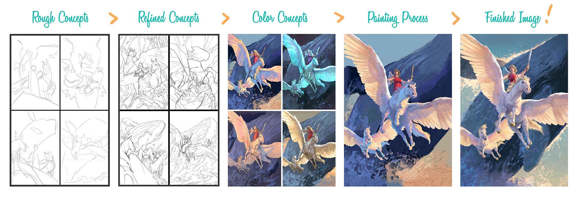
2. Commission & Workflow: You have a condition where assuming that you do throughout this, that you will be working from something that has an outline, whether it be a paid commission or some someone to challenge or competition. It can be daunting to take on a complex illustration. And this material we're going to walk through a full commission project example what to do and not do at each step. And discuss that thought process from two points of view, from the novice and from the Pero. And the novice is ambitious, but he is inexperienced. He would start by saying, let's read the outline was pretty good approach, but the pro, on the other hand, is creative and experience to he knows better than just reading that line. Let's study the outline and plan. So you build a tree for it as a kid without a blueprint. But as an adult, you don't build a house without one. You doodle without a plan, but you don't illustrate a commission without one. Having a game plan of how you're going to achieve your awesome image ensures a greater level of eventual success. So we realize IT pros plan and novices don't, don't just jump in to tackle everything at once, devise a plan and follow it. That is artistic and general human sign of maturity. To my art teacher taught me back as a high-schooler. That art is like juggling. You start with one ball and you practice until you can juggle it without fill. Then you add another until you can juggle them without fell and repeat this process. For us, the balls are aspects of the image. It is the design, composition, the values, the lining, the colors, each ball representing a different aspect. Now if you jump in without planning, it's like just going over and picking up eight balls and trying to immediately start juggling them all. A lot of balls are going to hit the floor, going to lose them all. A lot of the aspects of the image for us are going to fall flat if we approach it the same way. That's why we have a plan. We break down the process into a workflow. This allows us to add one ball that is one aspect of the image at a time into the process. So we don't end up with a mess of them on the floor. This is the initial problem that a lot of novices make. They let their ambitious creativity override their good sense. They jump in with both feet and they end up dropping a lot of balls on the floor. Maybe an aspect or two of the image ends up being okay. But the other ones all fall flat. So we wanna do better when use the pros approach and take it one at a time, put in a full intention into each aspect before we move on. As soon diving straight into the final painting, we're going to follow a workflow that lets us focus on each aspect individually were possible, we're going to use the Pegasus illustration as an example of the process. And the Pegasus illustration was a book cover that I was commissioned to do. And I think it is a good example of each stage throughout the process, but will also be supplementing with some other illustrations and commissions that are also done. If I feel like they may example that particular point better. Now the novice has the general approach of, I want to just make up the process every time I'm going to figure it out as I go. For the pro, on the other hand, is going to use a reliable logical workflow. But let's be clear here, not every pro uses this particular workflow. And that's okay. This one is actually fairly slow right now I'm doing that because I need you to be able to see the clear stage of what is getting accomplished at each step. This is not the time for a new creative approach. This isn't about your freedom as an artist. This is about bringing a quality image to your client for their project. Word of the day, iterations, we're going to be hitting on iterations multiple times throughout this project. I just wanted to get that in your head right now, paid to do it as we're progressing.
3. Concept Planning: We begin in the concept phase. This is where we started taking a look at the outline. Now this is also where we're going to research, brainstorm, and outline how you going to tackle your project. This is your plant. The same way that a chef is going to make sure that they have all the ingredients they need before they actually start making a dish. Number one, begin by familiarizing yourself with the provided outline. And we're assuming that your working from one. A lot of the stuff that we'll be going over will be applicable to even a personal project. But this is specifically designed to address one that you're having from an outline. So if you actually want to get closer to that, you could even write yourself an outline for your own personal piece and work in the same way. Number two, if anything is unclear in the outline, ask about it. Now if you're working from a commission, then that means that you probably have an art director, that art director is on your team. Their job is to literally direct you and to help you achieve your goal. Number three, determine the outlet or use. That is, how was this image going to be used? Is it an advertisement will be printed on a corridor or a book cover? What are the specs to follow? How many inches, how wide, that sort of thing, indefinitely. What are the deadlines and put them on your calendar? Number four, write notes on scenes requested. Know exactly what they're asking for. The graduate references you'll need, but don't collected them yet. I'm gonna say don't click them yet because you don't want to be too influenced until you have your rough sketches done. Then you will click your references. Forget me nuts. 0s and 1s that I started doing more recently or after some years of experience. Forgive me, knots are things that I feel like I will actually likely forget in the image. Don't forget that this person has this particular item. Don't forget that this sort of building has to be in the background. And make a little note, make sure that that is there an extra image or put it on a sticky note and put it on your monitor. And also start making a list of keywords. We're going to go through this and I'll show you how I would do such a thing here on the right side. Shop with 56 number five, right? A list of these seen concepts that you want to sketch. The grid out what your ideas are that you want to draw before you start drawing. Number six, gather idea references. Now, these are different references. Here are for the actual items in the scene. You're going to be drawing a person, you're going to get a reference for the posts. Don't get that yet. However, we do need idea references. This would definitely include pre-existing aren't created for the IP intellectual property. In this case. The Pegasus illustration was with the second book in the series. So I needed to make sure I found a copy of the first book cover so that I could help match up the appearance of the characters and the style and similar genre images but not subject references. These serve as an idea board. The probe will say, don't underestimate the importance of the concept phase. Remember the 80-20 rule, 80% of an outcome is often set by the initial 20% of the process. And if you have a really good concept phase and you make sure that you put your time in. It will be worth it, right? It will pay for itself time-wise.
4. Reading the Outline: Okay. Here is the outline for the Pegasus project that I was given. I did abbreviated a bit. Now the scenes there were fairly open ahead several ideas which is very nice. It gives me some room to work with. There'll be two Pegasus and one girl in each concept. Consider placing them in a lush tumble environment as some of the story takes place there. We would also like the younger Pegasus to be rearing with energy and the girl holding or soared as a pterodactyl type predator, flies above, frighteningly. Explore what the Pegasus might be doing, lying down, turning toward the girl or noticing a snake nearby or edit drama or Suspense. Another location to try would be a beach or ocean. The girl and Pegasus watches a giant will I creature breaches from the water. So after reading the outline, I didn't want to start taking some notes and work out in my head what I'm gonna do on when it into certain points and figure out how I'm going to approach this. I'll start by putting a list of references that I'll need. I know that I need force anatomy. I don't draw horses a lot. Certainly don't do Pegasus. I'd put that in there. I need wing references. I will need a pose reference for the girl. Also probably need a jungle reference and a well as well, because not something I draw very often. I also might need a snake reference and I need existing IP images. So like I said, that previous image of the series keywords, this is one I don't think a lot of novices do, but it's one that I always want to do. Which is, what is this image about? What is the emotion, what is the feeling? Is it or not? I need to make sure that, that image that I give them has that feeling. I think the biggest one here is adventure. This is an adventure MOOC. Poor kids, right? And so it needs to have that there could be an element of mystery, perhaps, maybe of myth. But a venture is going to be my main keyword, locations. So where do these images needs to take place? Just going to clear in my head, when basically have to we have a jungle and then we have like a beach or ocean location. So there we go and then the concept list. But here's where I actually start jotting down what I think the scenes are that I could be drawing. Okay, well, they already request a couple of things. We want to see the trio in the jungle. Ok, this is just going to be my classic. Three people in the jungle on an adventure sort of see, next up we're going to have wounded Pegasus, girl guarding. Next up we want to have some from the ocean and beach location. So trio watching. Well creature I'll put well, I know it's not exactly a Well, but yeah. Then we'll have the trio flying over ocean. So there is the sort of knows that this is something that's really good. Because if you can think through this, you can save yourself a lot of time going forwards and that you don't actually have to draw it out. You can just kind of played out and your head see what you need and then go into. Now, this is the same thing that our corporate or does. He looks at what he needs to make. It gives it some thought. And then he creates what's called a cut. And that this is a list of, I need 510 by 12 into boards of this size, I need, and you just make a list of every cut of every board that you need. That way you're not having to figure it out once you actually get to the saw. And the same way we're for Granta, exactly what our seamless does before we get to the drawing portion.
5. Controlled Creativity: We want to jump into the drawing, but before then we're going to have a quick conversation. Uncontrolled creativity. Since artists, we're creative people. Clients hirers to be creative and to bring to life and match it up seats. However, a commissioned in other outlined projects, we must exercise control, creativity, and personal pieces we can run with whatever I do is take our fancy, but outline projects have constraints. That means we need to identify the parameters in which our creativity can be used and where it can't. And these cases, just because an idea may be cool, it doesn't mean it's viable. Often we have creativity in our designing, in the rendering of the scene, but not re-imagining of it, unless otherwise stated by the client in some kind of hit is the case. Most time they aren't looking for your personal new take on their property. They're looking for YouTube, faithfully rendered their property in a visually creative and engaging way. If you have an idea that you feel would improve the project, but you're unsure of which taken too much creative license, then ask your art director, that will let you know if it is an art competition or a challenge and there's no art director available, then it's best to stay within the clear outlines. Provided. Bit of advice. If you have an interesting idea and it's not usable on the outline project. It doesn't mean it is a bad idea. And it likely means that the idea simply is not the right fit for that particular project. And that's OK. So you just saved the idea or the sketch and look for opportunities that it can be adopted for another project and consider making it into your own personal project. Obviously, you don't want to ever use any owned intellectual properties or characters. But it usually doesn't take a lot of modification to bring life into it from a slightly different angle. So here we have the outline again. And this case there are certain things that we can change and certain things that we can't. Bernstein's, we probably can change the color of the girl's dress. And we could change the pose the characters are in. We don't have any indication of the lighting or the frame mean of the scene. So there's a lot of creativity there. What we don't have the right to do or the creative freedom is to, for instance, change the genre. I could say here, go know what would be really cool. Be really cool if one of the Pegasus was cybernetic. And so like one was organic and he was the last organic Pegasus or than the other one was like this artificial Pegasus that the girl created because she's like this tinkerer and she met this other, the last Pegasus. And she thought, no, I'm going to make a friend for him so he won't be the last one as she builds this other Pegasus. Yeah, that's really cool. And then maybe shares like this arm that's also cybernetic. She lost it an accident when she's like building the other Pegasus. Ok. Thus all cool. But that's not what the client is asking for it. And that's the sort of thing that sure. You can jot it down if you like that idea. Do you think that would be fun to do? Jotted down, sorted away? That's not what the client wants. They don't need you to reinterpret their project. They need you to just make it look pretty. All right. They already have their idea. The concept is already created, that's not your job in this case. What you need to do is to get their thing and make it look good. This is potentially a problem for a lot of novices because to this point, everything has been their own personal work. They just aren't used to working from an outline. They're not use to someone else being able to say what is right or wrong on a project. And as a professional illustrator, It can be a bit of a hard change, but it's one that we have to learn where those boundaries are so that we can deliver the best thing that we can for our clients.
6. Character Design pt. 1: Now we move to the concept phase where we're going to start with actually the character design. Now I love the topic of character design. I think a lot of artists actually do, especially in the concept art and illustrative filled the novice, we'll say, we'll just make up the characters wall we paint. The probe knows. I can get away with that sometimes. But you aren't MY design first. Paint waiter. Mini-projects required new characters to appear in a C. So tackle the character design before you start painting. So you can put your full attention into it without being distracted by having to juggle all the other aspects. If any characters you are illustrating have been illustrated before. Like I said, we're existing ip, get copies of those images for consistency and design a reference. A lot of clients will actually send you this. When they send you your commission, you can be working on the character designs in compositional thumbnails. At the same time. The Pegasus illustration required almost no care or design as one character was already predesigned and the others were quite straight forward. Both Pegasus look white, similar. So there wasn't a lot of change there. And the girl basically just add a simple hairdo and a simple dress with a sword. So I didn't have to put a lot of time in the bat and they weren't very interesting. So I've used other examples to showcase burger designer iteration. The key to good ideas and designs is iterations. You must explore them, develop them, and produce more of them. Not every scene that you saw produces something. That's why you so more seeds than the minimum. If you want a tree, don't plant AC. But a couple of seats. Ideas are that way too. Develop more ideas than just one. Because as much as you may like it, it could be a dud. Iteration is about rendering a batch of ideas than picking the bets with the chosen image to a batch of variations and pick the best and the repeat. Now this is an old character S probably did this ten years ago, but it's a good illustration of what iteration looks like. A did a basic pose. And then I copied it a bunch of times. And then it just did a lot of versions of the character. I did pick my favorite six and I cleaned them up a bit, added a bit more detail to them, did some color variations of those, picked my favorite and then worked at that went up. So the final image here is the third iteration. The first is just in the whole batch. The next is where we drew it and colored it. And the third is where we got that and fully painted it. And I think it is the better for it. And that's the approach we're gonna be using throughout the character design. There is so much more to character design than this. But I'm just trying to give you some highlights. That'll be enough for you to work through during your creation process. Number one, write down the provided characteristics from the outline so you don't forget anything. I've done it, other people do it. It happens. Write it down so you don't forget. And this case outline is a fantasy blacksmith warrior. So we draw the basic body and make at least three copies of it. I would actually say do a lot more. But if you're pressed for time, R0 is probably your minimum. It then when you get those and sketch variations over the copies, aim for variation of shapes, silhouette, and symmetry. But we're talking about symmetrical and asymmetrical. No details at this stage. That's not what it's about, just represent elements with shapes C. Well, in this stage there's a lot of stuff happening. So we're going to go to three EI, which is considered the characters location and history to flesh out what they where and possess. So this character is from a cold climate. They probably need to stay warm. They need food for their travels. They need a hood for the whether they're going to be outside much. This all informs the character, makes them more believable and helps give you an idea of what the character should look like. 3b, consider designing elements to follow a visual pattern. Will methodology. Doing this will provide answers to the size, nature, and location of the shapes to use. Methodologies can tie elements together given a cohesive look. There are many paradigms to base them on. Here are just a few examples. So the methodology is, what do I put, where, how big is it? How do I get all of these different things and make them work together? In this case, we're using a zigzag pattern on this version of the guy is, instead of making the little tie from side to side goes straight across, we put it at an angle, would then let that angle moved by having the neck strap underneath it across the chest. Go what the opposing angle. We then have the next line of the lintel tablet shirt go at and opposing angle to that. So throughout, throughout the whole thing, we have a series of zag patterns that keeps the eye moving. And that is the overall methodology for the character. Down here we have three Dryad characters, each of them having a very similar appearance and using a lot of the same visual items and shapes, but arranging them in completely different ways. Again, this is an exaggerated zigzag pattern. But once we understand that that's the pattern that we're using for the items and make the decision of where to put what and how big it should be in a what angle, it should be a lot easier. Next we have an X pattern or crops. And everything here is following that pattern. Size variation using the same shapes at different sizes scattered throughout, but all following the same symmetrical layout. This would actually be a good practice of sitting down and trying to think of different kinds of methodologies or study other characters and see what's one of the methodologies they use. The sort of logic to the placement of the sizes of the shapes and the angles on the character. Number four, choose the best design. There it is, iteration. And do studies of real world subjects that could inform the design and the elements that may be included. So for the fantasy blacksmith warrior, I did studies of historical Viking designs. I also designed some accessories that the character might be carrying. This helps me have a more grounded feeling to what this character look like. This is a mistake that a lot of novices make is that they don't base enough things on reality. They draw too much from imagination and their knowledge, their innate knowledge of how to make things look more real and more grounded just isn't there, they don't have enough experience for that. So make sure that you are drawing information from Rio World subjects and let that inform your character so they are more believable.
7. Character Design pt. 2: Alright, Steps five through seven refine the chosen concept with a knowledge of the studies to help improve the design accuracy and believability of the elements. Good design is often just reality with a twist. So get something relatable, such as disliking that I just study and give it a design shove in a different direction. This can be a change in his genre, technology, physicality, or even a time period shift. So this is the character drawn again with more knowledge picked up from the real-world studies, the character may still be generic. So we want to find what the core of this person is about and say it. There could be multiple things or you could focus on. So pick an aspect, give it a megaphone, and draw another set of iterations. One, another one. Yes, another one. Remember generic, too specific or common to uniq? C. This feels like just your average NBC. It doesn't seem very cohesive. There's a lot going on. Visually, there's a lot to look at. But he doesn't feel like a unique character yet. It doesn't feel like he's about any one thing. He's about a lot of different things. And so now we're trying to get an aspect of him about that character, about his look, about his persona and make it more clear. First up, we have this version which is leaning into being an Arctic warrior. We want to play up that cold aspect of Helmand where he is and make him feel like more of a warrior and less of a blacksmith. We give him the heavier look. We give him for a lining on a lot of his armor bits. We have snow caked up on the bottom of his cloak. We given more ties and his hair or making a bit more rugged looking. This is also the same character, but we're focusing on a different aspect. We're not focusing on the Arctic warrior, we're focusing on the blacksmith. Now we have more of the tools hanging about his belt that he might be using during his craft. We showcased some of his handiwork with the armor going down his arm there. We show that he is maybe he had an accident in his shop, was working. So as an iPad, both of these filling more unique characters. There aren't just the background NPC, Maccabee, The main character. Now the concept film more specific and unique then generic. Have clothes are important. This would be the time to pick the best concept to new colors studies on. You would do at least three variations and choose the best. This character didn't need colors, so he's finished at this stage. But onto the scene sketching. However, quick note on what it takes. If you want pro level results, you have to put in pro level effort. You may see videos where proceeds to effortlessly produce a dynamic character. But what you're not seeing are the thousands of hours of study on the hundreds of drawings they did. So that their average designs could be at that level. There's a lot of behind the scenes work that goes into big illustrations. And most people don't ever see it like an iceberg. You only see the top of it. You finish, you see the finished image. Most of it is unseen. All the discarded concepts, all the disk a 100 characters, all the change compositions, all the reworks. You don't see that stuff. Not very often. If you do want to dive deeper into the topic of character design, auger remiss if I did not recommend and note that I do have an eBook called characters designing and drawing. You can pick it up once much as art.com. That's where all of these are examples are taken from. And I go into a lot more detail and I have several more illustrations. So feel free to go out there and take a look at that.
8. Scene Thumbnails: And the compositional thumbnails, the novice may approach it by thinking, I wanted to just start painting and hope it turns out good. Approach says, I sketch many concepts and intentionally posing every element that I pick the best. You don't have to hope. You can know compositional thumbnails armed with your list of scenes, it is time to actually start sketching. At this stage, it's all about composition. It's not about details, lighting, or even values. Just the composing of elements in the frame. To be clear, there is a lot of approaches to build newness. See where maybe you do your compositional studies at the same time that you do in your values studies, a lot of artists work that way, maybe even with color. But we're taking it one aspect of his time in order to simplify the process. And as you get more comfortable with it, that's when you can start having a little play with the workflow in whether you can do multiple things at the same time. But for now we're going to just focus on the composition itself. A good composition will direct the eye to the focal points, make a complex seem more readable and help convey the desired mood. Composition is not a thing in itself, but the context of the theme. How all the things relate to each other. It is not the image on the puzzle pieces, it is the puzzle itself. A lot of non-professionals underestimate how critical the composition is. They focus all the oil and the actual image rather than how everything relates. And that's why we want to give special attention to the stage. Composition affects mood strongest through a sense of balance. Energy, and space is important to have an idea of what the desired mood or just of the images. So you can use and compositional arrangement that reflects that and we'll go into that here in a moment. So here's the example of the roughs that I created for this project. Now other refs who also sketch, but these were the most promising, so I'm continuing with them. I ended up actually deleting the ones that I didn't need. So they are not included here. I thought leaves for work that best. So that's what you're going to see progressing to get better at this stage, a great practice to improve your composition and values skills is to do studies from cinema. Look for movies with good cinematography and don't use details. This was taken from Lord of the Rings, Fellowship of the Ring. Notice that there is very little detail, if any, in these scenes. When I'm paying attention to is where they align the character in the frame. The size of the characters is a medium shot of wide shot, close shot. And then also how do they balance the values in the scene? Good practice, right? They're easy to do.
9. Using Compositional Patterns: Patterns we've talked about using a compositional pattern. Let's go through it. Really notice scene can be confusing by putting together a puzzle without an image of what the final is actually supposed to look like. You can spend ages just moving things around and hoping to stumble across an arrangement that works. Or you could simplify that process by using reliable patterns and guides. The whole idea is to get a collection of various subjects and shapes and create an order out of it that coincides with the images desired mood points to remember is to fill the frame with the subject. One of the best tips to remember at this stage. Generally you want to just build a frame with the subject. That is, make them take up more of the visual Real Estate was someone to stick to simple shapes with no details. You can ask yourself the question of, what element do you want to draw attention to? Sintering makes the character of film more stable. The study composition, you'll find that putting a character in them, cinder, going completely vertically plumbed to the sides of the canvas will make them feel more stable and reliable, more trustworthy. The triangular arch makes the characters and unit a, team C, All of these guys are aligned in order to make one simple pattern. This gives a cohesion to it. It makes them feel like they are part of a team. If you broke that by having another character over here, he would fill like he was part of the team. And we can do that in order to give that impression that the one is not part of the other. But for these guys they are, they're aligned this way. The sweeping z angles keeps the eye moving throughout the image. So here I'm thinking of this guy's gonna be rearing this way. That is, wings could be created pattern this way. I don't want to go straight across. That's Boyne. There's no motion there. That's not very interesting. So we went to angle them this way. And what's that mean? That I want the next one and go at a counter angle to that, and then the next island and go Edit counter angle to that. This keeps the eye moving throughout the image. It's a great compositional pattern. The next one, the Pegasus wraps around the girl looping our attention to her. This is almost a spiral-like or Q design to the pattern where the Pegasus is laying on the ground, wrapping his head around to the girl. The girl is again centered, making her the focal point. This pattern mixture that you or I ends up on that character. The entire design of this one is a scene inside a Pegasus silhouette that approaches the image in a graphical way that can be very dramatic. So all of this out here, this negative space would be completely different scene or different color. Well, everything existing inside of this would be a jungle scene where one of the Pegasus has been wounded. This isn't really something that this particular project asked for and get a graphical sort of approach to it. But it is a design that a lot of the books in the genre used. So that's why I wanted to put it in here and give them the option. But the next one we see that this weekend curve from the Pegasus to the well keeps it flow throughout the image. And the second Pegasus looks in a countercurrent that directs our attention to the girl. And out of the corner. Again, character centered because we want her as the main character. And the last concept we see that the character is still a horizontal band, leaving room for text and leave characters suggested. And the angle of the well is countered by the angle of the neuropeptides. And so the closer Pegasus is put at an angle, why? It's more interesting, it's more dynamic than making them go straight across. So we want to do that. We also don't want it then put the well going at the same angle. We want to counter that. So this makes it really good dynamic. Now this was set in a band because in a lot of images on book covers they wanted suggests the subject or the necessarily say it. Or they want the title and the author's name to basically sell the book, not so much the image, again, showing a variety, just wanting to put it out to the client and see what kind of feedback is about what they're looking for.
10. Choosing a Compositional Design: Choosing a design, ok, so you should use a visual pattern, but how do you decide which one? As a starting point? I determined the images, mood or theme. We then interpret that mood in terms of visual energy. Since of all the different metrics, composition, most effects, the scenes, energy, all arrangements, patterns fall somewhere on the skill of low-energy, which is very stable things, and high-energy, which is very usually active things. This means we want to choose a pattern that matches our scenes energy levels. Well, a little breakdown here. High-energy moods are themes, would be often considered a venture or action dynamic, epic, cheerful or magical scenes. Where on the other hand, low energy moods and themes would be peaceful scenes are bleak environments. Maybe a scene, a mystery, or an ominous feeling or no war. Of course, exceptions do exist to this breakdown. But these are general rules. There's exceptions for nearly everything. Low-energy or static. Flat lines are static, plum and low level. There's no motion to them. They were completely, on the other hand, high-energy or active scenes probably should be using more angle lines which have a feeling of being more active or emotion or having higher energy and low and static scenes, little to nothing is movie would be like a tree or building more character, sitting calmly somewhere. And these can prompt positive or negative emotions. Looked to use a centered symmetrical arrangement and or plumb alignment to the frame. Additionally, placing a character in the center of can help convey steadiness, control and important. Likewise, high energy or active seeds. Angles in diagonals have more energy than plum, verticals and horizontals as they get the feeling of imbalance or motion. Curving designs also have a sense of life and movement use. These were scenes with high physical or emotional energy. Now these sort of patterns are the ones that you want to be thinking about to use in your compositional thumbnails. This would be a target pattern, which is very similar to the spiral, but not quite as energetic. And everything is still segmented and not continuous. Plum, verticals and horizontals as well as a static triangle. And we think that's balanced, but it uses diagonals. If anything. This guy could actually sit somewhere here in the middle, is a combination of the balanced symmetry of the low-energy with diagonals of the higher energy. A go-to option in active energetic scenes is radiating lines. Now that can radiate often from the subject. It can be the subject's head or perhaps where they are standing, right? And you want everything to point back to where that main focal point is, whether to character an item or a location. Continuing on, looking at the patterns and designs and low energy, inactive in static patterns, there is perhaps no better all around compositional pattern for illustrators. And then the triangle. It works for most vertical images and horizontal. And most of the time you can arrange a character to use that pattern or some classic images that use that strong triangular or pyramid pattern. Also author characters. And other simple shapes like numbers and letters can make great compositional patterns as well. Characters that can work well with patterns or AC, GH, JL, OK. Yahweh's TV, XYZ 12, 69. These all have a good balance and symmetry or an angle to them. They can work as a compositional pattern. Now the poem verticals and horizontals of the tomb, combined with the center and positioning gives a steady, calm impression. Again, everything is very static. It's not moving, it's not diagonal. And the high-energy active or motion scenes look to use more diagonals, radiating and converging angles, spirals, and posing characters off balance and or in a twisting motion.
11. Simplify the Composition: If you don't use a specific pre-designed pattern like a radiating lines or a spiral. How else can you approach it? What you don't have to use a premade guide. But whatever design you do go with, make sure it's simple. Remember, at the composition can't be indicated with just a couple of simple shapes and lines. It is likely to complicated and it should be. It's best to work out what the basic compositional patterns are in the early sketches to save the trouble of mini, changes later. If you've already been aggressively image to where you're putting in details and you've got multiple light sources and shading and character expressions and all that. The new hepta store reworking the composition. That's not an ideal situation. You're going to waste a lot of hours work this stuff out early so that you're not wasting time having to go back and edit stuff. And these two illustrations that I did, they weren't using a single basic compositional pattern that was premade like the letter G for instance. So I went with basically irradiating pattern, combining it with an oval. And this one, they are curved lines that go up to the center. Again, focal point is the character's face. So everything curves to bring you attention to that spot. And same thing with her sister character here, that the wings are intentionally designed to follow an oval shape with all of the items radiating out in a predictable pattern. Now you probably don't notice this when you're looking at the image itself. But it was intentionally designed that way because it gets something that can be very chaotic. With wings and arms and legs, in Sword and fabrics, in technical things and waving error that get all crazy. But I align them in such a way that most of the major ones are following a predictable angle. We don't have to use just one compositional pattern are designed. In fact, combination is a really good idea. Layering and combining patterns can increase the visual punch, strengthen the composition, and helped direct the eye to the focal point. So when this illustration here we see multiple compositional patterns being used. Firstly, we see the pattern of the radiating lines all coming out from the head and she was the goddess of the sunrise. What makes sense that there was a beams of light coming out from around her. We also have the background and the other elements aligning two concentric rings and a target pattern. Both of these together draw a lot of attention, backup their fates. Let's now turn our attention to these other two images. Now they don't have any lines put on them in order to indicate the composition. So we're gonna do that. We're going to examine them and look at what's going on in the composition that makes them work. First up is this illustration of j's that I've done. And we noticed that he is centered. This immediately makes him the focal point of the piece and it makes him feel more reliable and stable. This is situated by the fact that his lower body creates a very strong triangular pattern that again makes him fill. Stable. Feet are planted wide and that angle points up to his face. Something else going on with his face is that all of these blue little magic modes are circling his head. This is utilizing that same sort of pattern from this other image, which is the concentric REMS, which draw our visual attention. So that is going on there. The background has a couple of things going on with it as well. And it uses a sort of fan shape or might consider radiating lines. Basically everything stems from a point right about here, where we have this angle and this side that is balanced out with the same angle on the other side. Now, you don't want to keep things absolutely perfect. For instance, I don't want a straight line there, but you want to arrange things so that basically followed that pattern. And then as we continue up, these lines continue from the tree following the angle of the sort of radiating fan pattern of in-home being right in the middle brings more attention. That character. This is a subtle but strong compositional pattern being used in the scene. Now with all of these lines running off towards the edges, we don't want to run the i outside of the image. So we put something there in order to block scene. Here we have water coming down on this side, which creates a sort of visual barrier that kicks you back into the scene. And the same way we come around and we hit all of this hanging flowers and little vegetation running into the next waterfall, and it brings you back into the seat. If you are having a lot of things pointing out of the scene, look to arrange something there in the corner that will kind of block the eye or curve the eye back around. Now on this other scene, we have a trio of characters and a very fantasies. Some fun image here. Really enjoyed doing this one. And this one uses some very simple compositional patterns as well. Again, he centered. We want this to be a balance. See, this is very sort of classic centered frame. And of course the moon. The moon is a very strong visual compositional tool that keeps us right in the center of attention. Value wise, this is also fantastic because it gives us bright background, all of the darker elements and the characters to show up against. And the bright Keller helps to add a good pop to the scene. But what else is going on? Again? Triangle can hardly go wrong with the triangle. And if you look at it, you can probably see it as well. All of these guys are arranged to fit a triangle. Missouri happened chance that they are arranged like that? Not at all. They were intentionally laid out that way because I knew that that was going to work best. And that's also why there's not another random rock right here that wouldn't fit anything that wouldn't make sense. So there's not one there. It's also why the other character isn't overhear instead with his bow out this way, that wouldn't make sense. It wouldn't follow the pattern. So everything is aligned in a way that makes sense and draws intention back. On the same way we had this sort of radiating powder and from the trees in the background, we also have it from the clouds in this one where we keep all of these curving in this scene to get our attention back to the characters. This is what you need to be thinking about at this stage. And you want to be sketching them in very loosely, but very intentionally to figure out what your patterns are.
12. Additional Compositional Tips: Well, let's look at some additional compositional tips for you to remember while sketching. First of all, a line of sight, the placement of elements in the scene can draw the viewer in or block them out. Unless you have a specific reason to avoid placing all your subjects on a flat end goal to the viewing plane seems of adventure and epiglottis need the world to feel expansive and a Vitis in on the adventure. And we do this by allowing a through line of sight to the distance. Let's start on this topic by taking a look at these two examples. This one, I want the scene to fill expenses. I want you to feel the sorta emotion that he has as he's looking out over this vista on the first image. That is why it is less about the specific character and more about this character's relationship with the background. So that is why he's pushed over to the side and not completely centered. I wanted to move him over a little bit so that we can see what he sees. A, this is a through line of sight. That is, our vision is looking towards the distance and there is nothing to break us from seeing that far distance. There was no mountain right here in the middle to block our view. So this helps the world Fillmore expansive and invite us in. However, down here we have the same sort of thing, but used differently. The world does exist. We do SeaWorld outside in this character, in, in, towards the distance. But we use that pattern in order to draw our attention down to the character. All of these radiating lines from the perspective, put our attention right here. But this is focused all about the character. It is not about the characters and relationship to the environment, and it's certainly not about the environment. So as soon as you put a character or any other object in the middle of the line of sight, it makes division stop. You really have to take time and make effort to look into the background and figure out what's going on back there and what the rest of the world is. Because this is blocking you when you're putting together your scene. You don't want to put everything in one line. So let's say that you have your camera here and you'll looking off this direction than in your scene. Say that you've got your viewing plane here. And in your viewing plane, the characters are back here. You don't want to have a character here and a character here, and a character here, and then a tree on this exact same plane. Then you want this house on the exact same plane. Because why there's no depth. So instead what you wanna do is have your camera with its viewing angle and his viewing area. And then you will want to have like a character here and a character there, and a character here. And then you want the tree back here. And then you want the house back there. This way. It has a depth to it. But this is only if you want that character to be the main character. Otherwise, what you wanna do is actually move the character of side because we want to have a through line to the background, in which case you want to place everybody around that. Through line and not in the way because we want to draw you into the distance. Next step we see split. Avoid splitting an image in the direct middle, either horizontally or vertically. Adjusting the split even 10%, either direction can make a big difference. So seeing that we have a scene that we're looking at the side of a building. And we've got the building here. We'd have the building like this and then we have the windows. And it's nice because you know that the windows are in perspective and it makes it feel like it's more real. But we just put the edge of the building right down the middle of the frame. That's not very good because we want an imbalance even little bit. And generally speaking, the imbalanced needs to have the focal point and the large half. So if we put it like this, and the building is here and you got all the windows along this side. This is now pushed over a little bit. We would naturally expect whether we're conscious of it or not, that the focal point of the scene is going to be over here because this side is larger than that side. And so we want to just be aware of when you do split it, don't split it and then put your focal point on this side. Unless you're arranging things in a certain way. Okay. There were times to do that, but that's just a rule of thumb. Same thing in quotes goes horizontally. Say that we're having a scene of a beach and you got the beach crust here. And then you have the ocean. The place that you don't want to put the ocean line is right there in the direct middle of the scene, right? We want to make it go either up or down. And horizontal scenes that are at eye level, vertical scenes as well. But if you're mimicking II Level, you generally want to put it at about a third right about there. That is sort of the consensus of what feels the most correct to match human eye level. Now orientation, match the chemistries orientation to the direction of motion in the scene. And which aspect of the image do you want to situate? So if we have a rocket ship taking off, what is the direction of motion? Both upward, such a rocket ship. So we probably want to have a vertical canvas. Alright, we want the rocket ship to be going up this way. Put little spoilers on there. Then. So now we have a better sense other rocket taking off and wouldn't fill right, to have a horizontal scene with the rocket ship here. Could this, this, this all ends up being dead space out there. And we don't need that. Likewise, if it is a scene of perhaps a train, than we want it going side to side, right? The train is going to be going this direction. So we want to have a scene that follows the motion of the train. Oh, just keep that in mind if you're trying to figure it out. And this also helps do what? Fill the frame with the subject. That's the problem with this one. It's not filling the frame with the subject. It's using most of the canvas or something that's not the subject.
13. Composition Thumbnail Demo: We come now to the thumbnail demo. Now we're not going to be doing the Pegasus illustration outline. Again, I've already done that. So I wrote a new outline here, a bully and his two young dragging friends go on a quest to find the last on the Elder dragons who alone may be able to stop the awaken Gorgon. Like I said, I just made this up. I wanted to find something that would be a similar book covers style story outline. That would be like the Pegasus illustration, but obviously not the same thing. Starting off. One of the first thing that I wanna do is consider what are the sort of ingredients or a puzzle pieces I have to work with? These are the main ones that would need to be included. The rest of these are a kind of a take it or leave it depending on what the idea is. If I were to just sit down historic drawing, I'll probably run into a bit of a mental block. So I'm going to give myself some sorted guideline or criteria to try to meet in order to maximize the sketches that I'm about to make. That means going to my seamless, I'm want to jot down just a couple of ideas that have a kind of scenes, different kinds of layout in order to help me get some better images going and boost my creativity. Now I do this by going out to Pinterest on put together over a couple of minutes, I Board of some different ideas of illustrations and book covers. I'm just looking at those. As far as how did they arrange the seat or is it close? Was at far was it graphical was illustrative, did they was a symmetrical was asymmetrical, that sort of thing. So I jotted down some ideas here on a piece of paper next to me, and we'll be going through these and sketching those out. And the first one I'm going to do is a boy that is centered and the dragons or closely cropped around him. I'm not real concerned with the accuracy of the anatomy or any of that stuff. And then I want the dragons sort of circling around him. And his neck is sort of circling back around the dragon there. The other one, I think could be circling around this way underneath him. And maybe he even has his mouth open because that would make it a nice silhouette. Maybe arrange a wing or something to be back in there just so that we don't actually have any negative space. And I think this could be a pretty cool image. In this case, we're looking at adding the tidal right down here. And I am thinking of this as a book cover, so I wanted to lay it out in such a way that I would have a room for a title. You could go through quite a few variations to figure out how that would work. But overall, this idea, I think checks out and that's kinda cool. Next up silhouette boy with a dragon inside the scene. Okay, on this one, it is definitely more graphical. We do the title down here again. I'm thinking we have the silhouette of the boy taking up most of this. And then you would have the scene of the dragons inside of here. And we'd probably want them in more interesting pose. Like they're going to be flying around, not just standing there like he is. And not every project really needs a graphical approach like this, but it's fun and it's probably worth the time just to give it a shot and see how it works. The next concept would be a boy walking overhead with the dragon shadows. Yeah, this one is kind of cool and it brings up a different idea that you don't always want to directly show and illustrate the subjects. That is, I don't have to fully render realistically in show all of these, even though these are the main subjects. And this case we did that here with this silhouette that we indicate the boys by just the silhouette of his shape would the image inside of that shape. But we directly state the dragon is by illustrating them. Alright, I would work at all that pose later, but that just gives me the idea, so I don't forget. And then here I want the title down here because he's walking towards the bottom. And that means that R i is going to be headed that direction that he's going. So we want the title down there. And here is where we have the shadows of the dragons. And so here we see a very clear silhouette of the dragon on this wing would be maybe falling even across part of him there. This is indicating a course, all the three subjects without necessarily showing the two dragons. If you went to state who this character is we've talked about, are you suggesting the character to the viewer or you stayed in the Caribbean? This would be stating the character because he is fully visible to us and walking towards us. However, the opposite could also be true where we are looking at the back of the character's head and he is walking away. And then we have the shadows going that way. And then we put the title up here. And this case we indicate all three main characters without really showing any of them. And the client may like that, know a lot of book covers. They do like to just suggest things. Okay, and certainly boy in the error, essentially he's standing here on some sort of ledge, pedestal, old tree branch. I mean, it doesn't really matter. And then we have him being encircled in the error by his dragon friend. I'm looking for this sort of pattern. He could be banking over and his winged could be there. And I'm looking to use overlapping in order to help build a sense of depth. So he's overlapping this, and he's overlapping that guy. If you gonna have seen what one static character, then you can put a lot of motion around him were the other characters. And even though these are the guys in motion, because he is centered, he's gonna feel more like the main subject. And the next one is similar, but a bit different and it gives a different mood. And that would be what the boy emitter as well. But he's falling. I would definitely go check out some references or people falling. And then I'm thinking the dragons or sort of diving around him. And we want to get this sense of freefall, but also of a lot of sense of depth in this scene. We're looking for places to overlap. You use overlapping that Dragon or than this dragon is gonna come over here and overlap him. But that would be the basic idea and nothing that can be pretty cool. But we want to repose it. So the whole thing would probably need to be moved down and add the title up there on top. And you could even look at some elements, particularly of some kind in the error. So if this was more of a dusk as seen in the sky back here, was met darker than we could have like employers in the error from a fire. Next we have the movie poster style. Now, this one is a great option if the client is asking for kind of everything in the kitchen sink. So if they want to see the boys and two dragons, and the elder dragon and the Gorgon monsters and some of the major locations. And you're just going again, how do I arrange a scene that literally has everything in it? Well, one of the best ways to do that is what they do with movie posters, which is approach it collage style. And that is, you're not having a literal scene. You are having a mash up of sizes in crops. There was a lot of ways to do this. A classic ways to have a big face in the background. So maybe you're looking up at the boy's face so that we have that human connection with the boil up here. We have perhaps the elder dragon, alright? The two main dragons, we want them in intertwining pose of some kind or X pattern. Then this is where back here between those two planes we can have like silhouettes of some of the villains or other secondary characters. And we could have maybe back here like the mountain or castle that they come from. So this sort of approach can take a long time. You need to go through lots and lots of variations to figure out whose head do you you use? You use it on left side or the right side are centered and all of this sort of thing. And I suggest going to look at a collection of movie posters and see how they're laid out. Edges, great silhouette of other drag. This one is cool if you can do it, right. And that is you're using the shape of one thing, the positive shape of one thing to create the negative shape of something else. Silhouette of the elder dragon. Can I use some sort of positive element like the boy or the other dragons to fill in all of this area and leave this space. So that this looks like the silhouette of something else. Like if you had the boy year, just like the side of his face and then his cloak billowed out. You might build them, been like the bellows of the cloth to make the shape underneath that dragons jaw and along his neck. Then maybe you have another one of the Dragons line, the bottom part of the other Dragon life forms that shape. These are sort of tricky to do, but they can be really cool if he can pull them off. Well, that's all the ideas that I had seen. Why sketched out to try out any one of these I think has enough merit to try personally, if I were just to move on with this one, which one do I think would be the most fun? Which one do I think could work the best? I'm kind of going for this one I like that you get a really close crop of all of this. I'm not a big fan of the silhouette with the scene inside. I would absolutely do it if the client was asking for it, but that wouldn't be my first thought. Hopefully you found this demo useful and maybe give you some ideas about how to approach the process yourself. But we've got to wrap it up there and move on to refining the sketches.
14. Refining the Sketch: With a rough sketches drawn is selected, and it's time to refine those sketches into clear drawings. That mean given simple shading then presented to the client. Now clarity is key at this point. If the client doesn't understand what they're seeing, it's no good. That doesn't mean it needs to be detailed and means no blurriness, filter effects or ambiguous shapes. The goal of this stage is to turn our rough concepts into reasonably accurate image directions. And we want to manage our time well at this stage, loosen up. This is a place where a lot of people lose a lot of time. It's easy to lose hours chasing the perfect our reference and meticulously rendering extraneous details was simply over rendering for this particular stage will look at some common mistakes in a moment. For now, let's just look at an example of how I applied this and work through this process with concept one. I liked this out that there was a merit to this composition. So I needed to turn this into something that was more accurate, more realistic, but also do it as time effective as possible. Number one, the sketch now serves as the direction, an approximation of the placement and poses. I begin by making a list of the references I need. And R2, I find placeholder references that are quick to locate and good enough or reasonable accuracy. Now the images are blurred due to copyright. But these are images that I just pulled up off of an image search online. And I was looking for something that was cloaks that gave me enough of information that I could use that in combination with my understanding of the subjects and be able to get something that matched my rough sketch. Now, I didn't want to spend that much time at the reference of the state Wi because I don't know that this is going to be chosen and I don't want to waste those hours. Number three, I combine the relevant information from the photos. That is, I did not copy them a verbatim. I used what was relevant to my sketch that fit the image direction and refine the drawing. The shading will be later a number for the refined lines or the concept, or now finished. I can solve the initial sketch to make sure the image direction hasn't veered during the rendering. Toward this end, it's not perfect. It's not even highly detailed. I haven't worked out all the trees. I haven't figured out where all the feathers are and, you know, the whole cloth and stuff is. Okay. It's not perfect up public rework it. But that's okay. It's clear enough that the client would understand everything they're looking at. Especially once we get a little shading on there. And we'll just breeze through these other two through four concepts. And know that there are many ways to go about destroying stage, like I said earlier. So some artists will just start painting with full color and refined as they go. But we're not doing that. We're going on over viable way for non prose, which means separating the drawing and the shading and the color steps from each other. Juggling and remember, do be mindful that not all projects need multiple images submitted I'm submitting for, for this one. That's not always the case. Often only one concept is required. So clarified that expectation with a client before you begin refining your concepts. And this case, we had agreed on would send them a set of concepts that would be distinctly different from each other. So with concept to, I was using the silhouette of the image in an image approach, but this just wasn't a very good silhouette. And so ended up changing that in using a better a side view of the Pegasus and putting the image in that instead. Concept three, again, webcam photo of myself as her. Yeah, the anatomy is not perfect. The clothing is not perfect, but it's enough for me to put it in very quickly at this stage. And the last one, same sort of thing, just mashing up some quick to find photos and getting that information in there.
15. Common Mistakes pt. 1: What do people usually get off in this concept phase when they're sketching this and refining it, I'll just take a look. Number one references the novices. Hey, I've watched a video on anatomy. I'm good without reference that process. I taught a video on anatomy and I still referenced bureaucracy. One of the defining differences and the painting process between novices and professionals is the use of references. If you don't know the subject and if you're not literally an expert on the subject, then find a reference. Stop. Guess. Seen. The implementation of reference usage is likely the simplest and most effective way of improving a non bros art. When I start making my art students have to take reference. They have to have opposed reference, a phase reference, a lighting reference. Guess what? Their work improves. Why? Because they don't know enough at this point to try and going without. And a professional even realizes a lot of times it's not even worth trying to cut that corner. And it's best just to have something to look at. It doesn't have to be perfect. Like we take a look at this down here. That was a photo of me that I had a friend intake at the right angle and no, I'm not wearing a j's outfit and it's not perfect. And I don't look exactly like Jake. But there's enough good information in that that it can get me started in the process. Same thing with like the little man and gun down here. So the visual world is a complex thing and no one could remember how everything looks. So do what the others won't. Reference. Text and graphics. Do you need to leave room for text and other graphics? Most illustrations used for marketing such as book covers, posters, packaging, art, will all have areas of texts that you'll need to account for. Those areas will still need to be painted. But you can't put anything critical in it as it will likely be covered. So keep guidelines overdrawing that marks these safe areas and concern yourself with getting all these central information in there. I haven't showed you this so far, but yeah, I did have guidelines and boxes set up so that I would remember where the text is located and not to put, for instance, any of their faces in any of these blocks. An MTG card such as this one with J's only the areas inside the window or fully visible on the plains Walker card. The composition needs to work in frame and full scene. So we got to see everything that we need to about J's to understand who he is, kind of what's going on with him and the location he's in with just this frame. But if you see the artwork without the frame, it also needs to work in full figure.
16. Common Mistakes pt. 2: Next up, framing common mistakes with framing, it is important to bring her subjects to match the needs of your image. Because each type of shot as strings and weaknesses. For instance, the character should take up most of the visual real estate in the character illustration. If there's small, it changes the context. Some examples above, unless you have a good reason, otherwise, they'll live frame with the subject. And this also makes the image read easier in a smaller format. So when above we see a range of framing on how close the camera is cropped into the subject. And using a little character here as our subject. An extreme close-up is all about the characters. Emotion. It has no regard to the background is basically just cropped to the eyes. And the close up it is about the emotion or a thought of the character. Little background has visible, generally cropped to the face. The medium starts changing that right now we're getting a lot more background. It's still about the expression, but there is a minor element of the background. We're very aware of where they are. Prompt to the head and shoulders. And the mid shot, it is about the character's actions. What are they doing? And it's not their emotion, and it's not their thoughts. It is what their physical action is. Are they picking up a book or the setting down that sort of thing? The background has a lot more predominant and has now about this person being in this location. Prop from the waist up. And the wide shot is in an establishing shot, usually used to set the location of where this character is, then you would move in to a mid shot or a tighter shot. If this was in cinema, this is split between the character and the background. Again, is establishing the WHO in the where, not being about the background and not being about the character of being about the relationship of the two of them, which is generally crop to the full body. They're very wide shot is environment centric. We have moved away from the character being the subject. Now the character is the main subject here. And split basically between the character in the environment which you get to the wide shot. But once you get to the very wide shot, it's more about the environment is the character. And then an extreme wide shot, the environment remains a subject and the character has been demoted to being basically a minor pero. We want to use the the framing and the cropping. That is correct. Bo disorder scene that you are creating. Is it about the character? Okay, that we don't want to use a really wide shot. Is it about the environment to we don't want to use a medium close-up shot. So whatever the scene is, build a frame with that subject. First, third person. Another frame you pitfall is placing the camera outside of the action in the scene. Usually it's best to be in the action. The father of the camera is from the events. The more abstract they become. Say, a broader view gives a greater context for what's going on in the scene. But at the cost of removing personal connection and dynamism, by placing the camera at the level of the characters, we become an invisible participant. Keep this in mind for battle scenes where third-person view will give an advent view, but a first-person you will make it more visible. So we have this maybe heated conversation between these two characters. But in third person seeing we're up above the characters were seen a lot of the environment. We're not really invested in what's going on is more just about kind of where they are and what's going on in a general way. But down here on the first-person view is more about the emotional exchange and the dynamic of what's going on between these two characters. Often you want this, if you want more energy in your scene. Sometimes you want this if you are just showcasing a location. But if it's about the characters, put the camera down with the characters at the low characters eye level or somewhere near that.
17. Common Mistakes pt. 3: Orthogonal pose, orthogonal means of or involving right angles. When the characters have posed orthogonal to the viewing angle and make some Phil flat or poems. You see that when oppose is completely flat to you, the arm is completely straight in the face is completely straight to you. Looked at a little tilt and turn to the body and the limbs to add a greater sense of depth and make the pose fill more natural. And the example here we have an orthogonal pose can be fined for character design because it simplifies the task. However, even at the final pose is to be straight on at a little tilt and turn to the body. Photo film more 3D. So by just twisting that upper body that way a little bit. By tilting the head down a little bit. He makes the body filled more natural and it has a little better sense of volume. Now, probably even want to go further than that. But even that is a big improvement. So be vigilant to avoid snapping the pose to being completely face on or side view. Our brains naturally want to snap any limbs that are almost orthogonal to orthogonal. This is often the case and put legs for whatever reason, legs are particularly susceptible to being posed perfectly sideways when an otherwise three-quarter pose. Now orthogonal viewpoint is also an issue. That is where you're arranging things and orthogonal and 90 degree flat to the camera. Remember the scene is the stage, and you're the director. You can move that camera wherever you want it to be. It is up to you to determine where the cameras should be. To be most effective. Straight eye level and flat side views may be the best option when the readability of the scene is paramount. Now this may include scenes that are really complex and a lot of busy subject matter. A lot of things in motion or action or the images is going to be seen in a very small size. But if one of those points doesn't apply, then look to use a more dynamic camera angle. Now test the camera in different positions in your sketches or the scene. May get high. Put it low till the camera a little bit closer to the subject, bullet back farther from the subject. You need to think about this, because this is something that is rarely considered by the novice. And novice just picks the most straight forward first thought placement for the camera, and then they never consider it again. And you want to consider it because just moving the camera can make a huge difference in the scene. Often, it is not the character design that needs to change. It's not even the colors are the values. The camera wasn't in the optimal position ON your little stage. Now this is how I often actually think about it. I think about this scene that I'm illustrating as a little diorama or as if it was just a play taking place on a stage. And that I recognized that everything that is out there, it's just a little prop. And I just think, okay, well, I'm the director. I can move my camera wherever I want. Maybe I should be down here looking up that character. Or maybe I should be over here looking at it from the sideways. So I do some sketches to figure out where that camera should be boasting about a train. So we good idea. Sure, we've gotta train and understandable. And if you ask somebody to draw train, they might approach it that way. And most people would understand it. But is it really the optimal place to put the camera for that scene? I mean, could we not do better? So what if we moved it? What if instead, we try to make it a little more interesting? Little room there. What if the eye level stayed about the same? But instead, the train looped around towards the camera. Now that seems more interesting, right? Or you could even change it to being vertical if we put the camera angle lower. You've got this kind of fish I think going on with it. Now that this is also more interested, but all of this is more interesting than just a flat side view. That is, that's fine. If you just kind of working out what needs to be in the scene, you just sort of figuring that stuff out. But it's really, really boring. Look for other ways that you can place the camera closer, are higher or lower to make the whole scene read has a bit more interesting and engaging.
18. Common Mistakes pt. 4: Don't position your subjects. So the has a visual buffer between them and it flattens the image and makes it fill unnatural instead, use overlapping to help add depth and make the subjects fit into the environment. Will do a little sketch here, but let me read the rest. And most cases you want to establish a foreground, mid ground and background than overlap elements from each plane with the plane behind it. If you stack all the subjects on the same plane, the scene will fill flat, similar to play seeing the subjects orthogonal to the viewing angle. So takeaways or use overlapping to create a better sense of depth and create a foreground, mid ground, and background. Okay, let's say that we just have a little scene. Here are a couple of simple subjects. Voltage to have a horizon line there. We have our character standing here in the middle because they're at the main sub o. And then we have a tree. And the tree is over here. And then tree comes up in their branches here, comes like this and there's like foliage and stuff up there. I'll say that there's a house in the background. And houses over here comes up there like this. Then there is a chair sitting there next to them and they just setup that has all the subjects in it. But this is what I'm talking about, buffering. There's a buffer area, none being overlaps. Anything else? Every thing has room next to it, so there is no overlapping at this, flattens this scene out. Even if you've got this completely boring scene of a character in a tree, in a chair and just overlaps some of it. It would be a little better. And now feels like they exist in the same universe. Now here we have a lot of overlapping going on. Where you've got the foreground element, which is this button building. And her, the mid ground element, which is basically this series of buildings and these buildings. And then the far back ground towers. And each of these is allowed to overlap. The other one, Prince, I don't want to just have this building right here go up two right there and stop. No, I wanted to continue up behind her. Also using things like clouds to help acts at the center of deaf. To look to do that, try to create a foreground, middle ground and background. Put things at a slight angle. These buildings are intentionally angled what to draw you into the scene. They aren't drawn completely flat to the camera angle. And the last thing we're going to look at is over rendering. So avoid putting too much detail in the concept pitch that hasn't been approved for finalization. The scene isn't chosen, you'll lose valuable hours of work time. So elements like skills, chain links, and tattoos, they're secondary parts that can be implied in a sketch with very little time. But that doesn't mean necessarily need to be sloppy. So as you can see above, the image is clear, the proportions are good and all the elements are accounted for it, it's just not really detailed. Everything is where it should be. Everything is following the right perspective. Everything is the right size. I just didn't run all the perspective lines for everything. I didn't put in all the little gear pieces and the nuances. So I gave this to the client and say, hey, is this had the right GIS, is this feeling right to you? And they said, yeah, we'd like that, go ahead and go with it. And it is only after that was approved that I went over and I spent the time to refine it to the final drawing. So we wrap it up there on the common mistakes and move to value studies.
19. Value Studies: Moving into the next stage, we're going to put in some shading. And remember that the drawing sets the subject, the lighting sets the mood. And we want to use the lighting is set a certain mood, but also just for clarity sake. On this project is shading passes needed pooled the concepts are submitted to the art director. What you see here are the finals that I choose to sin, but what you don't see are the variations of each that experimented with before arriving at these. I did unfortunately delete those variations as I did not know that I was going to need them for this video, but we will take a look at the demo of the process a bit later. The goal of this stage is to establish a lighting scheme that reflects the, the desire and mood and keeps the image understandable. If you don't have a good understanding of values. Check out my art fundamentals, values episode on youtube.com slash swatches. Now client may want to see more variations of particular chosen constant, but for now, one of each is sufficient value studies. The novice might think, I usually just start shading and see how it goes. I'm a fashionable, says I do value studies to work out the value scheme. So I know where it will go. Do what at least three value studies of each concept. Each study is should use a different value and lighting arrangement, not just small variations of the same one. There are two factors to experiment with. Good variety. A is the light source position and be the light and dark pattern with a light position. Try moving the light source around in the scene. In front, left side, right side, overhead below. And combined with being high or low. Ideas moving the camera throughout the scene. In order to get a more dynamic scene, we want to consider moving the light source around to make it have the right mood for the image and create a dynamic light and dark pattern. For light and dark pattern, your focus on Placing light things against dark and vice versa. I think in terms of large units or areas such as an entire character or Obamacare. And make a unit stand out because it's averagely lighter or darker than the background. Step through it. Start by making maps of the different major areas of the image. This is usually the plains, but maybe large units like characters. It takes a moment instead of mass. But if you're doing multiple variations than it is faster in the long run. And this case it is divided into foreground, middle ground characters, and background. To depending on the scene, you may want to subdivide one of the areas such as the character unit into individual maps. That's as specific as you want to take it at this point. Don't subdivided into elements of clothing and skin and the different plants in the background. I'm note, values scheme concepts are more about changing the light and shadow pattern in the scene than changing the values of the objects in that scene. We aren't experimenting with making the Pegasus have a brighter or darker colored coat. But whether we are putting the Pegasus in light or shadow, this is an important difference and one that novices often get wrong.
20. Value Study Approaches: Value sodium approaches. Okay, so you need to do some value studies. But where do you even store it? How to even approach this? What, what's the guideline here for doing a decent value study? Because what this is about, we want to create simple value schemes with limited values. Now two approaches to start with our three value planes and reverse gradients. These are just ones that I named for myself that I sometimes use that I think have some merit as far as being very easy to pick up by somebody else. On the left side, we just have a little breakdown here that there are many ways to use simple value tones and gradients to create clear and engaging value schemes with no details. All of these have a different lighting scheme there on the breakdown. And they each show up just fine. But they show because of different reasons. Is it light against medium, or is it light against dark or medium against darker, dark against medium? A dark against light. Does it stay consistent tone? Does it goes from dark to light as it goes up to down or down to up or side-to-side. These sort of variations are what we're looking for in the state. Now the three value planes is very, very simple way to approach the value studies. But let's go over it because it has the most basic concept here. Assign each plane or ground, middle ground and background. One of the three values of light, medium or don't. If you don't want to start with value schemes that can get you moving. Some will look OK of those will not. And that's good. This helps give you a direction to move in or direction to not move in. Now exemple one over here has merit with a dork to light scheme that recedes. This is very consistent and very approachable as a viewer. It also keeps the main characters in the medium value range, which is where you're going to have the most saturation of color. Number three is good with a light beam on the focal point. So it is the brightest here, that background is dark. This nice contrast between light and dark there. Number two can be discarded because having the characters and the dark shadows just sets the wrong tone and makes them almost like there were the villains of the story and that's not what we're looking for. Number four has lined on the foreground rock, which is just distracting and makes it feel that the characters are lurking in the shadows. So we also discard one of three would be the best to try father variation zone. And like I said, iterations. But the reverse gradients, we were using the gradient tool to block in the values and lining. And it's called reverse gradients because we want to position the light half of one gradient against the dork half of the next. This ensures that all the subjects will stand out from each other and avoid the pairings of dark, dark or light, light. And that's what I'm always thinking about when I'm laying these out. It is the pairing. And there are only four possible pairings. If you'd just working with the idea of light and shadow. And that is light and light. Light on dark, dark on light, or dark against dark. And if you have mid tones and then you know, there's more play there. But this is the most simple way to think about it. So let's step through what these look like. The entire gradient range need not be used. Exemple number one. Well, looking at that foreground rot, because that was one element characters or an element background as an element. So this does not get real bright down here. There's just uses the dark end of the gradient, but not the light in because I don't really need light on that rock right there. Number two, use a straight gradient or circular gradient may be better. Alternate between these based on your scene and your needs. And strain gradient is just going to make things lighter or darker in a straight line all the way across over the circular gradient. You can see over here an example of three, which is the lightest part, is right there in the middle, and it radiates out in a circle pattern. So which one is right? I probably uses a circle more than I do the straight. But one is not necessarily always better than the other. Experiment with light coming in in different directions. As pictured, top-down, top-left, diagonal, and center. So this one has the light coming down this way. This one has let, coming that way. This one has centered going out in all directions. Again, we're looking at variety at this stage, which is trying to cover a spectrum of options to see kind of what works and what doesn't. And there's example of reverse gradients. And we can see that with the light in of the gradient on the characters is placed on the upper left. The dark in his place on the bottom right. But the inverse is done with the background. So when the background, the light is down here. So we have contrast of dark against a light. And then on the other end we have the dark against a light up here. This is the power of the reverse gradient approach. Now this is an example of one done badly that uses a dark, dark and light, light parents were the light in of the gradient is being used on the top of these characters with a base mean and shadow. Nothing wrong with that. Exactly the same sort of thing as we have over here. However, we mimic the exact same thing in the background. With the background is also light to dark with the same direction. And that means that the characters don't stand out at all. And the thing that actually sticks out the most is this rock there in the foreground.
21. Reverse Gradients Demo: I have each one of these planes on a different layer inside of a clipping mask, like we've already seen from the background. I'm gonna go over here. I'm going to pull up the gradient tool. And then I'm going to start with the background. And I think maybe let's experiment with something a little different. Let's have the light going up. This way. It's kind of interesting. Then on the mid ground characters, maybe the light is coming down in the opposite direction. It can be coming down like that. Puts more emphasis here on this force. But we get excellent edges all the way along here and we get excellent silhouette along there. And that case, I actually want to make sure that this horse leg is better. We probably want to raise that up so that it can be seen as silhouette a little better, since that's not going to have enough light on it. Now on the rock and see what do we wanna do there? We want light on that or not, must switch it over to a straight gradient. And we could do it like that, say, okay, well the top of that rock be catching some. But I don't really need light over here that kind of draws us off. And also we're losing it there, which is a light against the light peering. So maybe it could be all dark or it can maybe be under lit, which is sort of interesting, but we don't want it to be as bright as the rest. So that's kind of cool. Overall, I like the way the values are plain against each other there. It would be the artist's job then to sell this. Why is it this way is there's something glowing noun here. Could this be light reflecting out of a pool? Could you have a wide array of effect mean casted up on the characters at this state. Also, we're losing a bit there on that leg. So this might be a case where you wanted to actually create a secondary edge light just to pop out some of those, or we could play around with it. Let's play around with some other options for a moment. What if, for instance, that the characters were under lit? We don't have a variation in that way. So if this was coming up like that, sort of interesting, now they still stand up from the background pretty well, not a lot of needed changeability. Change it and see what we get. Okay, well, that's a really intense, but I really like how it puts them in to that much shadow is faces now just seem overly ominous. And that's kind of interesting. I sort of like that. So that this guy could have a bright light coming in just hitting his edges along there. And he's basically going to be in shadow, but these guys are going to be catching this underlying, might even pull this up a bit more and gets more pop out about wine. And then on this rock we do need to make a change, get some light down on the top of this crop because it's going to be having a dark, dark pairing against the background there. So we'll get that foreground. And which is going to get this toss a little light on it. Not quite as bright as the character, but what would be like someone that spill light is also getting reflected light. This is an approach that I always use. I don't always do any particular approach, but it is one that I definitely use and it is one that I do recommend because you can get a lot of information in very quickly. And it immediately builds a strong values scheme. And if you do it correctly, also don't underestimate audience. A lot of novices do a lot of flat tones, that the character is evenly lit. Generally, gradients are more interesting. They move from light to dark. There's a transition across to the characters and the subjects. And that is a better option.
22. 3 Value Planes: The studies are very simple as especially the three value planes. And you need to get them spruced up a bit before they're ready for submission to your client, will use variation one from the three value plain studies as our example, though the process can still be used on the reverse gradients as well. I actually think the reverse gradient versions are more interesting, but I didn't want to example how it can be applied to even the simplest version. So I grabbed this one. The goal here is to establish a light and shadow pattern in our values. This is important without compromising the values scheme. This is where people make the mistake. They create a value scheme. Then they start going in and adding light in shadow on all the different subjects. And they totally disregards the values scheme and undermines it. We don't wanna do that. That means that we can't veer too far from the base values already put down. The lines layer is on top and it's set to multiply. So we'll always be darker than things underneath it. A flat tones or under the lines in between them, a new normal error is made, and it is set about 33% opacity. That's a third that is important. This is important because if we allow it to be moved more than a third, then we are allowing the light to transitions to the mediums and the mediums to the darks. And that would undermine the whole value scheme. We could see the difference over here. This is our base value, this is our light, this is our medium, and this is our dark. And within that we want to be able to have a light, medium and dark of each one of these. But you'll know that none of these are allowed to have the full value range. Essentially, the dark of this is just getting to this one. And the dark of this is getting to the end of this one. Nobody in this can get to this, right? And this keeps things more coherent. But I can paint with black and white. I can just hit the letter D on my keyboard for default, which is black in front, white and back, I can hit the X key to swap those. You'll always swap foreground and background. If you do that, I'm just going to grab me a rounded square brush here. Scale that up a bit. And I can pay in my light and shadows without worrying whether they are going to overstep into the next value. Because this layer is set, like I said, thirty-three percent. I'm gonna put a little tone there in the background trees. I just want some of those to be silhouetted. If you go look at a lot of professional work, you'll see that this is a major characteristic that they use in their work, which is the limit value in things to a certain value range, especially for things receding into the distance. Now when these guys, let's just say that the light is sort of coming in to see from a top view. We can get a little shadow there because it's up underneath and that is really sick. That's basically an ORM underneath there. And so I'll let that get a little darker. And then that's going to work out well because why I'm still thinking about light, dark patterns, even though I can't go the full value range, it doesn't mean that I'm not thinking about the light and dark patterns. So I want the light getting her there. The net puts it against the shadow of the wing being casted here. Now I'm going to say that this other Pegasus is perhaps out from underneath the shadow of that wing. And so I'm going to let it get light. I'll I do want to indicate the form. That is something that you want to do at this stage is to just add a little light in order to help bring out what the forms are that will look. And there we go, that would be a quick value and light pass over this. Just kinda work out what the dynamics are. And you could turn this off and you could do another variation where you put the light coming in from a different direction. If I come down here and I push this up, that is full opacity. And the value scheme has just gone out the window. Don't make this sort of mistake. He put strong by actually having a little control. Now if you want good this overall scene and given an adjustment, absolutely, you can do that and copy and paste that. And then I can just do a value. Say, OK, I'm going to adjust the overall values there. If you feel like that maybe is getting too light or too dark, you can make that change.
23. Direction & Discussing Color: After taking time to review the concepts and the client settles on concept for was submitted. Now this is pretty common for the client to pick one, but also when some changes at the same time. And this case, they liked this scene, but they want to be closer to the characters with the camera, with them filling more of the frame. There would like to see that back pigs is placed on the left and below the front Pegasus to better uses space of the new composition. Now this is a good call if you do want to be closer to the character, is this placement of the Pegasus over to the other side does make better use of the overall room. Now some book covers Want to suggest the main character keeping them smaller with their back turn or keeping them in shadow. And this allows the reader's imagination and the character to still develop, make us they aren't specifically depicted in the art. Alternately, some Klein's went to clearly depict the characters setting exactly what they look like. Now the changes they requested will move concept for from the suggested approach to the specific approach. It's a sensible request that is immediately implemented. We're going to drop in on the characters, moved the Pegasus over. And if the changes requested or or for any reason from your art director or your client, then it asks for clarification. Don't just start well, guessing what they want and making all the changes and then see if that's correct. Now correct it with them first. Then go implement the changes. So a quick crop and repositioning later, the new composition is established. Before proceeding further, this is sent to the client for the confirmation that this is the results they were wanting. Okay. So talking colour and the provided outline didn't set a specific time of day or color scheme. So now we need to make color and lighting variations. And maybe that the client and once a set of options to choose from as it was in this case. However, even if they don't need options, you should still do a minimum of three variations just for you to make sure you're covering your bases. Iterations, improve the image, and they do want to see some options. I told them, pick your favorite one out of the batch of four. I've been, I'm gonna do some color variations. I'll send that to you. You let me know which ones you like the most. And so that's what I'm going to be working on at this point. Now, well, the value scheme direction has been set. There were still a lot of leeway in how the light and colors can be handled. Essentially, I need to retain these factors that the characters remain lighter than the background. The background is mainly dark and direct light is hitting the characters. Within that, there's still a lot of play with which direction the light's coming from and what colors everything is, as it would devalue studies. It's not about changing the tone of the individual elements in the scene, but changing the color scheme and the color palette will go into this. So you understand that somewhere different. And before the studies, let's have a chat about color. A key degrading mood in image is limiting the color palette. Now the novice has a tendency to think that more colors better. But the pro recognizes that in order to create a good mood, often the opposite is true. Limiting the color palette makes things more harmonious, ties things together, and it creates a certain controlled mood. Learn to recognize successful color schemes and save them for reference later. Now don't feel guilty for using a scheme that is similar to another images. Because all the schemes have already been used. Every combination of color of light and dark, every kind of color palette has already been used by somebody at some point. And that's ok. Now, obviously we don't want to copy another person's artwork. But if you have a completely different subject in a completely different genre, even and you want to use the same colors, then do it. It's not like they were the first person to use that color scheme either. We're all working from the same pool of colors. Nobody has ownership of any of them. And also, we want to learn about what does work. We want to figure that out. Colors themselves are rarely as important as the relationship of the colors. Once you define the relationship of the colors from your references, it becomes usable information. You can shift the colors being used, but as long as you keep the same relational distance and vibrancy variations, and then you're adapted color scheme will work. Now this has to do with colors being subjective. And as long as you keep the same distance between your warms and cools, you can shift a warms and cools around across the pallet and then remain the same distance and they have the same relationship from each other, will look more into that. The difference between a color scheme and a color palette is that a scheme refers to the arrangement in regard to themselves on the color wheel. While color palette is a specific set of colors on the will. For example, an analogous color scheme is any set of neighboring colors, say just these right here, which could be from anywhere on the Will. Whereas a warm color scheme is also analogous, that is similar family, but it is specifically located on the warm side of the color wheel. So the color scheme has to do with the group of colors in that can sit from anywhere on the color wheel. Analogous could be analogous in the green tone or analogous in the red tone. And color palette is always a specific set of colors and you can't move them around that, that is your palate. It's like saying, I have burnt umber and black and white. That's a specific palette. It's not a scheme.
24. Color Schemes: Now let's look at some color schemes. These are all based on this same color. Will we have monochromatic down here, which is one color and varying degrees of light and darkness and varying degrees of saturation. And you can do a whole image with one tone like this. Analogous color schemes is any like colors. It can take up about a third of the color wheel. And you notice that that wouldn't be about the same as would that if you get beyond a third of the color, we'll then you're really getting things that end up being opposites. So if we expanded this out all the way to here, now you actually have complimentary colors within that same thing. And that's not going to work. It's no longer analogous views have you have two opposites. So you've got to keep it within 30% of the colour will. This has a kindred or like minded tone, and this is a very cohesive color scheme and it can be used for positive seems, it can be used for negative emotions seems. But it plays together very nicely. Complementary color schemes create a lot of tension or opposition or do well to example those because it is based on having opposite colors. In the case of this up here it is red and green. Next up we have these split complementary carry. This one actually is one of my favorites because it gives you the tension of having basically opposite tones. But it's a little more balance. So you're not just using complete opposites. You notice here that on the split compliment Mary, you're not using the direct opposite. You're using the neighbor to either side of that direct opposite. This is actually the color scheme used down here on this little Yana piece, so that you have the violet tone. But then instead of having the direct a yellow as the opposite, we have the yellow green and the yellow orange. And this works together quite well. No, what we did a very colorful images. And the triadic is fairly tricky. It's very colorful because you've got a triangle across the whole thing. None of them is using its direct opposites. But essentially using all of the primaries are all the secondary colors. And it's pretty well balanced. But you don't really create a lot of mood out of it because it just covers the whole will. And this is also one that was a lot more popular in comic books because in the old days they only had a couple of colors to work with. And so that's why you have the main characters in comics using bright reds, blues, and yellows as a lot of the main colors were the old school characters. Moving over. We have the square root of this one is very colorful, but it's tricky to use because again, it's two sets of opposites. It's two complementary color schemes being used at the same time. And this is more about just having color. You're not going to create a lot of mood very easily. The scheme. If you want to create more mood, you wanna go with one of these guys down here because you can control the colors a little better. The rectangle is very similar, again, very colorful. This is also two sets of complementaries, and rounding it out is discordant, which is everything is basically within the gray range or a very great similar Kaldor. And you have an accent color like we have up here. Now the gray tone is actually slightly brownish, but then it's essentially just vat in red. And this can be a very stark image. It can have a lot of significance for that one particular color tone. What does this mean to you? What does this mean to me? It means I need to be aware that each one of these is better at some things and then other ones are better at other things. And I want to choose one that follows the sort of mood and direction that I want for my image. So if I want something that's just really colorful, I'm not going to pick analogous because analogous isn't gonna give me enough range of color. I probably want to pick one of these three. What if I want something that has a very peaceful feeling, very harmonious feeling? I'm not gonna try at triadic because that's all over the place. I want to try one of these guys. And if I want something that has a more dynamic to it as a conflict between two different opposing sides. I don't want this because there's not enough contrast of hue in the colors. Instead, I want something that has contrast of colors of one side against the other side. So we get that information of the mood in the image, and we translate that through the composition as we did earlier. And now we translate that through the color palette as well.
25. 3 Paradigms of Color: All of those color schemes we just looked at, they aim to achieve one of three objectives, either harmony, contrast or color fullness. In the harmony. It includes the achromatic, monochromatic, and analogous color schemes. And they aim to achieve visual power through similarity of color. This can create harmoniously peaceful or harmoniously terrifying scenes. Its power comes from the fact that all the colors are very similar. It pulls things together and it has one particular thing that it says, and it says it very clearly. Harmony of colors is what a lot of classic paintings were using in order to create a visual impact. So a lot of your classic images and your master paintings, However, contrast color schemes use completely different dynamic. Now these guys would include complimentary, split, complimentary, rectangle, and discarded. And they want to create visual impact through a clash of colors that reflect the emotional, psychological, or physical conflict occurring in the scene. So if you have a scene that deals with one of those subjects, and you probably want to use one of these color schemes. This is mainly what you see in advertisements. When they're trying to sell something, when they're trying to put up a poster and get your attention, they're going to use contrast to do that. Bright opposing colors that stand out from each other. And the last is colorful, which includes triadic in square color schemes, which are most common in subjects geared towards children. Children respond most two-color, rather than harmony of color or fancy contrasts of color. They just respond to vibrancy. Be aware that the more colorful will you go with your image. That is, the wider the range of colors, the harder it can be. Great, rich color based emotion in the scene. Often when I'm doing pain overs for students, one of the first things that I do is I limit the color range because often they go too broad with the colors. They have full oranges for yellows, full greens, bowl blues, and just has no cohesive emotion to it, then that really just can't work because not all colors exist under all lights. So by limiting it, we often come up with a better, more professional image. Let's talk about color harmony. There are a couple of options here. It's important to realize that there are several ways to harmonize colors. And color schemes do this by only using neighbouring colours. Monochromatic, and analogous example that here with the color will just limit it to one section, such as the analogous area there around the yellow. Those will naturally harmonized because they are neighboring colors. Another option is to desaturate. Toddler pellet all harmonize as they desaturated, subdued pallets do this in achromatic schemes, black and white naturally, all colors D saturate to grey in the middle. That means that they all me right here. So as things D saturate, they become more aligned. So we can actually harmonize colors by pushing num more desaturated. If you have a scene that has to have a lot of colors, but you don't wanna go overboard with it being so colorful. This is probably a really good choice to just bring the saturation, the vibrancy of the color is down a little bit, and I'll make them play together a lot better. Lastly, you can use a unifying or key color to the other colors. Orange sunset, naturally do this. Like we said. Not all colors can exist in all situations because the color is dependent on the light. And if the light is heavily tended, like it can be from a sunset, then that one just tin is going to attend everything that it hits and it makes all the different colors play together. Now what? That is a lot of information that we just crashed through. So let's put it in context. First, we want to define the images mood, determine if that mood is more harmonious, contrasting, or just geared towards children, which we would take us being more colorful. Then look for color schemes that fit the category selected and experiment with those. And it's not a perfect system, but it is a solid way to get started in a direction. So now let's move over to color studies.
26. Color Studies: Now with the Pegasus story being adventurous centric, I can translate that to contrast some base color scheme. This means I want to focus on using complimentary split, complementary, rectangle and discarded color schemes. I'll begin by gathering references of both art in photographs that use those combination of colors. Let's go through the notes. Value difference. So each is kept on its own layer for easy adjusting cropping. It's a good idea to keep a crop layer on top of everything to occasionally check that enough room is being added along the edge or out loud along the edge. For the printing process, generally, you can allow a quarter-inch around the edge. This is especially true in anything that's going to be in a marketing piece that is going to be physically printed. They need a little more image than the actual image because some of it is going to be cut off. And there's also going to be a little allowance. The paper may be pulled a little one direction or the other. So you need more image, then you actually will have visible. Lastly, just take a look at these images here on the right. While the image is adventurous centric, which like I said, I equate to a contrasting colors. I do want to include one, an analogous color scheme just to test the waters with the client. Now they don't end up choosing it, but I thought it would be good to give them that option. The other variations or some combination of a warm, cool dynamic. And because we were aiming for a reasonable villas on each color variation was based on a photo or artwork, not just me, Poland colors out of the air. Note that each variation also uses a different lighting direction. We have one from the right side, we have one from the top. We have one from the left side, and we haven't won basically coming in from behind. So while I'm experimenting with the color palettes, I'm gonna go ahead and experiment with the light direction as well as each of these creates a different light shadow pattern. And the client may really like the pattern of one, but the colors of the other. And that's fine. I can easily make that change. I wanted to show you the process of creating some color variations and held there were several ways to go about creating that. So we will be looking at three different options. Firstly, we are going to be looking at grabbing some colors and being inspired by colors from cinema seeds. And then we're going to be doing that by simply the color is also another variation where we're creating a pseudo palette based on nose. And the last week, we will be taking a look at the color will and creating some color palettes based on some mass of that. So let us start by looking at these images. These are just screen captures from three different movies. Hobbit, Gladiator, and The Life of Pi respectively. I don't want to be giving a little thought about how I'm actually gonna go about adapting some of those colors to my seat. I'm also looking at the value scheme here. Now for these variations, I'm not going to be following the value schemes that we set up earlier. I'm, I'll let myself be directed more by what my inspiration in my color guides are here. So for this one, it has a dark to light receding. That is, the foreground object is in the darkest shadow, and then it gets a little lighter than the background is very light. Now we could certainly follow that here. I went to sample the average tone, which is somewhere in the middle. I don't want to grab the White and I don't want to grab the darkest part of the background. I'm gonna grab something in between right about there. So go ahead and fill in everything on that. And then in a moment and grab a selection that I have premade of just the well. And the well is going to be something like this, right? He's kind of going to be a stand-in for the world. That tone right back there. Grab that back Pegasus. Really warm right about there. Maybe it needs to be slightly darker. And then I'll grab that foreground character again. Selections already saved them just to save time. And then that is going to be something like his white beard theorem. So I could see that that's kind of interesting. I've been on this foreground character. Now this isn't water course client approved. I'm just doing this for example, the net purposes. Alright, that you could have her in the shadow, but have some of that real light now in order to mimic that and not have to sample over and over and over ominous, go ahead and switch to a Linear Dodge was sort of a brown tone. And come in here and just see what that would be like if I was running some edge the light cross this and maybe his main can be catching some light. I'm going a little my pasty hearing disclaim some of that in so you can see where I am using the inspiration and the colors of that. But not necessarily just sampling every single color and trying to copy it verbatim. I don't want to be limited by it. I wanted to be guided by it. So this is kind of cool. And then you also see that there's a lot of cool light kinda doing the fill here. So I'm going to grab a much cooler tone, a bluish maybe slightly to the warmer side there. Have my opacity sit down about 30%. I'm just curious about maybe putting a little fill light that's on the cool side. Here as the eye could see this working that seems like it has an interesting direction there. So that will serve as our court variation one. I would probably go over this a bit more if I was just doing it for myself. But we've gotta be moving through some more ideas. But the next one to look at, this one with Gladiator. And this one has a very high contrast between the lit in the shadow of the shadows are dropping to black very quickly. And there's several ways that we could take this to. We want to use the direct light here. Do we want to actually just treat it has an analogous color scheme. We could do that, something in this blue tone. Let's just start with that and we go, and then the well is going to be more like what we have with that back tree. I'm just thinking that well is very silhouetted. And some of the spill, the lighter tone from the mist back there. I want some of that, but I don't want to completely uniform. And what am I gonna do with this back Pegasus? I can either tried to treat him much lighter or much darker. And if we treated in kinda like the snow down here, so the, most of the scene is just the same sort of colors. It's very analogous. And this could be a night scene. You see that working. You know, if they were really dark, That would be kind of interesting. So we're using the same contrast as we have on wrestle crows character here. If we did that when he really bright lights, so might have this, then this would be like really well-lit in whatever area the light is creeping over a mountain or it's creeping over and around that bees to whatever it is. This wouldn't be a little tricky to do because we would need to build a tell a lot of information with just a little side lied or edge light. And that could be really, really tricky. And we would have to bring out a bit more tone around the sky for that dark shape to show up. And let's go back to the other guy. And this is a balancing act. We're just putting them. We're putting the puzzle together and figuring out what the puzzle is at the same time. Not my favorite one, but it's a fun one to try out. I wouldn't normally think to use a really dark shadow with a high contrast on the main character. But it's sort of interesting. I don't know the way that you could actually take this is to go up here and grab this layer that has the screenshots. I want to go up to filter, filter gallery ousting glasses. The last one I use, so it automatically came up. But you can change the cell size depending on how precise you want to get. You want nice big cells and little cells. In this case. I want to just enough that I can kind of follow that. There we go. Then we could just sample off of this if we wanted to. And I could just fill the background and say, hey, we're gonna do this more as an analogous color scheme. So I'm going to just do it this way in the background, well is going to be this color. And I'm going to use this tone for the main guy. And I can see that I could use some bright lights like this four. And so this essentially just becomes a pallet to sample off of. And because it was shot in real life with the normal real dynamics of light and color. There is a certain harmony to this that just automatically works. They'll turn that off. Let's look at the other option noun down here. I'm one looking at how to use this image in order to get some colors off of it, or how I can match some of the colors in this to my scene. For instance, if I want them really bright in my scene, a seed that this is supposed to be a white Pegasus and this is a white boat was several white things like his pants. And so I could almost map the colors over here. And the back one could just be in shadow or be similar to what we have in the clouds and the well, the courses of bluish tone so I could use the water. So it's several markers in this image that I could use in order to generate a pellet. And that's one of the reasons that I've chosen. And this is sort of cool, very soft tones there in the background. But you get a good sense of that light. I'm going to lower the opacity here. And I'm just indicates some of that on the wings. I believe that this is actually very similar to how would I blocked it in originally just use the lower opacity, 40% or so with a Linear Dodge in order to get that light through the wings. So I'll select the will and then we'll get him a little bit darker. It doesn't have enough of that value difference. Or the blue for the back Pegasus and the legs of the first one to stand out. So you've got to play around with these forbid and see you kinda what works. But that would be an interesting approach as well. So let's take a look at the color palette in how you might generate some colors or get some ideas from a color palette like this. We want to limit the colors. Remember, I don't want to just sample off of any color in the palette by limiting it, I can usually get a better sense of mood and cohesive colors. So what I've created is a series and basically mass in order to limit the color scheme to a standard color arrangement. And this was based on some stuff that I learned from James gurney, color and light book. He shows where he has a physical color palette that he creates a piece of plastic and cut a hole in it and goes over his color wheel so that he can see which colors he wants to allow himself to use in his image. So this would be your split complementary. So I can get this layer and just run a transform on it and rotate it around and say, okay, well, which color scheme that I want, and that will be a split complementary color scheme. Or I could come up here and say if I'm gonna do an analogous color scheme, and that's going to give me 30% of the color wheel. I can just rotate that around and see which one I like. Now you can go with the standard ones that we have already looked at. Or you could create your own such as the boomer rain. And this would give you, again like primary set of colors. But it's not the full versions of all the colors. Say that we go with this one and just exemple an idea. Say that we now want to create our new color palette on this. So this is our new coolers colors. So that's down here on this in the most yellow thing we have is actually this, which is not real Yellow. And the hottest thing that we have is this red shear, which is obviously not pure red. But this is our new palette. And if I want them to play together more, I can just move to the center because the more desaturated they all get, the more similar they get, and the more harmonious they will be to what you can do with it then is just sample off of this and this serves as your color palette and should have using your full swatches menu right there. Okay, well, we're not going to create another one. I think we step through that with you. Hopefully you've maybe got some ideas about this or different ways to go about creating a color scheme. But we'll wrap it up there and we'll go ahead and move on to the direction is set. Coins have chosen polar variation one, but the bright side Lloyd and the warm, light, cool shadow dynamic. The next step is to move to refining the drawing bureaucracy, which means a better batch of specific references need to be collected on you do better than the quick place holders that I grabbed originally. Just for extra credit, here are some concepts from a different project. Again, just trying to have each one has a different color scheme, visual kinda dynamic going on. And this is just given the client options to help them tell me what direction they are liking.
27. Refining the Drawing: To refining the drawing. To this point, Detroit has been based on placeholder references and my general knowledge of the subject. Now that is no longer sufficient to join now needs to be refined and more specific references and additional studies is required to do that. Novice may say, I don't like to spend money on a resources to improve the image. Free is the way to go. The process. I by models and photo packs, a build markets and hire models to improve the image. A chef who buys canned tuna and sort of fresh tuna is ultimately self-defeating. Fresh will cost a bit more and require more effort to obtain, but the result will be better flavor, views, better ingredients. It'll have better results. In the same way with us as art is. Have we worked from better images, have better resources to build from. We're going to have a better result. So if you're only going with the easy to find free options, then you're probably working with inferior ingredients as it proportional. I'll go there and buy that market. I'll build a little diorama, whatever I needed to do in order to get the resources to build the scene to the degree that I want. Let's take a look at the responding going on here. It's time to take the basic forms in subdivide them into more complex, an accurate form collection. So everything is a collection of small forms built together to make bigger, more complex forms. So this is rather like changing a 3D model from a low polygon count to a higher polygon count. We're going to see that with the legs of this war's here. A basically just had a little cylinder for the upper leg there. But then I go in and I subdivide that into three different smaller forms. We're just getting this and being more precise with IT. Certainly on the face there, on the head. And getting that basic sort of ambiguous shape of yeah, it's generally horse-like. Now we're figuring out exactly where the angles are, exactly where the features are, and the volumes in those features. Particular attention is given to understanding and establishing the planes of a forms. This is important because if we want to reproduce reality or at least an illustrated version of it, we have to compute the variables that make reality look the way it does. That means understanding the forums and how light will fall across them. And this way we work as a rendering program, mapping the light onto our wireframe form. I talk about this to some degree. He my video art advice that will save you years on the art channel there on YouTube. Now here's an example of the references that I put together created in order to help me have a fuller understanding of how to illustrate this. I went out and I bought two models of belt BAD, this handheld little force model, which wasn't perfect. It was actually all Brown would like gold tones on it. And I got it and I spray painted at this flat gray so that I can see shadows and tones a lot easier. And I used a window for a light and I posed it the way that I needed it. And because there would be cast shadows from the wings, I got a piece of cardboard and put that on there in order to mimic the shadow from the wings. And that helped give me a lot of information, especially on the body. Now I couldn't get it to pose exactly the way that I needed it. There was a limitation to that joins. But I can pose one section of it the way that I wanted to then pose the other section the way that I wanted it. And by combining civil of them together, I can get the information I need it. Now the head was a bit small and I couldn't get any real good photos of that. So I bought a second model, which was actually a home decor item. And this was head was fairly large. It's about the size of my own head. And I spray painted it also. It was not the right tone. And I set it up with both a window light and a fill light from a lamp in order to get some bounce light and control the environment to get more better information out of it. I then contacted some friends about maybe photographing one of them for the stand-in for my model. And she doesn't look exactly the way that I need, but it's mainly about just the overall form under that perspective. In the sense of the gravity and the normal human motion that I'm wanna get. Could I use a 3D model yet? But they are limited. Okay, when you use a 3D model of a human, it doesn't compute for gravity, it doesn't compute for motion, and it doesn't compute for balance. So it doesn't know that if I drop the hip on one side that I need a balance it with the arms. Alright, we naturally do this. A model isn't going to naturally do this or to this point, they're not made to do so. I'm not really concerned with the phases. These are additional faces from other things that I use just to help give an idea of the right age and direction to go with the character. I don't own those, so those are blurred out. I don't really need to show you who she is. So I blurred her out as well. When we receive the progression of the face on the left, we see the basic block in just I knew about the size of the location that the head should knees went, but that in and then I draw the features based on my photo. But I don't want to be constrained by that because this character needs to look a bit different than cheated. So then our refine it and I change up the features, make them a little more illustrative and a little less literal.
28. Lengths We Go & Detail Level: Not every image will require you to build dioramas and market figures or range of photo shoot with a model, with a costume. But sometimes it does. And you need to be willing to do that. It can be really fun part of the creation process. And you may find that you love muddled making in photography or costume fabrication. So at this point, prioritize quality over speed. In a world of speed pains and digital trigs. A student of art to get the idea that all images can and should be able to be created quickly. And it just isn't so complex conditions often take significant time to illustrate. Focus first on being able to reach the quality there you want. Regardless of the time involved, unless you're no deadline that honestly you have to meet that deadline. Don't sacrifice quality for speed because you can never fell fast enough to offset inaccuracy. Speed will always come with experience. Don't worry about it. The more that you do it, the faster you'll get. But you can't go so fast to offset the fact that it's wrong. Rule of thumb for non prose. However long you think it should take you to create the image, triple it. That's not a joke. There are few are problems that can't be fixed by throwing more hours at it. This is something that comes up fairly often on the 101 console that I have with students. And that is they vastly underestimate how long it takes to create some larger illustrations. They put their time into it. And it's not reaching the level of professionalism that they wanted to or expect that it could. And they asked me, well, what do I need to do differently? I'll say, Well, how long did you work on it? Well, I worked on it for like five hours. Uh, really? Do you know how long I work on some of mine? No. And they think I'm wanna say like eight hours, 30 hours, or 40 hours. And their eyes go wide, like, yeah. This is real work. It takes a lot of time. Whatever amount of time you putting in. It doesn't really matter. And you're not getting the result that you want, it's not enough. So you keep putting in more time until it reaches where you need to go. I know one of my earlier pieces, I did an image of some NIH adds in a water. I put in about 20-30 hours into it, which is about the most that I have put it into an image up to that point. And it wasn't looking right. So I put it out on some art forms. And I was starting to get some feedback from people and I realize how I can improve the piece. So I just kept throwing more hours added and more and more to improve it and keep improving it and keep improving it. And I never pushed that hard on a piece before. Never pushed a piece for that long before. And eventually it became one of my favorite pieces in I learned so much by taking that as far as I could. And I'm logged in well over a 100 hours on the image. But that's what was necessary to get me over that plateau. One to the next level. Let's take a look at some examples over here. James gurney, big fan of his work and his teaching. James gardening builds dioramas, markets and costumes to breathe believability into his work. Pickup as books where he explains his process. Now he is the creator of the DynaTAC Olbia properties. The books. He goes over this process in his imaginative realism books. So if you're interested in that, pick that book up. If you want to understand more about the way that he approaches color and light and his understanding of these topics as an artist. And then pick up his other book, colour and line. Over here we see some work by Gil L1 in Norman Rockwell. They both routinely hired models and made costumes for their photo shoots. You want their results, then you have to do the same thing. Go and do likewise. Let's talk about detail level. We don't want to refine the drawing just to refine it. And we refine it to clarify the ambiguity of shapes and help us understand the forms to the degree necessary to render the OEM and realistic manner. So there was a purpose to this. And it is for you, the artists to understand the volumes in the subjects and to build the accuracy into your subjects. We want to clarify anything that was a little ambiguous. A little, OK, I just put a shape there to represent this thing. We have to go from. It kind of represents the thing too. This is actually what the thing looks like now, this is why every image will require a different level of detail for the refind drawing. Some elements will be simple to understand and what we require a much refining for you to know exactly how to render it. Other elements like the Pegasus anatomy here, required me to spend considerable time coined over the forms and anatomy. In this case, I didn't refind the Weems because I've studied and pain and wings multiple times before and was confident that I could establish them during the painting process. A little bonus here, here's some other examples that showed the level and manner of detail in how it changes from piece to piece. But the shading here is really required. So each of these has been taken to the level necessary for me to properly understand where all the details are and what all the subjects are on, what the forms are for each of the images.
29. Painting Block-In: It's time to begin the actual painting block in for the final image. There are many ways that you can go about this stage, but let's be clear. You could start with greyscale and move into color. You could use photos and bash them in and paint over those. You could just say, hey, I'm gonna restart fresh from a white canvas and just use my other stuff as resources and direction. You could continue from the color study, et cetera, right. Those other options there as well. I don't have the time in this material to go over all of those approaches. It would triple the size of this material. Instead, I'm plan to actually cover that in a future content. The code is sodium was already approved. So I began just painting into that. Well, this isn't always the right choice. It's not even what I do most of the time, but it was the right decision in this case. Take a moment and decide what the best approaches for your image. It may save you hours in the long run. So don't just think I'm gonna meet, at least start painting over it from the color study. There might actually be a better way. You might find that if you take a couple of steps back in, you rework it from the beginning that you're going to get a better result. I'm not saying that's the answer, but you have to give it some thought. Just pause for a moment. Give it five minutes. Think about what the most effective way would be to approach this and then go with it. Also, one of the things that I do here now that I'm starting to actually get into the painting process, begin by decreasing the opacity of the lines. I don't wanna be over-relying on the lines. Remember we looked at that earlier. And if we have good values and we have a good light against dark pattern with the values, then I don't need to rely on the lines clarity. And I just eventually turned them all the way down because I have enough information put in with the colors and values that I don't need them as a guide anymore. Or you can just paint on top of the line. And I find that you didn't know if I start doing that, I have a tendency to let some of them are remain. So that's not my first option, is to help keep my image on track. I keep a collection of images next to my painting. And this may include that color study, aligning refs, anatomy imposed refs, style oral illustration refs and preexisting aren't from the property. So if this is my canvas and I was painting on this area right here, then what I often do is create an extra room on this side of the image. I increase the canvas size. And then over here I have all of my reference images that I need to have quick access to looking at. And I just leave them on right there and I'd just paint over here on this area. And that works out pretty well for me. There's other options as well. But if you don't normally have your urban citizen guides open there so that you can just be looking between the two. I do suggest trying to work that way for a bit. And there will save you from having to turn layers on and off all the time. I'll special attention is given to establishing the form through the color and lighting. Change across the planes. Planes catching direct light are warm, in this case, planes in shadow take on the blue color of the sky. So you see here using the information I have from my photos, I have a pretty good idea of the forums and the anatomy of the face. And I want to really play up the sense of forms. And this is something that novices tend to overlook. They just start putting colors in, but they don't match that color in a way that it helps us situate the forms. I want to indicate the planes on the face. Because if you can work things in terms of planes, you have a lot better sense of the volume of the subject. Well, it's really about photo moccasins. We're moment. Not everyone does this, but I find it a useful thing. Occasionally. It is, sometimes it can be helpful to drop in a photo element just to see how the color and the pattern will look on the painting. Now none of the photo ends up in the painting. But it can speed up the decision making process to have a stand-in to judging it. Let's be clear, there's nothing wrong with photo bashing. If you own the photo. And that's the style that the client is happy with. Now photo bashing is certainly used very often in the concept aren't filled. Where is only about the idea of the thing that is most important. They don't really care how you come up with the image as long as the image conveys what it needs to. So in this case, I want everything hand painted and we want that hand painted look. We don't want a photo bashing look, but that doesn't mean that I can't take a look at a photo MOG begin to see how that pattern would look in my scene if I follow that direction. So that's what I've done here. I have the color block in. And then here I've got photos of some wings that had pretty close colors and values that I needed. And I actually just did them to match closer to my image. And then I put them in there. And then I can look at that and say, okay, well, if I follow this, my result is going to look very similar to that. Okay? What do I like about that? And why do I not like about that? What would I want to change during the process? While I see that this has been really blown out here, right? I don't know that I'm a big fan of that. But I do like this cool to warm sort of transition there is, that's kinda cool. Again, this pattern looks a little spotty, so I might try to even that out a little bit. And this is what I'm talking about. I'm using this to help me make decisions before actually have to start painting. So they serve as a guide, not as a rule. Now there are wings in your image. This is just on the topic of wings are eight, study wing anatomy. Take the time to look at a tutorial on how to draw and paint. Winx is, is something that I see come up fairly often in nonprofessional work. Where they had this basic understanding of how wind patterns worked and how a wings fold. But they don't really understand it. And so they block it in, in all of the feathers are symmetrical. There uniform at that just really isn't the case. The mechanics of what's going on there means that there needs be different sizes, there needs be different angles. And then you can have multiple overlapping elements, wings all working together. So if you need to know something like this, whether it's wings or how folds work, or what water looks like when it splashes. Gone to some word like Pinterest and just put an art tutorial, painting and drawing wings. Somebody has put together a really nice, concise one page tutorial that gives you the highlight information of how wings work and how the feather dynamics work. So go take a look at that. A lot of pros will take the time to do that. A lot of novices won't.
30. Painting Notes: What you think about what you're focusing on, the sort of questions that you're asking yourself. These are really important during the painting process. So let's go through some notes here. Starting at the focal point when a make each element understandable to the viewer, everything should be clear. Doesn't mean detailed, but it should be clear that the viewer can look at the image and distinguish, okay, that thing is a person, that is a rock, that is a tree. This is a piece of cloth, et cetera. Just start at the focal point because that's where it is most important. And then you work your way out just given a pass to everything, refining it and making clear what they're looking at. Remember, light consistency. You'll want to make sure that the direction of the light, the intensity of the light, and the color of the light remains consistent across all the things being lit. This is something that novices start getting off. They allow there to be too much variance in the light. Dom, perhaps like the arm with direction of light coming down here, but then no light, the head as if those light coming straight from the front. So we don't want to do that. We want to make sure it's consistent across the scene. Give a painting pass to all areas of the image. Distorting our focal point is work your way around the whole thing, cleanups edges, clarifying whatever the subject is. So what understandable. You also want to subdivide large ships to smaller, interesting ones to sings would middle approach, as we did with refining the drawing of giving the basic forms of the subject and subdividing them, essentially getting that higher polygon count out of the wireframe subject. And we're doing the same thing now with colors in planes. Paint up the lines or lower the line layer opacity. We're going to continually be moving away from the reliance on those lines. So this is good stage to do that. When begin any elements of authenticity from references. This could be Cloth and folds. Expression, materials, bounce light, et cetera. If you can go look at real-world examples of these things and get that accuracy and add that accuracy to your scene. And to really go into help itself as being more authentic and more believable. Now this one really could have been added earlier, but this is where I put it in just a different and option. Consider starting by putting down the base colors as if they were under shadow, and then add the lighting in deep shadows. This is an approach that I use frequently. I have my lines, I'll put in the base colors and my subjects, but I put them in as if they're all overcast. Everything's in this sort of soft shadow. Then I add my light sources on to that. I really liked working this way. It makes a lot of sense to me. And so I do it fairly frequently and I do recommend other people give it a try because you might also find that it clicks Well, the way that you think. For realistic scenes, it's time do shift. Everything from what you think it would look like to what it would actually look like. That's a big difference. See relatively usually has more nuanced in harmonious colors that our imagination first considers. But we have to fight against is the sort of mental programming that we did as kids with our OCR crayon box, right? Where? Grasses green. Yeah, but it's not usually this kind of green. If you go look at grass, grass is usually something more like this. It's a little duller. It's a lot warmer. And so it's these sorts of things that you want to move away from. You wanna say, yeah, in my mind, I think grass, green. But I have to realize as a observant artist that it's not that kind of green. That's more nuanced than that. And that's what we see here in this image that yes, she has green clothes. But under this lining condition, you're just not going to get them that warm. So they're more nuanced than that. And the same thing with the clowns. I might block in Cloud, say there are just these big white puffy shapes. Yes, sometimes, but that's the sort of basic approach. In fact, it probably look better and be moralistic if there were significantly warmer than the sky behind them. So this is why we need to take a look at references. It moves us away from our simple holistic understanding or thought of what it looks like to mimicking what it actually looks like. Now in here the leaves are given a once-over. By adding cast shadows in direct light. It's about turning a shape into a subject.
31. Copy & Principles: Copy and principles. When you're using your references. Don't just copy them, please. I want you to seek to understand the principles of what makes things look the way they do. It's like the old adage of teaching a man to fish and you just copy it. It's a onetime use. However, if you learn the principles of the subject of what is visually going on in y, then you can reuse that knowledge forever. If you learn the principles, it also frees you from the reference. This is very important. You no longer need to follow exactly because you can change the design and extrapolate how the principle would apply to the new design. So during the course of your painting, you want to move things from generic to unique. When you picking something for imagination, it's usually generic. It's nonspecific is the idea of a thing. We just looked at that in the other image, right? The blue light, blue clouds, that is the generic cloud. That is just my first initial thought of what the cloud should look like. But it's not unique. It's not specific, and it's not accurate. So by changing the clouds, it by observing that there are often warmer in that situation, that it makes them unique and more accurate. We want to move past that. This only comes by observation and learning of principles and exemple. You want your characters to feel like a specific person, not just a blind man. Again, let's take a look. What we have over here. Well referenced in renewed cloth is a mark of a bro. You want to be a pro. That's something that you want to pay attention to. The early left aversion fills generic in uninteresting. While the right version, Brinkley to Phil's real. So the cloth here is what I just sketched in. And I colored that and I think it's basically right colors. It's basically the right value. It has the general idea of what the clause should be doing. Within what. I went and I found some photo reference. I found a photo reference of kinda this area right here. Now it wasn't exactly like this. It had some of these elements. I can remember how close it was to that. But it had some of this element going on right here. And I got that information, and I followed it. Then I extrapolated, held that same sort of pattern in shape and a flow could be applied to the rest of the cloth. That builds like what cloth would actually do that believable. And if it didn't take that much effort. But yet it looks so much more professional. Over here, additional reference in study takes the character from just being a character to filling like a specific person. This feels like a guy in somebody's painting of a guy. And to me this was almost like a person, like an individual person, not just somebody who's drawing of a person that seems more real, more believable. And there's just a ton of little subtle changes there to this one I had painted with kind of your placeholder reference. I thought I knew enough about drawing the face that I could use those references combined with what I know in order to get to the level that I want. And I set that in, the art director said, it's pretty good, but I think we could just do better. Can you give it another pass? So I did. I went and I took even more references, more precise references, references that mimic the lighting direction more. And I figured out what this was too bright. It would be better for a tone that down. And there's subtle changes like the side of the face here and how that hair was coming out too far for that particular angle. And then the subtle skin tone variations where the jaw line is cooler or there, but then the warmth of the light coming through the nostrils with a subsurface scattering. So all of these tiny variations add up together to make him feel more like a real person. Examples 567, learning the principles of the backlit feathers allows me to improve on the references by clarifying overexposed areas and adjusting the design. So this is where we want to grow beyond the reference. Remember the references, the guide. It's not the rule, it's not the container. A color study here was this. And I think a lot of the tones were working quite well. Now the blockade was based heavily on the photo reference. But I actually thought I could do better. I can make it more dynamic where I make it better for my image. Which means I don't really want this blow out that strongly along the edges. And I sort of like this pattern design of the light dark pattern. So I'm going to continue that. So I learned enough about how this is working, how the feathers overlay each other and how the light comes through shadows, one feather against the feather behind it. And I change up the design system. This had a big block this way. It was very rounded there and I wanted to let that be a little more curved, a lengthen net out to be a smoother transition. So by understanding the principles here, I'm able to modify it and actually clarify from the sketch because the photo was a bit fuzzy. So I can actually get more detail and be more interesting than the thing that actually based it on. By extrapolating how it would look in a slightly different design.
32. Light & Dark Pattern: Light and dark pattern. We won the elements and are seen to be clearly distinguishable from each other, especially the character standing out from the background. Sticking to your value studies should help with this. But you also want to look for opportunities to great a light, dark value contrasts throughout the scene. This is something that can give big difference very quickly. Okay? These small value judgments appear throughout professionals work. But they're really notice. Their placement sometimes happens by chance, but is often by intention. During the course of making these light-dark adjustments, you may find that you can actually suggest objects and forms without as much detail. Also, this is a good way to move past meeting the lines. Do define edges in realistic work with proper value contrasts between elements, the visual supportive lines just aren't necessary. Note here that colour contrasts for separation is good, but value contrast is more effective and more important. Notes. And we'll have a little demo here. Look for places where two objects, edges or planes make a dark, dark or light, light dynamic. We will look at this in the value studies, right? Same sort of thing. But we want to revisit this topic now that we're into the painting process and we utilize in color as well. Unless there is a reason to keep it that way. You'll wanna change it to a light, dark OR dark light. No, what I mean by that is sometimes you wanna do what James gurney would call shape welding. Which is you want to simplify some shadows and lights to make a larger unit. You don't necessarily want to bring out every single item. For instance, the leaves down here. I don't want to go make a light, dark pattern on every single leaf, so every leaf stands out. I just don't need that kind of contrasts there. I don't need a bring attention known there. So I allow some of those shadows to bleed into each other. I weld them together so they simplify that collection of information. But usually on a character sing like this, you want to make sure that there is plenty of the light, dark pattern in order for the character to pop out from the background. So if you have one item that is light and when item that is dark, but then you need that dark to actually be the light thing down here that allows this to now be the light object against the next dark object. So by using gradients, we can switch it. We can flip flop with a way that that pattern is working across the image. This is a go-to practice that I implement in pain overs that can quickly make a big difference. If you ever go watch some of my painted over is that I do for the art challenges and own stream. You will see that this is one of the things that I do in order for things to clarify and to stand out in a scene. Let's do a quick demo here on this character of Liliana. And then we'll examine how this same sort of thing applies to some of these other images down here. I'll use my rounded brush and let's take a look at it. We're looking for what dark, dark and light blight dynamics not well, write them out versus we can see here we have dark hair against a dark background. That's no good. Something basically all the way down here. Dark Side of the character against a dark background. That's no good dark character, dark background. There would be some major ones there. We'll said this is fairly dark. It's almost like a medium against a dark. So I could see that being corrected as well. Let's start with those and we'll see if we can find some more. I'm gonna come over here and apply it to this side. I'm going to say, we really need to bring up this edge because we just have a dark background and Gibson dark edge there. Now I don't want to just do this now. This is a mistake that a lot of novices make and it's the cheapest solution to this problem. What a novices will actually recognize, what I want that edge to stand out. So the cheapest thing that you can do is say, oh, I'm going to just add a light that goes down the edge of all of this. I'm going to have this edge light. It does clarify the edge. But guys, please don't do it. If you're gonna put in a light, heavy to be a proper light source where it's going to be developing the form and not just one little edge light. You want to use it so that it actually goes across a former helps indicate the volumes of everything and it needs to affect everything that the light is hitting. But generally, a better option is to look for overall value change that you can make. So in this case, we already have some elements in the sky that are a little lighter. Someone grabbed that lighter tone there. And I'm going to let there be some lighter clouds that go up there to that corner. And then I can find that out. And that's enough to bring that out and seem sort of thing here. Maybe someone this lighter tone. And there is perhaps a light coming across in hitting the sky, one that pyramid-shaped back there. And we can add just enough light. That hair and that dark arm there stand out. And we can do the same thing over here as well. We could add, just pop a light there. We could let it get dark so that that white fabric has something to stand against. But if we have a slightly lighter down here, then that dark part of the waste can stand out. Now what if there were some light, this light here that's hitting this side, the steps was actually spilling over to this side. Okay, then we could have the tops of some of these steps coming over this way and hitting a bit of the sand on this side so that those dark sheep stand out. Again, we're looking at now having a dark against light pattern. We could do conversely, the thing over here that we have a light, one light pattern, we could grab some darker tone there. Well, let some of these shadows actually get to here. And it can be getting into shadow as it moves up. So this is a better light in dark pattern that we're helping that character pop out a little bit more. But most viewers will never noticed this sort of thing. That will just think, well, it's really nice that that sky is lighter so the character's head stands out. That's not by accident, that was intentionally placed there. So other things that are going on down here. And we can look at these guys. And if you're also trying to learn this and observe this from other artwork. Yeah, you can throw on, on Black and White Adjustment Layer and take a look at just the values if you want to look at the values. But you also can learn how to do it without needing the black and white filter to it. Here we have dark but at least shadowed version, right? And same thing here. This is dark and the shorter version of that. So this area would get lost if it was actually the same color, right? We would have dark against dark, and then we'd lose all of the forms of what's going on there and that's no good. So light is added. I specifically added light up in there in the back part of those feathers so that the pose of that leg and the edge of that horse money would be distinguishable. Carrying that same thought up to the, here're the Heron is your light, obviously catching direct light over here was in shadow. Now the shadow could be this dork, and we've already established that over here. But then we have a dark against a dark and there are two closing tone, even though they're different colors. So I let that get increasingly lighter, but I'll let it stay in the cooler range. So now we have a light warm against a light cool because it doesn't actually get that much darker. So this transition of the Hue, combined with a transition half hadrons as shouldn't actually have a value, it balances out so that this remains the light against dark there. So in the next image of the J's, We have a lot of small lighten dark patterns going on for things to stand out against each other. We have the dark leg and the light part of the leg. Now here this is problematic because this background naturally is about the same value as the light part of that leg. So that wasn't going to stand out and I needed some part of that leg to be catching the light. So what do I do? I have to either go extra dark with the background in that area or I need to go extra light. So that's what I did already established that these fan plants in the background, there's some over here on the other part of the image. So I moved one over here so that we can have a light against essentially a dork. And then that can serve as a light against a dark as well. But if you're working with a wider range of values, the medium can actually serve as a light or dark Of the other one isn't extreme. So the medium is serving as the light against this dark, but it's serving as the dark against that light. Really kind of interesting. That's about as far as you can really push it as far as a medium can be one or the other. And then we have the dark shape here against the light sheet there, right? But is actually lighter than the darker over here. So this is dark, becomes light. Again, hitting that medium range plane both directions over here. And we have a similar sort of circumstances going on where we had that spotlight, the spotlight that's hitting this area here is also hitting this area here. So here we have a dark in the shadow against the light. And we have that light against the dark, on that dark against a light and that light against a dork. And so this pattern works so that everything starts standing out from each other. And we intentionally don't want this to be lit very well, because we want the intention of the face and that light on the face to really pop out. And it wouldn't work if all of this was the same brightness. So when we do that intentionally, the same way that we have the light here that helps distinguish what's going on with that leg and the side of the horse. Light has been added to filter through the bottom of the cloak there so that we can see the edge of the character and the arm. Naturally, you would think that would probably be the darkest area. But if you do that, it just puts her in so much shadow and we don't have enough color. So I'll want to make sure that that color is coming out. And I have to raise the value a little bit in order for that to happen.
33. Reassess: Before we move into final details, which is the next step, we're going to pause and check your progress before proceeding. This is the time to make sure that the image is a still on track. These are the things that you want to consider at this point. Reread the outline and ask yourself, as the just changed. This happens to us, okay? We get an idea. We start running with an idea. And we really moved too far away from what the outline was asking for it. I've done this before. I've seen students do this before. Every artist does this at some point. But try to double-check yourself. Go back in, reread the outline and say, does this seem to be what the client or the competition or the challenge is requesting. Also, Have you forgotten anything from the outline? I've been there, I've done that. Elements that is specifically asks for get forgotten and not included. Double-check it. Also double-check the deadline is the date that you think it is. Do that date that it is actually do again, mistake I've made that's why habit in my checklist or the colors still on track with a color study? Hey, this happens, you start balancing one colour against the other one. The more you work with it, colors, schemes, and color palettes have a tendency to drift. So look at where you are. Does it look like where you were wanting to go initially? Is it close? Ok, cool. And if it's shifted a little bit, that's probably fine. But we don't wanna go too far. Check to see if the colors are TO DO or oversaturated. Again, these are things that over the time of hours and hours of working on an image, you can have them shift on you a little bit and you don't notice that their overall getting to DOE or getting oversaturated. This is also a place where you could toss it out to some feedback. If you're not under NDA and non-disclosure agreement, check it with some other artist or check it with an art instructor. Flip the image horizontally and check for problems. So you get your image blip at horizontal. This is one of the best ways in order to check to see if there was something wrong with the drawing, the forms, the perspective, that sort of thing. It makes you see the image of fresh effect. If you haven't been already, it's time to flip the image horizontally and check to see if anything gets your attention, then the work on the image that way for a while. I do this all the time. I'll work on the image and our in one direction. And then I flip it. And then I work on it for an hour that direction, and I flip it back, make a black and white Adjustment Layer and check if the value scheme is still strong. There's a scene work in black and white. Are the values drifting to low or high in contrast? Are they drifting overall too dark or light? Also has deposed shifted from the reference or the post study. Here we see an example of that. As the post shifted during the painting, place your post sketch over the current character and check that they still fit in their attire correctly or that their attire correctly fit on them. So when a character like this where you have big bulky armor and all kinds of layers of materials is on the character. It can be that you start changing the shapes of these guys and not notice that in fact, the human figure wouldn't naturally fit inside of that pose anymore. So you wanna double-check that and make sure that you haven't just contorted your character into an unnatural position. And have you sought feedback from art piers or a professional instructor? This may not always be the option if you're under an NDA, but it is something that is a good option if you're not so good, some feedback see from fresh eyes, from somebody else's point of view. Okay, now we move to the final details. We're almost to the end.
34. Final Details & Conclusion: Details don't make an image, but use correctly. They can make it feel more real and be more visually interesting. So start by detailing in the focal points and you'll likely find that not as much detail as needed elsewhere. Now focal points are where people want to look at the most and that's where the most of the detail needs to be. In fact, too much in detail and non-focal areas can actually be distracting inImage, everything receives a signal amount of detail. It basically says everything is equally important. And we don't want that. We want most of the attention and most of the detail to be in those focal points. Alright, details to be paying attention to focal points and especially character faces don't skip on the phases. Material Rendering. Does the cloth fill like cloth? Does the water-filled wet? Does the metal feel harden, shiny? Double-checking material rendering, let's try to keep it away from being all that same sort of plasticky tone. Double-check your edge work. Eliminate the hard selection edges with a midtone to soften. If you're using a lot of mass or selection edges during your painting process, you're probably going to have this really hard on digital sharp edge. And sometimes you need that. But most of the time yet don't. Most of the time it's going to be better if you just soften it out a little bit. And sometimes the right thing to do is get a little midtone, a pure midtone. And that you can run right along the edge to help soften between the two tones. So when is the image finished? Well, it may be considered finished. And when you're out of time, yeah, that one's really basic. But if you hit your deadline, it's done, man. So wherever it is, it's finished. You gotta turn it in other ways, adding more wood overworking and lower its energy. You don't wanna do that. You don't want to work on it so long that the overall energy and zest and freshness of the image goes away. Also consider that if it says everything that it needs to say, it's probably done, that's why everything doesn't need to be detailed. If it is about conveying a certain emotion of it's about convenience, certain idea, bunker Venus or an action. And now the image is already doing that and it may just be done. So don't worry about it. Lastly, more would be superfluous and less would be inadequate. Off get worried, learned this one, but I really liked it. So I'm going to pass it on to you guys. If you added more to the scene at this point and you feel like it would be superfluous, then don't add anymore. But if you were to take away anything and simplify the scene more from here and it would feel more inadequate. I mean, you probably have the right balance. More would be sperm Oculus. Less would be an adequate. Sounds like the images probably finished. What are you trying to establish at this detail stage? Will tones, do any of the large tonal areas need to be adjusted so the image of reads better when small. This isn't really a detailed thing. It's more like a final adjustment and it is certainly something that you should consider at this stage. Now this was the case with the Pegasus needing to be brightened. Here I had been working on the Pegasus and he all looked pretty good for himself. But overall, he was just getting a bit too much into the mid tones, getting a little too dark, and getting to similar and tone to the back. Will I check it against my original values scheme? And realize that these guys overall need to be a decent step lighter than the background. So I just brightened him up. I also unified his colors so that he was overall a little warmer than the background. And he's not using quite so much blues as the background is faces. Extra attention should be given to faces. Even non-human ones. Clarify any imprecise forms in shadows, help convey the right service texture. And double check the expression. Second read. This is the time to put it in a second read details like stitching, text-align papers, signs, labels, scratches, weathering, et cetera. These details aren't going to make the image, but it does make it feel a little more real. And it does make it feel a bit more tactile. And the second read, it's called that because at a first glance of the image, you don't really notice this stitching. You don't notice the sketches or the lines on the paper. You've noticed the overall scene, you get an idea of what's going on in the scene in general. But on the second read, you're spinning more time, your eyes wandering around and you're picking up little details in the scene. Generic. Anything that is still too generic should be reworked to be more unique and interesting. This was the case of this Swords guard here. This was based on a photo that I saw. But it frankly just isn't that interesting. And it's not really that unique. So our reworked it so that it would be a lot more interesting to look at a film like somebody's personal blade and that it was maybe custom made. So this would be a good example of taking something from generic to being more unique. Illustration process is now complete. So I want to thank you for joining me throughout this material. I really hope you found it helpful. And if you want to get more engaged and put this stuff into practice, hate. I run art challenges every month. You can check those out on my YouTube channel, youtube.com slash swatches. Try this, alright, go find an outline, find a competition, pickup a job, and follows material. I think you'll find it useful. And until I see you next time, keep drawn.
 Clint Cearley, Illustrator & Art Educator