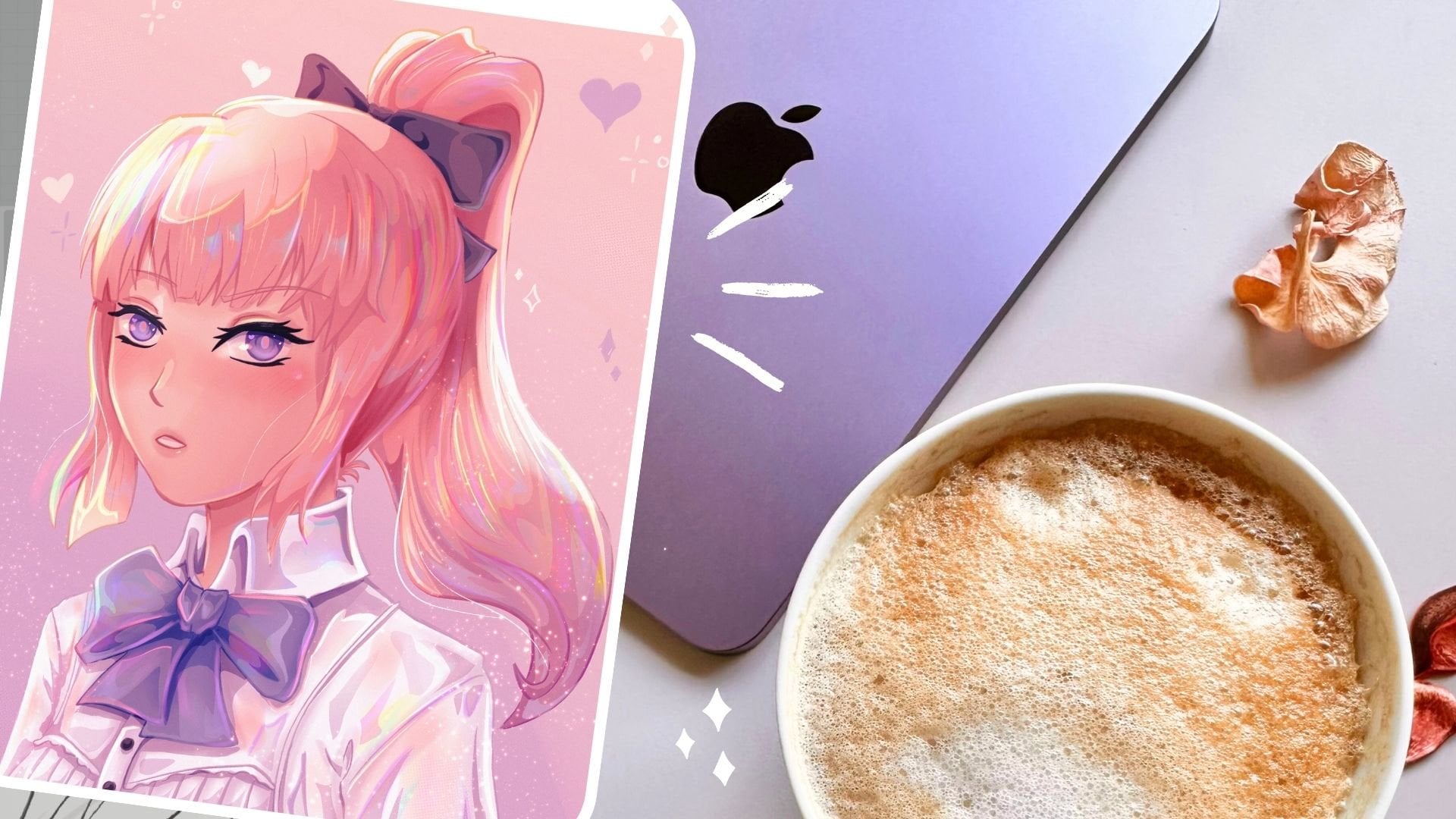
Transcripts
1. Intro: One of the best things
about being an artist is that moment when you can hold your own finished
artwork in your hands. And maybe even more than that. Take it wherever you go. It's one of the reasons that I love creating stickers
because you can put them on your favorite items that you have with you
at any given time. Hi, I'm Laura, a digital
illustrator and I'm here to teach you how to create
your own sticker designs. I will show you how to
do that from sketch to final adjustments in
two different examples. Namely the main characters of
the 90s anime called nanos. My intention is to make
a set of two stickers that any fan would loved,
purchased together. I feel like my
designs feel free to check out more of my
art on Instagram. The Handle should be somewhere on the screen
for you to see it. Let's not waste
any more time and jumped right into
the illustration.
2. Hachi Lineart: Hello guys and welcome to the
first lesson of this class. You probably already know this from the intro or
from the thumbnail, but we're going to
draw two characters, the main characters
from the animal, nana and the later, see how we can transform
them into stickers. Since we know from the very beginning
that they will become stickers that
decides needs to be sticker friendly from
the very beginning. Otherwise you might
have a difficult time cropping bigger
illustrations later on. So why sketched hace over
here and try to keep a simple shape in mind with a clean end marked
by the frills. Now, I've said this
before and even though the line art is my
favorite part of the drawing, that doesn't mean
that your sticker absolutely needs to
have a line art. You can simply
start coloring and created a counter
with color as you go. And lots of artists
are doing that, but I really cannot move forward with all
the clean line art. Maybe it's from the time
when I used to read mangas. Maybe it's from the time
when I was drawing them with a simple black
pencil on paper. But either way, I
love seeing line art. I love the Mongo style
and it's quite obvious that it influenced my
own sale quite a bit. You can find my brush pack
attached in this course and you will also find my
liner brush over there. Feel free to use it
and try it out in Procreate and let me
know we feel like it. I'm thinking of making
more of them this year, so I would appreciate
your feedback. So what I'm trying
to do right now, as you see on the video, is to go with a thin contour for the light
parts of the line art. So that is where the light would be hitting the character. And then go with thicker lines around parts
that are in the shade, like, let's say below her hair, next to her neck and
everything like that. But I'm also trying to add some thin lines along the hair. And this lines,
they might not be noticeable in the final result, but in the line art phase, it really helps you see
the flow of the hair. And that's an important factor. Now when drawing the frills, it's really important to have thin lines and to try
to take your time with this because it's one of those kind of details
that is quite repetitive. And it does add to the
richness of the illustration, but you really have to be
patient when drawing it. So as you can see,
I'm trying to vary my weight lines just like
covert there on the hair. And you will see more similar with lines around the frills, where they will
be in the shadow, where the blouse will go
behind the frills and so on. Adding a few more
details to the hair, trying to finish the
ends of the hair. And then we will move on
to the rest of the shirt. And then we will make a
separate line art for the eyes. There's a reason that I like creating a separate
line art for DUIs. And that is because
when we are going to change the color of the
line art to later on, it will be easier if there are parts of the eyes that are
intersecting the hair, which usually happens in this
kind of animal drawings. Then having the eyes
on a separate layer, you will have an
easy time putting it on Alpha Lock and simply color the line art without messing up the colored
line art of the hair. It usually tends to happen. And I decided at some
point that instead of trying to erase and redraw
into erase and redraw, it would be way easier to just put it on
a separate layer. For the eyes. You can see that
I'm trying to draw the outline of the eyelashes as opposed to how I
usually work with simply going for a
dark brush stroke, a bolt brushstroke, and just creating the
eyelashes directly. But recently, I've
tried to change the method of me
drawing the eyes. And I feel like it gives
space for a lot more detail. Maybe it's not the big change, but I really tried to
incorporate it my new workflow. So for easy access, since we have a
front-facing profile, now that we have
our eyes drawn out, Let's just duplicate
the layer and flip it horizontally and just
put it in place. I will let you watch the rest of the process and I will
see you on the next step.
3. Grayscale and choosing colours: Now that we have our
line art reveal, it starts to look
pink areas inside the whole shape and
fill it in with gray. I actually go for a
purple tinted gray, but you can go for a fully
saturated one as well. I'm doing this in
multiple bunches because I tend to
touch the screen with my hand when I'm far ahead in the selection and I
accidentally closed it. Since I don't want
to start again, I'd rather go by selecting
a few big chunks and fill them with color instead
of feeling frustrated. You might have seen some
videos on social media where people tend to
create an outline of color for the whole
character and then simply pick and drop the
color inside the shape. And that's entirely
possible with Procreate. I personally am not a fan
of this method because my line art brush is a bit textured and
my line art style, as you can see, is not
a continuous line. It has breaks every
here and there. And that's simply because I
like the aesthetic of debt. It's not intentional and yes, I know I have to work
more because of that, because they could simply do
the drag and drop the color. But in the end is the method I chose for myself to just create the outline with the Lasso
tool and put the color inside. Why do you want to do next
is create a multiply layer, clip it to your green layer, and select the round brush. Now that you have your
clipping mask put on, you simply have to pick the
same color of your gray base, peak around brush, and simply start creating
a basic shading. This will be in general
places like under the hair, under the chin,
around the clothes where they are supposed to
be darker and in the shadow. We will the general
shadow areas. But in order to do that, you will first need to
establish a light source. I will draw my number here so
that I know where the light is coming from and consequently where to draw the shadows. But of course before
creating the shadows. So you should also have
a light source in mind. I'm going to draw mine over
here so that it's more obvious to you guys what kind
of reference I'm going for, what kind of approach I'm using. And it will all make more sense. We are only going to fill in the general shading without
going into too much detail, without creating
too much contrast. Because later on we will actually create a
pink version of what we are doing now so that it will help us with filling in
the base colors later. So we can see that I'm messy
with adding the shadows. I'm trying just put
them down past, not to waste too
much time on this. And then I will move on. After marking the shaded areas, I will use the smudge tool
to smooth the shadows a bit and then we will merge
this layer to the base. You don't need to go into
crazy detail at this stage. This is merely the
general shadow or the ambient occlusion. Later on we will
fill in the shadows, but let's not a handlebar still. Actually, one of my
favorite parts of using Procreate is exactly
this smudge tool. I used to use a program
called Paint Tool SAI, and it had an
amazing smudge tool that I use all the time. And of course back
then I would only get an airbrush effect on my whole drawing because
I didn't know any better. But I didn't find that
kind of sponge tool on any other app that I have
ever used until Procreate. And I really love using it for this kind of basic
shadow and for a few more blending
parts along the drawing. Alright, these two
layers are merged. Let's switch the grave
with a nice pink them. We are doing this
because later we will add colors on
top of this layer, and those colors
will be on either multiply or overlay layers. If the base would remain gray, the overall colors look muddy and we don't
really want that. Okay guys, so I put
up my reference from Pinterest so I
could see the exact. Callers that nanos palate has. And we are now going to use a multiply layer for the skin. We are going to select
something very light from either the orange or
the yellow color palette. We will keep testing until we
will see what we like more. And the fact that you
are adding a yellow, orange, orange color,
abab of pink layer. You will see that
it will give you a pretty nice skin shade. And you can work with
it really, really well. You just have to
look out for finding the right kind of base color if you want from
the color palette. Because the multiply
mode will alter it. It will make it more vibrant. It will make it a bit pinkish considering that we have
pink minutes our layer. But that's nothing
to worry about. It's only a matter of
trying and figuring out. This is how the base
layer looks like. It's a really light yellow. This is how it would
look like if you added it on the gray kind of base. Okay, so now we are adding
a new Multiply layer. I'm speeding up
the process a bit here because it's
quite repetitive. But unless you check
it out for yourself, unless you try it
out for yourself, you will not know how
to pick the colors. But really, having
a pink base really helps a lot with
setting a basic shade underneath all of our base
colors and then adding more shading and more contrast and lighting from that point. So this is one of the part
that is taking a lot, but you are starting to
see your drawing come together because it's
wanting to have a line art, even if it's a
really detailed one. And it's another thing to see some basic colors
on your drawing. It feels like your character
is finally catching sunlight and you can actually visualize how it will
look in the end. I tried to use the
same color is often as possible in many more
places than just one. Like the blouse and
the earrings that I do not waste time
looking for more colors and the shading
will also be more uniform for the frills when we are going
to use a layer set to overlay because we want to have white frills and we cannot do that on
a multiply layer. The same goes for the
white of the eyes. We are also going to put
that on the same layer. And then we will make another multiply layer above it to create the color of the eyes. And I'm willing to play around a bit until I find
the right color. And then we are going
to make the eyelashes. Try not to make the
eyelashes full black, like the darkest black
that you can find. Because you will later want to add some shading to it as well. And that will prevent
you from doing so. Besides, you know,
that you are not supposed to use the
darkest black or the whitest white in your
drawings because it simply will not help you later on
when you are rendering it. This is pretty much the base
color part of the drawing. We can make some
adjustments if we want. And then we can jump
into the actual shading.
4. Hachi Soft shading: In my view, there
are two types of shading that you should account
for when you are drawing. One is the soft shading, the kind that you smudge
out and try to create a nice transition between your base color
and your shading. And the other one is the
heart shading where you have visible hard edges that
contrast with the soft ones. Now let me tell you why. I don't think that using
only one or the other is as effective or aesthetic
is using both of them. If you only use soft shading, you would risk creating
an artwork that's queens, these airbrush, as
you might know, airbrush fixed,
It's really looked down upon in the art community. Beginners tend to use the airbrush a lot because
they don't know how to emphasize the shapes
in their art and they unconsciously try to hide
that behind the airbrush. Now you might say
that you can do a stock trading using
a textured brush. India's were right. But in most cases, there will still
be something that is missing from
the illustration. That's why lately
I've been using a combination of soft
shadows and harsh shadows. In this lesson, you
will see me filling up spaces where I want the
soft shadows to be. The first places where I will go to the soft shadows
are on the hair, both on the very top of the hair and below the year level. Next is around the face with darker shadows on the
forehead below her fans. Then I will add shadows
on the clothes in order to put emphasis on
the phone and frills. I tried to smudge until I have
a soft effect on the face, but I tend to use the
painterly brush from Ross trust in order to smudge the hair and
some of the clothing. We are going to select a
darker shade from the skin. I'm trying to lower
the saturation so that it won't be a
bright pink shadow. Although there's
nothing wrong with that if you want to cry it out. But for my style, I'm trying to desaturate
the shading of the face. So I'm adding it
around the face, trying to create some
sort of contour. And then as you can see, I'm trying to smudge it
out and spread it out in a uniform manner because this is only
the soft shading, so we will add some clear
shapes in the next lesson. I'm trying to pay attention
to the details and tried to add shading around the ear
and the earrings as well. Because even if they will not be noticeable in
the final sticker, I know that it's there. And I really want to
have a standard of actually creating details
because I know they are there. And when I know they are there, it makes me feel better about my art even though
nobody notices it. You can see that
I'm actually trying to reinforce the
contour on the side of the face and how a darker shadow within the shadow that
I have already created. Now I'm erasing a bit of the skin shading
from the hair so that they will be able to proceed with the hair
shaving afterwards. Now I will add the
soft shading around the frills as well and
around all the false, That's the characters blouses creating them going
into too much detail. But I tried to emphasize all of the volume that this kind
of shirt is creating. I'm alternating between
the smudge tool and the brush tool, adding some color
than spreading it, adding more color and
then spreading it. This will create the base for my later shading and lighting. And it's also useful to see the flow that the
material is going in. Now let's add some
color to the eyes. I like to create a shading
on the upper side of the eyes because it's supposed to come
from the eyelashes. And then I will also
create the pupil. And since it's anonymous, kind of growing the pupil
will be quite large. Then we will add a
lot of details later. Especially with lighting
and width contrast. Now we're going to select all of these layers and create
a group of them. Because later we will simply duplicate and March
all the layers in the group so that
we can later work with the new marched player. For the white frills, it's quite difficult to
find a color to shade with because the material
is not exactly white foot, it's a really light
creamy color, like maybe bladder or
even lighter than that. But when you have
a light material and you want to shade it, try to think about
the temperature of the shading that you
want to achieve. If you want to achieve a
worm kind of temperature, the one that I really want for this piece and then try
to go for soft pink or red or orange
depending on what you are going for and simply
shade with that. If you are going for
cold temperature, maybe most of your colors
are blue or purple, then you can just go for
a really light and the saturated blue or purple and
create shading with that. So now we have our
soft shading layer. As I said before, we will only remain with one layer for the
whole soft shading. And now that we have
our first shading, what we can do is
color the line art. I usually try to color
the line art after I have at least the first
part of the shading, because it's easier to select colors directly
from our drawing so far and color the line art from those areas with the
darkest color in the area. Sometimes when
that's not enough, I'm simply going to create
a darker shade from the one that is already on
the layer so that the line arc will be
visible at least. To do this around
the chin as well. I want the line art
to be noticeable because I need to separate
the chin from the end. The line art helps
a lot with that. By the way, if you
didn't get to notice it, in order to color the line art, you simply have to
select the line art and select the
Alpha Lock option. It's on procreate and it's
in Photoshop as well. I think it's in Clip
Studio as well. I think most of the apps, most of the drawing apps
should have this possibility. The best thing about coloring
your line art is that the final result feels like
you didn't use a line art. It's not that kind
of a manga feeling. Instead of having a black
line art and everything pops up and it doesn't really look natural if you are old. So coloring it. If you are aiming to have only line arts and
only sketches, then there's no problem with
leaving everything black. But since we are adding colors, I feel like coloring
the line art as well as giving it
such a refined look. I will let you watch the rest of the process because there's
not much left of it. And I will see you in
the next lesson, guys.
5. Hard Shading: As mentioned in the
previous lesson, you should aim for a balance
in your illustration and try to include both soft
shading and heart shading. I already explained
what each one means. So let me show you why
heart shading is actually giving a much needed contrast
to your illustration. First, I will select
the hair in the back because it should be the
darkest portion of hair. Since we aren't
doing hard shading, It's easier to select the area that I wanted to cover
with the Lasso Tool. Now you will see that instead of automatically filling
in the selected area, I will start covering
it with my round brush. I'm doing this for two reasons. One is that it allows me to control the pressure
applied and with that, the intensity of the
color that I put down. Second is that hard shadows will be visible due
to their edges. But within the shape
that I create, I can play around with
gradients of color. That means either going
from dark to light or from one color to another
in case I want to shade, for instance, with
blue and purple. There are times when
I simply fill in automatically the shape that I create with the lasso tool. But I think most of the time I prefer to control the
intensity with my brush tool. After all, I'm not self shaping in any of
my illustrations. Over here you can see that I create the separate
smaller selection on the back of the hair and
make those areas even darker. This creates a
nice extra details that careful viewers
might know this. Be careful when
creating the shapes to follow the form of the
object you are shading. In this case, I'm trying to
follow the flow of the hair. Now we are going to
do the same thing on the other side of the hair
or the back of the hair. We are going to make a big selection of
this chunk of hair. We aren't going to
use a large brush and try to cover it with color. That's doesn't mean we
have to fully color it. Tried to not apply maximum
pressure on the tablet screen. So that later you can add
on the smaller shapes more pressure with your brush
and create this shadows. Also, when creating these
shapes with your lasso tool, try to have your hands
relaxed and tried to create a big motions so that the shapes will feel as natural
as possible. You can already see that
what we have added so far is creating a huge impact
in our drawing so far. And of course, the more that we add the list contrast
it will seem. And that's why we will add more contrast later
in our process. So we are trying to add the
bigger shape on the top of the head where I usually feel like there's
a lot of shading. Now for the banks,
as you can see, I'm trying to create
smaller shapes. I'm trying to leave enough space for what will
be the light later on. If I'm working in one
way on this side, I will have to try
to be at least a little bit symmetric
on the other side, especially for the banks. But of course, since my light
source is on the left side, the whole left side will have less shading compared
to the right side. But in the case of the banks
which are quite in front, we are going to try to create the shading on the same
places on both sides. So as you can see, I'm trying to create long shapes for the hair. I'm trying to erase and have a few strands of
hair above some others. You can now see how the line art of the hair helps in
this kind of situation. When you are creating these
shapes for the shading. You will actually guide yourself after the line art that
you did in the beginning. Usually the hair takes the longest time
because it can be very, very difficult to capture descends and the
flow of the hair. I like to add this kind
of airbrush effect above our shading so that the shading will not stick out too much. Okay, so I think we have a few more details
slept for the hair, and then we will move on
to the next shading place. Okay, so why create a
new Multiply layer so that I can have my shading
colors differentiated. And now we aren't going to create more shading
for the skin. And as always, we are going to start with the area on the neck. We need the chin. Alright, so after we've colored the
area underneath the chin, we can then erase the access part that
we do not need here. And if we are on this
side week hoop as well, add the shadow that the frills
will create on the skin. So next we will move on on
the area around the eyes, where the eyelid will
create a shadow. And they usually like to
create this quite dark. And then we will move on to the sides of the face
and try to give it a nice contour on the face depending on the
lighting that you have, you can either go for
subtle heart-shaped maybe, or maybe even half of the
face will be in the dark. In this case, I
want to emphasize the areas next to the hair and the eyes and the quarter of the face that's mostly
in the shadows. Right here next to the hair and on the forehead
and above the eye, we will have quite a
dark shading because the hair is really
close to the face, but it doesn't
stick to the face, so it will create the heart. Darker shadow. Then on the other
side of the face we want a little more shadow. We want it to be spread
more than on the left side. The way we look at
the illustration, we're going to make
a larger selection and then softly fill
it in with color. As you can see,
I'm trying to make my selections to follow
the form of the face. The face is not
flat as you know, and we want to accentuate that. Then we will add some
shadows around the eyes, although they will
be more subtle, we will erase parts of it. One of my favorite
parts of shading, of heart shading is
doing the shading of the ice and this character
has nice brown eyes. And that gives us the
possibility of creating a really good contrast
between a really dark shade, brown on the upper side. And then we can come to it with an even darker
brown like this. So I like to do this counter
using my liner brush and then I like to create
a deeper brown, in this case around the pupil, but without being fully opaque. You can see now
that the ice really stand out compared to
what we had before. Let's just add a little bit of detail on the earrings as well. And I'm sure that not many people will see
it because they are so small and on a
sticker design they will be almost unnoticeable. But we are also doing
this piece of art for ourselves and we want a
high standard of details. After I finished with
the face and the eyes, I will start working
on the clothes. The shading on white
clothes is always tricky to do because you can't use
gray as a shading color. You need to go with a really light color that compliments that Don't
of the overall shading. In this case, the tone of
the shading is pinkish. So I will use a light pink
to shade to the frills. Shading frills is a
game of patients. Since there's so many of them. What I like to start
things to create the shadows on the
back of the frills, the part that you can see, but it's not front-facing
you as the viewer. It's facing character's shirt. And that means it's
getting a lot less light. And if we try to consider where our light source
is coming from, another shadow is cast on the
right side of each frills. So you can see me
making selections that we'll try to follow
the shape of the frills, that we'll try to
follow every kind of swing that they have in assembly repeated
for all the frills. Now that we have marked our shadows on the grills
on the lower side of this thicker now we can move on to the one that is right
underneath the chin. I think this part will be
more obvious to anyone who is watching the arc because every tendency when you
have character artists to, is to look at the face. That means we need to be a
little more careful around this part and actually try to stylize it nice
to render it nice, and to actually correct
mistakes as we go. So just a little more on
the frills silver here. And then we will move
to our next section. I know this part is
repetitive and if you ever decide to draw
off rails like this, you will need some patients. Don't forget to also
shade the little, the band beneath the
frills from the neck. Because it will also
have some shading caldo, not too much of it, but we still need to
add those details in. As you can see, I'm
trying to keep it minimal in order not to take too much time or to distract the viewer from
looking at the face character. Okay, so now we can create a new Multiply layer
and actually tried to add some details to the
pink side of the blouse. Right now I'm testing
different shades of pink to see which
one I like more. And they think this
dark desaturated pink looks perfect and
multiply around it, the frills, they give a
really intense shadow. And since the frills are
very close to the shirt, It's quite realistic
to have it like that. So now I'm making
more selections. The color fill is deactivated, and I will simply come over with a large brush and tried to cover all of these
spaces in one go. Now for the rest of the shirt, I tried to emphasize the folds
using the same light pink. And I'm trying to create
this really round shapes on the upper and lower side
and leave the middle mostly untouched so that I can later place the
light over there. In order to create
a sense of depth, I will try to make the
shades of the faults, the ones that are basically one in front of
the other, if you want. I'm trying to make this
one's darker so that I can add lighting
to the other parts so as to create the idea of something that
is a little Morrison. Let's not forget to
add some details on the lower side of
the shirt because these parts will also
have to have some shades though folds are going
all the way down. You can already see
that you understand, nor you'll get an
intuition of how the material is supposed to act. You don't need to be extremely
realistic on this side. You just have to give
the impression of how the part that you are
rendering is supposed to act. It's not a problem
if it's not realist, as long as it looks good, stylized and people can get a general idea of what
you wanted to do. Now that we are approaching
the end of the shirt face. Because you can see
I'm farther from the light source line trying to make bigger, darker shapes. In order to give the idea of this side being farther
away from the light. Okay, So this order
details for the shirt. I'm quite happy with what
it turned out to be like. And let's add some details
around the neck as well. And then we will move on. Adding some small
details to the earrings. Just like that. Now, for the last part, although this is a soft shading, Let's do the blush
before moving on. I always like giving female
characters a little blush. Is it kind of make the
face look more lively? That's pretty much it
for the shading for now. In the next lesson, we will start doing highlights.
6. Hachi Lighting: Okay guys, so we are finally
at the lighting stage, which is basically my
second most favorite stage of any illustration. After shading and shading, we are now finally changing the base and adding some glue, adding some life and some shine. My favorite way of creating the lighting is by
using color dodge, and add multiple layers,
occasionally, even overlay. I always start by making
the hair highlights first. It takes lethal bit of
testing to see which color looks better in color dodge
on your illustration. So take your time with that. Then. I will go and cover
the upper side of the hair, let's say somewhere above
the eyebrows level. It's not a rule or anything. It actually depends on style. But for this hairstyle
that had she has, I will put down the base
highlights over here. Then what I will do is I
will grab the eraser with the hard round brush and
erase something like this. Then I will grab the
smudge brush and I will try to create this
elongated kinds of brushstrokes and try to define the form and
the flow of the hair. I'm also trying to differentiate between the lighting that is on the banks from the lighting that is on
the rest of the hair. I will do the same on the shirt because I wanted to give
it a bit of a shine. This park is not exactly
realistic because the lighting on the shirt
wouldn't really look like this. But it's simply a smallest
shine that will go in the back of the
illustration if you want. I will come over with different types of lighting
later on the video. You can see I'm actually
erasing a bit of it so that it won't
pop up too much. Next up, we will make
a new layer and set it to color dodge and start
by highlighting the eyes. I'd like to start by creating a nice semicircle around
the pupil of the eye. Then I will add the
highlights on the eyelids, on the corner of the
eyes and the nose, forehead and thin sheets. All be hard lights similar to the hard shadows that we
discussed about earlier. So in order to obtain
a light yellow, light pink, as you can see, I have chosen a really
bright grid that when you put in a color dodge Over a skin shading just
like this one. It's actually results
in this kind of really light, pale yellow. I like to deal with this kind of triangle lighting
on the forehead. And later on, I will actually try to reinforce
one of the edges. And speaking of it, as
I'm doing this nice part of lighting exactly
after our shading. So that's the contrast
will be visible. Adding some details to the eyes. And now some details
on the lips. I usually try to keep
the lips quite soft and not add too much
detail to them because I feel like they would be
a little too realistic compared to the stylized style
that I'm trying to obtain. Household like creating
this light contour between the face and
the shadow of the face. After I'm done with the face, I start adding some more
lights on the shirts folds, better emphasize their shape. When I'm done with that, I will move on to
my favorite part, adding more details here. So right now I'm trying to pick all the spaces between
the shadows that we have created earlier on the shirt and tried to
emphasize them with light. But as you can see, I'm trying to stick to the original portion
that I have lit before. What you can also see is
that I'm trying to create all of my shapes
to be quite round, to have really round
feeling to them. Because in general,
in animation, whatever is based on a circle. So every round kind of shape
is very, very feminine. And this is what I'm trying
to obtain over here. Still using the Lasso tool, we will create more highlights this time following the
length of the hair. We will place them above
our earlier highlight, but also in a few more places. Contrasting with what I've said earlier about the round shapes. You can see that I'm using really sharp shapes on the hair. And that's because
I wanted to show the flow of the hair and to
make it look really shiny. And there are some
cases when I'm using round shapes to do the lighting
and shading for the hair. But that's usually
when the character has curly hair or
even wavy hair. So I'm erasing a bit of
this light pink over here on the right side because
it's more in the dark, so there's no point in having such a bright light in there. And now I'm adding a bit
more light on the banks. So while I'm here, I'm trying to add a little bit
more lighting to the lips. I might come back to them and that little white
light later on. But let's move back to the hair. You can see that on
the upper side of the hair where we
have more shading, I'm trying to create a softer lighting
because in the end, that portion is
more in the shadow, but it will still have a few
portions that will shine. So this part is all
about the control of your pressure on the
pencil, on the display. And that's why I personally wouldn't be able
to do any kind of finger-painting because
with finger-painting on the screen of the phone
or anything like that, the pressure is the same. You can actually try to obtain these results if you are
painting on the phone, if you play around with
the opacity settings. So the moment you put your
finger on the screen, there's not much you can do
to control the pressure. It's just like 100% by default. But if you want to
play around with this kind of effect that I'm
showing you in this course. Just tried to work on the opacity and go from
lower opacities like maybe 1020 per cent to higher opacity on
different areas and see how it works for you. I know that a lot of you
are using Procreate bucket, I think it's called. So I don't want to this the fact that people are using
Procreate on their phone. Not everyone has a tablet and not everyone can
afford a tablet. And that's perfectly okay. But you will need to find
workarounds on your phone. Now we will add a
bit of lighting to the frills and the video. It looks like there's not much light added
because for some reason the video is a bit
more exposed than what it looks like in real life. But the lighting is there. So this is what our illustration looks like with and
without the lighting, we are actually bringing
life to it little by little. But there's still
a lot more to do. Before moving on, I will
add a few more details from a normal layer and correct a few things with
the Liquify tool. At this stage, I wanted to add a bit more details
to the hair using, as I mentioned before, a normal layer, I'm just
picking colors from the hair, colors that already
exist on the layer. And I'm trying to create some
hair streaks, some detail. Again from very far away, you will not be able to tell that these details
have been added. But later on when you will
actually create the contrast, you will be able to notice it. And it will help you to guide you along the flow of the hair. Now to correct a few details, I'm using my liner
brush and I'm adding a few more hair streaks
and rehearing there. And I like to use my line
art brush because it has a really nice
pressure sensitivity and actually creates those ends. Those really nice hair ends. And I can create
bold hair streaks, are really thin hair
streaks depending on how much pressure I
put on the brush. Till now I want to actually
adjust a bit the line of the face because it was
a little bit shaky, It was a little bit interrupted, and they wanted to look smooth. I also feel like I need
to add a few more, a few more details to the eyes. This is where we're at so far. And in the next lesson you
will see my favorite part of the process because as I mentioned at the
beginning of this class, highlights are my
second favorite. Check the next lesson to find out what my favorite part is.
7. Hachi Final adjustments: Okay guys, so right now we are at my favorite
part of the process. We are now going to
add contrast and a few final adjustments to
make this design even better. First of all, we are
going to duplicate this layer and create the
gradient on the new layer. Then we will lower the opacity and put
this on multiply mode. This will change
the overall tone of the original illustration. It will make the colors and especially the shading richer. And then we will mark the gradient layer
with the one below. Afterwards, we will create a new layer and clip
it to this one. We will start adding contrast. Now, basically, when you think you're done
with an illustration, you should always
ask yourself if you already dark and your darks
and lights and your lights. I can honestly say this was
one of the best things I have learned since I started
studying digital art. Let's start by darkening the few of the areas on the hair. At this stage, I'm
trying to work with big shapes and with a big
round brush and try to cover as much area as
possible in one go to create a nice contrast without actually adding any more detail. There will be a few
exceptions, of course, where I will have to go with smaller brushes or
smaller selections. But generally, I'm trying to create really large
shapes at this FARC. Okay, so you can see that
there are a few shapes that are really small
around this side. But they will be the exception
and not the general rule. At this stage, it's
best if you tried to separate your shapes. If you want. Basically, on this
side of the hair, you have to think
which portions are above one another and try to create a separation
between them. Because now you have
the chance to do so. Remember that the right side of the illustration is more in
the dark than the left side, so we will have even bigger
shapes around this part. So I think you can
already see how much of a difference this contrasting
layer is creating. Especially since we
have our basic shading and lighting down on the layer. Lethal more over here
nor there to put the emphasis on the
roots dendrite here, I'm adding the shadow
to basically create the border between the subtle
shadow and the lid part. Now we will darken some of
the areas on the clothes. We will try not to
go overboard here, but I especially want separate more of the
white from the thing. So you can see that by
adding smaller shapes inside the bigger shapes that we have created in an earlier video. We are basically adding depth
to our original shading. I think it was
somewhere around here where I got the idea of creating an outline around
the frills that will actually look really
great from a distance. And it will put an emphasis on the fact that this
is a sticker and the frills on the lower side are actually the bottom line. Again, on the right side, we are trying to create bigger shapes because
it's more in the dark. With the light source
being gone the left side. Again, smaller shapes inside the existing shapes of shadows. Now let's start going away
areas around the face. First, and most intuitively
is below the chin where we should have
our darkest skin exit. Then we will go into
add another shadow on the cheeks and around
the eyes and forehead. I like to have the area
around the eyes really dark because it creates some
sort of a makeup effect. So this is what our
illustration looks like with and without
the contrast layer. Now that we're done
with the contrast, let's add some highlights. We will basically add the
brightest light right now, which will be on the highest
point, will be just surface. And we will also add some rim light on certain
areas on the face. Just like many other artists. Although rim light
is defined as being the outer line that's lit
by your light source. I'm actually trying to stylize it a bit to
make it look good. And in all honesty, this kind of white light, a bit blunt in, is really giving a juicy
look to our character. I'm in and look at the hair
light that is now blended a little and it looks really
soft, really shiny. And it looks like she actually used some sort of really
expensive hair products. I also like to add this kind
of rim light on the side of the face that's the closest
to the light source. And yes, once again, this is not the actual
definition of a rim light, but it's separating my
shapes really good. And it's actually bringing a lot more attention
to the face, which is basically my goal. I absolutely love adding this nice white
highlights on the ice. It really makes them pop up. And one of my favorite
things to add, our shiny strands of hair. They look as if the
light is only hitting a bunch of hair strands
and make them pop out. I try not to exaggerate with adding this kind of
strands of hair. Although they look really
good when you add too many of them in a lot of
parts of the face, it can get repetitive and
it can get boring to watch. Now I liked contour, a bit of my lighting
shapes from the clothes. And you can see that
this kind of white frame around the light shape is
actually a really nice touch. I'm also adding a few
details around the frills. But once again, because for
some reason the video is a bit more exposed than
the real illustration. You cannot really see this part. So going back to creating more, there's four my light shapes. As you can see, I'm
trying to also blend them in and not leave
them as they are. Reducing their intensity with
a bit of my eraser brush. If you were wondering why I'm suddenly zooming out and
then zooming back in. I like to try to refresh my eyes a bit and look at the
illustration as a whole. After concentrating
on just a small piece of it for too long. Because that's one
of the mistakes that I was doing as
a beginner artists, I would try to add so many details to only
one side of the drawing. Then when I would zoom out, it would either be
not even noticeable or it would look really bad or unrelated compared
to the rest of it. Now I think this
part will really, really make her stand out. I'm using a normalised
black color with a little fuzzy brush and adding some details
around the eyelashes. And you can see that
it's really striking. So now I'm experimenting
with the kind of detail that is not
noticeable from afar, adding a few highlights
to the eyelashes. I don't feel like these are
the best kind of highlights, but I will learn more in time. And if I figure out a
trick that I like a lot, I will share it with you guys. So you can see the
details on the frills little better around the
neck when I'm adding them. Because this part is a
little bit more creamy on the filming compared to
the lower side of the frills. Adding a little bit of
shimmer around the blush. And now it looks really
nice and textured. So this is before
and this is after. Before and after. I really think it looks good. I will now intensify the
contour of the frills. On the bottom, I will use my liner brush for death
and the dark red color. I don't like using black already been great
for my line art. They do not really
genuine that way. This is the contour that I
was talking about earlier, the one that will really make this design and look
like a sticker design. I'm using my liner brush for
this and I'm trying to vary the line way the
rehearing there because this will be especially
noticeable once it's printed. And we do not want to have the same line weight
to all over the place. You can even see that I'm
stopping at some point instead of continuing with
the line all the way below. On the lower side,
you can see that I'm actually trying to fill in small triangles to make
it look even nicer and to keep an impression
of really dark spots. So we are almost done
with the frills. We are running a little
bit of line around the shirt if we are
here and trying to correct some of the
wonky lines that we remained with after all
of our edits so far. I don't know about
you guys, but for me, creating this kind of line is really relaxing,
really therapeutic. It's like a therapy
session through drawing. And I know it's not
always like this, especially when you do not like to create a line art or when you are just trying to get over with it as soon as possible. But for me doing the line art, after I started using
this brush, That's true. After I started
using this brush, I really started enjoying
creating the line art. Sometimes even more than doing
the rest of the drawing, like coloring it
and rendering it. Because the line art is going fast after it helped
my base sketch. And I still get that Mongo
filling after I'm done. So I already love
how this looks. I'm trying to add a
little bit more lines on the upper frills as well so that they would still feel like
they are matching. So now I'm almost done with, with outlining the frills. And this is what it
looks like so far. I really love how it turned out and I'm sure to make this kind of outline in the
future when I will be creating more sticker designs. So this is before
and this is after. Now I'm pretty much done, but before wrapping up, I would like to add some chromatic aberration
using the pencil option, not on the whole Canvas. Afterwards I simply add noise. It's around three
to five per cent because it makes it
look even better. That's it for the
hace illustration. I hope you had fun
and I will see you on the second part of this course
where we will draw Nana.
8. (Part 2) Nana Lineart: Welcome back guys to the
second part of this class. We finished hace earlier. So now we're going to jump into our nonlinear illustration. I wanted to know not to
be smoking in this design is it's a really central
part of her character. And they want to maintain
the front-facing plane, although she will look sideways, is if she's looking at hace, after they become stickers, I will literally put
them one next to another with nano
looking after hace. Okay, so I'm spitting up
this video a bit because you have already seen how
the liner quirks stage. I just want to remind you
that you can download the brushes that I'm using
in the resources section. So make sure you do that, especially if you are
struggling with line art. I'm confident that this
brush will help you a lot. And getting the
smoothness of the lines that anyone would really desire as if they
are doing line art. Also, when doing the line art, make sure you are
actually making use of Procreate's functions
of creating straight lines or
perfect shapes. If you wanted to create a
straight line like the, it was the case with
a cigarette earlier. You simply have to draw a line. It can be as wonky as it gets. Then instead of lifting up
the pencil from the screen, just keep it pressed. And the app will automatically create a
straight line for you. And it will be the same if
you are trying to draw, let's say a circle. And it's obviously not gonna
work well with the freehand. So after drawing something
that resembles a circle, if you keep the
pen on the screen, you will see that the author shape of
procreate will kick in. And we'll ask you if you
want to have an ellipse. I'm not sure if I'm
pronouncing that right. Our circle. And then you will
actually be able to adjust all the corners, four parts of the shape that
you are wanting to create, make it bigger, make it smaller, make it, I don't know, elongating it or actually placing it in a different
part of your illustration. So this is one of the really
great aspects of procreate. So I like creating this
kind of collarbone. The nano illustration is giving me the opportunity to draw them. I like to draw them
for a girl characters. They're usually more
of a male thing. But in this case, none as character
is really slammed. And it's easy to see her
collarbone like this. So you can see that
compared to patchy, I'm doing the eyelashes with the really big for our stroke. Instead of creating the
outline of the eyelashes. In the end, it's going to be
more or less the same thing. Sometimes I'm trying
to do the outline because I feel like it looks
a little more detailed. Time to add the streak
of hair over the eye, but I'm not sure it looks good. So I think I might be
a little bit later reinforcing some of
the lines around the hair and around the face. And after we finish creating
this kind of line weight, we are going to move on to
the base of the drawing, the gray base of the drawing. Actually, this is the line art so far, I will see you in
the next video.
9. Nana Grayscale: After we finished the line
art in the last lesson, we will now work on
the grayscale base. Let's start by selecting the whole outside shape of
nano and fill it in with gray. Just like before, I'm going
for a blue tinted gray, but you can go for a fully
saturated one as well. Next we will create
a multiply layer, clip it to our gray layer
and select the round brush. We will fill in the
general shadowy areas according to our
chosen light source. My light source will
be the same as for the Cauchy illustration because I want him to be cohesive. Okay, so just like
before we are using the Lasso tool to select the
outline of the character. Okay, so now I'm
simply adjusting the color that I want is a base. I'm taking my software
vendor brush, which is basically a round brush with a bit of an
opacity settings. After making the shaded areas, I will use the merge tool
to smooth the shadows a bit and then we will mark
this layer to the base. You don't need to go into
crazy detail at this stage. This is only the
ambient occlusion. The reason we are doing this kind of work
scale approach is so that we have a unified place
of shadows to start from. I like it much more when I don't have to start from
the flat colors. Alright, now that these
two layers are merged, let's switch the gray
with a nice pink tone. Just as a reminder, later, we will add colors on top of this layer and those
colors will be on, either multiply on
or overlay layers. If the base would remain grade, the overall colors would look muddy and we don't want that. From this point on, I will let you watch how I
choose the colors. There's the mouth before
committing to filling the whole space and how I put
them on different layers. So now I'm trying to test out
which can color to choose. Considering that I have
on my left side of the screen the nano reference
picture from Pinterest. And she's quite pale looking. I'm not going to go for such a pale color in
this drawing because it would be very difficult to shade without having
too much contrast. And I don't think it
would look that good. So I'm going to give
her a bit more color on her skin without
trying to change the overall color just
to make it a bit fail, then we will go find
the color for the hair, which will not be
exactly black book. You will see that in a minute. You said this is what
I was talking about, about the selections that I tend to feel close by
mistake with my hand. And that's why I'm
trying to select chunks. Of the character, when I'm
trying to fill in a color, it happens and it's
sometimes frustrating, but I know it's my fault for touching the screen when
I'm not supposed to. And that's because of my
position at the desk, which is not exactly
the correct one. Okay, so since I have an
overlay layer created, I'm doing both the whites of
the eyes and also the shirt, which I want to be kind of
full light yellow like. The shirt was maybe once
white-footed do too overwhelming and over washing
it a bit yellowy. And also let's do
the cigar as well. You can see that I selected the very desaturated
color for the jacket, but I did not select the blackest black on
the palette because that would be
really difficult to shape and to live later on. So I'm thinking of coloring the necklace or the choker
the same way as the jacket, or maybe just going
for a bit lower tone. Now we'll create a
different layer for the hair so that
I can play around with it if I do not like the
ones that I'm selecting. So lets just grab a big chunk of the hair and just out the color. I kind of like this color, I might stick to it. I will see after I fill in
the whole shape of the hair. So just a bit more until we finish filling in
the base colors. What? This is my first
time trying to draw a character who is smoking. And I'm not sure how
realistic that comes across. But I might try to do it
again sometime and maybe include the smoke that's the
cigar is producing as well. I can get to be a very
cinematic approach. So now we only
have the lips left and then we are done
with the base colors. And I hope you guys are having
fun watching this class, maybe crawling along
or maybe it's simply inspires you to create
your own stickers. I will see you on
the next lesson.
10. Soft Shadows: Now that we have our
base colors down, we will start by adding
the soft shadows on Nana. I already explained
the difference between soft and hard shadows
and why you should use each one in the hutches
side of the course. So after making a few
corrections here and there, Let's make a new Multiply
layer and clip it to the base. I duplicated my base color layer and named it soft shading. I tried to be organized
for this class and already created the group
of layers for this lesson. I think you already saw this, but if you want to group
multiple existing layers, always have to do in
Procreate is to hold and drag your layer to the right until you see that it stays selected. Do this for as many layers
as you need to group. And then you only need to tap on the group on the top right
side of the Layer menu. I prefer to keep each stage of the process organized
and be able to duplicate groups of layers instead of each
layer one-by-one, or March groups of layers
before moving to the next step. The more you will draw,
the more you will see how we prefer to organize
your own work. Maybe you prefer working on only two or three layers and that's great if it's
what you prefer. On the other hand, there
are artists to make one layer only to apply
to brush strokes. But they are distinct
those brush strokes. So they wanted to be able
to throw them away for during the process if they discovered that they
don't like them. Alright, back to the
shading process. Before letting you watch
the rest of the lesson, I want to tell you
something you probably have heard before about
not shading with black. There are a few
reasons for that. First of all, you
would be putting the darkest darks
possible on your canvas. And you would have no way of playing with the
shading anymore. If you think that
you are just using a translucent black to
shape a light base like, let's say the skin,
for instance, that will make you
have a muddy color. Remember that shadows are
quite colorful actually. You can have nonsense of
blue, purple, red, orange, and so on in your shadow, depending on the context
of your illustration. Fernandez hair and jacket, both of which are black. I tried to choose a
desaturated blue and some purple for the base and something similar but
lighter for the shadow. Because the layer is
already set to multiply. And if I use the same color
of the base for the shadow, it will turn out almost black. And as mentioned before,
we're trying to avoid that. So let me just clean it
up a bit before we move on with the next
part of the shading. I know I could have
simply selected the area that I wanted to shade
and shade inside it. But sometimes I'm trying
to move fast and I do not think one or two or
three steps in advance, but I should, at least when I'm creating
this kind of classes, maybe to set an example. I don't know if any of
you guys work that clean, but I should set an example
and do that for you. So now I have the shading for the hair and the jacket down. So let's just move
on to the choker. And this will be pretty simple. I just want a few places
where I will blend the color in because I really
want to go with the heart shadow in the
next lesson for the choker. So you see how I not putting
in the color all the way until the edge or the
line of the choker. That's because on the upper side we will have a bit of a lie. So now I'm creating the
shading for the eyes and I like to shade the upper
side of the iris. And that would be the shading that's produced
by the eyelashes. Course, you need to shape the
white of the eyes as well. Sometimes I do it when
I colored the iris, sometimes I let it for the end. There's no actual
reason either way. It's just about how I'm
working at that moment. I'm not sure what happened here. I just try to correct
this part with my brush. The trying to sit in small
shading over here as well. I know it won't be
noticeable from afar, but I know it's there and I know its 3D shape and I
want to convey that. Now we will just blend
in the scratches that we have made with
the brush earlier. Okay, So let's move on
to non-owners shirt. And just like with hace, it's gonna be a bit
tricky to shade something that is almost white. Now we are moving
on to the skin, which is actually the part
that I like second-most, after shaking the hair, we will go for the
obvious parts first, which is the parts that
are partially covered by the jacket and
then by the bones. You don't have to
worry about making it too detailed at this
stage because we will have a hard shading phase
where we will actually add a few more details and the few harsher ones
for that matter. Basically, what I like to do
in this phase is to create the idea of a freebie shapes. So the faces and flat, the face is in flight
piece of paper. We want to create a
dimension for it. And that's why we are first
adding the soft shading. Let's add a few more details around the eyes
before moving on. It looks like someone is simply starting
with doing portraits. But not to worry because
we will adjust it. And the next lesson, I will let you guys see this, listen to the end, and I will see you
on the next lesson.
11. Hard Edged Shadows: Alright guys, so before we
start doing the heart shading, let's color our line art. I often get asked
how am I drawing without a line art or how
do I hide my line art? It's really easy actually, you already have your line
art on one or two layers. In my case, it's
usually two layers because I like to keep the
eyes on a separate layer. All you have to do is set
your line art on Alpha Lock and pick a color slightly
darker than the hair, skin, and so on, and then color the
respective lines. It's useful to color the lines after you have at
least a soft shading down so that you already have the darker tones on
your illustration. So just a bit more until this line art coloring
phase is over. Okay, so we have this
metallic part of the choker. And let's see if
there's anything else. I think the ice or Lyft. After you've finished coloring, you will have to deprecate and merge your line art layers, duplicate the last version
of your illustration, and then March the
duplicates together. Of course, typically like to
keep copies of your work. You can merge them directly. I always keep copies but I
rarely end up using them, I guess, but their
sickness or right. Alright, now just like before the heart
shading is done with the Lasso tool and filling in the shapes with
the round brush. I will let you watch
the rest of the video and see you on the
lighting lesson. Okay guys, so now we're
actually starting the heart shading
phase of this lesson. And I like to start
from the top of the hair for this character. And you can see that
I'm already creating a shape that follows
the flow of the hair. Now we are going on the
other side towards the edges of the hair and creating
a similar shape. Now for the back of
the hair as well. As you can see as I'm
going lower and lower, I'm trying to decrease
the opacity of the shading shapes that
I'm trying to fill in. And that's because
we are going towards the parts that are
going to be lit. And I don't think the same
amount of shadows should be words the middle of
the hair as it is on the top of the hair
or at the bottom. And as I've mentioned before, I wanted to create
some hard shading on the choker as well. Okay, So now moving
on to the skin, we are creating the shadows around the hair,
around the eyes. And simply trying to
emphasize where we have really dark places
around the face. And those strands of hair are
really close to the face, but they are not glued to it. So they will create the shadow. And also around the eyes because the eyelid will always
create the shadow like that. You see that in this case, creating a shading
around the shirt is also separating the
shirt from the skin, both of which are
really light colored. And it creates a really
beautiful effect for a sticker. Now adding some extra
shading on the shirt. And let's try to create some very sharp shapes
because I really want the feeling of sharpness to actually symbolize
none as personality. So I think this looks good. Now let's go and intensify
the shading around the eyes. It's the same technique
that I showed you. For the hace illustration. We're going to outline the shading of the
eye and the pupil. And then we will create a darker tone around
the pupil of the eye. Adding some extra
shading to the lips. Not too much though. So let's also shaded a cigar, and I think we will be pretty
much done with this part. Now let's merge these
layers together and call them what they
are, hard shading. And let's just try
to apply a gradient. Now, this looks actually nice. Let's go with this
one and set it to multiply and play
around with the opacity. Let's see the difference. Let's try another
gradient. This one. I'm trying to decide
which one I like more. Okay, so now I'm preparing
the layers for the next part. I will see you guys
in the next lesson.
12. Lighting: We're nearing the end
of the class now guys select splash this
illustration with some light. I want to add a bluish
light to none as hair to contrast with
touches warm colors. And this will be the
highlights that we will put on lower opacity just
like before with hace. Then using the same
color of light, I will add some nice
details in the ice. You can see now that
for the lighting phase, I'm trying to manually use the brush to
create the lighting, trying to diversify the
way that I'm putting down the color and see if I like it more one
way or another. Now I want to create some extra details
like I did for hace. No. Okay. So let's create that small light
inside the pupil. Adding some of his life
on the chest as well. I'm putting an emphasis
on none as skinny. Again, I'm putting
down the color using a brush and
simply erasing it, which really hard edges
the same towards the neck. And you can see I'm
trying to create this kind of V shapes. And that only creates an emphasis on the bone
structure of nano. On the face, I will use a warmer color for
the light and try to recreate the same highlights
is in the hace illustration. In essence, nana is a
lot easier to draw, essentially has less
details than hace. I will let you watch the rest of the video and I will see you
again in the adjustments. Listen. So let's try to create that triangle shape
on the forehead. Again. Nana has a really
wide forehead compared to how cheap because she doesn't
have any bangs covering it. And I think it's nice to show
that one way or another. Now let's create the separation between the shadow and the
rest of the face width. This nice light. Okay, let's create
a multiply layer and do a bit of a blush. Now I'm blending can the block, trying to get a
soft to look to it. And then I will reduce the
opacity because I don't want a really intense
red on her cheeks. I just want something dusty, something that you
feel like it's there but it's
really soft though. Okay, So I think I will
stop here for now. I will see you in the
final adjustments section.
13. Contrast and adjustments: Okay guys, this is the last class on the
illustration side. Before starting the
final adjustments, I want to correct a
few small issues. Going to cover some of this fracture lines and try to correct some
of the line art. Now that that's out of the way, I feel the need of adding
a few more strokes of hair and make the
hair seems richer. When I think this kind
of details to the hair, I'm trying to pick
colors directly from the Canvas instead of
selecting any new colors. And I'm trying to create
new strands of hair. I'm trying to create different strands
within the hair shape. And actually for characters
that have longer hair. And It's true not
for sticker designs, but for illustrations
or art print designs. I like to create extra hair
in the back of the character, not on the same layer. And then I like to create or actually adjust
this layer of extra hair. I like to adjust it and create
motion blur so that I can add to the dynamism
of the whole pose. But it's not the case here. Nana has really short hair and it's also a sticker designs. So something like this, a blur like this. We're going to look
good on a stick curve. So I'm being careful
in this face because I don't want to
add too many details, but I want them to stand out and to bring value to the
whole illustration. Now, do you remember
how I created a stronger contour on
hatches, white frills. I want to do the same
for nanos ripped shirt because I think it will
look good on the sticker. And not only that, but it will also look like
they are part of the set, which is something that
I'm trying to achieve. I read the line weight when I'm doing an outline like this, as I'm going towards
the inner edges, I'm going for a darker line. And as I'm going towards
the middle of a long line, it will be a little thinner. So before and after. Now let's create
some more details. We will start with the
light in the lips, and then we will
blend them in a bit. Adding a nice rim
light on the nose, and adding some
highlights in the eyes. So I'm adding some, especially y two lights on the leather because as
I mentioned before, leather is a very
reflective material and I want a really strong
highlight like this. I will erase parts of it because I want it to
be a bit transparent. But I will not do the
same for the metal. The metal should have
almost white lights because it's reflecting the
light just like a mirror. Adding some highlights
on the side of the face that's facing
the light source. Adding a bit of light
to the ear as well. And some extra
lights on the cheek. Now let's add a few details on the hair where the
highlights shouldn't be at. We will blend them
in a bit because we want to have a few
long strands of white hairs and we do not want them to overlay
one another. I feel like you can really tell the difference between
these two characters. I mean both in terms of
personality but also design wise. It's not the same character, It's not the same palette, It's not the same
characteristics from one to another and yet
they belong together. And I'm happy I managed to
obtain that kind of effect. Okay, So let's create some really long
strands of white hair. There are distinctive feature of nonane that they simply
cannot miss this. The purple eye shadow. I absolutely love
this eye shadow. I used to work this
kind of makeup almost daily in high school
and then in college. And even now, my makeup
is more like hutches. So it's quite easy
to draw makeup. We are going to slowly add the colors on multiply
and on overlay layers. So we will first add the dark purple on
the edges of the ice, so the inner edge of the
eye and the outside inch. And then we will
blend it in a bit. And now using overlay layer, we will add the light
part from the middle. And let's select
a lighter color. Maybe even lighter. Yes, I think this is perfect. And I think this is creating quite a metallic
effect to her makeup, and I absolutely love it. In the reference picture, it looks a lot darker. It looks like she has
black makeup almost. But if you know the Animate, it's actually a
nice purple shade. And that's why I know I
have to choose purple. And they'd illustration
already looks a lot better and has a lot
more personality. Okay, So I'm really
happy about the makeup. Now let's create the shadows on the white part of the eyes. Just like I mentioned before, sometimes I tend to
live it to the end. Instead of doing it
with the other shading. Let's not forget
the bottom side as well and create the
idea of a sphere. And I'm adding a little bit of shadow underneath
the eyes as well. So let's intensify some of
the highlights right now. Starting with the forehead, I want it to be a little
more highlighted. And then around the eyes. Let's do a little bit of details around this part of
the eyes as well. And add some more
details on the hair using this nice blue highlight. They will be subtotal. And they will look
like strands of hair that are going with the flow in the direction
of the rest of the hair. I will add some details
on the jacket as well. Let's separate the choke
her from the jacket because they are
both really dark and they feel like they
need a bit of separation. And just like I
mentioned before, we are going to create a nice highlight on
the top of the choker. So right now I'm moving
around the canvas and trying to see where I
could add more details. And let's see the
before and after. So far it looks really good. Let's flatten this
lighting phase. And now let's create
a gradient on top of it and see if we like
how it looks with it. Okay, So in the end
I did not keep it. I'm duplicating the lighting
layer, renaming it, and preparing this face
for some contrast. I wanted to start by
adding some contrast to the part of the face
that's in the shadows. Not too much though, only enough to create a
little bit more adept. Going around the
shadows that are created by the strands
of hair over the face. Let's create the bid
under the lips as well. And the lethal in the
corner of the eyes. Plants intensified some
more around the eyes. Let's create the darker shadow within the shadow
made by the chin. This looks good. And now let's creates a
new shadow on the jacket. And then on the chest. You see that by creating darker shadow shapes within
your existing shadow, you are simply creating depth to what you have
already laid down. So I wanted to add a shadow
around the nose as well. And I felt the need of creating a darker or larger
or better yet shadow around the forehand. But I think it might be
too dark. I'm not sure. I will leave it like that
for awhile and decide later. I'm also adding a few
more shadows to the hair. And just the same way
that the video is a bit too bright compared to
the actual illustration. And you weren't able to see the highlights on
the lighter areas. It's the same with the hair. I'm not adding black
on top of black. It's actually just dark shades that really are noticeable, one on top of the other. Okay, let's create some depth around the eyelashes as well. I really liked this
effect on hace. So I want to do it
to nano as well. So now I'm going to chloric a few small details noticed while I was
threatening the darks. And I will add a
few highlights with our normal layer on the jacket. Basically creating the edges that I was talking
about earlier. Let's do some reflective
light as well over here, creating that purple
highlights on the chin. So now I'm merging the layers and we will
do some adjustments. As you can see, I'm adding
some chromatic aberration using the pencil tool and
not on the whole layer. And I'm trying to add some really blue or
purple highlights anywhere I can see
what looks good. It's actually a bit sad that when I'm in the
chromatic aberration, you cannot see where I'm editing unless you are really careful and watching very patiently. But as you can see, I created a few
chromatic aberrations around the highlights of
the hair and of the jacket. Now I'm trying to create some
adjustments in the curves. And sometimes I liked them, sometimes I don't, and they
discard them all together. It's just like now, it's not a problem really. It's better to try and to fail than not to try and
not to learn anything. Let's add a few highlights
around the earrings. I think they would look
really good and I'm using Guan of procreates default
brushes for lighting. So now I'm using the
Liquify tool and simply adjusting some of the shapes and of
the proportions. I will see you on the projects listen and on the final words, less than 4k video, I will see you guys there.
14. Project: Alright guys, your project who
will be quite an easy one, only have to do is create
and submit if you wish, one sticker design
that you have created based on what you have
learned on this class. If you submitted, I can give you a detailed review and critique. But if you are not
into critiques, please mention that as you post. Alright, that's it
for the project. I will see you in the last
video with some final words.
15. Final words: Congratulations for
finishing the class. I know it was a lot. Having two different
illustrations done in one class is something
new for me too. I wanted to share with
you the final result of our work, namely the stickers. I ordered the stickers in a glossy finish and then
a holographic finish. So here is the final product. I hope you enjoyed this
class and if you did, please make sure
you leave a review, tell me what to think about it, or ask any questions
you may have. I would also really
appreciate it if you followed me on
Instagram where I'm active daily and talking with other artists from my small
community on a daily basis. Thank you again for
enrolling in this class. The next one, Bye guys.
 Lara Militaru, Digital Illustrator & Coach