Transcripts
1. Intro: Hey guys and welcome to the Character Design
Crash Course. This is the fifth class
of the series where we will talk about
bolts and clothing. We discussed in previous classes about how to draw
heads and portraits, how to draw expressions, how to create character stories, and how to draw full body poses. Now it's time to discuss how we will dress up our characters. I'm so excited to be
continuing this series. I hope I will be able to share
with you some information, some insight and
some inspiration. If you wonder who I am and
why I'm teaching this series. Hi, I'm Laura. I'm a freelance
character designer and the children's
book illustrator. I have been doing digital art professionally for
the last four years. And there are many more years of traditional drawing and
painting before that. Enough about me
letting me tell you what this class will be about. This class we'll cover a
few basics about folds, points of tension,
breakdown some references, and then start drawing
for ourselves. As always, the breakdown
of the references will come first and then we
will start with drawing. You can watch me while I draw, draw along with me or have
me on the background, is you draw for
your own portfolio. This class is part
of a series that will revolve around
character design. So if you want to create meaningful characters that
will speak to your viewers, that will be different, special, and that
will have a story. You should definitely
follow the whole series. This is what the series
will look like each month, we will cover all
sorts of things such as character
portraits, expressions, full body poses, costumes, illustration, cinematic
posters, even props. And finally, I will
show you how to create your very
first art portfolio. I know that a lot of you publish your artwork on social media. Don't be a stranger. Let's connect them. Keep inspiring each other. Find me on Instagram, is MLR, underscore Arc escape and send me a direct message
with a simple high. I would love to chat
about our answer any art related questions
and become artsy friends. Come join my small
art community. My TikTok account
is also growing and it will soon
surpass my Instagram. So make sure to follow and
let's get to know each other. I have the same handle is on Instagram if you'd
like to follow me. And because I know it's really difficult to grow on Instagram, I wanted to help you
grow faster than I did if my class has
helped you even one bit. Daphne on your posts and I will share your art on my stories. Not only that, but if you
submit your projects in the Skillshare classes
from this series, I will feature your
work on the next class. No one will do the work for you. So I wanted to compensate
you for your work with a little bit
of extra exposure. You will also create your
portfolio bit by bit this way. So without any further ado, let's get started with
the first lesson.
2. Points of Tension: Hello guys and welcome
to the first lesson. This is the mood board that we will start our lesson with. And when it comes
to drawing quotes, I find it that the thing that
will help you the most with understanding
clothing is learning what the point of tension is. Let me show you what
the point of tension is by going to the
first reference. First of all, we need to
understand that clothing, art pieces of fabric that
wrap around the body. And this wrapping creates
places of tension where the fabric is being pulled
in a certain direction. And then there are places
of risk where there are loose folds at the
end of the set tension. Let me just draw
above the reference so you can better
understand what I mean. So we have two points of tension at the armpit where a lot of fabric will be gathered in
one place and create folds. And this of course happens
when our model has their hands next to their body
or in a similar position. If they raise their
arms above their head, the point of tension would
move around their shoulders. You can see how the folds
aren't really random. And they actually follow
the form of the shoulder, which is why this folds have a slight curve that
is going upwards. Try to remember this when
drawing those armpit folds. Now when you are following
the flow of the poles, you will generally find a
tension point is all false, leads to attention point. Some may be obvious such as an armpit and others
will be less obvious, such as under the chest. Now the folds of the shirt
down here are created due to the fact that the
parents are preventing the fabric from free flowing. Basically, the line
of the fans create some oven upwards tension and the folds are created
along the line of the bands. You can see that most
of these poles are gathered closer together
on the right side. And that is due to the
position of the model who is shifting more of her
weight on the right side. Now let's move on to the next reference where we
will have really large folds. And this is an indication
of denser fabric, which cannot really
create small pulses, the t-shirt from the
previous reference. So we can see that the model is bringing her arm backwards and that creates a force
that is pulling the fabric after her arm. This motion also creates folds, but this time very few of them. Let's also look at how the
fabric is at rest on her arm. Below her elbow level, there are areas where
there is an excess of fabric and so it tends to
stay at rest and go inwards. Let's check the
next two reference. I chose this reference
because the false created by the shirt are really
accentuated by the light. Also, I mentioned this before, but I like how well
the false graded around the chest are
shown in the reference. We can see how the chest
creates a slight point of tension that creates folds
towards the mid section. So let's create some
triangles. Also. Let's take into
consideration that these folds seem to
go towards wear. This shirt is talked
in the pants. We will also note that
the armpit is really different in this reference
compared to the first one. In the previous reference, the armpit was a
point of tension. But in this reference, the shirt is loose and the armpit area is not
actually at the armpit. It's below the chest area. So it's a loose shirt, it's a loose material. However, the shoulders are
creating points of tension and they create what is called the Diaper fold towards the chest. I will exemplify this
in the next lesson where I will show you a
demo of this kind of form. As usual, I recommend you study references and identify
all the big shapes and try to make sense
of them instead of copying what you see
and hope for the best. Let's move on to the next
reference and see some more loose false that come
from dense fabric. We can see right away that
the points of tension are at the armpit and add the hand on the right that rest
on her midsection. And then there's another
one at the elbow. Now let's mark some of these
faults that are created. Also, here's another small point of tension at her sleeve. But this is strictly due
to the type of slave, not due to the actual tension, but it will still
create some folds. Now moving on to the
final reference, this is a great backfill where we can see the
points of tension are created by the shoulders and we have an even more
obvious Diaper fold. I will mark all the false here before we will jump
onto the next lesson, where I will demonstrate how
you draw this kind of fault. That's it for now. See you on the next lesson.
3. Folds and Creases: Welcome back to the folds
and creatures. Listen guys. It's time for me
to show you what a diaper folders and
how you can draw it. Essentially, it's the fold that forms when you have two
points of tension that keep the material
hanging in the middle and creating this large
triangular folds. I tried to take into account both the large bowls
and the small ones. It's also good to
have a grasp of the general shape of what you are drawing and watch them
first 20 worst kitchen. Afterwards you can
add the skeleton, which means the larger shapes. And only then should
you add the details, the small creases end. So let's get the drawings. I will first mark the
tension points and then start sketching the outline
from top to bottom. While I keep checking
the reference, I noticed that this piece
of cloth seems to be folded into and then hand
from those two points. So after I have
my large outline, I start adding this detail. Now that I have a general idea
of what they need to drop, it's time to add the details. I will sketch away
and check back in. Thanks. Okay, So while I wait
for my camera to charge, I switched to screen recording
the rest of the process. Now we have a general partially refined sketch
of our reference. Now, in order to give
our full some dimension, some basic shading
will go along way. So I grab a darker color
and start shading, taking into consideration that our light source is
somewhere on the left. With false, it's important
because your values right? Since some quizzes will be
smaller and you will be darker shading in those areas
compared to the larger, more loose holes where you will rather have a light
shape on them. Now just for a
lethal X-RAY effect, Let's fill in with a darker background color around the fold and call it a day. Actually, no, we
won't call it a day. We still have things to do. So stick around. Okay, So next up we will
see a small step-by-step on how to draw a long sleeve
around the bend elbow. I already did the
outline of free elbows because we will have a different step of the
drawings on each elbows. Looking at the first one, we will see that the point
of tension that we will focus on Ruby on the
inside of the elbow. And from there the fabric we'll have to wrap around the arm. Remember, the arm is
a cylindrical object. It has volume, and
in order to show that the creases will have
to be slightly curved. The forearms fabric will have places that will point
towards the elbow. So let me grab a different color and just start
sketching the outline. One thing you should remember
is that similar to hair, clothes are not
glued to the skin. There should be a
small or large. It depends distance between
your clothes in the body. And that is why I
left both the line of the arm and the
shirts line visible, each one with its
distinctive color. Now on to the next step where
we will put some values on. Let me first copy paste the
line art on the second model. So now on a separate layer, I will fill in this league
with some random color. I also add some extra
creases for more detail. Now it's time to
select the areas that will be shaded with
my lasso tool. I won't fully rendered this. It will be simple. Cell
shading and lighting. Since it's a cylindrical shape, it's quite common to
shape the outer parts of the arm without going to the
end of the sleeves shape. And of course, we will have more shading around
the tension point. Now finally, for the lighting, the lighting will be placed
in the middle of the shape, since it's a cylinder, it's the closest to the light. Has the theorem highlight. It's a high place so the
light hits it first. You can refine this
a lot and add color and actual films to the
shading and lighting. But I simply wanted to
demonstrate what goes where. And speaking of leaves, what if they are in different
positions. No worry. I got you. So let's move on
to the final part of this lesson and
get an overview of what points of
tension will form on a monk sleep depending
on the angle of the arm. Let's start with the
top-right reference. We can see there's
a tension point at the shoulder and another
one down to wear, the shirt is stopped
and the fence. Let's also look at
the end of the sleep. Although the arm is
almost fully rise and the fabric doesn't look
to be heavy or flowy. It actually seems. This is a good
thing to look after because it can change
your perspective. Abandoned clothes that
your character is wearing, a stiff fabric to
bleed your thoughts towards a peasant
wearing rough quotes, maybe old ones that have been watched over
and over again. Keep in mind that
clothes are telling the story about your character. That's about it for this lesson. Next, we will illustrate
two different costumes for the same character
and see how that changes our perception
upon the character. There'll be two lessons
for each outfit. One lesson for sketching and
the other one for coloring. Take a break because the
next lessons will be longer. Charge your iPads and I will
see you on the next lesson.
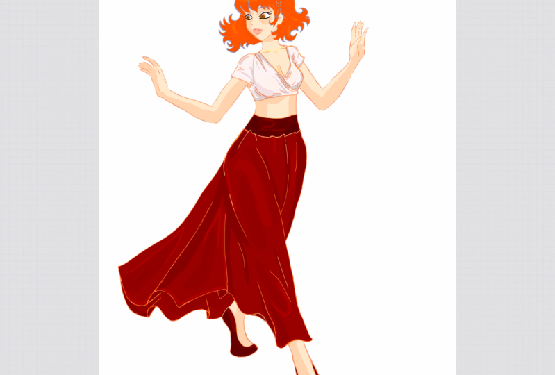
4. Feminine Outfit Sketch: Welcome back guys. You might be familiar
with this character if you are watching my
character design series, we drew on the previous
class on poses. So let's be smart and use previous drawings is
basis for our new ones. In this case, she will
become our modal. Okay, So as I mentioned before,
the rest of this class, we'll be focused
on outfits and how two different outfits can give a different impression
of our character. For this outfit, I wanted to
go for something feminine. And lately I've seen a lot of crop tops combined with
high wasted skirts. I also have a soft
spot for long skirt. They look silly,
elegant, and feminine. So I will go for a long skirt. Now that I have an idea
of what I want to draw, I will start sketching
it on our character. Now remember that close will
not be glued to the skin. There will be parts where the clothes will
be really close to the skin and others where the fabric will
sit more loosely. We remember from the
previous lesson that around the shoulders we will
have some tension points. And the same will
happen for the armpit. We will draw a proper folds and creases around these areas. This shirt will be
stopped in her skirt. So there'll be some braces in
the abdominal area as well. Now for the long skirt, you might think that
drawing glues clothes that cover the anatomy
or an advantage. And maybe if on a shortcut. But if done properly, you will look at the
artwork and feel how the legs are positioned
underneath the fabric. The fabric doesn't hide them. The fabric should be highlighting everything
that is beneath. So our character is
stepping forward, which means that the skirt
will flow backwards. In our case, that means
to the left side, this will add movement
to our close. Not only that, but since this current will be
flowing backwards, it means it will be
closer to the legs on the right side
of our artwork. This gives us the opportunity to highlight the shape
frayed by her legs. Thanks. Thanks for the loose holes on the left. If you don't know how to
draw false like this, let me show you a
beginner's kind of folds. You can essentially
apply this to any thing that has lose votes. Okay, let's delete the line
of the body because we are confident that our school
speak for themselves. So we know that her leg
is stepping forward. That means the fabric will
gather between her knees, but also her right leg
drags a big chunk of fabric in order to show that we will create some folds
that follow along her leg. Now I'm a bit unhappy
with the choice of shirt, so I will change it up a bit. I want something
with a VNet, fine, and I want the t-shirt
that will be short. Let's draw that. Thanks. Okay, Now this better, we can erase the body lines for good and start
refining our liners. I will let you watch
until the end. And I will see you
on the next lesson where we will start coloring. Thanks.
5. Feminine Outfit Coloring: Okay guys, so we have the
sketch for our feminine outfit. Now it's time to
choose the colors. But before we do that, let me just fill in the
colors for the skin and hair. I will let you watch the
process because I believe that a refresher on how to
do something is never bad. But if you are not interested
and you want to skip, go ahead and watch
from minute 12. I want to do this fast, so I will not spend time on doing the usual
grayscale method. If you want to see that you can watch any of my older classes. I will get started on this
and check back in soon. Okay, Now I'm back in. We have our model colored hope this short skin shading
them or help you out too. Now let's see what colors
to choose for our outfit. We want her to be elegant. So I instantly think around
the idea of red and white. These colors would also go
well with her hair color. And she would overall
have a warm pallet. So let's start selecting
and filling in the colors. Now that we are done with
filling in the colors, the next thing I
want to do is add the soft shading
in some key areas, like towards the
end of the skirt, on the right side of the legs, under the elastic belt, below her chest, and
around the armpits. Now something that I see
as a common mistake among beginner artist is using too
much airbrush on their art. A good artwork has a
combination between soft shadows and hard shadows. We already have
our soft shadows, so it's time to
create our hard ones. We can do that easily by
selecting lung areas with our lasso tool and have the
color fill option active. Choose the color to be slightly darker than
the base shadow. In order to diversify
your shadows, try to have a few of the heart shadow
spilled in manually. So the activate your
color fill option, select your shadow shape, close the selection, and then
fill it in only partially. We'll give it a gradient, make it more transparent
or even combined colors. And then look how good it looks. Now for the shirt, we want to intensify the shadows around the
points of tension. But when it comes
to white clothes, make sure you don't
overshoot or over highlight. Also use a constant
temperature for your shadows. If we use the warm color for the shade of the
skirt and the skin, the same will happen
to the shirt. You will not use black
when shading white coats. Use a new color. In this case. The lighting, we will also
go for some hard edges, create a new layer and set it to either Overlay Color dodge, or add and fill in with your
desired color of light. Remember to be consistent
with the temperature. If you use warm
light on the skirt, do the same for the shirt. Also, if you want to mix it up, only mix it up with
shading and lighting. That means you are allowed
to use cold shading and warm lighting or worm
shading and cold lighting. It's even recommended actually as it creates a big interests, but it also needs to make sense. In my case, I want the worm overall ballot in
order to enhance the feminity. One last thing, the highlights. Lately I've been a fan of doing this really bright transition between light shapes
and dark shapes. I will do this on
an adult ear and then adjusted transparency
as necessary. It's not the rim light
to be extra bright. So that's why I want
to tone it down a bit. Thanks. This is it. This is our first costume
and I absolutely love it. It's feminine, It's flowy. It has movement in it. So let's mix things
up and go for a less feminine outfit in our
next lesson. See you there.
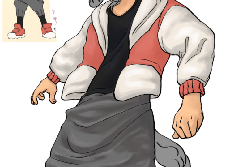
6. Comfy Outfit Sketch: Okay guys, we've finished our first outfit in
the previous lesson. Now, I don't really have a clear idea for the
second load with except the fact that I want it to
be comfy and include pants. So I put up together
a small mood board. I know I want the plans
to be a bit too lose. Not only do I like how
they look with the, with the idea of showing
folds increases. If you guys liked this class, I can make a follow up class of barbecue basically with
more different outfits. I would love it if you
could let me know in the discussion or in
the review section. I'm not sure if I will be
using the first image. The colors look awesome together and I absolutely
love this shirt. But I don t think
the shirt could go with the parents from
the bottom-right corner. But I will keep the reference even if for the
colors of the outfit. I do like the black
shirt though, and I feel like it's so
well with those parents. I also liked the whole
outfit on the left. But what I might take from
it is the scarf idea. Okay, So now that we have,
Let's start sketching. Now I have a rough sketch of what they want the
audience to look like. You can see that I'm using
this tarp just as I used to work in the first
outfit, that one. And to make it look like she's moving forward, stays back. Now what I will do is minimize the opacity of the
sketch and refine it. I will get the newest and we'll check back
in with you guys. Thanks. Okay, so now we have our line art finished
for this outfit. I want to use grayscale
method and I hope you guys will tell me which coloring method
helped you more. The Outfit. One method where
I would just jump in with a coloring or outfit to wear, I create a grayscale and set the values before I
choose the colors. For now, I will
just select them. We can fill it in
with a light gray and I will set some
ambient occlusion. That means the basic shading
that is not necessary. I would like first. Thanks. Shaping will almost always
exist in those places. I do that on a separate layer and blend the shading
again because I want it to be so we will do the hard edges shading
In the next lesson, I will see you there.
7. Comfy Outfit Coloring: Welcome back guys to
the final lesson. At the end of the
previous lesson, we put down the
grayscale base for this lesson and leave and
turned it to a pink month. Turning it pink removes
the possibility of getting muddy colors when you
start adding them on Multiply or overlay layers. So let's create a new layer, set it to multiply
and start selecting each clothing piece and see
what colors would look best. I will use this reference for
my main color inspiration. I will check back
in with you guys after I finish
choosing the colors. Okay, So we've finished
putting in our base colors. You can see that using the gray scale
method means that we already have some basic soft
shading on the clothes. And now we need to pick a light source and enhance
the shading accordingly. I want the light source to be on the left side of the
character coming from above. So let's start putting down the shading on a
separate multiply layer. Now we want to blend in
the shading that we put down before we start
creating the highlights. Also after blending the shadows, you will see that I
will spend some time to change the color of my lungs. I always do that after
I have the shading, figure it out because it makes the drawing look more cohesive, but more on that later. Now it's time to change
the color of our lines. You can do this by selecting
your line art layers, setting it to Alpha Lock
and coloring above it. I will do just that and
check back in snow. Now we are going to add the word highlights on a color
dodge or overlay layer. Check out your
reference and puts down some rough brushstrokes
and then blend them in. Don't worry, if you
don't like the color, you can always change it from the curves menu or the
hue and saturation one. Thanks. Now that we have our
relighting mapped out, it's time we reinforce
the shading. Remember, contrast is
essential in our course. When you feel like something is missing from your drawing, works on the contrast. Make your darks darker and
your lights light there. This is a perfect opportunity to get them some hard shadows. So I will be using the
selection tool and reinforce certain areas that should be darker due to the position
or due to the quizzes. Thanks. Now this looks so much better. Reinforcing the shadows
is always a good idea. Now for the final touches, I will try using some gradient maps to see if I can even has
the look or not. This is pretty much it
with the south tip guys. I really hope you like the
class and I will see you on the next lesson to give you your project and
some final words.
8. Outro: Congratulations for
finalizing this fifth glass from the Character
Design Crash Course. I'm so excited to be
doing this series of classes and I hope you are
loving it as well so far, I'm hoping to see many
entries from you guys because no matter how many classes
are tutorials you watch, whether they are free, you're not working on what
you learn will get nowhere. If you watch this
class until the end, I know that you are
one of the people determined to learn and
to get better results. Demonstrate that by
publishing your project, you will get detailed
feedback and you will also get featured
on the next class. Your project is to draw two different outfits
for the same character. Try to make them different
and see how they impact the personality
of your character. You can use some of the
references attached in the resources section
or find your own. Make sure you share your
project in the project section. And I will offer you feedback. If you found this class
useful in any way, I would love it if you followed
me on Skillshare so you could get constant updates
on my new classes. In-between the class
of the series, I'm sometimes creating
the short-term glass in a draw with me style. Also, please follow me
on Instagram as well. It's where I share all of my R-squares three to
five times a week. I'm trying to go for daily
wheels depending on how much time I have for drawing
and filming. On TikTok. I pulled two to three
times every single day and I absolutely loved
the community over there. I might start including shorter tutorials if it's something that you
are interested in, the next class within
the series will be about drawing a
full illustration. We will put everything that
we have learned so far in one seamless process and get the fully rendered
illustration until next time. Feel free to watch
my older classes for a refresh on previous
learning points. Have a great day of great week and the grid drawing session. Bye guys.
 Lara Militaru, Digital Illustrator & Coach