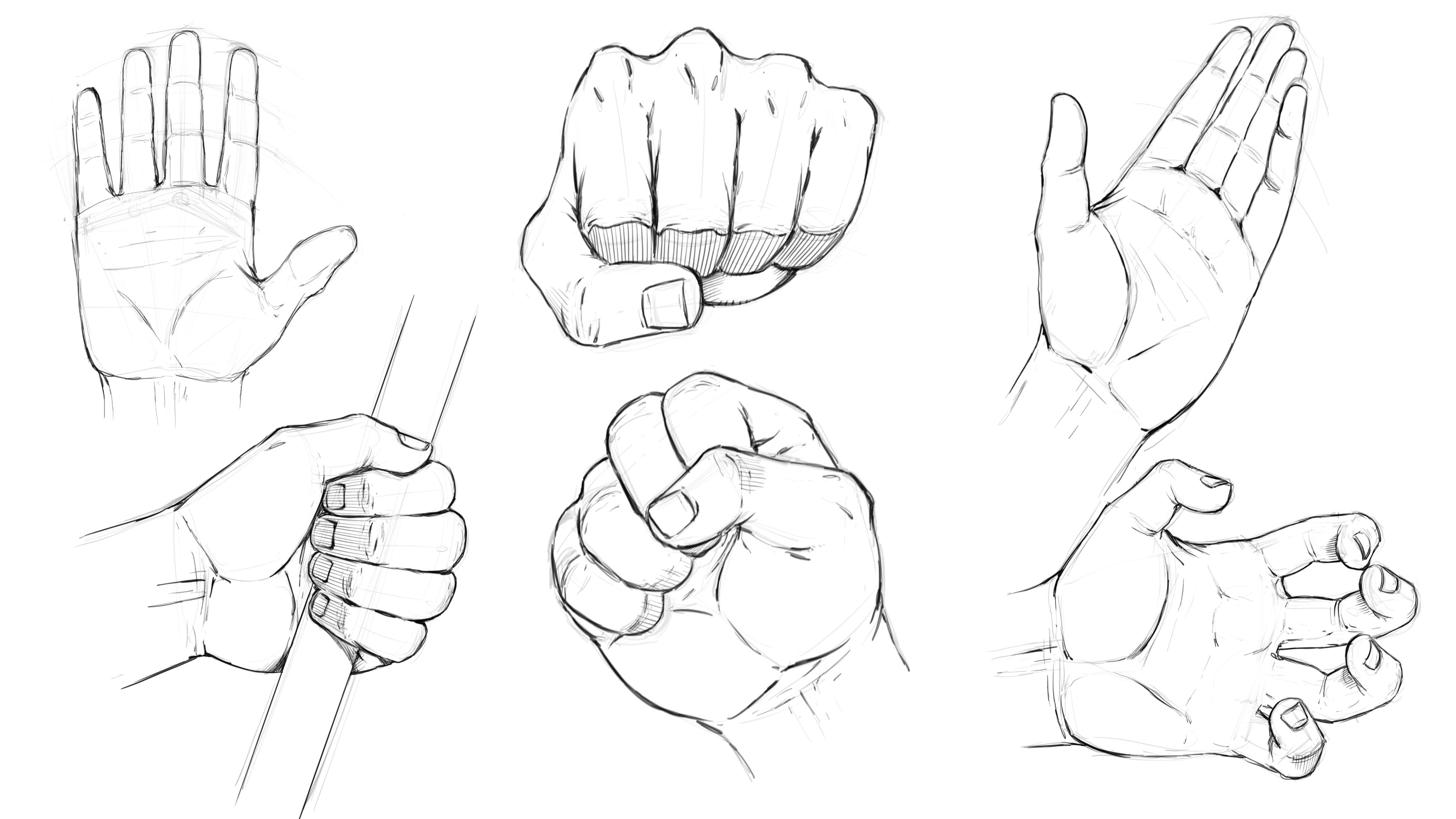
Transcripts
1. Introduction Video: Hello, everyone. My name is Robert Mars. Hello and welcome to my class. How to draw face by studying reference and a comic style In this class, you're gonna learn how to study from a photo and create your own artwork. So I'm gonna talk to you about placing the major features and forms of the face. Talk to you about how to use the reference but not adhere to it too tightly, so that you still come up with a pretty imaginative creation. This could be a great way to practice and really beef up your skills for drawing the face correctly and also give you a better visual library to draw more characters for your storytelling. So I find myself doing this often and always walk away feeling like I've learned immensely and that it's been very beneficial and worth the time spent. So I hope you enjoy this class. I'm here if you have any questions and I can't wait to see what we come up with. Keep drawn keypad and bond and I'll talk to you soon.
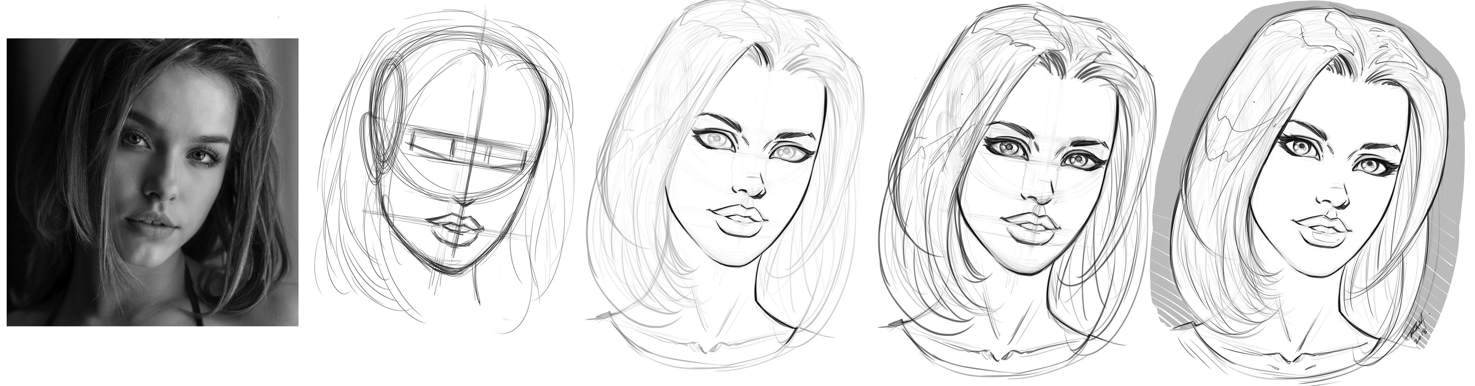
2. The Basic Forms: we'll have one Robert here. And in this lesson, I want to show you how to look at a reference photo and draw your own version. Eso, in a sense, a little bit of ah caricature. But not so much character words. Cartoony, more of a comic style. So just in a, you know, comic interpretation of, ah, the space so that you can hopefully implement this into whatever Fisher Ah, you're looking at doesn't need to be this particular photo. Just so you know, I got this from picks Obey. So picks obey has a lot of great creative Commons free resource is so that you can do your studies sharing things like that. So check it out if you wish. Um not paid in any way to say that Just sharing where I got this photo. So yes. So what I first do is start off by defining of the head shape, and I'm not gonna worry about this. Being some trace or exact replica is definitely not. In fact, they just want to pick up cues from it. But what I started with this kind of this Andrew Loomis method Ah, little bit shifted, but a circle here. Our spirit should say in the lips here, you can divide this. No. Well, I guess, actually, the way her eyes were positioned, you're gonna find the eyes based upon dividing this and coming over. But that's actually a little bit high. I made the Ellipse a little bit small, I think. But But in any regard, just kind of place. The major shapes will start with the sphere. Get in the, uh, the jaw line. Remember to kind of a line the sides of the jaw this way. So there's a tilt of the head, obviously, So you could establish that, you know, with a bit of an access line like that. And again, just kind of look for the alignment. So a lot of times when you're trying to convey beauty or, you know, whatever your perceived notion of beauty is, you want to think about symmetry or at least a basic alignment of the features. You know, you want to try to get some kind of float in alignment to the features, so keep in mind, this line right here isn't the center line. That's the access lines. I'm gonna draw the center line with Thea the chin. And just to make that a little bit more apparent, let me soft raise this bag. I grabbed myself to race and push this line back. I'm actually we just have that protrude out of the top and bottom, because again, it's just an access line, not the centerline. So what I like to do is get these basic forms into place. You see your neck kind of lines up with the mouth so you could take a little cues like that . We don't have the mountain place, but I guess and, you know, representation to the chin there. I'm gonna make the chain of my character a bit more pointed. So already I'm thinking about shifting away from things that I see here. And Duncan Morrow. It's beautiful face, you know, wonderful model there. But at the same time, I want to style eyes. This I want this to be a bit of my own Are I'm gonna change the hair. Many's the basic direction of the hair. Just get kind of this messy hairdo thing going on. Someone who actually confined those ah, locks of hair into bigger shapes. I think that'll work a bit better So, first off, I just want establish, you know, kind of these boundaries of the overall forms. So the main thing is the shape of the head, the tilt, the hair shape. That's about it. Next, we're gonna place the eyes. Now the thing I'll say, you know, that's most important about this is remember that the eyes air about halfway down. No, we don't see the full top of her head, but let's say it's right about here. You can see that based on that riser about halfway through that part, I do want to keep, even though I'm gonna style eyes it. So the line that you see appear minds up to the ear that I kind of placed. That's the brow line, not the eyes. So it's real easy, kind of mistake that a few different techniques here, you'll see some people draw in spherical shapes or on those air kind of egg shapes. But we'll start spirit Klay and then the work into it. You'll see this kind of weird, spectacle looking thing on my glasses. That's one way to do it. Another way is to just kind of position this rectangular shape across the face But you got to get good at looking through this because you know there's no rectangles. There's no straight lines in the face. But then what happens is the distance of the eyes is equal to one I and pay attention to how close her eyes to the very edge of her face. And then you get that space and going, and then also notice that there's a tilt to the I've eyes air coming up like this a bit. No, they're not completely straight across, so that's where these rectangles have to be edited. But you just want to put some kind of tell it like this, and then as far as the nose, I'm just going to start with a very basic downward shape. So it's basically resemblance of that part of the nose. I'm just gonna drop that in there, and that's it. Leave it alone. And you could probably notice that I have a little bit less room for the mouth. But I'm just gonna go ahead and try to place that, and I'll keep in mind the mouth. Generally, you can divide this into three in that top lip, so let's say one to three that top lips gonna go here. Bottom up will rest like that. You get a little dimple right there, but her mouth is slightly open. I don't know that I want to keep that part, but I do like the shape of her lips Got a very kind of, Ah, you know, full lips there, which I think is cool. So I want to add that in. So just remember, the mouth is kind of the stretched out M shape, and it tapers down work, connects and meats into the cheeks there. And the bottom shape with lip is really just kind of a, you know, lying across. And then it rounded kind of you shape and sea. Based on the way I have placed it, I'm gonna have to extend the Chen down a bit further. So a lot of these lines to me when I'm when I'm doing this or floating lines, they're gonna be getting nuts back and forth as we go. So, just like that, we've got a good start, you know, and probably ah could continue on and rough sketches. I'm pretty quickly now because there's a lot of base information in place, but I'm going to stop the lesson here, allow you to ah, you know, kind of practice this and and make sure you get the basic shapes. And so the main primary thing to focus on is the head shape. Also noticed that the head shape tapers and and gets thinner to the jaw. So there's a There's a taper that exists like this. An angle. It's very important. You can't see it as much on our model here because she's got a full head of hair. But, you know, if she was shaved bald sounds bad, you would see it. She you know, you could definitely see it from this side of the face right here. If you were to go from here to here, you can see that taper but the other side has been covered up by the hair. So just be aware that since we are drawing right through, also pay attention to get the eyes about the halfway point down, and ah, Then from there you will divide up the rest of the space of the face. Um, you know, just remember, the bottom of the ear will generally give you the nose top of the air will give you the brow line and then work down from there, divide the last area into thirds and be okay to nudge lines around. So with that, let's head over to the next lesson where we continue to refine this and even stylized it a bit, and it would come up with, so let's move on.
3. Adding the Facial Features: All right, So now let's continue on. Let's go ahead and get in a little bit more to the nose shape. So the main thing I want to pay attention, Teoh is really the dip you get here in the distance from the nose to the lip. That's probably the most noticeable mistake you're going to see. Most begin artists make, so there needs to be pretty tight to the ah, the nose. There needs to be a greater distance from the bottom lip to the chin, so just be aware of that. And you can think about the nose as a bit of a triangular shaped going back. But it shouldn't appear too strict, too, that even another big mistake is people draw like the line in just a rounded part and, you know, that's almost what it looks like. I mean, it does look pretty close to that, but it shouldn't appear that strict of a line. In fact, whenever you're trying to make character look pretty on my own opinion, I guess is ah less is more so you're gonna kind of hint to areas of the nose versus drawing . These defined strong lines all throughout the character. So a lot of times they'll actually stay away from tracing the entire bridge of the nose and just adding little hints to it. So something like that, what's going to get rid of, Ah, some of our sketch lines here so that we can see this a bit better like that lightly kind of pushes back. I tried to leave the lines in there as long as possible until I'm absolutely sure of the concept that I'm getting here, what I'm starting to get anyways. So the main thing is that we figure out the placement eyes based upon this. Now, luckily, we've got reference, but these type of techniques are really good when you don't have reference. Besides, the nostrils will generally give you the inter placement of the eye and X er, our preliminary marks have kind of establishment, which is great. And for me, when I draw eyes, I tried to capture that wall from looking at reference. I guess I try to do this regardless. I try to capture a feeling that it's rounded. So if I'm looking at this reference, I'm going to go with this. You know, this nice shape that she has there where it comes up and over. But I'm not gonna in here too tightly. In fact, I'm purposely bringing mine up higher. I'm gonna get in the tier, doc like this. And then I wanted to round up and kind of under that top eyelid. So that's what gives us that shape. Notice that it's more elongated on this direction or angle. And so the tricky part is when you come over to the other, I and you try to do that and you'll notice if you look at her eyes, they're they're slightly different because of the I'm not saying her eyes a really different, but because of the angle of the shot, you're always gonna get a different I from one side to the other. So that's probably that toughest part about drawing eyes. Is capturing one from one side to another and not getting this. Ah, this effect that you don't know where the shapes go, so it's always ah, almost always and everyone say, always with any phase. Ah, an upward bend right here. So even if it's ever so slight could get that in there. And there's a bit more height towards the middle and in this case, more towards an angle because of the tilt of the head. So it's pretty much, whichever way the eyes pointing. Uh, your eyes are generally gonna open up a little bit wider right there because the IAS spherical and so wherever that kind of directs the skin around the eye just kind of moves, you know, with that, give my poor sketch there. But that's ah kind of my reasoning behind it. And, you know, this size a little smaller, which really, if anything, this I should be a little bit bigger. Now, Billy thing is this. As I start to draw more animated character, I may purposely want to increase the size of these. Anyways, Right now, I'm just kind of focus in on the shape and seeing how much information I can pull from her eyes and then, you know, kind of come up with my own as well. So right now I'm just kind of studying, I guess. But, um, you know, because I also want to make sure as I'm doing this, that I don't end up with just a portrait because that's not really what I'm after him. After a stylized representation of this character, and I need to make sure it's in a style that's, ah conducive. You know what the way that I create so that I can draw this character from various angles s so what I'm gonna do is just kind of fell into my eyebrows and actually don't like those sort of made her look mad. So and the thing to be careful with that is that they are kind of evenly tilted back. And the more you bring him down the middle, obviously, the more angry the character is gonna look, trying to tell those back a little bit and still thinking, I need to edit those eyes little, But let's go with the pronounce it would come up with now. The other thing is pupil placement. This is probably the toughest part about getting eyes to look good and therefore pretty, because it's really easy to get this place in the wrong area for me. I recommend Dr Circles eso If you see him kind of circling the pupil, I find that to be a bit better. Um, just trying to dab in the shape. Now you can make it easier on yourself working digital. You could just dab circles in there and then move him around. But I try to practice this his free hand as possible so that, you know, when I got a drawing paper, I'm still going to get the result I'm after Now. The other thing I'm starting to see as I place these is that the forehead is coming out too far. You know, at least in comparison to our model. And again, I do want to make sure that I grabbed the proper, um, ideas from the reference and this would be one of them. So you need to bring this line bag. I think I was trying to really focus on that tapering that you get from the top part of the skull down to the chin. But in doing so, I made the line come out too far. So I do like the transition from her cheek to a job. I'm gonna try to get that in there. Now, if you're going for a more animated feel, then you could just get away with you know, a nice, smooth line like this eso that's popular in a lot of comic styles. Lot of animated styles. I do want a little bit of that transition in there, so I'm gonna actually do want to race it back that far about right there's, like, sewer rat. And so what I want to do is bring this and notice. There's just a little bit of a dip, and then the cheek comes out kind of lines up with the that knows a little bit. So use that his reference. And then you get some of that, uh, draw here that lines up its past outside of the eye there, but kind of use that for reference. You can also looked at it. You know, if you were to do a curved line right there, you see it. That ban starts to occur, or the bottom lip is. And again, this is tricky to do because as you're lining things to other parts of the face, if one things off, another thing will be off. So you have to really be aware of those decisions and ultimately just trusting your eye and making corrections as you go. I've got a guest with the other, uh, side of the draw is because their hairs covering it. But, you know, we got this for reference, and we can just draw a line across. Hopefully not that crooked, but to figure out what that bend is. So I like that a bit better. Just show showcasing that cheek and that draw. Ah, little bit more. And let's see, let's go ahead and fill in some of the hair shape just to kind of figure out I'm gonna actually bring the hair back further on mine. Uh, again, I want to make some changes on purpose here because I'm trying to make sure I'm not doing a replica and a carbon copy of what's there? Um, mainly because I don't want it to look too much like a portrait and more like comic are. So I'm gonna allow the eyes to be bigger as they are. I'm gonna detail these a bit differently. I'm gonna stylized certain parts. You'll see that Aaron a bit the next woman actually bring it down further some of the long Ethan Mac, and I'm not. You go too far into the neck because I just want to focus on the face, but and then I'm gonna simplify the Hera's well. So it's another kind of comic book E type thing that I'm gonna do intentionally. So just get on some base shapes. Good information. Now, another good thing to keep in mind is as you do, this is to flip it. So we're going to try that now. So just immediately from doing that, um, I see the you know, the awkwardness of the space of the I hear the eyes too far back. And really, the position of the entire phase could be brought forward towards this line or the line needs to be redrawn. I don't know if that I don't think that fixes it definitely helps it not being so far apart from that side. But I think the line itself, I think we're showing ah, too much of the forehead. So it's It's really important to flip the work early on, especially for faces. I always see that it helps immensely with spotting these types of errors like this. I see it's more widely open than the other. So let's push this line back. You didn't bring this hairline further down, and I think once we fill in the eyelashes, that will help out, but more. But we're gonna definitely have to pay attention to this line. Work here. So again, flipping the work is imperative because it really help you spot these types of flaws. And had I flipped it a bit earlier, maybe I would have seen it before. I created the error, but it's just something that happens. I always find that I have to flip faces back and forth at least a few times. So now let's continue on to the next lesson as we try to correct this and see what we come up with, so let's move on.
4. Refining Our Rough Sketch: All right, let's keep adding to this. And let's also flip the reference So you want to just really keep analyzing this back and forth and, uh, yes. Where is I think a big part is the distance of the forehand. Maybe not. Let's see, what else keeps staring at this. And it was checked the side of the mouth again comes up to the inside of the iris, but I'm purposely making the mouth larger in the eyes. Large is, that's gonna shift. Um, just be the the way this shape is kind of defined. And then also, we don't really see this curve of the head so that I could be throwing it off a swell and and and I don't like the way I've got the part going right up the middle there. But we'll just that as we go. So all right, so let's go ahead and softer, racist. Now redraw it again. This will help us get rid of some of the rough lines, and we can go back in here and make a little bit more, uh, more of our style choices, so make sure to keep ah, the lines as a parent as you need. And so what I want to do is picking up the line work. You got to remember that, you know, for comic style, it's going to be a lot mawr, um, of a few thick lines than all this detail. So again, I really want to stress the idea that less is more with the idea of of lines because of more lines, you add. It's generally gonna make the character look more rigid or more elderly, but it takes away a softness. Eso If you're going for something pretty, you want to try toe, err on the side of simplicity. So, like France's with the nose here, I still want to get the primary shape in of the nose and maybe like a nostril here. But keep it really tiny. Maybe just the bottom of the Was that the wing plans of the nose? I don't we call that, but but I'm just going to kind of get some of that in there, like you'll see a lot of artists just take this shape and make it solid. I like that, though tried again with just just a line to get the non stroll line going up Yeah, I think I will do the solid effect. So So I'll get the kind of plain change when going up. Or better yet, let's just to reset back and omitted when sift, Alex Arias will get the I was coming up back bend to the top of the nose, and I purposely make it more pointed than hers. So you see her, She's got, you know, just more of Ah, the shape do you see here It's more dynamic of a shape. So I'm just gonna simplify. I'm just gonna put that their line there. I still can't make that line works. I'm gonna leave that out and then now for a limp. You see, I kind of wind out the space here, so I kind of correct that a little bit because she does have really pretty lips. So capture some of that and I always fight the urge to put this. I put a downward point there, and that's more my style. You see, that's definitely not there in her her lips. So I may do away with that. We'll see how it looks so. But the way that I generally shade the lips is I put just a little bit of shadow on the edges, and that's kind of evidence. And hers, uh, probably won't detail the teeth I can ever put the teeth detail in there. Make it look right, you know, like the space or whatever. So I'll just put like the little part of the gums that you might see what you don't see on hers, but or I'll just leave that out and I'll shade that end versus drawing it in. So sometimes it's best to leave some information to the color because it's not going to be so so prominent like a lion will be So we'll see something like that and again of purposely making the neck longer little Ridgeline for the shirt. Okay, so now let's go ahead and draw the I zone. And for this, I'm actually just going to stylized these. So, you know, I've studied her eyes enough now, but I'm gonna go with what I typically would draw for eyes. So I tried to pull a little bit of inspiration in the shape from her eyes. But then, as I go to do this part, I'm gonna fall back into the way that I do I Z, and that would be The eyelashes are kind of clump together as a solid shape, especially starting off all draw this larger shape rebirth. And also I like to go back and forth, you know, hopes to try to keep some kind of feeling of cemetery, not exact cemetery, but just a little bit. So it doesn't seem so odd, but I'll go from one side to the other and detail the eyes. But again, I'm gonna go for that solid kind of affect. Get that little dip in their little drop shadow from the I have teared out, just drawn some faint lines for the bridge of the nose. And with the eyebrows, I'll just tend to, you know, like what? Hers air doing their thick here. And they thin out to the bag in a little bit more stylized the way that I do them. But, you know, same idea thick. And then then which there on her is because of the way of the hair is it looks like it just ends rather thick. Okay, so now for the placement of the eyes, you know, just remember, the iris is about 1/3 across. I'm gonna go a little bit, a little bit larger began. Go back and forth, try to figure out Thea placement of the iris. Probably the toughest part for me getting just the right placement. Okay, I'm a flip this again. Now, I'm not gonna flippers because he had, um, trying to focus less on studying from from the reference photo. Now, remember that place one of the pupils can make a character look like, well, there either looking up at you or they're tired or unenthused. And also just be aware that now her pupils are pretty much touching top eyelid. But I think I want a little bit more of an alert look. So I'm gonna let the pupils be a tiny bit further away from the top Eyelash I lived. It's just a choice. But again, play around with variations of this. It's clear lines on there and again, Sanoma. I'm gonna make sure to ah, make the eyelashes a bit more heavy. We live here based upon this style, top and bottom. But the main thing is, they're they're wider at the end. And then as they come into the eye, there just narrows down. In fact, a lot of styles. You'll see it where they will met the bottom line to kind of reinforce this it's feeling. And this, uh, this iris over here is a bit too large, Correct that a little bit, and the shapes are feeling a bit too different now. The other thing is, her top eyelid goes around entirely like this. I generally will Mitt some of that, but I think I might keep that. We'll see, and I starting to feel like this. I, uh they're just not loveless. Too many inconsistencies, so probably redraw that a little bit. It'll probably do is after I fill in the rest of this particular pass. Uh, I'll go back through a bit closer and tried to correct this. And now the other thing is with hair. I want to simplify this. So a lot of times we can come up to the top hair shape and I'll throw in these kind of cartoony angles and it's kind of animated little flips. We had a little extra hair hair. Is he changing that quite a bit, but just more stylized approach. And then I also think about where the lights worse would be and obviously you don't really see this in the reference photo. But I think it Ah, that's a neat little dynamic to the work. So I do a couple of clear lines on the top. Could be one right off to the side here. Just kind of sketch it in and test it out. Basically, then the assured area collarbones. Yes, there's something like that. So now what? Will dio Maybe another flip it here that comes in front of this? Not sure if I like that, but but not we'll do. We'll head over to the next lesson and continue to refine this, and we're going to do away with the reference now. Thanks very much. You've been awesome to work with. Um, and the now, well, you know, tighten us up a bit more and see what we come up with. So what? That Well, let's move on
5. Detailing the Drawing: Okay, so now let's go ahead and try to clean this up a bit. So one of things I'd like to do is checked the eyes. So I'm going to make a, um, bit of a grid pattern and distort that overtop. Now, I know this seems like, Well, I don't have Maybe you're working on paper and you don't have these digital tools. But just remember, you can get good paper at any art supply store. I just want to show you the technique of doing something like this. Yeah. I mean, he's seen that we actually ah, put a lot of, um, you know, reference lines in place. So it's like, Well, you know, why did it seem to tell to And that's Ah, that's something. I have to take the blame on there because for some reason, I always seem to tilt the eyes. Now, the good thing is, I'm aware of that. So I tried Teoh correct it, and that's all you can really do, so don't know, Don't beat yourself up. If you have this problem, it's actually pretty common problem amongst artists. So what I'm gonna do here is distort this to I mean I guess I could just rotate it. But hey, let's just do that. Let's try to rotate it first. So I'm gonna rotate this and I need to find a common denominator. I guess so. Basically the bottom lip top lip, those air pretty lined up. The nose is kind of tilted, but the nose actually could tell that could actually tilt up more. Um, and then the eyes up just as I suspected that one eye is lower. So I'm gonna try to correct that eso when I'm seeing here is that this one and I think it would need all this information right here. It's like that. Let's go ahead and try to tilt this up a little more. Onda. That might be close right there. Let's just tap it up once. Yeah, that's a tough call for May. Something like that. And then what? I'm seeing with the noses that again the nose can actually tilt up a tiny bit more so we could rotate that. We could even move that out just a little bit. So forgive, because I know if you're not working digitally, you're probably like, Well, wait a second, What I do there It means getting out another piece of paper vellum and reworking it as best you can. But just little corrections like that can sometimes, you know, not necessarily saved the day, but make it come out a lot better. So I'm gonna draw through here, because if some of this hair doesn't cover up the neck, we're going to see some of that try to make cover it up. But something like that with a bit of ah, skinnier neck for this animated type Look. So now I can softer race this again, and I am still feeling like the sign needs to tell now the joys of not being able to see the exact floy er noticing. Okay, we're just gonna We're just gonna wing it. Not awesome winging it. But hopefully as we clean this up Ah, we can make more sense of it and make it better A bit better for you. Me? Okay, so there's are soft race like that. And now for the fun part of zooming in and tightening up the work. So we've got a lot of this in place. We want to know make our final decisions are final pass. So one thing I would say about this stage is still don't feel the need to over refine and put tiny little lines everywhere. You still want to leave some pretty significant lines like good line. Wait, uh, at least for comics anyways, So that's really easy to wanna overly detail and putting these nice little fine hairlines everywhere. But then, all of sudden, you lose like a certain, uh, feeling to it. And good thing to do is again think about simplicity and heavier lines generally are gonna work better for you because in the most comic work, it's like size reduction and things like that. So just allow yourself to go with these nice, bold lines. You can have them thin, thin up in areas for contrast and by comparison, But the nice heavy lines will read well from a distance. So that's what you want. And and those eyes were still pretty far off. So now what I'm gonna do is drop that paper back in and see I'm telling the truth. I think even that grid needs to be tilted more so let's try that rights there. That's pretty tough, but the eyes were definitely still off, so what I'm gonna do now? I tried to correct this. As I draw through it, make sure I'm on the right layer, which I am because if not, it would be blue. So what I want to do is first try to get in this top line, if I can notice. So I want to bring the distance. No, listen the same distance away from that blue line right there if I can. And I think another part of it is the probably the shape of the eye. But, um, the other thing is the position of the iris. So, you know, as we do something like this kind of a cross section and you almost need to think about this more spirit, Klay, as you do it, see that this one's, ah, a different orientation. So it would need to be back here more. Maybe right there. Some wonder if that's part of what's causing the issue, but joys of drawing eyes. Okay, there's one was tryingto my goodness, how just a little bit. So it might just be the placement of the eyelashes by comparison. So, for instance, nudging lines nudging lines around is so powerful because if you draw, you know, quarter inch one way or quarter inch another way. That ends up being a lot. Aziz, you as you work through this, so try to be aware of the, uh the thickness. Even if I kind of clean up this line and I start pushing it too far on the inside of the eye, it's gonna change the look of this. I first just want this as heavy set of ah, eyelashes. Can't think that's looking a little bit better, but maybe not. Just remember to, the more the face tilts, the more you're going to get the side of the eyeball versus the edge of the eyelashes like this. But in this case, I'm gonna leave that alone, and it's going to get an Thea Top Island. I tend to stylized this a bit as well. So that's what you see me doing there so that lines going right through that blue line, okay. And what I want to dio I'm actually gonna wait to do the, um, the irises last and I think that might be part of the problem. But we'll see here, So I get the eyebrows in again kind of stylized He's just a little bit couple little gaps here. And you see, I still want to put this other nostril in trying to get that in with a slight shadow. Okay, And now for the mouth. So a couple ways to do the mouth for stylized drawing You can obviously just fill a men and show some glare lines. What I'm doing is doing more of a line wait approach. So I'm just gonna let the line wait. Kind of show the shapes. Just remember, too, that the absence of lines generally shows a light source. That's why you see me doing there where I'm, you know, purposely doing something some a little bit thinner, some omitted, like the bottom there. Just little choices like that to make it look like lights hitting it. Same thing. I'll do a heavier line for the jaw and then I'll have it taper off and get dinner. And how much it out? A little bit of curve right here to the chin. And then again, kind of omit the other side. A little bit of a line break there. Okay, so it's pan back a little bit. All right, so let's wrap up right here before we get into the hair, because we're coming up on our mark. So we're gonna stop right here, will move over to the next lesson, will finish off the hair and the pupils irises and see what we got. So let's move on.
6. Final Details: All right. So let's get this. Ah, hair shape in. So remember, you know, be open to change in the shape adding these little wispy kind of chunks. The main thing is to try to get these into larger chunks or pieces because it simplifies. It makes it easier to kind of not only visualize but render out and you re create and things like that turn the character. All those things become easier when you simplify. Uh, the basic shapes you don't want to spend all day. Ah, drawing during your hair do for ah character when you've got a story to tell. So simplifying the work can be ah, really create advantage. So yes, so getting in these shapes And you know the other thing is to study hair often Ah, and kind of do what we just did here where you're taking, um, a reference and redrawing in your own style. You're basically don't want to do that with everything that's your cataloging it and converting it not only to memory, but ah to, um to kind of like your own clip are you know, there's a lot of times when I've been ableto reference things I've drawn before and, uh, use them in a pinch. So you definitely want Teoh study it and then reference it later and utilize it. Okay, So again, with the glare kind of what I do here is this, like the spend. So I'm picturing like that The highlights is bouncing around the shapes. And sometimes I have toe kind of throw the lines through here to get what I'm after. So something like that, there's lots of ways to really do this. And really, the glare should kind of be on the same side. So if it's like hitting here, it should hit on this side of the hair, this side of here. You know, it's, um you remember that light works like perspective with same rules, but ah, I'll be honest. A lot of times I just kind of throw caution to the wind and do what I think looks cool in this regard. So forgive me for that, because that's probably not the best practice, but it's just something I do. But I will try to get the glare a little bit on this side like them, and the main thing is that you just don't put the glare everywhere. So, for instance, I had one kind of like right here, and that's not a bad thing. It's just you could be a little bit more strategic and probably get it to look more correct . So I'm gonna do that. I think that the hair is covering up enough of the the neck line. Here's we can push that back. And if the hair is gonna get colored in, you can use line, wait to do a lot of this. If it's not going to get colored in, uh, then it's gonna get filled in. Then you're gonna leave small bits of light where each one of these lines are. So a good way to do that is fill it all in and then come back with either a white out pen. Depends on, you know, obviously, the way you're doing this digitally, you can just convert anyone in your brushes to translucent, so it becomes very easy to black this and I know if this is light colored hair, you would pretty much be done right about here. You could add a few more little rendering lines whatever you want to dio, but you could just let the color Phyllis in and, you know, show the separation the difference. Little wrinkles in the shirt. Okay, so now back to the the eyes, the trickiest part. And let's see if we can get this right. Oh, I guess I forgot the little or shoe shape right here. And I could get rid of some of these rough land that are still in there. Okay, so for the eyes, I'm gonna start with what I think is the most correct. And that would be the one over here, so I'm gonna get the IRA. Sen. Nothing to keep in mind with this is that it's riel, uh, common or easy to think of it as just a perfect circle. And the hard part is looking at it like a small bit of an ellipse, remember, to to get the drop shadow on the iris from the brow that's gonna make it look more rounded . So, yes, So it's these shapes are going to be a little bit elliptical because they're tilted back towards the viewer. So, I mean, it's not very noticeable, but it's there. Andi, I've got mine looking more spherical, but, um, to something else to keep in mind. Okay, so I think that one's fine. But now the tricky part is noticing the difference over here. Now, the first thing I noticed is that this is a lot smaller than this. So I guess what I'm gonna dio is get this right out of there. What doesn't distract me as much? And if we were to map this out again, I said it's usually 1/3 but you could see minds a bit wider, so it needs to be a bit wider here as well. So I'm going to try to map out the distance of the white of the eye and then place the What is it right about here? I think we're probably gonna have to maneuver this. Well, let's try to get our spherical shape. Remember not to leave too much white to the top or bottom of the eye unless you're trying to convey fear or excitement of some kind. So I think it needs to be a tiny bit bigger, but not noticeably like a bigger iris or I and again want to try to draw that circle just lightly, sketching kind of place it and then fill it in the hardest single ever. Draw in life is a circle or a series of circles when you're trying to draw eyes, I guess. Okay, so now the drop shadow Ramirez should stop and look at those rights. When we stopped, it seems like it's a little bit lower. The pupil. Anyways, I was just try to put all the detail work on and see if it's gonna work, all right? And then I still want to stylized eyelashes a little bit more. But let's pan back. Let's get rid of that grid for a moment and let's flip the work because again, that's always gonna kind of help us to see any immediate inconsistencies. Yeah, it's really the shape of the eyes were just off of one is ah, coming up in a way more. Let's see here. Okay, so one more thing, we try to hopefully correct this, but it is. Ah, it seems to be a repetitive mistake here on my part. So I'm gonna try to just tell these both at the same time, prism up a little bit and let's flip it again and actually do this. Let's move it over. I'm gonna go this side and I'm going to flip one on this side. Oops. Horizontally. Okay. On what can I see here to narrow the side of the I don't bringing I last lower. Yeah, so that's a tough one. So, basically, let's just go with this one. And, uh, no one's perfect, but it's ah, I like it from this angle. And this probably shows some stigma I have with my own eye, but, um, I would think that if I just lower this a smidge but it's weird. It's like I've had to keep lowering it. Maybe it's the position in, ah, conjunction with the the eyebrow because I did just notice as I lowered this, it's a little bit too close to that eyebrow by comparison. Now, the other thing you can dio is, you know, kind of cheap and draw one iris and then maneuver it over eso I'll show you that just because this one is bothering me and forgive me, cause if you're not working digitally, this does mean a little bit of a cheat. You gotta get out the old light table or when we got there. But I do want to share with you exactly how I get through my daily routine without driving myself bonkers. So I would take this, move it over, try to position it and then fill it. And so, for instance, if I can rotate it if I need Teoh so I have less than fill in. But I want to keep those glares in mind as well. So what kind of check this from a distance like it needs to go up a little bit. All right, let's just go and fill that end. So this is me showing my, uh, my weak side, my weakness to you. And I think that's important anyways, because, you know, it's it's not. Everything in our art isn't perfect. Everything that we draw doesn't come out exactly the way we want, but it's how you ah, maneuver how you get it done on keep moving forward. That's really important, because it's easy to say, Well, this isn't right. I'm gonna throw it away, and I'm gonna redraw and I'm gonna redrawing memory drive and then all of sudden, you never get work done. For instance, um, you know, or you get it done, but throughout really? Ah, lengthy process. Um, but if you learn to make the best of it and get it on, you know, hopefully acceptable, Teoh your ah, your own liking or whatever, but to the client over your work with, um But you keep moving forward. You're going to see a dramatic improvement over time anyways, so they don't all need to be perfection. But they all do need to get done, hopefully in a timely manner. So this is how I work through it. I would love to know what you think and hopefully have learned from this experience and more classes around the way really soon. So thank you very much for watching good luck with your art and bye for now.
 Robert Marzullo, Online instructor of Figure Drawing and Comic Art