Transcripts
1. Welcome: What if your sketchbook
could become a visual diary of your travels, favorite places, and
everyday moments? Hi, I'm Fio, a watercolor artist
and sketchbook lover. I love using my sketchbook
to capture memories, places, and little moments from my travels in a creative
and personal way. In this class, I take you through my full
process for creating a watercolor sketchbook page inspired by a specific place. Together, we'll learn how to select meaningful
subjects from a location, design a balanced layout, create a cohesive composition, and combine watercolor, writing and small details
to tell a visual story. This class is
perfect if you want your sketchbook pages
to feel more artistic, intentional, and
full of personality. Whether you're
documenting your travels, preserving memories or simply enjoying the creative process, I hope this class
inspires you to fill your sketchbook with pages
that feels truly yours. So grab your sketchbook, your watercolor supplies, and let's start
creating together.
2. Class Project: Okay. In this class, I will show you how to turn
your memories from a place into a word Color sketchbook
page filled with colour, atmosphere, and
personal details. For your class project, you can upload your final page or one of the illustrations
you paint in your sketchbook. You can take this class
in only one session or take one lesson per day if you only have few minutes a day. So feel free to also share
your exercise spaces. Once your first
exercise is done, just head over the
Projects and Resources tab and click on Submit Project. You can give your project a
title, upload your artwork, and if you like, you can tell us a little bit of how this
process fell for you. Then just click
Publish and that's it. And of course, if you finish your full sketchbook
page, later on, you can always come back to your project and add new
images using this bottom. You can share your final
page when you finish it. I love seeing your work, and I often hear from
students how inspiring it is to scroll through
the gallery and see what other
students have created. Now let's move to the next
lesson where I'll show you the materials you need for
this class. I see you there.
3. Materials: For this class, you don't
need many materials. So let's start with a
watercolor sketchbook. You choose a format and size. This one is square, so when I open it, it has a two by one ratio. Also, you will need few brushes. This is my brush collection, but I only will use two
brushes for today's class. This one that is number
eight and round brush, and one small
brush, number zero, and round swell for
details and small areas. We colors, I will use these colors ultramarine
paints gray. Red, burn sienna
and also yellow. You will need also a
pencil and an eraser. This soft eraser is really good for work with watercolour paper. A ruler is really
important when you sketch bulky shapes like
buildings, a towel. Water, of course, you know, I use two glasses of water, one to keep it clean and the
other to clean my brushes, a palette for your mixes. And also we will use some pins. I will use acrylic pink, white, posca in two different sizes, and also I will use
black fountain pink. I have this caeco and
this one that is pilot. We're going to use this
for adding details and the text in our
sketchbook page. For the text, you can even use another color of your
preference if you like. Also some clips to keep your page flat while
you're painting and optional masking fluid
with a brush for it. That's everything
you need today. Feel free to use whatever
you already have. This process is very flexible. I encourage you to
experiment and explore with whatever will make
this class more interesting for you and helpful. See you in the next lesson.
4. Select Your Subjects: Okay, now that we went through
all the materials needed, let's start with
the exciting part. First, we have to write down a list of our subject selection. Give your list a title. It can be the name of the place. Keep your list short. No more than four
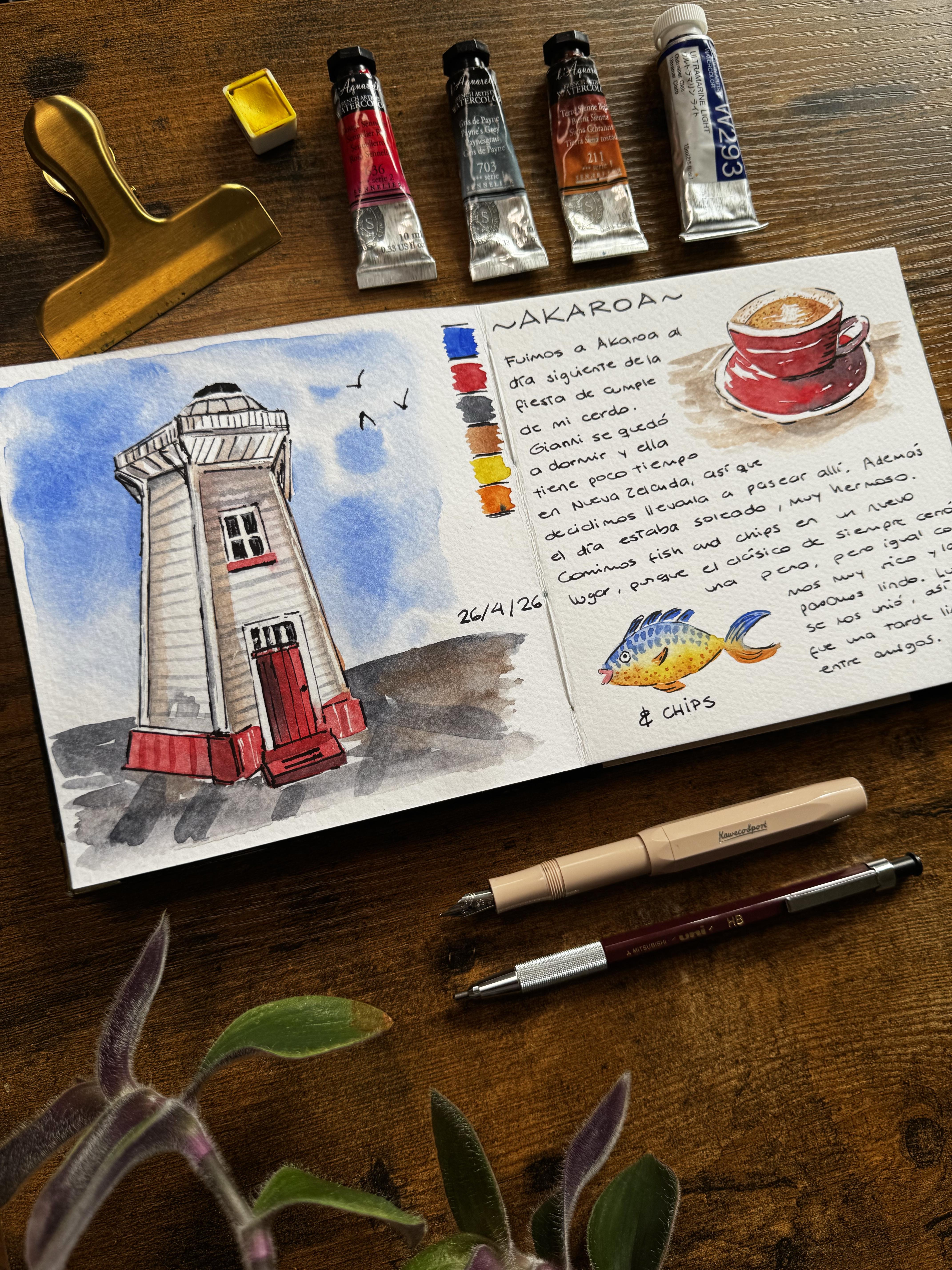
to five subjects. For me, my list is called Acaroa which is a place
here in New Zealand. It has a lighthouse, and the day I visit it, I had fish and chips with
my friends for lunch. And also, I had a Chai latte, and I have photos
of this, for sure. The landscape there
is beautiful, so maybe that could be an option in my
sketchbook as well. It has the sea and the
green hills. I love it. I also took a picture
of this boat park boat. So it's another option for including in my
sketchbook as well. Now that you have your list
with all your subjects, check the photos
you have of them. See which photo you like the most to use as a reference
for your illustration. This is my photo
of the chai latte. For example, I took many. It was on a red cap. This is the fish
and chips I had. I love the photo of
this boat parked there, but to be honest, the main attraction of this
place is the lighthouse. I love this photo I took that captures it from a
different perspective, and I like how it looks, the vibraal colors, the
red here, the shadows. So I will use it as the
main painting in my beige. And for the secondary subjects, I choose the chai latte I had the day because I
think that the red cap goes well with a lighthouse and the fish and chips I had
for lunch with my friends. So this is the lighthouse, this, and the chi latte. I like to make some heart
next to the subjects I choose and just fill the one
that will be the main one, the lighthouse, in this case. That's it. Now we can
move on to the next step, and that's all about planning
our sketchbook page.
5. Planning Your Page: Before painting, I like to
take a moment to plan my page. I like to use two pages for
one place in my sketchbook. So when I open it, every double page is
for a different memory. We have our subjects selected, so we can start
planning the page. For that, you have to consider the size
of your sketchbook. Take the same proportions and draw on a separate
piece of paper, the margins of your sketchbook. For example, my sketchbook
has square pages, so the proportions for the
double page is two to one. So I create three margins
here as a layout of my page. I use a ruler for that. And as it is squared, I just take a reference
in the center, draw a small dot, and then a line to know where
is the middle of my page. Okay, I like to include
apart from the subjects, the color palette, the
date, and some writing. That includes the name
of the place, of course. I have my reference
photo here on my phone, so I use them to make
some loose sketches. I said that the
lighthouse will be the main illustration
in my page. So I'm going to draw this first. And my first option is to draw it maybe here close
to the middle. And I just gonna start with some loose sketches,
nothing really fancy. Don't add much details here. The goal of this part is to define the composition
on your page. The name may be big on
the top right here, that child late
around this corner, maybe some text here. And the fish and chips, I notice in the
photo that the plate doesn't have a shape that
fits into my composition. So for the fish and chips, I want to play a little
bit because why not? It's my sketchbook and
I can be creative. So I will paint a fish, the animal, and maybe
just the word chips. Maybe here, I'm gonna
use a reference later. So it's a bit funny, and it will remind me
about that day anyway. I can do some
research about fish. The easy method is going online and have a look
on Google or Pinterest. I can just try to find fish. Yeah, easy, just for reference is similar to the
one that I just sketch. So why not? I also include the date
and the color palette. I have some space here for the color palette
that actually I left with that intention
and maybe the date here. Okay, so this is one option for my composition
on my double page. And now let's try a
different composition. This one maybe can have the
lighthouse on the right side. Here, for example, don't spend much time in
these sketches. They are just to help us
to choose our composition. It doesn't have to be
really clean or nothing. Maybe the child latte
around this part, and maybe the text, I mean, the title could be
like this in here. So texts here. The date and the fish
maybe here and chips. Okay. This is another option. I think between these two, as the photo of my lighthouse
is more is like this, I think that it needs more
space on this right side. So I like to keep
the lighthouse on the left side and have the
other subjects on the right. So I'm going to try
again to sketch the lighthouse on the
right on the left, sorry. But maybe now with a
color palette here, maybe with a color palette
in the middle of the page. So let's try again
one more time. This and this is like this. Like that. The color palette
here. Yeah, the chi. I don't like to have the fish on the top par because
I don't know, it looks like that it's flying because this
background would be the sky. So that's why I don't
like this option much. So I'm gonna keep the chai
latte on this top right area, and yeah, I like this one, but I think I like
this way more, so it could be very similar
to the first option with the name on
the top, the text, and the fish maybe opposite to the child to create some valence on this
right side as well, and the date maybe here. Okay, so I have
the options here, three different
compositions, and you just have to choose which
one you like the most. So depending on the format
of your sketchbook, you will decide a
different composition. For me, I like this one, so this is the one that I'm going to transfer
to my sketchbook.
6. Sketching Time: Mm hmm. Let's grab your sketchbook. I will start with a
light pencil sketch, placing the main
subject on the left, and leaving space for the other subject and
text on the right side. I use a ruler that is really
handy for drawing buildings or any other chunky item
like this lighthouse, for example, keep your
pencil sketch simple. I usually add more details with the paint and with
the fountain paint. I have my sketch here, but also the photo. And raise when you feel that you need to. When I took this photo that day, I was really close
to the lighthouse, and I think it makes it unique. It's not the classic
photo of a lighthouse. I mix some lines with the ruler and also some
loose lines, using my pulse. Feel free to use that as well. Remember to just use
your plan as a guide. You might want to
change it around because I know sometimes when
we are on the final page, plans can change, and
it's totally fine. In here and these ones
are more straight. Yeah, these ones
are even more in an angle like this or
like this. Mm hmm. And these ones are
more straight. Same on this left side. This one goes more outside, so I want to make this longer like this
and this part here. Okay, I need to draw
this step here. I go to delete some of the pencil mags I have
here and that's it. Okay, we got our plan over here. So I just follow
the composition and carry on sketching that chi
late on the top right side. For some shorter
circles like this one, I like to make some dots here and make a shorter
circle like that. So it helps me a little bit, and then I just
carry on sketching the the handle here. And the plate. And also the mark of the chi. I think that is more open. I think it's more open, so I'm going to open my circle
here a little bit to see more of the drink
like that. And okay. Simple way quicker than
the lighthouse sketch. And for the fish, I will use my reference from pinters again. Well, again, no, because I
didn't use it before but now that it's a proper sketch,
I'm going to use it now. And I said it would be
opposite to the child lattice. So I'm gonna draw on this side. I'm keeping it simple as I will add more details with
w coolor as well. And living space for the
word chips here, and chips. I'm living space
for the title here, the text, the colour palette, and the date as well that
I think I would change it from this side to this side, maybe I would see. So we'll move on the next step. And also, if you think
that you need a break, this is a good time to
go for a cup of tea or some water or even stop here for today
and carry on tomorrow.
7. Painting Time: I want to take the
opportunity of this class to show you
how I use skin fluid. I will use it for these
parts of the lighthouse, just some tiny parts on top of the door and in the window because I think
that they have a lot of light. I just take some product from the bottle and use a dish that I use only for muskin fluid and also a brush that I also
only use for this product. So I just open the
bottle, play some tiny, tiny amount of product here, that is more than enough,
more than enough. And with my brush, I just paint or actually cover these pencil
marks with masking fluid. This cross. And
these lines here. Clean your brush with
just your towel. I just have to let it dry
for a couple of minutes. It dries really quickly. And remember to always
always close your bottle straight after you
use it and save your masking fluid
for next time. Okay, I'm going to start
with this left side. Of course, I go to
start with the sky. So I have my bottles
of water here. You know, I use two
bottles of water. I have this pallet that
will use so I'm going to just start placing some
ultramarine blue, Kia. Keep all your brushes nearby. You know, I use
this brush only for active war colors
and make my mixes. I have this tiny piece of
paper to try my colors. I'm going to put my sketchbook
on aside just for a while, mix the blue that
I'm going to use for the sky and see if
it's the color I like. Yeah, it looks quite
intense. Or sky. But as I'm going to use
the technique wet and wet, it's going to look lighter. So I'm happy with this one. Let's try the red. I already have some red here. It's just classic red. So I'm going to activate
it with some water. I can feel that it's too light, so I'm going to
add more pigment. I already noticed, so I don't need to even try on my paper. Yeah, it's a nice red. Love it. Love it, love it. I need some shallow, so I'm gonna activate
a paints gray, on this spot for some shallows. It's quite dark, but it's okay. We'll add more water and see. Okay, this is lighter. Yeah,
I like this option more. I don't need it to be too dark, not for this illustration. And for the hail latte, I'm going to use born sienna, you know, for that
part of the liquid. I have some blue hair that
I'm gonna remove because I don't want it to mix much
with the born sienna. Now I mix the born
sienna quite light. If I need it more intense,
no, it's alright. Perfect. For my fish, I'm going to use orange and blue because I
like that combo. And I also have
orange already here. So I don't use it? I just activate it here. Quite intense, but it's alright. And some yellow that I
already have in the center. So I'm going to just
activate it a little bit. So let's see if it
still looks yellow. Yeah, still looks yellow. So this is my color palette, and these are the colors
I use plus yellow and orange that you can create your own orange with
red, yellow, of course. I have my brushes ready here. I'm going to wet this brush. This is the one
I'm going to use. I just place it
inside my glass of water to let it
absorb some water. By now, the masking
fluid must dry. I just double check.
Yeah, perfect. Anyway, I'm going to
start with the sky, so it doesn't matter if it's not completely dry now because I
don't want to paint over it. I like to start with light
washes and build up slowly. I use here the wet on wet
technique for the sky first. So I wet the paper with clean
water and then take some ultramarine blue from my palette and start with some
intense strokes, leaving some white
spots for clouds and other parts with
less intensity of color. So I wet everything here, all of this pot here as well, but living space for the color palette that
I'm going to have here. Okay, so just wait until there. Then close to the building, you can move your paper
to see if it's wet, really wet in the areas
that you want the water. If you page if you need
to clip your page, just use a normal clip here
that I'm going to use. And now I'm going to take blue and start with some
intense blue here. Leaving some white spots, as I already mentioned, pain before it gets dry. Okay, that is enough of blue. I'm going to clean
my sh a little bit, remove some of the
pigment and just I'm gonna pull the color
that I already have here. That this area as well, that. Clean your brush, dry it a
little bit on your towel, and maybe you can lift
pigment on some areas. Lift and clean your sh, lift and clean your sh. So, see, the blue look
really intense here, but as we use the wet
and wet technique, it doesn't look
that intense here. So I'm going to let it dry, and while we wait, we can move on to the
cup to the chilt, clean your brush really
well because it had blue, and now we're going to
start with the red. Okay, really simple. Just have your boater nearby to see the
lights, everything. Okay, I'm going to start
with this part here. I'm going to leave
a white space, negative space here
in the center. And here on this part, I clean my brush and take
with a tip of my brush only a little bit of
paints gray and more red. So it's a little bit
darker on this area. Just lay that, leave it dry. See if this part is dry. As the sky is still drying, I will carry on
with a chi later, but with a liquid part. So with a burn sienna
and with a lot of water, so I take burn sienna and
maybe some water with a tip, I gonna paint this part, leaving some parts
without paint, especially in the center. Take a bit of yellow and add some spots of yellow
here, and that's it. Okay, now the sky is yeah, it's dry, so I can carry
on with a lighthouse. For that, I've used the paints
gray that is quite light. It's this one that we made. So I'm going to start with this part that it has
some shadow here. This. And now you notice
I took more water, so still have a little bit
of pigment, but not much. So I cover this
pot and also here. Take more. I paint this top
pa also. And that's it. On this, I just
paint a bit here. I want it a little bit warm. So I take some of the Barcena. I paint here, this pot and
also on this pot this part. So it looks more warm. Okay, like this. Now the red. These pats Real right
here, really right here. Also the door is red, pain door, this ba
and also ups this ba. This bar is not, so with my drybush remove a little
bit, doesn't matter. Could be just a reflection. Okay? This pad the carry on. And in here, I'm going to add with the tip of my brush a
little bit of paints gray. There. Nothing else. I can carry on with
a cup of chil latin. So this is dry. Yes. So I just take some red and paint,
leaving some spots. This part inside the handle is a plate as well. So try to paint it. If you need to change
your brush, go for it. I'm going to take some paints
gray here this part is darker as the handle over it, but try to don't lose your white spots,
your negative spots. Carry on again in here, I think I will swap to my tiny, tiny brush that is
the number zero. And I'm going to carry
on with a lighthouse. It has this red frame
here under the window, so I go to paint it. And this spot as well. Okay, this is quite intense. And also, I will add on this
left side, some shadow. So with that paints gray, I add this shadow here, tiny, and then maybe more red. I know it looks not nice
now, but don't worry. Just give yourself permission
to flop, to make mistakes, to play around, and especially
be patient patient, okay? I will carry on with this side. Under this bad, I want
to add some shadow here. And inside the window, this spot with masking
fluid is black. So I want to paint
it with paints gray. And also the same in this part. On top of the door, you can paint over
the masking fluid. That is a nice part, but then you're not losing the light. So it's quite nice. Okay,
now this part is dry. Okay, I'm going to do the floor. This part and this. Okay? So just on here, you can add some boncena
just a little bit. Carry on with gray paint. Mm hmm. I like that. Okay. Now with your
tiny number zero brush, you can make the lines here. Remember the lines here, the perspective is like this, but then it goes
almost straight, and then the perspective
is like that. So it changed from
being here like that, then like this and
then like this. So keep that in mind. It's too dark. Mm
hm. Okay, like this. So I'm just gonna take like that and try to make them
more straight every time. Here, for example,
they're straight almost And the same on this section. Check that this is dry. Okay, so we can carry on. Like this, the same like
this, like this, like this. And then it goes like that. This pat has a shadow, maybe you can paint darker. To in this spot may be darker. It's almost done,
believe it or not. We just have to
make this part more clear to show that this
step and this part as well. Maybe more intense, more
red, more intense here. Same with this pot. I'm still using the
same brush because they are quite tiny spots, so I prefer to use
it to use this one. Then also, I do some of the
shadows here and just that. O, in this part, I can define a little
bit more the sit. Okay, I will carry on
with a chilla again, and notice that it's
pretty much done. I just need to
finish the handle, and then I take some dark
pigment like that, and the sit. I'm gonna leave it like that. I'm going to take some of the bon sienna and add some
dots here, here, like that. That is the cinnamon all
over the painted part, not on top of that
white part yet. In some areas closer
than in others. And now with this brush, I'm just going to make the table because it will help
me to define a plate. So I just do this. Just like that. It
looks really loose, but it looks nice. And with the born sienna, I'm going to paint a
little bit here and here, inside part of the cup and
just eat just like that. Maybe more on this section
and more on this section. Done. So we have almost
the child latter ready. Same with our lighthouse, we just need to add
some details later on with a fountain paint
and a posca paint as well. So let's move on to our fish. For that, I'm going
to use blue on this top area. Blue here. I could use masking fluid
here on the eye as well, but well, I'm just
leaving it like that. I clean my brush,
and I use yellow, okay, on this bottom part. Yellow here, and now clean
my brush quite well, and I'm gonna mix these two
together in the middle. Keep it like that. I'm going
to use some orange here, orange orange a little bit
here where it's still wet. Done. So I'm going to
leave it like that. I just need to finish this
section that is blue, and I will do the same
as it did in the body. I'm gonna mix it with
just water there. Okay, nice, nice, nice, nice. I'm gonna leave it dry and
carry on with the lighthouse. Okay, I just need to
add some shadows here. My photo has some shadows, so I think I'm going to add them with just some paints gray. Be careful to don't
put hand there. Okay. The clean
because I don't want it too intense there.
Just like this. Okay. And some more maybe
on this side and this side. Okay? And here as
well. Maybe that part. So shadow. Okay, I'm gonna let it dry and then
finish my fish. I'm gonna use this tiny brush. And I'm gonna paint
this pot more intense. And the mouth with some red, like the lips, quite
funny, just like this. Don't worry about perfection. This is a sketchbook page, so it's meant to feel
loose and expressive. So I'm gonna just
finish my fish here. It dries a little bit. Well, it's completely dry now, so I'm going to finish this. And I'm going to add some dots with this brush and
some lines here. More dots in this section, really, really close, really
tiny, just like that. And now I cling my brush
and I'm going to take blue. And do the lines here as well. And I'm gonna made some dots, but bigger than the bottom ones. It's like, so have fun
creating your own version. It's the first time
that I paint a fish, so I actually didn't have
an idea of how to paint it. But it's good to play. I'm going to finish the cup now, so I take some bon sienna. And on this top part, first, I'm going to delete
the pencil marks that I don't need anymore. So I take this, I'm gonna delete all of
this part, this part. Then I will add some dark
lines with a fountain pen. But now I'm going to
finish this part. So I add some dots here because the cinnamon is a little bit on this part of the cup as well. So I'm going to add
here like that. I clean a little bit, my brush, but just a little bit, so
still it has some color, and I'm going to
add some dots on the negative part.
Just like that. Maybe you don't see it well in the camera.
Okay, like this. You can see it there.
Okay. Done. So now is time for the details.
8. Final Details & Writing: Okay, for the details, I'm going to use fountain pens
and also white posca pens. I'm gonna test them here to
see how thick they are Okay. This is this. This is the
other fountain pen here. So it's slightly thinner. And for the post ca you
have to shake it first, of course. You know that. Clean it a little
bit, I'm going to add on top of this, okay? So dots and line. Same here. Dot on the line. Okay, so this is how they look. So we're going to add
details with these ones. Okay, let's start adding
details on the lighthouse. It's completely completely dry. I think I'm going to
use the aweco one, the fountain pen that is thicker and the
roller. Okay, okay. So I'm going to make the
line here and here as well. Also on this part. I mean, this area as well. Remember to clean it. Okay, here. This section. I can remove this now. I don't need it anymore. The door. I also
mix loose lines. Okay. In this section,
some lines here. So more lines here. By loose as well. So, see, it starts looking
nice way nicer than before. We the fan a little bit
next to the masking fluid. I also add some lines, and here are some
tiny lines like that. And the knob here as well, Okay, that. And now on top of these lines
with pens or Macs that we already have like that. So see, it starts to look nicer. And yeah, we can
carry on here playing with the interpretation we want to give to our lighthouse. This ba yeah. Okay, now we have to let it dry and I will carry on with cup. So these are the
final details here. I'm going to add in
this bag and also in this bottom part here. Just eat. And the fish, we need to finish
our fish as well. So I'm going to just maybe for the fish as it's
the tinest illustration, I will use this fountain pen because it's slightly thinner. So I'm going to make the eye Kia gonna add some scales that down. Okay. Now, we can add our
writing in my case. Ah. First, with a
brush that I use, I'm gonna add the color palette. So I start with a blue. It doesn't matter the order. I just start with a blue
because I don't know. No reason, clean your
brush, clean well. And then the red, leave
some space between them, of course, to mix them. So red. And what else
do you use the most? I think that paints gray. Quit light was light, yeah. Okay. And now the bon sienna, make it loose because I
think it looks quite nice. It's not a perfect square. Yellow that we use for the fish and also for a
little bit of the chi latte. And orange D. I think that is
our color palette. So while it dries, we can start with our writing. So I'm going to just
write down a caroa. If you like, you can
use your pencil first. So right here the name of the place or if you paint the
same as I did, it's okay, a caroa actually, I'm gonna put it's too
close to the center, so I'm going to move
it a little bit. So it's good to try
it first with pencil. So I'm going to start drawing. I'm going to start
lettering here caro. Like that. And now I go to just write down some of the memories? Okay, here, I need to put on chips because
that's what I said. I want to draw the fish
or paint the fish, but it's actually part of the fish and chips recreation
that I wanted to make. I just remember that while I was writing that I had fish
and chips for lunch. Okay, this is dry or almost dry. So what I like to
do is this, here, I like to separate a
color palette like this. What we need to do now is
remove the skin fluid. I'm going to use
some of this eraser, the soft eraser and remove it. Now remove this bad. Yeah. Looks nice. Okay, now that those white areas are completely uncovered, we can just finish our illustration with
some more details. And also, I like to add some
some white spots maybe here. Maybe in this bad and see
if you need more details. And here, I need two lines. I want to add those two lines. That is a step. Okay.
What I need to do just to make it more like nicer, I'm going to add
some birds here, some seagulls like this,
another like this. And maybe one more here. Okay, we have finished our page. Now I just need to delete the parts that needs
to be deleted. I still we have some pencil Macs and I just need
to add the date. So I think I'm going to
add a date on this part. I don't have much space. Actually, I like to add
the date quite big, as you can see, but I don't have much space
here or maybe here. Okay, this was in April
26 of April of 26. Done. See, I changed my mind. My plan was to put
the date here, but I noticed that I don't like this area
anymore for the date, so I just decided to add
a date on this part. Okay, see you in
the next lesson.
9. Extra Tips & Final Thoguhts: Before we wrap up, I want to share some tips for
your travel sketchbook. Make a list of places
you've visited with the subjects you want
to paint in your sketchbook, just as we did at the
beginning of this class. Then keep that list on the front or back
of your sketchbook. I like to paste it with
a nice washy tape. So when I open my sketchbook, I don't waste much time
thinking of what to paint. If you can at the date of
when you visited that place, so it will be easy to
find them in your phone. Other option, my favorite, is use the map option to find photos from
a specific place. You can zoom the map and find photos from
even some years ago. It may surprise you. Just remember not every page
is a winner and that's okay. Okay, well done for
completing this class. I'm already looking
forward to seeing your projects in the
project gallery. So don't forget to upload them. If you like, feel free to share your work on
social media as well. I love to feature students'
work in my stories. And if you enjoy this class, leaving a review really helps. Thank you so much
for being here, and I will see you in
the next one. Bye.
 Fio Ortecho, Watercolour Artist & Teacher