Transcripts
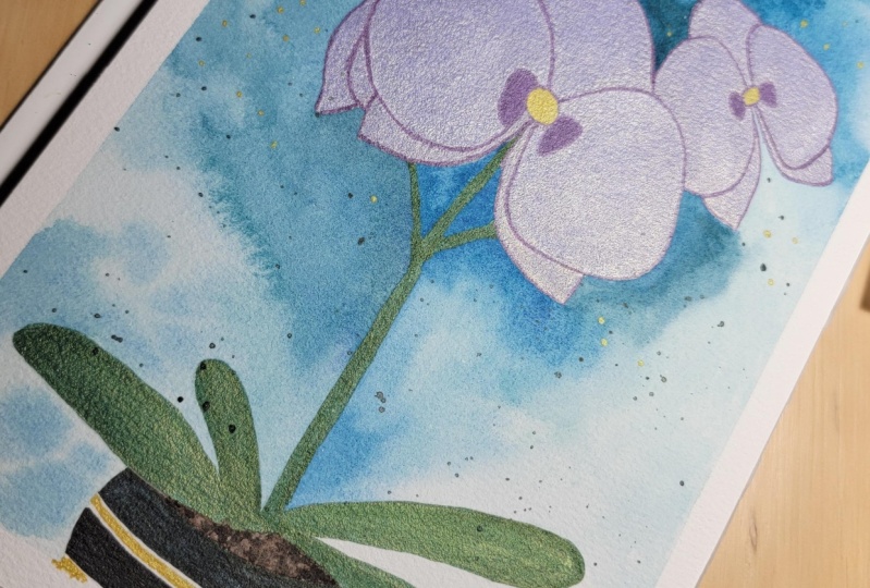
1. Introduction: Do you ever come across gorgeous metallic
illustrations on black paper and
think to yourself, how do they paint
on black paper? Well, together, we're going to create one of those
from scratch. Hi there. Am Theo Ortecho
an artist and illustrator. And run watercolour workshops and classes in my art
studio in New Zealand. While most of my work is painted with watercolours on white paper, there's something so deeply satisfying about painting
with metallic watercolours, especially on black paper, where it can shine the most. In this class, we'll explore this amazing medium by painting
a vibrant base of tulips. I will guide you through
every single step. We'll use this photo as an inspiration not to
recreate it realistically. That is not my style, but to craft a shiny
version of it. In this class, you will not
just paint this illustration, but you will also learn
techniques that you can easily apply and adapt to any other
illustration in the future. This class will be great for beginners or
intermediate artists. I believe that
having fun and enjoy the process is really important
for the creative process. That's why I made this class short, dynamic, and practical. It can be your next
weekend project. By the end of this class, you will have your very own metallic watercolor
illustration on black paper. Ready? Let's start.
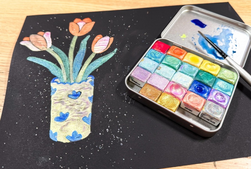
2. Class Overview and Project: Welcome to the class.
I'm thrilled that you are here on this journey of painting a tulips illustration using metallic War
Colors on black paper. Before we jump into the class, let's check the class structure and what your final project is. We'll start by exploring
the qualities of metallic W colors to get the right paint consistency
for the best result. Then we will explore two
different techniques that will help us to
achieve our final project. First, we will practice negative painting technique that enhances the colors
of the illustration. Second, we will mix two
colors to learn how to add the right amount of shadow and highlights for
depth on black paper. Then we will start with
our final project. First, we will create a pencil sketch as a guide
for our illustration. Once the sketch is ready, you'll dive into the painting, starting with the flowers
where you will apply and mix the colors while
painting each petal and leaf, getting the right amount of shadows and highlights
on the tulips. Finally, we'll paint a base
and add some details on the black background to give more shine to
our illustration. Throughout this process, we will use a reference
image to guide us, but only as a reference, not to try to recreate
it realistically. You are free to change
any detail that you want depending on
your preferences, your level of painting,
or your mood. I'll guide you through
the process so you won't miss anything to achieve that project at the
end of this class. You can follow the
same project as I am or use your own
reference photo. May be similar to the one I
will be using for the class. I encourage you to do this, or if you prefer you can paint a second
illustration using a completely different
photo reference and applying everything that you are learning in this class. Alright, let's talk
about the materials that you will need today. Mm.
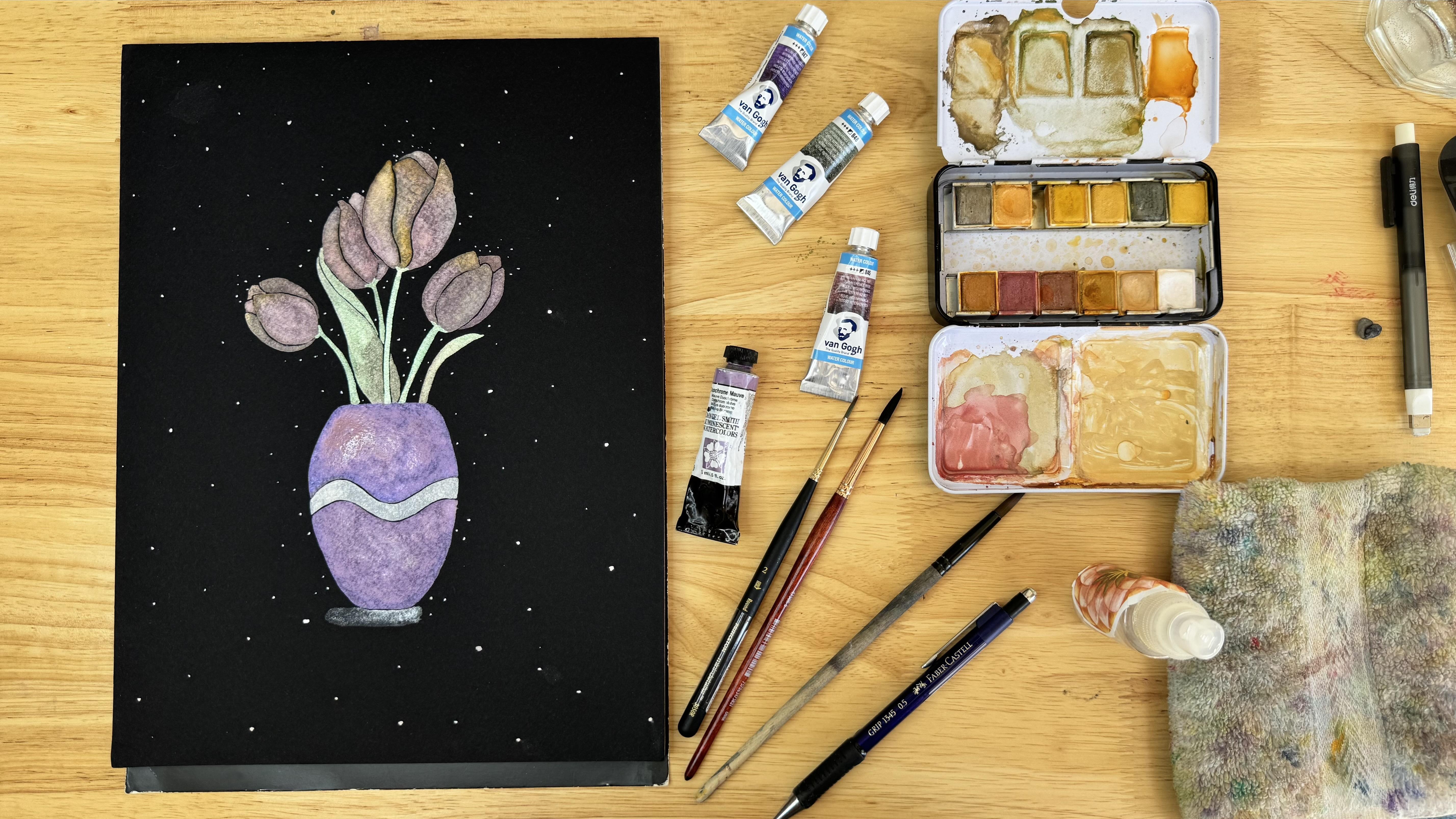
3. Materials: The first material
you will need is obviously the paint,
metallic work colors. Over time, I have collected different watercolour
sets and tubes. I'll be using
mostly Vangot brand that are the latest
that I bought, and I fell in love
with these colors. However, you are also
welcome to use any brand. Actually, I will
use a different mix of different brands that I have. The next thing you will need for today's class is something that you can't buy.
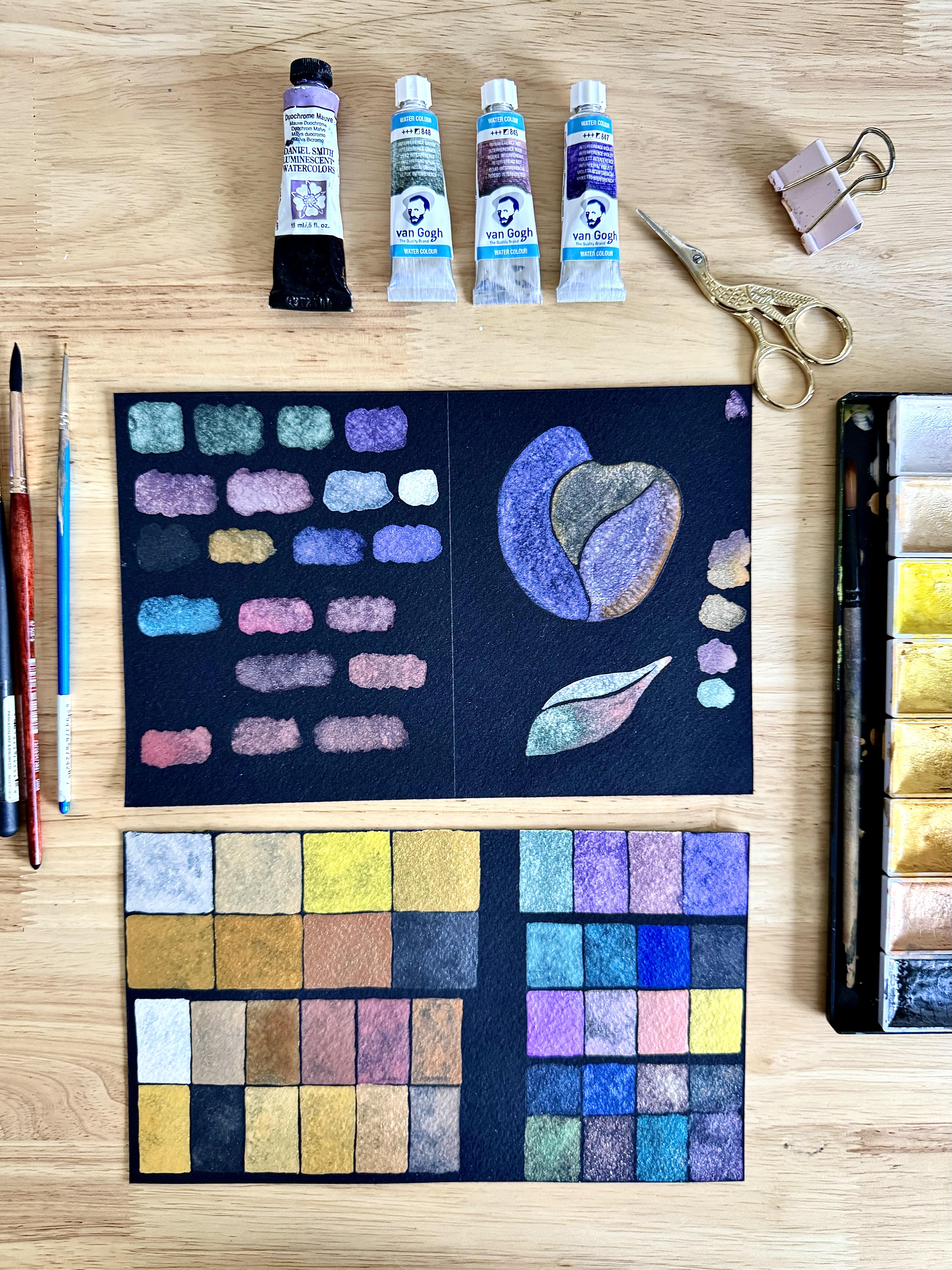
You have to make it. Yes, I'm talking about swatches, because you need to see how the color looks on black paper. With metallic paints,
that color can change depending on the
color of the paper. So just grab all the
metallic watercolor paints you have and make your swatches. For this, you can check
the next lesson to get the best paint
consistency on your chart. You also need watercolor
paint brushes. Usually, I paint with round
and synthetic brushes. These are number
six, two and zero. I also keep an old and expensive
brush to make the mixes. For paper, this class is all about painting
on black paper, but not any kind of black paper. It has to be for watercolour. Here, I do recommend you
the stone age aqua black. But if you don't have
this amazing paper, you can try with any
other black paper as long as it is thick
enough, 300 grams minimum. Between us, my first Metallic Water Color illustrations
were not on this paper. Besides this, you'll need a pencil for
sketching and eraser, a palette to mix colors, a jar of water, paper, towel or towel, and your reference image
for this illustration. So that's everything you
need to get started. In the next lesson, we
will learn how to achieve the right consistency of metallic colors to paint on
black paper. See you there. O
4. Paint Consistency: Painting with metallic we
colors is like painting with a completely different
medium instead of getting that translucent and
watery consistency like with normal wear colors, for the metallic ones, we want to get a more
creamy consistency. This would allow us to
cover the black paper. Need to understand how to mix your paint to the
right consistency. So on a different
piece of paper, we are going to
practice how to get the right consistency
for our paints. So you've got a selection of
metallic watercolor paints. It might be a set or a
selection you made up yourself. You squeeze out your paint from the tube or add water
to your w coolor pans, and we do this
with pans as well, so you can see how to
do this in both cases. Because pans are dried hard, they usually take longer for the paint to soften with water. You will need to add a
little bit of water to it and mix it in your
palette with a brush. So it becomes a
creamy consistency and has the right
amount of flow to it. Too much water and it will turn translucent and will not
cover the black paper. Too little water and the
paint is going to be dry and not allow you to
have a good brush control, as you can see here on
the bristles of my brush. The consistency is a
bit like double cream. Do this on one side of
your practice sheet, as on the other side, we will practice
something different. Practice this with as
many colors you have. For this, I'm using my
oldest and less fancy brush. So I save my favorite brushes
for the painting process. If I had to choose a few
colors to start with, this will be lilac, pink, orange, gold,
green and white, which is more like
a silver color. I'm going to use
mostly Vangogw colors because it is a brand that is quite easy to find
in many countries. If you don't have it yet, you can take advantage
of this lesson and start making your
swatches chart now. Here I'm going to
show you how I make my own swatches for these
paints that I have here. This is just a sample
set that I was gifted last year and I
haven't explored yet. In this piece of paper, I have all the metallic
work color swatches that I have so far. Next, I'm going to talk about negative painting technique. See you in the next lesson.
5. Painting Exercises: Paint exercises. Using a pencil, I'm going to make some shapes on this side of my
practice sheet. The first one is a round shape. But the important
part is to draw lines inside it to create sections. So we have three sections here. For the second
shape, I'm going to draw something that
resembles a leaf. And now, let's grab a brush. I'm taking a number
two size round brush. All we keep my other
brush on a side. Wet your brush and use the color skim you already
have in your palette. Now load your brush with paint. Here, I'm using a lilac. You can use whatever color you like as long as
it show ups well. And remember to get
the paint consistency. That is key. If you are
right handed like me, start painting the
leftmost section. Then continue with the
other section safely. Try to don't paint
a pencil marks, especially the ones
inside the shape. Next, I'm going to clean my brush and load it
with a different paint. In this case, I'm using orange. I like that color
scheme, orange purple. And here you have
to be more careful of not touching the first
section of this shape. It requires a brush
control skill. Okay, here I took my
bigger brush too fast. It still has water in
the bristles and it's making the consistency of
my paint more translucent. But it's good that this
happens here so you can see that making sure the paint stays the right
consistency is key. I'm trying now to grab more paint to make this
section less translucent. And then I will try to fill the last section of this
shape with a different color. Ops, here I touched
the previous section, so the colors now are mixing
together, but it's okay. I'm trying to embrace that error now and blending the
colors in that area. Okay, now the second
exercise, mixing colors. To achieve the right amount of shadow and highlights for depth, we will mix two
or more colors in the same shape instead of adding more water
like we do with conventional w colors
on white paper when we want to show sunlight,
here is different. Our paper is black. Toward these
highlights, we need to add a lighter color
instead of more water. So that is another reason for keep that
creamy consistency. The paint needs to
cover the paper, especially if we want to
show some highlights. So I'm going to load my brush with another color
this time green, and I'm going to paint the first third of this
section of the leaf. Maybe a little bit more, and then without
cleaning my brush, I'm taking a bit of red. First, I'm using only the tip
of my brush to load it with a second color and then
taking more and more paint. Just like this. So you have a gradient that
goes from green to red. Now, let's paint the other
section of our leaf. I'm going to paint a line
closer to the pencil mark, and then I'm going
to clean my brush, as this time, I want to
take a lighter color. So I load my brush with
white and start painting, trying to mix the two
colors on the paper. This time is not a gradient. We're just mixing the colors. So now you have homework to continue practicing
these techniques. Practice with at least
five different shapes with three or more
sections inside them, and paint each section
with different colors. To practice your brush control. Also, practice
creating gradients and mixing two or more colors
on another five shapes. Remember, your paint
needs to be at the right consistency
for this to work well. Don't overthink it. Have fun creating and
painting your shapes, experiment and see
what you can make. Remember, you can share this on the project
section as well. Join me in the next lesson where we'll sketch
our class project.
6. Sketching: And So now that we know how to achieve that negative space painting
with brush control, mix colors on the
same section and get that creamy
consistency of paint. Let's jump into
our class project, starting with the sketch. So grab your pencil and have an eraser handy as well
as your photo reference. First, let's find the
center of our paper. And we use a ruler here to
measure and find the center, which is where I want
my illustration. Begin by sketching the
outline of the vase. For sketching is
always helpful to use sic shapes to
simplify the process. So first the main oval
shape, it's slightly narrow. Try to keep the curbs to give the vase a natural
organic shape. We need to sketch
with an intention. We have to consider that
this sketch will later be painted using the techniques we learned in the
previous lesson. Sketching, considering
the next step will help us during
the painting process. Let's carry on with the tulips. Tulips have long, smooth stems
and large pointed petals. Begin by drawing the stems
extending from the vase, they may vary in high, some reaching up
higher than others, while others might vent
slightly to add a natural flow. Tulips often have six petals, some overlap, and others
are more visible. So to give my tulips
a more natural look, I add petals above the
ones we see in the front, which are actually petals in the center of the flower
and petals at the back. So only the top part
of them is visible. Varieta sizes for a
moralistic effect. I'm not staying stuck
to my photo reference, so I'm adding an extra
tulip to my sketch. Now, I don't want to draw
all the texture details, so don't go too far
on your sketch. I will add a simple strip
to the vase, as well, so I can have more colors and paint more, you
know, just for fun. Erase any unnecessary
guide marks, smooth out the shapes
of the vase and flowers to give them a
clean polish appearance. And that's it. Our
sketch is done.
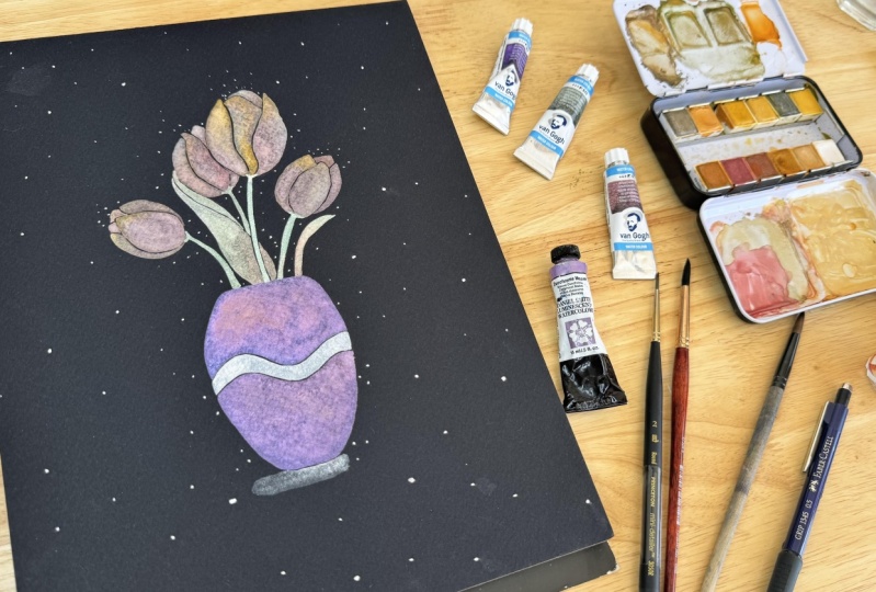
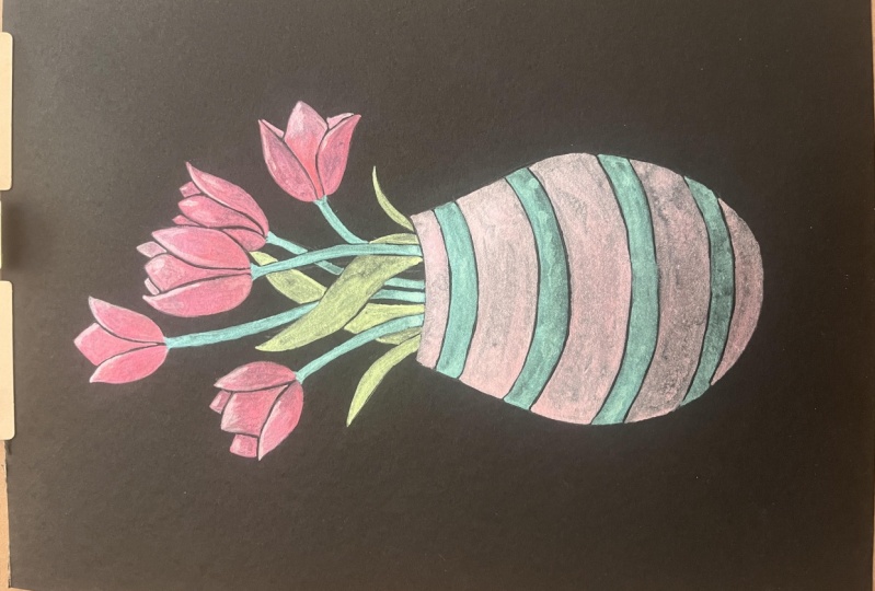
7. Painting Tulips: Now that our sketch is complete, it is time to start
painting our tulips. So for that, you need to
grab your other supplies. Here's what I got. I
got my reference photo. I have my purple with a sketch, water, and my paints
are over here. The colors that I'm going
to be working with for this painting are pink, lilac, orange, and, of course, green for the leaves
and white for lights. I mentioned before, I will use mostly these tubes
from Van Gogh. For choosing colors,
you have to check into your color chart because
as you may notice, the paint can look
very different on the paper as what it looks in the tube
or in your palette. So I'm sure about a
result of each color. I'm also going to
use a couple of golden and orange pans out of this set that I'll
just be using off to the side to add some
accents to those petals. So just I'm going to
activ them with water. And as you know,
for mixing colors, I use this brush,
my mixing brush. But sometimes I use
it to paint, as well. Don't think that
his only mission in this life is mixing colors. So start to active
your paints with water and remember to get
that creamy consistency. You can use a piece of paper for that and also to
test the colors. I'm using my photo reference, but just as a guide because I like to explore and
create my own version, I suggest you to do the same. If you are following this reference or if you're
using a different one, you can also change the
colors of the patterns. As a normal we color, you can create your
own colors mixing two or more colors from your tubes or pans.
Start doing that. Remember, we are going to make
gradients in these petals. You can test how the two colors mix
together on the paper. It's going to be pretty
fun because we have these really nice gradients on each petal of our
tulips reference. Really bright in the center, and then it smooths out to this really beautiful
pink orange ish tone. We're going to do the same
thing with metaliwa colors. I'm going to start with
my number two brush, and also I have my number
six and 30 brushes handy. Got my brush nice
and loaded with this really bright pigment and then start
painting one peta. Like it is a section
inside our tulip shape. The petal I'm going
to start with is the one in the center
right over here. If you prefer, you can
start with the one on the left so that you don't
smell the paint as you go. I wanted to start
with the biggest one, and if it's not comfortable for me to paint the
other tulips later, the ones on the left, I can just move my paper. I'm going to paint
on the pencil mark, but I will keep that negative space when painting the area
next to this one. Nice. I'm going to smooth out that paint a little
bit with white. Add the paint, try to mix it. You can clean your brush in
your towel to avoid adding too much paint and use your brush to mix the
colors on the paper. Add more of the color
you think it needs. Remember the trick here is
just not to let the paint to dry when you're still working
on that certain section. And Okay, now you can paint another tulip or paint
a petal in the center. You choose, but I
suggest you to wait. I know you may want to
see one tulip complete, but you know, the paint
is still really fresh, and as this is our
class project, I want it to keep that
negative space clean, at least on this main tulip. So I'm going to jump
onto another tulip. Remember that these tulips
share the same root, so I will keep them
all the same color. Of course, some of them can have more highlights
than others. As this tulip is smaller
than the previous one, you can set that brush aside
and go to the thinner brush. This is a brush 30. Well, it's quite old. It doesn't show the size, but I know it's triple zero. For me, as this number
two brush has a fine tip, I will keep painting
with the same brush. But you are free to change
your brush whenever you want. That is something that
comes with practice. You will get used
to your brushes and know when a brush is not helping you anymore and
need to swap to another one. Now, what I want to do is
also mix colors in this peta. So far, I'm using three colors
pink, orange and white. Be careful to don't have
water on your brush. If you have a drop of water, it will travel
through the bristles and ended up on your paper. And we don't want to lose that creamy consistency
in our paints. I will carry on with this petal. For this small petal that
is behind the front w, I want to paint it more intense. So I'm going to use
orange and red. This part is tricky. So breathe, hold,
paint, and release. That is the only way I can paint very close
to another section and keep that negative space and continue mixing
it with the pink. I have a drop here.
I don't want it, so I will remove it before it has the opportunity to
go into my painting. Almost every time
I clean my brush, it comes with extra water. That's why it's better to check it before start painting
another section. For the biggest tulip, I will paint the petal in the center with an
intense orange. We will continue
painting each petal. Remember, whenever you
feel like you don't have enough brush control
or things are getting a little bit
scratchy on your paper, just take more paint
to your brush, and that will give
you more control. We have almost all
the petals painted, and very soon we will start
with our green sections. To finish with the
smaller sections, I'm going to prepare more paint. And very carefully, I will
paint those sections. To go very close to
the other sections, I would change my brush for
the detailer one, the 30. Let's go ahead and paint the stems and leaves
of our tulips. For that, I have the
green paint, the red, and also white for lights and start by doing a fine
and long line with green. I will add a bit of green paint on the
bottom of the petals, touching the petals a bit. For this leaf, I'm going to
add a bit of red to play with the highlights and shadows and continue filling your
other green sections, playing with the colors. Our tulips and leaves
are now finished. Let's move on with the last step to complete our metallic
painting today, which is painting the
vase and the background.
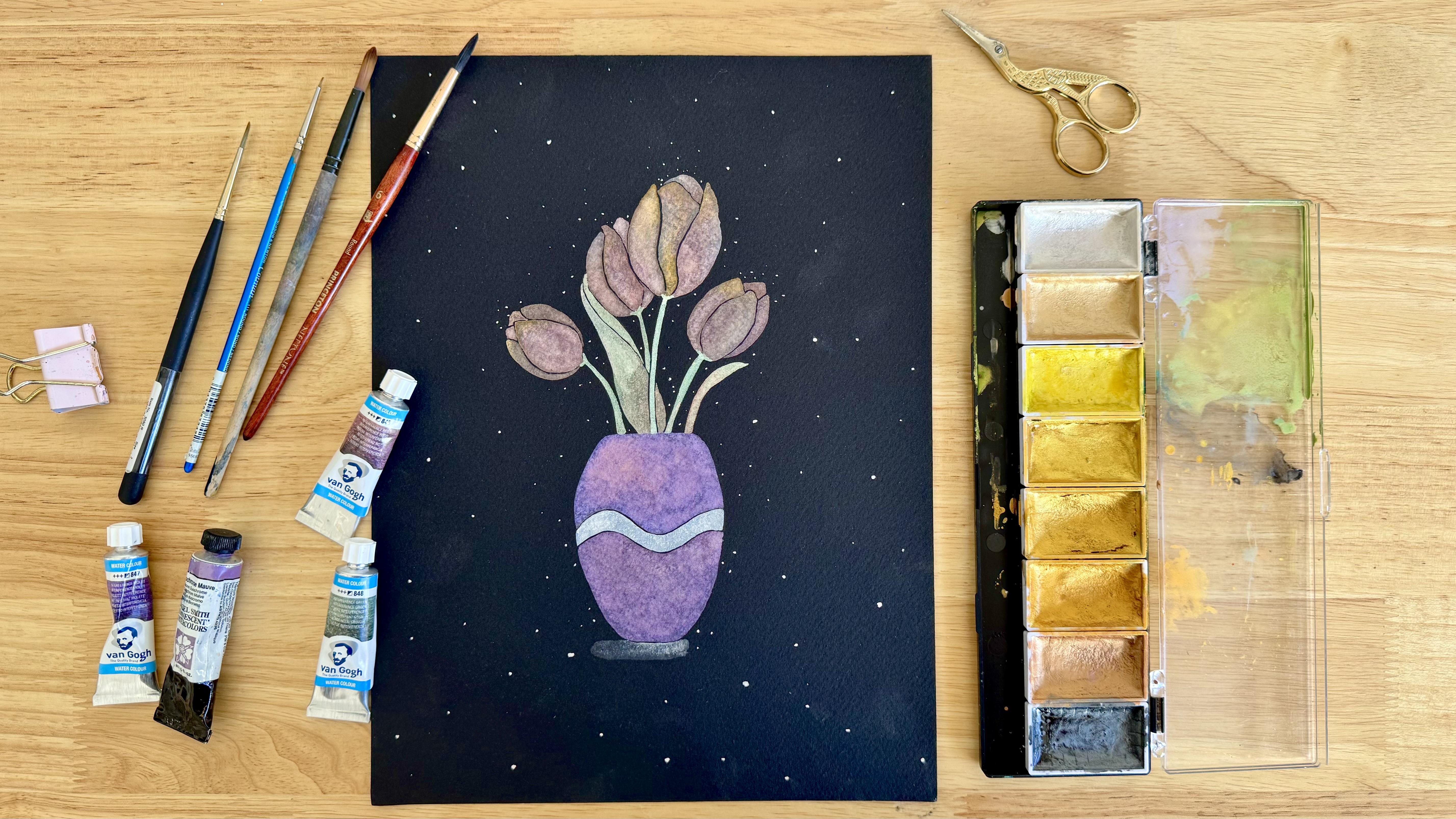
8. Painting Vase and Background: Now our beautiful
tulips are ready. So let's paint the vase. For that, I will use this
color that I have here. I want to paint a vase slightly different
from the tulips, but still keeping the
same color scheme. In our reference photo, the vase is almost the
same color as the tulips, but we make it more pinky. So I will activ this paint from Daniel Smith and get that
perfect consistency. For the vase, we
don't need to get that effect that we
got for the petals. So I will use only one
or maximum two colors so that iridescent effect will be more evident in our tulips. There are the main characters
of our composition. The vase will look more flat. I will use my biggest brush, the number six round
brush, and let's start. First, check your sketch. We have three sections
in our vase shape. I'm going to leave
this area for the end, and will use a
different color for it. So let's start painting
the two large sections. Load your brush with
paint and start painting. Okay, I noticed here that
this color looks too purple and I wanted it
more pink, but it's okay. My paint is still fresh. So I'm going to add a little bit of pink
that I have here on my palette and mix
the two colors on the paper to see if adding
the pink looks better. I like it, but I want it
more, even more pink. It's still too purple for me. So on my palette, I will add more pink and
get the consistency that I want and add it to this section while the
paint is still fresh. Much better. This is
the color I want. It's not that the
purple was ugly. It's more about, I don't want
to have many colors here. I want to keep my color palette. Carry on with the bottom
section of the vase. If you want to change your brush for the
cornes, just do it. Only check it is clean, and it doesn't have
too much water on it to keep that
creamy consistency. The brush I'm using
here has a good tip, so I'm okay with it. Then last but not least
the strip of the vase. You can wait until
these two sections dry, or if you feel
confident painting the strip of the vase
now, let's do it. Here, I'm using a
smaller brush than number two and start painting. Remember to breathe here, hold, paint, and then release. It helps me to control
my brush better. There are some areas
where we can accidentally let into that other section.
That's totally fine. These happy mistakes can make your painting look
even more interesting. Okay, our illustration is ready. Lastly, I will add some white
accents to our background. For that, I will prepare more of this white silver water color. And with my detailer brush, the 30, I will add some
dots on the background. I add more dots
closer to the pizzas, closer to the illustration and less dots closer to
the edges of my paper. Oops, this one doesn't
look how I want it. I can leave it, or I can take this opportunity to teach
you how to clean this. So with a big clean
brush and dry, I try to absorb it. Clean and dry the brush
every time you want to pick the pigment up until
you take everything. And be careful of not paint on that area
that is still wet. We can also add a surface under the vase with
the same brush that we paint a line with white and
try to blow it with water. So it will be more
intense under the vase. Continue filling the
background with the dots. And, Voila, our class
project is ready. See you in the next lesson
for some final details.
9. Share your Work & Final Thoughts: All right, and that is
the end of this course. I hope you enjoy it and
you found it helpful. So to paint with
metallic watercolors, you want to get that
creamy consistency and mix the colors on the
paper while painting. Now, please do upload your tulips into the
project section. If you want feedback from me, just mention that in your
project description. And don't forget to
check out the projects of your classmates and
show them some love. If you have any questions
regarding this class, don't forget that you can
use the discussion sections, and I will reply you
there. I'm here to help. If you enjoy this class, I would really appreciate
if you can leave a review. Your feedback means a lot to me and also help other creatives
to find this class. And don't forget to
follow me here on Skillshare to be notified
when I publish my next class. Thank you for spending
your time with me today. Happy painting, and see you
in the next course. Bye.
 Fio Ortecho, Watercolour Artist & Teacher