Transcripts
1. Intro : Hey, Dar. Welcome
to this super chill stress free drawing
class. I'm Joan. I'm an illustrator
based in Lisbon, and today we are using drawing
as a way to slow down, relax, and simply enjoy
the creative process. In this class, we will draw an abstract landscape
filled with flowing lines, organic angiometric patterns,
and playful shapes. But more importantly,
we will build a creative habit that helps you feel more present and at ease. We will explore repetitive
patterns and simple shapes and tap into the calming
meditative rhythm of drawing. Think of this as a
creative meditation. It's space to relax and create without any
pressure or perfection. This might be one of
the easiest step by step procreate colless
you'll ever try. All you need is an
iPad, a digital pencil, and percrve and
most importantly, a curious open mind
ready to play and chill. Alright, let's get started.
2. Canvas Setup: Alright, first, let's set up our Canvas and get
comfortable with the tools. Open Procreate and hit the plus size icon to
create a new Covas. I'm using 1080 and 13
50 pixels at 300 DPI. This size is perfect
for Instagram posts and also high resolution if you ever want to print your artwork. With this setup, we get close
to 400 layers to work with. Plenty of space to
experiment and play, but feel free to adjust the size based on what
works best for you. Okay, now that our
Covas is ready, let's pick our brushes.
3. Go-To Brush Setup: All right let's talk brushes, keeping it super simple
and stress free. For this class, I'm just
using a basic round brush. That's really all you
need to get started. Alright, I go to
the brush library, just tapping the
brush icon up here. I'm sticking with
Procras default brushes, so it's easy for you to follow along if you
want to do the same. I love a little
texture in my stroke, so I go to the inking section, and then here I
pick dry ink brush. This one is one of
my go to brushes. It's got a nice
slightly rough texture that still feels really
smooth to draw it. This is just a default setting. It's already feel good as
it is. I quite like it. But of course, if there is
a brush, you love using, go for it, no rules here.
One quick tip here. If you want your lines to
feel smoother or more steady, you can tweak the
streamline setting. For that, I just step on the
brush to open the settings, go to stabilization, and turn up the stream
line about a bit. It helps a lot, especially
for those longer strokes. You can totally adjust
this based on how loose or control you
want your lines to fail. Brush is ready, feels good. Next we will pick some colors
and get into the fun part.
4. Choosing Colors: I know choosing colors can
feel a little intimidating. Colors are super fun, but they
can also be overwhelming. So to keep things
simple and stress free, we are going to work with
a limited color palette, two main colors to create harmony without overthinking it. All right, here is the plan. We will use one color for the
background and another one is an account to make certain
areas or objects pop. Once we have our two colors, we will spice things up by
playing with different tones, lighter and darker shades to add depth and variation. All right. If you don't feel like picking colors yourself, good news. I already put
together a color shed with three created palettes, so feel free to grab one and jump right into
the next lesson. But if you want to create
your own custom palette, let's do it together. First, pick a main
color like blue, green, yellow, whatever
it speaks to you. I think I'm going
to go with orange. It's one of my favorites and
it has such a calming wipe. To pick it, I just tap
on the color panel in the top right corner
and go to the disc option, then choose a nice
mid tone orange, nothing too bright or too dark. All right, now let's
build on that. I will go to the classic
section and grab some darker and
lighter versions of this orange to add
variation to my drawing. Remember, this is your art. There is no wrong choice here. I'm just sharing
how I personally like to choose my colors. Next, I need my second color, something that
contrasts nicely with. I think I will go with blue. Just like before, I
will pick one mid tone, one dark, and one light blue
to keep things balanced. A All right. Now that we have our colors, let's save them to a palette. Just go to palettes
in the right corner and then tap the plus
button at the top, and then tap on
each color to add it to one of the boxes
in your new palette. When you're done with this one, you will be able to
see all your colors together in the brush library. That's it. We got
our colors all set, so let's warm up with
some stress free doodles.
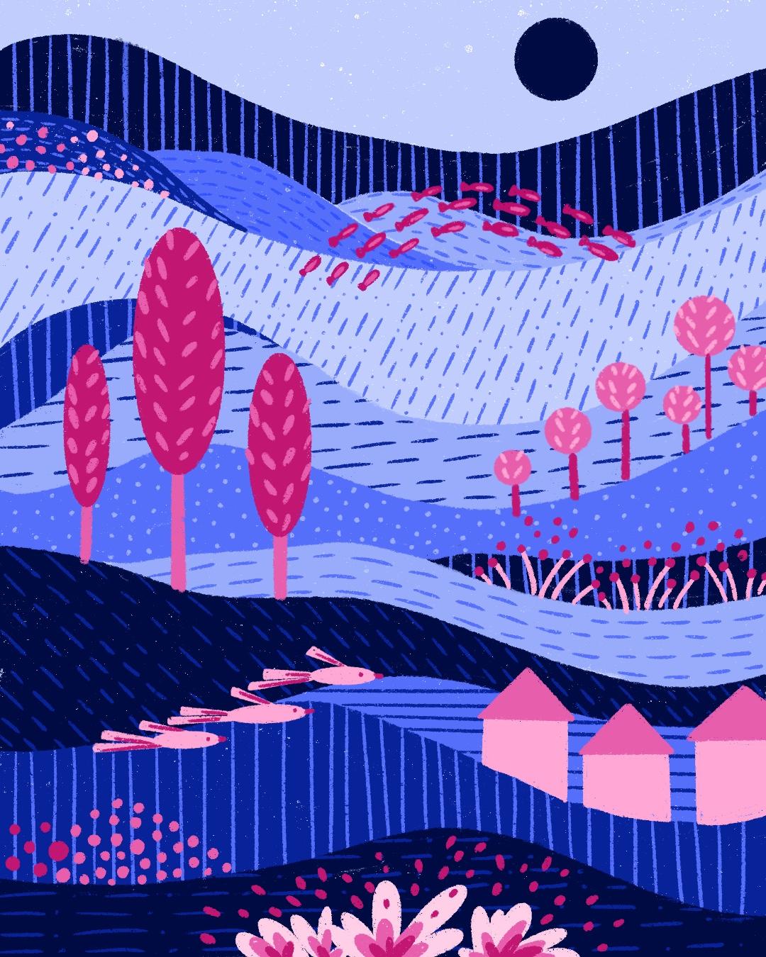
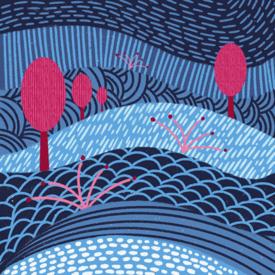
5. Flowing Lines: Base Layer: Alright, now we
are going to start building the base layer
of our landscape, and we are keeping
it super chill, just free hand lines
and no pressure. You can pick any color you
like for this practice. Alright, now let's
build the foundation of our landscape with
flowing organic lines. Start by drawing long wavy
lines across the page. I'm beginning over here moving from the left side of
the cavas to the right. Keeping it loose and flowing. You can actually go
anywhere you like, left to right, top to bottom. I honestly doesn't matter. The point is to
enjoy the process. I continue to add more lines. Once you get your
first view of lines, you can layer in a few more
underneath or above them. This time, I'm switching
things up with smaller lines, and here's something to keep in mind while you're drawing. Try to let your
lines either reach the edges of the commas or
intersect with another line. This helps create
interesting unclosed shapes that will make the composition feel more dynamic and it's important for the
next steps practice. Right, I keep adding
more wave lines, letting them flow naturally. Some are close together, some are further apart. It's all about variety. The beauty of this process is that there's no strict plan. Just play around and let the
shapes emerge on their own. I think I will add a few
more lines in between here. All right, I'm happy with this. This is our base
layer, and from here, we will start building
up colors and patterns to bring our
landscape to life.
6. Adding Colors: We are ready to add some
color and textures. If you don't feel like picking your own colors, don't worry. I already prepare a
color sheet for you. It's in the class file, so feel free to use
that as your guide. All right, first, I go to my layers panel and lower the opacity of the sketch layer. Then I tap the plus
icon to create a new layer and drag it
underneath the sketch. I always find that starting
with a colorful background makes everything easier
and way less stressful. So first, I'm picking
a background color. I'm going with this soft
light below to set the mood. Next, I crank the
brush size all the way up and I start
painting the background. You can drag and
drop your color onto the covas if you
prefer flat fills, but I more texture look. I also find it relaxing
to color by hand, so that's the way to go for me. All right, all done. Now we got a nice texture light
blue background. Next, we are going to paint
all the section one by one. I suggest creating a new
layer for each section. It's super helpful in case you want to tick the
colors later on. For color composition,
try sticking with the same color family
in different tones. Since my background
is soft blue, I will be using various
shades of blue. I'm picking a dark
blue from my palette. If you went with yellow, try using different
tones of yellow. It keeps things cohesive. I usually start
whatever feels right. There is no perfect
spot to begin. I just start drawing
over my sketch. If you are planning
to drop the color and just make sure you're drawn
a fully closed shape. I prefer slowly painted for that hand drawn
texture effect. The slower process can be
really common, take your time. I like how the light
blue shows through beneath the new texture
layered. It adds step. Now I'm going to keep going. Again, I recommend creating a new layer for
each new section. This makes editing
super easy later on. I'm picking another ton of
ball for the next shape. I just go with my intuition. It's really not about
choosing the perfect shape. We will be playing
with it as we go. I like to use my second
set for the edges, something around four person, and then fill in the rest
with a bigger brush. I keep coloring each section. You can go from light
to dark or mix it up. It's all part of the fun. I choose a little
darker and lovelier blue right under my
soft bulue here. I'm adding one more
layer to colouring. This time I'm going
with a darker tone, I decided to move from lighter
to darker colors as I go. Since I already have
my dark blue in, I want to use it for
a few more sections. Let's paint that area x. Maybe I will keep most of the darker tones concentrated
near the bottom. I All right, I'm about halfway through now. I think this next
polo a darker but slightly brighter shade will work nice in between the others. I'm just continuing to fill in the sections without
overthinking it. Just go with your intuition. There's really no right
or wrong way to do this. I'm just continuing to
fill in the shapes. Remember, you don't
need to overthink. Let your brush lead the way. I sometimes zoom out to
see the whole composition. This helps me to
decide why to add a pop of darker
or lighter color. If something feels off, you can always erase
and adjust it later. This is the beat of
working in layers, so I really recommend. All almost there, just a few
more shapes to coloring. Just trust your eye
and keep going. It's all about building
retime and flow. You might start to notice how the different tones of
Bolu play off each other. It really creates a
sense of depth and movement. Okay, all done.
7. Calming Patterns: Alright, before we dive
in into our landscape, let's loosen off with
some pattern play. This is like stretching
before we are cut, but way more fun and creative. You don't need to
overthink any of this. I already prepared this
drawing sheet for you. You will find it in the project
files ready to download. It's full of empty boxes that we are going to
fill out together. The idea is to come up with different kinds of
repeating patterns. It's a chance to play around, practice, and just mit. Draw tiny dust, dashes, wavy lines, whatever
feels good to you. Okay, let's fill these
boxes together one by one. Already, I'm starting
with the first box. I want to play with
the wave lines. I start from the corner, then repeat closer to the edge. Then I go into the
opposite corner, maybe make it even more dynamic. Follow the rhythm of
the previous lines as your guide ending with a
closed shape in the center. Draw carry lines that
follow each other like so waves or or
topographic lines. There is no right or wrong, let your hand move naturally. All right. Next one. Now
let's try a lose grade. I draw short vertical
and horizontal dashes, layering them randomly. It's like a basket view,
but super relaxed. I usually do three to
four vertical dashes, then three horizontal
ones next to it and keep filling
the box that way. All right. Now smooth
vertical lines. Let them curve slightly like tall grass blowing
in the breeze. So easy and calming, this is one of my gotos
for getting into the flow. Let's try one in
a similar style, but with the shorter lines. Create little girls of sharp vertical deshes and
then keep the spacing random. Let the marks dance
across the page. All right. Let's move
to the second row and try something
more structured. I drove a few
vertical lines then filag section with
diagonal lines going in the
opposite directions. It's like a fishbone
pattern, very rhythmic. It's one of those patterns
that looks fancy, but it's actually
really simple to build. All right. Next
one is super fun. Start at the bottom of
the box and draw rows of rainbow shapes stuck
like fish scales. You can keep them
even or play with the size for a
more playful wife. Okay, now time for texture, criss cross, short
diagonal lines in different directions. Think tiny overlapping slashes. You can use this
pattern anywhere to add a little energi
to your artwork. All right, let's
mix it up a little, pick a pin and draw short
lines radiating outward. There is no need for symmetry
here. Spread them around. Then maybe add some
longer lines to contrast, it creates a nice layered look. You can totally mix
anything with the software. All right. Moving
into the third row, now we are playing with
pressure and spacing. Use a ticker brush
or just press down harder to create bold
confident vertical stripes. Very wide and spacing
for interest. You can keep it slow, steady or orgols and Vigil.
Both are great. All right, I'm moving
to the next box. I'm drawing tiny uneven
dashes everywhere. Rotate your hands
slightly as you go to give them
different directions. It's like a drawing wild
field of little grasses, messy, but in the best way. Now, just let your pants
go around and have fun. You can draw short car
dashes in random directions. You can imagine it
like bird footprints or tiny flecks of moment. Just be free, let it
loose, however you feel. I all right, back to waves. Now create so flowing
horizontal lines that feel totally relaxed. Let each row follow
a routine building gently across the space. This one is super meditative, like watching raffles in water. All right, moving
into the fourth row, let's go playful
and wind skill now. You can make random
organic shapes, paints, splushes, cough spots, kidney
beans, whatever you like. No outlines, no rules. This is just pure
joyful mark making. And All right. Let's try some space
out vertical dashes. You can wear the
pressure a little to keep the feeling hand
drawn and imperfect. It's subtle but
really satisfying. A All right, maybe it's time for
some tiny dots, so simple but so suiting. You can even add a little
breathing practice here, you can breathe in
and then you can put a dot and then breath
up and another dot. It turns this into a
mini mindfulness moment. All right, last one. Just
like the wavy verticals, but this time running diagonally
from corner to corner. Let the lights move
freely and naturally. Another great one for bringing flow and calm into your art. All right, we did it. We explore so many different
patterns today, each one simple, meditative and super useful
in your artwork. They may look basic,
but they can bring so much texture and
life to your drawings. Remember, there is no need for perfect spacing or symmetry. Imperfection is what makes hand drum patterns
feel alive and human. You can even try
playing music or set a five minute timer per robe if you want to
deepen your focus, feel free to layer these
patterns into your art. Use them as background
textures or anywhere you want a
little visual writing. All right, that's it. You just practice 16
meditative patterns. Keep this sheet
nearby whenever you need a warm up or
creative reset. Hey, why not design
your own next? Make up a few new boxes and fill them with whatever
feels good to you. All right, now that
we are all loosen up, let's start our
landscape drawing next.
8. Filling with Pattern Play: Alright, we made it
into my favorite part, the most meditative and relaxing step of the whole process, filling in the sections
with patterns. This is where your
artwork really starts to come alive with detail
and personality. We already have our background
and we added color too. Now we can start playing
with the patterns. We already practice a
bunch of different ones, so now you can just go
with whatever feels fun. You don't need to overthink it. This is where you get to
be playful and intuitive. You can take your time
with these patterns. There is no rush at all.
Maybe grab a cup of tea, put some music on, whatever helps you get into
that creative zone. I'm going to start
with the top section. Find that layer and create a new layer right on top of it. Then I tap on it and
hit clipping mask. That way, everything I draw will stay inside the
boundaries of that layer. I choose one of the lighter
bolus from my drawing and just add some of the
patterns we already practiced. For this one, I'm adding
long vertical lines, drawing them from bottom to top. There is this wave
section going on here, so I want my pattern to follow
the curve of the shape. For this one, I'm adding some short flowing
lines and hatch maarks. I like to follow
the main wave line, placing one set
just underneath it, and then layering
more below that. You will notice it creates this really nice visual rhythm like gentle moment in water. It's super soothing
like doodling and it helps quiet the mind
and keep you focused. Plus, these small details really bring moment and energy
to your artwork. Sometimes it's also a good
idea to tap on the color of the section and just go
a little darker or lighter. That way, your pattern
blends in nicely and still stands out
enough to be noticed. Okay, all done with that one. Then I move on to another
section and do the same thing. You don't have to
create a new layer and clipping mass every time. It's totally fine to
work on one layer too. But if you want a little
more flexibility, you can do each new color or
pattern on a separate layer. This way, it's super
easy to change colors later on if you feel
like mixing things up. For the next area,
I'm choosing a darker to for the pattern,
not too dark though. Again, I just fill in the
space with a pattern. I want to do a line
one dot pattern this time and I'm also thinking about giving it a bit of angle. I find that tilting the
pattern slides the energy in contrast and helps break up the sections a bit
more visually. I like using different
patterns and different colors and
also different angles. I think it gives a nice sense
of moment to the drawing. A Maybe this time I will go for the
bottom section. You don't have to move
in any specific order, it's all up to you. You can fill in the pattern in whatever section you feel like. I'm using the same
pattern as before, but this time I'm
drawing it horizontally. Maybe I will go for
bigger lines this time. Next, I create another layer
on top of my section layer. I'm picking a different color, maybe another shade of bolo, and this time I'm going
with vertical lines, drawing them from bottom to top. I like mixing things up, so I play around with the spacing. So lines are close together
and some further apart. This variety keeps your
eye moving through the piece and helps each
section feel unique. There are no rules
here, and that's what makes it so much fun.
Just enjoy this part. It's all about experimenting
and getting into the flow. Trust yourself and
have fun with it. Okay, so now that you
got the hang of it, this is the part
where you can really settle in and enjoy the process. Again, take your time with these patterns. There
is no rush at all. Just let your hand move
however it wants to. As you're adding your lines
or dots or little doodles. Notice how they start to
bring your piece to life. Even the tiniest marks can
make a big difference. It's kind of like
watching a garden grow little by little,
things start to bloom. Hey, if you find yourself
making a mistake, I need to stop you
here because there is no such a thing as mistake
here. Roll with it. Sometimes the best surprises
come from happy accidents. If you're stuck on what
kind of pattern to do next, here are a few ideas. You can always go back to the pattern practice
lesson and check out the examples that I suggest
or just try simple dust, tiny dashes or spirals, see what feels fun
in the moment. And remember, you don't have to fill every section right away. You can skip around, just
jump to another area that's calling you and come
back later. Keep it playful. I love half this part of the process becomes
almost like a meditation. You are focused but
also totally free. Just you, your colors, your patterns, and a
nice creative grow. While you're filling things in, maybe think about
how you are going to bring contrast between arrays. Maybe one section has super dense patterns and the
next one is more open array. It's all about balance and
play with different textures. Don't be afraid to leave
some breathing room as well. It gives your patterns
space to shine. You can keep them
super close together, but then in the next section, you might space them
out or switch to that. There are no rules here. Together now, look at how
much movement our piece has. We are ready to move
on to the next section and add even more
excitement to our artwork.
9. Drawing Elements with Shapes: All right. An netssm we are going to take things
a step further and start creating some
really fun elements like houses, trays, birds, even little fishes, just using simple geometric
shapes, nothing fancy, just circles,
squares, triangles, ellipses, all the
basic geometric stuff. You will be surprised
how much you can do with just those shapes. Once you get the hang of it, you will start to see them
everywhere in nature, in buildings, even
in your own doodles. It's like a visual language, and once you learn to spec
it, you can build anything. So there is no need to stress. We are going to bring
everything down nice and easy, and I will work you through
each element step by step. You can follow a pause
whenever you want, and most importantly,
just have fun with it. Remember there's no pressure
and no perfection needed. Take your time, experiment,
and enjoy the process. All right. Let's jump brighten. Let's try to draw some trees. We are going to start
with some rounded shapes. I start with an ellipse and then a rectangle for the body, and then a circle next to it with another rectangle
for the body. You could also try a triangle if you want to change things up. Feel free to experiment
with different sizes and try imagining tall trees
or really small ones. Next, I like to work
on some pattern ideas on top of tree shapes. I will use ellipses, circles, or lines, really just
whatever feels right. You can draw the pattern in
some order or just randomly. I You can make them super unique by
mixing up the shapes and sizes and adding patterns
wherever you see fit. All right now let's
practice some houses. I basically draw
four lines to make a square and then three more lines on top to create a
triangle for the roof. If you make the bottom wider or shorter and try different
geometric shape for the roof, you will have a completely
different house. You can even add
some roof patterns, either vertical or
horizontal lines and throw in some
window or door details. All right. Let's try a bush now. Bushes are really useful in landscapes, even abstract ones. I start by drawing
three ellipses, all connected at the bottom,
and then color them in. Next, I will add another simllar almost identical shape inside
with a different color. This layering creates depth
and makes your bushes pop. If you want to get creative, try using triangles
instead of ellipses. Just throw three, four
different triangles, all connected at the bottom. And then add more triangles
in different sizes on top. You will create a
totally different bush perfect for your compositions. Now let's try an
animal, maybe a bird. I start with a big ps, imagining the bird
from the side. Then I color it in and draw a
few triangles for the tail. Try different sizes and
angles to mix it up. For the wings, I
try another color and I'm also using
a triangle shape. I choose a darker color for the wing on the opposite
side of the bird. Feel free to adjust the size and colors
to fit your style. Add a small triangle for the
B and a circle for the eye. All right, let's
move on to a ship. I start by drawing
a simple line, then another one going
down from the edge, followed by a third line. I complete the bottom with a
fourth line and color it in. Then I draw a simple line
from the middle and add a trianglon on top for the
sail and you have a ship. I know it looks
simple, but don't feel these basic shapes work
wonders in your composition, and they will look amazing when placed alongside
other elements. All right, let's
try some flowers. I draw several
lines next to each other as if they're
coming from a bouquet. Then I add circles in different sizes to
represent flowers. Mix up the sizes to give your flowers a
more natural look. Let's try some fish. I drove a circle then add
a triangle for the tail. Now we can play
around with patterns, try adding lines for
texture or details. You can experiment with
different sizes too, just like we did with
trees and houses. A All right, so that's
it for this one. You see how easy and
fun it is to turn the most Masic shapes
into cute little houses, trees, birds, or even fishes. Once you start seeing the
word through these shapes, it opens up so many
possibilities. Honestly, you don't
need to overthink. Just play around with the
size, position, and colors. It all comes together like
a little visual puzzle. All right, we practice drawing so many different elements, and now it's time to bring them all together into
our composition.
10. Adding Elements to the Composition: Alright, we have
our composition. Now we're going to
add some elements to take it to the next level. For the background, we
mainly use tons of polo, so to make a contrast
for the elements, I'm going with pink
and it's tones. I got a nice bright
pink pick dot. Now I'm adding new layer above all the others
to work with. We already practice drawing many different elements using geometric shapes, so
nowhere is there. I just imagine
where to put what. Remember, placement doesn't
have to be perfect, follow your instincts
and have fun with it. I want to start by
adding some trees. Trees can go anywhere in
this kind of composition, so I just place them randomly. Maybe I will start from here. I'm drawing a nice
ellipse and putting one finger down on the screen
to make it a perfect shape. Then I just rack and
draw my coloring. The background is quite texture, so I think it's nice to have
some flat colors on top. It's always a good idea to have one or two more trees next
to it in different sizes. I'm going to draw one more and maybe another
one on the left. I make sure the edges
don't touch each other. Their bottom and end lines
are all on different levels. This is good for a
nice composition. This kind of variety as routine and balanced without
needing to plan too much. Now I'm creating another layer beneath this one
to draw the trunk. I'm using a different
tone for this part, just very basic lines
for the tree trunk. The size is too thick at first, so I'm going with my
second brush option. It's a lot easier now since we already set the
bright size earlier. I'm basically drawing two
straight lines for each trunk. I hold my pen at the end to make it a perfectly
straight line, magic of digital
drawing. All right. Perfect. As you can see, I use the border of one of the Blow section as my landline and finish the trunks there. It gives the feeling
of a space or ground. Using existing shapes
in your composition as visual anchors helps
create depth and cohesion. All right, I want to
add some patterns to the trees to make
them stand out more. I'm creating a new layer for that just a few lines
to do the job here. Perfect, all done.
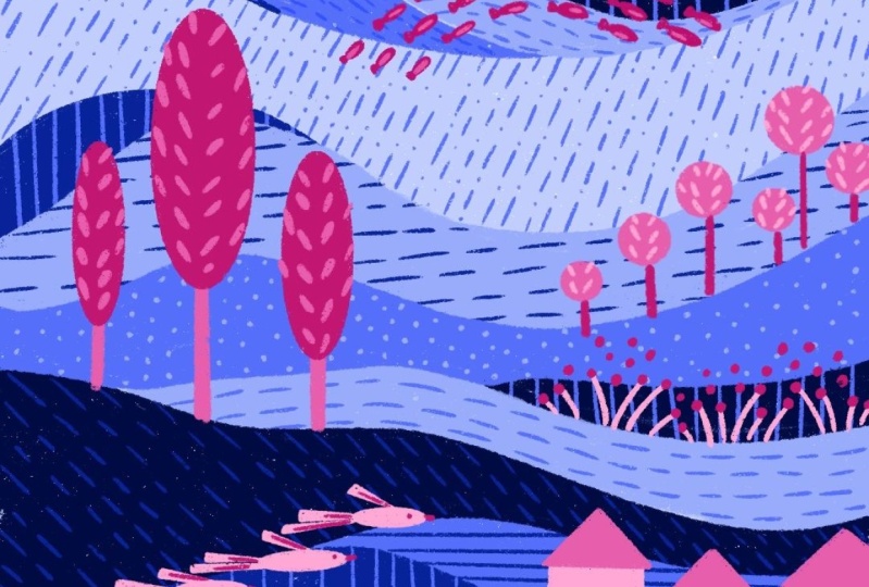
Already looks amazing, and it was so easy to draw. The three blue sections look like three
consecutive waves, that gives me the idea
to add some fish there. I think it will look
nice. This landscape, it's quite abstract, so no
need to look for logic here. That's the beauty
of abstract art. You're free to interpret. All right, new layer, I'm using
a different tone of pink. It's good to have
a variety in tone. Since we are only
using pink and blue, using different shades means
you can't really go wrong. I imagine a group of fish jumping from one way to another. I'm just throwing
many little ellipses and triangles for the tails. I want to add some
pattern to them too. Just using a lighter pink and drawing some lines on
top works wonders. Simple repetition
like this helps unify the composition
while keeping it playful. I forgot to add some pattern
on one of the sections, so I'm just going to do
that really quickly. All right, since we just finish that section, let's
add something here. Maybe some flowers. The
background is very dark, so I'm going to choose a
light pink to make them pop. I'm drawing a few lines
as the stems of flowers. And some dots in darker tones work great for the
center of petals. Keep contrast in mind, light on dark and dark on light helps your
shape stand out. Looks great. Maybe
a bit of cliche, but I want to add a sun too. The sky is very light blue, so I'm imagining a very
dark blue for the sun. Somehow I didn't want
this one to be pink because the sun still feels like part of the
background to me. I use the selection tool to
move it a little to the side. Now it's time to go
back and look at the whole composition
and see what we can add. I feel like some houses could
be nicer, as you can see, I'm using each section
as an opportunity to add more elements,
using them as a base. I'm drawing some rectangles using the edge of this
section as a guideline. I always aim for
lighter turns on darker background so my
elements don't get lost. Than just some smaller
rectangles for the roofs. Since we are using basic
geometric shapes here, it's important to create
diversity in shape and size. That mix of repetition
and contrast keeps the viewers moving
around the artwork. All right, I could always use more trees, just go for art. I'm drawing some circles
instead of Alepss this time. They are smaller and maybe
there are more of them. I All right, looking good already. I'm checking to see
where I can at more, maybe close to the bottom. Maybe I can draw some birds
flying through the sections. I use a basic ellipse for the body and triangles
for the tails and wings. If you have different tones,
make them stand out better. If you're ever unsure
what to add next, think about moment,
retime or story. What could live in this
world you are building. If you are struggling,
just go back to earlier lessons and practice
drawing different elements. Once you practice the basics, you will feel more creative and free to add your own ideas. It's not about perfection, it's about confidence
and creosity. Maybe last one thing
at the bottom. I think I want to add a bush. Again, I'm just
using ellipses and circles and different tones
to give up to the element. A All right, it looks great. You can always add more or
less totally up to you. All right, one last step here. If you feel stuck,
you can always add some circles and ellipses in groups and imagine them as flowers or just color
stains in the drawing. Believe me, they work wonders. A I'm quite happy with the result. Hope you enjoy the process.
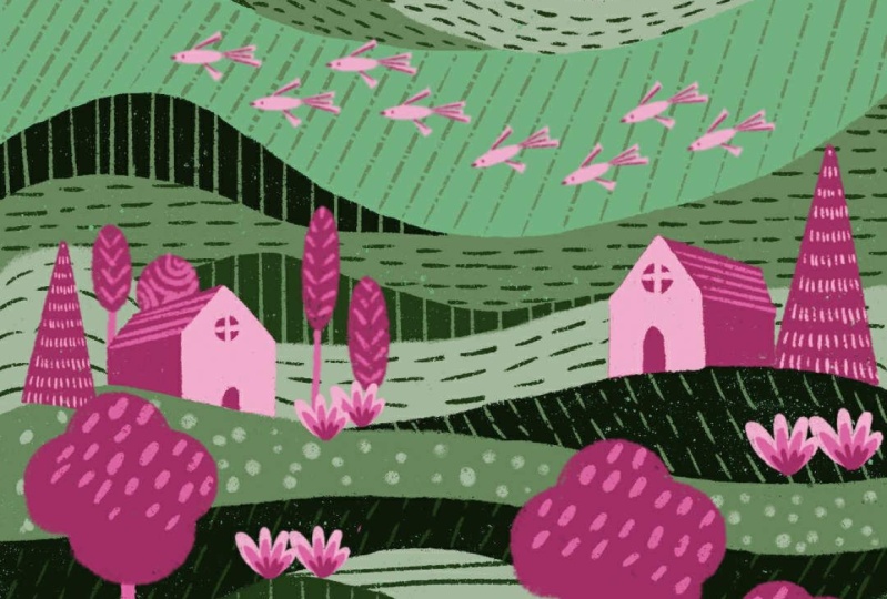
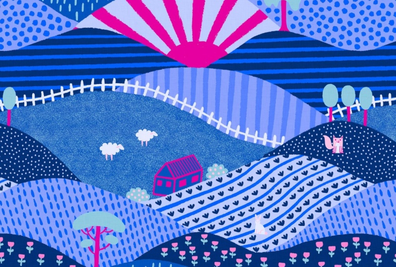
11. Final Thoughts: Great job. You just created your very own
abstract landscape. You let go of perfection, embrace the flow and build
something uniquely yours. I hope this class
has inspire you to keep drawing not just
as a creative outlet, but as a way to relax, recharge and reconnect
with yourself. Thank you so much
for joining me. If you would like to
see more of my work, get updates on future
classes or just say hi. You can find me on Instagram,
TikTok or YouTube. I would like to connect and
see what you're creating. Until next time, keep drawing, keep exploring and
remember there is no right or wrong on
your unique expression.
 Ceren Dabag, Illustrator