Transcripts
1. Intro : Every portfolio needs a powerful interior
scene illustration. In this class, I show you my workflow for
illustrating spaces with easy to follow steps
using Procreate and trust me, by the end of this class, you will have a new art board to add to your
growing portfolio. Hi, I'm Joanne. I'm a professional
illustrator living in Ola. Is Mitch I measuring
product designing college and then started
to work as a freelancer. I created my own products, created or exhibitions
and run workshops. But then I transition to the
digital illustration work. Now I teach online, solve my own illustrations and create custom
illustrations for clients if you want
to enjoy the word of digital illustration to
this class is for you. You will practice
throwing a subject. Every digital artists
should experiment. We did this one. We will
draw an interior seeing that can be easily a powerful
illustration on its own, but can also be a
good background scene for your character
illustrations. If you are unsure how to
get started with steps to follow or half to bring this unique touch to
your interior drawings. Then join me in this practice, you will get an easy start with the interior scene prompts. I proprietary inspire you. Then you will learn
how to gather and use your references
in your drawings. You will learn
techniques to create new objects and types of
furniture for your spaces. You will learn how to create a well-balanced
composition within easy to follow workflow. Down V, jump into leveling up your composition with
textures and patterns. We will play with
pattern-making and create two-color pattern
brushes in Procreate. Plus you will learn many
tips and tricks about Procreate brushes to shine
your interior sense. Then we will finalize our
illustrations with coloring. The class comes with
a custom brush set that you can use in
your interior sense. I also included many tissues, including design style cheat
sheet as an inspiration. So you will have
those references available whenever
you need them. Okay, let's get to work.
2. The Class Journey: I'm so happy that
you decided to take this class for your
class project, I want you to draw
an interior scene. I prepare a place for you to
have easy and fast start. Here you will find
different space ideas and some items to create
your composition. You can illustrate a
living room, a bedroom, a kitchen, or any kind of
space you want to draw. You will also find a cheat
sheet that gives you some inspiration
about the style and color charts for
different design moments that you can apply to
your illustration. First, we start with creating our interior scenes story
by selecting one group from the first part of
the problem is then a few more complimentary
elements from the second part. We will also get inspired
by the design moments and get an idea of our story
for our drawing down, we will collect reference
images based on our concept and start sketching. We will put up the
whole space with these problems are
sketching process. We'll have a few quick steps. First, we will sketch to create our car composition and unexpanded with our
complimentary elements. After that, we will
learn about one of the most common composition
guidelines through roll-off charts and
non-repeating and re-frame our composition
with the help of this guide. We spent some time here to create our sketch very roughly. Then we will practice
drawing different types of furniture and all the elements and accessories
create our scene. We will learn a new
method here on how to break down your reference
images to create sketches unique to
you will practice drawing animals emotion with the cheat sheets I
prepared for you. We will also practice drawing
patterns that you might find a use in some of the
elements in your drawing. E.g. you can use them as wallpaper or as a
pattern on the carpet, are on the armchair. To speed up your process for this practice and many
more in the future, you will learn how to create not just one but two colors stamp brushes for your patterns. I also prepared a
custom brush set for a specific use for
your interior scenes. You will learn many
tricks on using this sector brushes
I prepared for you. After you complete your sketch, your last step is to practice
your color composition. You can get inspired by the color charts of
different design moments, or can work with your
own color composition. You will also learn about how to add patterns and texture to your elements to shine your
interior drawings even more, you can find the
probabilities, cheat sheets, and the brush set and project and resources section below. Throughout the project, I
will be sharing many tips and tricks to help you feel
confident to draw your spaces. Okay, Let's move to our
first step of our project, choosing all the prompts
to create our story.
3. Brainstorming Your Scene: Okay, Let's start with
our class project. I prepare a prompt
list for you to have an easy and fast start
to your illustration. You can find it in the project and resources section below. I want you to download it and bring it to your
canvas in Procreate. Here on the left, you will
see six different group. Each prompt suggests a
space to illustrate and for different pieces of furniture
to use in your composition. On the right, I also
have another list for you that gives you
a random furniture and accessories ideas that you might want to use in your
illustrations as well. Okay, now I want to show
you how this problem works. So to start, I want you to select one prompt from the left. That's going to be the
core of your illustration. And then I want you to pick a few random words from the
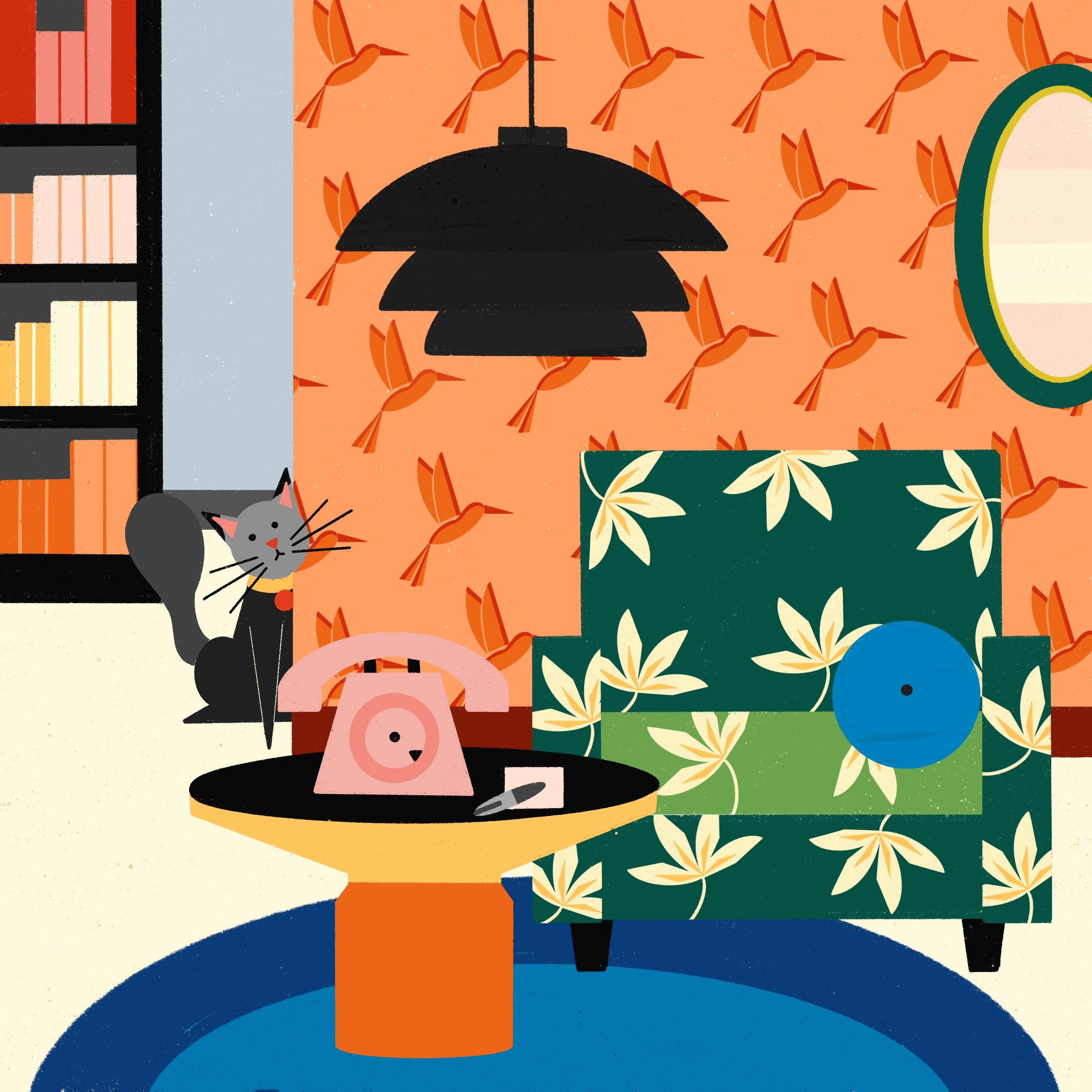
right to combine with that. Chosing diverse randomly from the right side can help you come up with surprising results. I want to illustrate
a living room. So maybe I can choose this
one here from the left. And my composition should
include an armchair, a site table, allow
an, a telephone. Again, these elements are
just the core of your scene. Now you can pick a few elements randomly from the right side. These are going to be your
complimentary elements. I want to choose a carpet, a frame, maybe I
shelf, and a plant. You are going to add
more elements to your composition and
the following steps. But first, you just
need to focus on how you can combine
your core elements. This will help you
not get our event and enjoy the process. One more. Okay, I also have a bonus
cheat sheet for you. This cheat sheet explains a few moments with
some keywords, references, and an example of
color palette for each one. This is just an extra cheat
sheet to inspire you. If you want, you can get
inspired by this design moments. Why creating your own drawings? E.g. if you created a bohemian, your character on
my earlier class, maybe this time you can
create a bohemian style, leaving room for your character. Okay, back to my trace ****. I can maximally style
is pretty interesting. So I can go for it and create, enjoy all these
wallpapers and patterns. Okay, I have all these keywords. Now, it's your turn. Go to download your
problem list and pick your prompts and your
complimentary elements. I also suggest you to get inspired by one of
the design moments. Okay, now, join me
in the next video where we are going to collect reference images based on our prompts for
our illustration.
4. Gathering Inspiration: Okay, we pick our prompts
before sketching our space. I like gathering some reference
images to get inspired. I think it's important to sing inspiration for nurturing
your imagination. In this lesson, I will
show you how to create your mood board to inspire
you for your project. Pinterest is one of
my favorite apps that I like to use to grab
reference images. Pinterest is great
because you can always find ideas to spark
your inspiration. And you can create boards to categorize all these ideas
without much effort. Okay, Let's start
collecting our references. Here I am on the
Pinterest app on my iPad, but you can also open
it in your web browser. First, you need to search
for your main topic. I'm going to create
an interior scenes, so I write interiors
on the search bar. You can easily get inspired
by editorial photos. Since I wrote interiors, there are many images of living rooms,
bedrooms, kitchens. And at the top left corner, you can see that there
are different words. You can narrow your search by clicking on your interests, e.g. if I click on kitchens, I see many images of
different kitchens. So based on my prompt, I know that I'm going to
illustrate a living room. So I add living room
to my search bar. Now I click on the living room references
that catch my attention. Okay, I like this image, so I click the red Save
button to save it to my Bard. When you click on it, it opens a page that shows
your mood boards. You can click on the Plus sign here to create a new board. You can also name
your board here. We can also decide if you want a public or a private board. If it's a private board, only you can sit like that. I created my board. Now. I can search
for more inspiration and add more images to my barge. I look at my prompts and I
need to draw an armchair, a lighting at phone, and a side table. I can search for all these
words separately to, you can also look at
your design moments. She should, and search for more references from
the design moment you are interested in. I add maximalist
to my search bar. Okay, here's the
small mood board I prepare for this project. I'm just going to take a screenshot and bring
the image to procreate. Ok, Now it's your turn. I want you to spend
like five to 10 min on Pinterest together your
references for the project. Use your prompts
as your keywords. Once you have done, take a screenshot to bring it to your canvas in Procreate. Now, join me in the following
video where we're going to create our car composition
based on our prompts.
5. Core Composition: Okay, Now it's time to create our core composition
by using our prompts. It's gonna be a
very rough sketch, no need for perfect, very fine lines here. So just enjoy the process. First, I bring my
reference images to my commas, okay, it's here. Now I create a new layer and reduce the opacity of
my reference layer. Before I start, I want to write
my prompts in the corner. Just to keep in mind, I'm going to sketch
an arm chair, a side table, a lighting, and a phone for my composition. Now, I'm just going to use gamma utricle shapes
such as squares, rectangles, or circles to
break down my references. This will help your
sketch easily or even recreate new shapes for
your furniture sketches. I will start with
this arm chair. By the way, I like
sketching with colors. I also suggest you to give a chance to colors in sketching. Okay, I'm back to my armchair. Let's break it down into shapes. I definitely see a rectangle
here on the staging area, two ellipses on the arms. You can always use curved or straight lines
to define your sketch to. And I see triangles
for the legs. Remember this is not
your final sketch. We're just going to use a metal to understand this
armchairs firm. And the good thing is you
can use this method for every reference element that you are going to use in
your composition. E.g. in this side table, there are definitely an
ellipse and a rectangle. The rest is just
complimentary lines. Okay, this is how it works. Now, I just continue to do the same with the other elements. Okay, now we get an idea
about our elements firm. Now I turn off my
reference image and bring my little
sketches to the corner. Okay, what I'm gonna do
right now is to create a small composition including
these four prompts. Since I broke down my other man, it's so much easier
for me to sketch without outlining
my reference image. I start with a rectangle and
then ellipses and the curve, and then the legs. Why I'm drawing, I think about
the position of dislikes, like why these shapes starts
and ends in my element. You can play with
their shapes and sizes and create a new
forum for your armchair. Okay, I drove the armchair now, I do the same for
the side table. I want to draw my site
table in a new layer. I don't really think about
the perspective rules here. I don't think you
don't necessarily worry about the
perspective either. I like mixing things, drawing the part of the chair from the side or front view, or the parts from the top view makes it
quite interesting for me. Okay, back to my sketch. I like keeping all my
layers and the same group. I just continue to sketch
the rest of my elements. See how quickly and easily I can sketch my elements
with this method. All down. Now, I want to
combine them together. I start with the biggest
piece, my armchair sketch. This piece is my center point than I bring the
rest one-by-one. At this point, I
suggest you to let these two objects
interact with each other. E.g. I. Draw the side
table in front of the arm chair and I wanted
to cover some portion of it. I do the same for the phone. I positioned the phone
on the site table, but again, I position
it carefully. I tried to avoid tangents. If you want to know
what tangents are. Tangents happens
when two firms touch or a library class together
in an unpleasant way. So try to avoid that
in your composition. Okay, let's continue. I want to keep the
lighting somewhere between the armchair and cite table. Okay, All done. I want to
show you a little trick here. Let's look at this composition
in a different way. So in a new layer, I draw some boxes costs during my elements firms and
mark their centers. And you see the lighting and the form are almost
the same size. I want to change that. I can do the lighting
a little bigger. The trick is I try not to draw two main objects
on the same size. I also avoid tangents
as much as I can. When you look at their borders,
Nothing really intersex. Maybe the lighting can
change a little bit more, but not a huge problem. Okay, back to my car
composition now, I change a few things
and I do some cleaning. All done. Now you know better
about tough to break down your elements and you are
able to sketch them easily. You'll also learn some
tricks and how to avoid common mistakes when you
work on your composition. Okay, Now it's your turn. I want you to create
a small composition using your prompts elements. Use your references
to get inspire. Break down your
elements to understand their basic forms and
sketch down very roughly. This is your first step towards
your final composition. Imagine it as a warm-up
and sketch loosely. We will work on the
element drawings in more detail later. After roughly sketching your car composition
for your space, join me in the next lesson. We are going to expand our composition
with more elements.
6. Expand Your Composition: Okay, now let's go to need
to work on our composition. We have the central
fire drawing. Now, let's add more elements to increase the richness
of our illustration. We will continue to sketch very roughly. Okay, Let's start. I suggested to keep a copy
of your cortical positions, so I duplicate it and
turn off the first one. Now I create a new
layer to sketch. You can choose a different
color if you want. This way you can
see your additions to your car composition. Now, I'm going to think of more elements that I can
add to my composition. It's good to use
reference images, but I think it's also important to sketch from your imagination. So I want you to give it a try. Since we have the base now, it's gonna be a lot
easier to add more from your imagination and mix
everything together. Okay, we have some prompts
from earlier lesson. I hit down here
right in the corner, but you can always add
more and change things. And also, I'm planning
to draw every element as a whole and everything
inside of the cameras. And I want you to do the same. Okay. I want to start
by adding a carpet. I feel like I can add
a carpet right under my arm chair and maybe
there's some pattern on it. As you see, I'm not thinking and worrying here how my
carpet shape will be. I just continue to use
geometric shapes here. Simple rectangles do the
work here quite perfectly. Another thing you
might notice is that I drove the carpet
from the top view. Why my other elements
from the front view, I like mixing those things. It's a personal choice, but you might try to experiment as well and see how you like it. Okay, let's continue. I imagined my elements
in front of a wall. This will have made to create a deepness in my composition. Okay, It looks great. Now I want to add some plant. Plants. One of the easiest ways to increase the richness
of your composition. So if you feel stuck, just add some sense
sketches to your drawing. They go with every space and comes with so many
different species. So I'll roughly
sketch a big plant. Okay, it's done. You can create more compelling compositions by using three main area
in your composition. I'm talking about foreground, middle ground, and
background here. I want to keep this
plant in the foreground. And since it's in
the foreground, I resize it and make it bigger. Again, I let my elements interact with each
other like in here, my plus sketch covers some portion of the other
elements in my drawing. Let's also work on
the background. Maybe I can draw a shelf in the background
with full of books and some accessories like
small sculptures or candles. I tried to bring
the diversity here. I think diversity can make
your composition stronger. And maybe I can add a
window on the other side. I think, I think I sketch that
opens up to another space. It's a lot to your composition, like seeing a garden or a
CT view through a window, or like a door opens
up to another room, that gives a sneak peak
to the other room. This will make your
composition a lot more interesting and
increase its stiffness. So I imagined this room
has a view with trees. When I look at my drawing, I see that my plans sketch and
trees on the window mixed. So I'm planning to change the bookshelf and
Windows position. I'm careful about tangents here, so I keep a part of the
window behind the armchair. Remember, tangents are one of the common
composition mistakes. Okay, maybe I can draw a
cartoon in front of the window, which some patterns on it. Okay, Let's clean up a little. I think it looks
great as you see, elements interact
each other very well. And there are elements
in the foreground, middle ground, and background. I do a last quick check if
everything intersex rarely, but I think so far so good. Okay, Let's try one
more. This time. I want to work on a
space that opens up to another room and gives a
little glimpse of this room. So let's start with the Walden. I cut the goal a little
behind all of my elements. Okay, now it's time to imagine what's going
on in the other room. Maybe it's a hallway. Maybe there is a cap board. I suggested to
draw off some part of whatever you draw
behind the wall. This is much better
for your composition. And just think what you can
combine with discount board, maybe a plant on top
and a frame behind. It's up to your imagination. We don't work here, calls
during perspective completely, but just keeping in mind that a little perspective tricks
doesn't hurt anyone. Okay, just roughly sketching other elements that
comes to my mind and costs during everything I pay attention in
my first sketch. I try it, intersect my elements and avoid tangents at all costs. Okay, all done. You can see
here that how we have created two different interior scenes by adding more elements
to our composition. Now it's your turn. I wanted to create two
different composition using your car composition
sketch as your base. Add more elements from
your imagination. Let your elements
intersects with each other and avoid
tangents at all costs, you have from simple
geometric shapes to create your sketch elements. We will work on the
element drawings in more detail later. We competed to sketches and now choose one and
go further with it. So join me in the next
lesson where I will show you how the rule of thirds
composition guideline works. And then we can rethink our
sketch and make some changes.
7. The Rule of Thirds: In this lesson, we will
learn a little about the composition guide
time, the rule of thirds. The rule of thirds
will help us to reach well-balanced and
compelling compositions. For the rule of thirds, you need to divide your
Canvas evenly into thirds. So I want you to divide
your canvas into three equal horizontal parts and three vertical equal parts. For this, you can get help
from procreate drawing guide. So I go action, a non-color ones and
toggle on drawing guide. You can click Edit
Drawing Guide, and play with the grid
size at the bottom. In this square, Cohn was, you should aim for
six squares for each side to divide your
Commonwealth into thirds. If your canvas size is this, you should aim 342 pixels. Now I draw my lines through
these guiding lines. If I hold my pencil
on the canvas, it straightens the lines and I put one finger on the screen. Okay, now I have a perfect line. I just clicked and
dragged arrest. Okay, now I have
my drawing guide. I turn off the Drawing
Guide and lowered opacity of my
composition guideline. Now I create a new layer on
top and I'm ready to draw. The trick in the rule of
thirds is to position the important elements along these lines or at the
intersection points. Placing focal points
at these intersections will create a great sense
of balance and harmony. In your illustration, you will make it more
engaging to the eye. You just need to
play with the size of your elements and practice positioning your content in balance with the help
of the roll-off starts. If you want to learn more and practice more about
the rule of thirds, check out my earlier
class about composition. Now create your rule of thirds composition guideline and join me in the next lesson, where we will re-frame our
drawing to reach a more balanced and started
driving composition.
8. Reframe Your Composition: Okay, we sketch two
different scene. Learn how to work with
the rule of thirds. And now I want you to think about your framing
one more time. It can be a lot more exciting
for your composition to lose some part of your
elements out of your frame. So we are going to create
a few square boxes and recreate our composition
inside of these frames. Okay, this is what
we have done so far. I want you to pick one of them. Now, bring your composition
guideline that you created in the earlier lesson
and lowered opacity. Then draw a square
in the new layer. I use the ages of my
commonwealth as my reference. Now, I bring it to the corner
and reorient my guideline. Okay, so what we're
going to do right now is to capturing a new
scene from our growing, like taking a nice
shot of Iran and the square will be the
frame of your photo, e.g. if I make my drawing bigger
and move around the frame, I can capture new
scenes by losing some parts of the elements on
the outside of the square, you can reach to a more
powerful composition with this method or you can change
the focus of your drawing. Okay, so let's start. I have my sketch and my
frame next to each other. I will start with
drawing my arm chair. This one is one of
my main elements, so I position it at the
intersection point. I want to position the side
table at the other intersect. I'm more careful about
my proportions here. You can use a
transformation tool here. You don't need to redraw it. For my first illustration. I don't plan a major
change just for their proportions
and positioning using my guideline, e.g. I want to keep delighting
in one of the targets, but also I'm being careful about its position with
armchair and side table. I tried to keep all the
elements centers at the different points and
avoid intersections. I continue to add
elements to my drawing. As you see, I positioned the
phone at one of the lines. I'm using the
guideline as much as I can and I plan to
add more details. E.g. a. Blanket on the arm
chair feels like a good idea. Again, using my guideline, I want to keep the wall
mainly in this Foursquare's. Okay, it's slowly
coming together. Maybe I can add more
accessories on the table. Maybe some books and a small plant who are working on all these little
accessories can add a lot to our
interiors in drawing. So I suggested to think about all these small accessories that you can add
to your drawing. I want to work on
the background now. I think I want to draw up the
cardboard on the other side feels like it will be too
crowded in its old spot. It should be smaller
than the armchair. Maybe I can draw a
plant on top of it. I just continue with the carpet. Is you see, I leave some parts of the elements of my frame. I still play with the proportions
as I continue to draw. Drawing all the elements in different layers comes
really handy at this point. So I strongly recommend it. I think the last elements and more accessories
as much as I can. Okay. It's mainly done. Let's clean up a little. Okay, It looks great, but to
make your scene more alive, I suggest you to add an
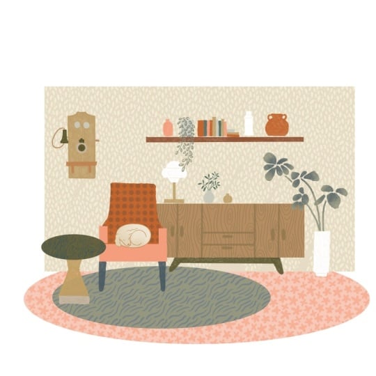
animal to our drawing. But in a Martian, e.g. maybe a cat slipping on the carpet are
scratching the armchair. Don't forget, I prepare a cheat sheet for you
with cats emotion. You can get a help from it. I talk more about this in the upcoming lesson about how
to draw animals in motion. Maybe pause here and
check this lesson out. For this scene, maybe
I can draw a cat hiding behind a wall
and checking the room. Curiously. Our first
scene is done. Let's try another one. For the second scene, I plan to shift my focus to
the side table. So probably the armchair are dressed will be seeing
less and my drawing. So I started with
drawing the arm chair and I position it in the corner. And this way we can see
the side table more. So I position it in the left two charts and cite table mainly in
the bottom charts. The phone at the intersect. I leave the right towards, for the other room view. I will not change some things. Maybe I can draw more
lamps this time. I want to keep domain
in the top charts. As you see, I've create
diversity in their position. This small change will
have my composition. I can draw plants in
the bag is you see, I don't try to escape with
the plan in this area. I imagined it as it grows behind the wall and out of the frame. I plan as seen for
this sketch as well. I think the cat behind the phone can fit quite well
for this drawing. I roughly imagine
all the patterns and add more elements
to my drawing. Okay, it's done. As you see, my focus shifted a lot. The armchair is just
the background element. Now, on the other hand, the side table, phone and cat as the focus
of the drawing. Okay, now let's
change things even more and see how far we can go. This time. I want the site table and the font to be my focus. I drove a site soluble
along my bottom line. I want everything going on, on top of the table
to be my focus. I draw the phone, maybe a small plant, and pencils, and an old book. These are positioning
in this six squares. I want to create a background
mainly in the top third, maybe we see another room
through the window here, I will draw the same
elements on the bag, such as armchair plans frames, but much smaller this time
since they are on the back. And I draw the frame and evolve. Okay, I can see that I can work more on positioning and skills, but I don't very
much about this now. These are my very
fast exercises. Okay, we've created three
different scenes with three different focus on each
one. Now it's your turn. I want you to retain your scene and practice re-framing
your composition. Shift your focus in every
tribe create at these two are tray rough sketches with the hub of the
rule of thirds. I wanted to choose one of
your drawings and join me in the next lesson
where we are going to work on the drawing elements.
9. Drawing Elements: Okay, We have a clear idea of
how our sketch looks like. But to make it a step forward, I will show you how to make new things out of your
reference images. With these new
skills you can work on outlining our composition. This is what we are going to do. We will use our reference
images as a start. They are very helpful, but you can do a lot more than just copying the
reference images. You can add up, play
with the proportions and reflect your style
on your drawings. Okay, let's start simple. I have a reference image
of a chair here on my com. Once again, I suggest you to use reference images as a start, but it's really important
that you create a sketch that is more than
this reference image. This example is especially
half-full to be easy on yourself if you are intimidated by drawing elements
in perspective. Okay, Let's start. I first lowered opacity of my reference image and
create a new layer on top. Your image can look complicated
to draw when you cause there are lots of details or the perspective on the image. But the good thing is you can cancel or change
things as you want. It's your sketch,
it's your style. I will sketch on top
of my reference image. I want to start
withdrawing this thing, diarrhea in the original, it's square or a rectangle, but I want to change it
and make it an ellipse. Okay, now, let's
continue with the legs. I'm mostly tracing over my reference here
for the first liked, maybe a little ticker. And for the rest, I
want to play with the reality and add
my style on it. The thing I like
about illustration is that it doesn't have
to be realistic. So I want to draw all the
legs at the same high, kinda distort my chair. And maybe three legs is enough not-for to keep it more simple. I want to do the same for the connection part
in the middle. It looks complicated
as it is now. So I think one straight line
in the middle will be fine. The same approach goes
for the top as well. I ignore the perspective and just draw one rectangle
for the back. And I think I can minimize the number of the wooden
sticks on the back. Okay, Let's move our sketch to the side to see how it looks. I think it looks great. Maybe I can add some details like some texture on the sting, diarrhea or different colors
finishes on the legs. As you see, even
though we sketch on top of our reference image, we were successful to
reflect our style on it. Okay, let's get more creative
now as our second practice, we will create a few furnitures, although one reference image, I have my reference image here. Let's see what we can do. The first thing we're gonna
do to break down our image, which shapes such as triangles,
rectangles are ellipses. Now we're going to use this as our structure and play
with them to come up with different ideas and
to create more balance items. Playing with shapes
endlessly what furniture designers do in
their sketching process to, you can use this method
in anything from drawing, from furnitures to even
drawing animals or people. Okay, Let's start. I lowered opacity and create
a new layer on top. Okay, there's a
rectangle on the back, another one here, and some
ellipses on the arms. So just try to find all
these shapes on your image. Okay, if you broke down
our reference image, now, I bring my sketch
to the side and completed if there's
a missing part. Okay, I don't need my
reference image anymore, so I turned it off and bring
my sketch to the corner. Then I create a new
layer to sketch. Okay, now we're going to
apply with our shapes. We can make them
bigger or smaller. We can play with the curves, make them curvier or flutter. It's easier to
play now since you know the structure
you want to create, experiment as many as possible, you will be surprised
with the idea of how many new items
you can create. Okay, as I start, I want to replace
the rectangle for the buck with that circle. Now I just draw a rectangle
for the sitting area. Two ellipses on the side, but I want to change the angle, make it much wider. Some triangles for the legs
and maybe circles as details. So as you see, it will make a few changes, be already created a
different furniture. Okay, Let's try one more. This time. I want to
make a bigger armchair, maybe at so far. So I started with
extending my rectangle. You can even think of
using different shapes, such as a heart shape. There is no boundary here, so enjoy your creativity too. We can also add a pattern
on your furniture. I think textures
or patterns also help you come up with
exciting results. Okay, it's done. Since this is
supersymmetric element, I suggest you to get
a little help from Procreate features,
the editing guide. First, I lowered opacity of my sketch layer and create
a new layer on top. Then I go action than
Canvas and turn on drawing guide on the settings at the
bottom, I choose symmetric. By moving the line here, you can decide where your
center is going to be. At the top, you can select
the color of your guide. Okay, All set. Now, I can start sketching. I choose another color to sketch is you see
now I can just draw one line on one side and the other one appears
automatically. The thing you need to
be careful here is that every new layer you create
needs to be set again. So I click on the layer
and a sidebar appears, and I took on the
drawing assist. Now my new layer is also set. You can do the same if you want to disable the Drawing Assist, tap on that layer and turn off
the Drawing Assist easily. And just like that, we created a different furniture by using the structure of our
reference image, you can use the same method
for every element in your sketch and surprise
yourself with your creativity. Okay, now I want to
refine my sketch, keeping this in mind. Okay, All done is you
see the pattern on the wall and the armchair
is still missing. And I can add some textures
on the floor or the carpet. Don't worry about these now, we will come to that next. Now it's your turn, drove new elements out of
your reference images, figure out the foundation of your reference elements and
play with the proportions and shapes and new combinations
to create yours than applying our sketch with all the new elements,
skip the patterns. Now join me in the next video where I'm going to
help you with drawing animals to get a little more excitement
to your illustration.
10. Animals in Motion: Okay, I think if you drove
an interior illustration, adding an animal
interior drawing can add spice to your drawing. It can be a dog, a
cat, or a parrot. It's totally up to
your imagination. But what's better is
to draw in, move. Like a cat is looking
behind the wall, are slipping on a couch or scratching the college
can be a nice touch for your drawing and all
these breaking down the elements method can be
used in animals as well. So if you're having
trouble drawing animals, I suggest you to check out my earlier class and hit
the drawing dogs lesson. I showed you how to
use this technique. Why drawing dogs? I also prepared a
cheat sheet for you to download all
the cats and move. Don't hesitate to check it out and get a little help from it. It's in the Project
and Resources folder. You can always head
over to Pinterest to search for your
reference images. Now go ahead and draw
some animals in more. Practice with my cheat sheet and add your animal
to your drawing. Now, join me in the next video where I'm going to show you how to download the brush set I prepared for you
and many tricks, how to use them in
your illustration.
11. How to Use Brushes?: In this lesson, I will show you how to import your brush set to your Procreate and some
tips on how to use them. Okay, Let's start. You can download
the brush set in the Project and
Resources folder. So to be able to use your
new brushes in Procreate, you just need to download the brush folder and
save it to your iPad. And then open the Bryce said, and then tap on the
plus sign at the top of the brush library and then click Import and search
for the brush file. The brush file will appear
in your imported folder. Okay, these are the five
different brushes I prepare for you to use
in your interior scenes. Okay? Now that you have your brushes, I want you to give you some information about
them and show you a few tricks that can be useful while you use them
for your drawing. The first thing you need
to know is the brushes I prepared for you, our
continuous brushes. That means they don't
overlap by your drove. So you can just stop and then continue to draw over your left. This is a great feature
for pattern consistency. The second thing
we're going to talk about is the brush size. If your pattern is too big or
too small for your drawing, don't worry, you can
change its size easily. To do that, you need
to go to your brushes, then click on that brush, tap Grain and I change the scale on the board
right next to it. You can test how it looks. Then you can just click
down and start drawing. Another thing you
need to know is that the brushes
are directional. So if you want to
change the direction, you can just turn your
account once and you will have another
look at your pattern. It's a very easy trick, but it's very helpful. There is actually another way to change your pattern direction. Tap on your brush to go your brush settings than
tap Grain and click Edit. Then use your fingers to change its direction than
just clicked down. Okay, The last one
is a golden thread. You can create new brushes by mixing two or just one brush by playing with its direction sees your brushes are
consistent brushes. To create new effects
with the same brush, you need to go back to your brushes than
tap on your brush, than on the left, tap on grain, and
choose moving brush. Now you are able to mix them. Let's try. Now. It's up to your imagination. Or you can easily use two different brushes
by mixing them. Just started with one and then try the second one on top of it. And you just issue
a new pattern. Now that you know some
tricks about these brushes, Let's have a look
at how to apply your brushes to your drawing. You can either use Alpha Lock
or clipping mask option. Why the COVID mask allows
you to be more flexible. The Alpha Lock is
crucial when you have to work with a
small number of layers. So just create a
shape in a new layer. For Alpha Lock, tap on that
layer and choose Alpha Lock. You can draw freely and your pattern will still
stay inside of your shape. For clipping mask, create
a new layer on top than tap on that layer
and choose clipping mask. Then you campaign
however you like and your pattern will
apply to your shape. Now go to your project and Resources folder and
download your brushes, then add them to your Procreate. Now, join me in the next lesson where I will show you how to create two-color pattern
brushes to use in your drawing. Then we will use all
these new brushes and work on our final sketch.
12. Two-Coloured Stamp Brushes: Drawing a repeating pattern in your illustration can
take a lot of time. But if you create
your custom brush, the process is much
quicker and less painful. So in this lesson, we are going to create our
two-color custom brushes, and you will be able to use these brushes in
your illustration. Brush making can be
complicated easily, but with my easy to apply
step-by-step process, you don't need to worry. Once you've created your brush, you can use it as a pattern for your wallpaper or for
your furniture's. And it speeds up
your process a lot. So very important skill. And when you learn this skill, you will see that it comes handy and you can
use it all the time. Okay, Let's start. I look at my sketch and there is a pattern on the wall
and on the arm chair. So I want to create
brushes for these areas. See spot patterns,
interacts with each other. I want to think of something
that can go well together. Maybe a bird pattern as a wallpaper and
flowers for the chair. You can go back to Pinterest and find new references
for your pattern. I already collected to reference images
from the Pinterest. Here's the first one. I want you to start with
sketching your pattern and it's totally okay to sketch on
top of your reference image. Just lowered opacity
and make sure that you work in a new
layer on top of it, I want my pattern to have some texture like
rest of my drawings, so I choose something
like chalk brush. This is important for
the brush making. You need to draw in black color. I suggest you to sketch your
element as much as simple. You can imagine it like
sketching a sweat for this part. And I like working with
geometrical forms, so this helps me to
keep my sketch simple. Okay, the frame is done. Now. I'm going to color it all black. I don't suggest color
dropping if you want some texture
in your part-time. So I just quickly
paintings side. Okay, first layer is done. This is important here. I want you to imagine
your pattern as two layers and draw it
as two layers as well. Two layers are going to
be in different colors, so it's a good chance to create a more
interesting pattern. Okay, Let's try for
the second layer. I create a new layer. The brush layer
should be in black, but for now I choose
another color to our grid. I think I can do color shadows
on the body and the wings. Okay, It looks great. Now I recolor it in black. Okay, All done. Now, we have two layers
to create our brush. To be able to create two
colors, stamp brush, we are going to create
two different brushes and then combine them together. Okay, Let's start
with the first one. Okay, I am on my canvas now. Three finger on the screen, slide down and then
choose Copy old. Now go to your brush library. Then tap on the plus icon on
top right than on the left, tip shape than tap on edit. And now tap on import and click Paste than two fingers on the cow was this will
invert the colors. Why do I read is your pattern? If you want to see the
bird as a pattern, the virtual be white and also shall be be like,
Okay, click down. Your first pattern brush is
here now you can do more. Your brush on the right board
is quite small to check, so still it's quite
not finished. There are a few more
little settings in here that venue to
Tyvek and alter. So let's begin with
naming our brush. I tap on About this brush
on the left sidebar. Then I changed the name on top. As you see now, I have
a brush name bird one. Now I go back to
my brush settings. This time I go to
Properties section. And now let's play
with brush behavior. If you select minimum
and maximum size over, you can see that birds
are becoming bigger, but there are still way
too close to each other. To fix that. I go to Stroke Path section this time and
I play with spacing. You can see that all the
birds are separating from each other and
become much more visible. I want to keep that
around 70 or 80 per cent, not so close to each other. Next, I'm going to Apple Pencil. I do want to change the
transparency because my birds are not so
visible at the moment. I turned up with C2 now, and I also want to
adjust the tilt, turn it all the way down. The next thing I want
to check is rendering. I want to check the blending. I want the flow is 100%, okay, that's done two. And the last thing I want
to check is the brush size. Again, I tap on the
properties and go to Brush behavior and
play with it to see how I like. It looks great. Let's go ahead and hit Done. And you can see your brush here. I want to see how it looks. So I create a new
layer to test it. Okay, I think it looks great. Now let's create
our second brush. I'm on my second layer. Now I need to copy this image. And again to copy
three-finger on the screen, slide down and then copy all. Now go to your brush library. Tap on the brush you
just created than slight lift and tap Duplicate. Now you just copied your brush. All the adjustments we made
is already on this brush now, so our work is much easier. Now I'll tap on your
second brush, go to shape. We are going to
change the patterns. So click, edit,
and then in part, and then paste your image,
It's already inverted. The only change we have to
make is in color dynamics. So go to Color dynamics and change all the secondary
colors are true max, this will help us to have a secondary color in
our pattern brush. Now, I tip about this brush on the bottom and name my brush. Let's go ahead and hit Done. Okay, now we have two
separate brushes. Now we need to combine them
to make one working brush. Combine, I am on my brushes. Your second brush is
already selected. Slide right is brush. And select the second one. Now you selected both brushes. Now type coal mine, if it's done correctly, it should work perfectly. Okay, Let's give it a try. I select my brush. Now I go to color charts. At the top, you see there
are two color options. You can select a color
for each brushes here. I choose two different
color and wallah, it looks perfect as you see. It didn't take me
long at all to create my own custom to color brush. Now I can just apply
it to my drawing. Before I go further, I want to create another
brush very quickly, just following the same steps. Since I already have the
settings from my first brush, It's so much easier to
create the second one. Now, what I need
to do right now is just to copy my bird brush
that I just created. Now I go to my brush settings. I want to change the name of my brush to avoid any confusion. So I tapped about this
brush at the bottom of the sidebar and name my
new brush at the top. I already have two layers of drawing for my flower pattern. I just select one
of them to copy. Three fingers on
the cameras slide down and I select Copy all. Then I go to brush
settings of my new brush. I select the second brush
from my Grouped brush, since both our domain
part of the pattern, then I tap on the shape than edit and paste my
new pattern here. Just like that, I
created my first brush. Now I'm gonna do the
same for the second one. I go back to my layers, select the second
layer of my pattern, three fingers on
the commonwealth slide down and select copy. All, go back to brush library. Select the detail
brush this time, go into shapes, select, Edit and Paste the pattern. All done. What I did was to change the
images with my new ones. Okay, Let's test it. I think it looks great. Now I can use these
pattern brushes on my illustration and
finalize my drawing. Now it's your turn. I want you to create at
least one to color brush, SketchUp pattern
with two layers, and create your brush
with the following steps. Use your new brushes
in your sketch and finalize your
sketching process. Don't worry about
the color choice of your brush right now. Now, join me in the
following video where I will clean up and finalize my sketch and apply
my pattern to my sketch.
13. All about Colouring: Now that you have
your refined sketch, you can start working on the
farm part, which is colored. In this lesson, we are going to finalize our sketch by coloring. And I think some
texture for coloring you can get inspired by
the reference photos. You can just look
at the colors you like and see how
they are combined. Or some websites offer you a different color combinations. Adopt color is one of them. You can even learn
which color palettes are trending at the moment. And you can easily apply this color combinations to your color palettes
in Procreate. Okay, Let's start. The first thing I
do when I want to color a new illustration
is to create a color thumbnails in a small
size and every quick one. So I want my cow was, I think any brush here
doesn't really matter. Then I copy my sketch
layer and make it small. Dan, I just create a new
layer under my sketch layer. My first step here is that always start with your
background color, then continue adding colors to our biggest pieces very
roughly and very quick. So for my drawing, I plan to go with soft and light colors on the background. A soft blue, a soft
gray or yellow, are generally my go-to
colors for backgrounds. The woolen armchair are some of the biggest pieces
of my drawing, and I want them to be very colorful and coherent
with each other. I might go for a soft orange for the wall and green
for the armchair. Or dual pattern. I can try to answer tone, since there are already
many colors going on, maybe a vivid orange and maybe another orange close
to the right as well. The carpet is another
big piece in my drawing. I can try a contrasting color for the wall, which is blue. Blue might go well
with green as well, maybe together with a
darker blue and round. This is my second big tip here, always use a limited
number of color pallets. You can use different shapes to Who's of your chosen colors. That will help you to have a control over your
color combination. It can also be a
good idea to keep a color palette in the
corner of your commas, just like here, I just
continued to splash colors on my drawing very quickly
without overthinking. And I always try to use one
color in more than one spot. And also don't forget, this is just a sketch
of your colors. You can change all
the colors as you go. I always add the black latest. Black is a very strong color
and difficult to work with. So instead of using black, I suggest using a darker gray, close to black, or dark hues
from your color palette. I think in this way it
looks so much better. Okay, All done. I want to turn
off my sketch layer to see how it looks without the
distraction of black layers. Looks great. Just adding
the last details now. Okay, one last tip before you
go to finalize your sketch, senior sketch in black
and white can give you a new perspective
on your color choices, how they combine to each other. So to see your thumbnail
in black and white, I want you to create a new layer in black on top of your sketch. Then tap on that layer and
choose saturation or color. Now we can check if every
important element pops up, it went black and white. If it's not, I suggest you play with the tones and check again. Okay, this thumbnail
will do the work as a start of my
coloring process. You can keep it in the
corner or you can just turn off the layer and go back
at it when you need it. Okay, our color
thumbnails is ready. Now, let's bring
our sketch back to the Commonwealth and start
coloring our drawing. My sketches here. Why I'm coloring? I like using a grainy, sharper brush on the outlines, a more grainy texture
brush on the side. I have a few brushes that I
use in my coloring process. I also made them
available for you. You can find them in the project and resources section below, just all around it and add
them to your brush library. I'm in a new layer. First with my outline brush. I outline my element and then drag and drop my
color inside of it. I like using a two
color texture effect. Like if the wall is red, I like having an underneath
layer in orange. So I first create
my bottom color, just like I did here. And then I go to my layers, tap on my layer,
choose Alpha Lock. Now I can use my texture
brush to color it. Since the Alpha Lock is on, it's easier and faster to
color without outlining. I like working on
different layers for coloring each element. That gives me a better
control and allows me to change things quickly and
easily if it's needed, I quickly continue
coloring my elements. Okay, The wall is ready. Now, let's use our stamp brush to add our pattern to the goal. I create a new layer on
top of my role layer, tap on my new layer, and this time choose
clipping mask. Now I go to my brushes and
choose my bert stamp brush. Here's the good part. My brush has two colors, so I need to choose
two different colors. Now, you can click between these two color charts here and select your color for each. And now I go back to my commonwealths and
add my pattern is, you see, it's so
easy to add down with this brush.
Okay, It looks great. Now I continue to color duress. Now I can use my
second stamp brush the flower brush
on the arm chair. I use the clipping
mask feature again. Then I choose two different
colors for my brush. I want to talk about an
important trick here, the Bryce size of two
colors stamp brushes. If you want to change
the brush size, It's important to make
sure that you change each of these combined brush
sizes in the same number. So I type on my brush, choose my first brush than typical forties and
on the maximum size, instead of sliding over the bar, I want you to type on
the number and write your number here than I do the same with
the second brush. Okay, now I add my flowers to the chair using Clipping
Mask feature here again. And as I mentioned in
the earlier section, to change the direction
of your stamp brush, you just need to
rotate your canvas. We finished our drawing. I think it looks pretty good. Now it's your turn. Go ahead and finish adding color and texture to
your illustration. First, create a quick
color thumbnail, then move on to the
coloring phase. Get help from the Alpha Lock, clipping mask features
and your stamp brushes. Now join me in the next
video where I will share my final thoughts
about this class.
14. Final Thoughts: Thank you so much for taking the time to
watch this class. I hope now you have more
confidence throwing your own interior
elements and creating compelling compositions
for your interior scenes. Besides learning how to
draw your interior scenes, you'll also learn a lot about
creating your own brushes, furnitures that will
help you to create more interesting and unique
interior illustrations. You can always use
my prompt please, to come up with
different spaces. Don't forget to download the
brushes I created for you, especially the stamp
brushes that will help you to speed up
your process a lot, not just for this illustration, but every time you practice, I always love seeing what
you guys come up with. So don't forget to post all
the steps of your process and your final illustration
to the project section below. You can also take me if you
share your work on Instagram, I always share a collection of my students projects
on my Instagram. So if you tag me, I can see your projects
and re-post them. I also have a class on stepping
up your composition game, which can supply you
with extra tips, not just for your
interior scenes, but an off your drawings. So I really suggest
you to check it out. Thank you again for
watching my class. I will really appreciate it
if you leave me a review. So hopefully see you
in my next class.
 Ceren Dabag, Illustrator