Transcripts
1. Intro: Drawing character
illustrations with bold styles, vibrant colors, and intricate details
with a strong sense of overall composition can truly transform your creative journey. And the best part,
it's incredibly fun. Hi, I'm Joan, a freelance
illustrator based in Lisbon. I have a passion for creating colorful and facion forward
characters using procreate. Drawing inspiration from
botanical registrations allow incorporating their beauty into my portrait registrations. Creating powerful and visually
striking compositions. In this class, we will combine poetry illustration with
the captivating world of botanical art to create
compelling artwork that takes your character illustrations
to a whole new level. With fashion drops and
intricate floral details, your illustrations
will truly shine. We will start by gathering
reference materials, whether it's observing
natural flowers or exploring websites
for inspiration. I will show you how
to simplify and slice these references
using geometric shapes, helping you develop your
unique artistic style. I will share many
composition tips and tricks, including the use of
symmetry in composition. We will also dive into the
world of botanical patterns. We will learn to drop
different flower types, create floral composition, and incorporate these
floral elements into your character style,
and oral composition. This is where your
illustration truly shines and stands
out from the rest. Then we will create a specific color palette for our project. I will share techniques
to help you create visually striking
color combinations that enhance the overall
impact of your illustrations. During the class, I will be
using Procreate on my iPad, but feel free to
use any drawing app that you're comfortable with. Whether you're a beginner
or an experienced artist, this class will provide
you with the tools and techniques you need to bring
your drawings to life. Get ready to level up your character illustrations
with a focus on style and composition and
let your creativity balm.
2. Class Journey: I'm excited that
you have decided to join me in this class. Your project for the
class is to create a captivating fashion
support registration set within a beautiful
floral tamed composition. In this lesson, I'm
going to go over the different steps that will be going throughout the class. We will begin by focusing on developing your
skills and creating compelling character designs
that are elevated by their fashion sense and how they fit in the
overall composition. We will learn how to pay attention to the
composition as a whole. We will start by sketching our
character with the half of triangular composition
guideline to ensure a balanced and visually
appealing arrangement. This step sets the foundation
for our illustration. Then we will move into
the centerpiece of our illustration,
the flower bouquet. At this stage, we will learn how to break down
reference images using geometric shapes to help us to create a unique
illustration style. We will practice how to
draw different kind of flowers and have to create
a floral composition. Next, it's time to make
our character shine. We will focus on incorporating fashion elements into
our illustration, seamlessly bending down with
the overall composition. We will explore how
flower patterns can be incorporated into both the characters clothes
and the background. Creating a cohesive
and stylish artwork. Once we have a sketch
that we are happy with, we will move into
playing with the colors. These steps involve in creating
our own color palettes, experimenting with different
color compositions and applying them
to our composition. Learn how to create a
harmonious color palette that enhances the overall
impact of our illustration. After we apply the
colors to illustration, it's time for us to add those final touches
that will bring our artwork to life and
make it truly exceptional. These final details will
include adding accessories, enhancing colors and
introducing texture. Throughout the class, I have
included various exercises, cheer sheets and resources to support your
learning journey. You can access them
in the project and resources section below. Additionally, I will be sharing valuable tips and tricks
along the way to boost your confidence in creating stylish characters within a
flower tamed composition. Now that we have a roadmap
for our class journey, it's time to dive in and
unleash our creativity. Get ready to develop your
illustration skills and bring your fashion upper create to life in a captivating
floral setting. So let's begin.
3. Composition Step by Step: In this system, we
will be focusing on developing the draft of
our portray registration. As you know, our class
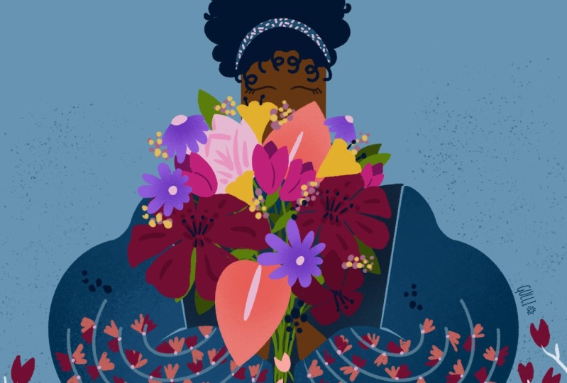
project involves drawing a girl holding
a flower bouquet, but we aim to take it
to the next level. Our main goal is text floor, how we can blend the
various elements of our character with the oral composition of our registration. We will plan how each element of the composition will
interact with each other, including the
characters proportion, style elements, and how they balance with the floral
motifs and the background. Don't yc, we will work through
the process step by step, and also I have created a composition guideline to
help you with this process, which you can find it in the project and
resources section. Our first step is to
create our procreate file. I just plan to open a convas
from the procreate tplax. To do this, I click
on the plus icon in the top right corner and choose
the square convas option. Now, I want you to bring the composition
exercise sheet that I prepared for you onto your
convas I go to settings, I tape on, and then insert
a photo. It's here. You can get rid of the
headlines and make your exercise boxes bigger
with the transform tool. Then I will go to
layers and lower the oposity of my exercise
sheet to around 20%. Finally, I will create a
new layer on top of it. All right, we are
ready to start. Let's get closer
to the first box. As you can see, there's a triangle
composition guideline inside. In this composition type, the main element is placed
inside the triangle and the rest of the elements
are arranged in a way that supports
a triangle shape. This creates a strong
focal point and gives the image a sense
of depth and dimension. We will use this
guideline to place the main element of our drawing,
which is the character. As you can see there's a triangle composition
guideline inside. In this composition type, the main element is placed
inside the triangle, and the rest of the
elements are arranged in a way that supports
a triangle shape. This creates a strong
focal point and gives the image a sense
of depth and dimension. By using the edges of the
triangle as reference points, we can ensure that our character is mainly inside the triangle. To draw very roughly, we will use basic
geometric shapes such as squares,
rectangles or circles. For the body of our character, I want you to draw a
rectangle in the center. And a big circle to represent the flower que the
character is holding. To enrich my composition, I plan to incorporate
the flowers from the ique into the clothing
and the background. I also intend to draw the
flowers in a manner that directs attention towards
the character in some way. This is very rough, but
it shows how I plan to place the main elements of
my drawing onto my comas. Let's move on to the
second box and create a more detailed sketch using
geometric shapes once again. To begin, I will
draw an oval for the heat and triangles
for the body and arms. I pretty much stick to my drawing guidelines
while I'm sketching. If you are worried about the proportions of your character, eight head rules can
help you with that. According to district,
in figure drawing, the torso of average
human figure usually occupies about
three to four heads. What's important not to obsess
over perfect proportions is we can always exaggerate or simplify them to
figure drawing style. Remember that it's your style, it's your drawing, so
everything is acceptable. I want to continue with
the flower bouquet. I draw a big circle for it. I also want you
to draw the heads that hold the flower
bouquet and for this, you can also use trangles. Okay, that's enough
for this stage. Let's move on to the third box. I would like you to use
the second sketch as your reference while
creating your tort drawing. Copy it and move it
to the next box, and lower the pot and
create a new layer on top. This time we will create
even more detailed sketch. You can add here and imagine the fit and flower per
turns on it very roughly. You can also include
some flowers from the ique in the background. Here's the, the body. For the arms, I add some volumes imagining as she is
wearing a big jacket. I also imagine how flower
bouquet will look like. I add small circles in different sizes for each
flower in the bouquet. I also imagine the hair type. Is it going to be all up with
a messy one or a pony tail? Does she have a curly
hair or straight bob cut? If you're having trouble
drawing different hairstyles, I created a chest for you. It's also in the project
and resources section. Don't be shy to use it. I imagine her in a flower yard, so I want to draw some
flowers around her. So in the background and
some in front of her. Okay. Our composition draw
is slowly coming together. All done. Now, I
want you to copy your sketch once again and
bring it to the next box. In our last box, we will
go into even more detail, paying attention to
the invisible lines that point towards
the main focal point. In this case, our focal point is the flower K and
the subjects heat. To emphasize this, I will
draw the flowers in a way that directs the
viewer's attention towards the main focal point. I quickly sketch my
drawing once again. I try to refine my lines and composition a
little bit more. Okay, for the floral composition, I want to go more in detail. First, I want to focus
on the background. So I drove some flowers
in the background. I want to integrate some of the flowers into her
clothes as a pattern. Make it more fashionable and enrich the
overal composition. I imagine the flowers pointing
the flower bouquet and her head to attract the viewer's attention
towards my main focal point. You can clearly see the
visible direction here. Okay, our very rough composition
sketch is ready. To finish, I want you
to make a copy of your final sketch and make it bigger to fit into your Cass. Okay, it's here. I add the
last touches and none. Now it's your turn to
create your rough sketch using the composition
guideline I prepare for you. Join me in the next
lesson where we will draw the outline of our character using the symmetry
tool and procreate.
4. Break Down Reference Images: In this season, I will
share some tips on how to draw various types of flowers
using reference photos. We will use geometric shapes to help us create a unique style. This method simplifies
a drawing process and helps you to create
a stylized look. It's fun and simple
methods, so let's begin. For reference photos, I will be using images that I
collected on Pinterest. If you are looking
for inspiration, Pinterest is an
excellent resource to find reference photos. But I recommend not spending so much time on it as it
can be time consuming. Maximum 10 minutes,
I think is ideal. To save some time, I
created a collection of reference photos in
a Pinterest folder that you can access
and download. Feel free to use them. The link to the folder is in the project and
resources folder. This is the pinterest
folder I created for you. I will select a
few that captures my eye and take the screenshots. I. Now, let's bring the reference images to
our convas on procreate. I want you to open
a ready convas on procreate and bring your
references to your convas. Go actions and insert a photo. Okay, I'm on my convas. Here is my first
flower reference. Now, I go to my layers and click on my reference layer and adjust to post around 40% and
create a new layer on top. Always remember to work on a different layer from
your reference images. Our next step is to identify the different
parts of the flowers, such as the petal,
steam, lays and center. We will break down each
part into basic shapes. For example, the pedals could
be represented by ovals or triangles while this team might
be a long team rectangle. Okay, let's start sketching. Start by drawing straight
lines for the steams. The focus on simplifying the
pedals as much as possible. You also don't need
to draw all of them. You can draw only a few using your imagination to
create a unique flower. You can always aim for a symmetrical look if you're
having a hard time. Hold your pencil on co once to create smooth and clean lines. Let's create a similar flower
on the other side as well. In the middle of the flower, there are many rounded
petals that create a chaper like shape in my mind, so I will try drawing
a circle here. Remember the reference images are just there for inspiration, so feel free to use your imagination to create
your unique flower. As I said before, creating a symmetrical look while drawing these flowers
can be helpful. The same method
applies to the leaves as well. Okay. Looks great. What's your finish
with your sketch, turn off the reference layer and clean up any intersecting lines. Let's move on to
the next flower. There's a trip here. We will use geometric shapes
and clean lines again. I start with the pedals. Now we can move on to the
CTM and leaves and don't be afraid to experiment with your own style which
is really valuable. For the leaves, I like to use mix of straight
and rounded lines. I encourage you to try sketching different
kind of flowers, using the techniques we learned. Don't worry about achieving
perfection at this stage. The focus is on capturing
the basic shapes. Use these shapes as a guide
to add more details such as texture on the pedals
or s on the leaves. Great job on practicing
have to breakdown reference photos and creating
stylized flower sketches. To wrap up this lesson, I want you to
finish sketching at these two or three
different flowers using the same
technique we learned. When you're happy
with your sketches, be sure to save
them as GPG file by clicking on the settings and
selecting the GPAC option. This will allow you to
easily share your work with others and keep a
record of your progress. Now join me in the next lesson, variable practice roving
different flower types.
5. Linework & Symmetry Tool: Okay, now that we have
our sketch ready. Let's start cleaning up using the symmetry
tool in procreate. First, I want you to turn
off the background layer, then go to settings and
save the image as PNG file. Then go back to your per
credit files and create a new convas by tapping
the plus icon here. I suggest creating a convas
with dimensions of 2,500 by 2,500 pixels and a
resolution of 300 DPI. This will provide us with
81 layers to work with. Now, bring the file
you just saved onto your convas,
go to settings, insert a photo and resize and reposition your sketch
according to my convents. Next, go to the layers panel and create a new layer on top. Now let's turn on
the symmetry guy. To activate the symmetry guide, got to actions and cvs and
Togolon drawing guide, the tapon edit drawing guide, and you will see a center
line in the middle. With this mod, anything you draw on one side will be
mirrored on the other side. You have four different
options here, but I want you to
select symmetry option. Here you can also
adjust the opposity and thickness settings
to your preference, and you can even change the
color at the top. A done. This feature will be incredibly useful when outlining
our drawing, since it's centrally and
symmetrically aligned. Once you've made
your adjustments, we are ready to
outline our drawing. To create straighter lines, hold your pencil on the screen, which will help straighten your lines and assist
you in outlining. Keep in mind that you
don't need to use the symmetry guide
for every detail, but you can easily turn off
the guideline when needed. Either create a new
layer or tap on your existing layer and turn off the drawing assist option. Breaking symmetry in the hair is a good spot to add some
variation to the drawing. For now, focus on
outlining the character only because we will
practice drawing flowers, creating a flower bouquet, and refining overall
composition in later lessons. When you're ready,
you can turn off the drawing guide by
going to actions. Before we move on, I want you to emphasize the position
of your flower bouquet, create a new layer and turn on your sketch layer for reference. To wrap up this lesson, I want you to finish
outlining your gir without adding details
to the flowers just yet. Remember, you can always rely on the symmetric guideline
for assistance. Now, join me in the next lesson where we will learn
how to create our flower bouquet and explore drawing from reference
images in more detail.
6. Practice Drawing Flowers: Okay. In this lesson, you will practice drawing
different types of flowers. I will share some tips
for drawing from nature, and I also prepare
te sheets for you that you can start
practicing immediately. It's always fun to go
outside and gather a few different types of
flowers that catch your eyes. While searching for
your inspiration, look for a variety
of shapes, colors, and sizes to make your
practice even more exciting. If you're having a hard time drawing directly from nature, you can always take
photos of them. Take the photos of the flowers from different angles and bring your favorite one into
your procreate file to use it as a reference image. When you are ready to draw, observe the basic shapes and structures that make
up each flower type. This will help you break
down the flowers into simpler shapes and
create cytlized drawing. Use circles, ovals and tringles
to break down the form. Then you can add more details. Focus on capturing the unique
features of each flower. You can always use my chee
sheets to draw more flowers. It's in the project
and resources folder. Bring the cheese sheet
to your comas and start practicing drawing
different types of flowers. Remember to break
down the images into simple shapes
to make it easier. As you practice, try to find out your own style and become more comfortable with
drawing flowers. I suggest drawing one
flower at the two times in different shapes and finalize the one you like the
most at the end. To wrap up this lesson, I want you to finish practicing drawing different
kinds of flowers. Go around, collect some flowers and try to practice
drawing them. You can always try to
reflect your style on it. You can also use my flower
chess sheet to practice more. When you finish, make sure that you save it as a GPAC file. Now, join me in the
next lesson where we are going to create
a flower bouquet.
7. Create a Flower Bouquet Composition: We already practice drawing
different types of flowers, and now it's time
to learn how to create a stunning flower
bouquet composition. This is an exciting and
creative process that will enable you to bring
your imagination to life. I will be sharing
some tips that will help you to create your
very own composition. First, we will create a
new convas by hitting on the plus sign in
the right corner and selecting the square option. Once we are on our convas
we will draw a circle to represent our bouquet and
lower the oposity of it. Then we will create a new
layer on top and bring the flowers sheet that we
practice drawing to our convas. It's here. Here's
a half full tip before we start
drawing our flowers. We can define the places
of the flowers in our bouquet by drawing
some circles on the cova. This will help us
plan our composition and decide where to
place each flower. I can draw a flower
right here in this circle and then maybe
another one over here. Now, let's try planning with
the sizes of our flowers, especially if we are drawing
the same type of flower. We can make some flowers smaller and others larger
to create variety. It's also a good
idea to intersect the flowers with each other
for a more natural look. For example, this flower could be positioned on top
of the other one. All right. I have already visualized three flowers
of varying sizes. Now I will choose another
color to represent a different type of flower and fill in the remaining is spaces. Maybe I will add one flower here and another
one at the bottom, trying out different spots and making sure they intersect. I could also create
a small bunch of flowers in the same location. With my reference of the
big circle at the bottom, I already created
an entire bouquet where all the spaces
are most of fill in. Next, I will bring my
flower sheet to the convas. Since this is a new
convas for practice, I can extend it and place the flowers next to
my flower bouquet. To do that, I will
go to actions and then select conv
followed by crop. All right, everything looks good now and we can begin drawing. First, I will create a new
layer to draw my flowers. Always start with the
biggest flowers in your cavas as they set the tone for the rest
of the composition. Using a variety of shapes and sizes is key to creating
an interesting bouquet. Let's start drawing. I'm going
to reference this flower here and try to redraw it in
a bigger size in my bouquet. When redrawing a flower, it's always good to start with the center and then
add the petals. Once you have drawn the flower, you can place it into your circle and try
to arrange it in a different directions to create diversity
in your bouquet. Don't be afraid to experiment
with different sizes and rotations to create
a dynamic composition. Next, I will draw
the same type of flower and position it
within the second circle. To keep things organized, I will create a new layer for this second bunch of flowers since there will be some intersections
with this first bunch. It's always better to
row on a new layer to easily control any
mistakes or messiness. Remember, you don't have to use each flower exactly
as you practiced. You can always modify
and interpate them. For example, I'm going to
change this one a bit. I will add a few more
flowers one by one and try to mix up their
sizes and rotations. You can also experiment
with placing some of the flowers in the front and some in the
back to add debt. Once we completed our flowers, we can ad leaves and greenery to fill in any gaps and add debt. Using a variety of shapes and sizes will help you to
create a more natural look. You can experiment with
different arrangements and sizes until you find
a design that you like. You can move the flowers closer
together or further apart and adjust the angle of each flower to create
depth and dimension. Okay, when we are happy
with our bouquet, we will save it as
a PNG image and on main image to place the
flower in the main spot. To wrap up this lesson, I want you to finish drawing a flower bouquet
for your character. Remember, don't be afraid
to experiment with different arrangements and sizes until you find the
design that you like. Have fun creating your
beautiful flower bouquet. Now, join me in the next
lesson where we are going to work on the
style of our character. We will explore ways to
incorporate our flowers into her overall while aiming to achieve a balanced
composition. A.
8. Composition & Fashion Up: Now it's time to
style our character. We will try to incorporate
our flowers into her look by working on creating
a harmonious composition. First, let's bring
our sketch onto our convas and adjust
its size and placement. As you can see, I already imagine incorporating
some flowers from the bouquet into her clothes as a pattern. Let's explore that. First, let's create
a new layer to work on the pattern
for her clothing. Since we exaggerated
the size of her top, we have plenty of space
to work on the arms. Instead of creating
a small pattern and repeat it in
the overall look, I want to make it an integral
part of the composition. For inspiration, you can take a look at the Facion designer, Mary transs use of
patterns on clothing. They are not just simply repeats but radio composition on a cos. We will apply a similar concept
here. Let's get started. I want the flowers on her
clothes to point towards the flower bouquet she
is holding and her face, since that's the focal
point of the drawing. This way, I will
draw the attention towards my focal point. Okay, I start by drawing
the stems in her clothing. To create a balanced
composition, I will use smaller size flowers, keeping them more subtle compared to the large
flower bouquet. Playing with sizes is key to creating a
strong composition. Make sure that the flowers you draw intersect with
each other as well. This will help you to create
a cohesive composition. As you can see, the pattern in her clothes becomes
a strong element of the overall
composition while also becoming a part of your
character's unique style. Now let's move on
to the background. We will incorporate more
flowers in the background. Imagining it as
if she's standing in the flowery flowers
surrounding her. I also want to place some
flowers in front of her, but for these flowers, I would like to incorporate
them into her clothes. It's like adding another
pattern to her clothing, adding to her fashion style. I plan to draw some flowers
ending within her jacket while others emerging from her jacket as if they
are coming to life. This fully enhance the
overall composition. Now that the refined
sketch is complete, I will increase the opcity of
the girl and do a clean up. Okay, everything looks good. To wrap up this lesson, I want you to finish refining
your sketch by adding composition elements to your character fashion,
and the background. Think about the ways
how the flowers can be integrated into her clothes
and the surroundic scenery. In the next lesson,
we will move on to another exciting part
which is coloring. We will begin by creating a color palette
using adopt color.
9. Create a Color Palette: All right. Now it's time to
bring some color tar drawing. We will start by creating
a color palette, and I will show you how to
do it using adopt color. Adopt color is a great website to create and customize
color palettes. It's super easy to
use and help you to experiment with different
color combinations. Let's start by opening
the adopt color website. At the top of the page, you
will find different options. You can create your own
color palette using the create option or explore color trends under
the trend section. Today, I will guide
you on creating a color palette from
reference photos. Click on the create option at the top and select
the image option. You can either drop
your image directly or click on tap here to upload
your reference photo. You can use the link in the
project and resources section to access the reference
photos I prepare for you. Once you upload your photo, the website will generate the most cohesive five
colors from the image. On the top left, you will
see various color options, each providing
different palettes based on your selection. You can explore colorful, bright deep dark
palettes, or even more. It depends on the mood you want to create in your drawing. I choose color palette option. After you choose your color
palette, take a secret shot. To take a screen shot, press and then release
the top button and the home button
at the same time. And then swipe the image to
the left to save the photos. Now go to top again and tap on the color wheel
option on the left. At the bottom, there
is a very tiny arrow that represents the
color you choose. You can select one color and create more color
palettes using it. There are options like analogs, monochromatic,
complimentary, and more. Just play around and try to find the color
palette you like. I want you to save at
least two color palettes. I plan to go with the color
palette that includes warm reddish orange tones and complementary palette
with blue tones. You can do the
same Now it's time to bring your color
palettes to your canvas. Bring all the screen
shots to your canvas. Here's my first secret shot. To decide on your
final color palette, place all the colors you like together and select the
ones you want to use. You can even pick colors
from the reference photo. I think this softer
orange pink color can add volume to my
palette, so I will use it. Okay, all my colorful
selection is here. Now I'm going to add
complimentary color selection, all the blue toons. Okay. Keep your color palette in a smaller size
in the top corner. All right, everything is here. I recommend sticking
with the main palette, but feel free to make
slight adjustments. You can also add
these color palettes to your procreate
color palette easily. To do that, go to
your color palettes, tap the plus icon at the right, and then tap create
a new color palette. And then add the
color is one by one. Tape on your color and then tape on an empty space
in your palette. Okay, your color palette
is ready to use. To wrap up this lesson, I want you to create your
own color palette using the adopt color website and save it your procreate
color palette. Now, join me in the next lesson where we will work on creating a color composition with a
quick color blocking exercise.
10. Color Composition: All right. Now that we
have our color palette. It's time to focus on
our color composition. Let's start with creating
a quick color composition. We have our sketch on the comas and the color palette is
located in the corner. To make color blocking easier, we will be working
on a simllar sketch. I want you to reduce the size of your sketch and move
it to the left side. Now, duplicate the sketch and
move it to the right side. Create a new layer and draw a black box on the top
of the second sketch. Then go to the layers
panel and select the black box layer and then
choose the color option. This will allow us to see a gray scale version of our illustration as we work
on the color composition. Now go to action and then come and turn on
the drawing guide. Tap on edit the drawing
guide and make sure the symmetry line is in the center between
the two sketches. Okay. Now, I want you
to create a new layer on top of your sketch and
turn on the sketch layer. Tap on the new layer and then tap on the drawing
assist option. With the drawing assist is on, anything you draw on the left will be mirrored on the right. With the black box on the right, you will be able to see your color composition
and gray scale. Seeing your color composition in gray skies has
several advantages. It allows you to
analyze the contrast between different
elements in your artwork. You can see how colors stand
out or blend together. You can check if
different elements such as clothing, accessories, or patterns based
on this drawing are separable from one another. By eliminating the
hue and saturation, you can better assess if the values of different
colors work well together. Think about all these
as we start working on our color composition
by color blocking. Okay, all set to create a great contrast in the
overall color composition, I want to work with
complimentary colors. I think blue orange combination will work pretty well
with this illustration. I want to work with Boltons for the background and clothing and mainly focus on orange red tones for the flowers and patterns. I suggest you to start
with the background. I pick one of the Boltons for the background.
This looks great. Remember to create
a new layer for each new element to
easily experiment with colors and don't forget to enable drawing assist
for each new layer. Let's move on to the clothing. I still want to use blue
tones for clothing, but maybe darker blue
tones to differentiate it from the background.
Let's try this one. As I continue adding colors, you can see in great
scale on the right side, how this the clothing
is from the background. Let's continue adding colors. For the hair, I want to
stick to the dark tones. Again, in gray scale, you can clearly see each
part distinctively. You can turn off
the sketch layer to make it even more
apparent. All right. For the flower bouquet, let's continue with
a blend of red, orange, and pink colors. I want you to experiment
with using these colors in different spots
within the bouquet to create a harmonious mix. Before going
further, let's color the face and hands and
decide on the skin tone. I suggest choosing a darker skin tone that will blend well with the overall color shame of the character and
the background. Okay, it's looking. Now let's focus on finishing the bouquet. For the stamps, I want
to use green tones. I want to add a few red lines as a reference to the
patterns on the flowers. This will make the bouquet
pop up in your drawing. I want to continue adding
some oranges and pinks. Okay. Wonderful. I also want to add some very light
color details. I think adding a touch of
dark purple in the midst of the lighter colors
in the bouquet will create an eye
catching contrast. Now, let's move on to the
patrona of her jacket. I want to choose
a vibrant red for the branches and maybe
pink for the flowers. While you want the
pattern to be distinct, make sure it blends in with
the colors of the jacket. Don't forget to check the gray scale version to
see its harmony. As you see it blends in with
the colors of the jacket, but you can still distinguish
it from the bolo tone. For the front part
of the jacket, you can explore
different colors like oranges and for the
flowers in the background. Consider trying pinky tones. Don't be afraid to
be experimental. Apply colors from your palette and observe how
they interact with the rest of the drawing in both color and gray
scale version. You can always play
with the lightness, darkness, or the
tones of the colors. Okay, it's looking great. Let's make a copy of this
color composition and place it next to our sketch
to use it as a reference. Okay, now, go ahead and create your own color composition with a quick color blocking exercise. Enable the drawing
guide feature and check your composition both in colors
and gray scale as you go. Okay, now join me in the
next lesson where we will work on the line work and
coloring of our illustration.
11. Coloring: All right. Now that we establish our color composition through
quick color blocking, it's time to apply
the final colors using our favorite
brushes in our drawing. To begin, let's
duplicate our cavas. In the as section, select the vas a duplicate
and tap ono duplicate option. Okay, I'm on my new covas. I have my rough sketch and my color blocking sketch and color palette right
on the convas. I'm going to reference
my color blocking sketch while applying colors
to my illustration. I want you to really trust
the decision you made with your color composition and
avoid making too many changes. Now let's lower the opposite of our sketch layer as we want
it to serve as a guide. Okay. Before we start, I suggest
placing the color palette in the other corner
and enlarging the color blocking sketch. This will make it easier for us to select
colors as we work. Next, I go to my layers. It's too crowded here, so let's delete any
unnecessary ones. Now I want you to
add a new layer, just below your sketch layer. Okay. For coloring, I will stick with procreate
default brushes, but feel free to use
any brush you prefer. You can even create
your own brush set by adjusting the settings. To begin, I will start
with the background color. It's always a good idea to
color the base first as it helps us to see how the colors interact when vid more layers. I will select the color from my sketch and d and
drop it to the cova. Perfect. Now let's
move on to the jacket. Working on different layers
provides more flexibility. I will create a new layer on
top of the background layer. CSR drawing is very symmetrical. Enabling the symmetry
drawing guide will speed up our progress. To do this, make sure that you are on the layer that
you want to work on. Then go to actions, tap on vas and Togolon
drawing guide. Ensure that you select the
symmetry option at the bottom. You can also adjust oppose the thickness and color
of the guide here. Great. We're all set. In the layer section, you will notice your layer
level as assisted, indicating that
you're ready to go. Now, select the six P
brush from the brush menu. Before you start, it's important to ensure that your
drawing is centered according to your drawing guide and that both sides
are symmetrical. Now let's start by outlining the jacket with the
assistance of drawing guide, as you draw on one side, it automatically appears
on the other side. Saving you time and effort. Now, let's drag and drop
our color into sketch. If you use a texture brush like the one I'm
currently using, the color can go out of your outlines and color
the entire convas. To avoid this, y dragging
and dropping your color, hold your pencil on the convas
and slide it to the right. This allows you to adjust a threshold percent touch
and keeping the coloring inside of your lines and minimizing empty spaces
within your outlines. We will continue coloring y referring to our color
sketch as a guide. Remember to create a new
layer for each new piece you color and ensure that
growing guide is turned on. To enable the drawing guide, simply tap on the layer
and select drawing assess. Similarly, you can turn it
off using the same method. Okay. The jet is done. Let's move on to
the hair. The here is an area where you can break away from the
strict symmetry and add some unique touches. After drawing the base, you can go back to the layers and turn off the drawing assist. This allows you to
make adjustments and add variation to
both sides of the hair. Now, let's focus on the
patterns on the jacket. Create a new layer on top of the jacket layer and apply
the clipping mask option. This will ensure that
everything you draw stays within the borders
of the underlying layer. I start by drawing the branches and then I
move onto the pedals. Create another layer
to drop the pedals. Initial sketch is pretty rough, so this time, I aim for
clear and defined lines. You can add more
flowers as you go. Basically, just play around. I also want you to explore
different color combinations. I focus on pinks and reds, but I try to use different tones of these colors in each pedal. Creating a contrast by coloring
a red pedal underneath the pins can produce a
visually striking effect. Experiment with sizes and consider placing
the some pedals in the foreground and others
in the background to add depth and dimension
to the composition. All right, all done.
You might notice that some of the flowers
goes beyond the edges. This adds a great visual touch. Try to draw some of the flowers as if they are going
beyond the edges. Use clipping mass feature to make sure they stay
within the outfit. Now let's move on to the coloring the flowers
in the bouquet. Begin with the largest flowers first as they serve
as focal points. Start by drawing their outlines using the sketch
underneath as a reference, but allowing yourself to
adjust and finalize the shape. They can be larger than
the initial sketch. I continue coloring my petals. I make sure that each petal has a slightly different tons. This adds harmony and
creates a dynamic effect. Continue this process for
the rest of the petals. You can also incorporate
patterns into the flowers. For example, consider drawing triangles or some
lines as your pattern. It's up to your imagination. You can collect all
the layers under the same group for
better organization. You can also copy this
flower and make it smaller to create a second
flower on the left side. Continue drawing and coloring
the rest of the flowers. Play with different sizes and decide on their
final shapes. Although the flowers should
interact with one another, be careful to avoid tangents. This is one of the common
composition mistakes. Tangents occur when two elements in a drawing intersect
or touch each other in a way that creates a distracting or awkward
visual connection. One way to avoid tangents is by positioning objects slightly
apart from each other, ensuring that there
is enough space to distinguish their
individual forms. You can also overlap
objects or adjust their position to create depth and layering within
the composition. Okay, all the flower
are complete. Let's add the leaves to bring the flower composition to life. Aim to use at these
two different colors, preferably in similar tones. To make the overal composition
more excited and vibrant. I Okay, the flower bouquet is complete. Now it's time to focus on completing the pattern
on her clothing. I'm just going to
copy the left side and flip it over
to the right side. But feel free to play around with the placement
of the flowers to create a unique composition
and break the symmetrical. Okay, let's work on the
background composition now. Make sure that the flowers
are positioned behind the character and extend
beyond the cavas. This will create a sense
of depth and dimension. Okay, as lost, let's finish drawing the flowers
on her clothing. Create a new layer with
clipping mass feature on. While I draw most of the flowers as part of the pattern
on her clothing, consider adding a few
flowers that emerge from her clothes and reach
towards the flower bouquet. This will add a nice effect and connect the pattern with
the oral composition. I Now it's time to put all the skills
you learn into practice and finish
your character drawing. Finish outlining your character, y adding colors and textures. Use your color blocking
sketch to guide your choices. Remember, you still
have the flexibility to make changes on your sketch. Now join me in the next
lesson where we will add the final detail star
illustration. A.
12. Add Details: All right, we made good progress on our drawing and now it's time to add those last touches to make it even more attractive. We will play around with the
colors a bit more Mbating more accessories and using textures to enhance the
overlook of the drawing. First, let's check how our
colors look in gray scale. For that, create a new
black layer on top of all the layers and then tapon date layer and
select the color option. This will allow you to view
your colors in gray scale. I want you to review your color composition
in gray scale. As you see, the girl is
in darker tones while the background and flowers blend smoothly with
the dark tones. The flower wick stands out
with its lighter tones, creating a great
contrast with the rest. But we can still take steps to make our colors
pop even more. Now, turn off the gray
scale layer and return to your original drawing and create a new layer on
top for final touches. I feel like we can add some
black detail star flowers to create more contrast and make the colors pop even more. We can be as creative
as we want with this drawing inspiration from reference pictures
or our imagination. Using alpaog or clipping
max feature will be quite useful while adding
your black details. For clipping mask, just add a new layer on top of the layer
that you want to work on, tap the new layer and
tap clipping mask. Now you can freely paint without doing any changes to
your original layer. Try to add at least one
or two black details to each flower and make sure that each detail is different
for every flower. You can add some polka
dots to the petals or a black ring around
the center of the flower. Try different geometric shapes, some triangles,
ovals, and squares. Feel free to experiment with various black details and try to adapt them to your
personal style and the specific flowers
you are working with. You can try adding patterns and black details between colors, such as on the tilips. These black accents will make
the color shine even more. I think some black
to the background of the bouquet will also
create a great contrast. You can draw clusters of
black pats in the background. Great. The drawing is
looking even better now. I think about how we can
create additional contrast. The girl's head and the
background is a bit unclear, so I'm thinking about making
it more visible by adding a lighter color accessory
like a hat or scarf. Feel free to let your
imagination guide you, or you can search for more
inspiration on Pinterest. You can use the
shape of the hair as a guide when drawing the
scarf like I do here. It makes the process a easier. Okay, as you see light
color contrast red black and make a significant
difference. Adding some texture
is another option. In this case, I might
focus on adding texture to her clothing
instead of the flowers, since it's one of
the larger species. It requires little effort but
has a significant impact. First, create a new layer on
top of the clothing layer. You want to change, and then enable the
clipping mask feature. Then go back to
the clothing layer and make sure that
alphlo feature is on. Choose two different
color for this task, the base color and
the main color. When using the texture brush, you will see the base
color peeking true. I choose two different
toss of blue. I plan to apply the
darker shade of the blou on the top and the
lighter bulue as the base. First, and drop the light
bleu on the clothing layer. Then through six b texture brush and paint the dark blue on top. Enling the symmetry feature
will help you to paint both arms simultaneously and
make the process quicker. Go actions and comms and turn on the drawing
guide and make sure that symmetry option is on and angle to your layer and enable the drawing
access feature. As you paint, you will notice the base color showing
through the texture brush, and clipping mass
feature will keep everything within
the painted area. Okay, all done. Now, let's compare
the before and after of our last touch ups. You will notice a
significant difference. All these little
details, accessories, and textures, makes the drawing much richer and a depth to it. The drawing looks much richer and has a greater
sense of depth. Go ahead and take a look at
your almost finished drawing, check it in gray scale, and add those last few details that will make your
drawing stand out. Add black and light
color details, consider including accessories
and play with textures. Now join me in the next
video where I will share my final thoughts
about the class. Okay.
13. Final Thoughts: Congratulations on completing
this class on creating fashion and style illustrations set widen floral compositions. Throughout the class,
we focus on developing your skills in sketching,
using reference images, incorporating flower
patterns, and adding color and texture to bring
your illustration to life. We learn how to create balance and compelling
illustrations by focusing on
composition techniques. Throughout this class, I have provided you with exercises, cheese sheets, and valuable tips to support your
artistic journey. I encourage you to continue practicing and exploring
your own unique style. Embrace creativity,
experiment with new ideas, and always trust your
artistic instincts. I'm always excited to
see your creations. Please remember to
share all the steps of your illustrations and exercises in the project section below. You can also take me on Instagram when you
share your work. I love showcasing my students
projects on my Instagram. Remember, creating art is a
continuous learning process. Don't hesitate to revisit the techniques and concepts
we covered in this class. Thank you for taking
this class and I look forward to seeing
your future creations. I will greatly appreciate if you could provide
me with a review. Thank you and I hope to
see you in my next class.
 Ceren Dabag, Illustrator