Transcripts
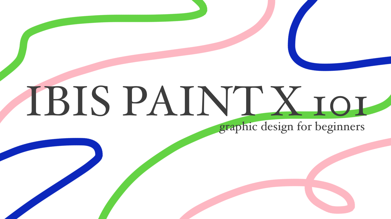
1. Trailer: A Short Introduction to this Course: so it has been almost a month into summer. But you still got absolutely nothing to dio like officially nothing to do. Do you know what we got you? In fact, we got something for you. Join on Corn today it's ive pain X 101 If you are new to graphic design, discourse is just right for you. We're going to change you how to use the app. I was being X to create professional artworks. We're going to show you how to make a movie Posters, book covers, magazine advertisement and many, many more Using the private pain Pain X is an app that you can Dallas to your device for free. It's available on both Android and IOS. Modest at will provide you many useful tools from this course. We'll give you two skills to use those tools and green your own beautiful artworks in this course got you through the process of making illustrations, drawing typography, etcetera on the app I paint X. So join of course. Today, Dell, be new videos every Tuesday. Once again, this is our course. My pain X 101 graphic design for beginners
2. Brush and Text: Hey, guys, welcome back to our course up this pain X one A one craft designed for beginners In today's listen, we're going to explore de Brush a text function. First, let's learn how to create an artwork. Open the APP By selecting the APP. Aiken Select my gallery to create a new artwork. Select the plus Aiken in the upper right corner. After that, you'll see a list of options to chose. From here. There are many suggestion for you. It can chose SD size HD size one by one, paper size and etcetera. In addition, IBIs Pain X also allows you to customize your paper size. For now, select SD size. Let's talk about brush to open the brush setting. Select depression Aiken in the left vertical bar. The Left column is a long list of different precious for you to choose. Most brushes are free, but some will require you to watch a short F ties hman to be able to use that brush. My favorites are dipped pain, hard crayon and soft shark. Try it out yourself and find your favorites on Variety column. Here you can adjust the start off the tip. A negative attack City of Start and a pack city of end. The two last bar are to adjust the fitness and capacity of crush. Close the brush setting. By selecting the brush. Aiken again, look down at the bottom horizontal bar. This is the mini brush setting. The left adjustable bar is to change the fitness of to brush the right one is to changed. Pack City of Depression in the bottom horizontal bar. The first Aiken from the left is to switch from fresh to a razor. Select the circle. Aiken will open the pressure setting. Selecting the square. I can open the color palette. You can chose a color that the APP suggest in the left window or picked your own color. Using the color wheel and various adjustable bar and the right window, close the color palette by selecting the square Aiken again. So like the down arrow to hide the bottom horizontal bar next to it is to undo and redo button. Actually, there's a faster way to undo and redo. Touch the screen by two fingers to undo and touched a spring by free fingers. To redo, select the layer Aiken opened A later window will learn more about the Foshan off layer in the next lesson. Finally, select the left arrow button. Here. You can either chose to save the artwork as transparent PNG save as PNG or to go back to my gallery. Moving on. Let's talk about text toe. Add text. Select the tech liken and the left vertical bar such to screen and select Add text and the white box type in the text Select fund and a list of options will appear. For example, I chose Future Up Bold. Next, you can change the alignment off the text. It could be left, center or right. Finally, the text can be either vertical or horizontal. Moving on select size. Used a trustable bar to change the size of sex. Select style, then so like the upper square Aiken. To open the color palette. Here, you can chose to color off the text. Select the first square organ again to close to color palette. Select the lower square. I can depict the stroke or to text outlined color. The bottom adjustable bar allows you to change the thickness of the outline. Select spacing. Here you can change the spacing between letters as well as do spacing between lines in a paragraph once you're finished. So like the tick I can to save your changes before we end today's lesson, I want to add a few things firstly, for the best experience with artist Pain X, or just craft design on your phone or tablets. In general, I highly recommend using a Matt screen protector. What it does is that it makes your screen much Morse mover and more paper like. In addition, you can avoid dirty fingerprints by using Matt Screen protector. I never way to enhance your editing experience is to purchase a starless. A stylist would be useful in hand written letters or drawing fine details. The most important thing you need to consider when buying a stylus is palm rejection. Make sure that you can. You rest your palm on the screen when you used to. Stylists check out the project description to see the link to Della the at Piper's Pain X on both Android and IOS and information about the Matt screen protector. But I'm using Desist e end of today's lesson. I hope you enjoy it once again. This is our course. I abstain X 101 Graphic design for beginners
3. Layers and Rulers: Hey, guys, welcome back to our course. I was pain X 101 Graphic design for beginners and today's lesson. We're going to learn about layers and rulers first. Let's talk about layers. Layers are an important aspect of digital art. As the name suggest, Layers are like multiple sheets of clear film. If you do the line drawing, coloring and creating the background all on different layers and colors will not mix, which is something can be caught useful. This also common to draw hair, skin and clothes and etcetera on separate layers. Let's come back to the later tool interface. Select the layer icon in the bottom horizontal bar toe. Open the layer window. The frame and the left is the preview section. Under right is where all layers are displayed when you have a lot of layers and you don't know which is which you can check by trying to hide and unhygienic by clicking the Aiken and watch from the previous section to see which element is hidden. To afford confusion, you should name your layers to rename a layer. Select the fray dot Aiken in the right vertical bar. Select renamed Layer Here, type and what's inside this layer. In addition, you can save a layer as a transparent. A transparent is basically a picture without background. For example, I true these beautiful flowers, but I don't want to save it with a white background. I just want flowers only. Select the free dot Aiken and then select safe layer as transparent. Now I can at this flowers into my other artwork. Next, you can select the trash I can if you wish to delete a layer moving on. Select the merge pichon to combine the current layer to the layer below it. The next two Aikens function is to flip the layers vertically or horizontally. Continue on the right vertical bar. Select the transform button to move the layer around in the transform window. Select the curved arrow to tilt the entire layer around. Select the perspective form and a mesh form to bend delayer however you want, just play with it and you'll figure it out. Finally, select the tick liken to save your changes. I know I have not introduced all the layers futures and ive pain X because many of them are not relevant to our course. Therefore, if you want to know more about potions of any features. I recommend checking out this pain website, which is like an encyclopedia for the APP, in which you'll find informations of any features that obvious pain offers. I'll lived a link to the website and the project description. Let's move on to the rulers. Select the ruler Aiken in the upper right corner. ST Ruler Tool lets you draw straight lines. Circular Ruler is a tool for drawing accurate circles. Elliptical Ruler is a tool that lets you draw precise ellipsis. Radio Ruler lets you draw radio lines easily. Mirror Ruler is a tool that draws to see illustration on the flip side. This useful in producing symmetrical illustration. Kaleidoscope griller lets you create place, parent and shapes easily. Every ruler and perspective are a ruler. Are amazing tools specifically made to draw Mendola, but they're pretty advanced for beginner. So if you want to know more, visit obvious pain. Website. Missus D end of today's lesson. On next week, Agenda will design a movie poster Once again, this is our course. I was paying X 101 perfect designed for beginners
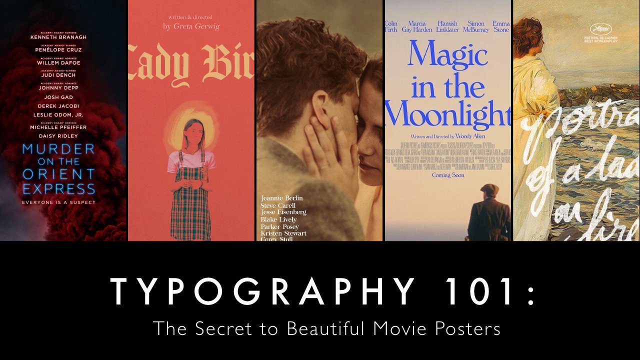
4. Create movie poster: Hey, guys, welcome back to our course iPods Pain X 101 Graphic design for beginners In today's lesson . I'll show you guys how you can create your own movie poster using the APP RBIs Pain X. Today we're going to learn how to create a minimal movie poster design. You've probably seen the stall of poster all over Pinterest. It is this eggshell what background Oven finished off a scene from the movie in the upper half and information such as running time director, producer and a cast and he lower half. It is very simple and minimal, but yet very beautiful and professional. Here's how you can achieve the same a static. I'm going to create a poster in this minimal style for the TV show. To grate on who first, you need to collect all the materials you will need to create this movie poster, go to Pinterest and search for an image of a scene from the movie that you like. Here I find this beautiful image from the movie to Dallas. This image. Select the free dot Aiken next to the image and select Della image. Next, you need to find the minimal movie poster design in the search box type in alternative movie posters to save your time searching for these images, I'll put the pictures link of these images that I use in the project description. Just click on the links and don't want to images to your device. Finally, you need to look up on the Internet for the running time to director the producer and a cast of the movie. Now that you have covered everything, let's start making the movie poster First. You need to create a new artwork that is 6 86 by whiffed and 10 16 by length. This is the size of a standard movie poster. Next, we'll take notes of Did ratio off the movie scene imaged to detects. To do this first import, be imaged off the minimal movie poster designed to your artwork on a separate layer. To import an image, select the layer Aiken and a horizontal bar. Next, select the camera I can in the horizontal bar below the previous section. Here, go to your photo gallery and select the minimal movie poster design. Now you need to adjust image to make sure that it's fits your paper size perfectly. when you are happy with the result, like the Tick Aiken in the transform window, create a new layer by select the plus I can in the horizontal bar below the preview section . We're going to mark the size and position off the movie scene. Imaged in this layer. Make sure that the new layer is on top of the layer. Contains the escape the layer window by clicking the layer icon. Select depression I can in the vertical bar on your left. Shows depend hard and adjust the thickness of to crush two to pixel closed brush window by clicking on the brush. Aiken again in the horizontal bar. Select the Square icon, which is differed from the left and chose a cried red color. Now we're going to use to Roller to trace the edged off the movie scene image. Select driller Aiken on the top right corner. Select straight ruler. Rotate Do roller until reach exact zero degree. Start Tracing the ash of the movie scene image, Theun marked the position of detects. When you're done, rotate driller again to reach exact 90 degree. Now continue to trace the vertical side of the image. Doing this will act as a template so that later on you know where to put imaged and attacks . Once you have finished your template, we're going to paint the background. First, select the eye dropper. I can end a vertical bar on your left. This tool will allow you to pick the exact shade of color from an image touch on your artwork where there is the background color. Next, hide all layers except the first empty layer beyond the first layer. Close layer window by selecting deep layer. Aiken. Select the bucket Vikan from the vertical bar on your left, then touch on your artwork. This tool. Just help us paint the entire layer. You're now ready to add the movie scene image to you. Poster. The first. Remember to unharmed of a template layer like earlier to add an image. First, select the layer Aiken. So like the camera, I can end a horizontal bar below the previous section, then select the movie scene image that you have hallowed earlier at just the image. So it fits perfectly. Luckily, my image fits just right. Once you're happy with movies, sin image, let's move on to the text. Select the lawyer Aiken select the plus, I can create a new layer for the text. Now you might be wonder which font should I use to replicate the same aesthetic, something that most beginners to craft design struggle with is that they don't know which fond use craft design is all about effective communication. Using images and texts so chosen to write font and knowing which funds Ghost Gover is very important. I'm going to help you guys out by providing the exact font size and spacing between letters . First for the title of the movie, select the text Aiken in the Left Vertical bar, click on the screen and select Varteks and the White Blocks. I'm gonna type into Great, which is the name of TV show Close to Keyboard. Select the Fund Aiken. Here you can chose Avenue next condensed bulled. Next, select the size I can. The size after title should be 76. Finally, select the spacing Aiken, adjusting the first bar to minus 6%. Now move to title to the right place. Next to the title is the release year, just like what we just did Select detects. I can select attacks and type in the release year for the release year. I used to fund Ping Fang TC light in size 42 a spacing is minus 9%. Once you're done, click the tick I can and put the release year next to the title. For now, you just repeat the same process for running time director, producer and a cast. For these information, use default Avenir next condensed regular in size 24 spacing should be minus 7%. One thing to keep in mind is to make sure that you put each phrase in a different text marks. For example, don't put running time and 40 fine to 55 minutes in the same text box. If you put them all in the same text box, you can't adjust this spacing between these two phrase they'll stressed out If you can't catch up. Details about the font, the size, the spacing and all related resource are in the project description. Make sure to check it out after adding all the text. You're now ready to save the hour movie poster to your device. When you're done with adding tax hide Everett template. It's a high to template. Select delayer Aiken find a template later and select the I liken to hide the layer. Close the layer window by selecting the layer. Aiken again select the left arrow in horizontal bar, then select back to my gallery. Now it's Adelo poster to your device. Select the share I can in the upper right corner. Here, you can chose to save it as Ivor P and G or J. P. E. G. File. I'm going to select photo P and G and then click Save image and there you have it. Here's your Simon. I want you to create a movie poster for our movie that you love. Recently. Here are the steps that you can take. Step one is to gather all the material. You'll need an image off the movie scene. The minimal movie poster design some information about the movie, including running time director, producer and a cast. Step two is to get right into doing it. Create an artwork now, just following the order, Pain to background marked a ratio at the image and finally at the text again. All the material and resources will be list in the project description. If you have any questions, don't be shy to live in a comment in a discussion tab, I will try my best. Answer all of your questions. This is the end of today's lesson. I hope you enjoy it once again. This is our course. I was pain X one, a one product design for beginners.
5. Design book covers: Hey, guys, welcome back to our course. I've this pain X 101 perfect design for beginners in today's listen, I'm going to show you how to design your own book cover. I'm inspired, but covers of Penguin Random House Cloth Bound Classics collection is very minimal, but it just immediately captured your attention. Today I'm going to design a book cover for the novel the ABC Motors by aka Foe Kristie. The result will look something like this. She was watching to see how I designed this book Cover. First, you need to create a new artwork that is 600 by wished and 900 by. Let's Next one. You choose it. Choose to colors that goes together. Here are some suggestions for you personally. I chose red and pink. Let's paint the background first to paint the entire layer. So like the bucket I can in the left vertical bar chose color. Select the square Aiken and bottom horizontal bar opened the color palette here that shows Brett closed color palette by touch on the square. Aiken again touch anywhere on your artwork to paint the entire later. Next, we're going to draw the borders. Great a new layer by selecting the layer I can in the bottom horizontal bar, then so, like the plus I can. Now that you're on the new layer, close the layer window by touch Another layer. I couldn't again to draw the borders. Select the brush I can from the left vertical bar. Here shows dip pain heart at just perfect nous to free point. Oh, pixels close the brush window. The chose the color of the brush. So like to square I can in the bottom. Horizontal R I shows to color pink from the color pod escaped from the color palette by touch on the square. I couldn't again. I'll use a ruler to draw a straight line. So, like the ruler icon in the upper right corner, select the street brawler. Rotate ruler to draw to virtual life and to horizontal lines to create a perfect total. People turn on. So like be a razor. I could, at just the victors of the race trump, as you wish used to straight ruler as your guide to clean up the edges. Moving on the next step is to design your own pattern. I'm going to design this ABC letter pattern in a new layer. To create a new layer, select the layer I can in the bottom horizontal bar Select Plus Aiken here in the new Layer two attacks. Select the text liken from the left vertical bar, click at text in the white box, type in a select font and shows raw quail from the list of options so like to slice and increase the size to 170. Moving the letter A to the bottom left corner. Finally, click on the Tick Aiken. Don't worry if the letter pick out off border, we'll fix that later. Continued to add in more letter A, B and C each layer in a different text box. Here I'm arranging these letters and sort of a crisscross pattern. You should notice that I left some plank space, the top and bottom blind so that later we can add the name of the book and offers name to raise some parts of the letter that pick out of the border. You need to paint it bread to hide it. First, create a new layer. Select the labor I can in the bottom horizontal bar. So, like the class, I can create a new layer. Close the later window by touch on. Later, I can begin in this layer. Select the brush Aiken from the left vertical bar. Increase the fitness off the brush stroke. Next, open the color palette by selecting the square. I couldn't hear I picked the red color that I used to paint background. Earlier did closed appellate court from the Square Aiken again, you sprint roller to draw red lines that hide the letter. Once everything is decent, it's time to add the name of the book and offers name. Create a new layer by selecting the layer I can bend. So, like the plus, I could close the layer window. Select Detects Aiken from the vertical bar on your left, click at a text and the white box type in the name of the book Select Front and Chose Time . New Roman Changed Alignment of the text to select a size and just to 40. Finally click on a Tick Aiken Move Thing detects to the top, tripping to text blocks so that the title is separate into two lines. Do take sexy things to add the offers. Name. Sotelo. The book covered to your device. Click under left arrow icon in the bottom horizontal bar here. Selected Safe asked PNG. Here's the bonus for you if you find these insect drawing pattern fascinating and you think to yourself, you could never do it just because you don't know how to draw. Here's how you can do it, even if you do have no drawing skills. Such a rule for an image of an insect. Here I find a picture of the monarch butterfly. Now I'm going to save it to my device back to Augustine eggs import image to your artwork by selecting the layer I can then so the camera. I could go to your photo gallery and select the finished that you've just bellowed, placed imaged in the center and click the tick. I can create a new layer by selecting layer. I can invent. Select the boss I can close to later window by selecting the later Aiken again and this new layer, we're going to draw the butterfly by tracing the image up to a butterfly. It's like the crash. Lighten from the left vertical bar at just for fitness to free point. Oh, pixel. So like the square Aiken and, uh, bottom horizontal. Bart opened the color palette here. I chose a white now using the butterfly imaged as your god draw the butterfly. This process might take some time, but I promise you your results will amaze you. When you're done drawing, you need to duplicate the butterfly drawing. So, like the layer I can in the bottom horizontal bar. Then select the item that is still second from the left and horizontal bar below previous section next week. Dr. Kate later continued to duplicate the layer until you have 12 layers off the butterfly drawing. Now we're going to arrange these butterflies into a pattern. First, hide the butterfly finished by selecting the I can go to the first later that has a butterfly drawing in the layer window. So, like the transform, I can enter right vertical bar shrinking the butterfly, drawing a little bit, then moved image to the upper left corner. Finally, click the tick Aiken, go to the next butterfly layer again select transform. I can shrink into drawing a little bit and then place it next to the first butterfly. Continue to moved next to player until four butterflies for into a diagonal. Keep on doing the same thing with the other layers until you have four diagonal made out of butterflies. Finally, you need to erase parts of birth. Fly the pink out borders. First, create a new layer. Select the layer I can in the bottom horizontal bar. Select the cross ICANN to create a new layer. Most layer window by touch on the layer, Oncken again and this layer, so like depression I can, from the left vertical bar, increased the thickness of depressed stroke. Close the fresh window. Next opened color palette by selecting square Ivan here, I picked the pastor blow color that I used to color the background. Two. Closed appellate. Such almost square Aiken again. You're straight ruler to draw blue lines that hide the drawing, and there you have it, a beautiful and professional pattern For today's assignment. I encourage huge great book cover for your favorite book. Details about the font and sides of texts are used as well as any relevant resources, and material will be a list and a project description. Make sure to check it out. If you have any questions, don't be trying to live a comment, A discussion tab. I'll try on the best to answer all your questions. This is the end of today's lesson. I hope you enjoy it once again. Is this our course? I was pain. Thanks. 101 graphic design for beginners.
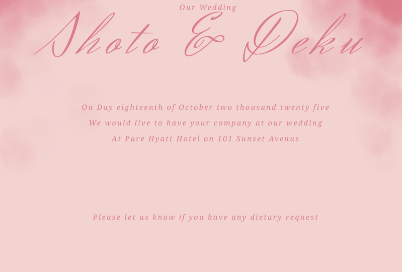
6. Design wedding invitations: Hey, guys, welcome back to our course. I was paying Exporter one graphic design for beginners In today's lesson, we'll teach you how to design a wedding invitation. Let's get started. If your mind is plank, just go on Pinterest and find inspiration. You can search for wedding invitation. The first step is to decide the theme. After scrolling through Pinterest for inspiration, I chose to go with astonished look phones and pinkish team color. Also, I want to introduce a very simple style and graphic design. The contrast between cursive and rigid phones. You've probably have seen this style everywhere. Since there are mostly words on carts. This just a position would make our design become more attractive. Step two is to list out what will be on the invitation. The essentials, including the crew and prides name, location and time and a short invite line. Let's start designing first Great a new artwork. Open the IBIs Pain X AB, Select my Gallery Advance Select plus Aiken. Before this design shows HD size. In this design, I chose pink as the main color on the card. Specifically, I want the background color to be dusty pink, and the letters in a doctor shade of pink. You can take a screenshot of two colors showing on the screen and then used tool eye dropper that we used in the last lesson. If you want to use the exact same color as mine to paint the background used a bucket tool . Select the bucket Aiken on the left vertical bar. After that, select the square Aiken on the bottom Horizontal bar out shows a pure wide and at pink tint into it to select appear wide. Drag the round color selector all the way to the white corner. After that, dragged around organ on the outer color circle to read. Now at just the saturation bar, which is the second from the top to 5% for the sake that everything is center nicely, I highly recommend drawing a grid at a new layer by selecting the layer Aiken on the bottom horizontal bar. Then select two plus Aiken. Select the layer Aiken again to s it for later setting. Switch to the brush tool touched the brush I can again and then select def pain soft at just the thickness to four pixel after bad. Select the square Aiken Change the color to plaque. Now open the ruler by selecting the ruler I can on the top right corner. Select a straight ruler with the ruler. Count the number of lines between two side and divide your canvas into two equal rectangles . Turn a ruler to 90 degrees and divide the canvas into four equal rectangles. We can hide discredit later when we finished with two to design fund that are this pain. X offers is a bit limited when it comes to cursive font. Therefore, I'll show you how to find a phone online and use them in our pa's pain. X My go to place to get a cursive font is deafened dot com. I searched the Web site on a Web browser and scroll around the website. After browsing, I decided to use default. Health stand to use despond. First Select did a load option. After that, select the Dalek Argon on the top bar. It would probably took you to falls where the dollar fund shall be stored. Select defile ended in dot T T f T, which is the special kind of file for funds. Click the share button on the top right corner and click the free dart button scroll through the list and chose to copy too obvious pain eggs. Now you should be able to use it in obvious pain. X Just a quick overview of the over of content on the cart and how I want them to look like I want the name of the groom and pride to be the biggest and centered. Smaller underneath will be did eight and Invitation line, followed by the address of the place. What a wedding will be held about fonts. I'll use default hell. Stand for the names of the brooms and bride to add a new layer. Select Delayer Aiken in the bottom horizontal bar. Select the plus Aiken. Close the layer window by selecting the later Aiken again. So like detects Aiken and then touch the screen and select at tanks. Type into two names. Select the font Health stand. Select the color. I choose this darker shade of pink, which I think those really well with the light pink background. The size is free 114 and spacing is 14%. Make sure the names are in the upper center of the canvas. Next, I'm going to enter the date the invitation line as he addressed all of them. It one textbooks for these information, I chose deformed basket, Bill says. I think of a spon. Was Chief Dad Khan trusting? Look we've talked about earlier. The size is 49 a spacing is 16%. Make sure of a text is centered. Notice that I didn't write the date in numbers, but in words. This is solely for the purpose of aesthetic sense, ill of so much nicer with the long lines below it. Now we're just going to move it to the center of the card. Finally, I'm going to add this line saying, Please let us know if you have any special dietary requests near the bottom of the card. Now that the essentials are on our card, let's finish up the design. I want to add the word our wedding above the names and a basketball fond to make the tile look a little bit fuller. Slight detects Aiken in the left vertical bar, then touch on the screen and select. Add a text topping the word our wedding select to take Aiken then moved a text to dissenter and bright above the title. So hide the border around a text select delayer. I can select any other layer. Since we're done with the text, let's hide the guard Ingrid, by selecting the I I can next to the great later. Since our cards still look pretty empty, I'll fix this, but adding the watercolor effect. I'm going to make big dots of pinkish watercolor on the top of the card, which I think it will achieve the look and feel of falling flower petals, which is pretty representative for a wedding. To do this, I'll add a new layer by selecting the layer Aiken on the bottom horizontal bar, then Joe's do. Plus, I can make sure that the layer wolf just grade is underneath. Detects layer as said the later section, by selecting the layer Aiken again. Then select the brush Aiken touch twice to open the brush setting. The brush type is watercolor plead. You have to watch a short advertisement in order to use this brush increase of a fitness to 255 pixel. I want these in plots to look pill in order, not suit, dragged the attention away from our heading. Therefore, the color will be the same shade of pink asked of texts, but I'll adjust capacity to down to around 50%. I'm just going to add of a dot around like this. Now that we're done with our design, here's how to save it to your device. So, like the left arrow I can on the bottom horizontal bar, then select Save as PNG. Now you'll be able to view your design via your device gallery. Here's Tadeusz Simon. I want you to design an invitation for any occasions that's coming soon. Whoever it's your birthday party or an anniversary, anything that comes to your mind. This is the end of today's lesson. I hope you enjoy it once again. This is our course. I was pain except one a one graphic design for beginners.
 Minh Ngoc Nguyen