Transcripts
1. Typography 101: Introduction Trailer: Have you ever find yourself being mesmerized by an absolutely beautiful movie poster? And you wonder, why is this so beautiful? Is it the font that they use for perfect spacing between the letters are proportional arrangement of texts or via static color combination. Ultimately, for secret to beautiful movie posters is topography. The art of using text. In this course type of graphene 0101, you'll learn what makes that movie poster so pitiful. And you'll learn how to design a beautiful movie poster like that. Epigraphy one-to-one, as no requirement for expensive software of basic knowledge about graphic design or wherever you are beginner to graphic design or you're just curious, this course is for you. So are you ready to unlock the secret?
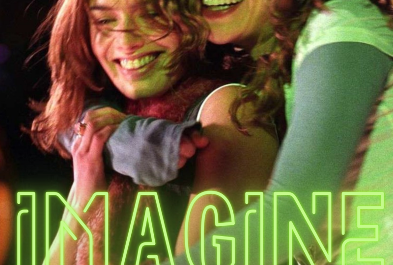
2. Typeface vs. Font & Which Font to Use in a Design: Hello everyone. Welcome to type of graphene 0101 is secret to beautiful movie posters. In this lesson, we'll learn what's the difference between typeface and font for design. First of all, typeface versus spawned. A typeface included multiple fonts from the same family, while a font with a specific weight and size type within that family. For example, and this poster, the typeface is Futura. But more specifically, the font is 22 feature on medium for the actress names and 72 future or extra bold for the title. Now, we pick a questions for every designer is which font to use in your design? There are two factors to consider when choosing a font. Practicality and aesthetic. Practicality means readability. No matter how beautiful is to poster, if the font is eligible, fan, it is a bad design. So how do you know if the font is practical or not? Ask yourself this question, is this easy to read? Pay attention to the spacing between letters and spacing between words. Pay attention to the leading of a gap between the lines. Pay attention to the color. And if there isn't enough contrast between color of the text and the background, it will be hard to read. And finally, as a general rule of thumb, a cursive and calligraphic fonts, harder to read and simple and minimal fonts. Next, let's talk about a set X. A movie poster is beautiful or not because the font itself is beautiful. But wherever because the font just goes really well. The theme of the movie. For example, when you go to Pinterest and search for beautiful typography, many fonts like this will show up. Let's have a closer look at this typeface. Font is Lovelace, extra light gray zeta fonts. The design of the swan is pretty amazing. It's consist of thick and thin strokes. Those details give this font a very classy and elegant feeling. However, it wouldn't make sense if you put a font like this on moving posters. So make sure you choose a font that suits the theme of the movie well, and not just any beautiful fonts. Have a better understanding of what I've been talking about. Let's look at some grade as well as some bad movie poster design. You're looking at the poster for the movie Lady Macbeth, released in 2016. This is an example of practical but completely lack of aesthetic movie poster. A chosen formed, it's very readable. Specifically, it is unit texts probe bold. The spacing is reasonable. It's not too tight or too far away. It is comfortable to read. Yellow color of the text really stand out. However, I don't see any connection between the text and the background. Searching from an alphabet, that mean character's wearing. I guess this film setting is in the nineteenth-century. Is font just doesn't remind people of nineteenth-century at all. Also, the color combination of blue and yellow is kind of non-related. Overall, I think it isn't. Okay design, but the designer could have done a much better job. Here is a better alternative. I think this color palette works much better than the yellow and blue combination. You may don't notice, but they actually used a different font in this design. It is still a minimal font like the last time. But this time it gives a suspense mystery wipe. I think that's due to the quote cited in the upper half of the poster. Those codes 12. This movie is actually about murder. Crt makes sense to use a font that is commonly used in many other mystery solving movies, like Murder on the Orient Express, death on the Nile, The Girl on the Train. A design that makes the same mistakes is the movie poster for the series and with an e on Netflix. Again, that is definitely readable. There's not much work to do really. It's just one word and a short line. Chosen Font reminds me of are in Microsoft Word. It is such an old-fashioned want for headlines nowadays. And it's definitely not suitable for a movie based on a coming of age novel about orphanage goal in the late 19th century. The yellow and blue combination is really out of nowhere. Here's a better alternative. I really like the blue pastel purple palette in this movie poster. Also a font used for the line, Welcome back to Green Gables, suits the theme of the movie really well. Let's look at one last example. Here's the poster for the movie the big gild, released in 2017. This time, this movie poster is extremely ascetic, but sadly, unreadable. Fonts here really express the FIM of the movie, which is feminine and romantic, but also dark and kind of forbidden. The colors are also beautiful. Soft pink just brings out feminine element of the movie. But admittedly, it is hard to read. Firstly, I don't understand why all the texts is vertical instead of horizontal. Secondly, the font used afforded title is a formal script typeface characterized by cursive and connected France strokes that suggests elegant, even though it definitely suits the theme of the film really well. It is definitely not something that people will understand in a short span of attention. Now, look at this design. They've improved by rotate everything to horizontal, but they still keep the same font for the title about the font, we want something that keeps the vibe of the formal script typeface, but we also need something that is more readable. This alternative design just get the best of both worlds. Honestly, I think this is a very clever design. They used to formal script font for the first letter and a serif typeface for the arrest. All in all, the key to beautiful movie posters really is to balance out the practicality element and aesthetic element. That's all for this lesson video. I hope you have had a better understanding of typography. Thank you for watching, and I'll see you guys in the next lesson video.
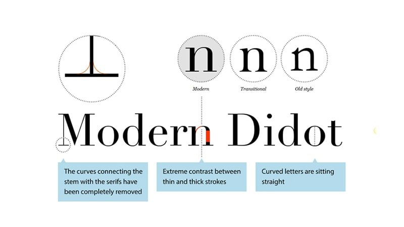
3. Categories of Types (Serif and San Serif): Hello everyone. Welcome to type of graphene 0101, the secret to build whole movie posters. In this lesson, we'll go through some topography terminology in different categories of typefaces. First, let's have a look at some basic topography terminology. Stress refers to the invisible line dissecting the cleft from top to bottom at us finish point. You can see to stress the most obvious and the letter O here are to 0 from two different typefaces. You draw a line from top to bottom at his spinous point. On the right, the line is diagonal, so we call it diagonal stress. While the left, the line is vertical, so we call it vertical stress. Next section is any kind of stroke or line or the core attached to the latter. Typically, there are two kinds of protection. Serif and terminal. Serve refers to the short line or stroke on open ends of letters. Terminal is the end of a stroke that is not a serif. And finally, bracket is curved or watched line connection between the stem and a serif of some thoughts. Now, we will go through two main typeface categories, serif and sans serif. First of all, serif. Serif typeface include a slight protection finishing off the strokes of its letter forms. These categories can be further divided into five subcategories. Old-style series, transitional serifs, modern serifs, slab serifs, and clearfix Arabs, who mainly examine free elements to distinguish these five subcategories. Stress is the diagonal of vertical market. Does it have project? And the level of contrast between thick and thin strokes? Otherwise, I will mention any other noticeable differences. Own style serifs characterized by a diagonal stress, a minimal contrast between thick and thin stroke. Serifs are in one shape and are almost always bracket. Head serifs are often angled. One example of an old-style serif typeface is Garamond. Moving on, transitional serif is usually have vertical strokes, vertical stress, and there's more pronounced contrast between thick and thin strokes compared to old style serifs. Serifs are packet and head serifs are clink. A famous example of transitional serifs is Baskerville. Next, modern serifs are characterized by the dramatic contrast between thick and thin strokes. For instance, of curved strokes is vertical. Serifs are inherent, line shaped and practice. A number signature of modern serifs, Chartres is the ball-shaped terminals. Two commonly used modern serif typeface or widowed and Bodoni continue. Slab serifs typically include very heavy serifs with very low or no cracking. There's no contrast and the stroke weight. A well-known example would be Rockwell. Finally, Conflict Theories are distinguished by the triangular shaped serif designed or tapering stroke ends, minimal contrast and stroke weight. And the axis of curved strokes tend to be vertical. One example of classic serif typeface is arbitrary. Now let's look at a few example to see where would it be appropriate to use a serif typeface. Here are three beautiful movie posters or use serif typefaces. From left to right. We got half a society where lists and 2016 for our formatting crowd, released in 2015 and lost in translation, the whole 1003 Oscars winning for the best original screenplay. So what is the general feeling but serif typeface brought to these free posters? It gives viewers the classic sophisticated dedicate, an elegant feelings. So in general, if your design has a classic and traditional and serious style, it would be great to use a serif typeface. Moving on, sans serif. Sans serif typeface do not include any projections at the end of the strokes of the letter form. This can be further divided into four subcategories, grotesque and neocortex sans serif to metric sensor of a humanistic sans serif. First of all, for task and new grotesque sans serif, there's minimal contrast and stroke weight and a slice squared quality. Too many curves. After famous examples are Arial and Universe. Next is geometric sans serif. These typefaces are characterized by their ground shape of the letter o. Character shapes are made up of simple geometric shapes and there's no contrast between strokes. These pieces are very commonly used in movie poster, notably future. And lastly, humanistic san-serif. The only feature that distinguishes humanistic sensory from oversight thereof is the apparent contrast and stroke weight. A few examples are a Gill Sans and Fergana. Let's look at some amazing movie posters, but use sans serif typeface to see the feelings. But sans serifs could give to a design. Here are parasite, the 2020 Oscars winning for Best Picture of the Year. The lobster released in 2015. And a free 55, which we'll never know. When will it be released. Sans serif typeface typically bring a very minimal, clean, modern, innovative five to the design. Therefore, in general, whenever you're doing a sci-fi movie poster, a mystery solving movie, or basically any genre assigned serif typeface will always be a great choice. That's all for today's lesson. Thank you so much for watching. I'll see you in the next video.
4. Categories of Typefaces (cont.): Hello everyone. Welcome to type of graphene 101 is secret to beautiful movie posters. In today's lesson, we'll continue to introduce in the upper three categories of typefaces. Part one, script typefaces. Script typefaces are characterized by fluid strokes of handwriting, ranging from formal to casual. Typically they are used for decorative purposes. There are three subcategories of script. Typefaces. Formal scripts, casual or calligraphic scripts, and plaque letters scripts, each brings a different feeling to the design. First of all, formal scripts for more scrub typhus mimic the 17th century formal handwriting. They usually have connecting strokes, flowing loops and flourishes by hand scripts as snail, round hand are two examples of formal scripts. You'll find formal scrub typhus is commonly used. Invitations, announcements, and decorative initials letter. They help setting an elegant, sophisticated, and most importantly, feminine tone. They are really used in movie posters. Two examples that I found are the big field and Billy Elliot. They be killed is the movie written and directed by Sofia Coppola, released in 2017. We've gone over this movie poster in less than one. The formal script font in some pink color, perfectly expressed with a few of the movie, which is feminine, romantic, but also dark and mysterious. Meanwhile, let's look at the Billy Elliot movie poster. Here. The design also used a similar font in soft pink color. I think it's a brilliant design because notice how the boy does not completely stand behind or in front of the text. Unlike the girls surround Kim, who are all completely behind the text. This shows have a boy struggles to fit in this world of ballet and ultimate feminist art. And that is the whole story of the movie. A few reminders, well, only use formal script typefaces for headlines or short phrases. Since long paragraph of text, set and formal script or not readable, also, never scanned them in all caps that are not designed to use like that. Next, casual or calligraphic scripts. Casual or calligraphic scripts mimic our casual everyday handwriting, but pen or brush use casual scripts to bring a friendly format or personal growth to your design. Here are some iconic use of casual scripts and movie posters. First of all, call me by Your Name, movie poster. The use of a very loose and casual handwriting font, combining with a beautiful color palette results in an absolutely remarkable design. Just by looking at the poster, viewers are already walked until the summer of Italy, Ready to witness a SAT love story. Similarly, for the fault and our stars, nothing could go wrong if you use the right script font with the right color palette. The black, white, blue color theme is consistent with book cover design, making the movie recognizable to this book Phantom. The crayon texture of this typeface just creates an Internet but playful vibe of teenage love story. Altogether, casual script hydrolases typically work well with love stories because it brings such a very personal and intimate feelings to design. Finally, a letter scripts. They are also called Gothic or Old English scripts. They are easily recognized by the traumatic thin and thick strokes as small as the intricate design of the letter form. But letters scripts are oftenly used in certificates, diploma, degree, and especially newspaper mean plates. They are barely ever used in the movie poster. But Lady Bird is an exception. The letters scripts to themselves, such as something very formal and serious. Meanwhile, the poster is basically a portrait of a pink dyed hair young female. She's a wild, unique. And this whole thing is not meant to be for more serious at all. I think that is a really cool contrast. And if you really look at the poster closely, you'll see that it is full of contrast. So to squirrel is wearing an old-style least trust with a pearl necklace or having her hair dyed pink and cut short. The blur background is actually Catholic high school, but does she goes through, but she's probably anything but conservative and traditional grow. You see, it is full of cultures and it works out to be an absolutely beautiful movie poster. Let's move on to part 2, monospaced type faces. Monospaced type faces are characterized by an equal amount of horizontal space for each character takes. They are used encoding computer programs or typing with a typewriter. Korea is a famous example of a monospace font. It'll be great to use a monospace font in a movie poster. If the typewriter got an interesting or important connection to the story. Can you ever forgive me, released in 2018 is a great example. And lastly, part free display typefaces. Display typefaces are two offices that are designed specifically for titles and headline. Typographers can be created with these surfaces to create a unique title of the movie posters. Many franchise and movie series have one of the current typefaces for their titles, such as the Harry Potter series, the Adventure Series, Captain America, Iron Man, or basically every superhero movie series. And that's all for today's lesson. Thank you so much for watching.
5. Typographic Hierarchy: Hello everyone. Welcome back to typographic. Want to learn the secret to beautiful movie posters. In this lesson, you'll learn about typographic hierarchy, part 1. What is the typographic hierarchy? A typographic hierarchy is an organizing system for establishing order in a body of texts and helps the viewer to find specific information, but editing different types of information in different styles. Let's look at some examples. This is some information about the upcoming exhibition that museum is promoting. If I didn't tell you that, you may not even know that. What does this about? Because there's no typographic hierarchy here. All information is edited in the same style, same font, same size, same color, same everything. And this is what you got when you create a typographic hierarchy. Just a couple of changes in size and weight. Viewers are now able to find the information they need. Now for movie posters, here is what happens when you don't have a typographic hierarchy and the design a poorly conveys any information, and it's hard to even tell what's the name of the movie. Once you fix it by creating a very simple and basic hierarchy. Things on March clearer. Moving on to how to create a typographic hierarchy. It's a three-step process, including step one, Identifying the information you need to include under design. For movie poster, that is typically the movie title, actor's name, the director's name, and a hook line to pull people to theatre. Step to organize information in the order from most to least important. This depends on the situation, but generally LP movie title, and then actors names, directors name, and Hotline can all be on the same level. Or if you want to highlight the name of an actor staring in the movie or the director of the movie. Then move that information up a level. Finally, step 3 is to figure out how to make that hierarchy recognizable to viewers. Here are six ways to do that. Number one, size, its symbol. Bigger means more important, and smaller means plus important number to wait. Making a typeface bolder or thinner is an option for you. Number 3, color. As all texts is unseen color, use lighter shades of that color for less prominent information and darker shades for important ones. Or you can use the color that is starkly contrast the background for the title, and less contrast in colors for the information. Number 4, case using uppercase characters for the titled differentiated from other information. Number 5, position and alignment, where you put the information on the design and the alignment of the texts can show the level of importance of that information. Usually, the most important information will be placed in the center of the design and center aligned. Finally, number 6, a combination of all of the above. Oftentimes, designers combine two or more of the options to effectively differentiate different levels of the hierarchy. A special edition is fun. Using different fonts for different types of information can help build hierarchy. But this alone won't be effective. So it's best to pair it with some methods. And that's all the general steps. Check out the next lesson for detailed step-by-step tutorial of how to build a basic typographic hierarchy.
6. How to Build Your Own Movie Poster: Hello everyone, Welcome back to target graphing 101, the secret to beautiful movie posters. In this lesson, I'll show you how to build your own movie poster. Today, we're going to remake a diminutive Kruskal for 500 days of summer. We will follow the general steps from the last lesson. First, list out the information you need to include in the design. Second, arranged them in an order from most to least important. Next, you need to pick a background image. Here, you have a lot of choices. You can pick a beautiful scene from the movie, or you can use photos that are specifically shot for the movie poster. Or some designers can build it completely from scratch. You can find and download these photos from a website called movie mania.com named provide high-quality, tasteless movie wallpaper, direct, just perfect for us. So you go onto the website, search for your favorite movie, like the image that you prefer, then click the blue button to download it. Now, we will go to Canvas to start designing. You can either use the web version or the app version. I am currently using the app canvas on my iPad. Select, Create a design and choose Poster to upload images. Select the Upload icon from the left toolbar, and then select Upload Media. I will upload the image from my photo library. Simply click on the image to add it to the poster, pulls the corner so that Emerick, she filled the entire page. Let's go back to step three. Before we continue. Remember, there are six ways to create a typographic hierarchy. Size, weight, color, Ks, alignment, and position, and form. Designers usually use a combination of two or more of these six methods. Beginners should start with a combination of two. And as you become more experienced, try combining all of the methods. The most basic combination is signs and alignment and position. It is the easiest way to get a decent hierarchy. So let's try that out. Back to Canva to add texts, slight detects or icon on the left toolbar. Select, Add a subheading typed in the name of the movie. And all tabs. Repeat the steps to add in the name of the actors, the director, and hook line, often in all caps in the same size we and fall. Now, before we apply the methods, Let's change the font to love law. Now. First things first, size, increased size of the title to 95. Next, decrease the size of the actor's name, 250. Here, you're trying to use the size of the text to show readers what is most important and what is less important. Therefore, the difference in size will be determined by the distance between the levels of the hierarchy for name of the actors is significantly less important than the movie title. So the size of the actors names should also be significantly smaller than the size of the movie title. However, the director and helpline are not as significantly less important, but the actors names here for I will only reduce the size 240. Next, apply our second method, alignment and position. To keep it simple, keep everything's center aligned. Now, you can move the text around and arrange them. Try the classic arrangement by putting the actor's name in the upper boarder. Put the movie title below bad in the center of the poster. Now, put directed by Merck, who have right below the movie title. So now you're looking at it. The upper part of the poster is quite crowded already, so we will move the hook line down to the bottom and also put it in the center like this. And you're done. Try this out on your own. After this, you can try a combination of three or four methods. Keep practicing and you'll get better. And that's the end of the course. Thank you so much for watching.
 Minh Ngoc Nguyen