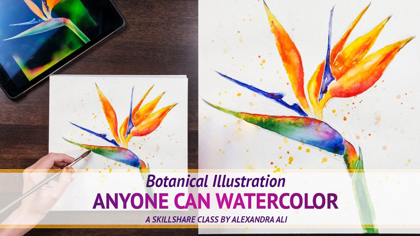
Transcripts
1. Hello & Welcome!: Hi, my name is Alexandra Lee and I'm a full-time artist. Welcome to my water color class. Today you learned how to paint beautiful iris. You will learn different watercolor techniques. Wet on wet, wet on dry. And you will get clear understanding that it's very easy to fix any mistake with watercolor and that it's very fun medium to work with in then you will paint a very complicated and complex painting of iris that will be a nice piece of art to decorate your house or will be a great gift for your loved ones. Don't forget to follow me here and an Instagram for new artworks and classes. Apart from painting very impressive flora, watercolor, you'll have a great fun time during the class. You will boost your self-esteem, relax your minds, and achieve an amazing result as an inspiring artists. So what are you waiting for? Take your brush and let's start.
2. Materials You'll Need: I will start our glass with quick supply around down. I'm using cold press paper. It's on bloke, which means all pages are glued together. And it's really nice for painting on. I'm using white swan 250 gram. But you can get canceled budget, but good-quality. You will also need a few brushes and different sizes. The one I'm using, our animal hair round brush, professional quality. And once didn't quality brush. Not very expensive, but with a nice point and a big belly to hold all the veins and synthetic thin brush for small details. I'm using professional paints. But the balance where you're located, if you're in Europe or US who can get nice Winsor and Newton set and also on students quality watercolors will be good enough. You will need a pencil and eraser color palette for watercolors. And please don't forget to. Glasses are clear water and some paper towels for blotting.
3. Making the Sketch: Let's begin with pencil drawing. As you see, iris flower is quite difficult. So let's start with poor overall shapes. Right in the middle of the paper. We're going to draw two pink ovals, one on top, one on the bottom, and two small ones on the sides. This way we will simplify the shape of iris petals. Ok, now we can draw two petals inside the soap for a while. And let's make a stem with simple straight line towards the bottom of the paper. And now we can start to draw more detailed borders of each petal, which are very beautiful. And as you know in nature, nothing is exactly the same and nothing is exactly symmetrical. So you can play with the shape and make it nice and curved, lean. And just, and let yourself draw it's very loose and in a very playful being. Also. Draw the top petals. Let's draw it in a nice and playful way. Let your hand lose. And so it's all make very nice and interesting curvy lines. And don't worry if you make any mistake, you can always fix it with eraser. And please don't press too hard on your pencil because I'm doing It's just for you to make it more visible on the video. But watercolor is quite transparent medium. So make sure that you don't press too much, too hard. Or you can also, once we finish withdrawing, you can just remove an extra pencil. And you can also help yourself or with some lines that will define the actual curves on the petals. You can draw, you can draw borders were properly. So afterwards you will know where exactly What is located and it will be easier for you to paint. Also, let's continue with the stamen. And yeah, as you see it, orange thing in the middle. So we can make this slightly triangular shape and carry on with the borders. Because some parts are very small and some are bigger. So those waves are quite different. And in a way that looks weird, but it's still quite nice. Please take your time because every parts it has its own speed and pace. So don't worry if you're doing it faster or slower than me, It's entirely up to you. You can always put on pause or repeat. And with some helpful lines, you can indicate where on the petals you have those lines. And that also will be in different colors. Downloads true and beautiful leaves. One on the left side and another one on the right side. As you see on the reference photo, there is only one leaf from bad. If you feel like you can always add up leaf on the side where you wanted. And also when you finish your artwork, you can also add up some little parts. Just the way you feel like.
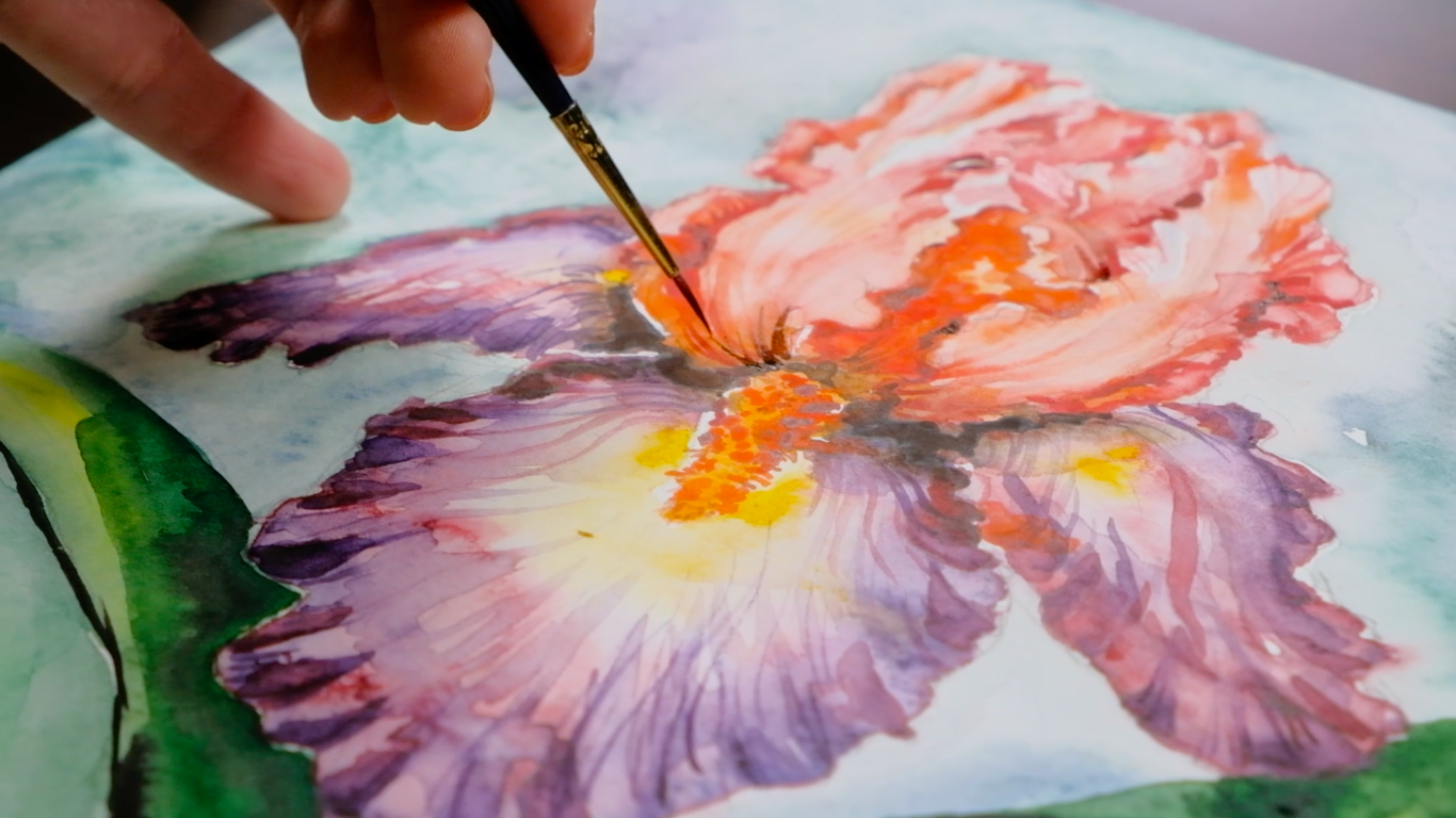
4. Painting Flower - Wet on Wet : So now we can start with the watercolor. And first of all, we're going to paint on the web today. It's gonna be really fun. So let's feel the biggest battle completely with water. Just deepen your brush into the water and put it all on your petal. And make sure that you don't have any holes, like without water. And follow your border lines. So the paint will take the right shape once you, once you add it and make sure you put quite enough water. As you see now I have some holes, some gonna fill them up with water. And if you look from the side, you will always see it more clearly. Those bars that don't shine, shine. It will be indicator of actually gaps without water. And now let's try to take some pink color and mix it with some water to have this very light pink. And also let's make some valve its color by mixing pink and blue colors together. You can also have variety of shades. Sometimes you can put a bit more pink. Sometimes when you put more of a blue color. So your violet won't be darker and cooler. And let's finally add the paint on there. And you see it blends itself very naturally. And don't be scared to put quite a lot of pigment on your battle. The more color you put, the nicer blend and mixing you'll have on your paper. So I'm mixing some more violet, just trying to get more intense color. And now I'm adding some more of a blue color. So some parts will be cooler. And you see this amazing transformation. On the color. It goes from very nice purple color to bury violet. And now we can add some yellow color right in the root of the battle. But don't forget that there's a stem and that we're going to leave untouched. Then let's add some more purple and violet and some pink color. Now you can actually just play with pains. And also you can help your paint to blend together. And don't overdo it. Still, it's nice when certain glands natural. And now I'm just trying to add some intensity to the pedal. And if your work quite careful in the beginning, then you can always adopt more and more pigment. Also, you can remove an extra paint by just mopping your brush, making in dry. And then you can just easily extra color off any adult forget in the very beginning of the petal. And so you see there's stronger contrast. And we're gonna work on it later on. And this point either speed up the process or if you're also working quite slowly than the and just take your time and enjoy the process. So, so far, the colors I use are pink, blue, and some violet, and also just some yellow in the middle of the petal. And make sure that you leave this white surface. And gij. Between yellow and purple color, so they don't mix together. Otherwise you might get a bit of dirty color that we don't want. And also don't forget to look at your reference image. And it's nice when you have within frontal view. So this way you will see where which color supposed to be. And then it can start to see how the petals and the one on the left. Also, we're doing exactly the same procedure. You just cover it all with water, with a big amount of water, making sure that you don't have any homes. And then interests fill it up with beautiful paints with some purple or some pink color. And you completely follow your ages. Those curvy lines. And let's leave the top part more whitish because we're going to add up some more yellow color over there. It's darker on the bottom part, and it's much lighter. In the top part. Also depends on which watercolor you're using. Some watercolors, like Winsor and Newton. They have very strong pigment and white wines. Your drawing is dry. Mutually like pigments won't stay the same and will be quite intense. But the pains and the ones I'm using, they're gonna lose some intensity now when it will get dry. So I'm going to put one more layer to make it stand out and pop up more. Then you can wet the petal on the other side covered with water. Make sure that you clean your brush before you start working with water. So afterwards you'll have some wide whitish parts. Then you're done exactly the same thing. You're adding some purple color on the side and some violet. And it's just splashing so beautifully. The weights moving itself, it's just fascinating. That's why I actually laughed and throw on wet. It's also quite meditative form of painting. So you just relax and enjoy the process. Also, as you see, there's a bit of orange color on the petal. So we're doing exactly as it is on the reference photo. Editing apps and orange color on the top and some yellow. And then also don't forget to read bit of untouched by white part. So this way we will get the right Told you. Also now, I see that I want to remove some extra yellow color and you just more pop your brush and remove an extra water and paint and just take off some unnecessary paint from your petal. And this way, you would enjoy making this very nice highlights on the battle. And you see that you actually can control your water, water color at almost any moment while it's still more or less dry. And now we can make those lines also those highlights that will make our border fun and playful. So you just dragging your brush from the middle of the petal with the tip of your brush. And just make sure you don't have any paint on your brush. And this moment. And you drag it towards the corners. And making this feel a nice lines. And you can do it a few times until we get the right the right effect. Until you just wash out extra paint from the top and make sure those lines are quite thin. And you drag it all the way to the age of the path of the nose. You see they're bigger in the beginning and they're much thinner in the end. And now you already can see the shape. And let's also wash and extra paint on to the petals, sides and on the other petal as well while the paint is still wet. But even if it gets slightly and dry, you still can fix it by adding more water on your brush. Then using the same, you're just making sure that you're making that white link between the center of the petal and the Warriors. Also a new jet, very strict and very moist outlines. You can always blend them afterwards. So don't worry if they're looks like it so much. You can just mix them up a little bit. I'm going to add some more color as I told you to mix up the lines. So then they don't do too defined. Because till it's watercolor and quiet area. And it's always nice when you have very natural mixing on the paper. And now we can continue with the top petal. Just cover it all with water. And then we can add a bit of pink color. We're getting pinged by adding quite a lot of water. And as you see, it's very orangey in the middle. So let's get some orange color and just add it on the patron. And you see it's also blending very nicely. Just make sure that you put in quite a lot of color in the root of the petal. And then it will blend itself. And you also can remove an extra pigment and you put it on the tissue. That's why it's always nice to have tissue very handy with you. Because you can always remove an extra color with your brush. Or sometimes you can actually remove it with your tissue. And then we can start with the other petal on the artist side. Also, let's put a lot of water and then let's add some orange paint and some pink color. Those two petals, they're quite similar. I mean, still in the colorable. I'm mixing different ways. So it will be night. They will not be exactly the same. But make sure you go through all the borders. And you repeated the way you draw it with your pencil before. And also as you see now, sometimes I can see my pencil through the watercolor. And I told you you shouldn't press too hard on your pencil so you don't have it. But anyway, I'm going to add some more paint afterwards. We're going to cover this situation. But EPA wouldn't be making into what they're drawing class was probably I would have very light pencil drawing. Also, you will get to the point where when you will not need pencil drawing at all. So just practice more and you will get better and better. And now let's fill up the middle part of the flower with the orange color. That will be the first layer. And then we're going to work on it more. And the middle bars in between the petals also be some orange color. And then you can also, so pop some of access color where you feel like it's necessary. We're using your brush and tissue. Just blot your brush so it's dry and then use the dry brush to Soapbox extra color. And you can do it on both sides of your pedals. So now they have the very gentle and pink color. But don't worry, it's just the first layer. And then we can adopt more, more color on top.
5. Painting: Background, Leaves & Petals: I've continued to work with petals. And let's add some contrast by adding up some blue color thanks to a black and mostly can take some brown color. And I never put everywhere the same color. Let's say black with you. In some way beyond the next petal, I will use some brown color links to it. So it also blend together and have this very nice shade. I think that's actually what's watercolor is about mixing different colors. And the more colors you use, the more interesting your piece will look like. And you can make some more paint and make it more intense. Don't worry, if it seems too dark. In the end, it's actually a workout and go to vary right way. All she can always blend and extra dark color would with other colors. So it blends nicely and doesn't look like crap. And we can add some more orange color in the middle of the petal on both sides. And also add a bit of brown because in the root it's a bit darker that in the middle. Let's make sure that in the middle of the flower, we will make the right contrast. And now we can also mix and add some more red color, like white thread. So God, the petals will stand out. And we can also work on the stamen in the middle by adding up a beautiful intense orange color just on one side of it. So this way we will start to get some volume. And also, as you see on the reference, Let's add some more orange color where it's necessary. And now we're putting in the second layer on our petals. You see the first layer is almost dry, so yeah, we can end up some more color. And it's actually very nice when you gradually adding up more and more color. So this way it's easier to control your paint. And also tried to leave the light parts lighter and some darker parts darker. And now, while our petal petals aren't getting dry, we can quickly work on the background. And we're going into the same technique. We're going to uncover it all with a boiler, with clean brush. And then we'll add some color. And also make sure that you're very careful with the flower border because those parts that are not dry yet, the spilled up towards you By accident, mix it with the green color. So now feel off all the surface with a nice emerald green and with some light green and blue color. And also you can use some violet. And you can make it says the way you wanted. There is no specific strategy. And I'm just mixing how I feel like. I'm adding quite a lot of color and then it won't mix itself. And it's also nice to have different colors, like green, emerald green and blue, and different shades of blue. So it will mix together in a nice way. And also those colors are good for mixing. So you wouldn't get some dirty color in there. So you can just play with it and it should go very easy, clear. There's really nothing to worry about. Just pad quietly and color. And then you can work with the background on the other side. Also, don't forget to wet at all with water. And then to add up some colors. Just the same way as we've done with the left part. So continuing gently to go around the flower agents. You can also use less water next to the ages. Just to make sure you don't steal the color from the flower. And add some blue and green color. Again, as the way you wanted. In general with this background is impossible to go wrong. So you can improvise and experiment. And don't forget to leave also, your leaves untouched. And we will work on them later on. And let's continue with the background. You just fill up the rest of the back ground with water and add some green. And I also decided to add some brown color because it's going to be next to the leaf. So still leave should stand out. So yeah, let's use some blue-collar. And also, as you see, RAT color fades away slightly wireless getting dry. So we can make one more layer afterwards. If you want to make it stronger, but also can leave it this way if you like. And make sure you don't go through too many times. So the color will blend itself. And then make sure you cover all the white holes in between the background and the flower. So now, while your background is still wet, you can go through one more time. Uncover those white gaps. Can also blends lambda when with your background by adding some more water to the paint. And now let's start finally with the least. I will start with the green light green color. And I will fill it out with it. This time we're going to try not to work on wet again and just start to paint on dry surface. So in one painting we will try to techniques. But now let's add some moon green color. And beautiful blue. Turned up some contrast. And in the middle, as you see, I left some white part. So he can add some yellow color right in there. And then continue with the green color. You can also use a bit of emerald green mixing when green color. And on the other sides you can also paint in with the same green color. Starting on the bottom and dragging the color on the way up. Just make sure somewhere in the middle you will leave you the lighter parts. And again, is just the first layer. So don't judge it too much. Up some green color on the tip of the leaf on both sides. And now I'm taking directly from the veins. So I have stronger and more intense pigment. Also, don't forget about the stem of the flower. Can you can take your time to work with details of our speed on leave any white gaps. Then I'm going to continue and the flower petals. And I'm going to add some more contrast with very intense purple color. I will fill up those parts where you have shades. And this way it will be more curly. And I'm starting with a and I'm tracking my branch to the center of the petal. Then you're doing it with the tip of the branch. So the lines are very thin. Lines. Then you go through all the pedal where they're very intense, purple color. And afterwards he can slightly blended altogether. And then up some water. All around the pedal. Just wash your brush, get some more water and mix it together. And this way you blend it all and it doesn't Luke, that plastic starts to look more natural. And then you can continue with domes lines towards the center of the paddle per chance to live color. So you just continue blending it all in the middle. And again, make your brush literally fly. Then you can add more details. And now ending up some more purple color all around the ages. And also you can mix up some white. And also you can mix or Islam water and blended altogether even more. Then we can start with other petals, small ones from the slides. And your ongoing from the same procedure. And you add some little lines of the purple color and value brand them gently into the paddle. So now we're getting this second layer and our flower or radial MOOC style much more intense. The same with the other pats on the product side. And we now sum All around the ages. On the previous battle. I'm just blending it altogether. Just take your time blended as much as you want. Again, those slides, they shouldn't be, it should look quite natural. And then we can continue with the stem. I'm just dotting and making some lines and little circles. Just would then brighter orange color and no red cedar interesting shape. And also I'm going to work with the surface in between those two petals on top. And let's add some contrast to the petals themselves. And let's add some bright red color. So it's gonna look like fire, flames. Then I'm adding up some minds. As you see on the reference photo. Now our iris looks when defined already. And let's go back to the leaves. Now, the first layer is dry. We can add some more green color. Because now it's almost the same as the background. But we needed to stand out more. And also when the flower to stand out more. So ways to continue working on the pedals. And adding out some more paint. Solid, continue filling out the middle part in between the petals with some orange mixed with brown color. Actual there also no rule. You can even jumps in time. Whenever you feel more comfortable. Place now you want to work with. Now, I'm going to carry on with the battle on the side. And then we're going to end up some lines and strokes. To add more contrast to that stuff. And I'm mixing myelin pink color. But also we're going to do the same or opposite battle is done. I'm going to add some more paint on the main pats on the one in the front. Hi. Let's continue with those little lines, little strokes all around the agents on both sides on the pedal. And then let's add some even more strokes. But let's add a bit of water. So the color would not be too intense. And Rican and main ghost strokes right in the middle of the paddle. As this on the reference photo. And make sure you just making it with the tip of your brush. Strokes are very thin and the same we can do in top petals. But just by taking orange color mixed with water. Now we're getting this beautiful effect like on the koala itself. And also it helps us to give a volume because we're making it in this round shape, like a half circle lines. And this way you already can see the shape, their own shape of the iris pedals and wood little strokes on the sides. You can add up bit of this wave we wavy shape on the borders. And I'm going to continue with those little strokes all around the borders. Twist with TPP book the brush. Actually doesn't matter if you're using super good quality embrasure, professional one. Or like here, I'm using, I switched Students qualitative brush. And as long as it has this very nice and very thin teeth, then it's going to work out very nicely. Of course, natural brushes are much better. If you use sable brush. And then also lived quite a long time, as long as you don't keep it in the water. So please narrowly, your brush in the water. Always take it out. This way. You can prolong the life of your brushes. And now, as before, we are mixing and blending those little strokes together. Then in the very beginning of those strokes, we're making this and blending, sort of uniting them all together. Then we're also working with their borders. On the left, you see now we have, we already can see the shape. And when you add some more contrast, actual, the actual shape start to pop out. And the same on the right side. Adopt a more contrast, some more infants red color. But now you can see that there are choices, separate petals.
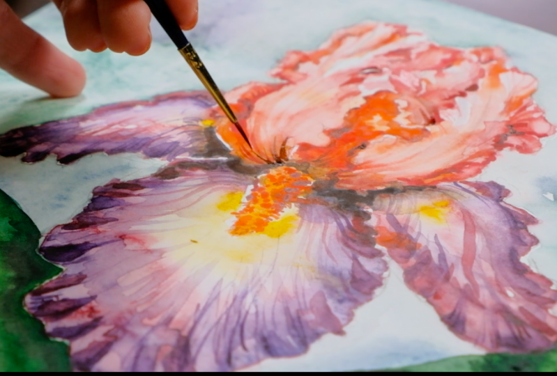
6. Painting Flower - Petals Details: And the brighter color and you get, the more fun and exciting your art piece will look like. I remember when I was younger and I was trying to work with watercolor, I was very afraid to use enough of paint. And all my paintings were very pale until I realized that the secret is actually the intensity of color and the right contrast. So this time just tried to use lot of color. And as you see, this painting is quite bright and has, its like a rainbow almost has so many colors. So it's really your chance to try and to get this real understanding and real understanding of beauty of this amazing medium like watercolor. Then we're going to add some more contrast in a bit more paul mixed with black color. So we're just adding up and making each layer and get darker and darker. And you see already those petals, they're just so outstanding. You can see the shape. You can see that this iris has very unusual structure. And we almost repeats in it as it is on the photo reference. And now I'm going to add some even more contrast. And I'm leaving those white parts in between. So this way, again, I'm just trying to define more and more those curly borders of the, of each petal. And actually it's very easy to work on layer by layer. Then I'm doing exactly the same with the main petal. I'm adding more and more contrast when the more intense color. And you see now it's Steven sending out even more. As he moved for the piece and adding more contrast. And also no background color and the flower. You can see the difference because before it was almost the same sheets at all. So you can make very thin, nice lines with the tip of your brush. By dragging your brush towards the center of the panel. Are also, you can do the other way around. But just make sure those good, very thin and amazing, engage more color and formulates. Third layer, on the top, petals. I'm mixing some orange and red color with water. And trying to make the age more undefined. Again, don't forget to leave some untouched white areas. Of course, with watercolor, you can fix it. There was some acrylics, thick white acrylics or gosh. But it's always nicer and looks more professional when you actually think about it in advance. And we also can finish up by adding up some yellow little circles and actually bits of brownish on its own. Circles. Famine. You just making this dots on the left and right side. And you getting the right shape of the stem. And also don't forget to blend in nicely. By removing some extra paint from your brush. I'm gonna mixing nearest layers together. And I'm going to make the middle part in between them to talk on adults, much darker and thread color. So those two petals or will not look attached to each other. You should see that the actual separate paddles. And we can achieve that only by adding some contrast in between them. I'm blending some more of those paddles. I quite like when you blend it and make it lighter. So I'm trying to wash out some. I paint. I actually like it should be lighter. And you can also help with the tissue to remove some extra paint. And this way, you also get some volume. By clearing up and washing note some paint. Then we can continue with the leave. And that's at all some more contrast and more color to it. I'm adding some green color, especially underneath the petal. Because you have this shaded red there. And you have to make sure that it's much darker than your paddle. And wood. Very light and thin stroke. You can show turn border of the leaf on the left side. And then you can go with the same strong color on gun stem. And on the other leaf as well. I like this beautiful contrast and this how it plays nicely with the yellow color. And I'm leaving into bits unfinished. But it looks very nice this way. Also adding up some more contrast to the underneath. So don't miss care to take a lot of paint on your brush and just leave them beautiful untouched place. So this way you also achieve the volume on the leaf. And you can push out and ex truck ain't just more put out. They'll use your tissue to remove an extra paint. And now when we added a lot of contrast on the leaves, you can see that we can easily add some more contrast on the flower itself. So it will look nice and inserts in harmony together. So in some black color. And that's obviously it's not the first layer. So now I'm not scared to add it up and just make contrast even stronger. And you go all around the stamen. And this way, it also pops up. Yeah, and the inside the flower, it's also going to get a bit darker. And you can switch the brush to the smallest one. So now it will be easy for you to work with details. And you can answer most strokes. Little ones. On the top petal would just the same color required, pink or light orange. And we'll go through all of them just the same way as we did with the previous petals in the bottom. But there we were using purple color and violet and here we use the orange and pink commerce. But we're achieving the same effect. So the flower looks more complex. So I'm also adding some darker strokes. And of course, a lot of patients. If you want some, I achieved this nice result and have a beautiful detailed flower. So please take your time. And also you can make some breaks for yourself to have some nice coffee or tea in between. And don't get too tired because it's a very enjoyable process. And also if you will share your results in Instagram and tag me on, we're very happy to see how it turns out. And you can always write anything in Skillshare and I will reply any questions. So feel free to ask. But I think in this stage you already see how nicely and beautifully your flower is turning out. So he should be quite proud of yourself and quite content. But trust me, just take some time. But with watercolor, you can achieve the right results. So if you're struggling, don't worry, just take your time, work on it a bit more and you will get there. Okay Now and further to blend even more and to get this highlights. So I'm trying to get a bit of more whitish color on the petals. I realized that this weight or be better. So as I said, there are no mistakes in watercolor. You can do whatever you want. So I am monk brush up and blended so it looks free and loose and quite light. You can easily so pop extra color where you feel like it's actually quite like this washed out effect on the Federals. So you just blow to your brush so it's dry and then you use that dry brush to so pop some excess color. My take some time that you can do it until you're happy with the result.
7. Final Touches: I'm also going to implant some coloring decides together. You can work on this fails, then just make your painting even more Perfect. I'm also going to remove some extra paint from the highlight. And the same on the opposite petal. I'm just highlighting its more and removing access pains can use your tissue, you can use. Also. I'm not very happy with that black part. And it's non bio, but it's quite dark. So I'm, I'm trying to make the end of the petal in slightly different shape thrown anymore and installed the dark anymore. He sees is actually to remove some access paint. In watercolor. I'm going to add up some more curvy ages and fill it out with some purple color and some pinkish color. And I'm just making up some more contrast now. I think dissuade look sexual much better. And you see you can control what a color so easily. Can you again and do the same on the opposite side. And also with the leaves. I decided to make one more leaf because the leap on the right side didn't look very natural to me. So now I'm going to fix it the way I wanted. And I'm just taking a lot of dark green and dragging it towards the stem. So now it's connected. I just didn't like how in bands, to be honest, it didn't look supernatural to me. So and then we're going to have secondly just behind. So I'm going to continue it and drag it towards the corner of the paper. Will go away this way and adding some yellow color and then some green. So I think this way it looks more fun. And now you see that at any point, almost in then you can change almost anything painting. And when sometimes people say that watercolor is impossible to make sensor to fix in the end. It's not like acrylic paints. No, it just depends how you work with this. And if not scared, you can easily fix anything and you can easily change anything the way you want. But almost any point of painting. And also I'm going to add some and dropping shade on the leaf right underneath the petal. I'm going to wash, wash out to be too bad ground. I wanted to be more whitish. Flower will stand out even more. Now to complete our branched and it's going to impede, be easier. And I'm just blending paint with water and then removing it. What tissue? So the principle is very easy. And you can do it almost anywhere on the leaf as well. And I'm going to remove a lot of extra paint from bank round. It also might take some time. But I'm keeping those interesting clouds that were achieved by using this wet technique. I'm going to just remove some extra paint right next to the borders on the flower and the bottom parts as well. So the leaves smelt also stand out more. Yeah, I'm removing some green color. And I really like now given more. Because you can see clearly each leaf and all your attention is now focused on the flower. And background is just a supporting the whole composition. I call painting books now even more because wood light background. All your attention and focus are on the flower and leaves. And the background is just supporting the composition. And those clouds. Blue, greenish color. Picture looks very, very Eyring and nights. And we can even make the flower more defined by some very phenyl lines. Splitting up some last touch. And the same on each petal, I will add some more defined lines with the smallest and sexual super easy to work with this brush. I think it's 0.7 are some of things sliced. It's like super small. And it's going to be very comfortable for you if you will use one big branch, one medium, and one smaller, one super small. So in general, would those four brushes, you won't be equipped. And for watercolor painting. Now, I'm adding even more brushstrokes. Look more natural. Because on the reference photos you actually can see those lines. So I'm just trying to copy them. And you can also work with the stem and a little bit more by adding up some dots on top and some little strokes as well. On both sides. Just work with it a bit more precisely than before. We can mix orange and brown and add some more contrast points. Just blush and Internet. But of course, leave some light color untouched. So we'll still have this round shape, this feeling of that round shape. Okay, What else can we do with the small brush? Maybe some lines on that. And also in the middle we can end up some ones on the top petals as well. And just gives this very cute effect. And I'm taking brown color with pink foam. Those dark parts and dark lines somewhere where I wanted to have more contrast. And also next to that age. So now you can see those angels more clearly and go all around. Hello. And helping with some borders. You can also add some more lines with this dark color on the top. Just make sure that you don't overdo it. They're always should be imbalanced. And the more you experience, the more you paint, that will be easier for you to feel when to stop. So I'm going to wash out a bit more. Because again, I feel like that and we will probably finish with our painting. I'm just going to wash out a bit on the sides of the biggest battle to make it even more currently this way. Because those highlights sexual help us to make the right shape and volume and with the petals on the sides as well. So I think by the end of this class, you already learned how to control your water color at any point or your painting process. And you should feel, or it's a quite happy and content with yourself. Because you learn so many techniques by now and you can actually use it even with some other flowers. Because principles usually much the same. Yeah, and you have this amazing iris flower. And I'm very proud of you. Well done with the, spent so much time and energy and your patients. And you achieved a new level of skills in watercolor. So congratulations. Please don't forget to subscribe. So you wouldn't miss my new classes. And also don't forget to share your project with me. I'll be very happy to give you a feedback and to see your amazing results.
 Alexandra Ali, ARTIST, ILLUSTRATOR, ART DIRECTOR