Transcripts
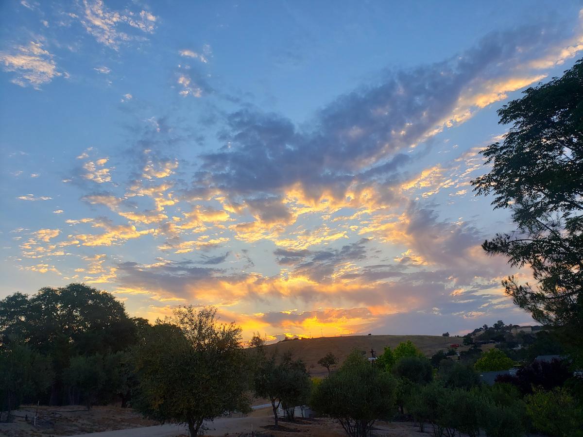
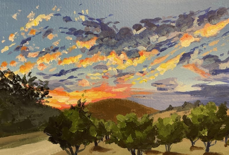
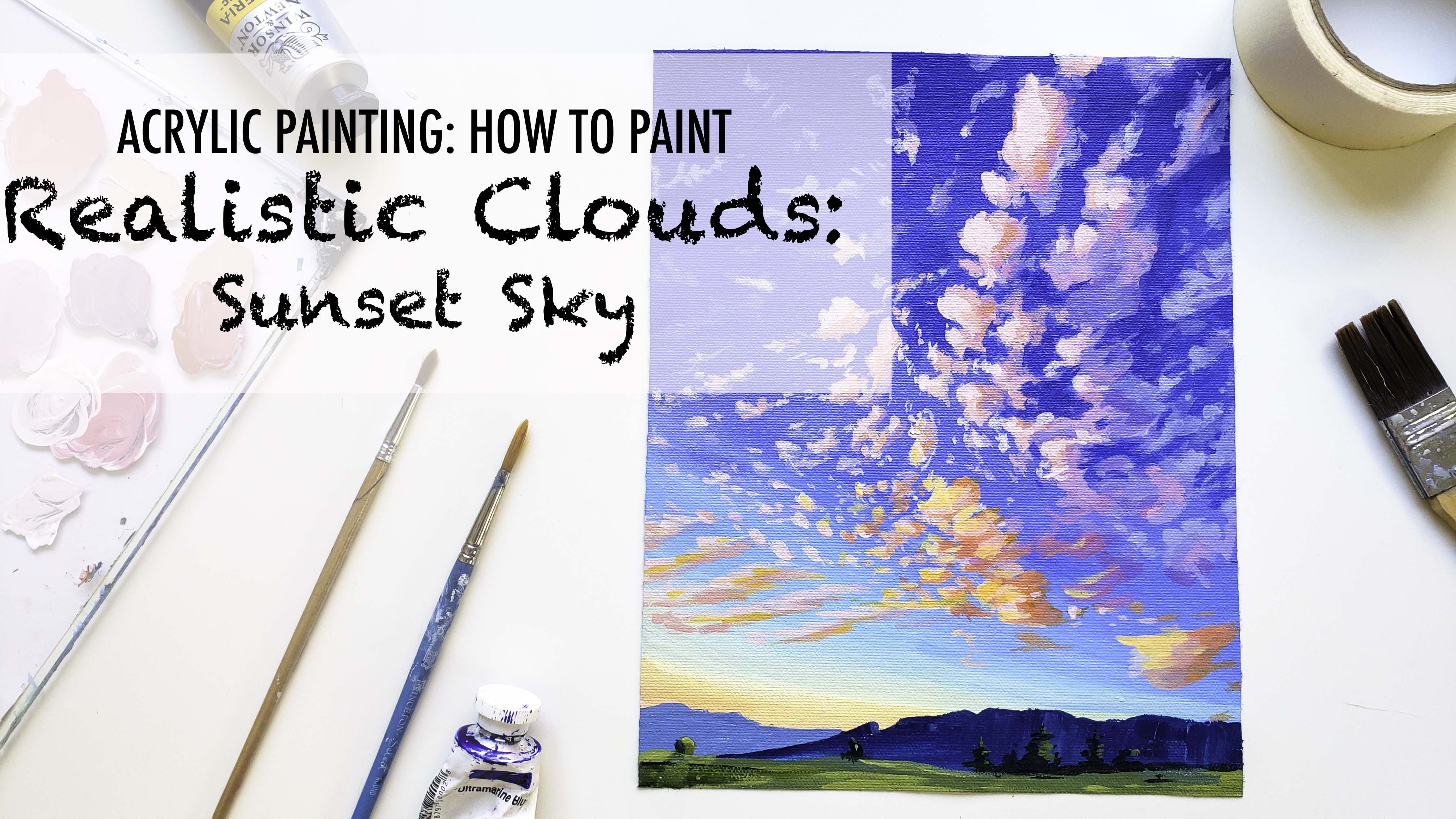
1. Introduction: How to Paint Clouds!: Hello and welcome to my Skillshare class. My name is Yvette lab and I'm a fine artist based on the central coast of California. I create landscape and seascape paintings with a special place in my heart for clouds and realistic water. In this class today, I'm going to be teaching you guys how to paint a beautiful sunrise painting. This one right here. I will be teaching you guys everything you need to know about how to paint clouds and the colors that we use in sky escapes like this. I will be mixing every color with you in real time so you can see how I make decisions. You will see how to look at a reference photo and then create a painting from it. I'll go over lots of layering and texture and blending and just every technique I use to get these realistic, beautiful cloud paintings. So make sure that you stay tuned for the video and watch my class. You can also share all of your work with me in the project section, which I just love to see and I can celebrate your work. I can also answer any questions you have, either with your project or in the discussion section. And I'm just so excited to see what you guys all create.
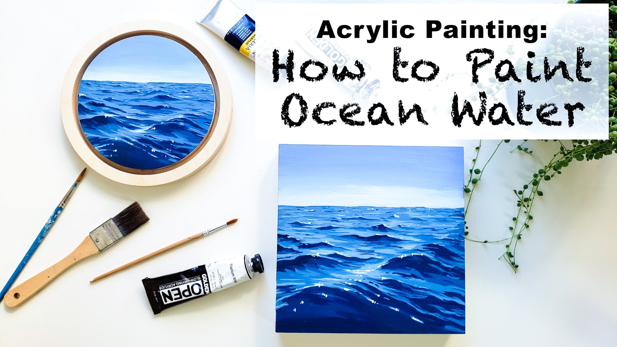
2. Materials and Supplies: Hello everyone and welcome to my Skillshare class. The first thing we're going to be going over and today's class is all the materials you'll need to complete this project. So first things first, we have our paints today. Mostly we're going to be using these Winsor and Newton Galleria acrylics. I picked up this set of six paints. There was a white as well for about $20 at Michaels, and I really recommend it for beginners and even more advanced painters. I think that it's really good to have affordable paints so that you can practice. You're not afraid to use your supplies. And they're also just a really good quality paint. I do still use them in my practice today outside of my sculpture classes as well, you can see that I've really gone through some of these colors. So yeah, this is what I really recommend to grab this set of mixing colors. It comes with your basic primary colors, a yellow, a red, and a blue. And then it also comes with a brown and a green. And this is kind of the ideal mixing sat, in my opinion. You can definitely get by with just your primary colors, but it's so much easier to have a brown and a green. You're still going to be mixing plenty of colors. We don't use any colors straight from the tube really. But it makes it much easier to already have a green and a brown to mix with the other colors. In addition to that, I have a titanium white. This did come with away and you can totally use that. I do recommend when you're feeling like you want to invest a little bit more into painting kit to get a professional artist quality white like golden. It's a lot more opaque and just really good quality. Then I think that's the first step into more expensive paints that I would recommend. Because you can continue to use your basic set and then upgrade just your white, which is mixed into almost all of your colors. And it makes painting just a lot easier. You don't have to lay down as many layers when you using light colors are white because it's a lot thicker and just a nicer paint. In addition to that, I have ultramarine blue. You don't have to get a fancy brand of ultramarine blue. It's just what I have, so that's what I'm using. You could totally use this brand and ultramarine blue. The difference between this blue, which is called Windsor blue, and ultramarine blue is that Winsor blue, which is also often known as the yellow-blue. So if you have phthalo blue dot is the same thing. You can save it in when we're mixing colors. The difference is that Winsor blue is more of a green, blue and it makes more of a teal, our quo kind of color. And then ultramarine blue is more of a purple tinted blue. So it will come out a little bit cooler and a little bit earlier. I really like to use both. When I'm doing skies, are you mix them both? And I think that that creates the perfect sky base color. So lastly, I have Payne's gray. This is one of my all time favorite colors for painting. I really recommend getting a Payne's gray instead of a black for your painting kit. I think that it just has so much richer colors, you can mix it with all your other colors and it gives that same darkness when you want a really dark section, but it just looks so much more beautiful. As you can see. This is a fluid acrylic. I think that's also really fun to try if you want to, but you don't have to. You could definitely use the same thing, this brand in a Payne's gray. I think it's fun to try a whole bunch of tools as you're playing with art and moving on. But it's definitely good to start with the basics. So the next thing we're going to need for our painting is, of course, paint brushes. I really recommend having at least one larger three-fourths of an inch or one inch brush. This will help us get really big areas down like the base for our sky quickly. And then one of my favorite brushes for painting is this like smaller flat brush. This is a three-eighths of an inch. And then I also recommend having a small round brush. And depending on how big your painting, you might also want a really small detail brush. Next step you will of course need something to paint on. This is actually flat canvas, so you can see that it's super movable and it's the same material that's on any stretched canvas. You can find a craft store. It's just flat. I like to use it for practice. And also you can frame it in a regular frame, which I think is really cool. You can find flat canvas, usually in really large roles at craft stores or shops. And you then cut it down to whatever size you want to use for your project. For this class, you can totally use just a stretched canvas. You'll get almost exactly the same results because it is the same material. Or if you'd like to use paper, you can totally use paper or wood or pretty much anything. That's one of the really cool things about acrylic is that you can paint on pretty much any type of material as long as u prime at first, I am going to be showing you guys how to prime any surface you want to paint with just 000 in the next video. So some last odds and ends is you will need something to mix your paint on. I have this glass palette, which is by far my favorite thing to mix on because the cleanup is so easy. I will show you guys how I clean it and do all that in the video you'll see in the class. But I definitely recommend this. If you have an old frame with glass in it lying around, you can totally use that to start out to see if you like it. And then I do recommend upgrading to a pallet or at least a tempered glass because it is stronger and it's much harder to break. So it's just really good to have in the studio. The other things you'll need are a cup of water. I recommend having two cups of water or a container that has two sides like this one, so that you can use one side for dirty water or you're putting your brush in and cleaning it off. And then one side for clean water when you want to mix water with your paints. Lastly, of course, you'll need some paper towel or a cloth to dry your brushes on as you're working. And if you are using a glass palette, I recommend getting some kind of scraper tool to clean it off when you're ready.
3. How to Prepare Painting Surface: The first thing I'm going to show you guys today is how to prepare whatever surface you're painting on for painting, whether it's wood or paper or canvas, you can use this same method. And what we're gonna do is use something called Jessup to prime the surface of the wood. Just so is essentially a cheap white paint and you lay it down all over your surface and it becomes the first layer of your painting. The reason that it's important to use is because it soaks into the word so that when you're painting over it with your nicer quality paints like these won't go into the wood and you won't need as many layers to build up a nice vibrant and opaque painting. That being said, you can paint on paper and wood and canvas. That is already primed without doing this step, it just will take a lot more of your acrylic paints and a little bit more time. But if you don't have just so you can still complete this project. So this process is super easy. You're just going to go ahead and some Jessup down on your wood or paper. And then I like to use a nice big brush. You can use this. If this is what you have, it goes really fast. Knees, nice big brush. And I just spread it all over. My painting. A lot of canvases that you buy at the store already pre primed with one to three layers of justice. But sometimes adding another one on top can make your surface even better. Or if you're using a really affordable, cheap Canvas, adding a layer of just so it makes it much easier to work on. So I still recommend doing this With stretched canvas as well. And depending on whether or not you're going to be painting the edges of your painting. You can go ahead and just so the edges or leave them as is. And I like to create a little bit of texture. I don't try to make it all go one way down the painting. I just kind of do it lots of loose brush strokes because that way once you're painting over, if you do see any texture, it's not all going the same way. I just really prefer that, but you can do whatever you want to do for this project. So once you've covered your surface in just so you just wait for it to dry. This takes probably between 10 and 20 minutes and just wait for that to dry and then we'll come back and start our painting.
4. Sketch: So once you guys have your materials already, we're going to go ahead and set up our pallet for painting. So I like to always start with my white, but it really doesn't matter what order you put your paints down on your palate. Just make sure you squeeze out a good dollop of it. You don't need a ton, but definitely don't be afraid to add more later. Sometimes I find myself scraping at the last bit of paint and forgetting to add more. So if you're like me and there'll be afraid to add more paint if you need it. I do like to group kind of my similar colors together. So I have my blues and my gray, and then I'll move into reds and yellows. Then I did forget to mention this in the materials video. But for this class, since we're doing a sunset, sunrise, really vibrant cloud painting, I do like to have a premixed purple as well. You can definitely mix your own purple with red and blue, but it won't be quite as vibrant. So that's one of the first things I recommend adding to your kit after you're comfortable with your basic colors is to get a purple. Because it's just really challenging to mix a really vibrant purple from primary colors. Alright, so once your palate is set up, the very first thing that I like to do when I'm starting my painting is to take a minute look at my reference photo. The reference photo is available for you guys in the project section of this video for you to display on your phone, your tablet, or prints out whatever is easiest for you. Definitely take a look at it. It'll help you on your painting to follow along with me, but also know what the end goal is and what the reference photo looks like. I like. I like to start out my paintings with a really basic sketch of the piece with using a little bit of our brown and a little bit of water. This is kinda just not even really a sketch, but just to mark out the dimensions of the painting and points. So this is our horizon line with our hill. There's a little bit of another hill here. And I like to just kinda mark all that out so that I know how far to bring down my sky. There's a tree over here, bunch of trees in here. So this is super loose and super easy. We don't have to worry too much about it. But it kinda helps you once you get going too. Now, what's where? And we've got our little road here, coming down a hill. So when you're thinking about your sketch, it's really important to look at the reference photo and kind of note how far up the horizon line is so that we have plenty of room for our glands. So it's just about a fourth of the way of the paper notice. So that's kinda where I've marked it off. And feel free to take as much time as you want with the sketch. Some people like to make a really detailed under painting. And that's totally cool. I like to work a little bit looser when I'm first starting out. But whenever you're ready, we'll go ahead and start blocking in the sky.
5. Gradient for the Sky: So for this guy, we're just going to start by mixing up a ton of our titanium white, some of our ultramarine blue, and some of our Winsor blue or yellow, blue if that's what you have in your kit. And I'm just going to start mixing this up. And I'm going to make it a pretty saturated blue because it is very dark. Because this is a sunrise scene. It's still pretty dark on the edge like the night is just being pushed away by the sun coming up. So it's still pretty dark up here. So we're going to mix up a really vibrant and dark blue. I like to use pretty equal amounts of my blues, maybe a little bit more of the ultramarine blue just because it's not quite as strong of a color. And then I just like to take my time mixing these colors up because you want to have a good amount of paint to cover the whole sky anyway. So it's good to just keep adding until you have the color that you really want. And once we've got this nice, beautiful blue mixed up, Here's gonna go ahead and start applying it across the sky. And I like to start at the top with our color because I'm going to lighten it a little bit as we move down the painting. So I'll start with my most saturated color. And in this scene I'm going to cover about a third of the sky with this dark color. And you can see in the painting that it kind of the clouds kinda go diagonal. So I'm bringing the darkness down a little bit more on this side than on this side. And then once you have done that, I will add a little bit more weight into a portion of the paint we remixed. And I'm going to add a little bit more of the Winsor blue to give it a little bit more of a green color. And then working quickly because the paint is still hopefully whet. We're going to go ahead and start blending Latin, the sky we already have. And then after a little bit of that, I'm going to add even more white to it. And we'll go ahead and add that in as well. I find that it is a little bit easier to mix sky colors smoothly on Canvas then on paper or on wood. But you can definitely do it if you're struggling with it. Just remember to take a deep breath, Take your time, and know that you can go back and forth with these paints as many times as you need to. And that is the beauty of working with acrylic paints. They dry quickly so you can just keep adding layers until you're satisfied with the gradient. The biggest tip I have is don't worry too much and move quickly. Because if you're working with still wet paint, that's definitely a lot easier to book. And then I'm adding even more white. So we're really light blue at the bottom. Homos just white with a little bit of glue. And going ahead and laying out down all the way to our Skyline. Sometimes it can help to wash your brush off or add a little bit of water to your paints as well when you're blending. And you wanna make sure that if you do go back up into this dark area, that you wash your brush off so that you don't get everything to muddied off. So once you have your base layer and like this, we're just going to go ahead and let that dry completely. And should only take maybe five, 10 minutes, but you wanna make sure it's fully dry. Before we start in with the columns that go on top.
6. How to Clean a Grass Palette: So once the base of your sky is completely dry, we'll go ahead and start outlining some of our clouds. But before we do that, I want to show you guys really quick how I clean off a glass palette. So I'm just going to take the spray bottle of water a little bit on there. This just helps it to come up really easily. And then I'll use a little scraper and just quickly scrape it off. It is super easy. And there's very little waste which I really like. It's not as much trash is like a pallet paper and you don't have to take it to the sink and wash it. So it's just really easy. So that's why I recommend glass balance so highly.
7. Cloud Composition: So I'm switching over to our smaller flat brush. And I'm going to just start mixing up a sort of purply dark color for the shadows of our clouds. I'm going to mix some white and we need a little bit more ultramarine blue. So I'm gonna make some white and some ultramarine blue. And a little bit of our purples that we have over here, and a tiny bit of our Payne's gray as well. And just mix that up and see how it looks. And then add a good amount more of the blue. I want it to be a little bit more of a blue, then a purple. And we'll add a little bit of white. More Payne's gray. I think it's really fun to just kind of mix your colors and play around until you get the shape you want. If you don't have a premix purple, you could start a teeny bit of red into it or just mix your glues and see what you like with that as well. So once we have this purply color, I'm just going to start with our main cloud shape here and just start kind of blocking it in so we can see it goes all the way up to this corner. And I like to use this dabbing circular motion for clouds. Just think it gives it lots of texture. And then it comes down to about a little bit less than halfway through the sky, where we have our ending quote. Here. We'll bring that all the way down. Create this shape that's branching off a little bit. It doesn't have to be two details. We're just starting out and then I'm going to add a little bit more blue to it. We get a little bit darker the color and kind of use that as well. Since we're just blocking it in, it doesn't have to be super precise. So this is kinda the time to have fun with your color and your shapes. And then kind of draw this shape here. And it really helps, I think, to still look at your reference photo. It doesn't need to match it exactly. Just trying to get like a similar shape and really just the movement of the clouds into your painting. And then I'm adding a little bit of white back in. It's good to have just a couple of colors going for your initial towns. Kind of fill in the rest of this block. And then you can see we have some lighter blue purple tones just around here. And we're going to use this light purple, blue color down on my horizon line as well. That a little bit more white to it, maybe a tiny bit more purple. And you'll notice that I'm just kinda moving all around the painting right now. I don't want to get super stuck in one area because I don't need to hyper fixate on the details until we have everything in its place. I think that's a really good way to make sure you don't get too attached to something before your compositions really set up. And it gets a little bit darker as we go to the edge. You can just kinda mix these together a little bit. We're just kind of adding in this line here. It gets a really wide as we get to this sine. And then we'll have that bright, patchy yellow that we'll add in a little bit. You can see we have some clouds that come up and around branching off of that. And then there's kind of this big card form that comes down right here. So I'm just gonna kinda block that in. We'll come back in with lots of details and all the lights leader. And then we can see over here, not bad. And there's kind of this purple mesh shape over here. It's going to surround all of this yellow. So there's kinda walking in, kinda everywhere we see this darker color. I'm not worrying too much about all the little specs, but kind of the bulkier areas.
8. Adding Contrast to Clouds : Composition cont.: And then I'll mix a little bit more blue into this, get that darker color again. And I'll go ahead and start strengthening up our shadows up here. This is a pretty big area, so I'm just going to get a little bit more pronounced with a darker darken up this whole area going up. You can see that it's much darker on this side and then it gets lighter on this side. So I'm just adding in some of the shadows. I really like to use this kind of small circular motion with these brushes. I think that that gives it a really organic Cloud feel because you don't need clubs to look exactly like the reference photo. You just don't want them to be too tight. It's really nice that they're loose and natural looking, which is one of the really fun things about painting clouds. I always talk about this in my classes, but you don't have to get them perfect. You just have to show that there's movement. And then you'll still get a really beautiful and convincing cloud painting. And then I'm just kind of building it up, adding lots of little shapes and dots with the corner of my brush. And once you feel like you kinda have gotten most of these shapes and you've got this nice whooping one. And we're going to raise it up a little bit, fill it out.
9. Building Up Shadows: Once you've got this guy in here, you can start adding in just a few of those details that you see. So we can see that there's little crabs and wrongness side that are kind of linear with the smooth, that most of them are a bright yellow bit. You'll notice if you look at your reference photo that some of them have some really pretty shadows. So I'm just kinda adding in the idea of those so that later it can all come together. It's really important to get kind of your whole composition down for you get to immersed in details. Come back down to this. We have some darker colors. I'm adding darkness. And I've got some darker colors over here. This is more of a blue purple. It's built up in these little zigzag lines. I think it's really fun to look at clouds and see how many different kinds of shapes they are and how they change as they go upwards into the sky or come down towards the horizon line. And then I'm mixing a little bit of white into that. We did just a slightly lighter color. And we'll start adding some of the shadows into this one that we did that was really light. These shadows aren't as dark, so I like to build them up slowly. And one of the big things with cards, I think, like I've been saying is just to add these little, little dots in details, little feathery bits. It's not like ever a perfect shape or circle or perfect cloud shape. So it's just really good to keep going back and forth, adding little details, adding lots of colors and all that kind of stuff. And know that if you feel like you've made a mistake, you've added darkness where you don't want it. The beautiful thing about acrylics is that you can just constantly come back and forth with your painting, paint over it, change it, spent as much time on it as you want to. So I'm going to add some of these little darker clouds in here that are reaching up. Just a little shapes. I'm just moving around with my colors, sort of blending them together so that nothing's too harsh. And I'm going to mix up a little bit of a darker color. Most of this color is just the ultramarine blue mixed with our initial color. So you really can just mix ultramarine blue. Maybe it's a little bit of Payne's gray and white if you want. Um, it's kinda whatever you feel like for this cloud color, the ultramarine blue, as you can see against the more thing, little blue is much more peripherally so it looks purple without even having to use purple, which is actually pretty cool.
10. Adding Light to Cloud Composition : So now I'm going to mix up this really light purply blue color and just start adding in some of the highlights where you see them. We are going to go in with all of our peaches and reds to do this more. But I think it's nice to add it in with a little bit of our same kind of color first so you can really see where the spots are that need it. I think that's especially true. Kinda go over in this section where we have going on with our shapes that we want to make sure we fill in so we know where things are as we're working. So I'm just kind of adding in all of these letters, shapes over here. Mixing together, we will add more colors on top of them, but it really helps to blend because purple and yellow are complimentary colors. So when you mix them, you get a really muddy colors sometimes. So it's easier to put in the lights with this light color rather than try and mix the yellow directly into the purple. And again, it's good to just step back and look at big shapes and got these little feathery clouds are sloping upwards. Adding in that. We actually have this cloud. Here, it's a little bit darker, so I'm gonna add that in. It's kinda connected. All this will go back into their lightened blend it out. So after we have our basic composition of the clouds in a little bit of darks, little bit of lights. I'm going to go back and mix up an even darker color just to get some of the really dark shadows and the Cloud. And this is pretty much just ultramarine blue with a little bit of white in it. And we'll just kinda put that in where we see our darkest colors. So I see a lot of darkness in here and kind of on the top end of here. I just want to make a little bit darker so it doesn't have to cover every spot. That's kinda the cool thing about clouds, but just start feathering it in, darkening up these edges. If you're feeling like you're having a hard time painting like you're running on painter. It's not as smooth as you want. You want like to not show the texture of the canvas bumps. I'll add just a little bit of water to my paint as well.
11. Working on Detail for Purple Clouds: So we're just continuing with our darkest darks wherever you see them in the picture. And see they come down here a little bit, make these little triangles. And then we can mix a little bit of white into that. Because I like to just really go back and forth with these. And we'll just blend in so little areas that need a little bit of blending. I think it's really cool with clouds. You can add just about a million different tones of the same color. And so you never really have to mix up the same exact color again, because when you're adding new colors, it really just adds to the shape and the vibrance of the piece. I'm adding a little bit more so that we have a little bit darker. But not as dark. I'm a shout-out to build up these shadows over here. Kind of blend these two together a little bit more.
12. Adding Vibrancy and Working on Horizon Line: And then at this point, I think we're just about ready to mix up some of our yellows. So you want to make sure you clean your brush really well. So there's no glue left on it. And then we'll go ahead and take some clean white and some yellow. And I'm going to start by adding in the sun just rising over the hill down at the bottom. So we're going to mix up a nice orangey color, add a little bit of our red to make a nice peach. And then we can just start to apply that kind of in this whole area. And that'll go in and add all the details that we see Just a minute. And making it a little bit peach here. And you can see it kinda comes over to this side of this purple cone. Sticks that are rising line. And then in the reference we actually have quite a few trees here. But you want to cover it up. Everything that you can with your paint. Don't leave room grew trees because it will be easier to paint your trees after on top than to go in and have to try to put a little bit of color beneath your trees after the fact. So having a little bit more white to this, I'm going to add that really, really light peach to the middle. And then we're going to add quite a bit more yellow. Make really vibrant yellow. And you can see that this yellow kind of is reflecting around the center area. It's kind of all around it. And it definitely comes up under here. And then we'll mix a little bit of our peachy color is we're just going back and forth quite a bit more, a little more red to it this time. So it's kinda like a light orangey pink and will start to bring it into our purple. It's kind of a transition color. What I'd like a really pinky color to study ends there. Mentioned a little bit to kind of transition the yellow and purple cloud. I like to add this orangey pink color all around it. We also have like a really vibrant orange just right on the horizon line right here. I'm going to add that in as well. And then you can see as we move up, there's these clouds that are purple right above the horizon line. We're going to use a lot of pink in there. And it's a very orangey pink area of the painting. I'm mixing up a pink since just read and a little bit of one to 10 your brush and some weights. So we're getting even more pinkish, orangey over here. You can add a little bit of our ground as well. I like to add lots of different colors to transition a sunrise or sunset painting like this.
13. Building up Light Sun Reflections: And I'm just starting to move around the piece and add in some of that pink where I see it, the light since it's coming from here, it really reflects mostly on the inside of these areas. Good amount more white to this really nice light color. And some more white. And we've got the soft peach and highlights with that. And so we can see there's a lot of reflections right in here. I'm still using this pretty circular movement with the corner of my brush. That's really one of my favorite techniques. Thank You. Get a lot of just cool shapes. Sounds like you're scrubbing the canvas. That's what it reminds me of a sponge or something like that. And we're just going to come in and kind of underline all of these purple areas that we laid in. Some of these later streaks. We can add some of it up in here and see that there's some reflections. We're just sticking with this peach color will come in with all of the different oranges and reds and mixed them all together. After we get all of these kind of lay areas, just block them. And you really just want to take your time with all those. It takes a good amount of time just to fill everything in, but that's really the fun part about painting. And so I'm going back and adding lights to all the places we put that light purple, as well as some extras where you think it would look good. And you can see that a lot of the white streaks are concentrated right here. And then as we move up and out, it gets less dense. So we just have a few.
14. Blending and Transitioning: So I'm going to go in and mix up a little bit of a stronger orange now, when I'm mixing a little bit of red and yellow, and then I'm actually going to switch to my small round brush. For this part. We're just going to start adding in little bit of this darker even see when you look at your reference photo that the darkest spots are where the most saturated I guess, is what I mean, are really close to the purple. So that's why I'm just going in and adding this little bit darker orangey color. And I'm still kinda using a circular scrubbing motion to add this in. So if you look at each cloud, you can see that it transitions from a really light yellowy color to a bright orange to the purple. So that's just why we're adding in our orange. And then we'll come in with her brightest yellows. And then we'll also go back a little bit into the purple at the very end. And you can take that bright orange and add some details down in here as well. You can see some little clouds coming across our sun rise that are bright orange. Like to add little details like I think it just gives it lots of interest. And then I'm going to add a little bit of white into that orangey color and blend them together just a little bit more. And you can see we have some of our reflections going up over here, some really bright yellows. They're kind of stretching up. I'll add in some of those. And you can use just like a swirling and dotting motion with the brush.
15. It's Okay to Change and Adjust!: I'm actually going to go in with a little bit of a blue sky, really light blue. Just cover up some of this orange sector that there's a little bit more sky space in here. I always like to remind my students that, you know, you can change anything about your painting you want. It doesn't have to be just like mine. And if you want to change something later on, you totally can. It's better to change it and adjust. If I Bonner, and you might end up with something that you really like. And I actually really like this blue. So I'm gonna go ahead and add it Just a couple of spots around the painting. So what I'm gonna do is leave that alone to let it dry. And over time, some other sections of the painting.
16. Layering Yellows: So I'm going to mix up a really, I'm actually going to get some fresh white. It was that white has a lot of blue in it right now. And then what I'm gonna do is mix up a really light buttery yellow. I'm just using the cadmium yellow and a lot of white and just a little bit of our pH in there. So it's more warm, yellow, but it's definitely not orange. And then we're gonna go in and start adding in some of our really great spots on a painting with this yellow. And so I'm focusing right in here. You can see these really bright sections. And kind of just everywhere that we put our peachy color. You're going to go over a little bit with this yellow as well. As you're building up your colors. And you might need a couple of layers to make it nice and thick and gray. That's one of the reasons I do recommend upgrading to a more artists quality of professional quality, white paint because it's much thicker and easier to work with and you don't have to have as many layers going on. I'm also using pretty thick globs of paint on my brush and just kinda letting them fall. I think that gives it a nice organic texture. Dabbing and dragging the brush with lots of paint on it for these little bright spots. This kinda gives it a lot of texture to which I really like. And I'm adding a little bit about really bright wait to the very middle of this sine area because it's kinda almost white where the sun is rising. And I'll kinda twist my brush in the paint to get all of the gloms are paying off. And then redeposit so that I can get like a nice thick blog just on the tip. So I have a little bit more control over it. You want to be a little bit sparing with the yellow. We don't need it on every single lunch section is really concentrated here in the middle of the painting and most, but just a little bit of flexibility coming out. So we want to make sure we have the most light right in here.
17. Building up Vibrancy: I'm going to mix up a little bit of a darker yellow, a little bit away, a little bit of yellow. And use that to transition our bright white yellow into that p.sit. So I'm just kinda coming through adding more and more colors to it. And I'm going to focus this dark yellow really in this area again, where it's the very brightest. At this point, I'm going to mix up a little bit of red into this yellow and make our peach color again. I like to go back and forth a little bit so that we can get the perfect effect. And I'm going to cover just a few of these yellow spots. I feel like maybe there were a little bit too many. And I want all the brain is 3 right here. So I'm going to just go over some with our peach color again. You can do whatever you feel like. You want your painting to look like. If you really like a lot of the yellow and the bright colors, feel free to keep it. I'm just kinda moving through it. I'm looking at my reference photo and trying to decide. A lot of painting is just making decisions about how you want your subject to look. And then we have just a few little scary clowns up at the top here. I'm just doing this really loosely.
18. Finishing Details in Clouds: We're going to go back into our purples now and move a little bit into our shadows. Still make sure everything's blended together the way that we want it to be in any shapes that we didn't do that first time. So I'm just mixing some ultramarine blue and some white. I'm just going to come back in and I'm asserting with a little bit of a lighter gray purply blue. I'm just going to take out some of this light. I think we added a little too much on this side. So I'm just gonna go ahead and cover some of it. And then I'm just going to move around my piece and add in some shadow blends to me where I feel like it's maybe missing it so we're pretty close. But one of the things I really like to do at this stage of the paintings add in lots of details kinda where the clouds are dragging back or branching into the sky. Because usually with Crohn's, it's not just a perfect straight line, but there's little bits, little wispy is coming off. That's one of my favorite parts about Cloud paintings. We're going to mix up a darker blue goes through this. Some of these wispy is up here. And then we can see there's a few little dark clouds right in here where all the brightnesses and I really like that contrast. So I'm gonna go ahead and add them in. Once you've added in just the last bits of here, purple. If you're feeling like your sky is pretty much done, we'll go ahead and start working on the landscape soon. If you want to keep going back and forth with your colors, just definitely just pause the video and keep going as long as you want to. But we're about ready to move into the landscape portion of this painting.
19. Blocking in Landscape: So first things first I'm going to go ahead and clean my palette again. And then I'm also going to switch back to my medium flat brush. So I really like that first starting out and the area of a painting. The first thing we're gonna do is mix up a nice golden brown color, gray for this background hill to kind of cement our horizon line. So for that, I'm going to mix some white, a good amount of brown, a little bit of Payne's gray. And then just a tiny bit of our green. And then I'm going to add a little bit more of a brown. So I wanted to be mostly brown and pretty dark. And then we'll go in and add just a little bit of yellow and red, warm it up. It's really just, you just play around with colors. And sometimes once you start laying down a color, you might realize that it's not exactly right and you want to change it. And you can do that as well. With this one. You can see that it's a little bit more brown and one right underneath the sunset or sunrise where it's coming up over the hill. And then it gets a little bit grayer to the side. So I'm adding in a little bit of Payne's gray over there. And our landscape is still quite dark at this stage because it's still a little bit dark. At this time of day, the sun has not quite risen over the hill yet. Almost risen. So a lot of our landscapes going to be pretty dark to contrast with the brightness of the sky. And then this hill over here is getting just a little bit more length. So to differentiate between the two, I'm going to add a little bit of a later version of that color and just added a little bit of white to a color we were already using. And then I like to just start blocking in some of my darker colors. So right now I'm going to start with the tree just using a little bit of Payne's gray and a little bit of green, a little bit of brown, making a really nice dark color. And I'm just gonna kinda slap loud and really loosely over here we have our big tree. I'm not going to bring it up to hikes. I do want to add details and a leader, I'm just blocking in this whole shadowy area right here because that'll help me get an idea of the composition. And then we'll go ahead and use this for a little bit warmer, a little bit of a gray brown, and add in sort of a light underneath her tree. So it's kind of a little bit of a hill coming down. And I'm going to use a little bit on the other side of the path as well. And then we will mix up a really light gray color to fill in our path where there's a good amount of contrast. It's definitely the lightest thing in the landscape portion of this painting is this road here. And we'll mix back into a little bit darker gray, kind of blend this. And you can see that there are some trees which we will go ahead and add in a moment. For now, I'm just going to kind of draw in this hill that the trees are on. If you look in the background with a little bit of this gray brown color. I'm just going to scrubbing this in for now to get an idea of the composition. And then we'll go back in and add lots of details as we go.
20. Landscape Composition: Drawing in Trees: And then the next thing I'm gonna do is mix up some Payne's gray and a little bit of water. So it's nice and smooth, a little bit of white, so it's a little bit more opaque. And just start drawing in some of these trees right in the front. So you can see that this has pretty interesting shape. There's two little branches that come up. And then we have these kind of mounds of dirt of darkness around each tree. So I'm drawing and then just going ahead and drawing up these branches. And then you can see they kind of move down the hill. So we'll just keep patterns and a little orchard. And this one's like a pretty thick tree here, lots of little branches coming off. So go ahead and fill that in. And we can kind of just start to lay in the shapes of these trees really muscly. Just to see how they fit in. I'm just scrubbing the sense super loosely. And then we'll come back in. And that way I can just see where things go as I've been saying this whole time. Mm-hm. Less than a draw, but I actually don't think it looks right, so I'm going to take that one out. We'll just paint over it again. No big deal.
21. Giving Shape and Depth to Trees and Ground: And then I'm going to carry that same color just a little bit up and around where these trees are because it's going to cover that whole area where there's no trees. I'm just kinda bring it up a little bit. We have to worry about it later. And then I'm going to mix up a nice brown and Payne's gray color here. Little bit of a warm gray and go over these mounds that we painted. They're not really about cold color and a little bit warmer. And then we'll mix a little bit of white, little bit more browns. We get a little bit of a warmer shade and kind of blend it out into the surrounding material. And we'll go ahead and do this for each one. Cover it with this darker brown. And then going with her a little bit lighter, warmer brown and blend them out. The next thing I'm gonna do now is start to work on the details in these treats. So I'm going to mix up some green, a good amount of yellow, and a good amount of brown. Because the green for the bottle's definitely not a natural tree type of green. It's super bright. So I like to mix some brown and some yellow and a little bit of red neutralizes the green to a really nice earthy color, which is much more realistic for trees. I'm going to go ahead and start slapping that down. I like to do this kinda quickly with texture similar to how I do the clouds in some ways because I still want all those little leaves and organic shapes to come through. And then we'll just sort of mix a little bit of Payne's Gray, get a little bit of a darker green, and start adding that in as well. Because we have quite a few towns in trees like this, you can see that there's some big shadows, especially towards the bottom of the tree. And then they kind of work their way up and around. And then you can add a little bit of white and yellow to get a little bit more of a brighter green and kind of go in and add some highlights. And this is just a really, you want to do these little silly to use a round brush for this. So you can do is it'll kind of tree leaf shapes for some of the highlights. I do this little stroking motion because it gives a lot of those tree textures elsewhere to dab. I think that gives like a really nice kind of realistic work. And I'll go back and forth between the lighter and the darker. You can see in this reference kinda this hole inside section of the tree is pretty dark. And then we have most of our light on the edges and the top of the tree. And that's because the sun is coming from here. So just the outside of the tree is really going to be highlighted. So I'll take our lightest green.
22. Adding Texture and Color to Leaves: I'd like to add a good amount of yellow to my green and got adds a nice earthy color and I'll kinda just go around the edges of the tree because it's really just these top 10 parts of it that would be super highlighted by the sun. I mean, you can just go ahead and add some of those into some of the other trees as we start to move around our p's. And I'll move back into our darker green. Start to fill them in. I think it's pretty quick. These trees, it doesn't have to be super precise. Is this feathering motion and the quick scrubbing this a bit, I feel like it gives a really nice realistic texture. And I can see that all of this area is, so I'm just trying to kind of fill it. Will add a couple more. Start to fill on this. They tree. This one's pretty dark and I reference, I'm going to keep it that way. And then this one's cool because at the top we can start to add some little branches and details and texture like we see in our reference photo. And we want to use our darkest, just Payne's gray right in the corner here to kind of separate this tree from this bush. So, and then we'll move and use a little bit of a lighter green for this tree behind. It's a little subtle difference. So I'm just going back and forth a little bit of the Payne's gray and yellow makes a really pretty desaturated green as well. Just kinda filling in all of this foliage area. And I just like to use lots of different greens. Go back and forth quite a bit. And just lots of little bits of texture and color.
23. Layering Lights and Darks for Dimension: And then I'm mixing up a really dark color with just Payne's gray and brown. And I'm going to go over these tree trunks again. This is like our darkest color on the page. And you can add some of it to the bottom of the tree and kind of blended up if you want to as well. And you can add a little bit more brown and kind of blended into that little mound that we painted earlier to each one. At this point, I'm going to go back in and mix the colors similar to this base color that we have. And then add some different towns to it. Color a little bit lighter than that one. This was all a bit darker. We'll add in some of the dirt and then I'll make a lighter one. Um, so I'll mix a little bit of weight into part of that. We have both colors going at once. And then you can just kinda go round, add some weight to Lake the tops of these mounds. And it has some dimension. You can even use your darker color to kinda fill in any spots that weren't filled in Canvas holes or anything like that. I'm just using this light to kinda do some big brush strokes. They don't have to be really London. They just give a little bit of texture to the ground, which I think is really nice and to the realism of it. And then we can take our darker color that we had and kind of go back over this hill and other time. And we're going to want to fill in any spots appear. This one where the trees didn't come up high enough to cover any empty spot. So where you can see our sketch through its DO or anything like that. So you can also use this color to create little negative space, little holes in the leaves where you can maybe see the hill behind the tree. It's really up to you how much detail you want to add into the bottom of this piece. Now we're going to work on this background tree area, which is mostly just Payne's gray. It's our darkest color. So I'm just going to go ahead and fill that in. I do want it to be a little bit stand out from this tree. So I might add a little bit of a light section with some green right here. There so we can see the difference.
24. Last Details and Tree Branches: And then for the fun part is to kind of build up this tree. It comes all the way up into the sky. So I'm going to add a little bit of water and then just kind of feathering around. So we want to be able to see the sky through this tree because this tree is kinda of all branches. So I don't want to draw exact branches for this kind of thing. I think it's nicer to draw just lots of little squiggles and connect them. Think it's a little more convincing. So if you look from a distance and squint your eyes at a tree like that. All you can really see are just little holes of light through the leaves. We can take as much time as you want with this, it's better to go slow. And like your result than to go too fast because it's a little bit tricky to paint the sky in the background again, although you could definitely mix up a nice blue and add in some negative colors. That way, if you do want to know. And I'm just kinda filling in some big chunks. You don't want to lose. Like we definitely want some holes in there, but not too many. And the last thing I want to work on for this landscape is I'm going to mix up a little bit of a green gray and add in some of these distant trees on this hill. So at this point, if there's any areas you want to go back over and smooth out some tree trunks. Or some wanna go back in, add more details to the leaves. Where to your sky. Now is the time to do that, because we are just about done with this tutorial.
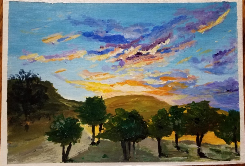
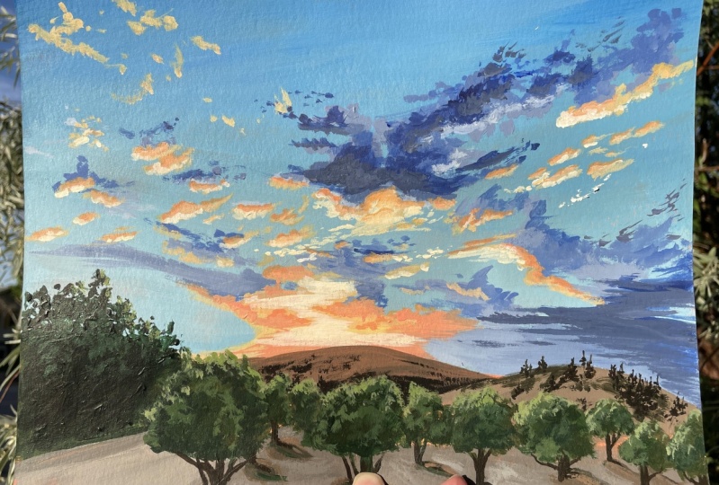
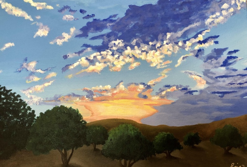
25. Tips for Finishing and Creating Quality Work: So I do have a couple of tips for finishing up a painting. Something that really adds to the quality of your painting is to make sure that there's no area of the painting where the canvas bumps are showing through white because you didn't put enough paint on it. Or an area where maybe you didn't really cover the initial Canvas. If you make sure that there's enough paint and you cover all your Canvas bumps. It will really increase the quality of your painting. And then list signs that I think this is the kind of piece you can just go back. You can lose yourself in the details if you want to, or you can leave it a little bit more abstracted like this. All right guys, so that's just about it for this class. Thank you guys so much for participating. I would really love to see your work in the student project section below. And if you would give me a review for this class, I'd love to hear what you think of it. And I hope you guys just had a really good time, had fun. It should be fun and relaxing. Don't get stressed out. Just enjoy the process. And yeah, let me know what you guys thought of the class. If you have any questions, you can also ask them when you post your piece or in the discussion section of the class as well. So thanks again. Bye.
 Yvette Lab, Fine artist in Portland OR