Transcripts
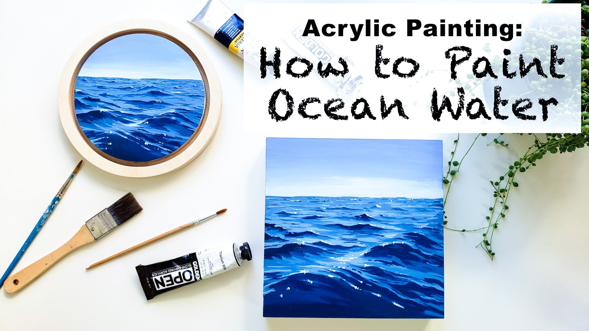
1. How to Paint Waves: An Introduction!: Hello, I am event the artists behind EBIT Studios based on the central coast of California. And one of my favorite things is sharing the inspiration that nature brings and teaching people how to find that inspiration and how to create art work that they love of landscapes, cityscapes and all that kinda stuff. So all my classes here on skill share are about different kinds of clouds, landscapes, and finding beauty all around you no matter where you are. And in this class I'm going to be teaching you guys how to create this beautiful painting. We're gonna be focusing on how to create detailed, realistic wave paintings and how to paint Sea Foam as well. So the things you'll learn in this class, you'll learn step-by-step how to create this painting right along with me. But you'll also learn tips and tricks to take forth and paint other seascape paintings, wave paintings, and just how to paint Sea Foam in general as well.
2. Materials and Supplies: So for today's painting, we're gonna be using acrylic paints. I'm using this set by Windsor and Newton that you can pick up really affordably at like my calls or anything like that. It just has your basic colors and cadmium red, cadmium yellow, Windsor blue, upper number. And then I'm adding in Payne's gray because that's one of my favorite colors when I'm painting the ocean. And then it'll come with a weight. This is a weight. I also like to use this y, which is a liquid. Why it's a fluid acrylics, so it's a lot more liquidity and sometimes like to use that as well. But you can definitely complete this project just using kind of a standard introductory kit of acrylic paints. Another fun fact is that these paints, these golden open acrylics, stay, went a lot longer than these ones well, which is really nice when you're working on your palette, where if you want to blend your colors a little bit more, but it's definitely not necessary. In addition to paints, you also need some brushes. I recommend having just a few different sizes of brushes for acrylic paints. I'd say you should have a one-inch or a three-fourths and inch flat brush, something a little bit bigger and sturdier. And then I like to use a smaller flappers. This is a three-eighths and then a small round brush, which I will use for a lot of details. And then I also have one really, really small round brush their use for little tiny details in there. But don't use this one as much, but it's still really good to have. In addition to that, you will need something to paint on today. I'm gonna be using this wood panel and I will be showing you guys how I prime it and prepare it for painting next. But if you guys can use paper for acrylics or you can use as stretched canvas, which is kind of the most typical that people use with acrylics. And how we show you how I prime this is the same for priming all those suppliers. So you can go ahead and do it the same way, regardless of what material you are using to paint on. You'll also need something to mix your paints on. This is a glass palette here with some white paper underneath. And I really recommend using glass pellets because they're just really easy to clean up. You just let the paint dry and you can scrape it up really easy in Through the paint away. But if you're used to using a plastic one or metal one, you can use whatever you like to use. Some tips for you if you don't want to invest in a glass palette, is you can also use a picture frame glass and just make sure that you take up the edges and don't cut yourself, of course, but you can put white paper under a piece of picture frame glass and it will work essentially the same way. I do recommend getting a glass palette eventually if you do like it, because this is a stronger glass so it won't break as easily and it's a lot more hardy. You'll also need something to put water in. I have this ceramic tank, but you can also just have a couple of jars of water, cups of water. I do recommend having to so that you can clean your brushes in one side and that will become the dirty water and then keep one side clean water for when you want to add to your payments. Last but not least, you will need either a paper towel or a washcloth, something like that to be able to draw your precious off after you rinse them.
3. Surface Preparation: How to Gesso: The first thing I'm going to show you guys today is how to prepare whatever surface you're painting on for painting, whether it's wood or paper or Canvas, you can use this same method. And what we're gonna do is use something called Jessica to prime the surface of the wood. Just O is essentially a cheap white paint and you lay it down all over your surface and it becomes the first layer of your painting. The reason that it's important to use is because it soaks into the word so that when you're painting over it with your nicer quality paints like these. It won't also kinda the wood and you won't need as many layers to build up a nice vibrant and opaque painting. That being said, you can paint on paper and wood and canvas. That is already primed without doing this step, it just will take a lot more of your acrylic paints and a little bit more time. But if you don't have just so you can still complete this project. So this process is super easy. You're just going to go ahead and some just so down on your wood or paper. And then I like to use a nice big brush. You can use this. If this is what you have, it goes really fast and he's nice big brush. And I just spread it all over. My painting. A canvas is that you buy at the store already pre primed with one to three layers of Justice O. But sometimes adding another one on top can make your surface even better. Or if you're using a really affordable, cheap canvas, adding a layer of just so it makes it much easier to work on. So I still recommend doing this with stretched canvas as well. And depending on whether or not you're going to be painting the edges of your painting. You can go ahead and just so the edges or leave them as is. And I like to create a little bit of texture. It don't try to make it all go one way down the painting. I just kind of do it. Lots of loose brush strokes because that way once your painting over, if you do see any texture, it's not all going the same way. I just really prefer that, but you can do whatever you want to do for this project. So once you've covered your surface in just so you just wait for it to dry. This takes probably between 1020 minutes and just wait for that to dry and then we'll come back and start our painting.
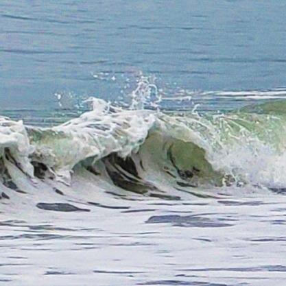
4. Sketching: Sky and Background Layers: Okay, so we're going to start this out by setting up our palette. And I'm just going to squeeze a little bit of paint from each tube onto our glass palette to put too much down at first, if you're not sure how much you'll need, I tend to do globs about this big. So to get started, the first thing I'm gonna do is mix a little bit of our Payne's gray with so little bit of water and a little bit of white. And I'm just going to sort of start outlining our painting. Just so you can get an idea of where things are and the composition of the piece. And I'm just going ahead and kind of looking at the general shape of the wave in our reference photo. The reference photo is available in the project section of this video. And you can see it there through our friend's photo is a little bit blurry because I zoomed in so much to get this crop of this really detailed wave. But I actually like to work this way because it allows you to have a little bit more imagination and not focus too much on the details and more on the general idea of the painting. So once we've got our sketch in, it's kind of about halfway and a mostly sought to mark out this top line. I'm gonna go ahead and mix up some more Payne's gray and white in a moral pink color and mix a little bit of our blue in there as well. Until we get kind of a nice desaturated late grey blue. And I'm just going to start adding that. I'm gonna make it a little bit later. I think that's the great thing about acrylics. If you feel like you put down a color and you want to change it, it's really easy to just paint over it. And this is going to be our sky. Because in this photo, spin of a stormy clouded a. And I'm going to bring this guy down. Getting a little bit later. As we approach the horizon line, which is about halfway between the top of the canvas and our wave, but halfway in between. And I'm going to add a little bit more of this white there. So it gets a little bit later fading out as we get closer to where a horizon line 0V. And this is after be too exact, but I'm gonna go ahead and mix up a little bit of a darker version of our sky color with a little bit more blue. And then add that rate in underneath. We'll take that all the way down to around our wave outline that we filled in here. And this part's pretty quick. You just go ahead and loosely fill it in working as quickly as you can so you can come back and blend it while it's still wet. So I'm gonna go ahead and rinse my brush off. So that's colony. Because I'm going to try to blend the sky and the ocean together a little bit and you wanna clean mostly dried off brush to do that. And then we'll go back into our colors and add a little bit of color. And just sort of this is mostly just a white peg mixed in. And we're just gonna go over horizon line and blurred a little bit. This technique kind of makes you feel like it's a little bit foggy. The horizon lines getting a little bit blurred just because it's pretty far away. And I like the look of our overall. It also eliminates the need for a really crisp, straight horizon line and makes it a little bit easier.
5. Composition: Blocking in Shadows: So the next thing that we're gonna do is go ahead and mix up a little bit of our Payne's gray and white to get a nice medium gray color. And I'm just gonna go ahead and start adding in some shadow over here where we see a good amount of shadow. And you can see in the reference photo we have a lot of shadow here and then a good amount more here. And that the shadow is showing us the depth and the shape of the wave. So we're taking it down and then over to show us the general shape of this wave. And then what I like to do first when I'm sketching out, our wave is adding some of those dark spots where we can see the water through the phone. And to get this color, I'm mixing up a really deep version of this Brown and our Payne's gray until it's dark. And then I'm going ahead and starting to sketch out where I see these holes in the fall. And for this part, what I recommend is really studying your reference photo. And you can kind of squint your eyes so that it's a little bit blurry so that you can see where the contrast is in the photo. And then try to use it in your own work. You don't have to be super exact because we are creating a painting. You don't need to mimic the photograph exactly. But it helps to get the, really, get the gist of the place and show realism without it having to be an exact copy. So you want to get the contrast of the replays and then focus on your colors as well. So I'm just adding in some different areas of this brown color. And really it is a Brown, it's just a desaturated Brown, which is why we added the Payne's gray. And you wanna make sure that your dots kind of match the direction of the wave. So you can imagine that the film is pulling downwards and then this way, so we're following that with our little holes on the phone as well. And the more that you paint foam and look at photos of CFO, the easier this will get. And you'll start to notice patterns that reoccur in just most waves and then you'll get a hang of what you wanna do for her.
6. Composition: Seafoam: And then you'll notice that as we move away from the wave section and into the flat foam section, it gets a little bit less saturated and a little bit more grey versus brown for little foam areas. So I'm adding a little bit more Payne's gray and a little bit of white to our mixture. And I'll go ahead and add in some of those as well. Now this is still darker than the Sea Foam for sure. Just a little bit lighter than our Brown URI than before. And if you're having a hard time getting smooth paint to lay down and it's getting too much brushstroke texture. You can always add just a tiny bit of water. Here. Acrylic paints. Adding a little bit more weight, fade that out even a little bit more as we move away. And you can always come back and change the colors of these dots later. We're just trying to get the composition of the piece down so he can start laying in our tones. Next, we'll lay in our tones after this. All right, so once we've got the mean shapes laden here, I'm gonna go ahead and go back and mix up some more light and Payne's gray. But this time I'm going to mix up a little bit of a lighter gray versions with mostly white, with just a little bit of Payne's gray. Because you can see in our way when you look at the reference photo that there's different tones of darks and lights and this piece, and we have a nice chunk of light coming in right in the middle here. So I'm adding that in. And then we'll just work back and forth. So you add a little bit more Payne's gray and you can work while still a little bit wet to get released. Nice smooth gradients, which is what I'm doing here. And you'll kinda just wanna move around the piece using different tones of Payne's gray, which creates this beautiful bluish-gray in different towns. And so we can see, for example, that the darkest parts of our wave are up in this section right here underneath. So we're adding in our darkest grade there and just kind of blending it out. And then we'll also have a really nice dark section over here on this side of the painting. And we'll go back in and kinda blended out because the darkest PR is usually at the top close to the wave. And then you can go ahead and blend it out with a medium. And this really gives it lots of dimension to use lots of shades of gray. And just slowly one at the back and forth. And you may need to go ahead and put several layers of paint down until you get the right toes and the right blending. So it's really nice to just work back and forth.
7. Blocking Colors: Seafoam: So I like to go ahead and work on the greys are mostly before I start on the top of the wave. So keep filling that sand. And I'm gonna go ahead and mix up a really nice light gray with a little bit of water. So it's mostly just a tad of our Payne's gray. And I'm gonna go ahead and fill in this whole bottom section with that color to start. And then we'll come in and add more and more as we go. I'm just carefully painting around each of these shapes we put in the darker colors. And sometimes if I'm struggling and realize it's because I haven't mixed up enough paint. So don't ever be afraid to put more paint down your palette or mix up more of that color. And don't worry too much if it's not exactly the same. Acrylics do have a tonal shift when they dry, they get just a little bit darker. So sometimes it can be hard to match your paint. It gets easier with practice for sure. But also one of the beautiful things about painting water is that having a lot of variety in your tells you graze near Blues actually adds to the piece so you don't have to worry too much about matching all your colors exactly in. You're actually adding more dimension when you have little tonal shifts. And so I'm gonna go ahead and take this lighter gray color. And once I've filled it in about to the base of the wave, we will go ahead and move back into our shadows of our wave and keep working there. So I'm mixing up a medium grey again. I'm coming back in under here. And in the areas that we haven't filled in yet. At this point, you're just kinda filling in around your composition pieces E4 you put in. And I like to use just different grays after you've gotten your mean areas of contrast. And you can just use kind of a medium grey to fill in the rest for now. And then will always come back in and add more detail later.
8. Blocking Colors: Wave Shadow: And I'd say the key to blending it with acrylics is to try to work it quickly because you want to try to blend it while it's wet paint, an acrylic paint dries pretty quickly. So it's a lot of working back and forth. And you might end up going over the same spot quite a few times just to get it to blend out. But that's okay. That's part of the fine. And that's totally normal doctor rework areas of your piece over and over again. But the beautiful thing about it as opposed to, as opposed to oils which you can blend easier because they don't dry as fast. If you make a mistake because it dries quickly, it's really easy to go over it, cover it up, and just start over with acrylics, which is why they're my favorite medium for sure. Another thing I recommend to people if they feel like they're struggling with the blending part is you can get these acrylic paints called golden open acrylics. And I recommend if you just get the white one, you can mix it with all your other colors you already have. And they'll all dry Just a bit slower. So you can have a little bit more time for blending if you like, that kind of thing. The other good thing about going back and forth with your acrylic paint is that you build up lots of layers which covers up your panel really well. The more layers you have in a, you won't have that canvas texture poking out or you're went green showing through because you're ending up with lots of layers of paint. And another thing is if you're having a hard time blending at all, you can also just always clean off your brush and start with new paints so that you don't get too muddy colors. Sometimes when you're working back and forth, it's hard to get a nice pure mixed color again, so you have to watch your paint off of your brush. And now I'm making it mixing up a nice darker gray. This is pretty dark. One of the darker colors we've used so far for sure, because I feel like this could use just a little bit more contrast in here. So I'm gonna go ahead and add a little bit more of a dark gray. And I'm just gently adding that kind of all of our edges of why the foam is cresting and carrying it down in some spots as well.
9. Blocking Colors: Green Water Wavetop: And so at this point, I want to mix up a little bit of a green color and we're going to start working on the actual water and the light coming through the wave. So I'm mixing a little bit of yellow and our blue and a little bit of Payne's gray eggs, it's a little bit too saturated. Maybe a little bit at Brown and a bunch more white. And you can just kind of play around with mixing all your colors. Obviously, you can make green, yellow, and blue, but adding a little bit of some of the other colours gives it different tones. So if you have a little bit of red to green needs it, or it can use the brown click I used. And then when we're doing a wave, we'll just go ahead and add in a little bit here at the top for now. And you can see that the water is kind of curving inward with the wave. So I'm using my brush strokes to show that as well. And we also have a section over here of our grief. And I'm actually going to mix up a little bit of a darker version of this and do a little bit of as more saturated darker version just at the edges. And this will show the movement happening in the water. And also the contrasts and peace. So you want to make sure that you're always using your brushstroke specifically to show the flow of the water. And going in with a later or UCLA. We can move down the p's and kind of blend in with our darker colors that we've added. And then we're gonna mix up a really nice late, late, late, green-blue, her latest colors so far. And pull that down to the crashing wave. So you can see that there's kind of a gradient going on. It's darker on the top of the wave and then it gets later as you come down to the White crashing part of the wave. And let's shows there's more air getting mixed with the water as we move down. And then sometimes adding a little bit of contrast at the bottom of it kinda helps show the movement and the shape of the water as well. And then we'll go ahead and do that same thing and add that really nice late me to green over the bottom of this little section of breaking waves as well. And you'll notice I didn't go straight to the top with this one. And that's because there is and the reference photos, some white foam above it. And we'll just blend it in with I made and then going back into our darker color, bringing some of that in there as well.
10. Blocking Colors: Wave Crest: So the next thing I'm gonna do is start working on the foam around the breaking wave part of the wave on here. And we're gonna mix up a light gray color and threw it in right here. So this is still in shadow in the piece, but it's lighter than what's underneath it. So we're not going to do a pure white yet. We're gonna mix up a nice light gray, making sure that it's lighter than the color it's next to. And put that on there. And then we'll go with an even lighter gray right alongside the top of it. Kind of blend it out a little bit and then go back to our darker gray. And you can see the way that the wave crests and the reference photo uses a nice contrast rate here, showing that it's kinda flaring up. And this is in shadow. We can then make sound a little bit. And there's also layering in here. So we're kinda going medium light, light and another dark layer. And then we'll be able to go in with our nice bright color next. Oh, and then we'll kind of do the same for some areas over here. Got some nice contrast. And it makes a little bit of green and two are grey because you can see a little bit about greenness of the water coming through. And we're gonna cre, just some little dots here and there that show where the waters and mixing with the foam and you can see it through it. Mixing back into our later Green. I'm also extending this little section over a little bit further. And we'll mix up a little bit of a green grade and go right over here as well. I'm just kind of eyeballing our reference photo, seeing where there are some areas of contrast and adding them NOT sleep just to get the composition of them down at first. So don't worry too much. And then we'll move back into our gray, which is just white and Payne's gray but no grain in it. And it mixing up by pretty light grey to kind of start to fill in all those white because I'd like to wait until the very end of a painting to add in the really bright flecks of peer waned. So using our nice light gray color, we're kind of going along these edges. And you can see it's not a perfect line and there's lots of little pieces of water and light coming down. So you can start to add in some of those details if you want it to. And I'm gonna add some of this gray just around these areas of darkness.
11. Blocking Colors: Seafoam and Wave Crest: And using that same MY degree here, where the foam is. And then we can also see that we're just kinda outlining all of these areas of foam for now. And they'll come in with really bright colors later. And then over here, we have our crashing waves. I'm going to add this lighter grey to the top and kind of a dabbing motion. And then I'll mix up a little bit of a darker gray, tiniest bit of blue in it. So it's a nice cool gray. And we'll put that in underneath. And this doesn't need to be too dark. Just a bit darker just to show the contrast. And then we can move back and forth into our way. Kinda fun them together for now. And then we can mix up and these darker, gray, too dark but amid Dirk. And go ahead and start adding in a little detail. So there's some shadowing up here. And we'll go around these little indents we already made. And then you can go in with your very, very light gray and fill in the rest of this area. And then at this point, I'm gonna go back and mix up some of our brown mix with Payne's gray cities, but await and go back in and add a little bit like another layer to our shapes because they were quite opaque enough, which is totally normal with acrylics. Usually after get probably two or three layers of paint on a section to make it look really nice. And so you're just going to go over all of the sections you already painted the first time and make sure you cover up any little white areas you can see through. So you can just take your time with this. Go nice and slow.
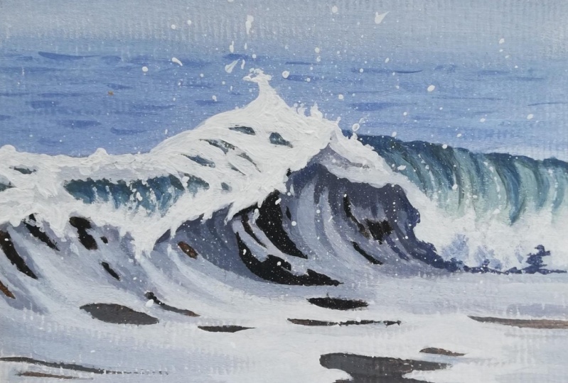
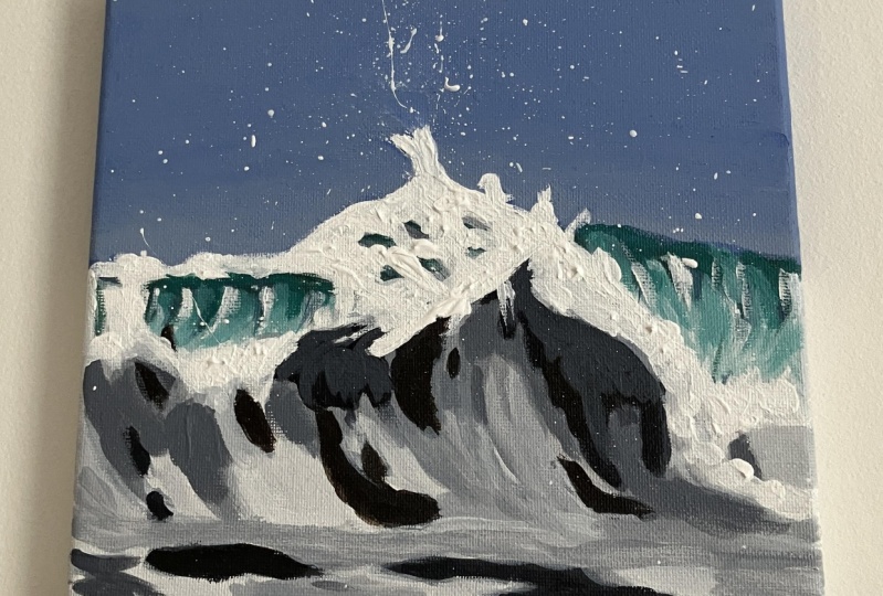
12. Details: Wavecrest Bright White Contrast: Then once you've gone over those areas, this wave, we're gonna go ahead and mix up just a little bit more of a dark green color and add some little lines of detail a little bit darker than what we were using before. And we're just going to use it very sparingly. And this really emphasizes the movement and the direction of the water rolling. And you can use that same color to add a little bit more dimension to some of these areas have been here. And then I'm going to start to go in with some of our just pure white and add in some areas where it's really great in their reference photo. And I like to use kinda thick blobs of paint for this. I watered. You can either use the fluid weight that I was telling you about earlier or you can add a little bit of water to your regular white so you get a nice fluid consistency. And you can do these thick gloves that make it really bright. And I like to add that just in some areas. So here we have, our wave is like splashing up. I wanted to be really bright, so I'm doing that technique. And I'm actually going to use a really small detail brush for this. Kind of splashing, shifting a little bit, crazy water stuff. And then we'll bring that down. And we're keeping it thick and reshaping as often as we want to. And I'm bringing it around here. And it's also very afraid. And the cool thing about fluid acrylics or watering down your paint a little bit is that you can do these really great whites without adding too much impasto textures to the whole thing stays relatively smooth still, which is how I like my paintings to me. And you're also going to want to add some little bits flying up and around because the air is hitting the water. There's lots of spray. Well, I didn't some more later. And I'll show you guys my favorite technique for adding in the spray to the foam. That's kinda the last thing I do on a painting usually. And you can move back into your darker gray at any point in time to add a little bit more contrast, which I'm doing now. Mm-hm.
13. Details: Highlights: And then we can add a little bit more of our bright whites over here and into our foam as well. And we'll just kind of mix that in for now. And then you can go ahead and carry that over onto the top of this foam over here. And there's just some areas have been here. This doesn't have to be too precise because we're gonna go back in later. We can see there's some areas reflecting light down here. And then you can take some weight and add two little lines coming down your waves with little dots. So dearly held the line and those couple dots, little bit line. And this shows the air coming through the wave as it comes down into the phone. And I'm going to make something nice and dark gray to add a little bit of contrast under here. We can see where that Wave phone stops. Kind of blended up in an area a little bit.
14. Details: Seafoam: And then the next step is to work down on this lower part again. So we're going to mix up a nice medium gray color. So we can add a little bit of contrast into some parts of this foam because it's not going to be all exactly the same hue. And so I like to take some of our medium gray and the foam is all kind of moving psi in this direction. So I'm making sure to mimic that with my brushstrokes. And this doesn't have to be too precise, but you just go ahead and add in some shapes in the little bit medium grey, a little bit darker than the rest. Kind of showing up movement some lines here and there really. And then we'll mix up our really nice lately. And we've already got going on here and kind of go over that again. Anywhere that you see the white of the Justo through it or anywhere that you feel like just needs another coat. And you can lastly go in with your really bright white and add in some of that brightness in a couple of spots just to bring that down to the forefront of the photo. And then we will want to go over these areas again. Again, we're just building earlier slowly. So I'm gonna make a nice gray color that is similar to what we had there before. Actually going out, tiny minute blew into it. I wanted to be a little bit more blue than brown. I'm just gonna go over that. Once again.
15. Details: Wave Spray and Final Details: And now that we have most of our painting done, it's time to go back into our distant background. And to do this, I'm just mixing up a little bit of Payne's gray, teeny bit of blue. This blue is really strong. So you wanna make sure you're used humor to, it's really easy for it to overpower. And we're mixing up a color that's just thought a bit darker than what we had. And then we're going to just go ahead and add in some little lines here and there. And this can be pretty subtle. It just shows you a little bit of movement in the background, a little bit of detail, as there always is in the water. It's always moving. And you can just keep mixing up the colors to get we are looking for or since it takes me a few tries. And these are just little lines and dots here and there doesn't have to be very detailed because is in the distance, but it just adds a little bit of detail where it's needed. And you can mix up or even lighter color. So basically we have our background is the mid color, and then we are adding a little bit of a darker color that a little bit of a lighter color in as well, just to give it really well-rounded dimension. And then the last step and the most fun part to me is the splatter. And this really brings the painting together. So you're just gonna dip your brush into on liquidy white. And then you just pull it back and let it go. And if you don't want it to be all over your painting, you can use like a paper towel to shield some of it. But I really love just the effect this gives and all the detail. And the ocean is such a natural shape that doing these kind of spotters really gives it the braid look. And then you want to just read it. You can get really big thick spotters or you can get thinner ones to know how much pain is on your brush. And then at this point you can go in at any more details. And in some more thick white with your brush if you want to or fix anything that you want to go back and add another layer on. You can also add in some dots with your own brush. In combination of the spotters. Sometimes I like to take my brush and spread this virus that they're not all circles. But yeah, that's pretty much it. Thank you guys so much for taking this class. I hope you guys had a lot of fun, learn something new and had a good time painting. The reference photo is in the class projects section where you can also share your work that you created along with me or using the information that you learned in this class. And I can cheer you on and love to see my students work. You can also ask me any questions you have in the Discussion tab section of the class. And that's about it. Thanks for watching guys.
 Yvette Lab, Fine artist in Portland OR