Transcripts
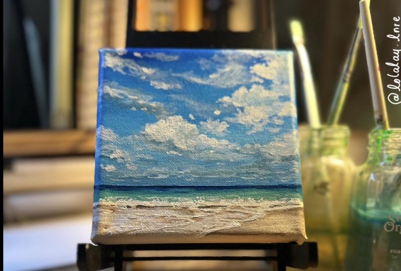
1. Intro and Supplies!: Hey, guys, My name is Yvette Lab and I create ocean on landscape paintings out of my tiny studio in Portland. Or again, I like to focus on nature and landscapes and skies. So in this class I'm gonna be showing you guys how I paint realistic clouds on a bright blue. A beautiful day with this painting will be walking you through each step of painting this painting, showing you guys the lights, the darks, how to get a good shape in the clouds on my color mixing process. I know also be going over how I paint seafoam and some techniques for painting the ocean. I really recommend this class for anyone from beginner to advanced because I will be walking you through every step of the way. You'll be seeing me apply paint, mix all my colors, and I'll give you lots of tips and tricks for getting good shapes. And all of that goodness is lost. So, for this class, you, of course, need something to paint on that you can either use watercolor paper, which you will need to crime with Jess. Oh, but I will definitely show you guys how to do that. Where you can use a piece of loose canvas like I did or stretched canvas. Of course, I really love to use canvas when I'm painting more detailed skies because I think it blends out the paint really nicely and looks really good with the texture. But of course, you can use whatever you like to use or have on hand. You'll also, of course, needs and brushes. I really recommend having at least one small detail brush one medium round brush since a seven on 11 inch flat brush. If you have more to use the n, you can. But these air kind of the basics I recommend you have for this class and also of course, is is an acrylic painting class, so you will need acrylic paints. I list all of the colors that I use on the brands that I recommend in the description below , but I definitely recommend for this class you have at least the primary colors, like a primary set for beginner set, and I also really liked have ultra marine blue, so but you could definitely work just with a primary set, but I would recommend also getting ultra rain blue, maybe a purple to round out your colors. Finally, you'll, of course, need something to put water in And be that a mug or a plastic cup. Whatever you have on something to makes your pain time. I really like using a glass palate because they're really easy to clean and really easy to use over and over again. And if you don't want to go buy a last palate, you can definitely use the glass from any picture. Bring that you have that maybe you're not using. You just would take the frame and make sure you put tape on the edges. You don't cut yourself. Be really careful and lay it flat on a table. Andi puts a white paper under it. So you have a nice white base on. I've definitely done that before. I still use that as one of my last college, and it works great. All right. So go gather your supplies and we will jump into this class
2. How to Gesso: All right. So to start out this project will be starting with either a wooden panel or watercolor paper, whatever you have and would prefer to use. And we're going to go ahead on prime these with some just so, And I'm gonna show you guys how I do that. Okay, so this is a really simple process for the wooden panel. We're just gonna take some just so right here and for a bit on there, not too much so that you it can always add more later. It's easier to do it that way. And then we're just gonna take a big, white, flat brush on spread it all across the painting. Justice is essentially just a cheap white paint on. The reason that I like to use just so is because it makes the acrylic paint. Once you're painting on top, sit much nicer, go much farther. You don't have to waste as much paint that gets soaked into the wood. And it also gives it a really nice underneath and texture. One tip I do have is if you're making a landscape oriented painting to make sure that all your strokes at the end after you covered it or going the same way in the landscape. Orientation versus If you were doing a horizontal painting, you would want them to go that way with, and then you will just wait for this to dry. If you're hoping to paint the sides of the painting, I recommend also just doing those today. We're not gonna be doing that. And it's really the vaccine thing with watercolor paper. This is on a block. You don't need to tape it down. If you don't have enough block, it's totally fine. Just painted. Um, you do want to use a watercolor paper that's at least 300 GSM, which just means it's a little bit thicker and can stand up to the paint better and for the papers. Same thing. We'll just apply some just so I may have done too much. So I was going to What about off over here? No big deal, and you just want to make sure that you cover every card of the paper. I actually really love painting on paper. I think it's one of my favorite things to paint on, so if that's what you have, definitely just use it painting on wood or campuses is by no way any better or worse. They're all just different tools. But I think that it's really fun to paint on paper. It gives a really interesting, cool texture, and it's really easy to frame afterwards.
3. Sky Part 1: Colors: Alright, guys. So for the first part of this cost, I'm gonna be showing you guys how to paint a bright blue sky with fluffy white clouds. We'll be using ultra Marine blue A primary scion. This is just a primary blue that came in a set White and, of course, Payne's gray. I'm gonna be starting out this painting on a piece of canvas. This is already been primed with just so, um and it's just like the campuses you find in the store but not stretched on wood. It's really fun for little experiments and just an easy way to store stuff. I'm gonna be starting by taping off my horizon line like I always dio and I'm just gonna eyeball this. But feel free to use a ruler to measure down from each side to make sure your horizon lines not crooked. And I'm just going ahead on putting this about 1/4 of the way in the bottom of the paper because in this composition for this reference photo, you'll see that it's mostly sky. And once I have that in place, I'm just gonna go ahead and wrap the taper on the edge of the canvas for now. I don't want it taped to the table because it's a little bit easier for me if you can move around the canvas while you work. So as we get started on the sky here I am going to be using some ultra marine blue, and this is called Windsor Blue. But it's also known as Primary Scion and some titanium white. I really love this fluid acrylic version of Titanium white and Payne's gray. I think it just makes the mixing go really well on. It makes a little bit smoother to apply not quite so chunky, which serves really well when you're working on the sky, because we will be doing a lot of layers here.
4. Sky Part 2: Gradient: All right. So the first thing we're gonna do with this painting is mix up a color to cover the whole sky area will be using a nice strong blue for this and just laying this in over the whole top half of the painting before we add in any of our clouds or white space. So for this, I am using some of the ultra Marine blue and then some primary scion on the white and with the primary Scion, it's important to know that this color is very strong. You don't need nearly as much of it as ultra Marine blue to get the right color one. So you can see I'm using quite a bit more ultra marine blue in her mixture here, and we're going to take this strong blue color and apply it at the top and create ingredient going down to a little bit of a lighter, more neutral blue color. This shows kind of how it's fading out in the distance and how colors become less saturated as they get farther away and you'll see me doing that. So I'm gonna mix up quite a bit of this really strong blue color to start at the top, and then we'll slowly add in bits of white and gray as we move down the painting. I like to mix up a really good size batch of paint before I start applying ingredient on a painting that's the size because I think you can get a much smoother nurse Nicer ingredient if you have quite a bit of paint, whereas if you're trying to remix halfway through, it's a little bit challenging. So just definitely make sure you have plenty of paint mixed up before you start. And I'm noticing on this painting that the dark blue is along the top and it comes down the middle and gets a little bit lighter where clouds are in the sky. This isn't a huge difference to make, but I am adding just a little bit of white on the sides there. For now, when you're trying to make a really nice smooth, radiant with acrylic paints, it's also really important to move quickly and use a big enough brush. You could even use a bigger brush than the one inch brush I'm using here, but definitely I wouldn't go any smaller than that because you can get a good amount of paint on there and quickly blend everything together. So at this point, I'm going to start mixing up a lighter color for the bottom half of our painting. I'm adding some white tower current mixture and a little bit more ultra Marine blue and add a little bit of Payne's gray as well. And then I'll start applying that. And actually I feel like this color is a little bit more green tone, a little bit too much of the primary scion. So I'm gonna go ahead, wash my brush off here and then remix a new color that I feel like is a little bit more of a neutral color. So many used white here, and then I'll grab some ultra marine blue and some Payne's gray, and this is a subtle difference. But you can see that it's a little bit of a warmer color, a little bit more neutral in gray and a little bit less of a green blue, and I really like that color. So then we'll go ahead and add that over the top, and then we'll use some of the color we mix before mix them together and start transitioning from our dark deep blue. Two are less saturated, lighter blue. I like to add a little bit of water here to help one them together. Not too much, just a little bit. Andi. I definitely recommend adding a little bit of water or acrylic medium to your paints when you're trying to do ingredient, especially if you're not using the fluid acrylic paints like I am, and you're just using heavy body of the tube paints. It'll just help you to be ableto one them together and move it around the paper better. So here I'm cleaning my brush off, because sometimes it's easier to get a nice, smooth radiant with a clean brush. Aiken dip back into my dark color paint without too much going on and start adding in darks where I feel like I need them. And it's also good just for blending together so that you don't get too harsh of lines, and this is definitely a back and forth game. I mix up a little bit more of our blue color here and start adding it, and we'll add in more of the light color and just blend it back and forth and take a much time as you need to get a nice, pretty radiant. - Okay , so now that we have our ingredient done, we're gonna let that dry completely before we come back and start working on the clouds before we get started on our clouds. I'm just gonna quickly it clean off my palate. If you're using a glass palate, it's really easy to just use a razor blade scraper and spray it with water to make the paint come off easily. And I'm gonna be leaving the paint that's still wet on my palate because we're still gonna be using our same four colors.
5. Sky Part 3: Blocking in Clouds: So we're going to use our one inch brush again. And now that this is all dry, we're gonna start mixing up our first cloud color. I'll be using titanium white on ultra Marine blue to start. I'm not going to use any of our primary saying I'm just sticking with the ultra marine blue because clouds are a little bit less so treated on warmer toned. For this, I am starting with a nice light blue. It should be lighter than the color that we used at the bottom of the painting, but not bright white, because we're gonna work in lots of layers for this piece. I'm actually gonna add a little bit of Payne's gray to this mixture as well. No, and we're just going to start blocking in the clouds as we see them in the reference photo . At this point, we're just using our light color and walking in the big primary shapes weaken. See, I like to use a large brush for this so that it doesn't get too detailed or too messy too quickly, and we can just add in basic shapes of every So we're getting started on this white, fluffy cloud I'm just kind of drawing in these little circular, fluffy, jetting out parts that you can see. And for now, since we're just using our one color, everything's gonna be kind of connected and flat looking. But I like to work and lots of layers on clouds. And so even though it looks this way now, it will definitely go back in. And I have lots of dimension. Another thing with clouds as I use the edge of the brush and I'll try to kind of give some of that PC texture on the edges and not have it be just a straight perfect line. Just what you can see me doing here because clouds feather out into the sky quite a lot. - And then I'm just using a reference photo to map out everything I'm making sure toe leave blue gaps in between are clouds. You don't have to get every detail in this early stage. We're just walking in the big, more dense clouds. And while I'm blocking in these clouds, I'm adding this color toe where I see the lightest parts. First is more of a mental exercise just to be noticing. While you're looking at your reference photo, where the brightest parts of the clouds are
6. Sky Part 4: Shadows: and now I'm going ahead and walking in the clouds as they layer backwards so we can just see kind of the underside lines of some of those bottom clouds as they fade into the distance. One of the really amazing things about painting clouds and also the ocean, is that it's pretty forgiving. It doesn't have to be exact to still give a really convincing portrayal that their crowd clouds because clouds organic shapes. And no one's gonna know if you got everything exactly perfect as long as it still looks like a cloud. So I love that about painting them. So I'm mixing up a darker shade to start adding in some shadows. Here, we're gonna add some into this upper corner in this middle ground area to connect these clouds. And below this cloud here I have mixed up this color with some Payne's gray. Here I'm adding a little more and some white and some ultra Marine because there should be more of a neutral gray and less blue. And then I'm going ahead on mixing this up, and then I will connect these clouds, start adding in shadows where you see them around. That's the process that I like to use for painting clouds is to add a mid tone all over to block in the shapes and then start adding in shadows, and then we'll go in with highlights later on. And I really like the effect when you're blocking in clouds in the beginning, when you use a large brush like this and then used the edges and sides of it when you want to get smaller details. So it looks like underneath this cloud here is one of the darkest spots on our sky. So I mixed up a little bit of a darker color with more Payne's gray, and I'm applying it in this corner. And then the other spot on our clouds is up in the right hand corner here, and it is also one of the darker places. - So at this point, it's kind of like a paint by numbers where we start adding in shadows where we feel like we need. Hm. And I'm also using the edge of my brush to create some wispy little textures because you can see in a reference photo we have, like these wispy clouds behind the big, fluffy ones. So we'll start to get into some of out here, too. - So with this big, fluffy cloud, I'm starting to add in some shadows here in the middle where we can see them. They're not too too dark, but they are important and they give it lots of dimension.
7. Sky Part 5: Lights: and another tip I have is, don't be afraid to use paint. Don't be afraid, Dad. More paint to your palate. Sometimes I find myself trying to scrape the last little bits off and not getting enough paint to get the color or the blend I want. And it's so silly that I do this. So just a friendly reminder for you. If you're like me, don't be afraid to use more paint you are painting. That's what it's for. - And so, ultimately here on this bottom section, it's gonna blend into the bottom color. We use that late, great blue that we used when we were making our ingredient, so that's kind of in the background. It's really just clouds fading out into each other as they get farther away. So we're adding some little highlights, watches and when I'm going back in thes mid tones like I have been, I am just mixing same three colors but a little bit lighter, white, ultra marine blue on Payne's gray. So at this point, I'm going to start going in with some of our highlights. This isn't the brightest white that will use on this piece, but it is significantly lighter than our mid tone, so make sure it's not bright white and still has a little bit of blue and gray mixed into it. But it is pretty break. And then we're just gonna start in on the areas that look like they have the most highlights on them. The whitest parts of the clouds. And I've switched to a smaller round brush for this because it's much easier to get details this way and feather them out. And when you're working in clouds, it's awesome. Toe have lots of different tones and shades, so don't worry at all. If you're mixing your whites a little bit differently each time, it's just gonna add to the desire to. - And I'm just using the very tip of my brush here toe odd little flicks and details. Because clouds are quite wispy, the edges of them are not perfect, and they'll have little bit sticking out as well. And I'm kind of using that technique throughout the whole cloud. Little circular movements and flicks cause it doesn't need to be like a perfect brushstroke that's really dense
8. Sky Part 6: Negative Space: so I'm just looking at the reference photo seeing where these light points are, and it's also helpful sometimes to look at the negative space in the reference photo and see where the blue part of the sky is pumping through. And that can help you figure out if you're getting a pretty good shape or not and how close and far each cloud should be. - So I'm just continuing here toe work on all these little highlights and some of the wispy parts of the clouds, and this can take a bit of time, but it's good to just take your time, play with it, build up each layer slowly. And then at this point, I'm going to start playing around with some of the wispy parts of the clouds here that are in the background and they're a bit darker and more blue. So I've added a little bit more of the ultra marine blue, so it blends into the sky behind it a little bit better than our main clouds.
9. Sky Part 7: Highlights: And when I'm doing thes with spear clouds, I definitely make sure that I had a little bit of water to my pain, as it's easier to it. Thes quick, wispy brush strokes on. It'll show through blue paint a little bit as well. So now I'm going in with an even brighter white than I used before, starting to add in some extra dimension. This is probably one of the brightest whites that will use on the clouds, but it still shouldn't be pure white. You still want to mix a little bit of the gray and blue, and and I'm just adding us to the whitest part of the clouds. This is easy to see if you look at your reference photo and look at it with your eyes blurred a little bit, and you can really see the contrast of the widest parts of the clouds and where you should be applying your brightest whites. And then I realized that I didn't really fill in this half of the clouds paintings. I'm going ahead and doing that now with a mid tone grey blue color, and then I'll come back in and add more shadows and highlights where they belong. So this portion of the clouds over in this lower right hand corner are pretty dark. They're fading out, so I'm adding plenty of darks over to outside.
10. Sky Part 8: Contrast: So at this point I'm moving around a piece going from place to place, adding in more shadows and contrast where I feel like it's needed, such as under these clouds, that air layering back into the distance and because it's getting further away. There's also last contrast, so we're not gonna use a super dark shadow for this, just one that's a little bit darker than what we already have down there. As things get further away in space and paintings, they get less saturated and they have less contrast, so they're more close in shades. It won't be like bright whites and dark darks, and they also won't be as vibrant, which is why, at the bottom of our sky we have that more de saturated blue color that we faded into. And then the clouds, as they get further away into space, are also less bright in contrast. - And now I am filling this in more because you can't really see any of that bright sky underneath our big cloud in the middle. So I'm using our mid tone color to fill it'll in and take that out and I'll just keep adding in some of these little clouds as they get smaller and further away, and eventually that just ones very seamlessly into our horizon line. No, something to remember when you're painting clouds is it does take a good amount of time to get all of these details, and so just take your time. Have fun. Use these kind of PC brushstrokes to get off the texture and definitely just take your time , adding in all of these details. So now I'm just going ahead, and I've mixed up a color that's pretty similar to that color. We had the bottom with ultra Marine Blue, Payne's gray and white. I'm going over it again. This will help it to blend seamlessly right into the bottom of our clouds.
11. Sky Part 9: Bright Highlights: So now I'm mixing up my brightest white. So far, I am using just white and a little bit of ultra marine blue. I'm cleaning my brush off so I can get a really nice bright white here. And this is definitely the brightest white you can use a little bit of pure white like I am , but you don't want to go overboard with the pure white. - And when I apply this pure white, I'm using my brush to blend it out of it. So it's not super super start, and you can see through it a little bit. I think that helps to give all of the transitionary effects because clouds have so, so so many different shades of white in them. And once you start adding in these really bright whites, you might feel like some areas where you added shadows or too dark or other areas are not dark enough, so you can go back in and cover up and change anything that maybe feels like it's too dark for the peace or to light. Um, because this is the time to play around with it, - and you might want to go back into a little bit of a darker gray. It's still a really light White is what I mean, but just not pure white, but mixed with a little bit ultra Marine blue to go ahead and blend out some of those areas with the stark white or add some last minute highlights.
12. Sky Part 10: Layers: The real key when you're painting clouds is to build up your layers pretty slowly with lots of different shades before you get to really bright white. So it definitely takes a good amount of patients. But it's really rewarding and beautiful and layered looking when you're done. And that's what really helps with the effect of realism here. If you think about it, clouds are pretty translucent in real life, so it makes sense that you would use a lot of layers of paint to get that same effect. So I'm going back in now with a blue color where I've used ultra Marine blue, our primary scion and white to get a very similar color toe, our original sky color that we used at the top of our Grady INT when we started. And I'm going in and creating more negative space and carving out some different sections of clouds to give it that PC, um, wispy with speed, texture and add a little bit more vibrance and darkness to some areas. - So for some last minute touches, I'm gonna use our white and Payne's gray and mix up our mid tone color again and just add in some last minute details here on the clouds connect things that maybe I didn't yet like this little bridge between our big cloud and our cloud on the side. And add in just any last minute connections here. Go back through the peace and make sure everything's blended out the way that I'd like it to be. - And that's about it for our clouds here. If you want to go out any bright whites or dark blues back in, you can. But for now, this is the completed cloud part of our painting, our medical ahead on Peel off the tape, and then we can see that beautiful clean horizon line, which is the best part, and then he will go ahead and get started on the beach line.
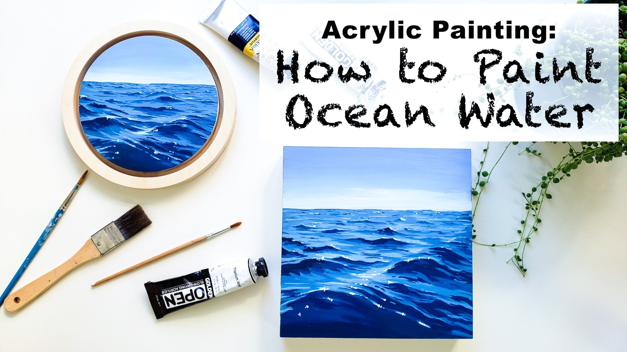
13. Water Part 1: Color Mixing : Okay, so All right. So now that we're ready to get started on the Seascape portion of this painting, I'm gonna be using ultra marine blue primary Scion cadmium, red cadmium, yellow front number Payne's gray, white and a green. Let me grab it. And this halo green What? I'm going to start out with some of this green, some yellow and some of our primary blue in some way. This is a bit too greens. I'm gonna add a little bit more of the blue, and we're trying to get a beautiful turquoise e color like we can see out in the distance in the reference photo. So once you get a trip was you like, we're just gonna put a thin strip here, and we're going to use a really bright and vibrant color for this all the way. I'm going to make a little bit later. It's good to just keep making adjustments when you are next thing we your colors from scratch like this. And then we're gonna mix a bit of the Paynes grey into that on a little bit more of our blue. So you want us to be a medium vibrancy? Dark blue and we're gonna apply that on the horizon line The difference between the darker blue We're doing darker because farther out, it's much deeper water out there. And then we have this beautiful, vibrant turquoise where the water is shallower and we have a sand bottom is what that means as well. - Yeah .
14. Water Part 2: Gradient: so I'm feeling like this dark turquoise here is a little bit too bright for what I'm hoping . So I've mixed more white into it, and a little bit of this pains green mixtures were so the next part of this painting is that will mix up a sand color of any user burnt number, a little bit of yellow, little bit of our Payne's gray to neutralize it. And lots of white, maybe attorney. Been a rat, but mostly a brown with just some hints of other colors. And then once I apply it, I'm actually feeling like I want it to be a little bit warmer. I'm adding more of our brown into us. - So a tip I have for mixing these guys together is to clean off your paintbrush, completely dry it out a bit, and then go in and start blending them. - Right ? So now that we have this base in here going to go ahead, switcher paintbrushes to around one, and I'm gonna go in with white and mix just a tiny bit of that sand base we had in there. So it's mostly white, just a little bit more neutral than white, and we're gonna draw in the phone. And at this point, I'm just adding in the kind of outline of where our waves and her phone will be, and then I'm actually going to go ahead and let all of this dry so I can start working on top of it.
15. Water Part 3: Sketching: Okay, So once you've outlined this really light line of where your shoreline will be and the first set of waves, we'll go ahead and mix up more of that white, just a tiny bit of the brown and start feeling it in a little bit more. - So when you're painting foam, it's really good to just start adding in some of these little details. You can see and know that this line that searching the shore won't be the same thickness all the way. There will be spots like right here where it's thicker spots over here. What's dinner? There's also quite a bit of overlap and different ways of the water's moving. You're also gonna want to mix up a brown that's a little bit darker than your current sand color like we have here, which I just used this dirt for a number on a little bit of this. Payne's gray, the yellow and red. It's a way that's high mixed up this color, and you want to take this a little bit darker brown in line underneath where the wave is to give it some definition. - Then I'm switching to a smaller detail brush, and I'm going to pick up some of that late sand foam color and start going back and adding more lines that show how the water is moving into our peace. I'm also gonna be using this to go over the foam again on the way, and I'm just adding a little bits of texture and foam details as well.
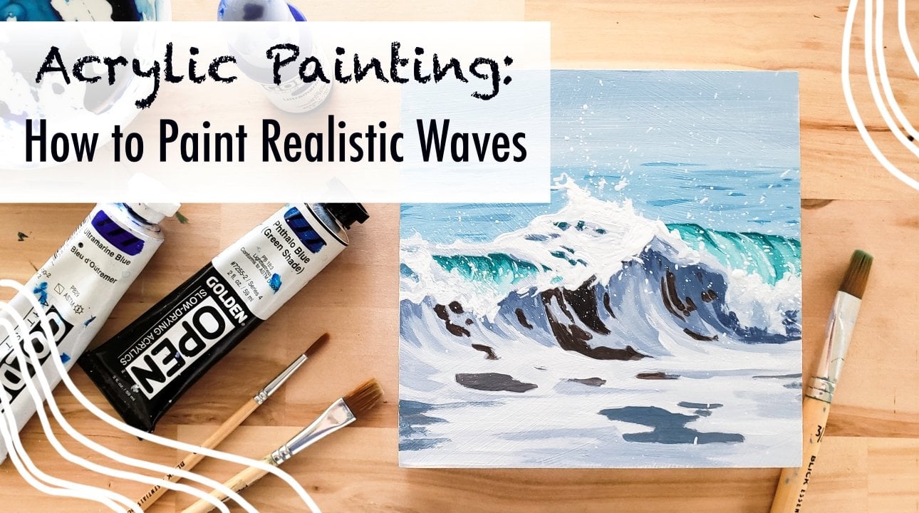
16. Water Part 4: Seafoam: So as I'm doing this, I am creating little ridges and crests in our foam water, and I'm noticing that the water is coming in at this direction. So I'm going ahead and painting the strokes in that direction as well to show that it has a direction to see. Little diagonal slanty lines and the shadows that I did underneath match up with that as well. - And now I'm gonna mix up a little bit of our seafoam green into the sand color to get a really light turquoise green and all start adding little bits of the floating sea foam that you can see behind the wave. And I'm a go ahead and zoom in so you can see better what I mean. So I'm going ahead and using these little sideways H shapes and quick lines and dashes to give the idea that there's a little bit of foam floating out past our breaking wave as well . And for this I recommend using the smallest brush. You have a little detail brush just so that it's dainty little lines. We want to connect this foam to our breaking wave as well, so it's good to make sure that some areas of it are touching each other. I'm also mixing a little bit of a darker seafoam green, still lighter than our turquoise and adding in some lines and waves out into the distance. I think it really helps when you're working with a small brush to add a little bit of water to your paint. Or use fluid acrylic panes because it will apply very thinly, as opposed to like a thick, chunky, gooey line. Now I used Payne's gray and burnt number to mix up a little bit of a darker brown. This is a little bit more gray and neutral, a swell, which means I used more Payne's gray in it, and I'm adding in some lines and shadows onto our foam that is on the sand. And as we start working on this foam on the front of the sand, there's a lot of blending and adding different shades of brown on a gray to show that there's lots of different areas and ducks and foam on top, so you can kind of just play around with this, add a little bit of darker brown, warmer brown, cooler brown and then blended out, and this will give it lots of dimension
17. Water Part 5: Seafoam Shadows: So at this point, I'm just mixing various amounts of burnt number and Payne's gray and white together and applying it all over the foam in Cem different shapes and making sure to definitely have darkness underneath the lines of our from as in where the wave is breaking. There would be a shadow underneath that, and then also, where are layers of waves, air braking? So we've drawn in the front of those layers, and underneath there will be a little bit of darkness there as well. And then I'm mixing up a lighter color, similar to the color we used to outline our foam and starting to add in some of the foam texture and shapes of all the white foam sitting on top of the water. I like to do this quickly with loose flowing brushstrokes. You know, use a lot of kind of sideways. H is and zigzags when I'm doing this, - and so I'll just go ahead and start thickening up some of the phone lines where the reference photo says that we should and adding in lots of different foam on top of the water with little dots and dashes on, and you can look at the reference photos to get a better idea what kind of shapes to use in this area. But they definitely don't need to be perfect or match the photo exactly as long as he used some organic flowy shapes, they will look like foam, which is great. That's something I actually really like about painting. The ocean is that it doesn't have to match exactly a photograph graft to give off the same feeling of the place. In fact, often times I feel like it looks more natural when you're a little bit looser with your hand anyway. Another thing to notice is Think about which way the water is flowing in this case, the waters pushing in from the left side over to the right side. So the phone will also be moving in that direction, which can help you figure out what kind of shapes on what direction they should be facing. There will be some that are more like lines in some areas that are much thicker because there's more foam there as well
18. Water Part 6: Seafoam Lights: I'm also starting to add some texture here the front, because this section of the foam is kind of crashing over a little bit, and this front area of foam is much thicker and much lighter all around. So I'm adding in lots of later brown color in here. After that, I'm mixing up a nice warm brown color using burnt number on a tout of Payne's gray, and I'm gonna go ahead and apply this into the gaps between the foam and underneath the lines of thicker phone. This is giving it a lot of depth by adding in these shadows, and then also added just to various places in between the foam to show that the water's moving and it's got some different depths and shadows in it. I've mixed up an even darker brown, still a warm brown, and I'm adding in tiny little details now with it and lots of these little details that lie right along the edge of the foam, where it's breaking just a little bit. And now I'm zoomed in just to show you guys a little bit better, how the foam is looking and where I'm adding in these little dark chunks and essentially here I'm just filling in the space around the light foam that we added where our base was and darkening it in most of the areas.
19. Water Part 7: Creating Contrast: to know. I'm using a neutral gray to underlying the foam that is on the sand. Dry sand, a NY mixing up a really dark blue grey brown with mostly Payne's gray and some burnt number . And this is definitely the darkest color we've used on this whole painting. And I'm gonna use it really sparingly in thes little edges, where the crashing waves is meeting the phone on a couple of other areas where the phone is overlapping and I really feel like this is what makes the painting come to life, adding in just a touch of her darkest darks, to give it really well rounded dimension and draw your eye to the important places. - And now we're mixing up our brighter whites and starting to add some highlights to the tips of the foam and adding a couple little breaking waves out in the distance. And I'm gonna go ahead and add some grey brown shadows into our waves as well. It's kind of similar to how we did the clouds, where I start with a mid tone color, and then I'll go ahead and add in some shadows, and then we'll follow up with some great whites in a little bit. And I'll just put thes around definitely in the areas that I see them in the reference photo and closer to the bottom of the foam as the light would be hitting the top of the phone, of course, which is where we'll have our bright lights, which means our shadows would be at the bottom. And now, with our bright whites, I, um, using my small brush and adding all these highlights to the tops of the foam. No, I'm mixing up a nice, bright white color. This is almost pure white with just a tide of the brown in it. And I'm gonna go over all of these fronts sections of the phone where it's touching the shore. And I'm just going to apply the bright white to the top part of that and leave a little bit of the neutral way underneath, as you can see me doing here. And this really gives it that three dimensional effect and I'll jump around the page, add some great whites to the clouds, and something to remember is when I'm adding these bright whites with a small brush, I'm just re dipping in the white constantly so that I can get really smooth dots and really bright whites. That way, I really like toe ob these like splatter type marks. So it's really good to read a pure brush, a loss eating at nice, smooth, thick splatter marks by using a dotting motion with your hand and brush.
20. Water Part 8: Bright Whites: So of course I'm adding this white to the tops of the waves where the sun is reflecting on it. And then I'm also bringing it down into these little trenches. As the parts of the wave certain sections of the wave are leaping forward ahead of others. So it's right on this kind of the long side of the triangle of these shapes that will also add highlights. - And after doing that, I'm gonna go ahead and start adding some of this bright white into the foam all around the front of the shoreline. I'm not gonna add it to every single foam that we already created, like we're gonna leave some of that neutral grey sand and that late sand color in there. But we're just adding it to some areas, and this will help give it lots of shape and show that the foam is moving. We're just adding a few little spotters here and dragging it up into the form above. And this shows how the water is curving down as it breaks at the edge of this part of the phone. And I'm just continuing toe, add some phone patterns and highlights all in this area
21. Water Part 9: Creating Movement: So I am going to go ahead and add a few highlights into this section of the formas. Well, I'm not gonna cover every heart that we already painted in, but just a few of them. And this just every time that you add a little bit more highlights on and contrast, you get more movement on more dimension, which is really important in painting. See, phone. I'm also gonna just fill in some of this area X. I felt like it was a little bit too busy. So some of that white is being used to make larger blocks of foam. Here is what? Okay, so at this point, I'm going to start adding in some of the light, reflections and darkness on our sand that is wet sand but not covered by water. And so I'm gonna mix up a medium neutral brown. This should be a little bit cooler on the cooler side, so make sure you add plenty of the Paynes grey as well. And once we have that mixed up, we're gonna go ahead and underline all of our bright white foam that is approaching the shore. And we'll also start creating some lines on the beach. As you can see in the reference photo, there some darker brown lines and I've actually warmed it up for that part is well added a little bit more of the burden number here on this is little rivets in the sand that are showing that the water has been coming up and dragging out. So that's why it's a little bit darker. And it's again showing that directionality of the water that it's coming in from the left, pushing up towards the right and then pulling back out. In this scene, I'm mixing a little bit of our light sand color up again just to go around this and go over it again to make sure that it's nice and opaque, cover up any areas that I might have missed the first time around. And again, you just want to make sure that you have that shadow underneath the phone, because that really helps with the three dimensionality of the water and separates it from the beach
22. Water Part 10: Sand Details: and I'm just going back and forth a little bit here, adding some light than taking away some dark and adding some darks back until it feels like it's the right amount of each color. And once we have this area of the beach done, I feel like I want to go back in and darken our horizon a little bit. So I'm gonna mix up a color that has a little bit more Payne's gray and blue and create a nice contrast in the distance out there. I'm also adding a little bit of movement in the water out there by adding a few little lines that show that the late on the water is moving and the light is creating shadows. As it moves, you go good . All right, you guys. So once you have finished adding in some darks to the horizon line that wraps up this painting, um, you can go ahead and add in any last minute details. You feel like you need any more bright whites in the sky or in the foam if you want to balance them out more. But yeah, I really hope you guys enjoyed doing this painting and definitely ask me any questions you need and the discussion and I will help you on. I'd love to see your guys is project
23. Thank you!: All right, you guys about it for this skill share video. I really hope you guys have fun and learn something new. Ask me any questions you have in the discussion section. And I would really love to see the work you guys do in the project section. Thank you guys. So much for watching. I hope it was enjoyable. And I hope you have a good day by
 Yvette Lab, Fine artist in Portland OR