Transcripts
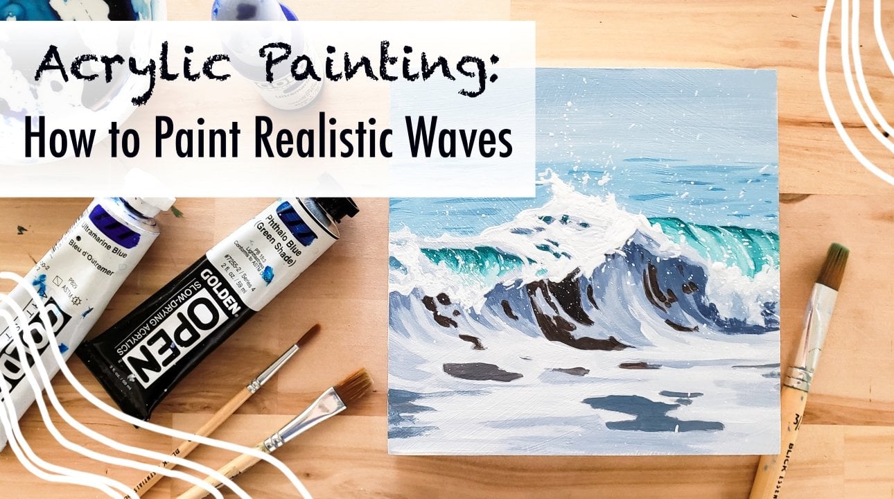
1. Introduction and Materials: Hi everyone. My name is event lab and I am a fine artists based in Portland, Oregon. I create lots of landscapes and seascape paintings here in my little studio. And in this class today I'm gonna be teaching you guys all about how to paint realistic open water paintings. So like a lake or an ocean view from a boat. Like these guys. And in this class today I'm gonna be walking you through painting, this painting here with me. I'll be teaching you all my tips and tricks, talking you through it. How I mix paint, how I apply it, how I look at a reference photo and then translate it into painting and all that good stuff. So this class is based in acrylic painting, so you will need acrylic paints. I recommend the brands that I like and colors that I use in the description and the student projects section below. And you'll also of course need paint brushes for this project. Specifically, I really recommend having a larger brush like a one-inch brush, not too big but bigger, a medium flat brush and a couple of smaller detail brushes. And in addition to that, you'll need something to put water in and something to mix your paints on. You can use anything you like. I really like using a glass palette, but you can use what I usually use or how about a hand? I've even used a paper plate and that works just fine. And then lastly, you of course need something to paint on. You can use paper for this project. You can use Canvas or a wooden panel, whatever you like. If you are using paper, I recommend using a heavy duty watercolor paper that won't work. But I will be showing you guys all about how to prepare your surface for painting in the next little video.
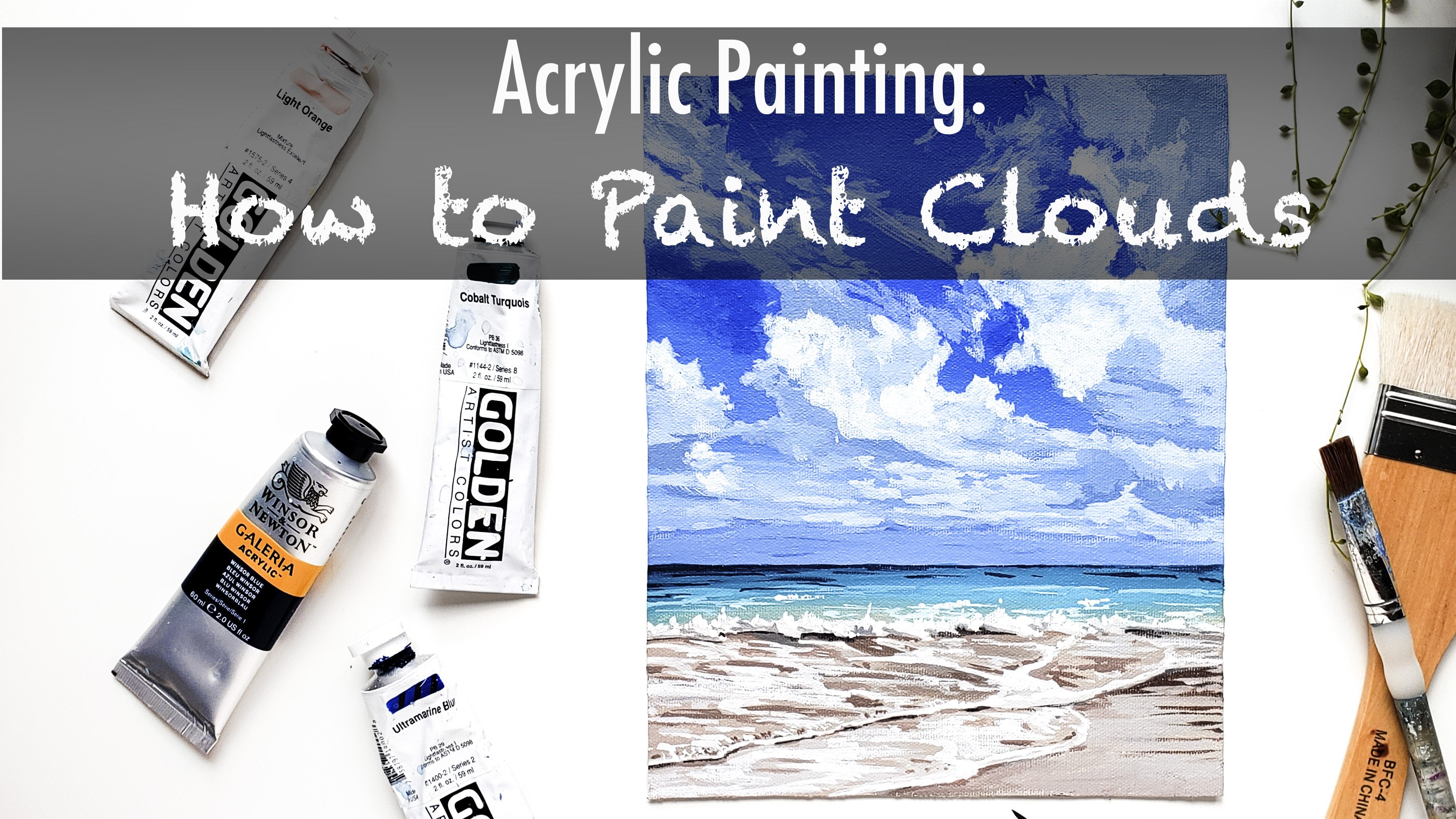
2. How to Gesso: Alright, so to start out, this project will be starting with either a wooden panel or watercolor paper, whatever you have and would prefer to use. And we're gonna go ahead and primaries with some gesture. And I'm going to show you guys how I do that. So this is a really simple process for the wooden panel. We're just going to take some just right here for a bit on there. Not too much so that you can always add more later. It's easier to do it that way. And then we're just gonna take a big white flat brush and spread it all across the painting. Just as essentially just a cheap white paint. And the reason that I like to use is because it makes the acrylic paint onto painting on top sit much nicer, go much farther. You don't have to waste as much paint that gets soaked into the wood. And it also gives it a really nice underneath texture. One tip I do have is if you're making a landscape oriented painting to make sure that all your strokes at the end after you've covered it are going the same way in a landscape orientation. Versus if you are doing a horizontal painting, you would want them to go that way. And then you will just wait for this to dry if you're hoping to paint the sides of the painting, I recommend also just knowing those. Today we're not going to be doing that. And it's really the vaccine thing with watercolor paper. This is on a block. You don't need to tape it down. If you don't have another block, it's totally fine. Just painter, you do want to use a watercolour paper that's at least 300 GSM, which just means it's a little bit thicker and can stand up to the paint better. And for the papers, same thing. We'll just apply some gesture. I may have done too much some scanning to wipe that off over here. No big deal. And you just want to make sure that you cover every part of the paper. I actually really loved painting on paper. I think it's one of my favorite things to paint on. So if that's what you have, definitely just use it. Painting on Word or canvases is by no way any better or worse. They're all just different tools, but I think it's really fun to paint on paper. It gives a really interesting cool texture. And it's really easy to frame afterward.
3. Creating a Clean Horizon Line: So to start off, today's painting, I'm going to be showing you guys what colors will be using. We using all blues and a white for this painting today, you're gonna need ultramarine blue and you're gonna need Windsor blue, which is also known as the little blue you might have. And Payne's gray, Of course, this ultramarine blue is like a warm blue. And the blue is a cool blue. So it's really important to have both of these in your kit. You can get totally different colors with them. And then pains grew. We are nice, dark, almost black color and we'll be using titanium white as well. In addition to that, you'll need some paint brushes. I recommend having this one-inch type of brush a little bit bigger, a half-inch flat brush, a little bit smaller, and then a medium round brush and a really small detail brush. Although if you're medium round brush is pretty pointing, you might not need a little detail brush, it just depends on what you have. So to start our painting today, I'm going to be starting on the sky and I'm going to take off our horizon line with some masking tape. I will be taping it off about a third of the way down the painting. And I'm just kinda eyeballing it to get it straight, but feel free to use a ruler if that's helpful as well. And you can kind of measure of your hands, see, it's about a third of the way down. Doesn't have to be perfect. And then we're gonna just go right in with adding our patients onto a palette and starting in on the sky. This Payne's gray and the white I'll be using is called a fluid acrylics. So they come in these bottles. You can definitely just use regular tube acrylics, But I really recommend trying these if you never have the really fun. And they go on a lot more liquidity and smooth. But if you don't have them and just add a little bit of water to your paints while you're mixing. Not too much, but just a little bit to get it nice and smooth. So as we can see in a reference photo, this guy goes from a nice bright, warm blue to almost a white at the horizon line. So we're gonna start off by mixing up that warm blue using some of the ultramarine and the white. And I'll just a tiny bit of our halo blew. The saleable is a lot stronger than the ultramarine blue, so it'll tend to really green really quickly so you don't need it nearly as much of it. And then once you get that color, we're just gonna start applying it. I'm actually going to need to make some more tetra water to. And then I'm gonna go ahead and start applying it across the top of our painting here.
4. Sky: How to Create a Gradient: Alright, and once you've got about the first inch or a little bit less than half done, we're gonna start adding in a little bit of white to that same mixture we already did. And kind of start adding that in. It starts getting lighter as we move down. It can help to move a little bit quickly, and it also can help to add a little bit of water to your paint in order to get a nice smooth gradient. And then we'll start adding in a lot more white and kind of just go in with a really light blue here at the bottom and start bringing it up to meet our darker colors. And usually I have to do a couple of layers of this to get it really nice and smooth. And also just to make the paint lay nicely on your canvas or your board. So we'll go back in mixing a little bit of that darker color and just start working it back and forth and building upper layers, adding little bits away at a time. The other thing that's helpful when getting a smooth gradient is using a large brush, which is why I am using our one-inch brush, which is the biggest pressure we'll be using today. All right, so once your gradients looking pretty smooth, you can look at your reference photo. I'll compare it a little bit. I feel like in our photo waits a little bit brighter down here at the bottom and I have it. So I'm adding a little bit more white here and just blending them out. And I'm just using pure white to blend this out because the paint underneath is still wet. But if your paint as little more dry, you might want to mix it with a little bit of blue. So it's not too stark of a contrast. And then we'll go on just how to fill light blue. Little bit darker than our pure white. Splendid out a little bit more. Just one more time. I'm gonna go ahead and add a little bit more dark, saturated blue and were taught. The good thing about adding Watson layers of paint is it really starts to cover up the canvas Well, so you can't see it through the pain. So there's two benefits to that here. Getting a smooth gradient and making sure that your canvas or paper or whatever you're using as well coded. Once you're satisfied with your gradient, you can queue up your tape. And then we're just going to let this dry for a little bit before we start on our bottom.
5. Water: Base Layer: Okay. So while I was waiting for this to dry, cleared off some new space on my palette. And I'm gonna go ahead and start the bottom half of this painting by mixing a good amount of white. Some of our, say low blue and a lot of our Payne's gray until we get a medium green-blue color. And you'll be able to tell that this is a pretty different blue from your sky and person. It's a little bit harder to tell my camera, but I think we'll be able to tell when you put it down because it's a lot more of the yellow, blue and not hardly any of the ultramarine blue. And we're just going to go ahead and apply that all over the bottom to give us a good base. And you can use tape again and take off your horizon line to get a clean line. But it's also, I tend to just eyeball it. It's easier to do once you have one straight line to match it on the other side. And if you mess up, you can always go back in with a little bit of the light blue on the Skype her and fix it so nothing to stress about. And you wanna make sure that it makes up a good amount of paint for this so that It's not too thin and it covers up the white below it pretty well. Don't be afraid to mix up a little bit more if you needed. And once you have that nice layer down, we're going to let that dry as well. And then we'll start on adding in the waves. And the next thing you're gonna do is mix up a nice, real dark color by using a lot of the Payne's gray and good amount of our Windsor blue or blue. And then just a little bit of weight so that it adds a little bit of opacity. Sometimes when you're just using a really dark colored by itself that can be really translucent, then it doesn't work as well. And we don't want it to look black just like a nice really dark blue. And I'm gonna add a little bit of water to that, get it nice and loops. And then we're just gonna go ahead and start laying in the shadows of our waves. So we can see this big one right here. And I like to use loose brush strokes for this because there's quite a bit of shifting and movement in the water, so it doesn't have to be perfect. And then in this dark lower corner, it's pretty much just all darks. We'll go ahead and fill that in. And I actually recommend mixing up a lot more of your color than I did. So you don't have to go back and forth as often. So I'll do that now. And at this point we're not really using ultramarine blue anymore. We were only using that in the top portion. So you don't have to pull yourself anymore that out. And then we'll go in and go back to filling this in.
6. Water: Sketching in the Shapes: And you can see this is kinda mound shaped wave right here that we're starting with. And will carry that dark all the way along the bottom of the painting. And then I'm going to switch actually to our medium, wrongful shooting. It's a little bit easier to do with these guys. And you'll start going in and adding in just shadows where you see them in any detail. So to start, we're going to be working on the lower half of this painting. So you can see as lots of little ripples and shadows over here. And I'm going to start to add in. And you really want to look at your reference photos to get inspiration for the types of shapes that these shadows make. Because there's a lot of curving in swooping and connecting. And since this is the first layer, don't worry too much. It doesn't have to be a perfectly laid out. We're gonna go back and forth with thoughts and different colors as we continue through this piece. You also definitely don't need to get every single little line in detail in there. We just want to sort of get the shape and the flow of the water movement. And then we're gonna move over to this side. Sir, adding in some of the waves we see or hear me until this one's kind of swooping down really quickly because I how dark it is. So I like to make high paint brushes for that same way where there's swooping downward like that.
7. Water: Blocking in Shadows: And then they'll just start to move around the piece, adding shadows as you see them in correlation with each other. So now that I finished this one, I'm saying there's another one going this way. And then we'll have a mound over here. And you want to keep in mind while you're adding these and to help it not seem as random and more like real water flying is, you can see the shape of the water as it mounds here and then as it goes this way and it's kind of like waves diagonally moving this way across the whole piece. So if you keep that in mind, it can really help to keep your water not looking random and looking a little bit more realistic. My hand. So I'll go back in. And I mixed up a little bit of a darker color now because we will add some different levels of shadows and such in here. And so now as I'm working on this wave, I'm seeing, you can see that I'm working on it going back in space this way. And then when we go in and add mid tones, that's really when you'll start to see a lot of difference and see the shapes of the water coming out. Moving back over to this side, I'm adding in some of these dark, choppy little waves over here. And this is basically this sketch portion of the painting. You're just drawing in the waves as you see them. And you can see this nice long dark shadow wave here in the middle sort of the painting. And then above him. And a little bit choppy, but almost breaking wave.
8. Water: Blocking in Shadows 2: Just as in some of these little lines here. And make sure they're not too straight lines, but kinda wiggle your brush around and give it little shapes and such like that. They don't have to be connected. You want him to be a little bit, oh, there's Pienta. Thank you. Get an OMB thing. And you want it to be a little bit natural seeming. And then once you've kind of outlined most of the water like that, the sketch, we're gonna take some white and add it into our dark pool. A little bit more. Purple, blue, Payne's gray, and get a color that is darker than the color we laid down here, but lighter than are really dark, dark color. And this will be our shadow tone. And we'll just start going in and adding that in places around our darks. So like I was saying, add all of this area will be a little bit darker. And I'm going to actually add a little bit more of that graded acts. A little bit quite bounced back out. And I, once you get the perfect color, you can go ahead and start adding in all these shadows. So I'm adding in these shadows on this side of the wave because as I said, it's kinda rolling a swaying, so there will be light here. And this section, as we can see on the reference photo, and then it gets dark as it dips back under. And then that would mean light over here and dark. And then we'll add it in here because this is another place where we can see shadows coming down wave before the sun had set. And we'll go up in here. And I added into little areas just to kind of kind of blending out our darkest shadow from the top of the wave down to a lighter shadow. And it'll kinda go along and do this on all of our little waves.
9. Water: Blocking in Mid Tones: I'm going to mix up a real dark color, a little bit darker than the sketch color. Will go in and stir, covering up the place where I touched it with my hand. And this bottom area closest to the edge of the painting is one of the darkest areas in the whole thing. And then we'll bring it up in some spots and trying to connect it down to that bottom area. And then I'm actually going to go ahead and use my really small brush. I like to use a small brush for a lot of details and paintings like these small areas. They look really good when you add lots of crispy little lines and such. So I'll go in and add in some of this really dark color where you see them in my reference photo and around the tops of the painting. And so once you start using a smaller brush and start adding in lots of little details, I feel like that's where you really start to see everything come together. So we'll be working on this for quite awhile using our dark, dark color and just going through and adding lots of detail and you like shape and edges and curves and lines to the base shadow we sketched in. And it's helpful definitely to look at your reference photo that I've provided in the student projects section to get ideas for how water moves and what the shadows look like. It definitely your painting is not going to be an orders that need to be a perfect rendition of your photograph. But it helps so much just to look at water, See how it moves, and get an idea for all the shapes that are present and how kind of to show it with your brush.
10. Water: Adding Depth with Layers: And we can see here that these shadows kind of, sort to feather out because we have a lot of late nights here. So that's why I'm going ahead and using lots of little lines here. Kind of furthering hand movement. Nothing too, too precise, but just to kinda show was so different terms will go into that here a little bit with a lighter color that the mound is coming up and kind of feeding back out. And so as we start to just smooth everything out. And also construct to our thoughts a little details. Man, I'm gonna mix up a little bit of white into this and get a little bit of blue. And this is just essentially same color we've been using, but just a hair lighter. Getting lots of little variations in tones really, really helps these pieces come together. And so we'll go back into this. And so I'm just kinda working back and forth with this grey, blue midtone and a darker color. And starting to blend out the darkest darks. Here. We're adding some new details and textures.
11. Water: Blocking in Lights: And then I'm gonna go ahead and mix up a nice light blue that's a little bit later than the midtone that we laid down all over the piece. Not to too much lighter, but a bit. And I'm going to start adding in some of the lights where we see them. We're going to be coming back to our darks again and again or mid tones again for sure. But sometimes it can help before you get to detail, to block in a lot of the colors and the peace and where the light is and whatnot. So we can see that there's a lot of light here. And this center part between this wave and this wave and this one in this one. So that's what we're going ahead and adding. And I'm again just using a quick movement. Paying attention to the direction of the water while I move my brush across the page. And we'll go ahead and add that weight just over the crests of some of these darker waves in a distance as well. And then we're back looking on our darker and our mid tones again, I'm going to just make some thin about nice tone, grey blue. And I like for the gray and a shattered, the more neutral than then blue. I'm, it's definitely all still agree blue. But in terms of tones, they take a little bit less vibrant than this blue. You can see it's a little more grey. And the really cool thing about this is that you don't need your colors when you remix them to match two perfectly. Because the more chance you get in these paintings, the cooler it looks. So.
12. Water: Sketching in the Background: So as you're moving back and forth here, just keep adding lots of layers. Thinking about the direction of a water and looking at the reference photo I've provided to get lots of ideas for how water is shaped. So I'm going to mix up a little bit more of our real dark color here. And start filling in the details over here, kinda joining things together where they need to be. I'm just cleaning up the top. So these here.
13. Water: Contrast with Shadows: And just kinda making sure it's a good shape for a wave. That's what I mean by looking closely irreverence photo just in some areas so you don't get overwhelmed. You can see this wave goes this way and I have a little bit of a dip and little details like that. You just need to get a few of them for the painting to really look good. You don't have to get all of them. So as I start working through these, I'll start to go back and forth more and more on each section and go through it from dark to mid to late start blending them out. Instead of moving all around the page with dark and all around the page width light like I like to do in the beginning. So now I'm mixing up a color that is similar to this color. And I'm going in, I'm gonna carve out some details where I might have gone to much of the black or not quite the right shape. And it also just helps clean everything up.
14. Water: Details and Shapes with Shadows: And then I'll move a little bit back into her darker color. Kind of a midtone color, a little bit darker than this, but not our butler dark color. And go back in here, back into a way Color and kind of have a few different colors going at once. And this glider color right over here. Sometimes you'll find that you added a little too much detail and you wanna go ahead and cover it up a little bit. That's the really beautiful thing about these paintings. And you don't have to be perfect. You can have so much fun doing it, knowing you can change it quickly with acrylic or leave it as-is whatever you like. Because at the organic live man, the imperfection of it is my favorite thing about painting the ocean. That's definitely awesome for beginners and stuff because it doesn't have to be exact or perfect to look good. And then the time you will see improvement as well, because the types of shapes and movements in these kinds of images will become more familiar to you. I'm going to go back into my darkest dark here next, one more of it. So it's drying out. And just a reminder that you always want to add a little bit of white to your dark colors just to give it some opacity and also so that it's not pure black. You don't want to do something that's so dark, you can't go darker. Because then if you find that you want any spots with more contrast, you won't be able to do them.
15. Water: Midtones to Create Shape: And so I'm taking my dark and I'm going around adding lots of little details. I like to add little dots, lines here in there. You don't have to match exactly what's in their reference photo, but just by adding them, you get a much more realistic effect. And so you can see what I am saying about this wave going this way and this fun building out. And we're getting that really could look. And then I'm going to mix up a color that's just like a really small amount darker than this. But not very much darker. To kind of finish out our wave over here is it fades into the distance. And then we're gonna take that same color and start adding in some details out in the back. You just kinda loosely wanna take your brash and add some aligns. Some square goes, some dots. With this light gray color. Those, we'll go ahead and pick up our dark color again, maybe a tiny bit of white in it, so it's not as dark as it was. And go ahead and do the same thing. Yeah. And you'll notice that out in a distance water there's some white caps and little tiny waves and this is a really common shape for them. It's sort of a little, sort of a little triangle shape. So I like to do lots of those. And they're just little swoopy little dots. And some of them will just be more like line's a little dot. It's good to have lots of variety. To fill it in too much, just having a few here and there of these dark wins adds a lot of depth and then only go in with our other mid tones and lights. You'll really be able to see it. Mixing up RNA summit tone color again, similar to this. I'm going to just round this mountain out a little bit here, NOT mountain, the mountain of a wave. And you can do the same depending on what shape you originally chose. And I'm adding some lights in sporadically down this way.
16. Water: Midtones pt 2: And then this a little bit later than our base colors, I'm gonna go ahead and take it into the distance. You're adding some lights out there. Just the tiniest bit lighter. And you can see I just get a little bit of paint on the brush and he's a really light flicking motion here. Isn't too much of a contrast. And then we're going to make a nice medium, dark gray, little bit darker than this, more like these shadow colors, but I'm just painting over some of these areas, adding in a little bit of light where I see it in the reference photo more. And then I'll go ahead and work that back into here. And you can see here on this wave, since it's kinda swooshing down, we have some of these lights swooshing up to meet it. Just going to even some of those out.
17. Water: Adding Details: So this give-and-take takes quite a mile and it's most of your painting is just going back and forth, adding details and taking them away and blending them until it feels right to you. And then we'll go in with one last round of our dark darks here. Along. We're gonna go in with some really bright lights to finish off our painting. We'll take some more of those darks and start having a look at a way to keep it pretty dark still. And we'll go ahead and start adding in more details out in the distance out here.
18. Water: Refining Details: And now we're going to mix up a nice bright white blue by using our three colors again, but a little bit more of a blue tone and gray and quite late, or look definitely our lightest color we've used so far. And we'll start adding in some of these breaks where we see them. So one place I see a lot of light whites is right here in this middle section a little bit. And then you can also notice that there's always going to be some reflections and bright whites on top of our dark mound hills where they peak. And then the light would be reflecting off of it kinda sparkly. So we can go ahead and have this really light white to all of those areas. And the painting. And it looks a little bit better to just do some little dots here and there and not completely outline each wave. Kinda give it some texture. And we'll add some sparkles coming down here. And then also add plenty of them out in the distance. And these can, some of these will just be lines that are independent and some of them will be above our little dark spots we already made. Okay. Man, dipping back into our medium blue-green. Oh, keep adding some different details. Lines out in the distance. You're actually going to add a little bit more weight. And so we're going to call it similar to the color that will get a similar shape to this color, but it's more of a gray then a blue. This adds lots of dimension because as you move further back in a piece, you get less saturation. And that shows distance and fading out into a three-dimensional space. And so we'll just be taking that gray and adding it all kind of along that area out here. And you don't have to cover up every part of the blue that's already laid down and we're just kind of adding it in here and there. And this gives it some extra depth. As I was saying.
19. Water: Highlights and Details: And dipping back into our old right weight color, tiny bit darker. It's still very wait. Just gonna add a little bit more. And I'm just moving this light back and spreading it into the distance a little bit. And then once you've spread it all the way out into the background, we will actually be going in with a pure white color and adding in some little sprinkles here in there. So these are just little dots. And we'll do the white paint on some of our highlights, some of our brightest areas. And this is just the sun's sparkling on the water and it adds lots of really pretty last finishing touch details. I like to do these a little bit up and down. So it gives that feeling of Sparkle, delicate little, little tiny line. And you can look at your reference photos, see where the sparkles are or you can also just put them on the highest points of viewer waves. And it's good to do lots of different sized dots for these sparkles to give it a better effect. And I like to go ahead and add some of these whites way out in the distance as well. Usually there's little white caps out there. But I just do a few, not a bunch. And once you've added in all of this for articles that you want, then you can go back and add any finishing touches you want, clean anything up you want maybe fix your horizon line if you need to. And that's about it for this painting. And then the last thing I'm gonna do is add in a little bit of detail matter horizon, mind.
20. Thank you!: Alright, you guys, that's it for this class. I really hope you guys enjoyed it and had fun. Please show me the work that you created down in the project section below. I'd love to see you and congratulate you. And you can ask me any questions you have in the discussion section as well. And please be sure to give this classical review. I really appreciate it, and I hope you guys have a goodness to your day.
 Yvette Lab, Fine artist in Portland OR