Transcripts
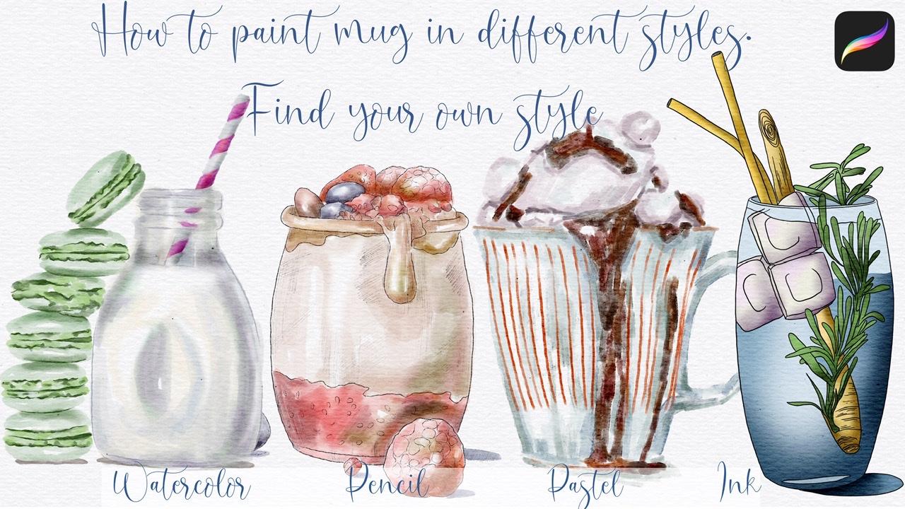
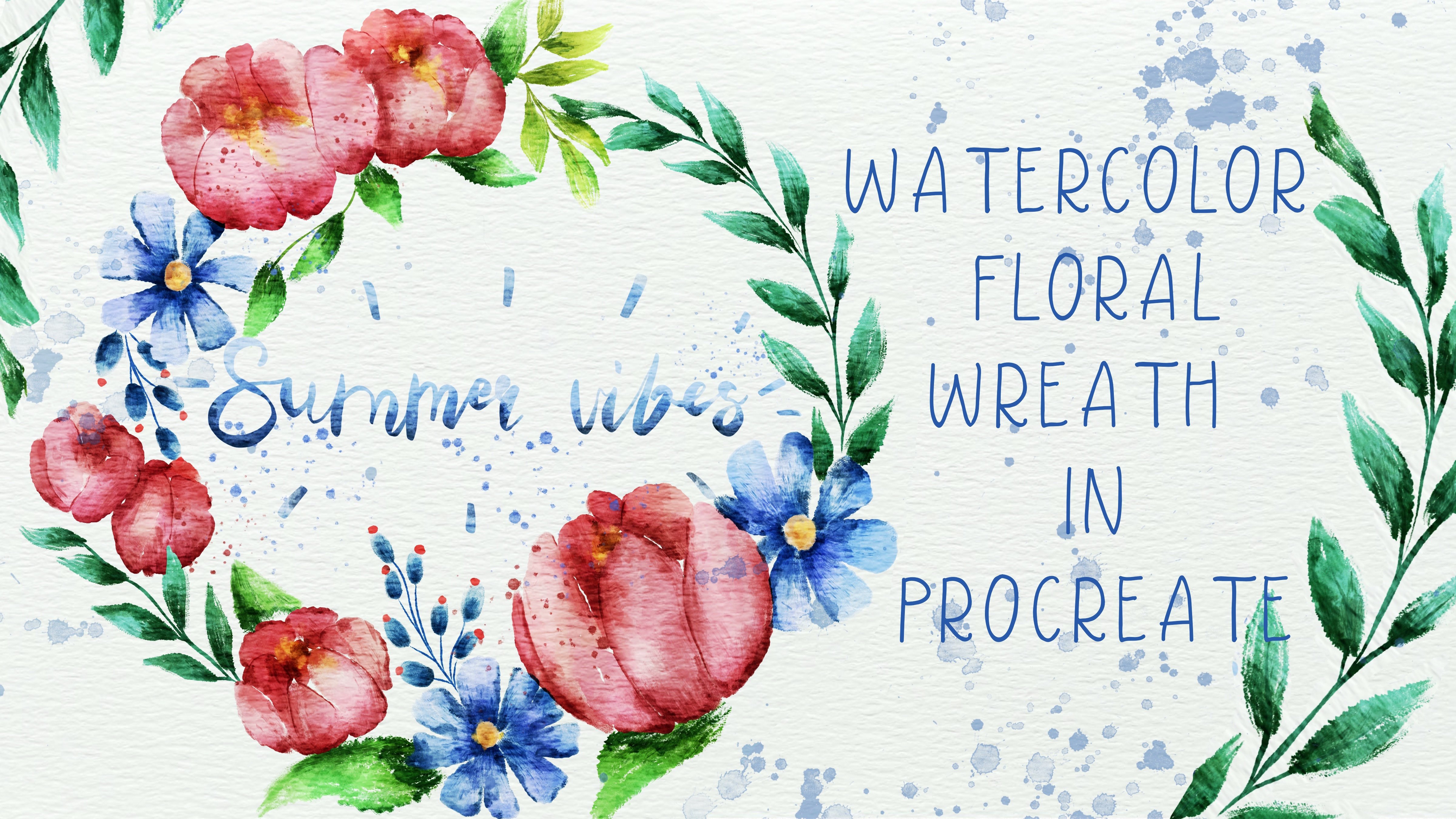
1. Introduction : Hi guys. Hello everyone. Welcome to the class. I am happy to see you here. And during our today's class, I will teach you how to paint for different mux in different styles. So as a first child with It'll be watercolor style without any sketches. Second Style, because this is combination of sketch and watercolor, rain to him. And the third one is XB will be coffee mug in Postel painting style as a 4-5 is in campaigned in. So guys, I hope in the end of my class you will. Styles and cesium best less than e. K, same Inga, freelance illustrator. Welcome back to my class and let's paint all together amazing illustrations in four different styles. We will paint coffee jar with ice cream and fruits. You can choose my sketches or go to the website and Splash.com be contained pictures at you like you can even printed later and put it in a frame. Today I want to show you that watercolor and some other styles. It's simple and it's colorful, and that's a real fun. And in the end of my class, you can decide which style is your favorite. Today, I will teach you how to create a texture paper. How to paint a picture from the sketch, result references. You can draw your own sketch or use mine. How to use my and default procreate brushes for watercolor painting. How to pay into illustration in four different styles. Watercolor, watercolor with sketch, pastel, and ink. I will also show you two techniques of aid and shades. I will show you my whole process from start to finish. And as a bonus, I will shave is you might texture paper, color palette, sketches alone with my pictures that I drew. Feel free to use them for your own art projects. This class is fine for beginners and for intermediate level. Even some experienced artists can find here some useful tips how to pay into different illustrations and of course, inspiration. Your class project will be next. Band picture in all four styles using the tubes and brushes that I gave you today. I will use procreate for this class with iPad, apple Pencil. So if you have it or some drawing pets or just regular paper with Spain's, please join our class and good luck.
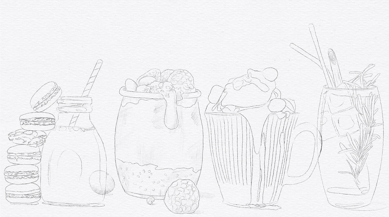
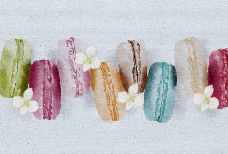
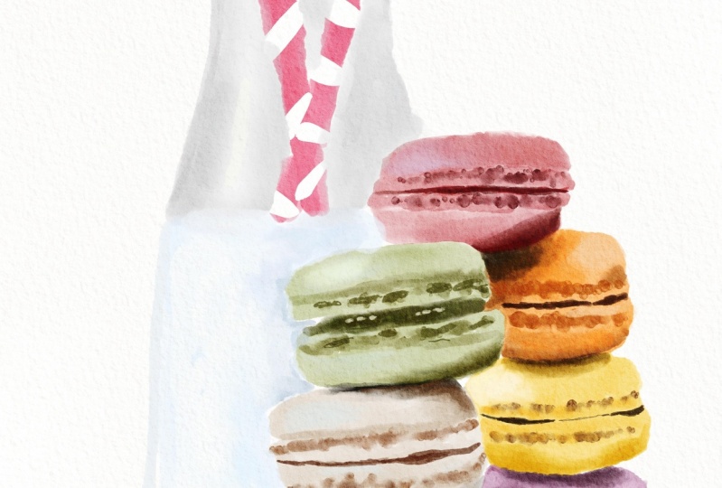
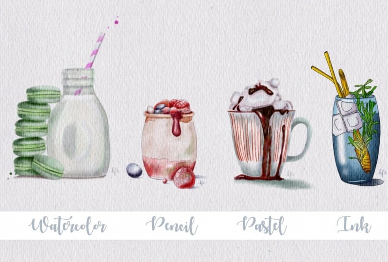
2. Texture paper and color palette: Hi guys. Welcome everyone to my class and I'm so glad to see all of you here. And I'm going to tell you today, you will pay in for different illustrations in completely different styles. And first picture really possess one since escapes that I created and I will share all sketches physio. So I didn't worry. Here, all those Emma here. And our first, our first picture real BIA, has this amazing milk jar, obese macaroons. For this type of painting, we actually, we'll not use any sketches. So after we finish painting, after you finish applying pains, we will turn off our sketch. So speaking about second picture, we will keep our pencil sketch. And as you see it's pencil sketch and I did lots of shades here. To add more wall. You're more texture to our painting. And our third picture. This is more pastel painting, pastel and ink combined all together. And sometimes even if you apply textured paper, it might create a log. It's oil paint him. And our last one picture is in pain team. So we're going to trace our sketch of these ink brash enough to, we're going to apply color inside may be till the watercolor or some other colors we'll decide later. And that's our 4P Indians. And in the end of my class, I hope you'll find for yourself which style suits your more and reaches more comfortable, Reese, your receipt. And let's start. So we need to be on a new layer, a completely new one. And after, you need to press, insert the file. And after said when I was at my texture paper will automatically be downloaded into procreate. I will share with you my texture paper as well. So speaking about size of mechanics, this is 11 pair nine inches with 300 DPI resolution. And now I wanted to replicate my textured paper and I don't change the mode to Linear Burn and Color Burn. And after I will replicate two times and two times, Color Burn and I will merge together Linear Burn and Color Burn molds. And after that, I went to lovers out positive Molina burn paper, glass, it's pretty dark and I want to make it lighter. Galaxies. And after said, I went to groups this layer and after I want to rename that. And you can use your Apple pencil or you can use some other styles. Or you can just use keyboard. It's all up to you that just cuts is enough to ride texture paper. And that's it. There's no texture paper and renames it right now. Guys, fuzzies class I create a color palette. This one, this called Qian Mian jars. And as you see, we have four different paintings and for each patient and we did many different colors. So as you see, all my colors, different palette, they're separated with black color. You see it here. So as this is our first pain DIN and for zed one and as our first paint and real Gino's kitsch layer sketch. So as it means that we're going to use what color brush and we're going to pay and what to kind of style. And often we finish, we will turn off oust kitsch layer. So this colors for our first painting. So, and this palette is black color. So second picture, pencil. This starts from beach scholar and finish like something between like peachy color and black color. This is the end of second picture. After they move to the third one, Postel won. And we start with these, it's almost white collar. And we've done this a red color, so it's, it's out. Sure. And fourth lines at picture, we start with a green color. And if Dan was a blue color, so guys keeps it in minds at black, a black colors. Zai help us to separate our color palace one from each other. And let's start with the first one. This is no sketch layer. I can lowers our capacity and I need to be on the new layer is it has underneath texture paper.
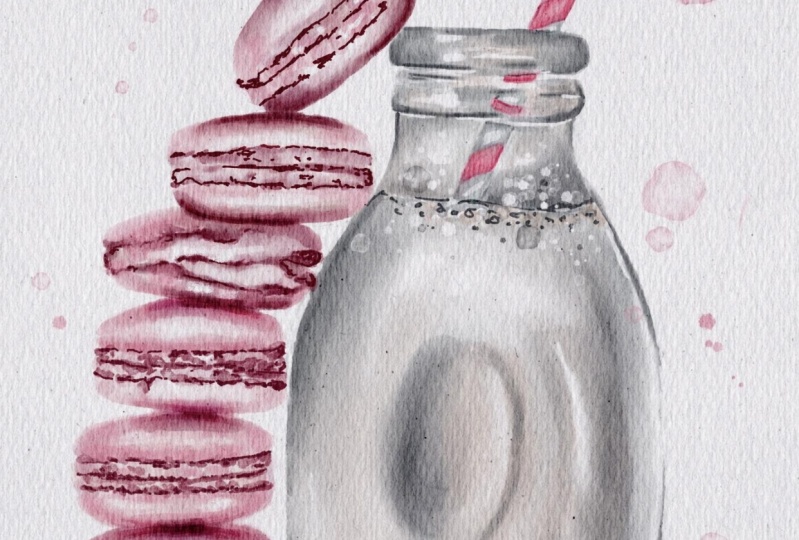
3. Painting watercolor jar: And I need to be on a new layers it has underneath texture paper. And for our watercolor painting vehicle and I use a brush that I created. This is poor marshmallow watercolour brush. Yeah. And let's start. And first of all, we need to return, grab green color, and start with our macaroons. And probably I want to start is light green color and nafta, I can apply some shades. And as you remember, if you've watched my previous classes, is this brush is pretty pressure sensitive. If you want to have more color, just press harder. Don't worry if you overlap Reese, same color, like if you leave to your Apple pencil promises cream, it's fine. Don't worry. We will go and grab our blender. Cento planter, color brush. Great. Now let's go and grabs this bright green color. Now it's darker color. Went to learners, said keep it in differential grade and I went to add some shades here. After planting. That's blend. All of it, pretend nicely at some shades and said, I need to add some details to our macaroons and phys ed my rule, marshmallow watercolor will not suit to this option because you see, it's, it doesn't have the TPP. So in this way, I go to our artistic sed and grep, wild light brush, brush. It's amazing. And he's, he seats very fiv treaty situated. And I want to add some details that keeps it in hindsight. Later we'll turn off our sketch layer. Great. That is now going to show you my, my magic trick. Okay, I paint and save layer side will just duplicate layer. And as you see, it's pretty lovely, pretty saturated, and I want to make it most iterated. So this via I replicated how painting layer and I marched or two layers. Now I went to a chase and facilities will go to the selection tool, press free hand. And I'm gonna go and grab some areas that I want to put in a shadow. And and so I just need to select the area and after press at same here, we have shaded in especially to occur roots are close Dante transuranic. And as you see, our line is pre-test, sharp, pre to situated. So I went to blend, it's likely pretty loudly. Now let's move to Army jar. Now let's move to a new layer because we need to achieve it's later in Seoul. And up to said, if you go and grab says grey, grey, grey, blue and white color, this is the color of our charter. And grabs this bluish color. Guys tried to feel all areas with some particular color. Belief blank spaces because later we need to achieve and you need to feel all areas with some particular color. Same as dear. Now I want to achieve some parental lust color from our color palette. Let's duplicate it. And after merge together, now guys, I wanted some details and I will put it on a new layer, but before that I want to add shades. So once again, we are familiar with our pain tape selection tool free hand. Have to sit. I want that shade here at shade and immediate aid. Professor, 11% is fine. She situation brightness, player, increase situation, logger practice. You can play with the colors. Satisfying and I wanted some highlights. Professor, 7% has attrition brightness. Chris situation, crease brightness. Now straw. That 10% hue saturation brightness. Perfect situation brightness. And now guys, I want to add some details, final details. And I will go to paint and sad artistic sed and grep file tonight. I think now we are ready to turn off our sketch. And we made it. Guys, if you want to blend some parts, if you think that too sharp. And like how it looks in guys, we've done is our first picture and let's move to the next one. Some merge together two layers and create a new layer. And after, he'll move to our pencil painting.
4. Painting pencil and watercolor jar: Well, our next picture is pencil sketch picture where we leave our sketch and SEC, once again, I made all those textural strokes and I think it would be great. Now speaking about our current prevalence is one. So from light badge to peaches, peach color. And we're going to grab like Beijing, who marshmallow watercolour brush. There is this kind of painting is very important to add shades in a proper way and combine blank. And so strokes with watercolor painting. Here you shouldn't visit accurate because you already have your pencils keeps that you want turn off. So that's pretty nice pretending to CO and crap. We can say so. Dark page color. So if you wanted to add more color, just go a second time and pay into bone and top layer. Like what I am doing. The thing that's nice. I will call it color was a berries. I have strawberry blueberry and I think that's called the respirator. If I'm not mistaken. P, if you like, you can just smoke to reddish color. Great. So a darker color. So I'm gonna go and Graham says, now I'm going to go blended tool and just blend sharpen edges pretty loudly. Now I want to add some shades and selection TO 11%. Brightness. Brightness and saturation. You can play with the colors. Highlights, 9% tuition brightness. He pretty situation. Pretty, pretty nice. Now I want to add some color variations. Nutrition priorities. Next it. If you want to intoxicate, make it more saturated. I don't want to keep any background. So it's all up to you. For me is this is fine. And guess what you need to do, just replicate our pencils kitsch, Huan Mei Kan, feasible enough to move our pencil sketch painting layer. And after merged together. Then. So now we need to create a new layer and peek on a bay and Postel painting. And it was actually a lowers that posit T bill on a new layer hand. Let's start.
5. Painting pastel jar: Well, speaking about pustule painting, we're gonna go to paint and set artistic and grab all Beach brash. I also want to use file applied and the other option, if you want to add some details, you can go to the Incan set and grab for mercury brush. Just wanted very cool. So our district said, oh peach and guys was just kind of paint and via need texture paper. So let's turns it on and off. And we have our third set. You see, third color palette said, it's pretty simple. I will go and grew up, but it's not wide, sometime between white and pink. And I also want to add white, blue color. So you don't need to be perfect. Definitely, because in our pesto PMT and keep in mind that they interfere with turning off. Ask. If you like you can just doesn't move, spot and just smooth, change the color to the P one. J can start date and 70 details at some color variations. And you didn't need to be accurate. Because impasto paint and 12K, It's a bit difficult to paint a credit lines. If you like, you can change the color to a darker one. And you can start the 8-inch. After said, just go and prep. Yellow color has just called craps is far from our second Pete. Now, to comment. Later, you can add some other colors. Sounds are the shades. I like to mix different colors. These find each other, one miss each other. So dont afraid too. So same. Pick a color that you like and just blend it. And especially if you pick more colors. Now, they need to achieve our shade. Right? Now I want to add shades. As you remember as a society crash. And I wanted to go to dark purple color. And I want ice cream. So once against areas where different parts of an ice cream are close to each other. In this parse, maybe you'll have shades of example like parts via chocolate. He's an ice cream. Even darker. Wait a second. I forgot our final detail. And now taco and grab red color. Well, look pretty nice. And now let's turn off sludge layer and let's see the pastoral painting, pastel, ice cream, coffee char. And once again, you can keep it that way. Or if you like, you can turn on texture paper and what we have phased out paper. And this a little bit like oil painting. So guys, up to you, which style you prefer. So, and we have the last one, this, and we need to be on a new layer, crap. Black color. Go to Incan said, after say to God in grips 2D append brush. Longer sub passivity of our sketch there. And let's start tracing.
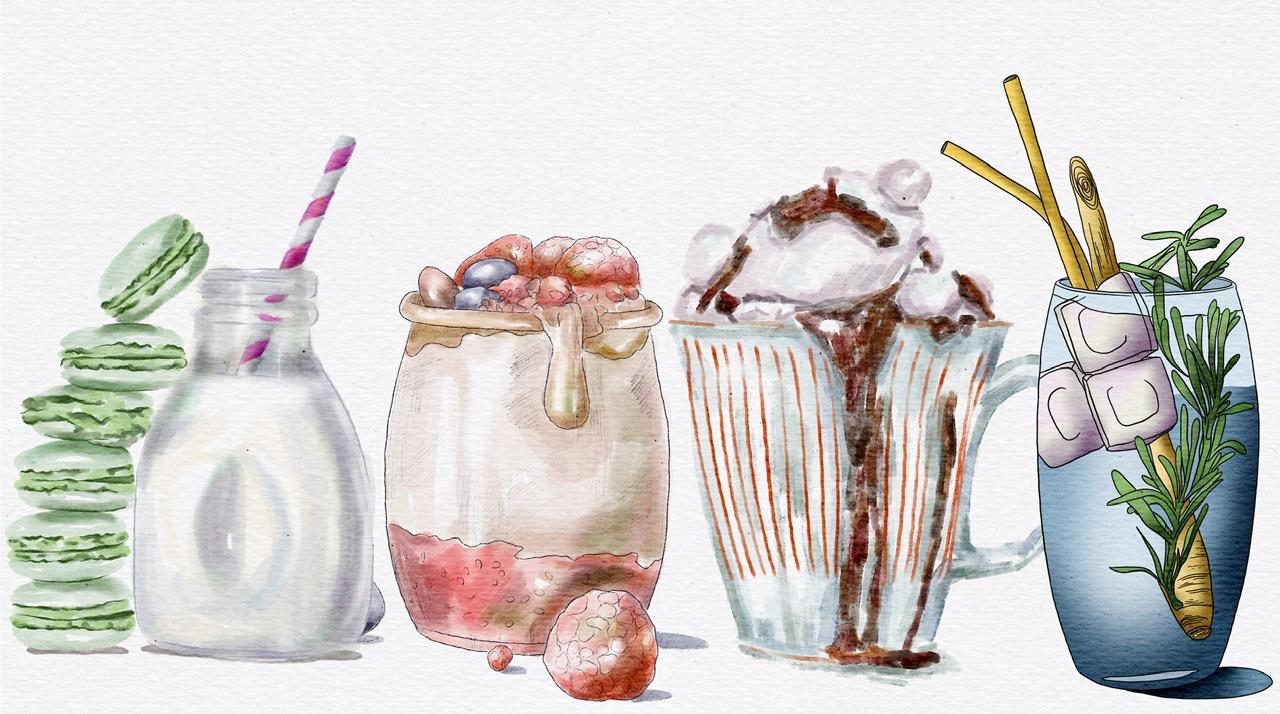
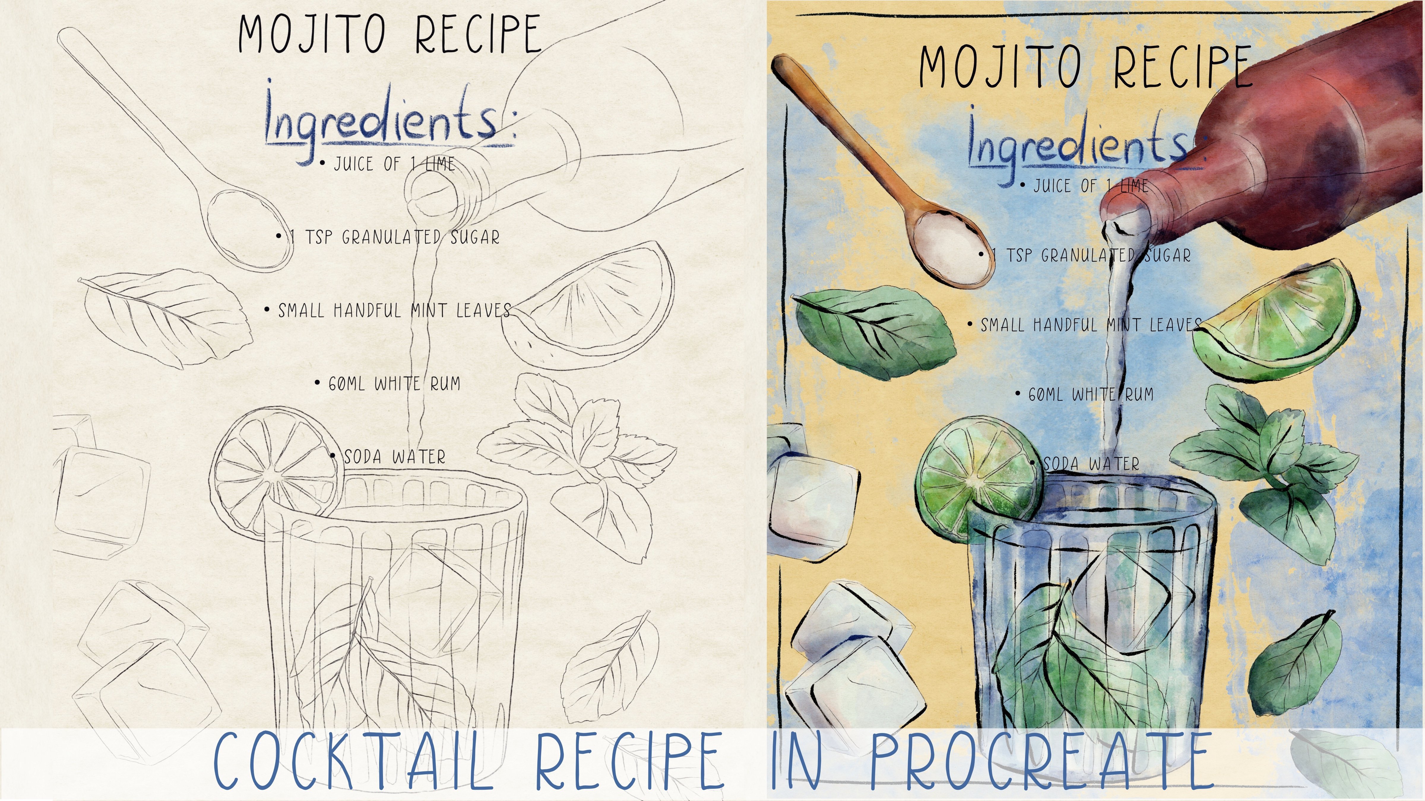
6. Painting ink jar and final thoughts : I'm gonna show you a magic trick. So if you can't draw a straight line or your lioness baby just being July and that breast, one finger, and it automatically will be very, very straight. And once again, if you think Linus sharp press one finger and it straight. Sir, what did after Rose Marie? If you make some mistakes like Aidid, chess, user razor. Ok, so once again, so many of you see, for example, if I want to, if I need to add one more leaf dot, delete likes it because this part is not closed. So if you're finished this one enough to drag it filled with a color. So be careful of is it well guy city of Dan is out paying ten seconds. You have two options how to paint. And first option is turned on our layer, one of all layers. And after that we need to be underneath of texture paper is gripped. Our green color via, on a new layer keeps it in mind. And you can just feel it. My suggestion to turn on house, kitchen layer. And you can feel it Reece, our brush. You can make it Lexis. But it's great because you can controls said color. You can add more green color, more green pigment, you can get more, less green pigment is great, but it's a downside of say, style is you can go beyond the edges. And after that you just need to return to our eraser and just erase some parts at zipped went beyond the edges. And I have to say it you can go and grip group blue color and keep. Like blue color to our glass. So options that we have a pretty nice, it's, it really looks like in, like in the watercolor style. A little bit, but just Incan sketch. So it's, it's what you can do this as a first option. So this, our second option is we need to duplicate layer and leave one layer in reasonable scientists way, we have three different layers and just one of them is physical and Rhea on one opposite layers. And after that you just need to go and grab green color, maybe lighter. And after call and drags it. And you can turn off a sketch layer B that needs it now. So we're done with this part later. We'll add some shades to this pain till now it's moved to assess a root. And the root is here. You see, yeah, here I have parts that they didn't close properly. I want to make it even lighter. Same here. Now let's go and grab this flight unit to paint like a watcher line here, like said. And after fields, This area is light blue color. Afterwards, this lighter area to feel this icicle color. And despite this a little bit darker create. Now guys, we still have bond dark side here. And they have a shade from this side. It's darker. So speaking about ice cube, you need to feel IceCube fees just draw white color. Set S. Now I want to tell you how to add different shades to RPT. Ahead. We just call crept Selection Tool after press automatic. Freehand. Can now be chose to select as this area enough to set. Our next step is crap, a brush. And we speech to the other one, which is paintbrush. And you go grab soft brush. Vivo Krebs is color a little bit darker. And now we need to differentiate. Once again, what is great is set, just sees, area is selected. Now lighter color. Light shades I gave you are done with this part. Now let's move to the next one. And now I want to grab ice cube 12 or three. Now I'll call grep rush, perhaps a color. Next thing is I'm going to go and grabs is plant. Okay, So rest is same. So now once again selection tool and I went to go and grabs this route. We still have our air brush a little bit darker color. Okay, is this net is lost. Hope you enjoyed this one as well. So once again, you have one option. And the last thing, because here you see I overlapped with some other colors. What he can do is just turn on our previous Incans cage and marched together. Because his painting nows is one is perfect. And this, once again, what you can do, you can finish as a paint in this texture paper, use watercolor brush as vds before. It's all up to you. But I like my pain team. I don't want to change it. I like how it looks. You can keep it with texture paper. You can keep it puzzle texture paper. It's all up to you. So guys, I hope you enjoyed my today's class and now I want to show you once again all our paint into tweak created. Well, I hope you enjoyed my today's tutorial and the ones again. So I'll set different pictures in totally different styles. You can keep it with texture paper or if you like, once again, is held up to you, you can turn off textual paper. Since this way you see our watercolor painting is not that hold the color. So my suggestion to keep his two paintings, visa, texture paper. And these two paintings, you might keep this out. Texture people. You might see that here, once again, all up to your result, like your preferences. So let's talk about main differences once again. So our first painting, it's truly what color one without any sketches is our tenure tracings. If you want to reach so soft texture, if you want to have like more marshmallows style painting. So you can band watercolor brush without any sketches. Second, our second theme, where you have all those pencil strokes that might help us to create feelings at this sketch. And once again, this is truly different style. But make sure it is one of my favorites because I like to give this pencil sketches. I like to have also strokes and is great for illustrations as well. Our third theme team. And if you like, v might turn off textured paper all up to you guys. This is Postel paint and Postel style. And some people might this is more like oil paint and sometimes yes, but for me it's Postel painting. And if you turn off our sketch, it's pretty soft, very situated. And what I like about it, if you like, I can make loader yet textured paper and what I liked it, we didn't have some sharp edges. You see everything is very, very soft. So forth paint pretty sharp. We have, it's in campaign team, we have Incan sketch. This paint is great for graphics illustrations, maybe for, I don't know, like integration of din, of website. Whatever we like. You can go now and tries is four different styles and fix the styles at HEW like set suits to your personality. And I will be happy to see what you create it. And I hope now you found styles it suits you perfectly. I will look forward to see you during my asic classes, during my other tutorials. And I will be happy if you share with me your own artworks. So guys, let's next week.
 Inga Yoon, Digital illustrator and teacher