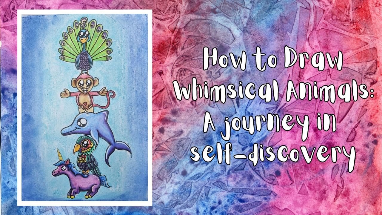
Transcripts
1. Introduction: Hi. I am Sam, the
creative alchemist. I have a bachelor
degree in art therapy, and I understand the power of creativity and its
ability to create change. Most of my classes do have a
therapeutic element to them. However, this one, I'm more focused on teaching
you some skills. I'll be taking you
through how to create beautiful
bre backgrounds for your trees and the
basic shapes and lines of two kinds of trees
and how to paint them. There's an invitation to practice practice practice by creating a lovely
rainbow forest, and we'll finish up
by putting it all together to create an
artwork with a quote on it. Be sure to check out
the supply list PDF, if you want a list of
the exact products and colors I used throughout, but I invite you to
simply use what you have on hand to practice
these new skills with. Make sure you follow me on
skill share and Rezuku, as well as all the socials. I also have a newsletter you can sign up for to
stay in the loop. Just head on over to my website, and fill out the pop up box to join my weekly e
mail newsletter, where I talk all things, art, therapy, writing, and well. Who knows what else I
might rabble about. I'm always super keen
to hear from you. So feel free to reach out to me via e mail or on the socials. And please, please
share your projects. It gives me so much joy to
see what people create. So with all of that said, let's go express ourselves
unapologetically.
2. Meditation: It's time to make yourself
as comfortable as possible, either sitting up
or laying down. Make sure you're warm and all your basic needs are met
to the best of your ability, not hungry, not thirsty,
bladder is empty. Once you're comfortable,
the invitation is to close your eyes and begin
to focus on your breath. Just notice the natural rhythm
as you breathe normally. Pay attention to if your chest and stomach are
moving with each breath, or perhaps you're breathing
quite shallowly and only your chest is
rising and falling. If you are breathing shallowly, I invite you now to make
sure you are taking nice full breaths right down into the bottom
of your lungs, allowing your stomach to rise
and fall with each breath. Now try to extend your
in breath, just a bit, and then extend your out breath just a little bit
more than that, making your outbreath
longer than your in breath. Now that you have focused on really filling
your lungs with each in breath and emptying your lungs
with each outbreath, we are going to do
some box breathing. This is a simple
breathing technique that will help center
us into our body, and we do this by
breathing in for four, pausing between the in
and out breadth for four, breathing out for four. Pausing between the out
and in breadth for four, and then cycling
through this again. Let's begin. M breathing in, two, three, four,
holding, two, three, four, releasing, two, three, four, holding, two, three, four. Now, let's do that
a few more times. Breathing two, three, four, holding, two, three, four, releasing, two, three, four, holding, two, three,
four, breathing in. Two, three, four, holding, two, three, four, releasing two, three, four, holding, two, three, four, breathing
in two, three, four, holding, two, three, four, releasing,
two, three, four, holding, two, three, four, Now allow your
breath to go back to its normal rhythm as you begin to pay attention
to your body. Notice any comfort or
discomfort in your body. Notice any sensations or feelings that are
happening in your body. You don't have to do
anything about these things. All we're doing
right now is being mindful in the present and
connecting to our body. As you notice in your body, we're going to imagine
our feet growing down and extending
into the earth below us like the roots
of a tree going deeper and deeper through
the layers of the earth, below the crust, past the vast crystal caves deep into the hot magma until we reach the beating
heart of our planet. As we tap into our
planet's heart, we allow that deep red love and warmth to flow back
up into our bodies and begin to circulate up
up up up into our feet, up our legs, up
through our torso, and arms up our necks to
the top of our heads, and then fall back down to
our feet and cycle through our body in a circular
motion to our heads, back down to our feet. And now with our body full of the delicious warmth
from our Mother Earth, we focus on our head now. Imagine it growing and
expanding, up, up, up through the
Earth's atmosphere, continuing up and out, into the solar system, going beyond and out past
the edges of our milky way, and out into the universe where we tap into the
collective conscious. Sometimes known as
the cacic records. As we connect with that
super brain of all knowing, we draw down the cool
blue energy down, down, down, into our body. Letting it pour into our head, going down our neck, down our arms and torso, into our legs, right
down into our feet, and then cycling back up the
body to the top of our head, and then back down
again and back up in a constant circle. As these two energies merge
in the center of our being, we find ourselves connected to the planet and
connected to spirit, centered firmly between
the two as they flow through our body, cycling
together, intertwining, and merging to create
a beautiful, rich, royal purple color that fills our body with everything
we need in this moment. As the two merge, it is time now to contain that beautiful energy and
our bodies and withdraw ourselves from first the
collective consciousness in the vastness
beyond our planet. Bring your tendrils
back down, down, down into the milky way, down, down, down into
our solar system. Keep bringing yourself back
back into Earth's atmosphere. Finally, bring all
of yourself back into your own body,
your own head, and seal off knowing
you can tap into that all knowing energy
anytime you want to. Now begin to bring your tendrils back up from the
Earth's warm core, back up through the
magma, back up, up through the vast
crystal caves, ride up through the Earth's
crust and into your own body, your own feet, sealing off, but knowing you can tap into the Earth's nurturing
energy anytime you want. Notice the energies from both still swirling
around your body full of knowledge and
connection, warmth, love, divinity, centering you
right here, right now, in the present
moment in your body, with your limbs, your brain, your thoughts, your
abilities, in your room. When you feel ready, begin to move your body, wiggle your toes
and your fingers, begin to roll your ankles
and wrists, stretch out, and move your legs and arms, feel your face and torso, and come back into the new, opening your eyes
when you are ready, and moving on to
the next lesson, knowing you are connected
and centered and grounded,
3. Shapes and Lines: To begin with, I'm going to show you the very
basics of a tree, which is basically if
we put it down into shapes and lines, is a triangle. We can have long thin triangles or we can have fat
wide triangles. Anything in between. From this triangle, we will draw the trunk straight
down the middle. Then all it is is a bunch
of lines going across. Now, of course, we don't
want it to look like that because then it's just going
to look like a ladder. We add a little
bit of variation. Make some of them longer. Leave a gap here and
there because maybe the tree had a bad year that year and didn't
grow so much. You can even make a few go
off in the wrong direction. Basically follow your heart
and just do what you need to do or want to do to
create your tree. If you want to decide
a Christmas tree, let's say this one's
a Christmas tree. We'll do our line down, but we're going to want
our leaves to come down this way rather
than straight across. That's what will help you
make a Christmas tree. Of course, you can't
have a sting tree. Maybe it's had a
tough time growing. Maybe it does only
have just a few little bits and bobs
here and there. That is the basics
of these trees. Now let's put some
paint on it so you can see how to put the
painting part. I prefer to have a damp brush, dry, sp, just a little bit damp. I'm going to use
die for the base. I'll just put some on H. Using my flat brush. I'll just grab
some of the paint, make sure that the whole
way across is filled. Then turn it over and make sure it's filled
on the other side. Then that way, it's
really well loaded. I'll flip it over a couple of times and pick up a
bunch of the paint. As you can see, it's not
a lot of paint on there. It's a thin layer of paint. It's just really
well loaded into the bristles if you wipe it on. Then the first thing
you'll do is do your What do you call it? Trunk. Load up some more paint. Then holding it
perpendicular to the page. Straight up from the page. Just start laying
down lines of paint. Now I'm moving it backwards and forwards because
I don't want it to all be theme
looking going do. Any time you seem to run out
of paint, just load a bit. You may need to
load up a bunch of times because I think
it's better to have small amounts of paint to dab on here rather than doing
a big load of paint, which will give you
much thicker branches. If you want thicker
branches, by all means, go for some extra
paint on your brush, but that's not
what I like to do. I'm going to just keep gloding
it up and do smaller ones. Now, I chose thethllo turquoise
because it's really dark. I especially with acrylic, I like to start
with dark and then build up and put
lighter over the top. That's what we will do today. Now, I just used when I did
that to make it really small, I just used the tip of my
brush and laid the tip down, not the full length
of the brush. Now, you could just put some light turquoise
over the top of it. But if the paint, it's usually okay to just add a
little bit of white. I add some more paint. What acrylic paint
dries pretty quick. We do need to be quick, but you don't have
to do it this way. You can just add this color and then add the turquoise over the top and then the
white on top of that. But for this one, I'll do the
white and the same thing. I'm not clean my brush, by the. I'm just going to pick up
on the tip of my brush, and it will slowly mix with the turquoise that's already
there both on my brush. And on the paper or canvas. I just tend to do the edges. I like to keep the
insides fairly dark. And same as before. Keeping the brush,
not flat like this, but straight, as you go down. You maybe do summer cross, and that is how I do my trees. Now, I'm going to
clean up my brush. This time, I'm going to
load up just the edge of my brush or about half of my brush
and do the very, very edges with the pure white. That's really good
if you want to do a snow ski and you
want the trees to have a little bit of white on them, which of course
makes them super. You don't have to
be picky with it. I'm not interested in
being a defectionis. If that's your style, I'm
not the teacher for you, I'm sloppy upping about it. For this one, I'll show you
the three different colors. Let's start with the dark
sallow turquoise again. Your brush really
well. Do the trunk. And then this time,
we're going to put the branches on an
angle going down. Just like the other tree, we hold the brush
perpendicular to the paper at a 90 degree angle. Yeah, maybe perpendicular
is not right. Maybe that's supposed
to be a perpendicular. At a degree angle. I'm going to have
to look that up. I will put some writing along here if I'm, which
I could very well be. Okay, so now, I'm
going to add some of the some of the light tis. It is light toi. Anyway, I go to pick this up the same as we
picked up the other one. The top. This just creates
layers and layers create an interest and they make things look more three
dimensional rather than flat. It's always good to
have lights and darks. Throughout painting. Okay. I got a little dry, so I'm going to go over it
again with the wet paint. I got a bit distracted. Sorry. Now, again, I'm not going to
change clean up. I'm going to do the
down the sides. To get it back grad into the co. Some in the middle
here and there. We don't want it to look all uniform because nature
is not uniform. Quite random. Have
a Christmas tree. Okay. Hopefully, you
get the general idea. I will see you in the next
lesson where we will start practicing and putting trees on those backgrounds we
did before. See there.
4. Ombre Backgrounds: Let's do some backgrounds
for our trees. To start with, I'm going to
get an 84 piece of paper, and measure out a 1 centimeter border the whole way around, then measure down the
middle and create two A five size
canvases to paint on. I use painter's tape to tape my page down and help me
keep the borders white. You can, if you want, just
paint from edge to edge, if you don't want to border or even paint a border
afterwards, if you like. If you do choose to use tape, perhaps use washi tape as
I believe it comes off easier than either masking
tape or painter's tape. Both of those seem to
pick up and rip off the top layer of my paper when I leave it on for too long. I just don't like wasting
the pretty washi tape, and I working on a canvas,
I don't have this problem. When working on a
piece of paper, I usually scan it and then produce prints to sell rather
than the original piece. The texture of the
top layer of paper coming off isn't so
much of a problem. Now I have the tape down. I'm going to start on
the left hand side, using my 1 " flat brush. For this one, I'm going to
divide the page roughly into thirds and put some more tape along
the bottom third, leaving the top two thirds so that I can paint in the sky. For this one, I'm going to use quinacridone violet
and titanium white. But you use whatever
colors you feel called to. Get a lovely umbra effect. I always mix my paints right on whatever
canvas I'm painting on. In this case, I'm starting
with my darkest color on top to represent the
dark or darkening sky. Then I put the lighter
color on the bottom. I then begin to swipe my
brush from left to right, right to left, the entire way across the canvas in one stroke, and slowly move the brush
from dark to light, then light to dark
and keep repeating the process over and over again until I am
happy with the blend. You can make the blend more distinct by doing it
only a few times. Or if you want a more
seamless finish, keep slowly mixing the paint together as you move
the brush up and down the canvas and
watch as the paint slowly begins to mix in
with the other color, merging the two into a
seamless umbra effect. While we wait for
the sky to dry, I'll move on to the right
hand side, and for this one, rather than creating
a distinct break between the sky and the ground, I'm going to let the
ombre effect create the distinction with
no stark horizon line. For this one, I'm going
to use three colors, and I'm going to make the
ground the darkest part. For the ground, I'm going
to do transparent red, iron oxide, and then that will lead up into
nickel azo yellow, and then titanium
white at the very top. Now, I did put a bit too
much paint down on this one. I do get a little
carried away sometimes. I always make sure I have a spare piece of paper
nearby so I can lay the excess paint down to use as a future
background as well. Or sometimes I
might turn it into an abstract piece of art or even rip it up and use
it as a collage for another piece of
mixed media artwork later on down the track. Just like we did
in the first one, slowly make your way doing long strokes
from left to right, right to left, and ever so slightly make your way
up and down the page. You'll find that while you start with the dark paint
on your paint brush, by the time you reach the top, the paint on your
brush will be light. So make sure you go slowly from the bottom of the page
to the top of the page. Then from the top of the page, slowly down the bottom of the
page, over and over again. Don't take your brush
from the top of the page, and then go straight
down to the bottom. Or you're going
to end up putting your light paint filled brush on your dark paint and
it won't stay on bra. Just remember that the more
you go up and down the page, the smoother your blending
will be, the more gentle, the change of color
gradient will be, as the paint literally
mixes on the page. Now, that one is done.
We can go back to the first one and add
the ground color. I'm going to do it in exactly the same colors,
and like the sky, I'm going to go from dark to light to show the horizon line clearly and with a
really stark contrast from sky to ground. This part won't take as long as it's a much smaller area to do. Okay, on to the next ones. For these two, on the left, I will show you the same
thing with the horizon line, except we'll use contrasting colors rather than the
contrasting value of color. On the right hand side, we'll do what is called a vignette, which is where the outside
is darker than the inside, creating an organic framework. For the sky in this one, I'm using dioxazine purple
and permanent light violet, along with titanium white. For people who are interested, titanium white will affect the color value of
your darker paint. While zinc white will not
unless you use a lot of it, and even then it won't change the lightness or darkness
of your color very much. So for the purpose of
doing this umbra effect, titanium white is the white you will want to use to
get the best effect. Now again, while we wait
for this one to dry, let's move on to the vignette. So for this background,
I'm going to use halo turquoise and
light thalo turquoise. I start in the corners with the dark color and then add the lighter
color in the middle. And in much the same way as
the straight up and down. I slowly blend the light color outward and the
dark color inward. This one isn't quite as
easy or as seamless, but it still gives a
really lovely effect. So I encourage you
to give it a go, remembering that
the only way we can get good at something
is to be bad at it at first and keep trying anyway because
it's fun to dry. It never has to be perfect, and I guarantee
your bad is still 1 million times better than
someone who doesn't even try. The viewer isn't
going to pick up on your mistakes the way you do, so. Don't worry about it. Don't worry that
it's not perfect. Just do it anyway. Now
we've done the vignette. It's back to the other
side for the ground. On this one, I'm going to
use light thalo turquoise, and I'm going to make
the lightest part up near the horizon so that the two light areas
are together on this one, because we don't need
the different values in color for us to see the difference as they're
two different colors. I do add a little
bit of white on the horizon line to
make it really pop, and I blend it into the
light thalo turquoise. And then at the bottom, I add some dioxazine purple to give it just a little
kick of darkness. However, in this case, the purple is so overpowering, I actually need to wash off my brush before I
begin to blend it in. Otherwise, the
purple is going to take over the whole lot. In this case, once I
cleaned off the brush, I chose to start at the
top where the turquoise is so that the
turquoise is already loaded on my brush by the
time I get to the bottom. That way, the lighter
color helps to lighten the darker color before I pull the dark color back up
into the light color. That way, the dark color doesn't end up overpowering
the light color. Now it's your turn. Prayers and backgrounds for your trees
using this ombre effect. You could do the
same combinations as me or come up with your own. You can experiment
with composition, making the ground
bigger than the sky, or even putting the horizon
right in the middle. Try out different
color combinations to see which ones
you love the most. Be sure to share your
backgrounds with everyone so we can see
what you come up with. Then next, we're
going to look at the shapes and lines
of these trees. I'll see you in the next lesson.
5. Trees on Backgrounds 01: For this lesson, we are going to take the first
two backgrounds we did and begin adding trees and other
elements to the page. These are just practice pages. However, if you
wanted to turn them into Christmas or
birthday cards, be sure to watch the how
to make a card lesson. I am going to start on
the right hand side using my 1 " flat brush and dioxazine purple to lay down a really dark version
of the tree I want. I'm putting this tree directly in the middle of
this background, starting with a thin trunk. I'm using the very tip of the brush at first
when I start the tree, so I have a nice pointy
tip of the tree. Even though acrylic does
dry really quickly, I still prefer to
have more than one project going at a time. I will probably go
back and forth between the images as we go adding
different elements. I accidentally laid the
entire length of the brush down creating a far bigger
branch than I wanted here. Before it dried, I
quickly wiped it off, which is possible to do
when you are putting your acrylic down on top
of already dried acrylic. Keeping in mind that triangle
shape I showed you in the previous lesson
without actually drawing the triangle,
just imagine it there. I am doing the same technique of loading my brush and da, da, dabbing the paint
straight across, holding my brush at that 90 degree angle to the page until I get all
the way to the bottom. Then using the same paint, I decide where the horizon is going to be and
where the ground is, and I smudge some of the
paint onto the ground, creating a shadowy
effect and use my finger to smudge it
onto the page even more. This does not have to be exact, it's just a
representation of shadow. M Next, I'll be adding some light violet over the top in the same way, I just laid down the
dioxazine purple, making sure to only load
the very tip of my brush and flipping it over a
couple of times to get a good but thin load
onto the bristles. I gently dab the paint on
moly toward the outer edges, bringing the lighter color
into the middle occasionally. But with the aim of keeping a good amount of the really
dark shadow color there to create that depth and
contrast that will help the tree look more
three D than flat. The key is to be really random about where you
apply the lighter color. Try not to make it uniform
or a pattern of any kind. If you do find that
you're being too uniform, just add some random extra lines of lighter paint here and
there to break it up a little. Don't add any of the light
color to the ground here as the light color represents the leaves on the branches
catching that light, whereas the dark paint
on the ground is more the actual
shadow of the tree. Lastly, for the tree, I add a touch of white
to the very edges. For this, I'm going to use
my smaller flat brush, so I don't accidentally do lines that are wider
than I want them to be. Because I really want the
very light white to sit on the outside tips of these branches where the light is going to hit the leaves, the strongest and brightest. With that, the purple tree on the golden
background is done, making for a very
contrasting image. Now I'm moving on to the
other painting and have decided to do a moon and mountain in the
background of this one. Moons really need to be
quite perfectly round. I'm going to use
my white poscapen and my circle template
to create the edge of the moon around two thirds of the way across the horizon line. I'm going to make the
moon look like it is only halfway risen
over the horizon. To paint the moon,
I'm going to use a size six round brush and my titanium white to
fill in the half moon going slowly around the edges to keep the shape as
precise as I can. I like to add a lot of white paint to make it
as white as possible, so you can't see the
violet sky underneath. Then I get some mas black on
the very tip of my brush and just dab it randomly
across the surface of the moon to create the
illusion of crater holes. I prefer to keep one side of the moon with less crater
holes than the other. To give the painting
a little more depth. I'm also going to add
the silhouette of a mountain that goes
across the moon, making it look like
the moon is peaking over the top of the
far off mountain. I do get a little
bit of white to smudge along the silhouette of the mountain while
it is still wet. I add it quite randomly, imagining the light of the moon, bouncing off the rocks and
cliffs of the mountain. But I don't want it to
stand out too much, so I let the white mix in a bit with the still
mas black paint. Now, I lean more towards the
unrealistic type of colors. That's what gives me joy. But you might have a blue
sky and green grass, and that's perfectly fine. You could make the moon a sun, so this could still all work
out exactly the same way. I am just really drawn to more fantasy like scenes
rather than realistic, but the same principles
and techniques apply. Using the thalo turquoise, I'm going to add my trees
down the left hand edge of the other side of the page to my background mountain and moon. Using the very same techniques
I've taught you so far. I make the trees
get progressively smaller as they begin to
point towards the moon, as that is how
perspective works. The further away an object
is the smaller it looks. I'm using my smaller brush again here for the
smaller trees, as the bigger brush would
end up making the branches look far too wide for
the smaller trees. After adding the first
layer to these trees, I felt like the foreground of the painting was a bit bare. I decided to do a
few tree tops in the bottom right corner to add a little bit of balance
to the painting. This image would have the viewer likely
in a house nearby, looking out over their
verandah and seeing the nearby tree tops and
off in the distance, the end of the forest pointing
towards the Mona mountain. You can add as or
as little detail to this as your heart desires. I'm not adding the midtone of color to the trees this time. As the first layer of
dark pain is quite dry by the stage I'm
putting the white on, the white's going
to go on without mixing with the
turquoise below it. I'm also not being very precise with dabbing
on the white. I actually got a
bit annoyed with my smaller brush as it is a little split and doesn't sit as crisply straight
as my big one. I ended up using the bigger
one for the trees closer by. Then with the remaining
white on my brush, Much in the same way I added the ground shadow to
the one on the right. This time, I'm
adding some white to the ground to indicate a bit of snow has
fallen on the ground, and the white in the trees is bits of snow
clinging to the leaves. The last thing I'm going
to do to these is get some white paint and water it down so it
gets quite runny, not quite dripping, but runny enough that
when I tap my brush, little droplets will
fall to the paper. For the one on the
left, I'm going to make the droplets be
stars in the sky. I'm putting a piece
of paper down. The one I used before to remove the excess paint when I put too much paint for the
background on the right, which will stop any drops from getting on the
ground or mountain. I try to make sure no
drops fall on the trees, either though if they do, they will likely just blend in with what is already there. I tap as gently as I can so as not to make the
drops too big and fat. For the one on the
right, however, I want that to look like
it's actually snowing. I add a bit more water, making it a bit more runny and tap a bit harder to
make the drops look fatter as though they are in the foreground rather than up in the sky like
the other one. I make sure the
droplets fall all over the painting from the sky
to on top of the tree, and droplets to cover
the ground as well. I also add a lot more
droplets to this image, while the stars in the other
image are more sparse. Now they are done, we get to peel away the tape
so we can see what it looks like with the
white borders around the edge if that's how
you chose to do it too. No matter how slowly or gently, I try and peel the tape off, it still wants to pick up that very top layer
of paper sometimes. Luckily, the paper is
thick and can handle it. All I can do is try to make sure it doesn't take any
of the image with it. And that's it. In
the next lesson, we'll practice these trees some over the other two
backgrounds we have made. I'll see you there.
6. Trees on Background 02: I don't know why I like to
start on the right hand side, probably because
I'm right handed, but we're starting on the right
one for this one as well, and I'm actually going to do a pretty monochromatic
piece for this as I'm using the
thalo turquoise to create the tree on the
background of the same color. As you can see here though, I've decided to do a more traditional Christmas
tree and I'm painting the branches on
that 45 degree angle down. For the Christmas tree, I'm making the branches quite dense, so you can't see a lot of
the background behind it. I'm not being particularly precious with branch
placement either. I'm going straight for
the white on this one, while the teal
paint is still wet, letting the white mix with the thalo turquoise
on my brush as I go. I'm starting at the
bottom and making my way up rather than
the other way around. I start off here trying out making the branches
come around the tree, though I seem to get
messier as I go upward, and eventually decide, I'm not a huge fan of the way I
had done the branches. As you can see, it's easy
enough to just keep adding more white and eventually remove the weird shape I had going on. T hough, this is a great
lesson in just giving it a go, whatever it is, because
acrylic pain is so forgiving. It's easy enough to paint
right over the top of it. I go on to use the mixed
paint that is left on my brush to create a snowy
ground in front of the tree, which would make a nice
calm space to leave a Christmas message if
that's what you wanted. I leave the tree to dry a little bit and add
some more white to the tree to give
a real indication of snow on the tips
of the branches. Trying to keep it
as random as I can, with longer and shorter strokes, the hallway down and curving it around the
bottom of the tree. Then add a few random strokes along the inside of
the tree as well. Looking at it, I feel
like I could have made the tree a little
wider down the middle. But anyway, I now add some white to the top of the tree
and rub it in a circle, which will create a glow for
the star that goes on top of the tree because I decided to decorate this as an
actual Christmas tree. Next, I decided to add some stars into the sky
of the background on the left hand side with
my number six round brush and runny titanium white paint. I continue with the
same white paint to put snow all over the
Christmas tree canvas. Lots and lots of snow. I live in a very
hot tropical part of Queensland Australia, putting snow all
over a paint and gives me unreasonably good joy. Next, I put down
some white where I intend to do the baubles
for the Christmas tree because I want to put
neon paint over the top and Non shows up better when it has white
paint underneath it. Finishing off with putting
a white star on top, and then I leave that to dry and move on to the
left hand side. I decide to grab my very
thin number two round brush and do some flicky
stars in the sky, always starting in the middle
and flicking the brush quickly and lightly outward
in four directions. I then decide I want a
really big moon on this one. I get out my compass
with a stabilo all water soluble
white pencil attached. Get out my ruler
and I measure where the middle is so I can
create the center of the moon as much
in the middle as possible and draw a half
circle on the horizon line. I have this lazy
habit of putting the paint straight
onto my canvas and just going from there. I think it's part
of my neurodiverse brain type where I prefer to do as few steps as possible
to get to my end result. If you prefer though,
place your paint on your palette rather than
directly on the canvas. I'm using a titanium
white to fill in the moon and vastly underestimated
the amount of paint I was going to need. I decided to wait for
the entire page to dry before coming back
to it and laying down another layer
of white because the first layer didn't quite
cover the sky behind it. Once I got the next
layer of white on, and before it could
dry this time, I added some mas
black and used my very scruffy and beaten up
brush to dab in the craters. Again, my amusing
neurotrgin brain doesn't want to use the palette, and I just dab the black onto my brush
straight from the tube. Another thing I
tend to do a lot. As I mentioned in
the last lesson, I like to make one part of the moon darker
than the other, and I also like to
spread the craters randomly across the surface
of the moon for interest. Now, while the moon dries, it is time to add some bright neon paint to
the Christmas tree using my small number two
brown brush and taking the paint right
from the tube again. I think part of it is
I hate wasting paint. This makes me feel like I'm
not wasting as much because there's no big patches of
paint left on the palette. Anyway. I have the royal and Lang nickel
essentials neon acrylics and used the lemon yellow. The pink or rose, the orange yellow,
the purple or violet, the light green, and the rose for the different
baubles and the star. Now I'm going to play a
little bit with perspective, and we're going
to either draw or imagine a big cross coming out from the
middle of the moon. I am using mybo water
soluble pencil again. Afterwards, if I need to, I can just wipe the lines away. I'm only putting them
there as a guide. Before I put the trees in, I'm going to use my
scruffy brush to lay some thalo turquoise down in the triangle shapes formed on the edges of the paper by
the big x we just drew. This is just a very
rough representation of the forest of trees behind those that we can see on the front line of the forest
we're about to paint. This background does not have to be perfect or
completely filled in. It's just there to suggest a
lot of trees further back. For the trees, I'm
going to lay down the base color and shape
in dioxazine purple, starting with very
small trees way off in the distance near the middle of the painting on top of the moon. Then following the
top and bottom of the triangles created
in the thalo turquoise, I make each subsequent tree bigger and longer as a line of trees slowly makes its way
forward towards the viewer. By creating this
very distinct path, this composition will
draw the viewer in. Now, I don't do this, but you could put some bats or something flying
across the moon or the silhouette of a person
as though they're walking down the path toward the moon
to add some extra interest. You could leave
your forest without any highlights at all
and leave it quite dark. But I am a sucker
for highlights. Seeing as I forgot
the press record. When I was adding
the highlights, you can see the very
quick difference between the dark forest and the highlighted
forest and decide for yourself which one it
is you want to do. I added light violet
and then the very tips, I added just a hint of titanium white to create those
rows upon rows of trees. Even looking at
it now, I think I actually prefer it to stay dark. All that's left to do
now is peel off the tape and hope it doesn't take off too much of my paper
in the process. There we have the
finished images. If you want, you
could use any one of these as the front
of a handmade card. Keeping them as is or writing a message over the
top somewhere, such as seasons
greetings or wishing you a winter wonderland,
or whatever you like. You can scan them and type the wording in and
have them printed out, or you can handwrite your
lettering right over the top. Whether you do that or just
use them to practice or turn into an piece or hues
in your art journaling. Make sure you share
them with us. Inspire others and
let me see your work. I absolutely love seeing
people giving it a go. Next, we're going to create
a rainbow forest of trees to practice practice practice
and get us closer to those 10,000 hours
or 1,000 times, so we can become
masters at painting these trees in acrylic
paint. So see there.
7. Rainbow Forest - Practise, Practise, Practise: This is an invitation for you to practice what you've
learned so far and also to have a play with colors and see which ones
you like or don't like. I'm doing a more
normal blue sky and green grass for the background for my practice page today, I'm going to keep the
video in real time for a little while so you can see the speed that I
normally paint at. If you paint slower or
faster, that's fine. Go at a pace that feels
comfortable for you. So pull out your paints and
let's start painting together and listen to some
of Michael's music while we do the background. Ions Oh H Now I'm going to do the first two trees
in real time for you as well so that you can see the
speed that I paint those in. Then I'm going to speed
up the rest of the video, so it doesn't take forever. But you feel free to keep painting along
with me as you go, choosing your favorite colors, and I'd even tempt you to some colors you
don't like that, you might discover that they make a really good tree color. D. Thank To finish this off, I'm just going to add a sun in the same way
that I do the moon, except with yellows and reds instead of whites and blacks. And then on a few cloud using my brush and adding a little
bit of purple to them. And I'm going to call
my practice page done. Please make sure you share
your practice page with us and fill this place with a
whole heap of rainbow forests. In the next lesson, I'm going
to do a very quick run of how I would do a using
the previous paintings, and then we'll finish off
with a project piece using everything you've learned
so far. See there.
8. Making a card: This is just going to be
really quick because it's not a card making lesson. There's just something
I really want you to be mindful of if you are
turning these into cards. This is an A four
piece of paper, a normal printing
size piece of paper. Of course, if you
want to make a card, all you're going to have
to do is folded in half. And score the edge, usually with a pair
of scissors to make it nice and crisp. The thing that I
just wanted to make you really aware of
and conscious of when you're making the card is that the front cover needs to be on the right
hand side of the page. If you've got a blank
piece of paper, don't do the artwork
on the left, otherwise, it's
just going to end up as the back
page of your card. So make sure that you do the
art on the right hand side. If for some reason you do accidentally do it on
the left hand side. It just means you
might have a nice, lovely piece of
artwork on the inside of your card as well in
case you do make a mistake. My recommendation would be to fold the card before you start, make sure it's in the
correct orientation, and then tape it down while it's still folded and then that way
you know you're not going to make a mistake. That's all I wanted to say about the cards. Thanks. See you.
9. Final Project Part One: Now you have learned the basic structure of these
trees, how to paint them, how to use your flat brush, and how to do your
umbra background. Now it's time to do the
complete project with me. Of course, you can do any
of the other ones that we did as we learned all these skills leading up
to now as a project as well. I'd love to see every single one of them. That
would be amazing. You might be able to see
some So drawing on this. It's just because
I was practicing some lettering on
the other side. I mean, on this side and I didn't like it, side
did on the other side, and I don't want to waste
paper if I can help it. I'm just going to paint over
the top of this because acrylic will go straight
over the top of it. The first thing we'll do, if you want to, you do not have to. If you don't want
the white border around your art, that is fine. You can paint all the
way to the edges. But if you want to now is the
time to put your tape on. Now that you have your tape on, you get to decide where you
want your horizon to be, whether you want
it in the middle, or if you want a lot of ground or if you want a lot of sky. Seeing as we're going
to have the tree coming up over here, and also because I
love a clear blue sky, I'm going to have
more sky than ground. I'm going to do my horizon line as the bottom third of the page. Again, I'm going to put
the tape along here. So I can have a nice
straight horizon line. Now it's time to choose what color you want
your sky to be. I think I might try something a little bit
different than usual. I think I might go with some
light blue and light pink. Into an orange yellowish.
Maybe we'll see. We'll see what happens.
Let's have ale experiment. Either way, we're going to need
a lot of white because all of my
colors are dark. I'm going to just put a line
of white all the way down. And I'm going to
put a little bit of blue. A little bit of red. Hopefully, when they
meet up, they'll make a little bit
of purple together. A little bit of yellow. Let's see how this turns out. I might need a little
bit more blue. We'll see. We shall see. This is either going
to work out good or it's going to be
a perfect disaster. He I'm going to wet
my brush a bit. Now, again, I don't
want it dripping, so I'm going to just dab it on some paper tail and now it's
time to start blending. Straight on the page
because that's how I do it. You can always mix your colors
beforehand if you want to. That is a totally valid option. Now as I go down. The red might have
needed a bit more white, but I don't care. I'm
just going to go with it. Now, I'm going to go
down into the yellow. Some interesting
colors happening here. Not a fan of the purple
and the yellow mixing, but it is what it is. I actually think
what I might do. I just need to get
this paint. To there. See I like this, but then
as the yellow comes in, I'm not liking it as much. So I'm going to add
a bit more white. Los that's yellow. I'm going to add a bit more
white down here and see if we can fix this a bit. I'm going to add some
more water to my brush. Yeah, I like it a a bit better. Now, I'm gonna add a bit
more red, I believe. I need touch, and then
a bunch of more white. B red and white make pink. Oh my gosh, a bit more Dabit. We're gonna lend this one
down into the yellow. Hm. Look at that horrible
little lump there. Get that gone and this one here. Wedding my brush again. Interesting. Interesting. Now I'm
going to clean my brush. A some blaze. H. I'm not a big fan of
what's happening here. I could not tell you why
it's happening, either. So I'm going to completely
clean my brush. Now, I'm going to put a
lot of water on my brush. And I'm just going to go over it with a of water this time. Clean up my brush again. Put a bunch of
water on my brush. Oh, I actually I
like that, though. I like the different streaks. It almost looks like clouds. Almost makes it
look like a sunset, maybe, or a Sunrise. Yeah. I'm happy enough
with that. That. I actually think this roughness that I'm noticing
here is probably from when I was using the rubber on the writing underneath when
I was trying to erase it. I think it's not here because
I didn't have any writing, but it made the paper rough. And so the pain is just
picking up that roughness. But that's fine. It doesn't
need to be a masterpiece. I'm just doing this because
I want to teach you guys how to do things because
it's always practice. Every little thing is
practice even when it doesn't turn out the
way you want it to, it's still really good practice. While I'm here, what I might do also is get my scruffy
bruh, scruffy scruffy. This one, get some white paint. You're going to put it
on my palette over here. That was a bit much. That's. I'm just going to
pick up a bit on my brush and do some
clouds, I think. By d d d. Tap dp. Try to always keep the bottom of the cloud fairly straight. I'm doing this while
it's wet because it's going to pick up the
paint underneath, which I actually want
and we will come back later maybe if it doesn't work now and put some
more white over the top. That way, you'll get the
different variations of color in your cloud, which will make
it really pretty. That's one cloud and I'll come back and put some more
white on it later. Let's do another
cloud over here. I actually put use my flat brush and just do you know how
sometimes clouds have that line that goes
across like this. I'll just do that. My put
a line of cloud up here as well. Yeah, I like that. Okay. Let's let that dry. We'll peel this off before
it dries because it comes off a lot better when
the paint is all still wet. Let that dry. Maybe I should have done it
with a new piece of paper. I'll let that dry and come back. And I will peel this off and. We'll do the ground. See, then. Okay, I've fripped
off this paper. Now, I'm keeping this
like this because I want to show that it doesn't
have to be perfect. And also that there are
ways to hide some things. And at the very least, it's just its practice, and the more we practice, the more we progress.
So I'm leaving this. And I'm going to do the ground, and hopefully we'll
see, won't we? Hopefully. The tape
doesn't pick up. This. Oh, I take
it back off later. Kind of not gm enough to
push it down too much. I guess for the ground,
I'm just going to go with some some some We'll do some deep turquoise
at the bottom. This one's liquid
tex, not golden. And then some light turquoise up here. Hopefully that's enough. We'll just blend that in like we've been blending in
all the other ones.
10. Final Project Part Two: While we're here, I'm
just going to add some more white to these clouds. I'm just going to grab some on just one edge of my fluffy. M scruffy fluffy. And I'm just going
to put the whites on the top rounded edges. Of the clouds. You giving him some dimension, some lanes. Of course, you don't have to add clouds if you don't want to, or, you know, feel
comfortable with it. This turquoise is looking a lot like water, but that's okay. Nothing needs to be perfect. It's all just practice. So the way I will cover this up is just by putting a
little mountain in there. And I'll do that by using
my dark d d d dark purple. And creating a mountain. Just keep it going. And using some leftover
white from the clouds. Just highlight the tops a
bit. That's more than a bit. But we'll just keep. But brush over it. Until it blends in a bit more. And now we've missed that little blemish
that we had there. And I might just
add a little sun. Teeny, tiny little sun. Here. Hm.'s not gonna do it. We might have to add some white. No, that's fine. I just
want it to be very little. Okay. Now, I'm going
to use my stabilo all white water soluble pencil to sketch in where I
want this tree to bend. And then sketch in hand, the shape of a head dress and some feet a hand coming out that I will
do the silhouette of. I'm going to make this tree
magenta. Cause why not? I'm just going to use my round brush to do the
trunk, add some water. Mark, my little
itty bitty brush. To do tip that that
person is holding onto. And I'm gonna use my small
flat brush to do the leaves. My small flat brush I don't
know if you can see it. There's a bit of a hole
bit in the middle, so it's making these interesting shapes there, but that's okay. I'm all about going
with the flow. E so, I'm still doing it at a 90 degree
angle to the page. This brush is also making the leaves thicker
than I normally would make them because of the honess. I'm just going to do a
little bit of shadow here. So the ground doesn't
look like the ground. So the tree doesn't look like it's just floating on nothing. Using the same
magenta. There we go. Now, I need my white
to add to the tree. Again, I'm not rinsing, adding. So there's just can show that different brushes can
create different effects. But with the same technique, it's always going to
look like a tree. Just, experiment with color, experiment with
different brushes, and just use the same technique. Then you have a tree.
Now, for the silhouette. I just going to use the
dark dark dark pepple. We're going to use Mt brush, which apparently
has a little bit of a split in it right now. I think there might
be some old paint stuck in the bristles somewhere. No, on, I'll just
be mindful of that. Hold him onto the tree. Woo. You don't get brown away. Free. Go to give hair, long hair 'cause
I have long hair. Give a bit of a nose. She looks like a bit of
a witch. That's okay. And there's my person, holding on to the tree, bending with the wind. Staying connected so that
she doesn't just fly away. I'm actually thinking
there's not a lot of space. I'm going to try it out in Fuss. Posca. I'm not any good
at painting letters. I have far more control when
I have a pen or a pencil. And I think it might
actually match the tree. And then we'll highlight
it in white. So let's go. You can bend. With Noah, I might do
winds of change in. Cursive. Winds of change. You can survive
anything in capitals. You Now, I'm gonna get some wit. That's than I thought. Oh.
 Samm The Creative Alchemist, Express Yourself!