Transcripts
1. Watercolor Parrot Tutorial: Hi, I'm Lindsay. I'm a self-taught artist
living in Wales, in the UK. I've also a moment of four children and I've
got a dog now as well. So I'm a very busy, self-taught artist, and I love
painting in my spare time. Making these videos
for you to learn more about towards
curlies is a huge passion of mine because I love
helping people to learn the way that I've learned
how to painting watercolors. You can use the techniques
I'm going to show you today to paint your own parrot. But you can also use
these techniques to paint other birds because
we're gonna be learning how to paint feathers, beaks, and also facial features. This is more for intermediate
to advanced painters. But if you're a beginner, certainly have a go at this. I've left the line drawing in the projects and resources
area for you to print off. So you don't even have to worry about the drawing process. I'll also be leaving a link to the reference photo that I use. And I'll also be
talking you through how I sketched this
pirate as well. So you can learn how to draw this if that's what
you prefer to do. I'll be splitting this parrot
tutorial into little steps. So you can paint
at your own pace. If you haven't got time to paint this whole pirate in one go, don't worry about it because I didn't paint this in Wednesday. It took me days to paint this. It's much better
like that anyway, because you allow each
layer to dry in-between. Take your time with this. I'm gonna be
carefully explaining step-by-step how I
painted the Parrot. We're gonna be going through
the techniques that I use. I'll be showing you the
colors that I mixed and the colors that I used and
also my supplies as well. I'll also be showing you some
techniques like blending, using the wet-on-wet methods, painting in layers, and also adding details
to the pirate. I'll also be explained
in paint consistency. So there's lots to
learn in this class. So what are you waiting for? Grab yourself a drink, and let's get started. If I'm moving too fast for you, all you need to do is
just slow the video down. You can either
play this video at a slower pace or you
can simply pause the video and then
restart the video when you're ready to move
on to the next stage.
2. Supplies: For this painting, I'll be using Fabriano artistically
watercolor paper, and this is 100% cotton. This is a nine by 12 size, and it's also cold pressed. It's 140 pounds as well. And I'm working
on a block today. I'll be sketching my parrot
using my hard lead pencil, and this is a mechanical pencil. And also I'll be
using an eraser. I'll be using two
pointed round brushes. So I've got a size
six and a size 12. My large pointed
oval wash brush for large background washes and
also some drawing papers. So this is just
normal printer paper. I'll be using a range of
cloths for dabbing off my brush to get most of the
moisture out of my brush. And also my favorite
mixing ceramic dish. So this is a 19 well dish and they'll be using my
favorite paints by Winsor and Newton and also to clean jars of water and
the most important thing, a cup of tea, but of
course this is optional. Next, I'll be showing you the colors that I used
for the painting.
3. Colours: The paints I'm using
are by Winsor and Newton on these
Academy in yellow. So yellow, blue, dioxazine, violet, and also Payne's gray. You just use whatever brand
that you've got though. And I'm also going to use some very diluted
permanent rose. I'm just going to be using
a little bit with that. I'm also going to mix
some colors together. So this is Thaler blue, dioxazine, violet,
and Payne's gray. I'm going to mix these
three colors together to get this lovely dark paint. We're gonna be using
this on some of the darkest areas of the pirate. And next, I'm going to show
you how to draw the parrots. So grab your sketching pencil.
4. Drawing The Parrot: I'm going to show you now how I do really with the pirate. So I'm going to turn my
paper portrait style and I'm going to focus on the outside shape of the pirate. I'm looking at the angle of the parrot's head and
the parents body. And just kind of looking at the rough outside shape and where the angle of fat head is. So you can see I'm just drawing a series of straight lines. I'm not making anything
curved or shaped. I'm just putting in some
basic guidelines and then will come along later and we'll define the shape of the pirate. This I found the best
way to draw boots, and I always find that I get a really nice accurate sketch
when I use this method. I'm working out no
where to put the beak and also the eye. So you can see
that I just marked a little crisscross
where I want the I to B and then I'm working out where the markings
are around the face. So there's this
lovely mark and on the left-hand side of his face. So I want to get that
in and you can see I'm just using some
straight lines here. And like I said, I will
come along a little bit later on and I will add the correct shape
that the zigzags and the curves and the
shape of that area. And you can see that I did
change that area a little bit. Give yourself permission
to make mistakes. That's what the eraser is. Therefore, what I do is when
I want to change something, I don't rub it out and
start all over again. I'll just make the adjustments with my pencil and draw it in a different area and
then remember where my new drawing is and
then erase it afterwards. If that makes sense, I'm taking lots of care to draw the beak
inaccurately because the beak and the eye are the
most important things that you need to make sure that a correct on a parrot or a beds. Because if you draw those
items or details in incorrectly and they're in a different proportion
to how they look. In reality, it can
look a little bit odd. So the most important parts of a bird is the eye and the beak. So I always pay a lot more
attention to that area. And then I just have
permission to allow myself to leave certain parts of the bird loose and not so accurate. You can see that I'm just using these straight
lines again, working out where that wing is. So this is the main
thing that we're going to add lots of focus on. And I'm just getting
in the rough shape and proportions of where
that ****, that wing is. Also, I'm going to draw
in the left hand wing, but obviously I think this is the right-hand side
of the parents, but for this tutorial, I will call it the left because we're looking straight on. And I'm going to just put a little guideline on both sides to where I
want that I to sit. A little tip for you is to
use the eye to be choline. So you can see the
middle of the beak. There is a line going upwards and that is going through
the middle of the eye. And that's what I use as a guide to where to put the
eye and that really helps me. So I'm just drawing in these little details
around the head. Now I'm starting to
define the pirate. You can see that I'm paying particular attention to around this area with this lovely feather detail
in around the head. And you don't have to
follow your reference photo completely in those back
feathers on the left-hand side. But pay particular attention
around the head area, especially around the
eye where we want the focus to be on
the eye and the beak, and also the main wing
of the bird as well. You can see that
I'm just drawing in these lovely feathers
on top of the head. I'm not going to put
too many feathers on top or I'm not going to
draw them in any way. Because we are going
to come along with our paintbrush a
bit later on and we'll put those further flicks
in using the paintbrush. I don't want to have too
many pencil marks showing. I'm carefully drawing
in this beak area. So I've noticed that the bottom of that beaker
really needs to curve around. So you'll see me fixing
that in a minute. Then I'm just drawing in this
lovely feather markings, the feather markings
around the face. And then I'm gonna
really curved that be kept in a minute. You'll see me changing
my beak shape. So watch this first
and then come back and have a look how I changed it because I did make this a little bit more curved. But I did want to leave this in the tutorial to
show you that you can make you can make adjustments
and change things up. You don't always
have to stick with your original pencil sketch. And I'm going to curve the
bottom of the beaker round. And you can see now I'm making that beaker
little bit more pointy. And then I'll just erase this area at the
front of the beaker, make it a bit more rounded. I felt like it was a bit more
it was a bit too angular. I'm also gonna get
in the rough shape of these feathers
around the neck area. These are going to be
underneath the beak. And I'm not paying particular attention
to my reference photo. My reference photo is
there for a guide. And I'm not being a
slave to the photo. I'm also going to change
this bit off of it because in the photo there are lots of lovely feathers sticking out. But I did change
this a little bit. So it doesn't look exactly
like the reference photo. You can go ahead and put more detail in this
area if you want to. But I'm just going to have a nice simple outline for
those outside feathers. Outside feathers are gonna
be super dark anyway. And then I'm just
fixing this wing area. I'm also going to draw
in a few feathers. So you'll see meters using my pencil to draw
in a few feathers. And I'm going to keep
those feather detail in at the top of the wing. So I'm not going to put loads
and loads of feathers in, but they're all going to be
enough feathers for there to be lots of detail at
the top of the wings. So it draws focus to that wing because I really
wanted to stand out. It also means we're not
gonna be here forever painting each
individual feathering. We are just going
to paint a few. I'm carefully rounding up
those feathers so the top of the feathers are going
to be quite flat and short. And then I'm going to make
some of these feathers a bit more rounded and
a bit more pointy. I'm also, they're kind
of like U-shapes. So if you think of a value
or an upside down mountain, I'll give you an idea
of what shape to draw. And then also getting this
lovely sorts of jagged further in this very super
long feather too. So I'm kind of drawing
U-shapes and then in-between the gap and
draw in another one. And I don't know if I'm
explaining this correctly, but I will show you could
get the idea of what I mean. So I'm just drawing in some lovely long feathers and also a few short ones
at the front as well. I'm going to also pop in a few little feathers on
this left hand wing as well. I'm not gonna go too
wild with the detail and further detailing
on this wing. We are going to keep
this wing very simple, so I'm just going to put in a
few simple little feathers. And then if you want
to transfer this, all you need to do is get
a nice soft lead pencil. So I'm using a to-be. You need to scribble
on the back of your design and then
flip it back over, pop it on top of your
watercolor paper, and then use a printed pencil
to trace your outline. And what that does is it sort of transfers your design onto the paper and you can lift it up and check that you
haven't missed areas. Next, we'll start
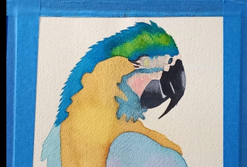
on the first layer of paint in the parrots.
5. First Layer: I'm going to paint the first
layer of the pirates now. So I'm starting off
with some clean water. And I'm going to drop that clean water all
over the chest area. So I'm avoiding the side wings, I'm also avoiding the face area. And I'm also taking some of that water onto the
bottom as you can see, because I want some of
that color to blend and bleed out and be
very soft at the bottom. Now taken a very diluted
wash of the cadmium yellow. I'm just painting the
chest area and into these little feathers avoiding the wing area, like I said, because we are going to
paint those wing areas blue and I don't want to till and green by having
yellow on the wings. So this is going to
be nice and soft because we've applied water
onto the paper first. You're gonna be able to
work on this area for longer because the paper
is nice and wet for you. And also the color is going to be nice and light
and diluted as well. I'm going to paint in
this little area here. So these are those top feathers. I'm just using the
tip of my brush to get into this small area. And I'm just going
to continue with painting down this
chest area now being very careful around
those wings because the wings have got those
little scalloped areas. This is a nice light layer
of the cadmium yellow. So I've added lots of words
it into this yellow paint. So it's nice and light. And this is the first layer
that we're popping on. So we are going to build up
the color and we're going to add some shadows
on depth to this. I'm just using a damp brush here just to soften out
some of the edges. Now I've got the
phthalo blue and I've mixed quite a lot
of water into this, so this is nice and
diluted as well. But with failure, blue
is always very intense. So although I've mixed a
lots of water into this, this is still very vibrant because silo is a
very strong color. Anyway. I'm going to continue with painting around the top of
the head and you can see meters using the tip
of my brush and sorts of flicking it out to
the left hand side. And that's creating some
lovely further detailing. So this is why I didn't want to draw those
feathers in because I wanted to just use the brush
to get that feather texture. I just think it's
better like that and it gives a better results. Be very careful when
you're painting around the eye area because
you just want to use the tip of your brush. And here's a closer look at me pulling up those further flex, just using the tip of my brush. So use your brush
up, move vertically. So if you hold it straight up, then that will allow
your brush to just hit the tip of the brush
with the paper. And then you'll get more
of a finer results. Then you can see that it does look a bit
darker at the Friends. And it's not because
I added more painted, just naturally went that way. I'm adding some cards me and
yellow to the friends now. So with this cadmium
yellow is hitting the blue and it's mixed in with that blue to
create a green. And that's exactly
what I wanted. So I would say that this
cadmium yellow is quite thick. It's definitely thicker than
the blue that I've put down. So it's a nice creamy mix
and I'm just dropping that into a few areas
around the head. I'm painting on some of the dark mixture that
I got from mixing the dioxazine violet with the fellow blue and
the Payne's gray. This is our lovely dark
paint that we mixed up. And then just painting that onto the front of the head feathers. So above the eye and
just a little bit onto the head feathers just
on the very bottom area. And then you can see I'm just
using the tip of my brush to sort of bring up a little
bit into the feathers. So it looks like there are feathers just in and
around the eye area. Now with a thicker consistency
of the Thaler blue, I'm going to start painting
around those neck feathers. I'm just taking the Thaler blue. It's probably a 50% mixed
with water and paint. So it's nice and
vibrant and very blue. It's a nice dark mixture anyway. So I'm going to paint
using the tip of my brush into some of those
had feathers as well. And I've diluted it now. So this is a nice diluted mix. The first layer that we put
on the head and the neck. I'm going to start painting
in this lovely wing here. So this is gonna be the
first layer of this when we are going to add
lots of layers to this. And I want some of that phthalo blue to be shown in
through and lighter areas. So we're just using this as the lightest tone on the wing. And you will see me in a minute using a dry brush technique. So I'm just using my
brush quite dry at the bottom to create some
light feather texture. And you'll see me using the
tip of my brush on that. I'm also going to use some of that paint and bring it out onto the side of that feather. The wings, sorry. I'm just bringing it
over to the side. Then I'm going to
use that phthalo blue on the left-hand
side as well. I imagine some dioxazine violet. So this wing now and this
is going on quite thin. So it's a nice diluted washes
the director's own violet, but it is still really vibrant. This is going on
too moist paper. So you can see that's
kind of blending out and creating
some soft edges. That's mainly at the top
of the wing and then at the bottom it has
dried a little bit. But in a minute I'm
going to come along with my damp brush and I
will blend that out. Now I've got the
dioxazine violet, and I'm going to paint
this onto the beak all over the top and bottom beak. You can see I've just diluted a little bit because I do want this to be a nice light tone. I want some of that
lovely lights, dioxazine violet to show through for some of the
highlights in the beak. So I want this to be
really nice light layer. I want it to be nice
and light in value. So I'm going to just carefully paint around the
tip of the beak, being very careful to make
that nice and smooth. I will also going to add a diluted wash of the
phthalo blue as well. So I'm dropping that onto the dioxazine violet while
that layer is still wet. So those two colors are
going to blend into one, but you're still going to
see the colors separately. So that's why I decided to
mix on the paper like that. Now I've got the blue
and I'm going to paint these neck feathers. So this is a nice vibrant
layer of the failure blue, but it has got lots of
water mixed into it. It's not as light as the feather feather
layer that we put down. It is slightly darker. Let this layer dry now and then we'll paint the
eye and the face.
6. The Eye and Face: I'm going to paint the iris
in a very enlightened, diluted wash of the
cadmium yellow. And I'm using my size
six brush for this. Now with a nice diluted wash of permanent rose
with lots of water. Add it to this. I'm going to add a tiny bit of green to this just
to dial it down. And the reason why I'm
doing this is because green and pink are opposite
on the color wheel, which means they're
complimentary colors. And when you add green to pink, it helps to take the
vibrancy from that pink. So it becomes more
of a dusky pink, which is what I want
to use on the face. So taking a nice small brush, I'm going to add some clean
water all over the face area. And I'm trying to avoid the
blue that we've put down because I don't
want any bleeding from the blue in the face. And then taking my
nice watery mix of the permanent rose
mixed with the green, I'm going to paint that onto
the wet areas of the face. And you can see that
I'm keeping that color onto the left-hand side
of the face mainly. And leaving some white of the paper around the
front of the beacons, also near that
button beak as well. Next we'll be adding depth
and shadow to the chest, beak, and face areas.
7. The Beak, Chest and Face: Adding Shadow and Depth: I'm going to add
some more paint into my yellow mixture
now because I want this mixture to be
nice and creamy, I'm also going to make
a little side mixture by adding a bit of dioxazine
violet into the yellow. And that's because I want
a darker shade of yellow. You can see I'm adding a
little bit more yellow to make it a bit more
thick and creamy. For adding dioxazine violet
into the yellow mixture will help to dull
it down because those two colors are
complimentary colors. I want the focus to be on
the beak and the wing. So I am going to
keep the body nice and loose and not very detailed. But I do want to add a different dimension
to the chest area. And that's why I'm gonna be using a thicker
mix of the yellow, which is the cadmium yellow, and also the darker mix as well. And this is the brush
that I'm using. It's a Jackson's Raven
size to mop brush. It's a lovely brush for
holding lots of water and I really love it for
large washes like this. I'm just applying
some water onto the bottom of my
painting as well. Using my size ten brush, I'm going to start dropping
in the thicker yellow. So this is the cadmium yellow. I did more paint to
this mixture so it's thicker and it's noticed
with noticeably darker. I'm just going to add that
to a few areas of the chest. You'll see me leaving lots of that lighter yellow
undertone showing through. And that's because
that's going to create highlights
within the chest area. So I'm not going to add this thick mixture or
low for the chest area. And I'm also going
to start painting around that side top
further as well. Now with that darker
mixture that we got from mixing the dioxazine
violet into the yellow. I'm going to start
out in that around the edges of the
parrots feathers. And the reason for
that is if you have a look at the
reference photo, lots of those darker areas are underneath the
feathers of the chest. So I'm adding that into a few little areas and
also around the edges of the feathers where
those wing feathers are coming over the
top of the chest. So it's going to be
creating a bit of a shadow and it's going
to be noticeably darker. I'm going to use
my smallest size, six pointed round brush now
to add a few darker areas. So I was taking off some of
the moisture on my brush by dabbing the bottom of my
brush onto a paper towel. And that will take off
some of the moisture so that you're not adding lots
of water onto the paper. And I'm going to apply this dark color
around that crease in the face area and also
under some of the feathers. And what I'm gonna do is
actually sort of hint at some of those feathers in the chest area without
actually painting them in. And that's why I'm adding
some darker areas. So lucky it's a bit of a shadow. And then that might look a
little bit like feathers. I'm going to start painting
in the darker color, which was the dioxazine violet
mixed in with the cadmium yellow around the creases of
the wing feathers as well. So with the creases are, then that's going to be
noticeably darker because those wing feathers
are coming over the top of that
yellow chest area. So they're creating
a bit of a shadow. I'm focusing my attention
on where it dips in. I'm also going to take
a little bit onto the top of these
feathers as well. In the next section we will be painting the darkest
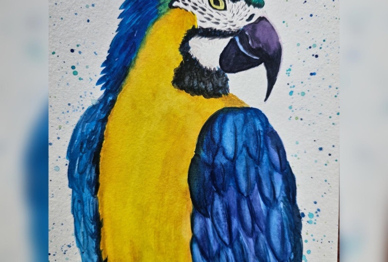
areas on the back, heads and side feathers.
8. The Beak and Face: Adding Darkest Areas: I'm going to watch the
bottom of the beak now. So this is just
some clean water go in on answering
this, smooth it out. And then I'm going
to start dropping in a darker mixture that
we got from mixing the dioxazine violet into the fellow blue with
the Payne's gray. So this is a nice thick mixture. Or they're going to start
dropping that onto the beak. I'm going to avoid the
little highlighter around the left-hand
edge at the top. So I'm leaving that strip of lighter color showing through. I'm also going to leave the strip at the
front of this beacon. You'll see what I mean in
a minute. This area here. And if you paint starts drifting up a little
bit too high, I'll show you a little
trick in a minute that you can use to stop
the paint from drifting too far and you can preserve the lighter
color showing the shoe. Then to fix this, all you need to do is
wash your brush off and then do a dab on a paper towel. So you've just got a damp brush. And then you can use
that clean damp brush to take off some of the paint
that's drifted too far. This is a really
simple little tip, but it really does work so well. And you do want to use this tip while the
paint is still wet. Because then of course, once the paint dries, it's going to be a
lot harder to remove. And this is Payne's gray. This is very sticky
paints now going on. So it's a nice thick
mixture of Payne's gray with hardly
any water in this. As I'm painting this
on the wet beak, I'm popping this into
a wet-in-wet methods. So while that darker layer we've just popped
down is still wet, I'm just popping it onto the
bottom of that beak there. So we'll allow the bottom of the beaker to dry completely, barely feel a little bit
impatient like I am. You can go ahead and wet that top beak with
some clean water. And I'm taking that
all over the top beak, avoiding that little strip
that we've left in the middle. Now I'm going to start
painting on that dark color. So this is a nice thick
mixture of the Payne's gray. And I'm just painting
around this area here, around the top of his beak. And then bringing it
down to the curve where his top beak
meets the bottom. I'm just going to carefully
preserve a tiny highlight. If you have a look at
the reference photo, this is a very small light strip where the curve of the beat
comes over the button beak, leaving some thin strips of the lighter colors
showing through. And that's because
I want that to look like the
cracks of the beak. I have diluted my paint
a little bit now. So this is the
thinner mixture of the gray blue dioxazine
violet mixed together. I'm going to just leave areas. So you'll see me leaving areas, but you can see it's
noticeably lighter. And that's because I wanted a lighter tone at the
front of the beak. You can also see that I left the front of the beak
quite light as well. And that's because in
the reference photo, the friends of the
beak is super light. So I'm going to take
a nice dark mix of that Payne's gray
and just fix up around the top of the beak
just to make it a bit smoother and a lot
darker as well. And then also darken
in the very tip. So this is a nice
thick mixture of my Payne's gray going
onto the wet paper. Now with my diluted mix
of the Payne's gray, the dioxazine, violet
or blue mixed together. I'm going to start dropping
that onto this area here. So just painting over that blue that we've
already put down. And I'm also going to just
paint around the bottom of that circular area around
the front of his nose. And then I was just
taking a damp brush then to blend that out. I'm using the tip of my
brush with the dark mixture now to add a few detailing
around the face. So few little flicks with
the tip of my brush. I'm also going to add
a few wiggly marks onto this blue area. And that's going to
give the look of feathers or feather separations
within that area there. I was really unsure
how to paint this, but I thought it worked out
really well in the end, so I'm just painting it on. And this is a nice
thick mixture again, so just in a few
different areas, bringing some of that dark paint onto the yellow area as well. So that's just being painted
onto the dry paper all over. In a minute you'll see
me coming along with a damp brush because
we are going to blend this color out certain
areas I wanted to be hard, so the top of those
marks are going to be harsh or hard ends. I'm going to leave those dry, but I am going to
blend at the bottom so the bottoms of those marks
are going to be softer. Now, my clean damp brush is just swiping along the
edge of that marking. And I've not got much
water in my brush at all. All I'm doing is simply just
slightly rubbing that along the edge of that paint to loosen the paint and let it
bleed out into the water. Now with my permanent rose mixed with a little
bit of green, but it's a bit darker this time. I'm going to add a
few lighter markings to the face as well. This has been painted
onto the dry paper. With my damp brush, I will
blend out a few edges. So this is a nice,
clean, damp brush. Now I've got a nice thick
mixture of the Payne's gray. So this is just
straight Payne's gray. And I'm going to start
painting around the eye. So I'm using my size six
brush, but of course, take a smaller
brush if you're not confident and you just want
to use a smaller brush. And to be honest, I wish I had because it would have
been so much easier. What I love about these silver black
velvet brushes is they've got a really
fine tip anyway. So I can paint really
small with them. And you can see that my brush
is really skipping over the paper because my paint
has hardly any water in it. So sometimes when your
paint is so thick, it is quite hard to get
that paint move in. So that's why I'm
painting so slow. I painted in the pupil as well. I'm just making sure that I get the correct shape of the eye. I'm also going to add a
few more darker markings around the top of his
iron, those feathers here. Next we'll paint the
head and site feathers.
9. The Wing Feathers: Building The Midtones: The mid tone now
of the feathers, I've got a nice diluted
mix at the fellow blue. And now I'm going to add some dioxazine violet
to that mixture. So I do want to have
a nice purply blue. I'm adding a little
bit more Phthalo to make sure that it is blue. Now I'm going to start wetting
this top further here. And I'm going to start
dropping on like color onto the top
of the feather, making sure that I leave the lights color on the
very edge of that feather. Now I'm going to rinse my brush off and I'm going to swipe it on the jar like this to take off and lots
of the moisture. And then I'm going
to dab the bottom of my paintbrush onto a
paper towel as well. And that's going to
make sure that I've not got too much water in my brush. Because if you have
too much water in your brush and you apply too
much water onto the paper, you're really going to struggle because that water has gone to the paint is going to
flood outwards too much. This is something
that I struggled with when I first started
painting for this, I'm avoiding those top feathers right next to the first
feather that we painted. That's because I don't want any of this color to stop bleeding into the top further that
we've already painted. Now, I'm avoiding those. I'm going to leave Troy and you will see me
skipping feathers. So making sure that I'm not painting feathers lost
on next to each other. So I've applied some water to the paper around these feathers. Now I've just got that blue
mixture and I'm going to add that to the paper while
the paper is still wet. You can see that
some of my paper dried on me a little bit. So I am taking a dump
brush and just blend in the bottom of that color out. I find that painting feathers is a little bit like
doing a puzzle. So you have to work out which further to paint
next so that you're not wetting the further next to the feather that
you've just painted. Because then of course, you're going to end
up pumping water into that paint and
it's going to start bleeding out and you're going
to get cauliflower ears and backgrounds and bleeding
where you don't want it. So I just wet this further. And now I'm applying that
blue paint that we got from mixing the dioxazine
violet into the fellow blue. And you can see that my paint travels a little bit too far. So I was just taken
a dump brush and taking off some of the
paint with my damp brush. I'm going to wet this
further as well. So this is just clean water and smoothing it out so there's not too much water on my paper. I'm going to take the blue and drop it into this
top further here. I'm also going to skip the furthest Sue and
painting this little one underneath and just see I'm smoothing the paint
around the feather. I'm following my pencil
mark and painting that blue into the crease and then around the one
side of the feather. So I won't actually be painting
around the whole feather. I'm also making sure
that's on every feather. I leave that lighter
color shining through. So it's always got
a light blue tip. And that's going to meet that further stand
out more because it's going to have a nice
contrast is going to go into, make it look like the shadows forming
underneath the feathers. And just see what
I mean a little bit later on while we work on these feathers and add lots of shadows and dimension to them. I've wet this feather now. So this is just the
blue going on again. And you'll see meters using a clean damp brush to bring
down some of that color. So you can coax the color down
a little bit if it doesn't travel as far as you want it
to with a clean, damp brush. Now that's hot
further his droids, I can go ahead and wet
this further here. I'm taking that blue and just carefully painting
around the top further. I'm always concentrating
on the feather above. And this is going to be the shadow ends underneath
that top feather. So obviously that feather
is going to be laying over the feather and casting
a shadow underneath. So that's what we're
painting on essentially. I will also wet in
this feather here, so some nice clean water, smoothing it out carefully. And then can you see when I add that darker color
around those feathers? Because the tips of those
feathers above our light, you get an, a real
good contrast with it. This is going to make those
feathers really stand out. And we're using a
negative painting effect. I'm also going to bring some of that paint onto the dry paper. So this is being painted
onto the feather above. I'm just using the tip
of my brush to create some little v shapes and that's gonna be like
feather separations. Then I'm also going to wet this further at the Friends
here and then taken a nice diluted mix
of that blue and just running it along my
pencil mark at the top. So I'm just painting that blue at the top
of each feather. And then allowing the color
to bleed down into the water. This is a lovely big blue feather that
I'm going to get in, but I did want to get this
little jagged further. So I'm just painting some of the blew up onto the dry paper. I'm just using the
tip of my brush to flick the paint upwards. I'm also going to try
and preserve some of the lighter color on the
left-hand side of this feather. If you have a look at
the reference photo, the color seems to sit in
the middle of that further. So I really wanted
to get that in because I just find
it so interesting. I'm also going to leave
a lighter strip on the right-hand side as well. And then I'm also using
the tip of my brush to bring down the paint
and create these lines, textures that I can
see in that further. But I couldn't really figure
out how to create that. But I think it worked
out really well. I'm also going to paint
this feather here because we've left but lighter
strip on the first father. It's okay to go ahead and let this because of
course we're going to not be adding
water to that paper. So I've just run my blue across
the top of that further. And then I was just using a damp brush to pull
down some of the paints. I'm going to wet this
further as well, and then adds my blue paint. So I'm just carefully smoothing
it around my pencil mark. I am paying particular
attention to the top further. So I really want to
bring out the shape of that top further and
make it nice and smooth. He has a nice close-up
look of how I do that. I'm just going to paint
that onto the bottom there. And then using a damp brush, just pull up some of the paint that struggled a bit too far. These feathers on the left
are gonna be very simple. So I'm just adding some
water to this further. And then a nice diluted
wash of that blue that we used on the first
right hand wing. And then I've also going to
wet this further as well, and then going to
run that blue paint along the top fat father. So it's going to create a
little bit of a shadow. Birth. Again, I'm keeping
this very simple. I don't want this detailing to take the focus off
the larger wing. I'm going to paint this
area very simply as well. So this is just that
blue color that we used on the mid tones
of the right hand wing. And I'm just going to
paint this all over the left-hand side of this wing. So we're very careful not
to touch the yellow because of course we don't want that
yellow area to turn green. And you can see it a
little bit of a mistake. I have actually painted onto the yellow accidentally and it's made it a little bit
darker and areas but to be honest, it looked okay. So if you don't want
that to happen, just try and avoid the yellow
area as much as you can. Now I've got a dark
mix and this is the mixture that we
used for the beak, which was the failure blue, the Payne's gray and also
the dioxazine violet. I'm using this in a
few darker areas. So mainly around the
edge of the wing. And also just using the
tip of my brush to create some little further detailing. I'm going to use a few shades of blue for the long feathers
at the bottom of the wing. So this is just a
strip of phthalo blue. That was just neat phthalo blue. And now I've got that
really dark color that we mixed from
the phthalo blue, the Payne's gray, and
the dioxazine violet. I'm also using
this dark color on the edge here and then just
bringing some of that color up into the yellow
feathers to create some further detailing and
some feather separations. I'm also going to
take this dark color just carefully into like a strip all the way
down to the bottom there. And then just using the
tip of my brush to bring some of that color
onto the dry paper. And you can see
I'm carefully just outlining some feather shapes. It's thought was
really effective. Now I'm going to use
a clean, damp brush. I'm just going to rub it along the paper between
those two colors. And that helps the color
to bleed out within the paper and keep
that nice and diluted. Next step we're going to define the wing feathers
with some shadows.
10. The Wing Feathers: Dark Shadows To Make Them Pop: I've got a nice vibrant mix of fallow blue on my brush now. And I'm going to start painting around these back feathers here. Because when, although
we're not going to be painting individual
feathers by here, I do want to add
another extra layer. And that's going to give
the parent a little bit more of dimension. It's going to be more vibrant in this area because
I feel like that light blue and the wash was a little bit too wishy-washy,
a bit too flat. And although we are
going to allow some of that light color to shine
through this darker color. We'll just make this area pop. And we can also use negative
painting technique. You can see me painting
around some of those feathers to make
them stand out more. So by adding a bit
more of this blue, it's really made those furthest
stand out quite a lot. Now I'm gonna be
using at the bottom are dry brush technique, so you can see it's dry. Here I am working
on the dry paper. I'm just flicking my brush out to create these little strokes. So it kind of looks
like the bottoms of the feather is that a parent
will have on its wings. And I'm just painting
around these, these large wing feathers here. So I'm really painting that. I'm going to make that
large feather standouts. And then I'm just going
to take this blue up to the bottom of the feathers
that we've already painted. And just carefully
smoothing it out and making those wing feathers
look really smooth. Just painting around
them very carefully. And now I've got a bit of dioxazine violet
and I'm going to drop that in while the
paint is still wet. The reason why I'm doing
this is because if you have a look at
the reference photo, that area at the front of the wing looks
more purple toned. I've mixed up a nice dark now by using fellow blue
and Payne's Gray. And I would say this is a 5050 mix of the Payne's
gray and the blue together. The color on the left is
really thick and Scott, hardly any water in this. And then the color on the writer's got some
water mixed in, so it's a bit lighter. And I'm mixing them
like this because some of the feathers or the
shadows around the feathers, I want to be slightly lighter. And then someone going to
drop on really dark shadows. And you'll see what
I mean in a minute. We're going to start
wetting these top feathers. And I'm going to
just explain that. I'm focusing on the top feather. So what I'm gonna be
doing is adding a shadow underneath that further to make that top feather standout. Because of course
that top further is supposed to be
hanging over the top, the top of the bottom feathers. I'm just going to be using
quite a small brush. This is a size four. And the reason why I'm using
a small brush is because I want to be applying
less water to the paper. And then I'm going
to be using my size six brush for
applying the paint. And that's going to
ensure that I don't have too much water in my brush. I'm going to start
off by wetting this one with some clean water. I'm going to wet it just
all over the feather. And then picking up the
lighter diluted paint. I'm gonna just
start dropping that into the feather around the top. And now I'm using
a clean damp brush to pull down some
thought paints, so it's a bit more diluted at
the bottom of the feather. I'm going to take my
small brush again, so my size four. And I'm applying some
clean water ends, are these top feathers here. So you can see I'm only
applying it in a bit, but I am I am taking that
water down further than I want that paint to travel because I don't want any harsh
edges for men. So I do want to have
a nice soft feel, the bottom of those feathers. So that's why I'm taking the
water a little bit further. And I'm wetting
this one again with some clean water and then taking the diluted dark paint
and dropping it around the feathers so you can
see I'm just dropping it into the crease of
thought further. And then I'm taking the
thick mixture and I'm putting that onto the feather just in the crack at the top. And that's going onto
wet paper as well. So I'm making sure
that I'm always applying these shadow
colors on wet paper. I'm wetting the feather
underneath the top further, first with clean water
and then I'm taking my diluted mix and
I'm dropping that on, making sure that I do always leave a lighter
color at the bottom. So if your paint
travels a bit too far, you can take a clean
brush and take out some like I did just now. Then using my thick
mixture and I'm just defining the edge
of this feather here. So taking it up into
the crease and then also into those
feather separations. I'm also going to wet this one with some
clean water and then dropping on a diluted mix of the lighter gray
that we mixed up, I will call it a grid because it looks green, so isn't it? But it's like a blue-gray. And then I've got
the thick mixture. So this is the mixture of the
blue mixed with the gray. And it's nice and thick, so it's got hardly
any water in it. I'm also making sure that it's not much water in my brush. Because if you have too
much water in your brush, you're going to end up
diluting the mixture. And then it's not going
to look very dark. You do want to make
sure that you're dabbing your paintbrush on a cloth before you pick
up the new thick paint. And that's to ensure
that you don't have too much water in your brush. And then you're not
adding more water into the paint as well. You can see I'm just applying some clean water to this
top further and then taking my diluted mix and
then pulling the paint up onto the dry paper to create these little feather
separations. I'm also going to wet this feather at the
Friends and then taking my diluted mix and dropping it
around the furthest. You can see I'm carefully smooth in around
that top feather, just following my pencil mark. And then taking a
nice thick mixture just around the top
where the crease is, and also around the
edge of the feather. If you just focus on
the feather shape, the top further, that will help you to know where
to put the paint. Now I've added a little bit of dioxazine violet to my
watery mix of gray. And this is why it looks
very purple at the moment. And then I'm going to take my thick gray mixture with
no dioxazine violet in it. And I'm just going
to drop that on. The reason why I've done this
with the different colors is because I just wanted
a bit of a variation. It makes the wings look very
interested in like that. If you've got different tones
and colors in the wing, you could always mixing some permanent rows as
well if you want to swap the colors F
and just see me doing that a little
bit later on. I'm taking some
of that dioxazine violet mix mixed with the gray. And now I'm dropping
that in as well. So I did use a separate area on my palette
to mix this new color. Here, I've got a color
that I've got from mixing Othello blue and the
permanent rose together. And this is created
more of a move or a purpley magenta color. And I'm just going to drop that onto this further here just so it's a bit warmer and
it stands out a bit more. It will also just create a little bit of interests and make it look a bit different. And I'm dropping
my thick blue mix around the corners there
while the paper is still wet. Now I've got some
wet paper again. I'm taking my
dioxazine violet mix. So this is the mixed with the dioxazine violet
that I've added to the diluted mix of
blue and the gray. And now I've got my
nice thick mixture of the fellow green and blue. And I'm dropping that into the little crease and
around those feathers. So you can see I'm just
following my paint, my pencil mark really. That's where I'm
focusing my attention. So wet in this one again. And I'm taking my
diluted mix, the, this is the dioxazine
violet mix. I'm just going to drop that
on and you can see I'm not bringing that color
all the way down. I am just leaving it to do its own thing and just
float out into the water. And if you find that your
paint travels to fall, you can take a clean damp brush
and just take off some of the paint and that will stop
it from traveling too far. I do want the bottom
of these feathers to remain nice and light
because they're not going to add a good
contrast between the very dark shadows that we're adding around
those feathers. And that's going to help to make those feathers really pop out. You can see I'm using
a dark mix around that further there and that
was going onto wet paper. I've just added a bit of clean water to this
further now as well. And they've got a very
dark mix and I'm just running around the
edge of that feather. And then I'm pulling the
paint up using the tip of my brush into some of
those further creases. So that's gonna
look like there's a little separation
in the furthest. And that really makes
it stand out by putting that very dark color
in Greece as well. Now I'm painting
on this feather. I've just wet the feather
with some clean water. And now I've got a
very dark mix again. And you can see I'm
carefully taking that dark mix up into the crease of that
further to give that real good separation
in those feathers. I'm wetting this feather
at the friends now and taking a diluted wash
of the dioxazine, violet, purple has got lots
of water mixed into it. It doesn't always
mean that I'm taking lots of water and
popping it on my paper. I am actually dabbing
my brush onto the paper cloth to take off
some of my water in my paint. I'm wetting around
these feathers with clean water as well because we're going
to add a shadow underneath these
feathers as well. And that's going to really make those feathers pop off the page. You'll see what I
mean in a minute. So I've got some nice diluted
mix of that green mixture that we mixed up earlier and then pop in that
onto the paper. I've taken my mood diluted mix. I'm just painting
around these feathers, making sure that I
make them really nice and smooth and
rounded shapes. And then I'm taking
that dark mix around those feathers and just allowing it to seep out into the water. You could always take a clean, damp brush and just pull down
some of that paint as well. I'm just adding a bit
more darker paint. So this is the dark gray
mixture that we got and I'm popping that onto the paper as well to really make
those further stand out. You can see I'm just
using the tip of my brush to draw a line up here and that's going to sort
of bring those feathers. I'll make them separate. And really make them
stand out a bit better. I've got some clean water now and I'm painting
around these feathers too because we are going to pop shadows underneath here as well. So this is the diluted mix. I have added a little bit of dioxazine violet to
the mixture now. So it's a bit more purple tones. And I'm just going
to pop that on. So you can see it's a
nice diluted mixture, but it is enough to make those for this stand
out a bit more. And then we are going to take the darker mixture in a
minute and we're going to pop that around
the feathers as well to really make them pop. Now with my dark gray mixture, which is the thick mixture, I'm going to paint that
around these bottom for this. So you can see I'm
just painting it into the crease and then
around the age. And I'm actually not taking that paint all
around the feather. I'm just painting
it on the one side. And that's going to make
that further look a little bit more realistic. I suppose. I'm just painting
around those feathers. So you can see that I did
paint around that one further, but I'm not doing
it to all of them. So I'm just sometimes
printed or rooms the left or the right
hand side of the feather. And then some of them
I am painting around. I'm just using a damp brush here to blend the edge a little bit. Now with the last feather, I'm going to wet the paper. And then I'm going to add
the really thick mixture. And you can see how lovely That's spreads within the water. I am smoothing lot
further out to meet that top further look
lovely and smooth. And then pulling some
of that paint up onto the dry paper to create those lovely separation
in the feathers. And then using a damp
brush just to pull up some of the paint and
blend it out a little bit. Now I'm using some clean water and this area has
dried completely. So you do want to let
that area dry completely because if you add water into
this area once it's dried, you can end up having some backgrounds and you
don't really want that. Now I've got a lovely thick
mixture of that gray. So this is the gray mixed
with the Thaler blue. This isn't just gray on its own. It has got a bit of a blue tone to it, but it's very thick. There's hardly any
water in this at all. I've really dried my
brush off as well, so I've only got a damp brush. And the reason why I've done this is because
I don't want to dilute the paint any further
by having water in my brush. I do want this area to be one of the darkest areas
of the pirate. So I am painting
around the Father and you can see that I've just
made a bit of a mistake. And I'm going to
fix that up by just popping in a little
further separation. So there's always a way
to fix your painting. So don't worry if you
go a little bit wrong. Sometimes these accidents can happen and they can be
happy accidents as well. And that's what will make your painting nice
and unique as well. Your painting is not going
to look the same as mine. Now I've got a
damp brush and I'm just going to blend
this edge out. And what's going
to happen here is the paint's going to float out into the water so you get more of a darker look on the Edge. Next we'll be adding the
final touches to the Paris.
11. Finishing Touches: I'm going to fix up the
shape of the beak now with some concentrated
Payne's gray, I'm also going to pull
up some of it for those little feather flicks that are around the
bottom of the beak. And then I'm also darkening up the edge of the bottom of
that end in that color out. Now I'm going to use
my very small brush. This is a scientist
to paint down some veins in the middle
of some of the feathers. This is very diluted
dioxazine violet. So I'm going to move some of
those, those middle things. And that's going to give the
look of the feather curve. And then some of those for this curve, especially this one. Now I've got some
concentrated white gouache. And I'm going to start painting that done the
friends of the beat. Because if you have a look
at the reference photo, that is, this is the Winsor and Newton
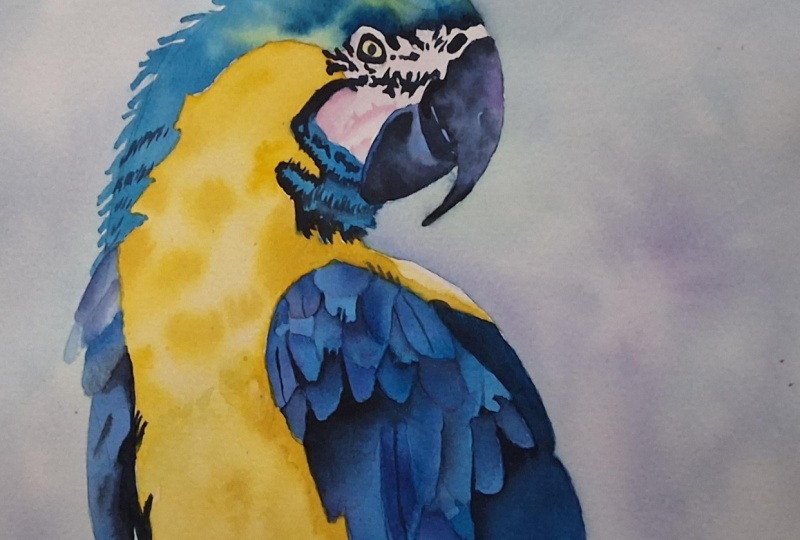
professional gouache. So here's my finished poet. I hope you enjoyed watching
this and also having a go.
12. Bonus Lesson: The Background: For the background,
I'm going to be using my large oval wash brush. This is a 1 " size and it's
by silver black velvet. I'm going to paint
some clean water all over the background. I'm going to be very
careful painting that water next to the Parrot because I don't want
any of this color from the background
bleeding onto the pirate. I'm also going to be very
careful around the beak. So I'm leaving a very
small strip around the beak and also
underneath the beak. And the reason why I've
done that is because I want that area to stay white. And that's so that it looks like there is light shining
from behind the height. So it sort of brings
focus to the head area. I'm going to take some phthalo
blue now and then painting that around the wing on
the right-hand side. You can see now that white
highlight that we've left on the wing is really standing out against that
darker backgrounds. So there is always a good reason to paint in a
background, I think. Because you can just make
your brain to really pop. You don't have to paint the
whole park background either. You could always
paint a small area. For instance, you could only
paint around the hairs in the background or the
side or just one area. For instance, when I laughed, it is completely up to you. I'm dropping in some colors now, so I'm using the same colors
as I used on the poet. So I'm dropping in some
cadmium yellow into the blue. I'm using a wet on
wet technique and I'm kind of mixing those
colors on the paper. I'm just varying
my colors really. I'm also going to
add a little bit of dioxazine violet into this. So I added a little bit of
dioxazine violet into the green and also adding
some phthalo blue now, so this is a bit
more concentrated. This they look blue. Now I'm going to add
some water droplets. Here is how this worst
droplets ended up. So these were just
clean water droplets from my paintbrush
dropped onto the paint. You want to time
this perfectly so. You want to wait until the paint has started
to dry a little bit, but it's not completely dry
otherwise it won't work. So when painting very
carefully next to the poet, making sure I don't
paint onto the poet. You could always leave a small strip of white
if you wanted to, if you're a little
bit worried about painting the pirate by accident. So I'm going to take that
along the bottom, the pirate, and you can see I left
the middle where the, the bottom of the
pirate meets the paper. I left that completely
blank of paints. So it looks like a lost age. I've got dioxazine
violet and I'm going to drop that
onto the Thaler blue while the paint is still wet hands because I'm
painting wet into wet, then those colors are
merging into one another. They blend in nicely
on the paper, kind of like mixing on the paper without mixing
in my palette first. But you can see those
colors individually. Now I'm going to use a
damp brush just to cross that top area because
there was a harsh edge. Here is my finished Paris. I hope you enjoyed
this tutorial. I was left to know
how you got on with this Paris and happy painting.
13. Your Project: Congratulations, you've just
completed the parrot class. I'm going to set you a task
to do now is to go ahead and paint your own Paris or bird using the techniques that
you've learned in this class, I'd love for you to share
your paintings with us in the projects
and resources area. You'll find that tab
underneath this video. And all you need to do is
just upload your file to the projects and
resources area so we can see your lovely
masterpieces. I do really love to see
your wonderful paintings. It just fills me with such
excitement and joy to see that you are really
enjoying this class and you get some use out of it. It also gives us the Luna's a really good idea of what are their boots
they can paint. It also motivates
other students as well to see your
lovely paintings. Have a lovely rest of
your day, happy painting. And if there's any questions as always, please
reach out to me. That's what I'm here for. You soon. Bye.
 Lindsey Dawn Art, Watercolour Artist