Transcripts
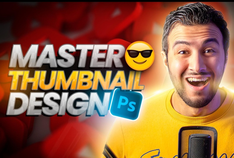
1. 1 Thumbnail Importance: Is that you were going to
learn how to create catches, thumbnails like
this from scratch. No previous scales needed. You can just follow
my steps and I will not even use my Photoshop. I'll just use a free
Photoshop version that is exhausted into
the browser directly. So without any further ado, let's dig into business. I want you to imagine this. You have just uploaded
a masterpiece, pouring your heart and soul into creating the most
incredible video ever. But wait, something is missing. Your video isn't getting
the views it deserves, probably because you
put all the effort into the content itself
and you forgot something. The packaging of the video, which is the thumbnail
and the title, whether you are a logger
gamer or any content creator, video thumbnail is your
gate to success in Youtube. Believe me guys.
2. 2 Criteria for a good thumbnail: Firstly, let me just tell you what makes a good thumbnail. It's not only that
it looks good, there are some criteria
in a good thumbnail. Firstly, we need the thumbnail
to arouse curiosity, to bring a curiosity gap into
the mind of your audience, and they want to fulfill it. For example, here
in this thumbnail, I'm targeting people that
want to create this effect. Here is before and
here is after. And that is exactly what you expect to learn
in the video. So you need to create curiosity gap in addition
to the title, of course. And then you can fill this gap with your valuable
content in the video. The second point is you need to put a clear and direct message. Because when you see thumbnails, you will probably
see it in this size, very tiny size in your browser
or in your mobile phone. So for example, this thumbnail
example is not good. It's a bad thumbnail. Why? Because it has a lot of
elements and you need to put some effort to understand what
is going on in this video. So when I changed
this thumbnail to this one more direct and
straightforward message, the views in this video
has drastically changed. As you can see, this
is exactly when I decided to change
the thumbnail. So clear thumbnail is
a very crucial thing. The last point I want to talk
about is that you want to create catche
contrasty thumbnails using contrasty colors. Hot and cold colors
contrast in sizes. So I have my big face
here, contrast in color. And putting some special effects and light effects to
just make it pop, you know, to grab
attention to the visual. All right, enough talking. And let's see how can we create this thumbnail from
scratch? So let's go.
3. 3 Starting with the face image: If you have Photoshop,
that would be great. You can follow along
with me directly. But if you don't
have Photoshop and you don't want to
buy it or something, you can go to a website
that is called Photopia. It's basically Cloud Photoshops. So you can use it from anywhere from the browser directly. So let's open Phobia.com and I'll leave its link
in the description. Okay, let's start by creating
a new project from here. And let's name it Theo. The dimensions will be
1920 by ten eightyB. You can make it smaller
and then press Create. Very cool. It's basically like a mini version of
Photoshop or something. But it's enough if
you want to create thumbnails like what I've done. Okay, so let's start by getting
my image into the canvas, this one, and I want to
tell you a tip here. Choosing the right images
for your thumbnails is a very crucial thing
guys, because, you know, when you have some
reaction in this image, as you can see right now, my image is well lit and
it has dynamic lighting, the light coming from the right. And there are shadows. And it's basically
a catchy image. And that is what
we want to have if we want to grab attention
to your images. Okay, so you need to take good images for your
thumbnails. That's a big thing. And by the way, if
you want to remove the background without using
this Photoshop version, you can go to a B Express. The link will be in
the Description. And then let's scroll to this
Remove Background section. Press on it and just
upload your image. And it will take some time to remove the background
for you in a second, so you don't have to put a lot of effort here
as you can see. Very, very good selection. And then let's download
it and we can just drag it and put it into
Photobia. Very nice. Let's make it bigger. I guess to zoom in
the reaction of my face is a very good idea. Then press Enter. Then if
we want to remove this, we can simply create
a mask from here. Press on this button. And using the brush, we can make it right click
to make the brush bigger. Then with black color. From here we can
remove the parts. Now let's bring a
background for this image. And for this, I chose this
background for Youtube, assuming that it is something related to
Youtube, you know, so you need to put
something related to the content as well
as something that is not distracting the viewer
from the main message. Then if you want to
make the image bigger, you can just press here, transform controllers
and make it bigger.
4. 4 Make face POP with glows: Now let's darken the background
using some adjustments. If you don't find this
adjustment panel, you can find it from here. Window and adjustment. Very nice. Let's create curves. Adjustment layer, and let's make the background a little bit dark because we want it to not
grab attention to the eye. Then let's make the
image pop more. And we will do this by creating
a new layer from here. And using the brush,
let's right click, bring the soft and brush, make it a little bit bigger. Let's choose some color, some orange, maybe some color like this from the background. And let's make it brighter. Pre. Okay, we can make
the brush bigger. Let's paint some glow effects
around the image like this. This will make the
image pop more. Let's change the blending
mode into screen. Very nice. Now we can emphasize
this glow effect using a new layer and changing this color to a very
bright color like this. And also change the
blending mode into screen and using the
same soft turned prush, I will put some touches. Nice. Now let's create some inner glows,
because of course, these highlights should cast some lights into
the image itself. How can we do this? I will basically right click
into the image, press into blending options, then let's go to
inner glow from here. Let's choose some bright
orange color from here. Something like this. Let's make it somehow bright. And press okay, let's increase the size for the glow
like this. Very nice. Maybe we can decrease
the opacity. Another thing I'd like to add is a struck, an outer struck. Let's go to struck, and let's change this
color into white. And I will show you a
second why I make this. Then press okay, maybe we can leave it as and
then press Okay. Now let's press into this
arrow, into the effects. I will right click
Create Layers. By doing so, I'm just
extracting these effects into separate layers so that I can mask it and
control it separately. Let's start with the struck. This one I will create
a mask from here. And using the brush solid color. And let's bring the black
and white colors from here. I'll press on this. Then let's just remove
with the black color. Remove this part. Very nice. Now let's bring the
softer ended brush, and let's just fade these edges. What it will do is this bright spot gives
you the effect of lights. Let's remove it like this. Let's remove the effect from
here as well. Very nice. Let's see here before
and here is after. Very subtle, but it looks good. Now let's go to this
inner glow effect and let's control
it using the masks. Let's create a mask. And maybe we can decrease
the flow of the brush, which is the intensity
of the brush. Let's fade it more like this, because I don't want
the effect to be exaggerated because it will
not look professional. I don't like this area, so let's make it bigger. I will select all these
layers by pressing shift, pressing into the first one. And then pressing shift and
pressing into the last one. Then pressing out
Control in Futopia. And if you are in Photoshop, you will just press control. Let's make the image beggar
like this. Then press Enter. One last thing we can do
in the image is to create another glow effect by choosing the same color for this orange
color but saturated one. And of course, in a new layer
with the soft turned push, I will and increase the flow. I'll just put a touch like this. Then let's just toggle
between the white and yellow with the white color. I will make the brush
small like this. And then I will
put another touch into the center
of the first one. Let's change this blending
mode of the layer into screen. Let's put it somewhere here. It gives us this glowy effect. But we need to make it smaller. So let's press out control. And we can make it
smaller like this. And maybe press Shift to
change its shape like this, to put it somewhere here. For example, press Alt and Shift to change its orientation. And then maybe we can
take another one by pressing out and dragging
to create another copy. Oops, we have created
multiple copies. Let's put this here. Pressing out control, I will rotate it and maybe
put it right here. Maybe reduce the
opacity or something. Now we can sharpen the image more because it looks
somehow blurred. Let's go to filter. And sharpen and smart sharp. Then let's increase
the sharpness. As you can see, not
so much the press. Okay, let's see. Here is before and
here is after. Let's go to the next thing, which is the text. Let's firstly put
everything related to my image into a group by
pressing into this layer. And pressing shift and
pressing into the top layer. And then press control. Now we can shift it
a little bit to the.
5. 5 Text effects: Nice. Now it's time
to put the text. For this, I will
grab this text tool, and then let's click
anywhere like this. And let's write master
thumbnails. Okay? So let's start with Master. Let's make it bigger. I will do all the effects
that I want into this text, and then I will duplicate it. Okay, let's make
this word bigger. Press Enter, And then let's tweak the shape or the
letters a little bit. Let's go to this paragraph
or character window, and let's change or
lower the tracking, which is basically the
distance between the letters. Okay? So something like this. I want it to be like contracted. This will give me the
flexibility to make it bigger like this. Very good. And now it's time to
play with it's style. The way we will do
this by pressing Grad, Click and pressing into
blending options. Very nice. Let's start by gradient overly. For this one, I will choose maybe some bright gray,
something like this. Then press okay. Next, let's go to
this stain effect. Let's change this into normal. You can play around with
these styles and get whatever style that
you want, but for me, I will just choose this white, increase the opacity,
reduce the size. It's basically this effect
that you see in the text. We can change it by
pressing into the text and just playing around
until you get satisfied. Okay, maybe something
like this is good. Maybe we can decrease
the opacity. Very nice. Next we can create
a drop shadow from here. But I will reduce the size and
will increase the opacity. And then I can change the
position of this shadow by dragging it like
this. Very nice. We can create also a new struck to create
like this three D effect. I will change its color to
something like dark gray, like this and maybe
make it somehow bigger. Let's get back to the shadow. Maybe we can put it like this. Now let's press Okay. Then I can duplicate this layer by pressing
Alt and dragging it. By pressing Shift, it
will maintain the same. It will move on
vertically like this. Okay, I will put it here and
let's double click on it. And let's change
this to some nails. Very nice. Now let's
change the color of this. Let's go to Effects, and let's go to
gradient overlay. Double click on it, and let's change this for this, we can choose some orange color like this and some yellowish. We can make it
brighter if we want. And then press very nice. Let's remove this. Maybe we can name it
Master Thumbnail Design. Let's change this into design. We can bring some
cool icons related to the thumbnail title or topic. For this, I got this cool
emoji and this Photoshop icon. So let's bring them
and put them here. And then let's make this smaller
by pressing Alt control. And let's put it right
here. Very nice. I want the whole typography part to be like a complete unit. Okay, let's go to
Photoshop icon. Let's press out control. We can maybe put it right here. Rotate it a little bit and
put it right here. Very nice. Let's put some effects into this emoji by
pressing Double Click on it to bring the
blending options and creating a drop shadow. We can change this shadow
orientation to be like this. And maybe we can
make it a little bit soft like this.
That's enough, press. Okay, let's put it right
here for the Photoshop icon. Let's firstly make
this text bigger like this to interfere
with the icon. And let's bring this
icon right here. We can put some effects on it. Right? Double click. Let's create firstly a
struck with a white color. Next we can create inner glow with some bluish
light like this. Okay, maybe we can decrease
the size a little bit. We can create also an outer glow but with the same blue
color, like this. Okay? Increase its size. Maybe opacity. Very nice. Okay, now we want something to contain all this text part. We can do this by simply
creating a rectangle from here. Let's create a
rectangle like this. We can tweak it from this tool, which is Direct Selection tool. I will right click and
choose Direct Selection. Let's select this point. Let's tweak it like this. Very simple. Let's see, at school, let's bring everything
related to text into a group. Selecting all the layers and
pressing control. Very nice. Now it's a solid unit. We can make it
bigger if we want, let's press Alt control
to make it bigger.
6. 6 Final effect (glow & grading) : One final thing I
like to do is to put some glow touches into
the whole overall design. I do this by creating
a new layer above everything and changing its
blending mode into screen. Then let's bring the
soft ended brush, let's make it big like this. Maybe we can decrease
the flow of the brush. Then I will pick some color. For example, let's
pick this blue color. Let's paint some glow
effect in these areas. Some other glow effects
into the text from here. Maybe you can pick
this orange color and put some glow effects here. Let's pick blue color from here. And let's create
some glow effects, other reddish glow effects from here and maybe some
agenda from here. Create some moody glow
effects like this. Nice. Now one final thing is to create curves
adjustment layer. And let's make the
whole image darker. And then let's paint over
the important areas. Okay, with black, let's
get black color here. Let's make the brush bigger. And let's paint with a
high flow, 100% flow. Now what I'm doing basically, is to darken the edges, okay? And to put the attention, only the important things
like this, okay? Very nice. Now our design is complete, so if we want to save it, we will just go to
file and save it as PSD and put it into
anywhere you want. And after this, if you want
to export it as a PNG or JPG, you can just export
it with any size that you want and then save
it, and that's it. So today's thumbnail
design was an example for maybe some gaming
channels, exotic channels. You know, you don't
have to create like thumbnails like
this all the time, But this was just an example. But the key thing
here is to understand the concepts that make
a good thumbnail, okay? Think about creating
curiosity gap. Think about being
clear and direct. And you can even take
a screenshot from the Youtube main feed
and you can test the final image into the screenshot and see if
it's going to work or not. Tweak it a little bit
until you're satisfied. The last thing, create contrast, vivid colors, thumbnails, that will grab
attention to the viewer. Yeah, I hope you found a good
value in this video piece.
 Nour Art, Digital artist, Youtuber