Transcripts
1. Drawing for absolute beginners: There's an incredible value
in being able to draw Like practicing mindfulness, strengthening the
mind-body connection, expressing our emotions,
creativity and imagination. If you want to
learn how to draw, but you're completely new to
it and don't know where to start or you are self-taught and want to elevate
your drawing skills, then this class is for you. Let's start demystifying
the ability to do art. You don't need talent
to be able to draw. Drawing is a skill
that anyone can learn and it's way easier
than you might think. Hi, my name is Plami and
then partially trained, partially self-taught artists doing freelance illustration
and graphic design work. I will teach you a simple
but very powerful technique that I learned way, way back in Art class that
I'm still using to this day. And that is - how to easily draw anything using the
power of simple shapes. Using this technique,
you'll be able to draw pretty much any object. All you need is
the right mindset and a little bit of
distraction free time. In this class, I'll
teach you how to think and see like an artist, the tools you will need, and how to use them. Lines, Shapes, Forms, and
getting started with values. And finally, we will put
everything into practice and draw a little bird
and graphite pencil. And remember, it's way
easier than it looks, and you can do it. You will also not do this alone. I will be with you every
step of the way. By the end of this class, you'll learn how to see, construct, and draw
any object in pencil. The knowledge you
will gain is the absolute foundation you will
need if you want to explore more in-depth
topics related to drawing. Are you ready? Let's get started.
2. ClassProject: Welcome to the beginning
of your drawing adventure. I'm honored to be your guide
in this wonderful journey. The class project for the
class will be to draw the little bird demonstration
from the class. And I've also prepared
some easy exercises that will help you get a
better muscle control over the pencil, but more on them at
the end of the class, when the instructions
will make more sense. If this class ends
up giving you value, please consider leaving a review and sharing your
results in a project. My reason for creating the
class is to make it easy for anyone who wants to pursue
their creative interests. So sharing your outcomes
will make me extremely happy and motivate me to
continue developing the subject. And don't forget, the
discussion section is open for any questions
and guidance. So don't hesitate to
reach out if you need any
3. Drawing Materials: It's easy to get lost in the abundance of names
and brands on the market. And depending on where you live, some may or may not be
available to you. The best paper or the best
pencil is often a subject of personal preference and how well it matches the
artists' technique. The best way to find your
favorite it's to try out as many as you can and see
which one is the easiest to work with and gives you
the results that you want. Check to see if your
art store offers single pre-cut sheets or test swatches of
different papers. So that way you can quickly test out the different
brands and papers. It's usually best to
use paper for graphite. I've seen this marked
as for graphics. It can even be multimedia paper as long as they include pencil. GSM stands for grams
per square meter, and it's essentially the
thickness of the paper. 80 GSM is the thickness
of most printer paper. And it's the minimum you should go for. A more durable 120
or even 150 GSM is better and always get Acid
free paper for your art. That way it will be
preserved and will not yellow and become
brittle in time. Paper is made from
different materials, like recycled cellulose, cotton,
bamboo, hemp, etc., which are amazing
sustainable options. Cotton paper is the
highest quality and it's considered
professional grade, although there are some really good cellulose papers as well. Now, for the pencils. I would advice on graphite as opposed to charcoal pencils. Charcoal is very dark and
beautiful and it's hard to erase, so you'll need to be very confident in your marks. The
difference between graphite and charcoal is that a very dark graphite deposit has sheen to it when
viewed from an angle, while charcoal is naturally
very dark and matte. Graphite pencils come in big
range from 9H to 9B. H pencils are hard
and leave a harder mark on the paper. That's due to their
composition of more clay and less graphite. And the higher the
number before the "H", the more clay and less
graphite they have. "B" pencils are black pencils they're softer and
leave a darker mark. You'll find that they
lose their fine tip quickly and require
regular sharpening. That's due to them
having more graphite and less clay,
with more graphite the higher the number
of the pencil. Just think of it like 9H has the least amount of graphite
and 9B has the most. There are also two
pencils that have equally the properties of an H
and a B pencil at same time. And these are the F
and the HB pencil. It's rare to find the set with
the full range of pencils. And quite frankly, you
don't need all 20. You can opt for any of the smaller sets or even
buy them separately. I personally work with the 2B, a 4B and an 9B. For sketching, you need
an HB or 2B pencil or a mechanical pencil;
and eraser, a sharpener and a lead refill
for the mechanical pencil. You'll also need a darker
pencil for shading, like a 4B, or the
darkest you can find. These are just the
tools that you will need to get you started. And everything else
I'm about to list is just bonus in case you
want to try them out. Like the Mars Lumograph, which is a math graphite or
a water-soluble graphite. Erasers can come in a
wooden pencil form, as a mechanical pencil, an electric eraser, or
a kneadable eraser. For blending you can
use a blending stump, a piece of cotton
wool, or a brush. You can also use your fingers, but it's not as precise and
it can get a little messy. For some mediums, It's
not advised to have any skin contact with
the paper because the oils on our skin can absorb it and make it hard for
any medium to apply. So just be mindful of that. A small piece of sandpaper will help you shape your pencil tips. Finally, a ruler with a
protractor or a compass. I would advise that you
start with a pencil and paper before using
any digital software. While the software is amazing and I myself
use and enjoy it, it's also fantastic in
doing things for us, like drawing straight
lines and perfect circles, which may end up
slowing your progress. If you want to use a
tablet and draw digitally, that's of course
entirely up to you. But don't forget to do the exercises with no help
from the software like straightening or stabilizing to improve your control
and coordination. Now that we've covered
the materials, we can start getting in the headspace of what it's
like to be on artist.
4. Mindset is everything: As most endeavors,
It's important to start your creative journey
with the right mindset. It's not the talent that
enables people to draw fantastic things -
is the practice. Everyone is born with a talent. We're just generally
incentivized to prioritize other skills
past a certain age. Talent without
practice and knowledge doesn't produce fantastic
results anyway. If you believed that
drawing is hard, that you can't do it, it will be hard and you'll probably succeed
in not doing it, because that's the goal
you have set in your mind. While it may be true
that you can't draw well now, that doesn't
mean that with the right technique and
showing up and doing the work, you can't get great at it. So I want you to start with
the statement that it is easy and you can do it even if you don't really
believe it yet. It's a little bit
of fake it till you make it. Drawing is not a one-time event. It requires time, effort, and showing up consistently. Every accomplished artist has put
in countless of hours of work to reach to a level where everything they do
seems effortless. What you're seeing is the muscle memory and hand-eye
coordination of work. Every time you sit
down and draw, it's a learning opportunity. Accept the fact that
there will be mistakes. That way when you don't have
the outcome you expect, you're not spending your
energy on the fact, but rather clear the
space for exploration, what went wrong and how do
you fix it for the next time? And then go and fix it.
Tap into your inner child, the one who was not afraid of
ruining a piece of paper, who enjoyed exploring, mixing colors, using
different media, who was making bold
strokes, bold shapes, and who conceptualized ideas without anyone telling them how. You've never lost this, it's still in you, so go seek it. Detach yourself from
the end result and just focus on the present moment, on how you move your
pencil on the paper, on the pressure you're applying, the marks you're making.
Once I managed to not care how an
illustration will turn out, I found a lot of freedom and a lot more bravery to actually start drawing, to experiment and search for my own
artistic voice. Perfection is an illusion. Aim for better than
the last time instead. Set realistic goals
for yourself. Be mindful during the process
and enjoy the journey. Celebrate the wins
however small. Remember that everyone was once a beginner and be patient
and kind to yourself. Don't compare yourself
to other artists. Only compare You ... to You. Your art and everything you do is as unique as yourself. No one else can make
the same marks as you do, or see things the
way you see them, or experience and express
them the way you do it. It maybe a little bit of a
challenge at first, but as you develop
your practice, many things become easier
to the point where they are second nature and you don't even need to think
about them anymore.
5. How to see like an artist: We all have a visual library in our brains that holds
memories of what a car, a rose or a face looks like. They serve in helping us
navigate the environment, but when it comes to
drawing any of them, just this knowledge
is not enough. We need more details. Being able to see
like an artist is another skill that we
actively work to develop. And the more we do it, the more we develop
the neural pathways so that it happens naturally
overtime. In its core, observation skills as an artist distills to being
present and shifting our perception from passive observation to
analytical observation. We're asking a set of questions and actively looking
for the answers. Once we have all of the
information we can gather, we then simplify by leaving
some of the details out while preserving
or amplifying others. This is where our own
artistic expression lies. It's very important that we
always work from reference. If it's a photograph
taken by someone else, check to see the license. It needs to include some sort of permission to
be used by others in a personal or commercial aspect. And make sure to give the
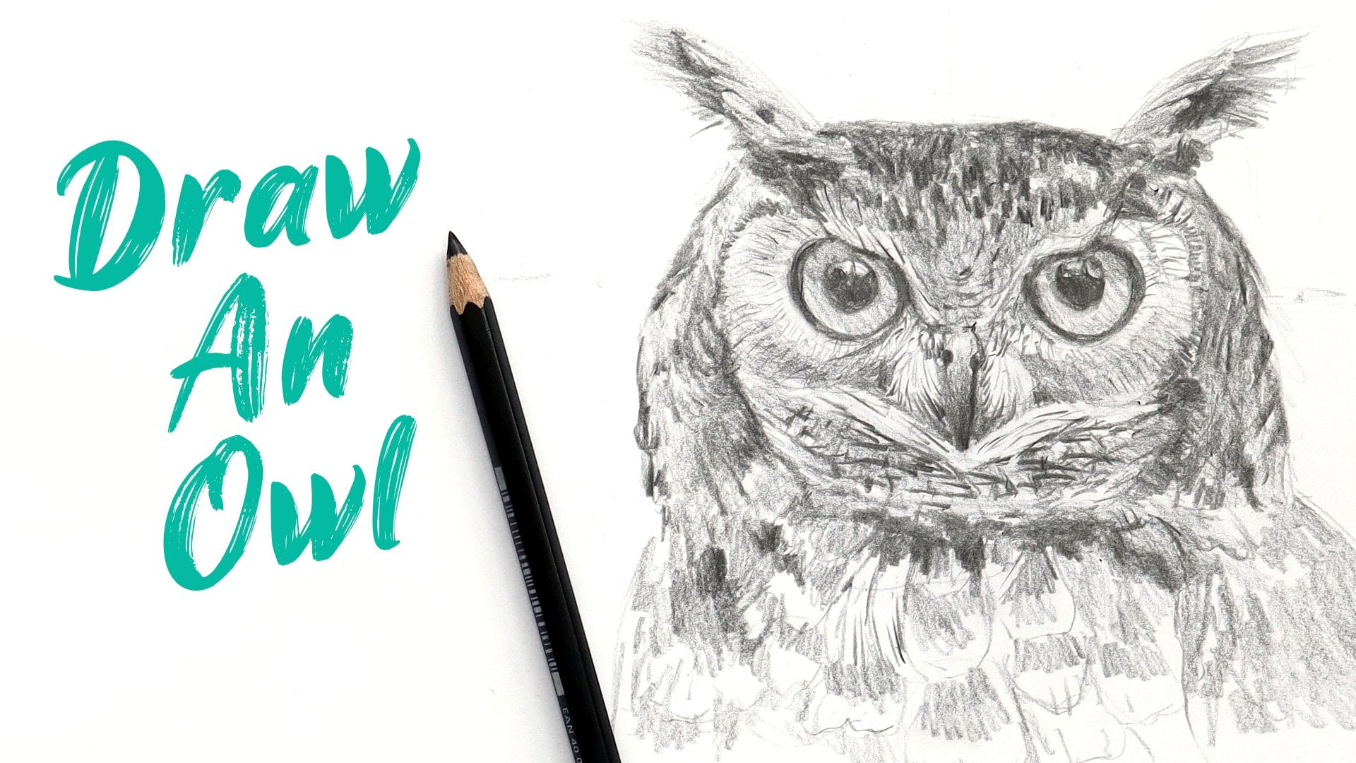
proper attributions when asked. Now, let's analyze the
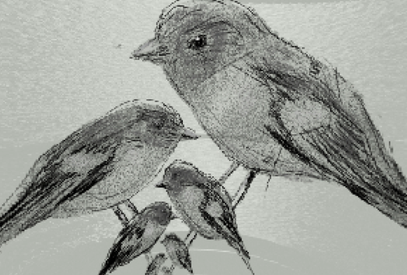
reference of our little bird. This is a very high contrast
image in two aspects - the pop of orange color, but also the sharpness
of the bird and the branch compared
to the background. So I can immediately state that the focal
point is do bird. The shape of the bird
resembles a bean, sitting at about 45-degree
angle from the horizon line. The wings resemble a triangle and their end rests at the
beginning of the tail. This tail is a long line which is about twice the
width of the legs. I can see that it's eye is a small ellipse that is
parallel to its head. And the value surrounding it is telling me that it sits
in a little indent, unlike the back of its head. We can connect the center of the eye with a straight line
to the bottom of the beak. And the distance is equal
to the length of the beak. We can see the feathers which have lower reflective properties, so they're soft and
just a little fuzzy. They have different textures
for the body and the wings. The beak, eye and feet
have some reflections. It has three fingers pointing forward and one
pointing backwards. They end with a long, sharp,
downward curved claws. And that's pretty much it. Now I feel like I know enough
to draw this little bird. Here's a little
exercise you can do to improve your own
observation skills. Ground yourself in the
present moment and take a mindful look
at your surroundings. Focus on an object and take note on as many
details as you can. The shapes, angles, proportions, lighting colors, texture,
contexts, the story. Now close your eyes
and try to see in your mind's eye every detail
you just acknowledged. The more you do this, the more you will start
seeing the world in a deeper, more profound way
without even trying.
6. Drawing Technique: While making marks with the pencil is
relatively intuitive, drawing requires a slightly
different technique. There are few different grips, but the most common ones are the traditional or handwriting grip, the paintbrush and
the overhead grip. These allow for different
parts of the pencil to come into contact with the surface, leaving
different marks. But for starters, hold
your pencil however it comes naturally to you - whether in your
left or right-hand. Don't squeeze and don't
hold it right at the tip, but rather an inch
or so from it. Make sure to rotate the paper so that when you draw
a straight line, it's perpendicular to the edge. I'm right-handed, so I'm
turning counterclockwise. And if you're left-handed, rotate it clockwise.
When it comes to writing, we're only using our fingers. But for drawing, that's
a very limiting range and doesn't help
with bigger shapes. Let's see the range of motions that we can get from each of the joints in our arms and feel free to
do this with me. First we have the
fingers - we're only able to make short strokes and
they're not very straight. This type of hold is
suitable for small details and small areas where you
need a lot of control. Next, we have the wrist. We do have slightly
larger range of motions, and this is useful for
making C-curves. Now, let's try drawing
from the elbow. We suddenly have enough
range of motion to cover the entire sheet
of paper and more. And finally, we
have the shoulder. And for this, we need to lift our arms from the table or desk. I'm right-handed. So most of the drawings
I will show you will generally be moving
from left to right. But if you're left-handed, you can start from the right to the left to avoid smudging. And you can always use a paper tissue or some paus paper to
rest your hand down, no matter which hand you use. Don't press too
hard on the paper - start lightly and build
your values gradually. If you're using textured paper, pressing the paper down will produce what is
called "Burnishing", where you apply enough
pressure to smooth out the to the paper,
making it flat. As a result, the graphite
doesn't have anywhere to hold on and you'll lose the ability to build up layers
in your drawing.
7. Lines, Shapes and Forms: Points in motion, create lines. Lines, then make a flood shapes, a two-dimensional figure that
has only height and width. These are your squares, triangles, and circles - the building blocks for all other shapes. If we add a third
dimension - depth - we now have a form which are cubes,
pyramids, and spheres, but also cylinders, cones
in different prisms. Forms with different value, colors and textures, arranged
in space produce Art. There are three types of lines - a C-curve, an S-curve
in a straight line. By connecting them,
we can produce a number of different
shapes like this ribbon, for example, I'm able to
construct it only using strokes. But for more complex figures, we need to use the
shapes and forms. And the three basic geometric
shapes are a circle, a square, and triangle. Combining or extracting
any combination of them can produce an infinite
number of other shapes. By adding depth, we can get the three basic
geometric forms - cube, sphere, and a pyramid. Again, combining or
extracting them can produce an infinite
number of other forms. By observing and
analyzing our references like we talked in a how to
see like an artist chapter, we can determine which shapes make up the object
we want to draw. And by understanding value, which is our next chapter, we can transform the basic construction shapes into forms. The basic construction
shapes into forms.
8. Values and getting started with shading: Shading is what transforms a flat 2D illustration into
a three-dimensional one. And it has a few key
ingredients, values, edges, texture of the object, as well as information
on how they are positioned in relation
to the light source. Value is very interesting
to me, because it's sometimes confused
with color saturation. But these are two
different things. Value refers to how light
or how dark a color is. While saturation
indicates the intensity, or how much pigment is in it. These terms are part of a bigger subject
called color theory. And as we're working
in graphite, we can only focus on
value for this class. So in order to determine
a certain value, we need to ignore
color. I know, I know. Here's how to do it. Look at the reference and squint your eyes as
much as you can. This will remove all of the
fine details so that we're mainly seeing information
on the value and the edges. Squint your eyes
only as you need to identify certain aspects
of the reference. Alternatively, you can take a picture and use
software to blur it, which will produce
similar results. Let me do that for you. Make a note of the values
and edges in the reference. Usually edges are defined
by a value shift. If the shift is gradual,
that's a "soft" edge. If it's abrupt with a
clearly defined border, That's a "sharp" edge. If the object and the background
has the same value, it's called a "lost" edge. Now, let's find
the value range in our reference. Identify
the darkest value and the lightest value. Different images will have different contrast and colors and they may not be as light
as white or dark as black. And that's okay. As artists, we can push
these values a little bit, and that's a part of our
artistic expression. The next thing we
need to do is group the darkest values in
one dark value shape and the light values in
one light value shape. And see - everything in
art is based on shapes. The trick is in being able to
identify and recreate them. Now, this doesn't
look a lot like our reference, in fact it
still looks two-dimensional. This is where mid-tones come in. There are different
systems when it comes to determining the exact
amount of mid-tones, some artists work in three, some in 5, 7 or 9 values. It's up to you and what
feels good to you, to decide how many values you
want to put in your art. For this bird, I'll
only use three values. I'll demonstrate the few
different shading patterns that will help you
achieve different values. Hold the pencil flat with
the paper or a upright - it's up to you. First we have hatching - using
spaced out diagonal lines. If we close the distance
between the lines, this produces a darker value. Next is crosshatching. Start with hatching, then add a second layer
rotated on a 90 degrees. This will cross the first layer
of lines, hence the name. But we can go even
further than that. Add a third layer to a
cross hatched area, but rotate it 45
degrees this time. This will fill in some more of the white spaces
in-between the crosshatch, resulting in a darker value. We can cross this with
another 45-degree line. And you can keep doing this for as many layers as you like. Besides lines, we can
also use spirals, begins small,
spaced out or tight. This is called circulism, and you can apply the
same 90 degree and 45-degree rotation to add
layers as with the line hatching. You can also use small dashes and use spacing and density
to control the value. Or if you prefer points,
that's pointillism, very fun, but requires a lot of concentration
and control. This looks best
when done in ink. Next, we have blending. I'm using a blending stump, which you can also use a cotton wool or a brush
if you don't have one. And finally, contouring. This technique uses lines that follow the
contour of the shape. Let's see first how the
circle will look with only straight lines. Very flat. Now let's try contour lines. And I'm using lines with the same profile as the
outlines of the shape. Imagine if you are
drawing a line on top of an actual sphere,
how would that look? Make sure to curve the edges to really enhance the
definition of the form. You can use just one
or any combination of these shading techniques to add values to your pencil drawings. And let's quickly shade
the ribbon I drew in the previous chapter
to see how this looks in practice before
moving on to the bird. First, we need to decide where our light source
will be. Perfect. I'll start with
some contour lines that follow the same
direction as the ribbon. And I'll do this for all three
parts that are top curves. Just some light
directional strokes, I'm not pressing too hard and I'm slowly building the value. Now for the two folds
that are below, these need to be
our darkest values as no light will
be reaching them. I start gradually again, first with some
directional strokes to help me establish the
direction of the shading. and then I'll press down
the pencil a little more and really deepen
the shadow there. I've already managed to
get my hands in graphite, so I'll use some paper
tissue to rest my hand on. I can definitely leave it there, but let's try blending
some of the values. It immediately started to
look smooth and silky, like the texture of
a ribbon would be. Now this is not fully
realistic render in real life, there aren't any outlines - we have edges and value shifts, and I can try picking
some of them up with this 8B pencil is
really stubborn, so I can't erase it,
just lighten it a little. Now let's go draw a bird.
9. Drawing a bird: Based on our observation
of the bird reference, and our knowledge
of the technique and how to use the Basic
Shapes and Forms, we can start drawing it. Feel free to draw along with me. Pause when you need
to, or finish watching the chapter and then come back to it again and
draw along with me then. If at anytime
you have a question, pop it below in the
discussions and I'll make sure to answer
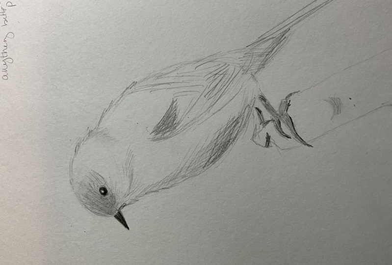
as soon as I can. First, let's measure
the birds proportions. I'm drawing an
ellipse for the head, and I'm taking the
width as a measurement. I see that the
entire body is two times and a quarter
the width of the head. I'll draw another
ellipse for the body, just slightly wider
than that of the head. I'm looking for that bean-shape
we talked about earlier. Asses the placement of
these ellipses on the page, and if you need more space, now is a good time to move them. It has a little bump on the
bottom half of the body, and this is slightly below the height at which
the wing starts. I'm adding a long strip
for the tail, which is the length of the body. I'm adding another triangle
for the feathers of the wing. The legs start at
the bottom part of the belly and they're going almost perpendicular
to the head. We can't fully see
the second leg. For the toes, draw an
inverted V like so, and draw a rectangle ending
with the downward curved law. A shorter rectangle for the finger that's
pointing backwards, also ending with a claw. Observe the reference
and where the branch is positioned relative
to the body and feet. I'm cleaning up some of the construction lines and
defining the shapes even more. I'm adding some quick strokes to indicate the feathers texture, but also doing some hatching
and crosshatching at the areas that are in my mid-tones
and shadows section. I'm not looking to render this in a photo-realistic manner, but rather to quickly
sketch all of the information I can
see about this bird. This is a little bit
of a push and pull where deepening one value
changes how I perceive another. And this allows me to
slowly build them up. I'm still using my 2B pencil and I'm only pressing down
for the beak and the eye. I'm also adding some fuzzy to the outline to indicate
the feather texture. This isn't dark enough, so I'm grabbing my 8B and going over the darkest
parts of the value shapes. I'm using this
mainly because it's the only dark pencil that
my camera can pick up. But you can absolutely use
a 4B or a 6B pencil. I hope you followed
along and I'll be looking forward to
seeing your drawings.
10. Exersices: The exercises I have prepared for you are quite easy
and will help you develop your fine muscle control and hand-eye coordination. They include progress sheets that you will need to fill in on the first and seventh day of your exercise program so that you can see the
improvements you have made. You can repeat the exercises for as many weeks as you
feel you need to. Basically, you will
need to block in 15 to 20 min each day to practice and divide
this time the way it suits you best
practice tapering lines, the three basic geometric
shapes, circles, squares, triangles, and their forms, spheres, cubes,
cylinders and prisms. I've included example sheets of everything in the
resources for this class. And don't practice on your
good paper for illustrating. Grab yourself the most
basic blank page notebook, sketchbook, sketchpad, or a
newsprint or printer paper. Whatever you choose, it needs to feel easily
replaceable to use so you don't get nervous about ruining something
good or expensive. You can continue doing this exercise for as long
as you feel you need to in order to master your fine muscle control
and hand-eye coordination. Start every week with
a Progress sheet. And on day seven,
compare your results. And don't forget to congratulate yourself for the
progress, the discipline, and for investing in yourself. When it comes to
the medium you draw with, whether it's a graphite
pencil or colored pencil, charcoal, markers, inks,
paints, etc., it's very important to know the capabilities and
limitations of these mediums. This is why I've also
included Value ranges sheet, so you can determine the range,
which you can expect. Use only one pencil
per sheet and create a value scale from
the lightest to darkest it can go. Then grab your eraser
and erase in the middle. This is the amount you can
expect to get picked up if you make a mistake. You don't need a swatch
every time you draw. If you do them once, you can always reference
them later on. That's it, and happy drawing!
11. Final thoughts: I'm happy to have been your
guide in this journey. And if you've enjoyed
the class, click "Follow", so you don't miss
my future classes on the topic of drawing. I'm looking forward to
seeing your bird illustration, so take a quick photo and
post it below in the projects. If you have any questions, the discussion
section is opened. You can ask me
absolutely anything and I'll be sure to answer as soon as I can. If you have gotten any value
from the class, I would appreciate reading your review and how
you've experienced it. Thank you for spending
your time with me and see you soon
in the next class. And you can always use a paper
tissue or some pace pa - ... And finally, a ruler with a protector, pro- ....
prota- ... protractor or a brush, or even your finger. Just be mindful of the oils
of your skin can leave ..... quality and ... but there's some really .... Cotton, bamboo, HELP
 Plami Taneva, Lover of Illustration and Graphic design