Transcripts
1. Intro: Digital paper cut art style is a very fun and creative way to add interest to your social media posts. You can create cards for any occasion. You can print it, use it as wall art. Or if you run a business, use it on your blog or website, your inserts, ads, and even in your branding. What I love most about digital paper cut is the ease. If you mess up, you don't have to start over, just tweak it a little. You always have an unlimited supply of papers and different colors and textures. It's less wasteful. Even if you're not a pro with the cutting tools that this craft typically requires, you can still create beautiful pieces of paper cut art. This class is suitable for beginners as well as more advanced students. You don't need any illustration experience to participate in it it and we'll be using a vector program called Affinity Designer. If you've never used a vector program or Affinity Designer before, don't worry, I will guide you every step of the way. You can take this class with only a mouse and a keyboard, but if you have a tablet and feel more comfortable using it, absolutely feel free to do so. Hello everyone, My name is Plami, and I'm a graphic designer and illustrator based in Bulgaria. Over the years, I've worked with clients big and small from around the world on projects such as packaging and label design, logo design, stationery design, and more. And in this class, I'll be sharing with you everything that I've learned about digital paper cut. We'll take a look at the defining characteristics of the paper-cut such as layering, light and shadow, and texture. We'll plan our illustration using mood-boards and thumbnails. Then we'll apply what we've learned to the actual illustration and tie it all together and bring it to life with a texture. Let's get started.
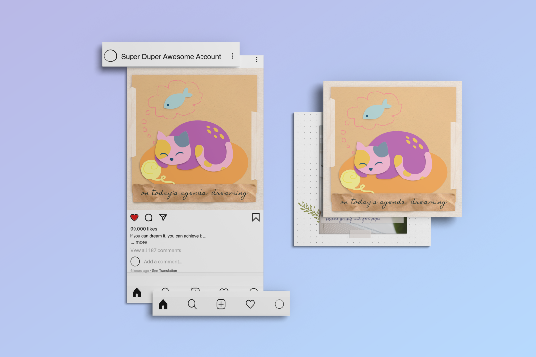
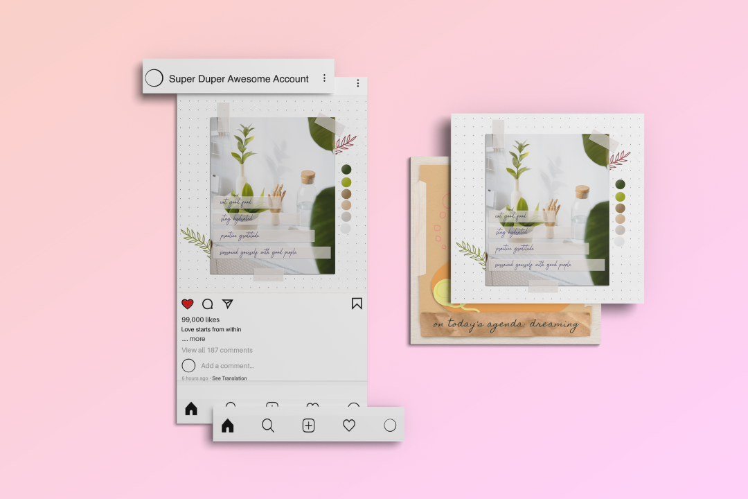
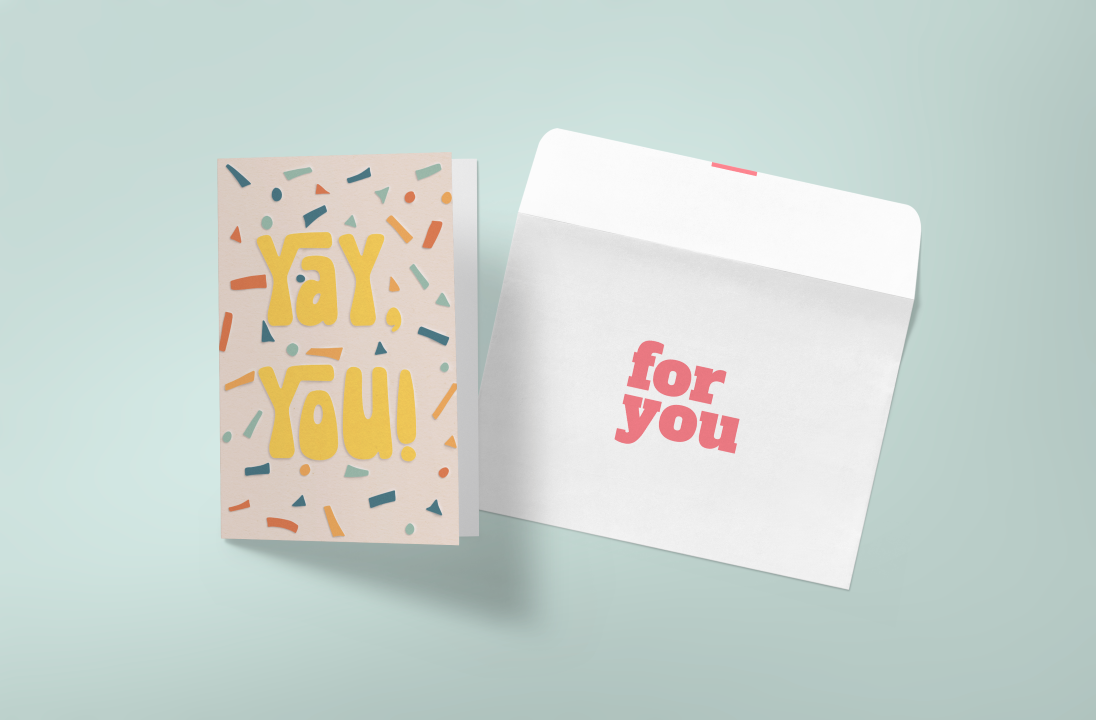
2. Class Project and Goodies : Your class assignment will be to create a digital papercut illustration. You can recreate the one from this class or pick a different subject from the list of prompts that you can find in the Project and Resources tab. In there, you will also find a list of keyboard shortcuts for both Mac and Windows, a thumbnail template, as well as my Affinity assets: the color palette, the vector shapes, and the paper textures. Just drag and drop the assets into Affinity to import and use them. I encourage you to start a project and share with us the thumbnails, your mood board, your process, what you found difficult and how you overcame it, and keep updating your progress as you make it. This is also a great place to get your questions answered. Don't be shy and come join the party.
[MUSIC]
3. Papercut Studies: Light: [MUSIC] There are two components
to the paper cut effect. One is light and
the other is paper. All of the following aspects I'm about to demonstrate have a compound effect
and will produce different visuals in
different combinations. It sounds a bit more complicated
than it actually is, so let me explain. First on my list is the
light sources direction. With this example, our
light source is the sun. It's important to note which
direction it's coming from, as it will be illuminating our objects from a specific angle and will be casting a shadow on the opposite side. This angle needs to be consistent throughout every element
in our illustration, so I always like to keep a visual reminder of where it is exactly. Let's start breaking down the
highlights and the shadows. A highlight is formed when
the surface that is facing a light source is directly illuminated by it. The shadow is absence of light and... there is so much I can tell
you about the shadows. One variable is how close to the surface is the object
that is casting the shadow. The closer the two
are to one another, the more narrow, intense and
sharp that shadow will be. This type of shadow, usually sits very close
to the object itself. The greater the distance, the less intense and
blurred that shadow will become until it melts into the
background and disappears. This shadow usually has a very large surface area and can spread a bit further
away from the object. We will dive into the
colors of the highlights and the shadows in a bit,
but first, reflections. Reflections like this one
are caused when some light is bouncing off one surface
towards another surface. This can be light bouncing
off the background towards the papercut shape, and vice versa. Note that these reflections can happen where there are shadows present and since paper is relatively low-reflective material, this reflection will
not be bright enough to fully illuminate the shadow
or make it disappear. It will only make it
appear less intense. Highlight and shadow colors. For simplicity, let's assume our light is regular
white daylight. The highlight color will be
a combination of the color of the light plus the
color of the object, but a very pale version of it. It can even appear white
on a very bright object. As we previously mentioned, paper is low-reflective material, so the highlight color will mostly be a very pale version
of the paper's color. On the other hand, shadow colors will be the same as the
object that casts it, but a darker and less
saturated version of it. If that object is sitting
on a colorful surface, the shadow will be a
mixture of both colors, but again, darker
and less saturated. Reflection color
will be a mixture of the highlight color and the color of the surface
it's being reflected on. If it's illuminating a shadow, it can take on the
shadows hue as well, but don't worry too
much about this color because like I said earlier, shadows are less saturated color than the objects themselves. So in most cases you'll get away with a dark, almost gray shadow, just fine. OK, but what if the light is not
regular white daylight? In this photo the
sun is setting, so sits closer to the horizon and is illuminating our paper
cut at a lower angle. We can see the shadows
here are very long, the highlights are
less noticeable and the hue of the entire composition
is in warm, orange-yellow. In the previous photos,
the light source, aka the sun was high in the sky. Illuminating our paper
shapes almost from above. This gave them sharp shadows and bright highlights
in reflections. The viewing angles
are self-explanatory. As we change the angle from which we're viewing
the paper objects, different parts of them become
more prominent in our line of sight while other
parts will disappear. But just to make my life easy, I prefer a top-down view on my paper cut illustration and that's what we'll
be using today. [MUSIC]
4. Papercut Studies: Paper: [MUSIC] We've discussed light and how it affects
the paper cut. But what about the paper itself? I'd start with its thickness. Papers with different
thicknesses will behave differently
in a paper cut. In this example, I've used
two different papers. The red one is thinner, and the pink one is thicker. So when we cut a thicker paper, the edge will represent a bigger surface area that will catch light from
the light source, if it's facing it, and will cast a bigger shadow if it's
facing away from it. We can see that in
this example as well. The highlight on the red is
barely visible because it's thinner and has a
smaller surface area compared to the pink one. Yes, paper can be
transparent if it's thin enough and or the light
source is strong enough. When light falls on
a piece of paper, only a small portion of
it is reflected back onto other surfaces while the
majority of the light is absorbed or even
transmitted through it. I don't think we will be using transparency in our
illustration today, but I wanted to show you
just for the science. Next on my list is adding
details and embellishments. There are a variety of
ways that we can decorate a paper cut shape and not
just with other paper. We can use inks, pencils, pens, markers, crayons, or anything
that can leave a mark. If we zoom in, we can see that there's a little
texture going on, and we should keep that in
mind when we want to emulate the medium being applied
over the paper digitally. Another way to add
information is with cutouts. If these cutouts are
inside a paper cut shape, essentially making a hole in it, we need to look for one
very important thing, and that is which
planes are facing the light source and which
ones are facing away from it. Even though these planes
are parallel to this one, which is casting a shadow, they're highlighted
because they're facing towards the light source. These here that are parallel to the highlight are actually
casting a shadow, that's because they're facing
away from the light source. Now let's look at folds. They are pretty simple, but there's one thing that tells us which way they're facing, and that is which one is lighter
and which one is darker. In this case, this
is the lighter side, and in this case, this one even though it's
a very subtle difference. This means these
planes are facing towards the light source and
light is hitting them first. So in this case, the fold is facing
towards the paper, whereas in this case, it's facing upwards towards us. Let's look at what
happens if we fold a thicker paper.
Look at the crisp. It's not as smooth and crisp as the one
on the thin paper, rather it consists of many smaller lines going
in the same direction. You can think of all these
crisps as tiny folds. Again, the side that is facing towards the light source
will be highlighted, and the one that is facing
away from it will be in shadow with a sharp
definition between the two. Paper texture. Paper texture is one more aspect that
is self-explanatory. One thing to notice is that the closer it is to
the light source, the less noticeable it can be, and the further away, some darker shadows
become apparent in it making it pop more. So essentially we
can have texture in one corner and almost none
on the opposite side. Finally, the layering. The layering is pretty
straightforward. We just need to pay attention again to which plane
catches the light. In this case, the
plane that is catching the light is the one that
is casting a bigger shadow. We've already discussed
how distance from the object to the surface
affects the shadows. We can see another example
of that here as well. That about sums it up. But with all of these variables, how can we be sure that
we're digitizing something correctly if we're only
working from imagination? The best advice I
can give you is to get a paper shape
in front of you, and start playing with it. Make a mental note of how different aspects of it change
and make the connection, why it changed in
that particular way. I hope the information I gave you will help
you with that. When you find a scenario
that really excites you, try to replicate it digitally. That's really the
best way to learn.
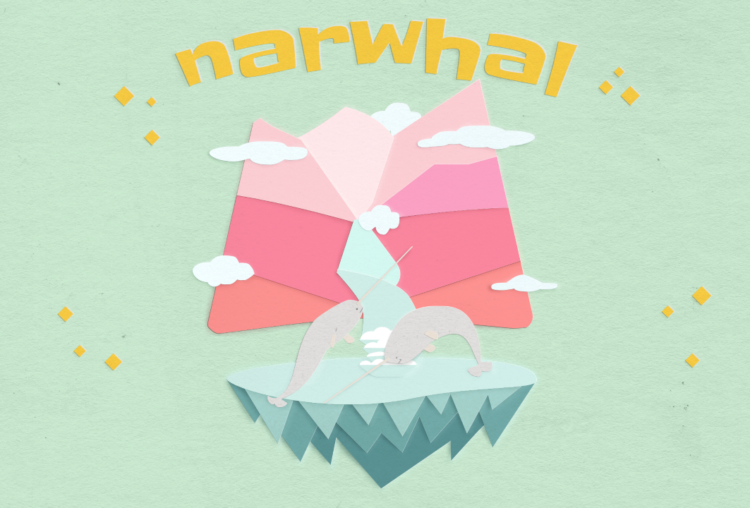
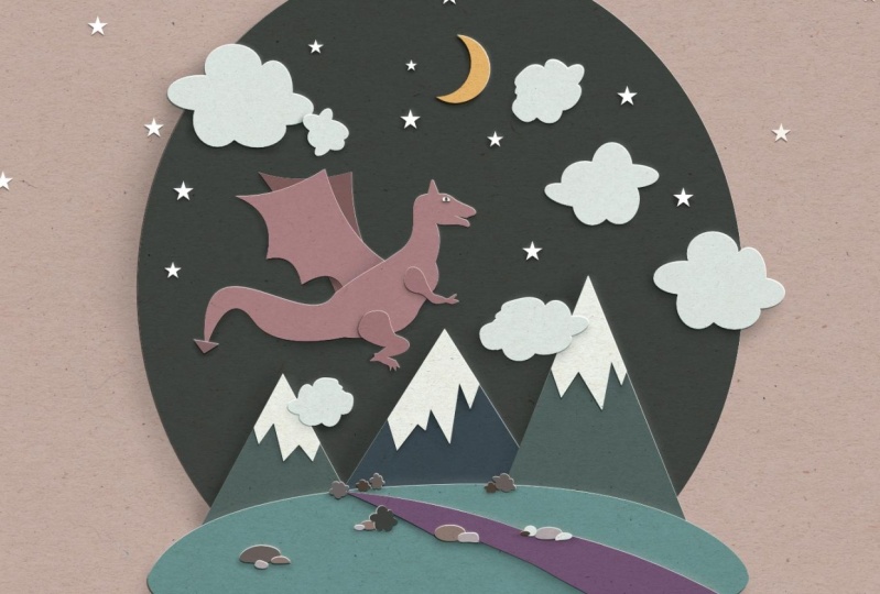
5. The Idea: Now that we understand the key characteristics of
the paper cut illustration, we need to come up with
an idea to illustrate. There are a few good ways to do this based on a
particular story, theme, observation, occasion, prompt list,
challenges, et cetera. I'll actually use the
prompt list that I created for this class
to pick our subject. These can be any
conventions at all. It doesn't need to be
something rooted in reality. I'll do very quick scan
and some things stand out, like the mountains, ocean, water fall, and I'm thinking a high
mountain water fall going into the ocean actually, this will be our
environment or an animal. Let's take a whale, and I'm actually thinking of
this very cool creatures. I'll also marked down unicorn. It's a unicorn whale
called narwhal, a very cute creature. You'll see it in a bit. Maybe some plants and maybe some seashells but
we'll see about these two because I want to keep the illustration
relatively simple. The vibe, I'm thinking, dreamy fantasy vibe
that sounds good. I think that's it. Now that we know
what we're making, we can start looking for
inspiration and reference.
6. Mood-board: What exactly is a mood board? It's an arrangement of images, materials, pieces of text, etc., intended to evoke or project a particular style or concept. Designers most often use it in the beginning stages of a project. This helps bridge the gap
between ideation and result. It can also be used for inspiration and the most convenient way to find items for it is to go online. But you could also draw from art and sculptures found in museums, books, magazines, street art, from history, folklore, nature, people,
ideas are everywhere. We just have to look. There are plenty of tools to create and organize a mood board. Since we're doing an illustration, I prefer having my images
directly into Affinity. But if you prefer a more aesthetic mood board or if you need to send it to someone else, feel free to create one in an external tool. The first thing we see when we open Affinity is this New document panel. On the left, we have
a handy selection of dimensions and resolutions. I typically start with a
Full HD 1080p canvas and actually change the DPI to 300 because it gives us the
higher-quality on the effects. 300 will also make the file larger and it's a bit heavier on slower systems. If you find that your
system is lagging, you may want to change
this to 72 while you work. In the color tab, the color profile is
set to RGB by default, but if you're planning on
printing the illustration, change this to CMYK. I'll leave mine at RGB as this will be for digital display only. Next are the margins
and the bleed menus and these are most useful for
publishing or print materials, so I'm leaving them blank. Scale is if you want
to make a billboard, but don't want to deal
with the billboard on your screen while
you're making it. Once you're happy with the
settings, click "Create". We need to save our file. Open File and Save
or use the shortcut Control or Command S. Give
your file a name and save. If you need to change any
of the documents settings, click here where it
says Document Setup. Now let's gather
some inspiration based on the keywords
we selected. The most convenient way, of course, is online. I'm looking for photos
of the narwhals that will serve as reference for the shape and proportions. I like this one. I'm
grabbing a screenshot. This is Firefox's native
screenshot function. But you can use
whatever you have. You can also download, but for now, I'll just copy, go to Affinity and paste
using Control or Command V, copy this one and
paste it in as well. I've also pasted this image of a mountain waterfall
that goes into a lake. These are all the images I need for the environment
and the actual narwhals and now we need something for the
dreamy fantasy effect. I'll be looking for images with colors that evoke that sense. I went ahead and this
time I downloaded the three images that I'll
use for the color scheme. Now I need to place
them inside Affinity. With the first file selected, left-click anywhere on the file, drag and drop to place. The next file is
automatically loaded. Just left-click, drag and drop and do the same for
the third file as well. What you see here
is the stock panel inside Affinity that you can use to search for stock images from both Pixabay and Pexels. Just make sure that if you download something, the license will be
appropriate for your needs. Now, let's get our colors and there are two
ways to extract them. A manual with the
color picker and an automated one right here
in the swatches panel menu. For the automated one,
there are two options. One will pull from all colors that we have in
this document right now, and create a palette. You can create a palette
just for this file or for the entire application that will be accessible always. But I actually prefer
the second option, create palette from
image because I have more control over the
amount of colors. Now let's load our first photo. Down here, you can see the
default amount is five, and the default location
is application. You can change this
number with the slider by typing it or by scrolling
the mouse wheel up and down. When you're ready,
click "Create". You can see the
palette is created and it has the name of the
image we used to create it. But you can rename
it if you'd like. To add the colors of the other images into
the same palette, change the location from application to currently
selected palette. Then import the image, adjust the amount of
colors, and create. If you want to have a
particular color in there, but don't want to rely
on the slider to get it, then use the manual approach
with the eyedropper tool. Left-click and drag
over the image. When you're happy
with the color, release the mouse button. In order to apply the color, click this little circle here, and then click this icon
to add it to the palette. You can rearrange the colors by left click and dragging them. Or if you're not
happy with a color, right-click on it and delete it. For now, I'm happy
with this palette, so I'm ready to move
on to the next step. That is making the thumbnails.
7. Thumbnails: The next step is to
sketch some thumbnails. Thumbnails are small, rough
sketches used to plan and visualize a composition before creating the final artwork. They help us explore different
ideas, plan the layout, and spot any
potential weaknesses, but without the time and effort it takes to
finish an artwork. It's easier to skip this step, but I like to think of it as a tiny time investment that saves a ton of headaches
down the road. There is no established role
for how many are needed, but most people will tell
you the minimum is five. For me, I've discovered, the more I push, the bigger the chance to come
up with an unexpected idea. I must warn you though, this will be ugly, and that's absolutely fine. The goal here is to spend no more than two
minutes on a thumbnail. I'll be using just lines
and simplified shapes. I'll need some empty squares. I've exported this
as a separate file, so you can simply open the file called thumbnails
and start sketching. For this, I'll be
using the Pencil tool. I need it to be just
the stroke and no fill. Make sure the fill is selected and press "Forward
slash" to remove it. I'm activating the stabilizer, I like having the
role pretty short, and I'll disable auto close. Feel free to play
with these settings and find the one that you
feel most comfortable with. Draw the first thing
that comes to your mind. It doesn't need to be the same
as mine or anyone else's, this is your art and
your composition. The great thing about doing this digitally is that we
can easily edit them. Right now, I'm switching
to the Move tool, selecting the shape, and
I'll just resize it. I don't want this
horizon line anymore, so I'm just pressing
"Delete" key to delete it. I also want the waterfall
to go the other way. I'm selecting the first line, holding down "Shift", and selecting the other two. Then come up here where
it says flip horizontal. Now, press "N" for
the Pencil tool, and I'll just draw a basic
representation of the narwhal. Hold down the space bar, click anywhere on the canvas, and drag for quick navigation. Looking at this first thumbnail, what can I change? Maybe have the mountain
like an inverted iceberg, because narwhals are
arctic creatures, and the waterfalls will
pour out of the clouds. Maybe the narwhal can be jumping out of the water
instead of diving. What about some simpler? This one will be very
focused on the narwhal. Now, I'll use the same idea
but add some more details. [MUSIC] What if we make them underwater? [MUSIC] With this one, let's have them enjoy the
view of the waterfall. I want to focus a bit more
on how high the mountain is, maybe add a river. For contrast, I'll make
the narwhal small. [MUSIC] For this last one, I want to have just a
close-up of the narwhals, and maybe they are jumping in the air and enjoying the sun. This one is bugging me, I need to give it a tail. Press "A" for the Node tool, select the node you don't want, and press "Delete" to remove it. Press "N" for the Pencil tool and enable the sculpt option. This will let me edit the shape with the new
lines that I draw. Now, we need to decide which
one we will be making. I'm just making a
quick red cross that I'll be using to mark the thumbnails that
I like the least until I'm left with the
one that I like the most. I'm using the Square Start tool, and I'm adjusting
the sides to four. When I'm happy with it, I'm converting it to curves. Just hold down "Alt" and
drag to copy the shape. I can't decide between
number 2 and number 8. I'll copy these to narwhals. What if I add a
mountain on number 2? With the Move tool enabled, I'm selecting the clouds, group them, and hide the group. That way, I can easily bring
them back if I want to. Then now, I'm still hesitating
between two and eight, but I think two has
more story to it, so that's our winner today. Now that we have our thumbnail, we can start fine-tuning it and making it into a beautiful
illustration. [MUSIC]
8. Base Illustration: Ice: The first thing that I
need is a clean art board. Select the Artboard tool and
click ''Insert Artboard'', press V for the Move tool. Drag over your sketch
to make a selection. Hold Alt, and drag onto
the empty artboard. I'm resizing the sketch, and I need to make all
of my strokes black, and I'm giving them
a one-point width. [MUSIC] I'll also reduce
the opacity to 50 percent. That's it for the preparation. On the left-hand side, I'm selecting the Ellipse tool, and I'm drawing a big
ellipse over the canvas. Click ''Convert to Curves'', press A for the Node tool
and start editing the nodes. We're trying to imitate
something that is cut by hand, though it needs to
be curvy and wiggly. Play with the position and the handles until you're
happy with the shape. Now, I need to do the
icy structure below it. You can use the Pen
tool, the Triangle tool, the Polygon tool, or
what I'm using today, which is the Diamond tool. Click and drag to
get a diamond shape, and then adjust the profile by sliding this red
dot up and down. Alt and drag to make a
copy, resize this shape. Alt and drag to copy again. Actually, I'll make some layers. Let's take this shape and resize it to fit the entire
width of the ellipse. Press Control or Command Shift
and open bracket to send this shape to back or just drag it with your mouse
in the layers panel. Let's give it some color. There are no rules here, just put you like the most. [MUSIC] Let's bring
the sketch group back on top by pressing Control or Command Shift
and close bracket, or just drag it in
the layers panel. Let's give this stroke
a different color, and color the icy
spikes as well. [MUSIC] Alt and drag to copy. Then come up here and
click horizontal. I'm selecting all
of the shapes and resizing them to fit
better on the canvas. Control and mouse
wheel to zoom in. With the stroke selected, hit Forward slash to remove it, and let's pick a color
for the icy top as well. Control or Command
close bracket to move this shape up until it's above the
other blue shapes. I'm continuing to tweak, copy and adjust the
shapes as I go. You can see that
even though I have a sketch and I have
an idea in my mind, I'm changing things constantly. In fact, the creation
process involves a lot of push and pull of
backs-and-forths. It's a search for the right
shape, the right proportion, the right color,
and every object on the canvas is interacting
with the other objects. One change will most likely
lead to another change. The secret is to
know when to stop, and that is when you
can no longer make it any better but just
make it different. [MUSIC] What I'm making now is uniting the
three shapes into one. Hold down Shift and select the shapes that you
want to be united, then come up here and press this icon where it says ''Add''. Let's move it back. Control or Command open bracket. [MUSIC] Let's unite the second row. I like to tidy up my nodes because they tend to
get in the way later. I'm selecting the ones
that I don't want, and pressing Delete
key to delete them. Okay, I don't like this blue, I feel like it's too blue, and the other icy shapes
have some green in them. Double-click on this field
to open the color chooser. Much better. [MUSIC] We can now edit the nodes with
the Node tool. Shortcut, A. What I'm looking for is some separation
between the spikes. I don't want them
distributed evenly, and I don't want them
overlapping each other. With the Node tool, press
anywhere on the curve to add a new node, and adjust it. I feel like it needs
more triangles on top, so let's duplicate
them with Alt, drag. Select all of the
shapes and add. With the Node tool, I'm dragging over the nodes to
make a selection, and I'm deleting them. I think that we
have it. I'll make the waterfall in
the next chapter.
9. Base Illustration: Waterfall: [MUSIC] This is my mountain
waterfall reference and I'll be using it to get the overall
shape of the waterfall. I'm using the pencil
tool shortcut N, and I'm outlining some
basic geometry shapes. I'm marking the waterfall
in three segments, top, middle, and bottom, where it meets the lake. I'm using different colors to differentiate them visually. With the move tool
enabled shortcut V, I'm dragging over the waterfall
shapes to select them and pressing "Control" and scrolling down with the mouse
wheel to zoom out, and I'm holding down
spacebar and dragging with the mouse to the left
to navigate the page. I'm resizing them and flipping them using the flip
horizontal option. [NOISE] Control and
mouse wheel to zoom in. The topmost shape resembles
a polygon so let's grab one. Rotate it and adjust it. I'm converting it to curves and switching to the
node tool shortcut A. I'm adjusting the
shape similarly to the outline that
I've picked up from the photo and I'm changing
its color to blue. Next, I'm selecting
a trapezoid tool and hold down "Control"
if you want to move both points simultaneously. I'm converting it to curves and switching to the node
tool shortcut A. Let's adjust the node. I'm clicking on the
curve to add a new node. But right now it's
an angular shape and I need it to be smooth. I'm selecting that option
from the menu above, and I'll do the same
for the other side. [NOISE] Double-clicking
on the fill color, to open the color chooser. I'm making the
color a bit darker. I'm also moving it up to
above the polygon shape, shortcut "Control or Command Close Bracket" or drag
it with the mouse. Now I want to remove
some of the angles, and I'm pressing "C"
for the corner tool, the red circle is indicating the arc that I'll see when
I release the mouse button, switch to the node tool shortcut A to edit the node
position and handles. Now for the bottom
part of the waterfall. I'm again selecting
the trapezoid tool and I'm rotating it 180 degrees. I'm converting it to curves, pressing "C" for the
corner tool and I'm dragging a selection over the
nodes that I want rounded. Pressing "V" for the move tool and I'm arranging it
below the second shape, leaving a small
gap for the form. I'm holding down "Alt" and dragging three more
copies of the trapezoid. I don't want these
to be identical, so I am making small
changes to its shape. If you're having
trouble moving a node, try disabling the snapping. That's the magnet
icon in the top menu. Now let's make some foam. I'm selecting the
ellipse tool and I'm placing a few
different ellipsis. I'm looking at the
outline of the shape. When I'm happy with it, I'm dragging a
selection over all of them and I'm clicking on "Add." This makes them one shape. I need it to be white. I'm placing it below
the topmost trapezoid, which is the fourth
on the layers panel, I'm using Alt and
drag to make a copy. Flip it vertically, and move it below the
second blue trapezoid, which is the third
in the layers panel. I Alt," drag it one more time, move it below the
second trapezoid in the layers panel and
flip it horizontally. Doing some quick adjustments. I'm "Alt" dragging it
to make a fourth copy, flipping it, and moving it below the first trapezoids
in the layers panel. I'm selecting the
node tool, shortcut A and I'll start
fine-tuning the node. I'm deleting all
of the nodes that are outside of the
blue trapezoid, and I'm also
removing the curves. Place the mouse over a curve and when you see a wavy
line next to the cursor, hold down "Alt" the wave
will become a minus, and "Left-Click" to
remove the curve. I'm also editing
the visible nodes to get some variation with them and you can make them as perfect or as
cute as you like. I'm toggling the visibility
of the sketch waterfall in the layers panel and now I'm
ready to make the mountain.
10. Base Illustration: Mountains: [MUSIC] For the mountain shapes, I'm using the same approach
as I did for the waterfall. This time I'm using
the Pen Tool, shortcut P. I'm making a geometric shape representing the different planes
of the mountain, and I'm again filling them
with different colors. I don't want an exact
copy of the photo, so I'm building my shapes
for this one as well. Starting with the Polygon Tool, I'm converting it to curves, and I'm editing the nodes
with the Node Tool. I'm quickly resizing the
composition to fit on my canvas. Next, I'm taking a Trapezoid
Tool, drawing my shape, changing its color,
converting it to curves, and again, adjusting
the nodes with the Node Tool, shortcut A. For the third shape. I'm Alt, dragging a copy of
the second shape, changing the color and adjusting the nodes
with the Node Tool. I'm doing the same
for the fourth shape. Now, I'm just adding some small irregularities
and curves into the shapes to help with the illusion of
being cut by hand. This mountain needs some
more planes so I'm grabbing the Trapezoid Tool and
then making a new one. I'm rotating it,
converting it to curves and editing the
nodes with the Node Tool. When I'm ready, I'm clicking
"Control" or "Command J" to duplicate the shape and then flipping
it horizontally. I don't want an exact copy of the shape so I'm editing
some of the nodes. For this last shape. I'm grabbing the Pen Tool, shortcut P. I'll make
a triangle shape, then edit the nodes with the Node Tool and
fill in some color. Then I'm duplicating it
with Control or Command J, and I'm flipping
it horizontally. I'm holding down Shift and
selecting both shapes. Then I click "Add"
to unite them, and I'm fixing
some of the nodes. I'm doing the same for
the two shapes above, keep in mind that the two
shapes need to have some overlapping in order to
be able to be united. I'm adjusting the nodes
to overlap first, and then I'm using
the add operation. I'm arranging this
middle shape to be above the one on its right. Now using the Trapezoid Tool, I'm drawing a big shape
over the mountain layers. I'll no longer be needing
my color for references, so I'm deleting them. I'm arranging the
new trapezoid below the waterfall group and
I'm holding down Shift, clicking on the
first layer below it and clicking on the last one. Then with all of the
layers selected, I'm dragging them to the
right of the shapes icon, and you can immediately see
the result on the Canvas. The mountain layers are now only within that
trapezoid shape. This is how we make
masks in Affinity, and I'll be using this
feature a lot in this class. This is non-destructive, and
if I end up not liking it, I can easily go back to my
previous mountain layout. Next, I'm clicking on
the trapezoid shape, removing the fill and converting it to curves so that
I can edit the shape. I'm adding some
irregularities and fixing some of the nodes
on the inner layers. I'm moving the
sketch group on top. Now I'm going to
make some clouds. I'm using the same
method as I did for the foam on the waterfall
in the previous chapter. Starting with some ellipsis, and I'm overlapping a few
different sides and dimensions. I'm once more looking at the silhouette and when
I'm happy with the shape, I'm selecting all of them and uniting them using
the add operation. I'm editing the nodes, making them a bit less rounded. Then I'm Alt dragging
the first cloud, flipping it horizontally, pressing "M" on the keyboard
for the Ellipse Tool. I'm adding some more
over the shape. I'm Alt, dragging another cloud, and this time I'm
just resizing it. I add some more clouds, and now that I'm happy
with how this looks, I'm ready to illustrate
the narwhals.
11. Base Illustration: Narwhals: [MUSIC] I'm using the sketch
as a preview of the narwhals and I'm adjusting its position in proportion to my liking. I'm looking at my reference
and trying to determine what are the big shapes
that make up this creature. I see a tear for the body, a heart for the tail, and a long triangle
for the tusk. I'm grabbing the tear tool and I'm drawing a big
shape on my canvas. I'm rotating it and adjusting the shape using the
red dot sliders. I'm converting it to
curves and adjusting the front of the shape as
well using the node tool. I'm again looking for
a handmade silhouette. [MUSIC] For the tail, I'm
grabbing another tear tool, and I'm adjusting it to resemble the bottom
half of the tail. I'm again converting
it to curves, switching to the node tool, and I'm continuing to adjust what I couldn't do
with the sliders. I'm duplicating the
shape using "Control" or "Command J," and I'm
flipping it horizontally. With both shapes selected, I'm moving them to the
tail of the narwhal, and I'm trying to achieve the same perspective as
the reference photo. A quick tip, if you want
a preview of the shape without the vector curve,
hold down "Spacebar." Zoom out if you need to. With both shapes selected, I'm using the add operation and I'm continuing
to adjust the shape. [MUSIC] Now, I'm adding the other half
of the tail to the narwhal. Switching to the node tool, I'm adding some more nodes to help shape the narwhal
as if it's moving. I'm using the tear tool
again to make the fins. I'm adjusting the
shape and position, [MUSIC] and I'll give
it a different color so that it's easily visible. I'm moving in behind the narwhal shape "Control
or Command Open Bracket." I'm duplicating
it with Alt-drag, and I'm adjusting its
shape and position. Let's grab a triangle tool and make the tusk
of the narwhal. But this is too sharp, so I'm converting it to curves. I'll zoom in, switch to the node tool, and I'll just add another node. When it's ready, I'm
adjusting its placement, and with the move
tool shortcut V, I'm dragging the selection
over the narwhal. Now, let's drag it
onto the canvas and adjust the
size and position. Next, I'm alt dragging
a copy that I'll be using as a starting point
for the second narwhal. Using the node tool, I'm grabbing the nodes of the head and flipping
them horizontally. I know, but trust me. With the node tool, just
make the bottom nodes up, and the top nodes bottom. Then continue to
adjusting the shape. [MUSIC] Now that I'm
happy with the result, I can switch to the
move tool shortcut V select all of the shapes, "Control or Command
G" to group them, and move them to my art board. In the layers panel, I'm toggling the visibility of the sketch and adjusting
my composition. Join me in the next chapter where I'll fine-tune the colors, and I'll use the
shape builder tool to make the mountain shapes permanent before moving on to applying highlights
and shadows.
12. Fine-Tune: [MUSIC] Shape Builder
tool was introduced in Affinity Designer 2.0. If you're running
an older version, you can use the Boolean
operations divide, then add, delete
what you don't need, and recolor your shapes. I personally think it's more convenient with the
Shape Builder tool, so that's what I'm using today. I start by removing the mountain layers from
the trapezoid mask. I'm selecting all of the layers, then I'm dragging them down
into the left until I see a horizontal blue line
indicating the drug possession. With all layers including
the big trapezoid selected, I'm switching to
the shape builder, shortcut S. On the top-left, I'm selecting the
Delete option first, and I'm clicking and dragging
over the unwanted bits. They are indicated in red. I'm switching to the Create
option and I'm dragging my mouse over the
shapes that I want united until I have them all. Now, I want to do the same for the waterfall and the form. I'm selecting each
pair and I'm just uniting this extra
bit to the bottom. I'm selecting the next pair, the third one, and the last one. Now, I'm ready to start adding the lights and the shadows. But before that, I want
to clean up my workspace. At this point, I'll no longer need my references
and thumbnails, but I don't want to
just delete them. Instead, I'm saving my file, Control or Command S, then I'm making a new
copy going File, Save As. I'm giving my file
a name and now any further changes will be done on this new details file. With the move tool, I'm
drawing a selection over these images and
I'm deleting them. I'm selecting Art board one and pressing Delete and
yes, delete, please. I'm also deleting the sketch
from the layers panel. Now that I have my
illustration done, I feel like these proportions are too narrow and too wide. I want to give it some
breathing space on the top. If you come here to
document settings, you can see that
this is grayed out. That's because I have included
an art board into my file. Instead, I'm selecting the
art board and I'm coming down here in the Transform menu
and disabling this link, and I'm changing the
height value to 1,200. I'm selecting all of my layers and I'll just
make them a bit bigger. I'm holding down Shift to
constrain the proportions. Now, I'm grouping my layers
using Control or Command G, and I'll just group
to the center. Then I'm ungrouping them using Control or Command Shift and G. Or you can right-click
on it and ungroup. Now let's give it a background. I'm using the rectangle tool to draw a shape
over the art board. I'm using Control Shift open
bracket to send it to back, or move it with the mouse. Let's change the color. A small tip, start with a gentle color because you'll be looking at
it for some time, and bright colors are
very harsh on the eyes. You can always make
it bright at the end. I'm looking this layer and now I'm ready to start adding
some lights and shadows.
13. Highlights And Shadows: Vector: I've included a
circle and some lines to indicate my light source
and light direction, and I'll hide this for now. The fastest and
most convenient way to add highlights and shadows is to use affinity
squeak effects to add a drop shadow
and the highlight, then duplicate the
layers and blur them. But I have several
problems with that, it's too uniform and ends up
looking artificial indent. The effects overlap
and I can't edit them. The blur is not directional, so it tends to bleed over
both sides of the shape. Here's what I do instead. With all of my layers selected, I'm pressing "Control Shift
G" to ungroup everything. Then with that same selection, I'm pressing "Control
Command J" once, this will create a
copy of each layer, and I'm changing
the blend mode to multiply the color to gray, I'm pressing Control or
Command open bracket, send them back ones. I'll disable the snapping, which is the magnet icon on top, and I'm just moving
the shadow to be very close to the shape. I'm still holding
that selection, I'm pressing "Control
Command J" once more, but this time I'll
change the blend mode to screen and the color to white. This will be my highlight there. The next step is to make
adjustments to the layers, I want the illusion
of thickness, so I just hold the layers closer or further
away from the layers. I like to work bottom to
top in my layers panel. For the bubbles, I've made them, and their highlight will
not be distinguishable, so I'm deleting them. I'm just making sure to
check that the blend mode is set to screen
before hitting delete. I'm continuing to work and tweak either the entire shape
or individual notes. For the clouds as they're
all the same, ''paper'', I'm selecting all of their highlight layers and
moving them simultaneously, and then I'm doing the
same for the shadows. I think that's all of it. Now, let's fix the colors of the highlights
and the shadows. Starting at the bottom, I'm selecting the
shallow layer first. With the color picker, I'm sampling the color of
the layer it belongs to, I'm applying dark color, but I need it to be darker
and less saturated. You can do it via this style, but I actually prefer setting my colors panel two
sliders and changing the slider to HSL or huge
saturation and lightness. I'm reducing the saturation
and the lightness, and I'm also reducing the
opacity of the layer. I'm selecting the next
layer, which is a highlight. I'm applying the main shapes
color and then I'm reducing the saturation and bringing the lightness up. Let's recap. For the shadows, I'm reducing the saturation
and lightness, and for the highlights, I'm reducing the saturation but increasing the lightness, I'm reducing the
opacity as needed. Since this judgment will
depend on the colors you choose and how they
look on your monitor, the best advice I
can give you is if it looks too
punchy, reduce it. The difference in
appearance is very subtle, but that's subtleness is what's attributing to
the realistic effect. I'm going up on my layer's list, and I'm also changing the colors on my mountain
because I don't feel like the contrast
and the harmonies are working well with dark ones. What I'm looking for is bringing the hues
closer together. That's it for the vector work. The next layer of highlights and shadows will be in
the pixel persona, which is where everything
[inaudible] happens. If you need to resize something
on your illustration, now is a good time to do so. I will see you in
the next chapter, to add the second layer of
highlights and shadows.
14. Highlights And Shadows: Pixel: [MUSIC] On the top right,
select Pixel Persona. I'm selecting the Brush
tool, shortcut B. On your right is
the brushes panel. I'm in the basic category, and I'm selecting
any round brush. I'm navigating to the
bottom of my layers panel, and I'm adding a
new pixel layer. I'm giving it a name and moving it below the
first shadow layer. Now, from the top menu, I'm changing some of
my brush settings. Hardness, zero percent, flow to about 20, opacity, 20. Don't forget to set this shadows layer
blend mode to multiply, and make sure that you have the right color for the shape. [MUSIC] Now, place your brush right on
the shape's edge, and draw. You may need to play
with the opacity and the flow until you're happy
with the mark you make. Even with the rope, these diagonal strokes
are far from perfect, but that's why we
have the Eraser tool. [MUSIC] You can start the tool from this menu or
press E on the keyboard. Check to see that the opacity
and the flow are low, and the hardness is set to zero. I'm not looking to
erase everything, just right on the edge
of my brush stroke, and I want to blend it
with the background layer. If you need to bring some
of that shadow back, press "B" for the Brush tool, and add some more color, then clean up with the eraser. Now, let's continue on
to the next ice shape. I'm adding the new pixel
layer and I'm bringing it onto the right edge of
this icon to make a mask. I'm changing the blend
mode to multiply, and I'm giving it a name. Now, everything I draw will only be visible on that mask layer. [MUSIC] I'm still
using the same color, and I'm making the shadow
of the layer above. Switching to the eraser, and I'm blending the shadows in. [MUSIC] I'm switching between the Brush and Eraser tool, and I'm making the
shadows darker in the corner and lighten them towards the
edge of the shape. [MUSIC] Now, I need reflections. I'm creating a new pixel layer, giving it a name, and I'm setting the
blend mode to screen. I'm changing my
color to light blue, and I start placing
my strokes on the highlight side. [MUSIC] I think this is too harsh, so I'm changing the
blend mode to lighten, then I'm going in
with the eraser and cleaning up some
of the excess color. Less is more with
the highlights. Moving up, I'm expanding
the new layer, selecting the shadow layer, and I'm adding a new pixel
layer for the highlight. The addition happens above the layer that is
currently selected, so that's a neat way to save some time masking
additional layers. Switching to the Eraser tool, shortcut E, and I'm
softening them. Still too harsh, so I'm
also reducing the opacity. I'm expanding the
next ice shape group, clicking on the shadows layer, and I'm adding a new pixel
layer for the highlight. I'm giving it a name, changing the blend
mode to lighten, and reducing the
opacity to 40 percent. [MUSIC] I continue
adding shadows and highlight as I'm moving
up in my layers panel. [MUSIC] For every shape that is sitting on
the background, I'm making a layer
at the bottom. I like having the
different colors on different layers so that I
can tweak their opacity, blend mode, and even
color individually. Make notice of how many layers are between the shape
and the background. In this case, the cloud shape
is sitting on a mountain, so its shadow should be
larger than the mountain one. On the left, I'm not starting the shadow right at
the edge of the shape, but a bit towards the left. [MUSIC] I'm making sure to pick the corresponding colors and
reduce the saturation and lightness if I'm
drawing a shadow or increase it if I'm
drawing a highlight. [MUSIC] For the mountain shapes, I'm following an
imaginary arrangement where the top shape is
overlapping the bottom one. I'm only having a
small shadow below and no highlight on
the bottom two pieces. I'm also observing the
pieces that are sitting on top and adding a highlight
and a shadow appropriately. For this cloud, I've added a bit more shadow right
at the left edge, and that gives it an illusion
that it's curved upwards. I'm not adding a fold, just the slightest bend, so I don't need to adjust the
color of the shape itself. [MUSIC] For this narwhal, I
am not adding a mask player as I would need to do that eight times in total to make a shadow. I'm just adding a new pixel
layer below the creature, and I'm careful where I
am placing the shadow. [MUSIC] If you're having trouble drawing the diagonal
lines straight like I am, you can Alt and scroll the mouse wheel to
rotate the canvas. I'm not doing this right now
because of the recording, but just keep that in mind
and use it if you need to. [MUSIC] That's it
for the brushwork. I'll see you in the next chapter where I'll add the
paper textures.
15. Texture: First, let's give the narwhals
eyes and a smile. I'm using a default
brush called low absorption ink from the
ink brush category, but you can use anything
else that you like. I'm working on a mask
layer and I'm using a bigger size brush for the eye and a smaller
one for the mouth. I'm reducing the opacity and I'm changing the
blend mode to multiply. I no longer need the light source reminder
so I'm deleting it. Now, it's time to start
adding the paper texture. If you haven't already, download the paper cut
assets for this class resources and drag and drop them onto your affinity
software to import. I'm dragging a paper from the paper textures category and then dropping
it on the Canvas. I'm sending it to back using
Control Shift open bracket, and then I'm arranging it
on top of my background. I'm dragging it into the
background to mask it, and then I'm changing
the blend mode to multiply and lowering
the opacity. I have a lot of layers
in my layers panel, so I'm selecting the
ones that are completed, grouping them using
Control or Command G, and renaming the group. I'm moving to the next
layer in the layers panel, and I'm placing another
texture on the Canvas. I'm again changing the
blend mode to multiply and nesting the paper to be
masked by the ice shape. I want to use the
same paper texture for the other ice
shapes as well, so I'm selecting the layer, I'm pressing Control or
Command J to duplicate it, and I'm sliding it
into the next shape. I'm moving and transforming
the paper texture so that it's not continuing
from the previous layer. I'm pressing Control or
Command J to duplicate it again and I'm sliding and masking it into the
next ice shape. I keep adding more paper, changing the blend
mode to multiply, and masking with the shapes as I'm going up in
the layers panel. For the shapes that
are the same color, I like making one mask, and for that I'm moving
to the designer persona. I'm holding down Shift and I'm selecting the layers
I want to unite, Control or Command J
to duplicate them, and then I'm using
the add operation. Then remove the fill. I'm duplicating
this paper texture, then Control or Command V to paste it above the
waterfall mask. Now, I need to bring the
foam above the texture, so I'm selecting all
four foam layers, uniting them using
the add operation, and then placing them
above the texture layer. I'm uniting all of the
mountain shapes as well, selecting them first, then Control Command
J to duplicate, and then add operation. I'm removing the color and setting the blend
mode to normal, then I'm dragging a paper and
masking it to that shape. I'm grouping the mountain
layers and naming them. I'm selecting all of
the cloud layers, duplicating them,
and uniting them. Then I'm removing the fill and I'm using that shape
as a mask for the texture. I've not included the cloud
that is behind the mountain, and I'm adding texture
to it individually. I'm grouping the cloud
layers and naming them. I'm selecting both
narwhal shapes, duplicating and uniting them. Then I'm removing the fill
and adding a paper texture. I'm setting the papers
blend mode to multiply. But as this paper is
changing my narwhals color, I want to give it an adjustment. Navigate below the layers panel, open adjustments, and
select black and white. The default settings are fine, so I'm closing the panel. I'll also reduce the opacity to where it looks more subtle. Next, I'm selecting the
top fins and both tusks, I'm duplicating them and
adding them to the new shape. I'm removing the fill and adding the paper
texture to that shape. For the bottom fins, I'm just pasting
the texture using Control Command V and
nesting it individually. A bonus tip. If you want to
add text to your paper-cut, here's how to do it. Using the text tool, shortcut T, I'm placing
my text on the Canvas. The font that I'm
using is a free font from Google Fonts
called slackey, but you can use any chunky
font that you like. With the Warp tool, I'm quickly adding a mesh then Control or Command Enter to convert the text to curves. It's now a group, and each letter is now
an individual layer. I'm pressing Control
Command Shift G to ungroup, I'm duplicating the layers
using Control or Command J, and I'm uniting them. From there, you can
add a shadow and a highlight layer like we
did in the previous chapters. Then go to the pixel persona and add the pixel
shadows and highlights, and finally add
the paper texture.
16. Final thoughts: Thank you for giving me your
time and watching my class, I really appreciate it. We looked at some
real paper shapes and learned how
light affects them, we learned about color and
reflections as well as the different ways to add information with paper
and other mediums, we planned the illustration
using a prompt list, a moodboard, and thumbnails, then we made our illustration. First, the base then we
added highlights and shadows and finally we
applied paper texture to it. I'd love to hear back
from you so please rate and review this class and
share your experience with it. If you have any questions, ask them below and I'll
be sure to answer. If you enjoyed this class, follow me for more
illustration and design classes in
Affinity Designer. I'll see you in the next one.
 Plami Taneva, Lover of Illustration and Graphic design