Transcripts
1. Introduction: Hey, it's Clayton in this class, you're going to be learning
about how to draw hairs, but not just regular
run-of-the-mill heads. We're gonna be talking
about specifically how to come up with different
head shapes for your character's facial
feature variation, hairstyles, head accessories. And finally, how
to capture a nice, polished looking aesthetic for your finished head drawings. Let's jump straight into it.
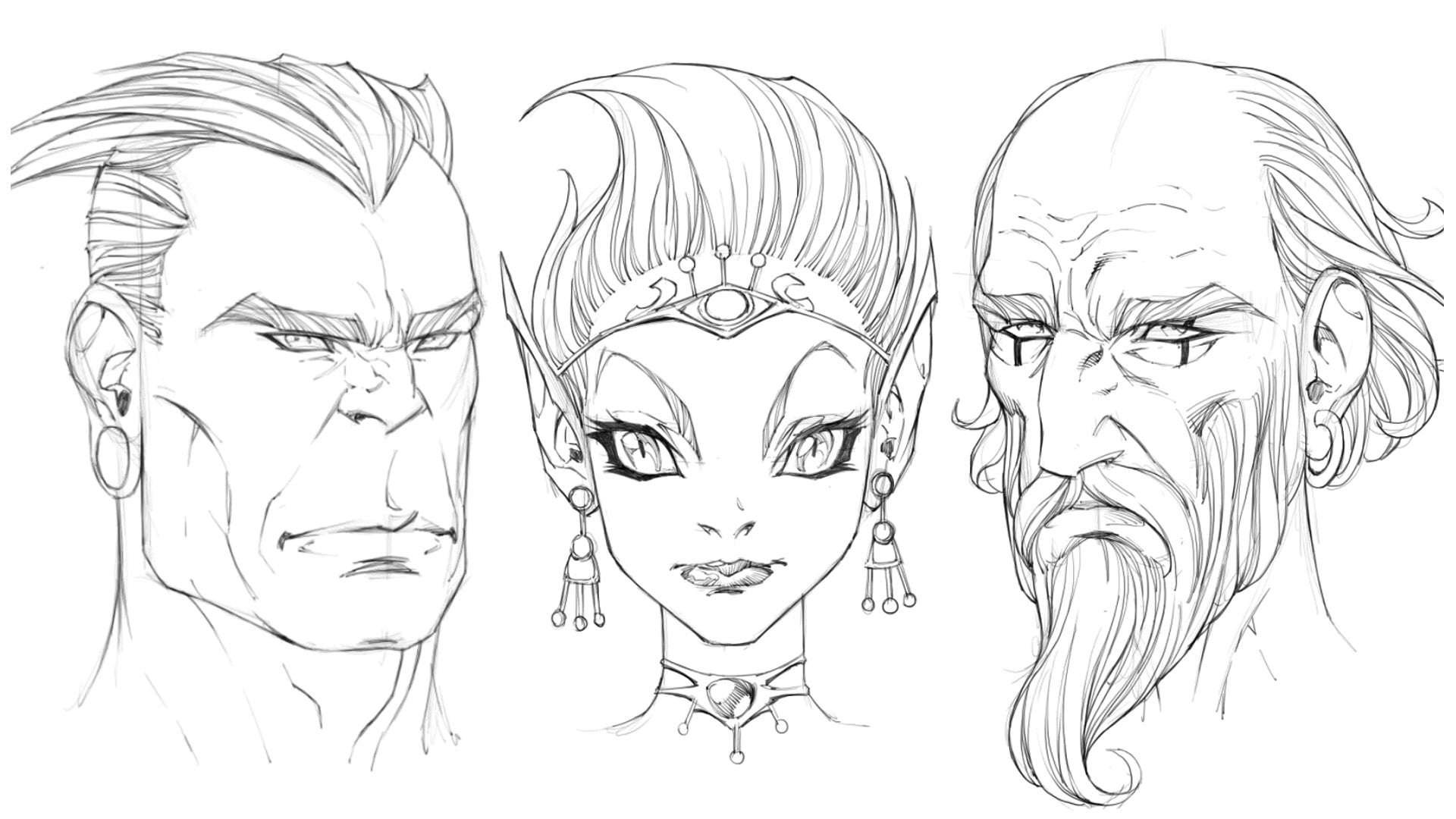
2. Professor Head: Okay, So I'm going to do up three different examples here. And each one of these examples, I'm going to turn them into individual,
unique looking heads. So they're going to
look different from one another in many different ways. So the first set that I'm
going to do is a male head. And I'm just going to
burst up loosely sketch out a sphere onto the canvas. I'm keeping it rough and
I'm keeping it light. So light, you may find it a little bit hard
to see actually. Then I'm going to
lay in the axes. All of these heads
will be drawn at an eye level just so
that we can take a look at how much their
proportions are being affected without the
distortions applied to them. We might see if
we were to put it into more of a
dynamic perspective. Okay, so I've got my
vertical axes established. I've got my horizontal
equator axes established. Next up, I'm going to
lay in the side planes. Here. You'll notice
I'm not even going to draw in another
vertical axis. Instead, I'm just
going to chop away this side plane right away. Alright? So we've drawn that
in very lightly. And by the way, when I'm
drawing in the side planes, I'm looking at how
much space I've got on either side
of the sphere. We've got this middle line here. And I know that I've got at least this much space on
the far side of the face. And so when I'm drawing on my side plane and I want to
know how wide to make it. While I just look at trying
to capture an equal amount of space with foreshortening taken into account since it's
a three-quarter angle, I tried to capture
a similar amount of space on the opposite side. So that'll give me a
symmetrical even looking face. In a way, the center
line actually determines how large the
side planes will be. Let's look at the
side plane laid in. I'm going to draw another vertical guidelines
straight down the middle of it and then
draw out the face. Now, for this face, what I'm going to do is a much longer face than I would
otherwise normally draw. So I'm going to take
this center line all the way down here. This would be a very exaggerated looking face because it's stretched and different sorts of head shapes are going to, of course, provoke
certain feelings and interpretations
within your viewer. They're going to feel
different ways about these various character
representations that you've come up with. Now what kind of jaw line are we going to give
this character? Well, that's another good
question because you can mess around with the shape of
the jaw line a little bit. You can make it a square jaw. You can make it more of
a triangular drawer. And I think that
given this character has a longer head in general, a triangular jaw might
actually work quite well. But we can also choose
to make it more interesting by
dropping the corners of the jaw down even further. So I'm going to go ahead
and do that as well. So you can see that the corners of the jaw all the
way down here, whereas normally I
would have stopped them at just underneath the sphere. We can mess around with the
shape of the jaw itself. So in other words, I can play around with this edge that connects the corners of the
jaw to the chin. I could even give
him a little bit of an upward raised right in the middle
of the chin there. Again, there's all of these different unique
characteristics that you can play around with. Then we can drop the jaw
down on the other side. I want to try to keep all
these changes symmetrical. So I'm going to
drop the corners of the jaw on this side
of the face down. The same same length, same distance, and make
sure that they align. There's lots of different sorts of jaws that you can have. So what I'll do is I'll just do some examples up
here really quickly. You could have a square
looking jaw like, well. They can you can have a
square looking jaw like this. Where we've changed
basically you're changing up the angles of the
jaw line and also the placement of the
corners of the jaw as well. Can draw more
triangular if you want. You can make it rounded. You can come up and invent your own
jaw lines if you want to. Totally fine. Anything really goes when it
comes to character design, what matters is that they
look like they're buyer. In other words, characters tend to visually represent who they are supposed to
be on the inside. And so if you're drawing
a villain, for example, while longer go into looking face is going to
work really well. You know, pointed looking nose, scary, green, evil looking eyes. All of that stuff plays into what a villain should look like. And if you give a
hero like a good guy, those characteristics
people will mistake him for a villain
because we all have these visual associations that we create with the
characters that we observe. Okay, great. By the way, you don't necessarily have to do exactly what I'm doing
here on the screen. I'd encourage you to
experiment a little bit. See what kind of shapes that you can come
up with for your head. Alright, so once we have
got the jaw line place, then we can decide
where we're going to place this character's nose. Is he going to
have a short nose? Is he going to have
a longer nose? Well, I think that
in this instance, I might give the
character a longer nose. I'm going to place a
little dash for it. Lower down towards the chin. As for the mouth, I'm going
to place that close to the nose, just underneath it. So he's got a really big
nose and a pretty big chin. And the giant jaw. Next step, we'll give him some eyes and
I'm going to place the eyes all the way
up here. Alright? And you can see that you can always see the character
coming through here, even on the basic level of the foundational head that
we've drawn the ears. What we'll do is give
him some little ears. That'll work quite well. Then as for his hairline and we will be
talking about here, here, we can go ahead and do is mess around
with the shape of it. So let's see, see what we
can come up with here. Maybe a widow's peak hairline. I think that'll
work pretty well. That's kind of receding. It's dropping down right
there in the middle. That'll work a okay. Except we've got a neck, so it will drop the
neck down about there. He doesn't have a
super thick neck. He doesn't have a
super thin one either. Somewhere in the middle.
Okay, Wonderful. So we've got our head drawn out, least the foundations of it. Next, what I'll do is
start drawing in the eyes. So just as with the
general shape of the face, we can also go ahead and start tweaking the shape that we
want to go for with the eyes. So is he going to have little
lies or big guy as well? I think what I'll give
him is long eyes. And they're going to be kinda
droopy and sad looking. I'm going to go for
something like this. In a previous lesson, we talked about how the
general shape of the eye is essentially a square which has been pushed on
its side a little bit. But that's just the standard I. We could come up with so many different
variations for that. We could come up with
an evil looking eye. And you could argue
that these are simply just expressions all the eye. But they can also
pass as I shapes. So default, default representations
of a character's eye, how they look in
an idle position. Okay? You can have round looking eyes and you could have very thin, small looking eyes.
Something like that. So mess around with the different
combinations that you can come up with for these features. Same with the nose. What I'll do is show
you some examples of how we can mess
around with the nose. We can have a long
nose that is pointy. We could have an inward scoop. No, he's just making names
for these up that bends. It bends at E and along
the bridge and then comes out at the bottom kind of like a beast and vein knows almost. You could have a nose which is rather square looking.
That would work. I know these look very
cartoony and stylized, but you can render them out and they can look very realistic. You could have a noise
that job straight down. And then the bulb pokes out
a little bit at the bottom. You know, good for
a younger person's looking, younger person's nose. And as for males, let's take a look at males
here for just a minute. Mouse you could have, again, these almost look like
expressions for the mouth, but you could have a mouth
that just sits there. And its default position. We're going a little
bit like this. You can do some studies, have all of these,
practice them, see what you can come up with. Getting inventive. I'm just
making these up as I go. There's, there's really never any right way to draw a head. This is wrong ways to draw it. So don't be afraid to try
things that are different, things that you
haven't seen before. You never know what
you can come up with. Okay, So again,
what we can do is a long math with very thin lips. Kinda like William,
William Defoe. You can do a mouth which is very small or very large lips. So you could do as a mouth
that curls up at the ends. To be honest, it's probably not as much variation was Mao's as there is with
the other features. You can get some very
interesting shapes with them. You can have big,
big bottom lips. You can have big top lips
and little bottom lips. And again, each one of these is going to have some level of association to it
that allow us to relate with the head as being something that we're
familiar with, something that we know. Again, the villain archetype,
the heroic archetype, and all the archetypes
in-between that if your character is able to be related to one
of these archetypes, then all of a sudden, what ends up happening
is the audience is able to understand
them on some level. Alright, so this guy has got very sad looking eyes
that is somewhat small. We'll give him thick
eyebrows that are straight. I don't want him
to be an evil guy. So instead of making them, drawing them out on an
angle such as this, what I'll do is
I'll have them just laying straight across
the top of his brow. That might look
something like this. I'm still going to capture
a nice shape for them. And you can see how thick
I'm attempting to make them. Again, Let's have fun with this. Let's see what unique, quirky and interesting
character we can come up with. Okay, so once I've got the
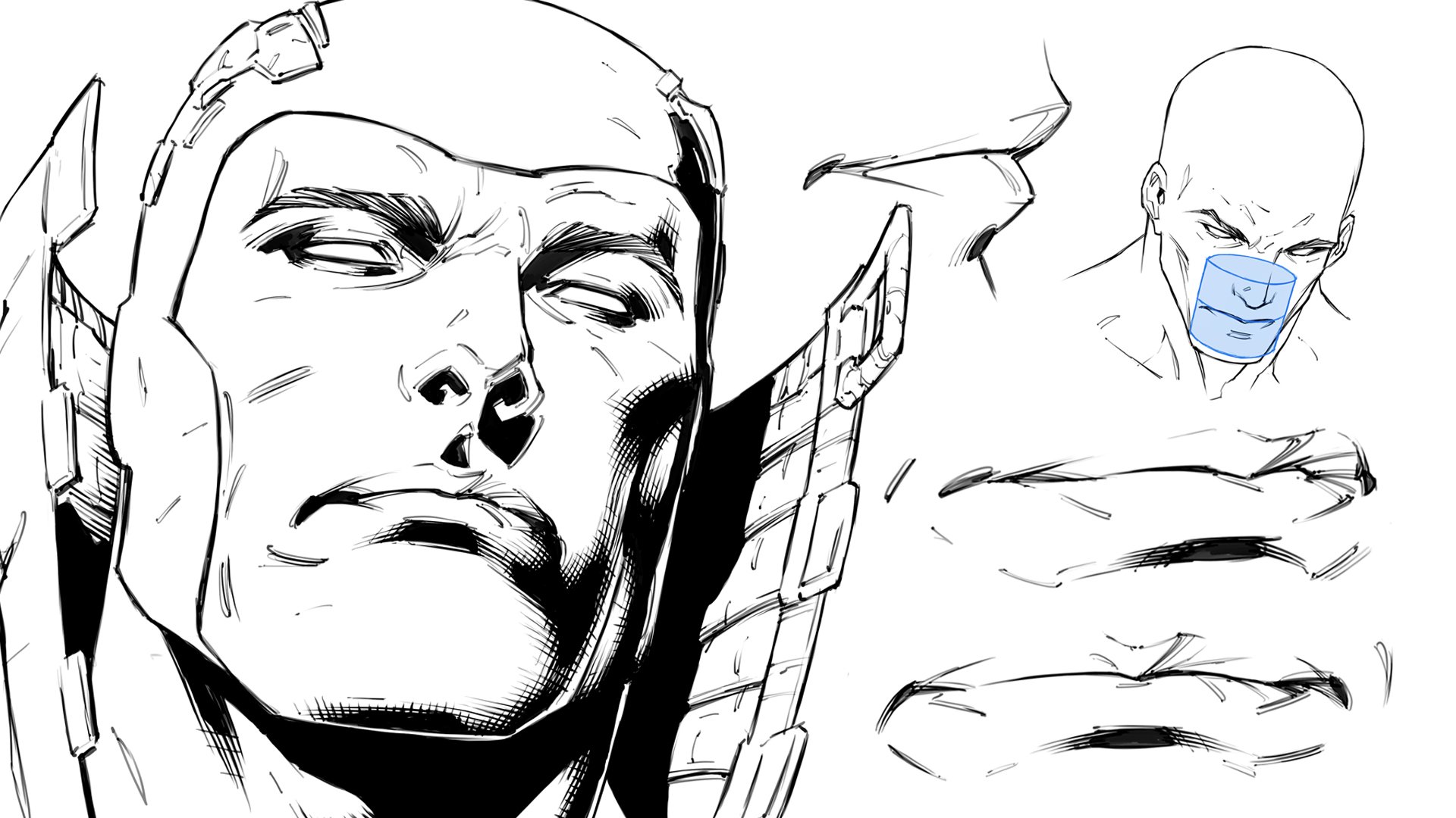
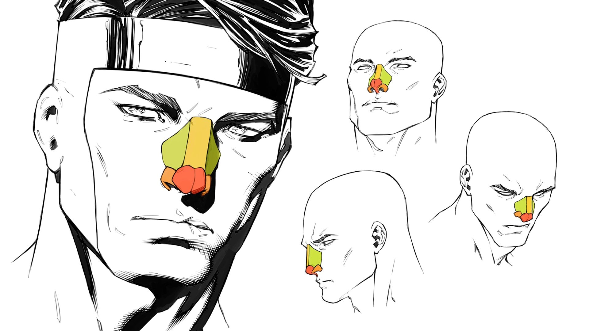
eyebrows roughly sketched in, I can then draw out his nose. And I think that his
nose is going to be it's going to be a
long curvy knows. Something like this. I like those monkeys
with the big red noses. I'll take the nostrils up. And here we can widen
the base of the nose. Usually it would sit in-between the eyes and I'd only be the
width of one single eye. But in this case we're
changing things up. And this is to show you that
just because we've learned about the default
proportions of the head, the idealized
measurements doesn't mean that we can't bend the rules a little
bit in order to get some uniqueness
within our characters. Those unique attributes make the character much
more memorable too. Make them much
more recognizable. Now if you want to capture a, if you want to
capture consistency within your character from
one panel to the next, the thing to remember is
that you've got to make the changes you've made in one view to every
other single view that you're going to
have all of them. So in other words, if I'm
drawing this guy from the side, then I need to remember
that his nose comes down to the point at which
it lands on his face. In order to capture
the same length, I've got to remember the
shape of the jaw and how to represent that from
the side view. Okay, so try to
keep that in mind. All of those different changes, the ways in which
we're pushing outside the boundaries established by
the idealized proportions. We need to apply those same
shifts to the proportions of the head that
we're drawing in all views in order to capture
the consistency within it. As for his mouth, what I'm gonna do is
give him a small mouth. So I'm creating contrast
within the features here. He's got a big nose. I'm gonna give him a small face, I mean, sorry, a small mouth. And I'll give him a little lip. So his mouth isn't really taken up too much
space on his face. And you can see a
pattern happening. Big eyebrows, little lies, big nose, mouth, and chin. That contrast
really is what will capture the attention
of your audience. We can suggest some anatomy
here within his face. Now I have to also ask myself, Is he going to be a
gone to character or is he going to be
a character with a little bit more with a face that's more
filled, filled out. I think what I'll do is give
him more of a gaunt face. The shape that I've
established for it kinda calls for it anyway. I'm gonna go ahead and we
learned about the mouth muscles so we can hint toward that. I'll go up here during the
cheekbone a little bit. Can't wait to see
your faces by the, by the way, I think that'll
be really interesting. Then we'll draw out the
cheekbone on the other side. So the other thing I need to ask myself is easy going to have alert cheekbones or is he
going to have high cheekbones? I think every character
that we draw up here, we'll try to mix it
up a little bit. This character has
fairly low cheekbones. On the next one we'll
draw our character with fairly high cheekbones.
Okay, Wonderful. So we've got a very rough sketch drawn in for our
character's face, but what about the kind of hair that we want to give them? Now here's how we go
about blocking out here. So what I like to try and do is I'll take large
clumps of hair. Well, let me, let me do
some examples up over here to the side so you can see it a little
bit more clearly. So what I'll typically do
say that this is the head of my character here.
That's the hairline. What I'll do is I'll take
larger clumps of hair and just loosely sketch out a bit of a hairstyle that I
might want them to have. And as I do, I'm thinking of these larger clumps is
essentially ribbons of hair, a k that overlap one another. And you can slowly but surely capture the shape that
you're looking for or the style that you want to create the characters
hairdo by doing so, by approaching it in this way. Now once you've drawn out the general shape of the hair
with these larger clumps. You're essentially
combing the style of the hair out with
these larger portions, is you can start
to split them up. And head doesn't need to get complicated for comic book out. It really does not start that. Rule them out like this. And as I lay in, these additional contours are just separating
the larger clumps. You'll notice that they
follow the same flow. And what I want to try to avoid is anything that
looks too uniform. And in order to do that, I simply make sure that these
divisions are making into the larger portions of hair sitting at different
distances to one another. So I have some that are
sitting close together, some that are sitting
further apart. Slowly, but surely we
can start to describe the texture of the hairstyle that we've decided to go with. You can have lots of
different hairstyles. Of course. You could have. Think about enemy,
for example, right? How often do you see
an animate character that is insanely recognizable
for no other reason, but their hairstyle, hairstyle is can be
quite incredible. You might have a head
down here, for example. And hairstyle might look a
little bit like this, right? That's the general
shape of the hairstyle. Might have another one that has a hairstyle that looks a little bit more like this, right? Practice trying to come up with different hairstyle shapes. Now the one where air is just flowing down
by the shoulders, could be a rock star,
could be a lady. Now the character where
we've got long hair, but it's a little
bit more messy. And this one's definitely
going to be a rock star. And again, once you've got those general
shapes established, becomes very easy to start
breaking it up and laying in. Well, in this case, we're
going to be actually laying in the larger clumps to the
overall hairstyle first. And then simply breaking it up. As we describe the texture
of the hair itself. And really you don't have to get much more
complicated than that. Yes, some people
render out the hair of their characters and
that's totally fine. You can certainly do that. But it's not a
complete necessity. What I'll do is I'll knock out a general shape for
his hair first. This may be the general shape of this hair is going to
have quite a lot of width. It's going to be coming
out at the sides there. And it's a bit messy. I'm breaking it up a little. You can have
symmetrical hairstyles. You can have
asymmetrical hairstyles. Again, it depends on the
character that you're drawing. Your characters hairstyle
is really messy. Well, that's probably
not necessarily going to suit someone who is supposed
to be a clean cut businessman as an example. And the thing is, is that if you don't
make sure that you're lining everything up so
that it makes sense. Well, you carry,
your audience will have a disconnect
with your character. They going to feel that
something is off about them, that things don't quite
make sense for some reason. I'm trying to do here is capture a little
bit of symmetry. It looks almost like the
mad hat or a little bit. Symmetry is quite important. Sometimes it's
difficult to nail. Every artist suffers
from that problem. In fact, you probably
heard before that many monger artist will try to discourage them mangas from being flipped
around when it comes to being printed over in the
Western world because they don't want their
work to be mirrored. And the reason for
that is because once you mirror or an artwork, all of the symmetrical
inconsistencies become quite apparent. So if you want to find a
symmetry within your own work, then what you can do is hold
it up in front of a mirror. And if you're working digitally, just flip the canvas horizontally
and you'll see quite quickly where the mistakes reside within your work that are causing it to look asymmetrical, but also just general
floors as well. Okay. So we've got his hair
drawn out there. Now let's go ahead and start to refine what we have here on the page with a darker outline. Now you'll notice
that I started out by drawing this in very, very lightly, this basic
foundational sketch that I whipped up here. And there's a reason for that. It's because it makes
it very easy to erase. And also, once I start going over the top of it
with darker lines, the lighter lines
somewhat just fall back into the backdrop and
then not as noticeable. So I'm going to go over exactly
what I've laid down here. Refining finished contours,
making them sharper, adding some line
weights onto them. Now, the other thing
about this character is that he looks like
an older gentlemen. Why is this that? What have we included in here that causes
him to appear this way as opposed to a
much younger character. You know, someone who
might be in their 20s now he might very well
be in his twenties. He doesn't look that way. And the reason is because while
the larger noise for one, what happens as we get
older, especially to men? Well, our noses get much longer. They get bigger, and
so does their ears. Now this guy doesn't
have very big ears, but I can tell you if we were
to give him bigger ears, he'd probably look even older. I'm doing some cleaning up, erasing a little bit
around the nose here. I'm going to describe
the nostrils that in just a little hint of detail to describe some of the key forms of anatomy
within his nose. Once I've done that, I'll jump over to the
opposite side of his nose. And I will refine that nostril. There we go. Now let's
move down to the mouth. Go ahead. Lay in a darker outline
for the opening. Keep it fairly thin in the
middle of the mouth opening, out to the corners. And add a little bit of a, a dash there at the end. Then we'll draw in the
bottom lip a lay in some very subtle lines here to define the bottom lips
outline the same with the top. Although I might just leave
it as is to be honest. We can add some
slight rendering or beyond here around the top lip. That's totally
fine. That'll work. Just to show that it is a different tone than
the rest of the face. Lips tend to be slightly darker. You have darker
skin on your lips. So if we can suggest
that now comic book art and certainly
not a bad thing, contrast is something
that seems to be visually desirable
within comic book card, within any sort of art. So certainly never
be afraid to use it. I'm adding a bit of
rendering onto the lip. There. There we go. He looks like he's
wearing lipstick, so I might just take
some of that atom. Alright, next up,
I'm going to lay some more darker tones
underneath his bottom lip. Is to describe the shape of
the muscle in this area. Sometimes you'll
get a completely black core shadow under here. So it can, it can
get quite dark. And because we've
got a plane that faces are directly away from most lighting conditions that are projecting down onto
the character from above. That's why we see such a
darker tone in that area. Same with underneath the nose. If we wanted to, we could even drop a shadow
which is being projected from the bottom of the nose down onto
the rest of the face. I think we'll just leave
that out for now though, since that's the focus of
today's demonstration. Now what I'm going
to do is start to make his jaw line
look more defined. Going over the top of that
lightly drawn sketch, the shape that I
laid down for it earlier and essentially
cementing it. And I'm just going over
the top of my line, making it thicker and darker to the desired degree
that I'm looking for. In order to capture the line quality that I think will work best for
the finished illustration. Okay, so you can see the very interesting
shapes we've got going on here around
his chin as well. I'll do the same thing on the
opposite side of his face. Pressing down hard, I'm
going back over the top of these lines many
times as I need to, in order to darken them up. And making sure that
the shape that they ultimately describe is
one that is strong. One that's a vivid, that's very, very important
shape is everything. In fact, the silhouette really does play a huge part
of your characters. So this guy has very
strong silhouette, thanks to his hairstyle, thanks to the shape of his face. Silhouette is just
the outline of the shape of each part
of your character. And even if you have no
details within your artwork, know Fancy Pants, shading
or anything like that. That shape is going
to come through and create the level of appeasement that you're looking for
with from your audience. I'm trying to describe some of the anatomy around
this area of his face. And I will add in some
very light rendering. Okay, So this is, this is more of a style that
you'd expect to see from. As an example, Maybe Jay Scott Campbell
or Michael Turner. And they typically didn't use
a whole lot of rendering. They would create areas
like this Yesterday. Smaller pockets, smaller
indentations within the anatomy. But really didn't go ahead and use a whole lot
of cross hatching or shadows or
anything like that? Sometimes they did, yes. But it wasn't a common look there you'd expect
their artwork to have. So what I tend to do is
I double up my lines. You can see that I've
just done it right here around his jaw. You can do the same
thing as well. And what it does is it
just gives your single contours some more depth than they would have had if they were just sitting on their own. Okay, great. And you can
see that I'm also adding in line weights around
the outer cheek there. Some thickening up the
lines in these areas. And really line weights. If I just do two
lines like this, for example, they're usually going to thicken up around
the middle, like so. And also around where they meet. There as an example, if you have some muscles, say that this is the outer
contour of a very muscly arm. You're going to have a nice thick outline
around the bulge. Here. It can up the outline of this muscle as it
overlaps the other. And it's basically just a
way of adding more interests to what would have otherwise been a very boring looking line. It's all about creating a
captivating experience, your audience in the end, that's why we go to the trouble of adding in all
of these effects. But really the most
important part of the entire thing is that foundational loose
sketch that we laid in to begin with because
you wouldn't be able to add the icing on the
cake if there was no cake. Okay, cool. So I'm getting,
getting my eraser and doing some clean up. And we can add a little bit of rendering around the chin here. Just at the base. You
can see how very thin that is a subtle the
rendering can be. And it doesn't need to get
any more hardcore than that. Hey, again, some more rendering
around the mouth muzzle. I'm keeping it very
light, very subtle, just enough to describe
the forms in that area. We've got some definition within his cheek bones on
this side of the face. So we can suggest them with
some more subtle lines. I do in fact is just
erase some of that. Okay. Then down here around
the side of the mouth, we'll also add a very
subtle suggestions of form. Could even be a single
line and that ado. The very different style. Sometimes what I would do on an, on the comic book I'm
working on right now, which is more dark fantasy. And with Doug fantasy comes a lot of really
thick dark shadows and lots and lots
of rendering as well. So here's the thing. The style you go for, the finish on your artwork
that you decide to pick is going to lend toward the genre of comic book that you're doing. I think that this style would really suit a sci-fi comic book, for example, because
it's extremely clean. Maybe if it's more of
a dystopian sci-fi, you could add the shadows in
there like a sci-fi Noah. But again, every
genre or is going to have its own look
in its own feel. So depending on the genre you've decided to go
with for your story, you're going to
want to represent your characters within it in the right way so that it makes sense
within that genre. Going to erase underlying head
here that we've added in. The side planes will get rid of this guy's face is really starting to
come together. Now. Let's tackle his eyes. So it will lay in a
more defined line, will lay in a more defined
contour around the term. Darken them up ever so slightly, hinting at his eyelashes again, it's good to add
a thicker outline around the eyes just to
draw attention to them. The eyes are the windows
into the soul, as they say. So. The first place that people are really
going to try to hone in on why it's important to be
able to draw her eyes well, because they end up being the first impression
of the entire face, people are going
to see them first. Everything else will be
judged against them. So you get good at drawing eyes. In other words, just going back to style what I'd
suggest you do if you're trying to develop your own
one that's memorable is yes, take into account
what I've said about ensuring that they are congruent with the genre
you're working in. But also on top of it. Fine styles that you like that other artists
have come up with. And if you feel like you'd enjoy drawing in
that sort of style, come up with a version, that style that is
uniquely yours. You can always be inspired
and influenced by things. You don't want to copy the
style exactly necessarily. But you can certainly
derive yours from it. Put multiple styles into a big blender and see what
comes out the other side. I think every single artist who has ever drawn has
done that before. Going ahead and placing in some eyebrow texture now and
you'll notice that it's, it's not unlike
drawing in the hair, breaking them up
into larger clumps, adding in some smaller
indications of hair, and trying to get something
that looks fairly textured, something that looks like
it's actually made of hair. And again, one of the keys
to being able to pull that off effectively is ensuring that you're
able to go ahead and space those individual contours out in an organic looking way, meaning that they're
not uniform, meaning that they're not
evenly spaced apart. There's somewhat
random, randomized. There we go. We've got his
eyebrows are drawn in. I'm just going around
the outside of them to further define their shape. And I'll do the same thing
on the opposite side here. First, finding the shape of
his eye, getting that sorted. And then I'll jump back
up to the eyebrow. And you'll see that I didn't necessarily start with the eyes. Sometimes I do and
sometimes I don't. But the moral of the story
is that you can really, you can tackle this
from any angle U1. There's a million ways
to skin a cat right? Now what they say, Oh,
there's more than one way. Same thing with your drawing. You can really approach
it would in whatever fashion feels best for you. Again, on this side, we'll
do the exact same thing with laying in those eyebrow,
eyebrow strands. Drawn out. The speed
at which you work, as long as you're able
to capture a nice, neat looking
presentation by the end. Work at whatever speed you like. I will say though, that if you work slower, it can cause you to overthink
things a little bit. And ideally, the place
you want to be in is working at a speed that's slightly faster
than you can think. That your natural intuitive, artistic self can kick in
and take over the situation. Because otherwise
you can really. Self-monitor a lot. And when you're self-monitoring, you're increasing your
level of anxiety. You're taking
attention away from the creation itself and you're judging the artwork before
it's even really done. So, rather than being so
invested in the outcome, try to sink into the process
as much as you possibly can. I'm a part of it and
enjoy the important. Alright, so before we
move on to the hair, what I'm going to do is just start to lay in
some additional details. You can see I haven't even
added in any wrinkles, but he's still looks like a fairly mature
looking gentlemen. I'm going to add in
some details around the eyes describing some of the forms and the
anatomy that you'd see around this area. Adding in some slight rendering. Those render lines, you'll
notice a very thin, they're very, very
elegant looking. They're not defined, but they're not taking
too much attention away from the main outlines
that I've drawn down there because there's simply
not as thick and dark. So make sure that your render
lines and never thicker and darker and never take away more attention than the
outline itself. Okay. They should be very, very thin. Yes, you can still add line
weight to them for sure, but makes sure that that
line weight does not exceed the thickness of
the line weights around the outer contours. Okay, and now what we'll do
is add in his iris and pupil. Now the positioning of the iris and pupil
is pretty important. You don't want to. The top
eyelid tends to rest over the top of the pupil and
iris just a little bit. So what you'll find
is that if you add your pupil right in
the middle of the eye, they look really surprised
or scared or freaked out. So if you want them
to look more relaxed, then move the iris and
pupil up a little bit. We can add a tiny bit more
rendering and around here to describe the area where the form and the form
of the eye socket and the nose somewhat merged
together into one surface. Something like that.
Maybe. There we have it. His face is pretty much
done at this point. You could call that
a finished artwork. Seriously. You could
frame it hanging on your wall and show it off to
your friends, your family. Say, Hey, here's what I learned in heads and faces workshop. I'm adding in some brown
lines up the top here. Again because he is somewhat of an older
looking character. Check this out,
right, I'm laying in the main outline and
then I might place in a slight render line that runs
against that main outline. I could do the same thing. This one as well. Again, just keeping it subtle so that's too much, so I'm
gonna get rid of it. And I can continue these
lines up and around the brow, up and around the forehead. You can see that they really
do add some character. The head that we're
drawing up here. The same thing on
the opposite side. Okay, cool. So I forgot to add in old around his bottom eyelid
on this side of the head. So I'll do that now. Again, just these little
lines to suggest form. That's all you really need. Next up, we will tackle
their hair finally. Now, here can be, it can be very long and
tedious in terms of the amount of time that it takes or
it can be fairly quick. One good thing that I'll
say about here though, is that it's something that doesn't lead to
look any particular way. All I would say is that comb. So as I draw out these lines,
check this out, right? As I draw out that line. I'm almost imagining
myself as combing the hair in the direction
that I want it to flow in. So what I'd say is think about
it in that way yourself. Again, we've got the main
clumps of hair defined. Now it's just a matter
of breaking them up. We'll do the same
thing over here. Again. I'm just pulling out the hair, combing it in the direction. I want it to flow in. And I'm trying to
keep these lines as smooth and as
free-flowing as possible. Again, here is a very
organic element that we add to the head and
biogenic amine that it, it, it follows its own path. It, it never looks any one way. All the time. It's always blowing in the wind. It's getting messy,
it's getting combed, it's getting neat and tidy. It's getting styled
in different ways. It's malleable. So there's fairly little pressure put on one's self when it comes to
actually drawing it out. People aren't going
to not going to necessarily be
analytical about it. Now of course, there's
some characters that have a very recognizable and uniquely
established hair lines, such as beaucoup from
Dragon Ball Z, for example. And think about those hairstyles is that you do have
to get them right. Because if you don't, people will say, hey, that's
not going to use here. Or whatever character
you've come up with. I'll say that's not
your character's hair. But even then, those characters are going to find themselves in situations where the
elements are at play. And at, if they're in the
middle of a hurricane, you can bet that
the hair is going to be blowing
around in the wind. Otherwise, it'll look like
it's made of some kind of a nice solid plastic or
something and there's no hair gel and the world that
can withstand hurricanes. So just keep that in mind. I'm slowly but
surely making my way around this
characters hairstyle. Breaking it up, bring it
out, clumped by clump. And I challenge you to
come up with lots of different hairstyles,
practice those hairstyles. Try to create something
which is going to with stand the test of time. But most importantly,
have fun with it as well. When you have fun drawing, that's when you get
the most creative. That's when you're
going to find that. Come up with the best ideas. Which is kind of annoying because you would
think that you'd get your best ideas when you actually tried to come
up with your best ideas. And you put effort into coming
up with your best ideas. But the most annoying
thing in the world is that these things happen when
you're not trying at all. So that's just the
nature of creativity. It likes to be free. So don't put pressure on it. Enjoy the process, Have fun, and let the chips
fall where they may. Now that's different
from practice when you're practicing. For example, the
basic structure of the human head. That's
a different deal. Or the anatomy of
the human body. You're trying to accomplish
something very specific. They are, there's not a
whole lot of creativity that actually needs to go into it. So yes, be very, very conscious of what you're
doing in that instance. What we're doing here today
is actually quite creative. There's some structure
involved with it for sure, but you are able to, to really push outside
the boundaries of the established set of rules and just look at
3. Brush Size & Pressure: So one piece of advice
I'd give you guys is to use a very
small pen or pencil. If you're working digitally, I'm referring to your
brush size there. If you're working traditionally, I'm talking about
you're making sure that you keep your pencil
or pen sharp. And so no matter what distance
you're working at from the canvas and what
whatever your DPI is, whatever resolution you're
using for your canvas. What I always try to do is
make sure that my brush size, if I can see it here, right, this is how big. I don't want to draw this big. Of course, that's not gonna
be a good thing, right? That's going to be too large. I don't want it to be that big. And so what I'm gonna do is
I'm going to shrink it down. And I don't want it to
be this big either. So I'm going to shrink
it down even more. And what I wanna do
is make it so small, is small as I can get it until those crosshairs
appear on the screen. Now I'm working in Clip Studio. I don't know if the
same thing happens. If you're working in some
other drawing application, but until it gets to the crosshairs and then I'm
just going to take it up one. That's the ideal size
that I want it to be at k. Now as soon as
I zoom in or out, that's going to change. So I'll just take
it back down to, again, size, as small as it can possibly get until the crosshairs appear. And then I'll turn it up one. So it ends up being
basically a pinpoint. And so that's what I'd recommend for your
own brush sizes. And the other thing is that you want to keep it nice and light. So you don't want to
be drawing like this. You're gonna be
keeping it nice and light and you can see just how much smoother the
lines become lighter. I press.
4. Female Hair Bun Head: So next up, we are
going to draw out a female head and we'll have her facing in the
opposite direction. We're going to start
this out just as we started it out before
with a sphere. And I'm telling you really it's the head foundations
that are going to give you the best success
of your drawing because they establish everything
right in the beginning. That later on you can practice the facial features
individually, of course, master each
of them. That's great. I think the order
at which you learn these things and
conquer them is really important because if
you learn how to get really good at drawing
facial features before you've really got a handle on the
foundations of the head. Well, unfortunately, you're going to be able to draw facial features really well, but you won't be
able to place them onto a head that
is foundationally sound and so not going to lead to a very
good-looking head. Started out with
the sphere here. And you can see
that no matter what modifications we are going to make to our head in order to
make it look more unique. I'm still going to make
sure that I divide the sphere up into quarters. Once I've done
that, kind of chop off the sides just as before. Now, remember that you
can chop off more or less of the sides in order to get a different shaped head. So say for example, that here I wanted to get
ahead that was a little wider. Now in order to make
it symmetrical, you still probably
going to want to have the same amount of distance on either side of the head here. So I'm looking at how much
space I've got over here. I'm taking into consideration
for shortening. And so it is gonna be about
that much space on this side. I'm looking at the
width of the face in general order to once
again figure out how much of the side plane I'm going to establish whether or not you have a wide or
thin looking head. It actually really
doesn't come down to how much he cut off the
sides because that's always it's always going to
be cut off to a point where you're going to have an
even amount of space on either side of the face so that you can
maintain its symmetry. So what determines how
wide or narrow a head is? In the end is how far
down you bring it. So here we're going to do the stock opposite
of what we did on the initial head example
that we completed. And we're going to, let's end our head at
about here, right? Actually, that will
probably be a little bit, That's ridiculously small. Attended about here. Alright, so it's gonna be
a nice heart-shaped head rather than a sharp jaw line. What we can have is a little
bit more of a rounded one. I'm tweaking the jaw line, I'm messing around with it and so on each of these examples, you'll be able to see how the head can be modified
in different ways. And I'll make her chin point. He's still it's just that her jaw line is going
to be somewhat rounded. Now, this actually
looks like a little bit more of a younger person's head. Isn't it funny how we've got
these visual associations, even to General
different head shapes. That longer head
is going to make for a more mature look
in your character. The smaller face
that's more rounded, that's going to give you an appearance of
a younger person, although that doesn't
mean that you can't apply it to
an older person. It's just very interesting
observation, of course. Now the nose, we will do
a little note up here. Okay, so it's gonna
be fairly short, so we'll take it up to the top and you can place
it anywhere, right? You don't even have to
keep it the same as me, if you like, of course,
but experiment. Again. Have fun with this. And we can make the
mouth really low. So now in this example, what we have is the nose and the mouth being quite
a large distance apart. In fact. In fact, let's raise the nose even more. There we go. So now that
we've raised the nose, we can figure out where
the eyes are going to be. And we'll put the
eyes down here. So there's gonna be a kind of a weird looking character, right? Maybe it is an alien in
humans skin, hair nails. And as for the ears, well, we can make them large. Right? The hairline, we'll we'll make that
a straight hairline, that one that runs
right across the top. And we go then we can
draw in the neck. Since we are drawing a
female character here, I'll keep that fairly
thin and fairly sleek. Like this. There we have it. I'll reposition the head so that it lines up with the
previous head that we drew. And I'll even enlarge
it a little bit. Okay, great. Now let's go
ahead and start sketching in the facial features,
really roughly. I'm going to give her some nice big eyes this time around, but they're going to be
kind of evil looking, okay, so they're not going
to be sad like the previous character, that
they're going to be evil. So I'm messing around with
the shape of the face, and I'm also messing around with the shape of the facial
features themselves. So nice, round but
evil looking at is that a set fairly
far apart actually? As for the nose, well, in see here that it's
been taken up a fair way. And I'm going to have
it pointed upward, unlike our previous example where the noise was
pointed downward. Okay, there we go. We've drawn in her nose
there, again very loosely. Talked about different
nose shapes before. You never really changing the anatomy that is placed down. You're always going to
have the same anatomy. It's just that, that anatomy is represented in very
different ways. You're always going to
have the bulb of the nose. But that bulb of the nose
can be placed down at any scale and any shape really same with the
bridge of the nose, same with the nostrils. See that this lovely lady
has a very small nose. As for her mouth. Well, this dude's amounts
was fairly small, so I'm gonna make
hers quite big. Okay, Now again, this is going to be weird
looking character because it greatly
vary, greatly. Runs outside the boundaries of the idealized
proportions of the head. Alright, so there
we go. Run that in. Now as for her eyebrows, well, what we'll do is again, we'll make them the opposite of the one that we drew before. We'll make them nice and
thin and raise them up. So that all the way up here now, again, kind of
ridiculous, but it works. You know, stylization
can be extremely fun. Cheekbones. We can bring them
out a little bit. Something like this. That might be a little
bit too much actually, since we are drawing
a female character, usually what we want to try to achieve is a softer appearance. I'm going to try to keep her cheeks and her face in
general, fairly soft looking. There we go, That's
a bit better. Alright, and then finally, we can start drawing
out some hair. And I think this
example will call for more of a maybe a bun
at the back of her hair. Yeah. That'll allow us to
draw in a ribbon. Show you how I would
go about that. And not to mention drawing a hair bundle is quite
interesting as well. Ears. I'm going to draw in some nice big earrings so that we can take a
look at some accessories. And I might also even icon the makeup with this
character as well. Some nice giant earrings. They're a great butt on
this side of the head. We might actually see that these earrings poking out
on the other side as well. There we go. And I'll draw in the top
of her eyelids as well. You can see it's very light. Okay. There's certainly nothing that
has been defined just yet. This is the stage you want
to get it to before you start laying in those
final outlines. Once we've done that, we can go ahead and start to
define the facial features. Let's do those first. I am going to start
with the eyes. This time. I'm
going to give this lovely lady some beautiful
thick eyelashes. So we'll define the outline of the eyes opening first
before we do that, however, what I'm focused on at this point is just
capturing the shape of the eye. Making sure that that
looks good and vivid. Than what I'll do is I'll pull out those nice
big eyelashes. And remember, the best
way to do that is to go ahead and just draw out
their general shape first. Never want to pull out
individual eyelash strands. You can see the
ones that I added, a smaller one there between the side eyelashes and the
top eyelashes. That's fine. Then we've got the
bottom set of eyelashes. So you can see we've got some really done thick
eyelashes happening there. Okay, great. I can define
their outline further. It really making sure that the shape of the eyelashes
is defined, nice, undefined. Where I go ahead and
start filling them in. That's what I'll do now, is start to just lay in a bit
of a black tone in there. There we go. I'm just filling those in with
black and you can see as well like straight away. How much attention is drawn to them as soon as you fill
in those eyelashes with black really does highlight
the eye and amplify the vividness that will
fill in the side eyelashes. And we'll fill in the bottom
set of eyelashes as well. If you're looking for ideas as to how to get creative
with your head. Besides just, again, being
curious enough to mess around with the shape and
the positioning of the proportions and
the measurements and all that other good stuff. Jump online, jump
onto Pinterest, jump onto Google Images, and find some, search for some interesting
looking people. If you're looking for
ideas of what to search, it could be anything,
it could be genres. Or you could say
that, for example, you do want to do a
fantasy comic or create a fantasy character
concept of some kind. Well, what you can do is you can look up NTC character concept. And there's gonna be a bunch
of other illustrations that artists just like yourself who have come up with ideas
that they've had and you can take some of those ideas and do
something new with them. You could look up
Viking costumes. You look, you could
just look up. You can just watch
a movie and look at the different characters within the movie, your favorite movie. It really depends on what kind of character you're
trying to create, what genre they reside in. Let's go to determine what you research and what you search up. Every designer is going to have their own mood board
full of different references. Okay, so we've got her
eye drawn in there. Let's go ahead and do
the other one now. Nice big eyelashes. And whether or not I'm doing a idealized head or a crazy-looking characterized
head like this one. I pretty much always
execute the same method, the same series of steps. Outline the eye shape. First, I lay in the eyelashes in pretty
much the same way. All of the character
eyelashes that I draw, I pretty much outline and lay in at one thickness
or the other. Lady has very thick eyelashes. So you really get a
good look at how AI. Go about doing that. So just as before, we'll draw out the shape
of the eyelashes first, determining what their
thickness is going to be. A little eyelash.
They're sitting between the top set of eyelashes and the eyelashes around
the side of the eye. And we'll lay in the
bottom set of eyelashes. And what I wanna do to make sure that the face is symmetrical. I want to ensure that the
eyelashes on either side, R&D going to be the
same thickness. Because if they're
not, then well one I will simply look like
it has larger eyelashes than the other and
that may not be the intention that I want
to go for initially. So just keep an eye on that. If you do notice that
your eyelashes on exactly symmetrical go
back just as I have done. And completely redo it. Completely redo it if
you don't have to. But certainly make the
tweaks and the changes that you need to make in
order to get back on track. There had been times
where I've started out. I've started drawing a
head for a character. I've gotten a fairway here and, and just realize that
that head was never going to work and I erase it and
I completely restarted. It breaks my heart a
little bit on the inside, but in the end, that
doesn't matter. What matters is the
finished result and whether or not I managed to communicate my idea in the
way that I imagined it being. It's all about
communication in the end. So think of drawing
as a playground, a testing lab where different ideas are
going to be tried. Some will fail,
some will succeed. And because of that,
you don't want to invest your self-worth into
your artwork too much. It's going to be whatever
it's going to be. The conduit, I guess, between your imagination and
what ends up on the page. And so you've just
got to trust in your own artistic intuition and hope that it all
works out for the best. But if it doesn't,
don't beat yourself up about it too
much, that's okay. Learn what you can from it. That's the gift
that it gives you. That's the gift of
failing gives you. I fail every single day
at different things. Usually to do with my art. I learned something
new because of it. Someone who has become
a great artist, who has succeeded
in their craft is simply somebody who has failed more times
than other people. The trick is to do something
with those mistakes, to take notice of them
when they happen, and to make sure that
they don't go to waste. So I'm going in here. I've got her other
eye drawn out. Looking nice and beautiful. And then what I'll
do is I'll draw in the iris and the pupil. Remember, make sure that you're being conscious of
the amount of space that you're a virus and pupil
are taking up in the I see. I just got rid of it. There. Have another crack at it. That's looking a
little bit better. You can see that I haven't drawn the iris completely round. Actually tried to add
some shape to it there. I'll add in a little reflection
to the iris as well. Now on the other side, I'll do the exact same thing. I want to make sure though
that my iris and pupil or at the same level that want my character to look
or googly eyes wide, open that iris and make
sure that it's coming down to the same level as the one on the opposite
side of the face. Again, just being
very observant. Want to be keeping
these things in check, things like symmetry
as you work. Once we've done that, we can
move on to the eyebrows. Just as before by going to define the shape of
the eyebrow first. And you can see even
though we're drawing a very different
character here in comparison to first
character we drew up. That we're still taking the same approach
as we did before, but still outlining the
eyebrows for example. And we're going to lay in the eyebrow texture
just as we did before. And so what this means is that
regardless of your style, you can still use
the same method. And it's going to
work out for you. These are very
different characters to the ones that I
would regularly draw. More idealized characters
that I would regularly draw. So I want to get
this eyebrow right as well on the opposite
side of her head. What I'm gonna do
is bring the bridge of her nose up a little
bit so I can see where that eyebrow ends
and where it begins. Then I'll have
another crack at it. So you can see some
things I'm tweaking here. I'm not getting it
right the first time. Try to analyze your work with
a bit of a skeptical eye. Especially at first. Try to look out for mistakes
and be conscious of them. What you'll notice is that as I lay in the eyebrow and
the far side of the head, I actually tried to hook the underside of the Brout
into toward the eye. So you can see that
flat plane happening. It's important to try to
add that in if you can. What I'll do before I move on to anything else is just
adding the eyebrow fors it than to actually look like they're
made of hair and look, maybe in some instances
you wouldn't even need to articulate
the eyebrow hair. Depends on the style you
want to go with. Me. I like it because it gives a certain amount of
texture to the eyebrow. Makes it look like
it's made of here. Rather than just being
drawn on childlike. There we go. Then next up, I'll move on to the nose. Let's do some cleaning up, some got my eraser out here. Get rid of some of these
construction lines so that they're not
distracting us at all. There we go. This side plane will get rid of. Okay, so that's
all looking good. Wonderful. Now we've got a nice
clean area to work with. Next up, I'm going to define
the outline of the nose. Thickest outline is usually going to be around
the base of the nose, since usually it's going to
be facing away from the lion. The same can be said for
the opening of the nostril. And in fact, a lot of shadow
that's going to collect in this area and so usually
give it a darker outline. Once you've drawn the
nostrils in there, you can go ahead and placing a little indentation
where the nostrils meets the bulb of the nose to describe the forms a
little bit in that area. I'll add a slight amount of
rendering up here just to describe the top of the nose bridge where
it joins onto the brow. And then actually let me get rid of this part of the
nose for a moment. Redraw that in. Just a little too
messy for my liking. There we go, that's
looking a bit better. Wonderful. So next up, I'm going
to draw in the mouth. Okay, Now as before, we're going to see that angle of the mouth become more apparent
dangling away from us. So I want to try to describe that with the form of the
lips as I draw them in. And you can see that on
the far side of the mouth, It's smaller, there's less room. And the side of the mouth
that's closest to us. Why? Because it's
simply further away. That's how perspective works. That which is further away. It gets smaller. As it recedes. Things which are closer
get larger, they scale up. See, I'm adding
in my line weight to the corners of the mouth, in the middle of the mouth here. Then we have her lips. For this character, I am going
to add in some lipstick. And I'll show you exactly
how I go about it once I define the outline of
her lips a little more. Now, for a lady character, you can most certainly
outline the lips and define them much more than you would
on a male character. Because it's going to work like the way in which lipstick
was intended to work. It's going to add more
contrast to the face. Draw more attention to
the mouth in the same way that eyelashes draw more
attention to the eyes. Okay, cool. So now that we've got
her lips drawn in place, CAN a reflection to give them
a little bit of shininess. I'll do that on both the
top lip and the bottom lip. Now what I do in order to imply lipstick is I simply start
rendering these areas out. And I'll go around
the top first. And usually the top
lip is going to have a little bit more rendering than the bottom lip is going
to have a darker tone. I'm changing up the rendering
along the top lip as well to describe the form that
we're dealing with there. Actually, you know what,
I'm going to undo that. I didn't quite like the
rendering and how it's looking. A little bit too uniform. So what I'll do is
maybe try this instead. Nope, that's still not looking the way that I want it to look. Maybe I'll go in the
opposite direction here. As you can see, you know, I make mistakes and changes as well. I see things that I
want to readjust. That's just part of the process. Especially with rendering. I find that I make a lot
of changes along the way. I don't always get it right. And what I'm looking for is a nice amount of
energy to it as well. A nice amount of movement. Alright, let's do the same
thing with the bottom lip. You can see that I'm painting these render lines out somewhat. To describe the form
of the bottom lip. Describe its surface. And what I'll probably
do is just go straight over the top of those
reflections here. To begin with. And once I've
drawn in the rendering, I'll simply erase
it in those areas. It is handy to have an
undo button, of course, and by all means, take full advantage
of the Undo button. Some people against it, some people for it. I personally, all I care about in the end is the final presentation
and how that looks. If it looks good in the end. And I did whatever I
needed to do to get there. That's all I care about. Okay, there we go. You can see I've
got a nice gradient happening there now
around the lips. And that their gradient gets darker towards the
opening of the mouth. As it spreads out toward the
middle. Tone gets lighter. Alright? So we'll add in some rendering around
the top of the eye now. Because in this area you'd see a little bit more darkness, a little bit more definition. But I'm also not going to add that much rendering
either because. Remember that we're drawing
a female head here. And it can very quickly
end up just being too much on a female head when you start to lay
down that hatching. Okay, so let's define the outer
contour of her face. Now. We want this to be strong, but not in the sense that
it ends up being masculine. We still want to
have a nice feminine look to the character. But what I mean is that we want a strong outline that's
nice and vivid, undefined. Hey, we've got her joy here. You'll see that there
is some sharp corners. And I'm adding in,
but there's subtle. And I'm doing that once more to make the shape that I'm
drawing more vivid. Because of it's completely routed and it's completely soft. And especially if there's no line weights that
are added to it. That's when you're going
to run into problems. That's when it's just
going to look boring and make you'd ever want
to meet outline. You always want it to look like it's done to look polished. And this is how you do it. So it's a mixture of, it's a mixture of curved
outline and corners. So you look at the
cheek, for example. We've got a curved outline, which is slightly curved. Then we've got another
curved outline, but these two meet
at a sharp corner. And we've got another
curved outline, again sharp corner here. And we've got another
code outline around the chin, sharp corner here. So again, mixture of
sharp corners and curved edges is
what will lead to a nice solid looking
outline for your character. And then we've got her forehead. We will draw in here as well. And just as before, just as with the
rest of her face, I'm going to go ahead and try to capture a nice vivid
outline for it. Okay, Wonderful. That's her face done
for the most part. Now it's time to well, let's move on to the ears
because that's really the final part of her face
that we are yet to address. Now we gave this lovely lady
much larger looking ears. We'll go ahead and make sure that we add in the anatomy that we articulate it nicely. And hopefully you've
practiced your ears. Hopefully you've had
a chance to sit down and draw a few of them out. Adding in the line weights as
I go here. Very important. We are going to add
in the earring. Now we'll just draw the ear
out as if it wasn't there. Do some erasing, get rid of some of those
construction lines just to clean up the
situation a little bit. Then we'll continue on with refining the anatomy of the ear. Nice good outline going for it. So we've got the
Y shaped piece of cartilage runs around
the outside of the ear. Ended encompasses the inner
ear that we see the ear Hall and these other modes of cartilage
being pulled into it. Then we've got the little
separation up the top of the Y shaped piece of cartilage that somewhat dips
in a little bit. There it is. A can add in some rendering
around the ear is to describe the forms that we're
dealing with if you'd like. I usually leave it at that
for this particular style. Now let's go ahead and
move on to the hair. And we'll be going over the exact same process that we did before in the
previous example. And it doesn't matter what
your head you're drawing. It's always going to be
the same old process. And that's what's
great about it, is once you learn that process, you know that it doesn't
matter what you're drawing. You can depend on
it to help you out. Okay, So going to lay in the general clumps of
hair here, combing it back. Just as we did before on
the previous character. And as I comb the hair back, especially here because it's sitting so close to the head. I'm making sure that it follows the spherical
form of the skull. But I also know that
it's being pulled back into the bunch at the back, the back of her head which is held together
with the ribbon. So because it's being
pulled in that direction, I know that as it
follows the sphere, that's where it will
lead all the way back to where it's being pulled. As I said before, here is malleable
and you can pull it. You can comb it whatever
direction you want to Coumadin. The hairline can be really
whatever you want it to be. If you're drawing
a punk character, you can really get inventive
with the hairline. There's a natural hairline
that most people have and that can split off into
other very common hair lines. As I mentioned before, the receding hairline,
curved hairline, the square hair line
that runs straight across the head from
one side of the other, similar to the one
that we've got here for this lady character. Now I'm just going to split
up what I've laid in there. I still want to make it appear neat and maybe to an extent, I don't need to split
it up that much. Here's the thing. What's going to give it more depth as if I start adding in
those thicker lines. And especially up the top
here I'm going to make any divisions I have to add in. I wanna make them sin
because I don't want them to take attention away from
those major clumps. Remember, we don't want
anything to be too uniform. We're really trying to do here is capture the flow of the hair, the direction in
which it's traveling. And it can be very
easy to overdo here. I probably overdone
this lovely ladies hair around the sides especially. But that's okay,
doesn't really matter. I think the same problem. Absorb with rendering
all the time. You end up rendering
the heck out of something and
before you know it, you detailed everything out and it just looks like a mess. So always be wary of
the dangers of that. You don't know when to stop.
That's half the battle. It's like once we
learn a new technique. And I had to do
here, for example, we want to go all out with it. We really want to
put it to the test. And so we overdo it. Alright, so now around
the edge of the hairline, I'm going to start to add in more little strands that
don't quite make it as far. But allow us to add
more contrast around the hairline just to make
it look more defined. Okay, so that's
looking pretty good. I'll do the same thing
over here. Once again. If we were to go ahead and start to lay in some thicker outlines, the made clumps of hair
that would break it up a bit and allow the viewer
to the cipher more easily. What it is they're looking at. Which is why, as I said before, it's important to keep details and rendering quite subtle, quite thin, while the
main outlines like the one I'm doing here around
the general hairstyle. I kept nice and thick and bold, at least in comparison to
those smaller details. Alright, so I'm
going through adding in more of an outline here. Keeping it neat, keeping
those lines nice and energetic, dream lined. All-in-one. I'll trim
the shape of the hair. It bit here. Quite like the way it's bulging
out in some areas. Again, the outer shape, the silhouette of
your character. It really does
matter quite a lot. So split the hair off a
little bit more around here. This area, just to
define the hairline in that section.
There we have it. Let's draw in this ribbon. Now this is going to be a
somewhat stylized Ruben, but in comic book art,
everything is stylized. Degree to which you
stylize it out. Well, that's a stylistic choice. That's completely up to you. Maybe you've got a super
realistic Alex Ross type style. Well, in that case
you might want to get some actual references of
ribbons up on the screen and try to capture
them as closely as possible so that the
realistic drawing you're creating as some resemblance to reality or a closer
resemblance to reality. But now I'm just going off of the symbolic representation. I've stored away inside my
mind of what a ribbon looks like and how it works, how it folds in on itself. I probably should have
actually gone ahead and won some longer ribbons
down the side of your head. But I'm just going to
pretend that they're at the back there. Beautiful. So we've drawn that in and we've got the ribbon as it wraps around her hair
and holds it together. So we'll lay that in. And then we've got the hair bun. And even though it's
the shape of a button, we are going to make it look
as though it's made of hair. In very much the
same way we went about making the rest of the
hair look like it was here. We're going to break it up into larger clumps once we've
defined the outline. And then we're simply going
to add in some subdivisions, splitting it up to
give it texture. Now there's different
degrees of detail that you can add to the hair
of your characters. You don't need to split it up as much as I've
split it up here. In fact, looking at, at, uh, probably split it up
too much, I would say. Alright, so again, remembering the direction in which
the hair is being pulled, the way in which it's
folding in on itself. You could, you can leave
it as that really. Some styles, depending on how
stylistic they really are, they'll tend to do that too. I'll add in only a few
lines and that's all that's needed to indicate that what it is they've
drawn the head barn or hairdo that they've given their character is
indeed made of hair. And see that the more
hair strands are, the more head clumps you divide, the more complex it looks. The more busier box. If you've got a very stylized
look for your artwork, it can ruin that a little bit. But to keep the consistency of the hair that I've
already established intact, am going to add a
few more strands. You more divisions into
these larger clumps. Just really quick. And you can see that I'm using this nice S-shape to capture a lot of the
hairs trajectory. So we call that the
line of beauty in fact. And if you Google it, you'll notice that it's
something that shows up a lot within it for some
reason there's a very statically
pleasing contour, a very aesthetically
pleasing line to behold. And so if you can incorporate
it into your art work, it really does lend to
the lack of ability. The final presentation by
onlookers, by your audience. Okay, so there we go. We've got the hair
been drawn in there. And the only other
thing that we need to Draw around before, of course we had in the neck
is her earrings. So we'll draw those in now. We can see that I'm completely derailing off of
the initial sketch. I laid it in for the earrings. And the reason is because I want to make sure
that they connect to the ear lobe and they simply weren't in the
underlying sketch. So you can deviate from your initial draft as
much as you want to. Sometimes it's their only
to tell you what not to do. Because you realized
later on that, hey, this wasn't going to work. This doesn't look good. Sometimes. I'll just
need to draw something out in order to figure out
that that's not what I want. I can't tell you
how often that is the case because in the beginning you've got
nothing to work with. It could work out. It
might not work out. But you don't
necessarily know what got what approach
you're going to take in order to arrive
at one or the other. So if you can figure
out what not to do, you're already
ahead of the game. In order to figure
out what not to do, sometimes you have to
do the wrong thing. To begin with. You see it
on the page and you go, Oh, okay, ****, that's
not going to work. My guess. What I'm saying is, don't be, again, don't get down. If your artwork doesn't
turn out perfect. The first time you
lay down a line. The decision to lay down a
line as only to make progress. Whether that progress be to move yourself closer
to the ideal outcome, or if it moves you further
away than ideally you want to try to make sure that
you get back on track. So I've tried to get her
earring as well as round as I can possibly get it so
that it's not too lopsided. Do the same thing on the
opposite side of her head here. Sometimes you go
to sketch it out, sometimes you can lay it
in in one fell swoop. Depends on what level of skill. I'm kinda half and half. Sometimes they can lay it
in with a single line. Other times I've just
got to sketch it out really lightly and then go over the top of
it and define it. Like what I'm doing right here. I guess you're getting
a very intimate look at the way in which I work. And hopefully you're seeing that not everything
I do is perfect. We look at the finished
presentation of someone's art and we think that they must be
some kind of wizard. We go, How the ****
did they do that? It looks like magic. But really oftentimes it's just that they fixed the
right mistakes. And they, they, they took their correct steps along the way in order to execute
their process properly. But make no mistake. It does not just end up on the page as a perfect
projection of everything they hoped
and dream it would be every artist can look at their artwork and see
the floors within it, because we're our own
worst critics no matter what level we get to. Now hopefully we we're not so hard on ourselves as we get better and that we can appreciate the finer
things about it as well. Not just the areas that
we dislike about it. Now what we can also do is
we could give this lovely lady some earrings or
some issued call them piercings, some some studs. Would you call them and
we're just going to call them piercings
in her top lip. There we go. And maybe even in her
bottom lip as well. Again, facial accessories,
right there we go. And then we can
draw in her neck. And that'll be the final thing that we draw in for
this character's head. She's done, she's all done. Another interesting, memorable and unique
looking character. What made them unique
and interesting? Well, we deviated somewhat from the idealized proportions that we learned about
in the beginning. But the thing is, is
that if we didn't know what the idealized
proportions were, he might not have
been able to tweak them in the right way
because as I said before, you can still mess up ahead. No matter how wacky
the proportions are. You can still mess it up. Again. Things like symmetry
are going to cause you to not end up with a drawing
that is most optimal. As crazy and unique is
your head may look, It's still going to look
like it could exist. So that's the main thing. Alright, great, so that is second head drawn
up and ready to roll.
5. Orc Head: So now we'll draw
another male character, but this time we'll draw
a bearded male character, maybe a bearded elf
looking character. Just as before, we'll
start out with a sphere. Started out the same
way every single time. Yeah, these heads aren't
really that dynamic, but you could certainly
take this same proportions. Keeps, keep them in mind. Keep the characteristics of
their proportions in mind. Then as you observe
the head from above, you observe it from below. You can always then
go ahead and scale the proportions that
you've established and these higher-level
views accordingly. It's important to
just take note if a character looks like they
have a long looking nose, ensure that you're drawing
them from another perspective. That they also appear to
have a long looking knows. It's really that simple. It's interesting because I get asked that
question all the time. Actually, how do I make characters look the same
from one panel to the next? Now, the really interesting
thing is though, that characters can look completely different when you're drawing them from the side, as opposed to when you're
drawing them from the front. For this character,
I think what we'll do is we'll do another, I think we'll do a relatively idealize
proportioned face actually, since we haven't
necessarily done one yet. But we'll mess around
with the other aspects of his head in unique
and interesting ways. For example, we could give him a really square looking
jaw by pulling it out at the sides and then giving
him a massive chin, are really, really broad chin. You know, he's he's a really, I guess, meet head
you looking dude. We'd go big gels there. And we can go ahead
and start to divide his face up so this
character will put his nose. We'll put it up here
a little bit more. I think so we'll
raise the nose and comparison to the first male
character that we drew. And we'll also raise the mouth to give him an
exceptionally large chin. And has for his eyes will
put them in about here. And I reckon what
will also attempt to do is draw his eyes fairly
close together as well, just to see how that looks. And then as for his
ears will make them dwarf like or, or l flag. Keep things interesting
and maybe we'll give him a bit of
a Mohawk as well. So what I'll do is just very roughly sketch
that in around the top. Again, just to mix things
up a bit and have some fun. And his neck will
be super thick. These characters all look
quite stylized of course, but once again, you render them out and just
shade them realistically, they'll start to look
quite convincing. It's a matter of style. Honestly. I'll do some
erasing around here, get rid of those
construction lines a bit. And there we have it. So
now let's draw in the eyes. And I'm going to draw these
fairly close together. And I'm going to make
them nice and small. And it might make them, rather than being evil
looking or sad looking. I'll just have them drawn
straight across like this. Do the same thing on the
opposite side of the head. And as for his eyebrows, yeah, we'll we'll keep
them nice and large. But I want to keep them sitting quite close to
the top of his eyes. Jordan, the eyebrow
on the opposite side. The side that's closest to us. Focusing on capturing a
nice shape at this point. And I'm trying to work a
little bit quicker here. Now for this knows, what we'll do is I'm going to try to get a
little bit creative with it. I'm going to give him
some nice big nostrils. Maybe something like
this will work well. There we go. So he looks, he looks almost a
bit beastly looking, which is exactly the intention
I'm trying to have for this character has
for his mouth. I'm just going to have
it run straight from one side to the other. And I might give him
some teeth as well. Go, He's like a dwarf or
rather an orc. I would say. My head is in a fantasy
irrelevant the moment. So I'm just spitting out
random fantasy archetypes. But no, we definitely
creating an archaea. Okay, great. We'll give him a little
bit of a goatee as well. I think that'll work quite well. Can have that time
together at the bottom, they're kinda like
a ponytail goatee. And then we'll draw in some
very loose anatomy for his. Here. I'll erase some of the construction
lines within it. It's to neaten things up a bit. Erase that construction
line right in the middle of
his face as well. Rid of that. This side plane k
so neatly it out. We've got a clear idea is to what the main attributes of this character are
going to consist of. And then I will give him
some accentuated cheekbones. And I can even mess around with the shape of his forehead. I can have it pushed
back a little bit more to make him look
kinda boneheaded. I mean, the other thing
we could do is just not give him any
eyebrows at all. I think it'll raise those that it makes him
look even scarier. More like the ORC that
he's supposed to be. Okay, there we go. Now we've got something quite interesting going
on for this guy. I think we're ready to start
to refine what's there. I'll lay in the contour that describes the
shape of his eye. A nice sharp outline. And you could fill up an entire sketchbook just
with heads like this. And I tell you what,
you'd be pretty savvy at drawing heads
by the end of it. I definitely encourage
you to do that. If you're serious about getting
good at drawing people, you've just, you've got to
dedicate that time to it. And you'll notice a difference. You will get so much more
comfortable doing this stuff. And the quality of your work
will certainly increase. There's no doubt about it. I wish it was more complicated and I could tell you something, some kind of crazy, difficult trial you'd have
to go through in order to be able to become the artist you hope
of being one day. But unfortunately, it's no more exciting
than just practicing this stuff over and over again till you reach the level you want
to get to with it. And the funny thing is if you just keep practicing forever, you'll keep getting
better forever and ever. That's kinda the way it works. And really you could
call it getting better, or you could call it
refining your skill set. However you want to look at it. I see it as getting to know
yourself as an artist. Getting to know the
way that you work. Getting to know the
way you work with the tools at your disposal and the things that lie deep
within your imagination. There's no telling what level of potential you could
possibly have in all of those different areas
in the execution of your work in terms of
the subject matters that you end up drawing out onto
the page. That's exciting. It truly is. Okay,
so I'll draw in his mouth and we're in
a nice thick outline. Therefore, it I'm just
going over the top of what I've already
drawn in here with a thicker outline
at darker outline. You can see that that outline is still fairly thin as well. I've got the sharp
corners drawn in there to develop
confidence in anything. It's, it's all about
exposure therapy, right? For example, when I used
to teach in the classroom, I can tell you that
very first day. But I had to step in there in
front of all the students. I was freaking out, man, I'm a massive introvert. And so I was totally
not down with it. In fact, when I was in
high school, every day, we every time we had
an oral presentation, we had to get up in
front of the class and talk about some topic. I'd skip that day. I pretended I was sick, totally fake it so that
I didn't have to go to school and our oral
presentation day. But of course,
somehow I ended up finding myself teaching
in front of entire, entire classroom of
students every single week. And the first time I did it
was really uncomfortable. I was so nervous, very shy. I was always shy even as a kid. And now here I was. I had to be captivating an entire
classroom full of people. And so over time, of course, as I exposed myself
to that situation, I got more and more
comfortable with it. Hi, became better
at dealing with it. I discovered ways in which I could capture the students
interests and attention. Discovered ways of communicating with them that were
more effective. And so the same thing
happened with my drawing. Every new thing that I drew, like if I was, let's see, what do I never draw? I never draw. I've never drawn a moose before. You've never drawn
a realistic moose. And if I was to try and
draw you a moose right now, I would completely
fail very, very badly. And in order to
be able to become an exceptional master
at drawing moose, I would have to draw them a few times over in
order to really get it. Especially to be able to draw them completely from my head. That's coming from someone
who's been drawing for a very long
time, for decades. So you probably get the idea. Now, practice. It's really what it
all comes down to. And you'll get there. That's what's awesome about it. It's quite an amazing ability
that the human species has. So I'm not gonna make the
same mistake as last time. I'm not going to play C
and an over abundance of contouring for the hair
and keep it fairly simple. I feel like I kinda messed up the previous example by going overboard with all
those strands of hair. So I'm just going to
start out by breaking up the general clumps, goatee. And you'll notice that it's quite a similar process
to what we went through. The full heads of hair that we looked at in
the previous examples. So whether it'd be eyebrows, whether it'd be facial hair. You're always going to
take the same approach. You going to define those
general clumps first. And then you'll add in the secondary strands
which will be thinner, subtler, and take
less visual attention from the rest of the artwork. Alright, so again, very easy to go overboard with
adding in these details. Try to be I would say, reserved the amount that
you add into the hair. And you'll notice also here
that I'm thinking about the whole form of
the goatee as I work and that on the
darker side of the goatee. So this side here, I've got more rendering. Well, more detail, you could say now what
does that detail do? Well, the darkens
the general overall tone of this form of this shape. So details can be used
to also describe tone. And the more of a cluster of line work you have
in any one area. More than that tone is
going to be darkened. Well, that area is going
to be darkened up. And you can see how
I've actually describe the form of his goatee here in a much better way than the
way in which I described this lovely ladies hair over
in the previous example. Okay, great. Let's move on here. We'll lay in the
outline for his brow. And these are fairly
clean pencils by the way, he could certainly keep
this a lot rougher and then just ink straight
in over the top of it. And sometimes I
will, usually I do. In fact, if the artwork is
indeed going to be inked. Let's give this a 4k
guys, some eye bags. Just for something different. Really trying to add some variation to all of those heads that we've
done up thus far. We could also add in some folds, really increase the amount
of tension around his nose. Sometimes when you've got an
angry looking characters are the folds in their
skin around the nose. We'll scrunch up a bit. Kinda makes them look like
they're snarling somewhat. We can also add in a fold
of skin around his nose. And you can see that all of these little details we're
adding in around the face, add to his expression. They give life to his face. You think about folds really, what do they say
about a character? Those folds usually have been created by all the
expressions that, that character has been through. All of the, if you are
someone who smiles a lot, smile all the time
every single day, then when you become
an older person, you'll have wrinkles that
reflect all that smiling. You've done
throughout your life. Now if you've found all
the time like I do, then you're going to
have lots of frown lines around your face instead. Okay, there we go. We've added in a
nice outline around his face, shoreline his chin. We can also go ahead and describe the lower edge
of his mouth muzzle. Some very subtle line
work. This area. Like so. Wonderful. And then
we also have his ear. So we'll draw that out. Add some nice shape to it. Actually, I'll undo that. I'll just get rid of some
of these construction lines so that the top edge
of the interior ear, the wire shaped piece of cartilage that's going
to drop down there. But the little e, a whole
covering want to add that in. Then the ear hole
itself is a very, very complex portions of
anatomy that are part of the face as a general shape that you can capture for them. Sometimes the way in
which people draw ears is a very unique to
their own style. So it's good to
keep that in mind. Again, I'll clean up the
year that I've done. They're just getting
rid of some of that underlying sketch
work that I've done. And then I'll tackle
the next year. So I am going from one
year to the other. And because that ear is
facing away from us, so we can only see
a little bit of it. Of course, we're not going
to be able to observe as much of that interior anatomy
as we did on the ear, which is closest to us. I'll add in some subtle
line weights here. Make good use of line weights. Actus them, dial them back and forth to see what kind of
effects you're able to get. Eventually this stuff,
it really does. All click Place in some rendering around his teeth just to give them some form. And by rendering, I just
made a couple of lines that we can add in around the F. And now let's get into the
folds of his forehead. Okay, so we'll just add in some, some detail lines up the top. And we go, Actually it will
take some of those out. And again, a lot of
these folds are created by the muscles around the
eyes and around the brow. We're just describing the
wrinkles that they're creating. Again, assist, It's hence
enhancing his expression. It's giving him more character. It also ages him a little bit. If you've got a character
that you want to have make look older than just add
more lines to their face. That's something
that some people do unintentionally as they age their characters
simply because they just put too many details in. Now if you want a
youthful looking, especially female
character than do not whatsoever, add line work. Like accentuate the
cheekbones or anything like that on her face because it's going to
age her immediately. And the effect of it
will be very apparent very quickly. Okay, cool. So by adding a few more lines
here, outline his brow. Outline the rest
of his forehead. Clean up the construction
lines with the eraser, just take those right out. Redefine that line because
I erased half of it. Whoops, see, that's okay. And I'm just gonna get rid
of some of these lines. Actually, I feel like
this now too much there. So I'm always going
back-and-forth on the decisions I make. You take away my eraser. Probably I would be
in a world of hurt. Actually when it
came to my art work, I wouldn't be able to
fix all my mistakes. There we go. Let's give this dude a little
bit of a different iris. We can give him like snake eyes. Like that. Yeah, that
looks pretty cool. Wonderful. So now finally, we
have his Mohawk that we need to add in and this is going to be very interesting. So what I think I'll do, again, we'll get that
nice S-shape happening. Let's just start trying to construct the
basic shape of it. With the hair strands, general clumps of hair that
I'm pulling into shape. Actually, I don't like the
way that's looking at older. So I'm going to redo it. And we'll just see how it goes. We'll hope for the best here. I don't know how
it's gonna turn out. That can be scary sometimes, but it's totally, you know, he just keep moving forward
and see what happens. Art can be somewhat
unpredictable. Comic book God, especially. Usually you've got a, you've got a reference on hand
for this stuff. But with comic
books, the thing is, is that you've got scenes
that you need to draw, that you're just not
going to be able to find reference for
every single time. But characters, interesting
characters like this one that just not going to be able to
find reference for at times. And so you've got to
create somewhat of a mental model of who
that character is and the places that they're
going to visit within the story order to be able
to draw it effectively. And sometimes that can be, it can be really hard to do. Alright, so that's
his little hairdo. You can see it's a
very stylish 4k. We could add like plants
and stuff into it, but I think that'll
take a little, little too long, so we'll just
leave it as this for now. There we go, do some
erasing around here. Then we will define what
we've laid down here. So give these main clumps a larger outline or a
thicker outline rather. And I'm going to break up those large clumps into
smaller subdivisions. Trying to keep in mind what I managed to accomplish
with his goatee. Again, I don't want
to let want to make this hair too
detailed looking. Otherwise it'll start
to conflict with the less detailed style that I've established for
the rest of the head. So I'm just gonna make my way around his general hairstyle and start to refine it. Breaking up those larger
clumps, as I said, following the flow
of their trajectory, the direction in which
the hair is being pulled. And in this case it's being pulled in an upward direction. As we get toward the darker
side of the hair do well, I'm gonna go ahead and add in a few more render lines
to imply a darker shade. Darker overall tone on
this side of the hairdo. Which will help to
describe the form of the overall shape of it. And it'll help to
describe it accurately. That's what's great about these, this rendering and these
details is that in the end, they describe multiple things. They can describe texture, they can describe materials, and they can also describe
the form as well. Once again, I'm going to
pay special attention to the outline of this
characters hairstyle. And really try to make sure
that before we call it done, we've taken the time
to polish it up. I'm trying to make those
lines as smooth as possible, as polished as I can
possibly get them. A little bit of time and care will allow you to
be able to achieve that. I'm certainly not saying be
overly precious about it. But I do think that you don't
want to rush all your work. You don't want to get it over
and done with straightaway. It's interesting because. I think that even I
have less patients with my artwork these
days funnily enough, due to all the, all the wonderful gifts that
the Internet has given us. Or should I say, distractions. Our attention spans are just in general not what they used to be
across the board. And so it pays to
retrain your mind to sit down for an
extended period of time, work on a piece of art
and not be distracted. Just kinda meditate
with it for awhile. Sometimes that can
be really difficult to do if you are
in the habit of, you know, constantly being stimulated by
interesting things. Because make no mistake. There are some, there's some
aspects of drawing that cause it to be quite boring
and tedious at times. But if that's the case and
you can only sit down for like five minutes
before you need to get up and do something else. Take it one step, one
little bit at a time, and try to extend that focus
time to maybe ten minutes, an extended to 20 minutes, and then extend it to an hour
and extend it to two hours. And slowly but surely you'll build those
focus muscles up again. And you'll be able
to put in the time required to actually
achieve something spectacular because it
does require a level of investment of energy and time that some people either
have or they don't have. You know what I
hear all the time from family and friends that I show my
artwork to they go, Oh wow, that's amazing. But I'd never have the patients
to be able to do that. I get that so often. Maybe you have as well from people who've
looked at your artwork. Okay, so we've got
our arc drawn up. Now let's just place
in his neck and I reckon we can call him done. Quite a handsome looking. Ok, if I say so myself. You can suggest
some of the muscles around his neck as
well if we want. You'll notice I didn't do
that on the female character. Even in real life. If you look at a woman's neck, especially a younger
woman's neck, you won't notice any any muscle being defined on
the surface of the skin. So especially in a
stylized representation of a female character
that isn't as old. You do want to try to make sure you're indicating
the same thing. What will happen if
you start to lay in the details on a female
characters neck, then show simply
start looking older, which is totally fine too. Okay, great. So here's our, our head examples for today. It's been a heck of
a lot of fun too. I mean, it's really
refreshing to be able to draw something which isn't just
another idealized head.
6. Assignment: Thanks for watching. I hope that you enjoyed
the class and that you've got a ton of value out of it. But now it's time to put what
you've learned into action. So for this assignment, what I'd like you to do
is go ahead and recap on everything we've covered
throughout these lessons. And then using the same
method of construction, head shape representation and
facial feature variation, come up with your own
set of unique heads. Once you've completed
the assignment, submit it in the project section of this class for feedback. Good luck, and until
next time, keep drawing.
 Clayton Barton, Harness the Power of Dynamic Drawing