Transcripts
1. Intro: Hello and welcome back
to draw with bulbar and this tutorial we'll be
learning how to sketch, ink and finally, paint
your own Chevy stickers. Follow along to learn today.
2. Sketching: Hello, every illustration
starts with the kid base. So we're going to use the blue color to start
our sketch that you want to go into your
sketching pellet and find a good pencil
to sketch with. So I'm gonna be using
the HB pencil today. Says wherever you're doing
your TV version of Duik GU or can actually start plotting
out the major forms, pretty much the head, body size and stuff. So to start, we're having
to do the head size. We're going to
start with the big, really good big size circle. Right in the center
of the page above. You wanted to leave a little bit of room
on the bottom for the body for the parties,
since it's a Chevy, let's do a little cube body
goalpost like say gum drop. Let's do some legs to seize tubes for the legs and
then for the shoe. Let's just plot them out. With these almost
like shoe boxes. To make it easier.
For perspective, we're just going to draw
these two big shoe boxes. And for the poles, Let's
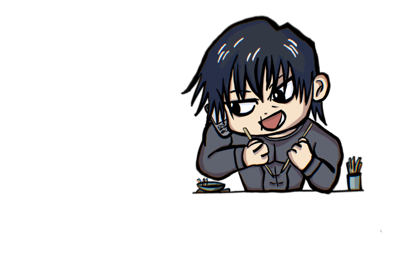
just match the pose of the illustration on the left. Just so we have her
somewhere to play with. I'm going to add a
circle right here for the Kula bar code. It goes towards the body. Excel. So we have one arm right
there, the other arm, Let's draw the circle
for the other fish. Go out back. And so the body does
look a little big. So I'm going to take your
lasso tool on the top-left. We actually increase
the size of the body. Just so it's a little cuter. Maybe almost like the head is half the size or meet the head is twice
the size of the body. So this is a foundation
sketch looking pretty good. And as he could, as you know, this is pretty much
primary shapes. There's no details anyway. We're going to separate
the head into clouds just so we have a little
bit easier to work with. So once you have your
pose of shapes, good, scale this up so we have more
room to work with Excel. I'm going to add another
layer on top of it. We're getting to lighten
the sketch layer. We're gonna do
another sketch layer, but this time we're going
to go into more detail with their foundations
and the foundations. The same blue, we're
going to start marking out some details of deck. You will get a markup of
mouth right around here. We're just going to add us oval. I think that should match up
the left side, right here. The mouth. We can change the
expression later if we don't like it, but for now, let's match the
expression gave him two big eyes, almost circular. I'm either side of
the center line. Let's give him a little
bit bigger eyes than the left because he's a trippy. I'm going to highlight circle. I should go treat the mouth a little bit because
it does look a little bit too round. So I'm just going to use the flat brush that
the eraser erase it. I'm going to choose
a mouth-feel cute. Her mouth too. Just had his tooth on the top. So let's plot how
the two eyebrows. When you're doing
the sketching phase, you don't have to be
perfect with the details. As you can see, I'm
doing multiple marks, just going to erase the ones that don't
want to keep the ones I like with face almost blocked. And let's just shape of the
face a little bit more. I'm going to draw a line
on the side right here. The curve it out just
for a little cheek. Again to darken this
just so you can see it. Good. Go down their face, little out for the
cheek and on this side, get it in the face
around this point. Start pull out of
your ear, the ear, we can simplify just a curve
of the two lines like that. That's looking good. Now we can focus
on dequeues, hair. Simplify a little bit. Let's just draw in as
much detail as we can, but follow the
concept on the side. We're just going to go through. For in as much as 30
tells us we care. I mean, you can sketch
a lightly the shape of the hair just so we
have some follow. Not too much, not too
little. It's looking good. Let's continue to add these
wild little spikes all around Michigan and move
him just a little lower. I'm just going to
combine the two layers. Mealtime a little lower so we have more
room for the hair. I didn't notice how big
his hair was going to be. We continue to sketch
his hair around. It's starting to look
more like dequeue. It is a little creepy because
we don't have the color. But just freshly process
with two growing. Just have just looked
creepy, wicked, always like either
erase and start over again. That's looking good. Once the face ID here, and we can start
focusing on the outfit. Hello, we're going to use
sketching out the body forms. Now we're going to keep it
simple because it is a chubby. So we're going to go out and
start on the outfit First. Let's go with the gloves shape. Let's go a little darker. Let's give him that globe shape and then maybe
simplify his club a little little thumb on the side for her repeat the
same thing on the other side. Second glove. We need
to add the details, this block detail
than the little mask. Let's add that in here. Think that's all the
details we really need for the top place to make
it look like deg q. Now let's work on the belt. The belt we're given its size up the pocket just a little bit, just so you can see it. The sides, rope, belt buckle and go to
lines to finish it off. And then for the boots, we're going to simplify it
the same way as the gloves. We're just going to go simple and only add the
details that we need. I think it's looking good. There's a lot of details
or has been outfit. We have to simplify
to get it in. So we're just going to add
just a little bit of area. We're just going
to color that red, black to indicate that that's gonna be the
detail over there. And she's still feel like the queue because we
have the other details in just going around detail
in just a little bit more. If I do the line work, tell where to draw
these details. One last thing I'm
going to do is draw in the helmet or the
cowl from the bank. So we're just gonna do it like that. That's looking good.
3. Ink and Outline: I want to combine
all the sketch layer and lower the opacity, want it to be low enough so
you can see the sketch still, but you don't want it
to be dark enough. They'll overtake the declines. And we're going to
switch to an EQ Metzler. In inking. Let's see if
we go find a good one. Let's try out a few with Bullock and make sure you
add a new layer above. This looks good,
but that there is some lightness into it. I don't like pretty
dark in corn. Syrup looks pretty
good actually. So we're gonna use
syrup from the menu to dry a little bit of thickness, but not too much. It is a chubby, so it
could be a little thicker. Doesn't have to be paper thin. Now we're ready to start inking. Then this part, you just
want to take your time, do What's step at a
time and then erase it. You need to or do you need to? But we're just going
to go throughout using the lens we have free
for us for reference. Just try see how I missed
this spot right here. We could just use the eraser, erase that in, or you
just undo it and go back. Clean things up. It doesn't have to be perfect. You just want to get
as clean as you can, but doesn't have to be perfect. It should look good regardless. But the ears, I'm just
going to simplify it. I don't want to draw
it in too much detail, so that looks good
enough. For the hair. We can actually do a
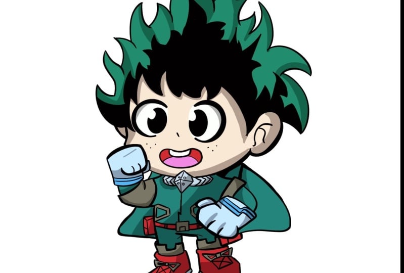
little bit to the style of my hero by drawing in
maybe some black outlines. Let's try this out real quick to draw the inner black details. Fill it in with black to
see what might be missing some space you want to fill in the negative space.
This to work. That's looking good. So
we're gonna do a little bit more of that site. Not all styles have this. So if your stickers or your
character has this tail, you're trying to mimic it. Keeping it simple. Just a little more right here. And I think we're
good to go. Move on. I'll leave the rest a little bit blank because I was
wearing a green. Let's just draw in
the rest of that. She be a little thinner,
a little thick. There's gonna be some
overlapping with his hand and his face. So we're going to
draw it in the hands first before we draw the face. Before I do that, I'm going
to miss, I miss their breath. So let's just draw
those in really quick. So for the glove, let's do the clip real quick. Soak up the fingers. Feel too much like a pause. So I'm going to prefix that, maybe draw a line right here. I think it doesn't actually
need the actual fingers. It could just be
electrical up like thing, you know, feel a
little bit more chewy. Like using little cute mittens. Little dry in the
fingers that we need it. Good. Actually liked
the little mittens on this right side. So I'm going to just
write, feels good. Actually do the other
main justice here. It looks just as good. Good now we have room to
work with the face D2. So, and then let's draw in
the rest of the details just going through with our sketch
and just cleaning it up. I'm zooming in and
out a lot just so I could see the details
of the reference. A lot more. References are definitely good
to double-check your work. Especially if your
sketches a little vague, but if you're confident
in your design or sketch, you could just
double-check. Yes, ma'am. Needs a little detail rigor. And then this one, spectrum disorder,
just the drug, other speculum, this side. Athens cow on the back. And let's just get in
this little detail. Shirt fold line. Let's work on the lower
body and we're almost done. But you try all data, you don't really need
the sketch lines in America actually
turn off the sketch. And then this phase, we
can just use some areas, some lines, just sorry, clarity. For example, the arm overlapping the rest of the body should be
a little thicker. So it stands out in
front of everything. Same for here. Lecture outline a little bit. This just so it feels
like it stands out. Now you can go in with a lighter touch and then
detail anything you want. Just make sure to keep the lines then just so we have a lot of variety of thickness
to work with. I think that's good for the ink. And now we're ready
to move to color.
4. Color and Final: In the next phase we're going to be coloring in the thing. So make sure your
files ready for that. We're going to add a new
layer right below here. We can use this to color. And then we're going to
split all the colors that are too flat colors. Every layer should
have its own color. I'll go through the
example real quick. So let's first say for
his hair to green, we can actually just select
it with a reference. Let's just color in
this Eric Green. Let's try to check first
to see if it works. We're going to go into our
layers to the inking layer, change it to a reference. Let's say we just use this
to pour in and it seemed to work perfectly fine for
the hair, your hair done. We're not going to use this
green and another place, so we're gonna use another
layer for the next color. So let's use the alphabet
color. That's looking good. And then let's just fill in as much as we can without breaking. See, this could
be greenhouse, so The boatload got caught up a little bit of it
should be fine though. We're going to add
a red rover it. Once you're done
using their color, Let's go and move
on to the next. Couldn't be this grayish color. I'm going to go to the lasso tool and quick
colorful, automatic. And we're just going to go
in and fill in really quick. These other areas, which is use the pen to fill in the
little lingering spots. Another layer and let's
do the colo color. I'm just going to fill
the whole globe and then will split and add blue. And the next, I miss a
little bit of a gray. So according to the gray layer, fill in this. Finally read. Propose actually
black, so we need to go back in for that. Let's add that same
color down here. Finally, the feast, low-power. So we're going to move on
really quick to see how far we didn't do one for white, for the eyes and the teeth. Good Eyes. We may have
to outline it first. Just color it in. I use the red layer to do
that instead of mouth, so we're not using too many
layers and what's cool? Little darker, just a little lighter for the tongue. That's looking good. I think we just need
a little bit of that dark blue area here. Brighten it up just
a little bit more. Let's see, we could fill over the weight here. And here. Really good. Now, we could go and
add the shadows. The shadows should
be fairly easy. We need, if we need to address, colors would kit like adjusted. Based on the chubby. To bump this a
little bit brighter. Just says it's not so
dark even I do like the Corinne of this heritage has to be a little
bit more saturated. So it pops up a little bit more. For shadows is really easy. You're just carrying go
with each layer alpha, lock it so we can
color outside of it. Actually we're going
to try clipping mask. So for clicking message
Cooper, pretty easy. I'll show you how to
do it really easily. So you see the green
right here, this layer, we're going to add a layer above it and we're going
to do clipping mask. Now, anything we paint is just going to stay in
that layer mask. So we're going to use this
to do really clean shadows. Just go Select a little
darker blue color and maybe shifted a little bit. And let's just how far
do with the shadows. Using the shadows, the bottom of areas you'd
think would be a shadow. This is almost like
your mid tone. And don't worry about
coloring outside the lines because of the
clipping mask process, this should contain it all. But that later, don't forget to just move on to the next one. So the next layer, clipping masks and
do the same thing. Go a little darker. Just kidding, add in the shadow areas because
they're the same preference. We're a little too dark. Should be pretty dark. So switch director, you notice I went to a purple color sometimes
like to do that. Just put a shadow
color just to keep it interesting that I'm just
going to a darker red, I just add some color. And the nice thing is if we
do that as a clipping mask, we can go in here and then change up to we
don't let it purple. You could go. Little bit more blue, red, feels a little purple, so they turn it to
a little bit red. A movie. Just as food, burger. We're pretty much almost done. Like we can add some
filter effects, but let's try some stuff out. I'm going to turn off the
background layer trial, turn off the reference layer. When I shake, copy this image by copying Canvas and
we're going to go paste. This should have us. This should give us pretty much our whole image in one layer so that we
can play around with, without messing up or file. Move this towards the top
and we can add a few things. Before we do that, let's
see if we could turn off the rest of things
by grouping them. So we're going to just use two
fingers combined together. It actually combined it. So let's just leave it as is and see if we
can turn them off. Just go and turn off the layers. Turn them back on. If we need to ever edit the
file using the main file, we're going to actually
move into the middle. So good play around with them. So let's see what we could do. We could try the filters. Let's do a halftone. Does, oh, this makes
it look like a comic. That's pretty cool,
pretty nice style. They could utilize this to make some other looks almost like pixellated look or
like the comic look. Let's see what other
filters doesn't undo these. See what chromatic does. It makes it look a
little bit cooler. It almost has a little bit more depth
with their aberration. I just can't do a little
bit of it. Kinda like that. Has a little bit
more vibrancy to it. And then another trick
we could do is to try to make a pretty much a
white outline for him. So it can be used for stickers. I permanently like
to make stickers. So this could be a
perfect example. We're going to
duplicate that image. The morning I go close up one, we're actually going to go here. You charged for
brightness pure white. And then we're going
to use this and we're gonna go cause them blur. You want to get it
just wide enough. Now let's see if this works. We're gonna do a
select Automatic. Select it from the inside. I didn't see what. Let's expand it out. We're actually going to
turn on the layer and see that looks a
little too wide. So we're going to turn that off. Go back to this top
layer turned on, but make sure you're selected
on the bottom layer. And we're going to turn
just color to white. Then we're going to
select Pin variety, the bottom layer with
the selection tool, automatic color fill. Selected just so it has
enough of a distance. And that's a pretty good border. I think we could
do it one better. We're going to delete this
loop will keep this again, turn this off brightness. And the reason why
it felt a little bit like not detailed. It's because I I think I blurred it a little too much
that we're getting blurry, but not too much. So we have some detail to the left and let's
see if that works. Attorney the acts,
that selection tool. And then as you can
see, it's closer to the pretty much the
little details. You can see some of
the details on the hair or less a perfect amount. That's our sticker. I'm going to show that
the black background so you can see the contrast
a little bit more. There you have it achieved, we dequeue drawing and the
process on how to do it. The homework assignment,
it's going to be selecting your own character and
should be fighting it. I wanted you to get as far
as the current process. You don't have to make
a sticker design yet, but getting into this stage
as being a perfect example. Thank you so much for watching. Maybe have any questions. Please feel free
to comment down in the video description
or in your assignment. I'll be sure to answer them
to the following week. And I'll see you
in the next one.
 Boba Tea, Art Teacher