Transcripts
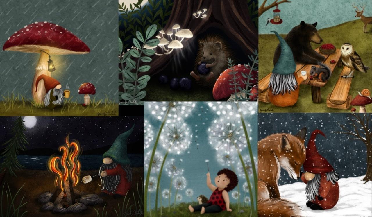
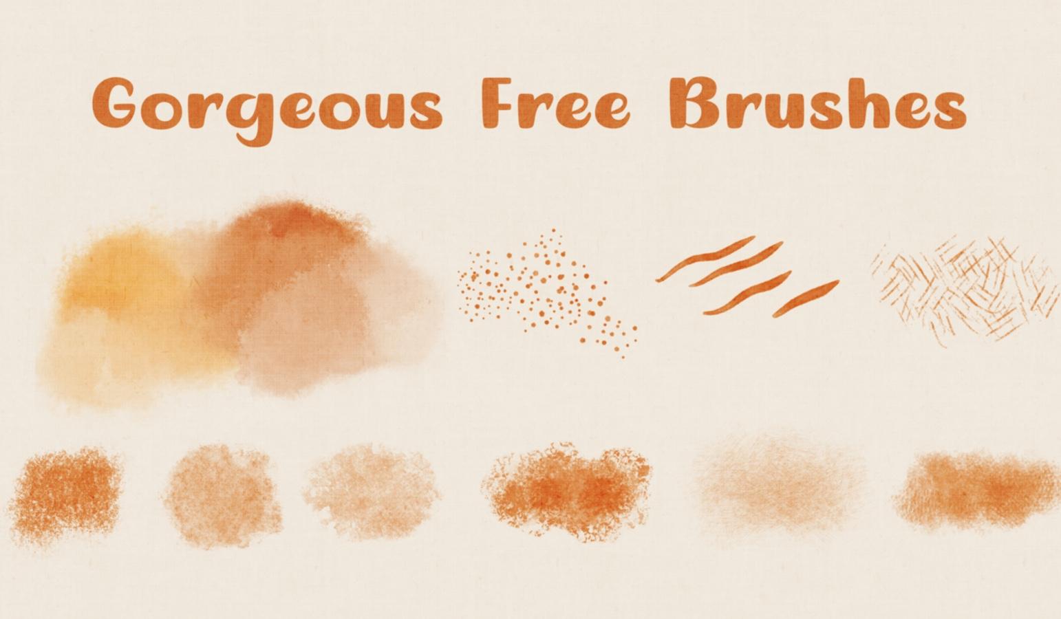
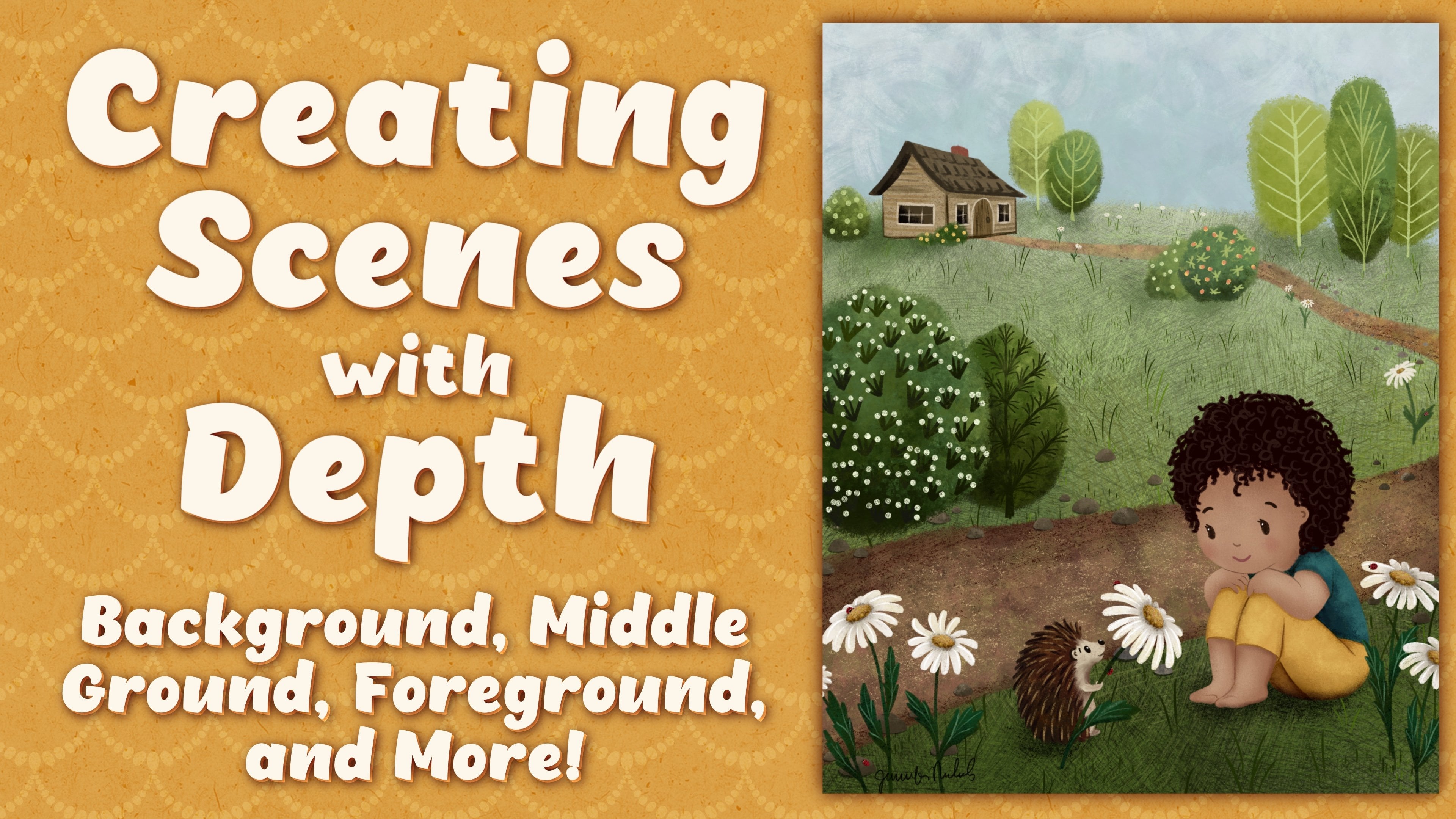
1. Introduction: Hi, my name is Jennifer Nichols. I'm an artist, a teacher, and a fabric designer. Today, I want to show you the steps I use to create beautiful whimsical illustrations. So many people have asked me, "How did you come up with that?" and after really thinking about it a lot, I realized that I do have a process. I figured out how to get it down on paper and I'm so excited to share it with you today. It's an easy step-by-step process so you can start creating beautiful whimsical scenes. First, I'll walk you through my entire process, including how I brainstorm and create a mood board. But the best way to help you really understand and remember is to show you. Once we learn about the steps, I'll show you a full lesson from the brainstorming all the way to the finished illustration. These skills can be used in any media. For those of you using Procreate like I will in class, I did provide some free brushes that will give you a whimsical look to your illustrations. I also provided a fall pellet, that's one of my favorites. If you find that you're enjoying creating scenes, you might want to also check out another class I have on Skillshare called Creating Scenes with Depth. This class does require scene sketching skills, but I encourage everyone to give it a try no matter what your skill level is. By the end of class, you'll have a better understanding of a great process you can use to develop your own scenes and you'll be able to add to your portfolio or just have fun. It's also great for anyone who's looking into being a children's book illustrator. The possibilities are endless. I can't wait to see what you create. I'll see you in class.
2. Class Project: This class has a simple brainstorming worksheet. You can print the PDF or you can import the Procreate file right into Procreate and work on your iPad, which is what I'll be doing in class. I'll also be showing you how I make a mood board, a sketch, and a final illustration. For your class project, post your process as you see fit, screenshots of your worksheet, images of your mood board, or your sketch. If you get as far as a complete illustration, I would absolutely love to see it. The skills in this class don't come overnight, they take practice. Go easy on yourself because the most important part is to have fun. If you're really new to Skillshare and to Procreate, check my beginner class if you need more information on downloading the class resources. All right. It's time to get started.
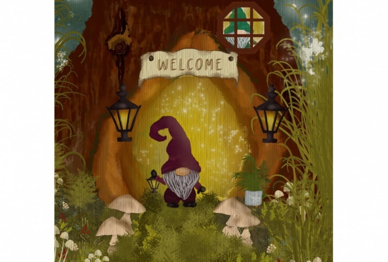
3. Full Overview of the Steps: The first thing I'm going to do is quickly walk through the whole process. From a browser on your iPad in landscape mode, if you're using Procreate, come over to the Projects and Resources tab and get this SceneWorksheet.procreate file. That will be a Canvas within Procreate. If you do not have Procreate, you can print this PDF right here. Then also for Procreate users I have a swatch and a brush set, so be sure to grab those. If you're not sure how to get those, check my beginner class on Procreate. Whether you have this on an iPad or printed out on paper, this is the brainstorming process that I go through. The first thing I do is I think about the object that I really want to create my scene around. Here you can see two simple things, one is candy corn and one is pumpkin pie. Those are both associated with fall. Sometimes the season really won't matter, but if it does, go ahead and add that now. The next thing I do is think about the characters I'm going to have. Usually it's a gnome or two, sometimes a ferry, definitely hedgehogs, sometimes. Just keep it simple. The time of day is also nice to know, especially if you're outside. You want to know if it's dark or light or sunset. All the different things with time of day. Think about that. Your location. Are you inside? Are you outside? Are you floating on an island? Are you in a kitchen? Are you in a forest? Are you near a lake? Think about what location you'd like to depict. The activity or the action. What do you want to have happening in your scene? Is somebody sleeping, relaxing under this mesh room, having a party or a picnic with friends? Think about what action you're going to show in your illustration. Then perspective or depth. How close do you want to be to that action in those characters? What angle do you want to show it from? Are you floating above a scene and looking down from a higher angle? Are you down there at the height of the characters looking straight at it? Are you maybe a small ant on the ground looking up at the characters? Think about what angle you want to, because this is going to help when we're looking for inspiration with photos. Then any details and accessories that might be in your scene. By now, you would know if you're in a kitchen and you have all the kitchen items that might be surrounding your character. Or if you are just really close up to a character and you don't have any details aside from the marshmallows in a hot chocolate. If there's any details that you're thinking of, that you'd like to show, potentially, go ahead and add those there. Once I have the completed worksheet, I take some of these keywords and I go make a mood board. In this example, I would go to pixabay.com and unsplash.com, and I would search for free use photos for more inspiration. Searching on words like fire pit, campground, roasting marshmallows, stars, and things like that. I would use the images that I found to create a mood board. I could do that within Procreate, if you're using Procreate, or you can simply save photos and have a collage within your camera roll or any way you want to hold onto a group of photos. If you are in Procreate, you can also start gathering some colors off of those photos and make a palette. From there, I would do my sketch, and then I would roughly color that sketch and get a general idea of what my colors are going to be. Finally, and of course, the most time-consuming part, I would complete the illustration. This is my process. Now I want to show it to you from start to finish.
4. Brainstorming & Moodboard Inspiration: It's time for a detailed explanation of my brainstorming and mood board creation. All right. I have my scene development worksheet and I'm just going to try not to put too much effort and I don't want this to be a roadblock for me. I'm just going to think about some simple answers to these questions. The main object, apple tree. If you're in Procreate, just make sure you're on a layer underneath, maybe an orchard. Oh, I love the fall, so I'm just going to do apples are always in fall here in Washington. Characters, gnomes, of course. Maybe hedgehog. Time of day, I'm going to say afternoon, maybe sunset. For location, of course, it will be outdoors, in a field, an apple tree in a field or an apple orchard. Picking apples. I think I'll have it be showing fairly close, close to the tree. That's so I can really show those apples, they won't be too tiny. The details, maybe a basket of apples that's already been collected. What else? Maybe gnome children. From here, I'm going to save this as a JPEG. If you have the paper version, then you have your paper and you can keep it next to you. Then I would go to pixabay.com and unsplash.com. If I didn't remember what was on my worksheet, I can go ahead and bring up my photos like that. I can search. Let's see the key things I would want to search are apple tree, sunset, baskets of apples, things like that. Let's try. Unsplash and Pixabay both have different types of images. It's a good idea to check both. Apple tree. From here what I'm looking for are examples that are somewhat closeup where I can see a nice apple and how the leaves look. I can just tap and hold and add to photos. Again, if you're not using Procreate or if you're not using your iPad, you can save those photos in any way you wish. I don't need too many of the same type. There's a wonderful basket of apples. Here's a nice orchard. When I look at that, I think I don't want to draw all those trees. I think apple orchard is no longer something that I would like to do. Then let's go over to Pixabay. All right. Here is a beautiful photo of a weighted down apple tree branch hanging out like this and the ladder and the baskets give me great ideas. I am just adding these. Now, this isn't a way to add high resolution photos. If you need a high resolution photo, you can tap on it and tap the free download. But for a mood board, you do not need to do that. There's a great apple. This is beautiful as well. Then let's search on let's see, apple tree and sunset. This one is the one I'm looking for. I love that field with the hills and the sunset in the background. I will save that. I wanted to just give you an idea of what I look for when I'm looking at images. If I know that I'm going to be close to the tree, I'm not looking down at the tree and not looking up at the tree, I'm just looking straight on to the tree. Then that helps me pick my images. That's why it's important to have this nearby and try to make sure you're keeping those things in mind so that you're not grabbing photos that are going to end up being irrelevant. Of course, I did this ahead of time and I went through and I found all the photos that I think might be helpful. This one I got just for those fall colors and maybe the trail. I loved the tree being off to the side and the branches coming over. Then here's the mood board I created. Once I created the mood board, which to do this, you just bring images right into Procreate and move them around. But once I did this, I realized that what I really was inspired by was this big tree with the branches coming over from the side, this sunset with the field and the mountains and the sun and these colors, the ladder, I was originally thinking that the gnome might be poking at the apples with a stick, so when I saw this ladder picture, I thought, oh, I want the gnome up on a ladder. Then I also like these big weighted down branches, all weighted down with those apples. Then the close-up of the apples here and what those leaves look like. Once I had an idea in my head, so I know I'm going to have this tree be off to the side. It's going to be an apple tree off to the side, just like this, with maybe this in the background. Lots of apples and that ladder, I think that is it. One gnome up on the ladder, I think all the leaves and apples are really going to make it busy. I got rid of the idea of having a kid gnomes and baskets of apples. Then I decided on my color palette. These two colors are for the apples and I got those from this picture right here. These are the colors for this scene here in the background. These are some fall leaf colors which I don't think that we're going to use. Just these colors here and then any colors that you might want for the gnome. Then I don't know if you saw at the very beginning, but you can use Pixabay and Unsplash for all sorts of things. Floating island, for example, let's say you want to have a whimsical scene where you have a floating island with some mushrooms on the island or whatever you want. It does not have to be a castle. You can come here and you can search for these images. These are free use images. You can really gain inspiration from them and then do whatever you want. I might use a photo like this as inspiration when I'm sketching. I'll just show you really quick what I mean. I'm just grabbing any sort pencil and then I see we have a big hill here close to us and then you have a horizon line back there. Then this, look, it's really close to the horizon line, so you can add this ellipse shape just like you see here and then have the jacket island coming down. That's just inspiring a layout of a scene. Even though the scene I'm about to show you today is more realistic, where it's like things that can really happen on Earth except for the fact that there's a gnome in it, you can let your imagination go wild and you can probably find some inspiring photos that will help guide you. Next up, we're going to use our mood board and create our sketch.
5. Creating Your Sketch: Now that we have our vision, it's time to create our sketch. I'm going to go ahead and create a 10 by 8 canvas and I'm going to pull up my photos here. I'm going to go ahead and show you just a nice fun way to create a palette. Just go ahead to your palettes and the plus sign, Create new. I like to go back to the disk. Then from here, grab a few of the colors that are from your photo inspiration, just like this. It's not getting every single little detail of every single thing that you want to do. I'm going to use a dark brown for the tree. I already have a dark brown. How about the apples? Pick a red for the apples, and one of these greenish yellows. Then I'm going to come over here to the yellowish, greenish leaves here and pick a couple of leaf colors. Just a couple, a dark alley and then how about in the middle? That's a good start right there and then you can keep that there if you want but, I'm just going to clear it actually. I have it over here and that's good enough. When we're illustrating, I will show you some fun ways to use all of these but for now I'm just grabbing the 6B for a sketch. I'm going to go ahead to these bigger images. I really like this one right here. I'm going to just sketch it out, I'm using green. It doesn't matter what color. I don't want any thing really super straight or it won't look hand-drawn. Then I want some really low mountains back there, an array and then the sun. The sun might end up in a different place but for now, just going to put the sunset here and that's all I need from that image. I need to change that. If I want to change the location of this, it will be easy to do if it's on its own layer. For now I am going to a new layer and remember that I had this really great photo of this giant tree that's way off to the side, with the branches coming over. I am using that as inspiration but I'm going to do the apple version of that. I really liked these curved branches of the apple trees. I am going to have this base of the trunk of an apple tree over here. I know that other photo was over there, and now I went this big branch. I want it really wonky and curvy. Here we go and it's thick over here and it looks like it branches out. It's hard to see, but it looks like it comes over and then branches out over there and then this gets thinner and thinner and thinner. You can see that there's quite a few branches that come off of it. One thing that will help it give a little bit more of a convincing look is if you're using the same angles that you see in the real thing. You can see the side branches coming off of it like that instead of like that for example. We just need some branches, coming off of it. Maybe one that goes that way a little bit, some down here, and even some branches that come off of that. I like the idea of having a branch right in front of the sun that will offer some nice contrast. I'm going to add more branches a little later. It's getting a little busy. I have a big gap over here, so I might go ahead and make this bigger. I like that a lot better. I'm going to have apples over here. Now I think I might go ahead and change this branch. I still have a branch in front of the sun here. We can come back to this. Let's go to a new layer and I'm going to do a ladder. My gnome is just going to be leaning up against there, climbing a ladder right here. We can still see the sun over there. We'll have the ladder B over here. I am going to go ahead and let this snap into a straight line. When I'm illustrating it, I won't do the straight line snapping. It looks like it gets really narrow at the top and wider at the base. That's also going to give it a look of looking closer to you, up to farther away, like it's leaning away from you, which it should be. Then I'm just going to rotate here and put some rungs approximately horizontal. I don't want that to line up with the horizon line. I might change the horizon line a little bit. Just lower it a little bit. That's a good reason to keep that on a separate layer. Something about horizon lines also is, one of the things about composition is the rule of thirds. If you have a canvas, and you cut it into thirds this way and into thirds this way. These are the lines where they're good to do things onto. If you have something, as a focal point at these intersections, are great spots, not every single one of them obviously. Horizon lines being down here or up here are a really great plan. Now I'm going to go to a new layer and I'm going to turn off things and decrease the opacity on the ladder and try to get a gnome up here. Let's go back to that green color. This is a simple known because it's the back of a gnome. The front isn't that hard though, it's just got the nose and beard but this is going to be a girl gnome. I think the gnome body is going to be about like this. Then I like to visualize a head inside the hat so that I don't inadvertently make the hat so narrow that there's no room for a head in there. Just put a small head overlapping here. Let me zoom in and I don't think we need this anymore for now. I know her shoulders are at this level. She's going to be reaching out for an apple and really simple arms and mittens. We don't need to do fingers. If you don't want her reaching really far, oh, you know what? She needs to be leaning as well. Let's hover over that way a little bit. We don't want to make it look scary like she might fall and she's teetering on the edge of anything. Let's have her reaching out like that. It's okay if our tree isn't matching up with this right now, we can change the tree, it's just the sketch. Then she needs to be holding on to the ladder. Maybe I'll lower her so we can get a wider part of the ladder. Her feet are going to be down here. A lot of times with hands, I just look at my own hand. If I'm holding the post of a ladder, I just need this U-shape here. The ladder is right in the middle, and I need a thumb and fingers over here. If I have my arm and shoulder like this and the wrist there, then I can do a U-shape right here. The thumb is on one side, and then the hand is on the other side. This part of the hand. Keep it simple. Then I'm looking to make sure they're similar lengths as well. This one looks longer because it's stretching. For feet, let's have one foot coming off to the side on that rung of the ladder and one is pointing down a little bit. Then finally the hat. We no longer need this. We just need that shape right there. That hat is going to come down like that a little bit. It is going to stick off to the side a little bit on each side. Then don't forget, there's a head in there, so have it curved out. It's like a little curved hat out there. Then from here, you can go narrow. You can start to be really wobbly about it and get narrower and narrower. You can curve it down and have a curved hat. I wouldn't go super long. Then you can erase all of this in here so you have a better idea of what you're looking at. Before I put the hair on, I need to decide, is this a girl or a boy? What kind of hair will there be, and is she looking off at an angle like that to look over at the apple she's reaching for. She probably is. I'm going to make this part of the hat a little higher. I'm going to curve it out and just come down like this and have a nose there. Norms are super simple, but sometimes that part can be really tricky. I have a little needle felted norm that I look at and I rotate to figure out what it would look like at certain angles. Because she's looking off to the side, I want to give her braids. But now the back of her head is moreover this way. Those braids might come down like this. But then over here, it's not as big of a section of, not braids, this would be pony tail. I'm going to have hair like this and a little hair band down here. Then a little flame shape down here. If you made it look like it was right in the center, then it would not look like she's looking out to the side. Then you can play around. I think this hat probably needs to be a little wider and maybe even taller. I'm making this sketch phase seem fairly simple. But this can take hours. Don't rush this, this will help your illustrating phase be so much easier if you spend time on this right now. I'm going to have the hair here and the arm here more. I want to make sure she doesn't look like she's looking directly over. If the hair is coming down right here, you can just see a little bit of the nose. Now we can look turn on all the other layers and we do need to do some erasing. Let's think about the tree right now. This branch on the tree is going to just be too confusing being right there where she is. I'm on the tree layer and I'm just selecting that tree branch right there, I'm just going to get rid of it. Let's just put the apple. For now, you can just make circles for the apple. But an apple shape would be pretty simple. Here in fact, if you make a circle and then go into liquefy and go to push. If you push the sides in a little bit and you push the top corners out, not corners obviously. You can really just make a pretty simple apple shape just like this. It's wider on top, narrower on the bottom. There's an apple and then how big do you want your apples to be? These are all things to start thinking about, and placing. This one is going to have a branch right here and then leaves. Don't forget your leaves. I'm pretty comfortable with where the norm is and where the ladder is. Just to make things a little bit more simplified, I'm going to go to the ladder layer, and I'm going to erase anything that's hidden by the norm. I'm going to do the same thing to the tree layer, and the background layer [inaudible] horizon line there. Then come back to the tree there and start refining my sketch a little bit. I can also erase where that horizon goes past the tree. I think we're good to go. I'm deciding I don't like this branch. It looks too straight up and down. I'm just going to erase that, and come up with something different. In fact, I think I'll erase this one too. Here's where you just want to start getting more of the details of your sketch figured out. Maybe there's a branch coming up here now, that looks funny. Maybe you can just put an apple here that fills in that space a little bit and start sketching out where your apples are going to be. Don't forget we have that sun back there. I think I really like that. Then we're going to be adding lots of leaves. One thing to look at, when it comes to leaves is don't make them all just flat like this. Look at some of the other shapes. You have this one where you have the side view plus the other side. This one has some curls to it on the side view and also different angles of the apple. Some of you are going to be able to look down into the center where the stem goes in. Some of them, you're going to be looking up at it into the bottom part where the bloom used to be. I'm going to fast-forward this part as I finalize the sketch. I can go ahead and merge all of those, turn the opacity down, go to a new layer and I'm going to go ahead and go to black and decrease my size for my brush and start sketching. I'm going to go ahead and turn the rough sketch off, and we going to have a look at all the details. These two apples look identical with the leaves looking exactly the same way. Let me add another leaf to this one, we can change the shape of this leaf. Maybe it curves this way, it looks a little different now. There we go. That is our completed sketch.
6. Roughing in the Color: Before we start a complete illustration, I do like to get the color roughed in. I really know what I'm doing, and I like what I'm doing before I get all the way to the end. One of the things I personally like to do, I'm going to go ahead, and erase the very rough sketch. I just need this final sketch. That'll be clear soon. One of the things I like to do is add a texture layer to my illustrations, at least one texture layer. I've given you two brushes to do that. If you just pick a gray, and go straight to the left, that's a nice gray to choose. Then these two top brushes here, you just pick a size, and fill the whole canvas in one swoop so that it's all the same opacity. Then turn it to a Color Burn blending mode. Now, down here, the reason you need to start with that is because it does change your color choices. For my rough colors, I'm going to go under an outline. I can turn one of these off, I don't need it until later. I'm going under the outline, I'm just going to get a big brush. You can do the dry ink, you can go really big with it. Look at my colors. That's pretty dark. I'm going up a little bit, and add that there. That's better. I'm just going to rough in my colors. You can use any brush to do this. The best thing about this is knowing how dark your background is going to be to start out with. I'm going to choose this brown. When I say rough, I mean, rough, really, really rough, as you can see. I'm going to go really dark for this tree. I'm going on a layer underneath all of this just to finish the skyline there. We have some nice oranges, and I think that lighter color was on top. You can be looking at your reference photos, maybe something in-between within there. Then pretty bright spot for that Sun. All I have left now is the gnome. I'm going to go ahead, and merge those other two layers because again, this is just super rough. I'm going to pick gnome colors. What color for the body? The teal looks really good with the red and the green there. Now, back to my palette. Then I don't want any more oranges, or reds, or greens so that leaves me yellow, which might still be too similar. Purple? Let's do a plummy purple, a little darker. I might do a little lighter actually. I going to add that purple to there. That skin color is going to be hard with that nose, just because it's close to his skin color there. I need to add that color here. I'm going to go more orange and more gray. You can make this green color any color you want. I'm going to go black for the mittens, come on Procreate. Then I'm going to go really dark for the hair for now, and I'm going to add highlights to it later. I need dark for the feet. There we go, really rough color. Zoom out, make sure you like all of that, merge it. Then I'm going to merge it with the outline layer as well. It's all on one layer, and that's why I have two outline layers. I'm going to go ahead, and move that up above my texture layer, which I'm going to Alpha Lock, with two fingers swipe to the right. Now, I'm ready for my full illustration. You can see really rough color, and in just the base color for each one. Now, I have the outline layer, and I can use that for the completed illustration. I have the finished color ref, which I can refer to when I forget, what color did I use for the hat? What color did I use for this or that? This one's fairly straightforward, but some others won't be. You can make changes. It's okay if you want a yellow hat in the end, for example. This doesn't have to be set in stone, obviously. Now, we're ready for the final illustration.
7. Final Illustration: Part 1: In the next three lessons, I'm going to show you my complete illustration process from start to finish. Illustrations take me a lot longer than what I would want the length of this class to be. What I'm going to do is speed through certain parts where you're going to want to pause if you're following along, and then I'll stop at each point that I need to describe what I'm doing. But the first thing I do is similar to this color raft but on more layers, I get a base color down. I have the texture layer that I'm going to be using, and I need to work on everything below that layer. I'm going to start with the field here, and choose the lighter of our two greens we have for this background area. Just three layers up and I'm going to turn on my sketch and turn the opacity way down. I'm on the dry ink brush. This is just my preference. You can really fill this color in with any brush you like. I would avoid the monoline brush. You want to have texture. Well, it just depends on the style you like. I prefer more texture and it does give a less digital look, so I do like that. I'm going down a layer and I'm going to go to that brown. I don't want my hills to look very rounded, but I'm okay with them being fairly fuzzy because if you look at the reference photo, it's quite blurry back there because it's so far away. I now work on the mountains here around the gnome so it doesn't go right where her feet are. I'm going down below all of those and I'm going to do the whole sky on that layer starting with these deeper oranges. You can see that deeper orange is really just around the sun. Then it just gets lighter. It does get grayer over there and I will work on that later, I'm just getting a base color down for now. At this point, I think I'm going to work on that sky a little bit. I'm going to go over to the smudge tool and I'm going to go to the splotchy blender tool, although some of these messy ones might be good as well. I turn the opacity down so that it's smudges a little bit more gently. I'm just going to very carefully mix this guy up a little bit. Remember, we're not going for a realistic look like you see over here, but it is our inspiration. These beautiful colors. The brushes I made for you are specifically for helping you get a whimsical look. We'll come back to that. Now, I'm going to be adding more color to this. Like I said, these are just the base colors. I'm going to continue moving up to the filling in the base colors for all of the objects we have here. The next thing that's closest to us is the tree. Now, I need to look at the tree carefully. I'm going to turn the opacity back up. If you need to refer back to the photos, please do. I'm just going back to almost black, that tree is super dark. I'm still on dry ink. I don't want a fuzzy edge on the branches, so if I come down to a smaller size, that will help be a little bit more defined. Once you're done with your tree, we're going to go to another layer and, did I go to a new layer? Yes. We're going to come forward one more layer and we're going to do the apples. Always still need to get my son back there too. We can go back down to the sky layer and add a layer. I may go to this creamy color. For now I'm just going to put a sun there so I don't forget, and I think I going to blur that later and maybe even make it have a nice glow. We're going to come up a layer from the tree and do our apples. Now remember, this is a base color and we're going to change it drastically. Right now you can just do a solid red. Again, just like with the branches but maybe even more so I don't want a fuzzy edge, but I also don't want a monoline edge. I'm going to go, and this is going to cover up anywhere where the branch comes down into the apple, and we'll deal with that later. I'm just going to come through and do some very simple apple shapes. Once I have that edge with a smaller sized brush, I can fill in with the bigger size brush. Go ahead and pause the video and go through and do all your apples. I went ahead and I have an overlapping apple up there and I went ahead and did them on the same layer in and it works out just fine. Check your apples by turning your opacity way down and you'll see sunspots that may need a little bit more attention. We're going to go up a layer and do the leaves. Again, just a base color. I'm going to choose the lightest color because I can see the best down here. For these, I can have a bit of a stem coming out like this. We will fix if you want the wood dark brown part of the tree to look like it's going down into as a stem. We can actually mask the apple layer and expose some of that stem. Let me show you how to do that. Tap on the layer and tap mask. Now you have a clipped layer here. You make sure you're on black and you draw on it with whatever brush you want. It will look like it's erasing the apple, but it's not erasing, it's just masking part of it and exposing what's underneath. You can go around and do that to some of them. If you can't really see under there and see where that branch is, you can turn the opacity down on your apple, and then turn the opacity backup. That does use a layer though. If you might want to just erase from the apple, but that's the non-destructive way to do it. Then if you end up moving the apple, you would come back to this and use white to fill back in any of these little spots that you ex-post. We're going to go finish our leaves. That's looking pretty beautiful. The next thing would be the ladder. We're going to go up a layer and pick a light brown. I had turned to my sketch off, so I'm going to turn that back on and look at the ladder. Pick a decent size here. I use the snapping to create the ladder sketch. Oh well, I guess I didn't done this one. I would recommend you not use snapping. Then you'll have a more hand-drawn look. A layer above that. We're going to start our gnome. The gnome has several layers. Basically on top is the hat, under that is the hair, under that is the nose, and under that is the body. Then we'll throw the hands in there somewhere too. We need several layers. It's got four here, we can start with four. What colors? Purple and teal. The purple for the hat, down a layer for the nose. For the nose, I'm going to end up being a little more orange and a little bit more gray because this is more pink. That's good for now, we can come back to it and change. We'll go on a layer under that for the hair, I'm going to go with a dark color for now and just fill it all in as one. Oh, look, I was mistaken, this needs to go on top of the nose. There we go. You can do some loose hairs and we're going to keep going down. We have the nose. We can go ahead and go down one more layer for the body. Now the hands and the feet. I'm actually going to go ahead and put the nose layer under the body too, and do the hands and feet on that too. They're on the very bottom and I'm just going to go black. Would make them however you want. I'm going to turn the sketch layer off. Hopefully you can see this. I want to select the ladder and erase from the foot. I'm going to select the ladder, tap on it and tap "Select", and then I'm going to go to the layer the foot is on, and I'm just going to erase from it right there, so the foot looks like it's curled over that ladder rung. I'm not erasing all of it because I want the heel to look like It's still on this side of the ladder. I know that matches the mountains a lot right now, but we're going to do some changes with color, and that won't matter. Those are all the layers for our base colors. Now, what I do is, I add clipping masks and I go a little bit crazy with adding texture and clipping masks. I'm not liking this apple up here without a leaf on it as I'm looking at this, so I'm going to come back and add a leaf really quick to the leaf layer. Now, I'm going to come through and decide what I want to do to each layers.
8. Final Illustration: Part 2: I'm going to go ahead and start with the background again, and for the sky. I'm going to add a layer above it. I'm going to turn it into a clipping mask so that it's clipped to the sky. I'm going to add it to the Add Blend mode, and go back to this creamy color. I'm going to pick the splotchy blender to brush and just get some fun brightness. Be careful, look how bright this can be. I'm just going to carefully tap and smear at the same time, and just get some brightness around there, and spread it out. Maybe even erase a little of that. I can look at the photo and see where else I need some brighter areas, maybe up here, and spread that out, things like that. This is a layer that Add Blend mode really brightens things up where you need to some brightness. I can smudge with that same brush. I'm also going to go above the sky layer to a new clipping mask. This was the one we just did and I'm going to go under that, but I'm above the sky. If you look at the reference photo, you see it's gray over here. I'm thinking about that. Makes it look a little bit more dark over there. I like that. I think I'm going to go ahead and blur that sun. Select the sun, Gaussian Blur. Zoom in a little bit and just give it a little bit of a blur. I'm at 5.4 percent. Now, I'm going to go above the mountains and the field here. I'm just going to play around without it being a clipping mask and see if I can just manage to keep things in that space without them extending up to the sky. For the mountain area, I'm going to select that mountain color, and I'm going to go way up to a faded version of that and then play with brushes. Obviously, you can use more than just what we have here. I'm going to choose, let's try wet painty sponge on a smaller size. I'm going to be smudging this. I'm going to smudge with the same brush. That's smudging pretty roughly. Let's smudge with the rough number one brush and see how that does. I have a little more control over that now. I'm just getting a little gray. It is going up into the sky a little bit. I can push it back down, and I'm okay with that being up there a little bit. You can barely see it there. Down here, if you look at that reference photo again, it's great to keep looking at it to go, okay, where are the bright areas? Where are the dark areas? That's pretty bright where the sun is shining, which makes a lot of sense. I like that green. I'm going to go to the darker version. We'll just stick with this sponge. I'm just start adding some darker areas down here. If you're uncomfortable trying to keep it down here on the grassy area without extending up to the mountain area, go ahead and turn it into a clipping mask just for the grassy layer. That would need to be done on a separate layer unless you want to go ahead and combine the mountain layer with the grassy layer right now. There's a lot of options for clipping masks. I'm going to go a little brighter. I don't want things to be super smooth. It's just lumpy, bumpy. The other thing I want to do, and I'll do it on a new layer because I might want to change those colors I just added. I want to add a little bit of a field of flowers. I'm going to go to an even lighter green and to the rough triple scratch. Technically, it would be closer and bigger here, and smaller over there because it's further away. It doesn't seem like it's a lot, but these little details make a big difference. I'm going to stay on that layer just to save on some space with layers, and I'm going to choose a creamy color. But I'm going to come down to a bit more of a orangey brown in there, and come up to one of my dark precious. These are a little different, but are also a little the same. This is a way to make scattered dots. If you want to do stars in the sky and you don't want them really condensed together, this is a great brush for that. This one is more like thin in small areas with a higher density of the dots, and this one has an even higher density. You can use it as a stamp, but it's also a brush. I don't necessarily want that many flowers. This is going to represent flowers. I would probably go to the scattered one and just get some over here. They would be really tiny out there. They are scattering up into the mountains, but I am going to erase those because this is a bit of a hard brush to control. That's a good thing because if you're doing stars in the sky, you don't want it to look like lines of stars or anything, you want it to be very scattered. I'm going to choose a slightly darker color and a bigger size for the ones closer. The size also, for all three of these brushes, the size has variation to it. Every little dot that goes down is going to be a little different. I really want to add some more here, I can switch, have a little bit more control. Here's a spot where I wish I had done those on a different layer. I did it on the same layer, this is all my little grassy pieces. Now, I'm regretting that. I could two-finger tap in and undo, and go to a new layer. The reason I was regretting that is because I felt like they were a little too bright and I couldn't change that. I couldn't turn the opacity down, I couldn't change the blend mode because it would also change the grass. You can play with blend modes now. I think I'm happy with the background. Now, let's move on to the tree. Now, at sunset, if you were on this side of a tree with the sun in your eyes directly on the other side, it would look really dark like this. You really don't have a lot to do to that tree, but go ahead and add a clipping mask and maybe highlight some of the edges because the sun would be brightening up some of those edges. For the apples, so you have a layer mask on there. You just treat it like it's one layer and add another layer and clipping mask. I'm going to come to my other apple color. Let's see, it's this one right here. These were the leaf colors and these are the apple colors. You can look at the reference photos if you want, or just come around and get some of the green on there. Now, I'm going to go to another clipping mask in case I want to make changes and I'm going to go back to that red, and go a little bit darker, and go to the triple scratch, and just get some lines on there. Your striations on the apple are down the sides of the apple, going from showing the curves. We actually need another clipping mask for those apples. This one, we're going to turn to multiply and probably go back to that main apple color and maybe this 6B pencil. Let's test. We need a shaded color there. That's pretty good. Maybe a little lighter. Multiply will take a color and make it look much darker. Right now, I'm going to turn my sketch layer back on, just for this apple. I have this apple sketched to have this apple on top of this apple, but I ended up making it look like this one was on top. Right now, I'm just going to go ahead and come through here and give a little shadow here. That just helps define it more. Then I'm also going to shadow under that leaf, play around with some blend modes and colors, and find a good way to do your shadows here. You can do some shadows here at the top. Mostly, we want to do some under the leaves a little bit, so it just gives it a little less flat look. I'm going to come back to the apples. Because they're looking pretty flat., think they need a little bit of a shine, but first, I want to do the leaves. We go to the leaf layer and add a clipping mask. The leaf layer is going to have two clipping masks, one for the veins and one for just changing up the color here and there. I'm going to go down to gouache. Go down to the painting and go to gouache. I'm going to choose the darkest of the three greens that we had, for the leaves. They're going to be darkest here in the centers. I'm just going to try and go with the direction of the leaf, not cover the light green entirely, but still try to get some variation on there, and then another clipping mask. We're going go to the 6B, and go to the light color, maybe even go a little lighter. Now, I want to put some veins in. This part just depends on the look that you want. You can also give some curly edged leaf looks here. When I'm looking at the apples, I'm liking them except I want a little bright spot on each one. I'm going to go ahead and go back to my apples and back to a clipping mask. Let's go to the red and just come up. Really bright towards white. I'm not sure what this splotchy blender either, makes it a little fuzzy looking. Then we can play with blend modes. That's a really pretty on color dodge. I'm liking that. I'm just going to come through and highlight the top mound of the apples on each one, this very carefully. Now, we go to the ladder and the norm.
9. Final Illustration: Part 3: For the ladder, you can save a layer, and you could just Alpha lock this and choose a darker color and do some shadows on it. I'm going to go ahead and go to a clipping mask and turn it to multiply and choose the ladder color and go back to dry ink. I am going to shadow the underside a little bit of each one of the rungs and probably the left side of the side poles there. This part, I want to just highlight or shadow in-between the rungs here. There'll be a shadow around the hand and around the hat. Maybe even around the hat over here, so that we can go ahead and add some of those. Maybe even this whole rung down here. Now, clipping masks on each of these layers. I'm not going to do a clipping mask on the hair, I'm just going to Alpha lock it, and I'm going to go to 6B, and then get a pretty dark color. I'm just going to do some hint of hair. Going right down to the ponytail, a couple down here, squiggle, and then go up the ladder here, and a smaller size and do a couple more. Especially where it might be mounded. You probably didn't know that it's that simple, at least for me when I do the gnomes. I'm going to go to the hat layer and let's do the apple color and give her little rubber bands here. I'm going to go to the body layer, add a clipping mask, and I'm going to change that to multiply as well. I usually spend more time on the body adding a lot of texture, I know we still haven't done the hat. But for now, let's see. Let's do messy one. Let's see what that's like. I want to have shadows down here to give it more of a curved look. I want shadows under the hair, and on the underside of that arm, definitely shadows under the hair. Let's see. I'll go ahead and put shadows on this part of the arm here. I need to shadow the apple there. I'm going to go a little darker, maybe a little bluer. I'm tapping on some texture now. I'm going to go even darker just for way down here. Maybe a little bit up in here in the hair area. I think I'm not going to highlight the feet or the mittens, but you could do something similar that you did for the hair here, and we could also do some shadowing on those little ponytail tail. I'm going to go up to the hat and clipping mask. Choose that purple, come down a little bit and also turn that out to multiply. The texture brush that you use, I just randomly pick sometimes. Because really most of the texture is coming from the texture layer that we did on the whole thing with all these speckles. I'm also going to do some highlights for the sun. I need to do that on the hat itself because on a multiply layer I can't do the brighter colors. I could add another clipping mask, but I'm just going to come to the color here and let me a little pinker and brighter and get some highlights on that hat here where the sun is hitting it. I can go back to the multiply layer and to the triple scratch or 6B and get some, oops. I need to go back to a darker color and get some striations on here. Be very careful with your texture. Don't go too contrasty like this. That's a lot. But that's because of the sunset. The nose is basically disappeared in there. Let's figure out where that noses is on the layer that the mittens are on. Let's just Alpha lock that layer and go for it here. When I choose that color, I'm going to choose the 6B, and I'm going to go darker and greater, and shadow above on a big size. Below. Get some texture filling in the whole thing now. Now go back to the color, it was and go yellower and brighter and give a little highlighted nose there. Maybe even quite bright for a little tiny bit just to make sure we can really see that it's there and the sun is hitting it anyways, so that's good. Now we can see it. Let's go back to the apple layer that had the shadows. It's the multiply layer, and we chose that apple color, but I think we went a little brighter. I'm just going to get a shadow under the mitten in the arm here. There we go. Let's zoom out and take a look. But this is where you can come back and start just thinking about any other details that you want to have and add them now. I think that that is finished. I hope you had fun.
10. Bonus!: I couldn't stop thinking about that photo that we found. After I recorded class, I decided to go ahead and make a drawing based on that photo. I've had to come back and show it to you. I used all brushes from this class. In class I showed you how to color pick from the photos. But one thing to practice is actually to try to figure out colors on your own. That's something that I've done here. I did not do any color picking. I actually used the greens from the palette that we already made. Then I just started to look at the blues. If you look over here in this as you go around this way. I started looking at the blues we have here, very gray blue and very vibrant peachy colors up here. I got pretty close. I think I'm a little bit more in the purples with my blues. Then the photo is but I got the darkness where the darkness is down here and the brightness in this concentrated area back here. I had a lot of fun. I did use the rough triple scratch as a smudge to smudge around the clouds that they're just artistic license. It doesn't have to look just like that obviously. Just using observation skills, just gray it up here. Again, gray it up here and so on. I put my shadows knowing that it's bright in the back. The shadows for the mushroom are coming this way and the shadow for the known is coming this way as well. It was so much fun. I'll go ahead and share the time-lapse video as well.
11. Conclusion & Thank You!: Thank you so much for taking my class. Hopefully, this simple brainstorming and mood board creation has you well on your way to creating beautiful whimsical scenes. Be sure to post your progress as a class project, so we can all see each other's work. Also tag me on Instagram or post in my Facebook group for Procreate artists. It is a group that is a very safe place to share for all skill levels. Those links can be found on my Skillshare profile. Also over on my Skillshare profile, you can see all the other classes that I have. I'd love it if you left a class review, and be sure to follow me here on Skillshare, so you can get notified of future class releases, and other exciting Skillshare information. Thank you so much for watching and I'll see you next time.
 Jennifer Nichols, Artist & Teacher, Procreate