Transcripts
1. Welcome To the Class: In this project, we are going to create an Instagram story. In fact, we are going to create three different
Instagram stories, although they are going to
be revolving around them. A similar subject. So we're going to create these allies, Japan,
Instagram stories. And then, well, the main
purpose of creating these guys. Let me just play,
play this back is, as you can see, to add a lot
of different animations. But of course, we are
also going to create this video instagram story. And we're going to
finish it off with like an illustration instagram story. So again, we're
going to do it all just so you can learn how to work with the
animations here inside Canada and how to
create nicely looking, engage in Instagram stories. Without further ado. Let's start with
our first project.
2. Your Project: So thanks again for
joining the class. And before we get started, I would highly suggest
and ask you to create a class project because I strongly believe in
learning by doing it. And I think that you'll
benefit the most from this class if you decided
to create a project. So instead of just
watching the class, actually follow my steps
here and create a, well, basically your Instagram
stories, so project. So let me show you
what I mean by creating a project here, in here in Skillshare. So first of all, what we have here is three
different Canvas, right? We're going to be creating
three different videos for our Instagram stories. So on Skillshare, in order
to create a class project, you could either simply grab images and add them
to your project. You could also add a link to
a video or embedded code. But here we are going to
keep it simple and we're simply going to create a
nice like a cover image. And then maybe we are going
to create like a very, very simple and quick
collage that we can also upload to our class section, class project section
here on Skillshare. This is something
that something new. I want to try it myself. So I guess we're gonna be
learning this as we go. We are going to be
learning together. So the first thing
that of course we have to do is to save our images. So I'm going to go
to the Share option. Then I'm gonna go to
this Download button. And I don't want to save
these guys as an MP4 video. I'll want them to
be simple jpegs. And down here we got this
all pages option selected. So when we now click on Done, we're going to
download all of three. All three basically cover images for our canvas,
for our stories. So this is actually
what I want to do, is I'm simply going
to click on Done. I'm going to download them. And as you can see, it's
going to be download as a zip file. And I'm going to put it inside my downloads some,
just gonna do it. So I'm going to click on Save and then I'm gonna
go to my Downloads. So as you can see, I
got this folder here. Now it is a zipped file
and I'm using Windows, but I believe that on Mac
it would look similarly. So what we could do is we can
simply unzip it or we can simply double-click it
to just get inside here. So what I'm going to do
him some simply going to select all of them, copy them. I'm gonna go to downloads and I'm just going
to paste them here. So I'm just, I just
have this 12.3. So these are these
guys right here. So now what I wanna
do is I want to create a collage for my, for my Basically class
here from my cover image. So I'm gonna go to my Canada
and let's create a new file. So let's create a new design. We can do a custom size. So let's do like a
full, full HD size. So I'm gonna go with 1920s
and then height Canadian, as you can see, we
already have this suggests that
presentation preset. So I'm just going
to click on that. And basically what I
want to do here is I simply want to add those files. So I'm gonna go to uploads and I'm going to click
on Upload Files. And I'm simply going to shift click on all
of these elements. So 123 and I'm simply
going to open them. And now we have our images being uploaded
here inside canva. So basically what
I'm gonna do is I'm going to just add one. Maybe I'm going to make it
just a bit bigger like that. Number two is this
guy, I believe. So. Maybe I'm going to
put it somewhere here and make it significantly
bigger like that. And last one, it's gonna
go somewhere here. And then I'm going to
make it bigger like that. And maybe I'm going to
put it somewhere here. And let's shift click on all of these elements and then go
to the position option. And I'm simply
going to space them evenly, horizontally like that. So now we have these three guys. So we have three, basically three images
for our canvas. This is like a cover image
for our first story. This is the cover image
for our second story. And this is the a cover image
for our third, store it. And now we can actually
share this guy, so this whole file. And I'm gonna go to download, I don't need the PDF, I just want a simple JPEG. I'm going to go to Download. And I'm going to call it my
story project like that. And I'm simply
going to save that. I'm going to go to my class. So here I'm within my class, and here in this project
and resources tab, I'm going to click
on Create Project. And this first option here allows us to
add a cover image. So I'm going to click
on Upload Image, go to my downloads, and this is my instant
project image. So I'm going to open that. And as you can see, we can
simply now add our image. Now, I know that it's been
cropped, but that's okay. We can just leave it like that. I'm going to click on Submit. And I'm going to type in as my project titled
something like my in my instar story project. Then we go for the
project description. I'm going to type
in something like my instar story project
created in Canva. Now it's just a matter of
adding a few words that would describe your project. And basically that's it. So as you can see down here in this add
more content option, we can also add an image. So let's try to
add my full image. So I'm going to choose
this my instant project one more time. And as you can see,
it's being added right inside my
project description. And now nothing is being cut. And it's just adding this extra something to
my project description. And then of course, you know, if you want, you can make
your project private. But I'm going to
leave it as public. I just want the
people to see it. Once everything is done on, I'm simply going to click
on publish it right now here in our project section, you can see that we got
our project, created. A simple thing that it's a good thing to do
because it just shows that you actually learn something that you
can presented, even, even, even to yourself, just to prove to yourself
that you actually achieve something
thanks to this class.
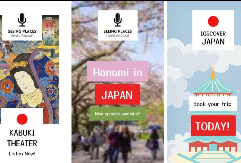
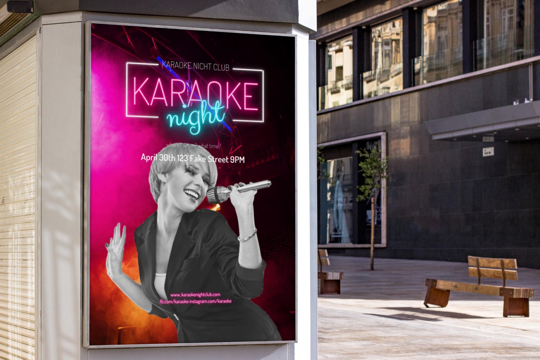
3. Let's Put Together Our First Instagram Story: So I'm going to start
with creating a new file. And in here I'm just
going to type in, maybe not here, I'm going
to type in Instagram. And then let's just
choose Instagram story. And there we go. We've got our blank canvas. So if we take a look
at our first project, you can see here that,
well first of all, we got this kinda like a very, very simple logo that I've put together using just a
simple icon and some text. So let's, let's first do that. So I'm going to search
for the elements. Let's type in my Crow
found like that. And here inside graphics, I'm just going to
look for a microphone that's going to look good. I think I'm gonna
go with this one. It can be black. It looks quite alright. And now let's just
add a piece of text. Let's add even be subheading. Believe it's sad. Scene, places like that. Let me just check yes, in places and let
me just quickly check the font that I used. It's called Love low. So let's do that. Now, I would like
assembling this kind of a logo is not the main
goal of this project. But I still want to, I want you to see like
the whole process of coming up with this design. I'm going to make it
significantly bigger like that. And maybe let's make this
microphone a bit smaller. So it looks more
or less like this. Maybe I'm going to decrease
the font size of this guy to something like 36 and the
microphone just a bit smaller. And now let's just copy this guy some
holding down both the old and the Alt key and
clicking and dragging it down. And let me just
consult the original. So this is a travel podcasts and it's using the font
that is called now. So let's type in travel
podcast, podcast. And let's change the
font to now when we go. And it needs to be
significantly smaller, something like 24 should be. Alright. So I'm going to, brain does get just a little bit to the top, make these guys, these
frames a bit smaller. And p, this guy should go just a bit down to
somewhere here. And I guess it looks
quite alright, this nice little logo. It's nothing too fancy. It's just it's kinda
like a placeholder logo, to be, to be honest. So the last thing to
do here would be to just select everything
and group them. And then we can maybe just add a simple, simple rectangle. And that rectangle
needs to be white. Because if we can just
take a look at this guy, you can see that we are
going to be putting it over a background. So it would be a good idea
to just add this kind of a, like a separator between the
background and our logos. So let me just maybe make it
just a little bit bigger. No line but that we can
always adjust it later. Again, I'm going to
select everything. And I guess we could maybe
make sure that these guys are nicely aligned and then
we can group them. So this guy is gonna
go to the top. So somewhere here. And now we have to find the right background
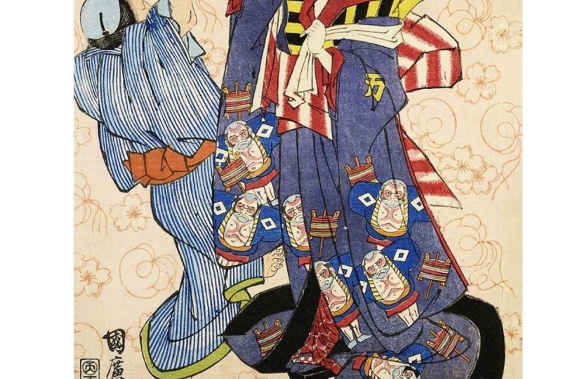
for our project. So from the elements, I'm just going to search for
like maybe, I don't know. I think I search
for Kabuki before. So like the ancient theatre. And let's go to maybe graphics or maybe
let's search for photos. Maybe that's going to
look a bit better. So here we got like
these really nicely looking like traditionally
an old traditional art. So let's maybe go with this one. This one looks also nice. I'm going to leave this guy. And of course this guy
needs to go all the way to the back so it can
go to the position and just send it
backward like that. So far, so good, it
looks quite acceptable. I gotta say. So the last part
here would be to add this bottom elements down here. So we need to add
another rectangle. So let's go to our elements
and let's grab our wealth. This is a square, but
we can turn it into a rectangle very, very easily. So I'm just going to maybe
move it to somewhere here. And it definitely
needs to be white. There we go. And we need to add that like, well, basically an ellipse. And let's turn it red. And now it's simply
will symbolize like oh, that dot circle from
the Japanese flag. Maybe let's make
it a bit darker. I think it's a bit darker in the original,
something like that. And now we have to add
the title of our podcast. So I'm going to go to the
text and I'm going to add a, maybe the sun has a heading. Maybe instead of writing
like ancient Japan, let's just type in like Kabuki. There we go. And of course
we need to change that font. Now the font that
I chose for this, well, basically for this
piece of text, um, I mean, I was looking for something
that's going to look a bit more like
traditional Japanese, but that's going to be
readable to Easterners. So this is this guy right
here, you say magic. I think it looks
really, really nice. So I'm gonna make this guy
just a bit smaller, like that. And I'm going to clone and down and type paddle-like Theatre. There we go. So maybe we should move these guys just a bit
up to somewhere here. And let's see what else we have. We got new episode available. Listen now, we could
type that in as well. So I'm just going to move
this guy to the bottom. And let's shorten
it a little bit. Let's time and let's type
in something like Listen. Now, just like that. And let's make it
significantly smaller. List is something like 42. Maybe This is gonna
look a bit better. And maybe I'm just going
to move these guys, all these guys just a bit
to the top like that. And it should be, it
should be enough. Now, the last thing to do
here would be to maybe try to just make sure that
these guys are nicely aligned to the center. So like that, it should be okay. There we go. We got our, well, basically our first Instagram story complete at
least the design. So now you can actually
move on to adding animations here
inside the Canvas. Pilot start doing that
in the next video.
4. Let's Learn To Add the Animations: So there are basically two
major things you have to remember about adding
animations here inside canva. So the first one is that in
order to add an animation, you have to first
click an element. And here at the top you're going to see this animate option. One is clicked. It's going
to open up a new window. That's going to give you quite a lot of
different animations. And when you hover
over any of these, you're going to see a preview
here inside your canvas. Now, if you grab
a piece of text, you can see that you have a
bit more of these animations. And I got to say that, well, it's good at the same time, but it has its drawbacks. I mean, if we were
to, for instance, grab this piece of text and our element and then group them. You can see that we don't have that many options right here. So we can choose from like, you know, like a smaller
number of animations. The same goes for if
we grab this piece of texts and our background
and this group, and group them, because
let's say we want to animate all these
guys at the same time. So I'm gonna go to pan. You can see that we
have like a, well, there's the number of
animations is much, much smaller in
comparison to like only the animations that we
can add to the text itself. So let's actually have
a little fun with this. Let's add different animations. So first I'm going
to grab these guys, so I'm going to ungroup them. I'm going to grab my
background for this, for this placeholder logo, I'm gonna go to animate. Let's see what we have here. Let's do, maybe let's do something like a
baseline. It looks nice. It's quick. I want the animation is
to be quick because well, the store itself is
not gonna be too long. So I'm gonna do a quick
baseline animation. I'm going to grab
this microphone. And let's see this. That might be a bit too much. But let's see rise. This looks okay. And then let's do the text. Maybe we could group both of these elements and apply
the same animation. Let's see. It looks quite alright. There's a lot of going on
here, but that's what I want. Now with the background. I usually just to simplify
it with the background. I think if we were
to add like very, very lucky FuncAnimation
to our background, something like wipe
is may be okay but like tectonic and it
looks kinda weird, not to mention the stump thing. It looks, it's a bit too
much to my to my taste. So let's actually maybe
try the swipe thing. It looks okay. Now let's do some things
with these guys right here. So this background,
let's see what we, what we added here,
this was baseline, so add the baseline as well. Now for this circle, maybe let's try, let's see wipe. Maybe not. Um, let's
do, let's see neon. Let's, let's, let's do rise. And let's maybe for
these pieces of texts, let's add something different. Let's add the typewriter
effect, which is, as you can see, like
mimicking the Tx beam type. So what we can also
use the Merge option. But I think that Let's
go with this typewriter. Same guy, same for this one. And for the bottom one, Let's maybe do something else. Maybe let's do the
baseline as well as going to come up
from the bottom. I think it looks okay. Now when it's all done, we can go to our preview
option right here. And you can see how this whole, this whole like Instagram
story is going to play out. So now, if you don't
want to do it like that, you can always just
grab an element. So let's say this background and just hover over the
animation and it's going to play out all the
animations that we have added to our project. And then you don't have to go to this Play button just to see what your animation is
going to look like. So all in all, I think
it looks quite alright. I mean, it's engaging enough. And you can use this undertaken to follow this understanding in creating your own projects. But I think that we might even want to try something else. We can create a video story. Maybe we are going to add a
video as our background and we are pretty quickly
going to learn how to edit videos here
on the side, Canada. But that is something
that we are going to do in the next video.
5. Let's Create an Instagram Video Story: So let's start with adding
a new page like that. And let's preview
our former design. And as you can see, we got this, well, this placeholder
logo here at the top. And we've got some text
here in the center. So maybe, I guess it would be a good idea to simply borrow these guys that we
already have here. So I'm going to, I'm
just going to type or copy them and paste them in. And remember when you copy the elements over to
another art board. And those animation effects are also going to be preserved. So if I just click
on this background, you can see that we still have this baseline animation added. So now let's add the video. So I'm gonna go to elements, and I'm going to type in that like this cherry blossom
festivity is called Hanuman. So I'm just going
to type that in. And from these, these options, I'm going to choose videos. Now. These videos are of course, usually going to be horizontal. So even if we try to find
something with vertigo, we're not going
to get that much. So I'm going to just
get rid of that filter. So let's try to find something
that is a bit more like animated in a way that there
are some people around. I just, I just don't want to
add like just the branches. Because now this specific the specific holidays
about people getting together under the
cherry blossom tree. So that's what I
would like to show. So I guess the one that I
just saw would be better. Maybe, let's see, this
one seems quite alright. Now of course, what we
would want to do is we would want to add it as a
background, video backgrounds. So we need to just make
it significantly taller. And I'm going to make
it this big like that. And we can always move
it to the center or may be moving something
like that should be. Okay. And of course it would be good
to add it as a background, so I'm gonna just push
it backward like that. Now, as I mentioned before, with this this video element, you can, you can do
some things about it. And if we go, if we go to this
top bar right here, you can see that we
got this edit video and this scissors right here. So if we click on it, you
can see that we've got this timeline showing us
like all the frames I guess, that are available here
inside our, our video. And as you can see it, this
video is almost 10 s long. So let's say that we want
to make it shorter that we want this to
play for only like 5 s. So here on the left and on the right we got
these purple marker. So when we just start moving it, you can see that we are
kinda like scraping these, well, these frames,
I guess so to speak. So basically we are marking
with this left marker. We are marking the
beginning of the video. And with the right marker we are marking the end of the video. And once we do that, you can see that the length
of the video is changing. So if I want to make
it like kernel longer, I can just move on my
mortgage to the right. And if I want to
make it shorter, I can move it to the left. And we could also just type
in what you want here. And as you can see, this marker is moving directly into
that spot that you want it. So now this video is going to go into play only four or 5 s. This time-lapse,
not for the whole 9.6 s. And once we're
happy with that, we can simply click
on the Done button, as you can see here in the top on the running
time of our video, is set to 5 s, which is definitely what I want. And I would also like to add those remaining
pieces of texts, are these guys right here? But I think that we can start doing that
in the next video.
6. Let's Add the Remaining Parts of the Video Story: So let's start with adding
our first piece of texts. And we can simply just
reuse what we already have. So I'm just going to copy and
paste this guy right here. And remember that we have this animation option
attached to it. So we have to remember that. So this guy is going to
say what it's gonna, it's gonna say
Hanani in our, okay. So let's just add a piece
of text. Can be a heading. So let's type in
Han army in Alice, change the type to
our, you say magic. And I'm going to just move it
to the top somewhere here. And let's now change
the color scheme. So I would want this
color scheme of our upcoming backgrounds and pieces of texts to match
the background, right? So the background video, and I would also wanted to at the same time
match the theme. So the cherry blossom
trees and also Japan. So this guy here in
the, in the back. So I'm going to search for
a while like a good car. But as you can see here, the colors from the photo, I'm not that great. I would want something that is more like pink or
something like that. So we can start with
this base pick color, but it needs to be desaturated. So it looks more or less maybe like this, something like that. So now we can change
the font color to white and the
contrast is going to be, I think it's gonna be enough. It's going to be readable. Then we can just grab
both of these elements and press the press and
hold down the Alt key. And then just clone
this guy here. And now let's just type in maybe Japan and I'm going to use the capital letters just so, you know, just so it
looks a bit different. And what I wanna do
here is I want to add like a red background
because I wanted to, I want this guy to be now since this piece of taxes Japan, and like this red circle is
so prominent in the flag. So I want this background
to kinda reminder that. But maybe that red
is not that great. Let's again make it
a bit desaturated. Maybe something like that. This should be okay, less than split hairs here. And the last thing to
do here will be to add new episodes available. I think it said
something like that. So I'm going to
just type that in. And so new episode of
failable available like that. And of course this piece of text needs to be
significantly smaller. So let's try 42 or may be 36. This should be enough. So let's make this guy
significantly smaller like that. And I think it
would be better if it went a bit to the left. And then let's make
this guy just a bit smaller so everything
is nice and proportionate. Now this guy, I'm going
to make it like greenish. So it matches maybe like
the leaves in the back. So again, let's make beam man, lets me make it a bit
darker and desaturated, maybe something like that. And there we go. We could again grab
these elements. So I'm going to group them because I want to make sure
that they are nicely aligned. So I'm going to
group everything. And now if we just shift
click on these three groups, we can go to the
position option and just make sure that they
are nicely centered. And then we can move this
guy to the center as well. I think it looks okay. So now what we could
do is we could simply animate all these
elements and remember that these guys are grouped. So let's just go to, go to the animate option. Let's just choose this group. So now this animation
is going to look, let me just go down. It's going to look
something like this now. It looks okay, but I think that now we can still
make it a bit better. So first of all, let's
grab this video. And as you can see, you can
also animate the video. But again, I'm just going to add simple fade option to our video. And I'm going to grab
this piece of text. So let's see baseline again. I guess if we combine the two, it's going to look okay. This guy, let me just
ungroup these guys. It's gonna be a bit easier for
us to check the animation. So baseline for this guy
and baseline for this guy. And let's ungroup these
cell and these elements. Let's grab the background
and let's do baseline. And let's do baseline for this. And as you can see,
they are nicely like popping in one after another. So it looks kinda, kinda okay, so now we can just
preview all our elements. I think that they look, they look quite alright. Now, one before move on. One important thing with
these animations here is these animate options like
both on enter and exit. So you can control how this specific piece is going to behave when the animation starts
and when it ends. Or you can control
what's going to happen. Like nose both states. So you can have this baseline to happen only when this
whole animation starts. You can make it like
animate only on the exit. Or you can animate
it on both states. But I usually just leave, enter because usually when it's like an Instagram story
and they'll just like, you know, like switch
from one to another. I don't think that the Exit
animation is that important. Like in this case, you
can see that we've got this both state here. So when active, so when
the animation ends, it's also going to animate. So not just on Enter, but that's something you can do. It's something to consider, but it's definitely
something you need to be aware of when creating
your animations. So the last project
we are going to do is this nicely looking, um, well, basically like a travel and storing
something like that. But the main difference
here is that I've used cut-out illustrations to
assemble this scene right here. And the other elements are
basically also animated. So we can actually start
doing that in the next video.
7. Let's Create the Cut Out Illustration Instagram Story: So let's go to our project
and let's add a page. So the first thing
that I'm going to do is find a nicely looking, nicely looking at background. So I'm gonna type
in something like sky background like this one. And I want to search
for graphics. And the one that I chose
is this guy right here. But as you can see,
it's pretty small. So what we could do
is we could create a mosaic out of these guys so they look more
or less like this. But sky look in this repetitive. It will look like, like it's
a very, very artificial. I guess the best thing to
do will be to just make it significantly bigger like that and move it like
somewhere to the center. So now we could put
something over it. Like that pagoda right here. But before I do that, we could maybe maybe do something like a
background separation. But unfortunately,
as you can see when we go to the
Edit image here, we don't have like all the, all the filters available to us when we are using a photo, since we're using a graphic, this is all we have here. So what we could do is we
could search for something like like a blurred rectangle, like the one that
I recently looked for when we added to our image. And of course we have to
make it wrote rotated. So what I wanna do right
now is I want to cover this background with
this blurred rectangle. Now, this effect might
be just a bit too much. So we can go to that transparency option
and just decrease the transparency being quite significantly to something
like 20 per cent. And now it looks a bit like
blurred this background, but not that much. So now when we look for a, Let's look for a pagoda like
that from the graphics. And I believe it was this one. We now just place
it down here and make it taller like that. Now, just this nice separation between the background and
this pagoda is being created. And I think that it's
simply looks nice. Now here at the top, we would have to add like this discovered Japan
placeholder logo. And I think that we
could reuse this guy right here because it has
the elements that we need. So I'm just going to copy them. And I'm going to paste them here and move them
somewhere in to the top. And let's type in this cover. This cover, and let's
make this guy is smaller. So it fits our frame,
at least for now. Discover. And let's type in
Japan like that. And it looks nice. So remember that we still have this animation added
to our elements. So this rise, this
typewriter, all these things. But I think that may be, I'm going to change
it from typewriter. Maybe let's see this asymptote when it might look a bit better. Let's ascend option it. I think it looks better. It also here at the bottom, we can add this book, your trip today thin. So I'm just going to maybe copy these elements and
paste them down here. So somewhere here. So this guy is
only going to say, let me just try to copy. I'm going to just
try to click N. So today, let's write that in. Then we can just move it may be a bit up
to somewhere here. And let's type in land,
grab these elements. So again, I'm pressing Shift and Alt keys
at the same time. And let's type in
book your trip. So let's do it like
book your trip. Let's make this guy is significantly smaller,
something like 32. That might be a bit too, well, not that visible. So let's select 48, and that would require us to make
this guy just a bit bigger. So we can make this
frame just a bit bigger. And this guy can be just a bit smaller and look in
more or less like this. And I'm going to push
these guys just a bit down and you know what, maybe let's actually do it. Keep it very, very simple. So we're going to
change the color to black and this background, I'm going to make it white. So remember that most of
these elements still have, they still have animation,
it's attached to them. So like this one right here, and this one right here as well. So let's change this baseline
animation again to that. Where was it? To the ascend option? Same for this guy. So ascend and this guy
was set to baseline, so it should be okay. So it will look more
or less like this. So we can also add an
animation for our pagoda. Let's do drift. May be not. Again baseline. Let's do pop maybe. Yeah, it looks, it looks okay. It looks nice enough. Now we got this, this rectangle as well here. So it's also being animated. But I would definitely like
to animate our background. So let's do, let's see Pan. Pan is going to look nice
because as you can see to kinda like mimics the
movement of the clouds. So that looks all right. Let me just move this
like blurred rectangle as well as add the
pen to it as well. So it was this guy. So let's
preview it one more time. Yeah, it looks it
all looks nice, law. Let's preview all of our, all of our stories. So this is the first one. Now we've got this
video story as well. We added this time-lapse. And we got this like
a cutout animation, cutout illustration
animation created as well.
8. Summary and Final Thoughts: There we go. This is how you can create your own Instagram stories and use the animations here
on the side, Canada. So as you've probably noticed, there's quite a lot of different animations that
you can choose from a normally I would advise to
just keep things simple, but since it's an
Instagram story and your products are fighting
for the attention of a lot of people with
a lot of competitors. So maybe adding a few different animations
might be justified. It might actually help you
stand out a little bit. So no, you definitely
can experiment with all these Canada animations and create your own
Instagram stories. So one more thing to remember here before we wrap
things up is that since we have a lot of moving elements and we also have a video
in the background. Now, if you want to download these elements and then
upload them to Canvas it. Well, it's highly
suggested to just use the MP4 video
format because it's the most popular video
format around the web and you wouldn't have any problems
uploading it to Instagram. There we go. We got our project is created. I hope you liked it and
I hope that you will share your own projects. And of course, until next
time, have a nice designer.
 Dawid Tuminski