Transcripts
1. Welcome to the Class: The website header is one of the first things people see
when they land on a site. It's where they find your logo, your main navigation, and often the most important
call to action. It's also one of those elements every designer needs to
create at some point, and that's exactly what we're going to do in this short class. Welcome, everyone. I'm Adi. And today, we're
designing and prototyping a responsive website
header that looks great and also works beautifully
on all screen sizes. We'll cover best practices, working with different layouts
for multiple breakpoints and using auto layout so
everything adapts nicely. We'll also use Figma make to create an interactive
prototype of the header. And for our call to action, I'll be using the
smart reusable button from one of my previous classes. So if you want to learn how
to make that from scratch, there's a link for you in
the class description. Don't need advanced Figma
skills for this, a fresh file, about 15 minutes of your time, and we'll build it step by step. Of course, there's
also a class project, so you can put these
ideas into practice. So let's open Figma
and get started.
2. Understanding Effective Headers: Before we start designing
our own header, let's take a quick look at a few real world
examples and break down the four key
principles that make a header both beautiful
and effective. First up, clear branding. In a great header, the
logo is instantly visible, usually in the top left corner. And that's not just tradition, it's what users expect, and it helps them instantly
recognize the brand. Next, simple navigation. You should always keep the
number of links manageable. Group related items together and make sure the text is
clear and easy to read. Too many links, and the
header feels cluttered, too few, and visitors struggle
to find what they need. The goal is a balance
between the two. Then we have a
strong call action, something that
stands out visually, often a button in a
contrasting color. This is the element that directs people to take the next step, whether that's signing up, making a purchase
or contacting you. Finally, mobile friendly design. A header should work seamlessly
across all screen sizes. On mobile, that often means
switching to a hamburger menu and adjusting spacing so the design stays
clean and functional. If you keep these four
principles in mind, so clear branding,
simple navigation, a strong cold action, and mobile friendly design, you'll be well on your
way to creating headers that not only look
great but also work. Great. So let's take
these ideas and start building our own responsive
header in Figma.
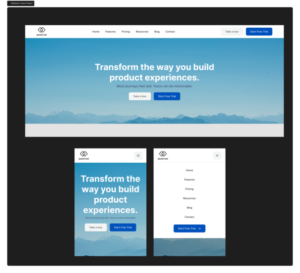
3. Designing the Website Header for Desktop: This is the starting file
that you can download by clicking on the links
in the class description, and it contains
some instructions about what you need to
do some project assets. That's basically a list of
components you can use. These are mostly borrowed from my previous class on
creating the SMR component. And I've made some
small adjustments to the button component. Basically, I changed the
a secondary variant, and I also added two
other variants that are basically smaller
versions of the first two. And then we have a dummy logo that we can use in our design. Also, I included some
predefined layouts. We have a desktop layout that's
about 1,400 pixels wide, and then two mobile ones
that are 400 pixels wide. And in the desktop version, we have the content that
we need to include. So let's get right into it. I'm going to start by
replacing the logo. So I'm going to copy
this component. I'm going to select the
placeholder here and press Control Shift
R to do replace. Or if you're on a Mac, you can use Command
Shift R. And right away, I'm going to go to
the layout section. I'm going to check
lock aspect ratio, and I'm going to change
the height to 48 pixels. Next up, we have these links. So because we're
designing a very simple, very straightforward
header, we're going to keep our
typography nice and simple, very readable, and we're
going to use Inter. By default, these are using
inter regular 16 pixels. We're going to change
things up a little bit. I'm going to use
medium because I want these links to stand
out a bit more, and I'm going to reduce
the font size to 14 pixels and use
140% line height. Also with these selected, I'm going to press
Shift A to add them to their own auto layout frame. Let's do that again, Shift A, and I'm going to
set 32 pixels as the gap between items,
just like that. And I'm going to make
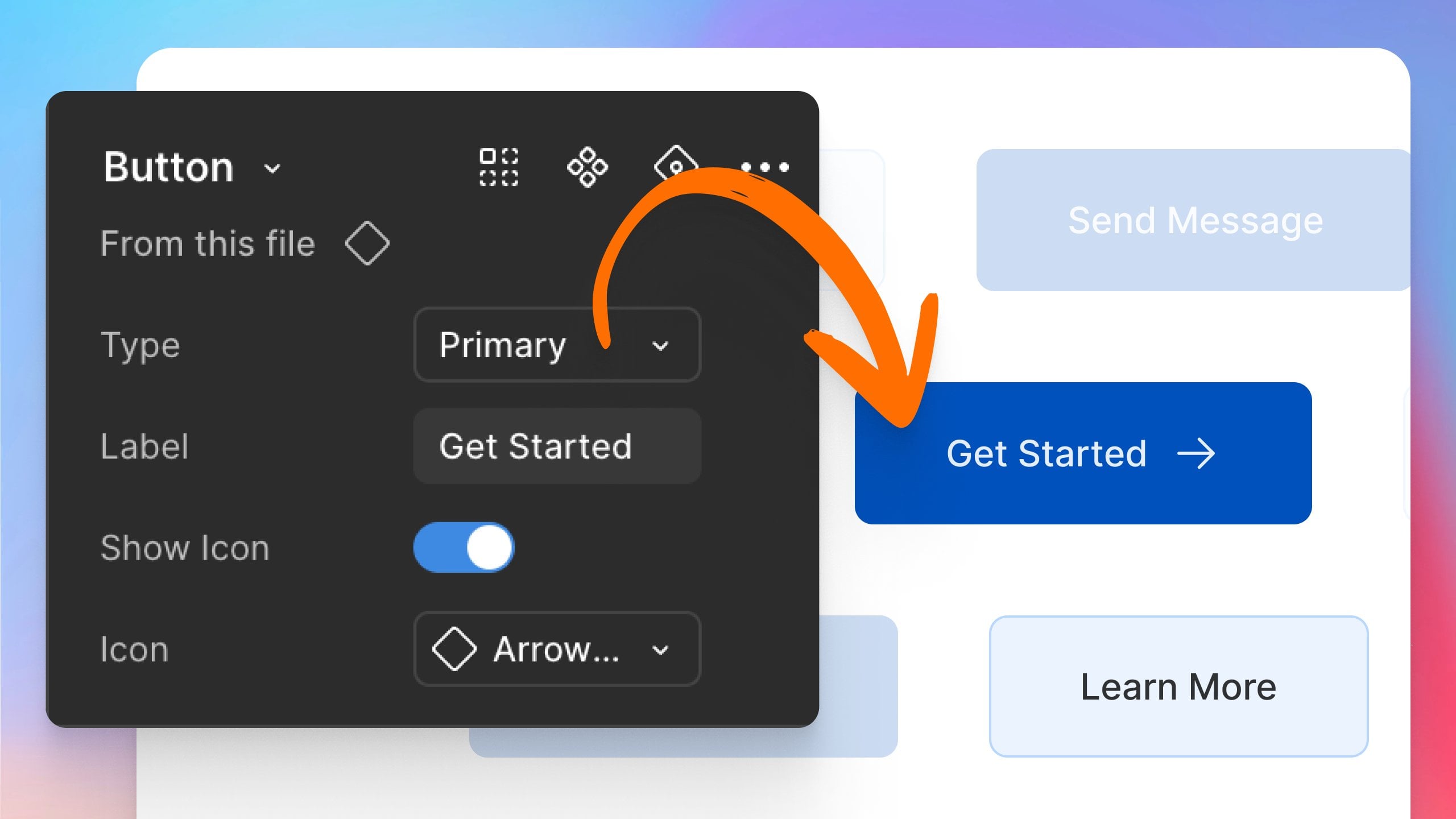
sure everything is aligned to the middle, like so. Finally, let's select the
start free trial placeholder. We need to replace
this with a button. I'm going to be using the
primary small variant of this button component. So copy that control Shift
R again to replace it. And right here, I'm
going to change the button label to
start free trial, and I'm going to use an
arrow right as my icon. Now, let's take these
three elements, and let's press Shift A to add them to their own
auto layout frame. Then in the inspector, I'm going to align everything
to the middle, like so, and I would like this header to span the entire available
width of my parent frame. Not only that, I wanted to
be able to adapt its size, to change its size depending
on the size of its parent. So when the parent gets smaller, header also gets smaller. We can do that with auto layout. So I'm going to select
the desktop frame, and I'm going to add auto
layout to it just like this. And I'm just going to
reset these defaults, the spacing, the padding. I'm going to set it all to zero. So now, with my
desktop selected, I'm just going to
increase its height just so we can see what's
going on here. And I'm going to
select my header. And I'm going to make sure that the sizing here is
set to fill container. Now, let's change a
couple of things here. First of all, I would like my navigation and my button
to be grouped together. I'm actually going to
take the button, cut it, so control or command X, and then select one
of the elements inside the navigation
and paste it in there. That's basically going
to move that element inside my navigation frame that has auto layout
applied to it. And that makes sure that I
have the same spacing of 32 pixels between the menu
and the called action. Next, I'm going to select the
space between items here, and I'm going to
change this from a fixed value to auto like that. And that's going to allow me
to now resize the desktop. Frame, and the header will
resize along with it. Let's do some final touches. Let's add some space
all around the header. So I'm going to add 64
pixels padding horizontal, 20 pixels, padding vertical. And let's make this a
little bit more visible. So in the fill area, I'm going to add a
fill color white. And I'm also going to add a stroke. So let
me show you that. Stroke that's going
to be E four, e6e7, and I'm only going to
apply this to the bottom. So that will create a nice separation between
the background of our page, which is a very light
gray and the header, which is just white. Finally, select the header, and I'm going to replace the
pure black that I'm using for the text and
logo with 27292 A, which is a darker gray. And that right there is our finished header
design for the desktop. Now, the reason we have to
make a header responsive is because not everyone browses the Internet on a desktop
screen that's the same size. So if people browse on a mobile device that
has a smaller screen, eventually, this is
going to happen. Our screen is going
to get smaller and smaller and
smaller and elements will start overlapping one another and layouts
will start to break. That's why we need to come up with a different layout
for the smaller screens. Let's do that in
the next lesson.
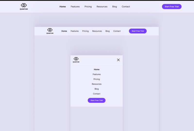
4. Designing the Website Header for Tablet and Mobile: Let me start by
showing you one of the easiest way you can create a responsive header or responsive navigation
for that matter. So we're on the
cleanshot.com website, and they have a
very simple header, very similar to
ours with a logo, a navigation, and
then a called action. So watch what happens
when we resize this. Right? The navigation and the cold action
disappear, and instead, we have this menu button, which, if we click will basically show us the menu that had
just disappeared. So we can click this to hide
it. We can click to show it. And when we view this
on a larger screen, we get the full experience. So that's what we need
to create basically. So now, going back to Figma, let's start by copying our
header element and going to the mobile closed frame, which is 400 pixels wide. And this is kind of around the area of mobile screens
in terms of screen width. There are, of course, screens
that are larger than this, some are even smaller than this, but 400 pixels is a good amount. So if we paste this in, you'll notice that
things start to overlap. Obviously, we don't want that. So let's actually select this frame that has the
navigation and the cult action, and we'll just delete it. Now, I'll go back to my buttons. I'm going to grab one of these
secondary small buttons, copy select the header, paste. That's going to paste it
in. And I'm just going to change the icon here to
a hamburger menu icon. And I'm going to select the
label and just press delete. Also, I'm going to
select this button, and I'm going to set
its width to 44 pixels, exactly the same as the height, and I'm going to change
the alignment to middle. Next up, select the header, and I'm going to
change the side or horizontal padding to 24
pixels because on mobile, we need to preserve as
much space as possible. So we need to make
things a little bit more compact than we
would on desktop. I'm also going to change
the vertical padding to 16 pixels just like that. The idea is on mobile, this element gets
replaced by this button. So when we tap this button, we need to show that
navigation and called action. Let's do that in the
next frame right here. Copy this, paste it in. When the button here is
tapped or is clicked, we want to change the icon from the menu icon to a close
icon just like that. Because we want to
tell users that, okay, you tapped on that button,
action successful, and also we're going
to change its contents so they know the next
time they tap it, they're going to
close that menu. So now let's create the
actual drop down menu, right? So we're going to copy this. We're going to paste it in, and we're going to do a
couple of changes to it. First of all, we're going to change the
direction to vertical, so all of the items are
displayed vertically, like so, and then I'm going
to add a fill color white. I'm going to set, let me actually move this
around a little bit. I'm going to set the
width to fill container, so it goes the entire
width of the parent frame, and we're going to
align everything to the top and middle
just like that. And finally, I'm going
to add some 24 pixels, horizontal padding
and 32 pixels. Of a vertical padding
so top and a bottom. I'm also going to copy
the stroke color that I used here and add it to
this element, as well. And we're going to make sure
that we're only applying this to the bottom of
the element, like so. So this is the flow, basically. We go from desktop where
our header looks like this. When the desktop gets too small to accommodate
all of these elements, we switch to the mobile view where initially this
menu is hidden, but we can access it by clicking or tapping the menu button. So that's cool and all from
a design point of view, our job is kind of finished, but we can take it
one step further and actually create a
working prototype of this. Let me show you how
in the next lesson.
5. Prototyping the Mobile Menu with Figma Make: Now that we've built our
mobile header layout, let's make it interactive and we'll prototype the
Hamburger menu, so it opens and closes
using Figma make. And in case you don't know, Figma make is a new
AI Power tool within FIGMa that allows
users to create functional prototypes
and web apps and websites from text prompts
and existing Figma designs. And it's really easy to get
started with Figma make. All you got to do is click
on the Figma icon here, go to File New and choose
M. And just like that, you are in and ready to go. The very first thing we want
to do is copy and paste the Figma frames into make so that the AI
knows what to build. So we're going to
go back and forth. So select the desktop, copy, and then going in
here at the bottom and just paste it in, and we'll do the
same for the mobile. So copy that, paste it in, and then mobile opened, copy that, paste it in. And then you got to
describe your idea. What do you want the
AI to do with this? So I'm going to say, create a Ptype of the
responsive header. And I'm just going to press
Enter, and that's it. I gave the command to the AI. Now, it's thinking. It does some reasoning, you know, determining
what it needs to do. And soon enough, it's going to start building. So there you go. It created our header here. I added some extra
content here that, you know, we can
always get rid of. But essentially, what
we're interested in is the functionality, right? So I'm going to open up mobile preview, and
as you can see, when I resize this, yeah, when I get to about that point, it changes to the mobile view. And when we click this icon, it shows me the mobile
design that I created. Click that to close,
resize this backup, and if there are any changes that you want to
do at some point, you can ask the AI for changes. For instance, I can tell it switch to the
mobile view sooner. I enter, and now it's
doing the same thing. All over again, it's going to change some
things in the code, and it's going to basically
do what you ask for usually. Okay, Version two
is now complete, and when we resize, you can see the change
happens a lot sooner, which is exactly what I wanted, and it's still a fully
functional prototype. Alright. Now it's your turn. Your project is to design your own responsive
website header in FIGMA. Or if you prefer, you can recreate the one I
built in this class. For the CTA button, you can design your own or
use the one I provided. If you're curious about how I create that smart
button from scratch, check out my other
Skillshare class. There's a link for you
in the description, or you can browse my profile to see all my design classes. You're done, please share your header design in the
class project gallery. I'd love to see what
you come up with. Okay, thanks for watching. Happy designing, and I'll see you in the next
class. Bye for now.
 Adi Purdila, UI/UX Designer, Framer Developer, Educator