Transcripts
1. Welcome to the Class: If you want to improve
your typography layout and color skills without taking
on a massive project, then this class is for you. Everyone, I'm Adi, and
in this short class, we'll design a responsive
pricing table in Figma. It's quick, it's focused, and every step is actionable. You'll see exactly how
to structure a layout, choose and scale typography, work with consistent spacing, and create a simple,
effective color scheme. And because we're only designing
one part of a website, it's easy to follow along. Plus, I prepared a
starter file with the brief instructions
and ready to use frames, so you can jump right in. This class is part of
my UI Pattern Series, short practical builds that focus on one pattern at a time. So you can sharpen your skills and practice
key fundamentals without getting lost in the
scope of a full website. So open up Figma, grab the starter file, and let's get started.
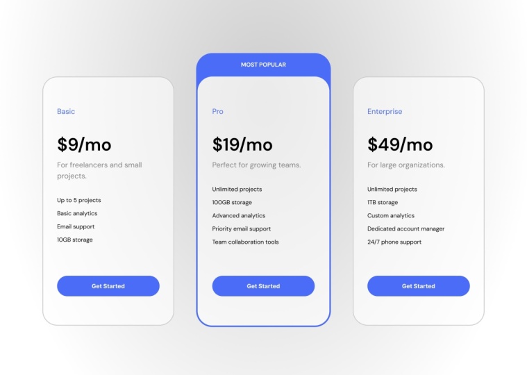
2. Base Layout and Typography: This is a copy of
the starter file. Let me show you what we have. First of all, instructions. We need to design our own responsive pricing table based on the class brief, and we need to include
three pricing plans. The plan names, prices, short descriptions,
and feature lists. We need to highlight
the most popular plan. We need to have a clear
CTA button for each plan, and we need to create
desktop and mobile layouts. Now we also have
some project assets. We're designing
this pricing table for a SAS startup
called task flow. We have the three plans, Basic Pro and Enterprise, and we need to
highlight the pro plan. We have some brand
colors to start with. In terms of typography, we need to use a clean
San serif typeface, and we also have the copy or the text content
for this design. Oh, let's actually
start right here. I'm going to grab the
copy for the Basic plan, and I'm going to go
to my desktop layout. This is where we'll start. I'm going to paste that in, and I'm going to start splitting
up the text as needed. So I'm going to grab the text, cut it from here, create
another text element, and I'm going to grab this
description, cut it from here, create another text element, and then I'm going to
grab the plan name. Pasted in here, and
all we are left with here is a list of
our plan features. So now let's arrange
these a little bit. We would basically have the
plan name, then the price, and then the description here, and then the plan features. That's a pretty standard layout. And at the end, we're going
to add the CL to action. And if we look
back at the brief, you can see that
the CTA button text should be get started. So let's copy that, paste it in. So now we have all of the
text content prepared. We're going to use
Auto Layout for this because it's much, much easier. Select everything. Shift A. This will add everything
to an Auto Layout frame, and then I'm going to
start grouping elements together depending on
where they belong. So for instance, the
price per month and this description should
probably be grouped together. So Shift A again, to add them to their
own Auto Layout frame. Then I think I'm
actually going to separate these elements as well. So I'm going to cut
each one of these, create a new text element
and I'm not going to use a list here. Let's just duplicate
that two more times. Let's copy this, paste it in, copy this, paste it in. Let's just remove those. And finally, the
last element that remains here is
the email support. And let's clean this up as well. Now, select this,
this and this shift A to add them to their
own Auto Layout frame. And for now, let's just set
up a random spacing like so. The next step is to apply a type scale
to this whole thing. And a typ scale is basically
a typographic system where every font size is based on the previous font size
multiplied by a certain ratio. This allows you to create, like, very natural looking
font sizes, so to speak. So you can do that
in multiple ways. My preferred way of doing
it is by using a plugin. So I'm going to press
Control or Command K to bring up the actions. I'm going to go to
plug ins and widgets, and let me actually zoom
in here and I'm going to search for type scale. And I'm going to just
click on one of these. The first one, I think
works just fine. I'm going to save this,
and I'm going to run it. And I'm going to choose 16
pixels as the base font size. And the scale, I'm
going to go with 1.333, which is also known as the
perfect fourth like that. And this is kind of the type
scale that we're looking at. So I'm just going to
click on generate, and I'm just going to
bring this up like so. So now you can see that we
have the 16 pixels here, and then the next font
size in the scale is 21, and then it's 28, and then it's 38 and so on and so forth. And it also goes to levels
below where we have 12 and nine pixels for
really, really small text. This is a great way of setting the font sizes if you're lost, basically, if you don't know
what font sizes to use, always use a type scale. Okay. So now let's apply this or this scale to
our design elements. We'll start with
the biggest one, which should be the price. And if we scroll back up, I won't go, like, the very first element here
because it's too large. Let's try 51 pixels because that looks
about the right size. So in here, we'll set 51
pixels, 150% line height. That looks pretty good so far. Next up, for this
small description, let's go with one step higher
than the default font size. The default being 16, we'll use 21. So select that. We'll set 21 right there. That looks pretty good.
Let's set 16 pixels. To the features because these resemble more
like a body text, like a regular body text. The plan name, let's
also use 21 pixels. So it is the same size
as this description. And then the button here
we go at 16 pixels, but we're going
to change this to bold because I want the button to stand
out a little bit more. Okay, so we got the
basic layout done. We applied the type scale, but we also need to
choose a typeface, right? Because by default,
this is using Inter, but Inter is it's
a great typeface, but it's used a lot, right? So there are a lot of
great options out there. And a great source of typefaces that I use all the
time is Google Fonts. They're free. Basically, there's
a huge selection, and they're preloaded in Figma. And if we look back at our project brief
under typography, we can see that the suggestion is to use a clean
Sans Serif typeface. So let's actually
go to Google Fonts, and we'll actually scroll down in the sidebar here
where it says San Serif, and I'm just going
to choose all. And that's just going to show me all the sanerif typefaces. In here, you can see Inter. The one that was
there by default, Monstera is another
great variation. And you can just pick
any one of these, test it in your design. Me personally, I'm going
to choose DM sons. I really love this typeface. It's very readable. It works great for body
text, and it has just, you know, a little
bit of character, so it's not too bland looking. So DMSnsF Google Fonts, I'm going to choose every
single text element in here, and I'm quickly going to change
it right here to DM sons. And this is what
it looks like up close Beautiful,
beautiful typeface. Okay, so with that done, the next step is to
work on the colors. That's coming up in
the next lesson.
3. Applying Colors: Let's quickly create a color
palette for our project. And based on the brief,
if you remember, the brief told us that, hey, we have some brand
colors you can choose. There's a primary, which
is like an indigo color, and there's an accent, which is like a warm orange. Now, I got those
colors right here, and the very first
thing I want to do is create a gray color
based on my primary. I can do that really easily
by duplicating this, opening up the color picker. And choosing the HSL color
mode to create a darker, less saturated version
of my brand color, and that's going to be
the base gray color. So here's how I do
that. I switch, first of all, from hex, which is probably
the default mode in your color picker to HSL. This stands for hue
saturation lightness. It's basically another way
of representing a color. The first box here
represents the hue. This is the saturation, this is the lightness. So what I want to do is keep the same hue but
decrease the saturation. So remove a lot of that color information and
also decrease the lightness. So saturation, I'm going
to decrease it all the way down to about
here to about 16. So it's more towards gray, but it still has a bit
of that color inside. And I'm also going
to make it darker. Instead of 63, I'm
going to reduce it to about this much 32, right? So by doing that,
I got a darker, less saturated version
of my primary color. Now, let's create some tints
and shades for these colors, specifically for the
primary and the gray. And a tint is basically a
lighter version of the color. A shade is a darker
version of the color. It's like mixing white or
black with that color. And there are several ways
of creating tins and shades. Personally, I prefer
to use a Figma plugin, and there are also a bunch
of plugins available. The ones that I've
been using recently is called Hu Hu Tins and Shades. So you can open up the
actions panel here and you can go to plug ins and widgets
and search for Hue Hue. So when you click this, it allows you to select
a color, basically. I'm just going to sample my primary and I'm going to leave the rest default and click
Generate Colors, right? So that's going to generate
some nice colors for me here. And I'm going to run
the plug in again. But this time, I'm going
to sample the gray color. And it generate again. And I can just close
the plug in window. Let's copy these and paste
them inside my section, right? So now I have my color palette. If at any point, I need to create tints and shades
for the accent color, I can do that just as easily, but for now, that's
not necessary. So now that I have some
colors to work with, let's start with the background. And let's do
something different. This time let's do a dark mode. Okay? So I'm going to
select the desktop, and I'm going to press
I, and I'm going to sample this very dark color. And instead of using a solid
color, let's use a gradient. So I'm going to go back to
the fill color right here. And I'm going to
click on a gradient. I'm going to choose radio, and I wanted to radiate from, let's say, about this
point outwards, ok? And I'm going to swap
the colors here, so it goes from a lighter
color to a darker one. And for the lighter color, let's just sample
maybe this one. Okay, so I think
that's good enough. It doesn't have to be a huge
difference in contrast, just enough so that we know
we have a gradient there. Okay. Now, let's
work on these cards. Let's start by adding a
background color to them. So let's add a fill, and let's sample this
dark color right here. Let's use maybe 60% of that color just to give it a little bit of a
darker background, so we can still kind of
blend it in the background. Let's also add a border color
to it, click on stroke. I'm going to set the
border to the outside. And let's see. We're also going to
use a gray color. So let's sample maybe this one. Okay, click outside,
see how it looks, and that looks
pretty good to me. It's still distinguishable
from the background, and it adds a little
accent border to the card. Next, let's add some
padding to this box. Because we're using Auto
Layout, it's really simple. We'll just add 40 pixels
to left and right, and then 80 pixels
to top and bottom. And let's also add
a border radius of 40 just to make this a
little bit more rounded. Now, let's color
these text elements because we can barely
see them right now. So select the card. And, you know, instead
of using black here, we could switch this to white. But I feel that has
too much contrast. So what I like to do is
just use another gray, but one that's very, very light. So I'm just going to select
this very light tint. And that makes the text visible. It has a great contrast, but it also kind of blends in a little bit more
with the background. And let's select the text here, and for it, I'm going
to use a darker color. So let's just sample
maybe let's see this one. That's too dark. Let's
go two steps up. That looks pretty good. And
I think I'll keep that. Now, what else? Let's create the button, right? The button should actually use, like, the primary brand color. So we'll select the text. We'll do Shift A to add it to
its own Auto Layout frame, and we'll use a
32 pixel padding. Horizontal 16 pixel
padding vertical, we'll align the
text to the middle. We'll make sure the fill
here or the width is set to fill container so
that when I resize my card, the button also resizes with it, and let's select
the text inside, and we'll set its width
here to hug contents. And let me just show you
the full picture here. And now let's take this button. Press I will sample
the primary color, and we'll just add a
100 border radius. So it's like a pill shape. So now, because of Auto Layout, the button resizes
along with the card. Cool. Let's also dress
this up a little bit more, and let's add some icons
to the feature list here. And one of my preferred
icon set that is also free is phosphor icons. You can grab it at
phosphor icons.com. And if we click
on Explore icons, we can search for maybe a check, and I'm going to
select check circle. And all the way
here at the bottom, we have the option to either
download or copy an SVG. So let's copy that SVG. We'll jump back into Figma and we'll select one of the
text elements here. We'll paste that in,
and we're going to set its size to 16. By 16. And we also need to
apply color to it. So I'm actually going to use the color from this text here, copy that, paste
it to that icon, select the icon and the
text we're applying it to. Shift A to add it to its
own Auto Layout frame. And then in the inspector here, we're going to set its
direction to horizontal and the alignment
to middle like so, and then we'll simply select the text, move it to the right. So now all that's
left to do is apply the same layout to the
other four features. And the way I like to do that is to simply duplicate
the first one, so control or command D, and then just select the text, copy it, paste it in. Copy, paste it in. And copy, paste it in like so, and then I can select
these, delete. And now my layout is ready. Finally, one other detail here, I'm going to select the
card, and I'm going to set the gap between
items to 40, okay? But I would like the button, the CTA to be placed
further down. And I would also like that
to stay at the bottom of the card when I resize the card vertically.
So how do we do that? Very simple. We select these three elements would you shift A to add them to their
own Auto Layout frame. And now, in the main card, we set the spacing to Auto. So that means when I
now resize this card, these elements stay on top while the card stays fixed
at the bottom. And before we wrap
up this lesson, just two more changes. Let's select this frame, which contains the price
and the description. And we just got to make sure
the spacing here is right. We're going to set it to
four pixels just like so. And finally, the plan name, let's give that a
different color. Let's use this axon
color right here. So now the plan name
is more visible. And for the rest
of the elements, we use the primary and also the grays that we
have created earlier. Okay. So with that done, the next step is to just
create the other two cards. That's coming up in
the next lesson.
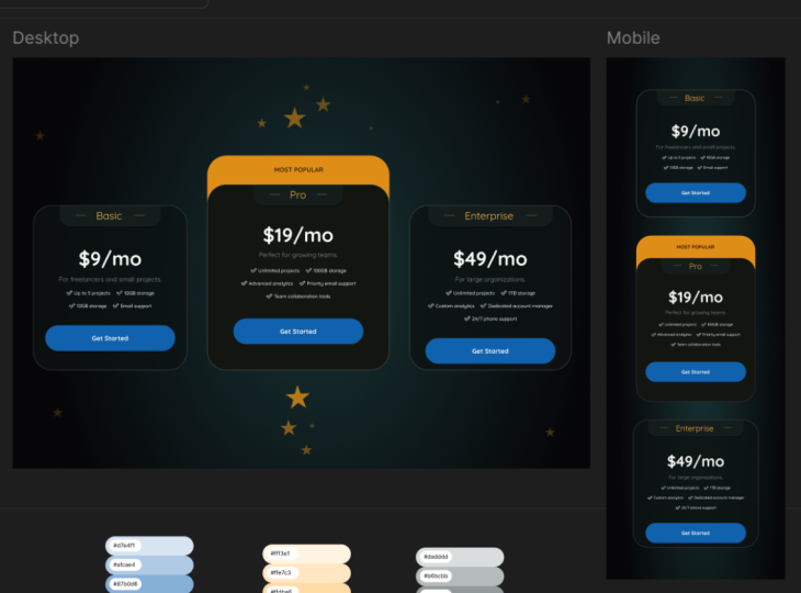
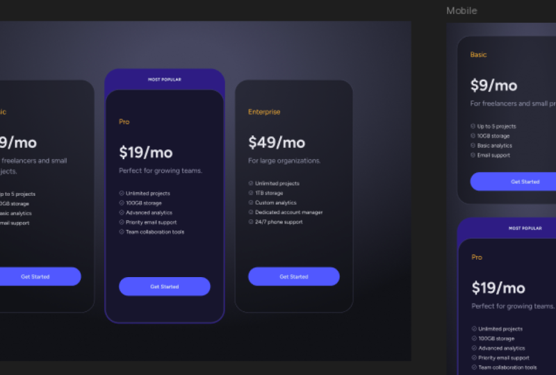
4. Completing the Layout: Let's complete the
layout by first creating the other two cards. So I'm simply going to
resize this a little bit, move it here and control or
command D to duplicate it, and I'll just move it to
the right, do that again, and create the third one, and now select all three. Shift A to add them to their
own Auto Layout frame, and I'm just going to set the
spacing here to 40 pixels. Okay. Now let's update the
content for each card. So we did the basic one. Let's do the Pro. So the Pro is $19 a month. And let me just copy
the text there. I'm going to replace
here Pro 19. Control Shift R to
replace the text. And then let's edit
these as well. We have unlimited projects. We have 100 gigs of storage. We have advanced analytics. We have priority email support, and we have team
collaboration tools. So let's copy this text, and then we'll go
in here and we'll just duplicate one
of these elements and select that
Control Shift R to replace the text or command
Shift R if you're on a AMAC, and then we'll do the
same for the Enterprise. The Enterprise is 49 a month. It's for large organizations, and we have unlimited projects, 1 terabyte of storage. We have custom analytics. We have a dedicated
account manager, and we have 247 phone support. Lovely. Now, there's
one more thing to do, and that's to
highlight the middle, the pro plan and add like a most popular
badge or something. So there are many ways we
can highlight this plan. We can give it like
a much brighter, a more colorful
background or we can add, like a colored badge. We can make it larger. For this application, here's
what I'm going to do. I'm going to select the main frame and I'm
going to right click on it, and I'm going to frame
selection, right? This will wrap it
in its own frame. So with that done, I'm going to add
Auto Layout to it. We can do that by going in the inspector and
pressing use Auto Layout. Now, let me actually bring this in so you can
see it a bit better. For Auto Layout,
I'm going to give it four pixels of
padding on all sides. I'm also going to
give it a fill. And that fill color is going to be one of the variations
of the primary color. So let's actually pick the
base color first. It's okay. It definitely stands out, but I think it's a
little bit too bright. So we're going to tone it down. I'm going to choose
this color right here, the third one from the bottom. Also, I'm going to select
the main card that's inside, and I'm going to increase the color opacity
60-80. All right? Because I want to be able
to see the background, but not too much of it. Okay. And now I'm going to
select the entire card, and I'm going to give it the same 40 pixels
of corner radius. So it looks like this. And then I'm going to select it, and I'm just going to zoom in here so you can
see what we're doing. And I'm going to click this
individual padding button, and on the top, I'm going
to set it to 64 pixels. And that basically adds
a top space here that we can use to place our
most popular text. Okay. So let's do that right now. I'm going to click
inside T for text, and I'm just going to
type Most Popular. And I want this text
to float freely. So I'm going to go right here at the top where
it says position, and I'm going to press
Ignore Auto Layout. Okay. And as soon as I do that, the text is still inside
my Auto Layout frame, but now I can move it
to wherever I want. So for the text, let's make it bold, and let's make it all uppercase. Like that. And because
we're making it uppercase, let's increase the letter
spacing a little bit. I think 6% is enough, and I want to make it smaller. So to determine what
font size I want, I can go back to my
type scale, right? We can see that fonts
that are smaller than 16 pixels based on the scale
should be either 12 or nine. So let's try 12. And let's zoom to 100% and
see how that looks like, and I think that
works just fine. If that doesn't work
for you, of course, you can increase it or
decrease it even further. The type scale is
there as a guideline. You don't have to
respect it like 100%. So let's then take this. Let's align it to the center, and let's kind of
move it up or down. Just to place it in the
middle of that space, and I'm also going to select it and align
it to the middle. So if we change it, it stays in that position. And that's how we chose to
highlight this middle plan. Now, before we wrap things up, here's a quick tip, and this is a pro tip for you. Notice how these two corners
look a little bit weird. And that's because they have the exact same corner radius. But something that I picked up a while ago was that
if you have, like, nested corners like this, the one on the
outside should have a larger corner radius than the one on the inside,
so they look right. So let's select this. And instead of 40 pixels, which is the corner
radius of the inside, we're going to do 40 pixels plus the distance
between the two, which in our case,
is four pixels. So I'm going to set 44 pixels. So by doing that, the corners
now look much more natural, and that makes the whole thing
look a little bit better. It's a tiny detail,
but details matter. So then this right here is the pricing table
design for desktop. But what about for mobile? Because if we were to copy
this in a mobile screen, it's not going to
look really good. So let's make the change
in the next lesson.
5. Adapting the Layout for Mobile: Before we create
the mobile screen, let's just make a tiny, tiny adjustment to
the typography. I'm going to select
all three prices, and I'm going to change their font weight
from regular to bold. I just think this is a little bit more balanced and it draws the attention to that
area a little bit better. Okay. Now, mobile screen. Here, I have a frame
that's 428 pixels wide. Obviously, when you're
designing for mobile, you can, you know, make this smaller or bigger, depending on what devices
you're designing for. But the first thing I'll
do is select my desktop, right click copy paste, copy properties, and then copy
paste as paste properties. This basically copied
the background. Next, I'm going to select this. I'll go to mobile. I'm
going to paste this in. And of course, it's too
big for the screen. So instead of a
horizontal layout, we need to do a vertical layout. So in the auto or
in the inspector, I'm going to change the
Auto Layout to vertical. Let's just move these in here and let's make the
mobile screen bigger. Like so. And let's just move these back because
they had their constraints. Set to the center. Let's
reset these to the left top. Let's push this up to 40 pixels. And let's actually select
the mobile screen, and let's add Auto Layout to it. Let's set it to vertical, and let's select this,
and let's ungroup. And with the mobile
screen selected, let's set 40 pixels of
padding there as well. And then I'm going to select all three pricing table cards, and I'm going to set
therewith to fill containers. So now every time I resize my mobile screen
these resize with it. And we can see right
now that we have a small issue here where
the salmon doesn't resize, but it's a quick fix, select it, and in the inspector, change its width from fixed to fill container, just like that. Now, because we're dealing
with a mobile screen, real estate is really important. So let's make this whole thing
a little bit more compact. Let's select this and this. And instead of 80 pixels
vertical padding, we'll switch it to 40. And let's also set the
gap between these to 40 and we'll also set this gap to 40 and we'll set the height of each of these
items to hug contents. So they're only as tall as the content inside.
We'll do the same here. Change this to 40, change the gap here to 40 and we'll set the
height to hug contents. And the final change here, change this to 40 and
the height to hug. And that is our mobile
version of the pricing table. It's now vertical instead of horizontal and it's a
little bit more compact. And there we have it a responsive pricing
table built from a short brief and adapted
for both desktop and mobile. Believe these quick
focused exercises are really good for building your skills because you're
practicing typography, spacing, sizing,
color, and keeping layouts consistent all without the pressure of a full project. So if you've only watched the videos but
didn't follow along, I strongly encourage you
to do the class project. And your task is simple. Open the starter file. You'll find linked in
the description and design your own
responsive pricing table. You can follow the brief exactly or customize
it to your liking. That's entirely up to you. And when you're done,
go ahead and share your design in the
class project gallery. I'd love to see your take on it, and you can also get inspired by what other students
have created. And if you enjoy this, check out my other design
classes by visiting my profile or the links in the
class description for my personal recommendations. Okay, thanks watching,
happy designing, and I'll see you
in the next class. Bye for now.
 Adi Purdila, UI/UX Designer, Framer Developer, Educator