Transcripts
1. Welcome to Class: Everyone. I'm Adi. Welcome to this
quick Figma session. Today we'll build a smart,
reusable button component. Our button will have two
variants primary and secondary, and we'll add
properties for tuggling the icon visibility
for switching icons, and for changing
the button text. What you learn today applies
not just to buttons, but to any kind of component you might want to create in Figma. You don't need any special
Figma skills for this, a fresh file and 15
minutes of your time. Oh, and there's also a
class project you can do. So let's open Figma
and get started.
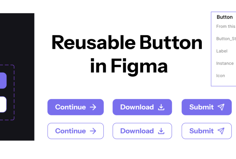
2. Let's Design a Smart Button: Alright, so I want to create
a versatile button that can be reused in multiple
places in my designs, and that button needs
to have, first of all, two styles, a primary
and a secondary, which is more subdued. And also, I would
like to display either a label inside the
button or a label plus icon. And I need a way to
change that icon and the button text and also the visibility of
the icon really easily. That's where component
properties come in, but about that just
a little bit later. For now, we're
going to start with these three icons
that I got from m an icon set called
phosphor icons. It's a free icon set. So they're SVGs,
and I'm going to select all three and turn
them into components. Now, this is really important because that's going to allow us to swap the icon in our buttons. It's not going to
work otherwise. So select all three,
and we're going to go in the Inspector panel, click on Create
Component Options and select Create
multiple components. And that's going to take
each element that I selected and turn it into a
component just like that. So now I have one component
for the cube icon, one for the arrow right, and one for the arrow up
right. That's step one. Step two, let's start
designing our button. I'm going to press T for the
text tool, type some text. In my case, button label. This can be whatever you want. For the typography,
I'm going to use inter medium 16 pixels font
size 140% line height. For now, we'll set
the fill to black. Now, I'll grab one of the icons. Let's say this cube one. And paste it in my frame. And let's change its color to black so we can
see what we're doing. And I'm going to create a
button with these two elements. Now, I would like my button
to be resizable, right? I would like it to change
automatically change its width, depending on the
contents inside. So for that, I'll be
using auto layout. Select both of these elements, press Shift A to add auto
layout to these elements. And if you don't know
how auto layout works, this basically creates a
frame in the layers panel, and that frame has
this thing called auto layout automatically
applied to it. Auto layout allows me to change the direction in which
elements are displayed. It allows me to change the
space between the elements. In my case, I'm going
to choose ten pixels, and it also allows me to add vertical and
horizontal padding. But for now, let's add a
fill color to this frame, and that color will be 00 51bc. It's like a darker blue color. Now, I'm going to change
the black here to white, and I'm going to use 90%. This is a little trick
that I like doing. This kind of borrows some of the color from the background because it's not pure white. It's a little bit see through. So, we're getting a little bit of that blue from
the background. Now, let's add some
breathing room around the label and the icon. For that, I will be
adding some padding. So I'll go with 40 pixels of padding on left and right
and 20 on top and bottom. Now, I found that using, let's say, X on the sides
and X divided by two. So half of that X on the top and bottom is
a good rule of thumb, and usually it yields
some pretty good results. Also, let's make this
a bit more friendly. Let's add eight pixels
of corner radius, just round off those corners. And the initial design for
my button is complete. Now, let's make it reusable by turning
it into a component. So I select it, and I can turn
it in many different ways. I can go in the
inspector up here and click create
component or use the Control Alt K
keyboard shortcut or Command Option K
if you're on a Mac, or I can right click and choose Create component
just like that. Now, the way I like working
is to kind of define my components outside of
any finished design frame. So I'll be working right here. Let's actually rename
this Command R Control R to rename that to button. No, I can always control C or copy this and
paste it in my frame, and that's going to
create a copy of it or an instance
as it's called. So in figma, this is
the main component, and this is a copy
of that component. And if I make any kind of
change to the main component, that's automatically going to be applied to any copy of it. So let's say I'm going to change the size of this icon
instead of 32 by 32, I'll make it 22 by 22. And that change happens here, but also in any
copy. Super cool. Now, let's add some properties to this button component
because currently, if you want to make
any kind of changes to the instance, that's
pretty hard to do. You can, of course, select the label inside and just
change it to whatever you want. But, you know, you
have to dig down and, you know, select that directly. Uh, you can select
the icon itself and just click on this drop down and change it
for something else. And if you want to hide
this icon completely, you can just click on the Hide button here and
it's going to disappear. But there's actually
a more elegant way of doing that of controlling
these things with components, and that's with properties. So let's select the
main component, and up here where
it says properties, we're going to click on the
title or the plus sign. And we have four
property types we can choose from variant text, boolean and instance swap. Let's start with text because
this is what we'll be using to edit the button label. So click that. Let's
call it label. And for the value, let's call it button
label. Create property. Next, let's add a property
for changing the icon, and that's called an
instant swap property. So again, click plus
select instant swap. This time, let's call it icon. And let's just pick
a value by default. Let's pick the cube that
we have defined here. Now, this list
basically shows you all the components
that can be used for, you know, swapping that element. So I'm going to choose
Create property. Finally, let's
click the plus sign again and we'll choose Bolion. Bolian is like a zero and one, true, false, on off
kind of property. It's either one or the other. So choose Bollion. Let's call it show icon. By default, set the value to
true and create property. Now, we have these three
properties created, but by themselves,
they do nothing. We need to link them
to specific elements. So select the button label, and in the inspector, we're going to click
this icon that says apply variable property, and we're going to choose
label because this is one of the properties that we have
available in the button. Next, I'm going to
select the icon. And again, in the inspector, click the button that says
apply instance swap property. I'm going to choose
the property name or the property called icon. And while we still
have the selected, let's go down to the appearance. Right here and click the
apply variable property, and I'm going to
choose Show icon. Now, this will
link the show icon Boolean variable to the
appearance of this element. So how does this work exactly? Well, if I select this instance or this
copy of the component, you can see that
in the inspector, I now have three options
I can play around with. I can choose to hide
the icon completely. I can choose to swap that
icon with something else. And I can easily change
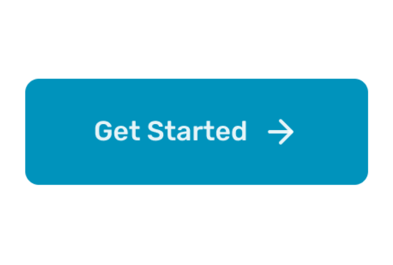
the label of that button. Let's say, get started, and let's choose
the arrow right. Of course, with this, I can, you know, copy paste, create as many buttons
as I want that look, you know, different, and
they do different things. That's the beauty of
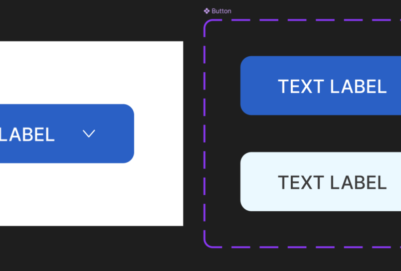
using components. Now, I mentioned that we also need to add a secondary
style to the button, and for that, we'll be using what's called variance in figma. So select the main
component button. And in the inspector, click on add variant. Now, this will add everything to this kind of container here, and it's going to do two things. It's going to make a copy of this initial style or
this initial variant, and it's also going to add
another property to my button. It's called by
default property one, but I can rename it
to button style. Or whatever I want.
And this button style, if you look in the layer
panel has two options. The first one, which
is called default, you know, you can
rename this to primary. And the second one variant two, you can rename it to,
let's say, secondary. So now let's make this secondary button
type look different. I'm going to start by
changing the fill color, and I'll be using EB
F three Ff for it. I'll be adding a stroke
or a border to it. That's b8d7 FF, one pixel. And then I'm going to change the white of the text and icon to black
80%, just like that. Now, if I make another
copy of this component, I now have another option in the sidebar
called button style, which allows me to choose
between the two variants. I also have access to the other properties like
Show icon, label, and icon. And if at any point you don't like the order
of these elements, that's really easy to change. Simply select the main button
and go in the inspector, just mouse over to the
left of the property until you get this
three dotted icon. Then you can move these around. So maybe I want the label to sit above that and then show
icon and then the icon. Okay. So now if I select
any of these instances, you'll notice the order of
these properties has changed. So let's change the label
of this button to learn more and let's just hide
the icon completely. So I would like just
a simple button in, you know, the secondary style
that doesn't have an icon. Alright, that was
super simple to do. As you can see, setting up components this way
saves you tons of time. No more rebuilding
buttons or making constant changes
throughout your designs. Now it's your turn. Use what you learned
in this video to create your own
button component, and feel free to
get creative with the colors and
typography and icons. Just make it your own. If you need a starting point, you can download the Figma
file that I worked on. You'll find a link to that
in the project section. And once you're done
creating your button, please share a screenshot or just a quick video of your
button in action and, you know, post that in the
class project gallery. I would love to see
what you come up with. If you enjoy this class, check out my other videos. I have an in depth class about Figma auto layout that
you might find helpful. And with that said, thanks
very much for watching. Happy Designing and
I'll see you next time.
 Adi Purdila, UI/UX Designer, Framer Developer, Educator