Transcripts
1. Welcome to the Class: If you've ever struggled to
choose colors that actually work together or ended up with designs that
feel a little off, this class will help. In just a few minutes,
we'll go from a single color to a complete
palette that's balanced, versatile, and ready to
use in a real design. Everyone. I'm Adi. Welcome to this short
class on creating your own color palettes
for web and UI design. We'll start by exploring color harmonies with
tools like Adobe Color. Then we'll move into creating tints and shades
right inside Figma. Finally, we'll apply
our palette to a ready made layout so you can see it in
action immediately. Don't need to be a
color theory expert. We'll keep it practical
and hands on, and by the end, you'll know exactly
how to build and apply your own palettes
with confidence. I've included a starter file in the Class Project section
with everything you need. Instructions, a space
for your palette, and a sample layout
you can play with. Alright, let's dive in and
start building our palette.
2. Understanding Color Harmonies: Before we jump into Figma, let's talk about
color harmonies. A color harmony is
basically a set of rules for picking colors that naturally
work well together. You've probably seen terms like complimentary,
analogous, triadic. These are basically shortcuts to creating balanced palettes. Each one has its own use. Complimentary is
great when you want strong contrast like making
a quota action stand out. Analogous creates
calm unified schemes, perfect for when you want to use colors similar to one another. And triadic gives you a variety, often used in playful, more colorful designs
like infographics. Now, you don't need to
memorize all of this. The beauty is tools like Adobe Color do the
heavy lifting for you. So let's hop in and quickly
generate some palettes. We can later refine Figma. Before we get started, let me show you what we're
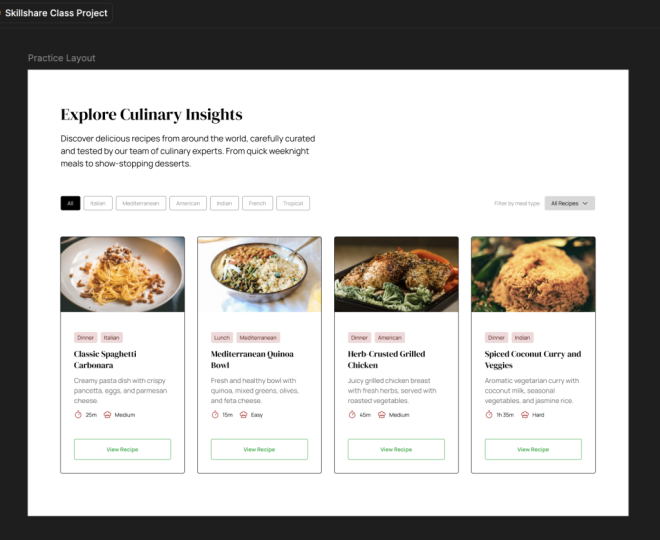
working with. So right here, I have a copy
of the starter file you can download by following the links in the
class description. And inside, we'll find some
instructions basically on what we need to do along
with some resources. And then we have a practice layout that
we can use to apply our color scheme and then some additional frames
for defining our colors. We have one for the primary
or the brand color. We have one for the gray, and then one for the harmony. Speaking of harmony, let me
show you a tool that I use all the time to create
color palettes, and that is Adobe Color. So you can access it by
going to color.adobe.com, and then you would
click on Create. Here, you would basically
choose your base color. It's this one in the middle, and you can click
here to change color. I don't know, maybe you want a darker green,
something like this. And once you have
this color selected, you need to go right here
where it says color harmony and choose from the
various harmonies. So by default, we have an
analogous harmony selected, and this basically creates
a color palette for colors that are next to each other
on the color palette. But if we switch
this, for example, to a monochromatic,
that's totally different. Now, it gives us various
shades of that color. You can see they're
in a straight line. But if we switch this to triad, now this picks colors from equidistant points on
the color palette. We have this very pastel orange. We have this kind of magenta
or lavender looking color, so totally different, right? And you'll see that if I change the color here
on the color wheel, the other colors
update automatically while keeping the same
algorithm basically. Then we also have complimentary. This is highly used. This basically selects
colors that are opposite one another
on the color wheel. And then you have
some additional ones, split complimentary. You have a square compound. We won't really go
over these right now, but feel free to play
around with them. So this is one way of generating a color palette based
on a starting color. Another way, you can
click on Explore, and Adobe Color has a bunch of color palettes
in its database. You can search, for example, food, and that's going to give you color palettes
related to food. And there are even
color palettes that are derived from a specific photo
like this one right here. So this is a great resource
for finding colors. Another one I could
recommend is coolers.co. You can start the
generator right here and you can simply
hit the space bar, and this will generate a
color palette for you, although, as far as I know, this doesn't really allow you to create color palettes
based on harmonies. So that's something
you keep in mind. Let's go back to our project and actually create a
harmony for this. And the color that I'm
going to start with for this project is this orange. It's f97 400. It's a color that
I think works well for this kind of project. Obviously, every brand color should be unique to that
particular project, but for this demo, I'm going to use this orange. So I'm actually
going to copy this, and I'm going to go
back to Adobe Color, and I'm going to create a color palette. I'm
going to click here. I'm going to paste
in that color, and I'm going to choose
complimentary because complimentary colors usually
work really well together. They complement one
another, right? And they also offer a high
degree of contrast with one another because they're on the opposite sides
of the color wheel. So this is exactly what I'm going to use
for this project, and I'm simply going to
click to copy that color, and I'm going to paste
it in my Figma file. Copy this, paste it in here, and then I'll just grab
this one and this one, and I have my
harmony all set up. So I have my primary color, and I have my harmony. Now, am I going to use all of these four complimentary colors? Not necessarily, but I have them just in case
I need them, right? I have something to work with. And I think this should be the very first step in
the design process. Figure out your primary
brand color and then create a harmony
based on that. And what harmony, what type of harmony really
depends on the project. In most cases, I
would suggest going for a complimentary
because it's, I guess, the safe bet, but there are other types, feel free to scroll through
them and pick the one that you think is right
for your project. Alright. Now you've got a base set of colors
to work with. Next, we'll make that palette more versatile by adding
tints and shades. So it works for backgrounds, accents, and
everything in between.
3. Creating Tints & Shades: Having a few main
colors is great, but in real designs, you need lighter and
darker variations for depth, hierarchy,
and contrast. That's where tints
and shades come in, and you can create
them super easily in Figma or on the
web. Let me show you. So first of all, let me explain tints and shades.
It's very simple. A tint is a lighter
variation of a color. A shade is a darker variation. It's like adding white or black
to that particular color. And there are so many ways you can create tints and shades. Let me show you a very
quick way in Figma, and that's by using
the HSL color mode. So if we select an element
and we open up the fill, we can click here,
and by default, you'll probably
have hex selected. It's the color format
that we all know. But if we switch to HSL, that stands for hue
saturation and lightness. And this is another way
of representing a color. In this case, 28 is the hue, and that's controlled by
this slider right here. It basically shows us the
pure color that we're using. This value stands
for saturation, so how saturated is that color. And you'll see that
if we drop this down, the color becomes
more pastel like. And if we go all the way down, it becomes just a
gray color, right? Let's keep that at 100 for now. And then the third parameter
here is lightness. Now, lightness controls how
light or how dark a color is. And this is your main tool
for creating tints or shades. So if you start with
the base color, which in our case, is this, and you bring the
slider up you're creating lighter versions
of that color because you're basically moving
the slider towards white. If you're selecting
the same color, but then you're moving the slider down or
decreasing the lightness, you're actually making
darker versions of that color, right? So just like that, yeah, we made a tint of
that base color, and we also made a shade
of that base color. Now, as I said, there are
many ways you can do this. You can, for example,
select or copy the color, and you can go to the web and there are a bunch
of tools like this. For example, make
tints shades.com. Here, you basically enter the hex code and you click
Make tints and shades. And that's going create a bunch of variations
of your color, and you can simply click
to copy that color code. And this works in hex format. There's also a tool by Noel Delgado that
I use frequently, and that's called shadow Lord
works exactly the same way. You paste in your color. You select how many
steps you want in here. Basically, maybe you
want in 5% increments, and that's going to
generate a bunch of tints and shades
for your project. However, if you want
the easiest way, you can use a FIGMaPlugin, and there are a bunch
of plug ins out there. I'm going to show you
just one of them. So let's open up
the actions here. We'll switch to plug ins
and we'll search for tints. And that's going to
give you a bunch of plug in suggestions
from the community. And right here, I'm
going to choose Hue Hue. Okay, I'm going to save this, and then I'm going to run it. And the plugin looks something like this. I'm
going to click here. I'm going to use the eyedropper, select my primary color. I'm going to choose how many
tints and shades I want. Five is good enough for me. Orientation vertical, and I'm going to hit
generate Colors. And that generates a
bunch of or in this case, five tints and five shades of
the color that I selected, which is highlighted
right here in the middle. That's basically the base color. So I'm going to keep this
to the side for now. Now, when creating
color palettes, it's very important that you
have one for grays, as well, because there are
different variations of a gray color in a design. For instance, you might use, like, a dark gray for text. You might use a very light gray for a border or a
background, right? So that's why it's very important to have a bunch of
gray colors to choose from. Now, how do you
create that gray? Do you just open up
the color picker and you just do this, basically. You could do that, but what
I like to do is create a gray color that's based on the actual
primary color. Okay? It has a little bit of
that primary color in it, and I found that this
gives me the best results. So here's what I'm going to do. Going to select this
gray box right here, and I'm going to
press I in Figma, and I'm going to sample
my primary color. Then I'm going to open
up my color picker, and I'm going to
do the following. I'm going to reduce the
lightness, first of all, so I'm basically creating a very dark version
of that color. I think about 10%
works just fine. And then I'm going to
reduce the saturation, basically removing a
lot of color from that. And I'm going to stop
to about maybe four. And I think I'm going to actually increase the
lightness a little bit, just so we can see this
a little bit better. Okay, so I'm quite
happy with that. That's my gray color.
So the next step is to generate a few tints and
shades based off that. So I'm going to run
the plug in again. I'm going to press Control K or Command K if you're on a Mac. I'm going to choose Hue Hue, sample that gray color,
and generate colors. This will basically generate tints and shades
for my gray color. And I'm going to set
these aside for now next to my primary
tints and shades. Now our palette feels complete. We've got light colors, dark colors, and
everything in between. Let's put it to the test by
applying it to a real layout.
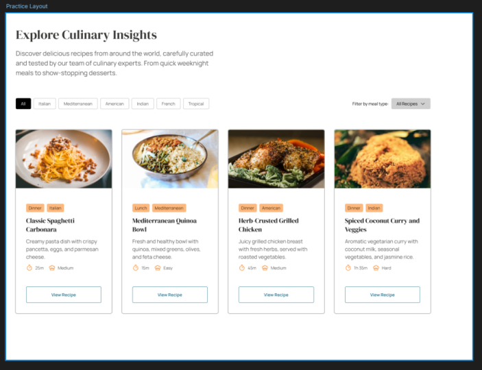
4. Applying Your Palette to a Layout: This is the fun part,
taking your palette and making it work
in an actual design. I'll apply mine to the
layout in the starter file, so you can see how I use each color for different
roles like backgrounds, text, and calls to action. With that said,
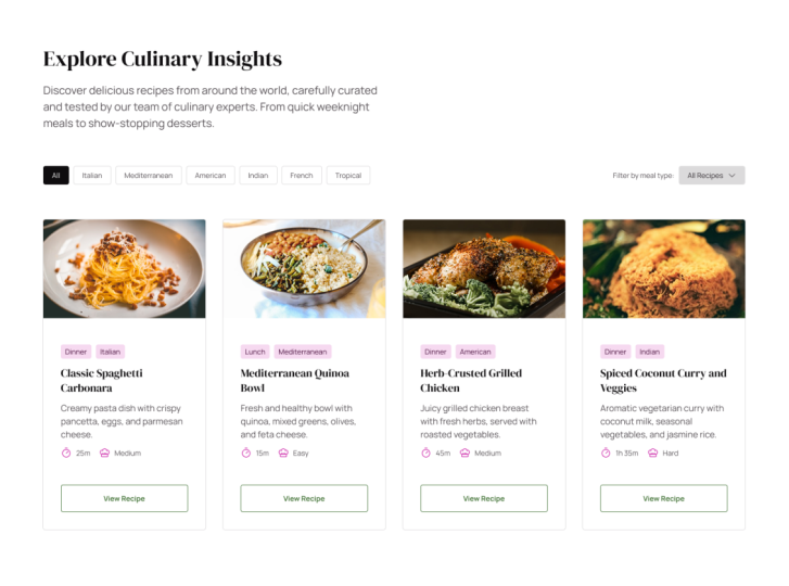
let's get started. I'll start by applying
colors to the text because that forms the majority
of content on our page. So the plan is, I want to apply a dark gray to all the headings slightly lighter gray to the
other text elements. So let's go back to our palette. This is the base color
that we started from. Let's go with this
one, for instance. So let's copy that, and
I'm going to select all the headings and I'm
going to paste in that color. Next, let's see about the
regular text elements. And one other thing
I'm going to do is copy this element
from the tints and shades here and just paste
it inside the grays frame. And this is just
going to tell me what colors I ended up
using in my design. Let's actually start with
the base gray color. Let's apply that to an element
and see how it looks like. And to my eyes, I think it looks good. Let's try with a slightly lighter
version, maybe this one. Let's apply it here. And I think that gives me a
slightly better contrast. Let's also select these
and apply that color. Yeah, I think that gives
me much better contrast between the actual text
element and the heading. And also, one very
important thing I need to check here is color
contrast for accessibility. So this is actually
super easy to do Figma. If I select an element with a fill color and I click that, we get this graphic here in
the color picker, basically. If the color you selected sits on this area of the color
picker that's not dotted, then that particular color has enough color
contrast compared to its background so that it meets the in this case, A
contrast standards. And these are for
accessibility purposes, right? It's for people with visual
impairments that have a hard time deciphering text when it's like when it
doesn't have enough contrast. And you can actually
see that we have a 7.45 to one contrast ratio. I'm not going to go over the
details of this right now, but just so you know, it's an important check to make. So remember to do
that every time. Okay, let's see where else I
can apply this text color. Well, I could apply it right
here in these tabs, right? So select that and
apply it there. Oops. Like so, maybe even this one because it kind of belongs in the same category
of text as the others. These will be colored
differently because they are kind of badges that they need to
stand out a bit more. But the cooking time and recipe difficulty text should
be colored the same way. So I'm going to apply
it to those as well. Now, because I used
this color for text, so 553, I'm just going to copy this element and
I'm going to paste it in my gray right here. Okay, let's finish
applying the gray. We have some other UA elements that should be using
some of the gray colors. And here, I'm talking
about, first of all, the borders of these elements
of these buttons here, of the cards themselves. And we also need to figure out a background color
for this drop down. So let's start with the borders. Let's pick the lightest
color that we have here, which in our case is DD, DC DC. And let's select
these four elements and we'll change
their stroke color to that element right there. And we'll just have a quick look that looks just fine to me. And let's go ahead and select these elements here and
change their stroke color. And I think these
look fine as well. So we'll just go with that. So let me copy this. I'm going to paste
it in just so I know which colors I used. And now let's see about this
drop down element, right? So I'm going to select it, and I'm going to
press I, and I'm just going to sample this color. So let's see how that looks. That looks pretty good. Maybe I would like this to
be a little lighter. And if we look in the color
palette that we generated, we don't actually have a
lighter version of this. And in this case,
we could, you know, regenerate the set of tints and shades for that
color and choose more steps, basically, or we can just
create our own color. So you can totally do
this. You can select that. You can open up the
color fill right here, and we can work in the HSL mode, just like I showed you before, and we can simply just increase the lightness until it comes
really close to being white. So 94, in my case, creates a good enough color for this particular background. So I'm happy with that, and I'm simply going to
copy this fill color, and I'm going to
add it right here. I'm going to paste
in that value, and I'm going to apply it
to this element, as well. So that's it for
applying the grays. Our practice layout now
looks totally different than what we had before because we took care of coloring
the typography, the borders, and
all the elements that basically
needed a gray color. Now, let's move on and start applying our
primary or brand color. And let me just say
this from the start. This should be used
sparingly, right? It should be more
of an accent color, not present everywhere
on your design. So with that in mind, let's actually select
the primary brand color, and let's see where we can apply it as it is, just directly. And from where I stand, a good place to do that is to apply it to
these icons, right? So I'm just going
to double click and double click until I
select the right frame, and I'm simply going to
replace the black color here. Where it says selection colors, I'm just going to paste
in my primary color. And that's just going
to target the elements, the icons, basically, the
ones that we're using black. And I'm going to do
the same here and I'm going to do the
same here. And here. So just by doing
that, we now have a little bit of that accent
color going on in our design, and it just makes everything
feel more cohesive. But now let's check on the other elements that
need our attention. And those are these two badges, where it says dinner, Italian
or lunch, Mediterranean. These could also use
that primary color. But the thing is, if we
select these and we choose to use the full
brand color on them, they're going to stand
out way too much. They're going to draw our
attention to that section instead of this section right here where it
says view recipe. This should be the
called action, right? This should be the stuff
that people click on. And by applying the
full color here, we're drawing way too much
attention to that area. So what we need to do is just tone down those
colors a bit more. How do we do that by
using tints and shades? So we'll go back to our
list of tints and shades. I'm going to select
the lightest color, the lightest tint of
that primary color. And I'm going to apply it as the background of this element. And that looks just fine for me. It's not too much color, but it's enough to make the whole design
feel more cohesive. Now, for the actual text, well, how about we grab like
a shade of that color. So this is the base. Let's grab this
one, for instance, let's paste that in
and see how it looks, select both of
these, paste it in. And I think that
looks really well. It's not like black. It's just a darker version
of our primary color. And I think it
looks really good. So let's apply this to
the other elements. So first of all, let me
select the other elements, and let's see if we can find it. It's this one right here. Like so. And then for the text, let's select that one. And while holding down
Control or command and shift, I can just click to select
all of these elements, paste in the new color, and we are done for
the brand color. Now, the final element that
we need to apply colors to is this view recipe button. So what can we do here? Well, let's remember
the fact that we have a harmony that's ready for
us and that we haven't used. But actually, I almost forgot, since we used some tints and shades of that
primary color, let's actually select
this and this copy them into our primary brand
color frame there, just so we know what colors
we used in our design. Okay. Now, back to the
complimentary harmony. Let's grab this color, copy it, and let's use
that for the buttons. So I'm going to select this, and I'm just going to replace the pure black with that color. And right off the bat, this is too bright. It's way too bright. And because it's way too bright
on this white background, it doesn't have enough contrast. If we do a quick check here, you'll see that
the color selector is inside the dotted zone, and we're not passing the
DA contrast standard. So one thing you can do in Figma is you can actually
click this button, and that's going to
automatically move the color selector to the first color that
meets the standard. Alternatively, you can create tints and shades for this color and then
pick one of those. Let's actually select this color that we created
with our harmony, and let's see how
that will look like. So let's actually select this, change the stroke,
and the text color. And if we look at the
color picker here, you can see that now we have a good enough color contrast
for those elements. So let's actually select
this entire section, and I'm just going to replace that bright blue
color with this one. And we're done. Let's take a final look this is what our layout
currently looks like. We have grays applied to most
elements, including text. And then we sprinkled some of that primary brand color as accents throughout
our design. And we used both the raw
color on these icons, but also tints and shades of that on these badges right here. And for the main Qualta action, we used the complimentary color that we got from our harmony. And just like that, your palette isn't just a set of colors. It's part of a real
functional design. We started with a single color. We built out a full
palette using harmonies, tints and shades and applied it to a layout to see how
it all works together. These same steps work
for any design project, whether you're
creating a website, an APUI or even branding assets. The more you practice
building palettes like this, the faster you'll
get at choosing colors that work
beautifully together. Now it's your turn. Download the starter file using the link in the
class description, create your own palette
using the techniques we covered and apply it to
the provided layout. You can follow my
approach exactly or make it entirely your
own. That's up to you. And if you want an
extra challenge, try creating both a
light and dark version using the same palette. When you're done,
share your work in the Class Project Gallery. I'd love to see your take on it. And if you enjoy this class, check out my other Skillshare
classes for more quick, practical web design lessons. All right. Thanks for
watching, happy designing, and I'll see you in the
next class. Bye for now.
 Adi Purdila, UI/UX Designer, Framer Developer, Educator