Transcripts
1. Welcome to the Class: In this class, I will
show you how to design and animate a collapsible
sidebar in Figma. This is a very practical class, and it's going to teach you
how to design something that you'll most likely encounter
in your design career, and I'll show you the best
tools and techniques you can use to do that
quickly and efficiently. This class, you'll get hands on with some of Figma's
most powerful features. I'll show you how
to use auto layout to keep everything
perfectly aligned, how to save time with
variables and layer styles, and how to streamline your workflow with
components and variants. Plus, we'll dive into some advanced prototyping
techniques so you can smoothly animate the
side bar between its collapsed and
expanded states. Hey, everyone, in case we
haven't met, my name is Adi. I'm a freelance web designer and developer with over ten
years of experience. Now, we'll kick off
this design project with a set of wireframes
and some brand assets. And I'll show you
how to properly use the different logos
that are provided, how to pick the right colors from the palette that
was given to us, how to choose the right
icon set, typography, and how to bring everything together in one cohesive design. Now, because this is a
very hands on class, you can follow along
by downloading the wireframes and
the brand assets and working alongside me. This is a fantastic
project to practice your skills and even
showcase in your portfolio. So ready to dive in?
Let's get started.
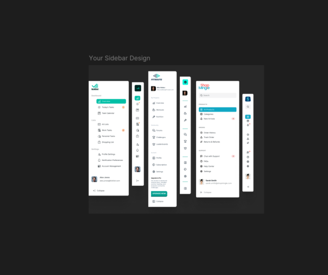
2. The Class Project: The class project is simple. You need to design and animate a collapsible sidebar in Figma. Now, in the class description, you'll find a link
to this Figma file. Inside, you'll find
three wireframes, each one with a
different structure, and each one made specifically
for a different brand. You'll also find the assets
for all three brands. These are, of course, fictional, and they contain
the logo suites, the brand colors, and some
typography information. So your task is to pick any of these three brands and design
the corresponding sidebar. In the class, I will be designing the
one for shop Mingle, but you can pick
whatever you want. You can even pick
all three and design three sidebars that's
totally up to you. When you're done,
export your design as an image and post it
as the class project. I look forward to seeing
what you come up with. And remember, as we go along, feel free to ask any questions. I'm here to help. Now, let's get started
with the class.
3. Choosing Icons: The very first step
we need to take is to pick icons for our project, and that's super
important because icons will complement the
links in the side bar. That's going to allow users to scan the
layout more easily and also quickly determine
what each link is about. Now, when picking icons, it's important that we consider a design principle
called consistency. That basically means that all icons should
have the same style. Either they're outline
or duo tone or solid, they need to have
the same style. So for example, if
we're going to pick some outline icons for
some of the links, we shouldn't pick, let's say, solid icons for the other links. All icons should
have the same style. And the easiest way
to make sure that happens is to pick icons
from the same set. Now, there are a couple of sets that I recommend you
get, and they're all free. I'm just going to
quickly go over them. The first one is untitled
icons by Jordan Hughes, and you'll find a link to this
in the class description. Then we have Font Awesome, which has over 2000 free icons. You can find this
at fontawesome.com. Then bootstrap icons is
also a great option. You can find them at
icons dotgtbootstrap.com. And finally, we have the
Google material icons. Just go to fonts.google.com
and go to icons. And here you will find
a bunch of these. Yeah, you can search
for various icons. You can even change the
weight of the icon here, which is very interesting. And all of these
are free to use. Now, for the design that I'll
be creating in this class, I will be using
the untitled icons because I think they match really well with the project or with the brand that
we're designing for. And speaking of that, let me show you what I'll be creating. So I got the file, the student resource file that I showed you in the
previous lessons. And here you can see that we
have all three brand assets. And today, I'll be
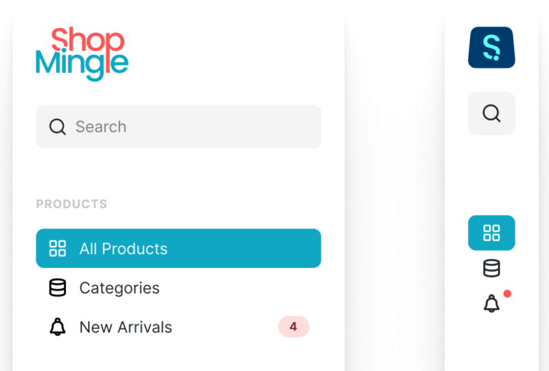
designing for shop Mingo, which is an e commerce platform focused on social shopping. Of course, this is
a fictional brand, but we get pretty much
everything we need here. We get the various logos and the color combinations
that can be used. And we also have the colors with variations for
lighter or darker. And we also have some
typography information. This is just the typefaces
used in the logo design. It doesn't necessarily
mean that we'll be using them in our UI design, but they're here as a
guideline, basically. Now, to make it easier for
myself and to you as well, I created a lot of variables for all the
colors that I'll be using. So as you can see, here, we have variables for
all the variations of the colors used in
the brand assets. For all three brands. And on top of that,
I also created color styles that you can
see here in the sidebar, and working with color
styles is really simple. So for example, if I draw a
rectangle here and I want to add or change the background color to one
of these predefined colors, all I have to do is
go to the fill here, apply styles and variables,
and I just click on this. I pick the color that
I want from the list, and now that uses, for example, blue lagoon 500. Will just save me a lot of time when picking colors
because I don't have to fumble around
with hex codes or, you know, generate tints or shades of that
colors on the spot. It's all saved and
ready for me to use. Now, let's pick the icons we
need for our design project. So I'll be designing for
Shop Mingle, as I said. So I'll go to the Wireframe
page and grab Wireframe two, which is the one we need. And I'll just go to this page here and let's just
paste the wireframe. Here. I'm going to
create a frame, Control or Command R to rename, and I'm going to
rename this two icons. This is just a place that I'm going to use to
store all my icons. So let's see what we got. We have a search bar, so we need a search icon. So going back to Untitled, I'm going to go
for, I don't know, search Small or search
MD, one of these. Click to copy, and I'm
going to paste that in and I'm going to
rename this to search. Next, we have three links that belong in the
products category. So icon for all products. Let's search for grid. And that's going to
give me this icon. Let's copy that, paste
it in, renamed to grid. And the way you pick these icons is kind of subjective, I guess. It really depends on how you
interpret a certain link. Me personally, when I
think about all products, I think about, you know, a collection, right,
a group of something. So I picked the grid
icon because it as well, represents a group
of something, right? It's just a collection
of individual items. So, in my opinion, this works really well for a page that shows
multiple products. Next up, we have the
categories list. Now, here we could go
for something like a list but I'm going to
actually search for database, and that's going to
give me this result. And database, I think
this works again, really well for the
categories link because it symbolizes a list of items, a collection of items. So it's going to
work really well. Let's rename this as well. Next up, new arrivals. So when I think new
arrivals, I say, Okay, new, I need to be
notified because it's new. Let's search for, like, a notification bell
or something, right? So search for Bell, and I'm going to grab bell 03. Pasted here. Let's move on. Orders. We have order history. So when I think history, I think past time, timer, clock,
something like that. So let's search for clock. And let's go with
this clock rewind and rewind because we're talking
about the past tense, right? History. I think that
would work really well. Rename that to clock. Next up, track order. So tracking gives me what? A precise location, right? And when I think about location, I think map pin, right, or you know, one of
those pins that you put on a map to mark a
specific location. So let's search for pin. And let's go with
this Marker Pin 06. Copy paste, rename. Let's move on.
Returns and refunds. So return is when you
send something back, refund is when you
send money back. So let's think about
something with arrows, right? So let's search for arrow, and for arrow, just scroll down. Let's see load more icons. I think this works pretty well. Switch horizontal. Let's get this one.
Let's rename to switch. Okay, next up,
chat with support. So when we think
chat, we think what? Message. All right. So let's go with one of these speech bubbles
with something inside, maybe this one
message text square. So let's copy that. Based
in rename to message. Next, FAQs. FAQs are frequently
asked questions. So we search for question. So let's use the question mark. This one, help circle. I think that would
work just fine. Rename to help. Next is Help Center. This one, I think I
saw this one Life Boy. This would work just fine. Let's rename this to help. And what else? We have settings. Settings, pretty easy. We search for settings here, and we get this cog icon. That's usually How we do things, or, you know, we could grab some of
this or some of this. There are plenty of icons
we can choose here, but the cog icon is, like, instantly recognizable
for anyone that's looking for
the settings page. So let's rename
this two settings. Let's see, we got
all the links here. We also need an icon for
collapse and Expand, right? So when we think, you know, collapse or expand, expand, the sidebar, you know, gets bigger in size, collapse, the side bar
gets smaller in size. So we're dealing with direction, right, either to the
left or to the right. Let's search for arrow, and let's see what we find here. So let's just scroll down.
So something like this. You see this download icon. This could work pretty well, except I would need
it to be rotated. Let's search for alignment. We might find something
there. Yeah, there we go. So a line left and a line right. I need both of these. A line left and a line right. Okay, so a line left
we'll use this for when we want to collapse because the
direction goes like this, and a line right, we use it for expand because it expands to the
right side. All right. So these are all
the icons we need. Let's tidy this up a little bit. So with the icons
frame selected, let's go up here and we're
going to add autoayout. Alright. And let me actually move this so
you can see it better. And I'm going to use
rap as a direction, and I'm going to set, let's say, 64 pixels between these items and 64 pixel padding
on all sides. So all the icons are nicely
displayed in a grid, like so. Alright. Now, one last
thing I want to do here, I want to make my life
easier in the long term. So I'm going to turn each of
these icons in a component. That way, I can use the
Instant swap feature infigma components if I want to change an icon from
one to the other, and I'll show you that
in the next lesson. But for now, let's actually
select all of these icons, and I want to
rename all of them. So I'm going to do a
right click rename, and I'm going to select
rename two icon slash, and then the current name. Okay, so that's just
going to rename them to icon slash Search, iconlahGrid, icon
slash database, and so on and so forth. Now, with these renamed, I can turn them all
into components. So to do that, I will
go here in the sidebar, three dots, and I'm going to select Create
multiple components. Like so. So that will turn each one of these icons
in its own component. And the reason I named them like icon slash in
the name of the icon, is because the icon slash thing allows Figma to
group those icons. So for example, I now want to add one of those
components to my canvas, and I go to the
Assets panel here, you can see that my icons are now grouped under icon, right? You can see them all here. But when you have
multiple components, it's much easier to
categorize them like this. So under local assets, all my icons that
I've just created, all my components are
now grouped under the icon sub folder, which can be really,
really handy. Alright, so now we
have the icons. We created the components, so it's time to design
the menu items. That's coming up next.
4. Designing the Menu Items: Now, because we have several menu items that have
roughly the same structure, it's a good idea
to use components. That way we can
reuse menu items. And if at some point we
decide to change something, we just do it once on
the master component. So let me show you
how we can do that. Let's have a look at the
menu structure here. So we'll have the
text, of course. Let's actually bring a copy
of that here and let's change the width to auto. Now, apart from the text, we also need an icon, right? So let's grab one of the icons. Let's say the first one, and
I'm going to paste it here. And if you don't know how
components work in Figma, it's really, really simple. So each component has two parts. Let's say you have
the main component, and then you have
the instance, okay? The main component is the single source of
truth, so to speak. The instance is
basically a copy. So the idea is, whatever change you make to the main component, that change will be propagated and applied to
every other copy of it. So for instance, right here, we have the main component
that's called icon slash Grid. And notice the icon it's using. It's like a full diamond icon. This right here, yeah, is a copy of that component. And in the layers panel, you can see it has
a different icon. It's an empty diamond. So now if I select the main
component, and for instance, I change its color,
you will see that the copy or every other copy
of it received that change. It has the different color. So if I change this
back to what it was, the instances will
change as well. That's basically how
components work in FIGMa. Of course, there are
more complex uses, as you'll see in this course, but at its base level, that's what it boils down to. Now, let's create
this menu item. So we have an icon,
and we have the text. Let's set the text to Inter. This is the typeface
that we'll be using for the UI design
in this project. Inter a free font
available from Google. It has a lot of
different weights, and it was made specifically for this
kind of application. So we'll use inter regular 16 pixels and
also 150% line height. Now, with these two selected, I'm going to press Shift A to create an auto layout frame, and I'm going to set the space
between them to 12 pixels. So space between text
and icon to 12 pixels. I'm also going to get or give some padding of 12 pixels to the left and the right
of the content and also eight pixels to the
top and the bottom. That's going to allow me to add some breathing room around the contents of that menu link. Let's rename this
frame to menu link. With it selected, let's
turn it into a component. So I'll go to the sidebar,
create component, or use the keyboard
shortcut Control AK on Windows or Command
Option K on a Mac. Great. Now, I want
to be able to, of course, duplicate
this component, create multiple instances of it. And also for each one, I want to change the
text and the icon. For that, let's
add some override. So with the text selected
inside the main component, I'll go in the sidebar right here where it says,
create text property. Click that. Let's
give it a name. It can be whatever
you want. I'll just leave it at text,
create property. Next up, I'm going
to select the icon, and also in the side bar, I'm going to go and choose
Create Instance swap property. I'm going to call this property. Let me actually show it to you. I'm going to call it icon. Don't worry about the value
or the preferred values here. Just click Create
Property. All right. So now, we can take
this menu link, copy it and paste it
in another frame. And this is what we'll use to
create our sidebar design. This is now an instance of the component that
we just created. So let's bring the wireframe a little bit closer here so
we can see what we're doing. And let's start creating
the menu items. So the first link all products. Good. Let's duplicate this. The next one is going
to be categories. So with the instance
selected, I can go up here. I can change the
text to categories. And I can even change the icon, and Figma will now use
the icon components, or it's going to show
me the icon components that I created in
the previous lesson. We can see all of
them right here. We can even search
for a specific icon. So I can just pick
that and Figma will automatically replace it in my instance. How cool is that? So I'm using a copy of the
main component, an instance, but I can personalize that with my own content or with
different content for each one. Let's move on. This one, new arrivals, and I'm
going to choose the bell. Let's duplicate
these two more times and fill in the rest
of the menu items. H So now we have created the
other menu items, all personalized with
their own text and icon. Now, one change that
I would like to make is shrink the icons
a little bit. By default, they are 24 pixels. So let's make them 20 pixels. Now, because I used components, if I make this 20 pixels, that change will be applied to every single component
instance, super cool. And by the way, I use the scale tool to reduce
the size of the icon. You just press K
on your keyboard and you get this interface
here where you can change the width or the height or change the size
by using a factor. Now, there are two
more variations of this menu items that
we need to create. The first one is the active. So what happens when we actually select or click on a
specific menu item, and that becomes
selected, right? So when that happens,
let's do the following. We'll select the main component, and we can go up here
and choose Add variant. Now, this will make a
copy of that component, but it's not an instance. It's actually a variation, a variant of that component. And now Figma wraps these
variants in this dotted line. Now, let's select
the main component, and where it says property one, let's double click and
we'll rename it type. And then we'll select
the first one, and we'll just leave
it at default. And the second one
we'll double click and we'll rename it to active. So for the active, I want to use a color
from our brand assets. So let's go to the
brand assets page, and I want to use
this primary color. So it's blue lagoon 500. So let's select this and
under fill, way down here. I'm going to search
for blue lagoon, and I'm going to select 500. So that's going to add
that color as a fill. But I also want to change
the icon and the text color. Now, I could go with
white for this, and that's going
to be just fine, but I want to use a variation
of that primary color. So I'll go back
and I can see that Blue Lagoon 50 is the
lightest color of the bunch. So we're going to use that one. So again, in figma with both
the icon and text selected, I'll go to Selection Color. Click this and choose
blue lagoon 50. Now, select the variant and let's add an eight
pixel border radius. So how does this
help me exactly? Well, here's the cool part. Let's say I want to make
the all products instance, be the active variant. All I got to do for that is go up here where
it says type, and instead of default, I
select active, and that's it. I can do that for any
of the other links. And then finally, the
other variation that I need to create is the
one with the badge. So notice some of these links, they have numbers
attached to them. And I want to add this
number as sort of a badge. So let's do that. We'll
select the first variant. We'll click the plus icon. That's going to
make a copy of it. And I'm going to rename
this to default with badge. So let's grab that number. And let's paste it here. Let's make this container
a little bit bigger. I'm going to use
Inter this time bold, 12 pixels, the same
150% line height. And I'm going to add this to its own auto layout frame because I want to add
a background to it. So I'm going to press Shift A, and that's going to allow
me to add padding to it. But first of all, let's
add a fill color. And I'm going to go back
to the brand assets, and I see we have this coral
red as a secondary color. So let's choose coral red
100 as the background, and then the 600 or the
700 as the text color. So here under fill, I'm going to search for
coral red, select 100. And for the text, let's do coral red, 600 or 700. I think 700 works
much, much better. And with the selected, let's also add some
padding to it. So I'll do eight
pixels left and right, two pixels top and bottom. Let's change the width
here to hug contents. And hug contents basically means that the frame will resize itself to match the
to mat its contents. It doesn't get bigger or
smaller than what it contains. And if you want to learn
more about auto layout, I have a very detailed course available that's just
about auto layout. It has plenty of examples, and I go really in
depth on this topic. Just check out the
links or check on my profile to find that course. Now, we created this batch. Let's actually give
it a border radius, and let's select
the text inside, and I'm going to set
it to auto width. So the text box matches the
width of the text itself. And also, what I want
to do here is add a minimum width to this
because if I change the text, you can see that we
have a pill shape. But if I just have
a single digit, it's almost like a circle. So I want this to always
look like a pill shape. So for that, I'll
go to auto layout. I'll click this, and I'll
add a minimum width of, let's say, 32 pixels. So that's much, much better. So now, we can go back to our instances I can select the menu items that
need the badges. For example, new arrivals, I'm going to change its
type to default with badge. Chat would support, same
story, default with badge. But I need a way to control the text of that
badge, the number. Let's go back in here
and I'm going to select the text in the main
component, the badge text, and down here, going to
select apply text property, create property,
and we're going to call this badge number. Okay. So now, if we select
those instances again, we have a badge number field
that we can populate, right? So four is okay
for new arrivals, but this one should use two. And let me actually
show it to you. Cool. Finally, one
last thing here, you'll notice that
if we select one of these instances and
we make it bigger, the badge number stays right after the text,
and I don't want that. I want the badge number
to be displayed on the far right side like
we have in the wireframe. So the way to do that is to add an auto gap between the
badge and the text. So let's go back to this variant and we'll
make a small change here. We'll select the main
text and the icon. We'll do Shift A to add them to their own auto layout frame. So then I'm going to
select the main frame, and I'm going to
change the gap value here from 12 to auto. So now, that will allow me to resize this
instance to any size, and Figma will
automatically set the gap between these items and the
badge to the highest value. And this works here as
well, as you can see. And with that, the
menu items are done. So let's turn our attention
to the rest of the side bar. So coming up we'll design
the rest of the elements.
5. Designing the Two Sidebars: There are a few more
elements we need to create on the expanded
version of the sidebar, and of course, we need to design the collapsed version as well. So let's start with
the first one. In terms of elements, let's have a look
at the wireframe. We still need to add the logo. So let's go back to
the brand assets, and I'm just going to
grab the regular logo for shop Mingle and I'm just
going to paste it right here. So I'm going to press K, and I'm going to resize this
to 56 pixels in height. Good. Now, let's take this and
let's rename it to a logo. Next up, we have a
search bar, right? So let's actually
take all of these, move them down a little bit, and let's resize
this frame as well. So for the search bar, let's grab the search text, and we'll put it here. And we need a
search icon, right? So let's go to assets
and I'm going to grab the search
icon, drag it in. Let's resize this to 20 pixels, so it matches the rest of
the icons in my sidebar, and then select both of these. Shift A to add them to
an auto layout frame. And I'm going to
add a fill color, and we're going to
use the charcoal. If we take a look back at the
colors here for our brand. In the color palette, we
have a charcoal color. This is for gray, basically. So we'll use this for text and for the more neutral
elements of the UI, like the background of
a form element, right? So we're going to use
charcoal, you know, 50 or 100 depends on
what looks best for us. So let's select this
and we'll choose fill. We'll search for charcoal
and let's see Charcoal 50. Yeah, that looks pretty
good. So we'll keep that. But also, I'm going to change the color of
the other elements. So the icon is going
to be Charcoal 500. We'll use this for the
rest of the text as well. And the search text, because it's usually a
placeholder, the way we put it, we're going to use a lighter
version of charcoal, which is 300, just
a more muted color. Now, I'm going to use or we are using auto layout
for this element. So let's actually define
eight pixels as the gap. That's the distance between
the icon and the text. And we're going to use 12
pixels for padding all around. Great. And now, finally, let's just add eight
pixels border radius. So we are matching the border radius of the
other rounded elements. Great. Now we can just take this and resize it to
any size we want. So that's the search bar. Next up, each group of menu items has this text
as sort of a group header. So let's grab that. We'll paste it in here. Let's make the width auto. And we're going to change the typography properties
here to enter bold. Let me actually zoom in
here so you can see. I'm going to stick with 12
pixels as the font size, 150% line height, and I'm
going to make it uppercase. And also, I'm going to make the letter spacing
a little bit bigger. So, you know, increasing
the letter spacing is something that I recommend you do when you have small text, bold uppercase, and
increasing the space between the letters just
makes the text a little bit easier to read. So let's move this up here. And also, I forgot about
the uh, the color, right? So the text color. We are going to use
a charcoal 300, so a very, very light text, and we'll just bump the
opacity back to 100%. Okay. Now let's actually
group some of these links. So I'll select these three, shift A, and that's
going to add them to their own auto layout frame. And I can change the
gap here to zero, and I want to make sure these
are aligned to the left. And I want to take all the
elements inside and have their width or their
horizontal resizing set to fill container. So now, whenever I resize
the parent element, the items inside resize as well. And there's one final
thing we need to do, and that's to add a
little gap between the group header and the
rest of the elements. And if I were to
just change the gap, from the auto layout properties, it's going to change the gap
between every single item. The way we can do that
is, first of all, let's set this back to auto
with and with it selected, Shift A to add it to
an auto layout frame. And because it now sits
in an auto layout frame, I can add padding to it. So I'm going to go in
the inspector right here and I'm going to change its bottom padding to 16 pixels. So that's just going
to add a little bit of distance to a little padding, basically just to
that little text, creating the distance
that we need. That's a nifty little trick. Next, let's do the
same for the others. So grab this, paste it in here. And that should say orders. And let's select the Shift A. Make sure the direction
is set to vertical. Gap is set to zero, and the items inside are
set to fill container. And finally, the third
group is for support. Same story, select
everything, Shift A, Gap set to zero, select all
the menu item instances, set they're resizing
to fill container. Now, two things here
that I forgot to do. First one, select
the search text and set its size to 16
pixels instead of 12. And then let's
change the color of the icon and text on these menu items because
I forgot to do that. It currently uses black. So let's select both
of these variants, and all the way down here
under selection colors, any item that uses black
should use Charcoal 500. Like so. So that's
much, much better. I'm not a big fan of using just pure black text
color in any layout. It's just too much of a
contrast, too big of a contrast. And finally, for this area, we have the user
information, right? We have a picture of the
user name and email address. So let's paste that in. And
let's start with the avatar. Let's make this 48 by 48. Let's add some eight pixel border radius
to make it around. And let's change
the picture inside. Now, the way this works in Figma is you have a shape
and you add a fill, and the fill can be color, and it can also be an
image among other things. So you can do that manually
or you can use a plugin. I have a plugin that
I use regularly and it's called Unsplash. This basically just, you know, downloads pictures from Unsplash and applies them directly
as a fill to your shape. So let's search for a portrait, and I'm going to
choose this one. Right here. And that's it.
That's all you have to do. Next up, let's grab
these two elements, and let's change their
size to 16 pixels. And let's change
the width two auto. Let's do Shift A, add them to their own
auto layout frame. We'll set the gap to zero, and also we'll change the
line height to 150%, like so. We'll select the name Command B to use the bold font weight. And let's change the
text here for the name. We're going to use Charcoal
500 for the email address. I want this to be a
little more subdued. I'm going to use
Charcoal 300 like that. Finally, select both the avatar and the text. Shift A again. Make sure the alignment
here is set to middle and we'll set the gap in between
them to 12 pixels. Like that. And finally, let's make this collapse menu item a little bit more subdued because it's more of a functional thing that's
related to the sidebar, not necessarily a part of the
main group of menu items. So let's change its color. We'll go from Charcoal 500
that you can see here. We'll go to 300 and
for the icon as well. So let's see what we have. Did we miss anything
from the wireframe? No, we have everything we need. So now it's simply a matter
of creating a proper layout, adding some proper alignment and spacing for all
of these elements. So select everything. Shift A to add them to their
own auto layout frame. Now, with the selected, I'm going to set the gap
between items to 48 pixels, and I'm going to use
a 24 pixel padding on both top and bottom. Also, I'm going to add an
eight pixel border radius, and I'm going to add a shadow
to this whole container. So for the shadow, I'm
actually going to use another Figma plugin
called smooth shadow. And smooth shadow basically adds a layered shadow to
the object that you want. So I'm going to
click Apply shadow. And because we don't have
a fill color that apply the shadow to every single item inside the frame,
but that's fine. We can just add a fill of white, and now the shadow is visible. Look at that just how
smooth that shadow is. Alright, so now let's
select the main frame here and set its horizontal
resizing to hug contents. So, you know, it matches the width and the height
of its content elements. Let's take the groups of menu links here and we'll set their resizing
to fill container. So, you know, whenever
I'm resizing this, they will resize along with it. And let's get the search and
set that to fill container. And finally, I want
a bit less space between the logo
and the search bar. So let's group these
up, select both, shift A to add them
to their own frame, and we'll set the gap
between them to 24. So that's the expanded
version of the side bar. Now, let's create the
collapsed version. So let's duplicate this
Command D or Control D, and the collapsed version is
basically a very tiny one. It's a very narrow one, okay? So to make that possible, we need to design our elements in such a way that they
fit a very narrow space. For the menu items, it means getting
rid of the text. We just keep the icon, the logo, we might need to either make it smaller or use a different
version of the logo. The search bar, we replace that with a button and
the list can go on. So let's get to work.
Let's start from the top. And we'll actually
replace the logo. If we go back to the brand
assets for shop Mingle, we have two versions
of the logo, the default version
and a smaller, just the symbol version, right? So let's grab this one. This is a perfect
for this use case. So we'll select the frame
here, paste that in, and I'm going to
press K to resize, and I'm going to set
the width to 48 pixels. Now we delete the old logo. We move this up by just pressing the up and down or the up
arrow key in this case, and we rename it to logo. Search bar, we can just
delete the search text, and we can select
the input here, and instead of fill, we
set it to hug contents. Or even better to
make sure we have the same width on
these elements, we can resize it to 48 pixels, and we can make sure the elements are
aligned to the middle. Next up, let's select the frames containing
the group headings, and we'll just hide them. And then what about
the menu items? We need a version of this
where it's just the icon. So let's go back to our
menu link main component. We'll select the
default version. We'll click the
plus sign and we'll rename this to
default collapsed. And all we have to do here
is select a text hide it, and then select
the main element. Let's set a width of 48 pixels, and let's align
everything to the middle. So now we can go in here and select default collapsed,
default collapsed. And again, here. What
about the selected one? Let's add another variant. So I'm going to select
this, add variant. I'm going to say
selected, collapsed. And same story. We select
the text here, we hide it. We select the main element. We set its width to 48, and we align everything
in the middle. So now we can go back and select this one
selected collapsed, or I should have said
active collapsed just to keep up with the
name convention. So active collapsed. Great. Finally, we need
one more variation, and that's the collapsed version of the menu item with a badge. So let's actually
duplicate this one. We'll call it
collapsed with badge. And let's draw a circle
that's eight by eight. And because this is in
an auto layout frame, Figma automatically positions
it, but we don't want that. So I'm going to
go right here and I'm going to choose
Ignore sorry, up here, wrong button. Ignore auto layout. Okay. And that's basically going
to allow me to position this element anywhere I want
within an auto layout frame. So let's move it
there and then one, two, three, four, one,
two, three, four. And let's add a proper color. If we go back to the
color scheme here, I want to use the
secondary, the coral red. So I'm going to
search for coral red, and I'm going to use the 500, which is the base color. So now we go from this to this, basically, and
from this to this. Now, one thing that I
want to change here is select everything and set
the width to hug contents. So they are displayed
at their regular size. I'm going to do this for
all of them. Hug contents. There we go. Okay.
And these should be 48 pixels in width, and they are 44 right now. So why is that happening? So 48, 48, 48. Oh, okay, so that's
because the width of these can be different. So I need to actually manually set the width here to
48 pixels. That's fine. It's not such a big deal. 48 and 48 here as well. Alright. So we're getting there. Let's let's select
all of these items, and let's just revert them
back to hug contents. Don't worry about
this pink line here. It's just an artifact that I kept seeing since
this new Figma update. Okay. And let's also
change this version. So I'm going to change
it from default to default collapsed, and I'm also going to change
the icon to a line right. And finally, I would like
to hide this entire frame. So all that's left
here is the avatar. So that's our collapsed
version of the sidebar. That's the expanded, that's the collapsed. That
wasn't too hard. It. You can see just
how fast this goes when you have things properly
set up beforehand with, you know, layer styles and colors and components and
variants and all that stuff. It's simply a matter of
changing a couple of things, hiding a couple of things. And you can easily go from, in this case, an expanded version of the sidebar
to a collapsed version. So, now that we have these two, let's see how we can animate the change between the two
states, and that's coming up.
6. Animating the Sidebar: Now, the way we're going
to animate the change between collapsed and expanded and vice versa is by
using prototyping. And if you've never used prototyping in
Figma, don't worry. It's super, super simple. Prototyping is a way to make certain
elements interactable. And you do that by using
triggers and actions. A trigger is something
a user does, clicking on something, scrolling to something, pressing a key. An action is something
that happens in response to a trigger. So let's actually start by creating or turning our two
side bars into a component. So to do that, we'll
select both of these. Let's actually drag them
outside of that frame. And let's rename
this to expanded, and let's rename
this to collapsed. Now, select both. And let's go up here in the sidebar and create
a component set. Okay? So when we do that, Figma will create
a component with these two elements as variants. Okay? Let's rename the
component to sidebar, and with it selected, let's actually
rename this property by double clicking to state. Of course, you can rename
it to whatever you want. So now we have a side
bar with two states. Expanded and collapsed. So then, if I go back
to this frame here, I can go to my assets. I can go to local
assets and I can drag that side bar right here. And this is, of
course, an instance. It's a copy of my
original component. But with the selected, I can very easily go up here and select the
state that I want. So this is the expanded, but I can easily switch to
the collapsed and vice versa. Now, let's create the animation that makes this
change more seamless. So we'll go back to
the main component, and we'll press Shift
E. That's going to toggle between prototype
mode and design mode. You can also make this change by clicking on these two
buttons here in the sidebar. Now, once we're inside
prototype mode, we need to select
the trigger, right? So what's going to happen that's going to
trigger that animation? Well, let's say, when we
click on the collapse link, I want this sidebar to change to the collapsed
version, okay? So with my mouse cursor. I'm going to hover over
the plus sign here, click and drag to the frame. Now, that's going to create
an interaction, right? So the trigger is on click
when I click on this button. The action is that I change
to the collapsed state, and then I can choose
the animation. So in order for this to be
a very smooth animation, we're going to choose
Smart animate. And Smart animate will basically look at how an element
is in state A, and then it looks at how that
same element is in state B. So it sees the differences, and it creates an animation for the change in
property, right? So for example, if element if the same element is
long is, let's say, wider in state A and
it's shorter in state B, the smart animate animate
the width property, right? It's going to
shrink the element. It's going to animate the
change in that width. So we're going to
choose Smart animate. For curve, we're going
to go with gentle, and we'll keep the 800
millisecond duration. Now, let's do the reverse. So when I'm in the collapse state and I want to go back to
the expanded state, right, I'm going to create
another interaction, and this is also
going to be on click, and we change to expanded
and same properties, smart animate, gentle
800 milliseconds. Okay. So now, let's actually make this
a little bit smaller, and let's select the instance
here and let's center it. And going back to
the prototype mode, let's add a flow starting point, and you can actually
see this right here. This is just going to mark
this frame as flow one. So when I press Shift and space, that's going to play flow one. So there's my sidebar. And now when I hit collapse,
stuff changes, right? It goes from the
expanded version to the collapsed version. And then vice versa,
if I hit this, it goes from collapsed
to expanded. And I can play around with
this as much as I want. But it's a very
smooth animation. The logo changes as well. Notice here. The
logo changes from that bit to that bit because they're named
the same, right? And Smart Animate looks at
the names of the layers. So because I named
both layers logo, it animates the change between
them. How easy is that? And of course, you
can, you know, play around with the different
animation properties here. You can double click on
any of these noodles, and, you know, you can
change, for example, the curve between, you know, gentle to quick, let's say. It's going to be a
slightly different easing. Let's change this to quick. So now shift space, and the animation will
look slightly different. And that's it, really. That's how you can
design and animate a collapsible sidebar in Figma. Now, just make sure in
order for this to work, the two versions of
the sidebar need to be variants inside
a component set, and that allows the whole prototyping system
to work properly. So with that said,
please join me in the next lesson
for the conclusion and some final thoughts.
7. Conclusion and Final Thoughts: Hey, congratulations on
completing this class, and thank you so
much for watching. I hope you found it useful, valuable and that you
learned something new. I really enjoyed
creating this one, and I can't wait to see
you in the next one. So, what should you do next? Well, I'd appreciate
it if you would take a moment and leave
a review for this class. It really helps me create
better classes in the future, and your feedback
is super important. Uh, also, feel free to check out my profile to see my
other FIGMa classes. One of them is dedicated
100% to Figma auto layout, and it has plenty of real world
examples and assignments. So make sure you
check that one out. I also run a YouTube channel
where I share content on web design with
a focus on Figma. You can also get
in touch with me via the usual social networks. You'll find links
in my profile page. And with that said, time
for me to sign off. Thank you very much
again for watching and looking forward to seeing you in my next class. Bye for now.
 Adi Purdila, UI/UX Designer, Framer Developer, Educator