Transcripts
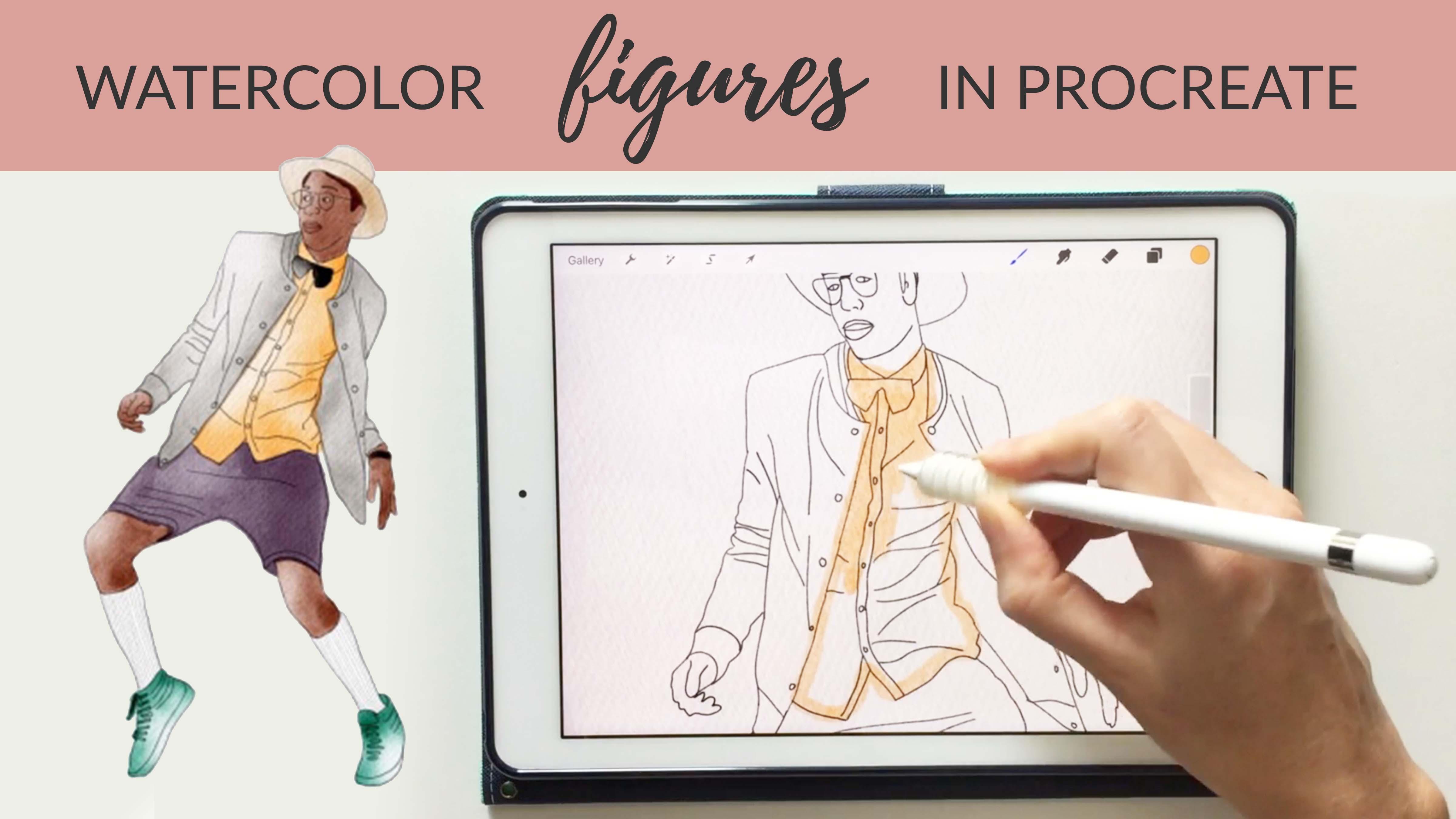
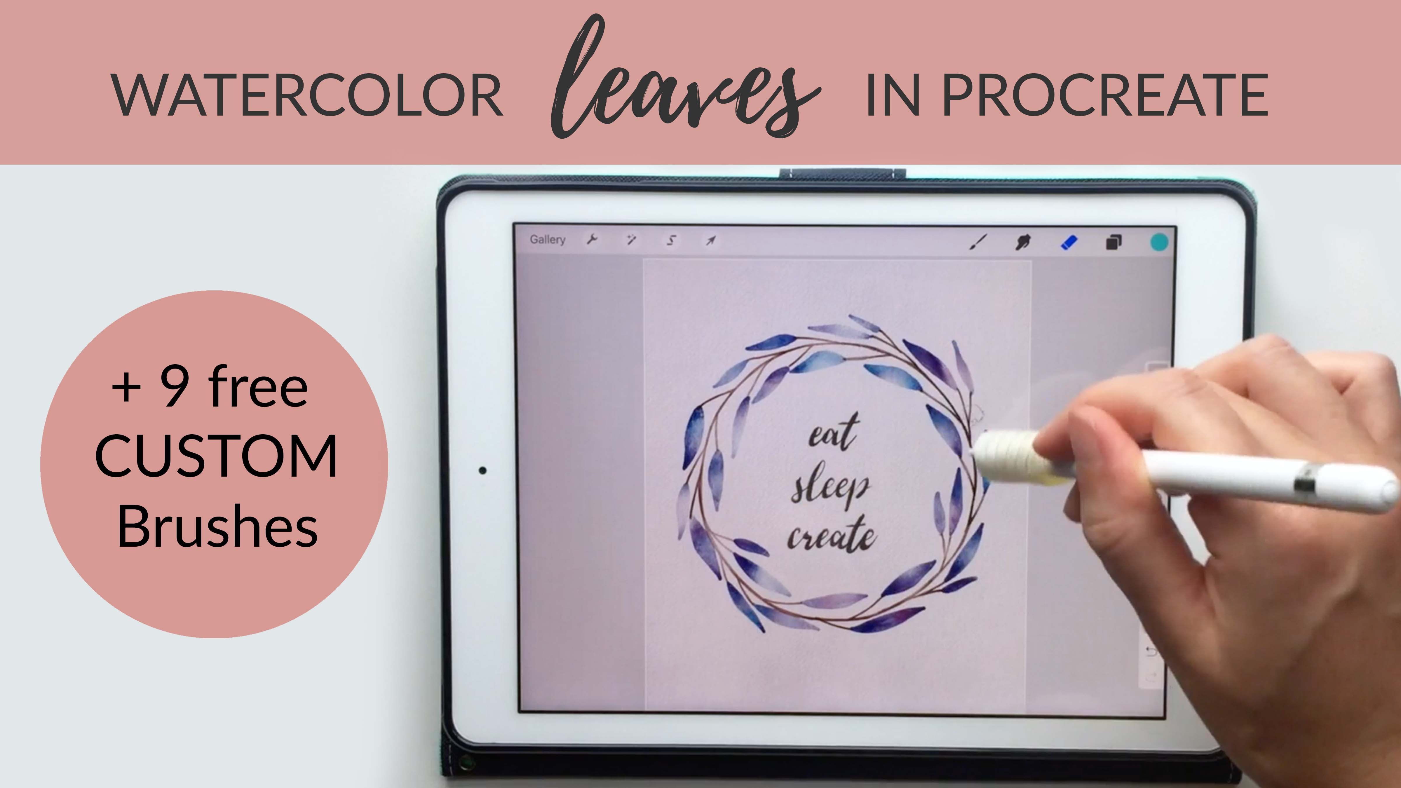
1. How to Create Watercolor Figures on Your iPad in Procreate + 9 Free Brushes: Hi everyone. Today I want to show you three ways to paint watercolor figures on your iPad. At first, we'll create a simple line drawing and use watercolors to add color to the figure. I'll show you how to create variation and depth and the paints. So your paintings look like real pigment on paper. Next, we'll use a sketch as a guide to create a watercolor figure. I'll show you how add layers of darkness and highlights to the figure so it's clear where the light source is coming from in the painting. Then we'll create a messy watercolor painting. By painting over a photograph with loose and painterly strokes. I created 10 watercolor brushes and a watercolor texture paper that I want to share with you as a free download when you take this class. You can use the processes I'll show you to create fashion illustrations. Family portraits or painterly watercolor art. All you need to take this class is an iPad and Apple Pencil and the app Procreate. So let's get started.
2. Downloads Password + Pencil & Watercolor: You can find all of the materials that I mentioned in this class in the About Section of the Class page. Here is the password that you'll need to access that page. The first thing we need to do is create a new document and drop our watercolor paper into the document to create that nice watercolor texture. If you're not familiar with Procreate and you're not sure how to import new brushes, and how to use the basic blending and erasing tools in Procreate, you may want to start with my first class. I go through all the basics in that class whereas this is better for someone who feels comfortable with Procreate. To get started, I'm going to click the plus side to create a new document. I'll create one that is 9 by 11 inches. But obviously you can make this any size depending on what your final use is. I'm using 300 dpi and click "Create." Next I'm going to click the little tool symbol image, "Insert A Photo." So you will have already downloaded this watercolor paper when you get started. I'm just going to click my watercolor paper, and click the "Expand" to make it fit the canvas here. Then I want to go to that layer and change the settings a little bit. I'm going to make it set to multiply and I'll decrease the opacity to about 50 percent. Then I'll duplicate this layer. Click my "Move Tool," and turn this upside down so that there's a nice amount of texture and any dark or light areas on the paper get evened out really nicely. With that new layer, instead of multiply, I'm using linear burn. I've got two layers of paper, both at 50 percent opacity, and one multiply one linear burn. Then I want to go ahead and lock these because I don't want to paint on either of those layers. I'm going to make a new layer and set that one to multiply. That'll be where I start drawing and painting. I'm going to go ahead and duplicate that a few times so I don't have to worry about making new layers as I work. The next thing I'll do is drop my image on this canvas, and I'll click the "Tool" symbol. Click "Insert A Photo." I'm going to use photos of dancers today because the pictures tend to have a lot of movement. So they look really nice with watercolor. But you could certainly do this with any image at all. I got this picture from the website Unsplash. They have tons of free images that you can use for anything and you don't have to credit the author even for commercial use. So this is a great resource. I'm just going to make this fit nicely in the center of my canvas here. A little bit smaller. Then I'm going to go to that layer and reduce the opacity a little bit. It makes it easier to draw over a layer if the opacity is down. I'm going to grab a new layer that's on top of that picture layer and start doing a sketched out line drawing. I'm going to use the sketching tool that comes with procreate called the Narendra pencil. I've got it all the way up for the largest brush size. I've also increased the streamline to 86 percent. That can help even out the variation in the line a little bit. I almost always increase the stream line when I'm sketching. But if you want it to be more of a hand-drawn sketchy look, this can be reduced. So you can increase or decrease the streamline based on how smooth you want your drawing to be. You may want to play around with that if you haven't done that already. I'm going to grab a black pencil here. I want to double check that I'm on the correct layer, not on my picture layer because I'm eventually going to just remove my picture layer. Now I'm just going to go through and draw over this entire figure. I'll speed up my camera while I do this. But as you can see, I just take little passes, I take my time and it doesn't have to be perfect. You don't have to get a perfect drawing of this person. In fact, it could be much more sketchy than how I'm doing it. So maybe try a few different styles, take your time and do this within the style that fits your personal aesthetic. Now that I have my image totally traced, I want to go ahead and remove my original image. Usually I take a few minutes to just check my drawing and make sure it looks exactly as I want it to. The face with a little bit of a trouble area because it was so covered in shadow. So I may come in and make some changes here. I think he's got way too much neck there. I might come in and make a few little changes there, but this is totally up to you. This is your artistic license that you can take to make this however you want. I'm going to grab an eraser here and just go through and remove any lines that I don't like. Of course we can always change this later because this is going to be on a separate layer. This isn't set in stone. You can make adjustments as you go. Well, let's stick with that for now. I'm going to lock this layer because I don't want to accidentally paint on it. Then I'm going to grab a new layer. Now I can start moving into adding color. First thing I'll do is look at the original image and decide what do I want to keep. I like his turquoise shoes. I might go in here, click and hold to get that color. Let's go ahead and start with his shoes. I'm going to go a little bit lighter. With this painting method, I tend to pick the medium color. So I'll add some highlights and I'll add some dark areas.
3. Adding Color: As I'm choosing this color, I'm trying to think what is in the middle of the lightest shade and the darkest shade that I will use on this piece. I'll go ahead and choose this medium shade, and I'm making sure that I'm on a new layer. Then I'm going to grab the figure brushes that you can download from the class page. Let's start with the blunt edge controlled brush. This brush has some nice watercolor variation in it, but it's really easy to control. Whereas this other one, the blunt edge rough, has even more variation, but it is a little bit difficult to control the borders of the paint. If you use that one, you may have to paint outside the lines and then go back in and erase, but then you get a lot of nice texture. Whereas this one is really easy to control and stay within the lines if that's your goal, but then it's also got a little less texture, so you choose which one works best for your style. I tend to go outside the lines a little bit on purpose anyway, I go between the two brushes. Let's use the blunt edge rough on this one so we can get some really nice texture. I'm going to go in and I'm totally fine with going over the edge here. I can always go back and erase if it's gone too far and I'm being sure not to lift up my brush because as soon as I lift up my brush, it starts creating a new layer. You can see if I lift up my brush and then I put it back down, you can really see the edge. We can work on blending that, but for this project, I just want to do one layer and then lighten and darken at a little bit. Let's go ahead and do both shoes so we can work on putting variation on both of those at the same time. Then I'll grab my eraser brush. I've got the fine detail brush as my eraser with a pretty small size. I'm just going to go through and make it a little more neat on the edge. I'm fine with going over the inclined a little bit, but I just don't want to go too far, but this is totally up to you. You could stay within the lines or you could just go totally outside the lines on purpose and make a more abstract piece. Getting both of these cleaned up here, that looks good for now. I've got these both on the same layer, so we're going to work on lightening and darkening these both at the same time. I'll swipe to the left and click Duplicate, then I will grab my eraser tool with the cloud brush. I'm just going to add some little highlights and these can be totally random or you could use these to show your lights source. If the light source is coming from the left, then I'll put all my light pieces on the left. For this one, I think I'm going to keep it random because this is more of a cartoon style, I'm not worried so much about the light source. Now I bring these two layers together by just pinching and squeezing to merge them together, then erasing a little bit more, so now we've got these nice dark areas appearing. Let's do that again, duplicate the layer, so now we've got a lot of variation, erase a little bit, and then merge those two by pinching and squeezing together and then erasing a little bit more. Now we've got some areas that are almost white, some medium areas and then some really dark areas. I think I would leave it at that, but you could certainly go again and duplicate again if you want it to be even darker. Now we've got our shoes finish. Let's move on to the shirt here. I think I'm going to make this shirt orange. This differs from the picture, but that's totally fine that, with this piece, I don't want it to look exactly like the picture. That picture is another artist's work, so I really want to change this as much as possible to make it my own. I'm choosing a medium range orange because we'll go a little darker and a little lighter with this process and let's stick with the blunt edge rough brush. I'm making sure that my new layers are always on multiply and I'm on a brand new layer. I sometimes will go through and lock layers just to be sure I don't paint on the wrong layer. Once you really get into this process, it's easy to just get sucked into painting and then totally forget about your layers. That really limits the amount of control you have over changing the colors later on. I try to be really careful about my layers. Let's go through and paint the shirt. I'm not too worried about staying within the lines because I'm going to go through and erase that anyway. One thing I'll often do is just go around and outline the whole shape that I want to color with that same color and then it's really easy to just go in and fill it in. This pressure is nice because it really doesn't show where you've been brushing, where you've been painting. If you see an area that it looks like you can, just rub over it a little bit and it'll disappear. The rough brush is really nice for hiding the strokes. That looks good. Now grab my eraser tool and I've still got my fine detail eraser brush selected. Then I'll just go through and clean this up a little bit. It doesn't have to be perfect. I'm not going to worry about the bow tie. Well, actually, I think I will. I'll go ahead and clean that up. I think I'll make that bow tie a darker color, maybe a gray. I want to get that orange out of there. I'm not trying to make this perfect, I'm just going through and making sure it's clear where the shirt ends. With all of these lines, it can get a little confusing for the viewer, just masking out this area can help. You'll see once we start painting the other areas, these little overlaps actually look really nice. They look like real watercolor because when you're painting real watercolor, you do overlap colors sometimes accidentally. Letting that happen on the page here can help it look more realistic and just a little bit here. That looks good. Let's go ahead and do our darkening process. Duplicate this layer, gets the cloud brush with my eraser. I sometimes like to just stick with the original areas that are already dark. Like right here it's a little dark and right here it's a little dark, so I might let this stay as my dark areas to keep the nice variation that my brush has already created and then just choose the other areas to lighten. Then I'll merge those together and do a little bit of lightning. I think that's good enough. I don't think I'm going to do any more layers with that one, but same thing, you could duplicate this again and do as many layers as you'd like. Now I've got two pieces colored. I'm going to go through and do the same process with this entire figure, just choosing colors as I go. You could leave it at this, this could be a really simple finished piece or you could go in and color the whole thing. I'll speed up my camera here since you get the idea of how I'm doing this process.
4. Adjusting Colors: I want to show you one cool change that you can do with this process. I colored his shorts and I'm not really crazy about how the color turned out. I'd like to change the shade. This is something I always wished I could do with my hand painted watercolors and you can't, but with this process, if you just make sure that layer is selected, where you just painted, click the Adjustments tool; Hue, Saturation, Brightness. We can take some of the color out, so maybe I just want these to be gray, or maybe I just want them to be a little bit purple. We can also adjust the lightness and darkness. Also back at the Adjustments tab, you can click Color Balance, and just totally change the color. I like that, it's like an off gray purple, so I'll stick with that. I'll go ahead and continue coloring the rest of this figure. I realized that I messed part of his shirt here when I was doing my original drawing. This is why this process is so great because I can still go back and grab my Nanda pencil, just like we did in the beginning, and click my drawing layer. I'm going to unlock that layer so I can draw on it, and then add in just that one little line that I forgot to do originally. Now I can go back to painting the rest of my piece. The last thing I'll do here is go in and add a little bit more variation to the face. I'm just going to choose a color for hair and eyebrows. This is totally up to you, sometimes I'll create a figure and I'll just paint the clothes, and sometimes I'll go in and do a lot more work with trying to make the face have a little bit more variations, it's totally up to you here. You can see I've reached my limit of how many layers I can have, so I'll go in and delete some of these blank layers. With the image of this size and procreate, they do limit your layers somewhat. I think this peach's piece is pretty much finished. The last thing I might do is add a little bit of color to the lips. Let me look at the original piece here, there's a tiny bit of pink and then a lighter shade on the top lip, I'm going to go ahead and create that effect here. You can really use your photo as a reference, or you can just totally abandon your photo and do something totally different. It's really up to you here, that's why this process is so great. You could create so many different styles with this one process. It's a little bit more pink than I want, so I'm just going to grab my Cloud Brush and come in and almost totally erase that. So you can just see a little bit of color. Okay, and that piece is finished. Let's go ahead and move on to the next one.
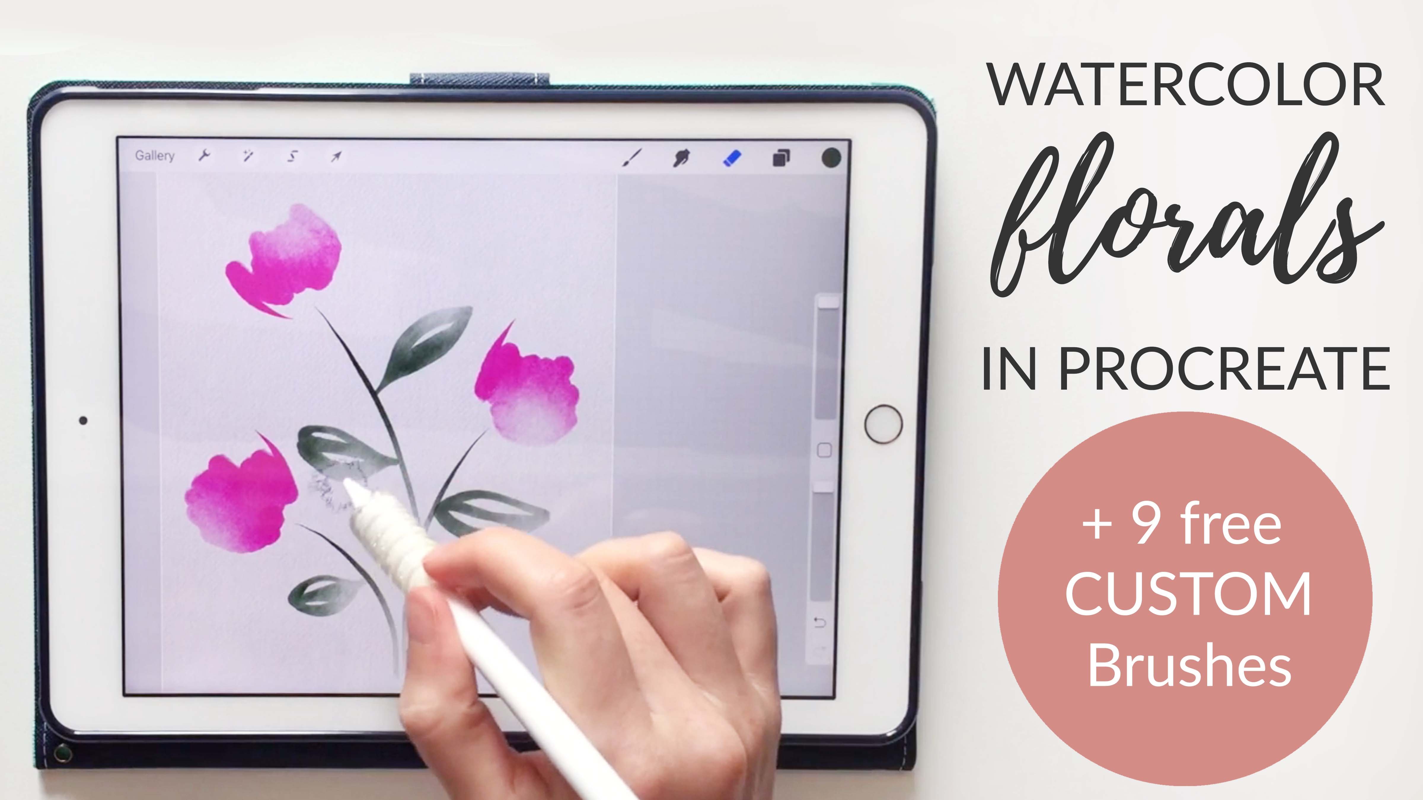
5. Working From a Sketch: With this next piece, I've really started in the same way, I've drawn an outline of a figure and I've added in some lines that show where the wrinkles are and just a few marks to show her face and hair, but I've kept it really simple here. For this layer where I've drawn this image, I'm going to go ahead and reduce the opacity because at this point I'm just going to use this pencil drawing as a guide. I'm really going to go in with my watercolors and do all the painting on that layer and this layer will eventually be deleted. Let's start with a new layer and I'm going to start with her dress, so I'll choose a pink color for this dress and again, I'm going with a medium shade because I'll lighten and darken it later on. Let's do the controlled brush for this one to get a slightly more smooth effect. I'm being sure I'm on that new layer and that it's set to multiply and then I'm just going to go through and color her whole dress. Again, I'm not worrying so much about going outside the lines, in fact, with this process, I try to go a little bit outside the lines so that when I erase later, it's really close to the outline of the actual image. I'm going to take my time here and make this somewhat even, but I like having a little bit of that watercolor variation. I tried to change how I do my stroke, sometimes I go back and forth, sometimes I go in more of a circular motion and that can help add a little bit of variation to your strokes. If I see some areas I don't like how they're turning out, I'll just rub over that with the brush a little bit and it'll help clear it up. I think I've got all the points covered and now I'm going to go in with my eraser and just clean up that edge. I'm getting my fine detail eraser and it's all the way at the smallest size and I'm trying to stay right on the outside of that line. Once I remove my pencil marking later on, it will make a really nice outline right where the edge of the image stopped. Go ahead and speed up the video while I do this, but I'm just going to do the same process all around removing all this extra water color that I painted. Now I have that whole piece outlined and I'll do my same process where I add a little bit of variation to start with, got my cloud brash and erase some of this just to add a little bit of variation there. Let's merge those together. I don't really like that color, so I'm going to go to color balance and let's make it a little more pink and reduce the saturation a little and bump up the brightness. Now I have this layer selected and I can either go in and do more darkness and variation or I can start adding some other layers that show the folds of the skirt and the wrinkles, I think I want to do that, so I'm going to go to my outline layer, zoom in a little bit, grabbed my selection tool and I'm going to select automatic rather than freehand. I've clicked "Automatic" and then I'm going to click in some of these areas, I'll do this one and this fold with the same effect. If you didn't select quite enough, you can put your Apple pencil down and then drag and you can see how more and more of that area is getting selected as I click and drag. You have to click on the blue area and then it looks like it's starting to grab some of that black and then it goes way too far, so I'll go back here, so let's stick with that, that looks good. Now I've got those two fold selected, I'm going to go back to my original layer and what I could do here is erase a little bit, so it's still watercolor, but it's just a little bit lighter or I could go in and paint another color on top of that. For this one I'll do both, so you can see both effects. Let's choose a darker color too. When we're done with that selection, we can click "Select" so if we wanted it to be darker, we could keep that dark layer we created or we could just stick with that original erased piece that we did, so that's nice. I do wish I'd added a little bit more variation on the lightness, so I'm going to go back, redo my selection, go back to that original dress layer, grab my cloud brash and just give some areas, and really in this area, it could be totally white because it's surrounded by pink. It would read us light pink even if you totally removed the white there, so I'm going to do that and then I'll click "Select" to deselect that. Let's remove my drawing layer just to look and see how this is going. You can see we've got some really nice folds. One thing I think we're missing is the colored lines on the dress and also a little bit of variation in the dress, so let's go ahead and add that in. We have a few different options here, we could grab our cloud brush and just start erasing on these middle sections that are in-between my fold lines. Then let's say I also want my fold lines to have a little bit of definition, I'm going to make a new layer, grab my blunt edge brash on a pretty small size and let's get a slightly darker color here, then I'm going to go in and create this line. Now you could just leave this as a line, it could be just like a fine tip watercolor brush line, that would be fine or we can go in and blend it. I'll do the blending option, so you can see both here. That would be the option if you just stick with the lines and if we remove the line drawing, you can see what that would look like or we can grab our blur or our blurring brush here and I'm going to get the wet blotchy brush to fade this out a little bit. I'm just going to go along the edge and just let it flow into that other pink and I think I'm going to remove my outline so you can really see what I'm doing here. I might do this just on one side of these so we have a hard edge where the wrinkle is and then we have a soft edge as it blends into the other pink. I'll remove those tips, it made her really rough blunt tip, so just going to blur over those. This is a nice blurring tool because it really makes a wet effect, it's almost like you just dripped some water on your paint brush and just let the ink flow. Now we've got a nice little dress and I may even duplicate this layer again and do a little more erasing, you could keep going with this, you can go as far as you want to create as much variation or as little variation as you want.
6. Adding Definition: Let's bring back our outline and go ahead and work on her skin a little bit. I'm going to find a skin color that I like. Again, we can always change this so you don't have to worry so much about choosing the perfect color because we can always go back in with that color balance tool. I'm making sure I'm on a new layer here. I'm grabbing the, let's do the controlled brush for this. I'm going to do the same process with her legs, go through and paint everything and then erase along the edge so that I've got a nice clean line. I'll speed up the video while I do this. Now, I've totally erased everything around the outside of the skin here. I noticed one little issue where I overlapped her arm and leg. This isn't really something I can erase because I would erase both layers. Rather than erasing, I think I'm going to grab my blending tool here, and just blend around the area where the leg meets the arm, just so these two areas blend really nicely together. I'll probably go in later and try to darken the arm a little bit more just so it looks really separate from the leg because as you can see now if I remove that, they almost just blend right together. I'll probably be darkening the arm and maybe lightening the leg area a little bit to keep those two sections really separate visually. Let's go ahead and duplicate our skin layer. I'm going to grab my eraser tool. Now, this is the point where you can decide, do you want to show a light source or do you want this to just be a general, more abstract watercolor painting? I think what I'll do is make my light source come over here from the left, and all of my lightning I'll do from the left side. Her face will be lit, her shoulder, the left side of her leg, the top side of her arm a little bit, and then the left side over here. I'm going to do that a few times so that I can really see some variation. She's starting to look a little bit more red than I want her to, so I probably will go in and adjust the color balance a little bit, and maybe even the lightness a little bit. Just adjusting, adding in a lot of variation here, maybe even merge these two layers together and bring in a little bit more lightness, especially on the face which is facing the light, and some areas that would get really hit if there was like a spotlight to her upper-left. Let's stick with that for now. Again, you can always go in and adjust the coloring. Let's go into the hue saturation brightness. I'm going to bring up the brightness a little bit, and into color balance, take out a little bit of that red tone and maybe a little bit brighter. Let's stick with that for now. But since this is on a separate layer, we can always go back in and adjust that later. I'll go ahead and color her shoes. Let's choose, I think I'll choose a golden color for her shoes. I'm going to do this same process. I'm going to paint over these and then add some variation to each one, and then we'll move on to the face after that. Now I've got the general idea of this ballerina laid out. I can go in and add a lot more detail. You could go into every single finger, every single wrinkle in the dress and add some detail, or you can just keep it really light and abstract like this. I think I do want to add in a little bit of marking to show where her facial features are. I'm just going to grab a brown small brush and I want a new layer. I'm just going to do exactly what I see here, what I've already mapped out. I'll probably add in some pink for the lips, and then just a little bit showing. You could add in the wrinkles or the folds that I've marked out here. This is totally up to you. I think I'll go ahead and add them in and then take a look and see if I want to delete any of them later on. Let's make our outline invisible. I want to go ahead and erase this for sure. Let's give her a little bit of pink to show the lips. With these abstract watercolor pieces, it really only takes a tiny bit of paint to show a gesture, to show a facial feature. You can go really detailed with this, or you can just leave it really nice and simple like this piece. I may even go in as well and work on the hair a little bit. We could add these brown curls that you see here, just to show a little bit of definition in her hair. Little things like that can really add a lot of definition to the piece. But let's go ahead and stop there. I think you get the idea with this, and you could make your own piece that's similar, or it could be totally different in terms of detail or abstraction. Let's go ahead and move on to the next and last watercolor.
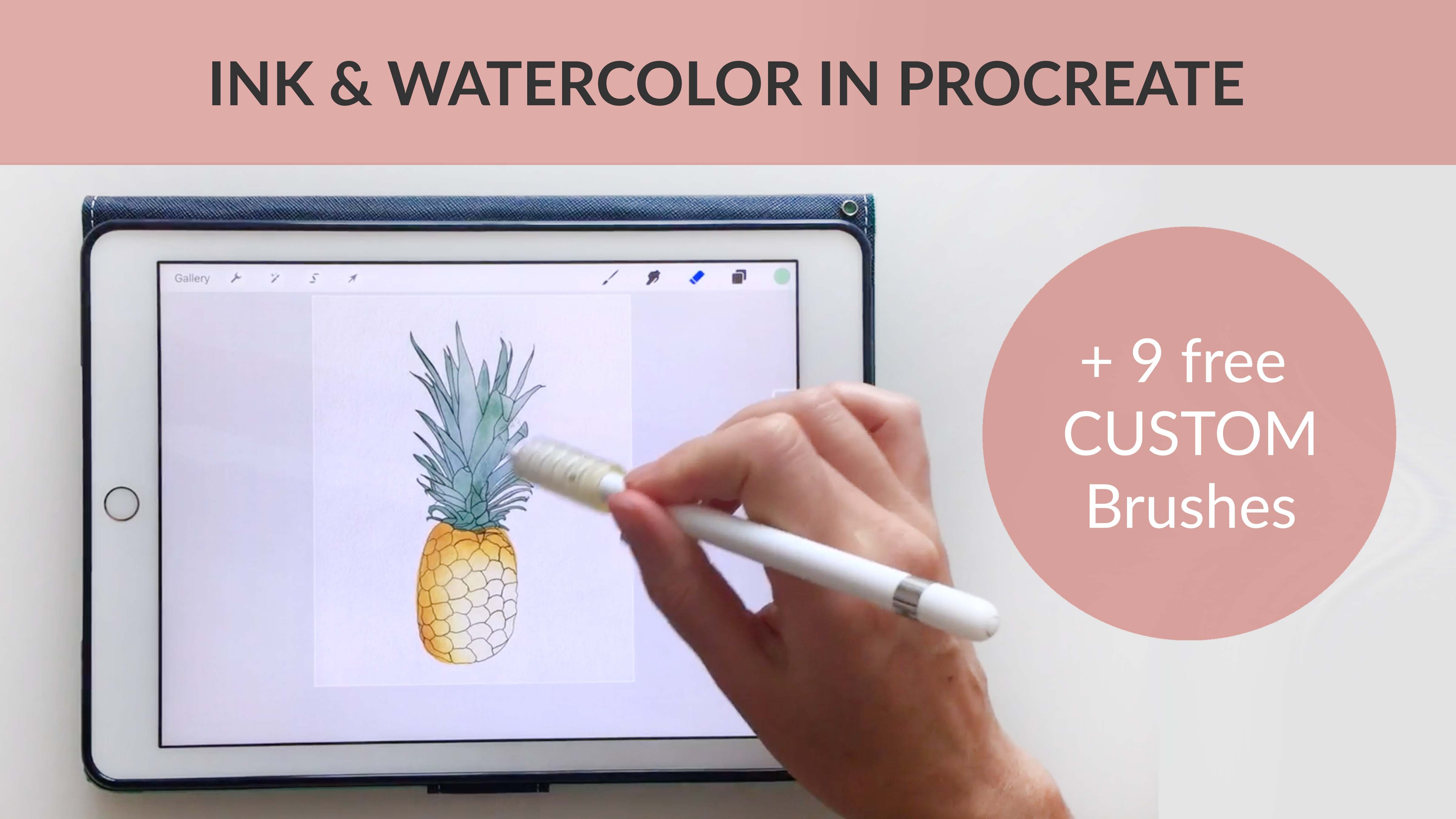
7. Loose and Layered Part 1: For our third painting, I want to do a really loose dial layered effect. We're going to layer a lot of different colors and paint that straight over a photograph and then remove the photograph in the end. This is probably the most abstract painterly style that we've done so far today. You can do this in a really loose way or you can keep it more controlled. You can see here I've gone ahead and placed my image so I've got my Canvas layer 2, watercolor texture paper layers, one on multiply, one on linear burn and then I've just placed this image that I got from the website Unsplash. Let's go ahead and add another layer on multiply, and that'll be our first painting layer. For our picture layer, I'm going to reduce the opacity to about 50 percent so I can really see when I'm painting. I've got my paint layer selected. Let's start with the face. As I'm looking at the face here, I can see the lightest areas here and the darkest areas here. I want to choose something that's in the middle, I'm just pressing and holding, I'm going to choose this medium color right here and I want that paint layer. Let's grab the controlled brush for this one. Let's get slightly bigger brush. I'm going ahead and paint his whole face. I'm not trying to make this perfect, I'm going to do a lot of layers so this is just laying down the first layer. That's just one solid area. Now I want to start going through and picking up some of the more shadowed areas. Let's start with some darker areas here and with normal watercolor painting, you usually work light to dark. With this method, it really doesn't matter, you can work light to dark or you can skip around. I tend to skip around a lot, but it's totally up to you. I'm just following the shadows of the photograph here and I'm trying to keep these angles that are already existing in the face present. Let's do one more of those here to capture this eye shadow and the side of his nose. Then if we move our original layer, you can see we're just masking out shadows. I'm going to take my blurring tool here and just bring some of these together. I'm just going along the edge of this dark color and letting it fade in to the lighter color. I'm just going to keep doing this, working through the painting, looking for all the various tones that are in this face, and then masking them out with all these colors. I'm not trying to be too precise, this is a really abstract piece so take your time. Do this, however, works best for your style. I'll go ahead and speed up the video here for the face part so you can see my process and then we'll pick up from there. You can see even with just those few layers, it's really starting to come to life and you're starting to really be able to see a face in there. One thing this is missing at this point is a bit of highlight. I'm going to go in with my eraser tool on the cloud brush and start taking out some pigment in these lighter areas. It's nice to be able to work from a photograph the first few times you do this, then you eventually may want to just move over to doing this without a photograph and just doing it by looking at a subject or just doing it by memory. His face is becoming really gray and he has more of a warm tone to his skin color so I'm going to come in and bump up the warm tones a little bit. Let's just go to the saturation and bump up the saturation a little and that's a little closer to his actual skin color. At this point I'm just going to go through and try to work through each area and make it look as much like the photograph as I want. Again, this can be really abstract. I could just stop there and start working on the rest of the piece. It's totally up to you. I think for this painting, for the sake of time, I'm going to go ahead and keep moving and work on the other areas. I'm going to do the same process with all of the parts of his body and clothing. For the hat, let's grab a gray tone and I'm on a new layer here. Let's get a bigger brush. I can change pink colors here, or I can just keep going with the same color. If you were doing a real watercolor painting, that's probably what you would do, just layer the same color or slightly different shades on each other. I'm just going through following the shadows of this hat. As you can imagine, this is a really good way to practice your painting. Now when you go and work on Canvas or paper, you'll be keeping these things in mind. You can really learn to study a photograph this way so I really love this method. Throughout the painting you'll see I'm just going in and adding darkness and lightness all over the piece throughout the whole painting, you're just jumping around, adding lights and darks as you see them in the photograph and keeping in mind that it doesn't have to be exactly like the photograph and it of course, will never be exactly like the photograph. But you can really use it as a guide to study where the light and dark areas are. There we've got a really nice start to the top of his body.
8. Loose and Layered Part 2: I want to start working on his stripes a little bit. Let's grab the blue and I'm going to get more of a lighter blue here and let's choose a new layer and start working on the stripes. I often will take the photograph away to just see where I am with color and shading. That way if I get to a point that I think I need to change something, I can start working on that immediately. I don't like to get too far in the piece before I take a look and see how my progress is going. I'll continue the same process with the rest of this figure. I'll speed up my video here so you don't have to watch this whole process, but I think you get the general idea. Laying down some color than laying down the shadows and bringing out the highlights. One trick here, if you know there's a certain area that you want to make a lot darker than the other areas of the same color, you can go ahead and start a new layer and put that piece on a new layer. I'm going to go ahead and paint the same strike that I know I want to be super dark and I'm just painting over the existing stripe on a new layer. Then, I can do that same process that we did in the earlier videos where I go through and duplicate the layer, and then each time we duplicate it, it gets a little bit darker. I'm letting there be a lot of variation in this line as I go and then go ahead and duplicate this a couple times because I know I want that to be darker than the other pieces and if you have any of these little weird areas that didn't blend well, just grab that blend tool and push those together. Then once you Zoom out, you really can't tell. Keep adding color to the rest of this piece. I went ahead and merged all the color layers of the stripes on his outfit. But let's say I realize, I wish I could just make this piece a lot darker because if you look at the original photo, that and that piece are really dark compared to the others. I'm going to grab my selection tool, click freehand, select these, click my adjustments tool, and then hue saturation brightness and let's just bring down the brightness on that and I think that looks good. Let's stick with that for now. Actually, I'm going to make this one even darker. Let's do that. If you mess up your selection, just click the selection tool again and go a little bit darker on that one. It's losing some of its blue. I may go back in with the color balance tool, add a little bit more blue and let's even do I think I'm going to do a little blue layer over that because it almost turned gray. It's nice you can just keep playing with these and just seeing the colors and working with these until it looks exactly like you wanted to. I'm going to continue doing the same thing and start mapping out his jumpsuit. Now I've mapped out all the major shadows and highlights and the main portions of this watercolor. I've just done some big blocks for the shoes and got these lines pretty much together. I can leave this as a very painterly style just like it is now. I like the style. Some people like more realistic pieces and some people like more abstract pieces. It's really just your personal style at this point. But if you want to get it a little more refined, I went ahead and merged all of my color layers onto the same layer just by pinching them together. Then you can grab this blending tool with the wet blotchy brush and come through and blend these colors together so that you don't have these little white areas and so you can't see any of these digital paint strokes. This is an optional step that some people may care about and some people may not care about. It's totally up to you here. For me, it just depends on the piece. If I wanted to do something really refined, I would definitely go through and add a lot more detail, a lot more shadows. But for this piece it's a breakdancer, so it's the theme of relaxed and an abstract idea. I would probably keep it very loose with this particular piece. But as you can see, blending a little bit can make it a little more detailed. Also going in and adding some more highlights and shadows. Let's say we want to make this a lot darker. I'm going to duplicate this whole layer and then I'm going to go through and just lighten some areas which seem to have got to a little bit too dark when I did that. That alone adds a huge layer of dimension. If we merge those two together, we can use our wet blotchy brush to continue blending and even adding some more darkness so I could take my almost black color here, bring back my picture and start. I've got my figure brush. Let's use the blunt edge controlled on medium. I'm going to go in and find where the darkest areas of this photograph and go through and really dark in those to just bring out some extra contrast in the piece. But again, this is totally up to you. Some people will like this style that's highly worked and really detailed, whereas others will want to stick with a more flowing abstract piece. The last thing I like to do for some of these pieces is add some texture in the background. This is also of course optional. I'm going to create a new layer. I'm going to grab my heavy bleed brush and let's do a mustard background. I've got my heavy bleed brush on the largest setting. I'm going to go in the background and just dirty up the paper a little bit. The theme of the breakdancer is like outdoors, grungy street look. I think a pure white background may not work well for this piece, but, it just depends on what you're going for. We can do that and leave our streaks, or we can grab our blend brash and really blend this together nicely, and then you may want to go in with the eraser tool and remove some of that yellow from our break dancer because otherwise his clothes look yellow, but I think it's fine to leave some of the background color overlapping with the figure. It draws the figure into the scene. I might just let the edges be a little bit yellowed and leave the rest as we originally painted it. Another option if you want to do a background, is to add a little bit of a splatter. I have a splatter brush included with this brush pack you can download. I'm just going to grab a gray and splatter and then let's reduce the opacity of the spatters so they're not quite so prominent and then again, go into with our eraser brush and clean this up a little bit or you may want to leave the splattered over the figure totally up to you here. I like to let my figure really come out of the background rather than be covered by the background, but totally personal choice here. There is our finished piece. If you liked this class, you may like some of my other classes where I cover a lot more ways to design and paint on your iPad like how to paint brush and procreate using the free downloadable brushes I created. Check those out on my profile if you want to see more. Also, I share a lot of free downloads on my site. If you want to get more downloads like the ones you got for this class, check out my website, I would love to see the final project that you create for this class. You could add it as a project here on Skillshare, or you can tag me on Instagram or Facebook. If you have any questions about the process you learned in this class, please feel free to ask. You can reply to my discussion here on Skillshare, or you can contact me through my website. Thanks so much for watching and I hope to see you again next time. Bye bye.
 Liz Kohler Brown, artist | designer | teacher | author