Transcripts
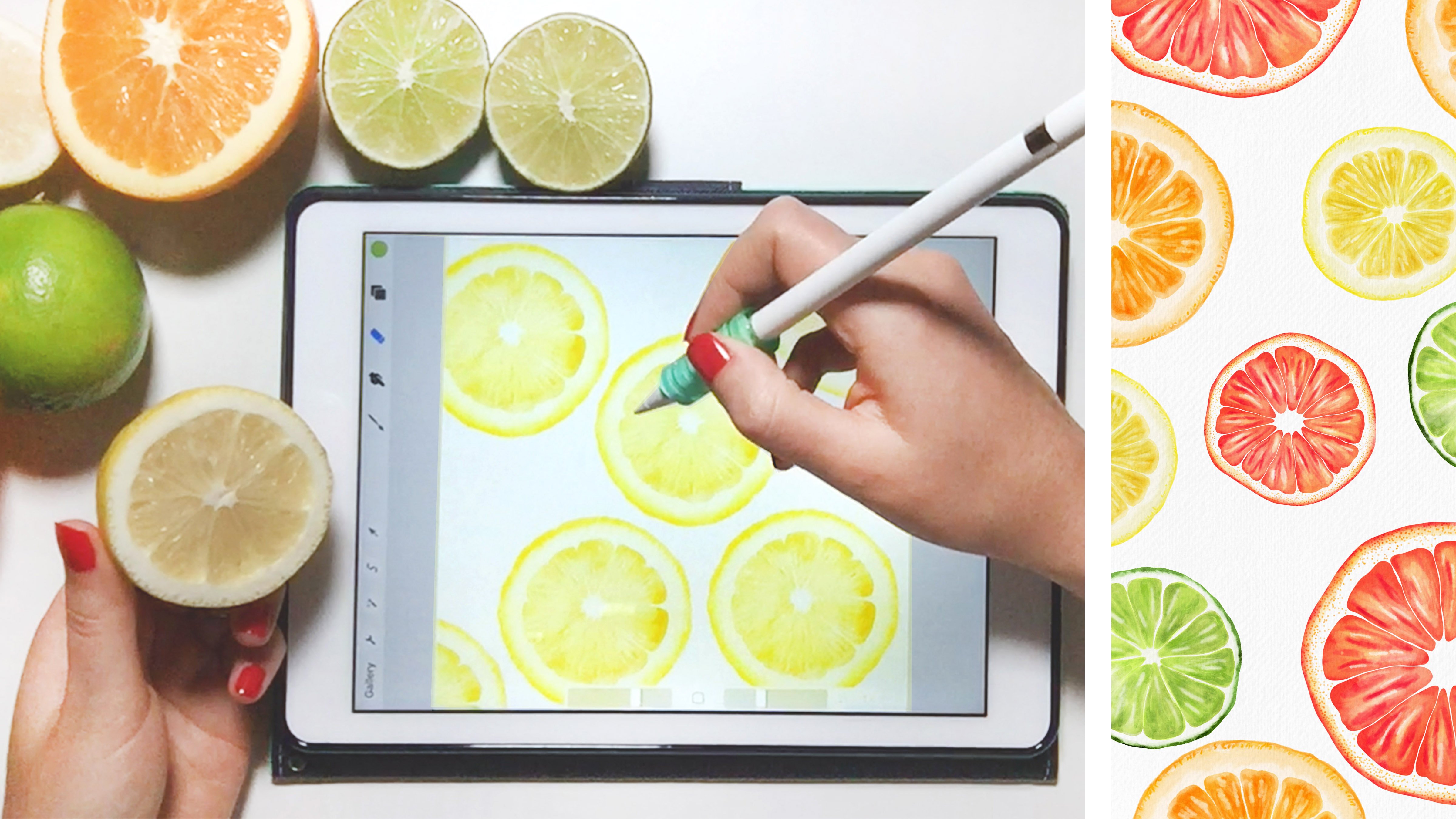
1. Watercolor & Ink Illustrations on Your iPad in Procreate: Hi everyone. In this class, I want to show you how to create ink and watercolor illustrations on your iPad. I created nine watercolor brushes and watercolor texture paper that I want to share with you as a free download. Using the brushes, I'll show you how I use lightening and darkening effects to create illustrations that look like real watercolor paint on paper. We'll start by covering the basic lightening and darkening techniques I use. Then I'll show you how to combine colors and shades to create a watercolor look on an illustration. Next, I'll show you how to get watercolor effects like combining two colors and how to create paddling effects that make your paintings look like real watercolors. You don't need to know how to draw well to take this class. I'll show you some simple drawing and tracing methods that will help you get started. If you already love drawing though, you can go straight to painting with the watercolor brushes. All you need to take this class is an iPad and a stylus. I like the Apple pencil because it's pressure-sensitive, but you can take this class with any stylus. Let's get started.
2. Downloads Password + Drawing & Painting: You can find all of the materials that I mentioned in this class in the about section of the class page, and here is the password that you'll need to access that page. The first thing we need to do is set up our Canvas with some watercolor texture paper and add some blending modes to the paper so that the watercolor really blends in nicely to the paper. The first thing I'll do is click the plus sign and click, "Create custom size." I'm going to choose nine by 11 inches, but you could really work with any size that you'd like. I always worked in 300 DPI that creates a nice high-quality image. I have a blank document here, and there's just one layer. I want to add another layer, and I'm going to bring in my watercolor texture paper. You can download this paper and all the brushes that I'm going to use today from the link in the class description. I'm going to go straight into painting and drawing here. If you're a beginner to procreate or you feel a little rusty with your procreate skills. You may want to start out with my first class. In that class I go through all the basics of procreate and importing brushes and things like that. If these steps seem a little fast for you, you may want to start with that first class. I'm going to click the Tool symbol, click, "Image", "Insert a photo." Then I'm going to find my texture paper on my iPad. I'll expand it by clicking the little expand button down here. Then on that layer I'm going to click the blending mode n symbol for normal, and I'm going to change that one to multiply and set this to about 50 percent. Then I'll duplicate this layer, change that one to linear burn. I also want to rotate that layer. You can see there's a little bit of shadowing on the paper. But if I rotate that paper, it really evens out all of the shadowing. I'll swipe left to lock each of these layers because I don't ever want to paint on my paper layer. My other layer I'm going to set to multiply. Every time I paint a layer or duplicate a layer, I'm going to always click, "M." Multiply makes a really nice blend between the paper and the other layers of watercolor. That's one thing to always double check when you make a new layer with this process. The first thing I'm going to do is go ahead and lay down an ink drawing. I'm going to use the inking brush called, technical pen. This one's really nice because you can get a lot of variation. You can do a light line or you can do a really thick line. I'm going to be using that aspect of this brush today. I want to make sure I'm on a new layer and this one doesn't have to be set to multiply because it's not a watercolor layer. I'm just grabbing a black ink and I've got my technical pen, and I'm just going to draw some balloons to start with. I'll start in the middle here, click and drag and then hold down my pen to create a straight line. Will shift this down the page a little bit. Click and drag to hold. This is a nice beginning project because it's really simple. I'm going to draw about 10 strings here, and then add some balloons on top. I've got a nice imbalanced design here. I'm just going to add some strings. I've got 1, 2, 3, 4, 5, 6, 7, 8, 9, 10 lines, so I'll make 10 strings. Now I can go ahead and draw my balloons. This would really depend on your personal illustration style. I'm going to keep these really loose. I don't care if they're perfectly symmetrical, and I'm also going to let them overlap with some of the strings. The strings are showing through the balloons. That way when we add in our watercolor, will get a really nice variation. That looks good. If you notice that your line is a little bit shaky, you can always go into your technical pen on the stroke section and increase the streamline. The higher the streamline is, the less shakiness you'll get. If you're feeling like you're line's a little bit shaky, just go ahead and bump up that stream line and you can see it just locks the line into place if you do that, I like to keep it in the middle. That way you get a little bit of the hand-drawn look, but not a ton of jagged lines. I'm going to go ahead and move my balloons down the page a little bit so they're right in the center, and I'll add a new layer. I want to set that to multiply, since this is going to be a watercolor layer. I also want to make sure my watercolor layers are all below my paper layers. Your paper layer should always stay on top and all the watercolor should be below it. I'm going to go to my watercolor brushes and let's grab the blunt edge ref, brush to start out with. Then I'll just choose a color. Let's start with a pink. I've got my blunt edge rough. I'm going to set that to all the way up to the top here since these balloons are pretty big. When I paint this layer, I'm going t hold down my brush and not pick it up. If you pick it up and then start painting again, you're going to see all that overlapping. It's clear that you did it in two different strokes. Whereas if you keep your brush down the whole time, you can get one solid brash. Then if you go over it a few times, you can remove any little stray marks that showed up while you were brushing. I'm going to add another balloon with that same color over here before I do my lightening and darkening technique. I like to go outside the lines a little bit because that's how I do it when I paint with real water color. But you could certainly keep everything inside the lines. Next, I'm going to grab my eraser cloud brush. I'm going to increase the size here and then just come in and erase areas. I'm trying to do this randomly. I did it on the top on this side and on the bottom on the side so that it looks really varied throughout the piece. That's a good start. If you want to make these even darker, you can duplicate this layer, merge those two layers together, and then you get even more variation. You get a dark pink and then you get a really light pink. Now that I want to add a new color, I'm going to click the plus sign to get a new layer and set that layer to multiply. Let's grab a yellow for this one. I'm trying to alternate my warm and cool colors, so I'll probably put a cool color in here. I'm going to let my yellow be two steps over. But you could do this in any way. You could make all of your balloons just two colors totally, depends on your style. Let's say you go a little bit too far with your watercolor painting. This fine detail brush is great for just coming around the edge of watercolor and cleaning it up a little bit. If you find you went a little too much over the line, then feel free to just use that brush to erase. If you use a regular eraser rather than that brush, it will create a really hard line which doesn't really look like watercolor. Whereas this fine detail brush is a watercolor brush, so it really mimics that style. I'm going to grab my cloud brush eraser. Actually I know I want these balloons to be darker, so I'm going to go ahead and duplicate that yellow and then merge these two layers together, and then I can do my selective erasing. Let's go ahead and continue with all the other colors. I'll speed up my video here since you get the idea with just choosing a color and making sure you're on a new layer, that's said to multiply, and then going ahead and laying down that color. There we have a finished piece. We have a lot of nice variation and a little bit of overlapping. You can see you can get some nice color variation when they overlap, and I could've painted these little triangles at the bottom where the balloon is tied. But that's totally up to you. This would be a great cover for a birthday card or a thank you card or something like that. Let's go ahead and move on to a more advanced project.
3. Creating Variation: For the first project, we used a hand-drawn image. For this one, I want to do something a little bit more complex and I'm going to trace an existing image. I've got my watercolor paper layers already laid down on a new layer, I'm going to get the tool symbol and click "Insert a photo" and this is a picture that I got from the website on Splash. All of the images on that site can be used for any use commercial or personal use and you don't have to credit the author, but you still want to change the image a lot, so you wouldn't want to just use the exact image they have. I'm going to try to make some changes as I go so it doesn't look exactly like their image. First of all, I'm only going to use the car and I'm going to take a simple tracing of the car. On my car layer, I'm going to reduce the opacity to about 50 percent so I can really see my line drawing. Then on a new layer, I'm going to grab black and get my technical pen again and I'm going to go through and just do the outline of this car. I'm going to get the major curves and lines, but I'm not going to try to get everything because I really want the feature of this drawing to be the watercolor, not so much the ink drawing. I'll speed up my video while I do this since I think you get the idea here. You can see as I'm drawing this, I'm trying to vary my line a lot so I press down hard with my pencil in some places and then draw really lightly and others that makes it look a little bit more hand drawn to have a lot of variation in the line and so I just keep that in mind with every piece I draw. Now that I have my drawing completed, I can go ahead and start laying down some color. I'll click the "Plus symbol" and I'll click "Multiply" on that new layer, then I'm just going to choose a random color here, I can go with the color that's in the picture or I can totally create a new color. I'm going to choose this blue tone here and I'm making sure I'm on my new layer and I'm going to grab my, let's use the blunt edge controlled brash and we've got it on a large setting. You could go through and try to really slowly get around all of these little areas, but what I like to do is just go ahead and get a really big blotchy pass on the whole outside area. Everything that I want to color, I'm going to go ahead and make sure it's covered and then I'll come back in with my fine eraser and just clean up some of those areas. With these brushes, it tends to be easier to lay down a big amount of color at once and then come back in and cleaned it up. If I use this fine detail eraser, it'll make a really nice watercolor edge, so I'm going to make it a little bit bigger here. Then we get that rough watercolor edge, so you can make it perfectly meet up with your line or what I like to do is just let it overlap a little bit. I really don't care if it looks like I didn't paint my watercolors perfectly in the lines, I think it actually makes it look a little bit more authentic. I'm just going to go through and erase all of these little overlapping edges. Now that I have that painted, I can go ahead and start adding in some variation, so I think I'm going to duplicate this layer and merge these together and then get my cloud brush. I'm going to come in some random areas and just add in some water color variation. You can see if you get really close, with this cloud brush actually make some little speckles too, so sometimes those are nice, but you may or may not want that on your painting. I'm going to leave those speckles because I like how that looks. If you aren't sure about this color that you painted, this is a great time to go to hue, saturation, brightness and play around with different color options, so I could have a red car, a pink car. Let's say you don't really want to commit to that color, you can duplicate this layer, make the first one invisible, and then that one's staying there safe and you can start playing around with the color on that new layer that you created, so let's stick with red for now. I'm going to make a new layer for the tires because I wanted to get a nice gray shade for the tires. Let's switch brushes here to the sharp edge blotchy. If you switch between these brushes, you can get some varied watercolor effects, I tend to use the blunt edge controlled, the blunt edge rough, and the sharp edge blotchy the most. Those three have slightly different effects and you can play around with those brushes and see how each one is a little bit different. I'm going to do the same thing with this, I'm going to go ahead and paint my whole tire and then I'll come back and with the fine detail brush and erase any little move where I went way too far over the incline. Another thing I could do, I think these tires look okay but they're missing some variation, so I might come through with my eraser and remove everything in this strip and maybe even remove what's in these little ovals as well. Now that I have those areas erased, I'm going to go ahead and duplicate my tire layer, merge those two layers together, and then come in with my cloud brush eraser and create a little more variation. Since these are tires, we can even go a little bit darker and then we get a ton of variation in those tires. Now we have the option to go in and add some more detail. Sometimes these watercolor paintings can look really nice with just this few tiny bit of color, but you could also go in and add a lot of color, like we can add some lights here, let's color this is also light as well. We could also go through and add some other colors to these window lines. It's totally up to you here, you can keep going with this and you can play around with some color variation as well. I'll go ahead and call this finished and let's move on to the next project.
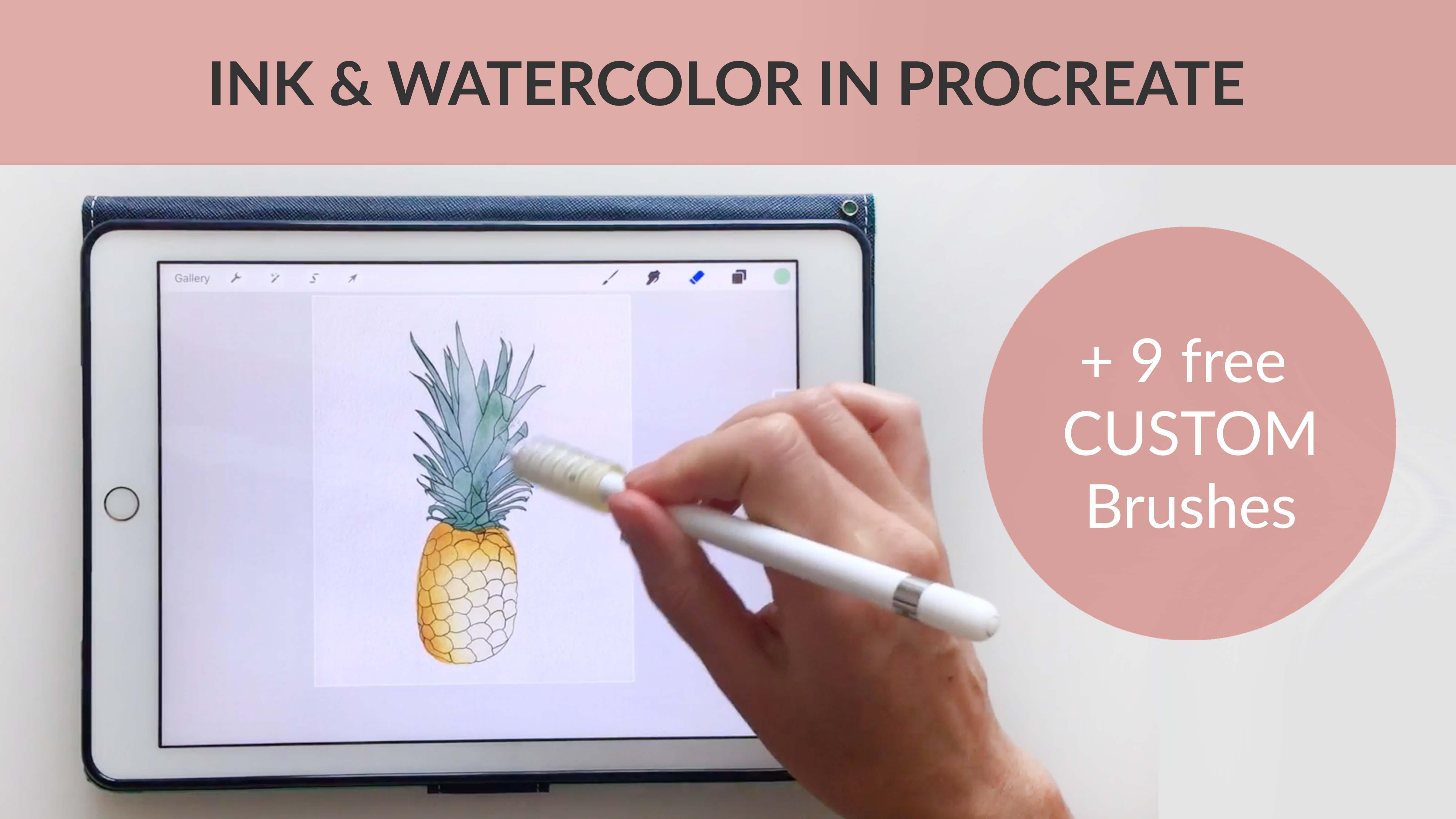
4. Multi-Color Effects: For this last project, I want to show you how to combine multiple colors within a single watercolor section and how to use a slightly more organic shape. I'm going to insert a photo. This is another one that I got from the site Unsplash. Let's expand that photo. Make it a little bit smaller here and fit it inside the canvas. I'm going to do the same thing. Put that on 50 percent. Then with this new layer on top, I'm going to grab my inking brush again with black. I'm going to go ahead and trace most of the parts loosely going through the leaves and the outline of this pineapple. You can see with this piece, I'm doing a really loose drawing. I'm not perfectly following what I see in the picture. I'm just loosely tracing what I see and leaving out a lot of detail. I think the more detail you leave out with this process, the more you can accentuate the watercolor. I do a really loose tracing and I'm trying to keep in mind that I want to vary the width of my stroke. I'm varying from pressing really hard, to pressing really lightly back and forth. Especially, when it comes to the tips of these leaves, having really dark line at the bottom of the leaf and then a thinner line at the top can help show some of the perspective of this drawing. You can see at the end here there's some places where I can't really see where the leaves are doing, but you can just fake it here and add some lines and no one will really know. Don't worry too much about it being perfect. Now that I have my pineapple totally drawn, I can create my new color layer and set that to multiply. If you look at this pineapple picture, there are a lot of different colors in the picture. There's some brown, some yellow, a little bit of green. We can incorporate those into the watercolor. They don't have to be in the exact same spaces that they are in the picture, but we could at least capture some of that color in our actual painting. I'm going to grab just a plain yellow here. I'm going to use my blunt edge controlled brush. On my new layer that's set to multiply. Then just go through here and add some yellow. I'm just really loosely masking out that pineapple shape. I'm going to duplicate that layer and go to my hue saturation brightness. Then play around with the color here to try to get a brown shade. I'm going to reduce the saturation a little, reduce the brightness a little. There I have a nice, we could get more of a golden brown or just say a dark brown, I'm going to stick with this darker brown. Then click your adjustments panel to set that. You can see if you look at the layers panel, that's actually a purple. But that's totally fine because we're just going to erase the purple to reveal the yellow. I'm going to grab my cloud brush and just very lightly come through and let some of that yellow show up. You can see you get a really nice effect. You don't want to go too far. If you erase all the purples then you totally lose that brown shade. I'm just going to let there be a little bit of that color variation. Then I can merge those two layers and do my same lightening process. I think I'll duplicate this layer, merge those together and then I get a little bit more variation. Now if you don't like that color, you can always go back to hue saturation brightness and play around with that a little. You could make this more of an abstract piece and have a different colored pineapple for sure. Another option, let's reset that so we don't save that color, is click color balance and then you can come in and boost the yellow a little bit, or maybe just take out a little bit of red, so it becomes more of a yellow. Those are some options for adjusting your colors as you go. Let's do the same thing with these leaves. I want to make a blue green color with the leaves. I'll start with my green. I'm going to get a lighter shade because I know I'm going to duplicate this with another color. I want to make sure that's set to multiply. For this one, there are so many tiny little leaves. I'm just going to do a really loose watercolor covering here. Then I'll come back through with my eraser and clean this up. I want to make sure before I lift my pen that every little tip has been covered and then I can lift it. Now I go through with my fine detail eraser and just clean up all these little edges. Now that I have that all cleaned up, I can duplicate that layer. Let's actually make that first layer invisible. I'm going to turn that second layer into a blue layer. I think I like this sky blue rather than the teal blue. Let's stick with that. Now we've got these two layers that are two different colors. If I erase on my blue layer, I can reveal some green. Whereas, if I erase on my green layer, I can reveal blue. If it's not drastic enough, we could always like duplicate that blue layer. Let's merge those two blue layers. Then we can get a lot more blue coming through. You can play around with those. I might even duplicate my green layer too. Now I've got even more color variation, the blue, the green. Now that I have this separated onto different layers, I could go back to hue saturation brightness and play around with some other color options. Maybe I wanted more of a purple-blue, or maybe I would just want to stick with two shades of green. This is a great time to just go through and adjust and play around with color. Once you decide on a color, you can merge those two together. Go back to your cloud eraser brush, and then create a little more variation. Some of these, I might erase all together just to create a lot of variation. Whereas others, I'm going to leave them really dark. You can play around with that, combining colors, creating new color layers. But lets call this piece finished for now. I hope you enjoyed this class and that you're ready to turn your own drawings into watercolor in ink illustrations. If you have any trouble with the brushes or any of the projects, just send me a message here on Skillshare, or you can connect with me on Facebook or Instagram. If you liked this class, you may like some of my other classes. I go through how to do florals, botanicals, figures and I have a lot more classes planned for the future. I would absolutely love to see you again next time. Of course, I would love to see your project as well. If you make a finished piece of this class, you could upload your project here on Skillshare or you could tag me on Instagram or Facebook. I would love to see what you made. See you again next time. Bye.
 Liz Kohler Brown, artist | designer | teacher | author