Transcripts
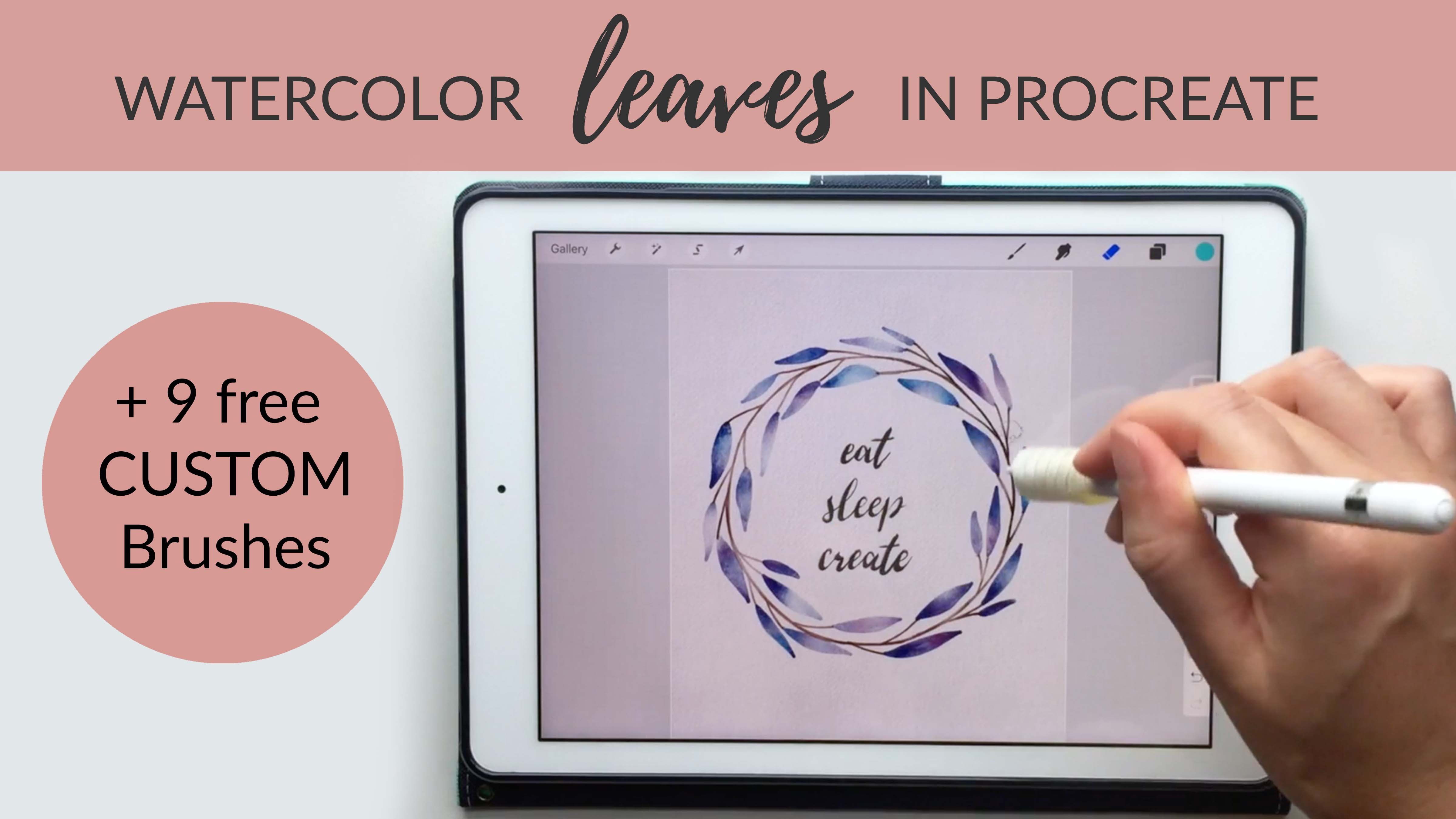
1. How to Paint Watercolor Wreaths on Your iPad in Procreate: Hi, everyone. I'm Liz. I'm an artist, illustrator, and teacher. Today I want to show you how to paint watercolor wreaths on your iPad in Procreate. I'll show you every step of my process, from gathering inspiration to planning out the layout and sketching. When you take this class, you'll get the watercolor brushes I made for Procreate and my watercolor texture paper as free downloads. First, we'll use a direct painting method using a single bold color to create an abstract floral wreath. I'll show you how to create a watercolor text effect and how to add multiple watercolor shades to the botanical elements. Then we'll create a multi-colored leaf wreath using a masking process. I'll show you how to use guides to space out your leaves evenly and how to add multiple colors to your piece to create a multi-dimensional look. Next, we'll create an asymmetrical wreath using a masking method to create rough watercolor edges. I'll show you how I paint basic plant shapes like roses and leaves, and how to modify and arrange your shapes as you create your composition. You can use the wreaths you create in this class as digital or printable art. You could even sell your wreaths as digital downloads on the site like Etsy, or use a print on demand site like Society6 to sell the painting on finished products. All you need to take this class is your iPad and the stylus. I'll be using the Apple pencil, but you could use any stylus or even your finger. Let's get started.
2. Brushes & Paper: So before we get started with painting, I want to show you how to get all of the brushes and watercolor texture paper in to procreate. So you can get to this download page by clicking the link in the about section of the class. You'll need a password to get on that page, and I'll show the password now. Once you get into that page, you can scroll down and you'll see the list of brushes and the texture paper at the bottom. So I'm going to click the first brush, and that'll open it up in a new window. You'll see the download option here, click download, and then click open in and click procreate. If you don't see procreate on this list, just scroll over and click more. Then you can find procreate here. So I'm going to click copy to procreate, and that's going to open up procreate with whatever document I had opened last. If you click the brushes section and scroll down to the very bottom you'll see imported, and the brush should show up on that list. I like to organize my brushes in sets or folders. So if you scroll down, scroll to the very top here, you can click plus to create a new set. So I'll type a title for this set and click 'Enter'. Then I have a blank set here. Now I can go to my imported brushes section and grab that brush that we just downloaded, and then drag that into the folder. So I would repeat that same process with each of the brushes. So once you get all of the brushes in you should see all five in your new set, then you can grab the watercolor texture paper. So that's at the very bottom of the downloads list. Click that one time, and that will open up the image in a new tab. One note here, I've had some trouble with this in Chrome. So give it a try and Safari if you can't get it to work in another browser. Once the paper opens you can click and hold and then you'll get the Save Image option. Click that one time to save it to your photos. So once you have all of your paper and brushes in procreate, we can go ahead and set up our first watercolor Canvas. So there are a few settings that I use for these Canvases, and I use the same settings for each Canvas. So click the plus symbol, click create custom size. I'm going to work at 10 by 10 inches at 300 DPI. You can really work in any size here it just depends on what your final use is. So if you think you might print this out onto paper and your paper is five-by-five inches, then five-by-five is fine. I like to use 10 by 10 so I have a little bit of flexibility for the final use. Click create to open the document. Then we can go ahead and put down our watercolor texture paper. So I'll click the tool symbol, click image, insert a photo, and then go to my photos where I just saved my watercolor texture paper and click that. Then I can just use my fingers to make this fit the paper. Then click on your layers panel and take a look at this layer. So right now it's set to N, which is normal. But we want to change it to a blending mode. Blending Modes help the layers blend together rather than just sitting directly on top of each other. So I'm going to click multiply. These all do similar things with different types of lighting. So you can play around with different types of blending layers, but these are just the ones that I like to use. I also like to reduce the opacity a little bit so the paper's not quite so dark. So I have one layer of texture paper set to multiply. I'm going to swipe left and duplicate that layer. Click on the M symbol here and rather than multiply with this one, I want to use linear burn. Linear burn is just a different type of blending mode. So with these two different modes you can think of light as passing through your paper in two different ways, maybe two different directions. So now that we have those two set up, I'm going to swipe to the left and click lock on both of those because I never want to paint on my paper layers. Those are just background textures. Those aren't painting layers. So I want to protect those two layers and be sure I don't accidentally paint on them. Next, I'll click the plus symbol, click the N and click multiply. All of my new paint layers are going be set to multiply. That's really going to help your watercolor paint blend nicely with the paper. So now that I've gone through the work of setting up this document, I don't want to have to repeat that same process over and over every time I start a new piece. I like to be able to just pull out a new document and start painting immediately without all these extra steps. So if you want to do that go to your gallery, click Select, click on the document, and then click duplicate. Then we've got two of those so you can just keep clicking duplicate, and maybe you want to do five or 10 documents at this size. It really just depends on how quickly you like to go through Canvases. Maybe you like to spend a lot of time on one Canvas, or maybe you're a person who likes to go through a lot of different documents. It's totally up to you here, but I'm just going to create eight linked documents.
3. Getting Inspiration: So before I start painting, I always try to get a little inspiration to help me get an idea of the layout and color palette and types of flowers or leaves that I want to use in my wreath. One of my favorite ways to get inspiration is to go to an outdoor flower market. These outdoor markets always have such a wide variety of flowers and leaves, and they're usually okay with you taking some pictures, but I always try to buy something too. I got these really nice flowers at one of these flower markets and I can use the leaves as inspiration, the shape of the leaves, the colors, and I can also use the petals. Once you take these home it's nice because you can move them in different directions, and get a lot of different types of angles that you can't really get from just the picture that you take at the market. But another way to get inspiration is to go to Pinterest. I like to create a Pinterest board when I'm starting a new project. I created a board for this class and I'll share this in the about section of the class. I've pulled together a wide variety of leaves here in a lot of different colors and layouts. Some of these are really dense. A lot of leaves overlapping and then some berries of some dark colors. But you can also do something a little lighter. Some of these have just a few little sprigs and then some leaves at the bottom, or some branches circling around with just a few leaves. There are just so many different layouts and styles to choose from. I really recommend just scanning around here or looking other places on Pinterest to find some images that stand out to you. These are really nice and simple for just getting started. You really just need to create a few leaves and repeat those in a circle. But you may be ready to dive into something a little more complicated where you combine a lot of different flowers and leaves. We'll do a few different styles in the class today, but this is just a really good way to get started with thinking about your color palette and your layout.
4. Adding Text: One thing I want to mention before we get started is that if this is your first time using procreate or you feel like a total beginner, you may want to start with my first class where I go over all the basics of painting, watercolors in procreate. In this class, we're going to dive straight into painting and designing your wreaths. If you feel a little unsure about procreate, you may want to start with that class. Let's go ahead and get started with our first project. I'm going to click on one of those blank documents that we created earlier, then I'll click the plus symbol to create a new layer. This is just going to be a sketching layer, so it's set to N for normal. I'm going to go to my brush set for the wreaths, and you'll see the first brush is a circle template. This is just a pencil lines circle and if you get a pure black here by double-clicking in the black section, and then you can change the size of the circle over here. I'm just going to click one time and see how big that is. That's good, I'm just going to move into the center of the canvas and maybe make it a little bit larger. If you resize your circle, just be sure to have magnetic selected. If you don't have magnetic selected, you will distort the proportions of your circle, which is fine if you want to do an oval wreath. But for this one I'm going to do a circular wreath so I want to be sure Magnetics is selected. I'm going to zoom out here so you can be sure I'm getting this in the very center of my paper. When you're moving something around the canvas, if you remove Magnetics, it makes it a little bit easier to do some free form adjusting. That one looks good, that'll be the outer edge of my wreath. Now I'm going to swipe left and click duplicate so I have two of those circles. Make sure Magnetics is selected and then resize this one. I'm going to let this be a thick wreath, so I'm only leaving a tiny little circle in the center for my quote. This doesn't have to be perfect. This is going to be an abstract piece anyway, so don't worry too much about perfection here, but just get it pretty close. The next thing I want to do is add in my quote. I can do that on a new layer, I could go grab a calligraphy brush, and just start writing. Personally, I am not very good at hand lettering yet, so I like to do more tracing at this point. But if you love hand lettering, just go for it or calligraphy, or if you just love your handwriting, just go ahead and write something here. But if you'd rather do some tracing, one easy way to do that is to get the app pages. This is a free app that's an Apple product, and when you open up your documents section, you can just create a new document and click Blank, then I'm just going to type a quote in here. I'm going to highlight that whole quote and then choose a font that I like, and here you just want to be sure that you're using a font that's okay for commercial use. If you've downloaded a font and you're using that on your iPad, you just want to be sure the font is marked as okay for commercial use if you have the intention to sell these as digital downloads or as prints. But if you're just doing this for personal use, it doesn't matter you can use any font. I'd like to break up the text here so that it makes sense with the pauses, so what you seek, is seeking you. Then I'll put the name on the second, the third row, and I'll highlight all of that and align that in the center. I want my quote to be centered. Now I'm just going to zoom in and make this as large as possible and take a screenshot. You can take a screenshot by clicking the home button and the power button at the same time, and you can see that's been saved to my photos. Now, open procreate, click the tool symbol, insert a photo, and then drop that photo into Procreate. Now I'm just going to resize this image and I want to be sure Magnetics is selected so that I'm not distorting the proportions of my text. Now I want to go to a new layer to do my tracing. On this picture layer, I'm going to click the end symbol and reduce the opacity because I want to just barely see that image. Now that I'm on that new layer, I'm going to grab one of the brushes in the set that you'll download, and it's the reverse masking brush. We're going to use this today to mask out areas that we want to paint, but I also like to use it for my text. You may have another brush in Procreate that you'd like to use for your texts, so feel free to use anything here. I'm just going to go through carefully with a size that I like and trace all of this text, and I want to double check that I'm on that new layer. I like this brush because it has a wavy watercolor edge, it's not super smooth like some of the calligraphy brushes, just depends on what you're going for here. But for me I want this to look like it was done with a watercolor brush or a brush pen, so I'm going to stick with this brush. You'll see that sometimes I don't follow the text perfectly and that's fine. You want to make this your own so I like adding that extra little tail to my S, whereas this font doesn't have that, so feel free to change the font here. This is your own creation and you can adjust this in any way you like. Now that I have that text trace, I can remove my image layer and I'll just delete that layer. Now I want to add a little bit of watercolor variation to my texts. I'm going to get my eraser and get the Cloud Brush that's in the download set. I'm just going to do some light erasing here just to add in a little bit of variation. If this was done with a water brush, it would have a lot of variation, contrast, darkness, and lightness all over that word, so I'm just going to add a little bit of that in. That's an optional step, if you really like the bold black, then just stick with that.
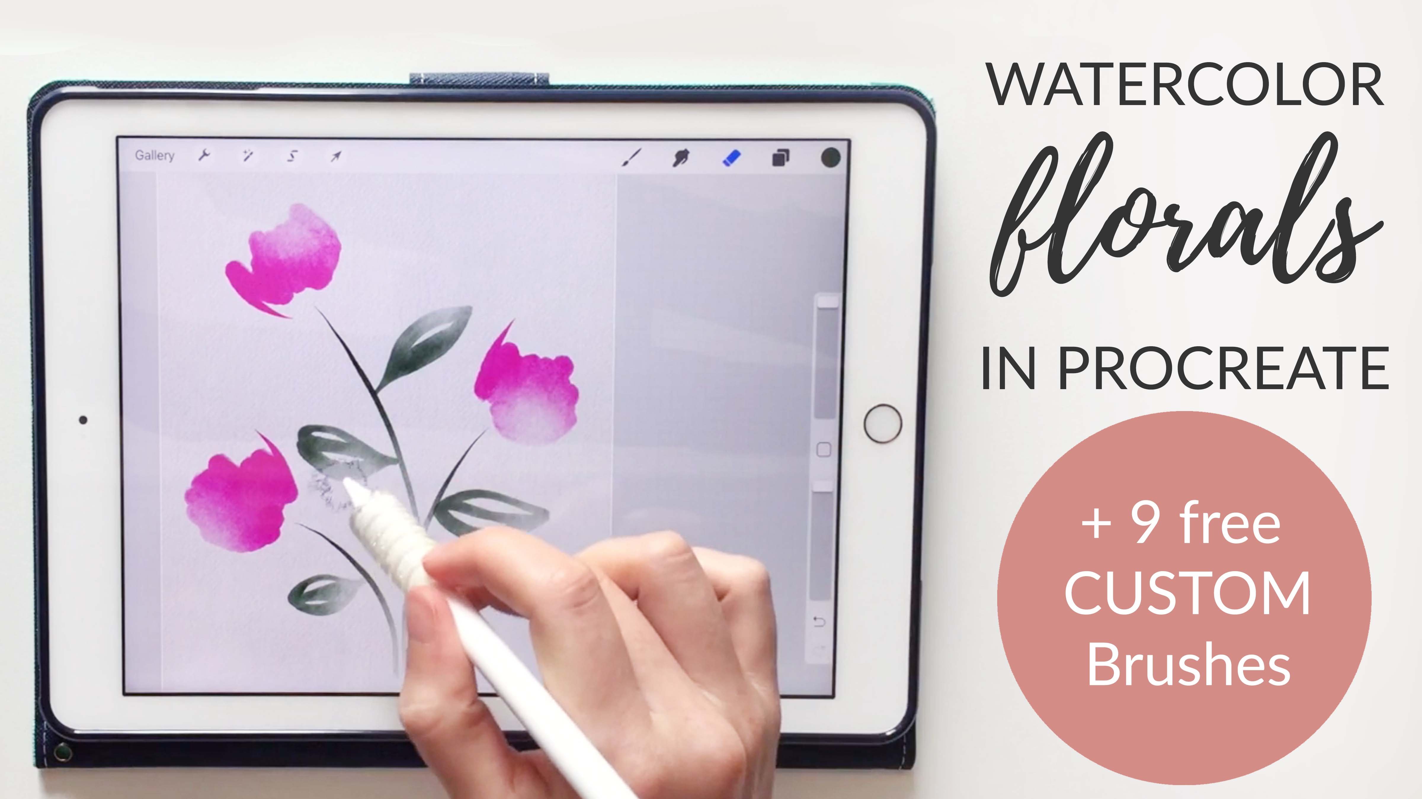
5. Single Color Wreath: So next I want to start working on my painting layer. So I'm going to create a new layer and click multiply. So I always want to be sure my painting layers are set to multiply. So double-check that each time you create a new painting layer. Next I'm going to choose a color here. I'm going to go with a bold navy blue, and if you grab the blended controlled water color brush, you can test out your color and see how it will look from light to dark. So I like this color because it has a lot of variation here. It'll get really dark, and also I can use my cloud eraser to make it really light. So when you work with a lighter color, it's a little more difficult to get that kind of variation, so I'm going to stick with a darker color for this piece. So I'll delete that layer since that was just a test, click "+" to create a new layer and make sure that's set to multiply. Now I'm just going to start playing around with shapes. So you can add any plant shapes that you want here. This is a great way to loosen up for a new painting. Get your blunt edge controlled brush, and just start playing around with some different shapes. So we could do some leaf shapes, and we can also do some flower shapes. We could do some single leaves, and we could do some really simple flowers, maybe like tulips, with multiple layers. So I'm just going to go around the canvas and repeat these same shapes and try to fill up this whole area with a lot of different shapes. Sometimes you'll notice as I'm working on this, I'll make a little stray mark. If you just grab the eraser with the Reverse Masking brush, you can easily remove those as you work. So I've got this pretty much filled out, but I do want to add in just some dots to fill up some of these spaces. The nice thing about this blunt edge controlled brush is that the dots really look like watercolor paint. So you can adjust the size of this brush and just use that to add a little bit of watercolor splatter to your piece. This is optional. I'm doing a really abstract piece, you may want to be a little bit more realistic with your flowers, but I think this is a great playful way to just loosen up and get ready to make some leaves. So I'm going to stop there and I'll remove my pencil lines. So now I have this painting layer and I want to add some watercolor variation to this. I'm going to swipe left and duplicate the layer, and you can see that makes it twice the darkness, and you may even want to do that again. So this will be our darkest color and then we'll go in and do some erasing. The amount of duplicating you do just depends on how dark you want your darkest color to be. So I'm going to stick with that, and I'm going to merge all three of these layers together by pinching and then get my cloud brush, and you can decide here. You could do more of an overall erasing where you go through and add some variation. What I like to do is go into individual pieces with a smaller cloud brush and just add a little bit of variation here and there to individual strokes. I think that looks a lot more like real watercolor than doing an overall erasing. So I'll just take some time here to go through and I'm looking for areas that are already light and large expanses. So like if you look at this piece, this is probably where water would pool if you were painting real watercolors, so that's where I'll add my variation. Sometimes to add a lot of variation I'll almost totally erase a piece, and you'll see when you zoom out, that is really how a real watercolor painting looks. It has some pieces that are so light that they're almost invisible. So I'm looking here for some areas that have too much darkness, and I'm just going in and lightening those up a little bit. So I'm trying to create a lot of contrast that's balanced throughout the whole piece. So I don't want to have like a really dark area over here and then a light area over here. It's better when it's much more balanced, visually it's just more interesting that way. I'm trying to not leave any pieces untouched. I find that if you don't erase a little bit on a piece, it looks a little bit flat. But if you just go in and add a tiny bit of highlight in each area, it really makes the whole piece look better. So I take a lot of time on this step, just playing around with lots of erasing and zooming in and out to get a faraway look and then a closeup look as well. That's a really good way to get a new look at your piece, is just zoom out and step back for a second. Now that you've done a lot of erasing, you may want to duplicate that layer and go even darker or you can use that new layer as a new color. So I'll make my first layer invisible so now I can only see that new duplicated layer. I'll click the adjustments panel, Hue, Saturation Brightness, and then play around with adding a different color. I think of blue, green wreath would be really nice so I'm going to do this color and then make my original visible again. So now I can go through with my cloud brush on a really large size and erase in random areas, and then go back to the other layer and erase in the opposite areas. Then I'm getting all this color variation and also a little bit more light and dark variation too. So if you want to get that kind of variation, you can add in that multicolored layer. But let's say you're not happy with how that turned out, you can just click two fingers to step back until you get back to that original blue layer. Another thing you can do is duplicate this blue layer a few times and make those duplicates invisible. Then on this new duplicated layer, you can just play around with color. So maybe you'd rather have a pink wreath. You can bump up the saturation here to get a little bit more color. Maybe even bump up the brightness to get a bright pink. You can see how once you get that original layer down, you can do a lot to play around with color. Now I could have a pink and blue wreath. If I make that blue layer visible, I can start erasing here to reveal blue and then erase on the blue layer to reveal pink. So there's a lot you can do once you get all these layers down, or you can just stick with your original color that you created. I'm going to go ahead and call this piece finished.
6. Guides & Masking: For this next piece, I'm starting in the exact same way that we started the last piece. I've got my quote, which was painted with the reverse masking brush and then erased with the cloud brush and I've got my two circles that I made from the circle template. For this one I actually want to add a third circle. I'm going to duplicate this layer. Hit "Magnetic." Then this circle, I want to be in the center of these two circles. I'm going to remove the magnetic settings so I can adjust this. The reason I'm doing this third circle is because, I need something to guide me when I draw my branches. I also need guides to help me stay within that perfect ring. These three guides are really going to help me stay organized. I'll put all my guides on the same layer. I'll just merge those together just to simplify things, and I'll click "Plus" to create a new layer and this layer can be set to N. For this process, rather than directly painting on the canvas, we're going to create an area that we want to paint with a reverse masking brush, and then we'll cover all the painting in one big swoop. Let's start with the reverse masking brush, and it doesn't really matter what color you use here. But I like to use the color that I'll be using for the watercolor just to help me stay organized. I'm just going to draw a branch here and this is just going to come down and then across like this so that the two branches will cross. I'm going to take a minute here to go slow and set this up nicely. I'm going to just put some little guides here first. I want my first branch to end here and the other one to end here, and I want them to cross here. That's just helping me stay organized with my shapes. It's a lot easier when you give yourself guides like this. Everything is easier, so I always recommend just taking the time to do this. That's my guide layer. I'll click "N" and reverse or reduce the opacity of that layer. Then I'll click the "Plus" symbol and this will be where I paint my branch. I'm going to get a somewhat thick brush so that I have a nice thick branch to work from. I was just adding some little thickened areas here to the bottom of the branch. That just shows that it's thicker here at the bottom and it makes it look nice as an ending here. This isn't perfect. You don't want this to be perfect because this is a branch, so it's going to be a little bit wavy, but I am trying to match up the two sides. So I want the thickness of this side to be the same as this side and the same goes for the bottom of the branch. So I took a little bit of extra time just to make sure that these are nice and even and that they match each other well. I like to use the reverse masking brush for erasing. I just add a little dot there and I'm going to remove that. Now that I have my branch taken care of, I can remove my branch guides. I'll just delete that layer. Now I want to add some little sticks that come off the side of the leaf. I'm going to be using this leaf shape for my wreath, and you'll see that off of this branch, there's always a little area, just a little twig that attaches the leaf to the actual stem. I'm going to add that little area in, in the same color. One thing I'm trying to keep in mind as I do this, is that I want it to be varied. I don't want them all to point the same way. I want them to point in slightly different directions, because you can see this one points straight, but this one curves back a little, and this one curves out this way. So when you look at a real leaf, you see a lot of variation. I try to bring that into my wreaths so that it looks not realistic, but just a little bit closer to leaf. I also try not to make these match up perfectly in all places so I offset these a little bit. This one's a little lower than the one on the right. This one's right across from it and then this one I'll put a little bit above. Little variations like that can really help the piece look a little more natural. Another thing to keep in mind is that you never want these stems to be thicker than your branch because the stems are always thinner than the branch that they come from. You can see that principal here; the branch is slightly thicker than all of these little areas that stick off the branch. I try to keep that in mind as I'm making these little points. Now that I have all of the branches taken care of, I'm going to go ahead and add in the leaves. I want to be sure this is on a new layer because this brown is going to be one color and then the leaves are going to be a different color. I'm also going to paint these in yellow, because yellow is a color that is really hard to achieve with the hue saturation brightness, whereas every other color is really easy to achieve with that tool. I'm going to start with yellow and that way I can turn my yellow into greens, and blues, and any other color. But if you start with a green, you can never get yellow. I'll go ahead and on a new layer, I'm going to start painting these leaves. I'll use the same brush here, the reverse masking brush, and I'll use the same brush here, the reverse masking brush. I just want these leaf shapes to be similar to what I have here where it's thicker in this top third, and then it comes to a really tiny point. I'm going to make my leaf shape, and then to get that point, I'm just going to take a second to use my brush on a really tiny light setting. Then I'm just going to barely touch my brush to the tip here to get that nice point. I'll continue doing that for the rest of the leaves. Just like we did with the stems, I'm trying to keep in mind the varying shapes and widths of each leaf. I don't want every leaf to look the same and I especially don't want two leaves that are right beside each other to look the same, because you almost never see that in nature. So I'm trying to add a lot of variation to each piece so that they look different. I might do one that's a little bit skinnier like this piece, and then the next one I do, I'll make it a little bit thicker. You can also see that I am going past my circle a little bit. It's totally fine to go a little bit outside of your guides and in fact, I think it makes it look a little more loose and fun when you go outside the lines a little bit, but I do use those lines just as a general guide, especially to size my leaves. I've found if I don't use the guides, it's easy for the leaves to get a little bit out of control and you'll get down the line and realize some are way too long. So these guides are a great way to just keep your drawing under control. I've gotten to the end of this and realized I really don't want to have those two branches at the bottom. So I'm going to go back to my branch layer with the reverse masking brush as my eraser, and just come in really slowly and gently and remove those little pieces. The same goes for this other side. It's not going to work on this side either. You can see how when you use the masking version here, you have a lot of freedom to make changes as you work. Whereas when you do direct painting, you're a little bit more limited as to how you can control your piece. I'm going to continue and do the second side here. Now that I have all of my leaves masked out, I just want to double check that I didn't miss any areas. Sometimes when you paint in yellow, it can be really easy to miss an area. I'm going to create a new layer just below my leaf layer, and I'm going to fill that layer with black. First make sure black is selected as your color. Then click on the layer one time and click "Fill Layer." Now we can really zoom in and see if we missed any areas and you can see I did. I'm going to go back to my yellow layer, click and hold to get that yellow color and make sure I've got my reverse masking brush, and then I'm just going to go through and clean up all these little areas that I missed. This is a really important step because if you don't paint on an area, no watercolor is going to lay down on that area. So it's good to just take a few minutes here and just scan over your drawing. You may even find some areas you don't like. I don't like how there's that little nub that shows where the brush was, so I'm just going to fix that. I'll take a few minutes here to double-check all of these leaves. Once that looks good, you can swipe to the left on that black layer and click "Delete" and now we can start laying down some watercolor.
7. Multi-Color Effects: Let's start with the branch layer. I'll click on the branch onetime, click select, and then click the little check mark here to make that layer invisible. Then I'll click plus to create a new layer, and on the blending mode I want to be sure multiplies selected because that's going to be my watercolor layer. So I've got my wreath branch selected, but that layer invisible, and I'm on a new layer set to multiply. Now, I'm going to grab the color I want to use, which is a brown color and I'm just going to go through and make sure I paint over every square inch of that selected area. You may want to go over it with two passes just to be sure you don't miss anything. Now I can click the selection tool to deselect that, and let's make our leaves invisible since it's making it a little hard to see. I'll also make my guides invisible. Now we have this nice watercolor layer, four branches. I'm going to duplicate that layer because I wanted to be a little bit darker, and then I'll merge those two together and grab my cloud eraser brush. I'm just going to go in and add a little bit of variation to this branch, and I think I'm gonna duplicate it again because I want a little more variation. Okay, that looks good. Now I'll bring my leaves back and I'm going to do the same process with my leaves. I'll click on the leaf layer, click select, make that layer invisible. Click plus to make a new layer, click multiply, I set that new layer to multiply and then with that yellow color, I've got my blunt edge controlled watercolor brush and I'm just going to go through here and cover every leaf. I'm not picking up my brush here because if you do pick up your brush and you put it back down, you really see the extra stroke. If you want to have that layering look, then it's fine to do that, but if you don't, then it's good to just not pick your brush up, just keep going all the way. I'm just going to double-check each one and go over it twice so you don't miss anything, and then I'll do the same thing on this side. Now we have a nice Watercolor texture on those leaves. I'll click select to remove that selection, and I'm going to duplicate that layer two times because I know I'm going to want several different colors here. I'll make the first two invisible. Let's do a green color, and then make the second layer invisible, and on that one I wanted to do more of a blue. Now I have three different layers, the green leaf layer, the blue leaf layer, and the yellow. I'm going to make them all visible, and now I can start going through and erasing to remove various colors. When I erase one color, it's just going to reveal another color. I'll take a few minutes to just play around with this and get a lot of nice color variation on this piece, so I'm happy with that. You can see a few different colors on there. Now I can merge all three of those layers together, and I'm going to try this, duplicate it a few times to get it darker. This is going to be the darkest color, so I think I'll go one more time, maybe two. That looks good to me, so I'm going to merge all of these layers together and get the cloud brush, and just like we did on the first piece, I'm going to go through and try to make each piece a little different. With some, I'll almost erase the whole thing, whereas with others, I'm just barely going to touch them, but I am going to touch every leaf because I don't want a single leaf to go with no variation. Now you can see I've just done one side and there's a huge difference between adding a little bit of variation to each one and just leaving it as a flat color. This really brings out the watercolor look, whereas this really just looks like a painting, which is fine, but if your goal is watercolor, then it's good to go through and just touch every single leaf. You can see, I'm really trying to space out how I change these. The ones that are almost invisible are this one, this one here, here, here, so they're nicely spaced throughout the vine, and then the darkest ones here, here, here, here, those are spaced as well. I'm trying to keep that in mind as I erase. Okay, so that could be a finished piece or you could keep going. You could do some more erasing. You could duplicate this layer and now it's really vibrant. If I did that, I would probably go back in and add even more erasing to get back that variation that I lost when I duplicated it. Another thing you can do is play with the color. I've got that leaf layer selected. I'm going to click adjustments, hue, saturation, brightness, and we could do a blue wreath, or we could go into the pink or purple range or it could be more of a fall theme dream, or even to hot pink. You can really play around with this. Once you get that layer finished, you can play around with a lot of different color options. I just want to show you a few more options that you can do with these leaves. Here's this same piece, but rather than doing those bigger leaves, I did some smaller leaves that were spaced out. You may want to change your spacing to leave a little bit more room for each wreath. Another thing you can do is just go a little bit more abstract with this. With this, when I did a really loose circle and I added a lot of color variation and let the leaves all go in the same direction and a circular motion. There's a lot of different options with this same layout. You can play around with what works best for your style. One last thing you can do, if you don't like how these stems meet the leaf, they look a little bit overlapped and maybe not quite as natural as a Watercolor would look. I'm going to go to that layer that contains the branch, get my blending tool, and get my wet blotchy brush that's in this set that you'll download on a somewhat small size, and then I can just go in and pull out. If you get a slightly larger size, it'll make a slightly larger pole. It really just depends on the effect you're going for, but sometimes I'll just go in and remove these harsh edges by just doing a little push of color into each leaf. So then when you zoom out and you can see there's a slight difference between the way the leaves meets the stem here versus how they meet the stem here, so that really just depends on your personal style. You can do this however you'd like.
8. Collaging Wreath Elements: For this next piece, I'm starting in the same way that I started with the last piece. I've got the text in the center, made with the same brush, so reverse masking and erased with the cloud brush. Then I've got my two rings spaced wide so I can fit some flowers on this side and a leaf vine on this side. I'm going to start with my vine. Rather than creating a new vine, I'm actually going to just steal one from one of my other projects. If you create a lot of these are if you just create the individual parts, it's really easy to just go grab a piece out of one. I made this branch and I really like how that one's laid out. I'm going to grab that layer, make sure I'm on that layer. I also want to get the branch with it. I'm going to merge all of the leaf and branch layers onto one layer. I'm selecting all of that. Then, I'll click the selection tool and make sure freehand is selected. I just want to make sure I select that whole branch. It's okay if I get a little bit of the other branch in it because I can erase that later, but I just want to be sure that whole branch is in my selection. Now, I'll pull down three fingers and click copy and go back to my gallery. Now, I can open up my document, drag down three fingers and click paste. Now, I have this nice leaf in my piece. I'm going to click magnetic to turn that off so that I can turn it just a little bit. I want to make it fit nicely within this piece. I want it to be low so that my flowers are coming around the corner here. I'm turning it just a little bit. Now, I want to come in and erase all this extra stuff that I don't want. I'm going to get the reverse masking brush and just slowly erase all this and get really closely zoomed in to clean this up. I'm noticing that the curve here isn't perfect. There's a nice tool that can help you fix that. If you click the move tool, then click warp, you see that the move tool changes a little bit. It creates a nice grid for you so that you can just pull and get this in the place just exactly as you want it to be. Then, when you zoom out, you really can't tell that you adjusted it. I also want to remove a little bit of that stem. I think It's a little excessively long. Now, I've got a nice start for my wreath. I want to add some roses here on the side. I'm going to use these roses as inspiration. These have a really nice color and they also have a really nice shape to them, a nice circular shape. You can see if you look at the pattern of each petal starts slightly to the right of the last petal. It's going in a circular motion and I'm going to try to capture that in my painting. I'm going to use the masking process to do these. I'm going to choose a color that's close to this color. One thing I like to do when I want to get a color that's exactly that color, its just take a picture of the piece.That is one of the amazing things about working with an iPad is that it's really easy to just use pieces around you as inspiration. I can just snap a few pictures of these and then I can pull those colors into procreate and immediately have a really nice color palette. I'm going to grab one of those pictures so I can sample the colors. I'll click, insert a photo, and just choose one of the pictures that was a nice up-close picture. I could pull a lot of different colors out of this, but I'm just going to pull a few. I'll click and hold on the picture. It looks like I haven't placed it yet, so I'll click my move tool first. Then once I have my color palette, I can click and hold and then grab a few colors from this piece. Now, I can delete my picture. I think I'm going to go with this color to start with, I really like that peachy shade. I'll create a new layer here. I'm using the reverse masking brush. I'm going to start at the center and just do some tiny little curves. I'm trying to put down my brush really lightly and then pull it quickly to the next area. I'm starting with the last petal and swooping around to the next one. Then, I might also come in and make some of these a little bit bigger and add some waviness to the edge. The great thing about this masking process is, you can just keep playing around and adding and subtracting areas.You can really make this your own. Take your time and just play around with some different shapes for these flowers. I'm going to do roses, but you could do any shape here. As I'm working on these, I'm also going to adjust the placement a little bit. I wish that they were a little bit more scrunched together like these three are. On that layer I'm going to click the selection tool with free hand selected. I'm just going to circle one of my flowers and just move it closer to the others. I'll repeat that same process with the rest to make room for one more flower over here. It looks like I missed a little piece there. I'm just going to erase that. Then I might add one more flower in there using that same copy and paste process. This scattered option is one way you could do this, but you could also just do a ring of flowers. Let's say you've changed your mind and you want to do a ring of flowers.That's really easy to do at this point because you have all the pieces and you can just play around and reorganize these. First thing I'm going to do is go to each flower that I like, circle it and copy and paste it to a new layer. Now, I can make my original invisible and I've got each flower on its own layer. I'm going to start at the bottom here and take each one of these and resize it a little, skew it around and just get a placement that I'm really happy with. I want to create one more flower. I'm going to choose what I like to go down here that's not too close to that area and swipe to the left and click duplicate. Whenever I do that, I always turn the flower a little bit so that it doesn't look exactly like the other one.
9. Adjusting Wreath Elements: I'm pretty happy with that placement. You can see that I didn't really know exactly how I wanted these to be laid out until I painted them and that's the great thing about this process. You don't have to decide immediately. You can paint all your elements and then arrange them into a wreath, which can sometimes be a lot easier than trying to compose the whole wreath at once. Feel free to do that, take your time and get this right before you start painting your watercolors. Now I'm going to pinch all of my roses together so they're all on one layer and I can delete that old roses layer. Now I've just got two layers, my roses and my original leaf. I'll click on that rose's layer one time, click select, create a new layer set to multiply and make the roses layer invisible, and now I can start painting. I've got that nice rose color that I pulled from this rose. I'm going to get my blend edge controlled watercolor brush and just come through and cover all of these. You can see that the water colors a little bit darker than the actual color that you see. If you don't like that color, just go to hue saturation brightness and I'm going to bump up the saturation a little bit, so that it has more of a vibrant color like this one. Now I'm going to duplicate that layer and if you look at these roses, they really have a few shades of that same color. I'm going to duplicate that layer and on the new layer, I'm going to go to hue saturation brightness and maybe just add in a little bit of pink. Now I have a pink layer and a peach layer and I can use my cloud brush to go through and add some of that multi color effect to this. If that's not quite dramatic enough for you, you can duplicate each of those layers and then merge the same color layers together and do that again. Now we're getting a little bit more color variation. Another thing we can do is go to one of those layers, go to hue saturation brightness and play with the color from there, because there you can really see the color difference. But I'm happy with this for now. I may add in some more color later, but let's stick with that for now. I'm going to merge these two together and then just like we did in the other piece, I'm going to go through the cloud brush and adjust this. With this, what I'm going to do it a little bit differently because if you've ever painted watercolor roses, you know that you typically start from the center and work your way in. The centers tend to be darker than the outer edges. I'm going to let that show on my erasing. I want to make this a little darker, so I'm going to duplicate it a couple of times and merge those all together and then continue my racing. Let's go ahead and remove the guides so we can take a look at this. Just like we did with the last piece, this is a great time to play around with color. I'm going to go to hue saturation, brightness, and play with a lot of different color options. You may want to go more pink with this, or moreover red peach. I'm going go with a pink here and let's go ahead and call this piece finished. I hope you enjoyed this class and that you feel inspired to start creating your own watercolor wreaths. If you liked this class, you may like some of my other classes, where I cover a lot more ways to design and pay on your iPad, like how to paint, wash, and procreate using the free downloadable brushes I created. Check those out on my profile if you wanna see more. Also, I share a lot of free downloads on my site. If you want to get more downloads like the ones you got for this class, check out my website. I would love to see the final project that you create for this class. You could add it as a project here on Skillshare, or you could tag me on Instagram or Facebook. If you have any questions about the process you learn in this class, please feel free to ask. You can reply to my discussion here on Skillshare, or you can contact me through my website. Thanks so much for watching and I hope to see you again next time. Bye bye.
 Liz Kohler Brown, artist | designer | teacher | author