Transcripts
1. Intro: Come to this course on coloring
with the app concepts. I'm going to teach you
how I color my sketches, how you can color your sketches, how to pick colors,
color schemes. I'm going to give you
tips and techniques on choosing colors and
talk about some software features that
relates to colors that you can find within this Now, this course is going to
be theory based mostly. There won't be
that many hands on exercises because as
you shall see later, this course is actually
very straightforward. For projects or if you want
to color your sketches, if you want to submit your
sketches as projects, you can actually look around at home and draw things
that you see and color those things using the knowledge that you have
learned in this course. The only prerequisite
you need for this course would be to
have the app concepts, either the iPad version
or the Android version. And you should have some
basic knowledge of drawing. And if you do not
know how to draw, you can check out
other courses that I have on Skillshare or Camo
and come back to this course. But seriously, even if you
don't know how to draw, you can still flow with
this course because it's really straightforward
and quite basic. This course is for the
absolute beginners. By the way, if you find
this course useful, do leave this course a
review so that you can help other students know whether
this course is any good. All right. Let's start.
2. Colour wheel: Look at the colour wheel first. When you tap on
the color here in the middle of the tool wheel, the colour wheel will
expand the colors that you see here are actually from
the CPaq coloring system, and these colors actually
work quite well together. But this is a limited
colour palette as in you can actually
count the number of colors that are here compared to other
colour palettes where you can select from an
infinite number of colors. The main thing you need to
know about this colour wheel is the saturated colors are located the inner wheel and the outer wheel have
the lighter colors. In addition to the
Copic coloring system, you can also change the
colour wheel to the HSL. Which is the hue
saturation lightness. Some call it HSV, hue saturation, and value. Hue will be the color like red, yellow, green, blue,
purple, violets. S will be saturation, which is how clean or
how pure the color is. For example, if I slide
the slider down here, you can see this very
vibrant green color becomes desaturated. And at a certain point, it would be quite difficult
to tell what that color is. For example, at a glance, this color may look
like blue or green, but you're not sure, that's
the desaturated color, and we have value, how bright the color is, and I usually will
use value to color. As mentioned
earlier, if I choose a color that is in the
middle of the bar, it will be the mid value. I can choose a lighter color
to get the highlights, a darker color, to
get the shadow color. And there is RGB, which is
difficult to use because, um, I mean, this is
just more cumbersome to use because you have to slide the sliders to get
the colors that you want. This together with HSL or HSV is more for picking
the precise color. Whereas for the
COVID color wheel, you just pick the colors
that you can see, which is obviously
more convenient. There is also the
eye dropper here. If you tap on this eyedropper, you get the eyedropper too, which is here that you can
move around to pick colors, but this is not as
convenient to using the shortcut to tap and
call up the eye dropper. Choose a color to
use, I usually will go with a color in the
middle of the bar. Here you can see five
colors and usually I will choose the one here or
maybe the one beside here, if I want something
lighter or here, if I want something darker. The star that you see here means this color has been used before. Even though I have used
this app for a long time, I'm still finding new
things about the app. For example, if you tap here on the
hundred percent thing, this is actually
the opacity slider. You will get a bigger color. You can actually move your
reference photo nearby. And tap on the percent to try and match the colors if you
want to match the colors. If you look on top
of the colors, you can see the different
types of grays. This is the warm gray. We have the lighter values
to the darker values. This is cool gray. Again, from
lighter to darker values, neutral gray, and
this is tone gray. If you look here, you can see the very vibrant colors
and there is zero. For off white, we have two
types of black, 100 and 110. And we have pure white, and this is black, 100% black.
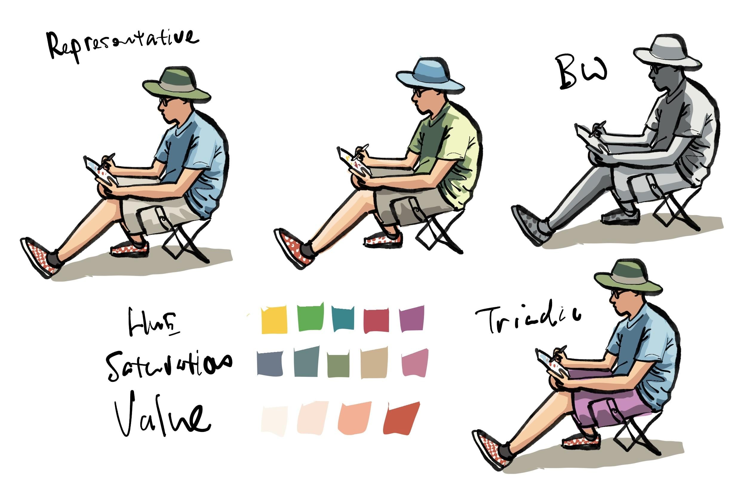
3. Colouring demo: Let me show you how I
would color this sketch. This is me sketching outdoors
and this color scheme, I would say is representative,
but it's more, how should I say cartoon like because of the flat
coloring style. I use very limited colors and to color I use
the field shape. Let me just move this
out of the way first. I've customized the Apple pencil to select when I squeeze
the Apple pencil. Let me just move this
blank drawing here. Make sure that the
sorting layer is set to oops automatic. When you draw, the line art will appear on the
line art layer, and when you color, the
colors will appear on the color or the field
layer in this case. I have already arranged a few layer to be
below the line art. The first thing I want to
color is maybe the shirt. Let's choose the
color for the shirt. As mentioned earlier,
um, you know what, maybe I should choose
a different color than the one that
I used earlier, so that is more fun. I'm going to choose green. I'm going to swap the
color of the shirt and the hat. Same thing. I'm going to choose a color somewhere in the
middle of the bar, so I'm going to
choose this green. This will be the
color of the shirt. Now, the light sauce is
coming from the right side, so I'm going to make the right
side of the shirt lighter. We'll choose the color at the outer edges,
this color, this. So once you add the highlights, you can start to see the
form coming to life. My style is very stylized. Using the field shape allows
me to color really quickly. Now, to add more details, now we only have the highlight and the color of the shirt. To add more details,
maybe we can add another color
to suggest shadows. For the shadows, I'm going
to choose a color from the inner wheel and look
at my reference photo and see how dark certain areas are and just color those areas. So this is a very basic
three value color system with three colors, you can make or create this almost three
dimensional form. Next, I will use a skin tone, the color the skin color. I actually remember all the
colors that I have here. So for Asian skin tone, it's E 21, but you can choose other
skin tones, of course, because there are so many
different colors here, choose the one that you prefer
for darker skin colors, I would choose colors that are
closer to the inner wheel. Let me just choose E 21. I will actually memorize the different colors and
just draw like this. This allows me to
color very quickly. We have the face here as well. Okay. Let's take a look
at the reference photo. You can see the face is
actually under the head, it's much darker and you can see the darker
areas of the skin tone, here and here, and here the legs behind the leg behind
is darker, here is darker. Now I'm going to choose
a darker skin tone. In this case, I'm
just going to choose the color on the side here. There are many colors
you can choose, you have to go through different colors to test and see how they work
with one another. Based on my experience,
this color E 13 looks good as a
darker skin tone. By the way, if you tap the pen away from the
colour wheel and drag, you can actually track
the colour wheel as well. Let me just tap once to remove the colour wheel and
add the shadows here. Again, once you add the shadows, you can see the form becomes
more three dimensional. You really get a good sense of where the light is coming from. Okay. Next, we can
maybe color the heat. I wanted to swap the
blue and the green hat. So let's choose blue for
the heat. Same thing. I'm going to choose a color in the middle of the bar and
just color it like this. Because the light source is
coming from the top here, I'm going to make the top of the head lighter hoops like this and this
part is also lighter. I will create a bend
for the head here, this to give it extra detail. For the pens, I'm going
to use a warm gray. I'm going to try
and use this color. So let's go with
a warm gray here. Yeah. So for the warm green, I can also choose a color in the middle of this stretch here. Okay. And now we have
this warm gray color, and I'm going to make
certain areas darker, choose a darker color. Sometimes it may be enough
to choose one color away, but to get more contrast, you can choose a
few colors away. You can see some of the
bars here are actually quite long and some of the
bars here are quite short. If you want to have a lot more contrast
from light to dark, go with a bar that is much
longer because for this bar, you can also get good
contrast because the light is very much lighter compared
to the darker colors. But if you want finer, colors, final differences,
go with a longer bar. Okay, so I'm going to
choose one, two oops. I'm going to choose two colors
away, see if it's darker. Yeah, this looks
darker, so that's good. If you choose a color that is where the difference
is not that obvious, then the contrast is
not going to be there. I may also want to create some lighter highlights
for the skin tone. You can tap a hole on a color
to get the color picker. If it does not appear, tap here because sometimes
it may be the less, tap again, item picker, tap again, color picker. If it doesn't work, you
can go into the settings and look for the color picker. So there is the tap
and whole option, so you can select
the color picker as the tap and whole option. With the skin tone picked
up by the color picker, now you can tap on
the colour wheel and choose a lighter skin tone. For the lighter skin tone, I have also memorized the color, so I'm going to choose e00. So I'm going to put some lighter skin tone
here and here just to create a bit more detail,
very subtle detail. For the socks, I have black. Now, usually for
the colour wheel, I will have black and white. So this is white, but
this is not pure white. This is actually
the off white zero. The color code is zero. And this black is
not pure black. This black is 100 black
or 110 black hoops. Let me select that properly. The reason why I do
not use pure black is because if you
use pure black, the line art will be lost. If I colour my shoe like this, you can still see the line art. But if I use pure
black to color, you can see the line
art is just gone. But pure black is good if
you need some contrast because this 100 black or 110 black is nowhere near
as dark as pure black. Okay, so I love to see my
line art above the colors, so I rarely use 100% black. But if you use 100% black, you can actually get
a very, how should I say, comic like feel. Let me show you what I mean. So with traditional comic that are colored by pen and ink, actual pen and ink,
you can see they use a lot of black ink
just to create a contrast. So with the black, you can see that there is
now a lot more contrast. Even for the shadows, I can use this to color the shadows. So the look and feel
is very different when you use pure black. Let me just undo,
undo and do do. And let's see what we have
here. I think this looks good. The last color I want to
add is red for my shoes, which are actually
checked shoes. In this case, I'm just going to, you know, save time and just colour the
shoe red like this. There are two ways
to color the shoes. I can color it red like
this or leave it white like this and go to white, zero white and add the dots like this or
add the dots like this. This brings me to
another way of coloring. Earlier I colored the shirt
and I left arms white. But sometimes it may
be faster for you to just color this area like this. Just color this whole
area like this. Because you can draw a shape
like this very easily, and after that, you can paint the arms on top of the ****. Now, you will be able to find your preferred workflow
with more practice. So how the sequence of coloring is really down
to personal preference. Now we have a sketch that is colored with the usual
style that I have. I have some drawings here
on the paper, and for this, I can actually use the few shape to color those drawings as well. So let's see what I have here. I have blue, green, red, maybe to make the
sketch complete, I can add some yellow and
maybe some red as well. Okay, so this looks good. I'm not very particular
about coloring within the line up, so you can sometimes see
my colors will spill out like this and
spill out like this. If I'm neater, I can actually go back and make
some corrections here, here, tap on the eraser
to erase this part here. You can set the pencil
shortcut or pen shortcut to switch between brush and eraser for easy or quicker erasing. But I'm not very
particular about coloring within the shapes because sometimes when I'm
out sketching, I just don't have
time to be that neat.
4. Software features: Dynamic palettes are color
swatches that will update accordingly depending on which
color you have selected. These are the different
color schemes, analogous, monochromatic, complimentary shades, triads, most used colors,
recently used colors. Let's look at analogous. Analogous are actually
colors that are close to each other on
the color wheel. For example, if you
choose this yellow, then the analogous
colors will be the ones that are just beside. If you choose this orange, it will be the colors
that are just beside. If you choose this
skin done color, it will be the colors
that are just beside. This will give you a color
that looks similar to this, but give you a slight variation
so that when you paint, you can get a bit more detail. Monochromatic scheme is just
colors from the same bar here and there is also
the monochromatic gray, which is actually quite nice. Let me show you a monochromatic gray sketch that I have here. Yeah, so this is colored
with pony grays, and this is kind of dark. If I zoom out, you can see, maybe this color
doesn't quite work. I may have to choose this
gray that I have here. And with the
monochromatic bar here, I can choose something
that is lighter. And maybe make this lighter. Now as I look at this color, I can see it's not exactly gray. It seems to have
some violet in it, which is why sometimes
I may not like to use what is this
dynamic palette. Instead, I would
choose the color, color pick the color
that I have here, tap on the color wheel and
see where that color is. This color is part of
the neutral gray series. I'm going to pick
this color instead. This is not as dark so
this color will definitely work well with the
existing gray that I have because it's from
the same color family. Yeah, I think this looks better. Let me just erase
this part here. Sometimes I do not erase, but sometimes I'm erase
because in this case, the gray is making
the shape here, is affecting the
clarity of the shape. Let me show you
what I mean here. If the color spills
out like this, you can see it affects
the clarity of the shape, which should be the side
profile of the face. So in this particular case, I will want to erase
the out color, the overflowing color just
to bring back the shape. This is a very typical color
wheel you can find online. When you choose or use
a triad color scheme, for example, if you
choose this green color, a square will be created in the software to pick
colors in this square. If you pick this green, then you may get an orange,
purple and blue. If you pick this yellow, you
may get a square as well. You may get a pink,
violet and blue green. You can add as many dynamic
palettes as you want. The one that is most useful is probably most used colors for
me or recently use colors. If you have different
dynamic palettes selected, you can swipe the
colored palettes here to swipe between the
different color palettes. So this one looks
like the shades. You can pick this color, for example, and if you want a darker color,
you can pick this color. If you want a lighter color,
you can pick this color. You don't have to
use the color wheel, but I prefer to use
the color wheel. This looks like a triad. If I'm not, no,
it's not a triad. It's analogous because these are the colors that
are beside blue. This is complimentary colors
that complement blue. And this looks like
analogous as well. You can play around with
the dynamic palettes and see how the
colors work together. Now, I use my tablet mostly
for urban sketching, so I like to use
colors that are more representative of the
scene that I see. For example, if the
t shirt is blue, I will use blue or a variation
of blue for the t shirt. Instead of using this. Let's look at the complimentary. This is the blue t shirt and the complimentary color for
blue is orange or brown, so you can see the brown
and they work well. This color combination, this
color scheme works well. We have the triad which
looks a bit weird. Analogous also
looks a bit weird. And we have black and white, which sometimes may look good. I use black and
white when I do not have time to pick all the different colors
because with black and white, you are only thinking about
light and dark, darker. You don't have to be worried about selecting different
colors on the color wheel.
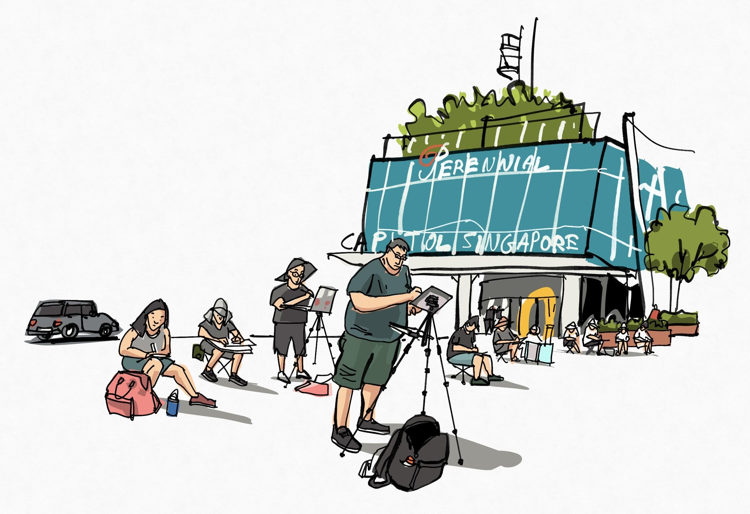
5. Gallery tour: Let's take a look at some
of the sketches that I have created and talk
about the colors. This was drawn on location. I have assigned a four
finger tap to hide the UI. This is a very,
how should I say, very detailed sketch because
there is a lot of detail. Let me just hide the colors
to show you what's happening. By the way, you
can have different colors on different layers. For me, I would color the details on one layer
for the background, in this case, for the sky, I would have the sky layer behind the colors
for the buildings. If I need to change
the color for the sky, or if I need to add
clouds for the sky, I can add those
clouds very easily because the sky is
on its own layer. I'm not sure how I would describe the color
scheme that I have here. I'll say it's
representative because the trees, the leaves are green. The ground, the road,
it's warm brown. I basically use the same
colors as I see in the scene. And in this case, we have the red that
complements the green really well because these
are complimentary colors. One thing to note about
coloring or painting is, I learned somewhere that if you have the three primary
colors in the scene, your colors will look complete. The three primary colors will
be yellow, red and blue. We have yellow or a variation
of yellow, red and blue. Now this looks complete. But if this scene
does not have yellow, then it's not going
to look as balanced. So you can see my coloring style is very loose and sketchy. As mentioned earlier,
do not really fill in the colors within the lines. I have the colors filled out. In this case, it works, I think. This took me a long
time to sketch. Okay, next let's look at this. This was drawn at a cafe or
restaurant with my friends. This is a very limited
colour palette. We have skin tones, browns, and we have blue, some red. So there aren't
many flashy colors. There is no big block of green, blue, yellow or red. So the colour scheme
here is mostly subdued. We have mostly grays, but there are little spots
of colors here so you can see yellow, red and blue. Again, the three primary colors. This was sketch inside cafe and you can see
from the line art, this is an extremely
loose sketch, and the colors that are
used here are yellow, red and blue and
gray and pure black. Five colors. Because of
the value of the colors, the values are either light
or saturated or white. The contrast is very
obvious you certainly don't always have to color with the field shape because
here you can see, you can use or color the line art as well to
create something different. Otherwise, if you are
just using black for the lines and field
shape for the colors, things may look well, normal. These are some
sketches that I have drawn on the train
and drawing on the train or on
public transport is a good way to practice drawing. And in this case, you can practice
coloring as well. But from what I can see here, the colors of the shirts that were worn by
all these commuters, they are on the dull
side, the darker side. So the colors are desaturated. When I am coloring, I don't actually pay
specific attention to the color schemes or
colour palettes to use. If there are people
in the scene, I will use specific skin tones that I remember, but otherwise, the rest of the scene, the colors are actually based on what I see when
I'm on location. I don't actually use
those color schemes like Analogous, complimentary, the nice thing about
this COVID colour wheel is for some reason, the colors work
really well together. This is a black and white sketch or a monochromatic sketch. I usually use a single color
or no color in this case, if I do not have time to color because when you are
coloring with black and white, you only think about contrast,
lighter, dark, darker. This is actually a good way to practice getting
your contrast right. Times it's good not
to color everything and have some white space so that the colors
can stand out. With more practice, you
will be able to use colors more effectively
and you will be able to figure out what
are your favorite colors. What are the colors that
look good for skin tones? What are the favorite
shades of yellows? Speaking of yellow, I
need to talk about it.
6. About yellow: Color this cute yellow and create some highlights
and shadows for it. For some reason, yellow
is not easy to color, at least for me. You can see this is not
a saturated yellow, it's a lighter yellow
because the saturated color, the saturated yellow is this. So I can use this to
create the shadow side, but it doesn't look as dark. So if I look at the bar here, I don't see any darker shadows. So for yellow, I
will have to look elsewhere for a darker yellow. But for other colors, you can actually get the highlights and the darker shadows
from the same bar, but not so for yellow
for some reason. So in this case, if I want
to paint this cube yellow, I may go with this
saturated yellow. I may choose this
yellow green here. As the darker yellow like this. Maybe maybe I can
have this side. Yeah, I shall just colour this side here,
make this darker. For the top of the yellow, I can have a lighter
yellow like this. This I think looks okay. This is the shadow
yellow that I use. It's actually from the
yellow green area. You can also try
to use some brown. Brown is made of yellow
and red and some blue, so you can try brown as well. But here you can see it
doesn't quite work as well compared to the
dirty yellow green.
7. Outro: We have come to the
end of this course. I hope you have
enjoyed the course. If you have drawn
something and color it, do share with me your artworks, your sketches in the
project section. Just upload your sketches there because I would love to
have a look at them. Once again, thanks
for following along. Do check out my other
courses as well if you have the time and if you want
to learn more. Bye.
 Teoh Yi Chie, Sketcher, watercolour lover