Transcripts
1. Intro: Hello, my name is T0 and I'm
an artist, graphic designer, and urban sketcher who enjoy
sketching out on location. I use a variety of
tools to create art for traditional
tools, I use pen, ink, and watercolor
for digital tools, I use an iPad and Apple pencil. In this course, I'm going to
show you how you can create digital hand-drawn illustrations
using the app Procreate, which is available on the iPad. This course is for
beginners and you don't need any prior
knowledge to creating art, to drawing in order
to follow along, all you have to
do is to download the reference picture
that is provided to follow along all the
instructions are step-by-step, guide it with visuals. More specifically
in this course, I'm going to show you how
to compose the scene, how to create line odd
color at textures, shadows to make your
illustrations look lively. By the end of the course,
you should be able to get a good idea on the process
of creating digital art. And this is the same process which includes the techniques that are used when it comes to creating my digital
urban sketches. When I am sketching
out on location. And when it comes
to urban sketching, that's a topic for
another course. Before we get started, I just wanted to ask you
to help me out here. If you happen to find
is caused useful, just lived his cause, a review so they can help
auditors discovered the cost. Alright, let's get started.
2. Inspiration: These are some books
that I have on drawing and urban sketching. You can learn a lot from books as well as
from online courses. So these authors and artists, they took years to improve
and perfect your craft. If you can just learn
a bit from them, you will be able to learn
drawing so much faster. These are books I would flip through occasionally
just to get inspired, just to get some
ideas on what to draw or maybe where to draw. And I would visit the
websites of this artist who see more of their art and
see what they are up to. So we can get ideas,
inspiration from anywhere. Now, if you are a beginner
learning how to draw, this is the book that
I highly recommend. This is Ke2 drawing
by Bert thoughts, and this is a terrific
instructional book. I've actually bought
several copies of this book to give a width who, some of my friends who
wanted to learn drawing. Even though this book uses traditional media
like pencils and pan, you can actually learn a lot
from this book because it teaches the basic
fundamentals to drawing. It doesn't really matter what tool you are using
because all the techniques taught here can be applied to whatever drawing
tool you use. You can use a brush to draw. You can use a pencil, you can use markers, you can use pan, you
can use a tablet. You can still use
all the techniques taught here to
learn how to draw. This is a terrific book. I highly recommend this. I actually have a lot
of travelogue styles, sketch books in my collection. So this particular
one is from La Paz, who is an illustrator
based in Barcelona, Spain, likes to travel to different cities
and draw the city. So when I look at
the sketches here, it really makes
me feel like I am there with him looking at
whatever he is drawing. So that is the fun
of urban sketching. When you look at your sketches, it really makes you
feel like you are on there, on location. And if you are the one who
draws all the sketches, you will be able to
remember the place so much more that you can remember
the place even years. Absolutely, you have
visited the place. He has published several books
for many different cities. So do check out his
work. This one is arm. You got all her friends. Who is a terrific artists who really likes
to draw in detail. I like his line art. This one is from
en-masse Serrano. I like her use of colors. She is really exciting. She likes to use
bold, vibrant colors. Likely to see how artists
use tools to create art, how they use the same tools
to create art differently. This is a terrific book as well. You can check out our
website for more art. This is Louis Reese. Looks like the sketches
here we're drawn with pen and ink and watercolor. Sketches were drawn with
traditional media fiber. You can still use the ideas
here for you-all digital art. This is from Swarovski, who is also a terrific
mixed media artist. This is one of my favorite
artists, Carlos Tonga, who is an Italian architect, Illustrator and book
author based in Berlin. He likes to create
all this detail. Cd illustrations. You can see the colors are sold. Fibrin style is very dynamic. The drawings are very lively, so I get inspired
just by looking at one obvious many
published books. Some of the lines were actually
drawn with pen and ink. However, the colors
were added digitally. I like his art
because he shows you, you don't always have
to use the line ought to draw the subject matter. So for example, with this
building on the right side, this is actually just a
colored shape and the windows, they were drawn with line art. And for the vehicles here, the vehicles and pedestrians, they are just colored shapes. But for the beauty
in the background, this was drawn with line art. You can see this sign poles
here and this is transparent. You can see through to
the building behind. This is a very creative
way to illustrate. I can get a lot of ideas just
by looking at this drawing. So I know I don't have to always use black to create a line art. He uses orange lines to create the drawing
for this beauty. You can mix and match different styles,
however, you like. Urban sketching is very popular. There are a lot of books
on urban sketching. This is one book, I would recommend
this as the auto urban sketching by
Gabrielle companies Mario, who also happens to be the
founder of urban sketches. This book features the ADH works all various urban sketches
from around the world. There are also tips on how
you can draw on location. There are a lot of
different stories from this artist who drew this sketches from
location on location. This is a very
inspiring book as well. And if you happen to be
in the same city as all, these are people you
may be able to find some friends to sketch with. This is a terrific book. This book is all
about inspiration. If you want to learn
some drawing techniques. There are also books on urban sketching
drawing techniques. This is one that is on
drawing architecture. This is called archae sketcher, drawing buildings, cities, and urban landscapes by cmon region. This is also a terrific book. This has a lot of
instructions on how you can draw beauty
beings and perspective. And there are so many
beautiful examples from other contributing
ideas as well. I believe you will be able
to find some online courses on drawing buildings and
architecture as well. So it really depends on how you'd like to learn that you'd like
to learn from books, or do you like to learn
from watching videos? So it's totally up to you. I like this book
because there are so many beautiful examples I will flip through
this book like are often another book that I would recommend
you to sketching people and urban
sketches manual to drawing figures and
faces by Lynn Chapman. This book is very helpful because when it comes
to sketching scenes, when you add people
to your seams, it's going to add so much life. It's going to make your sketch
look so much like me here. There are a lot of tips
from Lynn Chapman. She is also a very
prolific artist and there are so many exon, full secure, so many tips and techniques you can
learn from this book.
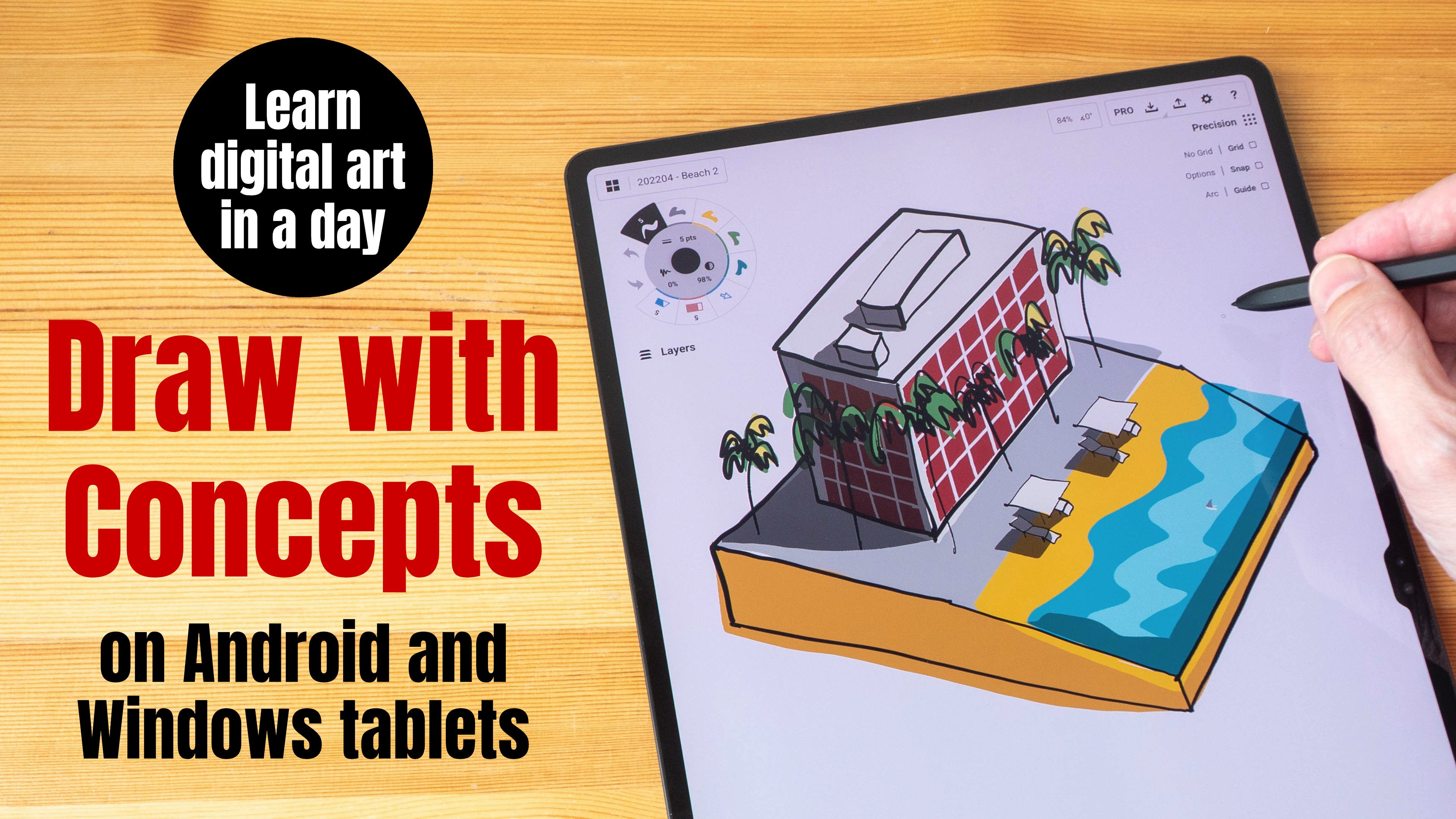
3. Exploring the Procreate user interface: In this lesson, I'm going to show you around the user interface of Procreate. I'm going to show you some functionality where you can find a 2s and also some settings that we are going to change. So let's open or launch Procreate. So this is the home screen that you will see when you launch Procreate for the first time. And there maybe somebody fought artwork. So on this screen, on this homepage, you can actually do this motion to pinch out too quickly. Zoom into an artwork to take a look and you can scroll left or right to view your artworks and to go back to the home screen jazz pinch in. So let's take a look at some of the files or artworks that I have in this folder. If you want to open a file, you have to tap on it. And he will show you all twos. So if you just pinch in, it's going to show you a preview. But if you want to work on a file, you have to actually tap on your artwork at a top right here we have Psalm called months. You can select your followers who share, duplicate or delete them. You can import Procreate files into the app. You can import procreate brushes or procreate palettes that you find online or purchase online. And here for photo, you can choose to import photos into a procreate file. So what we wanted to do now is to click this plus icon to create our own canvas size. There may be some presets here, but we want to create our own Canvas. So you want to tap here on this little icon here. And here we can create our own canvas. Let's choose pixels. You can choose between pixels, inches, centimeters, and metering meters. I'm going to use pixels and I'm going to create a resolution of 3840 by 2160. Basically it's full HD resolution because I want my OT worked to be presented on a 16 by nine aspect ratio and wanting term. So I entered the dimensions here. And for the DPI, which is the resolution, I'm going to enter 300 grit. Let's take a look at a taps on the site here we have color profile. If you are looking for print, as in if you need your ought to be printed, then you should choose the color profile CMYK. If your art is going to be presented on the line, then just choose RGB and you can just leave the options here as the fault. By default, Procreate will record a time-lapse video of your drawing process and this auditive friend options you can choose or change to affect the image quality of that time-lapse video. So you can choose different resolution. You can choose 10 ADP or this two K off fog, Hey, you can choose the image quality here. Low quality will view as the name suggests, low quality. So for me I want to choose lossless. And this is the video compression. Depending on how powerful your iPad is. When you toggle this button, they may show you a dialogue box to tell you whether or not your iPad is powerfully not follow this video compression. So personally for me, I like to record my time-lapse video in for K resolution in lossless quality, basically the highest possible quality and fall Canvas properties. Or you can just leave this as default. And there you have set all the settings for your custom canvas before you save it, rename the custom canvas, I'm going to call it for k and click Save. And then you have that can verse here, edit here. So now let's tap on the four k-fold that we have just created. Or you can choose screen size, maybe that's choose screen size. And this is the blank canvas that we are presented with. This is actually a back ground lee year. If you take a look at the layers palette, tap on this icon here on the top right side, you can see the layers palette and the background color is white. You can change the background color to something else. The color will reflect instantly. So that's habit as white. Now it may be a bit difficult to choose like the perfect white. So one trick is to actually double-tap here. And it will snap to this point here, which is perfect white. Okay, let's take a look at the top left. That's where you can go back to the gallery and twos and preferences. And here are the drawing tools on the right side. This toolbar here is going to control the brush size. You can drag the slider here to control the brush size. And this slider, we'll control the opacity or transparency. And there is this little button here just scrapped. But then here, this button can be customized who, whatever a shortcut that you want. So by default is going to be customized to the eye dropper, which I'm going to explain to you what it does in a drawing tutorial. Now, Dani, things that you can customize here is actually the location 4 is 25. So if you want to move this toolbar around, you can actually just tap on to square, just direct, just drag out a square and move it to whatever their positions you want. Personality, I actually like to have this right at the top so that when I hold my iPad like this, while I'm drawing out dos, I can have my tongue here, which is very easy. All right, let's take a look at this button here. When you tap on this icon, you get all of those different actions. So under Add, you can choose to add or insert a fall of total tax onto your canvas errors and under Canvas, you can choose to crop and resize your canvas. You can turn on drawing guide. I will not go through every single setting. I would just go through it as settings that are going to be useful when you're sketching on location when yon a quick sketch. So friends can be helpful. Iq you are working at home, so sometimes you may draw on location, but the Wagga changes and you have to bring all look back home. So we've referenced you can toggle this on like this, and this little window will appear. So here you can actually import the photos that you have taken. So maybe that's important. This foot door here and this reference photo will appear in this window. So you can resize this to whatever size you like so that it doesn't block the canvas. And you can draw, continue drawing the sketch where you have left off with the hell off this reference here. And if you don't want this anymore and just close it. So and they're shared disk will allow you to export the appropriate fall into different file formats. So sometimes you may want to work on the procreate file on your computer. So depending on the software that you are using, you will want to export the file format so that it's readable. So they can be read by all computers software solely. For example, if I'm using Photoshop on my computer, then I would want to export this procreate file as a PSD file. So fall video. Oh, you can actually turn off time-lapse recording. So earlier on I show it you while you are creating a custom canvas, you are not able to turn off time lapse recording, but here you can turn off, but you have to remember to turn this off right at the start off the drawing, otherwise, which has red caught right at the start of the drawing, right where you first put your Apple pencil on the canvas. And off to the time-lapse is record it. You can choose to export the time-lapse video. Fall preferences. This is where you can set the light into phase equal one UI to be light color. You can change or move this to bar to the right side if you are left-handed user. So now it's on a site. You can choose to display brush cursor. This are not as important. The nets tap on this at did pressure curve. So this is where you're kinda just a precious sensitivity of the Apple Pencil. By default, this line is going to be diagonal like this. So if you want to apply a light pressure to get thick lines, then you should change to curve to make it look something like this. If you want to, y'all, minimal pressure to produce very thin lines. Daniel curve should look like this. So just has guidelines on the Canvas. Let me just choose red color brush. So now I'm drawing with very minimal pressure and a lines are very thin. Oops, which is. Cut this layer. And now I'm going to change the pressure CRO, to make it look something like this. So now when I draw with the same pressure, I can get thicker lines. So I'm going to keep my pressure curve like this. You can also use this tool here to adjust the thickness of your line. Gesture controls as quite useful. So what we want do here is to be set the eye drop her. So here, take a look at this setting. Tap this icon too, invoke the eyedropper. So by default, if I attempt this icon here, I can quote the eyedropper and see the eye dropper and move the eyedropper to anywhere to pick up whatever it has that you want. And you can leave, lift your Apple pencil and I drop over, go away or topic into caught the eye dropper. So there are a lot of gestures you can change here as take a look at the general tab here, there's this option called Disabled hutch actions, which is currently turned off. So when that's taken off and you have your finger on the display, or when you are drawing and you have your palm on the display, sometimes you may introduce a strange looks like this. So if you want to have perfect palm rejection, you would have to return that on basically just turn on Disabled Touch actions. So now let me just delete this. So now when you draw with your finger or when you place your palm on the display while you are drawing, you will not introduce any stray strokes. Some other settings that I have turned on here under gestures controls are copy and paste. Three fingers swipe down. So when I do this, three fingers swipe, I get this pop-up menu for me to cut, copy, copy or duplicate is our quick commands I find is to be quite helpful. Clearly year I had is scrub here. Basically, I can use three fingers to scrub the display, to clear the layer, to delete everything on the layer. I will show you all this commands or actions in action later on during the drawing tutorial manual is quite useful as well. So I can have this toggle here. Basically, when I touched the display, the quick menu will appear. So for example, when I touch, you can see this quick menu will appear and you can choose all the different actions that are available. So you can customize all of this six shortcuts. Just press and hold onto the shortcut and you get to choose the different options. There are so many different shortcuts you can choose from here. For you raise, you can toggle this. I find these to be quite useful. So basically press the square Plus Apple pencil to erase. So for example, I have this, I can press this. And then you raise like this. The alternative is to press this eraser button here and then erase. If you have the Apple pencil shortcut, you can actually just double-tap on the Apple pencil to switch between brush and erase there. So let's go back to the iPad home screen and do a search on Apple Pencil. So the shortcut to switch between the current WHO and erase it or so if you are using the brush, is going to switch between brush, any razor that show Cody's here. So these are the different shortcuts that you can choose. I have this turned off because I find that when I am drawing, I have a tendency to sometimes accidentally double tapping for this shortcut. It's very irritating. It affects my productivity. So I have that turned off. And not under option you might want to turn on is this option here called scribble maps. Called scribble. This is quite useful. So let's turn it on. When you have the scribbled functionality turned on. When you write any tax, that tax will be converted into editable text. So some, oh, let's rename this layer. I'm going to tap here to rename. So I can do this to the name and let's write our own name. Align, OT, and dare hit converse the handwritten texts into this text, being able to write with the Apple Pencil and half that text converted into a double tax can be quite convenient and will improve your productivity because when you are drawing, you don't have to move your hand a way to type the name of the layer. You can just write the name of the year as. Take a look at other options here. So this button is for the adjustment layer. So here you can change the hue, saturation, brightness, color balance curves. You can even add special effects like all shun blood, motion blur and noise. Or you can shop or in your drawing. There are a lot of effects here you can use, and this will affect the artwork on that specificly year. The third button here are for selection tools. And once you tap this, there's options will appear. There's different selection tools to help you select almonds, all books that are on leaders. And the last button here is for the move tool. So the move tool will allow you to move things on the canvas. So once you have the correct layer selected, you can tap on the move tool to move whatever object that is on that a year. As take a look at the brush icon here, procreate actually comes with a huge selection of default brushes, which are surprisingly good. Brushes that have the custom icons are the default Procreate brushes and brushes that have this wavy icon are the custom brushes, all brushes that Our purchase. So I actually have some purchased brushes here. For our drawing tutorial, we will be using the default Procreate brushes. And if you take a look at the individual brushes within the brush set, you can also spot that we ve icon. So this is a custom brush. Whereas those brushes we thought icon ADA default Procreate brushes. Let's go to the inking brushes set to choose this Tinder books brush, which is the main brush that we'll be using for our drawing. So let me just scribble some lines here and tap on this tool. This is the smudge tool. So with these two, you will basically so much your line art. You can also choose different brushes to create this modulus. And this eraser too is, as the name suggests, it's a eraser. And here you can also choose a different type of eraser. So let's choose tinder box as well. And now I can erase with straight lines or you want to erase with the airbrushed, you can do so. Just choose to add brush again and he race. And this icon here is the layers palette icon. So with the latest, Pelley can create multiple layers. You can also have a lot of commands or actions here, just by tapping the layer or swiping deadly year. And this button here is the color palette icon. You can tap the buttons here to switch between the different color palettes. Now all of these color palettes will allow you to choose whatever colors you want. Just that way the method of choosing color will be different. So for example, with this colored disk all color wheel, to choose the color, you have to move around the color wheel to choose how bright or how light or dark the color is, or how vibrant or the saturated the color is. You have to move around this wheel, within the wheel. And for today's class sake palette, again to change the color. This time Raul, you have to use the slider here and here you can choose between how bright or how dark the color is, how saturated, or how vibrant the color is. And this is the color harmony. We'll these, we'll give you basically a color wheel. So if you choose a rate, also show you the complimentary color. In this case it's a green or cyan light color. And if you move the color picker around, you can see the complimentary color we'll shift. And for value, this will allow you to set a specific color. So if you know a color index, basically the color code, you can type in those numbers here. And these are different palettes. These are actually a custom palette. So by default, you should have to spend it color palette, but if you want to add more, you can create your own palettes and all of them will be found here. So the procreate user interface is actually very minimal and they tried to keep the user interface as small as possible. And you can see most often, usually interface are on the sides so that they don't cover your art work. By the way, I have this button here. This is actually an iPad OS or iOS functionality. It's called assistive touch. So I have customized shortcuts to this button. This is not a Procreate button. So when a tet once I can go back to the home screen. And if I tap twice, I can switch off my iPad.
4. Some gear talk (optional): Talk about the tools you'll need in order to follow along with this cost. So obviously you are going to need an iPad, preferably one that supports Apple Pencil. So any EIP hat that is released from 2018 on What's will support Apple pencil. If you don't have an Apple pencil, make sure to buy the correct one for the iPad model that you are using. Because at the time of making this B0, there are two types of Apple pencil. The Apple pencil first-generation, which charges using the charging port at the bottom. And then there's Apple Pencil second generation, which charges by attaching to this side of the iPad. In this case, I'm using the iPad Pro here. Now, there are third-party services out there that also supports pressure sensitivity. How ever the drawing performance for the Apple Pencil is the best compared to any other third party is dollar this out that even if they are significantly cheaper. So I do recommend getting the Apple Pencil on urban sketching is about drawing out those drawn on location. So you are going to be using this outdoors. If you want to protect your iPad, I highly recommend you to get a case. I recommend you get a fluke case such as the one that I have here. But you don't have to buy the same brand. And there are some things you need to know when it comes to buying a case. Because if you are using the iPads that use the second-generation Apple Pencil, it needs to be charged by attaching the Apple pencil to the size of the tablet. So when you buy a case, makes sure that the case allows the Apple Pencil 2 charge on the side here. All right. You buy a case that doesn't allow the Apple Pencil 2 charge, then you will have to remove the case to charge to Apple Pencil each time. And obviously, that is going to be incredibly inconvenient. I recommend you get a case that protects all the sites. The top, the sites here and the bottom. Don't get those slim cases that protect when he the front and the back while the ages are exposed. I was actually using those slim cases while my earlier I've had and I have dens here, here and here and here on the metal frame of the iPad. So if you want to protect your iPad properly, get proper case. Most flip cases will allow you to prop up the iPad like this with a triangular stand. This is not for drawing because this is not going to be stable anyway, when we are drawing on location, we are going to be holding. I like this. Now, stands like this can be TPP ploy, like does as well at a lower angle hybrid is not going to be stable. If you need to use your iPad at home maybe to work on a sketch that you are not able to complete on location. I highly recommend you get a proper stand to prop up the iPad. The one that I'm using is this standard called Pablo PER 100. This is a very nice then because you can adjust the angle of this then very easily and you can adjust it to any angle you want. So if you need to work on your iPad at home for long periods of time. This is a wonderful Stan. It's very stable and this is the stand that I like so much that I bought two of them. And another thing that's quite popular with art, his, is a matte screen protector. There are pros and cons to using a metal screen protector. So the pros, well with a matte screen protector apply on the display. You get a more tech tall drawing experience. You get that paper like experience when you're drawing with the Apple pencil compared to just drawing with the Apple Pencil on glass. The downside is the anti color on the mask and protect and diffuse light and create that white haze. And that white haze me actually block whatever that's on the screen. So for example, here, I have this iPad that doesn't have any screen protector. So we can see the reflections. They are very sharp. However, if there is a matte screen protector, all of this white reflection will be diffused into white and it would be incredibly challenging, very difficult to see what's actually on the display. You want to even be able to see the icons here and you won't be able to see your artworks very clearly. And also with the white haze. Sometimes the why he's can be quite glaring. That's not very good for your eyes. I used to use metta screen protectors, but I have stopped using them because of the white haze created by man screen protector and the matte screen protector also affects the image quality and white hazy, so, so very glaring. So nowadays I just use my a thick haze without the screen protector. If you do want to get a screen protector, I highly recommend you get T01 and do not get those template glass screen protectors because those are thicker and will affect the accuracy of the Apple pencil with a template glass screen protector when you are drawing diagonal lines, diagonal lines are going to Walpole. So this is obviously not going to be good for accuracy. This is not going to be good for drawing. And this is how the lines look on an iPad with, without any screen protector, with thought, a template glass screen protector, the diagonal lines are going to be very strict. There are certain aipac cases that come with some sort of mechanism on the back. Those cases are pretty nice as well because they give you something to grip. So you can actually rip that attachment and hold your iPad like this rather than WHO your iPad like this personality for me when I hold my iPad like this for long periods of time, I find my Tom and the fingers, the muscles here to be quiet straining. So if you have those cases, those may be more comfortable. And it was so definitely more secure. And you also resting the iPad on your, it's slightly easier compared to holding iPad from this site because you have to balance the weight of the iPad if you're on this side, right? So to conclude, get the Apple pencil. If you don't already have one, if you want to protect your iPad, get a proper case. And if you need to work on your iPad at home for long periods of time, get a proper Stan.
5. Setting up the workspace: Hello and welcome to the first hands-on Zhuang QED, horrible. So in this tutorial, I'm going to introduce you to the basic digital drawing. What floor? I'm going to show you the settings, the brushes, the tools that I use when I am urban sketching out on location. Now this tutorial is basically to get you familiarized with what procreate is capable of. I highly recommend you get as much practice as possible with the app before you bring your iPad out on occasion to sketch, because when you're out on location, it can be quite overwhelming. You may not have the time to figure out what are the best brushes to use for whatever subject you rod drawing. You may not have the time to figure out what the app can actually do. So if you're not familiar with the app with Procreate while you are on vacation, it can get quite stressful were so definitely get as much practice as possible at home with Procreate before I bring your iPad out, how to draw on location. Heard sketching is about drawing on-location, drawing the things we see in front of us. But for this tutorial, we are going to draw an imaginary subject in the state. We are going to draw a tree from our imagination. And the reason for that is because I want you to focus on the process or the work flow. And we are not going to draw something this complicated. We are live this for later lessons. So let's go back to the gallery homepage and create a canvas. Let's choose screen size. And let's set our workspace first. So you don't already know, you can actually tap on this where here to drag out this slider and move this. I have it here so dad, my Tom can reach the two slightest very easily. The other thing you may want to do is to go into the preferences here and on the preferences tap on at date pressure curve. So we'll just line by default should be straight. That's moved to control point up here so that when we draw with light or minimal pressure, we can get a thick line easily. You can adjust this however you want. Later on. Next, let's go into Gesture controls and look for you raise. So look for the shortcut, the square button class, Apple pencil. If this is not already turned on, just toggle it, turn it on. This will allow you to use this square button here as an eraser. It's very convenient. Let's go back to the gesture controls again and go to General Disabled Touch actions. If it's not already disabled. This basically will prevent you from drawing with your finger or with your palm resting on the display. So now you can only draw with the Apple pencil. Next, I wanted to show you my favorite brushes for urban sketching. So all the brushes that we are going to be using for this course are the default Procreate brushes. And when you tap this brush icon here, you will call up the brush library. And there are many default brush sets here. We are going to create our own brush set so there we can assess our brushes easily and quickly. So to do that, just scroll down until you see that little plus icon there. Tap on the plus icon to create your own brush set. Then we call this US K brushes. And now that's looked for brushes to add to this brush set of folder. The first brush we want to add is this brush called Tinderbox. Tap on the brush and drag it on top of the brush set that you created earlier and drop it into the brush set. The next brush, the second brush is phrased the net, do the same thing, drag it into the custom brush set. The third branch is under the Artistic brush set. It's called hots. This is a nice brush border drawing trees. The last brush we want to add is under aliments, plots. Now that we have our favorite brushes in our own custom brush set, we can find them very easily. We no longer have to scroll through this long list of presets to find our brushes. So let's choose tinderbox and that's pick a color. I'm going to use the color wheel to pick all the colors for this course. You don't have to select the exact same color that I use. So if I pick a red, you just have to pick any red that looks kind of similar. It doesn't have to be exactly the same color. Let me explain this column. We'll, to select the color. You just have to move this circle around the wheel. So if you want green, just move it to the green. And there's this goal we been the color wheel, this will affect the attributes for that cholera. So if you want the green to be lighter, just move the color picker here towards the top of that. If you wonder green to be vibrant, move the color picker to the top ry. If you want a green to be darker, move it to the bottom. If you want the green to be muted, to be desaturated and move the green is somewhere in the middle.
6. Brief intro to digital art workflow (hands-on): For this tutorial, we will be drawing a tree with leaves, branches, and a tree trunk just for practice, just to get warm up. So to draw the tree trunk that select a brown color, brown is basically a muted orange. So select orange and tap the color picker or summer here to get that brown and tap on the layers palette to create a new layer and call it a tree trunk or trunk. When we are drawing digitally, we always work with layers. So we are going to have a layer to draw the tree trunk and earlier for the leaves, layer for the shadows. So make sure that you are always working on the correct layer. So that's select a brush called tinder box and just draw an imaginary tree. Now this line is a bit too thick, so let me undo by using two fingers to tap on the display and use this slider to change or adjust the size. Now Apple Pencil supports pressure sensitivity so you can press down harder to get thicker lines. It doesn't really matter if you are not able to COP be the tree that I'm drawing, just draw whatever tree you have in your mind. So this is the tree trunk. We have some branches, what a bunches, that's half the branches, the inner. So draw with lighter pressure. So we can zoom in and out using our finger gestures. You can also rotate. And if you want to see your whole canvas again, just do a quick pinch like this, and you can see everything using the same brush. I'm going to color this tree trunks. So to color it, I'm going to create a new leader called collar trunk. And I'm going to choose a lighter brown. So I just want this dark brown Florida line out. I'm going to choose a light eyebrow for the tree trunk. So let me move the color picker to the lab to site. You can also shift the color here. So that's have a light brown here. Now we have this brush called tinder box. You can actually hold the Apple pencil like this. And for all thin and thick lines, depending on your pressure, you can associate with the Apple pencil, just have the Apple pencil at a much lower angle and you can shape and cover a much larger area. So notice as I am painting this, the color actually went above the line. So what I wanna do is to tap on the layers palette, move the color layer below the line art. And this Tinder brush is really nice because when you shoot with it, you can actually get some sort of texture. There is actually some sort of texture. However, if you go over that texture again, by shading again, you will lose the texture. So try to just color it once though and layer upon layer. Now notice, this coloring process can be a bit tedious. So the other way to fill this shape is to use the few bucket tool. To use the bucket tool you have to select a line art first layer, select reference. It is very important to make the line art layer, that reference layer. So now we can use the same color for the tree trunk. Now to select a color that is on the display, just put your finger down on the display for a split second or two. And he will co-opt an eyedropper and he will pick the color here. So let's tap on this circular color thought and quickly drag it to this area here. So this will feel the area here as well. So this is what we have so far, ups the dye color the paint onto the correctly or no, I did not. I actually painted the brow onto the line authority you so make sure you undo and select the correct layer. Now, if the line out here is broken, images tapped is squared, but then here to erase. Okay, Let's say you drew something like this. Now if this shape here is broken, you will not be able to use the fill bucket like this. The color is going to skip out from this gap here. So if you want to use the few bucket, you have to make sure when you're drawing, close up all the gaps. So let me just close this gap using this darker brown. I'm using the eyedropper again to pick the color and close this out. And we go back to the color layer again. So you have to be familiar with switching between layers. It may seem a bit tedious right now, but believe me, using layers is going to help a lot later on, especially if you need to do some changes. The downside to do is fill bucket tool is the color that is being filled into the shape. It can appear quite flat. So sometimes I actually would just shade with the tinderbox brush just because I want to get that texture. Again, let me emphasize you should always paint on the correct layer. This is what we have so far. Let me extend the tree trunk to the bottom as well. Maybe add some lines to make this look more sketchy. So the next thing we wanna do is to add leaves. So let's create a layer and a little leaves, we'll be above the tree trunk. So let's move that layer right to the top. Just drag and push that later right to the top and renamed a layer. It is good to always have name is foil layer because when you are working with too many layers, it can get confusing as to which elements are on which layer. So for the trees, Let's select the brush that is called huts, and go to the color wheel again, pick a green color. And we're going to pick a green. Just any green, just pick, just pick the correct brush and pick any green and just dab onto the display, onto the converse. And this is the tree that we have, right? So to switch between the different colors, just moved the color picker wrong. So I'm going to have the light source coming in from this direction. So I'm going to have to leaves here to be lighter. And leaves at the bottom right side we'll be darker. So for the darker leaves, just moved our color picker down to the bottom right. Sometimes you may not want the color to change. So drastic goalie. So let me use the eyedropper again to pick this color and move the color picker down slightly just to get a slightly darker color. So this brush, huts brush is really nice because you can draw texture leaves like this so easily. Oh, okay, let's erase this part here. So you raise, let's use this shortcut here again. Notice my eraser is not the right brush, so let me undo. Go to the eraser tool here, and you can choose to use the same brush as you were using to paint the tree. The shortcut to using the same brush as you were using earlier is to just tap on the eraser button. And there will be some texts there that tells you that you will be erasing with the previous brush. So that's erase this here. I use the same brush to erase because I went to get the same texture at the H here. That's at another layer for the grass. For the grass, let's use tinder box and gain. So that's just use whatever green that it's already on the canvas and make sure we are on the correct layer. Let's have some yellow grass or move the slider here to what's yellow to get the yellow grass, or this is this color here. A bit dull. That's because the color picker is somewhere in the middle. That's move the color picker to this site where it's more vibrant. So that's half to grass here on the ground in front of the tree trunk. And if you don't like this, look, you don't like the grass on the ground because the gaseous on its own layer, you can actually use this checkbox here to turn off the layer. I think this looks good. I just need it to be of a different color. Okay, So far so good. Next thing I wanna do is maybe at a meal box by the side. That's at a mailbox. To do that, let's go to let's create a new layer and maybe use Tinder brushing. In this time, let's use a black color brush and just draw a mailbox here that's have a mailbox that looks like a house. Okay. So again, let's color this. So you can choose to color on the same layer as the color as the trunk tree trunk. Because sometimes when you create too many layers, it can get a bit confusing. So in this case, I'm just wanted to share this color with the tree trust. So let's use red again. And that's select a rate and just drag it in year 0 ps. Notice the color actually went out. That's because you need to select this mailbox, make it reference layer. Okay, Earlier on debt rate was too vibrant, so now it looks better. So let's go back to the color layer and drop the color in. Sometimes when I'm coloring, I may want to color outside of the line to make it look a bit sketchy. Because when you use a few bucket tool, sometimes the color few is to perfect. This is why we have so far and discussion is looking a bit flat because there is no light and shadow. So why do we wanna do now is to paint some shared dose. So that's create a layer and create a new layer, renamed a layer shadows. There are actually different ways you can add shadows. This is just one of the many different ways. So I have the shadow layer right at the top, and I'm going to pick a brush that is gray color. Just double-tap onto this left edge here and Picker, we're locked with that position. So let's choose tinder box as the brush. And that's go into color. This branch here. Now notice as you are coloring, this is just gray. You won this gray or this shadow to blend onto the tree trunk under layers palette of cane, tip on this little n and choose blending mode, Multiply. So tap away. And now you can paint the shadows here. So the light source is supposed to come here. So that's how the shadows here. Notice the shadow is on top of the leaves. We have to move the leaves right to the top so that it's over it. Oops. So that's overdose shadow. That select the shadow. The urine can make sure you're always painting on the correct layer. So some of the causes shadow will be from the leaves. There will be some live stream through the leaves so you don't have to color everything. Was shadow. And maybe some parts of the tree trunk we'll catch the light. So we done Pinot does shadows over there to erase. That's this button here. Okay, this looks right to me so far. Let's add some highlights to the tree trunks or let's select the tree trunk layer. Use the eyedropper to pick this brown. Moved our color picker to the top left and we get slightly lighter to add some highlights or textures. We need to add shadows to this Mux box as well. So the light source is coming from this direction. Let's add shadow to decide here. And here shadow as well and some cast a shadow on the ground. We need to add some cast shadow from the tree as well. If you find a shadows too dark, go into the Layers palette again, tap on that little text icon. The text icon will reflect the blending mode. So if you use multiply, it will be m. If it's a normal blending mode, you will be caught N. So notice as you tap on that lending icon, this opacity slider will appear. So if you find the shadows too dark, you can actually just adjust that passive D hall. You can actually change the grip of the shadow. To change the green of the shadow, use two fingers to swipe the early year. This will create an alpha mask. Basically, when you create an alpha mask, you can only paint onto existing pixels. Let me show you what I mean. I'm going to hide all the alleles to do that. Just to check, just tap on the checkbox here for a few seconds and all the other leaves will just disappear. So I have a radius swipe, double fingers swipe on to that layer. Now I wanted to make a lighter. Now I want to have a lighter gray. So now when I pin disagree, notice the only paints onto the existing pixels. But it's difficult to see how the shadows loop because there is nothing on the display. So let's turn all the layers back on again. Just tap the checkbox here and turn it back on. So you can change the shadow color to whatever color you want. You can make it darker or lighter. Yeah. So that's how useful Maschine Alpha masking is. Maybe I should make it a bit darker. The advantages of using layers is you can make adjustments very easily. So earlier on I showed you, if you don't like the grass, you can actually just turn off the grass. If you have odd elements on this seemingly year, some adjustments will be a bit difficult to make. So for example, if I want to hide the mailbox, this mailbox is actually painted onto the assembly as the tree trunk. So if I turn off the tree trunk, noticed the color of the mailbox also goes off. I actually have the line art for the meal box on its own layer. So if I don't want the mailbox, I can actually just turn off the eye, not order mailbox, but I would have to erase this part manually. So it's good to have differently is for different objects. The other advantage of using layers is, for example, if I wanted to change the color, does mailbox, I can do so very easily. I can click the layer with the color and again, do the two fingers swipe to call up or to invoke to create the alpha mask. And now when I paint, I can only paint onto the pixels. So let me choose something yellow and paint here. So notice as I paint, the shadows asked deal there because the shadows are on its own layer. All I did was to paint or change the color of the mailbox and I can change it to any color you want using the alpha mask. If I don't have the Alpha mascot, let's say I want to change this yellow to some degree that is blue, then I would have to color it is very carefully. I am not going to be able to color heck, or the yellow mic or the yellow become blue. So using the alpha mask is fair R3 useful. It allows you to change basically colors of the pixels, of all the pixels that are on that layer. Extremely, extremely useful. The rate mu box actually looks much better so that select rid again and used alpha mask to change this back to red. I may want to move the leaves lower. That see how it looks with the leaps law because the leaves are on its own the year. So I can use, I can select the layer with the leaves and then use this move tool to move it down. This or I can tap on the control areas here to resize the leaves. So that's how useful it is when you are working with layers. You can actually move things around like this. And I want to maybe paint some more leaves here. I'm going to color pick this color and make this slightly darker here. So the color picker is extremely useful. It allows you to select colors so quickly. The last to do is to tap on the layer. And this is something I do for every art work that I create. Create one last layer right at the top. So that next time when you, for some reason open your art and you accidentally at some strange strokes onto your Canvas. You can just clear out all the pixels on this layer very easily. So this layer right at the top, that's basically the protective layer to protect your art, right? In the next lesson, we are going to draw this, a citizen.
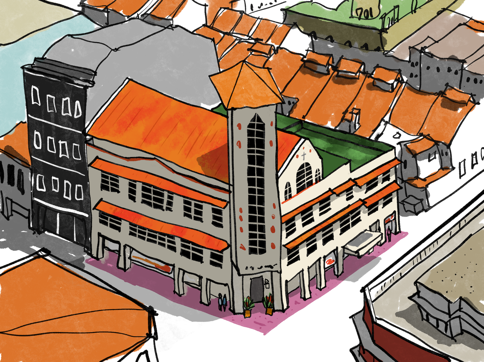
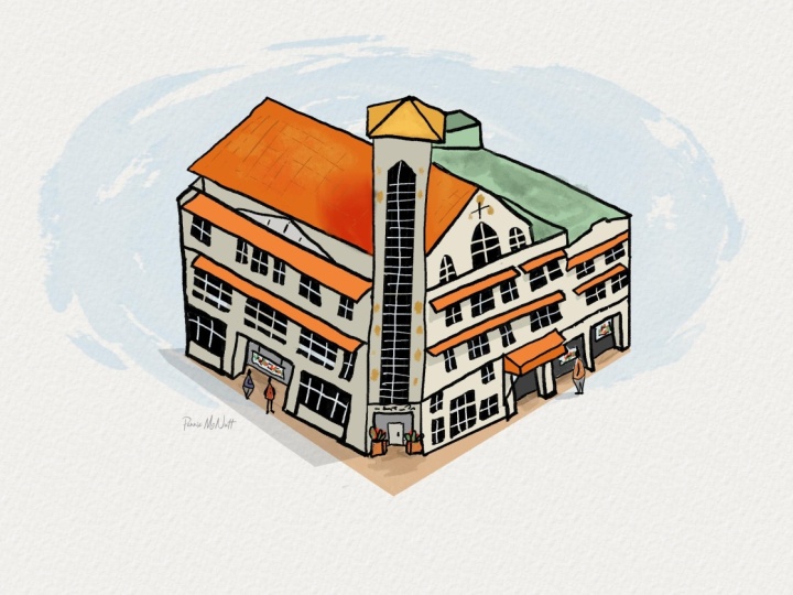
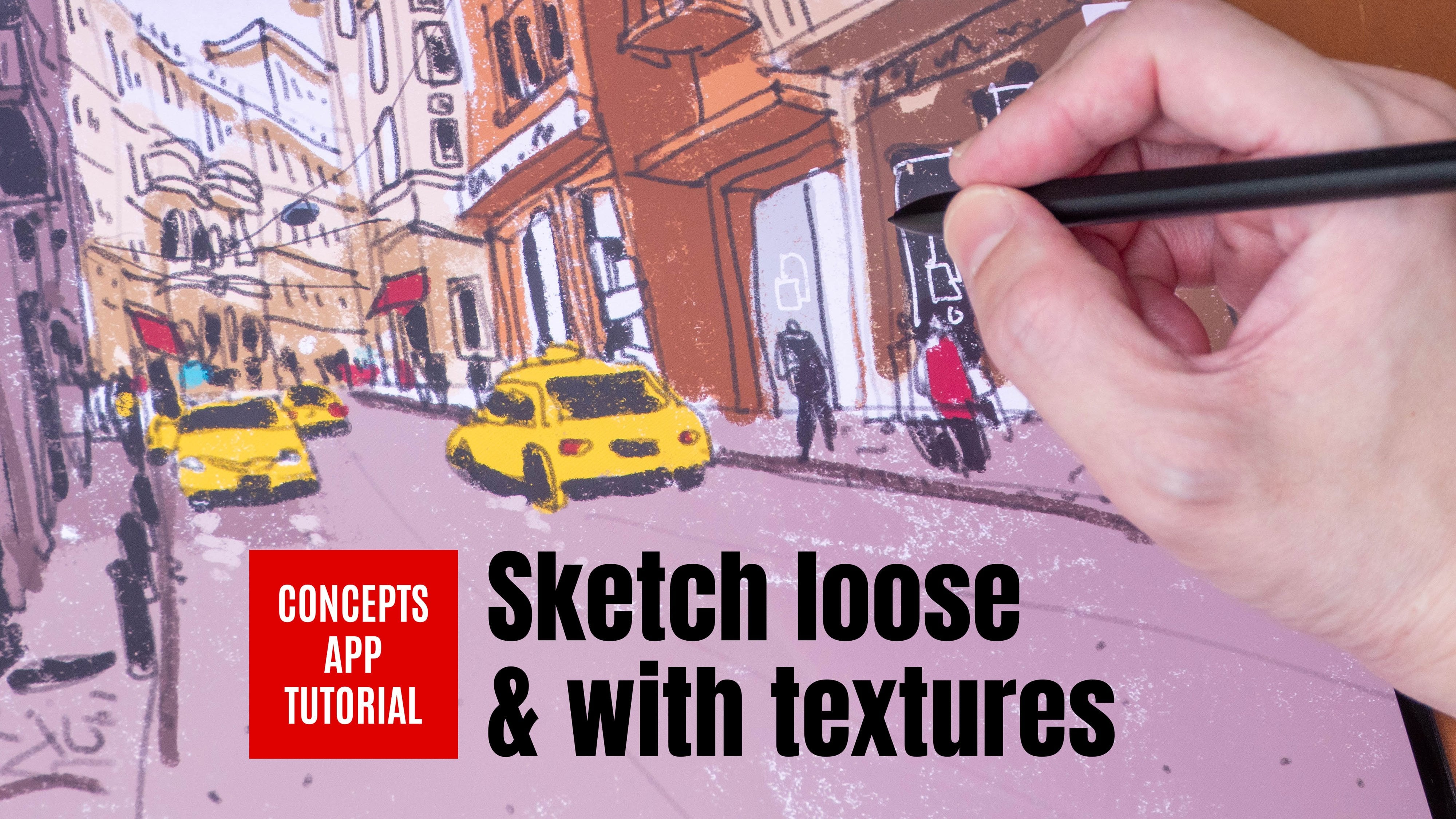
7. Project 1A: Draft: In this lesson, we will be drawing in this scene, we will draw this building which is a more complicated subject compared to the earlier example of a tree. And we will be drawing this from observation with the help of a reference photo. Now, urban sketching is catching on location. So when you draw from a photo, technically speaking, it's not considered urban sketching. However, there are certain situations where there are certain scenes that are almost impossible to draw on locations such as this one here where the viewpoint is actually quite high up in the air. So unless you can find yourself on a high flaw on a high building, there is no way to get a view like this. So we are going to use technology to help us find a view like this. The reference photo that I have created that you can download by the way, is created from this app called Google Earth. This is an app that allows you to fly around the Earth, fly around any neighborhood, zoom in and out, rotate, and look at all the 3D buildings. So this is the building that we are going to draw. And I'm going to create a screenshot so that I can get the view fixed. And we are going to draw something like this so you can arrange the viewpoint to whatever viewpoint you're like. And this is one that I like because I can see the front of this building and I can see some diagonal lines which will make the sketch look more dynamic. Let's start by creating a new canvas. Again, let's create a screen size. And let's create a few layers. So for the first layer right at the bottom, Let's rename it. That's quiet dropped because we are going to create some drafting lives to help us compose the scene, Let's select light blue color as cyan color. And let's use the brush tinder box, so make sure we are drawing on the correctly or dropped. So at this stage, I just want to draft out a composition That's draw the vertical rectangle to represent that tower like structure. At this stage, you can afford to be very sketchy. It's all right. And if you make any mistakes, you can identify the mistake at this early stage. So data make that mistake later on. So this is something that I do when I am out of drawing on location, especially when it comes to drawing really complicated scenes. I wonder who dropped out the composition to make sure that everything can fit onto the pitch, onto this canvas. So at this stage you can actually just draw like really quickly because we just want to get the composition. And if you get the angles wrong, you can actually just undo or erase your mistakes at this stage. At this stage is really useful to identify some of the more problematic areas. Some of the mistakes that you may make later on, such as getting the right angle. Now for the bottom of this building, I'm just going to draw this one straight line here, even though the straight line is not that obvious. Because I can use this straight line to help me place the pillars and grow. And the pillars on the ground are actually divided according to some spacing. So try and get the spacing right. We can also draw moves or the sun shade here I just want to use one line to represent the sign-in sheet. And there will be some windows beneath you against you can draw some windows here to help you remember that windows later on. But that is not that important. Anyway, my windows here, as you can see, it's really rough. So at this stage, I just want to get the composition right. I want to get the view, right. And later on we can turn this layer off ohmic, this layer much lighter so that B can ink our black lines on top. For this bottom here, I was wanted to draw this like an online here. There is an extension here. Let me just zoom in or you just see there is an extension here. Try to get the spacing between the pilus, right? Because these peelers actually will affect the dimensions that spacing of the windows, a birth. So there is going to be one window here for example, and under here. And they're here. And they're big one here. This will be the sunshade, and this sunshade here on the right side is actually lower. So this drafting stage, I will try to draw like really quickly for the drafting stage, I don't want to spend that much time. I just want to get the composition and the location of some of the details. Basically, I just want to make sure that this can fit onto the pitch. Now, there are going to be on the buildings in the background, but we are not going to draw those in yet. Hand draw them much later on. So the main building is the main subject here. And now you can see disputing is it's a 3D data structure is already there. So if you find that you have drawn this too much to the right side or to the left side, or it's too big or too small. You can use the arrow tool here, the move tool to move your sketch around your draft around. I think mine looks all right, so that's just place it here and tap away. And that's go back in again. So now we can use this drafting LEA to help us draw the actual thing. And I'm going to make this more transparent. I'm going to reduce the opacity to something that is lighter, but something that I can still see. All right, I think this is good enough. All right, so for the line art, I'm going to draw that in its own layer, That's called as new layer line art. And this time I'm going to pick black brush. And I'm going to be using the same brush tinder box. So now we can ink over our drafting lines and draw more accurately.
8. Project 1B: Inking: Start by drawing this vertical rectangle first. Now if your allies are not perfectly straight, you can undo, you can redraw. But the thing is, you don't have to draw a perfectly straight line to create the illusion that it's a straight line. The more important thing here is to actually have your lines look confident. So don't draw those lines over and over again. Like for example, if you draw something wrong, you may want to draw the line again done, don't do this. It's going to make their lives more fuzzy. So if you can whenever possible, just draw with one stroke, make the lines as clean as possible. Don't use two lines where in one line will do. If you want to draw a perfectly straight line, there is a shortcut in Procreate to let you do that. So for this tall rectangle, I can actually see the side of the war here. So I'm going to use that shortcut. So draft Apple Pencil, but don't leave the Apple Pencil and that line will be Street. And while the Apple pencil is still on the screen, so you can get that straight line there. So notice this is a perfectly straight line and dislike here, it's wobbly. It's OK. Now this rectangle is actually protruding to the front. So the peeler here behind is actually below. So we can draw it a peeler here. Now when you're drawing, sometimes you may want to just zoom to the bigger view. When I'm drawing, I like to zoom in to draw the details and zoom out to check the sketch to make sure that everything still looks. All right. So let's draw the site here. This line will dot somewhere to as the top site here and then enter right here at the center, like this. And this will go down all the way here. If you find allies to a thick, you can reduce the thickness of the line. And you need the lines to be thicker. You can increase that or you can use your Apple pencil to draw those thicker lines by pressing Dow harder. So here hopes this is why his too wobbly. So always be comparing with the reference photo right in front of you when you're trying to make sure that your sketch is your drawing, what you see basically. This is very different from drawing from imagination. You can use your imagination for certain subjects. So for example, if there are no cars on the street, you may use your imagination or your memory of how to draw it, how to add some cars onto the street. And if you draw on location r, then you will be able to develop those memories. If you're drawing for all your memory, you've got drying California memory the first time. You won't be able to get that car to look right? Okay, so here we are just drawing the windows. Notice that lies to wobbly. And right, so there are three windows here, 123, I'm going to draw the outer edge here, this one, delta H, and then the window in the middle. So when it comes to sketching, it's always good to draw like the, the shapes first and then a few in the details later on. So I drew this big shape first and then I drew it a sunshade and then trued smaller windows. Draw and then draw the DTUs. We'd been the picture. This is the roof at the top. And we have this diagonal line here. And this is the roof. There is, I think it really is situated on top of this, this thing here. So we need to draw a vertical line there. And we have to route here. There is this section here which is white. And maybe we can add another section here as well to make sure that we have this here as well as here. And this diagonal line is shorter and comes down vertically like this. And we can draw this here. Again, let's draw the beak shapes first. Let's draw the surface of this wall first. It comes down like this, maybe too much. And then goes up like this. And this diagonal line will end somewhere around here. Let's zoom in. So if you have problems drawing, you can zoom in or you can actually rotate the canvas to help you draw that line more accurately. I think this Luke's our right to me. This is actually the roof top. So this is actually the wall on the rooftop. Now if you are not able to see the reference for though accurately, reference photo does not have too much details. You can actually use your own artistic impression who at certain elements. So in this case, I think this is all right. I'm going to have this particular solid. So let me erase. Remember the shortcut to erase is to press this button and 2, oops, I selected the wrong brush. So let's choose the correct brush tinder box. Let's go back to the brush and press this button to erase. The resist. Too thick. Again is too thick. Right now it looks all right. Let me undo. It's good. If this is your first time using the shortcuts, It's going to take some time to get used to it. Okay. Sometimes I may just want to go use the eraser so that it's easier. But it's really up to you. Oops. K. I can see the angle here. It's a bit of so again, I have to erase this. So that's why sometimes when you are drawing, you may want to zoom out to see the overall picture. When you zoom in like this, when you're drawing this angle, it may look right, but when you zoom out that angle, who is going to look wrong? Oops. K that's tried to get this angle to be parallel to this angle. I think it looks okay now, I mean, wanted to extend this site here as well, just to go over the drafting lines that I had earlier. So this is a mistake. If you've drawn this right the first time, that's great. If not, you have to go back to erase and do corrections. And doing all these corrections is going to waste some time. Okay. The Chicago is not working well for me. Let me just use the you raise her shortcut instead by tapping on the eraser. Because sometimes when I press on that button, I may not press step, but then had to write police. And also notice here I am joining the lines. If possible, just draw one straight line, do it one time. But if you have to join the lines, I'm trying to make sure that you are drawing it in such a way that it looks as if you've drawn this line with one stroke, k. Let's draw this. And also when you're drawing, you may not feel confident at first if you are a beginner. But as you draw more, you will become more and more confident. So your lines, you actually show how confident you are. But don't worry, all this will, I mean, you will get better with more practice. So let's draw the extension here. So this looks like an extension for her drop-off point for car. So these are the pillars on the growl. And also depending on your personal preference, you may want to have that allies thicker or thinner. It's really up to you. When I'm drawing with an actual fountain pen, I prefer to use medium nib. But when it comes to a digital drawing, I just go with how I feel at the moment. Alright, so for this pilus here, they are actually in perspective. So we need to draw the side of the PDL, basically give the peelers more form. So we need to draw the side of the peeler here. I'm not sure if you can see the side of the pizza from the reference photo. But when you are drawing those kilos, you need to give them the form. Otherwise, it's just going to look like theirs. It's going to look very flat. So by drawing the side of the pedigree, you make the ELA loop 3-dimensional, right? This is very nice. This sketch is coming to life very quickly. So let's draw this sunshade here. The Edison sheet is actually just be sight. And we have an unassigned sheet here. And one here that goes all the way to the right side. Now when drawing this sunshade, the sun shade is actually on the same level as the sign-in sheets. So when you're drawing, try to make them look like they are on the same level. And notice here I did not. Draw this line continuously. So now you see this line, it's not that Smith. I shall leave it as it is. K, The son shoot for the windows should be in front of the Wausau that you raise this here to create the illusion that this is in front. So when drawing, we want to create this illusion of our foreground elements, overlapping background elements to create that sense of depth. Okay, so let's fix this thing here. You can see this line, it's like curving down. It doesn't look that great. So let me erase here. Now if you can draw this one time, That's great because it will give you that fresh look. But if you have to go in and do your corrections, sometimes you may not get the lines to look as fresh. So here I have difficulty joining the lines to make them look as if I've drawn them with one stroke. Okay, now I think it looks, all right. It's not the best, but it looks all right. Let's draw the windows. The windows should followed the pilus below. That's why earlier I told you to pay attention to data. We've done distance, the spacing of those pilus. There are three windows here. So let's draw those windows, 1, 2, and 3. This Windows Apple x. So that's going and color, oops. Let's go in and color window. I actually accidentally colored outside. So you can either look how low the window like this or you can use the Fill Bucket two. So I want to color it in like this because tinderbox, this brush, it will create some textures. If I use the fill bucket, the black is just going to be like very flat. Okay, so for the windows we want to draw SOM, we knew frames. We can use the eraser. So let me just switch over to using the eraser and draw those window frames, the wide window frames like this. At this stage, you may want to turn off the drafting lines because they are starting to get a bit distracting. So just turn off to a drafting lies. And now you can just draw on the line art layer. So this is the new king rate. We have some details for the windows there, That's collar on this Windows. Let me just use the shortcut, the field bucket shortcut. Because when we look at this sketch from a far, we aren't unkind to see the textures. Maybe for the roof later on we will pin with tinderbox. So that's just used a few bucket to feel Audis. Now if you have open gaps, you won't be able to feel property. So make sure when you're drawing, always try to close your lines properly. Now that I have drawn and filled all the windows, I want to draw the window frames as well. This is done by erasing the lack. So you can actually draw those window frames very easily just by drawing a cross like this. Instead of drawing the window frames individually, this is going to save you more time. At this stage, the sketch is almost complete, so now I just have to zoom in on certain areas to add some DTUs and also to make sure that I did not leave out anything I am supposed to draw. So this building here actually has a triangle structure here. So I want to draw that. Let me just draw that triangle structure is actually somewhere here in the middle, like this. Okay? I can raise this line beneath. Why is it not erasing? Okay. Because I did not press that shortcut probably. All right. This is not working for me. Sometimes it works, sometimes it doesn't. This line here is a bit too wobbly for me, so I will want to make this line straighter. So let me just draw a line down like this and be closer here. And I'm going to erase this. All right, I think it looks slightly bad. And we can draw the windows here it is. Tall window, which is going to start here. Go all the way up here. And errors is sharp point. And come down here and use the few bucket to fill this. I mean, touch up and use the eraser to create a window frames. So I'm going to rotate this to the silent, is to make it easier for me to just draw those lines where it quickly. So this is just a beauty. Now I want to add Psalms size of live. So for example, right here at the bottom, I can have some plans. I can have some banners actually, there are some banners here hanging around and now the banner here also. So all these little details will create the illusion that there is life. And you may also want to add some people on the street if you can actually see people, but if there are no people on the street, you can still add people. And let me just add maybe a person standing here. The person will obviously have to be like shot there compared to this height here. I can add one or two. There may be another person standing here. So this sketch is now complete and ready for coloring.
9. Project 1C: Colouring: Before we color this sketch, Let's make sure we are working on the correct layer. So we are going to rename this empty layer and call it colors. If you don't have an empty layer, create one and quiet colors and move it down below the line or not. So for the line art, Holy Year, I wanted to tap on it to make it a reference layer. So now that's Tetlock, the collars layer again, because we wanted to color on the color layer that's colored a roofers, let's pick an orange and drag that orange onto DON layer. Make sure you're painting on the layer k. So we have some orange here, we have some red color sign-in sheet here. I have this color slightly different from this. So the colors that are filled are actually looking quite flat because there are no textures. Or you can choose to cholerae like this using the tinder box brush. But let me show you another way you can add textures. So let me, and MSM great line here. Naive, Kay? And I have and not a line here. This written line seems to go here at the H. So this will create a nice area of interest. All right, so to create textures, we are going to use the alpha mask. So use two fingers to swipe on the collars layer. And we are going to pick a different brush. Let's choose the hots brush. And we are going to use the eye drop birth here, tap on the color and with a few seconds, a split second folder, color picker to pick the color. And we're going to adjust the color slightly. So maybe I want to make it a bit lighter. So using the hots brush, you can now paint onto this orange that you already have. This color is not that obvious. Let me just I drop the skin. So instead of changing how light or how dark the color is, I'm going to change the hue of the color, make it more rate. Okay, Now it looks nice. I get some texture on it. So I can add some textures like this and also onto the sun is shit here. And here. You can make it even more red just to add another layer of color. Or you can make it like more range so that you get different colors within this shape of color. So within this shape now I can see three colors. It's more interesting than just one flat color. And I was always get to see some textures. Had forgotten to colored this. So for this, I'm going to use tinder box two colored this. And notice nothing is happening desk because the alpha mask here STU turned on. So we have this on. It means I can only paint on existing pixels on that existing colors. So let me just turned it off. And now I can shade here. So we have tinderbox while shading, you can get textures, It's very nice. So that's just zoom in closer. Remember with this brush, if you color a second time, you will lose the texture so as much as possible, try to color it just once. And notice I have some white areas here way I did not colored them or feel them completely. That's fine. I like is imperfection sometimes when it comes to draw and sometimes you want to have some imperfections. That's at some details here as well. There are actually some woods here. So that's at what's her That's probably the name of the building or some sayings. And I can use this RID here to add some textures here, some little details here and dare. All right, next let's color the area here. There's a spot here. It looks like a very dull green. So let's select a tau green here and just, let's just fill this with this color. Am I working on the correct layer here? Yeah. Always make sure you're working on the correct layer. So in this case, I want to create some textures. What is as well. Let me just create the alpha mask again. And this time let's make the texture much darker. I'm going to reduce the brush size for hots. And pin here. Okay. Maybe smaller. Yeah, just create some texture. Now, notice you can actually paint over the roof. That's because the green color is on the same layer as the roof. Now if you don't want this to happen, you have to create the green color on its own layer. But here I think I shall just keep them on the same layer. Right? I think it looks fine. Maybe this looks a bit unnatural, so I'm going to use the eyedropper to maybe lighten despots lightly. This building is not white in color, it's white. It has this cream color to it. So maybe four, the column, this beauty, I will create a new layer void. That's call it building color. Okay, So fall butene color, Let's choose some thing that is light and off white color, some color that is warm. And use that color to feel the beauty. That's make this even lighter, a warmer. Okay, I think it looks good. Notice as I feel the colors, those red dots D disappeared. That's because this layer is on top of the layer. While I wanted to do is to move this below and a red.com back that's used is too few the color as well on the side here and here and here. So just use this color to field building. Okay? Sketch is coming to live very quickly. For smaller ears here I can just color with brush, Tinder brush like this. I missed out on this part here. This is supposed to be green as well. So let me go back to the collars layer with the green and feud this, oops, the alpha mask is due on. So sometimes when you try to feel and nothing is happening, it could mean that the alpha mask is due on. All right, great. That's continue to color the details here. Now I want to draw some lines on the line art layer because I want to create gate shops that are behind. It's not totally empty behind thing. There's a door here or maybe some signs on the side, maybe a doorbell there. And also while I am drawing these extra lines, I notice certain eras that I did not color. So I can go back to color those areas. Color on the color layer. I dropped mic, same color and color here and here as well, maybe you have to back here in the same color. Okay. And here as well, for the person here, maybe that's have hemo her where this blue colored shit. Maybe the person beside is worrying light color should. Black pan means k, the plans, the pot up plans maybe have to put a plans. The pot will be brown color like this, and we have some plants here. So that's how green. Notice the rate is still above, does because the read is actually on top. And I just realized that I call it on the Unfortunately wrong layer. I painted a plants on the, the beauty and color. And maybe I'm going to leave it as it is. Sometimes it can be a bit tedious to keep track where your colors outgoing. But in this case it's not a big deal because he's just a sketch. But if you are doing like very deep few illustrations, you really have to double-check where your colors are going sometimes when he wanted to do corrections later on, for example, if you wanted to change the color of the roof, you have to make sure that the color of the roof is on its own layer. Otherwise, it will be very difficult to change the color of the roof without changing out of parts of the roof. Next, I wanted to add some flooring to the bottom, so on to create a new layer and call it flooring. And this layer will go below the beauty in color. So what is, I wanted to choose a magenta color, something that is not too vibrant. So let's move our color picker or somewhere in the middle here. And let's color it. Notice as I color does pot here, the color on top actually overlaps the magenta up in neve. So later on I have to go in and erase that pot, or I may just leave it as it is. So let me just draw this here. Draw this line here like this. Picks the, basically I wanted to create this flooring for the beauty. Now, I want to be able to use the field bucket to fuel this enclosed area, which looks like it's an enclosed area, but it is not because when you actually turn off this layer, turn off the outer layers. You can see the ship is not enclosed. So if you want to use the few bucket, you have to draw the shape at the outline for this. And you can do that just by drawing the outline, which I'm going to show you right now. So now I've just drawn all the outlines and this is an enclosed shape. I can feel this shape and notice the colors actually ran a halt. That's because I still have my reference list set to the line art. So let me just remove that reference layer and tap on flooring layer again to make sure we are coloring on the correct layer. And now we can feel this. So sometimes when you feel a color and the color runs out, it could be because your reference layer is wrong or because your line art, your outline, or have gaps. Now that I have filled that, that's turned his back on and it looks great mix. We want to paint the shadows to give this cache more form, to make this look even more three-dimensional.
10. Project 1D: Adding Shadows: At shadows, we want to create a shadow layer first. So tap on the Layers button there and at a shadow layer, quite shadows. And push deadlier right to the top. If it's not already at tall. And I want to change to multiply, straight away to multiply. And I'm going to pick a gray color. So let me try. It is darker gray or maybe this gray that is slightly lighter. And for this shadow layer I12 maybe used line hi again as a reference layer. So tap on the lines layer, tap reference before we add shadows, Let's create a layer for the shadows. So let's create an empty layer and rename this shadows. Now from the reference photo, it may not be clear where the light source is coming from. I think their license is coming from this direction. But it's not that all PheWAS. So we're going to have the light source come from this direction, which means this side of computing will be in shade. Now if you are drawing on-location, you should just draw the shadows as they are. However, if you're drawing with a hell of a reference photo, you can actually change red light source is coming from. So if you wanted to have the license count from here, you can do so when you're drawing at home. But here we are going to follow the reference. So make sure you are painting on the correct layer and the shadows layer changed and multiply mode for that to multiply and choose a gray color. And set the line art layer to reference. Because we are going to feel those areas. We've done a few bucket two. Okay. With the FIO2, that's halved is gray and that's viewed this site first. Okay, I think that looks fine. Let's do it here as well. And here, and here. And here. And for the bottom as well, all of these pots will be in shadow. So I can actually just colored this bottom here with the tinder box brush. Just paint over the whole area here like this. And this part here protrudes out, so it's actually casting shadows to the bottom. So maybe let's have this pot here and shadow. Oh, actually that light source is coming from this direction. So this edge here is the itch that defines the light side and a darker side. We want to add some shadows here as well. Let me just zoom in for you to see. So we add the shadow to this side of the peeler. But for this side of the peeler, it's under the light. Here as well. This side will be in shadow, but this scientists, I will be under the light. And we can add some shadows beneath the sand sheet as well. So for this, I may want to just zoom out to see the bigger view. So I just wanted to add some shadows here beneath the assignor shade and here as well. Accidentally painted over the roof here. So let me just erase. Oops. Is this pot. And we need to add shadows here as well, because this side of the wall is under shadow. And there will be some cast shadows here on row here. Okay, So this is what we have so far on. We need to maybe add some shadows here. Because the shadow, this extrusion here will cast shadows. So the shadow in this case we will follow the form of the extrusion of birth. But it will be more twist rice, right? I'll move it to the, sorry, towards the left side. Okay. And we want to have some cast shadows onto grouse or maybe let's have some shadows here. And this point here, we'll be taller because of this thing here. And we can just shade this part here, like this. Okay, so this is a very quick and easy way to create shadows. I notice some cast a shadow here. On the cast shadow yeast form of this. So maybe let's add a cast shadow here like this. I think it looks like Chris. But the thing is since the cost of shadow is here, then it should not create the cost of shadow here. So let me just erase this part here. Let me make that you read so much beaker. This. Alright. Now all this shadow are actually my own artistic impression. This part here will be accurate. This part here will be in shadow hybridized, cast a shadow on a growl. And this byte here is actually my own impression. So at this stage, this sketch is actually considered complete. You can choose to add more details to the sketch if you want. Just to make that sketch look more like Lee, I sometimes like to at some thoughts here and dare to create some textures. And this pot here seems to be gray, darker green. So I'm not sure why there is this pot here, that screen. So let's add that texture in. And I want to say what's here as well. There is a cross Odysseus, actually a church. There is across here, as Reid call it woods here, here and here. I am. He was a 12. Add some lines here to create the direction of the roof. So let me go to the layer with the roof color. Use the eyedropper here. And in this case, I may want to create a new layer to create those lines because I'm not sure whether those lines are going to look good or not. So let me just rename this new layer called lines on roof. And I'm going to eye drop here and I'm going to make those lines liked her slightly lighter so that I can see some contrasts. Yeah. So that's just draw those in lines. Just add a few lines here and there, see whether or not they look good. If they don't look good, you can just delete that layer. I think they look nice. Or maybe it shouldn't be this color. Maybe it should be a color that is like darker. So you can actually change the color of the lines by using the adjustment of the year. So let me show you how you can do that. Tap on this button here, which is the adjustment layers. Tap on hue saturation brightness, and tap on the so that we affect the leader. So now you can switch to talers. You can switch the saturation at switch to brightness of those slides that we have just drawn. In this case, I wanted to make their lives darker. So here you can see the lines, they become much darker. This is the original and this is Docker. So let me just zoom. I'll slightly for you to see. Or if you don't want, you can just color. I can make it green, I can make it purple. I can make it desaturated. That's me that this just slightly darker. And it doesn't look good because the color is actually a totally different color font from the orange. So I may want to change the blending mode to multiply. So at that, SHE, this texture here can multiply onto the roof. And I wanted to maybe change the opacity or maybe I can use the adjustment layer again to change the brightness. Yeah, I think this looks good. I don't want the lines to be too obvious.
11. Project 1E: Adding the Neighbourhood: What do we have here right now is just an isolated building. We don't know the neighborhood. We don't know how the other buildings look. So I went to an ADA beauty is to create a neighborhood to give this beauty moral contexts. So to do that, let me create another layer called line art. I'm going to create a beauty on the right side. And you can create out of buildings to fuel up a real later on. So let me create another layer called colors. Basically I'm creating the same layers that I've created for this beautifying. So with the layers here for the new building, Let's tap and swipe to the right site. Select all the layers you one and tap to swipe to the right side, and then group, and then renamed as group called the right building. So now we have this Grouped layer, all this folder with all of this layer. So we can proceed to draw on deadline layer using a black tinderbox brush. Let me just zoom out who see what beauty I have here? So I'm going to draw this building really quickly. You can draw this building with greater detail if you want. So this is the roof top. And if you don't like this building because it's on its own layer or layer group. You can actually just turn off the layer later on. Okay, so there are some structures on the roof. So I'm going to keep this really sketchy just to show you how you can add additional elements to this scene that you have just drawn. And this side here is the wall. Sometimes like dual plays vertical lines here to represent our verticals of face. Because sometimes when you draw too many admins, you may lose track as too hot the surfaces as D is a flat, slow phase oils days of vertical. So face. I also want to add some thoughts sure. To let me know that this is the face. Okay. So to color this last tab on the line, LEA for us to make this a reference layer, because we are going to use the few to get. So tap on the color layer, select a red color or some rate looking like color, and use this color too few, this side of the wall. For this area here, I just want to color it. Notice I painted over deadlines. That's because the color layer is on top off DO ion, let me just move that down. And looks good. Let's paint some shadows as well. I notice I accidentally moved colors later outside of the right muting group. So let me just move this layer back into the group and switched the order here. All right, so now if I want to remove this beauty, I can just height disputing are easily. That's continue to color this side. So for this building, That's just color it with dirty little at top here. Using Tinderbox as a brush for shading. And maybe for the query that's have a very light gray here. For the corral. And maybe this building will be this structure on top of the ceiling. This will be white. So it's why we can leave it, but we wanted to add some shadows. So let's create a shadow layer within this layer group. And move the shadow layer right on top and renamed as shadow. So the steps here are exactly the same steps that I use to draw this. So let's create a shadow layer. Remember to multiply the shadow layer. And we can paint the shadows here. Like it is painted really quickly and we can have some cast shadow here as well. And this site here, we will be in shadow because remember that light source is coming from this direction. So this beauty, He's actually in shadow. But the top here is lit by light. So this is the top of the war. This is the side of the wall. This i o the war that is not facing, the light will be in shade. So now when we zoom out, we can see one side building at it here. One extra building here doesn't make this a neighborhood. So now I want to draw all the other buildings. Surrounding this building. So what I wanna do is to again do the same thing, create a layer for the line art for the color and put a shadow and group it into one layer group. And this time I'm going to call that layer group back buildings. And I wanted to create another layer group for maybe there's beauty in here at the bottom left. So let me just swipe this direction to duplicate this layer. So I'm do pinning the layer group and that's called front Bu Ding. So now you can continue to draw or the other buildings. So I've just drawn the whole neighborhood. And I have layer groups for this building, this building in the front, and also for the buildings in the background. So I can actually turn off the buildings in the back if I want to, disputing, disputing, if I want to select the advantage of working with players or you can turn them back on. So if I have everything turned back part, you can see disputing. It may not stand out compared to other buildings. So you may want to reduce the vibrant colors for the other meetings or you can actually just buy, take away that Tatas because I have the colors on their separate layer. So for example, for the buildings in the background, I can just turn off the Callas later like this, and all the colors would be gone. I can leave the shadows on or I can turn the shadows off. Maybe let's just turn off the shadows. And let's turn off this layer. Sorry, this color's as well for the building on the right side, reduced or turn off the colors. And that's the leaved align OT as turn off the shadows as well. So now, because everything around is white and this is in color, we get to focus on this building. So you can play around with layers. If this looks a bit weird to you because there is no shadows, you can turn on the shadow layers just to see how it looks and it looks like there's I think it looks right. But if the shadows are too dark, again, you can't go to the shadows layer. Tap on the button there and reduce the opacity of the shadows just to make them lighter. This one as well, just to reduce the shadows, just to make them lighter. And now the shadows are there, but not too distracting. By thing, I'm going to leave the shadows turned off. Oh, maybe I should just turn everything back on. I think it looks good with everything. Back on. The last thing you should do when you complete your sketches to create an empty layer and pushed and Leah, write a to the top. That will be your protective layer to protect your drawing. When it comes to, uh, creating digital odd, there are so many things you can change, so many things you can try. There is a lot of flexibility. So let me show you some other versions of this similar sketch that I have just drawn. So let me just go back to the gallery here and I'm going to pinch to zoom in. So this is the sketch that I just drawn. And this is not a variation on this sketch. This was drawn with even fewer details. So the colors of the rooms, they are a dear friend compat to here you can see the roofs here, the orange more radiation and roofs here in the background, the colors odd doll. But here the colors are brighter, orange, and we have strong rates as well. And for the rulers you can see it's this warm gray color. We have some ruined markings here. Whereas for this, I left the room and white and there are no cars. And here I have a car, but there are no people here. And I kinda like this sketch because this is a very simplified version of the sketch. I actually accidentally left out certain things, but the overall feel of the neighborhood, I think it's very well captured here. And one thing to note is I actually have to shadow host on the right side. That means I had the light source coming from this direction. Whereas for this sketch I had that light source coming in from this direction. And this is another version, again off the same sketch but with the beauty isolated. Now for this particular sketch, the brush that I used on, they are different compared to this sketch. I believe the brush that I use water line OD is do tinder box but flawed this sketch, It's a different brush. So here you can see the lines day can be quite big at certain areas. So this creates a different feel. So when you use different brushes, you are going to create a different feel. You are going to be able to create a different style very easily just by changing the brush that you use. If you're wondering how you can develop your style or how you can find your style. I would say, don't waste time trying to find our style. Let you, I'll stop a fine you in state. So just practice drawing. Get used to the workflow, the digital art work flow and practice as much as you can and your style will find you.
12. Goodbye: I've come to the
end of the course. I hope you have
enjoyed the cost. When it comes to creating art. How far you want to take your
art is really up to you. My general advice for
beginners is to practice. The more you draw the batter
and the more you can draw. And also look at other
artists to get inspiration. See whether or not
you can replicate the techniques digitally
using procreate. This will help you learn
faster and grow as an artist. So thanks for following
along with this course. I hope to see you again. Bye.
 Teoh Yi Chie, Sketcher, watercolour lover