Transcripts
1. Intro: Hello, and welcome to another digital urban sketching course. My name is Teo, and I'm an
artist, graphic designer, and urban sketcher who enjoys sketching
outdoors on location. For this cost, the app we
will be using is Concepts, which happens to be one of my favorite drawing apps to
use when sketching outdoors. To follow along
with this course, obviously, you will
need the app concepts, which is available on the iPad, Android, and Windows tablets. You will need a tablet
with official pen support, and by official pen support, I mean a pen that supports pressure sensitivity
and palm rejection. In this course, I
will show you my workflow when it
comes to sketching, and I will also show you the
tips and techniques that I use to sketch faster
and more efficiently. While this course is
suitable for beginners, it will be great if
you already know the basic features of concepts and know
how to use concepts. So if you are a total beginner, I highly recommend you check out the beginners course on
drawing with concepts before you start this course
because it's going to be easier for you to
follow along if you already know how
to use concepts. My goal for this course
is to show you how easy it is to sketch
with this app and also help you gain
confidence when you are sketching outdoors on
location and with confidence, your art, your sketches
will just look better. Are several hands on tutors
included in this course with reference photos provided
for your practice purposes, and I highly recommend
you submit your projects, your sketches online
so that I can have a look and give you some
critics on how to improve. Before we head over
to the first lesson, I have a favor to ask of you. If you find this course useful, do leave this course
a review so that other students can know
about this course. All right, let's head
over to the first lesson.
2. Tools needed: This first lesson,
I want to show you the tools that you will
need for this course. So you'll need the app concepts which is available on the iPad, Android and Windows tablets. Now, the version of concepts that's
running on the iPad is not exactly the
same as the version that's running on Android
and Windows tablets. So the artworks that you create
are not interchangeable, which is to say that you cannot
export the file that you create on the iPad and open this file on the Android
and Windows tablets. And some of the features
that are available for the iPad version are not available with the
Android version. But for this course, I will try to remember to use the features that
are available on all the different platforms. Having a pen that supports pressure sensitivity and
pump rejection is needed. With pressure sensitivity, this allows you to draw
thin and thick lines, and this will make your sketches look way more
interesting compared to drawing the same subject matter with consistent line width. And with pump
rejection, you can rest your pump on the display
while you are drawing, and this will not introduce
any straight strokes. Now for concepts, you have to go inside the settings
under interaction, scroll down to touch input, finger action and change or set the settings
to pen Canvas. Now when I'm using my
finger on the display, I will just pen the canvas. I will also not introduce
any straight strokes. Not all tablets have
official pen support. So if your tablet does
not support the pen, then the types of pen you
can use for drawing would be pens with the mash
tip or the rubber tip. This is not a very
precise pen for drawing. There are also pens
with disk tip. And this is also not that
precise for drawing, but they can be
used for drawing. It's just that when you
draw with pens like this, the line width will
be consistent. You will not be able to get thin and thick lines like this, which are more expressive. Other items that are
really useful for urban sketching will be a
hat and a portable stew. And these are rather
inexpensive items. So a portable stow
will allow you to sit anywhere you
like for sketching.
3. Gallery of my sketches: Me show you some of
the sketches that I have drawn on location and talk about my style and also some of the stories behind the sketches. Now, when it comes
to urban sketching, the story aspect is
actually quite important. So with urban sketching, it's not just about the art. It would be great if you can
incorporate some sort of story into the sketch
that you brought. So for this particular sketch, it was actually drawn
inside a Chinese mansion, which is more than
100-years-old. So we had a special
invitation to sketch this place before
it's being renovated. So we wanted to capture the original architecture
before they put in the air conditioning and
other concrete additions. So I use urban sketching
to document places, and I was sketching
with my friends who are from the urban
sketches, Singapore Group. This was sketched
at Tika Market. I wanted to capture the
business of the wet market. Now, there are many
stores selling fish. Let me show you the fish. So you don't really have to draw the fish to show the fish. Here I'm just using some
ships to suggest the fish. And this sketch took me about 1.5 hours to draw and color. The sketching part is
not that difficult. I mean, as you can see,
it's quite detail. I mean, it's difficult, but it's not as difficult compared to coloring because there are
so many things to color. Anyway, when you have
more experience, you will be able to tackle such complicated
scenes with ease. And I will show you how to
draw such complicated scenes, how you should start
scenes like that. So this is a more simplified
version of a sketch. It's of this lady
at the fruit stall. This is without the line art, which still looks
kind of recognizable, and this is just a line art. Sometimes when the scene is
very busy and complicated, it may be better to just
focus on a smaller area and focus on a specific subject
so that it's easier to draw. This was drawn on the train while I was
commuting on the train, so it was a long commute, so I had the time
to actually draw. And some of the colors were
added on the train and some colors were
added back at home. When sketching on trains, try to avoid eye contact so that people will
not know that you are looking at them or
staring at them and try not to tilt your head up
and down that obviously. Otherwise, people will be
wondering what you are doing and they will look
at what you are drawing. Actually don't mind
people looking at my sketches because I'm
used to that already. I've been urban sketching
since 2009 with my friends. So over the years, I have gained confidence to sketch outdoors. And not just that,
I have also gained confidence to let people
look at my sketch. And sometimes when people
look at what I'm drawing, we may strike up
certain conversations, and that may reveal
more information about the place or the subject
matter that I am drawing. Have two styles for drawing. One is the pencil style
with pastel coloring, which is this style
that you see here. That's actually a
sketch of this corridor where I am at right now. It looks like a Mundane sketch, but it's still quite
fun to draw and it really helps me
remember this place more vividly because I spent more than an hour sitting
here and sketching. This is my pencil
and pastel style, and this is my ink and
flat coloring style. You can see the coloring is
just created with shapes. I am not very particular about
coloring within the lines, you can see the color
spill out of the line. Sometimes I don't even color. Cite the lines and it's okay because my style is
the sketchy style. What is more important is, are you able to capture
the essence of the scene? Are you able to tell the
story that you want to tell? This is how the line art
looks without the colors. Now, the line art should look
good without the colors. The colors are just icing
on top of the cake. So if your line art
does not look good, adding colors later on
may not help your sketch. Here's another pencil
and pastle sketch. So I was sketching
at this place where there is a pond
with many turtles, and I wanted to capture
what's happening. So what's happening is there are families who brought their kids along to feed the turtles. So we have many people in the scene in the
background and we have this lady with a kid in the foreground that is
feeding the turtles. This sketch, as you can see, is very loose and sketchy, but at a glance, you can see what's happening. This is how it looks
without the colors. And this is how it
looks with the colors. One quick way to
make your sketches look more lively is to
add people in your scene. And if you can add
people doing something, if you can add action
poses in your scene, it's automatically going to make your scene
look more lively. So for example, with this
sketch of this skate park, now, I was actually sketching in the afternoon and
it was quite hot. So there were no skaters
at this skate park yet. But I spent like 1 hour to draw, and it was towards the evening where the kids
actually came to play. So there was this kid
on his roller blades, and there were other kids on skateboards and
also roller blades. So by adding people
in your scene, it's just going to make your
scene look more lively. Other way to make
your scene look more lively is to add some plants, especially if you are drawing architecture or
buildings where there are many solid shapes
or straight lines. It's good to add some
plants because these are organic shapes that
are just going to make the scene look more lively. Another way to make
your sketch look more lively is to add colors and the color w that you get with
concepts is really great. What I mean by that is you can choose colors that work well together very easily compared to color wheels or color palettes
from other drawing apps. For some reason it's
just easier to pick colors from this color wheel and use them and have the colors look
harmonious together. For this sketch, I actually started by sketching
this part here. So these are some old shop
houses here in Singapore, but it's going to be quite boring if I just draw
the shop houses. So I also wanted to
capture what's happening. So in this case, we were
invited to sketch inside this gallery that overlooks the shophuses across the street. So I wanted to
capture the activity. So we have sketchers who are seated just behind the window
sketching the shop houses. So at a glance, immediately, to someone who's
looking at this sketch, he or she will be able to
tell what's happening. This was sketched at
the Hong Kong airport while waiting for my
plane back to Singapore, and I have used colored lines for drawing in
addition to the black lines, and I have also
used colored lines to create the title
for this sketch. This are some of my friends that I met while I
was in Hong Kong. I don't always have the time
to color all my sketches. So sometimes I just
have black and white. Line art. Oh, okay, I had some colored vehicles
here for this sketch. The more you sketch, the more memories you
will create and some of these memories will remain with you for the
rest of your life. And that is what I really
like about urban sketching. So it's not just
about creating art, it's about creating memories and when you are
sketching with friends, you're just having a lot of fun. And some of the stories
behind the sketches may not be that obvious to people who
are looking at your sketch, but those sketches will
still have meaning to you. For example, this is a sketch
of a bus stop in Hong Kong. So I was waiting for my friend. To go somewhere else to
sketch while sketching this. As you sketch more often, you will create more memories, and some of these memories will remain with you for
the rest of your life. This is why I enjoy urban sketching so much because sometimes it's not
about creating the art. It's about creating this
memory that you can remember. When sketching with my friends, I can remember the good times when sketching
under hot weather, I can remember the heat
and also the noise. Now, some of the stories
behind the sketches may not be that obvious when you're looking
at the sketch. For example, this is just a mundane sketch of
a bus stop in Hong Kong. So it looks like
there is no story, but the story is
I was waiting for my friend to join me to go
somewhere else to sketch. So that's the story behind
this mundane sketch. Creating memories using
urban sketching is so much better compared
to using a camera to take photos because
when you're sketching a location for half an hour
or an hour or 2 hours, you will be able to remember the scene way more
vividly compared to just spending half a second to press the shutter
button on a camera. These are just some of the sketches that I have
drawn over the years. I have used digital
sketching to create a visual journal of
my trips when I'm overseas and I have drawn my baby girl who
was born in 2022. And this is her four months
later with longer hair. I love all these sketches because they have meaning to me, and this is what urban
sketching is about. It's about the art, the story behind sketches and sometimes the company
that you have, the friends that
you sketch with.
4. Useful settings in Concepts app: Come back. In this lesson, I want to show you some
of the settings that are used to create a
more fluid workflow. This is the homepage
of concepts, and you can actually
create folders. Here I have the urban
sketching folder with all my urban sketches, and these are some
of the sketches. Created by my daughter. I also have some sketches for renovation design because I'm currently moving
to a new place. I'm using concepts to help
me design the new place. Yeah, definitely
create some folders to sort the different types of sketches or artworks that you have to create
with this app. The first thing I want to
show you is how to create a template file with all the tools that
you use frequently. So all you have to
do is tap here, create a new drawing. Let me just turn
off the grid here. Now, there are
eight tools you can save in this two
wheel or two bar. So I'm going to save a tool
here in this first slot. I'm going to tap it once, twice to call this dialogue box, and I'm going to
scroll down to one of the purchased
brushes that I have. It's called Watercolor B four, which is the brush that I will
be using for this course. If you do not have this
brush, it's alright. Just go with dynamic pen, which does the same thing except for watercolor
brush, there is texture. For the second tool,
just tap on it again and I'm going to
choose a field brush. And for the third, fourth, fifth and sixth tools, I will use the same field brush. So go ahead and choose
whichever tool you like and put them all
into the two wheel. So I've already saved all the tools that are
used frequently here. So let me show you what I have. This is the brush
tool for drawing. I have also created this field two with this skin tone color. I have another field to
with this brown color. This allows me to switch
to drawing with the line. And switch to color
and back to the line and switch colors very
easily, very quickly. So these are the tools and colors that are
used most frequently, and now I'm going to
delete everything here and go back to the gallery. So now you can see
there is an empty file, and this will be
the template file. So next time, when you
create a new drawing, you don't just tap here to
create the new drawing. And if you do tap here
to create a new drawing, it will actually load
your previous brushes. But if you want that set of tools that you have
created yourself, just tap here, duplicate
and open that file, and that file will open with all the tools that you
have already saved. You can see here I have
two template files, one is the ink template, and one is the pencil template. Let me show you what
this pencil template is. So if I want to
create or draw with the pencil and past style, I will create a duplicate
of this template, the pencil template, and
just start with this. Now you can see I have all the tools that
I have already saved. This is actually
really convenient, instead of just starting
with a blank file that loads the brushes and tools
that you previously used, but cannot remember
what they are. Next, let's go into the settings here and under interaction, scroll down to touch
input finger action. So I have finger action
set to pen canvas. So now when I use my finger, it will just move the canvas. I will not be able to draw or introduce any
straight strokes when my finger or palm
is on the display. Another good shortcut for
the finger is to select. So if you use the select, if you set select to finger, you can use your finger
to select things easily. And you can still pen around. Like this, that when
you use your finger, it's the select tool. You can choose other tools that you commonly use and
set it to your finger. Now, under pressure sensitivity, more specifically
pressure response, I have this set to
around 15 to 100%. If I set it to zero to 100%, let me show you what's
going to happen. Let me choose the dynamic pen. The line sometimes
can be too thin. So I prefer to draw
with a thicker line. So if you find that your
lines are too thin, you can actually go into the settings
interaction and change the pressure response so that your line is not
going to be too thin. Or if you find the
lines too thick, you can also adjust the upper and the upper limit for this. Under the settings, you can also customize shortcuts
for two finger, three finger or four finger tap. So by default, two
finger will undo. And if I remember correctly, three finger will redo, but I have customized
three finger to show the layers palette and four fingers to
hide the interface. So if I tap with four fingers, the UI is gone and tap again
and this brings back the UI. Depending on the pen you use, you may be able to
customize more features. For example, if your
pen has a side button, you can actually go
into the settings and set what that
side button can do. So you can set it to
undo or select or erase. For the Apple pencil, there is this
double tap shortcut which you can customize. And for the Apple Pencil P, there is also the
squeeze shortcut which you can also customize. Feature I use quite
often that is available on the iPad
version of concepts, but it's not available with the Android and
Windows version is this color palette
below the wheel. This is actually a
dynamic palette. If I tap on different colors, you can see the colors update, and you can choose what
colors appear here. For example, if I tap on the center here and
tap on this star, this will bring up the palettes. Some palettes have
fixed colors and some dynamic colors
where the colors will update depending on
which color you select. For fixed colors, I
have the vibrator, vibrant watercolor
palette, and new palette. This new palette is created with colors that I commonly use. I have skin tone colors
because I like to draw people, so I have color for lighter skin tone and
darker skin tone. And for dynamic palette,
I'm using shades. So let's say I have a box, and this box is red in color. So if I want to
shade this side of the box with this
dynamic palette, I can just choose
a darker color and just pin the side of the
box in a darker shade. So this is really useful because this can help
you save a lot of time. But unfortunately,
this feature is not available with the Android
and Windows version of concepts yet. So switch between
different palettes, you just swipe left or right. So without the dynamic palette, if I want to maybe make
this color lighter, I will have to go into the color wheel to
choose a lighter color. Which is fine. It's just that the
dynamic palette can help you work faster. Those are the settings
that are used frequently. Now, there are other
settings that you can use to customize the workspace or interaction
or finger gestures. So just take some
time to go through the settings, and who knows? Maybe you can find
a good shortcut that can make your sketching
workflow more efficient.
5. Useful drawing tips: Lesson, I want to show
you the techniques and shortcuts that are used
frequently with concepts. The nice thing about concepts is this is a vector sketching app. So you can actually
move things around very easily by
selecting the things. So understanding the selection
tool is very important. Let's say I want to move this
box under the text here. So just tap on the
selection, the arrow two. If it's not there,
just tap the 22 times and choose the arrow
two from the dialog box. So once the arrow tool appears, there will be this pop
up that appears below. You can choose the item picker, which means you have
to pick that item, or you can choose a
lasso that allows you to draw over things to
create a selection loop, which is what I usually do. So let's say I want to select this box and move it around, maybe move it to the right side. You can see that it doesn't
move the shadow for the box. So let's undo, and
that's because the shadow is on a
different layer. So if you want to
move everything, Make sure you tap
here when you are in the selection mode to
select all layers. Now when you select
this, you can move the line and the shadow and every other thing on all the layers and
just move it around. The next technique
is lock and erase. By the way, when
you're watching this, you can also practice along to get yourself familiar
with all these techniques. So I'm going to draw a box here. And I want to draw
another box behind. So, you know, what okay. Let's say I have some lines
overshooting the first box, so I want to erase the lines. You can select the
eraser tool or the slide two, and erase this. And when it comes to this
particular area here, it's kind of difficult
to erase this part here. So there are a few ways you can use to erase
this more easily. The first way is to
erase this part here. And then use the
selection tool to select this and delete it. So this is one easy way. The other way is to lock the
line that you want to keep. So I want to erase this line, and I want to keep this line. So use the selection tool, select the line that
you want to keep. And tap on this
lock button here. So now this line is locked. So when you erase this line now, you can erase over
the locked line, and this is not going to
affect the lock line. So this is basically how you can draw things of fast and when
you need to erase things, you can select the
precise object you want to erase and
erase it perfectly. Rock and erase is
extremely useful, especially when you are
drawing overlapping subjects. So sometimes when I'm
drawing something, I realize I have to
draw another thing in front of all the things
that I have already drawn. For example, if I
want to draw a chair here and there is a box behind. I need to delete
part of the box. So I have to select the
lines that I want to keep, lock them, select and lock. And then switch to the
eraser two to erase. So this allows me to erase
the lines so easily. By the way, now that some
of the lines are locked, if you want to select the chair, for example, you realize that you cannot select
the locked lines. So when you are selecting, you can choose to
select locked object. I'll just toggle
this option off. Or what I usually do is tap on the layer
where the line is, where the locked objects are, tap on the arrow button, and there will be
this pop up here. Oops. Okay, there will be this pop up here
and tap unlocked. So all the items on that
layer will be unlocked. The next technique
I want to show you is select and stretch. Because concepts is a vector
drawing or sketching app, each line that you draw
is actually an object. So you can select the
lines individually. Let's say you want to
make this line longer, there are two ways
to go about that. You can select the line, delete and redraw the
line to make it longer. Or you can select the line
and stretch it like this. And sometimes you may need
to rotate the line as well. Now sometimes when
you stretch the line, you may notice the
line becomes thicker, and that is because there is this skill option
that is enabled. So if you want to
scale or stretch the line and retain
the consistent width, make sure it's stretch. Make sure the option
is stretched. This will allow you to
stretch it consistently. So this is very useful when you realize
that you have drawn something and you feel like this line should
touch the top and bottom. So this line is too short, so you can select this
line and just stretch it. Or if you feel like
this line is too long, you can select it
again and stretch it. The next thing you
have to know is how auto layer selection works. And this is very important. So if you look at
the layers palette, there will be this
sorting option. It's either automatic or manual, and each time you
touch the layer, it will switch from
automatic to manual. So I have it at
automatic right now. So what this does is when you
draw a line, in this case, if you draw a box here, the lines will go onto the pen layer because that's
the to that I am using. And if I choose the field two, the field color will
go to the field layer. In this case, it's
below the line art, so this allows me to color
beneath the line art. So if I have to draw
something on top, the line art is above
the field layer. Now, if you set the
sorting to manual and you have your line art
and you want to color. Now, when you color this now, Notice the shape, the color
is going on top of the line. That's because if you want to add the color below the line, you now have to manually
because it's manual, you now have to manually
select the layer beneath first before you color. So each time you add color and you want to switch to drawing and
you want to color, you want to draw, you have to
select the layer manually. But if you have this
set to automatic, you can draw And when you color, let's say, I want
to color again, the layer selection will
switch automatically for you. Let's say, I'll switch
back to the line to draw, and I want to switch
to color this gray. Again, the layer selection will switch
automatically for you. So this allows you
to switch between tools and coloring very quickly and the the tool that you use will always go
onto the correct layer. The last tip that I have for you is after you have
completed your sketch, always create a new layer
and leave it empty. In this case, I'm also going
to call this layer empty. So next time, when you open
your drawing or your sketch, and you accidentally, you know, add some line somewhere, and you realize that, oh, okay, there are some
straight strokes. Now, you can delete all
these straight strokes very easily because they are
on the empty layer. So just select the empty layer, tap on arrow tool to
select all the items or objects on that layer and
tap the delete button. So all the straight
strokes will be gone. If you do not have
this empty layer and you open your file and you accidentally left some straight
strokes on your artwork, now you have to manually
go in and select the straight strokes
to delete them if you actually can spot
the straight strokes. Having the empty
layer just makes it so much easier to delete
straight strokes. These are the five techniques or tips or shortcuts that
are used all the time. Later on during the
hands on exercises, I may show you more tips.
6. Workflow: This lesson, we
will draw something really simple so that we can get ourselves familiarized with the concepts drawing workflow. Now, if you already know
how to use concepts, you can skip this
lesson and go on to the next lesson because this lesson is for
the total beginner. Let's draw some potted
plants for this exercise, and you can download
the reference photo provided we are drawing plans because I
don't want you to be that particular
about accuracy. Because I want you to
focus on the workflow. This is the same
workflow that I used to create detailed
sketches like this. So if you have created
a template earlier, now is the time to
duplicate the template. If you did not
create a template, just tap on the new
drawing button. So I'm going to duplicate
this template that I have with all the tools
that I use frequently. So I'll be using this brush, which is the watercolor
before brush. If you do not have this brush, just use dynamic pen, which will react with pressure. So let's draw the pot.
So this is the pot. Now, when drawing,
try to, you know, draw what you see, not
what you think you see because this is
about urban sketching, we should draw what we see. And when drawing,
try to close up the shapes or the
lines properly. So try not to have
gaps like this and also try not to have lines
that overshoot like this. If you draw a box, try not to
have lines that overshoot. Like this, it's not
going to look nice. Close up the lines properly like this and do not leave gaps, do not have the lines overshoot. It's going to make
your drawings look so much neater and
read more clearly. Let me select the
arrow two oops, select the arrow two
and delete this. Next, we will draw the leaves which are overlapping the pot. Now, there are two ways
you can draw the leaves. So you can draw it on the
same layer as the pot, or you can create a
new layer and draw the leaves on top of the pot. If you draw the leaves on
the same layer as the pot, you will have to erase the
part of the pot later. So just choose whichever
is easier for you. So in this case, I think
it's easier for me to just create a new layer on top. So that is easier for me
to erase the pot later, which is on a separate layer. So let's just draw the leaves, draw it fast and loose. For this sketch, you
don't actually need, you know, the reference photo. So now you can see the
lines overlapping the pot. Yeah. Try to, you know, draw what you see
instead of what you think you see because urban sketching is about
drawing what you see. So spend some time to
follow how the leaves me, how the leaves actually bend. The more time you spend observing the subject
that you're drawing, the more accurate
your sketch will be. And the less cartoony
your sketch will look. Okay, I'm going to use my
artistic license to maybe add some additional leaves. Okay, so this looks really good. So now to delete the pot, we need to select the
layer with the pot. Just select the eraser
and just delete. Make sure the eraser tool is deleting or erasing
the active layer. Do not erase all because
if you erase all, it's going to erase
all the layers. So we want to erase
the active layer. This is easier to delete compared to
selecting all the lines, locking the lines, and
then deleting the pots. I think this looks pretty good. Yeah, maybe I can
add let me switch to the leaves layer and maybe add some leaves that are behind. So when you have
lines like this, this is a so called T section, a T section like this. It shows that one object is
in front of another object. So it will clearly
show the overlap. And that is what we
want when sketching. We want to have that
sense of depth. So we want overlapping objects. Okay. So details, additional
details on the leaves. So if you're using a pen that supports
pressure sensitivity, you can just vary the pressure to get
thin or thick lines. It's going to make your sketches look way more interesting. Okay, so now I think
this is almost done, and now I want to
merge the layer with the leaves with the pot. So I can just press
this button here. Sorry, this layer here,
and this pop up will appear and press
this down arrow, and this will merch down. So now we have the leaves and
the pot on the same layer. And now we can color the pot. Or maybe we can add some
details to the pot. I mean, I want to see
the interior of the pot. This maybe some
additional texture this, I think it looks now
doesn't look that great. So I will leave the
texture to calory. So right now I have the salting set to menu
because earlier on, I know, created a new
layer for the leaves. So now I want to set
it back to automatic. When I select this field brush, which which looks
like red to me, I want to brown a brown color. This field layer is
created automatically. If this field layer is
created above the pen layer, make sure to drag it down. And when you drag
the layer down, the salting will
change to manual, so you have to set it
back to automatic again. Now, all this thing with sting automatic and manual will become second nature as
you practice more. Right now, it may
seem confusing, but after you use
concepts for a while, you will notice this sorting
is actually very convenient. So now I can use this
color to color the pot. And since the field layer
is below the pen layer, when I am coloring, I am adding colors
below the line art. Yeah. Okay, I'm not going
to color so perfectly, so I'm going to just, you know, have some colors spill
out of the line. I'm going to make certain parts lighter or a different color. So you can use the
dynamic color palette if you have the
dynamic color palette. If you're using the
Android or Windows version of this app, unfortunately, there's no dynamic palette, so you have to go into
the color palette to choose different colors. So I'm just adding some
textures to the pot, just to create more textures. For this area here, which is really dark, I'm just going to go
with this very dark brown and see how it looks. I think it looks
okay. Looks fine. Okay. And now we can
color the leaves. So let me just select this
color, which is black now. Let me make it green. I'm not sure which
green I want to use. Maybe this green.
Does it look good? Okay, this looks good.
I'm going to select another field brush and
have a yellow green. This looks yellow. Now I can use this green to
color the leaf here. And just well, spend
some time to color. So I'm not again, very precise with my coloring. I'm having some of
the colors spill out because sometimes
when I'm sketching, I'm drawing really fast, it's very difficult for me to color within the
shapes all the time. And for this app concepts, there is no field bucket tool, so I cannot just click on this enclosed area and have
the green feel the area. I have to, you know,
redraw the shape. And now I can switch
to the yellow color to maybe create some highlights. And I can also maybe
add darker green. Let's see if it works.
Okay. This works. So I can add a darker green
to create some shadows. For example, this part
here, it's underneath. So that will be darker. Yeah. So it's good to create some
areas of highlight and also shadows in your sketch
so that there is contrast. If everything is
just a single color, it's going to look kind of flat. Okay. We have this white area
here that I did not color. So I'm going to
tap hole so that I can use the eye dropper
or color picker. Now, if you type hole and the color picker does not
appear, you may have to, you know, tap the option
here, the pop up option. So this looks good. Let me tape hole and maybe
change to a different color. Yeah, so let me just
add some texture to it maybe I can use this
color to color the back. This looks fine. Yeah. You can go ahead and draw
the wooden support. If I go ahead and draw the
wooden spot by using the pent. Notice, as I select the pent, the layer actually switch to the pen or the
watercolor layer. Now I can draw the support
that this pot is on. This is just my artistic
impression of the support. And if I want to color this, I just tap maybe this color, change it to brown. And once I select the field to, the layer automatically
switches to the field layer. So now I can use this to
color the field layer. If I feel like I need
more details with this, I select the pen tool or the watercolor brush tool
and just add more details, and this will be drawn
on the correct layer. Now if I turn off the colors, you can see it looks like this. If I turn off the line
art, it looks like. If you feel like you have
to delete some lines, just use the selection
tool and delete the lines. Yeah. If you are selecting the lines and you
also select the colors, just make sure you are
selecting the correct layer. I want to select the lines
on the current layer, so I have bit set to
active layer. Yeah. So let me switch back to the pento and maybe
rod like this. Now, let's say I want
to add some shadows for the pot and also the support. So the downside of
concepts is there is no multiply layer. There's no blending mode. So to add shadows, you actually have
to choose a color. You cannot choose gray
and overlay onto color. So let me select this
color and set to a darker shed so
that I can draw oh, sorry, I'm using the wrong tool. I should select the field tool, use eyedropper to
select this color and then choose a darker
shed for this color. Okay, so this is
the darker side. So once you add
shadows like this, the scene immediately looks
more three dimensional. I can also add
shadows for this pot, so I have to choose a darker
version of this color. Let's choose this and
see if it looks fine. I think it looks okay. Yeah, it looks fine. I can also add some
shadows beneath the leaves just to
give it more contrast. Yeah, so that the
leaves appear to be floating in space above the pot. Yeah, it looks good. Yeah. So without blending mode, if I want to change this wooden color to
maybe purple color, I will also have to
change all the shadows. I have to choose, you know, darker purple for the shadows. But if there is blending mode, which this app doesn't have, I can just choose the brown
and change it to purple, and all the shadows
will up automatically. Yeah, so that's one downside
when it comes to painting darker shadows with concepts. So far, there are
only two layers. So let me just add another layer for the
shadow on the ground. And for that, I want to
have this gray color. And I'm going to tap here to rename this layer
called maybe ground. And now I can add this
shadow here like this. Hey, maybe we can have
some shadows from the plant one that
looks like this. Okay. So with multiple layers, if you want to turn
off certain layers, maybe you just don't
want the shadows behind, you can just turn it off. Now with concepts,
if you want to focus on a specific layer, you can double tap
and it will focus on that specific layer
while turning the visibility off
for the other layers. All right, so that's pretty much it for this warm up sketch, which you can see
is quite simple. In the next lesson, we
will draw something more complicated and
something more challenging. Oh, I almost forgot to write the date and write the
place as well if needed. And don't forget to
create the empty layer above and also change
the file name. I'm just going to call
this 2024 or 624d plant. The reason why I
name my files with the year followed by
month and day so that I can sort my sketches chronologically because
for some reason, with concepts, when you open a file or a sketch that
you have created a long time ago and you close it the date here will be
updated to the latest date. This is not the creation date. Also if you create a duplicate, the duplicate creation tip will be based on the duplicate
or the template file. With the numbers, the year
in front of the filename, this allows me to sort the
files chronologically.
7. Looking for things to sketch: Come to Chinatown Singapore. Let's walk around
and see if there are any interesting
things to sketch. And I just realized I
forgot to bring my cat. When you're out sketching
at a place that you have never been to be careful. Always be aware of
your surroundings. Be aware of traffic,
people, pick pockets. Yeah. Be careful when
you're crossing the street. Crowded places can be quite
challenging to sketch because there are always people walking in front of you
to block your view. And also drawing people
that are moving, walking, that is
quite challenging. Drawing people having people
in your scene is going to make your sketches
look way more lively. So this is where having
a portable stool is very convenient
because you can just place your stool wherever
you like to sit and sketch. If you do not have
a portable stool, it's going to be
more challenging, more difficult to
find a place to sit and sketch or you
can stand and sketch. But it's going to be quite
tiring to stand and sketch. Before you start your sketch, it's always great to think about what you want to capture. What do you want to
show in your sketch. So that's the
storytelling aspect. If you are just drawing an
isolated object, for example, the potted plant earlier, it doesn't really show the space or the location
where you are at. So that's not really urban sketching because
with urban sketching, you really want to show, where you are, the environment, the place, the location. So this is where you can see
many old folks play chess, and this place is just inside the Buddha
tub Relic temple, which you can see is
quite a challenging. Building to sketch. Sometimes it's good to create a few quick sketches
first just to warm up, just to get into the
mood of sketching. So I'm going to sketch the
old folks playing chess. And hopefully later when the sun is in the
correct direction, I will find a good spot
to sketch the temples. If you feel self conscious
when you are sketching out at, you can choose a place
where your back is against the wall so that no one can stand behind you to see
what you are sketching. Or you can choose to sketch in the cafe where everyone else is doing their own
stuff and they will not be looking at you to
see what you're doing. So this is the view
that I'm looking at, and I can barely see the
chessboard because there are so many people blocking the
view of the chessboard. So this is something you should anticipate when sketching, people blocking your view, vehicles that will
suddenly come in front to park in front of you
to block your view. But with sketching, I can choose not to draw the people
in front of the chessboard. Alright, now I have a much
better view of the chessboard. And I can also see the
faces of the players, but this is not going to
last long because there will definitely be people
walking in front of the chessboard later
to block my view. So right now I'm seated
on my portable stool. It's best to make yourself
as comfortable as possible when you're sketching because sketching takes time. Okay, I probably should have
mentioned this earlier. Always remember to charge
your tablet 100% before you head out because you really do not want your tablet
to run out of battery, while sketching.
Alright, let's sketch.
8. Sketching chess players (pt 1): I have the tablet on my lap
and the battery life is 59%, which is not ideal, so I'll have to sketch fast. I have already duplicated
the template and renamed the foul so let's spot. I'm going to tap on this custom layer
and rename it draft. So I'm going to
use light blue to create some drafting lines first just to get
the composition. It's good to create some
drafting lines first, some very loose lines
just to get the shapes, the people in the scene
at the correct sizes. And if you make any
mistakes at this stage, that's great, because you can avoid making the
same mistakes later on. So while drawing, pay very special attention
to propulsion, like an alignment, pay
attention to alignment. The drafting stage does
not require much details, pay attention to alignment. For example, the
head of this person is slightly higher compared
to the head of this person. The arm of this person is
below the head of this person. Sorry, below the head. Okay. The legs come out here, goes below the
corner of the table. So what I'm describing is the
precise location of where each element is relative to other elements that
I have already drawn. So I can see the chess
board, which is great. But later on, there will be
people blocking my view. So it's good to
draw whatever you can draw first before
your view gets blocked. There are actually many people behind watching
other chess players. So let me just brow
this person that is standing. This is the body. You know what? Let me just
select everything and change the color to lack so that
you can see more easily. And because this is
vector, later on, I can change all the
colors back to blue again. So this is not something you can do with other drawing apps. Yeah. So at this stage, just focus on getting
the proportion accurate. Make sure the people are sized correctly relative to
other people in the scene. Okay. I'm just going to
focus on these two players. As for the other players behind, I may draw the crowd behind
later if I have time. But right now, I just
want to focus on this. And this will be a good warm
up as well because it's not that complicated
a scene to sketch. So once I'm done with this, I can select everything and change the color
back to light blue. And I'm going to select
the watercolor layer. Make sure the sorting is
set to automatic and change the color of the pen
back to lack hoops. This select everything
first and change the color back to black. Okay. So now the
sorting is automatic, and I'm drawing on the watercolor
layer or the pen layer. And we can start. Don't rush, you know,
draw what you see. If you rush, there is a
tendency to make mistakes. So the slower you draw, the more careful you will be, and believe it or not, the less mistakes you make, the faster you can
complete your sketch. Okay, so this arm
here starts here. It's behind the head, right? So this is alignment. By the way, I have
another course on turban sketching with
alignment techniques. So do watch that
if you have not. We have the hand, fingers here. I am not being very precise. I'm just well, drawing. So just make sure you
close up the lines and don't leave open caps. So let's zoom in and
have a look at the eyes. Let's draw the mouth. If the line looks
like it's too thick, you can always adjust
the brush size. Okay, I think this
looks pretty good. There is now a person
standing in front of the chessboard that
is blocking my view, so I'm going to draw other areas first because that person
is actually standing here. And later when the
person moves away, start drawing that area first because other people are going to come in and
block the view again. Oops. Let me just disable the
pen shot cut first. So with the drafting lines
that I have already drawn, it really helps keep everything in perspective at
the correct size. It is good to draw
some people watching the chess play so
that you get a sense of the crowd and how popular this is in this neighborhood. Okay, the person has just walked away and now I can
draw the hand. So you can see there's this
line that overlaps the hand. Let me just delete this. Let me just delete this
first and erase this. Remember, you can always lock this line and erase the line. But here, it's just I can
just erase this very easily. I'm also using my thumb to switch between the
French shot cuts. Hey, let's draw the chessboard. Let's draw some chess. Because we are so far
away from the chessboard, I don't actually have to draw the pattern on the chessboard. I just need to draw, you know, the chess bits, whatever
they are called. Yeah. So I'm trying to draw faster now because I
have already warmed up. This person is wearing
a collared shirt. Looks like an omen
with a hunchback. The hand is positioned
like this. Sorry. The hand. The thumb is here, but the fingers are here. Okay? We have the legs. Adding some texture to the fall. We have the person
wearing slippers. The other leg is behind, so we have this overlap here. We have the chair here, some perspective lines here. We have the other leg. So when you are drawing, try to think about consistency. For example, if you
can see one leg, maybe you should also be
able to see the other leg. For example, there's one
leg here for the guy. Oops. So the other leg
should be somewhere here. Anyway, just draw based on observation, based
on what you see. Sometimes I like to
add vertical lines to suggest the
direction of the plane. In this case, this is facing me. I'm adding some
texture to suggest the direction of the plane. There are some
checked pieces here. Let me just erase this part. And this guy's elbow, sorry, hand is actually resting
on this area here. So let me just erase this part and have the hand here
come down like this. Four fingers here. The thumb is barely
can barely be seen. We have a t shirt here.
Yeah. So it looks like this. There is a secret in his mouth. Okay, looks good. This step is coming to life. There is another man
here behind Hooks. So just spend time to draw. You don't have to rush, draw
slowly, draw carefully. Make sure alignment is correct. If you have to if
you make mistakes, you can always select the
line and delete it to gains. So this guy is seated
on a chair behind. The leg should be like this. Yeah. So here you can see the
overlapping subjects. This eyebrow looks weird. Well, let me just delete this. And now I can turn off
the dropping lines. So, believe it or not, this sketch is almost complete. So now I want to, you know, draw maybe the crowd
in the background. So for the crowd in the
background, you know what? Just you don't have
to add much details. Just draw the shapes. Hey, we have this guy here. We have another guy here looking at another chess play behind. The main thing to note
when sketching people in the back is try to get
the proportion right. For example, the bottom of the T shirt aligns
with the head here. And the bottom of this shirt
aligns to the bottom here. So alignment is very
important but drawing. For elements in the background, people in the background,
you don't really have to add that much detail. And this person
that I'm drawing, he has just walked off. So when you see
someone walk past and draw that person
very quickly, because the person who has
just stopped may stop for a longer time compared to someone that has already been standing there
for a long time. Okay, so this sketch, believe it or not,
is almost done. Just need to add more
people in the background. You can see at this stage, my sketches don't really
have much detail now. So this guy is putting
his arm behind his head. Wow, there are actually a lot of people watching the chess, so I just want to, you know, draw as many as I can, given the amount of
time that I have. Now, this part here
is not very clear. So when you're drawing, try
to think about clarity. Like how can you make the
person behind more clear? So in this case, I may want
to draw another person just standing further away so that the bodies are
not merged together. Okay, so, believe it or not, this sketch is the
line art is conflt. So now all we have
to do is to color
9. Sketching chess players (pt 2): So to color, I'm going
to use the well, skin to colors that I have here. Make sure the sorting is
still set to automatic. So now I can use this to feel
the colors really quickly. I'm not being very precise here. I'm not filling in the
colors within the lines. I'm just going as fast as I can. So try to color
everything that's of the same color at the single go. Because if you have to quit
switching to other colors and come back to this skin color
and switch and come back, it's not very fluid because you are always
switching colors. Okay, this looks
good. Let me switch to this color called
the shirt here. I may also want to have
a darker skin colour for areas that are, you know, not getting the light. Adding shadows will also make your sketch look
more dimensionally. Hey. Let's have a y. This guy seems to be
wearing a yellow shirt. Anyway, the color is
not that critical. I actually cannot see the guy he's wearing a white gray shirt. So if you color
wrongly, no problem. Select the object and change
the color like this. Yeah. It is that easy with concepts. As you sketch, there will be
many things you will learn. Okay, we have the
seeds which are black. And we have the
darker areas above. This is not very clear. Yeah, this is not very clear
because I lost the line art. So let me use this color. Okay. I just realize
what happened. So this line art is
not completely black. This is black. Which is fine, I guess. Okay. Okay, let's have this guy
wear some jeans or gray. Hey. I'm going to use
this same color, type and hole for
the color picker. Use the same color
to color this. I'm going to make this darker. So let's choose a darker
color for this area here, which is in shape,
this is black. This I'm going to use this
black here for the table. Okay. For the chess board, I'm going to have
some highlight. I'm going to mark
the boundary of the chessboard green so that it stands out
against the white. Oh, this is to create contrast. So when you're sketching, you should be thinking
about contrast. If certain areas
do not stand out, how can you create contrast? Okay, this part of the table
is supposed to be black, but I'm going to leave
it white so that it can contrast against the black
ants that this guy is wearing. I'm going to have this
guy wear neutral gray. Or maybe another guy will
wear a neutral blue. Notice this arm that I that
I had forgotten to color. So let me just use the
eyedropper and color this. I will switch to black
to color the hair. Okay, so you can see the sketches coming
to life very quickly. So this is real time sketching and I'm sketching really fast. Okay, this sketch
is almost complete. I'm going to have yellow here. Because I feel like this
blue color contrast in contrast with the yellow. And for all these people
in the background, I'm going to have them wear very neutral pastel
light colored shirts. Okay. So right now this sketch is still
looking kind of flat. So let's add, you
know, some shadows. So I'm going to add some
shadows for this guy here. I'm going to make
the shirt darker. The light sauce is
coming from the left. So we are going to have
some shadows on the right. We can have fun with the colors. Yeah. Shadows don't always
have to be of the same color. I think this looks fine.
This looks all right. Let's have one of this. So now you can see this gray, they are all looking
kind of similar because the value is very close. So I want to create stronger
values, stronger contrast. So this area here is just flat. We need to add some shadows
so that we can get the form. We can see the
form more clearly. I'm going to add some
details on the chair, so let me switch to
the brush or the pento again and just tap. Tap. So as I switch to the pen, the layer is automatically
switched to the pen layer. I'm going to add some
texture here as well. Switch back to the field two. Eye dropper this guy and paint more shadows because the light source is
coming from the left. So remember earlier I
talked about consistency. So the light source is
coming from the left, so this part here should
be in shape. Yeah. And this guy as
well. Eye dropper or color pickers to select the color and choose
a darker color. And this guy as well. Again, the light sauce
is coming from the lab, so this will be in shape. Let's add some
colors to the bot. We will have some red. Oh, that's not red. Doesn't matter, which
we can choose red now. Okay. Alright, so this sketch is done. Now, it looks like these
people are floating in space, so it would be
good to, you know, add some context as
to where they are. So you can add some structure
to the well to the scene. So I'm going to create a
new layer and I'm going to, you know, maybe add
some structure behind. Maybe we can add
a lamp post here. Just to just to create some details just
to get a sense of space. There is actually
an umbrella here. So let's maybe
draw the umbrella. I also want to
maybe draw a chair. I actually wanted to
draw a chair behind, but I'm just going to skip that. This part here is not consistent because there is
no shadow on him. So let's put some shadows
here, books, wrong brush. Use the field brush, make
sure you are coloring on the correct layer and just
paint the shadows in. Yeah, so with the shadows in, now you can see this guy
is just more dimensional. Looks more dimensional. I may also want to add some
shadows beneath the feet. And this is a weight chair. Okay. I think this is done. So let's turn off the
colors and have a look. You can add more
details if you want to. But at this stage,
this is already done. So remember to create
the empty layer above to protect your heart. I'm going to call this empty. And now I can see there are many people standing in
front of the chessbd. So what I can do is maybe create a new layer and switch
to a different color. So this is where
you can have fun with drawing with concepts. So maybe I will
draw another person here with standing hoops. So this person is just
standing and watching. And I'm not going to
color this person, so I'm just going to
leave this person out as the orange line. So he's watching the
people playing the chess. You have the hands here. I need to erase this line here. So let me erase it. Draw some fingers. This is the leg.
This is the pants. Shoes. So just wow what you see. Yeah. Okay, so we have
one person standing here. Let me just erase
this part here, maybe have the hands
come down like this. Okay, this looks good.
This looks really good. Maybe I can switch
to another color. Maybe yellow. Yeah, maybe yellow can work. Maybe I can draw a person. Maybe I can add a new
layer to draw this person. So if this doesn't work, you can just turn off the layer. Okay, so we have
this person here. Another thing when it comes
to creating a new layer is if you don't like the yellow, you can change this
color to something else. The hand is behind
the back. Okay, so this is kind of
difficult for me to see. So let me just select everything and change the color to
something else, maybe green. No, it doesn't work.
Let's change it to blue. Doesn't quite work as well. Let's maybe change
it back to Blue. Alright, let's just leave
it as it is right now. And just raw it Okay, we have the leg here. This guy is wearing
a pair of sandals. I cannot see the
other leg because it's blocked by someone, so let me just use my
artistic license to, you know, draw the legs. So this part here is
actually not that clear. So I have to choose a color
that works well for this. Let's see. Orange seems to work. Maybe it's the positioning
of this person. So let me just select this and maybe move this out of the way. Or maybe it doesn't work for
this person to stand here. So let me just select this
person and do a scale. Make sure the option is scaled so that when you
scale this person down, it's scale
proportionately. And also you can tap on the display to scale it
proportionately, as well. So maybe let's put this
person somewhere in the pack. Maybe here. Maybe somewhere in the back
there. This could work. Yeah. Alright, so this
is the completed sketch. Don't forget to write down
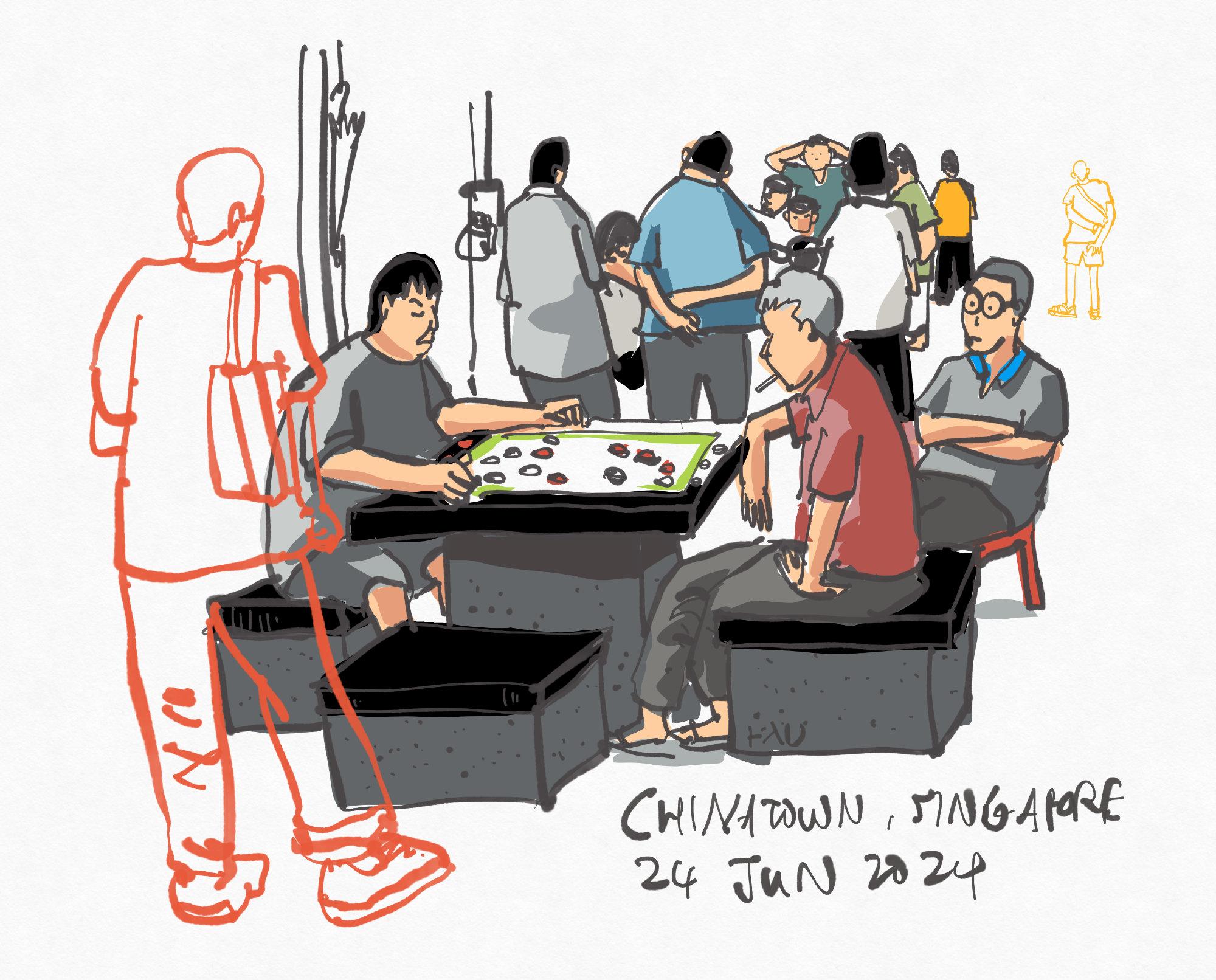
the name of the place. This is Chinatown, Singapore. And today's date is
24 of June 2024. And I'm going to sign
my name somewhere else. Maybe I'm going to
sign my name here. Yeah, so that it's
not that of yours. Okay. Almost done. I just need to
make sure this bag looks like a Back. Okay, uh.
10. Sketching a Chinese temple (pt 1): Now for the next tutoro where
we will draw this temple, and this is going to
be quite challenging. But the good thing is
the light is actually facing this side,
which is what I want. I want to draw from this
side view so that I can see the front or the back of this temple and the
side of the temple. That's where I will be sitting. Back against a wall with
a postbox by the side so that it's very unlikely for
people to stand behind me. I will try to simplify this
scene as much as possible. So let's once again start by duplicating the
template file and renaming it to 024624 temple. Let's open the file, select the custom layer, which I'm going to name as raft. And I'm going to use black
lines first because I realize I can just use black lines and then change
the color of the line later. So I am seated. So let me just draw the
horizon line first. So this horizon line is the line that intersects
the bottom of the t shirts for all the
people walking in front of me. So if I draw a person here, this is the bottom
of the t shirt. This is the height
of the t shirt. If there is another person here and this is the
bottom of the t shirt, this is the height
of that person. There is a VP vanishing
point on the left side, but it's very far left,
so we cannot see it. So to draw the temple here, we need to measure. We have to draw
from observation. So at this stage, just
draw the big shapes first. Make sure they look right
as they look accurate. H Okay, blocking
out the big ships. Anyway, this is going to be an extremely stylized sketch because I have no intention to draw all the details
for this temple. I mean, if I have the time,
if I have a lot of time, I guess I can, you know, draw all the details. But to draw a temple like this, it's probably going to
take at least 3 hours. I have to draw all the details. So just block out
the shapes first. Block out as much of the
building as you can. Okay, this is
looking pretty good. So this roof here is between
this point and this point. And the roof ends here. Comes down like this. We have another roof
here starts here. Yeah, almost at the
midpoint of this roof, starts here, go up like this, comes here, and slightly at this point here. Let
me just erase this part. I goes down oops,
goes down like this. We have this thing here. Yeah. Wow, this is This is exceedingly
challenging to sketch. Okay, there is a VP here,
vanishing point here. I think I should probably
put in my lines just so that so that I can
make the mistakes at this stage at the drafting stage so that I don't make the
mistakes later on. Okay, so all these lines at the right edge, they
should go to the VP. So I'm using some perspective
knowledge to help me sketch the perspective lines. And we have some skyscrapers
in the background, and I shall just leave the skyscrapers out
first as a tree here. Some shop houses behind. Okay. Um Where's the Oh, okay. This is the as I mentioned
earlier, this is the horizon. So there are still some
bits beneath the horizon. Yeah. Okay. I think this
looks this looks okay. So let's select everything. Change the color to light blue. Yeah, change it to
a light blue color. And now let's go back to the pen layer or the
watercolor layer, set something to automatic, select the pen you want
to use, and let's sketch. Um, yeah, so this
is the part where I dread because Oh, wow. Um, this is This is
exceedingly difficult to draw. So this is it's going to be quite
impossible for me to draw all the details. So I'm just simplifying
as much as possible. Just drawing the shapes to make sure the shapes
look recognizable. This thing here comes
down like this. There are some structure
that's holding the balcony. There are four of them,
so we have one here. Let's draw the one at
the outer edge first. Now, all the details that
you see me draw this is just This is just
artistic impression. Alright? I guess I can just
draw the shapes to make sure the shape is
almost recognizable. But it would be I wouldn't say it's impossible
to draw all the details. It's just that you need the time to sketch
all the details. Yeah, that's the
issue that I have right now because I don't
have that much time. Okay, so let me just mark out the bigger structure
of the temple. Yeah, four columns
one, two, three, four. We have the temple,
roof here, here. Let's have some circles up here. Wow. As the details or as the
object is further away, I have to make sure that some
of the diss are smaller. Like the circles that I draw, they have to be much smaller. So for the circles in front,
you can draw them bigger, but for the circles behind, you have to draw them smaller. Let's have the structure again. I'm switching between
drawing the structure, the structure with
the straight lines and the structure with
the curved lines. I hope it makes sense. Fall pillars again. Three pillars on the side. Yep. We have the tree here. So while sketching it
may be good to skill zoom in and zoom
out just to have a look at your overall sketch. Having the drafting lines
drawn earlier really helps significantly.
Helps a lot. I have some windows
here for the windows, for the shop houses behind. I'm just going to have it
as a vertical rectangle. But there are
actually a lot more details for the windows. But this amount of
detail is alright for something that is
in the background. This line looks a bit too
straight for the tree. So let's select this, trash it. Let's undo. Okay. Yeah, I need to make sure I'm selecting
the active layer. Select this, thrush it, and draw a tree where the
trunk is tilted at an angle. Yeah, this looks better. Okay. Yeah. It is actually quite
difficult for me to explain the perspective
of this building because there are too
many things to explain. But the main thing here is just block out the
general shapes. Like, how I would
think about this is if you have to draw
this temple with, say, 50 lines, you're only limited to using 50 lines
to draw this temple. What are the lines that you should use
to draw the temple? Yeah. So that is how you can
think when it comes to drawing the drafting ones and also drawing the structure. You know, sometimes
when I'm drawing, the shortcuts keep activating. So I'm going to turn off the shortcut for the
squeeze as well. Yeah, do nothing. Yeah. Sometimes the
shortcuts are useful, sometimes they just
affect my workflow. There are four pillars
in one, two, three, four, this white balcony goes down to the
vanishing point. We have another roof here. We also need to draw, you know, the rails for the balcony. And now the flies are
coming to disturb me the one thing that I hate about sketching
outdoors is flies nts. I can tolerate the heat. I'm fine with the weather. I'm fine with the noise, but wow, ants flies, man. There are I just don't like. Yeah. Okay, so maybe you
can add some people. So this is not No this
black line has to be moved. Let me just delete this
and draw this again. Yeah. Okay, I think
this is better. This is better because
this line here, this blue line is the horizon, so we need people to be here. There is a potted plant here. So as you can see, this
sketch is very loose, exceptionally sketchy, but it still looks
like the temple. We need to draw the entrance
of the temple, by the way. We have four pillars
here, one, two, three, four, and we also
have some steps here. Let me just rotate this so that I can draw
the steps easily. We have people doorways, there is this big urn here. We have more people, more
people, and more people. Let's draw some, you know, tall buildings in the
background as well, just to give this
sketch some context. Like, where is this temple? So this temple is
actually located on the outside the city area. Yeah. Just outside the city area. So it's good to add
some skyscrapers in. And for the skyscrapers, I'm just going I'm just
going to suggest lines. There won't be much details. So this does not have
to be very precise. Buildings in the background, objects in the background, they don't have to
be that precise.
11. Sketching a Chinese temple (pt 2): So this sketch took me 13% of
battery to create, to draw. And now let's hope I have
enough battery to color this. So just color the
big shapes first. Yeah, so just color
the big shapes first and we can worry
about the details later on. In fact, I think I will
just use this red to color the whole tem fold
because there is a lot of red. I can add back the
white later on. Yep. So now I can go back
to add the white one, two, three, four, five, six. This part here is
white, or white. I am not again, being very precise when
it comes to color ring. So this part is white. Some white areas here. Sometimes when sketching, you don't actually
have to, you know, draw exactly what you see, use exactly the same colors. Sometimes you can just
use your artistic license to change things up. Some sign boards here. Okay. So areas are darker because
they are under the shade. So let me just select this color by using
the color picker, tap and hole, color picker, select the darker color. Is this color dark enough
doesn't seem so You see, this is where the dynamic
palette is very useful. Let me see if I can
use this color. This looks darker, yes, but not as dark as I want. So, let me just choose a
color from this palette. Okay, this looks okay.
So this looks okay. So just choose a darker color to color the shaded
reas underneath. Yeah. I will also need to add some gold color later because I can see the top of the roof
as some gold trims. Let's have the white here. Switch back to the shadow. So, as mentioned earlier, it's good to have
highlights and shadows. So this part here has shadows. Hm. This part here has shadows. We see some, I see
some white here. And here as well. Here as well, maybe we
can have some gray. So let's have a gray darker gray perhaps because some pots are
actually under the shade. Okay, let's have some, you know, this black color here, a darker gray for this urn, a lighter gray for the ground. And for the tree, let's have a neutral
green pastle light green. This part here should be red. Oh, it's not red. It's
actually not red. It's actually gray. Yeah, so the roof
is actually gray, or at least the part
where I can see. So this right side here
is the shadow side. So this part here is
going to be darker. So let's make it more obvious that the right side
here is darker. You have the tree. Let's have a darker shed for the tree to
suggest the light source, which is on the left side. Let's have some orange
building, orange roofs. Okay. Let's have a gray. For this building which is in shape parts of the skyscrapers are in shape. Okay. This sketch is coming
along quite nicely, very nicely, I must say. Some of the skyscrapers
here are blue light blue. Let's see if I can get a light intralblue for one
of the skyscrapers here. Maybe a darker purple,
may, light color. Let's use the same green for this tree here so that the
colors look harmonious. Let's have a brown for the pot. Let's erase the
bottom of the pot. Go back to the fuel layer. Let's add some colors. Oops. Let's have orange. Let's maybe have
green, maybe a blue. So black for the windows and
also for the bottom here, which is very dark. Let's have a lighter gray
for this part of the road. This part here is
lighter because there is glass that is
reflecting the sky. Okay, and looks. This sketch is almost complete. What else? Okay, I need to add the gold colored
details for the. So let's create a
new layer above, which I'm going to call details. And I'm going to select the pen, change the color to yellow, and just add the gold colored. Okay. So as you can see, this is very sketchy,
very, very sketchy. Just some details to suggest a roof with the ends that
have the gold color. This is looking pretty good. Just make sure that
whenever you are coloring, you're coloring on the
well, correct layer, which is quite important
to create certain areas to make certain areas to give
certain areas more contrast. I can add maybe black. Let's try. Let's
see if we can add some black. So I'm not sure. So I'm going to
create a new layer. Just to see whether
it makes sense to add to make
certain areas black. So let's have black. This is not black enough. There are three
blacks in concepts. There is 100 and 110, and then there is black. So if you want pure
black, it's black. This is not easy to use. I think it works. Sort of works. So because it sort of works, I will keep this layer. Under the details, I want to add an orange line because it seems like there is
an orange line here. It's not straight enough. No, not straight enough. Let me just adjust
the straightness. Yeah. So this looks I
think this looks better. Now, when you have no idea what else to draw or whether you
should add more details, that is the time where you can actually
start adding details. Let's add some
texture to the tree. So remember earlier in one
of the earlier lessons, I mentioned that you
can make the scene look more likely by adding
plants, adding people. Yeah, this is pretty much what I am doing right
now adding plants. There is a balcony here, so I'm not sure if I should draw the balcony with
black. Maybe I can. Yeah, let's just draw
the balcony with black. I was actually thinking
on drawing the balcony with the rails with red. But if I do so, the red may not stand out against the red. Yeah. And the last thing I want to do is maybe Oh, there are some
window grills here. Maybe I should draw
the window grills. Okay, let's add another
layer for the sky. New layer, and drag this
down to the bottom. So this will be sky. Even though it's quite
a cloudy day today, I still want to add the sky. I'm going to add a very
light blue for the sky. I think this looks fine. Yeah, this actually looks fine. I just need to use white to
look out this area here. And this area here
here and maybe use the white to add some clouds even
though there are no clouds. I'm adding on the wrong layer. I should be drawing
on the clouds layer. Okay. So for the clouds that are further away that are lower
down closer to the horizon, just make the clouds smaller. For clouds that are, you know, just above you, you have
to draw them bigger. Okay, so this sketch is done. Let me just write the
name of this temple. So this is the completed sketch, which is difficult to draw, yes. But as long as you create the drafting lines at the start of the sketch
before you sketch, that will help a lot. That will actually
help immensely because when you make mistakes at the start with
the dropping lines, you can avoid making those
mistakes when you're drawing. But if you draw straight
with ink with black, Um, you're bound to make more mistakes unless
you are really careful. And if you are very careful
while you're sketching, it's going to take
a much longer time. So by creating the drafting lines at the start
of the sketch, it actually helps you sketch
much faster later on. So now I'm just
adding the details. I may also want to add some
details here on the side. Basically just have the drawing fit into the white
on the left side. I've got to say that I am actually quite satisfied
with this sketch. Even though it looks even though it doesn't
look that sketchy. Okay, let me show you
the focus mode again. So I just want to
see the line art. So let me just double tap this and this will
show you the line art. It looks certainly looks
better with the colors.
12. Outro: We have come to the
end of the course. I hope you have
enjoyed the course, and I hope you enjoy
sketching with concepts because I really had a lot of fun
sketching this app, and I also had a lot of fun
making this course today, just walking around, sketching, looking for things to draw. It is just a lot of fun. So don't forget to send in your sketches or your
projects and let me have a look because I
would really love to see what you guys have created. And if you have any
questions regarding the app, let me know in the
command section or you can email me directly
with your questions. And lastly, don't
forget to leave this course a
review if you enjoy the course so that
other students can know how good
this course is. Thanks for watching.
See you guys in the next course. Aye.
 Teoh Yi Chie, Sketcher, watercolour lover